Featured
Dow Jones earnings hit a new all-time high
Following the US midterm elections, the Dow Jones advanced 2.13 percent with more all-time highs to follow before the year ends.

The Dow Jones saw some action last week. Wednesday, the day after the midterm elections, it advanced by 2.13 percent from its previous day’s closing price, our fourth day of extreme volatility since early October. Everyone was happy about the nice daily gain. But I’m only noting that days of extreme market volatility (Dow Jones 2 percent days) are in the main bear-market phenomenon, be they negative or positive.
In any case, the Dow Jones saw a nice bump up from Friday the previous week, which ended with the Dow Jones at -5.81 percent in the BEV chart below. With the Dow Jones closing the past week only -3.31 percent from its October 3rd last all-time high, it’s hard being short-term bearish. So I continue expecting the venerable Dow Jones to make additional new all-time highs before the end of 2018.
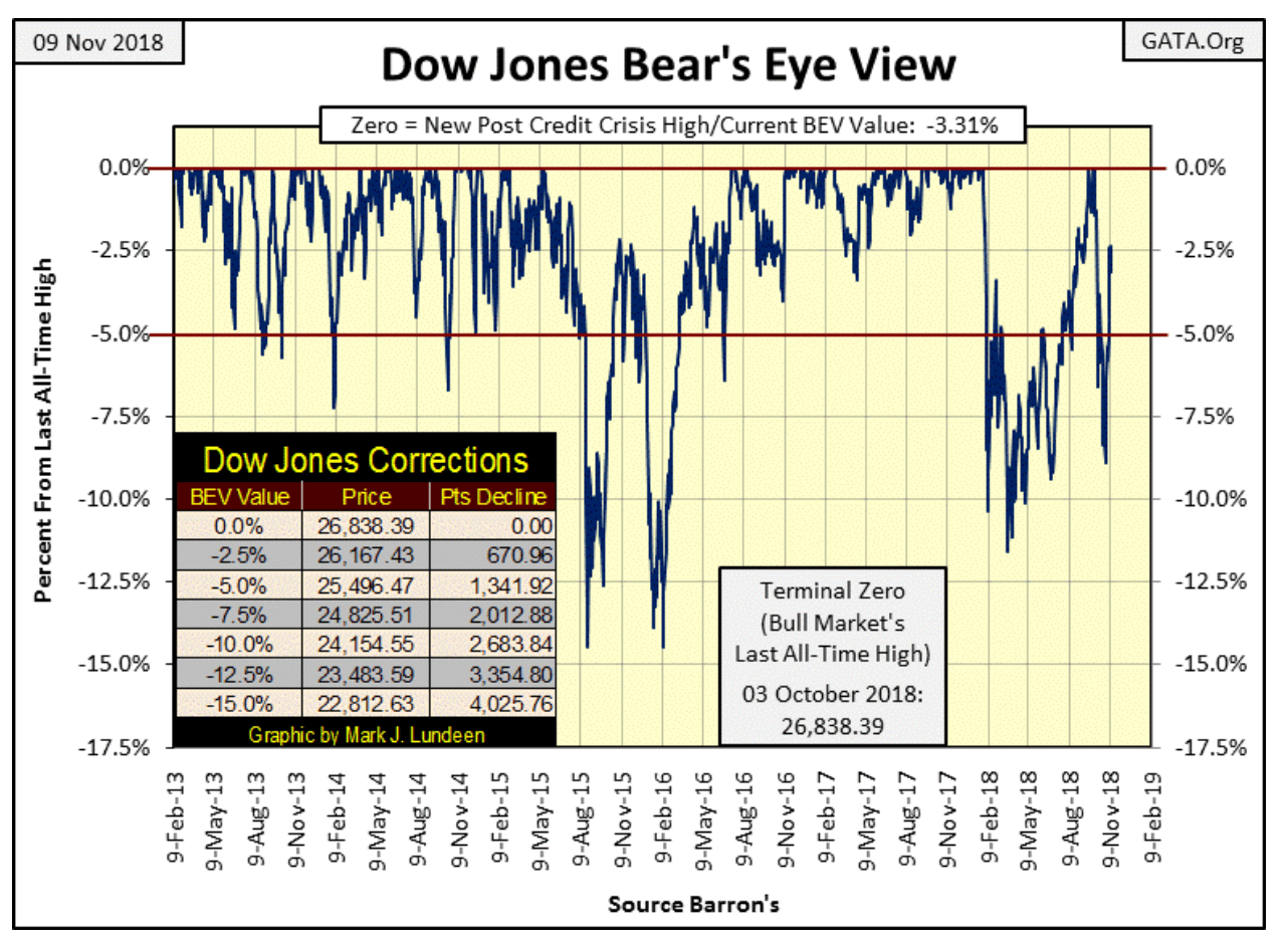
© Mark Lundeen
One thing in favor of an advancing Dow Jones is its trading volume is still very high, as it has been since it began its current decline in early October. But I attribute this volume (demand for stocks) to artificial support from the FOMC.
It’s just a fact of life that for a long time now, the “policy makers” have been supporting the stock market with pseudo-demand for what Wall Street is selling any time the stock market is down, and pseudo-supply for the gold and silver markets whenever the old monetary metals threaten to break above some predetermined parameter set by their “policy.”
Here’s an article from ZeroHedge on a J.P. Morgan trader in the gold market. This isn’t really news. Bill Murphy and Chris Powell from GATA have been reporting on manipulation in the gold and silver markets since the late 1990s. And to be fair with ZeroHedge, they also have been covering market manipulation for a long time. This same longtime where the mainstream financial media has been dismissing such things as “conspiracy theories,” where in fact they have been a market reality for a very long time. But this too shall pass.
Still, it’s nice seeing such market intelligence being reported by someone. All we need now is for the government regulators to begin prosecuting these lawbreakers for being the criminals they are. The reason they haven’t done this so far is our government regulators are in on the scam.
Next is the Dow Jones in daily bars; volatility still hasn’t returned to what it was before the October 3rd top. Thinking about all the excitement the stock market has at a market top, one would expect to see big daily moves in the Dow Jones. In fact, if you actually look at the data, it’s just the opposite, that advancing markets advance typically on low daily volatility as you see from June to October below.
Seeing the daily volatility for the Dow Jones greatly increase after the October 3rd top (big daily bars) is typical of a major market decline.
I’m not going to argue with success, such as the remarkable market recovery off the October 29th market bottom. But seeing this advance happen in large daily moves is a point to be concerned about.
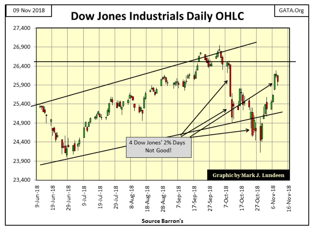
© Mark Lundeen
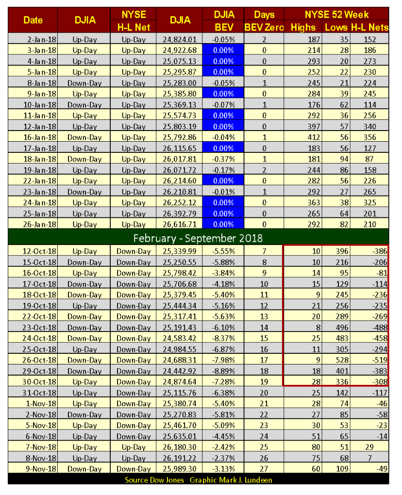
NYSE 52Wk Lows have contracted to double digits since the end of October (table below). And two days this week saw more 52Wk Highs than Lows. That’s something we haven’t seen since September 21st.
If this advance in the Dow Jones is real, in the weeks to come we should see 52Wk Highs at the NYSE increase to triple digits as we saw last January. But for the bulls, seeing NYSE 52Wk Lows contract as they have since October 30th is welcomed.
© Mark Lundeen
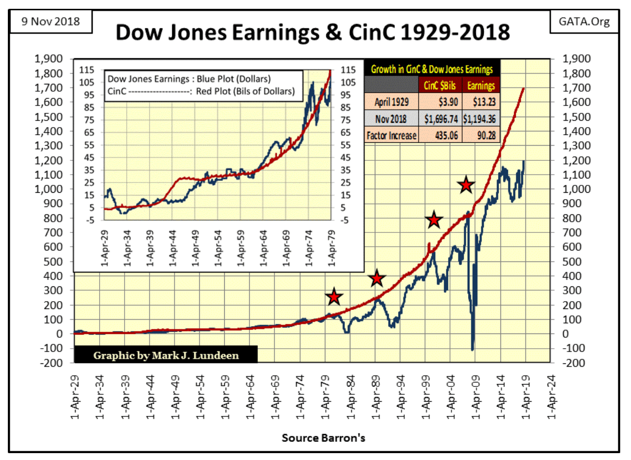
Earnings for the Dow Jones are currently at all-time highs. But how earnings are computed has changed greatly in past decades. I’m not an accountant, but if accounting standards from the 1950s were rigorously enforced on today’s corporate balance sheets, I doubt the earnings for the Dow Jones would be as we see them today.
The two plots below are *NOT* indexed, but the as published data. Over the decades there have been some amazing relationships between Currency in Circulation (Red Plot / the number of paper dollars in circulation) and the Dow Jones Earnings (Blue Plot).
From 1934 to 1979 (chart insert), a billion dollars of CinC apparently supported about a dollar in earnings for the Dow Jones. To my eyes, I’d say that corporate earnings for these years were only a function of monetary inflation flowing from the Federal Reserve.
After 1979, for the Dow Jones earnings (Blue Plot) to rise up and touch the Red Plot resulted in a crash in Dow Jones earnings. The last time that happened was in October 2007, and since April 2014, CinC inflation has decoupled with the Dow Jones earnings. Exactly what the implications of this disconnect will prove to be I can’t currently say. But I expect in the fullness of time it won’t prove to be a positive factor for the stock market.
© Mark Lundeen
This is interesting too. The Dow Jones saw a collapse in its earnings from 1930 to 1933; they were totally wiped out and went negative during the Great Depression Crash. They didn’t break above their peak July 1930 level ($20.22) until January 1949 when they reached $21.52. That’s just six months short of twenty years.
That wasn’t the case for the October 2007 to September 2008 collapse, where for only the second time Dow Jones earnings went negative. Post-sub-prime credit crisis earnings took only four years to completely recover from their wipeout.
That just doesn’t seem right to me. Maybe this is just another of those strange market coincidences of the past two decades I like to call the “policy makers fingerprints on the market.” Anyway, I expect earnings today will ultimately prove to be fragile things. When Mr. Bear comes back and begins to do his thing unhindered by the “policy makers,” I wouldn’t be surprised to see the Dow Jones earnings going down, hand-in-hand with the Dow Jones itself.
A big problem for corporate earnings is today’s economy is carrying too much debt. Even if a company has a squeaky clean balance sheet, you can be sure its customers and vendors don’t.
That plus the debt markets have for decades overpaid (purchased debt at too low of yield). Look at the chart below plotting the US National Debt (Blue Plot) with the yield for the US 10yr T-Bond going back to 1962.
It wasn’t just consumer prices increasing at annual double-digit percentages that brought about the huge increases in bond yields and interest rates from 1962 to 1981. With memories of the Great Depression still vivid in the minds of many, as the US National Debt approached the one trillion dollar mark, rational people from decades ago asked themselves how is Uncle Sam going to pay back all that money?
That’s a good question which is no longer asked. But back when it was in the late 1970s, the markets began demanding double-digit yields from the US Treasury as a default risk premium.
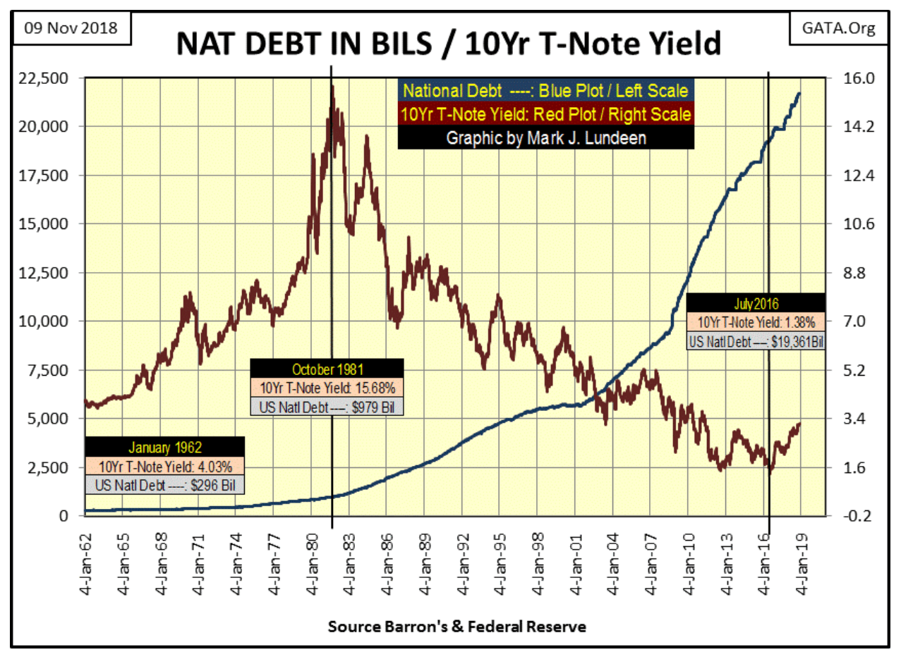
© Mark Lundeen
But then we baby-boomers began to dominate the markets, economy and yes “monetary policy” dictated by the FOMC. Proving we weren’t going to learn from the mistakes of others, we continued overpaying for US Treasury debt for the next eighteen trillion dollars in the national debt until yields for the 10yr T-bond declined to a trifling 1.38 percent in July 2016.
As we see below, that’s now a problem as interest rates are now going back up. This bond seen below was issued with a 5.38 percent coupon in February 2001. In other words, a $1,000 investment in this bond will return to its owner an annual $53.80 payment until February 2031. Bonds are fixed income; this particular T-bond will never pay any less than $53.80 a year, but then it will never pay any more.
The changing yield (Red Plot) this bond has seen in the past eighteen years is a function of what price (Blue Plot) it was trading at. It yielded 1.48 percent in July 2016 because the market was willing to pay $1556.50 for the annual $53.80 it paid to its owner.
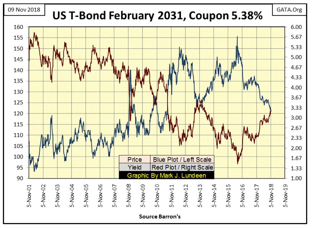
© Mark Lundeen
But July 2016 was a long time ago. At this week’s close, this bond was yielding 3.22 percent, as the market was willing to pay only $1216.90 for this bond’s fixed payout of $53.80. In other words, since July 2016 this bond’s valuation has deflated by a whopping 21 percent.
That is an unrecoverable loss for anyone who foolishly purchased it in July 2016 when its annual return was only 1.38 percent. The same will be said for anyone who purchased this bond this week at 3.22 percent when market forces drive this bond’s yields up over 6 percent.
How high could T- bond yields increase to? In the fullness of time I expect they’ll see double-digits again for the same reasons they did in the late 1970s and early 1980s:
Pending annual consumer price increases of double-digit percentages.
The debt markets once again demand a default risk premium as Washington continues spending other people’s money with abandon.
“Market experts” may laugh at this prediction of mine, but that’s because they have confidence in the system that underlies the financial markets and the economy rests on solid footings.
But I don’t share that confidence. What I see is a financial system that is basically predatory in nature; a financial system that benefits a few at the expense of the many. Such a system cannot maintain the confidence it now has forever. Rising bond yields and interest rates indicate the debt markets are slowing coming my way.
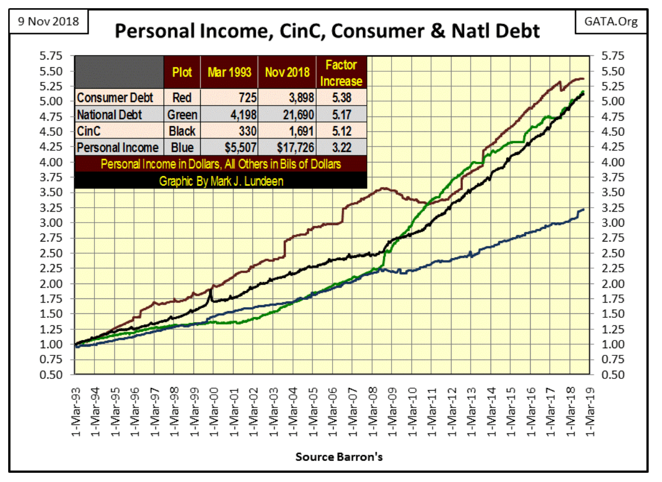
Below is a chart plotting the indexed values of consumer debt, the national debt, CinC and personal income with 01 March 1993 =1.00.
Ultimately all debt is serviced by consumers. It is taxes consumers paid to the US Treasury that services the national debt. Corporations also pay federal income taxes, but these burdens are only passed on to consumers with higher prices. The same is true for the operational debts companies have to service, those expenses are also passed on to consumers. Then there are the debts taken on by consumers themselves, they too must be serviced by personal income.
I only have data on the national and consumer debt, but you can still see the problem below; the burdens of debt services as seen in the national and consumer debt is growing faster than is personal income.
© Mark Lundeen
This is a situation that can’t continue forever, but it may go on longer than you or I believe it can. Then the burden of debt service may collapse the financial system sometime next year or next week.
One thing is certain, there is an unknown threshold in the debt markets, a rising bond yield or Fed Funds rate when once crossed will result in a panic from the debt market as counterparty default becomes the primary focus in the markets. That day won’t be good for investors in the stock market but will be for those who have taken a position in gold and silver bullion as well as precious metals miners.
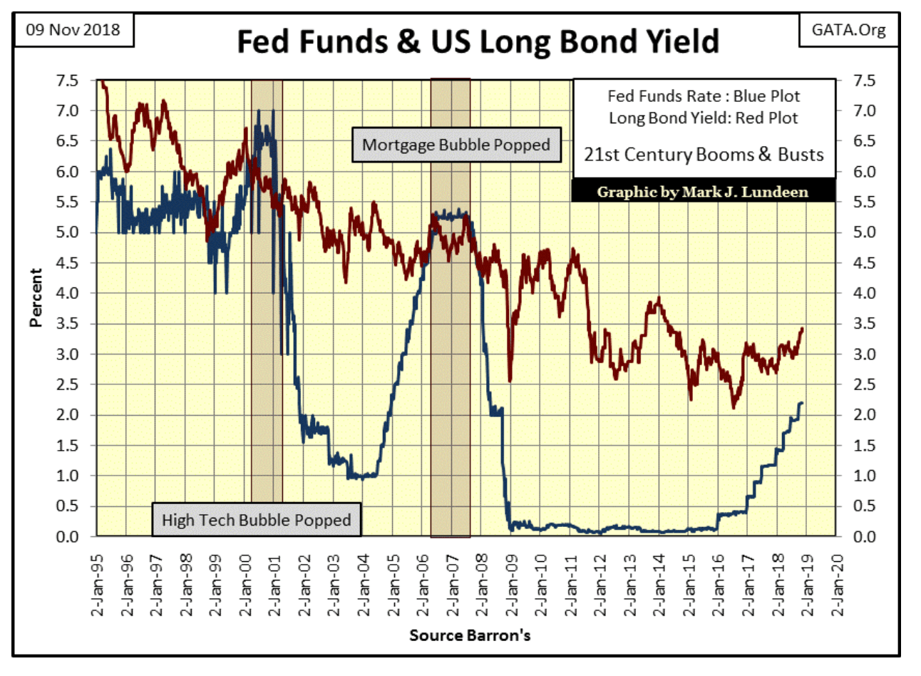
Here’s a chart plotting the Fed Funds Rate and the yield for the US Long Bond. Can they return to where they were in 2007 and not have another credit crisis? If you look at the chart above you’ll note that since 2007 there is a lot more debt to be serviced, but not that much more personal income to do so.
© Mark Lundeen
Next is a BEV chart for gold going back to 1969. The 1980-1999 bear market took the price of gold down by 70 percent. Gold’s current decline from its August 2011 all-time high was only 45 percent (Box #1) in December 2015. That’s a big drop, but nowhere near the 70 percent decline gold saw from 1980 to 1999.
The next decline occurred in December 2016 (Box #2) when gold touched its BEV -40 percent line. So far box #3 has only declined to -38.29 percent on the BEV chart on August 15th of this year.
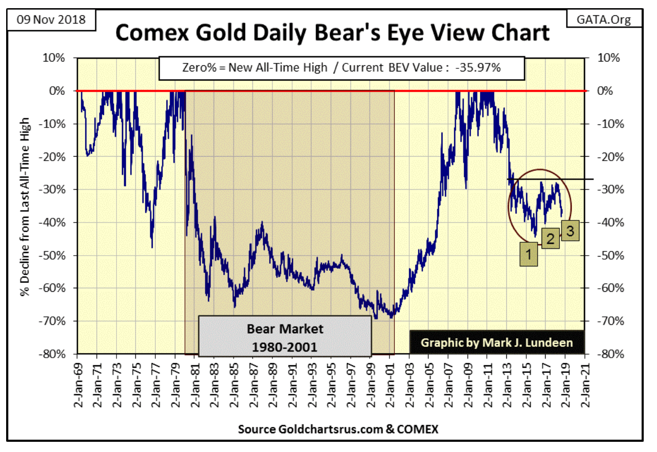
© Mark Lundeen
Watching gold is like watching paint dry—boring. But it’s important to note that the decline seen in Box #2 failed to break below Box #1, and so far Box #3 has failed to break below Box #2. Also, it’s been three months since Box #3 bottomed, and since then gold has done absolutely nothing.
Three months is a long time for a market to do absolutely nothing. Some time ahead of us gold is once again going to be doing something, and that something is most likely seeing gold break above its BEV -28 percent level that has twice stopped gold’s advance since 2016.
—
DISCLAIMER: This article expresses my own ideas and opinions. Any information I have shared are from sources that I believe to be reliable and accurate. I did not receive any financial compensation for writing this post, nor do I own any shares in any company I’ve mentioned. I encourage any reader to do their own diligent research first before making any investment decisions.


Temotiva Launches Crowdfunding Campaign to Advance Preventive Mental Health
Temotiva Innovación Lab has launched a crowdfunding campaign through Santander X Explorer, marking a new phase for the University of...


Fed Policy Shift Raises Concerns Over Debt and Inflation Risks
The Federal Reserve is criticized for resuming balance sheet expansion through Treasury purchases despite expectations of tighter policy under new...


AI Adoption in Italian Retail Stalls Despite Strong Experimentation
A survey on AI in Italian large-scale retail trade shows companies are increasingly adopting artificial intelligence, but only 1.4% have...


Crypto Market Stays Stable as Bitcoin and Ethereum See Mild Declines
The crypto market remained stable despite slight declines in major coins like Bitcoin and Ethereum. Bitcoin held near $64,362, while...


WNBA Removes Cannabis From Banned Substances List in New CBA
WNBA removed cannabis from its banned substances list in a new CBA running 2026–2032, aligning with NBA policy and allowing...
 |
|
 |  |
 |
|
-

 Africa2 weeks ago
Morocco at an Energy Crossroads Amid Global Gas Volatility and Critical Minerals Opportunity
-

 Fintech4 days ago
Trade Republic Brings Back Human Support and Launches Customer Council
-

 Biotech2 weeks ago
EFPIA Warns Limited SPC Reform Could Weaken EU Pharma Competitiveness
-

 Markets6 days ago
Corn Prices Slip Amid Strong Crop Conditions and Favorable Weather
You must be logged in to post a comment Login