Featured
Here’s why the Dow Jones Industrials is having a good month
The U.S. government is helping push stocks higher thanks to its off-the-books spending, while the central banks are playing a role in the rise of the stock market.
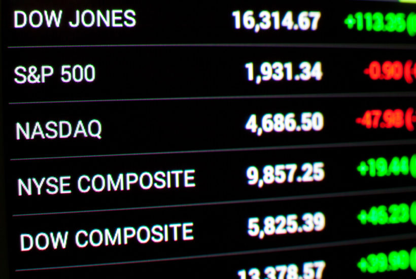
Halleluiah! It’s April. April is the number one month for the Dow Jones Industrials (DJI) since 1950 with 47 up months and only 22 down months. So far, so good this month. Alas, it is only the number 3 month for the S&P 500, the Russell 1000 and 2000, and the number 4 month for the NASDAQ. But the good news is the indices have their best years in pre-election years, which this is. The average gain for the DJI + 4% during pre-election years. Watch carefully for “irrational exuberance.” The indices remain in a potential mode for a blow-off.
So, what exactly have the indices done since they bottomed in December 2018 following the steepest decline for the indices since 2008? Overall, the indices were down roughly 20%. Only one index has made new all-time highs—the Dow Jones Utilities (DJU). But many have made new highs for the current move, including Dow Jones Industrials (DJI), Dow Jones Transportations (DJT), Dow Jones Composite (DJC), S&P 500, Russell 1000, Russell 3000, S&P 100 (OEX), NYSE, and Wilshire 5000. Not making new highs for this move so far are Value Line (VLE), Russell 2000, S&P 400 Mid Cap, S&P 600 Small Cap, and, KBW Bank Index. So far, the new highs for the move range from barely to labored. However, most of the indices have crossed a point that suggests new all-time highs. We await.
Since the low in December, the DJI has gained 21.3% while the S&P 500 is up 23.0%. The DJI remains off about 1.5% from its all-time high seen on October 3, 2018, while the S&P 500 is also off about 1.3%, but its all-time high was seen on September 21, 2018. Its October 3 high was only marginally lower. Note these are based on closes, not actual highs and lows.
We can’t help noting that the volume on this up wave is not strong. There were rumors that the plunge protection team was active at the bottom of the market. So, who is the plunge protection team (PPT)? Well, their real name is the Working Group on Financial Markets. The PPT was created in 1988 under President Ronald Reagan. Its purpose is to provide financial and economic recommendations during turbulent times. The PPT was created in the wake of the 1987 stock market crash. Headed by the Secretary of the Treasury, the group was charged with “enhancing the integrity, efficiency, orderliness, and competitiveness of our Nation’s financial markets and maintaining investor confidence.” Its board includes the Chairman of the Fed, the SEC, and CFTC.
The group is quite secretive. They do not release reports, and they are not widely covered. If they were asked about their activities, they would probably respond with “no comment.” But it is widely accepted that the PPT intervenes in markets. The PPT is a favorite of conspiracy theorists. But others also intervene in the markets. It has been well known that for months corporations were buying their own stock back. It is an activity that creates no economic benefit; however, it does help push stocks higher.
Something else that could be helping to push stock markets higher is the off-the-books spending of the U.S. government. It was only in 2017 that a Michigan State University economist Mark Skidmore found $21 trillion in unauthorized spending, primarily by the Departments of Defense and Housing. The study covered the years 1998–2015. The study was triggered by a former assistant secretary of Housing and Urban Development, Catherine Fitts who had uncovered unauthorized spending by, in particular, the Department of Defense. It is highly possible some of these funds found their way into the stock market.
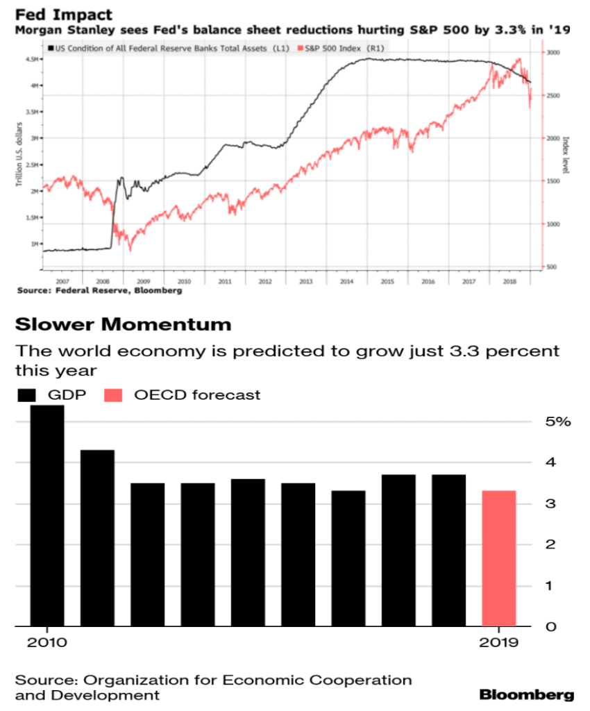
Central banks also play a role in the rise of stocks markets over the past several years. The massive injection of liquidity through quantitative easing (QE) from the Federal Reserve, the ECB, and the BOJ has seen their balance sheets explode from just over $3 trillion back in 2007 to roughly $14 trillion in 2019. As the chart below demonstrates, the S&P 500 rose almost in lockstep with the rise in the Fed’s balance sheet. As reductions began that eventually moved from QE to QT, the S&P 500 and other markets faltered. Given the anticipation that surrounded the announcement from the Fed of no more interest rate hikes, coupled with the ending of QT, the stock market has been rising since.
Despite all this liquidity that has been poured into markets over the past several years, GDP growth has been largely below previous recovery periods. Now the global economy is beginning to falter and central banks around the world are noticing it and have expressed a higher level of concern. The world economy is expected to grow only 3.3% in 2019, according to forecasts from the World Trade Organization (WTO) and the Organization for Economic Cooperation and Development (OECD). (See the chart below.) The Fed has expressed its concern by becoming more dovish. Interest rate hikes for 2019 have been dropped and, as noted, QT ends in September.
©David Chapman
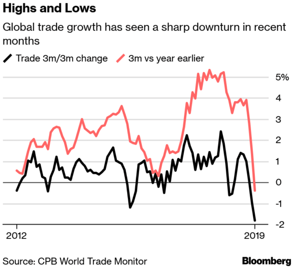
There is growing concern about the global economy. A number of factors are beginning to weigh on analysts. Global trade has taken a downturn in recent months. U.S./China trade talks continue. Trump claims that an “epic” deal is close. But, as we have seen in the past, this can change suddenly from “we are close to a deal” to “no deal.” The problem is, given the trade wars that have been ongoing since January 2018, they are actually taking a toll. The biggest impact is being felt in the key nations of the U.S., China, and Germany, but the eurozone, Japan, and others are also feeling it.
©David Chapman
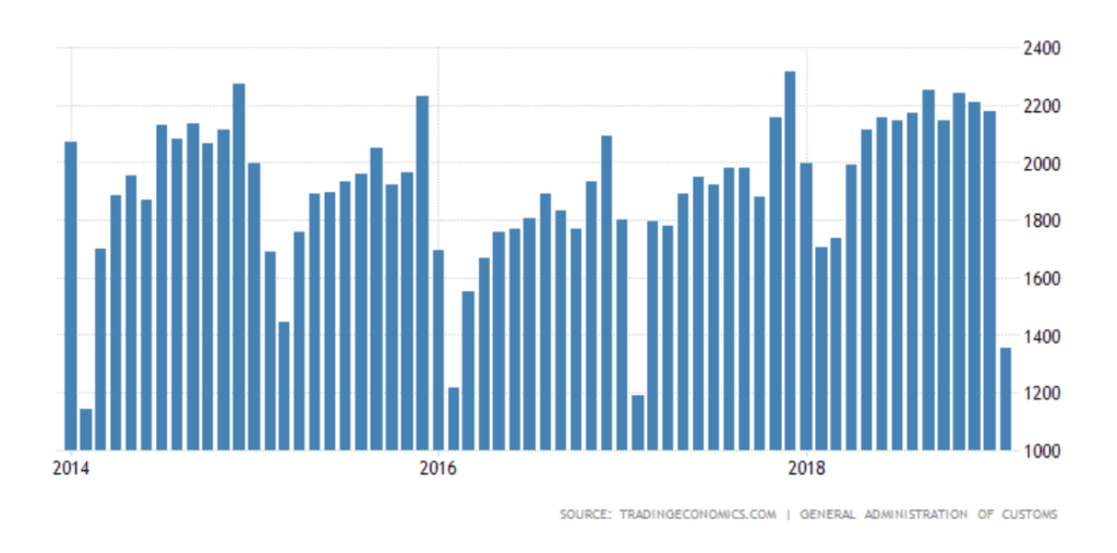
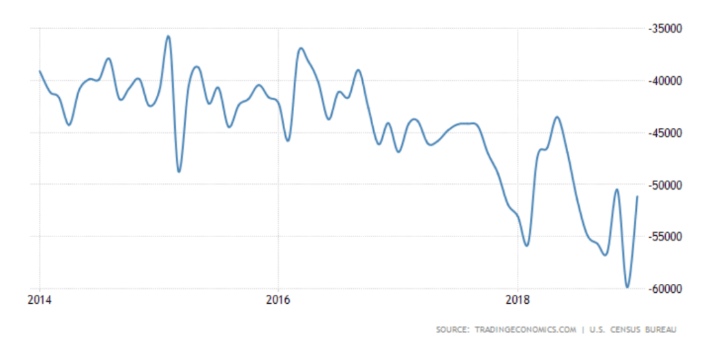
The biggest decline in exports is being seen in China. Year-on-year, exports from China have tumbled 20.7% to February 2019. But China is not the only one. U.S. exports peaked in May 2018 and since then they have been generally in a downtrend. Meanwhile, the U.S. trade deficit has been in a steady uptrend since early 2016. It is ironic that the trade deficit is rising under Trump when he vowed to put an end to it.
China exports
©David Chapman
U.S. balance of trade
©David Chapman
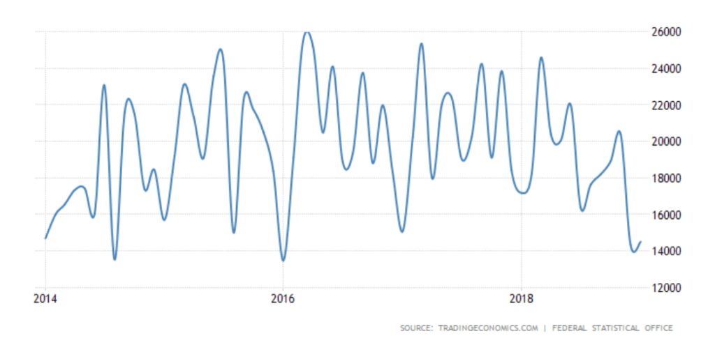
Germany is also experiencing a slowdown in its exports which is showing up in a falling balance of trade. The trade surplus reported in December 2018 was the lowest in three years. January was only marginally better.
Germany balance of trade
©David Chapman
No wonder so much is riding on a solution to the U.S./China trade talks. April could well be a key month for this. Bloomberg has noted that many of its gauges are not particularly rosy. They help support the thesis that trade is faltering. If global trade falters, then recessions could follow.
©David Chapman
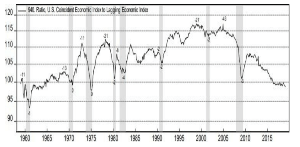
The chart above is rather interesting. It is a ratio of U.S. Economic Index to U.S. Lagging Economic Index. They come from the Conference Board of the U.S. This ratio should be rising. Instead, it has been falling and is now hitting some of its lowest levels in over forty years. It is lower than it was during the 2008 financial crisis. As Dennis Gartman of the Gartman Letter notes the ratio has been useful in the past for calling recession bottoms. Except, this time, it just keeps making new bottoms. And we are supposed to be in the good times.
There are many other factors at work that are helping to weigh on the global economy. As noted, trade is a major factor, but so are others like Brexit. One of the biggest potential drags for the global economy is the extremely high level of debt. There are growing concerns about debt—China’s shadow banking system and real estate market, the U.S.’s leveraged corporate loan market, and the eurozone banking system, particularly Italy, plus continued concerns about Deutsche Bank. The high U.S. dollar is also taking its toll as currency crises grip Turkey, Argentina, and wherever there are US$ denominated loans in foreign countries.
A slowing global economy should be negatively impacting the stock markets. But they keep chugging higher as some indices are now not too far from their all-time highs seen back in 2018. There seems to be a “what, me worry” attitude. But as long as the signs remain positive, the stock market will continue to move higher, and since this is April it is poised to live up to its reputation as the number one month for the stock market.
Trump is at it again
Okay, he has never really stopped. President Trump is continuing his bashing of Fed Chairman Jerome Powell, calling on the Federal Reserve to cut interest rates by 50 bp and stimulate the economy by bringing back QE and end QT. Trump has been criticizing the Fed almost from the time he was elected. Yet he appointed Jerome Powell to replace Janet Yellen.
You see, Trump wants to get elected again in 2020 and he knows that a booming economy will help his chances considerably. The impact of his $1.5 trillion tax cut is waning and the trade wars are slowing things down with a negative impact on the U.S., China, and even Germany plus others.
So, Trump wants to “goose” things as we head into the 2020 election. Here comes QE4. He thinks it will create a “rocket ship” for the economy. The reality is it would be like adding gasoline to a fire and there will be a big explosion.
To help things along he is planning on nominating allies to the two vacant seats on the Fed. The candidates: Herman Cain, a failed 2012 presidential candidate who faced allegations of sexual harassment, and Stephen Moore, an adviser of Trump’s and a conservative economist who has criticized the Fed. The trouble is, neither has been officially nominated and both would have to pass the Senate. Neither candidate is considered ideal for the Fed. Cain was CEO of Godfather’s Pizza and Moore was a Wall Street Journal editorial writer. Neither have a monetary or economics background. Both have personal issues. Many believe that if they are nominated, they will not pass the Senate.
But Trump has kept up his pounding of Powell. The Fed is an independent agency and while the President appoints the Fed Chair, he does not nor does the Fed report to the White House. Other presidents have also tried to influence the Fed. Two of the more famous ones were Richard Nixon and Arthur Burns, and Paul Volcker and Ronald Reagan—the latter is where things almost crossed the line.
Volcker faced intense pressure from Reagan leading up to the 1984 election. In a memoir from The New York Times, Volcker was summoned to the White House to meet Reagan and his Chief of Staff James Baker. They met in the library. Reagan apparently never said a word. But Baker did. “The president is ordering you to not raise interest rates before the election,” Baker told Volcker. Volcker was stunned. He actually had no plans to hike interest rates at the time, but he was stunned by the affront on the independence of the Fed. Volcker later realized the meeting was held in the library because there were likely no recording devices in the room as there would have been in the Oval Office.
But Powell, like Volcker, had to use the same words: “I can’t respond to that because the Federal Reserve System is autonomous.”
While Trump complains that the Fed’s monetary policies are “loco,” he should look at his own calls to cut rates and juice the economy with more QE if he wants to see what is really “loco.”
Consider that:
-
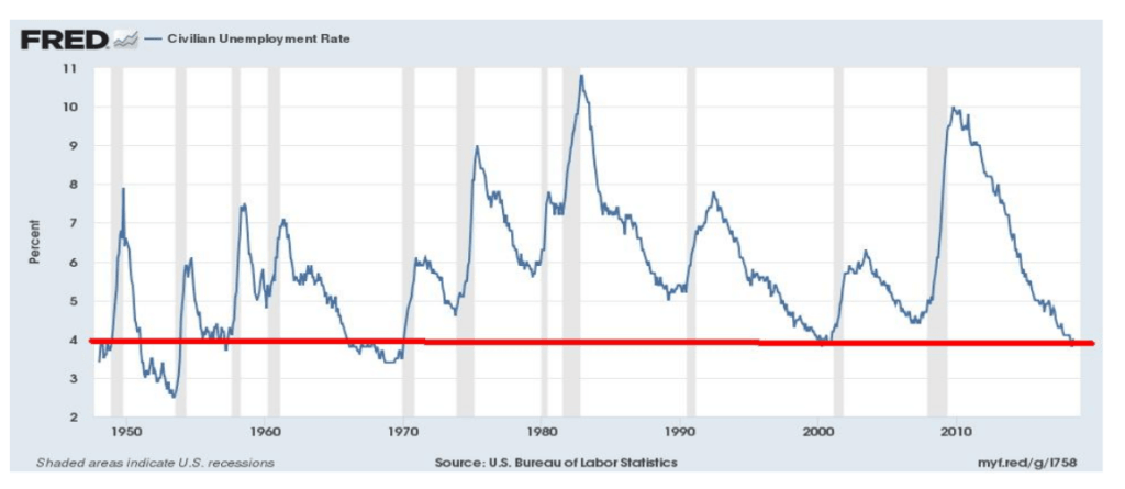
Unemployment is at a multi-year low, at levels last seen in the 1960s.
-
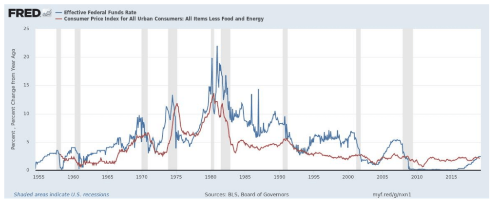
The Fed rate remains below the core inflation rate and has, since 2008, the longest sustained period of negative spreads between the Fed rate and inflation since the 1970s. Overall, interest rates remain at historical lows.
-
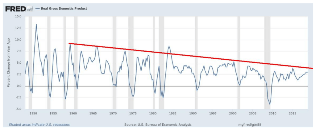
Despite that, real GDP growth remains below previous recoveries, although in general GDP growth has been in a downtrend for years, despite years of QE and massive debt growth.
We illustrate this in the charts below.
Unemployment rate
©David Chapman
Fed funds vs. core CPI
©David Chapman
Real GDP % annual change
©David Chapman
Will Jerome Powell have his meeting in the presidential library too? With Trump, anything is possible.
Markets and trends
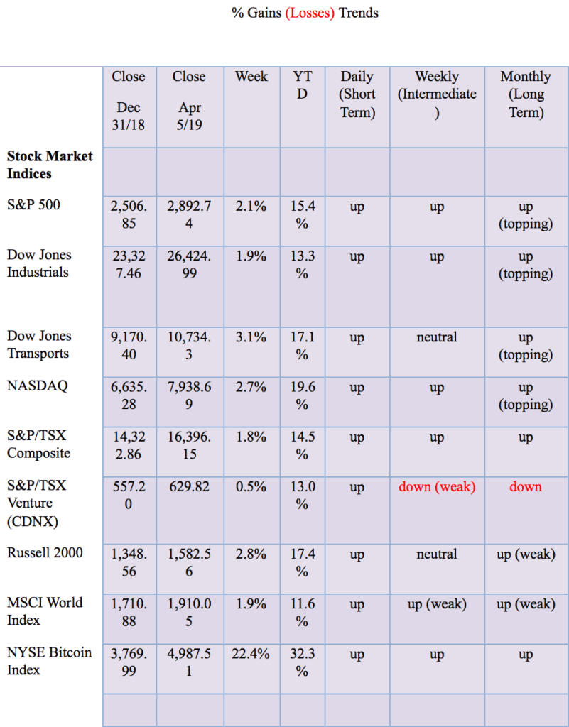
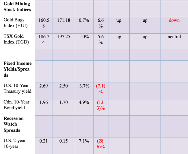
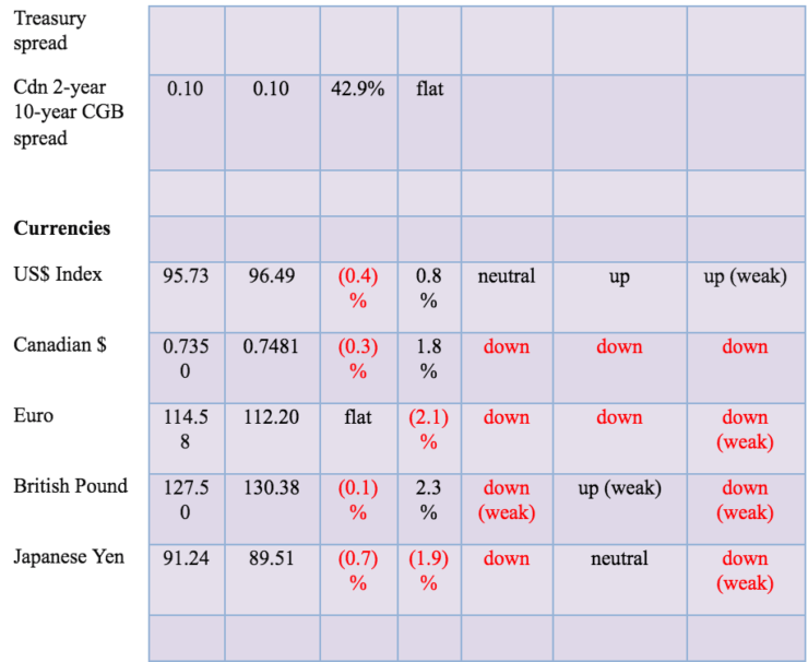
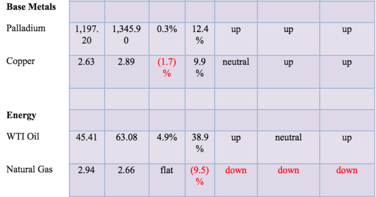
*New highs/lows refer to new 52-week highs/lows. ©David Chapman
©David Chapman
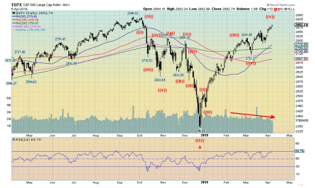
Like Thomas the Tank Engine, the S&P 500 keeps chugging along. Oh, it has little bumps now and then, but the current advance is, so far, one for the books. Since the low on December 26, 2018, the S&P 500 is up 23.3%. This past week the S&P 500 gained 2.1%, helped along with some decent economic numbers, including the jobs report that came out on Friday. Other indices were up as well. The DJI gained 1.9%, the DJT jumped 3.1%, the NASDAQ was up 2.7%, and the Russell 2000 small-cap index gained 2.8%. The TSX Composite joined the party, gaining 1.8% and the TSX Venture Exchange (CDNX) was a bit of a laggard but still gained 0.5%.
Overseas, the London FTSE 100 was up 2.5%, despite all the shenanigans related to Brexit, the Paris CAC 40 was up 2.4%, and the German DAX gained 4.2%. For Germany, what recession. In Asia, China’s Shanghai Index (SSEC) jumped 5.0% while the Tokyo Nikkei Dow (TKN) gained 2.8%. Happiness all around.
Yet all we hear from the doom-and-gloomers is the world is going to end. Oh, this bull will end at some point, but not today. Despite decent economic numbers that may not be spectacular and a rising stock market, a president wants to ignite it even further with interest rate cuts and QE4. April is the best month of the year, and so far, it is proving to be the case. But next month is May and the old saying is “sell in May, and go away.” Of course, the other saying is “buy when it snows, sell when it goes.” Okay, it has stopped snowing but there is still snow on the ground in some places. Should be all gone by May.
Our expectations are that the S&P 500 should soon make new all-time highs. After all, we are only 47 points away or 1.6%. We have passed the point that suggested we should make new highs. And most indicators are still pointed up. So up we will go. 2,800 becomes a new line in the sand. A break below there signals trouble and a break below 2,700 would say the bull is over. Otherwise, as Wall Street and Bay Street love to say, “Buy, Buy, Buy!”
©David Chapman
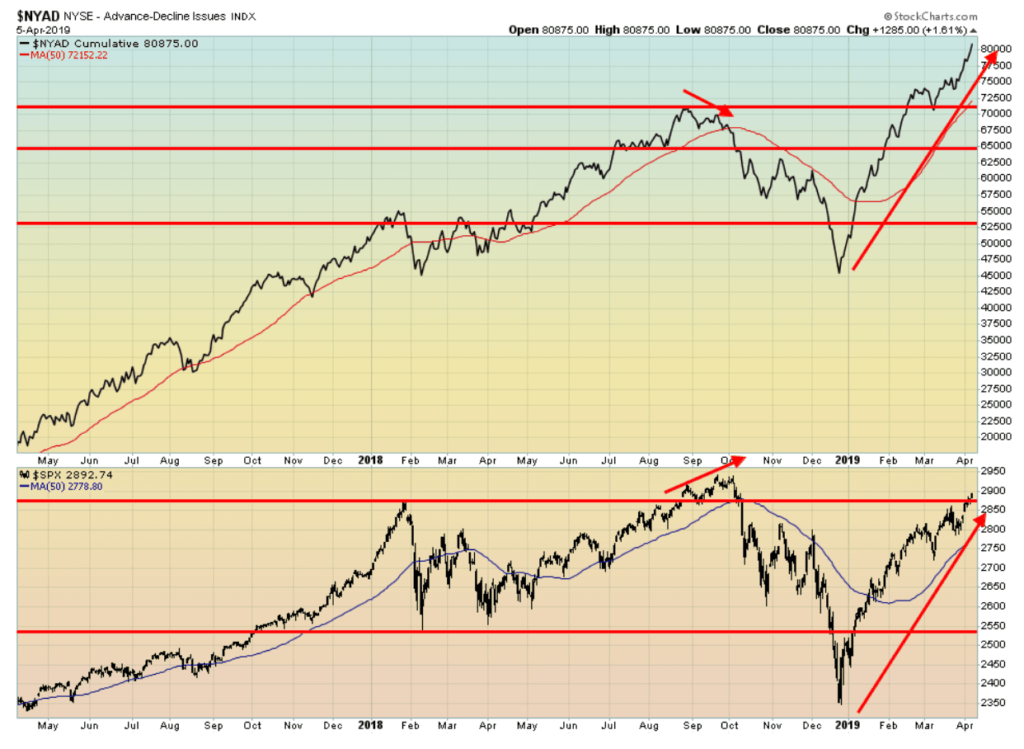
We’d like nothing better than to see a significant divergence between the S&P 500 and the cumulative NYSE advance-decline line. But the only divergence we are getting so far is no new highs on the S&P 500 and rising highs on the NYSE advance-decline cumulative. It is supposed to be telling us that the S&P 500 should be making new highs and if it follows the NYSE advance-decline line it should make a significantly higher high.
So far, it’s not. Is this the divergence? Normally, the divergence comes when the S&P 500 makes a higher high but the NYSE advance-decline does not. We saw that at the highs in September 2018. Nonetheless, the NYSE advance-decline line continues to suggest that the S&P 500 should eventually make new all-time highs.
©David Chapman
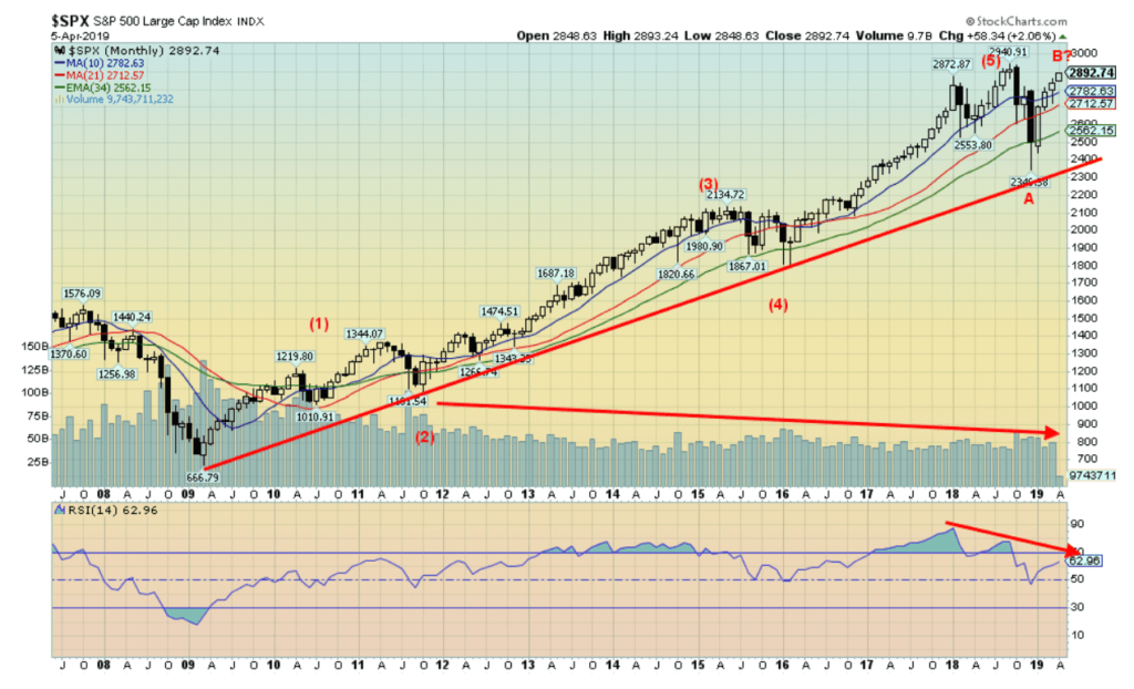
What stands out with this monthly chart is two things. First, the rise in the S&P 500 since the lows in 2009 has been on decreasing volume. Secondly, the RSI appears to have topped months ago with the highs in January 2018. Note how many months the monthly RSI spent above 70. We have often said that just because an indicator like the RSI is overbought (oversold in a bear market) doesn’t mean that a top (or bottom) is imminent.
The RSI went over 70 in early 2017 and stayed that way for a year. It made a lower high when the S&P 500 moved to new all-time highs in September 2018. Now the S&P 500 is moving higher again, indicating it is poised to make new all-time highs once again. But the monthly RSI is nowhere near its former highs and we suspect it might not even go over 70 this time. That would signal to us one, two, three higher highs for the S&P 500 but three lower highs for the RSI. And that spells significant trouble when the markets turn down.
©David Chapman
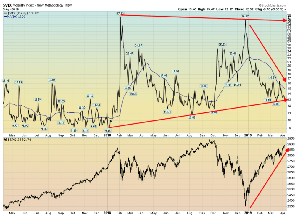
The VIX volatility indicator, a measurement of fear and greed in the market has fallen to its major support line. We’ll see if it can break through that level or actually turn up even as the S&P 500 continues to march higher. That would be a significant divergence and suggest that the S&P 500 is getting closer to a top. If it breaks below this uptrend line then the VIX would be confirming the rise in the S&P 500.
©David Chapman
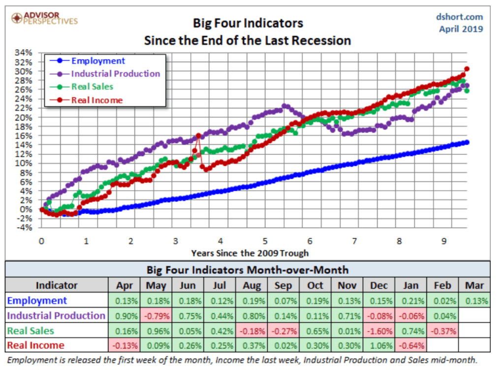
We slipped in this chart from Advisor Perspectives that shows the performance of what they call the generic Big Four indicators’ performance since the end of the recession back in June 2009. The Big Four are Employment, Industrial Production, Real Sales, and Real Income. Employment and Income have been relatively strong, even though overall employment appears to lag the others. Real Sales are starting to dip but it is only one month so it’s too early to tell. What this shows us is that generally, the U.S. economy is doing well. Too bad Trump doesn’t seem to understand that and is demanding that the Fed cut rates and bring in QE4.
©David Chapman
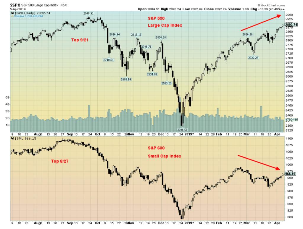
While the S&P 500 appears to be headed to new all-time highs, the small-cap S&P 600 is lagging badly. Oh, maybe it will catch up, but we are not optimistic. The S&P 500 is a mere 1.6% from making new all-time highs. The S&P 600 is 12.3% away from its all-time high seen in August 2018. We are, of course, watching the granddaddy of comparisons between the DJI and the DJT. Currently, the DJI sits 1.8% from its all-time high while the DJT is 7.7% away. Major divergences are not unusual at major tops so we’ll be watching these closely over the next few months to see if the S&P 500 and the DJI make new all-time highs but the S&P 600 and the DJT fail to confirm. Normally, in a bull market, the small-cap leads. Not this time. So, this bears watching.
©David Chapman
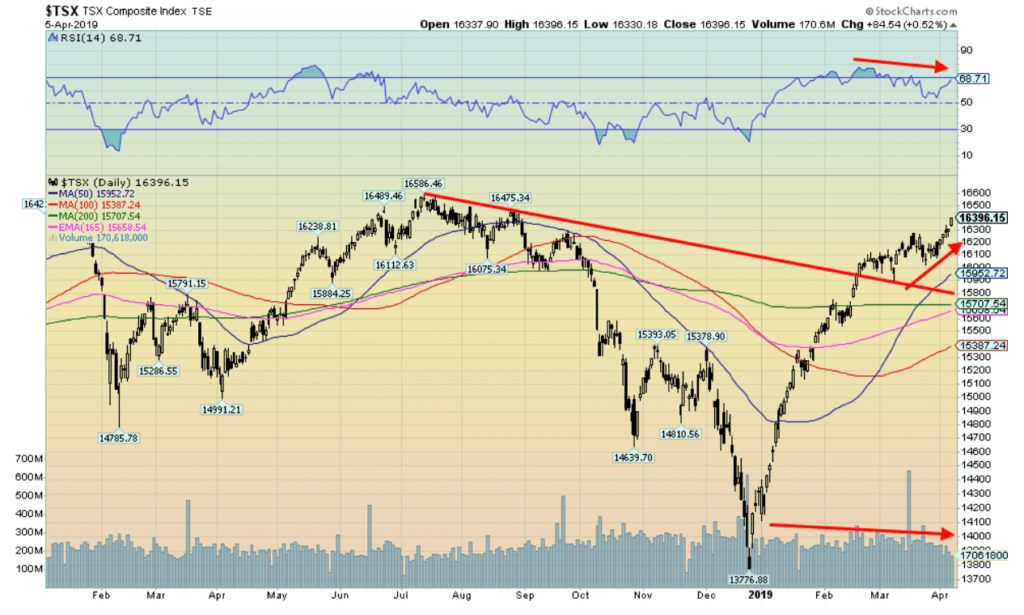
Like the U.S. indices, the TSX Composite is steaming ahead. It broke above that downtrend line from the top and now appears to be headed higher. Leadership is coming from Income Trusts, Consumer Staples, Mining, Industrials, Real Estate, Information Technology, Telecommunications, and Utilities. We like the emerging Golds, Energy, and Consumer Discretionary. Financials are higher but they are not the major leader they are supposed to be. Health Care is faltering but should move higher as should Materials.
But some cautionary notes. Volume is not exactly robust. And the RSI is diverging as the TSX Composite moves higher even as the RSI is making a lower high. But after saying that, there have often been strong up moves on low volume and divergences can go for quite a while before the down move takes place. The TSX is now only about 200 points from the July 2018 high. It appears poised to make new all-time highs. But warning signs abound, so this is not a market to be buying at this stage, except possibly in the three sectors we noted that appear to be emerging. Support is down to 16,000 but we’d have to break down under 15,400 to consider this bull move over. The TSX’s bullish percent index is nowhere near its former highs so it could be another sign that this is not a healthy move.
©David Chapman
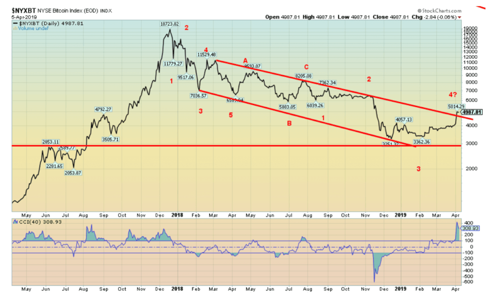
Are Bitcoin and the other cryptocurrencies on their way to a new bull market? It seems that way as Bitcoin leaped to over $5,000 before pulling back slightly. Bitcoin jumped in a matter of hours to the $5,000 level, taking others with it. The trouble was, nobody seemed to know why. Stories have abounded that 95% of trading in Bitcoin and other cryptocurrencies is fake and manipulated. Maybe that’s all this is, a manipulation to sucker in people before they slam it again. Remember this is not exactly a mature market and it is not particularly transparent.
The CBOE cut back on Bitcoin futures, but the rival CME has no plans to do the same for the moment. Possibly the jump in Bitcoin was all an April Fool’s joke as a story was circulated that the SEC approved Bitcoin exchange-traded funds (ETFs). It proved to be false. Overall, Bitcoin was up 22.4% on the week. It even appears to be breaking out. We’d avoid it.
©David Chapman
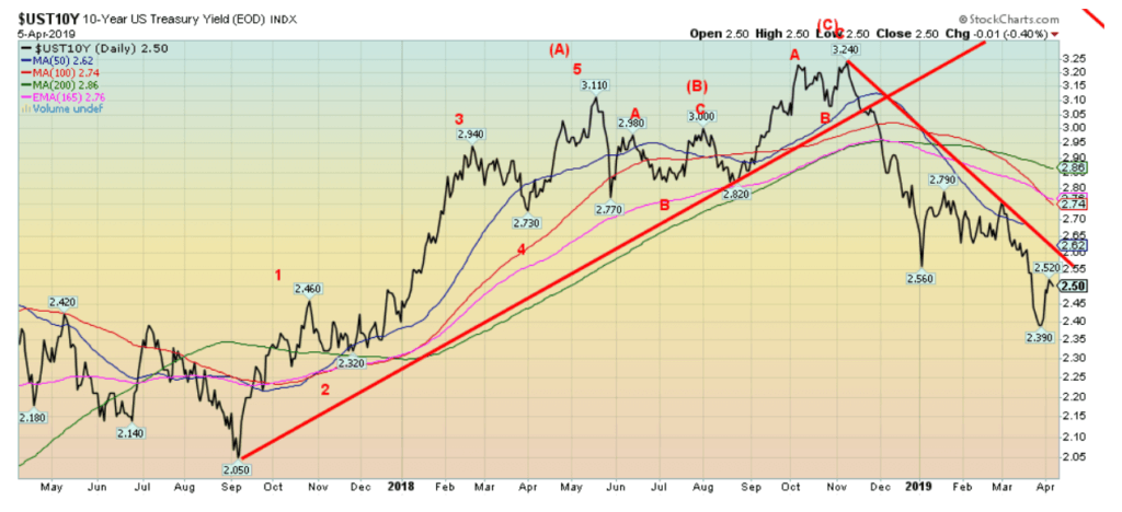
As we suspected, last week we thought the 10-year U.S. Treasury note may have bottomed, at least for the moment. This week the yield rose to 2.50% with a high of 2.52%. The 2.39% zone is now key support. Look for a rebound to around 2.60%, but above that level, a move to 2.75% would most likely get underway. Above 2.90% the market would suggest a move to even higher levels above 3%. For the record, yields rose in Canada as the 10-year Government of Canada bond rose to 1.70% from 1.60%.
Recession watch spread
©David Chapman
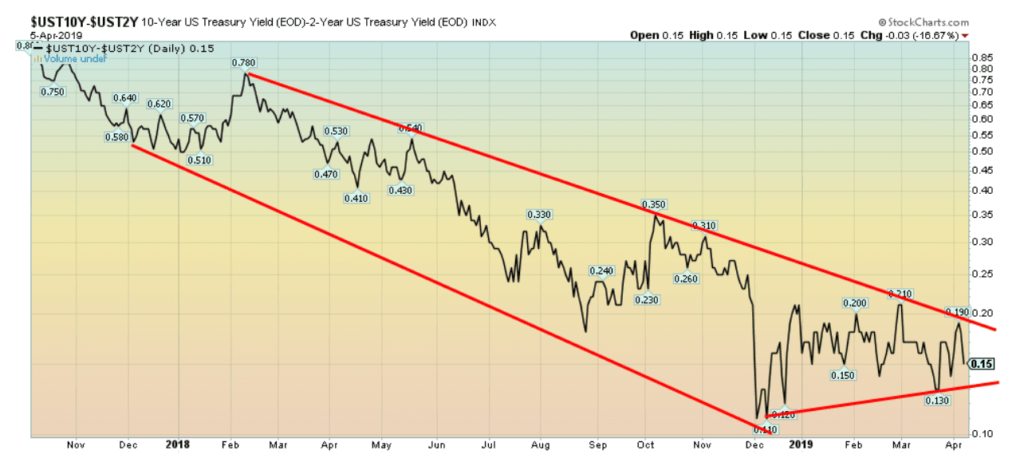
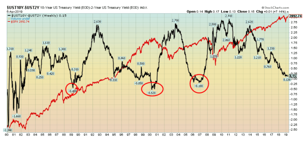
The recession watch 2–10 spread remains positive. It is not signaling a recession anytime soon. Indeed, with at least decent if not spectacular numbers this past week, a recession seems a long way off. But we agree that things can change quickly. The 2–10 spread has been moving in a sideways pattern since December and appears poised to break one way or the other. We suspect that will be to the downside and that this time it would turn negative. The trouble is, the market puts too much stead in the negative spreads and that was the cause of the recent hiccup in the stock market. But we agree with some analysts that ultimately it is a bit overblown. Still, it is worth watching.
©David Chapman
This is a longer-term view of the 2–10 spread. Note how the spread went negative before any recession in the early 90s, the early 00s, and the 2007–2009 recession. As well the first time the 2-10 spread went negative didn’t stop the stock market that kept on climbing. Given the 2–10 spread is still not negative it does not appear to be signaling a recession anytime soon. We placed the S&P 500 over the 2–10 spread and one can see that S&P 500 only turned down long after it first went negative. During the early 90s the stock market never did turn down to any great extent, but there was a recession nonetheless.
Note how the spread fell sharply and inverted into 1994 and again pulled back into 1998. The stock market faltered at those points but there was never any official recession and the stock market returned to the upside. By the time the steepest inversion occurred in 2000, the decline was already underway and the recession was also getting underway. More evidence that just because the yield curve inverted it doesn’t mean the stock market is about to crash nor does it signal the start of a recession. However, one can treat it as a warning sign.
Currently, the 2-10 spread has not inverted. We note that the 3-month to 10-year spread inverted briefly but has returned positive. Our conclusion is that the stock market should continue higher and no recession is imminent. But we are in a dangerous phase for the stock market so the strategy should be selling into the rise and if buying, buy those sectors that are coming out of a long slumber like golds, mining, and energy.
©David Chapman
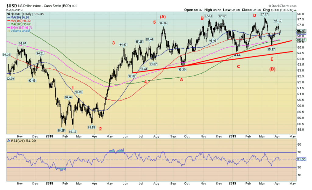
While the US$ Index faltered slightly this past week, we believe it remains in an up mode that will eventually carry it to around 100. The US$ Index hit a high of 97.10 and then faltered, falling back towards the 50-day MA before bouncing. It closed off 0.4% on the week. The euro and the pound sterling were largely flat on the week. The pound is waffling around, awaiting Brexit. But it is coiling, suggesting once something is known it could move quickly up or down.
The US$ was buoyed by the job numbers on Friday while numbers earlier in the week were not bad. The US$ Index’s breakdown remains at 95.70 and 94.50. The high so far was 97.10 and it barely suggested that the US$ Index should move to new highs above 97.67. A firm move above 97.10 would confirm a move to new highs. 96.30 is acting as support but a move under that level could see a decline to 95.70 to test the breakdown line.
©David Chapman
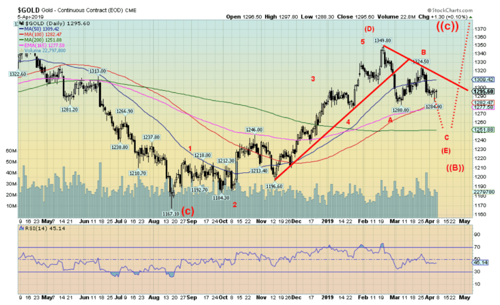
Gold waffled around this past week, losing a small 0.2%. Silver was off 0.1% but platinum jumped up 6%. Palladium has lost some of its luster but eked out a 0.3% this week. Copper prices remain firm even as they were down 1.7% this past week. Gold continues to play out what we believe is the E wave of a larger ABDCE-type pattern that started with the key high at $1,377 back in July 2016. Potential targets for this wave are down to around $1,250 and the 200-day MA. Following that, gold should ignite. This E wave could take a few more weeks with a potential low in May or June. The move to $1,250 will be a bouncy one both up and down.
©David Chapman
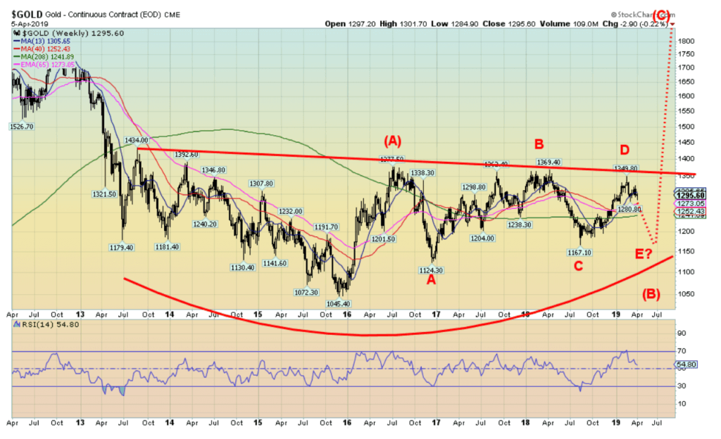
This is just a reminder as to how bullish gold looks right now. We believe the current weakness will culminate in a wave E to the downside that could draw gold towards $1,250. Once that level is achieved gold could take off. QE4 maybe? This remains a fabulous-looking rounding bottom. Once gold breaks out over $1,375 and especially over $1,400 potential targets are up to $1,700.
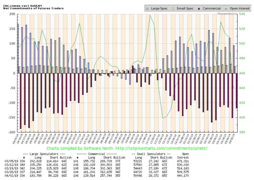
©David Chapman
Despite gold being down this past week the commercial COT for gold actually rose slightly to 35% from 34%. Long open interest fell almost 22,000 contracts but short open interest fell even further down, roughly 55,000 contracts. The large speculators COT (hedge funds, managed futures, etc.) fell to 66% from 69% with long open interest down almost 21,000 contracts and short open interest rose just under 5,000 contracts. Despite the weakness in the gold price, the commercial COT is very mildly bullish.
©David Chapman
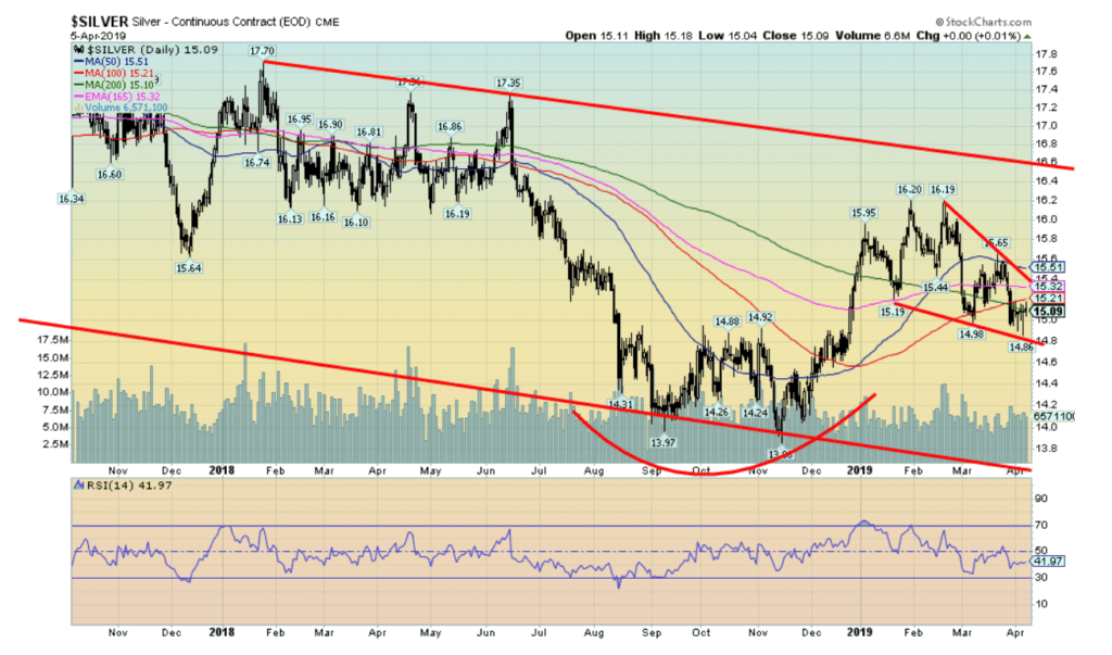
Silver prices fell a meager 1% this past week. However, we couldn’t help but notice that a bunch of silver stocks jumped on Thursday this past week. The catalyst was an announcement that a small exploration company New Pacific Metals Corp. (NUAG-TSXV) may have hit upon a large silver deposit at its Silver Sands project in Bolivia. Some have estimated that it is upwards of 100 million ounces or more of silver. Okay, don’t get too excited. This is a very early exploration and Bolivia is not exactly known as a safe investment country. Still, it ignited NUAG, rising to $2.50 from $1.18 in January 2019.
The announcement ignited other silver stocks on April 4, 2019, following the announcement. NUAG’s largest shareholders are Silvercorp Metals (SVM-TSX) and Pan American Silver (PAAS-TSX). We couldn’t help but notice that NUAG was being pumped by a newsletter known as Golden Opportunities. It didn’t do much, however, for silver prices. Nonetheless, we like how the silver chart is shaping up. We did break down under the 100-day MA and it is pulling the 50-day MA down with it. However, the 50-day MA remains above both the 100- and 200-day MAs.
Prices could be pulled lower to the $14.80 area and still remain in the channel. It is shaping up so far as a potential descending wedge triangle which is ultimately bullish. But it could spend a few weeks in the wedge before it breaks out. We’d be concerned that lower prices were ahead if we break under $14.80 but right now, we appear to be forming a nice bullish triangle.
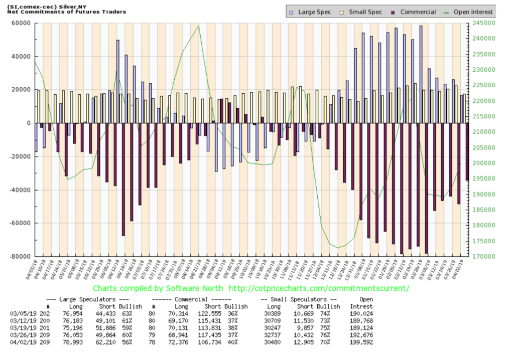
©David Chapman
The commercial COT for silver turned somewhat bullish this past week even as silver fell. The commercial COT jumped to 40% from 37% the previous week. It is, however, still has a way to go to get to the 50%+ that was seen last July/August/September. Long open interest jumped by roughly 3,500 contracts while short open interest fell almost 11,000 contracts. As well the large speculators COT dropped to 56% from 60%. While we don’t usually note this, we see the small speculators COT (retail) fell to 70% from 76%. None of this suggests that silver is about to take off, but we have to view it as a positive sign as silver weakens.
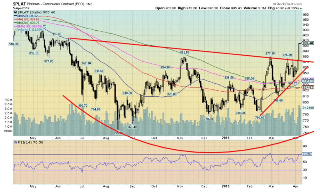
©David Chapman
Platinum appears to have come alive after months of slumber. Palladium has done quite well but now appears to be cooling. Platinum is taking over. This is another bullish sign for gold with platinum rallying even as gold and silver falter. Platinum gained 6% this past week and is now the leader for the metals up 13.8% so far in 2019. Palladium has fallen to number 2 up 12.4%.
Meanwhile gold is up only 1.1% while silver languishes, down 2.9%. Platinum has successfully busted above the 200-day MA and the golden cross has been made with the 50-day MA crossing both the 100-day and 200-day MAs. The breakout suggests a minimum move to $1,030. We note as well that platinum stocks are also perking up.
©David Chapman
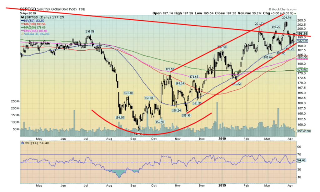
The TSX Gold Index fought off weakness in both gold and silver and gained almost 1% this past week. The Gold Bugs Index (HUI) was up 0.7%. This is a positive development if one wants to be bullish on gold and silver. Both the TGD and the HUI are holding above the 50-day MA as they bounced firmly off of it this past week. We like the bullish action of a ratcheting upward chart. The pullbacks do a great job in shaking out weak longs and stronger hands step in to buy. Note, however, that volume has tailed off on the recent action. That is not necessarily bad. It is not as if the TGD and the HUI are just breaking down. A break under 190 would be a bit more bearish and suggest a decline to the next level of support near 184. Otherwise, we like the bull channel that appears to be forming. If the TGD can hold this channel even as gold falls to $1,250 it would be a very bullish sign.
©David Chapman
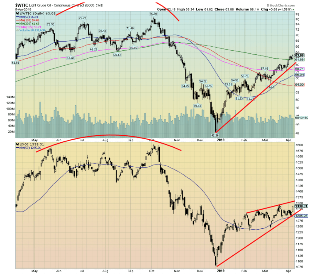
WTI oil prices have leaped to their highest level since October 2018. They are now only $14 off the high seen in September 2018. Rising oil prices have translated into rising gasoline prices at the pump. Technically, WTI oil has broken out over the 200-day MA, a positive sign. The so-called golden cross with the 50-day MA crossing the 100-day MA has also occurred. It will look better if the 50-day crosses the 200-day but the golden cross does get many excited, especially talking heads. WTI oil remains in a nice uptrend and there is no sign of any topping action. Pullbacks are shallow. The expectation is that WTI oil should continue higher. Still, it has a way to go to suggest to us that new highs will be made. That point is $68.75. Above that level and especially above $70 new highs are highly probable.
Energy stocks have been slow to respond, but this past week the XOI and the TSX Energy Index (TEN) both showed signs of life, especially on Friday when the TEN rose 2.9% and the XOI was up 2.1%. Both remain below their 200-day MA but are finding support above the 100-day MA. In both instances the golden cross of the 50-day crossing the 100-day has been made, thus suggesting bullish momentum.
Chart of the week
©David Chapman
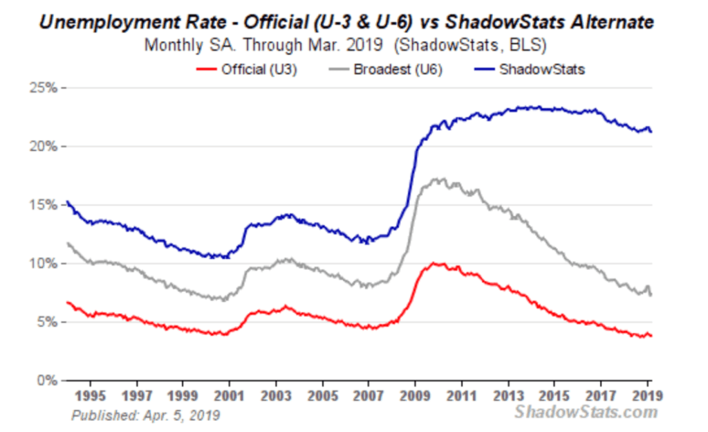
The U.S. reported that March’s nonfarm payrolls rose 196,000. That was substantially above the revised 33,000 reported in February. The unemployment rate remains at lows not seen since the late 1990s, currently 3.8% (U3). A reminder, however, that the labor force participation rate is sharply below the levels seen in the late 1990s. That ratio peaked at over 67% in 1999–2000. Today it sits at 63%. If it were at 67% today the unemployment rate would be sharply higher.
One of the oddities of the nonfarm payrolls is that when one looks at other numbers, things don’t really make a lot of sense. The total civilian labor force actually fell in March from February by 224,000. Yet somehow, they created 196,000 jobs even as the labor force fell. Full-time employment fell 190,000 but part-time employment jumped 60,000. Those holding multiple jobs jumped 212,000. Some of this has to do with the way things are counted. As we have noted before there is the household survey and the payroll survey. The household survey asks people if they are employed. The payroll survey counts the number of jobs. Those working two jobs are counted as 2 in the payroll survey but only 1 in the household survey.
The total of people not in the labor force rose 369,000 in March from February for a total of 95,577,000. Of that total 53,283 thousand are retirees while another 10,137 thousand are disabled. Of those not in the labor force, there are 5,227 thousand that want a job but are no longer counted as a part of the labor force. Not surprisingly, the Shadow Stats unemployment rate remains elevated at 21.2%, unchanged from February. Shadow Stats unemployment number contains those workers defined out of the labor force back in 1994. They are workers unemployed for longer than one year. The Bureau of Labour Statistics (BLS) highest unemployment is what is known as U6 which stands at 7.34%, up slightly from February’s 7.27%.
Despite the appearance of at least a somewhat robust employment market, there is no particularly strong wage growth. Average hourly earnings rose 3.2% year over year. That was actually down from the previous month’s 3.4% gain. The gain in March of 0.1% was below the expected 0.3% gain. Year-to-year jobs growth sits at 1.7%, the slowest pace since mid-2018.
All this leads us to conclude that while things appear good there is considerable stress in the labor market. Otherwise, why would the labor force be shrinking and the number of people holding multiple jobs be rising?
However, many will tout this report as evidence that the U.S. continues to enjoy a strong expansion now into its 9th year, one of the longest on record. Since 2010, 21 million jobs have been created and unemployment has plunged from 10%. But then no expansion in history has had the benefits of unprecedented quantitative easing (QE), historically low interest rates, and, more recently, massive tax cuts. And helping the unemployment rate along has been a drop in participation in the labor force. In 2010, the labor force participation rate was around 65. Today it is 63. As we noted before if the participation rate was where it was in 2010 the unemployment rate would be quite a bit higher. The question should be, why have so many dropped out and where did they go? Did they all retire? After all, the number of retirees has jumped almost 20% since 2010.
©David Chapman
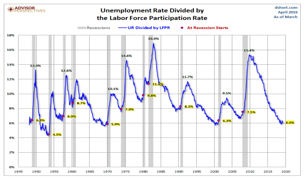
Above is a chart of the unemployment rate (U3) divided by the labor force participation rate. We believe that is a better reflection of the real rate of unemployment. This series is not to be confused with the BLS’s U6 unemployment rate which stands at 7.3%. The U6 is the U3 plus marginally attached workers and total employed part-time for economic reasons but preferring full-time employment. Nonetheless, the above chart is interesting because the current level is at levels just before the start of recessions. No, that does not in itself signal a recession but is another sign that we are closer to one than we are away from one. Still, that could be months away.
(Featured image by Pavel Bobrovskiy via Shutterstock)
—
DISCLAIMER: David Chapman is not a registered advisory service and is not an exempt market dealer (EMD). We do not and cannot give individualized market advice. The information in this article is intended only for informational and educational purposes. It should not be considered a solicitation of an offer or sale of any security. The reader assumes all risk when trading in securities and David Chapman advises consulting a licensed professional financial advisor before proceeding with any trade or idea presented in this article. We share our ideas and opinions for informational and educational purposes only and expect the reader to perform due diligence before considering a position in any security. That includes consulting with your own licensed professional financial advisor.

-

 Fintech2 days ago
Toss Explores Blockchain Mainnet to Power Next-Generation Financial Services
-

 Cannabis1 week ago
Poland Proposes Cannabis Decriminalization: 15 Grams and One Plant Without Penalties
-

 Fintech1 week ago
Credibur Scales Rapidly: €2 Billion in Structured Debt Facilities in Six Months
-

 Impact Investing2 weeks ago
Ridemovi Secures Financing to Drive European Expansion and Sustainable Mobility Growth


