Featured
Dow Jones moves higher while gold falls further down
Dow Jones can be expected to continue its upward trend in the coming months after closing higher last week while gold slides lower.
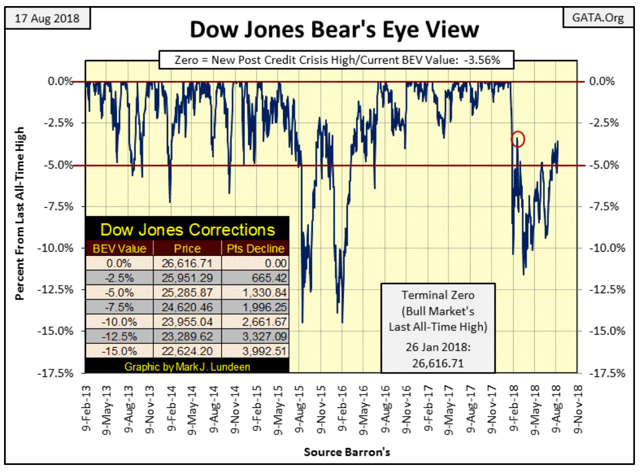
The Dow Jones did good this week, closing just a hair from its February 26’s -3.41 percent (Red Circle below). Hopefully, it can take that out next week, but who can say whether it will or not? So let’s all cross our fingers and hope for the best.
© Mark Lundeen
I’m not risking my money in this market, and it’s more enjoyable being bullish than bearish. So when I say the Dow Jones could make a few more new all-time highs (BEV Zeros) in the BEV chart above, I’m not lying; it could really happen. And knowing that makes people feel good about themselves and the world they live in, why shouldn’t I point this out. Isn’t that what market prognostication all about?
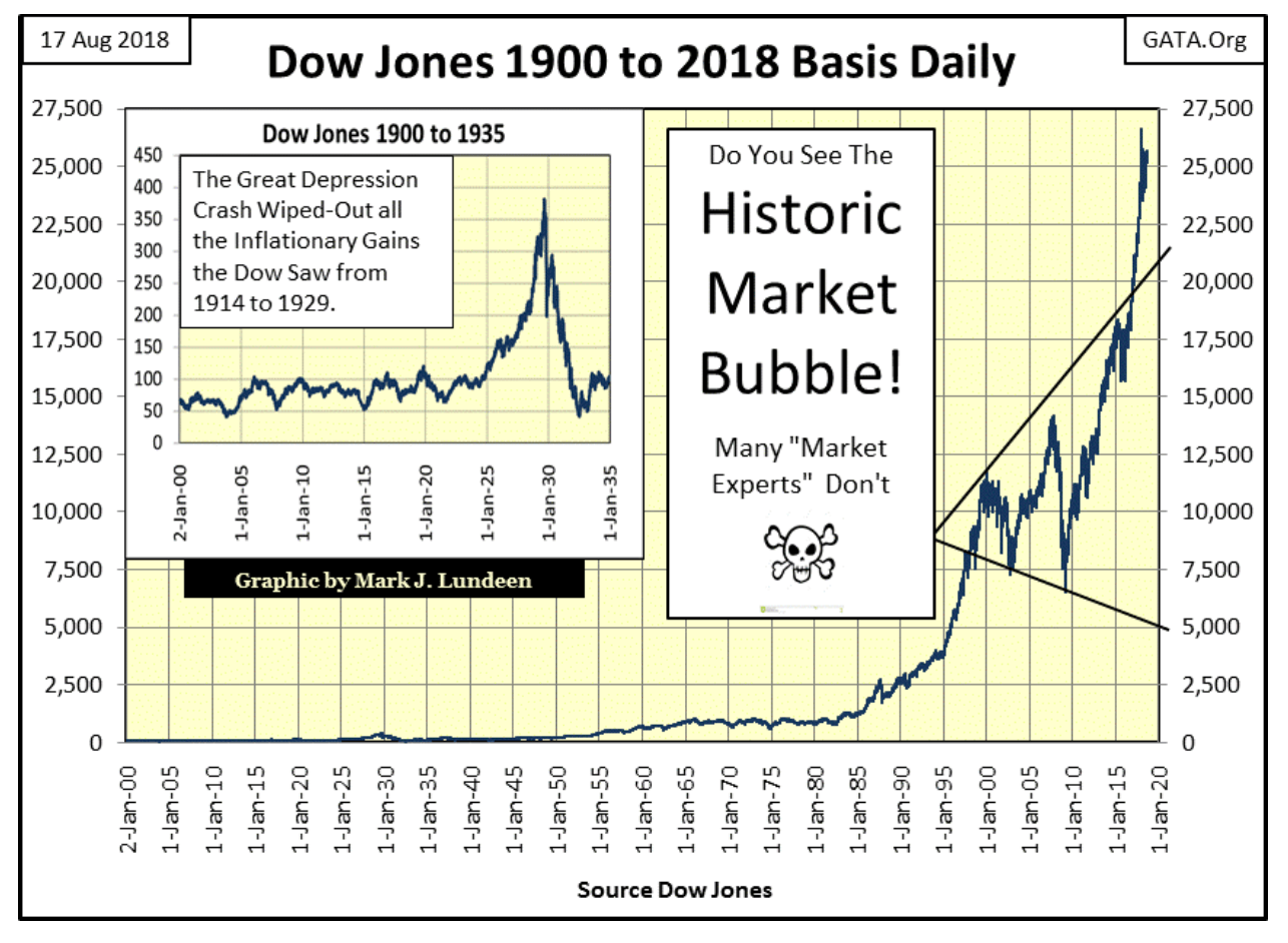
The other choice I have is to say what I really think about the stock market and risk losing some of my friends. For instance, look at the chart below; in August 1971, when the Dow Jones was only about 860, they (you know who THEY are) decoupled the dollar from the Bretton Woods’ $35 gold peg. Since then our “policy makers” have inflated a series of humongous bubbles in the stock and debt markets.
I have to admit the “policy” which accomplished these inflated market values was skillful. What “market expert” or Keynesian economists wouldn’t be proud to show the public is this chart as proof positive of how decoupling the dollar from gold many decades ago has allowed the markets to experience amazing “growth.” That would be especially so of the stunning gains seen after the March 2009 bottom of the 2007-09 sub-prime mortgage debacle.
© Mark Lundeen
There’s no shortage of historical books on the market citing the specifics of how the “policy makers” did the same thing during the 1920s, as plotted in the insert in the chart above. When that bubble began deflating, it was called the Great Depression crash, an 89 percent market decline that wiped clean all the gains the Dow Jones had made since 1914.
Forty-seven years have passed since August 1971, five decades of inflating values in the stock market that saw the Dow Jones rise up from 860 to over 26,000 in January 2018. Five decades that also saw credit creation and debt growth take the U.S. national debt from $400 billion to over $21 trillion. That’s a bubble too, and ultimately bubbles deflate or continue inflating until the unit-of-account they are denominated in becomes worthless.
I see Venezuela is experiencing a 1,000,000 percent annual inflation rate; who could have seen that coming?
Reuters doesn’t explain exactly how a country’s currency declines to such a sad state. Apparently, it’s a total mystery why Venezuela’s Bolivar is committing suicide, except maybe low oil prices for Venezuela’s petroleum industry caused the bolivar to lose all hope and want to die. Reuters also pass on without judgment Venezuela’s “policymakers” plan of removing five zeros from their bolivar. This would do nothing to cure what ails their money or ease the misery of Venezuelans struggling to survive from day to day in a hyperinflationary economy.
In fact, the problem with Venezuela’s Bolivar is a familiar one: to curry favor with their population, the government and its central bank over issued it at a rate that will soon drive it into extinction. Expanding the supply of money never delivers prosperity, but politicians and bankers continue traveling down this well-treaded path that ultimately has never done well for anyone.
Venezuela is an example where a financial bubble will not deflate. Rather, the socialists in charge of Venezuela will continue inflating the supply of bolivars circulating in their economy until even the government will refuse to accept it for payments of taxes. Should U.S. “policy makers”, like their colleagues in Venezuela, absolutely refuse to allow over-inflated market values to deflate, I expect the U.S. dollar will see something similar before it too becomes a unit of no-account. But if that’s to happen, it won’t happen anytime soon, or so I hope.
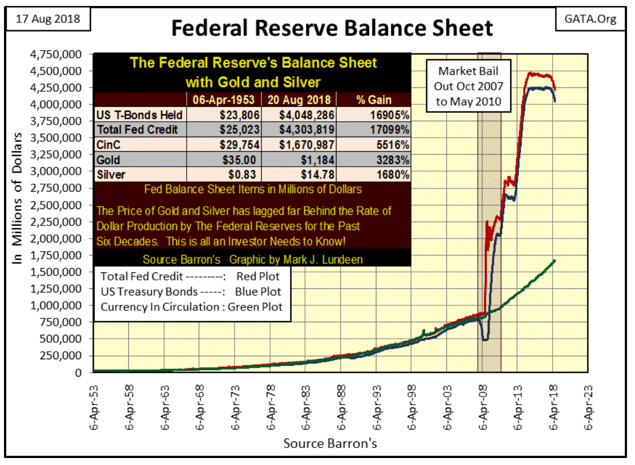
Also, I note how the FOMC has sold off a good amount of their US Treasury holdings they purchased with inflation during their QE 1-3 (chart below). There’s no way they can reduce their “monetary reserves” down to where they were in December 2007, but it will be interesting seeing how far they reduce their balance sheet before the financial markets begin deflating.
© Mark Lundeen
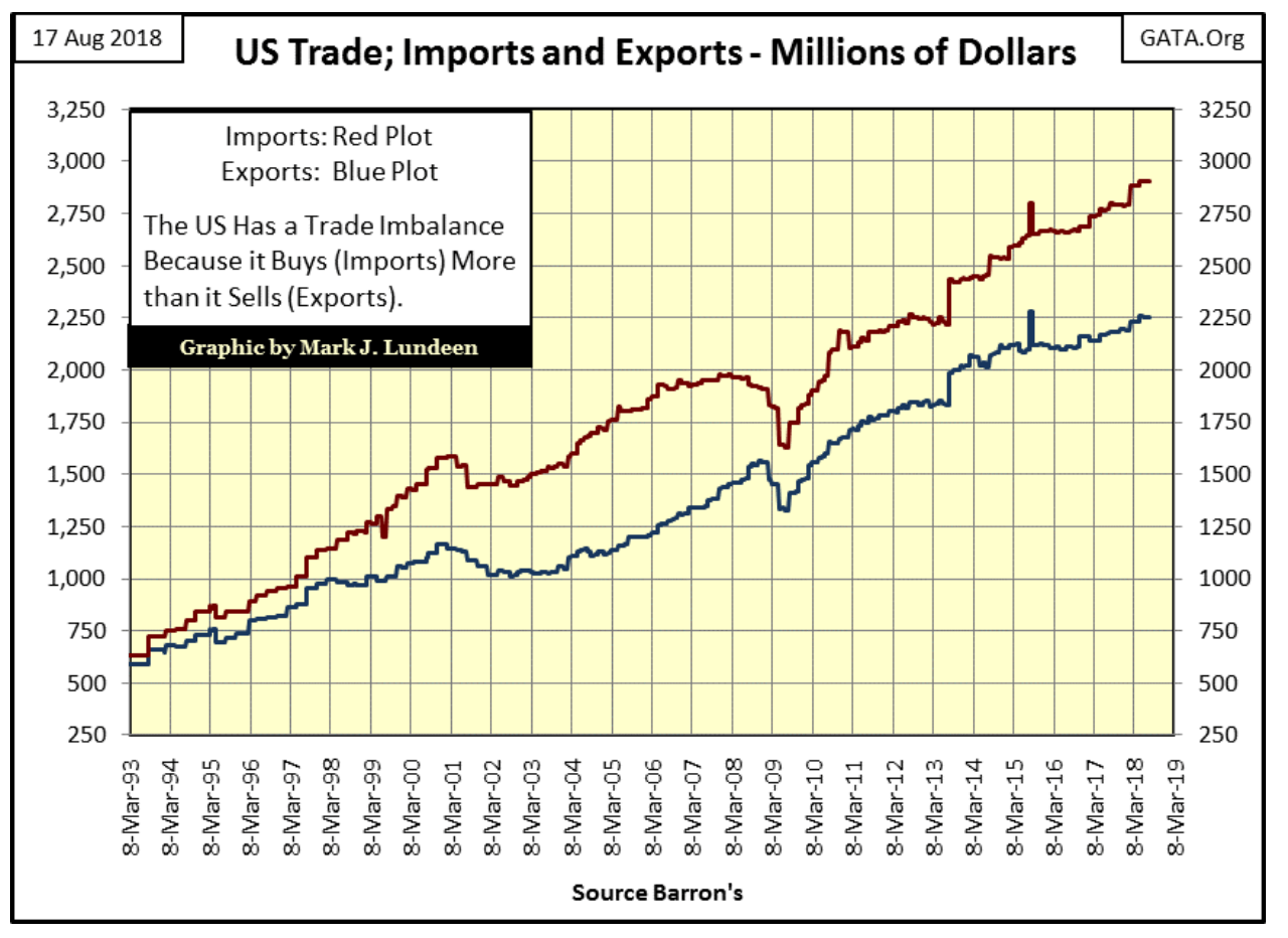
Another deflationary factor, one I don’t see anyone talking about, is if President Trump is successful in reducing the trade deficit down to zero, in effect forcing the Import (Red) and the Export (Blue) lines in the chart below to merge, that’s deflationary.
Why this is so is because as things are now, foreign trade with the U.S. leaves other nations with billions of dollars in excess of what they purchased from the U.S. Under a gold standard, this situation could continue for only as long as the U.S. could finance its trade deficit with gold.
But gold is limited, so international trade imbalances operating under a gold standard can’t continue for decades, as the U.S. has. However, as noted above, since August 1971, the United States and our trade partners settle their trade deficits with America’s national debt—Treasury notes, bills and bonds.
When accounts are reconciled, America’s trade partners typically purchase Treasury debt with these excess dollars, which assists in keeping bond prices high, yields low and Congress flush with even more money to spend.
© Mark Lundeen
Being a bear at the tail-end of an inflationary boom is hard. Here’s all this horrible economic data festering beneath the markets, facts off most people’s radar screens, and yet for years it doesn’t matter. Actually, being a bear at the tail-end of a historic inflationary boom gives one the appearance of being a total buffoon as everyone is making money except for those heeding the bear’s warnings.
But in fact, this is an often told tale of history; the story of inflationary booms and busts has played out many times in the past thousands of years. Here’s one of my favorite historians, William Durant telling of the Chinese invention of paper money in the 11th century.
“Such were the sources of that flood of paper money which, ever since, has alternatively accelerated and threatened the economic life of the world.” —William Durant: “Our Oriental Heritage,” (1935) pg 780
Today, our “policy makers” don’t even want to bother with paper, not when they can create money even faster and cheaper with bits and bytes of data in the banking system.
The entire idea of money being something of value in itself has become totally alien to the general population 45 years after the U.S. government decoupled its (our) dollar from the Bretton Wood’s $35 gold peg. That’s unfortunate.
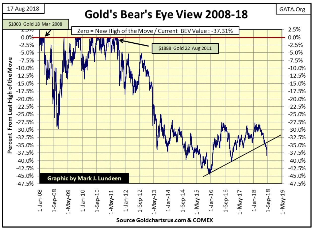
Like the people of Venezuela today who are now painfully aware of just how worthless their government-issued money really is, and wished they had traded their paper bolivars for some gold and silver coins a few years ago when they could afford it, I expect Mr. Bear is also going to give Americans an education on “monetary policy” in the not too distant future. Not that one sees any hint of this in gold’s BEV chart below.
What’s a BEV (Bear’s Eye View) chart? It’s a plot that looks at market valuations as Mr. Bear does, with each new all-time high (BEV Zero) being just a zero percent on the chart. This is seen below for 18 March 2008’s $1,003 for an ounce of gold, and again for 22 August 2011’s $1,888, our current last BEV Zero in the BEV plot—both only big fat zeros in the BEV plot. Those daily closing prices that failed to close at a new all-time high are registered as a percentage decline from their respective BEV Zeros.
What’s seen below are new all-time highs and the percentage declines from them. From March 2008, the price of gold declined 30 percent in about six months, while from gold’s last all-time high of August 2011, it declined a whopping 45 percent by December 2015. As what the gold market did before December 2015 is now ancient history, what has it done since is our concern.
From December 2015’s bottom, gold was doing good, but the -27.5 percent BEV line was offering the price of gold resistance every time gold approached it since the summer of 2016. Then came April 2018, when gold once again had the opportunity to rise above its BEV -27.5 percent line. Instead, gold decided to begin a four-month uncorrected decline that now threatens to break below the lows of December 2016, the BEV -40 percent line.
© Mark Lundeen
So what should we do? Unless you need the money to pay for your expenses, I don’t recommend selling your gold and silver. In fact, should you have funds waiting for something to invest in, I’d buy more at today’s prices in anticipation of a market turnaround sometime in the not too distant future.
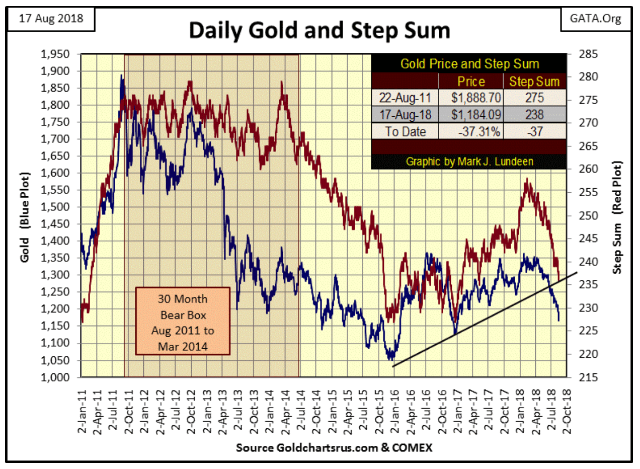
Below is gold’s step sum chart. Since February 14’s step sum of 258, advancing days in the gold market have been overwhelmed by declining days, and all this selling has had an effect on the price of gold. But after six months of overwhelming selling, the bears have failed to create panic in the gold market—panic selling as seen in the chart spanning February to June 2013.
© Mark Lundeen
Usually, a market in decline ends in capitulation, some big down days where the bulls just give up and dump their positions. The gold market since this decline began in April hasn’t seen that yet. But should that happen, I would welcome it as market bottoms (excellent buying points) happen when after a long struggle between the bulls and the bears, the psychologically traumatized bulls sell at any price as the bears run victory laps around them.
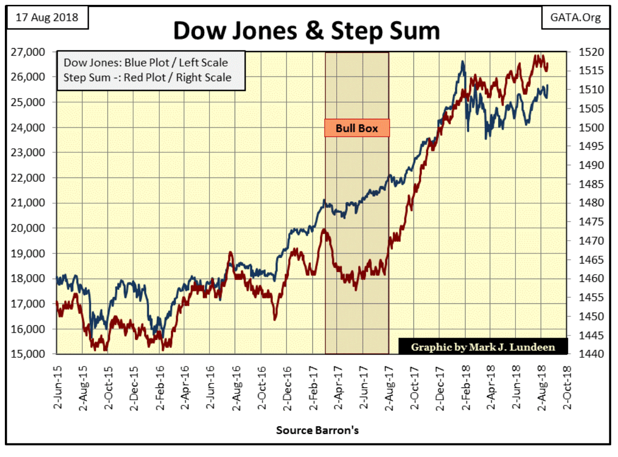
Here’s the Dow Jones’ step sum chart. The Dow Jones itself (Blue plot) has been making a series of higher highs and higher lows since April as its step sum (Red Plot) has followed along. This is a good chart, and as I’ve been saying for a long time now, I expect we’ll see the Dow Jones rise up to new all-time highs in the weeks or months to come.
I’ve also said I really don’t expect much from gold and silver until the stock and bond markets begin to deflate, sending dividend and bond yields too much higher levels.
© Mark Lundeen
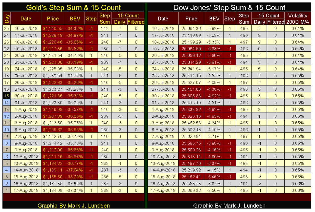
Here are gold’s and the Dow Jones’ step sum tables. Look at all the down days for gold since mid-July. In the past 25 trading days, gold’s 1,5 count was positive for only two of them. In the counts, we don’t see any counts of -9 or double-digit values, but seeing counts of -5 and -7 indicates heavy selling nonetheless.
© Mark Lundeen
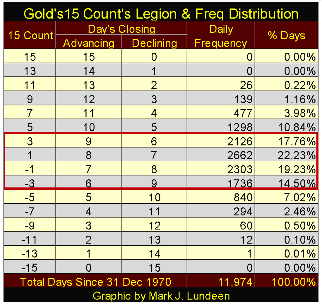
To see the importance of the 15 count in the gold market, below is a table showing the construction of the count (how many up and down days for a particular count) as well as how often they’ve occurred since 31 December 1970. Gold has traded in 11,974 COMEX trading sessions since 1970, yet has never seen a count of +13 or +15. It has seen a -13 count once, but never a -15.
Historically, gold finds itself with a count ranging between +3 and -3. To fully appreciate the five -7 counts seen above for gold since July 16, how many days has gold’s count ended with a -7 since 1970? In only 294 days (2.46 percent). And a count of -5 isn’t a common occurrence either, but gold has seen seven of them since mid-July.
My point is, since this selling began in April, unrelenting selling pressure has been applied to the price of gold, and I’m pleased with how well it has held on to its valuation after all those down days.
© Mark Lundeen
That’s not dismissing the possibility that in the days and weeks to come, the bulls in the gold market may toss in the towel. We could see some big down days, daily declines in the price of gold in excess of 3 percent. But that wouldn’t change my mind that in August 2018, gold is a better place to have one’s wealth in than stocks or bonds.
(Featured image by DespositPhotos)
—
DISCLAIMER: This article expresses my own ideas and opinions. Any information I have shared are from sources that I believe to be reliable and accurate. I did not receive any financial compensation in writing this post. I encourage any reader to do their own diligent research first before making any investment decisions.


The TopRanked.io Guide to 2026’s Biggest and Best Affiliate Opportunities
Want to earn affiliate commissions on literal billions of dollars worth of revenue? Then this week, we've got something special...


Eni Advances Energy Transition with Major Investment and Emissions Cuts
Eni showcased its “Just Transition” report in Rome, highlighting stakeholder collaboration and progress toward decarbonization goals. The company invested over...


The German Fintech Market Shows Resilience and Strong Investment Growth in 2026
Germany’s fintech sector remained resilient in 2026 despite economic crisis and rising insolvencies. Investments reached €14.2 billion, showing strong investor...


Cannabis Legalization in Germany: A Mixed Interim Assessment
Germany’s cannabis legalization has reduced criminal cases and eased pressure on the justice system, while the black market is slowly...

Sustainable Restoration of the Haus Hövener Garden in Brilon
The Brilon Construction Workers Association is restoring the Haus Hövener garden into a cultural community space, funded through a €10,000...
 |
|
 |  |
 |
|
-

 Biotech1 week ago
Early Use of Tirzepatide Shows Strong Results in Type 2 Diabetes Study
-

 Fintech2 weeks ago
Credit Saison Invests in RedGirasol in Landmark Mexican Fintech Impact Deal
-

 Africa5 days ago
Morocco at an Energy Crossroads Amid Global Gas Volatility and Critical Minerals Opportunity
-

 Impact Investing2 weeks ago
Italy Advances Recycling but Infrastructure Gaps Threaten EU Targets
You must be logged in to post a comment Login