Featured
Dow Jones closes in on another high; Facebook, Twitter shares drop
The Dow Jones BEV broke a new record high, closing in on 4.38 percent. Facebook’s shares plunge by 19 percent while Twitter’s shares drop by 20.5 percent.

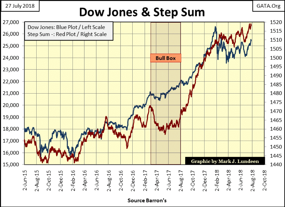
Dow Jones has finally broken above its BEV -5 percent line in the Bear’s Eye View chart below, closing the week only 4.38 percent from making a new BEV Zero, (new all-time high). The bulls deserve a big Bravo Zulu for forcing me to change the question I ask every week. Last week, I was asking whether the Dow Jones would next break above its -5 percent or below its -10 percent line. This week, the question is whether it will next break below its -5 percent or above the -2.5 percent line. This is progress.
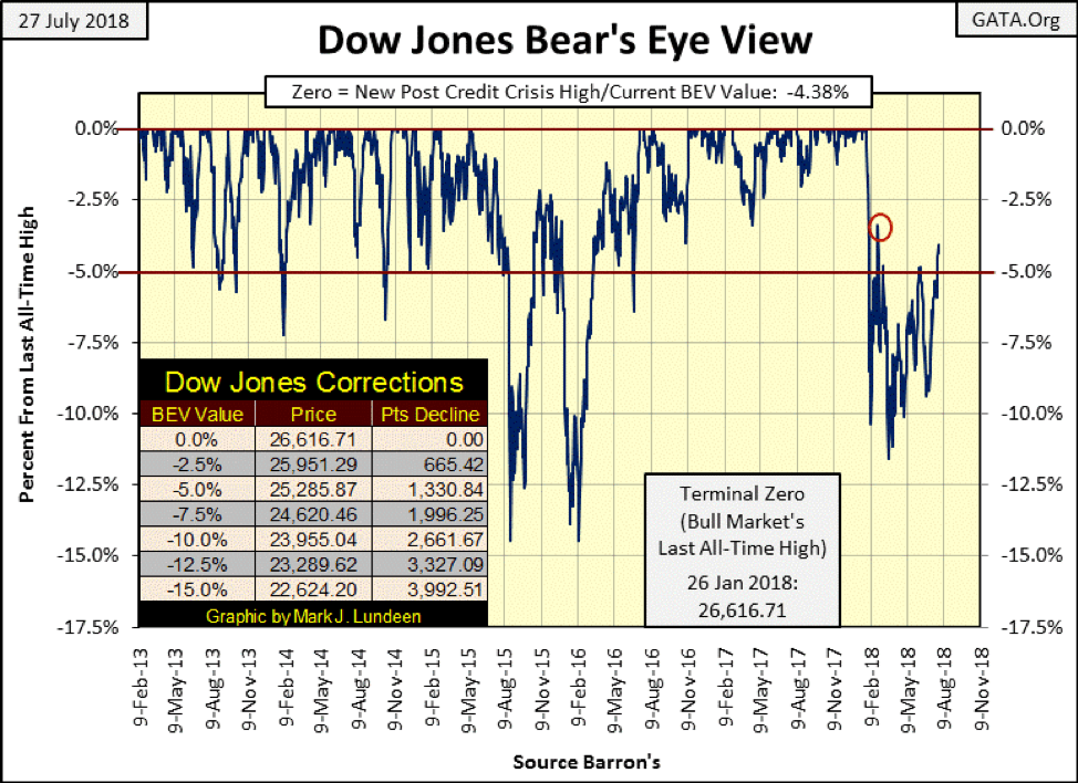
© Mark Lundeen
If you prefer seeing the Dow Jones in points rather than in percentage terms, here’s the Dow Jones in daily bars going back to last December, and it looks really good. Since late March, the Dow Jones has reversed direction, developing a new trend with its recent pattern of higher highs and higher lows inside the trend lines I placed on the chart. The rectangle contains the market action of the past five trading weeks. I do this so you can compare this chart to the Dow Jones’ step sum table I have later in this article, which also goes back five weeks.
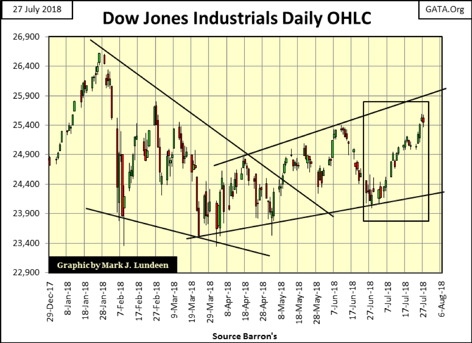
© Mark Lundeen
So what’s driving the Dow Jones higher? Well, it’s not higher earnings, though I’m sure there are “market experts” who would say it is. Looking at the Dow Jones’ earnings below, they are up nicely in the past few months, but since 2012, they have been stuck in a trading range.
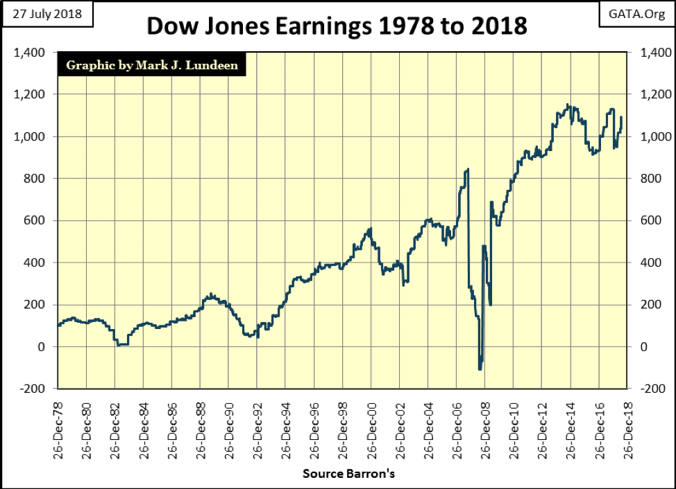
© Mark Lundeen
But I have a big problem using earnings to justify movements in the broad stock market. It’s just a fact that before the Greenspan Fed (1987-2006), most market commentaries said little about earnings, and for good reason. The reason for that was the stock market’s history of seeing price trends lead to trends in earnings. Today, this has been turned around, hence, the current focus on earnings.
Look at the chart below plotting the Dow Jones (Blue Plot) to its earnings (Red Plot) from 1968 to 1984. The 1973-74 bear market occurred as earnings soared to all-time highs, and the 1982-2000 bull market began as earnings for the Dow Jones crashed.
To be sure, there are periods below where the Dow Jones’ prices and earnings are in synch with each other. But following earnings during these 16 years exposed your retirement funds to a 45 percent bear market decline (1973-74), and kept you out of the market at the start of a historic bull market in stocks (1982-2000).
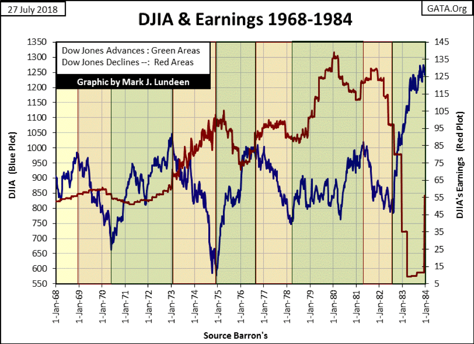
© Mark Lundeen
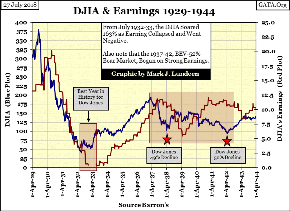
Here’s the Dow Jones with its earnings from 1929 to 1944. In 1929, using Dow Jones earnings to decide when to buy or sell kept you in the market until they peaked in July 1930 – ouch!
Look what earnings did during the best year in Dow Jones History (July 1932 to July 1933). From the July 1932 bottom, the Dow Jones soared 163 percent in the next 12 months as the Dow’s earnings declined and then went negative. In fact, when earnings once again became positive, the best year for the Dow Jones was over; and using earnings to time the market after April 1937 proved to be a losing market strategy too.
© Mark Lundeen
So, why are earnings so important today? Best I can guess is during the Greenspan Fed years, the FOMC in conjunction with CNBC began focusing on earnings as a way to goose the market. CNBC went along as focusing on earnings provided a means to fill endless hours of program time in a format that advertisers (the NY big banks) found very advantageous to themselves and their clients.
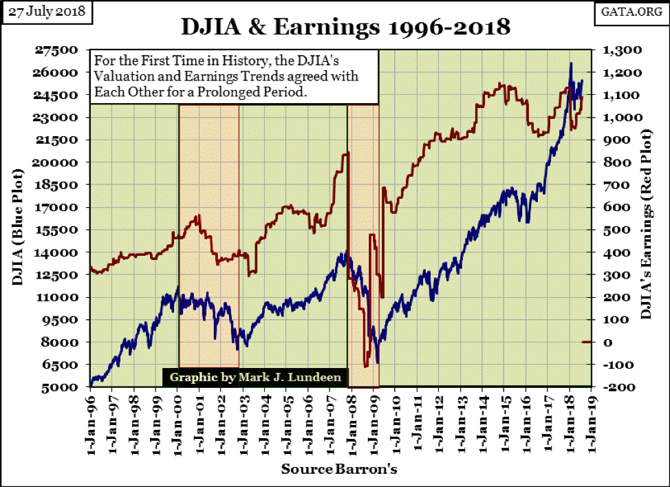
But even so, this doesn’t explain how the Dow Jones’ valuation and earning trends came into synch, as seen below. That’s a question I don’t really have a good answer to. But if forced to answer that question because someone had a gun pointed at my head, I’d say (under duress) it’s because of declining standards in market regulation and accounting standards have allowed less than honest people to manipulate corporate earnings for the benefit of the elite in control of Wall Street.
© Mark Lundeen
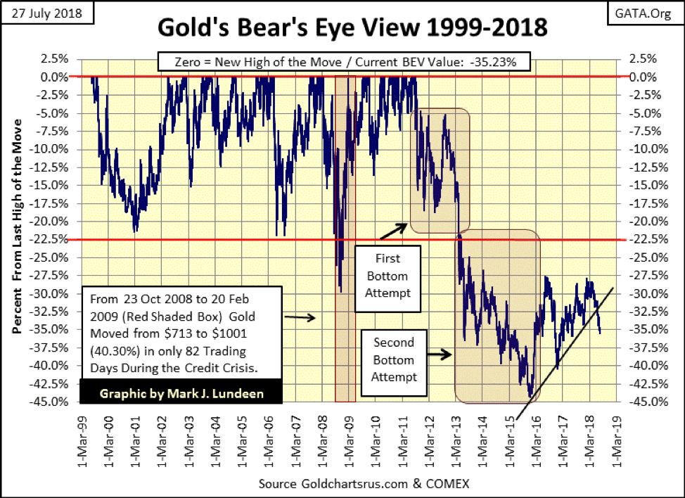
Moving on to gold’s BEV chart below. Gold broke below its BEV -35 percent line on July 19 and has been holding its own since then. What should investors do?
First, understand why it is you’re buying gold. If you agree with my views on the financial markets under current management, then even gold purchased in September 2011 at over $1,880 an ounce is still a hold. If today you can purchase more gold at a 35 percent discount from seven years ago, that is only a good thing.
However, like my readers, I too am frustrated by the current decline in the price of gold. I just keep in mind that no market trend lasts forever, so this too shall pass. And besides believing that, knowing how the “policy makers” are rigging the price of gold and silver down in the COMEX futures market, by selling tons of digital-gold that doesn’t exist, I’m smiling inside thinking is this all they can do, and what happens when this trend reverses, as one day it must.
© Mark Lundeen
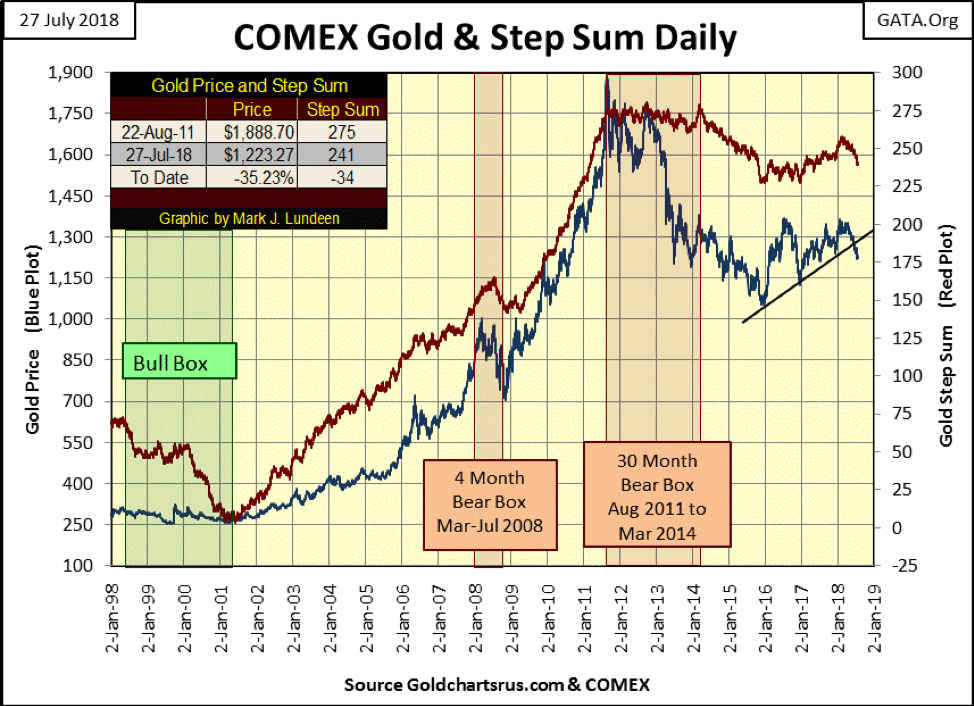
Looking at gold’s step sum chart, not much has changed from last week. One thing that may be notable, the current decline in gold began in March. After four months this decline is getting stale. We could see a bounce upward come this August or September.
© Mark Lundeen
The Dow Jones and its step sum are looking good. Daily advances dominate the declines; the rising step sum plot tells us that. That plus the Dow Jones is rising in response. Not much more to say about that, except wonder should the Dow Jones make a new all-time high – what happens then? We need to keep in mind that the current advance began in March 2009, an advance that took the Dow Jones up by over 21,000 points. How much more can the stock market offer investors?
© Mark Lundeen
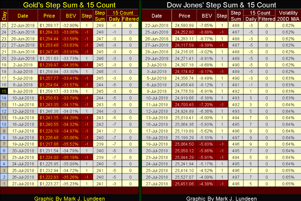
Here are gold and the Dow Jones’ step sum tables. The thing to note is their daily 15 counts. In the past five trading weeks (25 trading days), gold has seen only negative counts, with lots of -5s and -7s to be seen below. That’s serious downward pressure on the price of gold, and for all that gold is down only 3.62 percent from June 22nd?
The Dow Jones’ table is a mirror image of gold’s. Since July 9, its 15 counts have been positive, with lots of +7s and three +9 to be seen. This is a market with its afterburners lit; still, the Dow Jones has advanced by only 3.54 percent since June 22. Excuse me for thinking so many advancing days should have delivered more.
© Mark Lundeen
Exactly how long these markets can maintain these trends is the question. It’s hard for the bears to keep slamming a market with as many declining days we see in the gold market, and for the bulls drive prices higher day after day with the frequency we see on the Dow Jones side. However, these trends may go on longer than you or I believe they can, but the day is coming when they will reverse.
It will be interesting to see what gold does when its step sum chart looks like the Dow’s side does, and what the Dow does when its step sum chart appears as gold does now.
I do a lot of work with daily steps, the daily ups and downs of the market. I was inspired by something Richard Russell used to say about the Dow Theory, “letting the Dow Jones tell its own story.” I never worked in the financial industry; rather I began following the markets as a hobby while I was in the Navy. Like most people seriously following the markets, I read books on technical analysis to better understand the data I was compiling. However, the thought occurred to me that most of these techniques were widely followed, and frequently used in the financial media for public consumption. Doing what everyone else did wasn’t attractive to me.
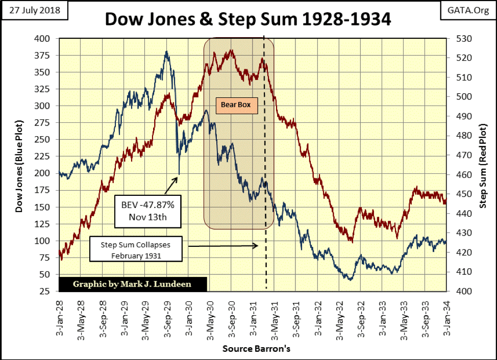
So, I decided to see what market insights could be discovered using the daily ups and downs in the Dow Jones as a single item Advance-Decline Line: my step sum. As the Great Depression crash is still the most widely remembered market event in all history, even after many decades have passed, I decided to construct a step sum plot of the last few years of the Roaring 1920s Bull Market and the market crash that followed. What I saw plotted below was, and still is a stunning chart.
It’s predictable during the bull market of the 1920s the Dow Jones (Blue Plot) would have seen more daily advances than declines (Red Plot / Step Sum) or that during the initial deflationary collapse of September – November 1929 the Dow Jones would have seen more daily declines than advances.
But weeks after the November 1929 to April 1930 dead-cat bounce, who’d believed as the Dow Jones began its 89 percent collapse of July 1932, it would do so with more daily advances than declines for almost a full year, as seen inside the Bear Box? Then as the Dow Jones approached its ultimate bear market bottom, daily advances in the Dow Jones were overwhelmed by declining days, resulting in the collapse in the Step Sum.
© Mark Lundeen
Without a doubt, something important was going on here, but what? If you look at the plots above as the valuation of the Dow Jones (Blue) being a market reality, and the A-D Line (Red Step Sum) computed using the daily advances and declines of the Dow Jones as market sentiment, it makes a lot of sense.
When did the Dow’s step sum become decoupled from the valuation of the Dow Jones itself? Not at the September 1929 market top, but as the dead cat bounce began collapsing in April 1930 because the bulls believed the -47.87 percent decline of November 13, 1929, was the bottom. People were committing suicide at the November 1929 bottom. The bulls must have reasoned how much worse could it get? We can see when the bulls finally admitted they were wrong, February 1931 when the bear box closed with the collapse in the step sum as it recoupled with the Dow Jones’ price trend.
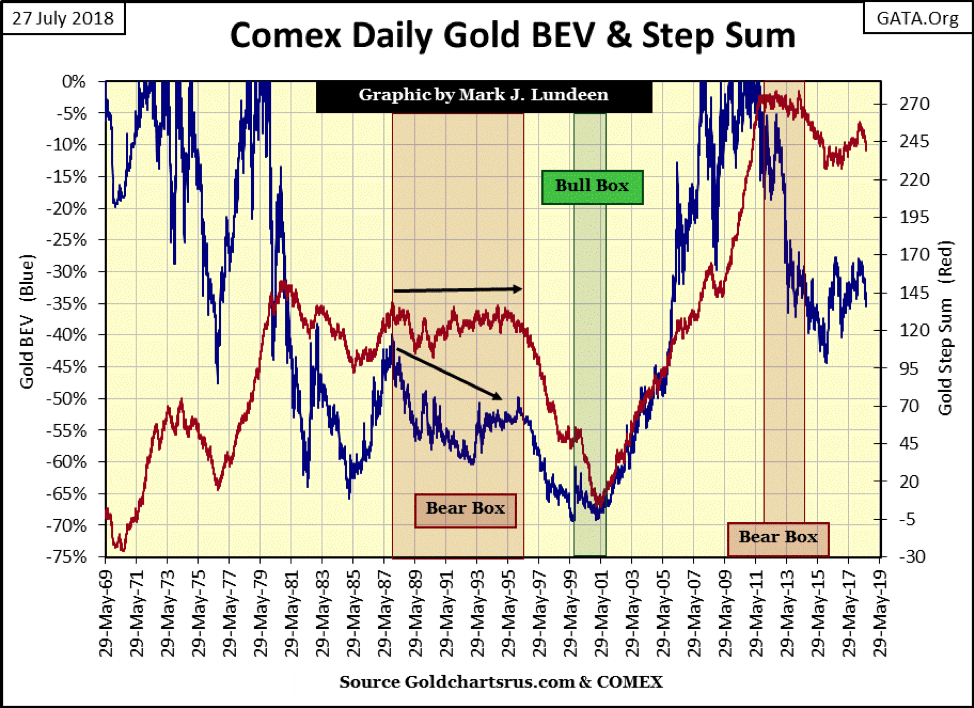
Seeing the trend of a step sum decouple from its price trend can be seen below in the gold market. It happened three times since 1969:
- 1988 to 1996 (eight-year bear box)
- 1999 to 2001 (three-year BULL box)
- 2011 to 2015 (four-year bear box)
We also see a bull box below, where from 1999 to 2001 gold’s step sum collapsed (declining days overwhelm advances) with little effect on the price of gold.
© Mark Lundeen
I’ve covered these charts in the past, but a little review is always good. However, the real purpose I’m publishing these charts this week is for background for the following chart plotting the daily step-sum symmetry between the Dow Jones and gold. Symmetry, what is that? The fact is for most days when the Dow Jones advances, so does the price of gold. And for most days when the price of gold goes down, so does the Dow Jones. That sounds symmetrical to me.
To construct the daily-data points to be plotted, I used the following logic table for the symmetry found in the Dow Jones and Gold Markets. On those days when the symmetry between the daily advances and declines in the gold and Dow Jones holds, each going up or down with each other, my logic table produces a Zero. When the symmetry is broken by gold advancing as the Dow Jones declines, my logic table produces a +1, and when the Dow Jones advance as gold declines produces a -1.
Obviously, later in this article, I’m going to use this data in a chart, and it’s key to understand how this logic is biased for gold. More daily advances for gold than the Dow Jones drives the plot up. More daily advances for the Dow Jones than gold drives the plot down.
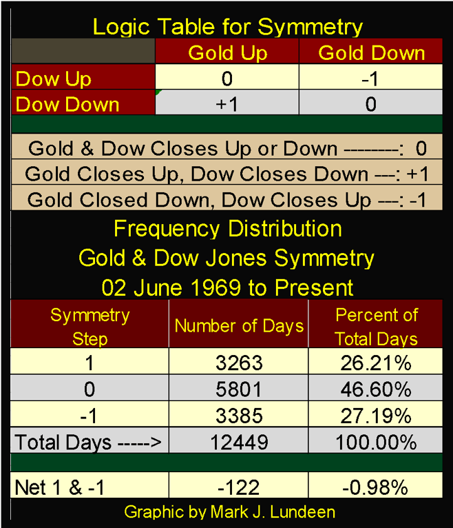
© Mark Lundeen
The above frequency table displays how many days the symmetry between the gold and the Dow Jones held, producing a Zero: 5,801 days since 02 June 1969 (46.6 percent of daily closings). Those days where the symmetry was broken in gold’s favor numbered 3,263, and 3,385 days closed with the symmetry broken in favor of the Dow Jones. I took the net of the +1 and -1, which tells us that since June 1969, there were 122 net days where the Dow Jones closed higher as the price of gold declined (-1).
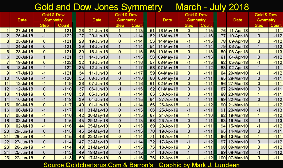
Below is a table listing the symmetry data for gold and the Dow Jones for the past 100 days. As expected, days where gold and the Dow Jones closed up or down together (0), dominate those where the two went their own ways resulting in a +1 or -1 for the day.
© Mark Lundeen
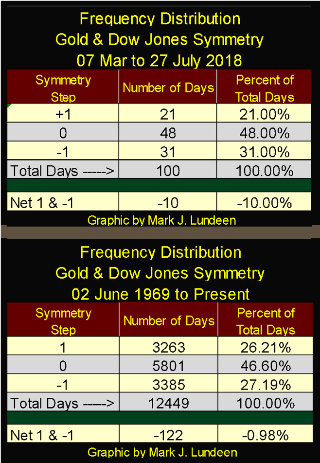
Next is the frequency distribution for the 100 days above placed over the frequency distribution since June 1969. Comparing the data in the Percent of Total Days columns of these two tables, it’s apparent the gold market has seen considerable selling pressure since early March.
© Mark Lundeen
Looking at the Net 1 & -1 data above, of the 122 net this data has since 1969, a full 10 of these -1 (Gold Down / Dow Jones UP daily closings) have occurred since March 7th. Seeing 8 percent of the nets of the past five decades occur in the past one hundred days suggests something or someone is applying a lot of pressure on the price of gold.
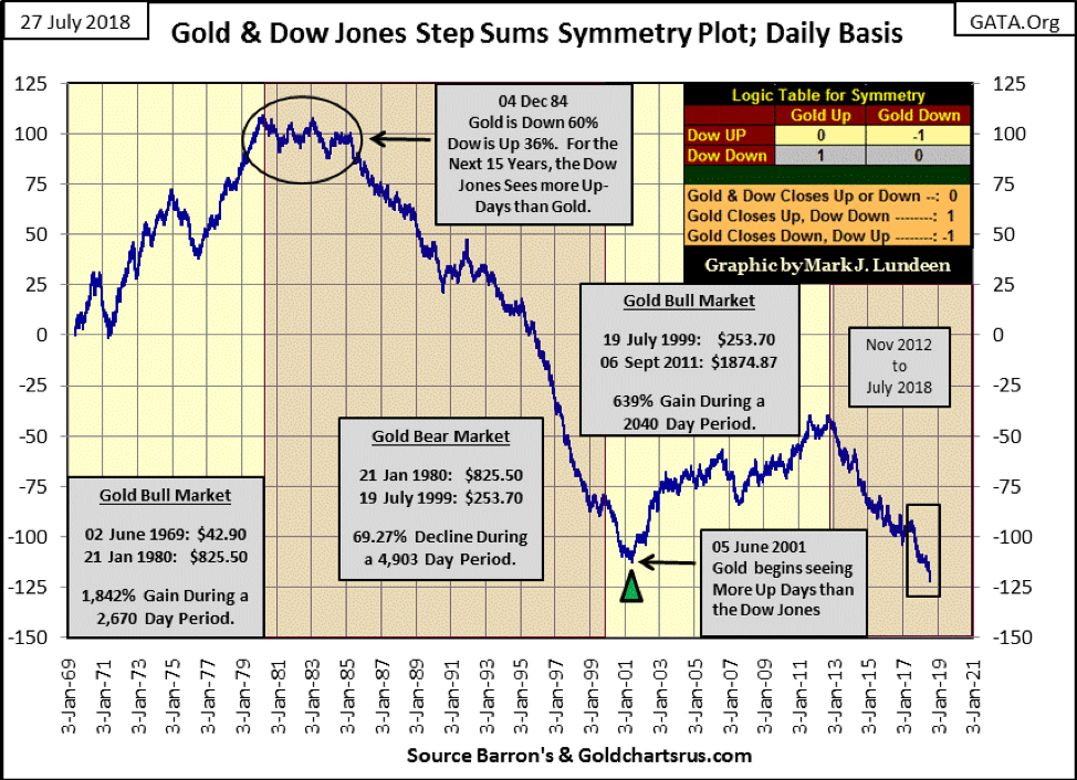
All the above was a background for the following chart plotting the symmetry for the price of gold and the Dow Jones. Text boxes are provided to fix the bull and bear markets gold has seen since 1969. As expected, during gold-bull markets the plot advances as the price of gold sees more daily advances than does the Dow Jones, as during gold-bear markets the plot declines as the Dow Jones sees more daily advances than does gold.
But this isn’t always the case. From January 1980 to December 1984 (black circle), the price of gold declined 60 percent with the Dow Jones advancing 36 percent as the plot trended sideways for these five years. Then when gold’s 1980-99 bear market hit its absolute bottom of $253.7 on 19 July 1999, we see the symmetry plot continue declining for the next three years until gold made a double bottom with a $255.1 close in February 2001 (Green Triangle). A few months later, the gold bull market began in earnest when for the first time since 1979, gold began seeing more net daily advances than did the Dow Jones, pushing the plot upwards.
© Mark Lundeen
The latest advance in gold terminated in September 2011, 14 months later we see the Gold / Dow Jones Symmetry plot begin its current decline. Something interesting to note about the current decline—in the past year (July 2017 to July 2018) the symmetry plot has collapsed by 29 – that’s a big drop for a single year.
So what should we make of all this? I don’t believe this data is practical for use in forming short-term opinions on the market, however, it provides a superb view of the gold and stock markets’ rearview mirror.
The 1969-80 bull market in gold makes perfect sense. In a decade where CPI inflation was in the high single and double digits, and the stock market found itself in a malaise, as President Jimmy Carter noted, that gold would see more daily advances than would the Dow Jones.
The 1980-99 gold bear market also makes sense. For the best part of two decades, monetary inflation ceased flowing into CPI inflation (consumer prices) and flowed into financial asset valuations. Why would people want to buy gold when the big bucks were being made in the stock and bond markets? So, considering where the FOMC’s monetary inflation was flowing into, it’s expected the daily advances in the Dow Jones would dominate over gold causing the symmetry plot to decline by over 200 net Dow Jones advances.
The 1999-2011 advance in gold began slow. It began in a time when investors were focused on their high-tech future in the NASDAQ. But six months after gold’s July 1999’s $253 bottom, everyone’s high-tech future began deflating.
By the summer of 2001, as the NASDAQ high-tech bubble continued deflating, it was obvious to the smart-money crowd that the “policy makers” were reflating the financial markets by “injecting liquidity” into the retail mortgage market. The wisdom of encouraging consumers to assume hundreds of thousands of dollars of debt for housing to inflate another asset bubble seemed dubious to reasonable people. By October 2008, everyone else, including the US Congress came to the same opinion. Considering everything, is it really surprising that from 2001 to 2011 gold saw more daily advances than did the Dow Jones?
Here is another point that I believe is important. Before 2001, most new stories about central banks and their gold reserves were ones of them selling their gold, after 2001, these stories switched to central banks buying gold. So what changed after September 2011 that would result in the above plot to decline? Really nothing, actually the reasons for gold, silver and the precious metals mining shares to rise have only gotten better as their prices have declined for these past seven years.
- The global banking system is still on life support.
- Debt loading on the global economy has become even more onerous.
- Financial assets and real estate valuations have become even more inflated than they were in 2007.
These are just three factors for liking gold, but there are many more.
One point Richard Russell always stressed was how market trends would continue until they reach their point of EXHAUSTION, the point where they simply can’t continue on.
Points of exhaustion pertain to bull markets, and we’re seeing stories that strongly suggest we’re rapidly approaching one in the current bull market on Wall Street. In my opinion, seeing a glamor stock like Facebook drop 19 percent in a single trading session is a shot fired across the bow from Mr. Bear warning of worse things to come.
And then just today, Friday July 27, shares of Twitter dropped by 20.5 percent.
Seeing glamor stocks’ valuation drop by double-digit percentages in a single trading session is something that happens at market tops.
Problems can be seen outside the stock market too. California real estate is seeing early signs of trouble in the link below. Home prices are at record highs (not a good sign), and alarmingly the volume of home sales themselves have been reduced by 11 percent from a year ago. Apparently, rising mortgage rates are shrinking the pool of prospective qualified buyers.
Bear markets also reach their points of exhaustion. Looking back at history, the points of exhaustion for the Great Depression Crash and for the market declines in the price of gold since 1969 can easily be identified in their step sum charts posted earlier in this article.
Here’s something to understand and hold on to in our current market: valuations for gold, silver and their miners ARE NOT driven higher by monetary inflation. Monetary inflation comes from the banking system, and the banking system “injects” their “liquidity” into stocks, bonds and real estate. So it’s actually valuations in financial assets that are driven higher by monetary inflation, not precious metal assets.
What fuels bull markets in gold, silver and their miners is DEFLATION in stocks, bonds and real estate. During bear markets in financial assets, capital fleeing deflation flows naturally toward assets with zero counterparty risks, such as gold and silver, which greatly benefits their miners. So I’m not going to get too excited about the old monetary metals until we see the stock, bond and real estate markets gets a dose of deflation from Mr. Bear.
Seeing into the future is not so simple, but given pending, yet unknown developments we can anticipate. Go back and review my chart on the step-sum symmetry for gold and the Dow Jones above and take a good look at the box covering the last year of the plot. Seeing this plot drop by 29 in a single year is a BIG drop, and I have to wonder whether we are reaching a point of exhaustion for both the bull market on Wall Street and the current market decline in the price of gold.
Mac Balkam of Eskay Mining sent me an interview with John Kaiser. Mr. Kaiser’s comments on Silver Standard Mining’s project on Eskay’s property in British Columbia is a bit technical, but then it’s about geology. The point being is Silver Standard’s geologists are willing to spend millions of dollars looking for billions of dollars in precious metals they believe is located on Eskay Mining’s property. Will they find it? Like me, you’ll have to wait to find out. But as a speculation with potentially huge rewards to Eskay’s shareholders: I’m hopeful.
—
DISCLAIMER: This article expresses my own ideas and opinions. Any information I have shared are from sources that I believe to be reliable and accurate. I did not receive any financial compensation in writing this post. I encourage any reader to do their own diligent research first before making any investment decisions.


XRP Under Pressure Amid Macro Forces, Fed Policy, and Regulatory Shifts
XRP remains under pressure despite easing geopolitical tensions, as macroeconomic factors and Fed policy dominate market sentiment. Liquidations and high...


Edison Accelerates Renewable Growth and ESG Impact in 2025
Edison reports strong 2025 sustainability progress, boosting renewable investments by 90% to reach 2.3 GW toward a 4 GW 2030...


New Gene Therapies Transform Rare Disease Care, but Gaps Remain
Gene therapies are transforming rare disease treatment, enabling normal lives for some patients. However, only about 6% of 7,000 rare...


Temotiva Launches Crowdfunding Campaign to Advance Preventive Mental Health
Temotiva Innovación Lab has launched a crowdfunding campaign through Santander X Explorer, marking a new phase for the University of...


Fed Policy Shift Raises Concerns Over Debt and Inflation Risks
The Federal Reserve is criticized for resuming balance sheet expansion through Treasury purchases despite expectations of tighter policy under new...
 |
|
 |  |
 |
|
-

 Africa2 weeks ago
Morocco at an Energy Crossroads Amid Global Gas Volatility and Critical Minerals Opportunity
-

 Fintech4 days ago
Trade Republic Brings Back Human Support and Launches Customer Council
-

 Biotech2 weeks ago
EFPIA Warns Limited SPC Reform Could Weaken EU Pharma Competitiveness
-

 Markets6 days ago
Corn Prices Slip Amid Strong Crop Conditions and Favorable Weather
You must be logged in to post a comment Login