Featured
Dow Jones enters a period of selling, gold declines
The stock market at current valuations is vulnerable to a significant market decline. Meanwhile, gold dropped to $1,301.96.
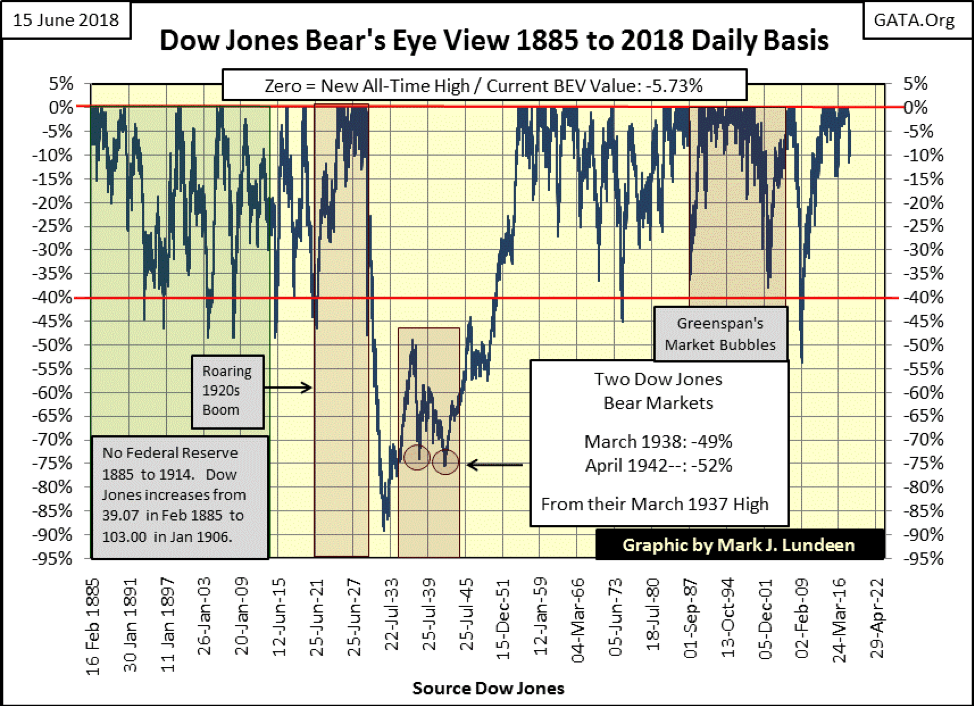
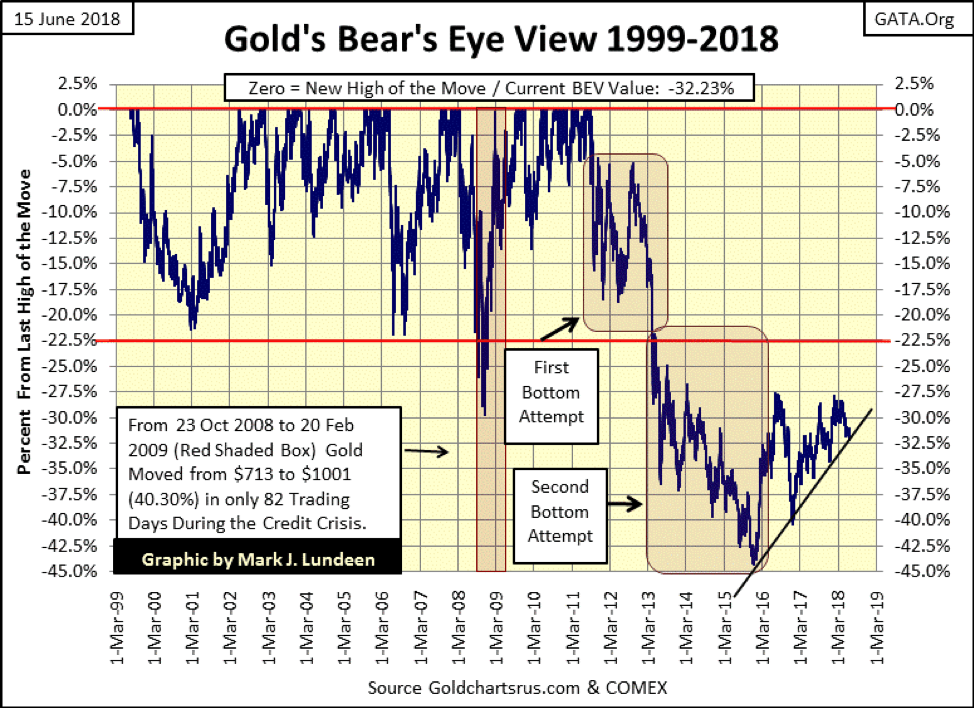
I thought I’d start out with the Dow Jones’ Bear’s Eye View (BEV) chart going back to 1885 showing every bear market decline of the past 133 years. This week ended with the Dow Jones 5.73% from its last all-time high of Jan. 26, which is pretty darn good from the perspective of Mr. Bear’s View of the market.
Mr. Bear doesn’t care about how many points the Dow Jones, or anything else, rises. The only thing the big furry fellow cares about is how many percentage points he can claw back from the gains the bulls have made. But points do matter to us, even if we don’t see them in the BEV chart below. Knowing since Mar. 9, 2009, the Dow Jones had advanced over 20,000 over the past nine years suggests, to suggestable minds like mine, that the stock market at current valuations is vulnerable to a significant market decline.
That’s why I posted a long-term BEV chart for the Dow Jones this week to give us a clue of the possible for the next market decline; not if, but when it comes.
© Mark Lundeen
Here’s the latest data of the 52Wk Highs and Lows for the Dow Jones Total Market Group (DJTMG). A 0.00% in the green 52Wk High column shows a 52Wk High, a 0.00% in the blue 52Wk Low column shows a 52Wk Low, with 12 new 52Wk Highs and no new 52Wk Lows this week.
We naturally look to the 52Wk Highs (Green Column) to see which groups are outperforming the rest. However, data from the blue 52Wk Low column is key in understanding which groups are really leading the way upward. For instance, which group has outperformed all others in the past 52 weeks?
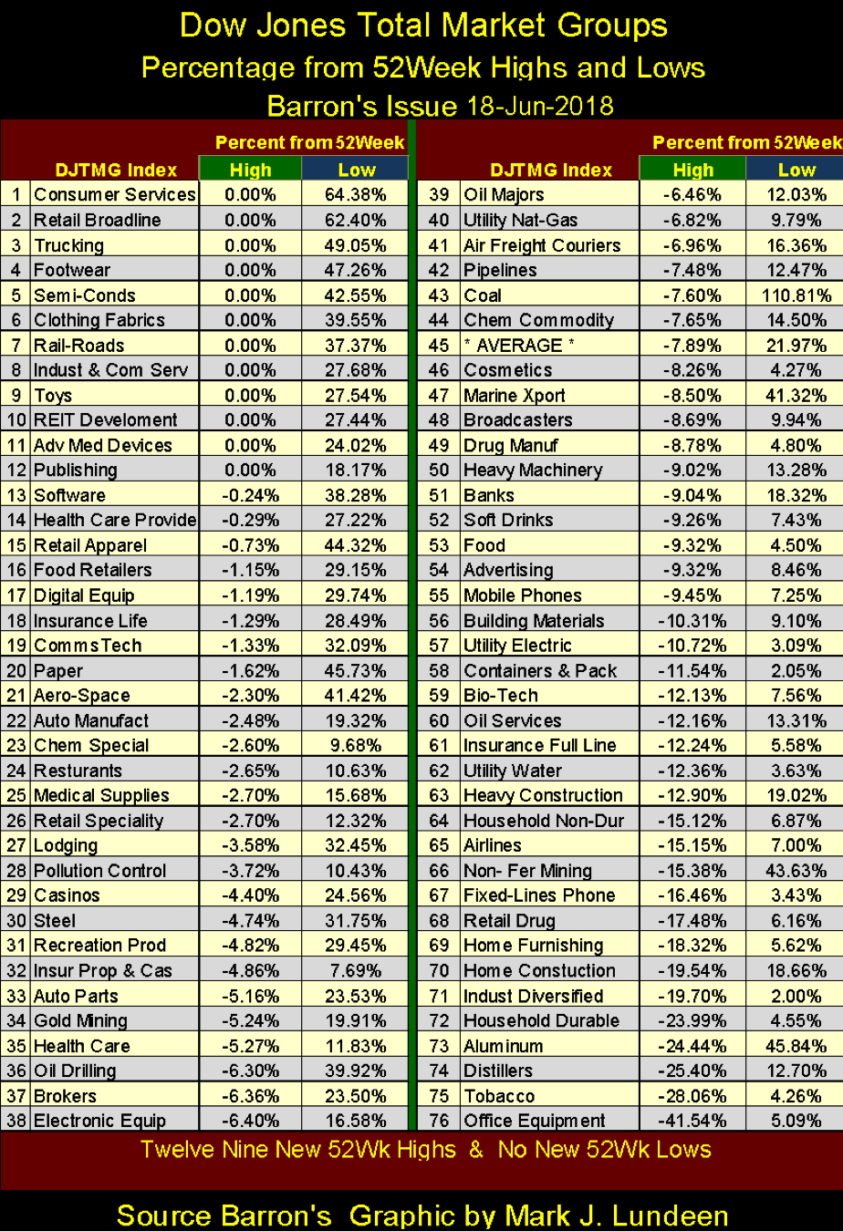
© Mark Lundeen
The answer to that question is found at #43/Coal, which at the end of this week finds itself at a whopping 111% above its 52Wk Low, while only 7.6% below its 52Wk High.
Last week, I made the case for avoiding overinflated assets at a market top, as such investments will prove to be low hanging fruit for Mr. Bear when he returns to feed on Wall Street. I recommended investments that were deflated as others inflated during the post-Credit-Crisis advance – precious metals and their miners.
But looking at the below BEV chart for the coal miners, and knowing that President Trump has taken the Federal Government’s jackboot off of the neck of the coal miners, I think coal mining can be added to this list of deflated assets to own in the coming deflation in the financial markets.
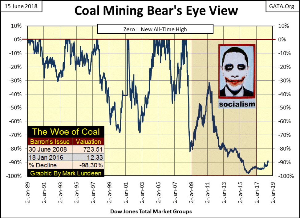
© Mark Lundeen
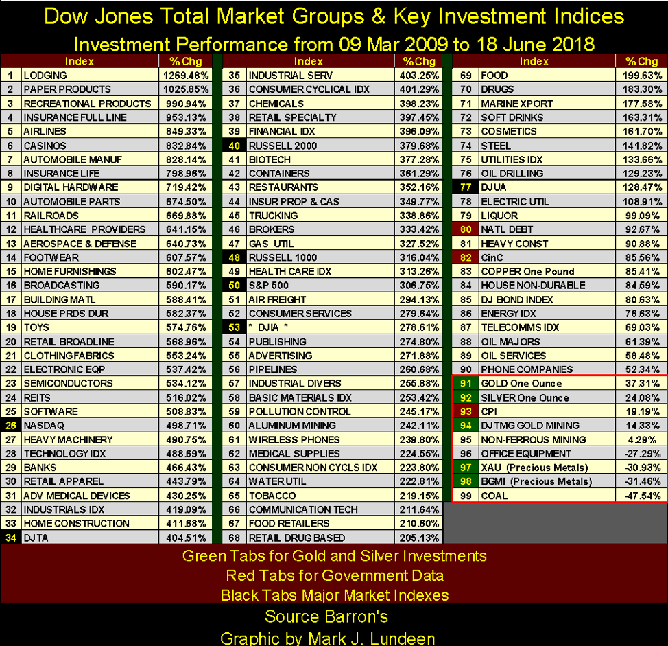
For a more complete picture of what was or not inflated since Barron’s 09 March 2009 issue (the bottom of the credit-crisis bear market), I’ve prepared the following table listing what has gone up and what has gone down in the past nine years. Coal finds itself at #99 on the list, dead bottom, while nothing precious metals-related managed to rise above #91 on the list. The XAU (#97) and the BGMI (#98) are actually down 30% from nine years ago.
Look at #93 (CPI). I went grocery shopping today, and I can guarantee you that consumer prices have increased much more than 19.19% since March 2009. Still, the mainstream financial media never questions the veracity of the government’s inflation statistics.
© Mark Lundeen
During bear markets, investors find themselves in a world where people are more concerned about the return of rather than the return on their money. If you feel the need to maintain a position in the stock market, focusing one’s investments at the bottom of this list would go a long way to minimize one’s risks in the coming bear market.
However, I’d be careful of some of these groups, such as the phone companies (#90); they’re old technology. These companies may not even be trading in the stock market ten years from now, but I could be wrong on that. Look at the gold miners; the XAU and BGMI are both down by double digits percentages – I love them!
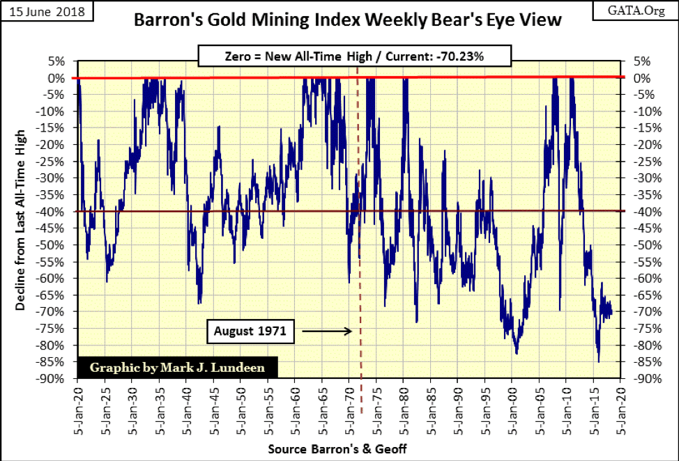
Here’s the BEV chart for the BGMI going back to 1920, which we can all thank Geoff (from Down Under) for getting data on Home-Stake Mining from 1920 to 1938 which made this chart possible. In their application of Fud’s Law, where we see if one pushes hard enough, it will fall down, the “policy makers” from April 2011 to December 2015 pushed the BGMI down by a historic 85% from its last all-time high. Like coal, I don’t think Mr. Bear will be very interested in the gold mining shares in the coming bear market, not when there are so many juicy capital gains to be clawed back in the table above.
© Mark Lundeen
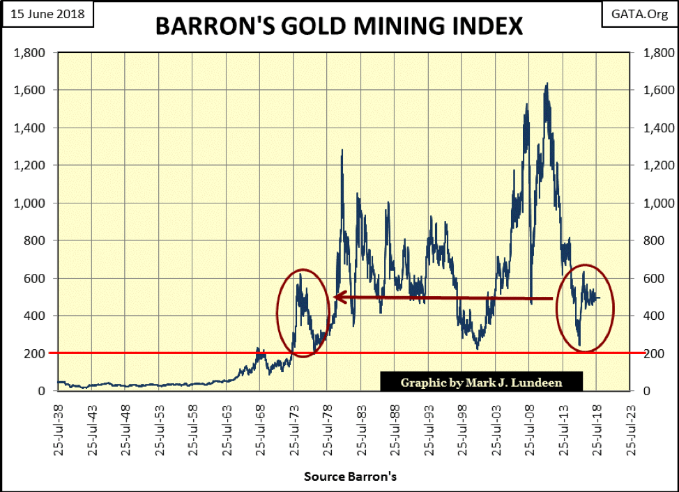
Looking at the BGMI plotted in points below, the gold miners are back where they were in the mid-1970s, and during the past five decades haven’t traveled very far in the round trip seen below. This was not so for CinC and the National Debt, whose “growth” during this time pushed the Dow Jones up from 577.60 in December 1974 to 26,616 in January 2018.
If in bear markets inflated market valuations deflate, where is the greatest risk to one’s wealth in the current market? Certainly not in the precious metal miners. In fact, I believe the gold and silver miners in the coming bear market will once again prove to be the destination of choice for flight capital fleeing deflation in the general market.
© Mark Lundeen
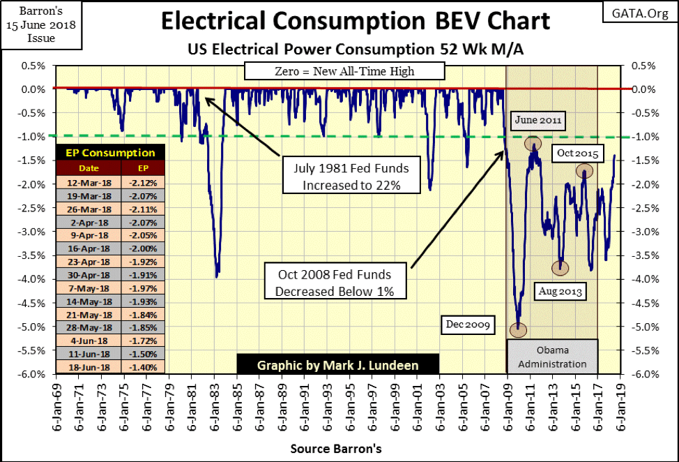
Economic demand for electrical power (EP) is increasing, which I give full credit to President Trump. Last September, it was under -3.5%, this week it was at -1.40% from its last all-time high recorded in August 2008. But what happens to EP when Mr. Bear comes back? It can’t be good.
© Mark Lundeen
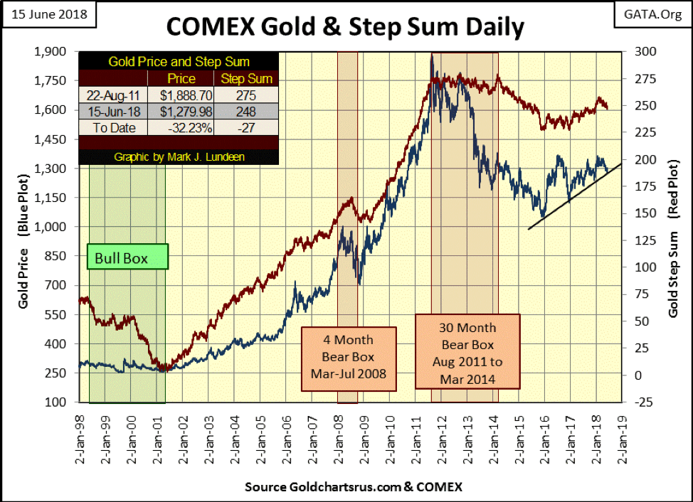
Gold had a horrible week, or so I’m told. Strange, I don’t see the collapse in the price of gold below.
© Mark Lundeen
Moving down to gold’s step sum chart below, I don’t see this big decline there either.
© Mark Lundeen
Silver too, I’m told, had a horrible week; not that one would notice this in the chart below. What is noticeable in this long-term view of silver, as is also true for gold and the BGMI, is that precious metal assets haven’t done much of anything since the summer of 2016. The circle in chart below could also be placed in a long-term chart for gold and the BGMI.
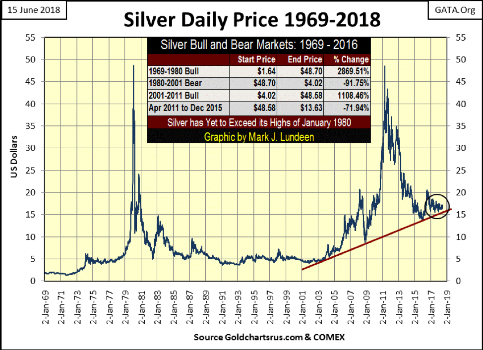
© Mark Lundeen
In the years to come, I expect we’ll all come to understand how since the summer of 2016, the old monetary metals and their miners have been waiting for something to happen before they make their next big move. This big move may first prove to be a 10-15% gap down thanks to our corrupt market regulators in the early phases of a major bear-market decline in the Dow Jones. But when the decline in the broad market is perceived by all as something terminal to the advance we’ve seen since March 2009, the waiting and frustration of owning precious metals assets will prove to be more than worthwhile.
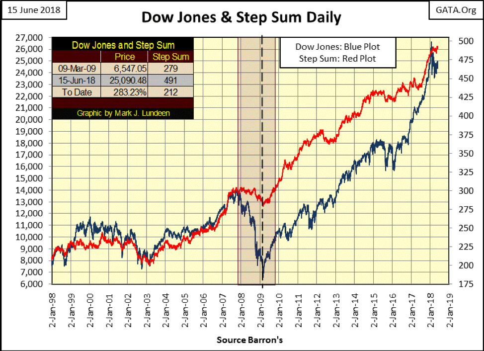
Keep in mind the current market is one that has its valuations managed, as seen in the bear box in the Dow Jones below. This was the second-largest percentage decline in the Dow Jones since 1885. During this decline the Dow’s step sum declined by a net of only 25 down days during an 18-month / 54% market crash. Yet it somehow avoided a collapse that’s so typical of a bear box in a bear market decline.
© Mark Lundeen
This failure to see market sentiment collapse (the step sum collapse) during the credit crisis market crash was the result of the bulls never surrendering to the overwhelming power of deflation during a bear market.
The FOMC this week once again raised their Fed Funds rate by 25 basis points, and long-term rates have been trending upward since the summer of 2016. At some point, the current inflationary bubble in financial assets and real estate is going to enter a phase of deflation. It always does.
But when is that going to happen? I haven’t a clue. It may be this October, or a year or more from now. But the best of what the post March 2009 stock and real estate markets had to offer the bulls is now best seen in the market’s rear-view mirror, while the profit potential of investing in the precious metals and their miners lays in our not to distance future. It makes sense that one should reduce their exposure to the financial markets while taking a good sized position in precious metals assets.
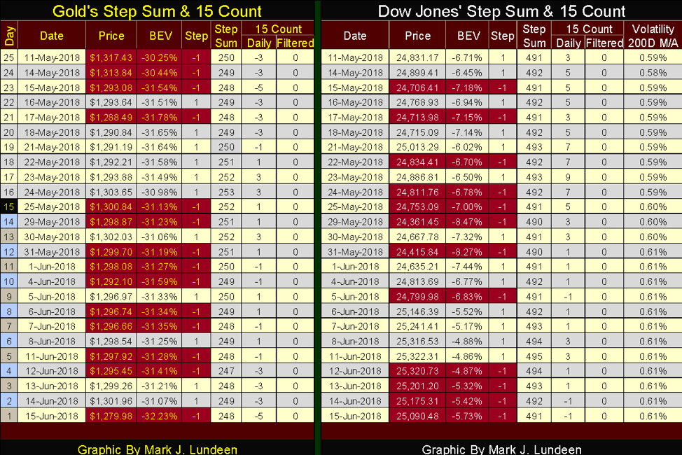
So let’s move on to gold’s and the Dow Jones’ step sum table below. Gold saw a bad day on Friday, down $22. However, one bad day does not a bear market make. This is especially true when the usual suspects (the big Wall Street banks) were once again flooding the market with insincere promises-to-deliver gold by the tons sometime in the future; gold that doesn’t exist or will ever be available to these banks for delivery! If it wasn’t for this single day loss of $22, gold would have been sitting pretty as it waits for its next big move, which I expect to be up.
Looking at gold as it stood on Thursday this week, it was at $1,301.96 with a 15-count of -3. Meaning gold was down only $1.69 from May 24th (15 days before), with nine of those 15 days seeing gold close down, and then Friday happened. So, should gold sell off some more next week, I’m not going to panic. I’m not the guy looking at a crystal ball to see the future, but I wouldn’t be surprise if next week gold is above $1,300 again.
© Mark Lundeen
For the Dow Jones, once again, it’s entering a period of selling, but I don’t expect much of a decline in the short term. The Dow Jones, like gold, is in a hurry up and wait market, both are waiting for something big to happen before they see something significant happen to their valuations.
—
DISCLAIMER: This article expresses my own ideas and opinions. Any information I have shared are from sources that I believe to be reliable and accurate. I did not receive any financial compensation in writing this post. I encourage any reader to do their own diligent research first before making any investment decisions.


SBTi Net-Zero Standard 2.0 Enhances Corporate Climate Action
The Science Based Targets initiative (SBTi) has released Corporate Net-Zero Standard Version 2.0, a major update to its global framework...


Europe’s Cannabis Shift: Rising Use, and New Risks
EUDA report shows cannabis remains Europe’s most used illegal drug, with 22 million adults trying it. Use is highest among...


Remote Work Reshapes Sales Management: Key Lessons for Moroccan Leaders
Remote work is rapidly expanding among Moroccan managers, yet practices lag behind. Insights from France show higher productivity but weakening...


Corn Prices Slip Amid Strong Crop Conditions and Favorable Weather
Corn was lower again last week on Midwest rains despite a neutral WASDE report. The report showed slightly higher beginning...


Advances in Biomarkers and Targeted Therapies Transform Kidney Care in Autoimmune Disease
New biomarkers and targeted therapies are reshaping the management of kidney damage in autoimmune diseases like lupus and vasculitis. Experts...
 |
|
 |  |
 |
|
-

 Fintech2 weeks ago
Revolut Begins Controlled India Rollout Targeting Massive UPI Payments Market
-
 Markets20 hours ago
Corn Prices Slip Amid Strong Crop Conditions and Favorable Weather
-

 Biotech1 week ago
TG Therapeutics Advances Subcutaneous Briumvi With Strong Trial Results and Rising Sales Momentum
-

 Crypto2 weeks ago
Altcoins Show Mixed Performance as Bitcoin Weakens
You must be logged in to post a comment Login