Business
How to improve your e-commerce landing page to increase conversion
The sole aim of every e-commerce website is to sell products/services and make money.

All the e-commerce websites invest significantly in their business to turn visitors into customers and boost sales.
Per Statista research, e-commerce sales around the world are rapidly increasing. The revenue of e-commerce sites accounted for $2.3 trillion in 2017, which is expected to reach $3.45 trillion in 2019 and then to $4.88 trillion in 2021. This shows that opportunities exist in this business, driven by the demand of customers to purchase everything online.
Importance of landing pages
Landing pages help businesses to attract more traffic, drive conversions, generate leads, which eventually deliver a high return on investment (ROI). According to HubSpot, the websites that use more than 40 landing pages generate around 120 percent higher leads than the ones that use only 5 or less landing pages.
Traffic not converting into customers
Businesses are putting their best efforts and working hard to generate more traffic on their e-commerce landing pages. They are leveraging social media campaigns, sending out bulk emails and more such things, but are failing to turn visitors into customers.
This is one of the major problems for e-commerce store owners as the traffic coming to their website is of no use until it converts into customers who buy, review and interact.
Creating high-converting landing pages
If you are running an e-commerce business and facing the same issue, then this article is for you. We have curated few of the best tips and tweaks that will make your landing page a money-making resource.
1. Focus on personal benefits in the headline
On the landing page, you should include a catchy headline that focuses on the personal benefits of customers, rather than focusing on the company or product. Telling benefits of the product could help you influence your visitors in making a purchase.
Ensure that you don’t brag about your product too much. Focus on providing a solution to the problem for which the user has landed on the page. Prepare a strategy to cater both the cases because problem-solving technique can influence your visitors while the benefits of your product can actually make them buy.
2. Create a sense of urgency
One of the main reasons behind e-commerce websites selling more on Black Fridays and Sale period is because people know that these occasions are for limited time and the offers wouldn’t be available tomorrow. This creates urgency among them which results in action.
What this means for you is to make people think that the certain products are available at a discounted price and for a limited time only, or only a few items are left in stock, or the coupon will expire soon. These tricks work for all e-commerce websites and help them increase sales.
However, you have to be careful with it, because overdoing it can impact the way people see your brand and might become the reason for lower conversion rate.
3. Create simple and visual flow towards CTA
If your landing pages contain a lot of information that doesn’t lead people to CTA, then the bounce rate will increase. You need to write short paragraphs and sentences, use white space and bullets where necessary, to optimize readability.
Each element of the content should lead the visitors towards your CTA. This will attract their attention to your aim and encourage them to convert.
4. Have same CTA at multiple locations on the page
You should try to include multiple CTA buttons on your landing because you never know which part of the page can influence their decision to make a purchase. When you have multiple CTAs, the people don’t have to search for it and click further whenever they feel like. This works well for all e-commerce landing pages.

E-commerce entrepreneurs should focus on conversion and have customers buy, review, and interact on the website. (Photo by DepositPhotos)
5. Have trustworthy testimonials
Testimonials are a great way to show how satisfied your customers are, with products you sell and services you offer. But this feature has, lately been exploited by a number of business houses. This has made users vulnerable about trusting the website testimonials. Modern-day testimonials lack genuine character and authenticity.
To make your visitors believe that the reviews are from your real customers, use customer image along with their name along with some other necessary details like order number and date. This will help you gain trust of your visitors and also increase the chances of them making a purchase on your website.
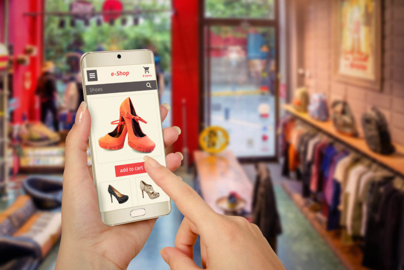
6. Optimize landing page for mobile
There are around 3.7 billion mobile users around the world. According to Statista, website traffic from mobile devices is rapidly increasing. In 2017, traffic from mobile devices accounted for 50.3 percent which increased to 52.2 percent in 2018. This shows that more and more people are accessing websites from smartphones and tablets.
Hence, you have to ensure that your landing pages are mobile-friendly and working well on small screens. If you haven’t optimized your site for mobile, the people will abandon it without a second thought.
7. Use high-quality product images
Use of product images is crucial for e-commerce sites because these images show how the product looks like. You have to ensure that you use only high-quality images. The zoom functionality is optimized for better view of products. Also, use multiple images of the same product to let visitors see it from different angles, including close-ups.
Further, to take things to a whole new level, you can also include a video of the product that shows exactly how the product works and looks like in action.
8. Integrate live-chat option
Sometimes, people have a query about a product and the answer might not be available on your landing page. That one unanswered query can impact their decision to purchase the product. Hence, it is always good to integrate a live-chat option that can help them find answers to their queries.
Live chat options are especially critical for B2B enterprises because the visitors will require some additional convincing before making a decision and paying a handsome amount. Hence, the live chat tool is something every landing page should have.
9. Use SSL certificate
Security has become more important than ever. When people land on your e-commerce store, they should feel that they are on a secure site.
The first thing you need to do is to install an SSL certificate on your site and push HTTPS for your website URL. If you don’t do it, your URL will show a ‘not secure’ warning which will scare out the visitors. Use of SSL ensures that the information submitted on your site will be encrypted and no middle man would be able to access it.
Along with SSL Certificate, you should add security badges and privacy policy on the landing pages. These things will build trust and show that your site is secure and legitimate.
Have you optimized your landing page to boost conversions?
If you answer is NO, then consider the above-mentioned tips to make your landing pages more convincing and visually appealing. Implementation of these will surely help you get the conversion rate you hope for.
If you know of more such tips, please let us know via the comments below.
(Featured image by DepositPhotos)
—
DISCLAIMER: This article expresses my own ideas and opinions. Any information I have shared are from sources that I believe to be reliable and accurate. I did not receive any financial compensation for writing this post, nor do I own any shares in any company I’ve mentioned. I encourage any reader to do their own diligent research first before making any investment decisions.

-

 Biotech5 days ago
Gilead Sciences Advances Growth Strategy with Focus on HIV, Oncology, and Innovation
-

 Crowdfunding2 weeks ago
Crowdfunding Evolves into Core Financial Infrastructure in Europe
-

 Impact Investing3 hours ago
Ortus Secures €97M Green Loan to Expand Solar Portfolio in Italy
-

 Impact Investing1 week ago
Italian Unlisted Banks Lag on ESG Sustainability


![Kevin Harrington - 1.5 Minutes to a Lifetime of Wealth [OTC: RSTN]](https://born2invest.com/wp-content/uploads/2023/12/kevin-harrington-400x240.jpg)
![Kevin Harrington - 1.5 Minutes to a Lifetime of Wealth [OTC: RSTN]](https://born2invest.com/wp-content/uploads/2023/12/kevin-harrington-80x80.jpg)


