Featured
Financial and banking indexes continue to struggle
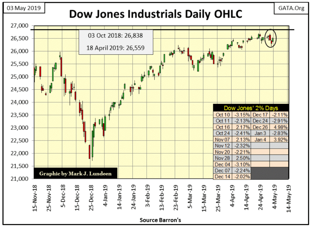
A new definition for tedium should be having to follow the Dow Jones; for weeks now it hasn’t done much to entertain market watchers.
I wish the Dow Jones would go up, or down, instead it just daily trades near to, but just short of a new all-time high. It’s been like this for over a month now. But nothing lasts forever. One of these days, I will get more excitement from following the venerable Dow Jones than I bargained for, but I doubt that will be anytime soon.
©Mark Lundeen
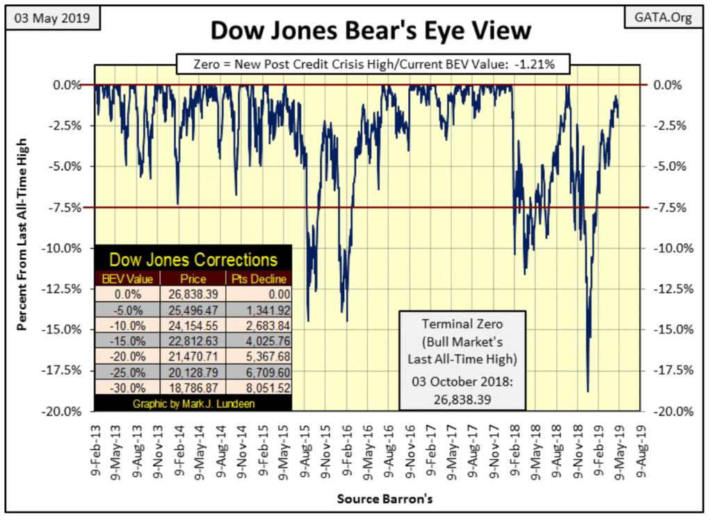
For a better view of the Dow Jones in its current quiescent state of being, below is the Dow Jones in daily bars. On April 1st the Dow Jones broke above 26,000 and has remained there; it’s just having difficulty closing on the last 838 + 1 points to break above last October 3rd’s last all-time high.
Does anyone else care that the Dow Jones keeps quitting just short of the goal line? Back in the late 1990s, when the stock market was a big thing in the lives of most people they would have. But I have the feeling that I’m one of the few that cares today.
©Mark Lundeen
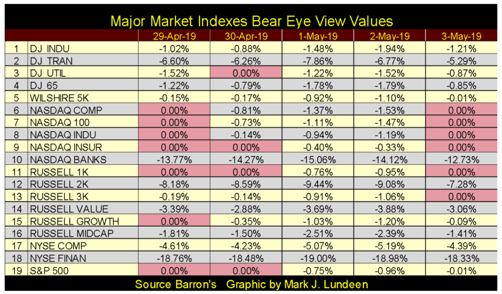
But the Dow Jones is only thirty huge blue-chip stocks. There are other market metrics people can follow. Most professional money managers follow the S&P 500 as their proxy for the broad stock market, and the S&P 500 saw two new BEV Zeros last week, and then again this week in the table below.
It wasn’t just the S&P making new all-time highs last and again this week. On Monday, six other of the nineteen indexes in the table also made new all-time highs with the S&P. Then on Tuesday, the market cooled off as only three other indexes besides the S&P made new all-time highs. On Friday the NASDAQ indexes, except for its banking index, hit new all-time highs as did the Russell 1&3K indexes. In fact, the NASDAQ and Russell indexes were all making market history last week, and again this week.
©Mark Lundeen
So excuse my peevish view on the market for the failure of the Dow Jones to follow the lead of the S&P 500 in making new all-time highs, because this is actually a good stock market. Actually a better market than what we see in the table below for January 2018. What’s wrong with seeing all the BEV Zeros seen below? January 2018 was a hot-market top followed by an 11.5% correction in the Dow Jones two months later, and this table became a BEV Zero free zone as all of these indexes also corrected from the BEV Zeros seen below.
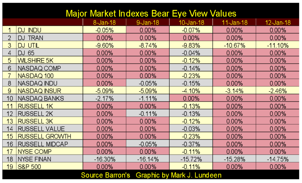
©Mark Lundeen
One item that I find interesting is how the banking stocks have done in the two tables above. The NYSE Financial Index (#18) hasn’t seen a new all-time high since July 2007, but the NASDAQ Banking Index (#10) was making new all-time highs in January 2018. However, note that now in May 2019, the NASDAQ Banking Index is performing no better than the NYSE Financial Index; both are double-digit percentages from their last all-time highs.
As we discovered during the subprime mortgage crisis, how the banks go, so goes everything else. The reason for this is simple; the banking system is the economy’s payment system. Should the banking system cease to function, for a day or even an hour, it’s like a heart attack for the economy as the money stops circulating in it.
Sure, your electric utility doesn’t need the banks to generate electricity to power homes and factories, but it does to collect the utilities’ monthly payments from customers and to pay their employees. What can operate without the banking system working in the background? Certainly not retailers or manufacturing firms who require the banking system for payments for the goods and services they provide and the disbursement of funds to pay their vendors.
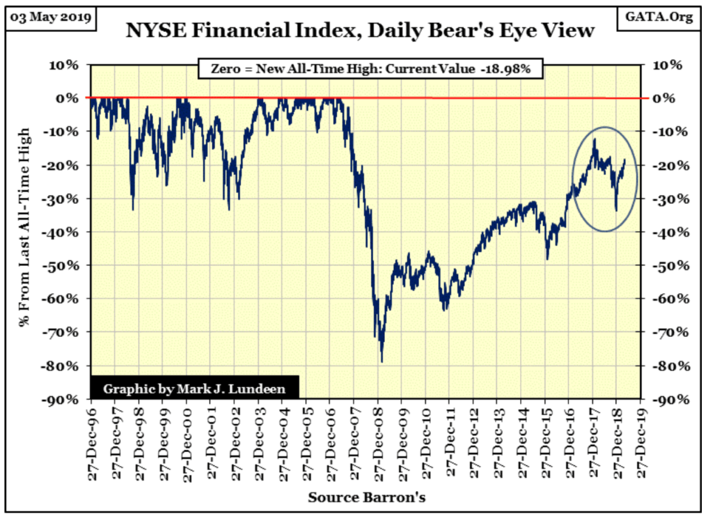
For this reason, it’s a bit disturbing seeing how the NYSE Financial Index has performed for now over a decade in its BEV chart below. This index was ground zero for the 2007-09 credit crises, and though in the past decade it did enjoy some solid advances, unlike all the other major market indexes I follow, the NYSE Financial Index has never fully recovered its losses from the 2007-09 mortgage fiasco.
Remember, Washington “injected” trillions of dollars into these companies to bail them out, changed accounting rules so they wouldn’t have to declare bankruptcy when they became insolvent ten years ago, and who knows what else? Then after all that, ten years later this index still finds it impossible to break above its BEV -10% line? Something isn’t right about this.
©Mark Lundeen
Look at the market action within the circle. It peaked in January 2018, as seen in the Major Market BEV Table above, then dropped below its BEV -30% line just last December. It’s advanced since then, but the NYSE Financial Index continues to be weak, and now the NASDAQ Banking Index is also falling behind.
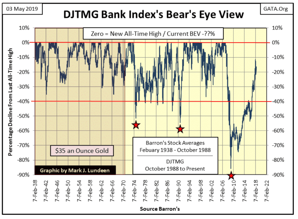
Here is a BEV chart for the DJTMG Bank Index. It’s missing the past year of data as Barron’s stopped publishing this data last summer (darn it), but it still tells the history of the American banking system.
From 1938 to 1971, the banking index never saw a 40% decline, but it did see plenty of BEV Zero’s (all-time highs). Banks weren’t the best performing stock group in the now discontinued Barron’s Stock Averages data set, which Barron’s published from 1938 to 1988, but shareholders of these banks made money.
After August 1971, with the dollar and credit creation unshackled from the Bretton Wood’s $35 gold peg, the American banking system’s ability to create credit was greatly expanded. Unfortunately, domestic economic demand for credit wasn’t, so Wall Street went in search for new clients in South America and Africa, as documented in the dusty old pages of Barron’s.
©Mark Lundeen
As expected, a good portion of these third world development loans went bust, and that’s why this banking index’s BEV plot post-August 1971 frequently broke below its BEV -40% line. The fact is after August 1971, to this day, the banks never discovered an appropriate sector of the global economy with which to use their expanded credit creation, something that would prove to be profitable and economically beneficial for the long term.
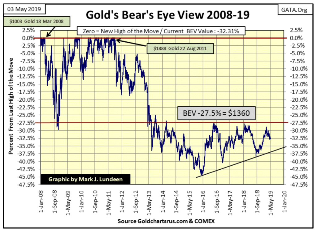
Gold in its BEV chart below is slowly deflating, but still remains “attractive.” What would make gold unattractive? In a world weighed down with historic levels of debt and counter-party risks, seeing gold fall down to below $1000 would only make it, and silver more attractive, as the old monetary metals have no counter-party risks.
©Mark Lundeen
So, when are gold and silver going to do something profitable for their owners? I can’t give a date, but I can say when: when the economy once again enters a recession. Currently, we are living in the best of times, but even so, the debt service weighing down on individuals, businesses, and governments is huge.
When the economy enters a decline and businesses begin shedding jobs, and tax receipts for local government begin to fall, defaults in the debt market are going to rise dramatically. As things should be; cascading defaults in the bond market would result in declining bond prices and rising bond yields. Should that happen, the big banks could default on a few hundred trillion dollars in the OTC derivative market. The potential for losses in such an event is staggering, far above the ability for the Federal Reserve or even the US Treasury to cover.
There will be a panic in the financial markets not seen since the depressing 1930s, and flight capital fleeing deflation in the stock and bond markets will flow into undervalued assets, such as gold, silver and precious metals miners.
Most of the major stock market indexes are at, or just a few percentage points from making a new all-time high. So, how undervalued are gold, silver, and mining shares?
-
Gold is 32.31% below its last all-time high of August 2011;
-
Silver is 69.33% below its last all-time high of April 2011
-
The Barron’s Gold Mining Index is 72.85% below its last all-time high of April 2011
Below is a BEV chart for the BGMI going back to 1920. The post-April 2011 market decline in the mining shares is the deepest depression the precious mining sector has had in the past 100 years. It’s as bad as the Great Depression of the early 1930s.

©Mark Lundeen
When I was growing up I heard stories how bartenders on the East Side of St. Paul made millions during the Great Depression because they would trade shots of liquor for shares of Minnesota, Mining and Manufacturing (aka 3M). During the early part of the depression, 3M couldn’t pay its employees with dollars, so if their employees wanted to work at 3M they had to accept 3M shares as payment. The bartenders who held on to those shares became rich as the economy and 3M recovered in the decades that followed.
Looking at the current depressing situation for the BGMI in its BEV chart below, I wonder what is to come for the gold and silver miners when the current market rig comes undone, and the financial markets begin to deflate. We can’t go back to the early 1930s and trade liquor for shares of 3M. But in 2019, you might want to belly up to the bar and wet your whistle with some established precious metal mining companies.
A good place to start your search is to look over the companies now operating in the Golden Triangle of British Columbia. Though not mentioned in the linked article, my favorite precious metals exploration play; Eskay Mining controls a huge land package with excellent geology just next door to all the companies that are.
So, with gold and silver mining shares currently at bargain prices, don’t be like Warren Buffett, who’s buying over-valued Amazon. Go buy some undervalued gold and silver mining shares and have the patience to wait until the market turns our way.
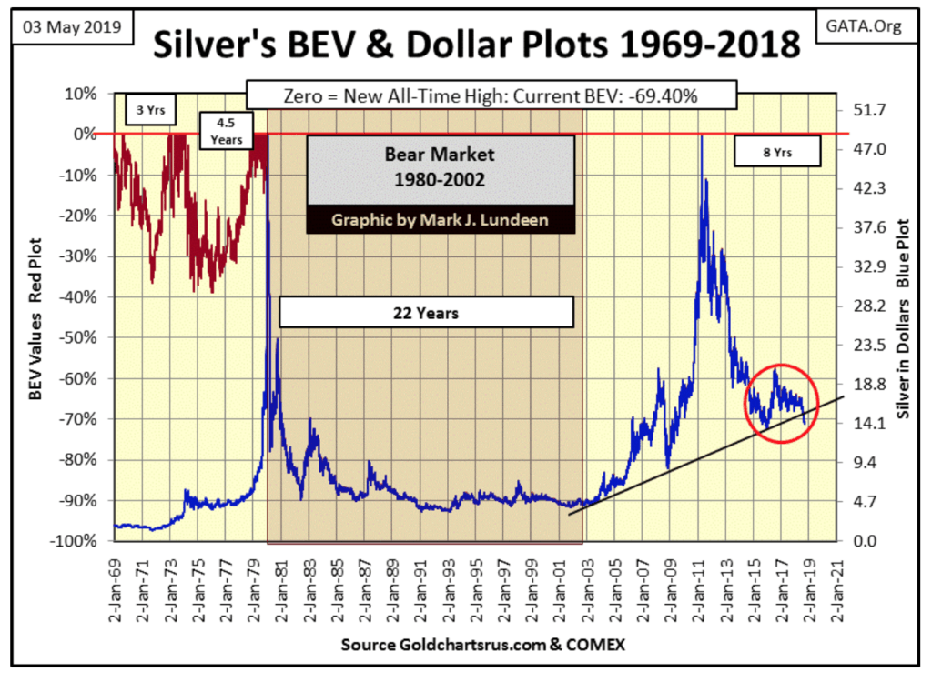
Silver is dirt cheap too! I like this chart below for silver as you can see its BEV values to the left scale and its dollar price on the right scale. This is only possible for silver, as silver’s last all-time high is still in January 1980.
Before 1980 its BEV Plot (Red Plot) and dollar plot (Blue Plot) didn’t overlap, but since then they have, allowing me to present a unique view of the silver market below. Once silver breaks above its high of January 1980, these plots will once again split apart.
Anyway, you can see how depressed (cheap) the price of silver is in the chart below, in BEV Terms on the left scale, and in dollars on the right.
©Mark Lundeen
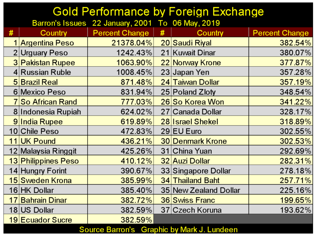
Below is a table listing the advances in the price of gold by different foreign currencies since January 2001. As gold trades internationally in US dollars (#19), those nations whose currencies who have seen the greatest appreciation in terms of gold (#1-18) have inflated their money supply at a greater rate than has the United States.
There’s a dollar block (#15-21), seven nations who have tied their rate of inflation to that of the United States. For the most part, these countries are Persian Gulf Oil Sheikdoms, but Hong Kong, Ecuador, and some Scandinavian counties are also in the block, or in the case of Panama (not shown below) that actually uses the US dollar as their national currency.
©Mark Lundeen
The best of the lot are those currencies who have seen gold increase less than has the US dollar. But Europe’s Euro (#29) is managed by a banking system that has as many, if not more problems with derivatives than has America’s banks.
China (#31) has huge debt problems too. But unlike the US Treasury Bond Market which is an international market, China’s debt is owned internally, much like the situation the United States found itself in during the booming 1920s and depressing 1930s. But defaults are still defaults, whether to foreigners or domestic creditors. The United States suffered greatly in the 1930s as its banks and debt structure suffered defaults and deflation. China won’t do any better in the 21st century when Mr. Bear pays them a visit.
Gold and its step sum below are correcting, as they have for the past few weeks. I remain long term bullish on gold, but what happens in the next few weeks or months I haven’t a clue. But I’m confident the lows of December 2015 will hold, and the market action since then is creating a base from which much higher gold prices will come about. $1360 is the key price level, or -27.5% in gold’s BEV chart above.
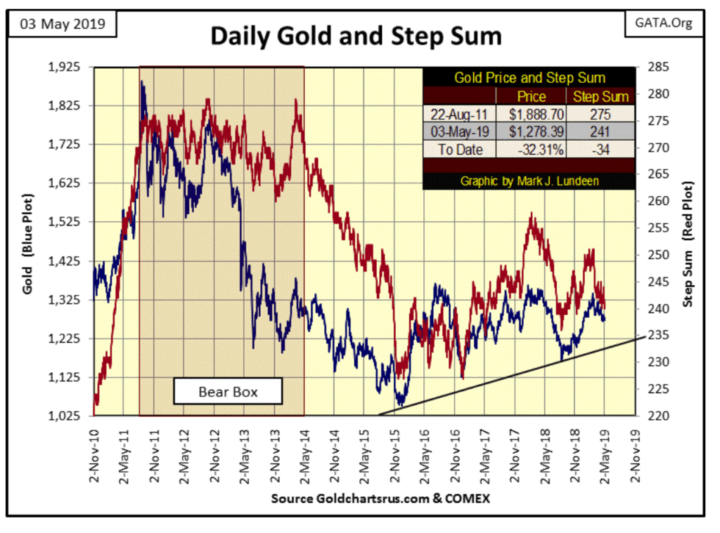
©Mark Lundeen
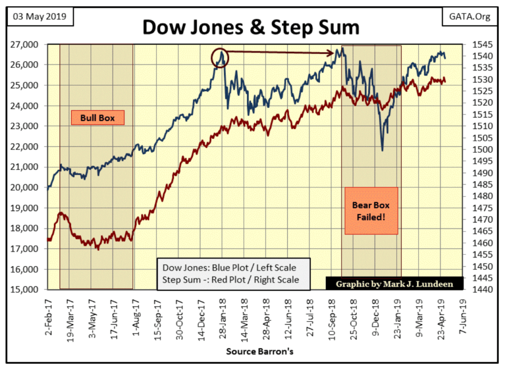
As for the Dow Jones and its step sum, the best that can be said for them is they aren’t trending down. Rather, they are just in no hurry to go up.
Looking at the failed bear box that formed when the Dow Jones saw its latest 12% correction last November / December, its step sum never collapsed down with the Dow Jones itself. That’s why the bear box failed, which is a sign of market strength. I’m really surprised that since the end of March the Dow Jones has yet to make a new all-time high. Let’s see what it does in the weeks to come. With daily volatility remaining low, I expect the Dow Jones will once again be making market history not long from now.
©Mark Lundeen
Here are gold’s and the Dow Jones’ step sum tables. Gold is seeing some selling pressure; seeing a 15 count of -5 on Thursday this week tells us that. But since the end of March, it’s only down about $20. One of these weeks gold’s 15 count is going to rise up to +5, hopefully, its price will increase to something greater than $20.
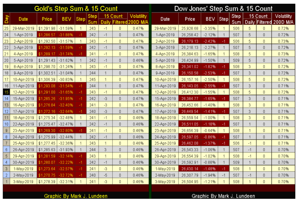
©Mark Lundeen
The Dow Jones isn’t seeing the same selling pressure gold is, but it still closed below last week’s closing price. What’s to think of this? This is a bull in need of an “injection of liquidity.” Wait a couple of weeks and it will happen.
—
DISCLAIMER: This article expresses my own ideas and opinions. Any information I have shared are from sources that I believe to be reliable and accurate. I did not receive any financial compensation for writing this post, nor do I own any shares in any company I’ve mentioned. I encourage any reader to do their own diligent research first before making any investment decisions.


SBTi Net-Zero Standard 2.0 Enhances Corporate Climate Action
The Science Based Targets initiative (SBTi) has released Corporate Net-Zero Standard Version 2.0, a major update to its global framework...


Europe’s Cannabis Shift: Rising Use, and New Risks
EUDA report shows cannabis remains Europe’s most used illegal drug, with 22 million adults trying it. Use is highest among...


Remote Work Reshapes Sales Management: Key Lessons for Moroccan Leaders
Remote work is rapidly expanding among Moroccan managers, yet practices lag behind. Insights from France show higher productivity but weakening...


Corn Prices Slip Amid Strong Crop Conditions and Favorable Weather
Corn was lower again last week on Midwest rains despite a neutral WASDE report. The report showed slightly higher beginning...


Advances in Biomarkers and Targeted Therapies Transform Kidney Care in Autoimmune Disease
New biomarkers and targeted therapies are reshaping the management of kidney damage in autoimmune diseases like lupus and vasculitis. Experts...
 |
|
 |  |
 |
|
-

 Impact Investing2 weeks ago
ACBC and OVS Partner to Launch Sustainable Footwear Collections for 2026
-

 Crypto2 days ago
Bitcoin Rises on Iran Deal as Crypto Markets React to AI and SpaceX News
-

 Crowdfunding1 week ago
Historic KiHa 2101 Railcar Restored in Japan Through Community Effort
-

 Fintech2 weeks ago
Barcelona Strengthens Its Position as a Southern European Fintech Hub