Business
What should be above the fold on an e-commerce website?
What you put above the fold of your e-commerce website can improve your interaction with your customers.
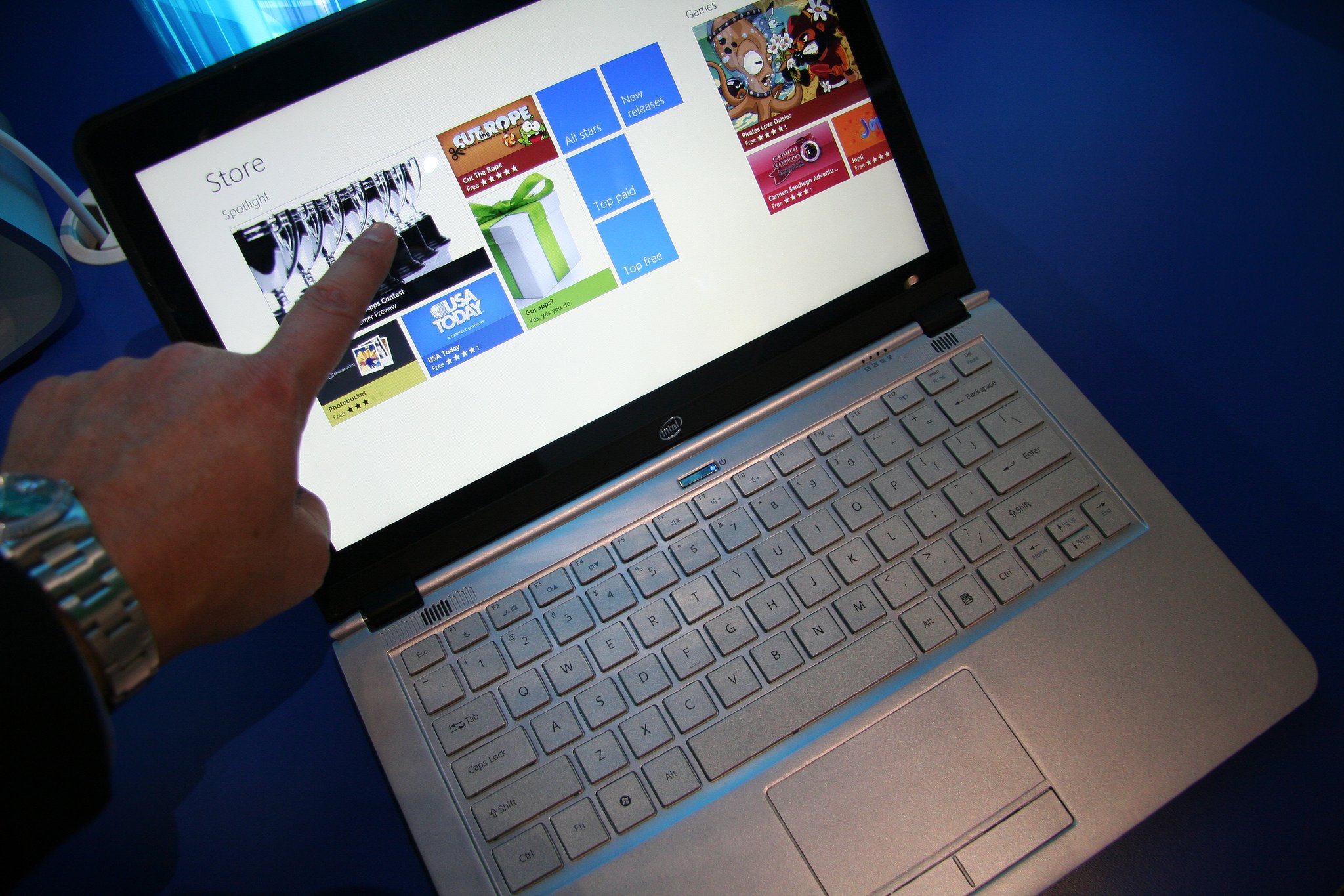
The phrase “above the fold” represents the prime real estate in print journalism. Whichever story earns top placement on the front page of a newspaper is guaranteed to capture the most attention. It’s the literal headliner. Putting the most compelling or pressing story above the fold ensures people see it and read it first.
This same principle applies when it comes to websites, except the fold is simply where the visitor’s screen ends. Anything above the fold is visible without further action from the viewer. So, what should be above the fold on an e-commerce website? There are a number of different ways to approach prioritizing the information on your homepage.
Lowering interaction costs
The most basic way to approach designing with the fold in mind is to consider interaction cost for customers. Anything immediately visible—including headers, copy, CTA buttons, photographs, videos and etc.—has a low interaction cost. All shoppers have to do is view it to understand what you’re offering and what their choices are moving forward. Anything hidden until a user scrolls or clicks comes with a high interaction cost because customers have to expend mental and physical effort to engage.
When you’re considering how to make an e-commerce website, it’s important to understand how web design and navigation affect user experience. For example, the right theme will strike a balance between visual appeal and placing the right amount of information where visitors can absorb it at a glance. With too little above the fold, users may not feel compelled to continue engaging with your website. If there’s too much information above the fold, shoppers will feel overwhelmed.
Presenting a clear value proposition
Well-designed websites make their value proposition clear at a glance, meaning brands should prioritize this information above the fold. If a customer is a first-time visitor, or simply needs a refresher on what you have to offer, this will help them quickly determine if they’re in the right place. One or two concise sentences outlining exactly what your store stands for—whether it’s low prices, high quality, luxurious materials, one-of-a-kind offers, free shipping or any other value proposition—plus a CTA button like “Shop Now” is often enough to convince consumers to take further action.
Optimizing CTA placement
However, in some cases, CTA placement above the fold actually puts premature pressure on shoppers to convert before they fully understand their options. Kissmetrics actually goes so far as to call the fold a myth.
To clarify: While putting the CTA above the fold is usually considered a best practice, it’s important to give shoppers all the information they need to make an informed decision before trying to convince them to take action. Sometimes, you’re better off using the space above the fold to inform customers and compel them to scroll.
Enticing users to scroll
Although scrolling comes with a higher interaction cost, most internet users are so used to doing so, they’ll scroll without a second thought. If you can use visual cues to encourage shoppers to scroll, you’ll eliminate spatial constraints. Sill, if you’re going to put important content, visuals, and CTAs below the fold, make sure the space above the fold lets consumers know they must scroll to get the maximum benefit.
When you’re determining what should go above the fold on an e-commerce website, you have two choices: put everything important above the fold to lower interaction costs or use the space above the fold to introduce concepts and persuade customers to scroll down for the payoff.
(Featured image by Intel Free Press via Flickr. CC BY 2.0)

-

 Biotech1 week ago
EU Biotechnology Law Aims to Boost Innovation and Cut Trial Delays
-

 Markets2 weeks ago
Stagflation Fears Rise as Energy Shock and Iran Conflict Shake Markets
-

 Cannabis2 days ago
Aurora Shifts Strategy Toward Global Medical Cannabis Markets
-

 Biotech1 week ago
AI Boosts Cancer Detection While Cutting Radiologists’ Workload


![Kevin Harrington - 1.5 Minutes to a Lifetime of Wealth [OTC: RSTN]](https://born2invest.com/wp-content/uploads/2023/12/kevin-harrington-400x240.jpg)
![Kevin Harrington - 1.5 Minutes to a Lifetime of Wealth [OTC: RSTN]](https://born2invest.com/wp-content/uploads/2023/12/kevin-harrington-80x80.jpg)









You must be logged in to post a comment Login