Featured
FOMC slows its quantitative tightening
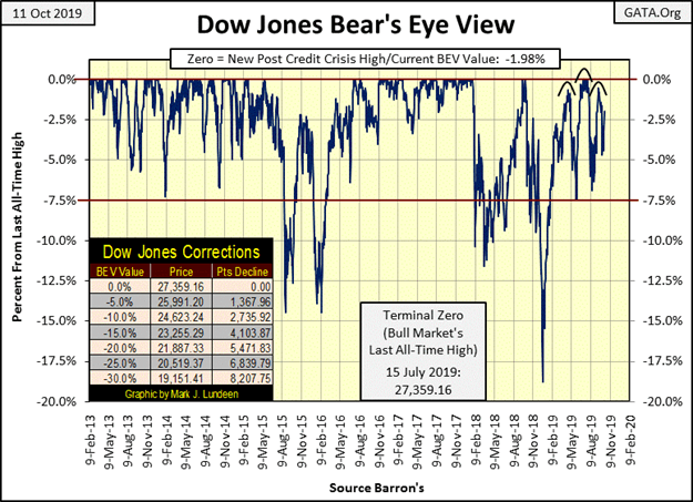
The Dow Jones continues running wild, as the FOMC slows its quantitative tightening. This week it closed only 1.98% from a new all-time high. Next week we’ll see what it does with this scoring opportunity to break his highest mark. It’s a solid chance but, similar circumstances appeared since last February, yet it could not make a new all-time high and only managed four BEV Zeros in July.

The Dow Jones continues running wild and free in its BEV chart below, as the FOMC slows its quantitative tightening; eight months of going nowhere fast bounded between its BEV 0.00% and -7.50% lines.
For all the effort it took to keep it between a new all-time high and only 7.5% away from one since last February. I would have expected more than just four new BEV Zeros last summer in July.
This week the Dow Jones closed only 1.98% from a new all-time high; it’s leading off third base waiting for someone, anyone to hit a line drive to center field. Next week we’ll see what it does with this scoring opportunity to make a new all-time high.
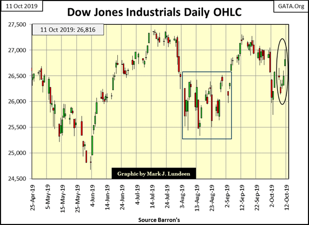
Below is the Dow Jones in daily bars. For the fourth time since February it’s taking off in another attempt to break into new all-time highs. I wouldn’t bet any money that this time the bulls really mean to do something historic.
Deflating back down
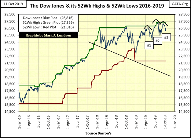
The next chart plots the Dow Jones with its 52Wk High & Low lines. Of all the charts I’ve published so far, I think this is the most bullish. Since the Dow Jones lifted off its 52Wk line late last December, it’s found remaining close to its 52Wk High line much easier than deflating back down to its 52Wk Low line.
So, it’s at times like this we should just look at a chart and ask ourselves a question. Is it indicating that the next big move to come is going to be bullish or bearish?
When I do that with this chart I get a bullish view of the market. Since early summer the Dow Jones has attempted to break to lower levels. The last just this week. And note how each bottom bounced off a higher level than the ones before it.
Considering everything, I’m going to assume a short-term bullish opinion of the stock market. Even that the Dow Jones may soon break above it current 52Wk High (and current all-time high), thus closing at a new all-time high in the next few weeks.
Should the Dow Jones accomplish that, then what? That depends on how much “liquidity” the FOMC is willing to “inject” into the financial system.
This has happened before
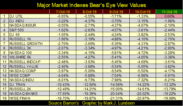
This week the Dow Jones Utility Average (#1) closed at a new high, with the Dow Jones closing at (#2) in the table below. All the groups from the Dow Jones (#2), down to the NASDAQ Composite (#13), are within 5% of their last all-time highs. This places them in a scoring position of doing something historic.
But since last summer this has happened a few times before, usually with disappointing results for the bulls. But then this is a market advance that began in March 2009 – over ten years ago, making this a wheezing-geezer market advance every time the indexes below attempt to break into record territory.
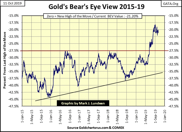
Gold in its BEV chart below has remained above its BEV -22.5% line since August 5th. That’s good. What’s bad is that since September 1st it’s also developed a pattern of lower highs and lows.
So, for the past two months, gold hasn’t done much to make either bull or bear happy with it. But I believe what is key to this chart is how after six years where gold’s BEV -27.5% line ($1360) proved to be a “very hard” ceiling, in mid-June gold broke far above this critical level and has remained a healthy distance above it since.
Oscillating gold
Maybe what it will take for gold to break above its BEV -17.5% line is for it to first make an attempt to break below its BEV -25% line. I’m just thinking after two months of gold oscillating around its BEV -20% line, it’s about time for gold to break this pattern, which could be a move to the up or downside.
It goes without saying I’d prefer gold’s next big move to be a break out above its BEV -17.5 line. But I can’t rule out a move down to its BEV -25% line before it goes on to much higher levels.
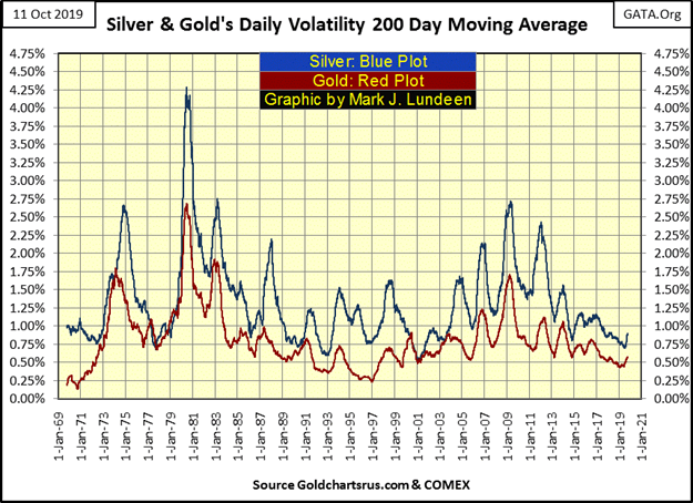
A positive development in the precious metals market is that both gold and silver’s 200-day volatility’s M/A has turned up in the chart below. What we need now is for gold and silver to begin seeing a series of days-of-extreme volatility. Daily moves of +/- 3% for gold or +/- 5% for silver from a previous day’s close. Just one or two a month would do.
Historical
Silver saw a 5% day (5.96% advance) on September 3rd, but nothing since, and gold hasn’t seen a 3% day since late 2016, almost three years now. Should these rising trends in daily volatility continue, the bull market in gold and silver that began in 2001 should begin its next advance into market history.
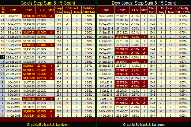
Next is gold’s step sum chart. The current advance in the price of gold actually began on July 2018, but gold’s step sum plot hasn’t increased in a proportional amount in these past fifteen months. It’s gone up with the price of gold, but not as it had between 2009 & 2011.
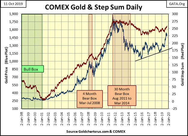
But that’s actually a positive thing to see, how since July 2018 gold has seen about as many daily declines as it has seen daily advances as the price of gold advanced from $1165 to over $1500. In other words, advancing days for the past fifteen months have had a much greater impact on the price of gold than has its declining days. Gold wants to go up.
When advancing days once again dominate the gold step sum’s plot, as they did from 2009 to 2011, the price of gold may become explosive.
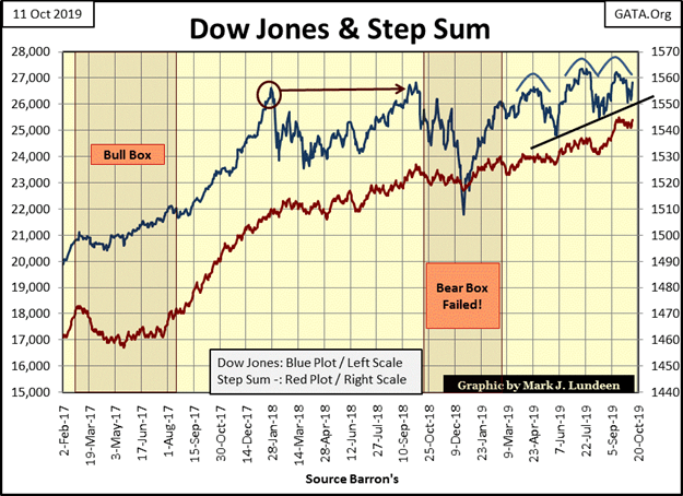
Neither the Dow Jones or its step sum is breaking down in the chart below. The only problem I see in the step sum is the Dow Jones itself doesn’t seem to have what it takes to produce more new all-time highs from all those daily advances since January 2018.
With no comment, here are the Dow Jones and gold’s step sum tables.
Popped bubble
Plotted below are the monthly changes in the Federal Reserve’s holdings of US T-Debt going back to 1997. There’s lots of history on display below. Such as how the FOMC inflated both the NASDAQ High-Tech and subprime mortgage bubbles by on average monetizing $2.98 billion dollars a month in the Treasury market.
That doesn’t seem like much, especially when one considers the growth in the market capitalization for the stock market during the 1990s and inflated real-estate evaluations from 2002 to 2007.
Wall Street takes a dollar of inflation from the Federal Reserve and lends it out to multiple debtors. This is done via fractional reserve banking. Who knows what else they do to leverage their balance sheets with credit, debit, and derivatives.
The first cracks in the sub-prime mortgage scheme are seen in late 2007 when the Federal Reserve was forced to swap its T-bonds with Wall Street’s non-performing sub-prime mortgages to keep the big banks afloat. That worked for a while; until it became apparent Wall Street’s portfolio of non-performing mortgages far exceeded the Fed’s inventory of T-Debt.
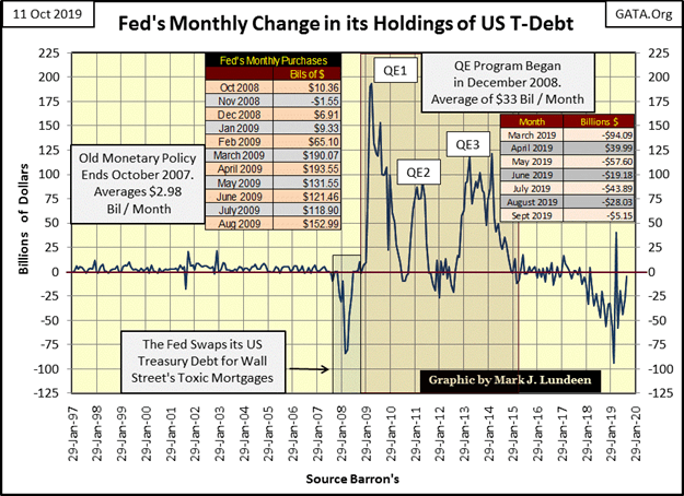
Eventually, the mortgage (real-estate), bond and stock markets crashed as the global banking system ceased up. In October 2008, on CNBC (live & commercial-free), Congress held hearings on the dire situation the financial system was in.
Little was said about why the global financial system became a crisis. Then Fed Chairman Dr. Bernanke and US Treasury Secretary Hank Paulson both testified the solution to the world’s financial problems was to first bail-out Wall Street.
However, Congress had first to allow the Fed and Treasury to implement “new policies” that at that time was not authorized by law.
Congress then made all that happen. Proof of that is seen in the three rounds of quantitative easings QEs seen above. After these massive “injections of liquidity” into the financial system (Wall Street), the Federal Reserve returned to its previous “monetary policy”. They are monetizing only a few billion dollars of Treasury debt per month.
Draining the “liquidity”
In late 2017, with President Trump now in office, the Federal Reserve was now willing to risk another huge market crash by draining the “liquidity” Dr. Bernanke “injected” into the financial system.
The chart above lists the reductions in the Federal Reserve’s holdings of T-debt from last March to September. The net effect of this quantitative tightening (QT) on the Federal Reserve’s balance sheet since it began in late 2017. This is best seen in the blue and red plots below.
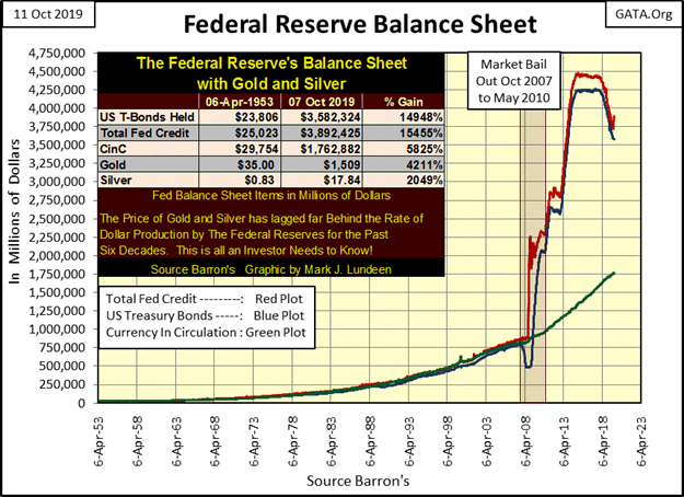
There are real-world consequences to the changes seen in the Federal Reserve balance sheet charts above. For the Federal Reserve to expand its balance sheet, it increases credit inside the banking system.
When the Hollywood Reporter has one of its reporters covering the entertainment industry’s debt woes. Well, that’s something we don’t see every day: “A ripple of anxiety ran through Wall Street on Sept. 9 when Jay Clayton, chairman of the SEC, warned that corporate debt now stands at $11 trillion. This is half the annual gross domestic product of the United States.
“Should we be cognizant of the growth in corporate debt? Who holds that debt and the potential ramifications for our markets and our economy?” Clayton asked. “Of course we should.”
Not all debt is bad debt
According to investment bankers interviewed in the article, media behemoths such as Netflix, Comcast, and AT&T are not over-leveraged. As of June 30, Netflix carried a debt of $12.5 billion. Comcast has $108 billion and AT&T, $170 billion, per SEC filings. However, the cash flow of these companies is sufficient to carry their debt.
But there was no shortage of investment bankers whose views of the sub-prime mortgage industry were positive in 2006. All that changed when the economy turned down in 2008.
Should we expect a similar episode of debt defaults in corporate debt when the next business recession cuts into corporate cash flow, as always happens when business conditions slow?
After almost a decade of artificially low-interest rates and bond yields, corporations have gorged on the credit supplied. So I’m expecting a reprise of debt defaults, this time to include corporations. Not just in the media sector before this is all said and done.
Let’s look at another ramification of the Federal Reserve’s meddling in the financial system. With its massive “injections of liquidity” and their manhandling of rates and yields far below where a free market would have them.
Cutting coupons
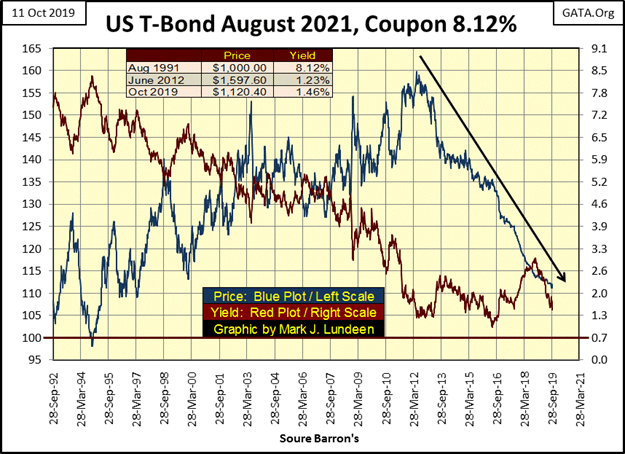
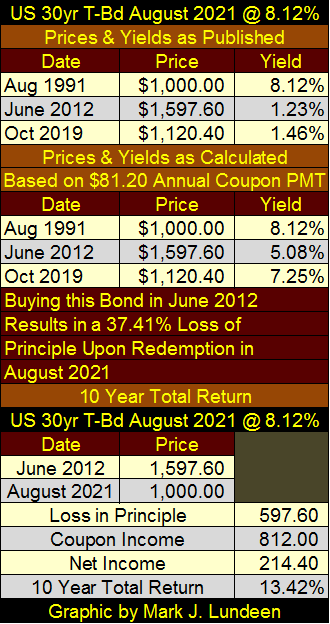
Here’s a T-bond I’ve been tracking weekly since September 1992. When issued in August 1991, this thousand dollar bond (Blue Plot) had a coupon of 8.12% or an annual coupon payment of $81.20 a year for the thirty years this bond was in the market place.
So for someone to have purchased this bond in August 1991, they would have received $2,436 in interest payments in the next thirty years, and then have their $1,000 principle returned to them by the US Treasury in August 2021.
But what if the owner of this bond wanted to sell it before it matured in 2021? They could sell it in the Treasury debt market to money managers or individuals who were very willing to purchase it. But as yields in the bond market changed these past twenty-eight years (Red Plot), so has this bond’s market price.
As bond yields declined during these three decades, this bond’s market price increased from $1,000 in August 1991 to $1,597.60 in June 2012 as this bond’s yield declined to 1.23%. But since June 2012 the market price for this bond has greatly decreased as this bond approached its maturity date in August 2021 when it will be redeemed for $1000 – and not a penny more.
Tables galore
Looking at this chart’s yield is a bit confusing. Since June 2012 the price of this bond has collapsed, yet its yield hasn’t increased as a result. The reason for that is the yield is based on the total return to maturity for the bond’s purchase price.
The yield is calculated to include the loss of principal when this bond is redeemed for $1,000 on August 2021. The upper section of the table below lists the prices and yields for this bond as published in Barron’s.
The middle section lists the yields for this bond using the price paid at that date using the annual coupon payment of $81.20. But keep in mind that in June 2012 someone purchased something for $1,597.60 that the US Treasury will only payout $1,000 for in August 2021. That is why this bond’s market price has been declining ever since June 2012.
Though in June 2012 this bond with a coupon payment of $81.20 did yield 5.08% for its market price of $1.597.60. If held to maturity this bond will automatically lose $597.60 as shown in the table bottom section.
Okay, all this is a bit of overkill for most people reading this. But I know there are some people who will appreciate what I’ve covered above. The point is because the Federal Reserve’s primary purpose is to preserve the solvency of the big banks on Wall Street. They’ve been forced to lower interest rates on savings paid by banks and high-grade bond yields to asinine levels.
This has forced elderly people into junk-grade financial assets to maintain their living standards. This is an unstable situation that can’t go on forever.
Here’s an insightful X22 Interview of Rob Kirby. Rob covers topics the MSM financial “experts” refuse to cover; like global-dollar rejection.

One of these days a buying panic in the precious metals and their miners is going to develop. You’ll want to have your position in them before it does.
—
(Featured image by Pexels)
DISCLAIMER: This article expresses my own ideas and opinions. Any information I have shared are from sources that I believe to be reliable and accurate. I did not receive any financial compensation for writing this post, nor do I own any shares in any company I’ve mentioned. I encourage any reader to do their own diligent research first before making any investment decisions.


Advances in Biomarkers and Targeted Therapies Transform Kidney Care in Autoimmune Disease
New biomarkers and targeted therapies are reshaping the management of kidney damage in autoimmune diseases like lupus and vasculitis. Experts...


Bitcoin Rises on Iran Deal as Crypto Markets React to AI and SpaceX News
Bitcoin rose above $65,000, gaining about 5% as a tentative Iran war agreement boosted markets. ETFs still show weekly outflows....

Rising Inflation, Fed Uncertainty, and Market Excess Amid War and SpaceX Mania
Rising inflation, driven by war, debt, and money growth, puts the Fed in a difficult position ahead of its meeting....


SpaceX IPO Sparks Déjà Vu as Market Risks Loom and Gold Bulls Stay Hopeful
The author compares the 2000 AOL Time Warner merger to SpaceX’s planned IPO, warning it may signal a market top....


The TopRanked.io Guide to 2026’s Biggest and Best Affiliate Opportunities
Want to earn affiliate commissions on literal billions of dollars worth of revenue? Then this week, we've got something special...
 |
|
 |  |
 |
|
-

 Crowdfunding2 weeks ago
Prestadero Sees Rising Female Loan Participation in Mexico
-
 Business3 days ago
The TopRanked.io Guide to 2026’s Biggest and Best Affiliate Opportunities
-
Business1 week ago
TopRanked.io Weekly Affiliate Digest: What’s Hot in Affiliate Marketing [+ The Best Affiliate Program Directory on the Internet]
-
 Crowdfunding2 weeks ago
Spain’s Crowdfunding Sector Surges as Real Estate and SME Financing Expand