Business
Global holdings of US Treasury Debt
During 2007-09 credit crisis the global banking system suffered from a grand-mal seizure. Trillions in their reserves becoming insolvent. The global payment system broke down. There was no way the big Wall Street banks and the financial markets would be spared from his slaughter unless Dr Bernanke and his FOMC began “stabilizing” the financial markets with a brilliant new contrivance; a QE.
As always, we begin with a Bear Eye’s View (BEV) of the Dow Jones, with this BEV chart beginning in January 1982. What’s a BEV chart? It’s a view of a market’s price series where each new all-time high registers as a 0.00%, or a “BEV Zero.” All other data points NOT a new all-time high are converted into a negative percentage claw back from its previous BEV Zero.
This is how Mr Bear looks at a market; new all-time highs as BIG FAT ZEROS, and everything else as a percentage claw back from the bulls. In effect, a BEV series compresses price data into a percentage range of 100%, with a 0.00% new all-time high and -100% total wipeout in market value.
Below, on 11 August 1982 the Dow Jones closed at 776.92, or a Bear’s Eye View (BEV) of -26.13%. The next day a historic advance in the Dow Jones began, an advance that has taken the Dow Jones up:
- 33,424 points,
- 4301%,
in the past thirty-nine years. Nothing else like it for the Dow Jones since its first publishing in February 1885.
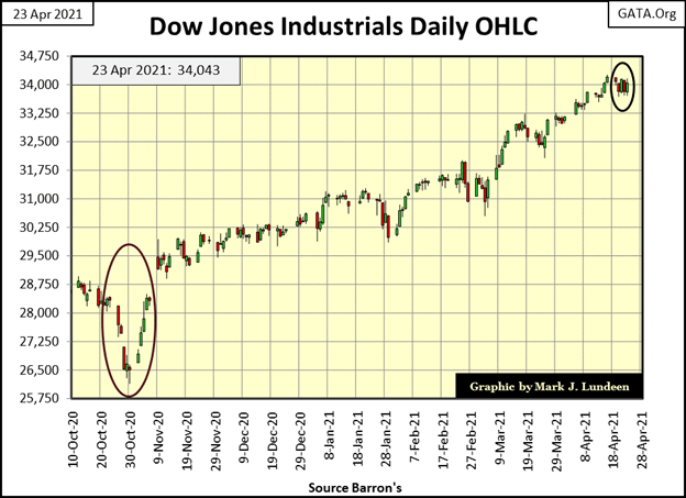
This week the Dow Jones closed at 34,043.49, or a BEV of -0.46% from its last all-time high from last Friday’s all-time high close of 34,200.67. Quite a difference from where it closed on 11 August 1982; 776.92. Yet in the BEV chart below these two daily closings are separated by only -26% BEV points and thirty-nine years of market history, recording each of the 9911 daily Dow Jones’ closings BEV values. 797 of these daily closings saw the Dow Jones close at a new all-time high (0.00% aka BEV Zero), and 9114 daily closing at a percentage claw back from its last all-time high.
The nice thing about a BEV chart is, it allows us to see historic patterns that are missed when plotting the data in points. For instance, I’ve placed a red line at the BEV -35% line, and since 1982 the Dow Jones has seen its BEV value deflate from a BEV Zero down to its -35% line on four occasions. The sub-prime mortgage bear market bottom deflating down to 54% in March 2009. But five months earlier in October 2008, when the Dow Jones deflated below its BEV -35% line (8,579), with -20% BEV points to go (6,547 on March 9th, 2009), buying on a 35% market decline still proved to be very profitable thing to do.
So, why didn’t people do that? Because on these four occasions most people wanted O-U-T of the market. The best time to buy is always when the market is cheap, as when you see the Dow Jones break below its BEV -35% line below. But the market is cheap only because everyone else is selling. Psychologically speaking, most people don’t have what it takes to go against the crowd, and actually buy when a market is down by 35%.
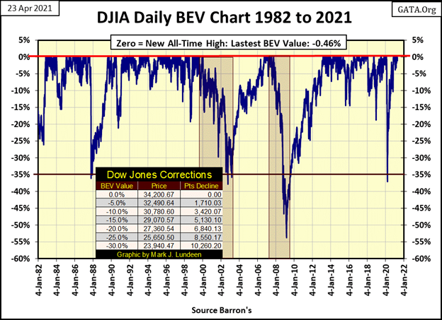
Here is another market fact this BEV chart points out; after the Dow Jones had deflated down to its BEV -35% line, and began its rebound into record territory, the Dow Jones (my proxy for the broad stock market) would continue advancing for several years, twice for over a decade before it saw another 35% market decline.
So, just looking at this BEV chart for the Dow Jones, we should anticipate a few more years, possibly another decade of the Dow Jones accumulating one hundred or more additional BEV Zeros, and point increases in the tens-of-thousands, with market pull backs from these BEV Zeros of no greater than 20%, before the next big market decline comes. Take a look at the Dow Jones’ BEV chart above – it’s beautiful!
Am I predicting this? Oh, hell no! There is this little rule-of-thumb from far back in market history that goes like this:
Frankly, this is a good time to be expecting a rule change in the market because of how this amazing thirty-nine year advance of 33,424 points came about – pure inflation – aka; hot air blown into it by the FOMC.
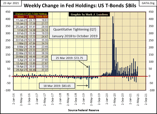
Just this week in the chart below, the FOMC “injected” an additional $66.46 billion into the financial system. Look at their “injections” into the banking system since the FOMC terminated their QT program in October 2019 (chart below). The last time the Dow Jones broke below its BEV -35% line in March 2020, the idiot savants at the FOMC “injected” $1.34 trillion dollars in the following month into the financial system to reflate market values and “stabilize” the corporate bond market that was then in a state of collapse.
So, some people see the advancing Dow Jones and get a bullish, warm and fuzzy feeling from the current rise in the stock market. Me? I look at how the FOMC is managing their balance sheet below, and live in constant dread for my future because I know this cannot end well.
But in April 2021, the end hasn’t arrived, yet, as seen below in my table of Major Market Indexes BEV Values. We saw many more BEV Zeros last week than we did this week, but then this week all but one of these indexes – the XAU – closed in scoring position, or within 5% of their last all-time high.
So, what is wrong with the XAU? Nothing is wrong with the XAU. It’s just the tsunami of credit dollars flowing from the FOMC is avoiding its gold mining companies in the daily trading in the stock market. At times like this, that isn’t a bad thing.
When all the other hot-stock indexes below begin upchucking the inflationary dollars they’re now imbibing, where do you think many of those dollars are going to flow to, to survive deflation in the financial markets? I’d say the gold and silver miners in the XAU, as well as into gold and silver bullion.
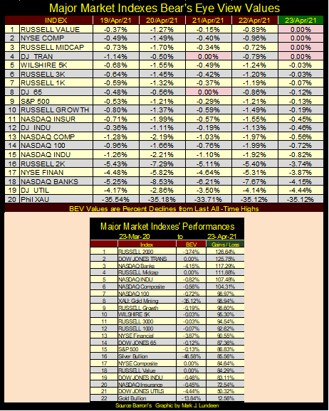
Look at these Indexes advancing off their March 23rd 2020 lows in the table above. Even the XAU (#8) and silver billion (#16) have advanced over 80%! So, what’s wrong with Tail-End Charlie / gold bullion at #22? Official sector market manipulation is my best guess. This too shall pass.
Here’s the Dow Jones in daily bars, and this week the Dow Jones took a break. But no one has changed the rules in the market just yet, so I’m anticipating further gains in the stock market until they do. Hopefully the change in market rules will come sometime before Christmas 2021. Why do I hope that? Because the longer this monetary malfeasance continues, the more damage will result when Mr Bear returns to settle accounts with the bulls at the FOMC.
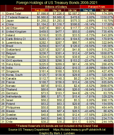
The US Treasury Department publishes monthly data on foreign holdings of US Treasury debt.
https://ticdata.treasury.gov/Publish/mfh.txt
I’ve been doing this report a few times a year for over a decade, using Windows XP or Windows 7. This week was my first attempt to update the data using Windows 10, and I discovered Windows 10 can’t export data from a text file into an Excel File, something that was easily done with Win XP & 7.
Oh, sure Microsoft claims Windows 10 can, but for something that should have taken less than a minute, after an hour I couldn’t get it to. Out of frustration, I hooked up my old computer running Windows 7 to complete the update, and then copied the updated file into my new computer.
Anyway, my monthly data set begins at May 2008, with the latest data as of February 2021. The latest figures are seen in the table below, under the Feb 2021 column, sorted by largest holders to the smallest. The other columns in the following table are self-explanatory, listing the maximum and minimum values since May 2008 in billions of dollars. For the columns under the Percentage From, the Max Val column should be read as if it’s a BEV value; because it is. The Min Val column shows the percent increase of their stockpile of T-debt is from its minimum value.
For the most part the minimum values seen in this table occurred on May 2008, which as you recall was just months into the 2007-09 sub-prime mortgage crisis. By May 2008 Bear Sterns had already fallen, with Lehman Brothers liquidation a few months later.
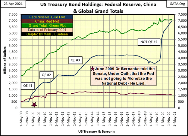
The Federal Reserve is #2 in the table, but the US Treasury doesn’t, and never has included the Federal Reserve’s holdings of T-debt in its data set. As I have the Federal Reserve’s holdings of T-debt data going back to 1932, I just put it in. Keep in mind, the table below and following charts, the Grand Total (#1) is a grand total of all the countries in the Treasury’s data set, which doesn’t include #2; the Federal Reserve.
Looking at the table’s holdings in billions of dollars is interesting, seeing in February 2021 the Federal Reserve has over five times the holdings of US Treasury debt than does either China or Japan. However, as seen in a chart following the table, it wasn’t always that way.
Where’s Russia? The last entry for Russia was in April 2018. I don’t know if they sold all of their T-debt or if the US Treasury just stopped noting them in this data set. This is the case for many countries whose holdings of T-debt is only a few billion dollars or less. The Treasury sweeps these totals to be included in their “All Other” classification (#5).
The following chart plots the monthly data points for the Federal Reserve, China and Japan. In May 2008, both China and Japan held more T-debt than did the Federal Reserve. All that changed in 2009 with Doctor Bernanke’s QE #1.
During 2007-09 credit crisis the global banking system suffered from a grand-mal seizure. Trillions in their reserves (sub-prime mortgages) becoming insolvent (totally worthless / BEV -100%). The global payment system broke down. There was no way the big Wall Street banks and the financial markets would be spared from his slaughter unless Dr Bernanke and his FOMC began “stabilizing” the financial markets with a brilliant new contrivance; a QE.
Dr. Bernanke, began his QE #1 in early 2009 to reflate the financial markets, and for “injecting liquidity” into the balance sheets of bankrupt Wall Street institutions that should have been left to an ignoble end. The rest is history.
In June 2009 (Red Star) Dr. Bernanke testified (under oath) before the Senate the Federal Reserve wasn’t going to monetize the national debt. It was a lie, and everyone in the Senate knew it was a lie; so, who was Dr. Bernanke lying to? The American public and anyone else gullible enough to believe him of course. Dishonesty and mistruths are the real currencies that circulate in Washington, and in the mainstream media that promotes the pernicious schemes of our deceitful powers-that-be.
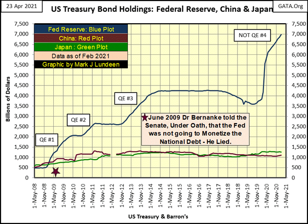
My next chart plots the totals for the Federal Reserve, China and the Grand Totals for the Treasury’s data set. This is a shocking chart; seeing the Federal Reserve’s holding of T-debt (which isn’t included in this Treasury’s Dept data set) has in February 2021 almost exceeded the global grand total eighteen months into Fed Chairman Powell’s “Not QE#4.” From a “monetary policy” stand point, this is a most impressive achievement!
Why do I call this a “Not QE#4?” I don’t; Chairman Powell did in late Autumn 2019 when he terminated his Quantitative Tightening program (QT). Powell made a big deal that though the FOMC was once again monetizing additional T-debt, it was only to “stabilize” the overnight repo market “temporarily.”
That was it and no more Chairman Powell asserted. So, no one back in October 2019 would confuse this with a QE, such as Dr. Bernanke’s QE #1-3 seen below, hence Powell’s “Not QE#4.”
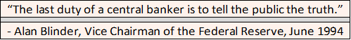
Its amazing how easily our “policy makers” lie to us. But then Alan Blinder, who was selected as Vice Chairman of the Federal Reserve in June 1994, warned everyone this was how things worked at the FOMC.
He wasn’t doing the public a favor. Nope! Doctor Blinder was boasting to the world of his good fortune, as he was interviewed on TV news show, such as PBS’s Nightly Business Report and the Mainstream Media nightly news, giddy as a school girl that he was selected as the #2 guy under Alan Greenspan. I wish I had a full clip of these interviews, as each one I saw had him boast;
with obvious enjoyment on his part.
Where do they dig these people up? I don’t know, but I do know there is no shortage of these sociopaths corrupting coming generations of students in academia or dictating their corrupt “policy” in Washington.
When we have people like this managing the money supply, we can’t have a stable monetary system as we had during the pre-World War One gold standard. These academics and bankers just keep issuing new dollars for their benefit as if the entire monetary system is their plaything – which as things currently are, does belong to them.
How did that happen? Our elected officials in Washington gave it to them when they created the Federal Reserve System in 1913.
I like the following quote from James Turk, as it is so true.
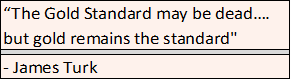
I never met James, but in past years we’ve exchanged correspondence over the internet several times. He’s offered me encouragement and technical advice on various occasions. Like Bill Murphy and Chris Powell of GATA, James Turk is the real deal and a class act of the first order.
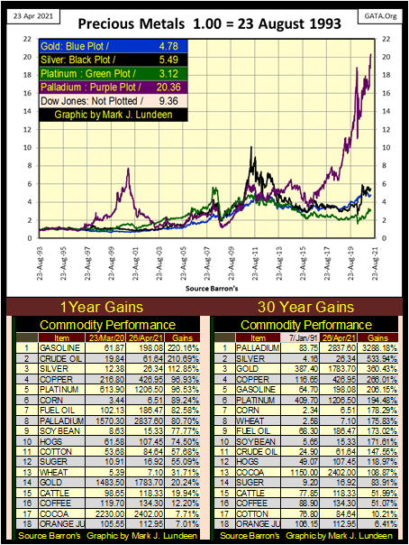
Here’s a chart I haven’t published for a while; the indexed values for the old monetary metals plus platinum and palladium with 23 August 1993 = 1.00. In the legend I have each metal’s color code and the end of week factor increase since August 1993. I also have the Dow Jones’ factor increase, though I don’t include a plot for it.
Palladium (Purple Plot) is the star of the group, though back in 1993 few could have predicted it would be. It saw some excitement from 1997 to 2001 as the auto manufacturers began outbidding each other for the supply of palladium required for their catalytic converters. But it was a bubble and the price of palladium fell back into the pack.
The next star of the group was silver (Black Plot), who following the credit crisis lows of the market in October 2008 saw an excellent run up to its old highs of January 1980. However, that was not to be allowed by the big Wall Street banks. So, in late April 2011 the silver bulls once again saw multiple changes in margin requirement (to their great disadvantage) at the COMEX silver market as a tsunami paper silver flooded the market.
In late 2015, these precious metals saw their lows in the post 2011 market correction, and once again palladium became a star. Following its correction bottom of March 2020 (when everything else bottomed and Powell’s Not QE#4 began in earnest), pallidum in April 2021 now finds itself at significant new all-time highs.
One of two things is going to happen from this point. If this advance in palladium’s valuation is only a bubble, it will be popped in due time. If so, in due time we’ll see a decline in the price of palladium, deflating its valuation back to the pack below it. But there is another possibility; that the laggers in the pack, currently with factor increases in single digits, will follow palladium to the +20 levels in this chart.
Every week I publish a chart showing the grotesque monetary inflation flowing from the FOMC. Though no one in Washington or in the mainstream media cares as long as the stock market advances. What I’m actually showing my readers is the cold-blooded murder of the American dollar by a nasty little cabal of nameless nobodies.
That said, if in April 2021 I had to choose for a long term hold between an ounce of palladium, or the $2800 in Federal Reserve Notes I could get it for in the market; I’m taking the ounce of palladium. The only thing better than that would be an ounce of metal from the pack below as I expect they all have some catching up to do with palladium; this is especially so with silver.
Why would that be? Because of just about anything else in the entire world is selling for prices above where they were in January 1980, even broccoli at the supermarket. But not silver, whose last all-time high is still from January 1980; forty-one years ago. In fact, this week silver closed 46.5% below its January 1980s high.
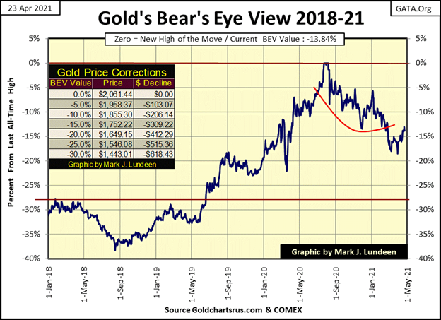
Let’s look at gold’s BEV chart below. For the past few weeks, the story for gold has been the battle of the BEV lines. A month ago, the big question was; can the bears take gold down below its BEV -20% line. No, they could not. At the end of this week this battle has shifted up by 5 BEV points to gold’s BEV -15% line.
This is the point in time when we’ll discover how hard a bottom gold made at its March 30th BEV of -18.53%, when gold slipped below $1,700 and closed at $1,679. Go back and look at all the inflation the FOMC has been “injecting” into the financial system since October 2019 (charts above). As things are now, apparently gold doesn’t like trading below $1,700. This is something I completely understand.
As markets operate, if the bears can’t get gold to close below its March 30th low of $1679 (BEV -18.53%), in due time the bulls will drive gold up to new all-time highs, which currently is a close above $2,061.44. When that happens, we should see some remarkable market action to follow in the old monetary metals (gold and silver bullion) as well as in the companies that mine them.
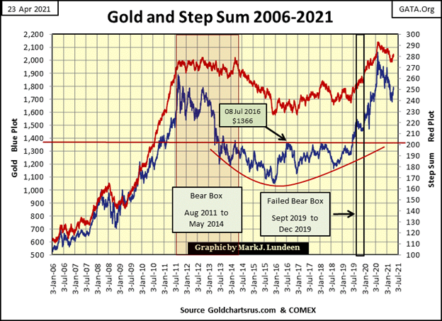
Gold and its step sum below are little changed from last week, but like last week remains bullish. We are waiting for a breakaway moment in gold; as seen below from October 2008 to August 2011.
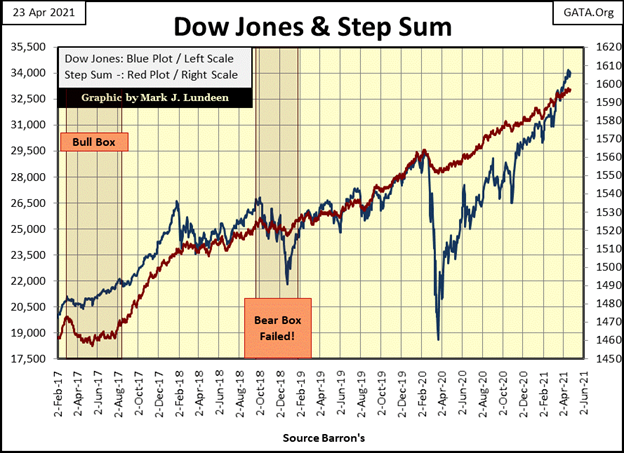
Looking at the Dow Jones’ step sum chart below, the ricochet recovery off its March 23rd 2020 bottom continues. But who fired this bullet? The Lone Ranger or one of the bad guys? In due time we’ll all find out.
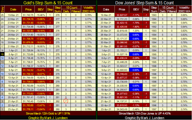
In gold’s step sum table below, gold on Wednesday, April 21st, closed with a 15 count of +7, making gold overbought. The bears took gold’s 15 count down to a +3 by Friday’s close. Apparently, gold’s break out moment hasn’t stated just yet.
When I see something valuable, I like to pass it on to my readers. Here’s a website that covers WWII in a unique manner, with episodes of twenty minutes or less containing superb production value. Indy Neidell, the host has done a outstanding job covering the big-picture history of WWII.
https://www.youtube.com/c/WorldWarTwo/videos
News, like gold is where you find it, and if you’re looking for news about the Middle East, Africa, and anywhere else that impacts Israel, Amir Tsarfati’s Middle East Updates have information not spoken of elsewhere.
As I remember, Amir is a Major in the IDF reserve, and provides information on military matters, for example in this week’s link below on the Iranian nuclear program disaster.

Amir is Jewish, and like me he’s accepted Jesus as his savior. So, most of his videos on his YouTube page are about sharing Jesus with the world. But I’m not bringing his YouTube page to my readers attention for that purpose. Its just that once a week he has an hour-long video on current events in the Middle East that is the best there is. I get blown away listening to the intimate details of the goings on in Turkey, Iran, Egypt and so many other places.
I don’t care who you are or what you believe in; if you watch Amir’s current events weekly update, you’ll be glad you did.
__
(Featured image by QuinceCreative via Pixabay)
DISCLAIMER: This article was written by a third party contributor and does not reflect the opinion of Born2Invest, its management, staff or its associates. Please review our disclaimer for more information.
This article may include forward-looking statements. These forward-looking statements generally are identified by the words “believe,” “project,” “estimate,” “become,” “plan,” “will,” and similar expressions. These forward-looking statements involve known and unknown risks as well as uncertainties, including those discussed in the following cautionary statements and elsewhere in this article and on this site. Although the Company may believe that its expectations are based on reasonable assumptions, the actual results that the Company may achieve may differ materially from any forward-looking statements, which reflect the opinions of the management of the Company only as of the date hereof. Additionally, please make sure to read these important disclosures.


Bitcoin Stalls Near $60K as Strategy Moves, ETFs Outflow, and EU MiCA Rules Take Effect
Bitcoin hovers near $60,000 with ETF outflows, while Strategy boosts reserves, sells BTC, and raises dividends to reassure investors. Ethereum...


Cannabis Dominates Global Drug Use: Trends, Risks, and Shifting Markets
Cannabis remains the world’s most widely used illicit drug, with 256 million users in 2024, surpassing all others combined. Growth...


Italy Approves First Hydrogen-Powered Train for National Rail Network
ANSFISA has approved Italy’s first hydrogen-powered train, the Alstom HMU214, for use on the Brescia–Iseo–Edolo line. Capable of 140 km/h,...


Cotton Market Weakness Persists Despite Brief Rebound
Cotton prices fell to new lows last week before a modest rebound. USDA data shows crop conditions remain worse than...


Eli Lilly Hits $1 Trillion Valuation Amid Strong Bullish Momentum
Eli Lilly stock hit a record high, surpassing $1 trillion market value after strong product demand. Shares surged over 7%,...
 |
|
 |  |
 |
|
-

 Impact Investing2 weeks ago
AI Adoption in Italian Retail Stalls Despite Strong Experimentation
-
 Cannabis17 hours ago
Cannabis Dominates Global Drug Use: Trends, Risks, and Shifting Markets
-

 Impact Investing7 days ago
EU Weighs More Free Emission Permits in ETS Review to Boost Industry Competitiveness
-

 Impact Investing2 weeks ago
SBTi Net-Zero Standard 2.0 Enhances Corporate Climate Action