Business
The Dow Jones to Gold Ratio 1885 to 2021
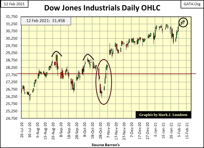
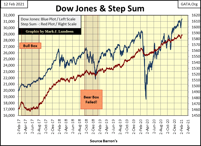
The Dow Jones is being very resilient. After the January 20th’ BEV Zero it saw five consecutive down days that only took it down by 2.84%. It then dropped to a BEV of -3.87% two days later before it recovered and began making new all-time highs this week. And so it will be until further notice by Mr Bear; you know the dreaded days-of-extreme market volatility, Dow Jones 2% days.
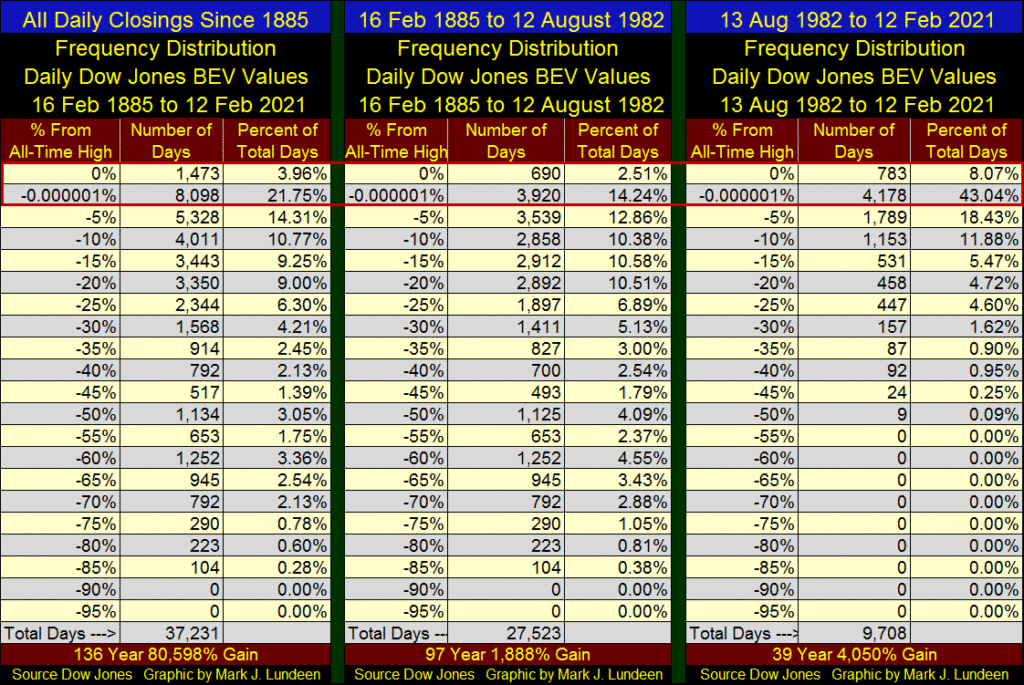
Here’s the Bear’s Eye View (BEV) of the Dow Jones going back to 1885. What’s the Bear’s Eye View? It’s how Mr Bear has looked at the Dow Jones since 1885, with every new all-time high registering as a 0.00% (or Bev Zero in BEV Lingo), and every daily close not a new all-time high registering as a percentage decline from its previous BEV Zero.
To Mr Bear, that’s all any new all-time high is worth – a big fat zero. All he cares about is how large of a percentage claw back he can take from the bulls, and that is exactly what is displayed in the Dow Jones BEV chart below; new all-time highs and percentage claw backs from them since 1885. In effect, the BEV compresses market data within a range of 100% points:
∙ 0.0% = new all-time highs
∙ -100% = total wipeout in valuation
The table below lists the specifics:
∙ Feb 1885 to Feb 2021 (every daily close for the Dow Jones since 1885)
∙ Feb 1885 to Aug 1982 (daily closes before current bull market began)
∙ Aug 1982 to Feb 2021(daily closes during our current bull market.)
I’ve placed a red box around the 0.0% and -0.000001% rows, as these rows list the daily new all-time highs (0%) and the days the Dow Jones closed in scoring position (<5% from a new all-time high). This information provides a gauge with which to measure the effects of “monetary policy” on market valuations for the past decades.
The table on the far left samples every daily closing since 1885. In the past 136 years the Dow Jones closed at a new all-time high, or within 5% of one for 25.71% of all daily closings. That’s bullish, but for the first 97 of those years (middle table), the Dow Jones closed at or within 5% of a new all-time high for only 16.75% of the daily closings in the sample. Examining the far right table below (1982 to 2021), the Dow Jones closed at a new all-time high, or within 5% of one in 51.11% of its daily closings in the past 39 years.
Looking at this data, reasonable people wonder why the past 39 years has seen so many BEV Zeros and daily closes in scoring position. It’s as Andrew Bary informed Barron’s readers in October 2007; the Federal Reserve is on the bulls’ side.
“One reason that monster declines are less likely now is that investors recognized something that they didn’t in 1987: The Federal Reserve is on their side.”
– Andrew Bary, Barron’s 15 October 2007 issue
In the chart below I placed a red line at the BEV -40% level, as since 1885 after Mr Bear has clawed back about 40% of the bull’s gains, the stock market is close to a bear market bottom and it’s time for the bulls to start looking for bargains. The sole exception to this 40% market decline rule-of-thumb was the Great Depression’s catastrophic 89% market collapse (Sept 1929- July 1932).
For the 136 years since Charles Dow first published a fourteen-stock average of 39.07 on February 16th 1885, his now thirty stock Average is now approaching 32,000 in February 2021. No doubt there has been tremendous economic growth as the Dow Jones’ valuation increased by a factor of 819, but a dollar in 2021 purchases far less than it did in 1885.
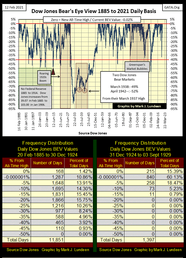
I placed two additional frequency tables below the above BEV chart to compare market performance of the Dow Jones before and after December 1924. Before December 1924 “liquidity” flowing from the Federal Reserve did not flow into the stock market. After December 1924, until the Roaring 1920s Bull Market topped on September 3rd 1929, monetary inflation did flow into Wall Street.
In the last five years of the 1920s (right table) the Dow Jones daily closed at a new all-time high, or within 5% of one for 75% of its daily closings – wow! This is why the 1920s roared, and when this market bubble deflated in the 1930s why everything became so depressing. So, if the past 39 years the Dow Jones has closed at a new all-time high or within 5% of one for 51% of its daily closings, how does today’s stock-market bubble compare with that of the 1920s’ Dow Jones?
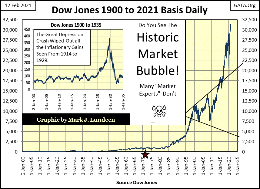
For those who like seeing the Dow Jones plotted in dollars, here it is going back to January 1900. Look at Roaring 1920s market bubble in the insert. This was a financial bubble that inflated the stock market for five years and devastated the economy for the entire decade of the 1930s.
Compare the last half of the 1920s to the current bubble that actually began in August 1971 when the US Treasury reneged on the Bretton Woods $35 gold peg (Red Star). This is actually a frightening chart.
But the stock market isn’t crashing just yet, or will anytime soon if the FOMC continues managing the markets as they have. Looking at the Dow Jones below in daily bars, it’s behaving as a bull market should; rising on low volatility the Dow Jones made three new all-time highs, and no bear tracks to be seen on Wall Street this week.
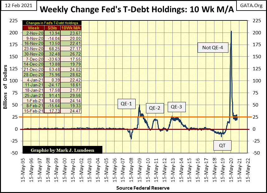
There may be no problems seen on Wall Street this week, but problems are coming because the gains seen above are only from monetary inflation flowing into the financial markets, as seen below. After last year’s Not-QE#4’s “liquidity” spike, the 10Wk M/A has settled in at around $25 billion being injected into the financial system weekly, making QE#4 our new normal.
If there is anything to be taken away from studying the chart below, it’s how damaging the 2002-07 Sub-Prime Mortgage Fiasco was to the global financial system. That was over a decade ago, yet the world hasn’t recovered from it.
What should have happened in 2009 was allow the system to purge itself of asset overvaluations and insolvent financial institutions go bankrupt exactly as happened in the 1930s. Instead the “policy makers” chose to reflate the financial markets with their QEs to infinity seen below.
That may be so; but until Mr. Bear returns to claw back all we see above, the stock market’s major indexes are doing spectacular.
Here’s my Major Market BEV Table, and last week the stock market saw a lot of bullish action, everywhere but with the XAU’s gold and silver miners. Last summer the NASDAQ Banking and NYSE Financial indexes were below the XAU; now in February they’re approaching new all-time highs .
The NASDAQ Bank index hasn’t seen a new BEV Zero since June 2018, and the NYSE Financial index not since July 2007. The XAU’s last BEV Zero was in April 2011.
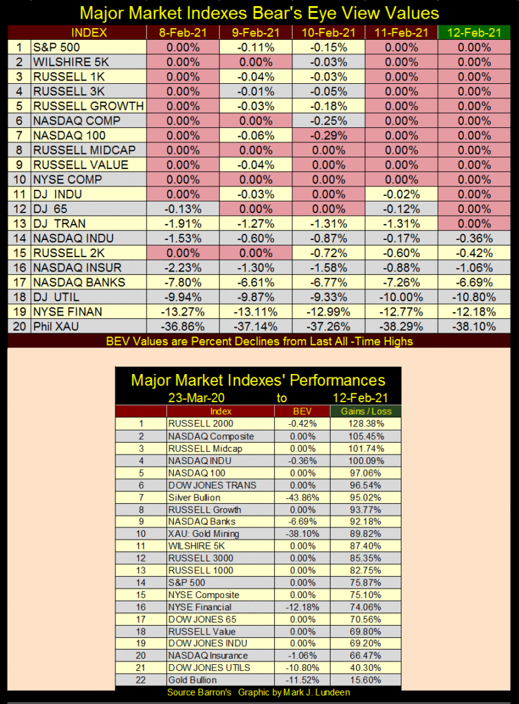
Looking at the NASDAQ Banks (#9) and XAU (#10) in the table above, they’ve both advanced by over 90% since their last March 23rd bottoms. However, the XAU remains almost 40% below its last all-time high of April 2011, while the NASDAQ Banking index is only 6.69% from its last all-time high of June 2018.
What should we make of this? This is an expensive market that has all the makings of a major market top, except for the XAU’s precious metal miners and gold and silver bullion.
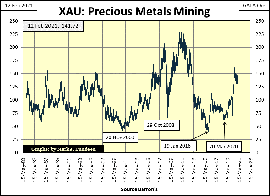
Precious metal assets haven’t done much for a very long time. At the close of this week the XAU is only $35 above where it first traded in December 1983.
Silver with its BEV of -43.8% is still 43.8% below its last all-time highs of January 1980. Note: Silver’s BEV value is read on left axis, dollar value on right axis. Silver’s all-time high of $48.70 seen in January 1980 still stands after four decades.
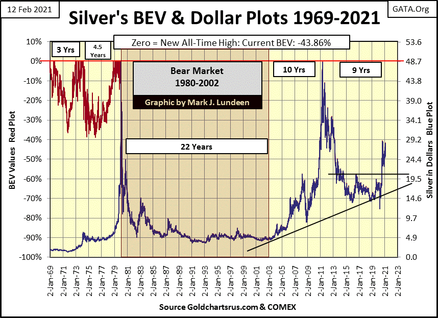
When silver last closed at an all-time high on 17 January 1980 ($48.70), the Dow Jones closed at 863.57, and the Dow Jones to Gold Ratio was almost 1.00 (next chart).
In February 2021, precious metal assets remain undervalued and primed to take off when the financial markets once again get mauled by Mr Bear sometime in the unknown future.
Here is a chart I haven’t posted in a few years; the Dow Jones to Gold Ratio, the Dow Jones priced in ounces of gold from 1885 to today’s close. It’s important to know that for most of the time this chart covers the price of gold was fixed by law because gold was money;
∙ $20.67 / 1oz: 1885 to 1934
∙ $35.00 / 1oz: 1934 to 1971
This means from 1885 to 1971 in the chart below, we are seeing dollars of credit flowing into, and then out of the Dow Jones, but not gold as the price of gold was fixed and didn’t change. It’s more complicated than that, but at a very basic level this is what we are seeing below until gold was demonetized in 1971.
After 1971, all dollars became instruments-of-credit as the FOMC monetizes debt to create dollars, and both gold and the stock market’s valuation depended on how successful they were in attracting the FOMC’s units-of-credit. That changed how this chart worked.
Note how this plot captures the Dow Jones’ market tops for September 1929, and January 1966 as well as the Dow Jones bear markets for July 1932 and the early 1980s. The plot also catches the Dot.Com Market top but was a half year early.
Since 1999 this plot is no longer useful in tracking bull markets for the Dow Jones as gold began its own bull market as it too began attracting dollars-of-credit to its valuation. By August 2011, the price of the Dow Jones in terms of gold declined down to about five ounces of gold, down from forty-five ounces just a decade earlier. In other words, gold’s appreciation from 1999 to 2011 was greater than the Dow Jones’.
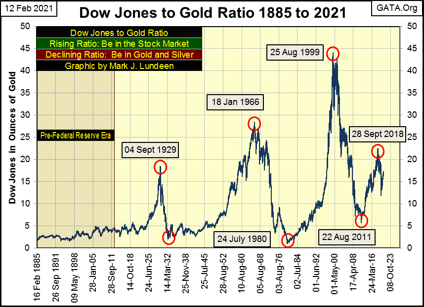
Since August 2011 the plot indicates the flow-of-dollars favored the Dow Jones until September 2018, when once again the price of gold began inflating faster than the Dow Jones, until August of last year when the Dow Jones cost about thirteen ounces of gold.
At week’s close the Dow Jones cost 17.25 ounces of gold, which begs the question is the Dow Jones (my proxy for the financial markets) going to become more or less expensive in terms of gold? If you’re a bull on the stock market you’ll want the Dow Jones’ price in terms of gold to increase. Bulls in the precious metals will want the Dow Jones’ price in terms of gold to decrease, hopefully to something below one ounce of gold for the Dow Jones. For example; if we take the Dow Jones at this week’s close of 31,458, a Dow Jones to Gold Ratio of 1.0 would fix the price of gold at $31,458, a gold price equal to the Dow Jones.
Is that going to happen? With the FOMC flooding the global markets with dollars via their “policy” of QE-to-infinity, the price of gold will one day increase to levels few “market experts” today could believe. But what the price of the Dow Jones will be when the price of gold does rise above a daily closing price for the Dow Jones only God knows. Before Mr Bear is finished with Wall Street and the FOMC, I expect we’ll see the Dow Jones valued in terms of fractions of an ounce of gold.
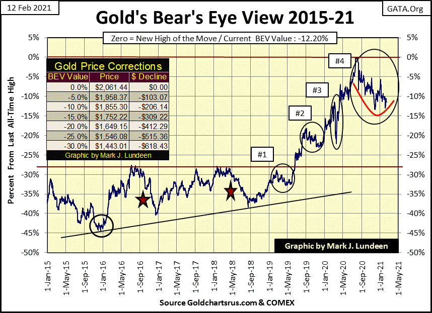
Last week we were wondering whether or not gold’s BEV -13.44% ($1784) from last November would hold. Since then we’ve learned that it has held for yet another week. This correction is getting old, meaning the bears are either going to force gold down below its current low for the correction (BEV -13.44%), or the bulls are going to come in and take the price of gold up to a new all-time high.
Key levels to watch for in gold’s BEV chart below are its BEV -5% ($1958) and -15% ($1752) lines. Being a bull, I doubt the bears have it in them to drive the price of gold down below $1752, and should gold close above $1958, it should see a new BEV Zero in the chart below fairly quickly.
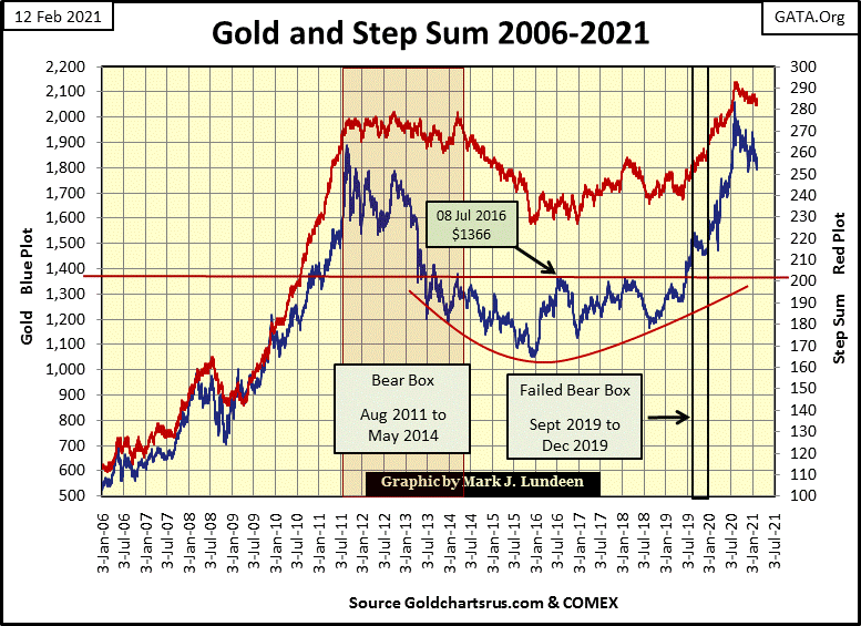
Nothing new to say about gold and its step sum chart below, but this chart remains positive. Once gold (blue plot) terminates this correction (2011 to 2021?) by taking out $2100, it should advance as it did from 2006 to 2011 below by a factor of 4 (or more), taking gold up over $8000 in the next couple of years and possibly better.
The Dow Jones in its step sum chart below remains positive. However, having advanced 69% since its lows of last March, making fourteen new all-time highs in the process, the market really is due for a correction. Is the market going to correct? It will in the market’s good time, as it is the stock market is headed higher.
Since January 8th gold has seen lots of down days, but as its 15 count closed the week at a -3 it’s not oversold. I’m impressed how after all those down days, gold in the past twenty-five trading sessions lost only 1.21%. Are we close to the termination of this correction that began last August? I’m thinking it.
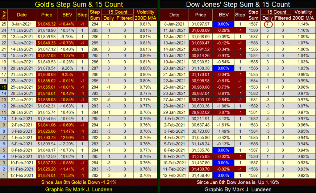
The Dow Jones is being very resilient. After the January 20th’ BEV Zero it saw five consecutive down days that only took it down by 2.84%. It then dropped to a BEV of -3.87% two days later before it recovered and began making new all-time highs this week. And so it will be until further notice by Mr Bear; you know the dreaded days-of-extreme market volatility, Dow Jones 2% days.
A very popular theme I hear is the 21st Century is going to be China’s. That may be, but it’s going to take more than American academia and the mainstream media’s cheerleading the Chinese Communist Party to make that happen.

The first problem China has is its leaders are a bunch of communists, and that isn’t a joke. The history of the 20th Century is full of examples where national leadership taking its cues from Marxist Leninist thought, or in China’s example Maoist thought, and economically and militarily things frequently came up short.
That isn’t saying the Communists didn’t have their successes. By the 1970s over 50% of the map of the world was controlled by Marxist Leninists. However, by the turn of the century all that changed as communism was largely rejected, unless one went to an American college or university, where sadly Marxists still dominate these formerly great institutions of learning.
If China’s economy and military has advanced greatly since the Death of Mao, it’s only because of an American “policy” to export technology and manufacturing to China for its slave-labor wages.
But even with this vast transport of technology to the CCP, still there is something missing in the Chinese system.
Here’s a video from China Uncensored on how China’s construction doesn’t hold up. China’s housing stock and civil engineering infrastructure is a mess! Geeze Louise, China’s Three Gorges Damn is failing. When that thing falls down it will wipe out China’s industrial core and flush it into the South China Sea along with millions of Chinese citizens.

Militarily, China’s geography doesn’t support the CCP’s dreams of global domination. They’ve enraged their neighbors in the South China Sea with their “nine dashed line” and now all China’s maritime commerce must now pass by nations who are hostile to them.

The CCP has also picked a fight with India, as seen in the video below.

India’s position between the Persian Gulf and the Straits of Malacca facilitates the Indian navy’s ability to blockade tankers from delivering petroleum to China. And while China’s naval response to such a move by India is questionable, such a blockade would make the CCP’s invasion of Taiwan impossible
__
(Featured image by Markus Spiske via Unsplash)
DISCLAIMER: This article was written by a third party contributor and does not reflect the opinion of Born2Invest, its management, staff or its associates. Please review our disclaimer for more information.
This article may include forward-looking statements. These forward-looking statements generally are identified by the words “believe,” “project,” “estimate,” “become,” “plan,” “will,” and similar expressions. These forward-looking statements involve known and unknown risks as well as uncertainties, including those discussed in the following cautionary statements and elsewhere in this article and on this site. Although the Company may believe that its expectations are based on reasonable assumptions, the actual results that the Company may achieve may differ materially from any forward-looking statements, which reflect the opinions of the management of the Company only as of the date hereof. Additionally, please make sure to read these important disclosures.


Bitcoin Stalls Near $60K as Strategy Moves, ETFs Outflow, and EU MiCA Rules Take Effect
Bitcoin hovers near $60,000 with ETF outflows, while Strategy boosts reserves, sells BTC, and raises dividends to reassure investors. Ethereum...


Cannabis Dominates Global Drug Use: Trends, Risks, and Shifting Markets
Cannabis remains the world’s most widely used illicit drug, with 256 million users in 2024, surpassing all others combined. Growth...


Italy Approves First Hydrogen-Powered Train for National Rail Network
ANSFISA has approved Italy’s first hydrogen-powered train, the Alstom HMU214, for use on the Brescia–Iseo–Edolo line. Capable of 140 km/h,...


Cotton Market Weakness Persists Despite Brief Rebound
Cotton prices fell to new lows last week before a modest rebound. USDA data shows crop conditions remain worse than...


Eli Lilly Hits $1 Trillion Valuation Amid Strong Bullish Momentum
Eli Lilly stock hit a record high, surpassing $1 trillion market value after strong product demand. Shares surged over 7%,...
 |
|
 |  |
 |
|
-
 Impact Investing2 weeks ago
AI Adoption in Italian Retail Stalls Despite Strong Experimentation
-
 Cannabis18 hours ago
Cannabis Dominates Global Drug Use: Trends, Risks, and Shifting Markets
-

 Impact Investing7 days ago
EU Weighs More Free Emission Permits in ETS Review to Boost Industry Competitiveness
-

 Impact Investing2 weeks ago
SBTi Net-Zero Standard 2.0 Enhances Corporate Climate Action