Featured
Global markets could be entering a new bullish season
Are we in a bear market? Or is the bear over with the December low and we are entering a new bull market?

Seasonals are supposed to be strong in favor of stocks from November to April. So far everything is according to the script as markets have rallied since the December low. January was an up month and according to the January barometer, 2019 should be a good year. Some indicators such as the advance-decline line do suggest that this market has more room to run even as we may have hit a temporary top. But the background reasons that sparked the October/December sell-off have not gone away. Bear markets are twists and turns and blind alleys.
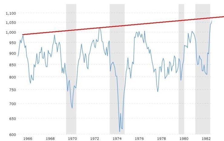
Take the 1966-1982 bear market. During that period there were several pullbacks followed by equally strong rallies. Sometimes the market even made small new highs. But the reality was it was actually a very powerful bear market as inflation eroded any and all gains. In all the collapse between 1966 and the final low in 1982 was almost as devastating as the 1929-1942 bear market. We take a look at the markets from 1929 and our conclusion remains the same. The high in September/October 2018 may be a top for years to come. We also take a closer look at the 1966-1982 bear and how devastating it was on an inflation-adjusted basis.
The good news is both the Great Depression bear and the 1966-1982 bear was a great period to be in commodities. Signs continue to suggest that we still in the very early stages of a potential multi bull in commodities.
Our recession watch spread didn’t budge this past week so in the U.S. at least there is little sign of a recession, unlike the Eurozone and Japan. China is also slowing and what happens overseas eventually comes here as well. But junk bonds made new highs and that to us is a sign of complacency in the market.
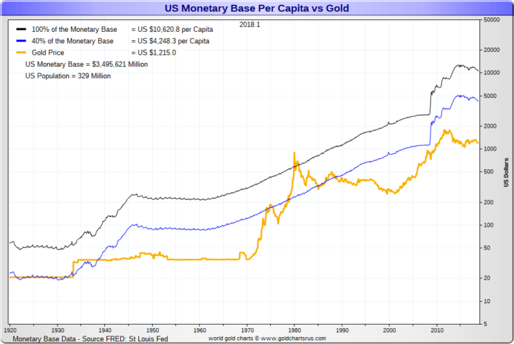
Gold was off mildly this past week and oil took a breather because of a slowing Eurozone and elsewhere. Our chart of the week looks at how the U.S. could dig itself out of the massive debt problem. It would require a revaluation upwards for gold. Radical? Hardly they did once before in 1934 to help dig us out of the Great Depression.
Season to be bullish?
So far, so good. ‘Tis the season to be bullish. Okay, February tends to be the weak month in the “best six months.” The S&P 500 is up almost 9% so far in 2019. That’s still below the 2,800-breakout level we have noted if we are to make an attempt at new all-time highs, but we are inching closer. Given current levels, this would be an ideal time for a pullback. Pullbacks tell us a lot about the nature of the current rise and whether we could have more upside.
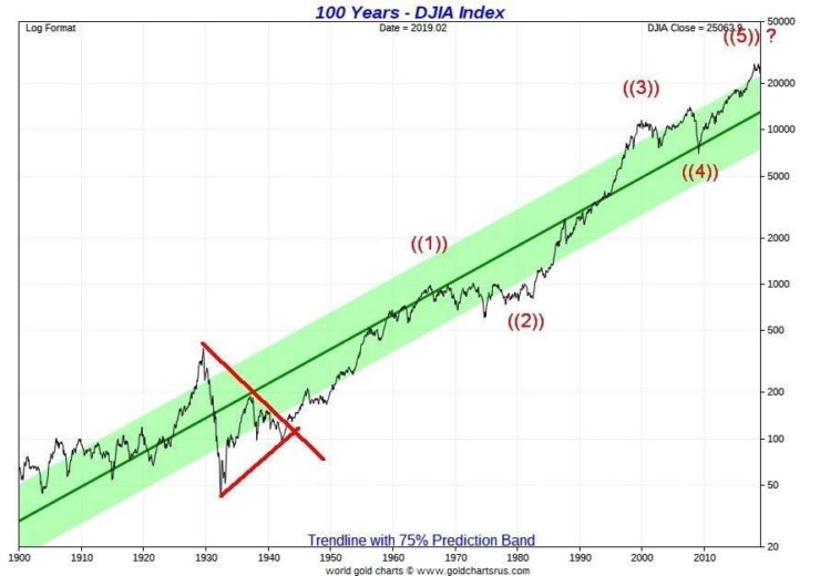
We continue to see a number of bullish reports concerning the market and that the drop from October to December 2018 was merely another correction. That harkened us back to the report we read that the Dow Jones Industrials (DJI) could soar to 30,000 or higher. That is only about 20% away from current levels. However, we have outlined how we believe that we have completed five intermediate waves up from the February 2016 low. We have also completed five primary waves up from the key 1982 low, and we have completed five cycle waves up from either the 1942-low or the 1949-low, depending on where one starts.
Two charts below show the five (Elliott) waves up. The first shows the DJI from 1900 to present, although our focus is on the 1932/1942 stock market bottom. Wave 1 up topped in 1966, wave 2 was the 16-year correction from 1966 to 1982 that bottomed nominally in 1974, wave 3 took us to the top in 2000, wave 4 was the high-tech/dot.com crash of 2000–2002 followed by the financial crisis of 2007–2009 that bottomed in March 2009, and wave 5 was the long rally that appears to have made its final top in September/October 2018.
The argument: is this the final top or is there more upside to come? How will we know the top is in? The top is confirmed in when we break the prior year’s low, the low that was seen in December 2018.
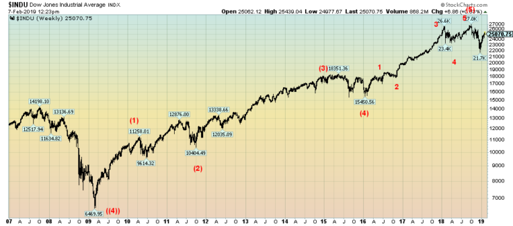
The second chart shows the five (Elliott) waves up from the March 2009 low. Wave 1 topped in 2010 before the 2011 EU/Greek debt crisis. The crisis formed wave 2. Wave 3 took us to a top in 2015 while wave 4 signaled the end of QE. Wave four bottomed in February 2016. Wave 5 was the one that took us to the final top in September/October 2018. It too subdivided into five waves with wave 1 topping before the Brexit vote in June 2016. Wave 2 bottomed with the election in November 2016.
What followed was the long wave 3, spurred on by tax cuts, stock buybacks, ultra-low interest rates, and a sea of debt. Wave 4 was the first shot of the emerging trade wars while wave 5 was the narrowly based run to the final top on the backs of the FAANGs. The October/December decline is, we believe, the first shot in an emerging bear market that most likely has few years to run.
©David Chapman
Bear markets don’t happen all in one fell swoop as we probably saw 1929–1932. They twist and turn with ups and downs and blind alleys. Following that first drop, we are probably now embarking on the complacency stage where the belief is that the problems will sort themselves out and we’ll return to the bull market of 2016–2018. This is quite typical. There is no denying that at this stage we could once again see new highs, although we’d be surprised to see 30,000 DJI. However, one should never say never.
With the eurozone appearing to be headed for recession, China slowing, Japan appears to be moving into recession, trade wars, geopolitical concerns, political concerns in the U.S., negative impact from global warming and a world awash in a mountain of debt, the odds of a return to the heady days of 2016–2018 are slim. This is what happens at the end of a cycle.
The question is, how long and how deep will the coming bear go and what shape will it take? Since we are at the end of a possible long cycle from 1942–2018, odds favor that the coming bear will be lengthy and deep. But it won’t occur in all markets. Previously, we showed that the conditions favor gold and commodities much like what was seen during the Great Depression and the long inflation/recession period of the 1970s.
©David Chapman
The Great Depression and subsequent war bear market of 1929–1942 (some say it didn’t end until 1949) was an exceptionally deep one as stocks fell 89% from 1929–1932. The market didn’t regain its 1929 high until 1954, a period of 25 years. On an inflation-adjusted basis, it took until 1959 to regain the 1929 high, a period of 30 years. The market then topped out again, a mere seven years later.
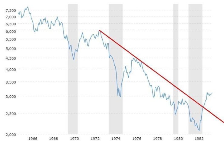
On the surface, the long inflationary and recessionary bear of 1966-1982 did not, nominally at least, appear to be as bad as the Great Depression. But when one adjusts it for inflation it was equally devastating. On an inflation-adjusted basis, the market fell 73% from the top in 1966 to the final bottom in August 1982. Nominally it took the market until 1983 to regain fully above the series of highs made between 1966 and 1976.
However, on an inflation-adjusted basis, it took the market until 1995 to recover the 1966 high, a period of 29 years. That was virtually the same as the recovery period for the Great Depression bear. What is different this time is the market has been in an upswing for 24 years once the inflationary high was taken out. And that includes the bear markets of 2000-2002 and 2007-2009.
The bear market of 2000–2009 saw the DJI fall roughly 55%. The market recovered its nominal high that was made in 2007 by 2013 and on an inflation-adjusted basis, the 2000 high was recovered as well by 2013. In many respects the 2000–2009 bear was not on the same scale as the previous two collapses. The bear was aborted with record low-interest rates and massive amounts of liquidity injections through quantitative easing (QE). Given that the monetary authorities have limited ability to once again lower interest rates and inject massive amounts of QE, the next bear could be more devastating.
The 1966–1982 bear market is interesting because of its series of bear and bull markets. In all, there were seven bears ranging from 16.4% to 45.1% and there were six bulls ranging from 22.3% to 75.7%. Each bull move was hailed as the start of the next bull market. But when one looks at the 1966–1982 bear, on an inflation-adjusted basis there were four bears ranging from 23.4% to 49.4% and only three bulls ranging from 17.5% to 50.5%. Quite a difference.
Bear Market 1966–1982 Nominal
©David Chapman
We are showing the 1966–1982 bear market on both a nominal and inflation-adjusted basis. Quite the difference. Our table below examines the multitude of bear and bull markets that occurred during that period. It is a picture of how a longer bear market can play itself out. It is not necessarily one that just goes into complete collapse as happened in 1929–1932. The model could be closer to what we may experience in the upcoming bear rather than a collapse.
Something for us to at least ponder as a mini-bull is underway with many calling it the end of the bear. We are, after all, in the seasonal bullish period. And the feeling is that nothing can stop this bull.
1966–1982 Bear Market

©David Chapman
1966-1982 Bear Market Inflation Adjusted
©David Chapman
Markets and trends
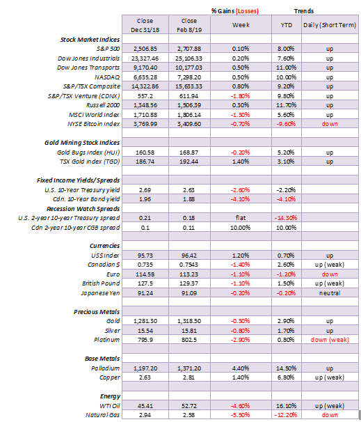
*New highs/lows refer to new 52-week highs/lows. ©David Chapman
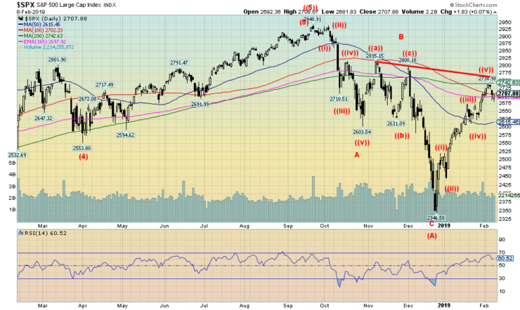
©David Chapman
U.S. stock markets eked out a small gain this past week. The S&P 500 was up only 0.05% while the Dow Jones Industrials (DJI) gained less than 0.2%. The Dow Jones Transportations (DJT) was up 0.5% while the NASDAQ was up about 0.5%. All remain up on the year led by the DJT, up almost 11%. The S&P 500 is up roughly 8%. The Russell 2000 (small cap) gained a small 0.3%. Elsewhere, the results were not nearly as good. The eurozone is slowing and, as a result, the Paris CAC 40 fell 1.2% while the German DAX was off 2.5%. The Brexit-beleaguered FTSE 100 was actually up almost 0.8%.
In Asia, the Tokyo Nikkei Dow fell 2.2% as Japan slides into recession while China was holidaying for Chinese New Year and, as a result, the market was closed all week. Here in Canada, the TSX Composite gained 0.8% but the TSX Venture Exchange (CDNX) faltered, losing 1.8%. Still, the CDNX is up 9.8% in 2019 while the TSX has gained 9.2%.
The markets may be running into a zone of resistance. With the eurozone threatening to fall into recession, China trade talks faltering, and the threat of another shutdown looming, it shouldn’t be a surprise that the markets might falter here. U.S. corporate earnings are also faltering. Interesting as the S&P 500 ran into the 200-day MA this past week. While the markets bounced back on Friday, it would not surprise us if the S&P 500 fell to test the 50-day MA down at 2,615.
We could argue here that the S&P 500 might actually form a head and shoulders bottom pattern. The potential left shoulder low is seen at 2,603, so as long as the S&P 500 stays above 2,600 on any pullback, a head and shoulders bottom pattern could happen. That would get the bulls excited. A firm break of 2,600, on the other hand, could set up the market for further declines. The S&P 500 may have made five waves from the December low. Seems impulsive, but…if the head and shoulders pattern does develop, then the S&P 500 would have potential to rise to around 3,200 and new all-time highs. The breakout would come around 2,775 with confirmation above 2,825.
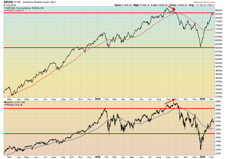
©David Chapman
Is the advance-decline line signaling potentially higher prices ahead? The advance-decline has been quite strong out of the December lows, outpacing the S&P 500. Note the small divergence at the top in September/October when the advance-decline line made a lower top even as the S&P 500 made a higher high. This divergence appears to be the opposite so it could be signaling new highs ahead. As we noted, the market seems poised to correct back here, but how deep it goes will go a long way in determining what the next move might be.
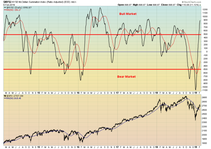
©David Chapman
The McClellan Summation Index ratio adjusted has soared into bull market territory. It might be a bit overbought up here so it is another sign that the market could be poised for a pullback. We have also noted the put/call ratio that favors the bulls over the bears. That is also a sign that the market could be poised for a pullback here. But, as we have emphasized, it depends on the nature and the depth of the pullback. A break under 2,600 for the S&P 500 would be negative.
©David Chapman
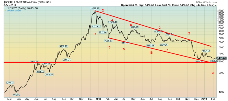
Cryptos as Bre-X. The shocking story of Quadriga, one of Canada’s biggest cryptocurrency exchanges broke this week, leaving investors with a potential hole of upwards of $250 million in their pocket. The cover story in Saturday’s Globe and Mail, ROB said it all— “Crypto chaos.”
We have often noted how the crypto market was unregulated and how regulation was coming. Obviously, not fast enough for those who placed their orders and held their cryptos with Quadriga. And, like Bre-X, there are questions as to the mysterious death of Gerald Cotton, even to the extent of questioning whether he has actually died.
Nonetheless, this is probably another nail in the coffin for the industry. We are surprised that Bitcoin fell only 0.7% this week. It should have been more. Who can trust this stuff any more? The cryptocurrency market still has a market cap of $122 billion, of which Bitcoin remains almost 53% of the market. There are still 2,062 different cryptos listed at Coin Market Cap.
This begs the question—why? Money is apparently coming out of cryptos and going into gold. Makes sense. If you are going to speculate on price, you might as well purchase something real, not virtual. Nevertheless, we see Bitcoin in a long-term decline that could easily take it back to $1,000 or lower. $3,000 remains key support, but below there we are probably headed for $2,000.
©David Chapman
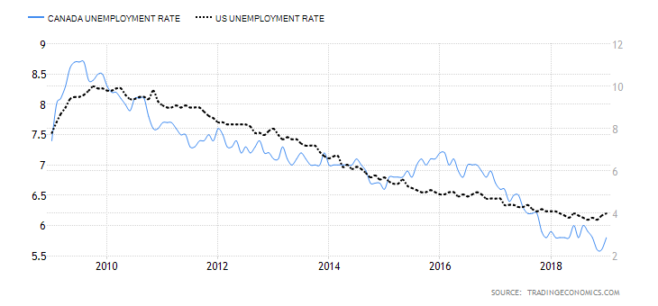
Canada added 66,800 jobs in January, much higher than the expected 8,000. December’s job gains were reduced to a loss of 1,300 on revisions. Of the jobs, 36,000 were part-time and 30,800 were full-time. The job gains were all in service industries as goods-producing industries saw losses. The unemployment rate rose to 5.8%, but that was largely because more people were looking, as the labor force participation rate rose to 65.6% vs. 65.4% in December. Okay, the chart looks a little weird. We compared the U.S. unemployment rate with Canada’s. The Canadian unemployment rate should be higher at 5.8% vs. the U.S. at 4%. But then Canada’s rate is reflected on the left axis while the U.S.’s is reflected on the right axis. The result? It gives us an unbalanced look. The U.S. unemployment rate is lower because their labor force participation rate is 63.2% vs. 65.6% in Canada. If the U.S.’s rate was at Canada’s level, their unemployment rate would be much higher, adding over six million to the unemployment rolls and putting the unemployment rate over 7%.
©David Chapman
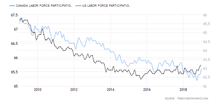
Here is the chart comparison between the labor force participation rate in the U.S. vs. Canada. Canada’s rate is on the left axis and the U.S.’s is on the right axis. So as with the unemployment rate above it looks out of balance. Canada’s labor force participation rate was 65.6% in January vs. the U.S.’s 63.2%.
©David Chapman
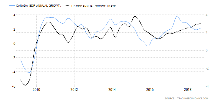
Canada’s GDP annual growth rate was 2.1% in Q3. In the U.S. it was 3%. But Canada’s growth rate has been sliding while the U.S.’s has been rising. Canada reported negative growth in November although it bounced back in December. This chart does not reflect Q4. Again, Canada’s rate is the left axis and the U.S.’s is the right axis; hence, the difference in the chart.
©David Chapman
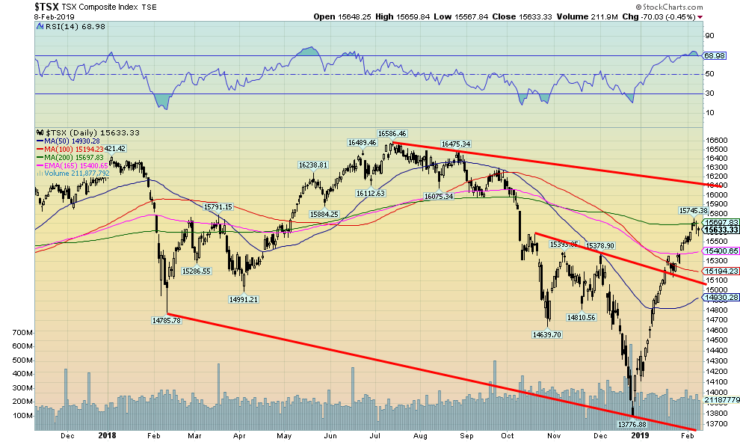
Like its U.S. counterparts, the TSX Composite is testing the 200-day MA. And, like its U.S. counterparts, the TSX appears poised for a pullback. If the chart is correct, the TSX should test that breakout line currently near 15,000. A breakdown under 14,500 would be negative and a test of the lows would be underway. We like golds, materials, and utilities on pullbacks. Note the RSI soared over 70 recently as well, another sign that the market was getting a little frothy. Major resistance is seen up to 16,100, but above that level new highs are possible.
©David Chapman
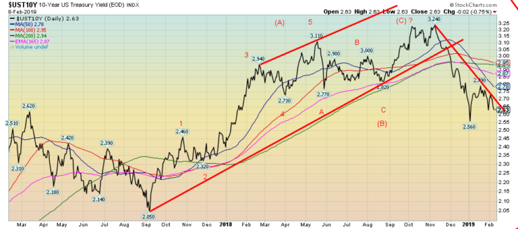
The 10-year U.S. Treasury note fell to 2.63% this past week, down from 2.70% the previous week. Slowing economies in the eurozone, the disaster of the Brexit negotiations, the potential for another shutdown looming this coming week, plus the potential for trade talks to flounder all conspired to move rates lower this past week. The recent low was seen in January at 2.54%. A break under that level could see the 10-year fall to 2.25%-2.30%. Only a move back above 2.95% would suggest that the bond rally is over and higher yields lie ahead. It has also helped that the Fed has softened its stance to “patience” with regard to further rate hikes. There is also little sign that inflation is picking up. Further signs of weakening overseas, particularly in the U.K. with Brexit floundering, could have a considerable negative impact not only in the U.K. but also in the eurozone. Australia has also lowered its growth estimates and Canada is showing similar signs of slowing. All of this is positive for bonds, particularly U.S. Treasuries.
Recession watch spread
©David Chapman
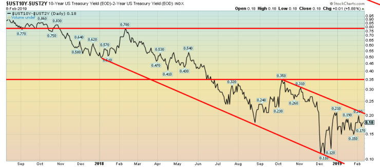
There was no change in our recession watch 2-year—10-year U.S. Treasury spread this past week. It is still at 18 bp, a long way still in many respects from going negative. But, as we have seen in the past, it can move lower quickly. And right now, the pattern on it appears to be a just another potential small top pattern that could see the spread fall to 5 bp once it breaks under 15 bp. Resistance is seen up to 20 bp.
©David Chapman
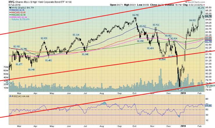
Seeing the iShares Boxx $High Yield Corporate Bond ETF (HYG) make new highs made our eyes pop. After all, this is an index of junk bonds. Last week we noted that the spread between junk bonds and U.S. Treasuries had fallen back again after rising to over 5%. This told us that risk was on but we didn’t expect the HYG to be making new highs. The SPDR Barclays High Yield Bond ETF (JNK) also made new highs, so this level of risk-on is surprising. It may imply that the stock market indices are also going to be making new highs.
On the other hand, both HYG and JNK quickly became overbought so a pull-back is expected here. We note volume was not exactly robust so it may just be a bear market rally that took us to new highs. We have seen that in the past. Nevertheless, a pullback appears to be in the works here, so we will see the nature of that pullback which might offer clues as to whether another assault on new highs could be made.
©David Chapman
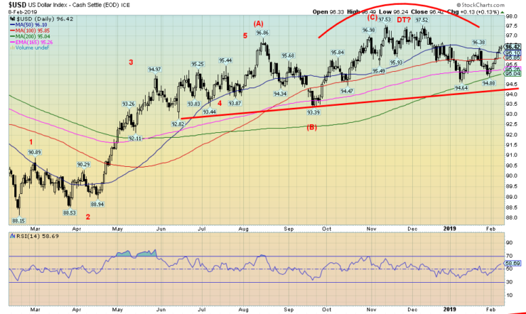
The US$ Index moved higher this past week, gaining 1.2%. With the US$ Index higher, other currencies fell. The euro lost 1.1%, the Brexit-beleaguered pound sterling fell 1.1% while the Japanese yen was off 0.2%. The Cdn$ was hit, losing 1.4%. The US$ Index has poked a little higher, largely due to economic weakness being seen in the eurozone, Japan, and China.
A stronger US$ would negatively impact U.S. corporate earnings abroad as, once they converted, they would receive fewer US$. It is possible that the US$ Index is forming a head and shoulders top here. Key is that we stay below the left shoulder high of 96.86. Usually breaking the left shoulder high begins to negate the potential head and shoulders pattern. 94 remains our breakdown point, although if a head and shoulders pattern prevails, the breakdown zone could come at 95 and the downside projection would become 90.85.
©David Chapman
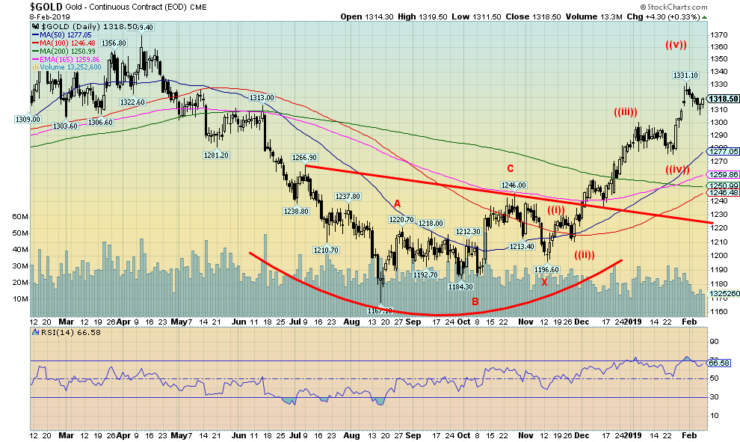
Gold suffered a pullback this past week, losing about 0.3%. Gold remains up 2.9% on the year. Gold bounced back on Friday following a short sell-off, after hitting a high of $1,331. A stronger US$ Index did not help gold this past week. But continued signs of a slowing economy in the eurozone, China, and Japan and slowing earnings in the U.S. encouraged gold to buck the stronger US dollar. Gold remains in a solid uptrend. The pullback appears normal. We are into a potential wide-ranging resistance zone from roughly $1,320 all the way up to $1,370. Our initial thoughts following the $1,167 low seen in August 2018 were that gold would, initially at least, rise into the $1,320/$1,350 zone before a pullback takes place. We are in a period of strong seasonals, but the upcoming PDAC (Prospectors & Developers Association of Canada) convention from March 3–6 often signals a top for gold (and, by extension, silver and the gold stocks).
So, we believe we could be poised for one more up move here before a steeper pullback sets in. Once that pullback is over, we believe gold will eventually assault the major $1,370/$1,375 resistance zone and move to over $1,400. Then a much strong up move would be underway. We are confirmed that the low in August 2018 was most likely the 31.33-month cycle low for gold. That means the next one is not due until at least February 2021 +/- 3 months. Upside targets on this phase could be up to $1,500 with outside shots at up to $1,725. The much longer 7.83-year and 23.5-year cycle lows are not due until 2023–2024. That implies to us that it would also coincide with the next 31.33-month cycle low. Gold currently would have a setback if we fell under $1,300 before support comes in around $1,280. A break below $1,260 would be negative.
©David Chapman
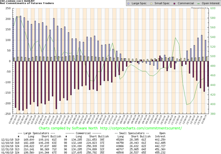
At long last: the COT reports. Finally, the CFTC is back at work after the shutdown. They are now up to date. It was no surprise to discover that the commercial COT has fallen since we left off. No surprise because, normally, as gold rises the commercial COT falls. This past week the commercial COT came in at 35% which was actually up from 32% the previous week. Long open interest rose by roughly 7,000 contracts while short open interest fell roughly 16,000 contracts. We have not as yet fallen to levels that would suggest to us that the market may have topped. So, there is definitely room for gold to rise more here despite the falling commercial COT. No surprise either—as the market rises, the large speculators increase their positions. The large speculators COT is up to 67%, but it is down from 71% the previous week. 80% is often considered a potential topping gold market. Again, room for gold to move higher.
©David Chapman
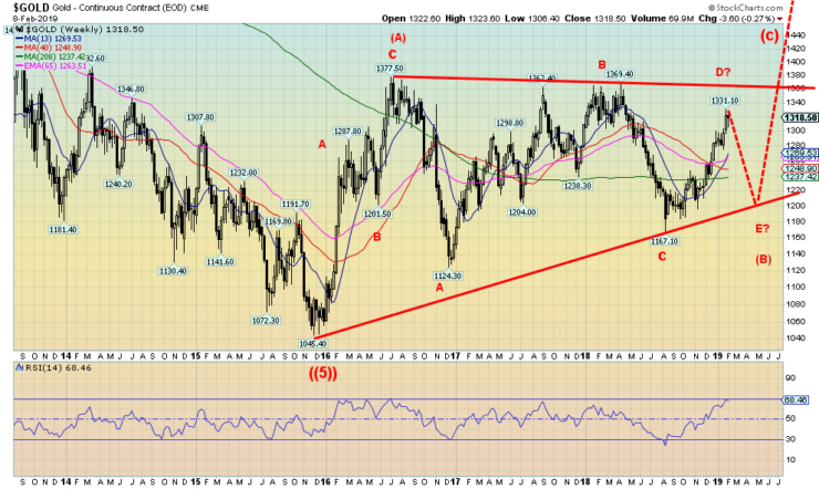
This weekly chart shows what we believe was our 7.83-year cycle low (came roughly 7 years after the October 2008 low) connected to the 331.33-month-cycle low of August 2018 (came 32 months following the December 2015 low). Our expectations are that we are once again going to run into resistance in the $1,350 to $1,370 zone. Following a pullback (could be an E wave) our expectations are that a more significant rally should get underway. Once we breakout over that major resistance line at $1,370 the projection could take us all the way up to at least $1,670 +/- $60. That would complete the (C) to the upside. Once that wave is complete, we could face another gold bear.
However, that wouldn’t bottom until the next 7.83 cycle low which is not due until at least 2022/2024. That would also coincide with a 23.5-year cycle low dating from the major low in 2001. The dotted lines are our projection going forward from here. It does not mean that gold will fall as low as $1,200 once again but merely to denote the coming pullback once the high on this move is seen.
©David Chapman
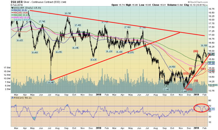
Our outlook on silver remains unchanged. Silver remains in a solid uptrend that we do not believe is complete. Good support down to $15.25, but below that we admit it would probably set silver on course for a steeper decline. The progress admittedly has been slow. Silver fell about 0.8% this past week. We can’t say the current pullback is over. We note up trendline support coming in at around $15.55. Below that, silver could fall to $15.25 support or even mildly lower. There does not appear to be a lot of selling pressure here so our expectation remains that once this pullback is over silver should rise to new highs. We have quite a way to go before we would see new 52-week highs last at $17.35 seen in June 2018.
©David Chapman
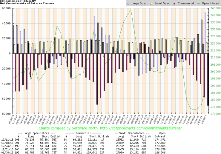
Like the gold COT, the silver COT is back and the commercial COT has fallen to 32%, actually down from 33% the previous week. Long open interest rose over 4,000 contracts, but short open interest was also higher, up over 15,000 contracts. The large speculators COT rose appropriately and is now up to 73%, up as well from the previous week when it came in at 69%. Like gold, there is still some room here for silver to move higher. But silver is looking slightly more negative than gold.
©David Chapman
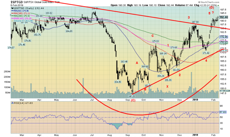
We continue to like the gold stocks here. The TSX Gold Index (TGD) bucked the slight weakness in gold and silver this past week by making new highs for the current move and closing up 1.4%. The Gold Bugs Index (HUI) didn’t fare quite as well as it lost a small 0.2%. Both indices are now up on the year and we note the TGD is within hailing distance of a new 52-week high. That was seen last July 2018 at 196.56 vs. this week’s close at 192.44. Since the low in September 2018, the TGD is now up almost 31%. Some individual stocks are up even more. We expect that further gains lie ahead even if they were to suffer a pullback here.
Nonetheless, we like the small rising triangle forming on the TGD and higher prices could be seen this coming week. Major long-term support is seen down to 171. Our wave count suggests that once this up wave is complete, we could see a more substantial correction. But even if it does occur, it would set up the potential for another strong up move later.
©David Chapman
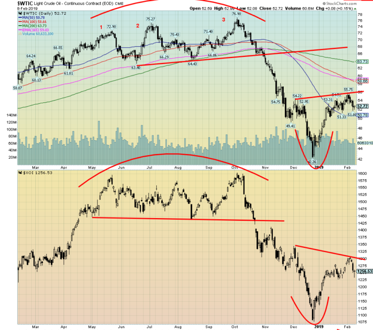
Oil prices had a setback this past week on economic worries (eurozone, Japan, China all slowing), record shale output in the U.S., and signs that the Russia/Saudi cuts are not cutting it. Add in trade worries and one had the makings of an oil pullback. Note natural gas is also falling, down some 5.5% this past week and now down 12.2% on the year. WTI oil fell 4.6% but remains up so far in 2019 by 16.1%. We are, after all, in the period of the positive seasonals for oil. The energy stocks also fell with the Philadelphia Oil & Gas Index (XOI) down 3.0% this past week while the TSX Energy Index (TEN) dropped 3.1%. The bullish sentiment that had prevailed since the beginning of the year dissipated this past week.
An argument could be made that WTI oil and the XOI are forming a head and shoulders bottom pattern. That remains to be seen, of course. WTI oil falling below $49 would put that pattern in doubt. The XOI breaking down under 1200 would not be positive. V bottoms are rare (and difficult to read) and typically there could be more accumulation going on before oil breaks out to the upside.
Chart of the week
©David Chapman
Many have suggested that one way for the U.S. and the world to dig themselves out of their mountain of debt is to revalue gold upward, effectively backing currency with gold once again. In other words, a return to a gold standard. The world is buried in a mountain of debt totaling some $250 trillion. The U.S. holds almost 29% of that debt—some $72.1 trillion. The U.S. has the largest national debt in the world, currently at almost $22 trillion and poised to rise by $1 trillion/year. A debt collapse of unknown proportions could no doubt occur at any time, particularly as the world moves into a recession.
If that were to happen there could be an even bigger crisis as currencies collapse and confidence in paper money (fiat currency) collapses. Short of massive paper money printing, one could argue that there is little way out of this financial mess that could, at its extreme, plunge the world into a huge depression with accompanied social collapse.
Some claim the solution is to revalue gold upwards. However, bankers, both central and private, along with many economists, scoff at the idea. After all, that is what happened in 1934 when gold was revalued upward from $21.66/ounce to $35/ounce, a de facto devaluation of the U.S. dollar. The Federal Reserve would most likely have to lead the way because they hold the world’s largest reserves of gold at 8,133.5 metric tonnes. That translates into 261,498,926 troy ounces. Currently, that gold is held by the Federal Reserve at a value of $42.22/ounce. At current prices, that gold is worth around $344 billion, not the $11 billion it is currently valued at.
It is debatable as to what one should revalue to cover the debt. Should it be tied to money supply or, as the chart suggests, to the monetary base? The chart is a little out of date but remains relevant. At just over 40% of the monetary base, gold is revalued upwards to over $4,000/ounce and to cover it completely gold would need to be revalued to around $10,000/ounce. Some have even suggested a move to $50,000/ounce. A revaluation would help to stop the deflationary effects of debt collapse and restore discipline to the value of money.
Grant you, back in the 1930s the U.S. confiscated gold before the revaluation. Some have even claimed that could happen again but at least it would be at market rates, rates that would probably rise. In 1934, the gold price was fixed.
(Featured image by Bacho via Shutterstock)
—
DISCLAIMER: This article expresses my own ideas and opinions. Any information I have shared are from sources that I believe to be reliable and accurate. I did not receive any financial compensation for writing this post, nor do I own any shares in any company I’ve mentioned. I encourage any reader to do their own diligent research first before making any investment decisions.

-

 Crypto2 weeks ago
XRP vs Solana ETFs: Retail Hype Meets Institutional Interest
-

 Fintech6 days ago
Swiss Fintech Sector Enters Maturity as AI and Infrastructure Take the Lead
-

 Impact Investing2 weeks ago
Integrated Energy Solutions Boost Profitability and Cut Emissions in Italy’s Decarbonization Efforts
-

 Biotech3 days ago
EU Biotechnology Law Aims to Boost Innovation and Cut Trial Delays


