Featured
Gold fares well, but is the bear market coming to a close?
September is considered to be a rough month for the S&P 500, the Dow Jones Industrial and Nasdaq. However, gold shone the brightest this month.
“Give me control of a nation’s money and I care not who makes the laws.”—Amschel Rothschild, Rothschild’s banking dynasty
“At the end fiat money returns to its inner value—zero.”—Voltaire, French Enlightenment writer, philosopher, historian
“In the absence of the gold standard, there is no way to protect savings from confiscation through inflation […] Deficit spending is simply a scheme for the “hidden” confiscation of wealth. Gold stands in the way of this insidious process. It stands as a protector of property rights.”—Alan Greenspan, Fed Chairman 1987–2006, “Gold and Economic Freedom” (1968)
September: end of vacations (well, for some anyway), back to school, and a traditional start to the business year. September and October are also known to investors as the cruelest months. October is known for its famous crashes. But it is also a month that is known to end bear markets.
September is also cruel because it got off to a bad start for President Trump with the coming Bob Woodward book “Fear: Trump in the White House.” Then came the anonymous op-ed in The New York Times on the Trump White House followed by the search for the perpetrator, with accusations that the author is a traitor. The first week of September also saw continual warnings that Syria is going to use chemical weapons in Idlib as the Syrian army, backed by Russia and Iran, moves in to the take out the last remaining pockets of resistance against the Assad regime. Between Woodward’s book, the op-ed, and the threat of chemical weapons, it made for an interesting, eye-brow raising start to the month.
September is the cruelest month for markets because it is the biggest percent loser for the S&P 500, the Dow Jones Industrials(DJI), and the NASDAQ. September ranks at the bottom for the worst performing month. Since 1950, the S&P 500 has seen a down September 37 times out of 67, for the DJI 41 times out of 67, and the NASDAQ 21 times out of 46 (NASDAQ got underway in 1971). Memorably bad Septembers occurred in 1974, 2001, and 2002. On average, the DJI has returned a negative 0.8 percent for September. During mid-term election years, the record is worse.
For gold bugs, however, September is known as a golden month. Since 1970, 26 of 48 months were on average higher than the previous month. September has seen the best returns for gold, averaging 2.1 percent. For gold, September ranks number 1. For stocks, September ranks number 12. The disclaimer, of course, is that past performance is no guarantee of future performance.
However, for beleaguered gold bugs, following what has been to date a miserable year, maybe it is something to look forward to at least some relief. And for a stock market that seems to know nothing but the word “up,” a pause might actually be refreshing. It is ironic that Amazon became the second company this year to hit the trillion-dollar market cap following Apple as September gets underway.
The stock market, after having its mini-meltdown in February 2018 following Trump’s saber-rattling on tariffs, stabilized and found its legs once again with many indices recently making new all-time highs. The stock markets, at least in the U.S., appear to be impervious to the potential for a global debt crisis, currency wars, trade tensions, global tensions amongst the Great Powers, and the polarization in the U.S. Instead, the focus is earnings and the U.S. economy. While the numbers aren’t gang-busters, they are at least good enough to keep the stock market buoyant.
Problems with stock markets seem to be everywhere else but the U.S. The U.S. indices are up in 2018 but largely down everywhere else. The S&P 500 is up 8.5 percent to the end of August 2018 while the DJI is up 5.0 percent. But elsewhere, markets are down—London FTSE 2.1 percent, German DAX 4.3 percent, Euro Stoxx 1.6 percent, while the Shanghai Index (SSEC) is down 17.6 percent, but the Tokyo Nikkei Dow (TKN) has eked out a small 0.3 percent gain. The worst performing stock markets are reserved for Turkey and Argentina—down 18.6 percent and 15.3 percent in local currency terms, but both down roughly 50 percent in U.S. dollar terms.
The problem is the U.S. dollar. For years following the financial crisis and crash of 2008, the U.S. followed a near-zero interest rate policy and provided massive liquidity in the form of quantitative easing (QE). U.S. dollars flooded the world. Others were either forced to follow, were reluctant followers, or had their own problems and crashes to deal with. Included was the EU, Japan, and even China. With cheap U.S. dollars sloshing around the world, the world borrowed and the banks, particularly in the EU, were only too happy to accommodate.
Then the U.S. reversed, course. Interest rates began to rise and QE turned into QT, quantitative tightening. Effectively the tap was turned off and massive amounts of U.S. dollar debt is/was all that was left. The U.S. national debt that stood at $10.6 trillion in 2008 turned into $21.5 trillion in 2018 and is growing at $1 trillion per year. That tends to squeeze out almost everyone else. The result is the U.S. dollar rises while other currencies crash.
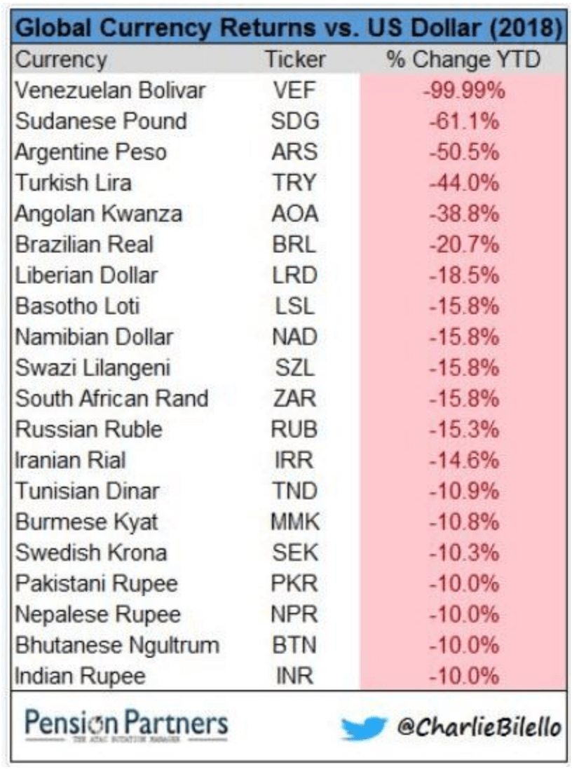
And crash they have. Sanctions, tariffs, mismanagement, and fractured politics are amongst the reasons for currencies crashing. The worst are the Turkish lira, the Iranian rial, and the Argentinian peso. They have fallen 43.6 percent, 14.6 percent, and 50.5 percent respectively in 2018. Turkey and Iran are under U.S. sanctions. Argentina has been mismanaged coupled with austerity. Other currencies including the Russian ruble and the Chinese yuan are also down. We provide a list of global currency returns in 2018 below.
The Canadian dollar is down 4.6 percent against the U.S. dollar in 2018, thanks largely to tariffs and threats of ending NAFTA. Russia is under U.S. sanctions while the U.S. and China are in the early stages of a potential trade war. It seems that if you want to defeat your enemy you unleash economic warfare against them. The weapon of choice: the U.S. dollar. The U.S. has sanctions, tariffs, and more against upwards of 30 countries and a quarter of the world’s population.
© David Chapman
The massive rise in the stock market has been predicated on a mountain of debt. U.S. debt (governments, corporations, personal) has climbed from $50.6 trillion in 2008 to $71.1 trillion today, a gain of $20.5 trillion. U.S. GDP has gone up by only $6.5 trillion in the same period, suggesting it took $3.15 of new debt to purchase $1 of GDP over the past decade. That has played itself out around the world as well. Global GDP at the end of 2017 is estimated to be $79.9 trillion, a rise of $16.4 trillion since 2008. But global debt has climbed by at least $75 trillion in the same period, suggesting it took $4.57 of new debt to purchase $1 of GDP. That is unsustainable unless there are no limits to debt.
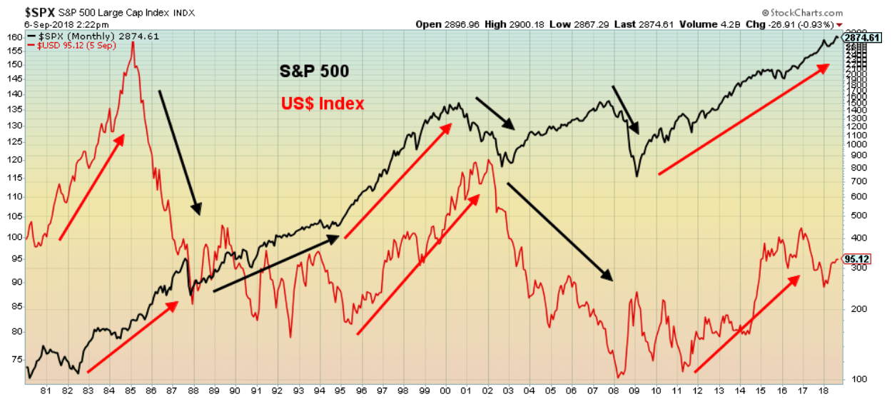
Setting aside China’s growth, the U.S. economy has been the fastest growing G7 economy. Given QT and rising interest rates this has helped push the U.S. dollar higher and attract money flows from elsewhere as other economies do not perform as well and they continue to maintain a low interest rate policy and supply their economy with funds through QE (the EU, Japan, in particular). It is probably no surprise that as the U.S. dollar rises so too does the U.S. stock market. Our chart below shows the performance of the U.S. dollar vs. the S&P 500 since 1980.
© David Chapman
No, the correlation is not exact as the chart shows, but generally, the US$ Index rose from 1980 to 1985 while the S&P 500 was rising from 1982 to 1987. The next big rise saw the US$ Index rise from 1995 to 2001 while the S&P 500 was rising sharply from 1995 to 2000. The most recent rise saw the big jump in the US$ Index get underway in 2011 although the bottom was in 2008 while the S&P 500 has generally been going up since 2009.
Given all of the U.S. dollar-denominated debt that is held outside the U.S., this debt has become vulnerable given a rising U.S. dollar, crashing currencies, and rising U.S. interest rates. No wonder, given U.S. sanctions and a potential global trade war that Russia, China, Iran, Turkey, the other BRICS along with many other emerging economies want to escape the clutches of U.S-dollar hegemony. Led by China they want to create their own equivalent of the IMF, the World Bank, and the global payment system SWIFT. All are currently dominated by the U.S. For the most part, they have been buying gold to back their currencies with a tangible asset and in many cases, they have been dumping U.S. Treasuries.
Even the Germans, as the leading economy of the EU, have discussed leaving the U.S-dominated global payments system SWIFT for something that they can control. The EU has not been pleased with the U.S. backing out of the Iranian nuclear deal and placing sanctions against Iran, sanctions that extend to any company with U.S. operations trading with Iran. This has negatively impacted numerous EU corporations forced to choose between Iran and the U.S. The same holds true with Russia as numerous German companies have been hurt by U.S. sanctions against Russia and have complained vociferously.
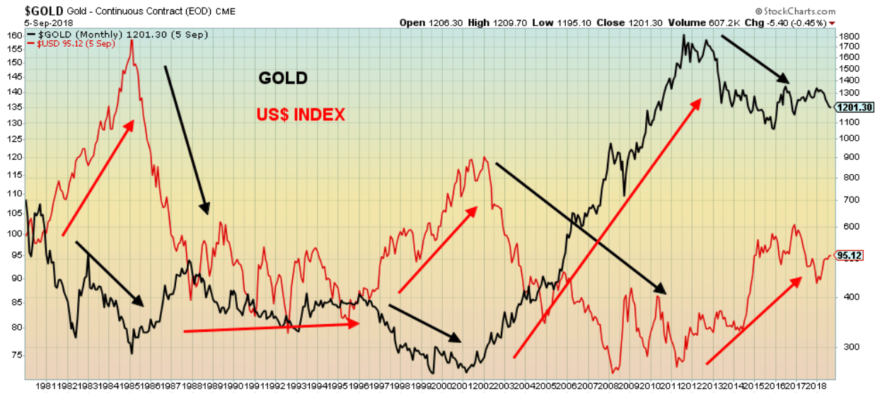
Over a century ago J.P. Morgan coined the phrase “Gold is money. All else is credit.” China and Russia have been leading the way in purchasing gold to back their currencies the yuan and the ruble. But the gold price has been falling as the U.S. dollar rises. If the economic weapon of choice is the U.S. dollar then it pays to have it rising while keeping the gold price “under wraps.” Gold can be suppressed using derivatives and central bank intervention. It has been reported that the Bank for International Settlements (BIS) has seen its gold swaps and derivatives decline by roughly 24 percent in August 2018. The price of gold has fallen over $100 since June 2018. The BIS does not answer questions related to its activities. The BIS is the central bank for the world’s central banks.
The U.S. dollar and gold have an inverse relationship. Generally, as the U.S. dollar rises, gold falls and vice versa. Gold prices fell from 1980 to 1985 during a period of a strong U.S. dollar. Gold prices were falling from 1996 to 2001 once again during a period of a strong U.S. dollar. The most recent gold decline starting in 2011 has also coincided with another strong period for the U.S. dollar.
© David Chapman
Despite all of the global problems of debt, collapsing currencies, and more, the U.S. economy continues to perform. The trouble is, trying to pinpoint what might throw it off and the U.S. stock market with it is difficult to predict as to both “what” and “when.” When the trouble starts, there is usually a little warning and liquidity suddenly dries up. We’ve seen that before during the high-tech/dot.com crash and the financial crash of 2008. While watching signs such as the narrowing yield curve between the short end of the interest rate curve and the long end is fine, it doesn’t exactly tell us what might cause the markets to suddenly turn. Nor is the yield spread necessarily an omen of a stock market collapse, despite having some history of predicting recessions.
Many investors searching for yield, hold high-yield corporate debt, but when the markets turn you won’t be able to sell it. The next crisis is liable to be a credit crisis and the currency wars are one of the potential triggers. The U.S. is engaging in economic war with the rest of the world and the ending is not likely to be pretty. And as we have often noted, the wherewithal of the central banks to bail out the next crisis has been severely compromised by them having to bail out the 2008 financial crash. The problems will come when the U.S. dollar turns down. So far, that is not happening. But when it does, watch out below. Holding a bit of gold as insurance might be a wise idea. At least gold, unlike paper U.S. dollars, is tangible and has a long history of being money. It’s just since 1971 that we are going through our latest experiment with fiat money. And fiat money, as Voltaire said, eventually returns to its real value—zero.
Bitcoin watch
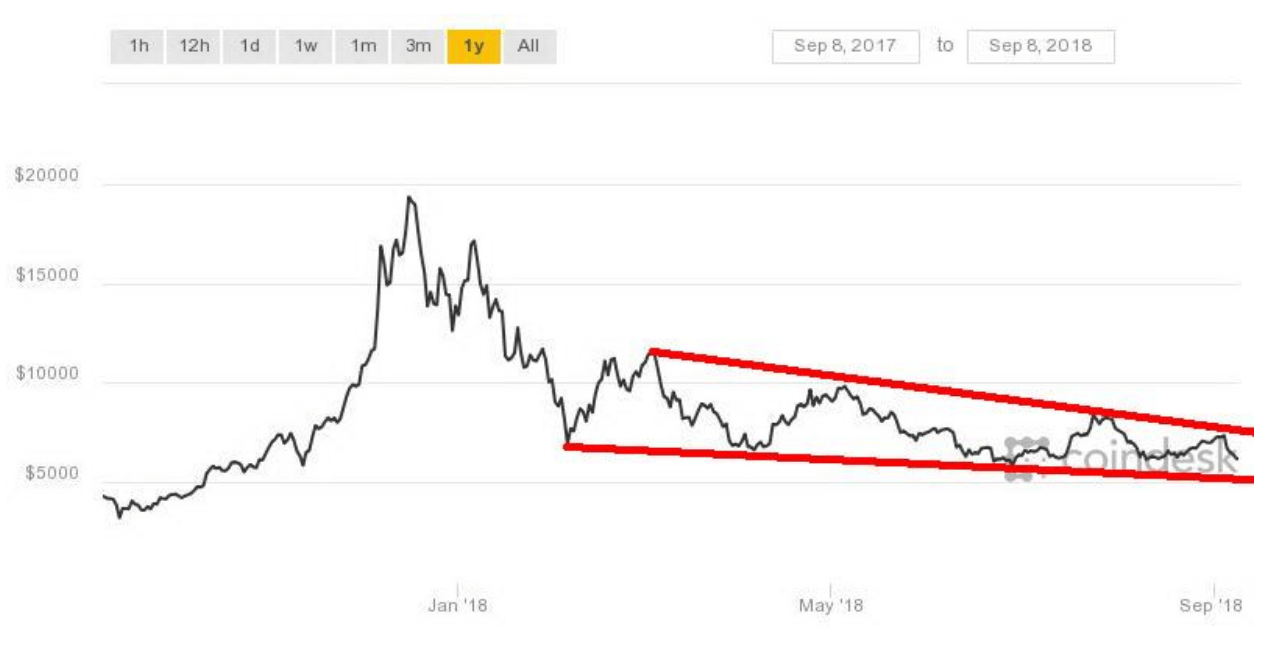
© David Chapman
Just as the crypto bulls thought it was safe to come out, Bitcoin and the other cryptos reversed course and suddenly plunged once again. Bitcoin quickly fell almost 13 percent in a day or two. The hype surrounding cryptos remains, but then surely the hype has become tarnished and fear should be replacing greed. What if Bitcoin and the cryptos are not all they are hyped up to be?
Bitcoin hit a peak of around $19,000 back in December 2017. Today it is around $6,200, down roughly 67 percent from those heady days. Every time Bitcoin attempts to overhaul $7,000 it gets pushed back. You’d think that would be telling the crypto bugs something. Of course, some may say that is no different than the gold bugs—gold is languishing around $1,200, down from the heady days of $1,900 back in 2011. Seven years is a long time to be miserable.
But a major difference. Gold is actually tangible. You can touch it, feel it, and see it. There is nothing tangible about Bitcoin. You can’t even see it unless you count blips on a screen. At least with gold you can determine some valuation. With Bitcoin and the other cryptos it is nearly impossible. Cryptos may be an anarchist’s dream, but at some point, they forget that eventually the authorities would question it and they may not want something competing with their fiat currency. At least we can store gold safely in a vault. With cryptos, the scams, hacks, and outright theft have already been innumerable. And that is if you can figure out the software. Maybe it just remains that—a computer geek’s paradise. But it made a number of geeks filthy rich. Hope they cashed out.
Cryptos became pure speculation. Why else are there so many listed on Coin Market? At last look, 1,921 are listed there. Two weeks ago, when we last wrote, there were 1,889. Somehow, they found a way to add another 100 or so? Incredible is all we can say. At its peak Bitcoin had a market cap of $325 billion. Now it is down to $110 billion and fading. All the cryptos are only worth $202 billion. Two weeks ago, they were worth $212 billion. Ouch! $10 billion in a couple of weeks. Not the worst loss they have suffered. Still, 15 of them have a market cap of over $1 billion unchanged from two weeks ago. And the number of dead coins grows at Dead Coins? Last listed were 911 deceased, hacks, scams, and parodies. Two weeks ago, there 905 were listed. Seems the dead grow more slowly than the newly living.
Cryptos are what they are—a hyped-up, overcomplicated, and untrustworthy casino. They are not a store of value as many would love to claim. What value is there to a blip on a screen stored somewhere on a computer? What if the power went out? They can’t be used for everyday transactions, although some are trying. Fiat currencies, like our dollar, are also a blip on a screen. Seems few carry real cash these days. But the government sanctions fiat currencies as a medium of exchange even if they’re not worth the paper they’re printed on. And most of them aren’t even paper anymore. They’re just a blip on a screen or a tap of your card.
All this hasn’t stopped countries from creating their own cryptocurrency. Venezuela is an excellent example. Venezuela issued a “sovereign bolivar” pegged to a cryptocurrency and backed by oil. The petro, as it is called, is worth 3,600 bolivars. The question is—what exactly is it? A forward sale of oil, or a debt backed by oil? But you can buy it knowing it is backed by the Orinoco reserves, one of the largest reserves of oil in the world. Some suggest Iran could be the next one to create a cryptocurrency and back it with their oil and even their natural gas. Iran also has some of the largest oil and gas reserves in the world. And they have the need to get around U.S. sanctions.
Support continues at $5,800/$6,000, but we believe it is a matter of when, not if, Bitcoin falls under $5,800 and heads to $5,000 and lower. Rampant speculation and greed turn to fear and typically in a mania losing 90 percent of its value is nothing. Ask the Dow Jones Industrials (DJI) of 1929–1932 fame that fell 89 percent. Resistance remains at $7,000/$7,500. A long descending triangle has been forming and when the bottom falls out the decline should be swift.
© David Chapman
August job numbers
The August nonfarm payrolls for the U.S. came in somewhat stronger than expected Friday at 201,000. The market had expected 191,000 new jobs. The headline unemployment rate (U3) was unchanged at 3.9 percent although technically it fell to 3.85 percent from 3.87 percent. The U6 unemployment rate (U3 + marginally attached workers and short-term discouraged workers plus those working part-time that want to work full time) was reported at 7.4 percent vs. 7.5 percent. The Shadow Stats unemployment number which is U6 plus long-term discouraged workers and those workers defined away out of the workforce way back in 1994 came in at 21.2 percent vs. 21.3 percent the previous month.
The stronger than expected gain was a sign that so far, the economy is largely ignoring all of the trade wars and sanctions and whatever impact they might be having. If you are bailing out those impacted by trade wars as Trump is doing with the agricultural sector it softens the blow. That the deficit rises seems to be beside the point. The employment situation as it stands is the best, on paper at least, since 2001. The market is now expecting the Fed to hike interest rates once again by 25 bp at the September 24–25 meeting.
Sectors benefitting from employment gains were construction, wholesalers, and professional and business services. There were also gains in healthcare and transportation. Hourly wages also increased, up 0.4 percent of 10 cents following a 0.3 percent rise in July. Wages are up on average 2.9 percent year over year. The gains helped push up the value of the U.S. dollar.
The labor force participation rate slipped to 62.7 percent from 62.9 percent. That alone helps keep the U3 unemployment rate low. The civilian population employment ratio also slipped to 60.3 percent from 60.4 percent in August. That suggests fewer people were actually employed. Sure enough, the number of people actually employed fell to 155,542 thousand in August down from 155,965 thousand in July. A drop of some 400,000. Full-time employment fell 444,000 while part-time employment was down 79,000 from July to August. Doesn’t seem to jibe with the nonfarm payroll gain of 201 thousand.
Many, it seems, just dropped out of the labor force. Hence, the decline in the labor force participation rate and the civilian employment-population ratio. Those not in the labor force rose to 96,290 thousand in August from 95,598 thousand in July a gain of 692 thousand. Not all were retirees. About 52,365 thousand are listed as retirees. Instead of viewing the current employment report as great it is actually showing deterioration.
Declining full-time and part-time employment, rising not in the labor force but the market still created 201 thousand jobs in August? No wonder some are calling the job numbers fiction, even Orwellian.
In Canada, they reported a loss of 51,600 jobs in August. The unemployment rate jumped to 6 percent from 5.8 percent. Since 40,400 of the jobs were full-time it meant that 92,000 part-timers lost their jobs. Seasonal work ending? Retail trade, not surprisingly, saw a large drop. And the job losses were largely in Ontario, with 80,100 jobs lost as its unemployment rate leaped to 5.7 percent from 5.4 percent. It was the biggest job loss for Ontario since 2009. Losses were heavy in the construction industry. Alberta was a net gainer. Nonetheless, the report might be a cause for concern by the BofC that might hesitate now in hiking interest rates. Overall, many economists described the report as a “mess,” particularly for Ontario, although it largely seemed to offset the gains seen in July.
U.S. unemployment rate
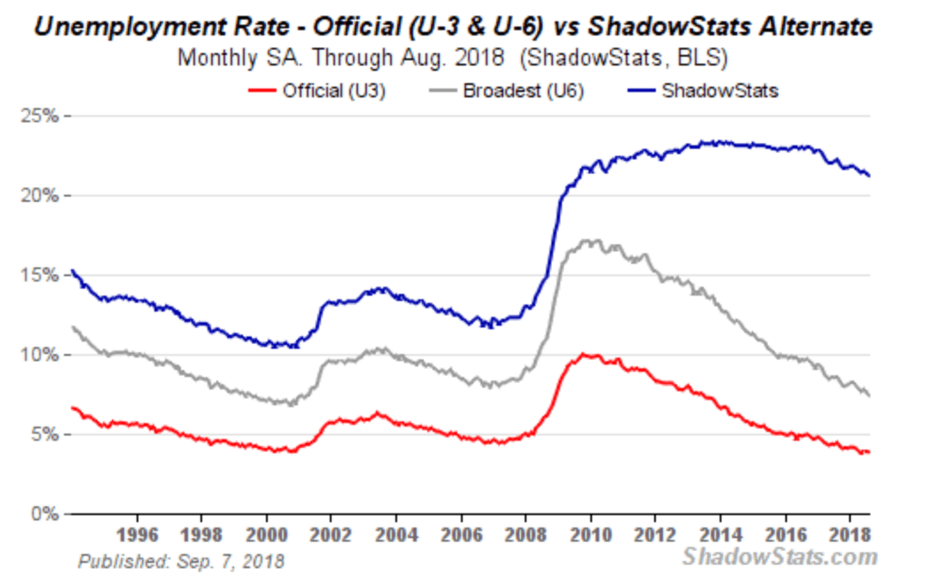
© David Chapman
Markets and trends
For an explanation of the trends, see the glossary at the end of this article. New highs/lows refer to new 52-week highs/lows. © David Chapman
© David Chapman
The U.S. stock markets just keep jugging higher even as they steadied this past week, given renewed threats to place tariffs on practically all goods coming from China, totaling some $267 billion, plus continued worries about emerging markets. While President Trump was experiencing problems with Bob Woodward’s new book and an op-ed in The New York Times, neither appears to have been an issue for the U.S. stock markets. The tariffs seemed to overshadow the supposedly good news of the August job report plus the ISM manufacturing number coming in at 61.3, the second highest level in 30 years.
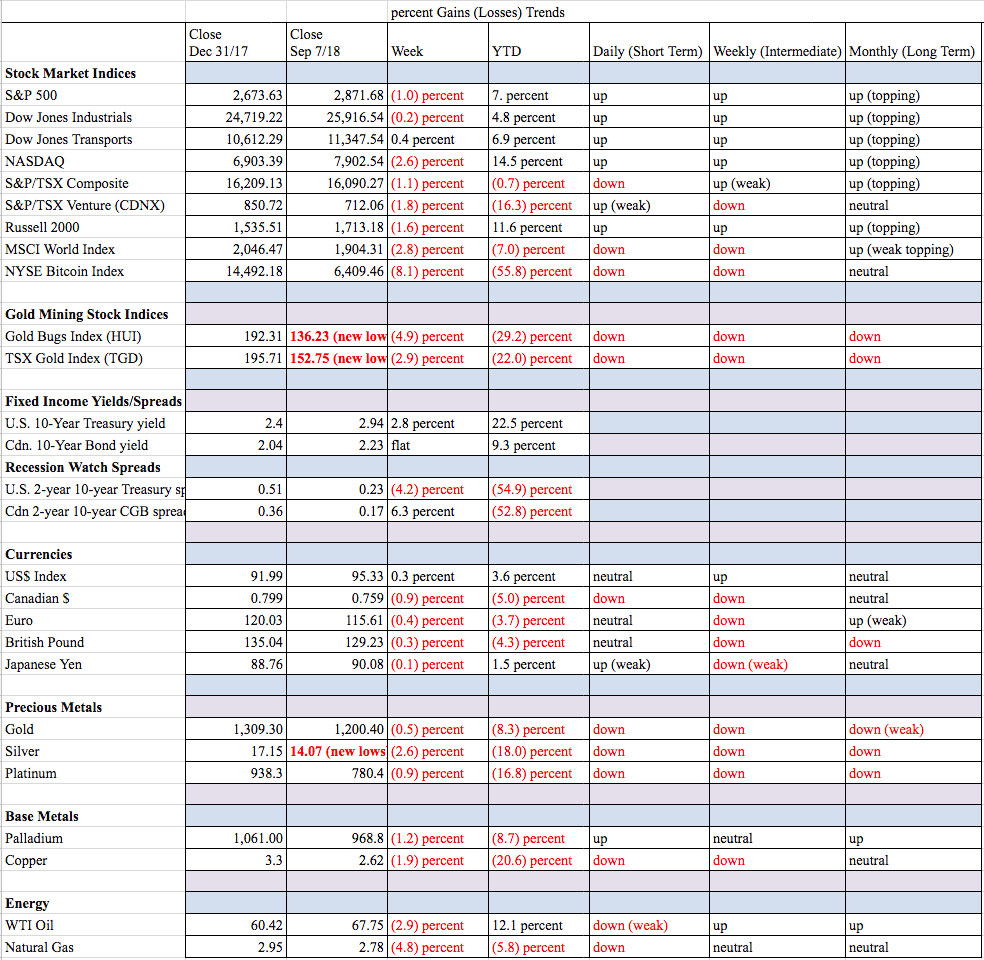
The S&P 500 lost 1 percent this past week while the Dow Jones Industrials (DJI) was off by a much smaller 0.2 percent. The Dow Jones Transportations (DJT) was up on the week, gaining 0.4 percent thanks to weaker oil prices. The tech-heavy NASDAQ was down 2.6 percent while the small cap Russell 2000 dropped 1.6 percent. Canada’s TSX Composite was off 1.1 percent while the junior TSX Venture Exchange (CDNX) fell 1.8 percent. Overseas, the global MSCI World Index (an index of indices except for U.S. indices) fell 2.8 percent, continuing its losing ways. China’s Shanghai Index (SSEC) was off 0.8 percent and is now down 18.3 percent on the year. Japan’s Tokyo Nikkei Dow (TKN) fell 2.4 percent. In the EU the London FTSE fell 2.1 percent, the Paris CAC 40 dropped 2.9 percent, and the German DAX fell 3.3 percent. Not a lot of joy anywhere.
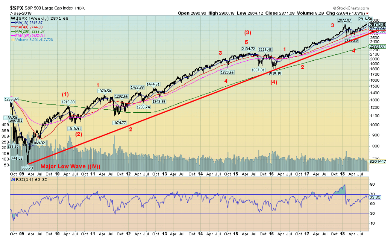
Above is a long-term weekly chart of the S&P 500 from the March 2009 financial crash low. Nothing much has changed on our wave count as there have been two significant corrections. Wave 2 was the 2011 EU/Greek crisis and Wave 4 was the end of QE crisis. We continue to believe we are in the fifth and final wave to the upside. However, we have re-ordered our thoughts on the wave count from the February 2016 low. The Wave 2 correction either ended with the Brexit low in June 2016 or the election mini-panic low in November 2016. We now believe that the long wave up from the November election low was Wave 3. Wave 4 was the tariff mini-panic that played itself out in February and March 2018. It makes more sense this way than the previous iterations. We should now be on Wave 5 to the upside and the question is where will it top. We see little sign of a top. The action this past week appeared to be corrective and not impulsive to the downside. We may have some bumps now and into October but we should resume climbing, quite possibly into 2019. That might surprise a lot of people given the negatives of trade wars, emerging market debt woes, and saber-rattling amongst the Great Powers in Europe, the Mid-East, and the South China Sea. Add in the goings on in Washington coupled with a polarized controversial election in November and many believe the markets should be panicking now.
But markets care more about whether it is making them money or not. And here the economy continues to muddle along despite the negative news in the background. The U.S. is a recipient of positive money flows from emerging markets and the EU because the perception is the problems are worse there than in the U.S., and the markets continue to feel the positive effects of the tax cuts and the repatriation of funds from overseas. Not only has this helped the U.S. stock markets, but the U.S. dollar has also benefitted. The Fed may be raising interest rates but they are not yet high enough to derail the stock market.
This bull market will end sometime, but unless an event comes out of the blue to shock the markets the rest is known (tariffs, sanctions, emerging markets, record debt, great power conflicts, Washington) and the markets are comfortable (maybe too comfortable) with all of that.
© David Chapman
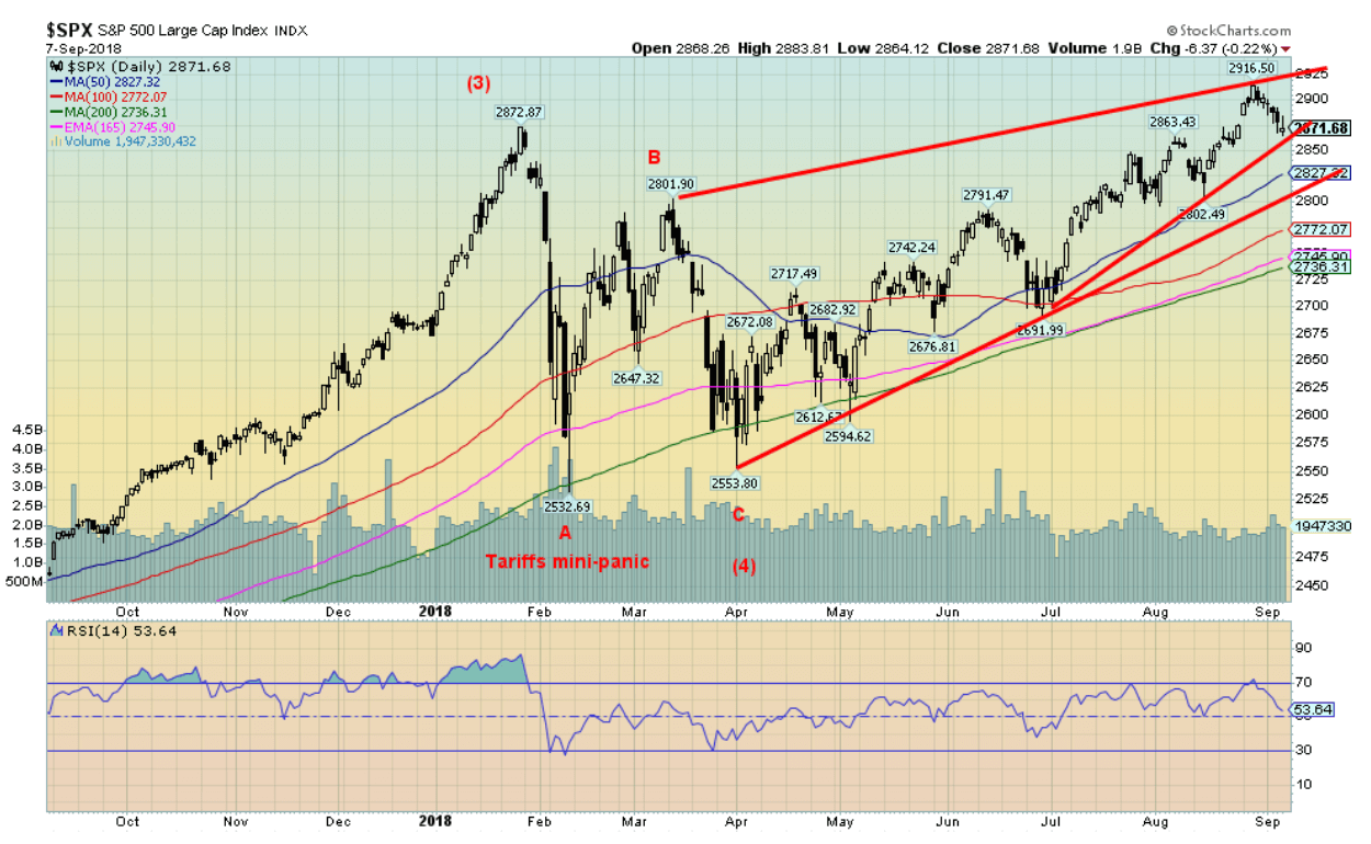
Here is a closer look at the S&P 500 over the past year. As we noted, we suspect that the January top was high for Wave 3 up from the February 2016 low. What followed was a classic ABC correction flat that played out as a mini-panic because of the fear of trade wars. We should now be embarking on the final wave to the upside. So far, it’s a choppy affair and it may well continue like that including, as we note, into 2019. The DJI is one of the last hold-outs to make new all-time highs. Most markets have gone too high to suggest classic double tops. The S&P 500 has support to around 2,870 but below there a test of 2,800 is probable. The 200-day MA continues to rise and is currently at around 2,735. There are negative divergences on the dailies but not significantly on the weeklies. We could be seeing a bit of weakness through September and possibly into October, but from what we are seeing, we expect that following another corrective move to the downside we should resume our upward climb. Just remember it is getting late in the game.
© David Chapman
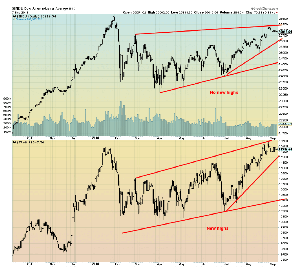
The Dow Jones Transportations (DJT) has now made new all-time highs (barely), but the Dow Jones Industrials (DJI) remains below its all-time. The DJI is one of the few remaining U.S. indices that have not made new all-time highs. This remains a potential negative divergence as the indices need to confirm each other. Divergences of this nature are not unusual at major tops and bottoms. We will continue to monitor. A confirmation of the negative divergence cannot be made until the DJI and the DJT make new lows below the February 2018 low.
© David Chapman
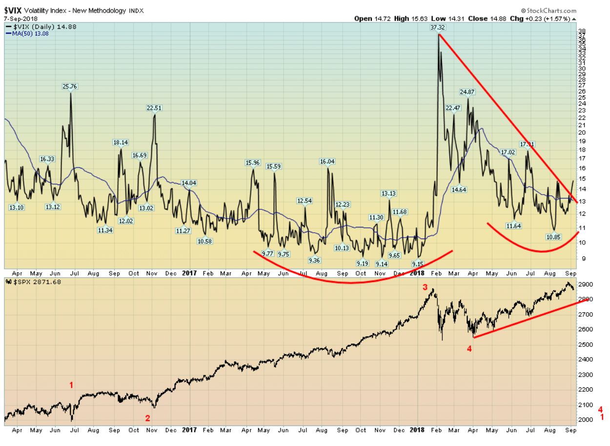
The VIX volatility indicator, a measurement of fear and greed in the market, has come down from its high in February/March 2018. However, it remains well above the lows seen throughout most of 2017. This is no surprise and it sets up the divergence between the index (S&P 500 has been making new highs), but the VIX volatility indicator has not been making new lows. The VIX has started to rise once again and appears to be breaking above the downtrend line from that February 2018 high (note that the VIX moves inversely to the S&P 500). This is a divergence worth noting and fits our thoughts that the markets could be in their final stages to the upside. But a reminder that it could still take months for this final high to play out.
© David Chapman
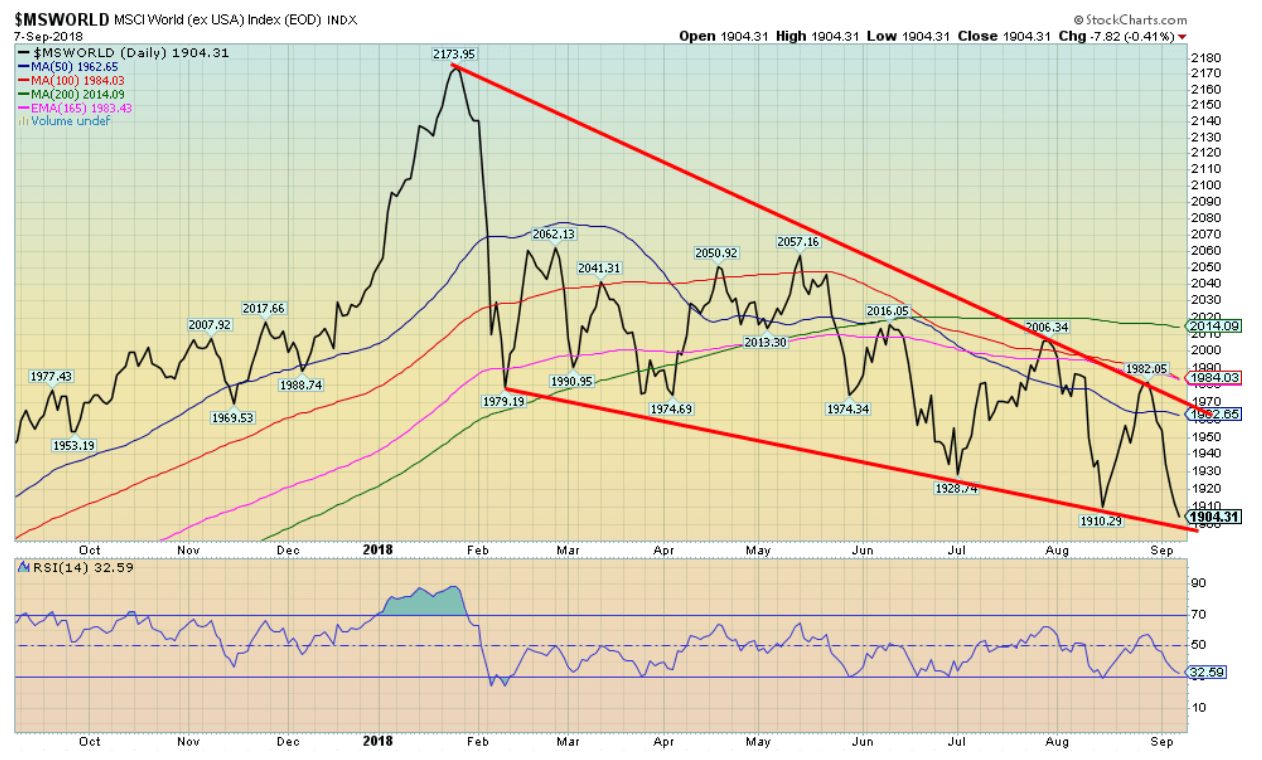
The U.S. indices may be doing well, but the rest of the world is not doing so well. The MSCI World Index is an index of global indices. Overall, it represents 23 developed markets and 85 percent of the free-floated market capitalization in each country. The index above excludes the U.S. indices. It has fallen below its 200-day MA and is now down about 7 percent on the year. This is a significant divergence with the U.S. indices.
© David Chapman
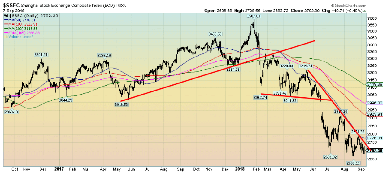
China is the world’s second-largest economy behind the U.S. Most recent numbers indicate it is still growing at 6.6 percent annually. Yet China’s main index, the Shanghai Stock Exchange (SSEC) is down 18.3 percent on the year. The SSEC actually topped way back in 2007 at 6,124. It is down almost 56 percent from that top, even as the U.S. indices soared to new all-time highs after the crash of 2008. The SSEC has broken down and is trading well below its 200-day MA. China is the target of the U.S.’s ire. Given China’s dominance in trade, tariffs will bite but they will bite the U.S. as well. Financially, China is in far better shape than the U.S. with a national debt to GDP of just over 21 percent vs. the U.S.’s national debt to GDP of almost 105 percent. China’s debt problems are in the corporate sector and in the shadow banking sector.
© David Chapman
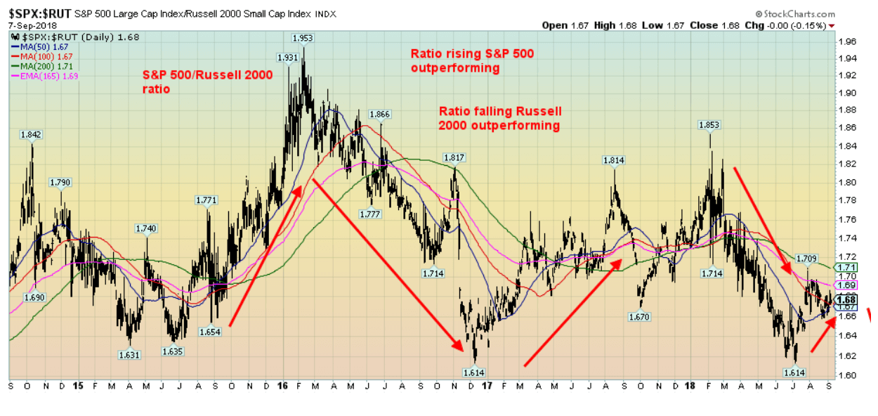
We like to follow the S&P 500 Russell 2000 ratio as it is a measurement of large cap stocks (S&P 500) vs. small cap stocks (Russell 2000). We expect in a bull market that the Russell would outperform, but in a bear market the S&P 500 would outperform. For most of this year, the Russell has been outperforming, but the tide has shifted and over the past few months the S&P 500 is starting to outperform. But the tide is not yet fully in favor of the large cap stocks. Notice how the S&P 500 outperformed during the mini-bear of late 2015 early 2016. After that, the tide shifted once again to the small cap stocks.
© David Chapman
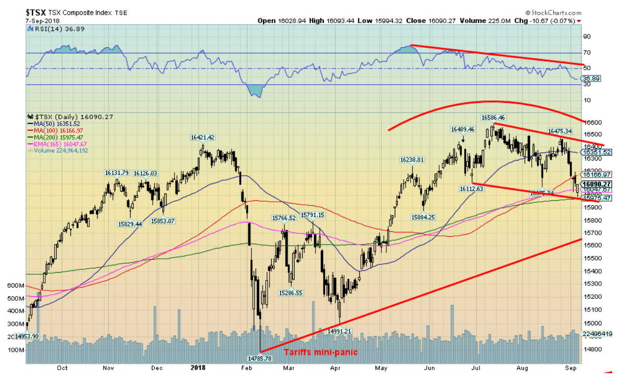
Even as the U.S. indices were rising to new all-time highs the TSX Composite started to roll over. The TSX Composite topped back in early July, barely taking out the previous high set in January 2018. The TSX Composite could now be starting to break down. It is, however, currently at support at the 200-day MA. The TSX Composite is dominated by materials and energy, unlike the U.S. S&P 500. Recent weakness in both may be helping to pull the TSX lower. A solid breakdown under 16,000 could spell trouble and swiftly send the index down to support near 15,700.
© David Chapman
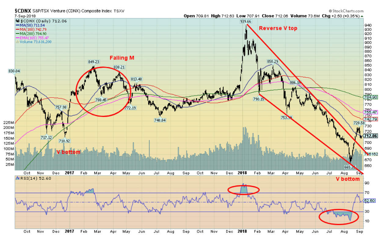
Could the TSX Venture Exchange (CDNX) be making a V bottom? V bottoms are hard to read because, as the letter suggests, the market falls swiftly, then turns and rises just as fast. As the chart shows, it can even make a reverse V at tops. The wave count on the CDNX is not clear so we can’t quite tell whether this collapse is finished. The 200-day MA is currently up around 784 and, ideally, we’d like to see it regain above that level to convince us that a final low is in. Regardless of what the CDNX does from here, it does appear poised to make a significant move. The CDNX is 50 percent junior mining companies. Many of these companies are trading for less than the value of the metal in the ground. Some are even trading below their cash value.
© David Chapman
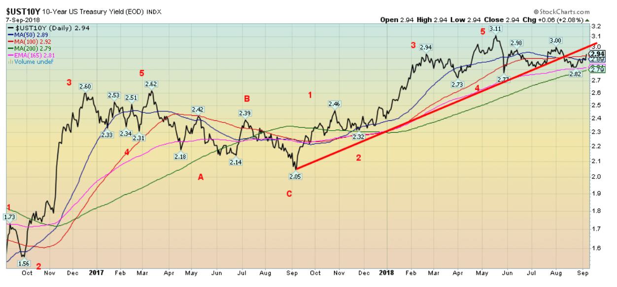
The 10-year U.S. Treasury note backed up this past week to 2.92 percent, up from 2.86 percent and up from a recent low of 2.82 percent. Threats of further tariffs against China, the stronger than expected job numbers on Friday, and stronger wage growth than expected sparking some inflation fears all helped to push yields higher. There is little doubt now that the Fed will hike rates by another 25 bp at the Fed meeting on September 24–25. The market had expected a weaker jobs number on Friday. Overall, the 10-year (and even the 30-year) are all moving sideways in yield this year. The range on the 10-year has been 2.73 percent to 3.11 percent, but most of the trading has taken place between 2.85 percent and 3.00 percent. Generally, inflation appears to be under control within the Fed’s target of 2 percent give or take. And that is helping to keep long rates steady.
Recession watch spread
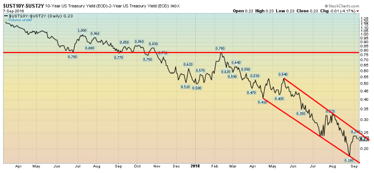
© David Chapman
The two-year U.S. Treasury note jumped to 2.66 percent this past week, its highest level in a decade, thanks primarily to the better than expected nonfarm payrolls and, in particular, the better than expected wage growth. The 2–10 spread settled the week at 0.23 percent, up from the recent low 0.18 percent. We remain far from the yield curve inverting. The 2–10 spread is the favorite one to watch, and when it inverts a recession is not far behind. We don’t believe it will invert until sometime in 2019.
© David Chapman
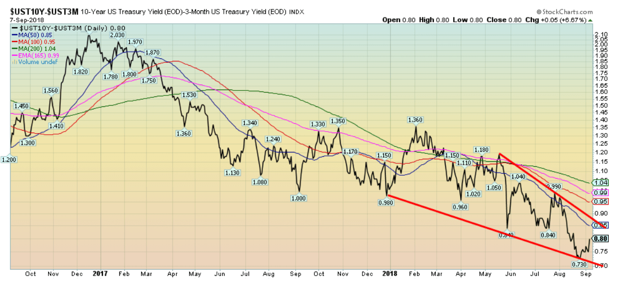
While the 2–10 spread is widely followed as a potential recession watch spread, many believe the 3-month Treasury bill ten-year spread is more valid. Currently, that spread is at 0.80 percent far from turning inverting. Since 1980, the 3m–10 spread has turned negative only four times—in 1981, 1989, 2000/2001, and 2007. At current levels, it is not signaling a recession anytime soon. But it is worth noting that it is well down from its peak of 3.83 percent seen back in 2010. Since 1980, the 3.80 percent/3.85 percent level has proven to be the peak.
© David Chapman
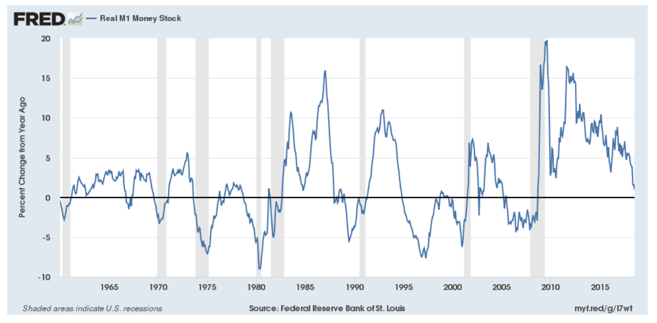
Is liquidity drying up? The Fed has turned QE into QT. Annual growth in money supply has been slowing since its peak in 2010. The liquidity squeeze has intensified as shown by the recent sharp drop in the annual growth of money supply (M1). The same pattern is seen on the charts of M2 and the monetary base. It has not as yet turned negative. Note how money growth turned negative on a number of occasions in the past, usually before slowdowns in the economy, even as the negative growth persisted for a few years in some cases. Eventually, it does squeeze the recovery. So, we’ll become money supply followers as well.
© David Chapman
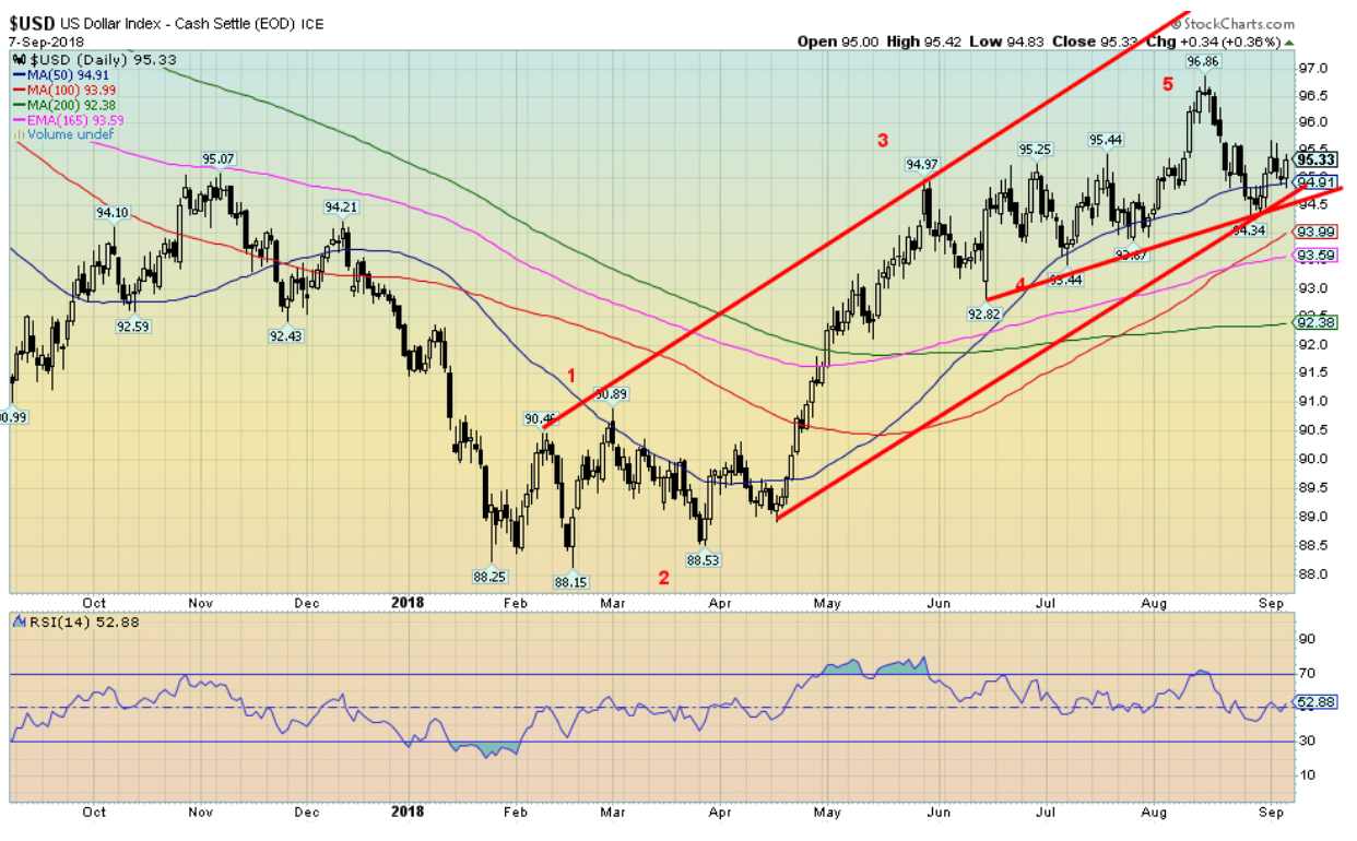
The stronger than expected nonfarm payrolls and wage growth helped push the US$ Index up on the week by just under 0.3 percent. The Euro, that constitutes some 57 percent of the US$ Index, fell 0.4 percent. The British pound weighed down by Brexit was off 0.3 percent while the Japanese yen was down 0.1 percent. The Cdn$ was pushed lower by 0.9 percent on the week especially following the release of the Canadian job numbers which were the polar opposite to the U.S. numbers. Given the Fed is highly likely on target for a rate hike at the Fed meeting on September 24–25 that could help to keep the US$ firm going forward.
The pattern forming is either a topping pattern or a rising triangle. The former is bearish while the latter is bullish. U.S. President Donald Trump is not happy about the high U.S. dollar nor is he happy about the Fed hiking interest rates. A high U.S. dollar discourages exports while rising interest rates could nip the ongoing positive economy. It is noted that the recent Chinese trade numbers showed a record surplus in August. That turns up the heat on China as Trump threatens more tariffs on Chinese goods. Overall, China’s surplus with the U.S. is up 15 percent from the previous year. China had devalued the yuan to offset the impact of some of the tariffs, but they recently ended that. As a result, the US$ Index fell.
It is possible that the US$ Index has completed five waves up from the lows seen last February. On the other hand, there may be more to the recent rise of the US$ Index. Eventually, the U.S. dollar is going to fall. The high U.S. dollar is causing all sorts of problems in emerging markets, especially given the high U.S. dollar-denominated debt. We can see the potential for a Plaza Accord type of agreement to lower the value of the U.S. dollar to take the pressure off and hopefully prevent any major defaults. On the other hand, the U.S. dollar has been an economic weapon.
The US$ Index is still in an uptrend and is trying to hold above the 50-day MA. Regaining 96 would most likely suggest that new highs are probable. A breakdown under 94.50 would be negative, but a dollar bear would not start until the US$ Index broke under 92.80.
© David Chapman
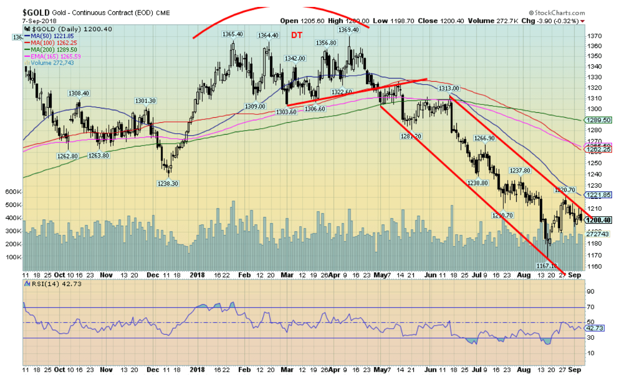
Because of a stronger U.S. dollar, gold prices fell this past week, losing 0.5 percent. Unlike silver and the gold stock indices, gold did not make new 52-week lows. This is a potential positive divergence. It is unconfirmed until gold takes out resistance above at $1,210 and then $1,220. The double top that formed earlier in the year suggested a decline down to around $1,240 once gold broke under $1,300. Given it took out that level gold fell to its next target at $1,195. That level was also taken out so the third potential target becomes $1,130. That would be negated if gold closed back above $1,220. Gold sentiment is miserable. The commercial COT is as bullish as we have ever seen. We are entering a period of strong seasonals. Everything appears to be going for gold to end this bear move except for the rally and breakout. New lows below $1,167 would set up the decline to $1,130. A breakout over $1,220 would most likely start a stronger rally. Above $1,260 a run to $1,300 is probable. Some resistance at $1,240.
While gold has been struggling in U.S. dollars that has not been the case in numerous emerging currencies where gold has been soaring to new all-time highs. No surprise that gold purchases had picked up recently in Turkey, Argentina and elsewhere suffering from collapsing currencies.
© David Chapman
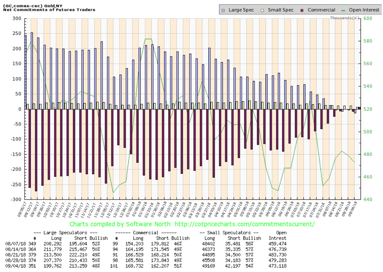
This may be a first. We have never seen a positive gold commercial COT in all our years of following the COT reports. Some have indicated it happened before back in 2001. That was a major low for gold prices. The gold commercial COT came in at 51 percent up from 49 percent the previous week. Long open interest jumped roughly 3,000 contracts while short open interest fell over 11,000 contracts. The large speculators COT (hedge funds, managed futures) have record shorts coming in at 48 percent down from 50 percent. The large speculators long open interest fell over 7,000 contracts, but short open interest rose only about 3,000 contracts. This is admittedly an exciting report if one wants to be bullish for gold. The commercials are net long 6,525 contracts or 652,500 ounces while the large speculators are short 13,497 contracts or the equivalent of 1,349,700 ounces of gold. Each contract is worth 100 ounces.
© David Chapman
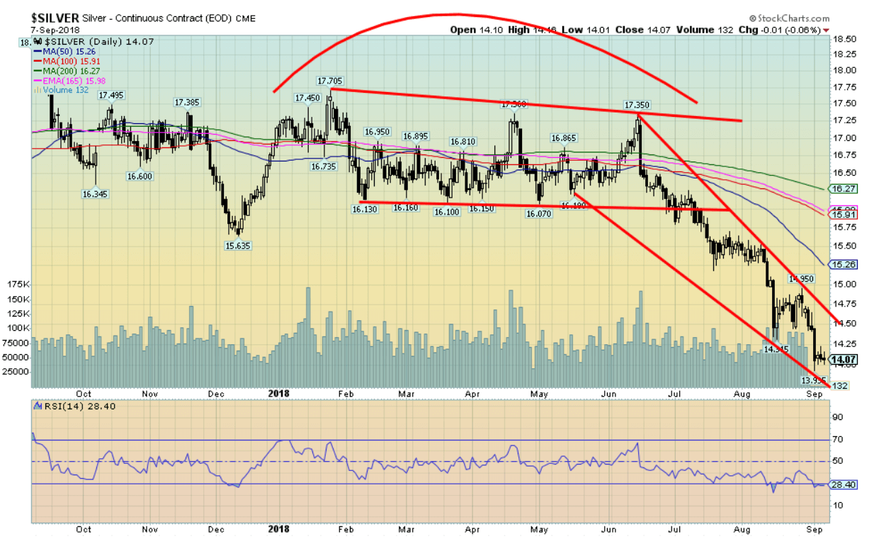
Silver fell to new 52-week lows this past week, falling to a low of $13.94. Talk about miserable. Silver is oversold, the sentiment is miserable, and it is unloved. There seems to be nothing to stop its decline. The breakdown came following the sideways pattern that formed from February to June. Silver broke down in July and the initial potential target was around $14.45. That has fallen and the next target could be down to $13.45. Silver is not that far from its 2015 low of $13.62. In making new 52-week lows silver has diverged with gold that did not make new 52-week lows this past week. Silver made new 52-week lows along with the gold stock indices. Silver needs to regain above $14.50 to start to suggest that a low might be in. The 50-day MA seems far away at $15.25. The deep suspicion here is that given silver is near long-term support, the deep negative sentiment and the very positive commercial COT, a rebound and strong rally to the upside could soon develop.
© David Chapman
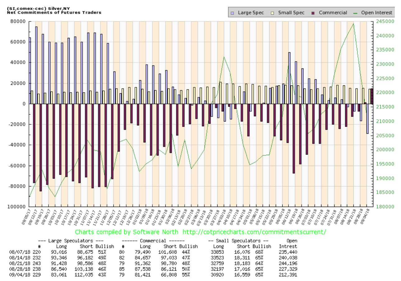
Like the gold commercial COT, the silver commercial COT has turned positive. This past week the silver commercial COT improved to 55 percent from 50 percent. Long open interest fell roughly 6,000 contracts while short open interest fell almost 20,000 contracts. Open interest contracted on what was a down week. The large speculators remain quite negative as their COT fell to 43 percent from 46 percent. Short open interest jumped by roughly 9,000 contracts. The commercial COT is quite bullish even as silver prices have made new 52-week lows. Overall, the commercials are long 14,613 contracts of silver and the large speculators are short 28,974 contracts of silver. Each contract is worth 5,000 troy ounces.
© David Chapman
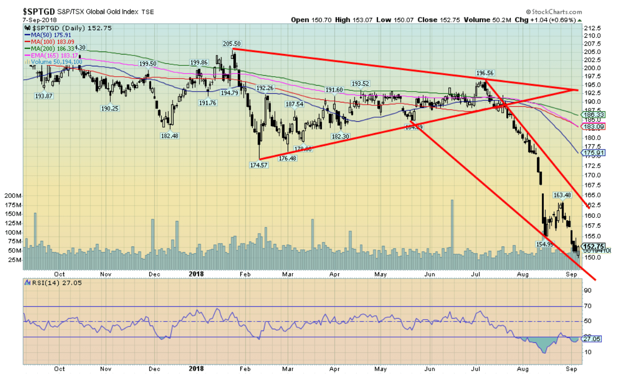
The pedal is to the metal and for the gold stocks, that means they just keep falling. Once again, the TSX Gold Index (TGD), as well as the Gold Bugs Index (HUI), fell to new 52 week lows this past week. The TGD lost 2.9 percent on the week while the HUI fell 4.9 percent. Divergences have crept in and many indicators are treading in deeply oversold territory. As well, the sentiment is miserable. The gold stocks in relation to gold remain extremely cheap on a historical basis. The TGD did show some encouragement on Friday by managing to eke out 0.7 percent gain on the day after making another 52-week low. Technically, it counts as a reversal day but it is not a key reversal day. The TGD needs to regain above 162.50 to suggest to us that the downtrend could be over. The TGD does appear to be at the bottom of a bear channel, so further downside at this time appears limited.
© David Chapman
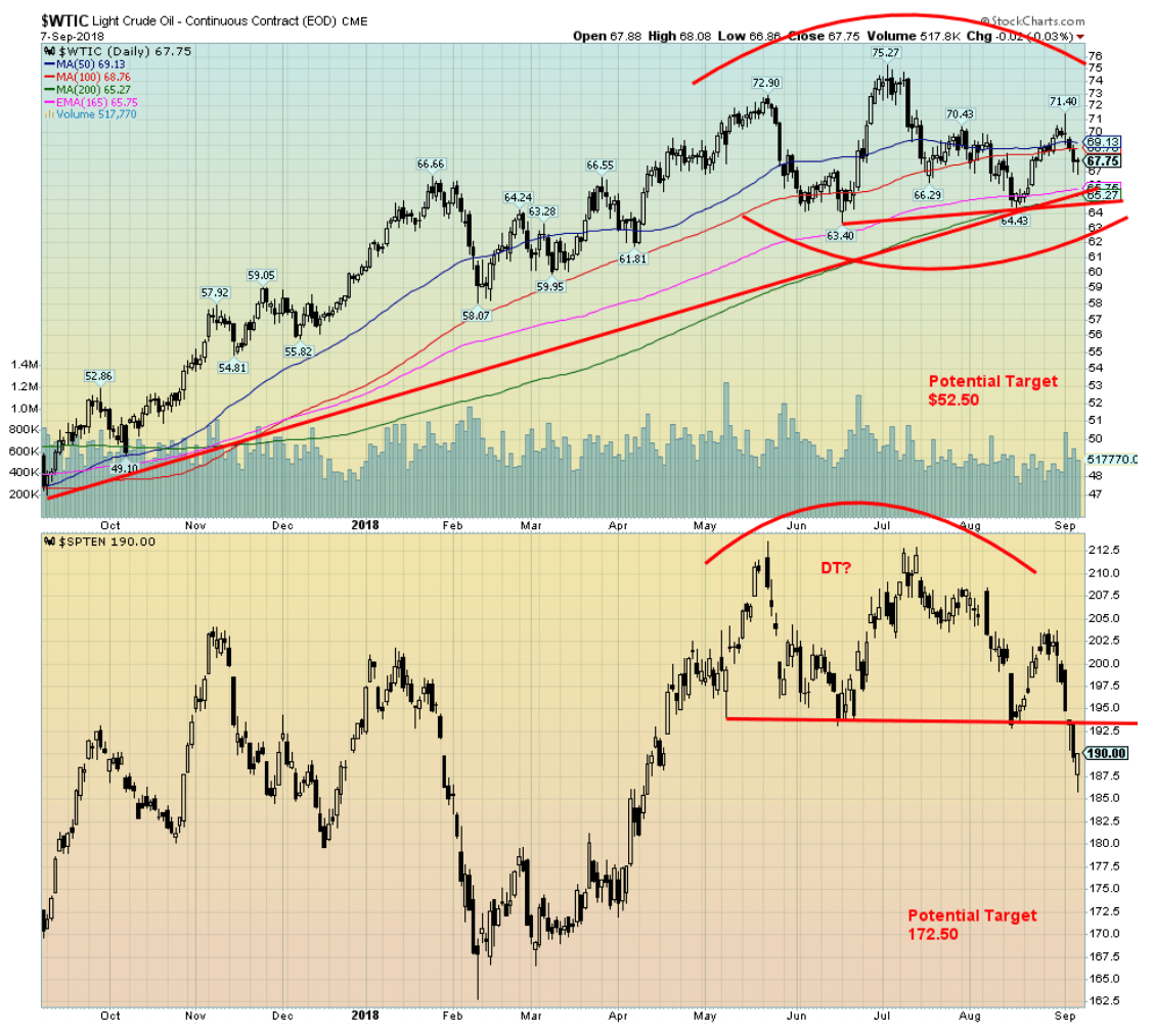
Are oil prices topping? They could be. WTI oil is forming a potential head and shoulders top while the TSX Energy Index (TEN) has formed what may be a double top. Targets are below at $52.50 for WTI oil once it breaks under $64 and 172.50 for the TEN. The TEN already appears to have broken down under its neckline of the double top. We are moving into the heart of hurricane season and that could cause dislocations. As well, sanctions are supposed to bite against Iran and Trump wants to squeeze their oil sales. That could cause supply problems unless the slack is picked up primarily by Saudi Arabia. The head and shoulders pattern would be broken if WTI oil were to regain above $73 and the TEN would negate the double top by returning above 202.
Chart of the week
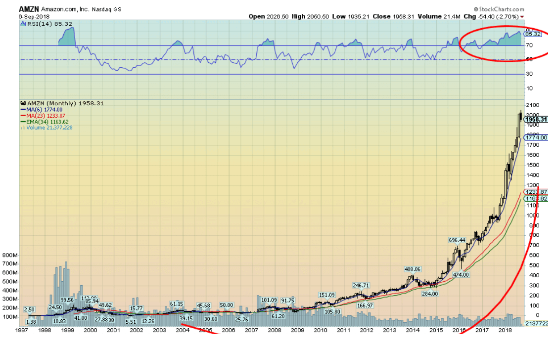
© David Chapman
Up, up, and away! The favorite whipping boy of President Donald Trump has become a trillion-dollar company. Amazon (AMZN-NASDAQ) now follows Apple (AAPL-NASDAQ) into the trillion-dollar stratosphere. Since bottoming at $61.20 during the financial crash of 2008 Amazon has soared to almost $2000 for a gain of some 3000 percent. Stocks and stock indices are not supposed to go parabolic. Yet Amazon has been almost straight up since 2014. Yes, the tax cuts have helped. But rises such as this usually end in tears and not tears of joy.
Amazon was founded in 1994 by Jeff Bezos, now one of the world’s richest men with a net worth estimated at $167 billion. Amazon’s tentacles reach into almost every corner from retail to groceries to video streaming. Amazon went public in 1997 at $18. Amazon is involved in web services for companies like Airbnb, Netflix, and Unilever. They have their own content, developing TV shows and movies. Healthcare is probably its next big target. They own media through The Washington Post (although it is a separate company), a newspaper that regularly draws the ire of the President. The President also wants to look into all of its operations and questions its dominance in so many sectors.
Irrespective of this, cities are falling all over themselves to be the next big Amazon headquarters with huge tax breaks to follow. Amazon, along with Apple, are now bigger than many countries. Either company could swallow all of the gold mining companies in the world and still rank in the top five companies by market cap in the world.
We can’t help but notice that the monthly RSI has been over 70 now for at least two years. Again, this is very unusual. Nothing goes up forever. Unless it seems your name is Amazon, giving true meaning to a race of female warriors.
(All charts are courtesy of Stock Charts and COT Price Charts.)
—
DISCLAIMER: David Chapman is not a registered advisory service and is not an exempt market dealer (EMD). We do not and cannot give individualized market advice. The information in this article is intended only for informational and educational purposes. It should not be considered a solicitation of an offer or sale of any security. The reader assumes all risk when trading in securities and David Chapman advises consulting a licensed professional financial advisor before proceeding with any trade or idea presented in this article. We share our ideas and opinions for informational and educational purposes only and expect the reader to perform due diligence before considering a position in any security. That includes consulting with your own licensed professional financial advisor.


Youth Cannabis Use in Colorado Is Falling — But the Full Story Is More Complex
The 2026 Colorado survey shows teen cannabis use fell to 10 percent in 2025, down from 21 percent in 2015....


Morocco’s Growth Holds at 4.6% as Agriculture Offsets Economic Pressures
Morocco’s economy grew 4.6% in Q1 2026, driven by a strong agricultural rebound offsetting declines in industry. Services expanded moderately...


Abivax Shares Surge as New Trial Data Eases Safety Concerns Over Ulcerative Colitis Drug
Abivax shares surged nearly 36% after positive updated trial results for its ulcerative colitis drug obefazimod reassured investors following earlier...


El Dorado Raises $9M to Expand Cross-Border Fintech Platform
El Dorado, a Latin American fintech improving cross-border financial services, raised a $9 million Series A led by Paradigm with...


Bitcoin Stalls Near $60K as Strategy Moves, ETFs Outflow, and EU MiCA Rules Take Effect
Bitcoin hovers near $60,000 with ETF outflows, while Strategy boosts reserves, sells BTC, and raises dividends to reassure investors. Ethereum...
 |
|
 |  |
 |
|
-

 Crowdfunding2 weeks ago
Wyrmgold Launches Crowdfunding Campaign for Believe in me! (please)
-
 Business2 days ago
Dow Jones Near Highs Signals Strength Until Volatility Returns
-
 Crypto1 week ago
XRP Under Pressure Amid Macro Forces, Fed Policy, and Regulatory Shifts
-
 Cannabis3 hours ago
Youth Cannabis Use in Colorado Is Falling — But the Full Story Is More Complex
You must be logged in to post a comment Login