Featured
U.S. labor force rises; bitcoin and gold slide
Labor force rate jumps higher and surpasses 190,000. Bitcoin trading closed in on a new low. Gold stocks dropped further by three percent.

This might turn out to be a week to remember. No, stock markets globally haven’t crashed, but they have been shaken. International markets, particularly in the EU, were hit harder than U.S. markets. The trigger was the potential for another EU debt crisis—this time, it’s not centered on Greece but on Italy, the world’s ninth largest economy. In 2011, the Dow Jones Industrials (DJI) fell almost 20% as the PIIGS (Portugal, Italy, Ireland, Greece, and Spain) debt crisis shook global markets.
At the time, the debt crisis was centered mostly around Greece, a country with a GDP of about $288 billion and government debt of about $500 billion in 2011. The crisis almost tore the EU apart, and global markets were on tenterhooks as to whether the crisis could spread. The European Central Bank (ECB) dropped interest rates to zero and even lower and embarked on its own version of quantitative easing (QE) to stem the crisis.
But a debt crisis centered around Italy would make Greece’s crisis look like a “Sunday school picnic.” Italy’s GDP is almost $1.9 trillion, and its government debt outstanding exceeds $2.3 trillion. Worse, its banks are effectively walking zombies. It was estimated that non-performing bank loans in Italian banks were almost 20% of total loan value. Banks have been effectively bailed by the state, and there have been bail-ins whereby depositors’ funds are converted to equity. There have been some reforms, but there remain serious structural problems. Italy is a country burdened with an excessive bureaucracy, uncompetitive industries, convoluted politics, and corruption.
In the March 2018 election, two anti-establishment, Eurosceptic parties gained power, while a third center-right party did not have enough seats to form a government. Since March, no party has been able to form a government. The result is a hung parliament, although it seemed this week that situation was coming to an end as the two Eurosceptic parties, one from the right and another from the left, appeared to find a way to establish a government. The political crisis is potentially turning into a debt crisis. The threat of yet another election could return a populist party bent on taking Italy out of the EU.
Italy’s bond market is the fourth largest in the world behind the U.S., Japan, and China. The result of all of the political chaos sent bond yields in Italy soaring (prices falling as prices move inversely to yields) and stock markets falling. It was no surprise as well that the Euro fell sharply as the US$ jumped sharply. Gold usually falls when the US$ rises but generally held with a slight upward bias. Chaos is good for gold.
© David Chapman
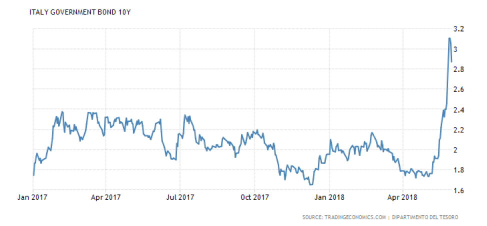
The Italian 10-year government bond leaped 150 basis points to over 3%. The speed at which the market rose (yields) caught most by surprise, especially considering it is central banks who are the prime holders of Italian debt. And it wasn’t just contained to Italy as bond yields in Portugal, Greece, Spain, and other weaker EU countries also jumped. The beneficiaries of the chaos were bonds in Britain, the Netherlands, Germany, Switzerland, and the U.S. as their prices jumped and yields fell.
Global stock markets were hit to varying degrees. The DJI at one point was down 500 points on May 29, 2018. The Italian stock market, as represented by the FTSE MIB, was down roughly 12% in May.
But this crisis goes beyond just Italy and its Eurosceptic parties that have gained political power. It is the survival of the EU itself that could be at stake. Italy is just another country being torn apart by growing nationalism. Other EU countries such as Poland and Hungary are also under the grip of right-wing nationalist parties. It shows itself as well in the nationalist policies of the U.S. under Trump where globalization, global financial flows, and international trade are under attack. Trump has now slapped steel and metal tariffs on the EU, Canada, and Mexico. Trade wars with China are sure to escalate as well.
The EU was ill-conceived from the get-go despite the desire to unite the countries. But it was always an unequal marriage with Germany and France and even Britain at the center with the others around it. The common currency caused dislocations. There was a common currency, but there was no political oversight. For some, especially Germany, the common currency was a boon as it effectively devalued the Deutsche Mark. But for others such as Italy and Greece, it meant they lost control of their currency (Lira, Drachma) as the Euro was effectively an upward revaluation of their currencies—currencies they could no longer control.
With Germany, France and even the Netherlands and Austria as strong currency countries, they thrived. They have a $1 trillion trade surplus with the rest of the EU and the Eurozone, resulting in thriving wages in countries like Germany, France etc. but beaten down wages in the Mediterranean countries and Eastern Europe. Many Eastern European countries joined the EU and the Eurozone figuring it would be better for them. It hasn’t been. Unemployment in the Euro area averages 8.5%, according to The Economist. But it is 3.4% in Germany and 11% in Italy. In others like Greece and Spain, it is 20.8% and 16.1% respectively.
Yes, there was a central bank in the ECB, but its powers were considerably less than the Federal Reserve. Each country continued to have its own central bank, sometimes seeming in opposition to the ECB. With no political control, the ECB may have a solution but be opposed by the politics of the country or its central bank as was the case with Greece during the 2011-2012 crisis.
The financial crisis is not just limited to Italy as other countries such as Venezuela, Argentina, the Philippines, and Turkey are also gripped with both political and financial crises. A massive amount of debt denominated in US$ is not helping as a rising US$ coupled with rising U.S. interest rates makes that debt more expensive. That debt lies predominantly in emerging markets.
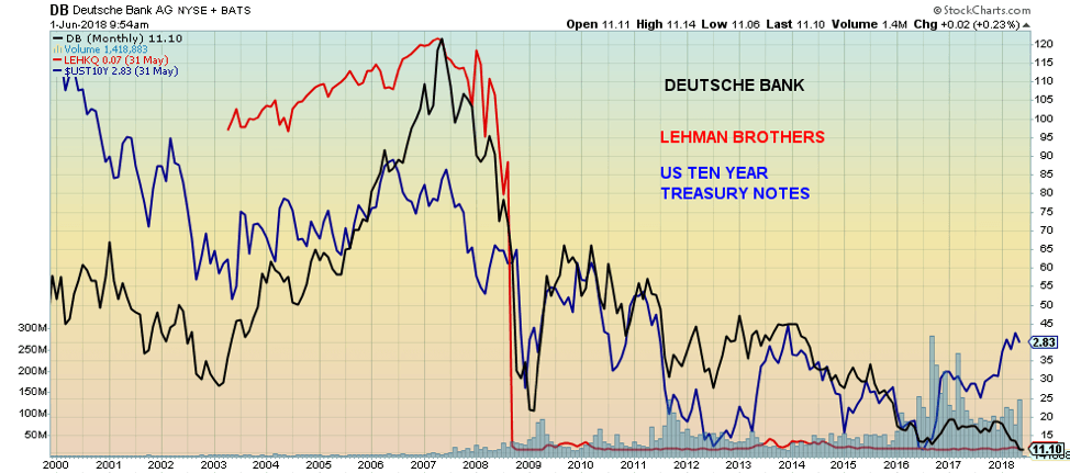
The financial crises flow over into the international banking system. Rumors persist that Deutsche Bank, one of the largest banks in the world (17th with assets estimated at $1.8 trillion), is once again potentially in trouble despite slashing costs and staff. A collapse of Deutsche Bank would make the Lehman Brothers collapse in 2008 look like another “Sunday school picnic.” But Deutsche Bank is a bank in the category of “too big to fail.” Or is it? Deutsche Bank has fallen to new all-time lows. The FDIC has declared Deutsche Bank is a problem bank. The fear is there are hidden derivative losses. Here is a comparison with Lehman Brothers.
© David Chapman
Trade wars have a very checkered (and dangerous) history. The tariffs imposed by the U.S. accomplish little except to trigger retaliation. Trade wars tend to become a game of one-upmanship. They can also lead to real wars. Bizarrely, President Trump thinks “trade wars are good.” History does not support him. Without going into details, we can go back centuries to see the negative results of trade wars. The events leading up to the American Revolution (remember the Boston Tea Party) in 1775–1783 were sparked by tariffs (taxes) placed on goods by Britain.
Fast forward to a century later, a British trade deficit, especially on tea from China (there is tea again), sparked Britain to export opium to China. Opium created an epidemic, and the Chinese, in retaliation, put tariffs on it and then banned it. That sparked what became known as the Opium Wars in 1839–1842 and 1856–1860.
But it was the trade wars that preceded both WW1 (1914–1918) and WW2 (1939–1945) that were the most devastating. As historians note, globalization is a cyclical process. It rises and falls as backlashes result in rising nationalism, xenophobia, and inequality and social unrest. Many note the enactment of the Smoot-Hawley Tariff Act of 1930 as a leading cause of the Great Depression and events that triggered WW2.
Today’s events appear to be more akin to the events leading to WW1. Globalization, surges in immigration, increasing inequality, technological changes, and government policies that appear to favor the haves while leaving behind the have-nots all conspire to create the same conditions. Compare the challenge to British global hegemony by Germany before WW1 and today’s challenge to U.S. global hegemony led by China—and one has the conditions for a perfect storm that gives rise to demagogues such as Trump and could, in theory, lead to WW3. We live in dangerous times. So far, the markets don’t seem to care. But they will.
(Source: Deutsche Asset Management) © David Chapman
U.S. employment numbers
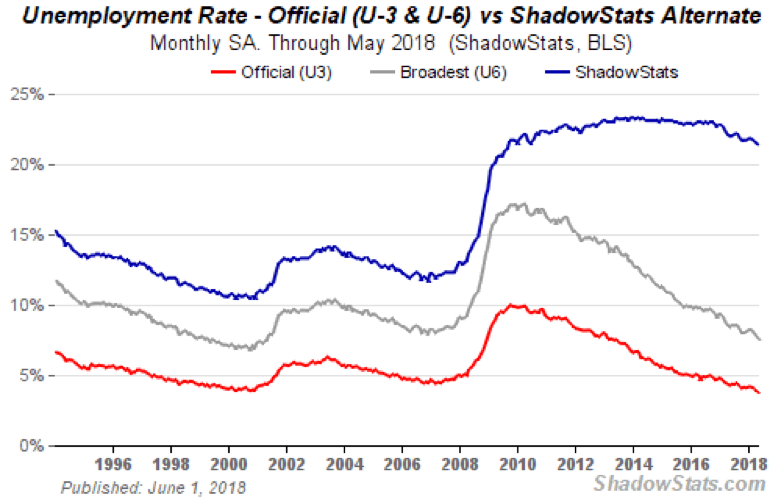
The U.S. non-farm payrolls reported a gain of 223,000, well above the expected 190,000. This helped strengthen the US$, sending U.S. stocks higher and gold lower. Trade wars and Italy’s financial troubles be damned. The April non-farm payrolls were revised down to 159,000 from 164,000. The unemployment rate fell to 3.8% (actual 3.75%) (U3) from 3.9%, the lowest level since April 2000. The U6 unemployment rate (the BLS broadest unemployment measure (U6) includes short-term discouraged workers and other marginally attached workers, plus part-time workers looking for full-time employment) came in at 7.6% vs. 7.8%. That’s the best since May 2001. The Shadow Stats number (U6 plus long-term discouraged workers defined out of official existence in 1994) came in at 21.4% vs. 21.5%.
© David Chapman
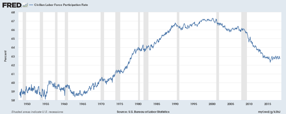
In looking at other numbers, the BLS labor force participation rate slipped to 62.7% from 62.8%. This helps contribute to a lower unemployment rate (U3) because fewer people are working. Yet the civilian employment-population ratio rose to 60.4% from 60.3%. The civilian labor force was higher by 485,000, but the number of people considered not to be included in the labor force also rose up 170,000. The number of part-time workers fell by 625,000, while the number employed rose by 293,000. Full-time employment jumped by 904,000. The number of people unemployed fell by 281,000.
Average hourly earnings rose by eight cents to $26.92 or 2.7%.
Overall, the May employment report will no doubt be viewed as quite positive and signal the economy is doing just fine. CNBC will be jumping out of its chair. The expectation is the Fed will hike the key rate by another 25bp at the meeting on June 12-13, plus at least one more time in 2018.
The reality is the report hides flaws that suggest the employment situation is not as rosy as they would like us to believe. Two indicators tell this tale. The first is the labor force participation rate. Today at 62.7%, it is back at levels seen in 1978, a period when more and more people were moving into the labor force and finding employment. It, of course, was led by women. The labor force participation rate peaked in April 2000 at 67.3%.
© David Chapman
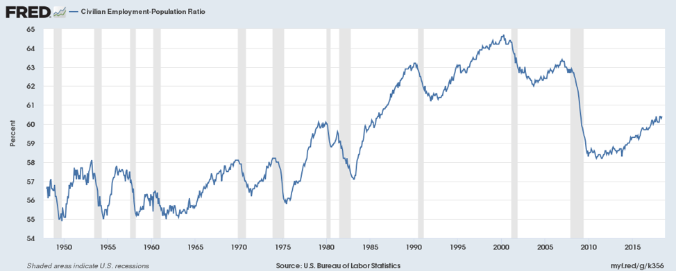
The second chart is the Civilian Employment-Population Ratio, a reflection of how many are working out of the civilian population. It stands at 60.4%, up slightly from the previous month. It is at levels that were last seen in the mid-1980s. What both indicate is that the economy is operating well below its potential of how many people could be employed. If the two of them were to return to their historical highs seen near 2000, then the headline unemployment level (U3) would be closer to 10% rather than the current 3.8%.
© David Chapman
The major difference is the high number of discouraged and displaced workers who cannot find employment and just give up. They are not even counted and typically show up in the “Not in the Labor Force” category. Not everyone in that category is a retiree, full-time homemaker, or full-time student. Currently, it has 95.9 million, but only 52.2 million are retirees, a level of 54.4%. Back in 2000, retirees made up 55.5% of those not in the labor force. Since 2000, the category has gone up by 26.8 million, but of that, only 13.8 million were retirees. Does that mean everyone else is in school or is a full-time homemaker? There are, according to the BLS’s figures, over 9 million people in the discouraged and displaced category. A veritable army of unemployed, chronically. Many are homeless.
Bitcoin watch!
© David Chapman
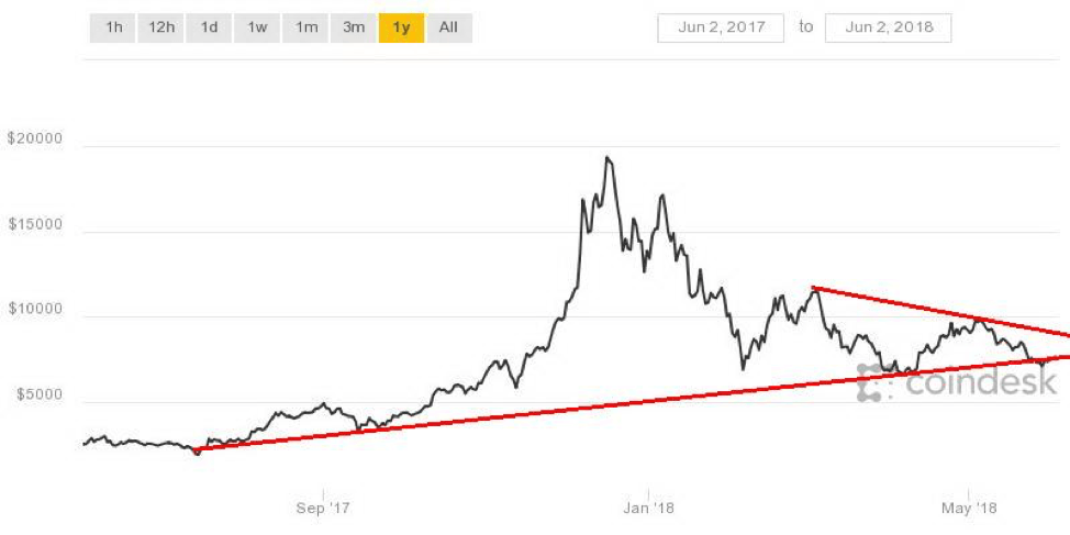
Going to Bitcoin, it went sideways this past week, off roughly 0.4%. It tested down to $7,000 but failed to break under that support level. The subsequent rebound was feeble, so odds of any new upswing are probably low. Overall, Bitcoin was down roughly 19% in May. The market capitalization of all cryptocurrencies is now down $330 billion, down $6 billion on the week, and a drop of 26% in the month of May.
There were winners, of course. Bytecoin (BCN) jumped 24% on the month. BCN currently has a market cap of $1.2 billion and is ranked 20 in terms of size. There are now a mind-boggling 1,640 different cryptos listed at Coin Market Cap, up 17 from the previous week. We confess the growth in the number of cryptos, and we are baffled as to who would actually use all of these different cryptos. The biggest users are in Asia—primarily Korea, Japan, and China.
But nothing has really changed. Regulators continue to circle. The DOJ is investigating (a criminal probe) into Bitcoin price manipulation. The DOJ is working with the Commodity Futures Trading Commission. The Securities and Exchange Commission is also lurking in the background. Despite all of this, it hasn’t halted the start-up funds in the blockchain sector. Binance is one of the largest cryptocurrency exchanges, and it has announced the launch of a $1 billion “Social Impact Fund” to foster the growth of blockchain and cryptocurrency startups. We have also seen other plans for blockchain funds and the creation of ETFs. But they are all in Asia.
There remain numerous bulls who continue to believe that it is merely a matter of time before Bitcoin rises to the heights once again. We doubt it, but the fact that so many bulls remain suggests to us there is further downside. Bitcoin has taken out the key Fibonacci 61.8% retracement of the rise of Bitcoin from the 2015 low of $162 to the 2017 high of $19,891. Below $4,800 increases the odds that the market could fall all the way to the lows, although we doubt that will happen.
For the moment, however, a break below $7,000 could set in motion a drop towards $6,000. The low thus far for the move is around $6,800. Odds are good that level should be taken out. Only a move back above $8,400 could suggest higher prices.
Markets and trends
Note: For an explanation of the trends, see the glossary at the end of this article. New highs/lows refer to new 52-week highs/lows. © David Chapman
© David Chapman
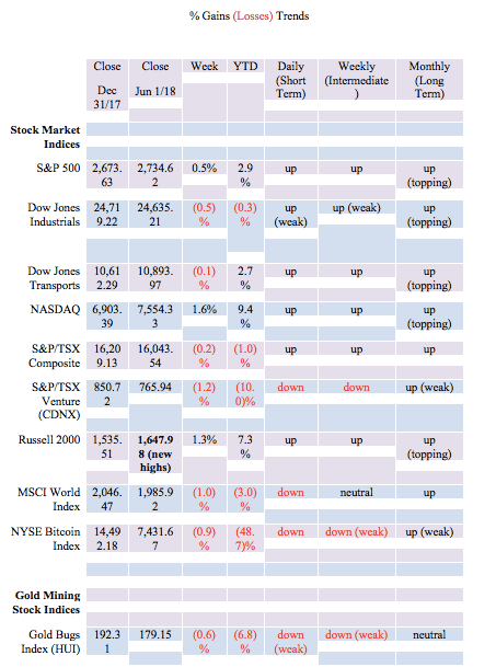
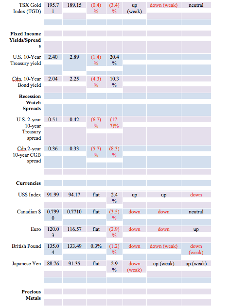
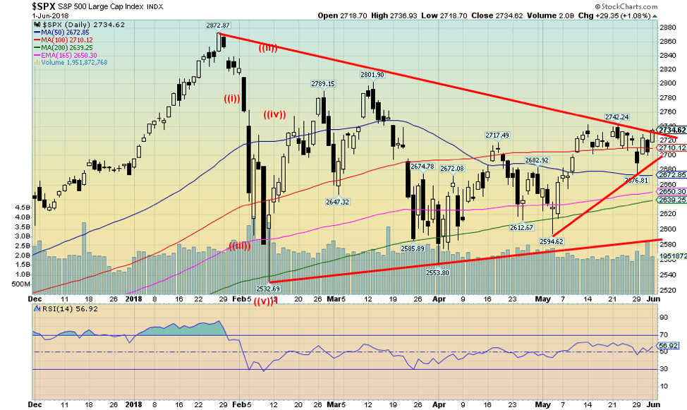
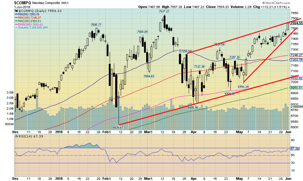
After falling earlier in the week because of trade wars and jitters over Italy, the U.S. stock markets rebounded on the heels of the better than expected employment numbers. The S&P 500 eked out a gain of 0.5% on the week. But not everyone participated. In what might be a divergence, the Dow Jones Industrials (DJI) fell 0.5% on the week, while the Dow Jones Transportations (DJT) was off a small 0.1%. The star was the NASDAQ, led by the FAANGs up 1.6%. The small-cap stocks soared to new all-time highs as the Russell 2000 gained 1.3%.
But trade wars and Italy jitters did impact international markets. Here at home, the TSX Composite fell 0.2%, while weaker gold prices helped push the TSX Venture Exchange (CDNX) down 1.2%. Overseas, they fared worse. The MSCI World Index was off 1%, the China Shanghai Index (SSEC) lost 2.1%, the Paris CAC 40 dropped 1.4%, the German DAX was down 1.7%, and the Tokyo Nikkei Dow (TKN) fell 1.2%. Only the London FTSE 100 held in but still was off 0.1%.
The S&P 500 appears to be on the cusp of breaking out to the upside. But the market does not appear to have a lot of strength. Volume and other indicators are not suggesting a major move ahead, even if the commercial COT remains positive and the small cap stocks have fared much better than the large-cap stocks dominating the S&P 500. Volatility picked up with the drop in the markets in the early part of the week but fell again when the market rebounded. The S&P 500 could break out, and we could see new highs for this move. However, only a move above the March high of 2,802 could suggest a move to new all-time highs. Below 2,700, the S&P 500 begins to look shaky. The DJI could signal further losses on a break below 24,250.
© David Chapman
The NASDAQ is suggesting it could make a run to new all-time highs. It is at a potential channel line, but there is not a lot of space between Friday’s close at 7,554 and the all-time high of 7,637. That’s only another 1.1% move. But we do respect divergences, and as we noted, the DJI and the DJT were down on the week and remain well below their all-time highs. The S&P 500 is as well, although it looks more positive than either of the DJI and the DJT.
We’d prefer the divergences were showing up between the DJI and the DJT. Still, it is a head-scratcher when one sees the tech-laden NASDAQ approaching new all-time highs and the small-cap Russell 2000 and S&P 600 making new all-time highs and the large-cap stocks staying well back of their highs. It is these kinds of divergences that potentially make for a final high.
Time, of course, will tell. The NASDAQ begins to break down under 7,350 and especially under 7,200. Oh, and did we mention what looks like a developing ascending wedge triangle on the NASDAQ. If correct, that is bearish going forward.
© David Chapman
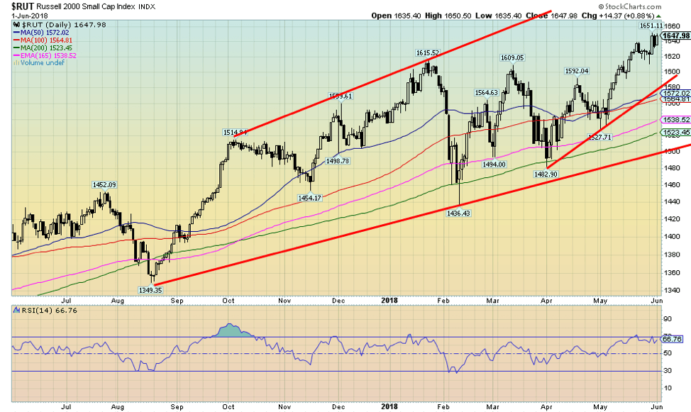
Here is the Russell 2000 fresh off of a new all-time high. The Russell 2000 (and the S&P 600) are diverging with the large-cap stocks represented by the DJI and the S&P 500, and they are diverging with indicators that are not making new highs along with the price. Just something to watch for. A break under 1,620 could signal the end of this rally. Otherwise, there does appear to be room to move higher.
© David Chapman
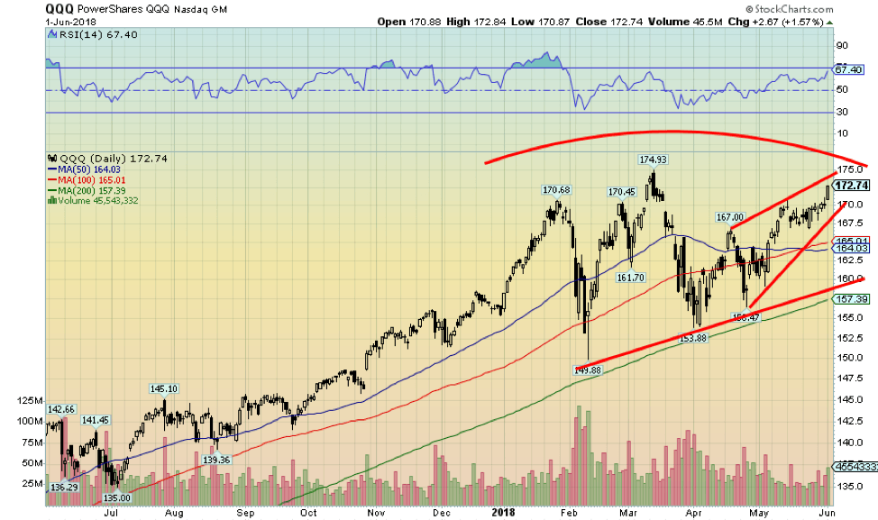
This is the PowerShares QQQ NASDAQ 100. It is an ETF representing the NASDAQ 100. What is interesting about this chart is the QQQs appear to be making an ascending wedge triangle as it rises towards its previous all-time of 174.93 seen in March 2018. It might have a little more wiggle room to the upside early this week, but our suspicion is if this ascending wedge is correct, it should soon run out steam, turn around, and fall once again. The wedge begins to break under 168.50 and suggests the QQQs should fall back at least to 160 once again.
© David Chapman
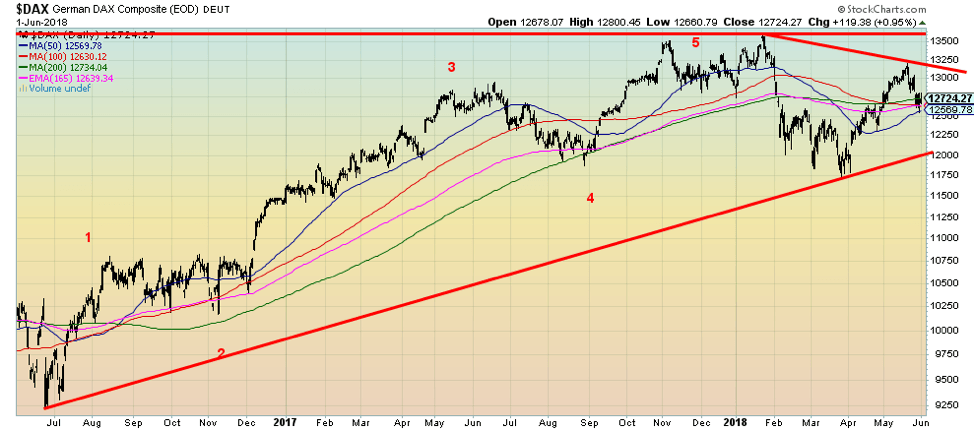
The German DAX may have completed a 5-wave advance with the top in October 2017. Since then, the DAX has made an attempt at taking out those highs in early 2018 and then failed and fell sharply into March. The recovery has been going well but appears to have run out of steam and is now turning down again. A firm break below 12,600 would suggest that the DAX is more likely poised to test the recent lows. Italy jitters are at the heart of the problem. As well, maybe it was nervousness about Deutsche Bank.
© David Chapman
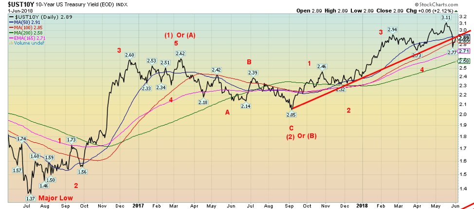
Trade wars and Italy jitters sent investors into the safety of U.S. Treasuries, German Bunds, and even British Gilts this past week. The result was the 10-year U.S. Treasury note yield initially falling to a low of 2.77%. It also broke the long uptrend line from the low seen last September 2017 at 2.05%. It also suggests that the 10-year may have topped (in yield, bottomed in prices as yields are inverse to prices).
Regaining back above 3.00% would suggest that the uptrend is not over just yet. And we do remain shy of our original target of a yield of at least 3.20%. A break of 2.70% would probably seal the deal that the rise in yields is over. But it would also suggest something is going amiss and that U.S. Treasuries are being sought for safety, as was the case in the early part of the week. The better than expected non-farm payrolls steadied the bonds on Friday, and the yield rose to close the week at 2.89%.
Recession watch spread
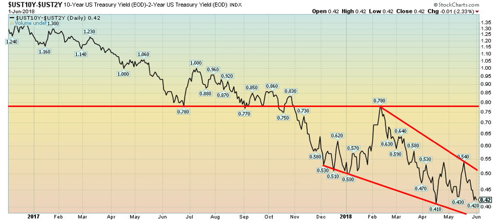
© David Chapman
With the expectation that the Fed will likely hike its key rate at the upcoming two-day Fed meeting by at least another 25bp, the 2-year–10-year spread narrowed slightly this week to 0.42%. It is now just above the previous low of 0.41%. The spread still does not suggest an approaching recession. Usually, the spread has to go negative for a period of at least four months. But the direction remains firmly to the downside.
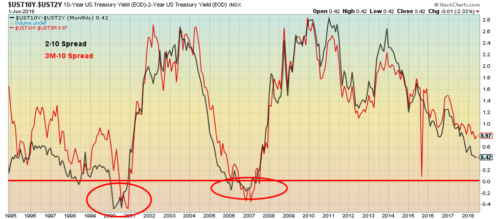
© David Chapman
There has sometimes been a discussion as to which spread is a better indicator of an impending recession: the 2-10 spread or the 3-month bill–10-year spread. So here, we show both on top of each other. As one can see, there is little to choose between the two. Both went negative in 2000 and again in 2007 before the recessions of 2000–2002 and 2007–2009. Currently, the 2–10 spread appears to be the weaker of the two, but with impending Fed hikes, the 3M–10 spread should narrow further. The 2–10 spread appears to lead the 3M–10 spread, so the current weakness of the 2–10 spread vs. the 3M–10 spread appears to be normal.
© David Chapman
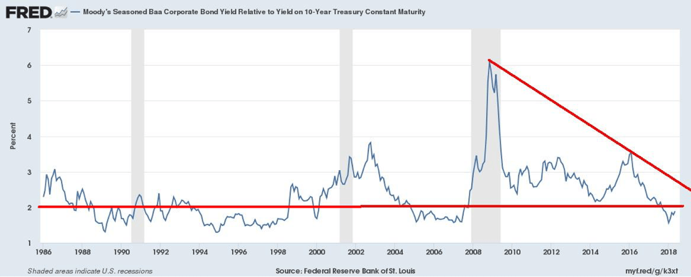
We might want to keep an eye on credit quality. This is spread between Moody’s Baa Corporate Bonds and the U.S. 10-year Treasury note. A spread of 2% appears to be the dividing line. If it’s below 2%, all is good, but above 2%, credit quality is a concern. Note the spike during the 2008 financial crisis. The tendency of this indicator is that credit spreads rise as the market deteriorates but fall when things improve. As was shown in the 2008 financial crisis, it can change and rise quite quickly. It has moved higher recently but still remains below 2%. A move above 2% would be a strong signal to make sure one is out of weak credits. And it also would indicate impending trouble.
© David Chapman
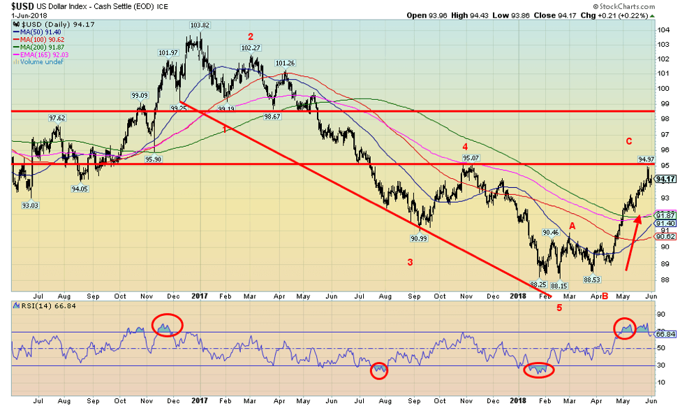
Has the US$ Index topped? For some time now, we have noted a potential target for the US$ Index up to 95 or just a bit beyond. This week, we hit a high of 94.97 before the US$ Index backed off, closing at 94.17 and leaving it with a small gain of just 0.1%. Trump’s announcement of tariffs for Canada, Mexico, and the EU triggered the US$ Index lower after it was political instability and a potential debt crisis in the EU (Italy) that took the US$ higher. It could be that this week’s pullback from the highs is merely a launch for another run at 95 and a higher high. Odds are pretty good that it is the case as the rise from 88.53 back in March 2018 does not appear to be over.
© David Chapman
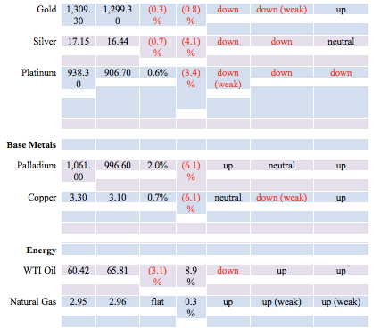
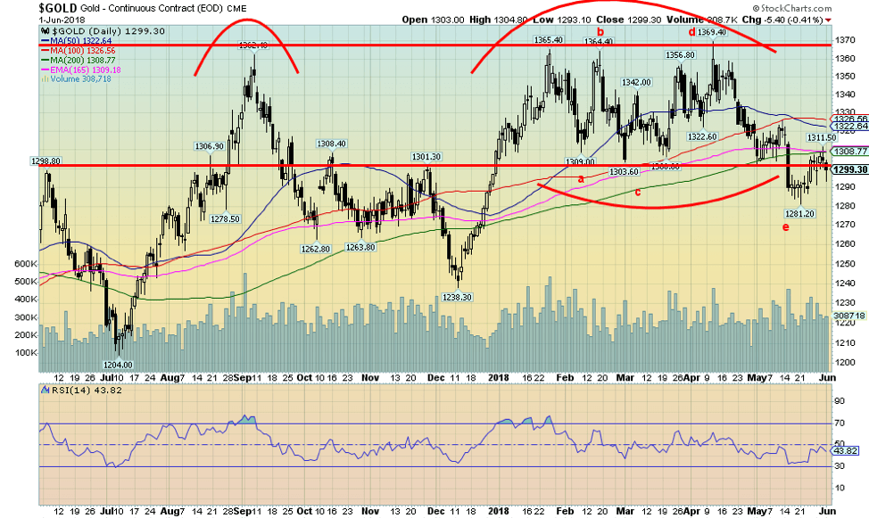
Gold fell this past week, losing 0.3%, and is now down 0.8% on the year. The catalyst for the drop was Friday’s non-farm payrolls that came in higher than expected. Everyone now expects the Fed to hike rates 25bp at the upcoming Fed meeting. Gold has struggled to hold its head above $1,300 closing as it did Friday just below that level. Further resistance has built up at $1,310. There is even further resistance seen up to $1,320 to $1,325. Above $1,325, a stronger move could get underway.
We continue to believe gold has completed an abcde type of pattern, and the next significant move should be to the upside. The caveat is a move back under the recent low at $1,281. The conditions for gold are there (debt, the potential for a financial crisis, global geopolitical instability, trade wars, and political instability), but no one seems to care. A Fed rate hike has proven to be a catalyst for a gold rally in the past. We expect the same to occur again.
© David Chapman
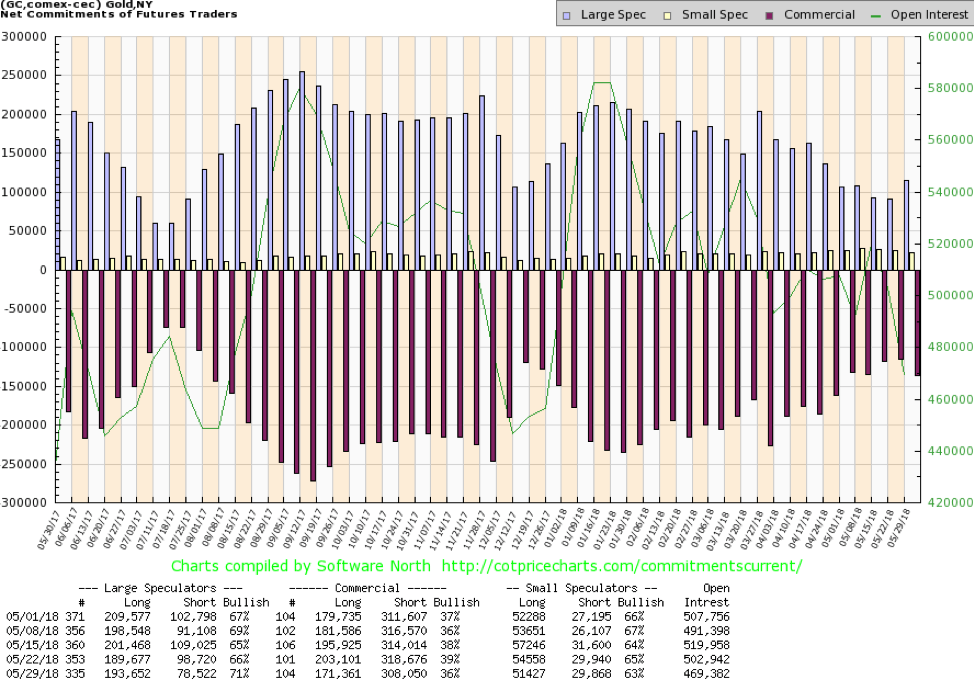
The gold commercial COT slipped this past week to 36% from 39% the previous week. The large speculators COT (hedge funds, managed futures, etc.) rose to 71% from 66%. Are commercials losing their bullishness? It would appear that they are at least faltering. Maybe it’s because their patience is wearing thin in terms of a move to the upside.
Nonetheless, this past week, both long and short open interest fell, suggesting some caution coming in. We are still over a week away from the Fed meeting, so it is hard to understand its reluctance to stick with its position. Short open interest fell just under 10,000 contracts, while short open interest fell almost 32,000 contracts. Falling open interest is associated more with a cautionary market as it lightens up before an important event (the Fed Meeting of June 12–13).
© David Chapman
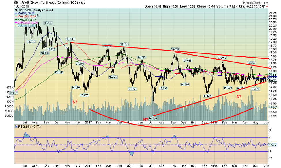
Silver prices meandered this past week, losing almost 0.7%, and are now down 4.1% on the year. The pattern continues to look positive, and silver still appears to be forming a multi-month huge head and shoulders bottom reversal pattern.
What is needed is an end to the recent sideways trading and give us some direction. One could argue that shift could be to the downside, but it is unlikely given the huge basing that appears to have taken place over a couple of years. It is instead more like a launch pad for a potential significant move to the upside.
A firm break above $17.75 could send silver prices sharply to the upside with potential targets up to $22.40. We suggest that only a break below $16.25 could change this seemingly more bullish scenario. But like gold and the gold stocks, silver’s performance has been frustrating. Bearish sentiment towards silver continues to hover down near 10%—meaning, it is hard to find a bull anywhere.
© David Chapman
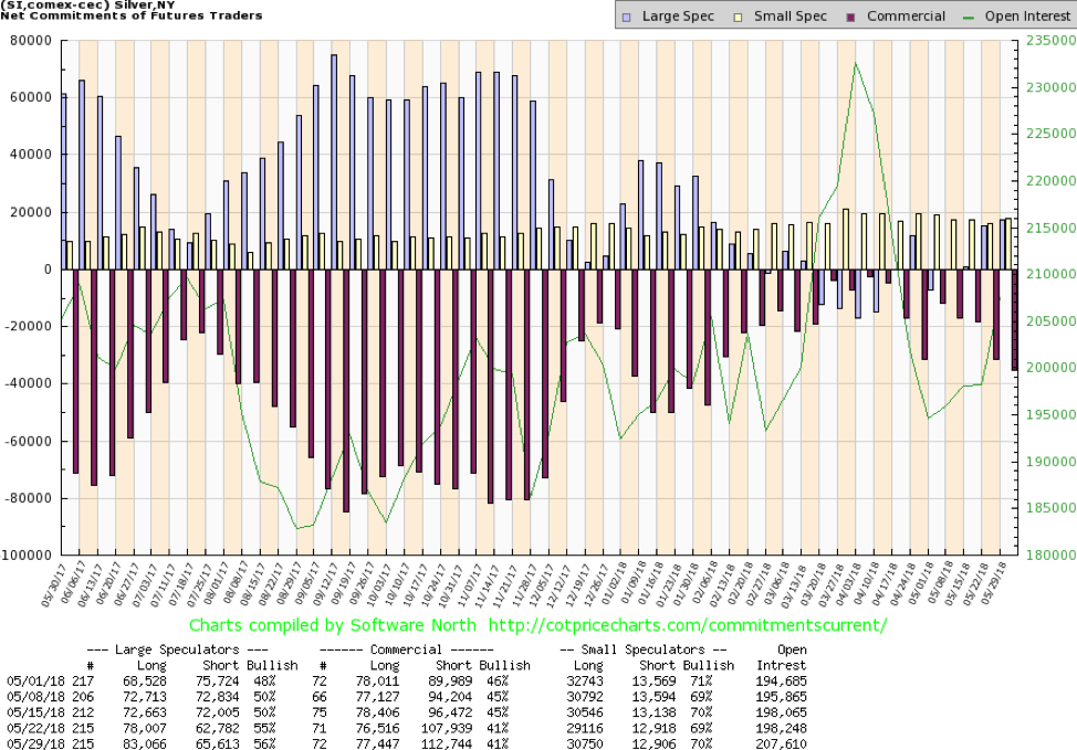
The silver COT, like the gold COT, is now somewhat confusing. The commercial COT remained unchained at 41%. However, there was a rise by roughly 5,000 contracts in short open interest along with about a 1,000 contract rise in long open interest. The large speculators COT rose to 56% from 55% with a rise of almost 5,000 contracts in long open interest, along with a rise of just under 3,000 contracts in short open interest. The silver COT remains bullish but diminished in its bullishness over the past couple of weeks.
© David Chapman
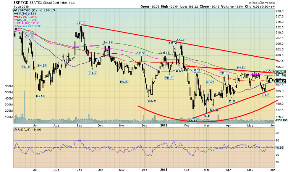
Gold stocks, as represented here by the TSX Gold Index (TGD), continue to frustrate and tease. The TGD actually fell this past week, losing 0.4%, and is now down almost 3.4% on the year. Still, that is better than the U.S-based Gold Bugs Index (HUI) that lost 0.6% this past week and is down 6.8% year to date. But gold stocks remain cheap compared to the metal, and sentiment towards the gold stocks, while not rock bottom, is not exactly robust either. The Gold Miners Bullish Percent Index (BPGDM) sits currently at 46.4%.
While these are not exactly depressive levels, they are also nowhere near elation levels. There is room for growth. The TGD continues to form what appears to be a rising or ascending triangle. The break level is just below 193 with a level of secondary resistance seen near 198. Once over 200, the TGD could start a move that could see it rise to potential targets near 265. A breakdown under 185 would negate the bullish scenario and lead to a re-test of the recent lows.
Chart of the week
© David Chapman
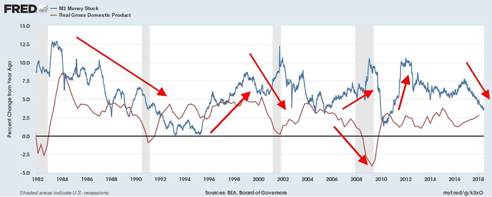
Ever since the Fed announced back in 2015 that it would be embarking on a period of hiking interest rates and divesting itself of its huge portfolio (the opposite of quantitative easing (QE), quantitative tightening (QT)), monetary growth has been falling. Monetary growth is the lifeblood of the economy because without monetary growth, economic growth would tend to stagnation and then contraction if conditions became too tight.
Yet, as the chart above of M2 money stock annual growth, along with GDP annual growth, it shows that M2 growth has been slowing now for a period of two years dating back to 2016. Periods of slowing monetary growth eventually show up as periods of stagnation or a slowing economy, if not outright recession. We saw that in the 1980s, where slowing economic growth accompanied the decline in monetary growth.
Following a burst of monetary growth, the economy predictably took off. We saw that in the 1990s and in the 2000s before the onset of the global financial crisis. Given the sluggishness of economic growth (GDP), we wonder when it will turn from stagnation to contraction, given the ongoing contraction in monetary growth since 2016.
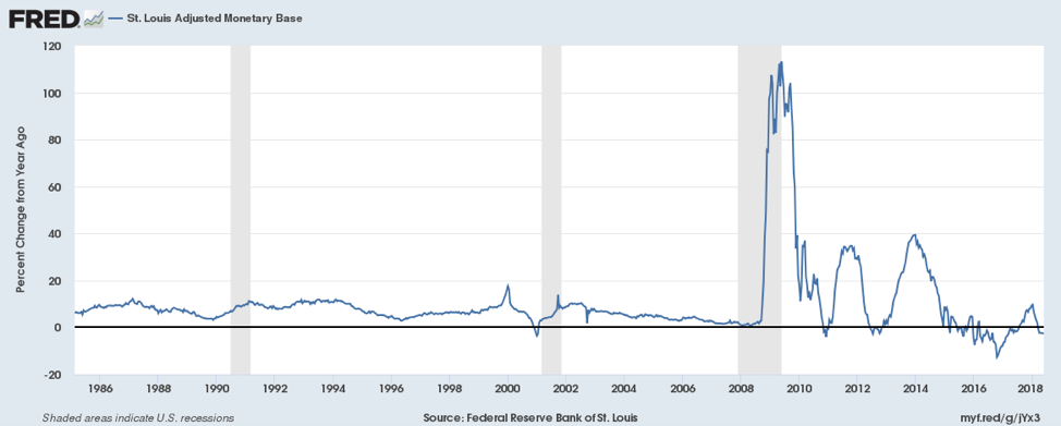
Our second chart below shows the monetary base, which in many respects is also a substitute for the Fed’s balance sheet. The huge burst in the growth of the monetary base occurred as a result of the global financial crisis of 2007-2009. The monetary base soared from roughly $800 billion to over $4 trillion. But for the past few years, its growth has been negligible; indeed, it is contracting as a result of QT. QT like interest rate hikes is a tightening of monetary conditions. Eventually, it will come home to roost with contracting economic growth.
© David Chapman
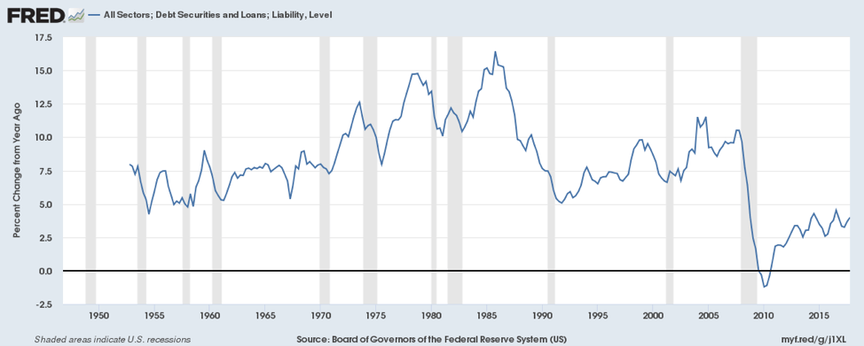
Our third and final chart is debt growth. This chart includes all debt (U.S. only) of government, corporate, and consumer. Note how debt grew consistently up until the mid-1980s before contracting with a series of financial crisis in the late 1980s that led to the early 1990s recession. Debt grew again throughout the 1990s but slowed at the end of the cycle, and the result was the early 2000s recession. But debt growth contracted considerably following the financial crisis of 2008. Since then, it has been growing again. This only goes up to the end of 2017.
Since then, roughly $1.5 trillion has been added in just five months, an annual growth rate of over 5%. No, the rate of growth isn’t as high as it was back in the 1970s or even the 1990s, and that is another explanation as to why GDP growth has been sluggish coming out of the last recession. Dollar-wise, debt growth has been huge as the U.S. has added some $20 trillion in debt since 2008 (includes government, corporate and consumer debt).
© David Chapman
__
DISCLAIMER: David Chapman is not a registered advisory service and is not an exempt market dealer (EMD). We do not and cannot give individualized market advice. The information in this article is intended only for informational and educational purposes. It should not be considered a solicitation of an offer or sale of any security. The reader assumes all risk when trading in securities and David Chapman advises consulting a licensed professional financial advisor before proceeding with any trade or idea presented in this article. We share our ideas and opinions for informational and educational purposes only and expect the reader to perform due diligence before considering a position in any security. That includes consulting with your own licensed professional financial advisor.


EFPIA Warns Limited SPC Reform Could Weaken EU Pharma Competitiveness
EFPIA supports the EU Biotechnology Law and a 12-month SPC extension but warns the current proposal is too limited. A...


EU Approves €23B Italian Renewable Energy Plan to Boost Climate Goals
The European Commission approved Italy’s €23 billion aid scheme to boost renewable energy and meet 2030 climate goals. Supporting wind,...


Institutional Bitcoin Buying and LiquidChain Presale Signal Market Optimism
Institutional Bitcoin buying, like Strategy’s 1,550 BTC purchase, signals confidence, stabilizes prices, and may trigger bullish momentum. Meanwhile, infrastructure projects...


The German Biotech Industry Faces Funding Crunch Despite Market Stability
German biotech held steady in 2025 but faces ongoing financing pressures, according to EY-Parthenon and BIO Deutschland. Total capital fell...


Argentina Legalizes Cannabis Seed Sales Under New Regulatory Framework
Cannabis seeds purchase becomes legal in Argentina under INASE Resolution 260/2022, allowing open acquisition but keeping cultivation illegal without Reprocann...
 |
|
 |  |
 |
|
-

 Biotech2 weeks ago
AstraZeneca to Showcase Extensive Oncology and Rare Disease Data at ASCO 2026
-

 Impact Investing6 days ago
World Environment Day: Warming Risks and Clean Energy Breakthroughs
-

 Crypto1 week ago
Ethereum Under Pressure as Bitcoin Stalls and Crypto Tensions Rise
-

 Africa1 day ago
Côte d’Ivoire Cocoa Price Crisis: Record Decision Turns into Market Breakdown
You must be logged in to post a comment Login