Featured
Global tension over tariffs intensifies; Bitcoin rallies steady
Trump poised on maintaining tariff over steel and aluminum imports during the G7 summit. Bitcoin trading holds steady at $7,200-$7,500.
The newsworthy volcanoes currently going off remind me a bit of market behavior. There are a lot of active volcanoes around the world. At any point in time, there may be 10–20 active eruptions around the world, most of which you won’t hear of. Today, according to Volcano Discovery, there are at least 33 active volcanoes erupting. At least three of them have made the news. Kilauea in Hawaii, Merapi in Indonesia, and the latest, Fuego in Guatemala.
Kilauea has caused widespread destruction given its monstrous lava flow, destroying homes and everything else in its path. It has disrupted the lives of thousands who have been made homeless and disrupted the Hawaiian tourist industry but caused no deaths due to evacuations. Fuego, on the other hand, exploded unexpectedly, dozens have been killed, and there has been widespread destruction. The economic cost of Fuego is unknown. Kilauea’s economic cost is estimated to be in the millions.
It has been a very busy year for volcanoes. What is unknown is whether any of these current volcanoes or ones to come could not only cause widespread damage and deaths but also serious economic fallout. It has happened before. In 1815, Tambora, a volcano in Indonesia blew up. It sent molten rock 40 kilometers into the sky. It was the most powerful eruption of the past 500 years. Ash spread over one million kilometers. Falling rock and ash triggered tsunamis. Its roar was heard 2,000 kilometers away. The estimated death toll was 60,000–120,000, but that probably only scratched the surface. The destruction was even more and longer lasting. It caused famines in China and typhus plagues in Europe. As a result of it dropping the earth’s temperature, 1816 became known as the “year without summer,” sparking famines, riots, deaths from starvation and disease and negatively impacting monsoons and more. In other words, it was an unmitigated disaster. Something similar today would no doubt be even more devastating.
In more recent times, we have had a few very costly volcanoes. In 1985, Mount Nevado del Ruiz in Colombia was estimated to cost over $1 billion. Over 20,000 people were killed and mudslides buried entire towns. Mount St. Helen’s in Washington State in 1980 shot smoke and gas 15 kilometers into the atmosphere. Ashes covered a dozen states. The estimated economic cost was $860 million. Mount Calbuco in Chile exploded in 2015 destroying thousands of homes and negatively impacting the agriculture and tourism industries. Costs were estimated at $600 million.
An even more devastating period occurred during what became known as the Little Ice Age (LIA). It lasted from roughly 1300 to 1850 and followed a period of warming. While not known for sure, it is suspected it was caused by severe volcanic activity. The period was dominated by plagues, wars, famines and economic depressions. The Thames river froze most every year until early into the 19th century. It was also the period of the Renaissance, the Age of Exploration, and eventually the age of industrialization.
We are noting all of this as while volcanoes along with other natural disasters (floods, earthquakes, hurricanes, tornadoes, wildfires, etc.) all have the potential to cause destruction, loss of lives, and huge economic costs, a series of volcanic eruptions or even a huge one like Tambora could have global consequences. Volcanoes can cause global cooling with potentially huge economic costs in lives, famines, disease, and wars. History supports that.
More recently, the explosion of Mount Pinatubo in the Philippines in 1991 sparked a drop in global temperatures of about 0.5°C from 1991–1993. Interestingly, there was a global recession of varying degrees during that period. Pinatubo was the biggest eruption since Krakatoa in 1883. The eruption of Eyjafjallajökull in Iceland in 2010 disrupted European air travel, causing chaos for several weeks. In terms of volcanoes in Iceland, however, it was minor.
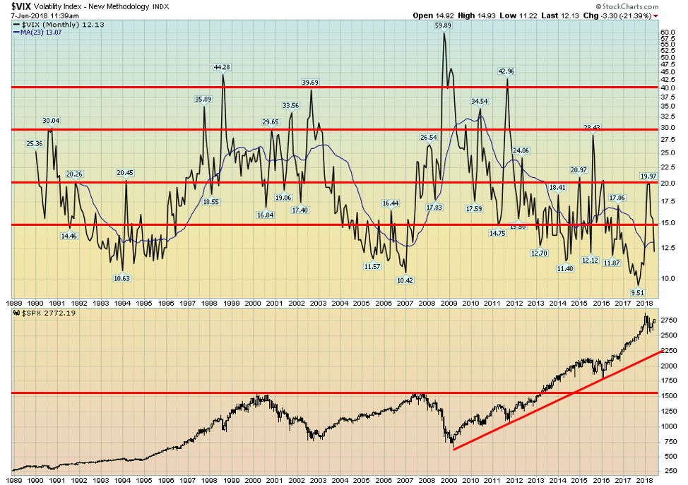
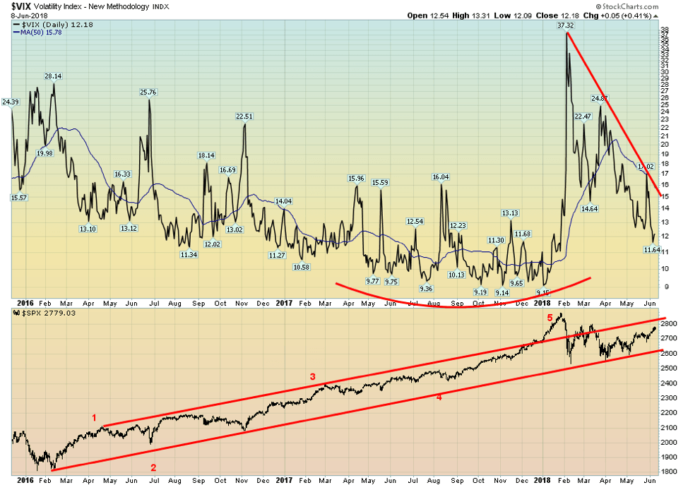
Earthquakes, volcanoes and detonated explosions have their motion measured by what is known as a seismometer or seismograph. The seismograph prints out what is known as a seismogram. Stock markets also have a seismometer known as the VIX Volatility Index. It is also known as the CBOE Volatility Index. It shows the expectations of 30-day volatility. It is a measure of fear and greed in the stock market and is known sometimes as the “investor fear gauge.” When the market is falling, investors are fearful and the VIX moves higher. When the stock market rallies, investors lose their fear and may become greedy so the VIX falls.
The VIX indicator is calculated using both puts (protection against the market falling) and calls (expectation that the market will rise). VIX readings over 30 are usually associated with high volatility, along with considerable fear and uncertainty. Readings below 20 usually suggest that the market is calmer, less stressed out, and even complacent. A printout of the VIX looks like a seismograph measuring an earthquake or a volcano. High readings on a seismograph would indicate high activity or motion whereas low readings would indicate low activity or motion.
Since readings started on the VIX back in the early 1990s, the highest recorded was during the 2008 financial crisis when the VIX hit a record high of 59.89. Since 1990, there have been only three occasions when the VIX was over 40. The 1998 Russia/LTCM meltdown, the 2008 financial crisis, and the 2011 EU/Greek debt crisis. The 2008 financial crisis wiped 55 percent off the markets whereas the 1998 and 2011 declines were only about 20 percent. In all instances, central bank intervention saved the day.
© David Chapman
The all-time low was hit in 2017 at 9.51. While periods of extreme fear (readings over 40) appear to be short-lived, the same can’t be said of periods of calmness and complacency. The VIX indicator was consistently under 15 from roughly 1992 to 1996, again from 2004 to 2007, again from 2013 through 2015, and once again from 2016 to 2018. This long period of calm was interrupted in 2015/2016 when the Fed ended QE and started hiking interest rates. After leaping to almost 20 in February 2018, the VIX has once again fallen below 15, indicating that investor fear is dissipating and another period of calmness and complacency may be descending.
We doubt that a period of calm is returning. The VIX seismograph has been a lot more active of late, bouncing between some calmness and complacency and some fear as more fear creeps into the market. Like a volcano seismograph, it indicates increased activity. In this case, call it nervousness. But like volcanoes, one just never knows when a huge explosion might go off. In 2008, it was a big one, catching many people by surprise. At least those that were not prepared. The market fell 55 percent. But for those that saw it coming, even if they didn’t know exactly when, it turned out for them to be a key buying opportunity. Even in a huge market explosion, there can be a silver lining.
Trade wars
The growing spat between Canada, the EU, Mexico, and even Japan with the U.S. over tariffs seemed to intensify this past week. With the G7 meetings in La Malbaie this weekend Trump did indeed come but seemingly under duress. He kicked the meetings off by threatening more tariffs and scorning what he called “unfair trade.” Trump didn’t even stay for the weekend; he attended for one day only, leaving some low-level official to deal with the rest of the meeting which was to focus on climate change and clean energy, two topics Trump has no interest in. The G7 attempted to issue a communique, but Trump refused to sign it.
The deteriorating trade situation was weighing on markets on Friday. But Trump showed no signs of backing down as he lashed out at France and Canada in particular for retaliatory tariffs. He also got personal with Canadian Prime Minister Justin Trudeau for “being so indignant.” Trump has threatened once again to kill NAFTA and wants to negotiate separate deals with Canada and Mexico. The U.S. wants a “sunset clause,” something that is totally unacceptable to both Canada and Mexico. Canada and Mexico have also made it clear they are not interested in separate deals, seeing this as the wrong way to approach North American trade.
Of the attendees, only British PM Theresa May tried to strike a conciliatory tone by suggesting the EU (which she wants to exit) use restraint. Japanese PM Shinzo Abe appeared to be caught in the middle, mainly because he backs Trump’s upcoming meeting with Kim Jong Un of North Korea (assuming that actually happens as well) and because of Japan’s close proximity to North Korea. The remaining G7 members are looking to take the U.S. to the WTO (World Trade Organization). The WTO itself appears under threat from Trump as well as the U.S. is dismissive of it.
In a bizarre move, Trump wanted Russia back in the G7 just like it was when it was known for a while as the G8. That would be exceptionally odd given the U.S. sanctions against Russia and NATO troops encircling the country. Besides, in terms of GDP countries like China, India, and Brazil are larger so why not them as well? Of course, by then we would be approaching the size of the G20 of which Russia remains a member. Russia was removed from the G8 following its annexation of Crimea (a peninsula that was a part of Russia for 300 years and home for 300 years to the Russian navy).
Trump’s tariffs against Canada plus further threats of tariffs on autos and auto parts will primarily impact Ontario and to some extent Quebec in Canada. It would also seriously disrupt supply chains that the auto companies have set up between the U.S., Mexico and Canada. Threats against auto and auto parts would be a major blow to Ontario’s auto industry, something that would put newly elected Premier Doug Ford in a political and economic bind.
It could, at worst, trigger a recession. Some 49 percent of Ontario’s GDP is generated through trade with the U.S. If NAFTA were torn up, or tariffs placed on Ontario’s auto industry, either could prove devastating for the province. But it would be equally disastrous for the U.S. as well. Trump has also attacked Canada’s supply management system, conveniently overlooking the $20 billion in subsidies to U.S. farmers.
Trump continues his belligerence by first proposing tough tariffs, and then seeming to back away, only to return with a vengeance attacking everyone and in Justin Trudeau’s case attacking him personally. He probably calls it the “Art of the Deal.” Some deal as it would hurt the U.S. just as much as it hurts Canada or Mexico or the EU. But it plays perfectly to his base. Oddly, Canada is a major source of aluminum for the U.S. and U.S. manufacturers depend on Canada’s aluminum. They’ll probably pass the cost on to customers.
In trade wars, nobody wins.
Bitcoin watch
© David Chapman
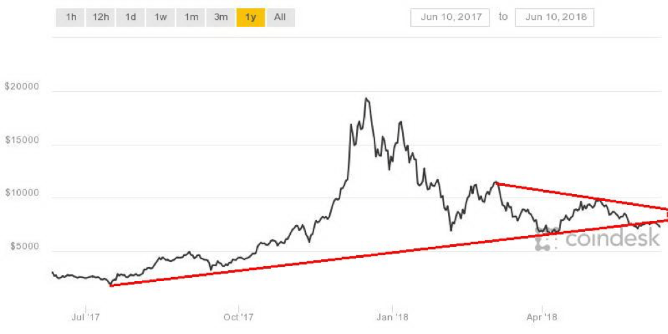
There is not a lot to say about Bitcoin and the cryptocurrencies this week as it was generally a pretty quiet week. At the time of writing, Bitcoin was down 5.7 percent and was range trading with $7,700 at the upper end and $7,200 at the lower end. The recent lows near $7,100 haven’t really been challenged since hitting there on May 28, 2018, although it may be in the process of doing that now. What this suggests to us is Bitcoin is priming for a move and it could be either up or down. The trend has been down. Low volume suggests the break should be to the downside.
Of the 22 cryptos that have a market cap over $1 billion, nobody was really up this past week. IOTA (MIOTA) has fallen 21 percent while Bytecoin (BCN) lost roughly 18 percent. The total market cap of all cryptos was estimated at $321 billion vs. $330 billion the previous week a loss of $9 billion on the week. There were 1,634 different cryptos listed at Coin Market Cap vs. 1,640 the previous week.
Maybe some of them are realizing they are not going to make it. It seems rather crazy to us because it is difficult enough keeping track of a half dozen of them let alone over 1,600. 286 cryptos have no market cap listed nor any listing as to what the circulating supply is. Many of them seemed to be recently listed ICOs and raised only minimal amounts.
There remain many who believe Bitcoin will eventually go a lot higher and also eventually become the currency or at least cryptos will become the currency. Given that governments and regulators continue to look at cryptos it is highly unlikely as governments have a history of controlling what is money. But at the end of the day, cryptocurrencies are just another form of fiat money at worst or as some like to compare it to another commodity-based form of money like gold.
Except gold is real and tangible. Cryptos are not. We already have digital currencies as a reminder that over 95 percent of transactions are now carried out electronically. Some say cash is for criminals and there are governments that want to ban cash so that they can control all flows and thereby recover more taxes and maintain control over what they call money. Governments do not willingly give up control of money. Cryptocurrencies will suffer the same fate. If that point comes to pass barter is more likely to return to the economy.
Bitcoin appears to be breaking down under that long-held trendline. A break of $7,000 could quickly send Bitcoin down to $6,000.
Markets and trends
| % Gains (Losses) Trends | ||||||||
|
Close Dec 31/17 |
Close
Jun 8/18 |
Week | YTD | Daily (Short Term) | Weekly (Intermediate) |
Monthly (Long Term) |
||
| Stock Market Indices | ||||||||
| S&P 500 | 2,673.63 | 2,779.03 | 1.6% | 3.9% | up | up | up (topping) | |
| Dow Jones Industrials | 24,719.22 | 25,316.53 | 2.8% | 2.4% | up | up | up (topping) | |
| Dow Jones Transports | 10,612.29 | 10,938.47 | 0.4% | 3.1% | up | up | up (topping) | |
| NASDAQ | 6,903.39 | 7,645.51 | 1.2% | 10.8% | up | up | up (topping) | |
| S&P/TSX Composite | 16,209.13 | 16,202.69 | 1.0% | flat | up | up | up | |
| S&P/TSX Venture (CDNX) | 850.72 | 775.22 | 1.2% | (8.9)% | down (weak) | down | up (weak) | |
| Russell 2000 | 1,535.51 | 1,672.49
(new highs) |
1.5% | 8.9% | up | up | up (topping) | |
| MSCI World Index | 2,046.47 | 2,003.96 | 0.9% | (2.1)% | down | down (weak) | up | |
| NYSE Bitcoin Index | 14,492.18 | 7,600.16 | 2.3% | (47.8)% | down | down (weak) | up (weak) | |
| Gold Mining Stock Indices | ||||||||
| Gold Bugs Index (HUI) | 192.31 | 178.83 | (0.2)% | (7.0)% | down | down | neutral | |
| TSX Gold Index (TGD) | 195.71 | 189.00 | (0.1)% | (3.4)% | down (weak) | down (weak) | neutral | |
| Fixed Income Yields/Spreads | ||||||||
| U.S. 10-Year Treasury yield | 2.40 | 2.93 | 1.0% | 22.1% | ||||
| Cdn. 10-Year Bond yield | 2.04 | 2.32 | 3.1% | 13.7% | ||||
| Recession Watch Spreads | ||||||||
| U.S. 2-year 10-year Treasury spread | 0.51 | 0.43 | flat | (15.7)% | ||||
| Cdn 2-year 10-year CGB spread | 0.36 | 0.41 | 24.4% | 13.9% | ||||
| Currencies | ||||||||
| US$ Index | 91.99 | 93.54 | (0.7)% | 1.7% | up | up | down | |
| Canadian $ | 0.7990 | 0.7730 | 0.3% | (3.3)% | down | down | neutral | |
| Euro | 120.03 | 117.68 | 1.0% | (2.0)% | down | down | up | |
| British Pound | 135.04 | 134.05 | 0.4% | (0.7)% | down | down (weak) | down (weak) | |
| Japanese Yen | 88.76 | 91.35 | flat | 2.9% | down (weak) | neutral | up (weak) | |
| Precious Metals | ||||||||
| Gold | 1,309.30 | 1,302.7 | 0.3% | (0.5)% | down | neutral | up | |
| Silver | 17.15 | 16.74 | 1.8% | (2.4)% | up | neutral | neutral | |
| Platinum | 938.30 | 905.70 | (0.1)% | (3.5)% | down | down | down | |
| Base Metals | ||||||||
| Palladium | 1,061.00 | 1,005.70 | 0.9% | (5.2)% | up | neutral | up | |
| Copper | 3.30 | 3.30 | 6.5% | flat | up | up | up | |
| Energy | ||||||||
| WTI Oil | 60.42 | 65.74 | (0.1)% | 8.8% | down | up | up | |
| Natural Gas | 2.95 | 2.89 | (2.4)% | (2.0)% | up | neutral | up (weak) | |
New highs/lows refer to new 52-week highs/lows.
© David Chapman
The S&P 500 continued its recent climb, gaining 1.6% this past week. The star, however, was the Dow Jones Industrials (DJI), jumping 2.8%. The Dow Jones Transportations (DJT) were laggards with a small 0.4% gain. The NASDAQ gained 1.2% and is now up 10.8% on the year led by the FAANGs (Facebook, Apple, Amazon, Netflix, Google). The small cap Russell 2000 jumped another 1.5% making another new all-time high, continuing its divergence with the large cap indices of the S&P 500 and the DJI.
Globally, the foreign indices did not fare as well. The TSX Composite did gain 1% and the small cap TSX Venture Exchange (CDNX) was up 1.2% but remains down 8.9% on the year. Overseas, the London FTSE 100 was down 0.1%, the Paris CAC 40 was off 0.3%, the German DAX actually gained 0.3%, while the Shanghai Index (SSEC) fell 0.3%. The Japanese Tokyo Nikkei Dow (TKN) was the star, rising 2.4%.
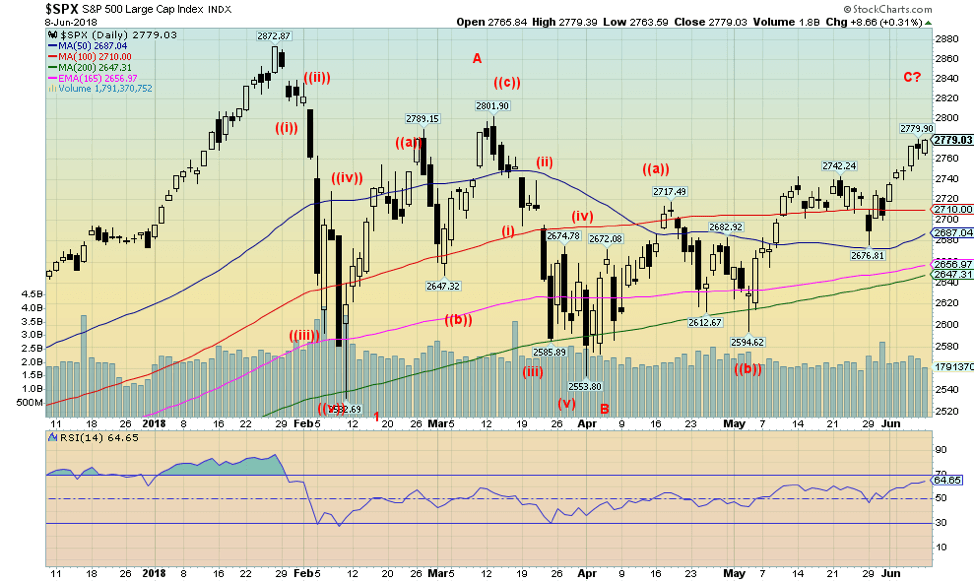
If we read the S&P 500 index right we can see clearly there was a sharp decline in February, possibly making the first wave down or at least an A wave down. The two (2) wave or B wave may, however, be more complex. We just see series of ABC type patterns. What might be happening here is an elongated wave 2 that doesn’t make its final high until much later.
These types of patterns typically play themselves out as an ABCDE type of correction. If so, we have what we believe is an A wave, a B wave and we may be completing a C wave. Ideally, this wave could top here or make a slight new high above the A wave high of 2,802. It could in theory even double-top with the January 2018 high of 2,872. If the assumption is correct, then to come is a D wave down followed by another wave (E) up again that may or may not make a higher high than the C wave or A wave.
Certainly, volume is somewhat anemic and the advance decline line is not confirming a strongly bullish stance. Elliott Wave International is comparing the current action as akin to gold’s action in 2011 following its first break into a low in December 2011. Following that low, gold made a series of ups and downs with the final top not coming until October 2012. What followed was the devastating crash in April 2013.
We like the comparison and concur with what we are seeing ourselves although, as Elliott Wave notes, they don’t believe it will last as long as that gold move did. That gold move, by the way, fooled a lot of people back then with few if any believing we would see the devastation that followed in 2013 when gold collapsed $500. However, what we believe to be true is that whenever this corrective wave is finished, which may not happen until this summer or even into the fall, a big drop is coming.
© David Chapman
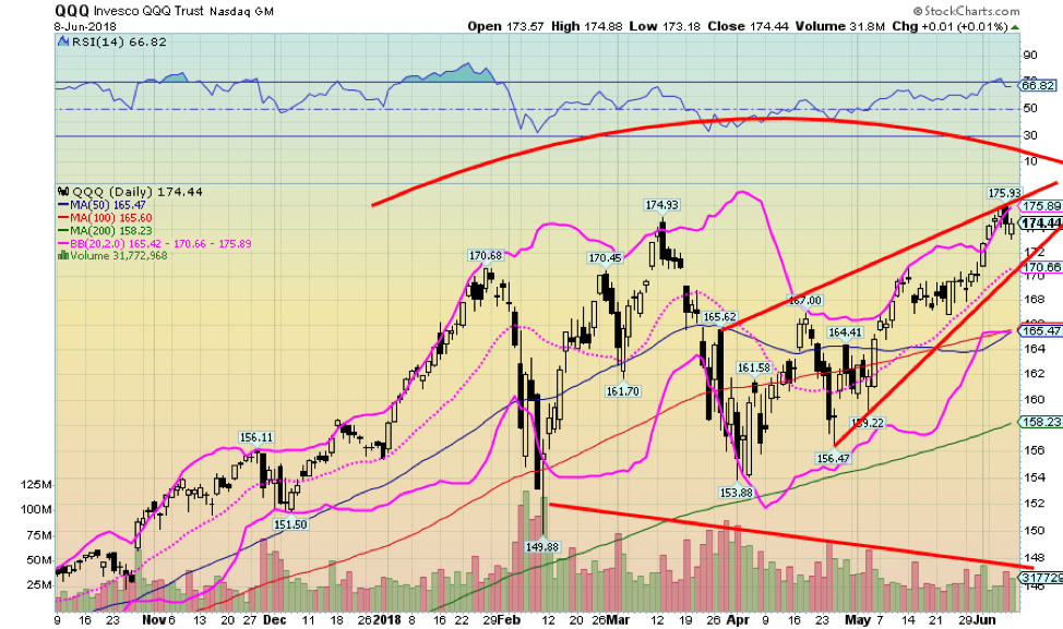
Here is the QQQ NASDAQ Trust Units (QQQ-NYSE). It is a proxy for the NASDAQ 100 (NDX), an index dominated by the FAANGs (Facebook, Apple, Amazon, Netflix, Google). It is the FAANGs that have been leading the market up and that is reflected in the rise of the QQQ. The odd part is that as the index rises the sponsoring firm of the ETF has to issue more shares to keep the share price as close as possible to the net asset value (NAV).
Naturally, the number of shares issued goes up and down with the price. Must be a lot of taking away and adding back over the past few months given the gyrations. We added to the QQQ a Bollinger band using the standard 20, 2 settings—meaning 20 days and two standard deviations above or below the 20-day MA. When the QQQs get to the top of the Bollinger band it usually suggests a pause or a pullback. It is the opposite when it hits the lower band.
Recently, it spiked through the top of the band just like it did back in January before a sharp drop. Does that mean we are about to get another sharp drop like we saw in February? Maybe. Watch that 20 bar MA because if it breaks that it might spark a sharper drop. The 20 bar is currently at 170.66. That area also coincides with an uptrend line from the April low.
© David Chapman
Here is the daily VIX Volatility Index reflecting the recent activity. If you are just looking at the VIX and not the S&P 500 itself it reflects increased seismic activity. Currently the VIX is falling again but it is highly unlikely it will fall to the levels seen in 2017. The risk is that the recent high activity could lead to even higher readings down the road. These recent gyrations are often a sign that a bigger one could be coming.
© David Chapman
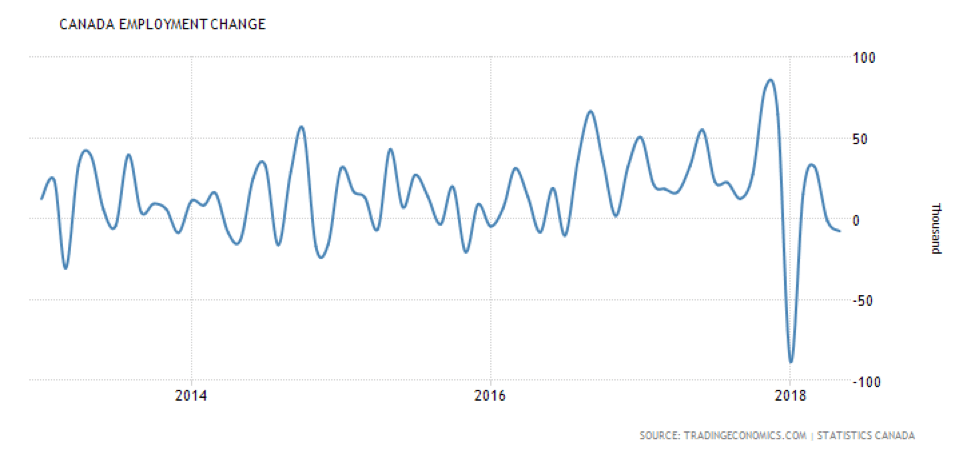
Could Canada’s job picture be dimming? Last month saw Canada lose 7.5 thousand jobs when the market expected a gain of 17.5 thousand. Of that, Canada lost 31 thousand full time jobs but gained 23.6 thousand part-time jobs. The average hourly wage rose to $25.06 vs. $24.98 the previous month. The number of people unemployed fell to 1,151.6 thousand vs. 1,155.0 thousand the previous month. The drop can be attributed to a drop in the labour force participation rate noted below.
The job picture hasn’t looked that rosy in Canada since the beginning of the year, although the January decline was merely reflecting the typical decline (only more dramatic) usually seen following the Christmas buildup. Overall, though the trend may have shifted and with looming trade wars and even the end of NAFTA, the situation might deteriorate even more.
© David Chapman
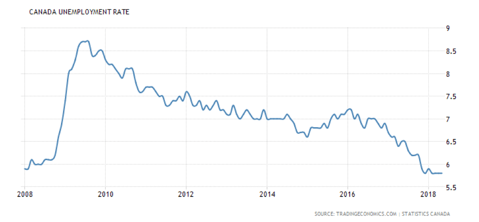
Canada’s unemployment rate remained unchanged in May at 5.8%. It is the lowest level seen in years and is equivalent to what was seen back in 2007 before the 2008 financial crisis. The R8 unemployment rate (similar to the U.S. U6 unemployment rate) fell to 8.4% from 8.6% the previous month. It is interesting to note that the labor force participation rate fell to 65.3% from 65.4% in April. A lower labor force participation rate translates into lowering the unemployment rate.
Canada’s unemployment rate is higher than that in the U.S. primarily because our labor force participation rate is higher, at 65.3% vs. 62.7%. That difference in labor force participation, which is higher in Canada, is the difference between an unemployment rate of 3.8% and 5.8%. For the record, the unemployment rate in Ontario is 5.7%, the lowest level seen in years. The participation rate overall, however, is lower in Ontario, coming in at 64.4%.
Still, Ontario has been a driving force behind lowering the unemployment rate over the past several months. The unemployment rate has fallen by 0.7% over the past year. Considering the province has just elected a new government, they are taking office when the unemployment rate is at a 20-year low and the growing risks are clearly to the downside for the economy.
© David Chapman
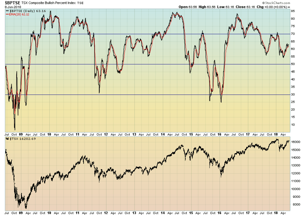
The TSX Composite Bullish Percent Index (BPTSE) is pretty neutral here. Despite the TSX Composite suggesting the potential for new highs (see below), the BPTSE is not confirming making a lower high. That high was seen way back in August 2016 when the TSX was trading almost 1,500 points lower. Since then the sentiment, if anything, has been falling despite the price rising. A divergence. Something to keep in mind as we go forward and the TSX approaches new all-time highs.
© David Chapman
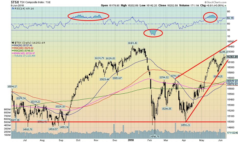
The TSX Composite made a slight new high this past week for the current move to the upside. It did not, however, make new all-time highs above the January 2018 high. Still, at 16,249, it is less than 1.1% from a new all-time high. We have taken out the Fibonacci 76.4% retracement level of the down move from January to February 2018. This suggests to us that new highs above 16,421 are clearly possible.
If so, then we believe Energy and Materials would need to lead the advance with maybe some help from Financials and High Technology. What is interesting is the TSX Composite appears to be forming an ascending or rising wedge pattern. This is ultimately bearish. If the advance were to continue in that narrowing cone it would confirm the wedge and it could also mean that any new high will be marginal at best.
The current wedge still could take the TSX to 16,400 or slightly higher. Support is seen down to 16,100. A breakdown under that level could confirm the wedge, but confirmation wouldn’t come until we broke down under 15,675.
© David Chapman
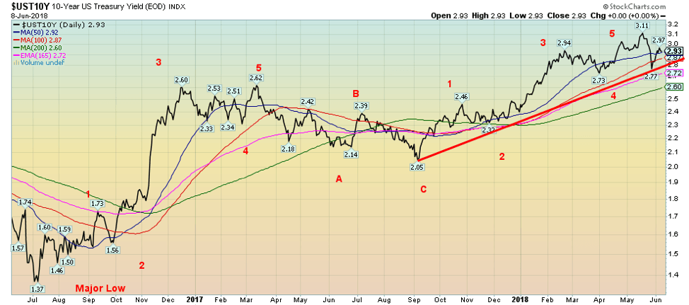
The 10-year U.S. Treasury note saw its yield rise back to 2.93% this past week from 2.89% the previous week. The 10-year appeared to find support down near 2.75% recently following jitters over the Italian election and Italian debt that sparked a flight to safety. As such, the 10-year yield is now back above the 50-day MA and could, in theory, move higher.
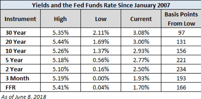
Another move back over 3% could suggest that the recent high at 3.11% was not the final high. We had long held that our targets for the 10-year were up to 3.20%. However, there is no law that says it has to fulfill that target. Maybe at 3.11% it is close enough. We wouldn’t get too excited about rates falling until the 200-day MA at 2.60% were taken out. In the interim we could make an argument that the 10-year has completed five waves up to 3.11%. From the major low seen in July 2016 at 1.37% the 10-year has jumped 156 bp. This chart below puts the rates in perspective since 2007.
© David Chapman
Recession watch spread
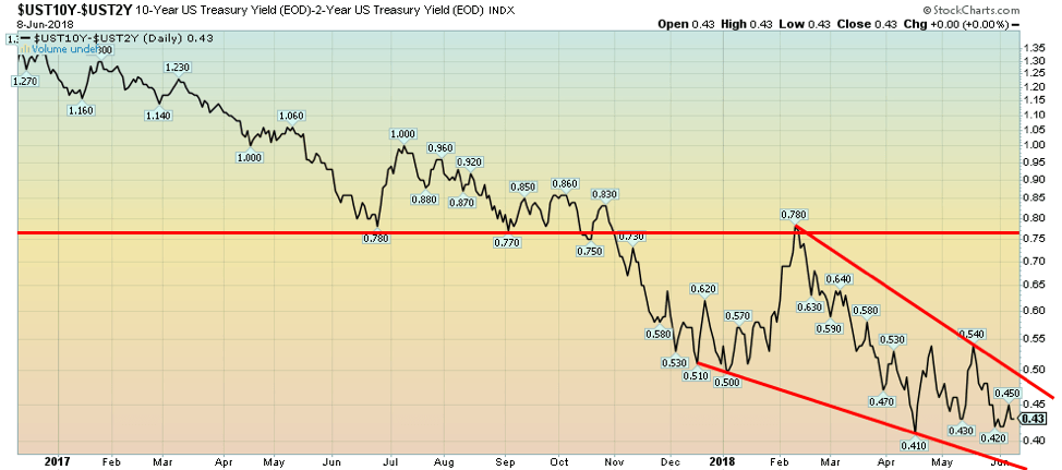
© David Chapman
The closely watched 2–10 spread was unchanged this past week at 0.43%. We remain some distance from the spread going negative. If the spread were to go negative there is usually up to a six-month lag before a recession might take place. There is no guarantee that the spread will go negative, but it is noteworthy the 2–10 spread did go negative before both the 2000–2002 recession and the 2007–2009 recession. Negative spreads are not unusual before a recession. At 0.43% there is currently no sign of an impending recession, but we are reminded that the spread can narrow quickly if conditions change.
We expect the Fed should hike the key Fed rate by 0.25% next week at the June meetings June 12/13. That alone might help narrow the spread further. Effective Fed Funds are trading around 1.70%. The current Fed rate is 1.75% so we are not seeing a significant upward move in the effective day-to-day rate. But still, the expectation is the Fed should soon hike to 2% and to 2.5% by 2019.
© David Chapman
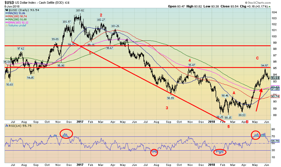
Has the US$ Index topped? This past week, the US$ Index fell 0.7%. The Euro was up 1.0%, the Cdn$ up 0.3%, with the British Pound up 0.4%. The Japanese Yen was flat on the week. The US$ Index has come close to our targets which were just above 95. We had noted some long-term resistance at that level and premised that could be a target zone. It was with the recent top at 94.97. Since then the US$ Index has slipped 1.5%. Support can be seen down to 92. Below 92 the US$ Index could fall further, but it would take a firm break below 90.74 to suggest the US$ Index tests its lows at 88.15.
What is not clear to us is: this the start of a new wave to the downside or merely a correction to the up wave that got underway at 88.53? We have labeled the recent wave up as an ABC, but if instead, it is five-wave advance then this would only be wave 4. A firm breakdown under 92 would convince us that it was an ABC correction and not the start of another wave to the upside. But if the 92 zone were to hold and the US$ starts to advance again, then the odds favor at least one more good wave to the upside. We believe this wave is trying to correct the down wave that got underway at 103.82 back in December 2017. There appeared to be five waves down to the low of 88.15 in February.
Challenges against US$ hegemony as both China and Russia continue to expand their trade in Yuan and Rubles. Iran also continues its move away from the US$ as a means to avoid U.S. sanctions. Oddly Iran has conducted some transactions in gold as the movement of gold does not require Iran to use the U.S-dominated SWIFT system.
Chinese and Russia trade has seen 9% of it conducted in Rubles and 15% in Yuan over the past year. That’s up sharply from earlier years. Countries primarily use the US$ to settle trade as it can be conducted using the U.S.-dominated SWIFT system. Another reason why China and Russia are building an alternative payments system. All of this action is a threat to global US$ hegemony and a threat to the U.S. economy.
© David Chapman
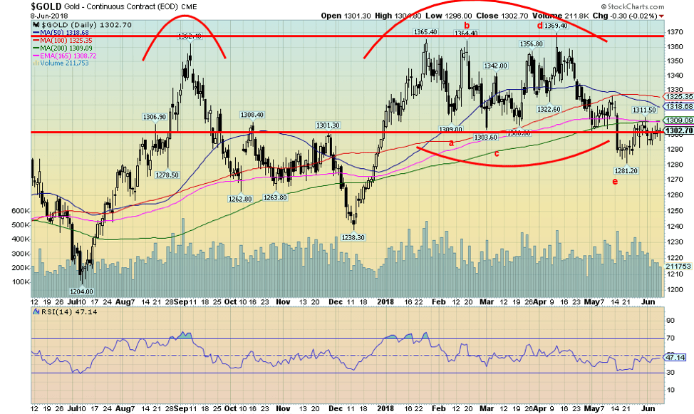
Gold managed to eke out a gain of 0.3% this past week but remains down 0.5% for 2018. This past week, silver made a higher high, but gold did not confirm that. It is noteworthy that at the recent low in May when gold fell to $1,281 silver did not make new lows. We note these divergences that often happen at tops and bottoms. This past week silver had a good week up, and while gold was up, it failed to make a new high.
So, some cross currents here, but we believe that overall the signs are positive, especially given the potential for a shift in seasonals as we will note in our “Chart of the Week.” Sentiment toward gold and silver has been hovering down around 10% levels usually associated with important lows. Still gold has run into resistance in the $1,300 to $1,310 zone which corresponds to the 200-day MA.
New highs above $1,311 should send gold to the next resistance zone seen at $1,320 to $1,325. Above $1,325, gold could start a run towards the old high and major resistance at $1,370. We believe gold may have completed an interesting ABCDE-type of corrective pattern with the recent low at $1,281. If correct, then the next move for gold could be quite good.
A firm breakout above $1,370 would send gold up to $1,400 and even up to $1,450. Longer term charts are noting a huge bottom pattern that could suggest a move to over $1,700 once gold firmly breaks above $1,370. Long-suffering gold bugs can only hope. But we feel positive toward gold right now with looming positive seasonals, a generally positive COT, a building base, and very low sentiment toward the metal. If the US$ were to break down gold would move higher.
Gold has done well in other currencies that have come under pressure recently such as the Turkish Lira and the Argentinian Peso. Gold also does well in major currencies if they decline against the US$. As an example, gold is up 1.6% from the recent $1,281 low, but gold in Cdn$ is up 2.3% in the same time frame. During that time, the Cdn$ has weakened against the US$.
© David Chapman
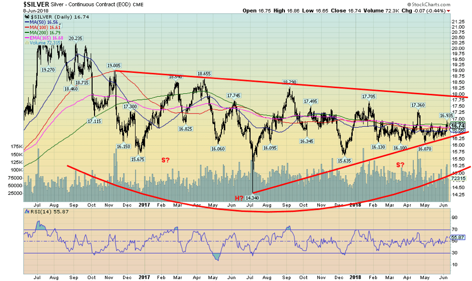
Silver prices continue to meander about, although they did manage to gain 1.8% this past week. Silver closed over a minor resistance zone at $16.70. Silver led the metals this past week and that helped improve the gold to silver ratio to 77.80, the best level seen in a few weeks. The recent peak saw the gold to silver ratio at 83.20 back in April. The gold-silver ratio has been above 70 now for months, including most of 2014 through 2018. Traditionally, when we see these high levels it suggests to us silver is relatively cheap in relation to gold and that relation can’t hold forever.
Generally, anything seen over 80 over the past 20 years has translated into a top for the gold to silver ratio. If the market is truly to embark on a rally, silver needs to lead thus lowering the gold to silver ratio. At the peak in 2011, the ratio fell to 31.50. Silver has generally range traded in 2018. Except for a brief foray in April when silver jumped to a high of $17.36 the range has been largely between $16.10 and $16.70.
That’s why we thought it important this past week for silver to actually close over $16.70. There is further resistance at $17 and then up to $17.75. If silver were to break out over $17.75, then there is potential for a rise to $22.40. Now that would warm the cockles of silver bulls. Key is that silver prices remain above $16, but there appears to be excellent support down to that level. Seasonals are also shifting for silver. This past week’s action was encouraging.
© David Chapman
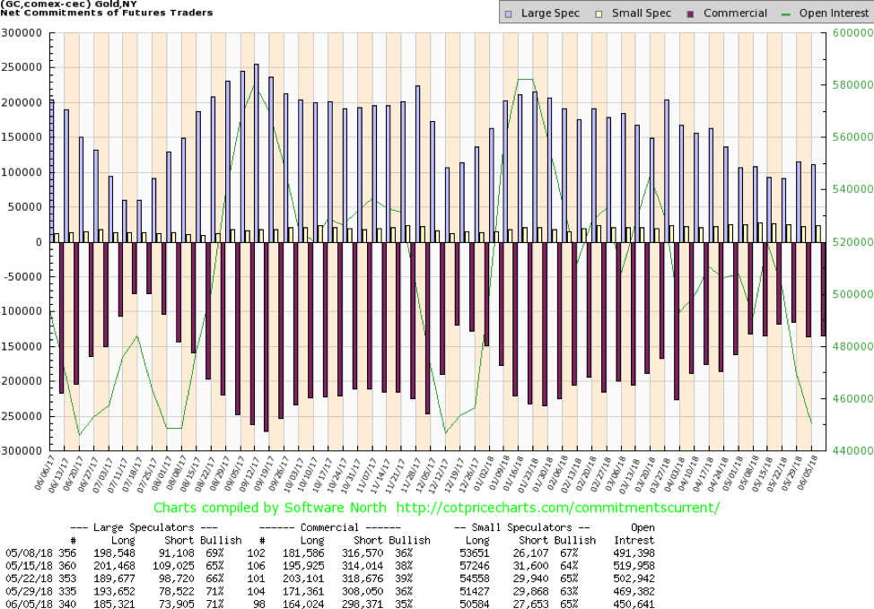
The gold commercial COT slipped slightly this past week to 35% from 36% and down from 39% just three weeks ago. Both short and long open interest fell this past week as doubt crept into the market. Long open interest fell roughly 7,000 contracts while short open interest was off almost 10,000 contracts.
The large speculators (hedge funds, managed futures, etc.) COT was steady at 71%, but even here they shed about 8,000 long contracts along with dropping just under 5,000 short contracts. Like the silver COT below the gold, COT remains friendly but is reflecting some uncertainty due to the failure of either gold or silver to take off one way or the other. Still, the COT remains at least mildly bullish.
© David Chapman
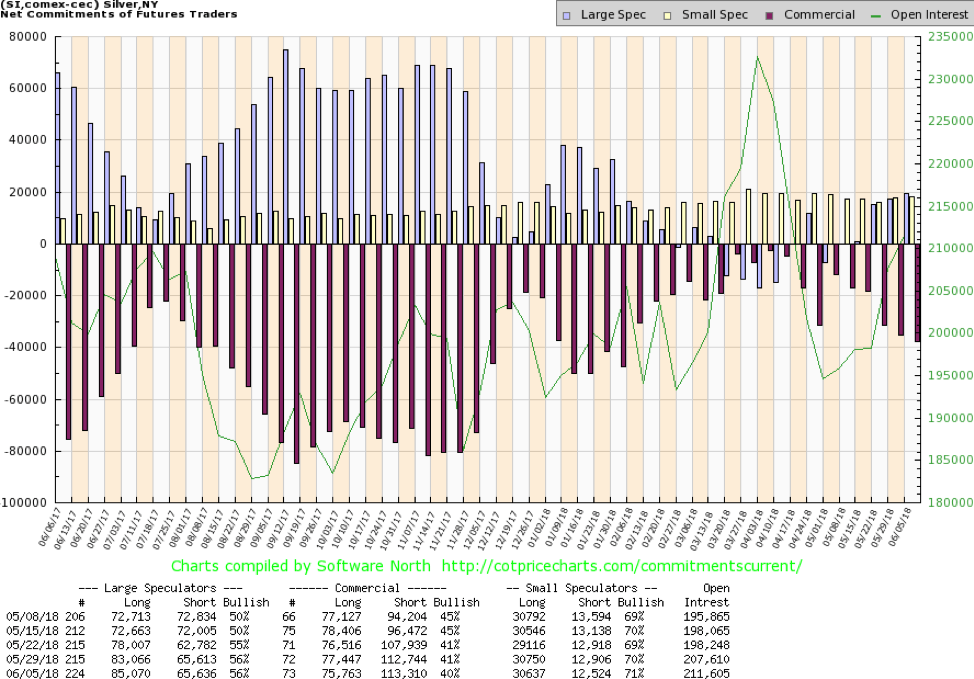
The silver commercial COT remains bullish but has dampened a bit over the past few weeks with silver continuing to trade in a sloppy manner. The commercial COT slipped to 40% this past week from 41%. It is down from 45% four weeks ago. Short open interest rose under 1,000 contracts while long open interest slipped just under 2,000 contracts.
Overall open interest rose this past week to its highest level in weeks. We view the rise in open interest as positive. The large speculators COT was unchanged this past week at 56%. The COT remains positive, but some note of caution has crept in. Maybe it’s because they are disappointed silver hasn’t made a big move yet. Or maybe the large brokerage houses (think J.P. Morgan) continue to keep a lid on silver prices.

© David Chapman
The gold stocks as represented here by the TSX Gold Index (TGD) fell a small 0.1% this past week. The U.S.-based Gold Bugs Index (HUI) was also off small, down 0.2%. Both indices remain down on the year with the TGD off 3.4% while the HUI has fared worse down 7%. Both indices remain remarkably cheap when compared to gold. As much as many might like to say gold is trash and the gold stocks even trashier, it is in these times of despondency that one is presented with buying opportunities.
We have been saying that for the past few months, but, as we note further below, the seasonals should soon shift in gold and gold stocks favor. The TGD has been range trading for the past few months, frustrating everyone in the sector. But the TGD appears to be forming a classic ascending triangle with rising lows and generally flat highs. If that’s correct, then a breakout over 193 could project up to at least 213. Further resistance can be seen around 198.
A breakout over 198 could trigger a bigger longer-term triangle (not shown) that could project the TGD up to around 260. That’s an almost 38% move from current levels. The gold stocks have been down for some time and sentiment is poor towards gold and silver and the gold stocks, even as the BPGDM sentiment index below is somewhat neutral. Seasonals, as we show later, are shifting. A big move could get underway if gold were to break out as we noted above.
© David Chapman
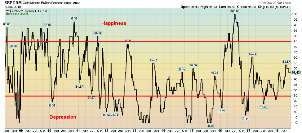
Sentiment toward the gold stocks remains decidedly anemic. Above is the Gold Miners Bullish Percent Index (BPGDM). Happiness and elation are seen above 75 while despondency and depression are seen below 25. Currently, the index is somewhat in the middle—not too hot, not too cold. We view it as potential to grow, especially given our comments below on the “Chart of the Week” where we believe that a buying opportunity for gold and gold stocks is approaching. That this index has managed to hold its head up with gold stocks so cheap in relation to gold has to also be viewed as a plus.
© David Chapman
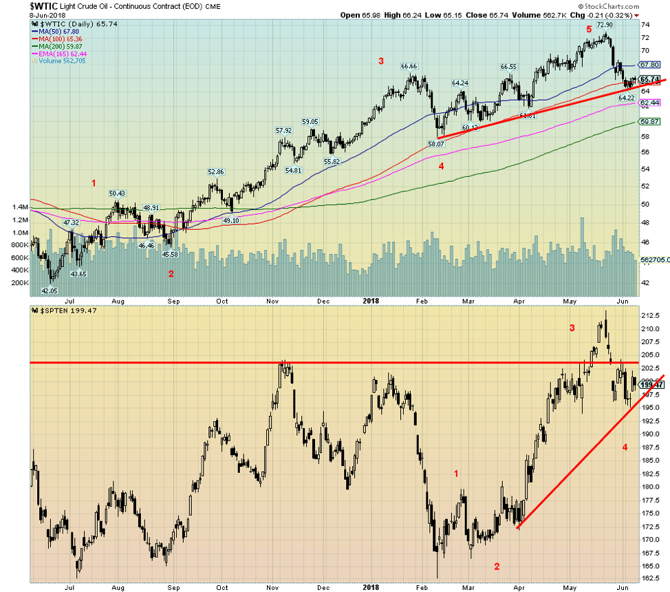
WTI oil has, after a long run-up, finally hit a period of consolidation/correction. The pullback in oil prices generally coincided with the suasion in particular to Saudi Arabia and even Russia to up their production. The U.S. has also ramped up production thanks to higher oil prices. After making what appears to be a five-wave advance from the lows of June 2017 at $42.05, WTI oil was a clear winner advancing some 73.4% to $72.90 in May 2018.
The pullback, which may be an A wave down appears to have found support for now at the 100-day MA. The energy stocks as represented here by the TSX Energy Index (TEN) also made a nice advance from July 2017 to a top in November and a secondary slightly lower top in January. The TEN followed the broader market down in February.
Since then it appears to be making another advance and by our count, we have only completed three waves up and appear to be working on a 4th wave correction. We still like energy stocks here and they are one of the prime reasons the TSX Composite has done well of late. We may have hit a low for WTI oil, but until it takes out at least $70 again on the upside risk remains to the downside. The 200-day MA currently $60 could be a draw. That might also draw the TEN somewhat lower as well.
Chart of the week
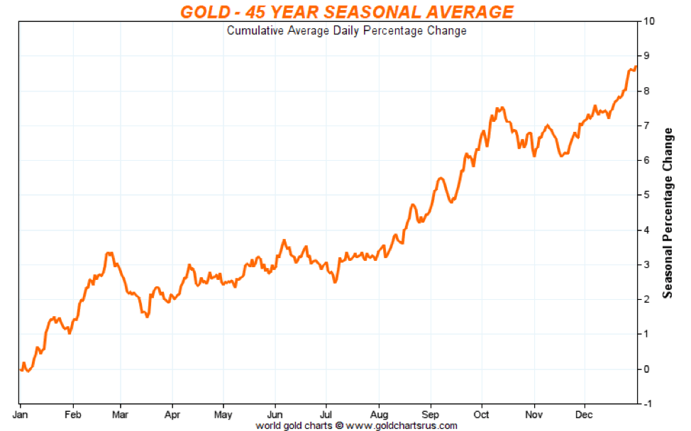
© David Chapman
Tis the season. That is, tis the season to buy gold. Gold has interesting seasonals and while all seasonals don’t work all of the time they work sufficiently enough that failure to pay attention to them means a potential opportunity lost. It is now June and while the seasonal chart above shows the low tends to come in July we have seen enough June lows to know that is probably the time to be at least nibbling away.
The last good seasonal move tends to come from November to February. This year the low actually came in December, as it has the past few years (see second chart below). This past December the low came in at $1,238 and the final top (with some ups and downs) came in February at $1,364 a gain of 10.1%. Silver also participates, but it topped in January and made a lower high in February.
The December to January run saw silver jump 13.1%. Finally, the gold stocks also go up during the period. Unfortunately, the gold stocks, as represented by the TSX Gold Index (TGD), generally followed the broader market and topped at the end of January before plunging in February along with the stock markets. But from the December low to the January high the TGD gained 12.6%.
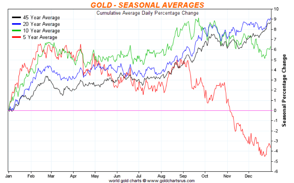
The market tends to meander a bit after its February peak. Gold did make a low in March and then topped in April before hitting the skids once again. Of late, as discussed above, we have shown signs of coming out of the funk but we have no good confirmation that a low is in. However, seasonals suggest we could be looking for one starting anywhere in June although it could hang on until July. For the record, in 2017 there was a low in July at $1,204, and then the market had a strong rally into September to $1,362 for a gain of 13.1%. As the five-year chart of seasonals shows below, gold appears to have deviated from its longer-term tracking and the market has generally gone into a swoon from September through December. We don’t know whether this year will revert to the longer term seasonal averages but based on what we have seen thus far in 2018 gold’s seasonals appear to be alive and well. Investors may wish to start nibbling.
© David Chapman
__
DISCLAIMER: David Chapman is not a registered advisory service and is not an exempt market dealer (EMD). We do not and cannot give individualized market advice. The information in this article is intended only for informational and educational purposes. It should not be considered a solicitation of an offer or sale of any security. The reader assumes all risk when trading in securities and David Chapman advises consulting a licensed professional financial advisor before proceeding with any trade or idea presented in this article. We share our ideas and opinions for informational and educational purposes only and expect the reader to perform due diligence before considering a position in any security. That includes consulting with your own licensed professional financial advisor.


Bitcoin Stalls Near $60K as Strategy Moves, ETFs Outflow, and EU MiCA Rules Take Effect
Bitcoin hovers near $60,000 with ETF outflows, while Strategy boosts reserves, sells BTC, and raises dividends to reassure investors. Ethereum...


Cannabis Dominates Global Drug Use: Trends, Risks, and Shifting Markets
Cannabis remains the world’s most widely used illicit drug, with 256 million users in 2024, surpassing all others combined. Growth...


Italy Approves First Hydrogen-Powered Train for National Rail Network
ANSFISA has approved Italy’s first hydrogen-powered train, the Alstom HMU214, for use on the Brescia–Iseo–Edolo line. Capable of 140 km/h,...


Cotton Market Weakness Persists Despite Brief Rebound
Cotton prices fell to new lows last week before a modest rebound. USDA data shows crop conditions remain worse than...


Eli Lilly Hits $1 Trillion Valuation Amid Strong Bullish Momentum
Eli Lilly stock hit a record high, surpassing $1 trillion market value after strong product demand. Shares surged over 7%,...
 |
|
 |  |
 |
|
-

 Impact Investing2 weeks ago
SBTi Net-Zero Standard 2.0 Enhances Corporate Climate Action
-

 Crypto5 days ago
Bitcoin and Ethereum Slide as Market Pressure Builds Amid Strategy Concerns and Layer 2 Disruptions
-

 Business2 weeks ago
Fed Policy Shift Raises Concerns Over Debt and Inflation Risks
-
 Crypto20 hours ago
Bitcoin Stalls Near $60K as Strategy Moves, ETFs Outflow, and EU MiCA Rules Take Effect
You must be logged in to post a comment Login