Business
The level of euphoria in the stock markets at record highs
The trading frenzy continues, and stock markets once again soar to new all-time highs. When will the craziness end? Euphoria reigns. Trading volumes soared. Valuations are ignored. The rich get richer and as for everyone else? Not so much. Commodity prices are on the rise and with it so are bond yields. Our Chart of the Week looks at the rise of renewable energy vs. traditional fossil fuel energy.

Is the euphoria over the Reddit and the Robinhood traders over? As we showed a week ago in our chart of Panic/Euphoria (shown again), the level of euphoria in the markets has reached dot.com euphoria status. And we know what happened then. The stock market topped in 2000 and two years later bottomed down 49% for the S&P 500 and the NASDAQ down 80%. Numerous high-tech companies just disappeared. The effects lingered for the next two to three years.
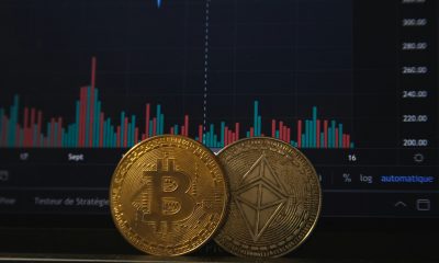
Now we have complete craziness once again. So far this year Bitcoin is up 30%, GameStop (GME) peaked out, up 2,600% in a mere 14 trading days only to collapse 86% in the next five trading days, and in the silver market First Majestic (FR, AG) doubled in 11 trading days, then promptly fell 35% in the next three days. To demonstrate the insanity, GME rose 19% on Friday but at one time was up over 50%.
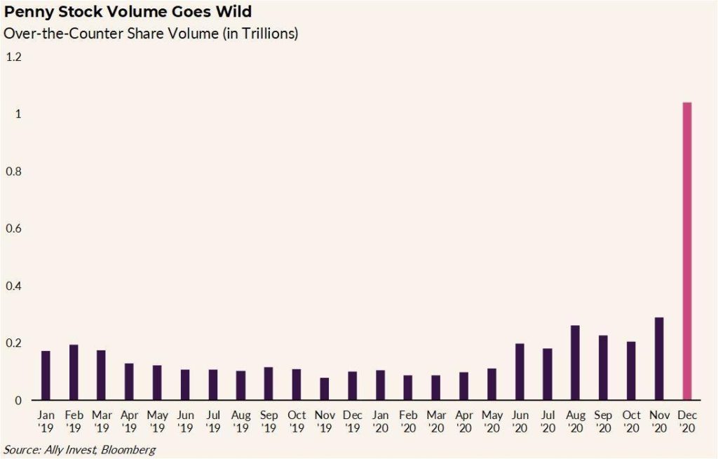
Robinhood charges no commissions. When they opened with that it attracted millions of new accounts. Other brokerages were forced to adjust their commissions. Then the boards like Reddit, WallStreetBets, and more turned the stock market into a gambling casino like some latter-day Jordan Belfort, the Wolf of Wall Street. Or is it Gordon Gekko of Wall Street (1987) fame “Greed is good”? Online platforms, whether they are Robinhood, Reddit, or TikTok, are a rage. Penny stock over-the-counter share volume has soared (see chart below).
We only know that, given the history of these kinds of manias, they always end badly. The authorities struggle to rein them in. But can they? Normally retail piles in at the top of the market. But this time they are trying to break the system as we saw with hedge funds who were caught short collapsing. Davids vs. Goliaths and, like in the biblical story, Goliath took a stone to the forehead. It seems that stimulus cheques, coupled with a lot of time on one’s hands and 0% commissions, spur a lot of activity. So, is it over?
We suspect not, but the authorities are struggling with how to control this. Millions of retail traders vs. big hedge funds, the banks, and the Fed? Limit short selling? Higher margins? Short-selling plays an important role for the smooth functioning of markets. Big players like hedge funds are the main participants in short-selling. And often it is naked short-selling (i.e., selling shares of companies where the shares don’t actually exist). Margin limits are a constraint but not a be-all to curb excessive trading. Raise commissions? None of these are likely to happen. Trading itself is not an illegal activity and traders provide liquidity to the market.
If, as noted, markets are really soaring on a wave of euphoria that actually may not have topped yet, what’s next? The hangover? What we have learned over the years is that there is always something going up, even in a bear market. Bear market in stocks? No worries, during the 1970s gold and commodities went up. High-tech, dot.com crash, and bear in the 2000s? Again, no worries—value stocks held in while, again, gold and commodities were rising. Bear market in gold? No worries—the 1980s and 1990s saw stocks roar, especially high-tech while the bear market in gold during 2013–2019 saw the stock market roar. Oh yes, in panics everything falls as we saw in the 1987 crash, the 2008 financial crisis crash, and the 2020 pandemic crash. Panics are vicious but usually short-lived. Real bear markets like we saw in 1973–1974, 1980–1982, and 2000–2002 are grinding affairs.
Penny Stock Trading Volume
No, we can’t say a bear market is starting, even if we suspect that one could get underway this year. As they say, we need evidence. Evidence comes when the stock market breaks certain levels. And then does it turn into a panic? Or is a grinding affair where the market just relentlessly goes down? 1930–1932 was a bear market. 1929 was the panic that presaged the bear. Even we have wondered—was March 2020 the panic, and was the rally that got underway following the crash (still in progress) merely the rebound (as we saw from November 1929 to May 1930 before the real bear got underway)? The time elements are not as important as the direction of the market.
That is why value stocks are key to surviving a bear market; i.e., good businesses that will weather a sharp recession and a bear market. Banks, infrastructure, etc. are examples of value stocks. But commodities and gold tend to do well in a bear market as well. Gold rallied through the 1930–1932 bear when Homestake Mining (now Barrick Gold) was up 474% while the Dow Jones Industrials (DJI) fell 89%. Gold rose 20% in 2000–2002 while Barrick Gold was up 55% from January 2000 to May 2002 although it fell into year end, ending up at 5% while the S&P 500 fell 49%.
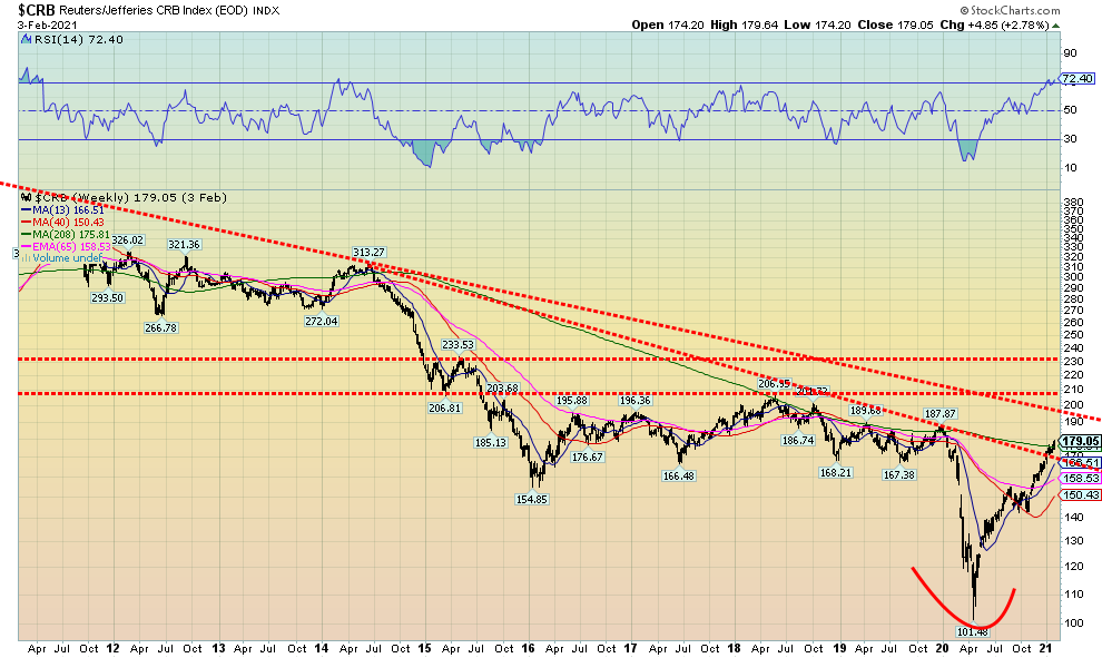
As evidence of a nascent commodities rally getting underway, our long-term weekly chart of the CRB Index shows that the CRB is trying to break above the long-term 4-year MA. It has broken the downtrend line from highs back in 2014 and is moving towards the downtrend line from the major top in 2008. A 12-year bear market in commodities during 2008–2020 may have ended with the March 2020 pandemic low. The CRB Index is representative of the global commodity market, comprising a basket of 19 commodities with 19% allocated to energy, 41% to agriculture, 7% to precious metals, and 13% to industrial metals. It is noteworthy that food inflation has been picking up.
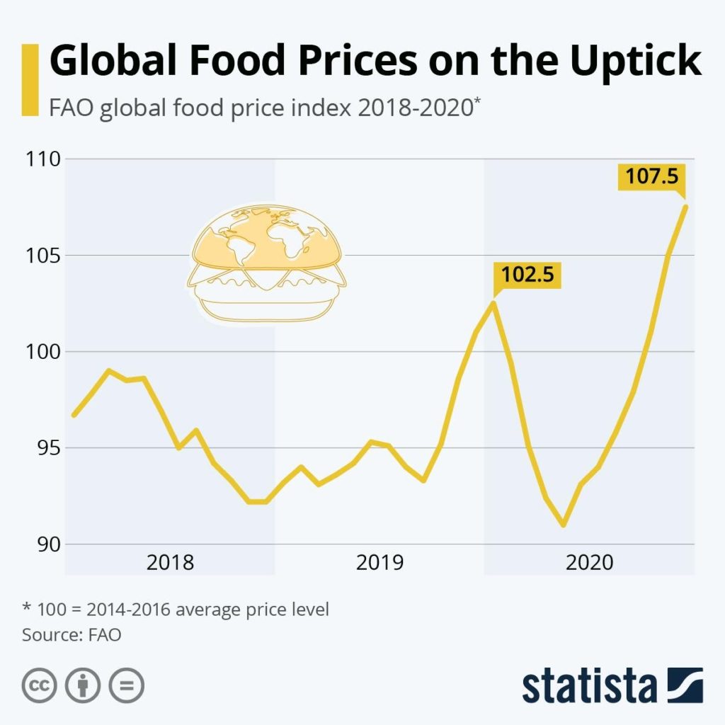
Droughts, flooding, unexpected cold snaps due to global warming plus disruptions due to COVID-19, and falling inventories have all played a role in pushing up food prices. As we noted, agriculture makes up 41% of the CRB Index. But others are rallying as well. Examples since the March 2020 low are oil prices up 750%, natural gas up 84%, copper up 81%, lumber up 230%, gold up 23%, and silver up 125%.
We also note with gold and silver that there are huge short positions out there far exceeding the actual supply of gold and silver. We note that 10 billion ounces of gold trade every year when the global supply is only 120 million ounces. For silver, over 100 billion ounces change hands vs. a supply of 628 million. The bullion banks have sold more gold and silver than they can possibly deliver. GameStop had a 140% short position vs. the actual amount of stock outstanding. For silver, it is estimated at 5,000% (500 times) and gold 1,000% (100 times). Could the Reddit traders spark a run at the bank? The banks operate their gold and silver position like a fractional reserve system you’d find at the Fed. You only need to keep a small supply to satisfy the few that will ask for delivery.
Note: these short positions are different from what one sees on the weekly Commitment of Trader’s Report (COT) which is a report from the CME on futures positions.
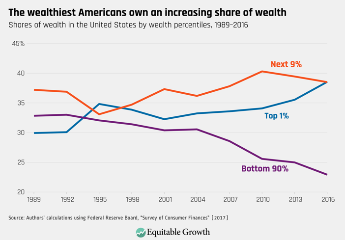
It has been noted that mass euphoria + inexperienced traders = disaster (www.mauldineconomics.com). But amongst the mass hysteria of the markets, we can’t help but notice that the main beneficiaries of all of this insanity have been the top 10% of the households. Financial engineering of markets got underway in the 1970’s with the advent of a deep derivatives market. Things really began to soar following the 1987 stock market crash when we saw a major intervention in the markets by the monetary authorities under then Fed Chairman Alan Greenspan. It took a few more crisis but by the time we added the dot.com collapse of 2000-2002 and the financial crisis 2007-2009 and more recently the pandemic crisis 2020-date, cheap money coupled with massive infusions of liquidity into the markets became the norm.
The beneficiaries of all this largesse have been the top 10% who according to statistics own some 85% of the stock market. The top 1% own 42% of the stock market (www.davidstockmanscontracorner.com). Annual GDP change has been on a relentless downward trajectory for years even as the stock market has been on a relentless upward charge with occasional sharp interruptions. Corporations don’t invest much any more. Deals are accretive. Stock options for executives’ incentives the goosing of earnings and therefore the value of their stock and their own pocket book. Financial engineering allows all of this.
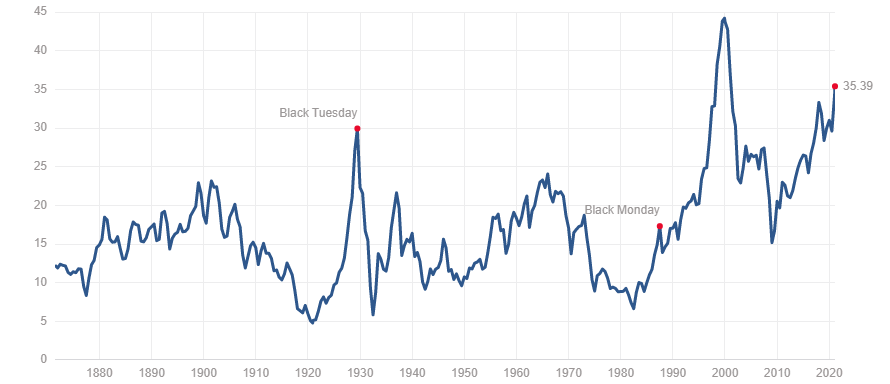
David Stockman, the former budget advisor to President Ronald Reagan has noted in a recent article that manufacturing output in the U.S. is still 2% below its pre-crisis level of November 2007. Total industrial production has gone up only 4% in the past 12 years. And the stock market has gone up almost two-fold not because of real earnings growth but because of the inflation of financial assets due to cheap debt and massive infusions of liquidity (QE). The Case Shiller PE ratio is more than double today where it was in 1989 and more than double its long-term mean and median as recorded from the late 19th century. The only time it was higher than it is today was at the peak of the dot.com bubble in 1999.
The question that is constantly on our mind is when does all of this run out? All of this is coming to a head during what can only be described as a very turbulent period against the backdrop of a potential political/constitutional crisis plus the potential for a real civil war and financial engineering, trading frenzies and money growth on steroids. Does it all add up to a coming financial and political disaster?
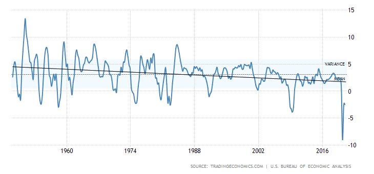
U.S. GDP Annual Change %
Shiller PE Ratio
The Pandemic Rages On!
Sunday February 7, 2021 – 15:12 GMT
World
Number of cases: 106,432,586
Number of deaths: 2,322,097
U.S.A.
Number of cases: 27,522,479
Number of deaths: 473,551
Canada
Number of cases: 801,057
Number of deaths: 20,702
Source: www.worldometers.info/coronavirus
Chart of the Week
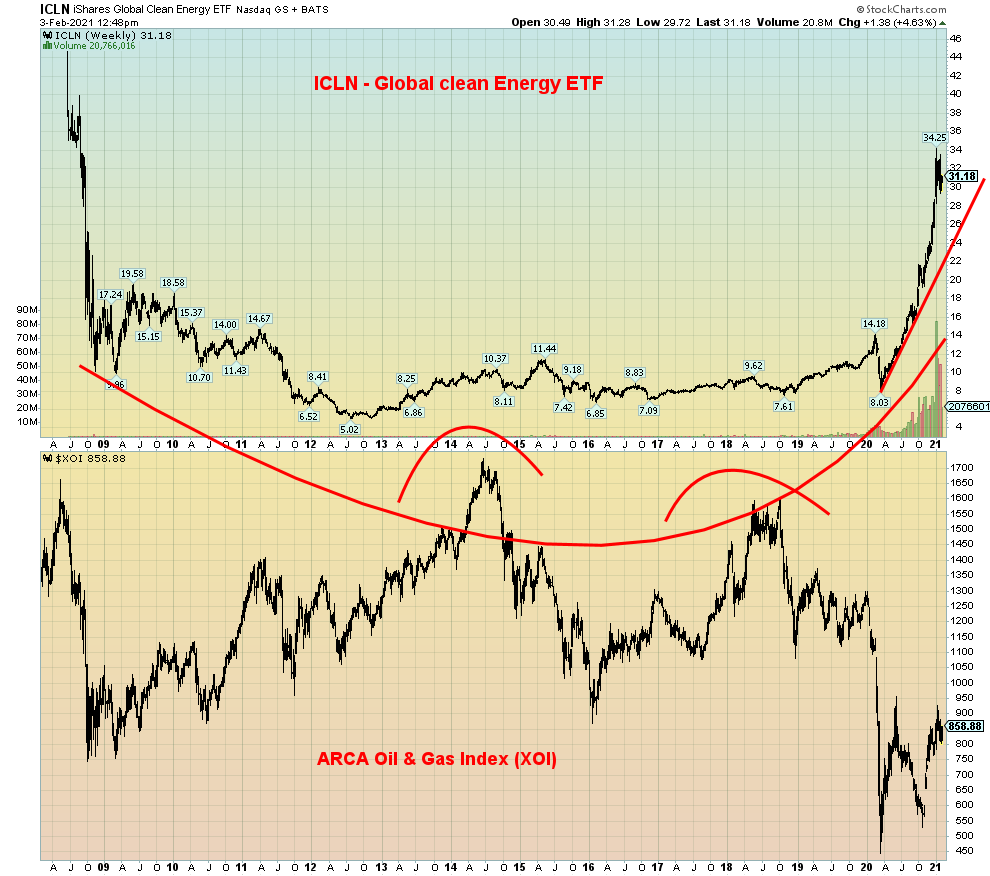
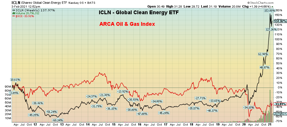
One goes up! The other comes down! Renewable energy up! Fossil fuels down! It is, as they say, the tale of the tape. Here we have the iShares Global Clean Energy Fund (ICLN-NASDAQ) vs. the ARCA Oil & Gas Index (XOI). For the past year – ICLN up 147%; XOI – down 23%. And, for the record, the TSX Energy Index (TEN) is down 26%. Over the past decade (chart below) the ICLN is up 138% vs. the XOI down 34%. However, the XOI is up 7.4% and the TEN up 6% so far in 2021. The ICLN is up 10.5%. Where would you rather be? In clean energy? Or dirty old fossil fuel energy?
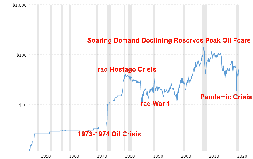
Okay, fossil fuel energy isn’t dead yet. Oil prices have been rising. Well, not so much because of demand but because the major producers (i.e., Saudi Arabia and Russia) have cut supplies. Oil is very cyclical in nature. If you enjoy roller coaster rides, then invest in the oil and gas industry. The Arab oil crisis, coupled with the Iranian hostage crisis in 1979, saw oil prices rise over 1,000% from 1973–1980. Then the 1980s price wars that lasted into the 1990s saw oil prices fall roughly 75%. Only the brief period of the Iraq War 1 in 1990 saw a short-lived spike in oil prices. Then came the big demand surge in the 2000s and oil prices soared from $11 to $147 from 1998 to 2008. The financial crisis of 2008 killed oil prices and they collapsed 70%. Sure, they recovered before collapsing again and then after another brief upward flurry they collapsed once more with the onset of the coronavirus pandemic, even at one time briefly turning negative. Big projects like the Alberta Tar Sands, deep sea drilling, the shale industry, and more all suffered immensely as stock prices collapsed, projects were mothballed, and big, integrated energy companies wrote off billions in investments coupled with outright losses. Bankruptcies in the industry have soared. Don’t expect that to slow down.
Crude Oil 1946 –
In the meantime, the clean energy was growing, pushed by and even subsidized by governments to combat global warming, plus the arrival of new technologies has helped the renewable energy sector soar. Prices have come down sharply. Even General Motors, the poster child for gas-guzzling cars, is pledging to build electric cars and zero emission cars by 2035. However, renewable energy makes up only about 5% to 12% of all energy uses, primarily through hydro power, bioenergy, wind, and solar. But with prices having come down it is competing successfully with non-renewable fuels, primarily oil and even coal. China has become a leader in renewable energy, recognizing that people could no longer breathe the air, given they were heavy users of coal.
It is no surprise that renewable energy has done well, given the earth has recorded its ten hottest years in the past decade since recording began back in the 1850s. On average the world’s surface temperature has gone up 0.07% every decade and 0.18% since 1981. The industrial revolution(s) has played a big role. Global carbon emissions, rather than falling, continue to rise. Huge population growth has not helped. The world’s population has more than doubled since 1970 even though growth rates are slowing. It is no surprise then that, through the auspices of such global forums as the World Economic Forum (WEC), both governments and big business are together in this, with varying degrees of success. Not all are in favour and resistance and deep polarization exists in the world and individual countries as to whether the world should go green and if global warming even exists. But for big business, the reality is—with some push from big funds such as Blackrock, the world’s largest asset management fund—go green or perish.
The rise of renewable is a secular trend that still has not reached its zenith. More and more governments are pushing for renewable energy and more and more companies, including oil and gas companies are leading the way in converting. The use of solar power is very labour-intensive so it does create numerous jobs in the solar industry. But given that the oil and gas sector is cyclical in nature, one cannot write it off. Global oil demand is still growing and that is expected to continue. Despite renewables being subsidized, the oil and gas industry is the most subsidized industry in the world with subsidies for the oil and gas industry outstripping renewables by upwards of 10 times. Global subsidies for the oil and gas industry—that include both direct subsidies through tax and cash transfers plus indirect underpricing of environmental damage—totaled almost $5.2 trillion in 2017.
Not everything in clean energy is necessarily clean; i.e., pollution tied to infrastructure coupled with a huge need for rare earth metals along with silver. Note that China controls some 51% of lithium, 62% of cobalt, and 100% of spherical graphite. Overall, China controls 80% of the global resources of rare earths resources that are essential components of electrical vehicles and wind turbines. We also note that most wind turbines cannot be recycled and following a life of roughly 25 years they are just buried. There remains a need for major recycling of old turbines and solar panels.
And add that not all governments believe in the shift to clean energy. One government may make a big push for clean energy only to be replaced by a government that doesn’t buy it and they roll back the progress. We witnessed that with the shift in the U.S. from the Obama government to the Trump government and then back again with the election of the Biden government. It’s like a yo-yo, only a very expensive one as starting up, shutting down, and starting up do come with a cost.
But the march to clean energy will continue, regardless. Renewable energy in electricity is leading the way, representing some 26% of global electricity. But that’s the good news. Renewable energy represents only 10% of heating and cooling and a small 3.3% of transportation. Heating and cooling runs mostly on oil and gas while transportation relies heavily on gasoline and diesel. While many countries support the goals, less than half are coming close to fulfilling them. Cities tend to lead countries because they face the biggest environmental problems. 65% of energy demand along with 56% of population come from cities. Some 33 cities are considered megacities with a population exceeding 10 million. Tokyo leads the way with 40 million. How to price the use of fossil fuels remains a difficult question with carbon taxes the most favourable but globally underused and/or condemned by opponents.
The question is, are the clean energy stocks fairly valued or are they now way ahead of themselves? Huge gains as we have seen over the past year are not necessarily sustainable. A pullback to that uptrend line for ICLN near $24 would not be surprising. We note that more clean energy funds are coming out. We saw a full ad for the International Clean Power Dividend Fund (CLP.UN) in The Globe and Mail, ROB (February 3, 2021) to be administered by Middlefield Funds, targeting a 5% distribution. Slow and steady type of investments in the sector may prove to be superior to ones promising growth. Meanwhile, at the same time there has been a good uptick in traditional oil and gas stocks as once again they demonstrate their cyclical nature. There may be a shift to renewable energy but the reality is that fossil fuels are not going anywhere. Those calling for the death of fossil fuels are premature. Clean green energy will grow but it won’t lead to the demise of the fossil fuel industry.
Performance of ICLN vs. XOI 10-years
January Employment Reports
U.S.
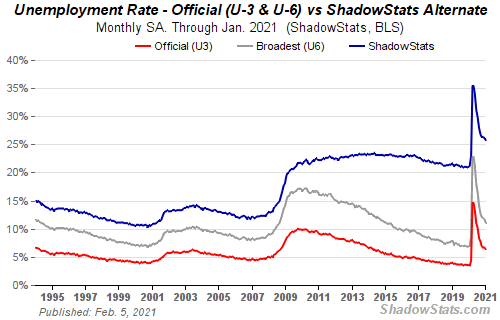
The U.S. nonfarm payrolls for January came in with a gain of 49,000. That was close to the consensus expectation of 50,000. Revisions to earlier months showed a decline for both November and December by a total of 159 thousand. Government payrolls rose 43 thousand vs. private payrolls up 6 thousand. Education workers grew. The unemployment rate (U3), however, fell to 6.3%, well below market expectations of 6.7%. Job gains were seen in professional and business services but losses were recorded in leisure, hospitality, and retail. Unemployment rates fell for both men and women, whites, and Hispanics but changed very little for Blacks, Asians and teenagers. The U3 unemployment rate fell it appears, because of once again the BLS revising how it calculates its population estimates and updating seasonal adjustment factors. No surprise then that it always seems to err to the side of lowering the benchmark to make things look better than what they really might.
The U6 unemployment rate, the Bureau of Labour Statistics (BLS) broadest measure—and which is the U3 rate plus short-term discouraged plus other marginally attached workers and those forced to work part-time because they can’t find full-time work—fell to 11.1% from 11.7%. Shadow Stats (www.shadowstats.com) unemployment rate, which is the U6 rate plus long-term discouraged workers and defined out of the labour force in 1994, fell to 25.7% from 26.2%. The Shadow Stats number translates into 41.2 million workers of which just under half are receiving some kind of benefits.
The labour force participation rate fell to 61.4% from 61.5% while the employment population ratio was 57.5% vs. 57.4%. The drop in the participation rate helps lower the unemployment rate (U3). The civilian labour force level fell by 406 thousand. That drop helps explain why U3 unemployment fell so sharply. The number unemployed for less than 5 weeks fell by 626 thousand but the number unemployed for 27 weeks or longer rose by 69 thousand and totals over 4 million workers. The number not in labour force rose slightly by 27 thousand to 100,690 thousand. Of that, at least 55.4 million are retirees and 9.6 million are disabled. Some 4.7 million not in the labour force were prevented from working due to the pandemic. The number of people employed part-time fell 290 thousand to 24,627 thousand. Those working full-time rose 301 thousand to 124,990 thousand. Marginally attached workers were at 1.9 million while 14.8 million reported that they did not work because their employer closed or lost business due to the pandemic.
The BLS continues to note its misclassification of workers amongst the employed. These are people classified as employed but who should have been classified as unemployed or on temporary layoff. If corrected, the U3 unemployment rate would have been 6.9% instead of 6.3%. No attempt has been made to correct this anomaly but the BLS does acknowledge it.
We note that the average hourly earnings increased 6 cents and the average workweek rose 0.3 hours. This reflects the fact that most who lost their jobs were at the lower end of pay scales and worked fewer hours.
For the record the initial jobless claims for the week ended January 30 slipped to 779 thousand from 812 thousand the previous week. That was well below consensus of 850 thousand. Continuing jobless claims were 4,592 thousand vs. 4,785 thousand.
The U.S. lost 22,362 thousand jobs in March/April 2020. Since then, they have recovered 12,470 thousand or 55.8%. That still leaves 9.9 million out of work. Federal relief programs are being extended to millions in an effort to keep many heads above water and prevent mass evictions and rising homelessness.
Overall, the jobs report isn’t that great. It still shows great disparity between the haves (full-time professionals) and the have-nots (part-time workers in leisure, hospitality, and retail). The K recovery and continued polarization even in the jobs market. All of this continues to point towards an L recovery for a big chunk of the population while the upper echelons benefit from continued employment and rising stock markets.
Canada
Canada Unemployment Rate
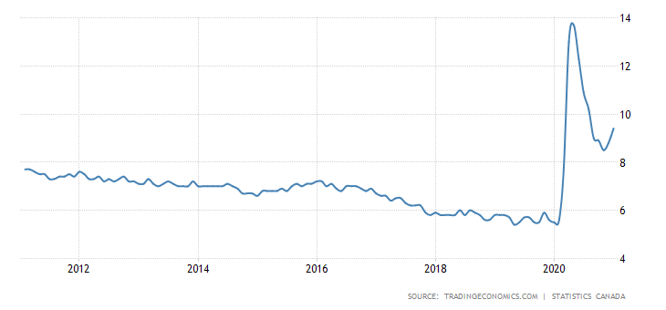
Canada’s equivalent of the nonfarm payrolls fell 212,800 in January vs. a decline of 53,000 in December. The decline was well above forecasts of a decline of 47,500. Canada lost 3,004,500 jobs in March/April 2020 but have since gained back 2,162,500 or 71.9% of the jobs lost. The job losses were almost all concentrated in Ontario and Quebec, primarily in retail trade, and all basically as a result of the public health lockdowns due to the COVID-19. Ontario and Quebec lost 251,000 jobs so the rest of Canada gained 38,000 jobs. At least half of Canadian workers are working from home or some 5.4 million. As a result of the jump the unemployment rate (R4) jumped to 9.4%, the highest since August. The R8 rate of unemployment which includes discouraged workers, and involuntary part-time workers jumped to 13.3% from 11.1%. Remaining at a record high was the 512 thousand workers unemployed for 27 weeks or more. The labour force participation rate fell to 64.7% from 65.0%.
The biggest drop in employment percentage-wise was for teenagers as they lost 74 thousand jobs. The core age group of 25–54 lost 107 thousand jobs. The number of unemployed rose 125 thousand including a rise of 62 thousand on temporary layoff. The number who wanted a job but had given up increased 74 thousand in January. Since they are no longer counted as part of the labour force, their inclusion would have jumped the unemployment rate to 12%.
Total hours worked increased 0.9%. That reflects the fact that it is the lower paid part-time and gig workers who are bearing the brunt of unemployment. Overall, the labour force fell by 88 thousand in January including a decrease of 46 thousand for those aged 15–24. Underutilized workers are those who want a job but have given up looking for one, those on temporary layoff, or those who are somewhat employed but who have worked far less than they normally would. They totaled at least 244 thousand.
The big job losses were those especially impacted by public health restrictions, including accommodation and food services, retail trade, information, culture, and recreation. Increases were seen in health care and social assistance. Others seeing gains were in construction.
The Canadian jobs report remains as dismal as its U.S. counterpart, but, overall, Canada has gained back more jobs despite the losses in December and January. Most economists are upbeat about Canada despite the big jump in January. Recall as well that the Canadian economy grew 0.7% in November which was higher than expected and it was the seventh consecutive monthly gain. And again, it is a K recovery with high-end professional jobs doing well while low-end, low-paying jobs suffer. The problem is trying to balance the need to protect public health with the need to keep people employed. Overall, Canada is faring somewhat better during this second wave.
MARKETS AND TRENDS
| % Gains (Losses) Trends | |||||||
| CloseDec 31/20 | CloseFeb 5/21 | Week | YTD | Daily (Short Term) | Weekly (Intermediate) | Monthly (Long Term) | |
| Stock Market Indices | |||||||
| S&P 500 | 3,756.07 | 3,886.83 (new highs) | 4.7% | 3.5% | up | up | up |
| Dow Jones Industrials | 30,606.48 | 31,148.24 | 3.9% | 1.8% | up | up | up |
| Dow Jones Transports | 12,506.93 | 12,788.51 | 5.8% | 2.3% | up (weak) | up | up |
| NASDAQ | 12,888.28 | 13,856.30 (new highs) | 6.0% | 7.5% | up | up | up |
| S&P/TSX Composite | 17,433.36 | 18,135.90 (new highs) | 4.6% | 4.0% | up | up | up |
| S&P/TSX Venture (CDNX) | 875.36 | 1,022.64 (new highs) | 10.9% | 16.8% | up | up | up |
| S&P 600 | 1,118.93 | 1,252.75 | 5.4% | 12.0% | up | up | up |
| MSCI World Index | 2,140.71 | 2,178.47 | 2.9% | 1.8% | up | up | up |
| NYSE Bitcoin Index | 28,775.36 | 38,190.89 | 2.9% | 32.7% | up | up | up |
| Gold Mining Stock Indices | |||||||
| Gold Bugs Index (HUI) | 299.64 | 286.63 | 1.1% | (4.3)% | down | down | up |
| TSX Gold Index (TGD) | 315.29 | 306.55 | 0.9% | (2.8)% | down | down | up |
| Fixed Income Yields/Spreads | |||||||
| U.S. 10-Year Treasury yield | 0.91 | 1.17% (new highs) | 9.4% | 28.6% | |||
| Cdn. 10-Year Bond yield | 0.68 | 1.01% (new highs) | 13.5% | 48.5% | |||
| Recession Watch Spreads | |||||||
| U.S. 2-year 10-year Treasury spread | 0.79 | 1.06% (new highs) | 23.3% | 34.2% | |||
| Cdn 2-year 10-year CGB spread | 0.48 | 0.80% (new highs) | 9.6% | 66.7% | |||
| Currencies | |||||||
| US$ Index | 89.89 | 91.03 | 0.5% | 1.3$ | Up | down | down |
| Canadian $ | 0.7830 | 0.7810 | (0.6)% | (0.3)% | down | up | neutral |
| Euro | 122.39 | 121.33 | (0.3)% | (0.9)% | down | up | up |
| Swiss Franc | 113.14 | 112.24 | (0.6)% | (0.8)% | down | up | up |
| British Pound | 136.72 | 137.09 (new highs) | 0.1% | 0.2% | up | up | up |
| Japanese Yen | 96.87 | 95.49 | (0.9)% | (1.4)% | down | up | up |
| Precious Metals | |||||||
| Gold | 1,895.10 | 1,813.00 | (2.0)% | (4.3)% | down | down (weak) | up |
| Silver | 26.41 | 27.02 | 0.4% | 2.3% | up | up | up |
| Platinum | 1,079.20 | 1,133.00 | 5.0% | 5.0% | up | up | up |
| Base Metals | |||||||
| Palladium | 2,453.80 | 2,326.30 | 5.3% | (5.2)% | down | up (weak) | up |
| Copper | 3.52 | 3.63 | 2.0% | 3.1% | up (weak) | up | up |
| Energy | |||||||
| WTI Oil | 48.52 | 56.85 (new highs) | 8.9% | 17.2% | up | up | neutral |
| Natural Gas | 2.54 | 2.86 | 11.7% | 12.6% | up | up | up (weak) |
Note: For an explanation of the trends, see the glossary at the end of this article.
New highs/lows refer to new 52-week highs/lows.
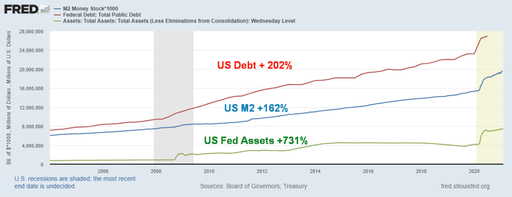
We wanted to once again post a chart of the massive growth of debt and money since the financial crisis of 2008. All the gains noted above are since the beginning of 2008 and the financial crisis. But note the even bigger spike that got underway from the pandemic panic of March 2020. It has been termed by some as massive Fed money printing and reckless government borrowing. We should add in as well reckless business and household borrowing as well. Corporate debt (financial and non-financial) has jumped 45% since 2008 and much of it is BBB-rated (the lowest investment grade). As to the stock market during this period, the S&P 500 is up 164%. Cheap money, money-pumping (QE), and debt to fuel a stock market rise, creating what many call a bubble. Now we appear to be getting into mass speculation as seen with what was going on with the Reddit traders and stocks like GameStop. So, stock speculators and the 1% do well but Main Street has been living with stagnant wages and deteriorating living standards. At the other extreme, P/E ratios of the S&P 500 are at their highest levels since the peak of the dot.com bubble in 2000. Yet many consider valuations cheap and are not perturbed by these record levels. Markets keep going up. But when does the gravy train end? The U.S. federal budget deficit is estimated at $4.6 trillion which is almost 22% of GDP. And there is another $1.9 trillion coming to keep the economy afloat.
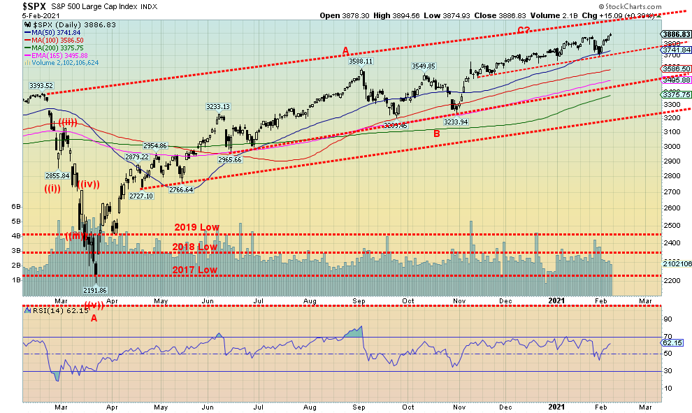
The records keep on falling. Once again, the markets moved to new all-time highs. A down January? Who cares! The S&P 500 made all-time highs again, recovering quickly from that sell-off in the last week of January that turned the month negative. But, despite the weaker than expected job numbers, the market focused instead on all the expected stimulus plus potential for even more as the Democrats figure out how to get their stimulus package through. Also, the U.S. is making good progress on inoculations, which is helping thoughts of a consumer recovery into the second quarter and beyond. Funds are flowing out of bonds into stocks.
Not everyone made new all-time highs this week so that is a small divergence. The Dow Jones Industrials (DJI) was up 3.9% but no new highs. The Dow Jones Transportations (DJT) was also up 5.8% but shy of new highs. Both the DJI and DJT could see their new highs this coming week if the markets continue to rise. And that is our expectation. The NASDAQ made new all-time highs up 6.0%. The small cap S&P 600 was just shy of new all-time highs but still gained 5.4%. Others making new all-time highs included the Value Line, the NASDAQ 100, the S&P 100 (OEX), and the Wilshire 5000. As well the Russell 1000, 2000, and 3,000 all made new all-time highs.
Elsewhere, the MS World Index (MSCI) gained 2.9% but no new all-time highs. Bitcoin was up 2.9% but also no new highs; however, by this weekend it was threatening new highs. In Canada the TSX hit new all-time highs, up 4.6% and the TSX Venture Exchange (CDNX) made 52-week highs up 10.9%. In the EU the London FTSE gained 2.0%, the Paris CAC 40 was up 4.8%, and the German DAX jumped 4.6%. In Asia China’s Shanghai Index (SSEC) was up 0.4% and the Tokyo Nikkei Dow (TKN) gained 4.0% but was just short of new 52-week highs.
Stocks gained on Friday despite the weaker than expected jobs numbers as thoughts of inoculation and more stimulus beat lousy job numbers. The stock market had its the best week since November and was making everyone forget that January was a down month. The VIX indicator fell to close to 20, indicating that higher prices for the stock market were expected. It is risk on once again. Earnings have actually been better than many expected. 84.2% of the reporting 184 companies in the S&P 500 were above expectations. Better earnings, inoculation, stimulus—the mantra for risk on so buy, buy, buy. But a caution that, yes, complacency is getting higher and that eventually translates into a kick in the gonads. But that is later. In the interim, enjoy.
We are at resistance so we do need to burst through 3,900/4,000 to suggest higher prices. Yes, we could be forming a rising wedge triangle so be aware. A breakdown under 3,750 would be negative and under 3,700 a breakdown could be underway. That could then take us down to support near 3,450. Once again 3,200 is the final support zone and under that level a panic could get underway. To the upside, we do have resistance at 3,900 but we also see room to move to higher resistance near 4,000. February is supposed to be a weak month and it was February 2020 that proved to be the top before the March 2020 collapse. So, keep raising stops even as we move higher. It is hard to trust a complacent market.
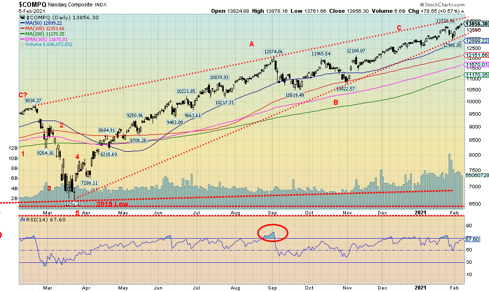
The records keep on falling. Once again, the NASDAQ led by the FAANGs leaped to new all-time highs with a gain of 6.0% this past week. FAANG stocks led with Facebook up 3.85, Apple up 3.6%, Amazon gaining 4.6%, Netflix up 3.5%, and Google soaring to new all-time highs, up a strong 14.3%. Others were up, including Microsoft, to new all-time highs, gaining 4.4% and Twitter recovered from losing Donald Trump and also made new all-time highs, up 12.4%. Tesla gained 7.4%. Not to be outdone, Berkshire Hathaway was up 3.0% and also made new all-time highs. Is there anything that will stop this train?
The top of our channel is up near 14,150 and that appears to be a target. The fact that we have a bad week like we did into the last week of January then immediately bounce back and make new highs shows the strength of the market. A down January? Piffle. 13,500 is now a breakdown point. Below that level we could fall to 12,850 and under that level down to 12,150. But this has been a strong bull and pullbacks have been very shallow. However, given the levels of complacency out there, we’d keep tight stops. Indicators like the RSI still have room to move higher.
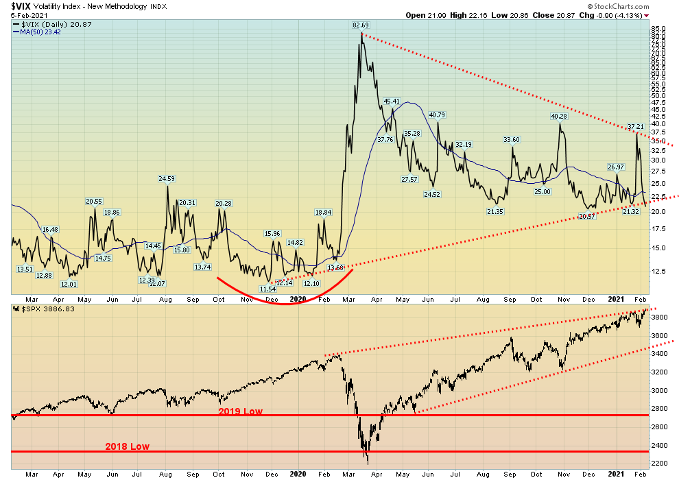
The VIX volatility index continues to improve, falling to 20.87 on Friday. It may be breaking an uptrend line but that is not yet confirmed. A break under 20 would be positive for the market. Any negative divergences are now in the process of being wiped away. So, all that points to a higher market for the S&P 500 as volatility falls. We won’t dwell too much on other indicators as all continue to look positive. We see record highs on the NYSE advance-decline line, still rising on the new highs–new lows line and up volume–down volume line as well. The McLellan Summation Index (RASI) is at 700 below its highs but still bullish, and the ARMS index is positive. The put/call ratio at 0.42 is not as low as it was last week but it is still in very bullish territory which suggests there hardly is a bear around and expectations are that this market will continue higher. If the VIX falls under 20, all negative divergences will be eliminated and we will be in a position to keep moving higher for the S&P 500. The only caution is that the S&P 500 appears to be at the top of a channel.
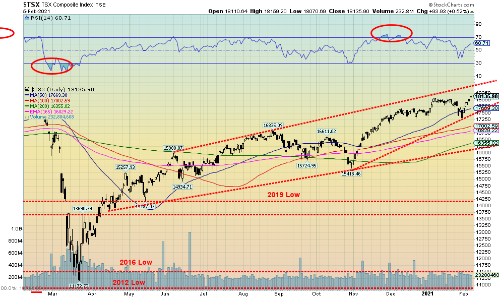
The TSX Composite soared to new all-time highs this past week, hitting 18,159. The TSX gained 4.6% on the week. The TSX Venture Exchange (CDNX) continued its winning ways, up a strong 10.9% and now up 16.8% on the year. The CDNX made fresh 52-week highs. The CDNX continues to be a marvel (not unexpected and long overdue) and it is not just the junior miners leading the way. This is a much more diverse CDNX than in the bad old days. Still, junior miners—particularly gold miners—dominate.
The top of that channel up near 18,500 looks enticing. All of the TSX sub-indices rose this past week and Health Care (THC), long thought by ourselves to be a strong performer, gained almost 11% on the week and made 52-week highs. Impressive gains were also seen for Energy (TEN) up 10.0%, Consumer Discretionary (TCD) up 6.0%, and Information Technology (TKK) up 6.6%. The weakest performer this past week was Gold (TGD) but it too gained, up 0.9%.
The failure to break down under 17,500 was a positive sign even though the TSX did dip under that level but failed to hold. We continue to move higher but the pattern forming could be taking on the formation of a rising wedge triangle (which is ultimately bearish), but most likely not for a couple of months yet. At just under 61 the RSI has room to move higher. So right now, the TSX looks higher and as long as it holds above 18,000 things look quite positive; however, use 17,500 as a stop breakdown point.
U.S. 10-year Treasury Bond/Canadian 10-year Government Bond (CGB)
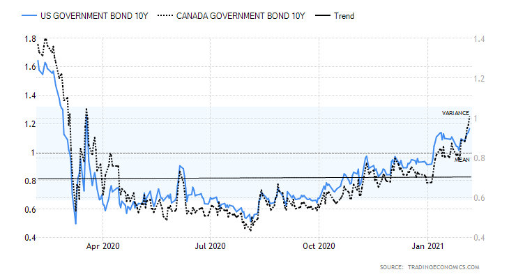
Bond yields finally took the current path of least resistance and rose sharply this past week. Bond yields are rising due to these factors: 1. Signs of growth in the U.S. economy and outperforming the EU and the lethargic Japan, 2. Higher inflation as oil and other commodity prices rise, 3. Stocks benefiting from rising yields as bonds are sold and stocks are purchased, 4. Lousy job numbers, highlighting the need for more relief beyond the current $1.9 trillion package, and increased borrowings helping to push yields higher, and 5. More inoculations, causing the bond market to think of the wave of consumer spending that will be unleashed.
These economic numbers caught our eye this week: the Markit Manufacturing PMI for January was a strong 59.2 vs. 57.1 in December; the ISM Manufacturing Index was 58.7 off slightly from December’s 60.5; construction spending rose 1% in December following a 1.1% rise in November; jobless claims were lower at 779 thousand vs. 812 thousand the previous week; factory orders rose 1.1% in December after rising 1.3% in November; and, despite the lower than expected rise in the job numbers on Friday, it was still positive.
The U.S. 10-year treasury note yield rose to 1.17% this past week, the highest level seen since March 2020. It broke resistance at 1.12%. Canada’s 10-year Government of Canada bond (CGB) also jumped this past week to 1.01%, the first time over 1% since March/April 2020. The spreads with the 2-year also jumped to their highest levels in months. Wide spreads are good for the banks.
There is not a lot of resistance between here and 1.50% to 1.60%. In December 2019 the 10-year closed at 1.92% so those levels could be targets. We do have potential targets up to 1.80% to 1.90% based on the huge triangle that formed at the recent lows seen in March 2020 and August 2020, at 0.54% and 0.52% respectively.
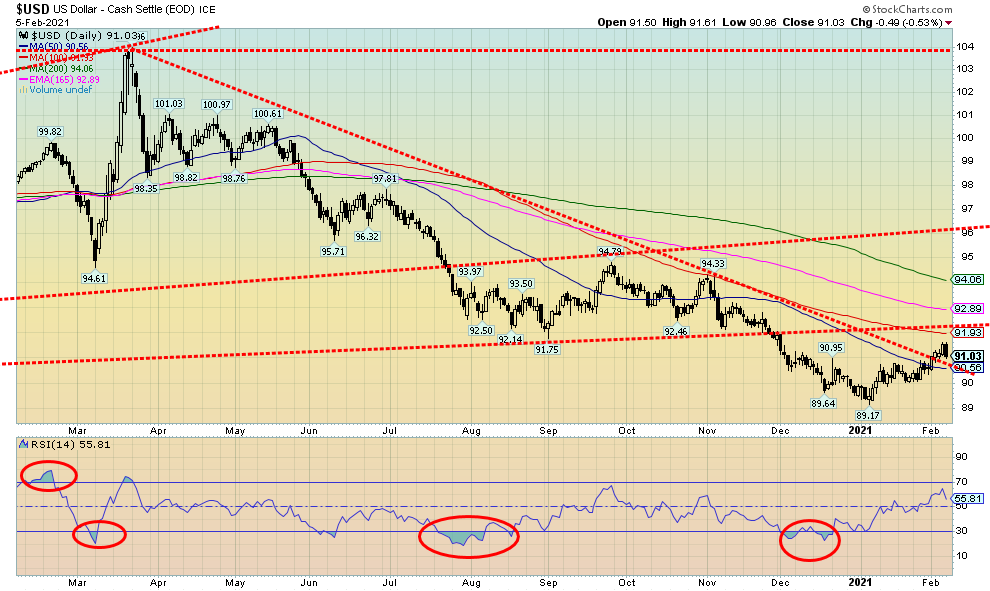
U.S. dollar strength continued this past week, although the weaker than expected jobs numbers on Friday helped stop the rally for now. The US$ Index gained 0.5% this past week as dollars flowed in from the EU. The EU reported a GDP decline of 0.7% in Q4 while the U.S. reported a 4% gain. The EU decline was primarily due to lockdowns and restrictions related to the COVID-19. The EU is also well behind the U.S. in inoculating for COVID-19. Overall, the EU GDP fell 6.8% in 2020 vs. a decline of 3.5% for the U.S. All of this has been encouraging for the U.S. dollar. The euro fell 0.7% this past week, the Swiss franc was off 0.9% as well, the pound sterling gained 0.3%, but the Swiss franc fell 0.6%. The Canadian dollar gained 0.3% thanks to higher oil prices.
The US$ Index has broken the downtrend line from the top in March 2020 but hasn’t really taken off either. Next resistance was up at 92 and, so far, that is elusive. The US$ Index fell 0.5% on Friday stopping the rally in its tracks. It might resume but if we break under 90.50 again the rally may be over. It is very possible we made a 5-wave decline from March 2020 to the low of 89.17 in January. If so, we are going through an ABC-type correction that could last a few months. This may be only wave A up. The B wave could correct back as far as 90 and still be okay. A break under 89.70, however, would suggest new lows ahead. A move over 91.58 would suggest that the current hasn’t topped yet and 92 would be next. A higher U.S. dollar would weigh on gold prices. Our expectation is, however, that the U.S. would continue to outperform the EU and that’s bullish for the U.S. dollar.
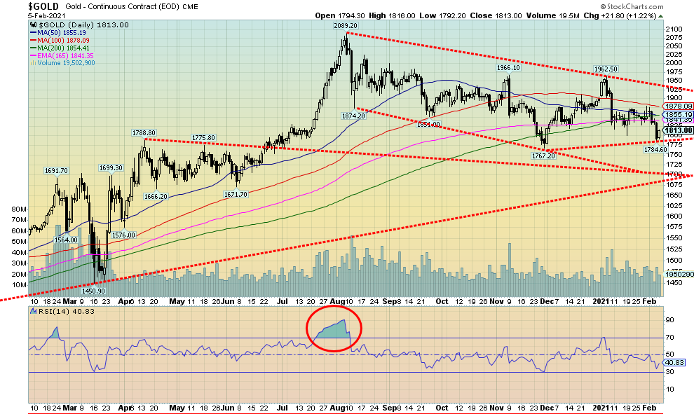
Gold fell this week as the U.S. dollar strengthened. But when the U.S. dollar fell on Friday following the weak job numbers, gold rallied. However, the rally was not enough to put gold up on the week as it lost 2.0% and is now down 4.3% on the year. While gold faltered, silver gained 0.4%, platinum jumped 5.0%, palladium was up 5.3% and copper gained almost 2.0%. All of this hints to us that gold was the outlier and should soon join the others to the upside. The thought of the huge deficits created by fiscal stimulus will eventually become too much for gold to be held back. This is especially the case given the Democrats have apparently found a way to get their $1.9 trillion package through Congress without much, if any, Republican help. More debt means more currency debasement and that translates into higher gold prices.
But before we get ahead of ourselves, we need to see the U.S. dollar continue to fall and gold needs to take out points to the upside. We saw divergences this past week. Silver surged to new multi-month highs at $30.35. Gold was nowhere near its $2,089 August high. Gold then fell back under $1,800, setting up a possible test of the November 30 low of $1,767 and even new lows. Silver failed to break under $26 support and was nowhere near its November low of $21.96. Gold was also negatively impacted by the rise in bond yields this past week as the U.S. 10-year surged past 1.12%. Higher yields hurt gold because the carry cost rises. But then recall that gold rose sharply in 1979 even as yields were soaring towards 20%. So higher yields are not necessarily a deterrent to higher gold prices.
We continue to believe the March 2020 low was an important cyclical low for gold, quite possibly 9-year cycle low (range 7–11 years) to a longer 18-year cycle. As well, the November 30 low may have been our 31-month cycle low dating from the last one seen in August 2018 at $1,167. That low came 32 months after the December 2015 low. The next 31-month cycle low is due March or April 2021 (+/- 5 months). The November 30 low was 27 months after the August 2018 low. But we are still in the influence of that low and it remains possible that was not the cycle low and it is still to come. And that could be as late as August 2021. We don’t want to rule out the possibility, at least not until we clear upside points. Above $1,900 things look better. Above $1,950/$1,960 it would be very encouraging and above $2,000 we would be absolutely confirmed the 31-month cycle low is in.
Meanwhile, gold poked under $1,800 but there was no real follow-through. That is encouraging. The bottom of our bear channel is near $1,725 and below $1,700 we would consider the bull market in gold to be over. Regaining $1,850 would be the first sign of encouragement, but we really need to regain $1,900 to support a bull case. Overall, we remain in a bull market up from the March 2020 low. In the interim we can’t rule out further corrective action. But as long as the downside holds, we will eventually move higher.
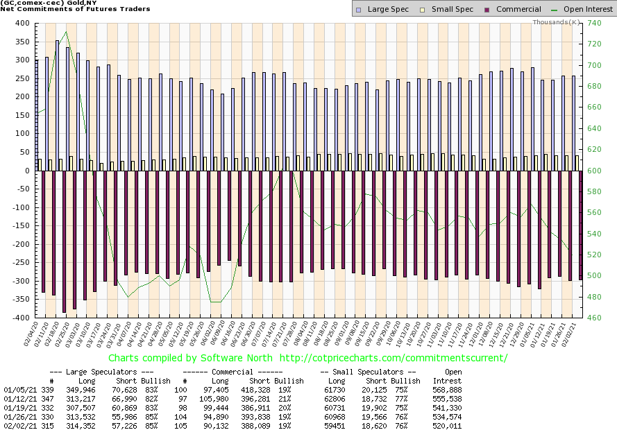
The gold commercial COT was steady this past week at 19%. Long open interest fell almost 5,000 contracts while short open interest also fell off almost 6,000 contracts. The large speculators COT (hedge funds, managed futures, etc.) was also steady at 85% despite a small rise in short open interest of about 1,500 contracts. Overall, open interest fell on a down week which suggests to us covering of shorts (and longs too, it seems). The commercial COT remains too bearish for our liking but we have seen gold rise before even as the COT was bearish.
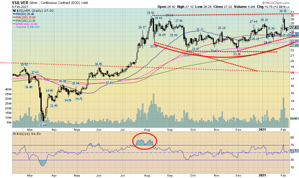
While gold may have suffered this past week, silver did not buck the trend. Silver prices were actually up, gaining roughly 10 cents, up 0.4% on the week. Silver is up 2.3% on the year while gold is down 4.3%. After hitting what appeared to be a spike high at $30.35, silver promptly collapsed along with gold the next day. But there was no follow-through. While gold plunged through $1,800 support silver held above $26 and never even approached $25. That silver ended the week up and held $26 we view as quite positive. The jump to $30.35 may still have been a blow-off spike but the lack of follow-through and support zones holding was encouraging. Of course, we are not out of the woods. We still need to see a move back over $28 then over $29 to confirm a low. Above $29 puts the high of $30.35 back in focus and raises the odds that new highs could be seen. We may have seen a double bottom at $21.81 in September and $21.96 in December. A solid neckline now stretches from the $29.92 high in August to the recent $30.35 high. A solid breakout of that pattern could project silver up to $38.50 targets. Minimum targets would be $32.25. If we were to achieve $38.50 and close above that level, we could look higher to $43.50. But first we have to regain $28, then $29, and hold above $26. Long-term support is now at $22, so if that ever fell the bull market would be over (not expected).
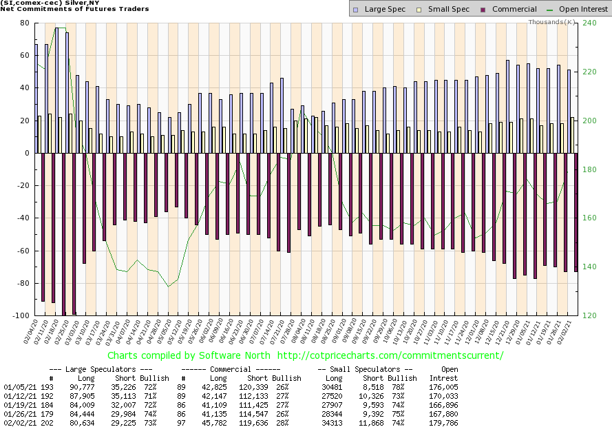
The commercial COT for silver improved to 28% from 26% this past week. While it was an improvement both the long and short open interest rose. Short open interest rose around 5,000 contracts while long open interest was up almost 5,000 contracts. But it was enough to spark the rise in the commercial COT. The large speculators COT slipped slightly to 73% as long open interest fell almost 4,000 contracts. Overall open interest rose on the week along with the rise in silver prices. We are cautiously optimistic but, overall, the COT remains bearish.
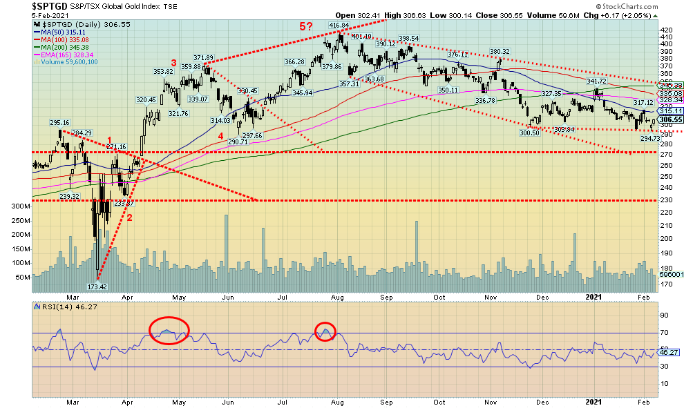
The gold stocks continue to meander even as they managed to eke out a gain this past week. The rise in silver certainly helped. The Gold Bugs Index (HUI) rose 1.1% this past week while the TSX Gold Index (TGD) was up 0.9%. Both, however, remain down on the year. The gold stocks were most likely helped by the rise in the broader stock market this week. When things catch a bid sometimes everybody catches a bid. The TGD dipped below 300 this past week but it didn’t hold and on Friday we rebounded back over 300. Since 290/300 was a support zone, the thought that we were going below that level could have resulted in a deeper selloff, particularly against the backdrop of the big drop in gold below $1,800 this past week. But we never broke under 290 which was the final line to break.
But we are not out of the woods just yet. First off, we need to regain above 315. But even above that level we have continual resistance up to around 345. Above 345 we break out and that could signal the end of the mini-bear in gold stocks. The decline from the August high appears to us to have fallen in five waves but in an ABCDE-type corrective decline. So, 300 remains key even if we do see further support down to around 270. Below 270, however, the bull market would most likely be over.
Technically the gold stocks are in a downtrend despite strong jumps by the silver stocks led by First Majestic (FR, AG). But divergences have appeared on the charts. Both the daily and weekly trends are down but they are weak downtrends. Despite the downtrends, the market has never really broken down. We remain in a bull uptrend following that huge buying opportunity back in March 2020. We remain cautiously bullish going forward and become more bullish as we take out points above – 315, 330, and 345. Above 350 the low is fully confirmed.
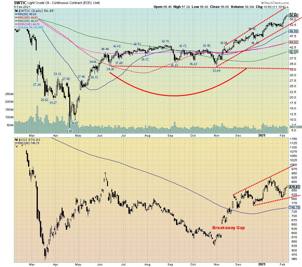
And away we go. Off to $60. Tight supplies. Declining inventories. They are the conditions pushing oil prices higher. Not increased demand. The Saudis seem determined to keep the lid on supplies. Now if demand actually ticked up as well.
WTI oil rose 8.9% this past week, pushing oil prices to 52-week highs. Oil is now up 17.2% so far in 2021. Quite the contrast to 2020 when oil and energy stocks were the worst performers. Natural gas (NG) rose as well, gaining 11.7% now up 12.6% in 2021. And the energy stocks followed with the ARCA Oil & Gas Index (XOI) jumping 7.2% and the TSX Energy Index (TEN) up 10.0%. WTI oil remains nicely in an up channel while the XOI appears to be forming either a new up channel or this could actually turn into a topping pattern. So, we’ll watch that closely. You want to see new highs on the XOI. The positive news is that the current high is higher than what may have been a left shoulder of a potential head and shoulders top. As a result, that has hinted to us that we should soon see new highs above 925 for the XOI. The breakdown point is near 800.
One interesting thing that we noted is that oil and gas mergers have jumped. Oil and gas mergers in Canada in Q4 were worth $10.01 billion, up 468% from the previous quarter and way above the average for the past year. Could there be more? Could be helping the energy stocks surge.
How high could oil go? WTI oil is currently punching above the 4-year MA. Can it hold? Or is this a resistance zone? There is a large congestion zone between $50 and $66 that played out throughout the latter part of 2018 through 2019 and early 2020 before the March 2020 collapse. There is little doubt in our minds that the April 2020 low at $6.50 was a major cyclical low. Now that we have started what appears to us as a new cyclical bull market, the question is, how high could we go? Above $66 the next major resistance is near $75. We could be in the throes of a powerful wave 3 to the upside. The first wave up peaked at $43.78 and wave 2 bottomed at $33.64. A Fibonacci 1.618 relationship between wave 1 and wave 3 could see this wave carry as high as $95 to $100. Now that would cause some eyebrows to rise. But ahead lies some heavy trucking for oil prices. We’ll see how it performs through this. And if we are truly in a bull market, then one would not want to see oil prices fall back under $49.
__
(Featured image by StockSnap via Pixabay)
DISCLAIMER: This article was written by a third party contributor and does not reflect the opinion of Born2Invest, its management, staff or its associates. Please review our disclaimer for more information.
This article may include forward-looking statements. These forward-looking statements generally are identified by the words “believe,” “project,” “estimate,” “become,” “plan,” “will,” and similar expressions. These forward-looking statements involve known and unknown risks as well as uncertainties, including those discussed in the following cautionary statements and elsewhere in this article and on this site. Although the Company may believe that its expectations are based on reasonable assumptions, the actual results that the Company may achieve may differ materially from any forward-looking statements, which reflect the opinions of the management of the Company only as of the date hereof. Additionally, please make sure to read these important disclosures.


Advances in Biomarkers and Targeted Therapies Transform Kidney Care in Autoimmune Disease
New biomarkers and targeted therapies are reshaping the management of kidney damage in autoimmune diseases like lupus and vasculitis. Experts...


Bitcoin Rises on Iran Deal as Crypto Markets React to AI and SpaceX News
Bitcoin rose above $65,000, gaining about 5% as a tentative Iran war agreement boosted markets. ETFs still show weekly outflows....


Rising Inflation, Fed Uncertainty, and Market Excess Amid War and SpaceX Mania
Rising inflation, driven by war, debt, and money growth, puts the Fed in a difficult position ahead of its meeting....


SpaceX IPO Sparks Déjà Vu as Market Risks Loom and Gold Bulls Stay Hopeful
The author compares the 2000 AOL Time Warner merger to SpaceX’s planned IPO, warning it may signal a market top....


The TopRanked.io Guide to 2026’s Biggest and Best Affiliate Opportunities
Want to earn affiliate commissions on literal billions of dollars worth of revenue? Then this week, we've got something special...
 |
|
 |  |
 |
|
-

 Biotech2 weeks ago
Early Use of Tirzepatide Shows Strong Results in Type 2 Diabetes Study
-
 Biotech19 hours ago
Advances in Biomarkers and Targeted Therapies Transform Kidney Care in Autoimmune Disease
-

 Africa1 week ago
Morocco at an Energy Crossroads Amid Global Gas Volatility and Critical Minerals Opportunity
-

 Impact Investing2 weeks ago
Italy Advances Recycling but Infrastructure Gaps Threaten EU Targets