Business
A look at the “Monetary Policy” of the past four decades
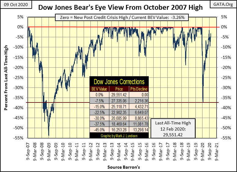
In the Dow Jones’ current correction from its high for the move for September 2nd (BEV of -1.53%) it has yet to deflate below its BEV -10% line. Closing the week at BEV -3.26 places the Dow Jones in scoring position (< -5%). There is no reason for the Dow Jones not to see a new all-time high next week or in the weeks to come. But then it just may break below its BEV -10% line too.

I used to subscribe to Richard Russell’s Dow Theory Letter. I consider my actual education on markets began with Mr. Russell’s market comments.
My inspiration for my Bear Eye View (BEV) charts came from one of his letters, published around 1995. A subscriber submitted a bear-bone chart of the S&P 500 in which new all-time highs were only 0%; all other data points were percentage declines from those 0% all-time highs.
Mr. Russell never took this format to heart, but I did. And for market series, such as the Dow Jones going back decades, and now centuries, I believe what I now call the Bear’s Eye View (BEV) provides a uniquely insightful display of market history.
Years ago I had people write, accusing me of taking something that isn’t mine, and claiming it as my own invention; my BEV charts. I’ve never claimed the Bear’s Eye View as mine. Heck, I’m just a retired fleet sailor, and following markets are my hobby. While sailing the Seven Seas I’ve read a lot on markets, and except for that one Dow Theory Letter from Mr. Russell, I’ve never seen anyone compress decades and centuries of a market data into a range of 100 percentage points, with each new all-time high equal to only 0%, and a total wipeout in valuation equal to -100% before that letter.
So what if I spiffed it up a bit with a catchy name, and made it widely available in the public domain? That’s a good thing; for instance, this Bears Eye View of the Dow Jones from February 1885 to October 2020 below.
There’s lots of market history on display here the Dow Jones plotted in points fails to reveal. Note the Red Line on the BEV -40% level; since 1885, seeing the Dow Jones decline by 40% (or even 45%) from an all-time high (BEV Zero) was not only a safe reentry signal back into the market but a profitable one too! If I hadn’t published this Bear’s Eye View of the Dow Jones, my readers would have been unaware of this historical fact.
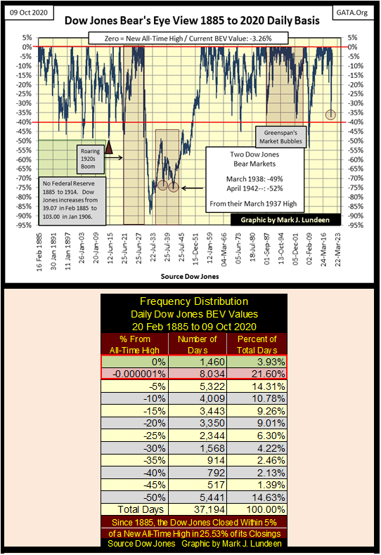
The sole exception to that rule was the 1929-32 89% market crash, where coming back into the market after the initial 40% market decline on 29 October 1929, and holding on until 06 July 1932, resulted in a loss of 83% of invested funds during a 89% bear market.
Sad but true. Below is a table displaying the grizzly mathematics of a deflationary 90% market collapse using the Dow Jones current all-time high of 29,551.43 from February 12th. The valuations for the Dow Jones are different from those of the Great Depression Crash, but the Percentage Mkt Decline are BEV values, and so directly comparable to the Great Depression Crash.
As every new all-time high is only a big-fat zero to Mr Bear, whether it’s the last all-time high for the Roaring 1920s bull market; 381.17 on 03 September 1929, or the 29,551.42 of last February 12th, they are only BEV Zeros to him. And to investors, whether they lived in October 1929 or March 2020, a 40% decline is still a 40% decline.
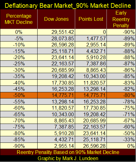
Why did I construct this table? Because I believe before Mr Bear is finished with Wall Street, we’re going to see a reprise of the Great Depression Crash for all the shenanigans the Federal Reserve has afflicted the free markets with since Alan Greenspan became Fed Chairman in August 1987.
In fact, the abuse the FOMC has inflicted the market with today is much worse than during the Roaring 1920s bull market. In the 1920s the Federal Reserve flooded the economy with credit far in excess to its gold reserves. There were bubbles in real estate and farmland also. How that ultimately worked out, one has only to read John Steinbeck’s Grapes of Wrath, about a family whose farm in Oklahoma was repossessed by the bank during the Great Depression.
In the 1920s the Federal Reserve also allowed investors to borrow on margin; 90% for speculations in the stock market. The data seen below was compiled from issues of Barron’s actually published during the Roaring 1920s Bull Market and Great Depression Crash. The 1920s bull market (Blue Plot) was fueled with “liquidity injected” (Red Plot) by the Federal Reserve. The Great Depression Crash came as the “policymakers” withdrew their “liquidity” from the stock market.
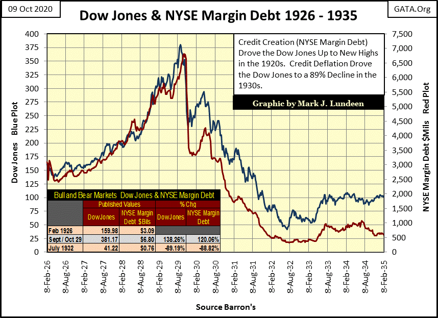
Reading “monetary history”, it’s widely accepted it was the withdrawal of this “liquidity” in the early 1930s, not the initial “injections” of “liquidity” during the 1920s that is seen by academics today as THE MISTAKE of this period of “monetary history.” This is a mistake the “policymakers” of today refuse to repeat. Unlike the “policymakers” of the 1930s who allowed farmland in Oklahoma and stock market values to deflate, today’s “policymakers” are committed to perpetual inflation in asset valuations.
So, our “policy makers” are determined to bungle things in a completely different fashion, similar to John Laws “monetary policy” during his Mississippi Scheme of the early 18th century. In other words; they intend to go toe to toe with Mr Bear, no matter the cost, to fight deflation in stock, bond & real estate valuations by ever greater “injections” of inflation.
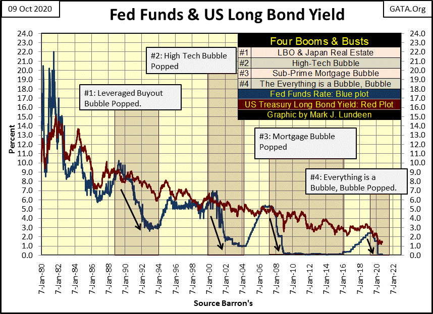
The following chart plotting the Fed Funds and US Treasury’s long bond yield illustrates the four times the FOMC has bailed out Wall Street since 1987:
- The Leveraged Buyout Bubble (LBO) of the 1980s;
- The High Tech Bubble of the 1990s;
- The Sub-Prime Mortgage Bubble of the 2000s;
- The Everything is a Bubble, Bubble of the 2010s / 2020s.
#1: The leveraged buyout bubble of the 1980s
Beginning with the October 1987 flash crash (#1 above), the “policymakers” have practiced bear-market interruptus by “injecting liquidity”, in one form or another, into the market whenever the Dow Jones deflates by 30% or so. This is seen in the chart above by an abrupt lowering of the Fed Funds Rate (Blue Plot) far below the yields for the US Treasury’s long bond.
Following the leveraged buyout and Japanese real estate bubbles of the 1980s, Wall Street found itself in some difficulties with what was called “bridge loans” on inflated market assets in the early 1990s. These loans were sound loans when made, but no longer after the Japanese real estate bubble popped and the October 1987 flash crash.
Alan Greenspan’s solution to Wall Street’s difficulties were to lower his Fed Funds rate to 3.0% (down from 9.0%) in 1992, allowing Wall Street to borrow billions at 3% to invest in long-term Treasury bonds yielding over 8%. As noted by Barron’s Alan Ableson, this was a neat trick to allow Wall Street to “re-liquefy” their depleted balance sheets. Congress also loved this bailout, as demand for Congress’s IOUs in the Treasury Market increased significantly, and soon so did investors as once again they were made whole as Wall Street now inflated a bubble in high-tech stocks.
#2: The high tech bubble of the 1990s
In 2000, the high-tech stock bubble also popped (#2 above). In what became known as “the Greenspan put”, for the second time in a decade Alan Greenspan pushed down his Fed Funds Rate far below the yield for the long T bond. All that “liquidity” had to go somewhere, and beginning in or around 2002 much of it flowed into single-family mortgages.
#3: The sub-prime mortgage bubble of the 2000s
The deflation following the inflation of the single family homes via sub-prime mortgages proved devastating to the global banking system, and economy. The entire banking system was on the edge of failure, and with it the global payment system. The potential failure of the banks in 2008-09 would have resulted in the global economy coming to a halt, as without the banks’ payments for goods, services and wages, day to day economic activity would have become impossible.
As expected, Doctor Bernanke (then Fed Chairman) lowered his Fed Funds Rate to effectively zero, and they have stayed for the following eight years in the chart above.
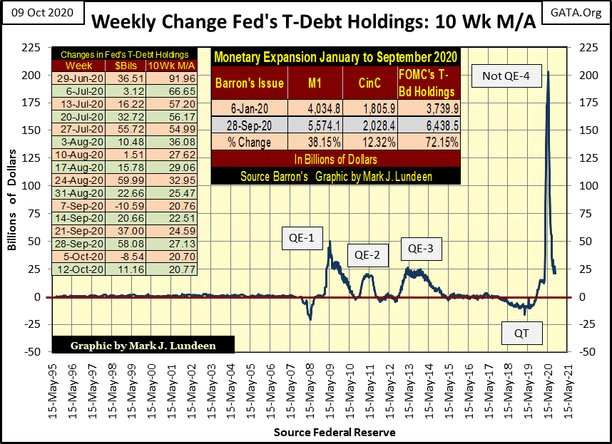
But this reflation of the market was different from #1&2. To revive the banking system and the global economy it serviced, Doctor Bernanke began what today is known as quantitative easings (QEs). To reflate stock market valuations to where they were before the second deepest percentage crash since 1885 (a 54% market decline as seen in the long term BEV chart above), Doctor Bernanke prescribed three QEs for the financial markets, as seen in the chart below.
But the FOMC’s quantitative easings (QE) are actual declarations-of-war on the free market’s mechanisms to fix market valuations independent of Ivy League academics supervision. It’s a war with Mr Bear, a war the FOMC will win every battle, until the last when Mr Bear overcomes and crushes the idiot savants who now are managing the markets.
#4: The everything is a bubble, bubble of the 2010 / 2020s
This is the lay of the land in 2020, where financial assets and real estate valuations are all inflated far above the point of prudence, though everything today seems okay. That is unless one lives in New York or California. But then that is how things felt back on February 12th when the Dow Jones saw its last all-time high. Twenty-eight NYSE trading sessions later, the Dow Jones had deflated by 37%, a stunning collapse, whose swiftness was never before seen in the Dow Jones long term BEV chart above.
In my opinion, last February’s collapse would have become another Great Depression crash had Chairman Powell not implemented his epic “Not QE-4” below. A QE that continues to this day as seen in the weekly double-digit billion-dollar “injections” of “liquidity” in the table on the chart below.
The QEs seen below are only holding actions in this war between the FOMC and Mr Bear. The issue this war is fought over is exactly who is to decide market valuations; Mr Bear (the free market) or a gaggle of idiot savants devising “monetary policy” at the FOMC.
At best, these QEs are only dubious purchases of time for the bulls with trillions of dollars of monetary inflation; holding actions that only offer a false sense of optimism, while making the inevitable market collapse only more prolonged and painful.
The reason to purchase gold and silver bullion and precious metal mining companies has never been so compelling.
What is seen above is the world as I understand it, the background supporting my weekly opinions on the market, which I’m now going to give.
In the Dow Jones’ current correction from its high for the move for September 2nd (BEV of -1.53%) it has yet to deflate below its BEV -10% line. Closing the week at BEV -3.26 places the Dow Jones in scoring position (< -5%) in the BEV chart below. There is no reason for the Dow Jones not to see a new all-time high next week or in the weeks to come. But then it just may break below its BEV -10% line too.
So what is it to be? The Dow Jones rising to new all-time highs or a continuation of a correction that began on September 2nd? I don’t know and I don’t care. I’m just going to watch the Dow Jones from the peanut gallery as the FOMC and Mr Bear go at each other toe to toe.
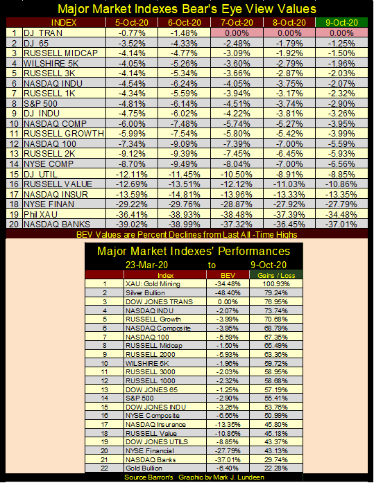
Looking at the major markets I follow in the table below giving their BEV values, it’s been over a month, but the Dow Jones Transports (#1) made three new all-time highs (BEV Zeros) this week. The other indexes have also been inflating. Indexes from #2 to #11 all close the week in scoring position, within 5% of their BEV Zeros.
The setup for next week is very promising. It’s now up to the bulls to take the ball and run with it, by generating more BEV Zeros in the table below.
On Tuesday, Wednesday and Thursday, the XAU (#19) fell below the NASDAQ Banking index (#20). I didn’t like that. But on Friday’s close all was once again put right, with the gold miners rising above the banks. What I’m waiting for now is for the XAU to rise above the NYSE Financial index (#18) as it advances to this table’s #1 position sometime in 2021, or maybe before Christmas.
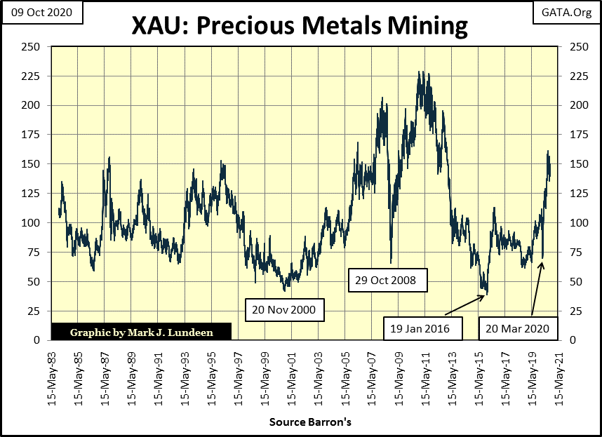
Seeing the XAU rise up from #19 to #1 in my rankings for these major markets in the next twelve months may seem a bit ambitious to most. But look at what the gold miners have done since their March 23rd bottom in the table above; they’ve doubled even as their current BEV is still only -34.48%. For the XAU to move into market history with a new all-time high, it would have to advance only seventy-five points from here, as seen in the chart below.
But the gold miners have been a suppressed market group since the XAU first traded in May of 1983; a doubling from here (up 150 points) would advance the XAU up to 300. After the four decades seen below, would that make gold mining overvalued? I don’t believe it would. In fact, I would see that as a promise of even more to come as the other indexes seen above have their valuations clawed back by Mr Bear.
In a market being deflated, wealth contained in it seeks inflation to preserve its purchasing power. It’s reasonable expecting gold and silver bullion as well as PM mining shares to benefit from a big-bear market in everything else.
Here’s the Dow Jones in daily bars, looking good for the bulls. The Dow Jones is only 3.26% away from making yet another all-time high. If the bulls can’t do that before the November presidential election, I’d say there is a lack of bullish enthusiasm, or possibility of insufficient “liquidity” flowing from the FOMC.
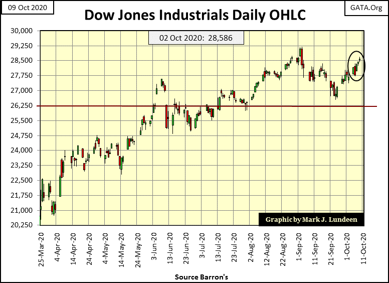
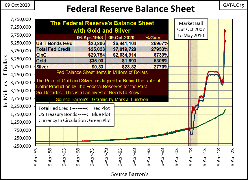
Looking at the Federal Reserve’s balance sheet below, believing the market is suffering from a lack of “liquidity” is hard to believe. But for any addiction, be it heroin for a human being, or “liquidity” for the financial markets, in its terminal stages a huge increase in the addict’s drug of choice has less and less of the desired effect.
For the stock market, looking at the expansion of “monetary reserves” seen below for the benefit of the bulls now running wild and free on Wall Street, it’s actually a bit shocking that the Dow Jones isn’t well above 30,000 at this week’s close. Instead, we see the Dow Jones struggling to break above its highs of February 12th: 29,551.
I look at this chart of the Fed’s balance sheet, and the first thing that comes to mind is: geeze Louise! The current upward spike is only since last March. God save us from these idiot savants from Harvard and Yale. Enjoy the good times we are now enjoying, as their days are numbered.
Here’s the comparison between the Great Depression Crash and our current market correction. If the Dow Jones fails to make a new BEV Zero, thus terminating the correction from the Dow’s lows of last March, confirming that in fact this bounce off of last March’s lows was only a Dead-Cat Bounce aka a sucker’s rally, what a historic chart this will prove to be.
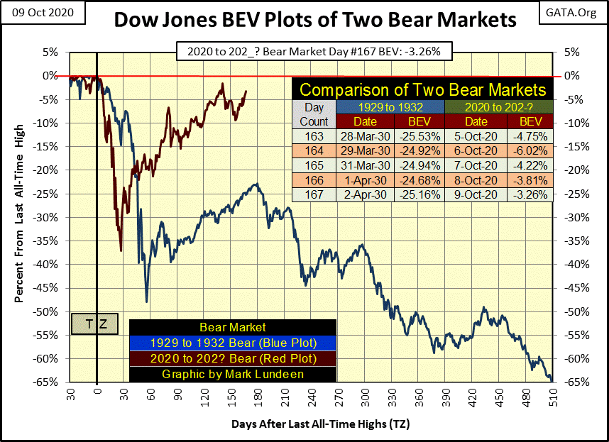
Enough of this depressing stuff; considering the Dow Jones is on the verge of another Great Depression market event. It’s time to move on to gold.
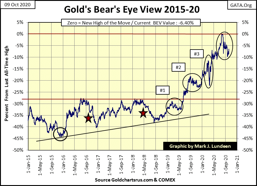
Like the Dow Jones, for the past two months gold too has refused to correct by 10%. But the Dow Jones closed the week within scoring position, while gold still has a way to go before it is less than 5% from its last all-time high. So why not like the stock market over gold and silver?
Well, for one thing, the “policymakers” aren’t just manipulating the stock market, but the bond and real estate markets too, and who knows what they’re doing in the OTC interest-rate derivatives market. If Chairman Powell’s Not QE-4 (see above) was so large, it was because it had to be to maintain market valuations in all the markets the FOMC has been manipulating for decades. That plus to prevent his banking system from shutting down.
If we were to use a huge blue whale as an analogy for the markets, what the FOMC is attempting to keep inflated is the blue whale, while gold and silver bullion and the PM mining companies would be the little barnacles growing on the side of the blue whale. What the “policymakers” fear is when their preferred markets begin to deflate, flight capital will flow into precious metals assets. In effect, their blue whale will attempt to squeeze into our little barnacles. Well that’s impossible, but our barnacles will expand significantly as wealth flees the deflating financial markets.
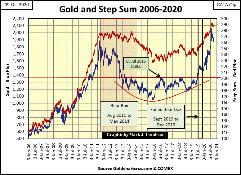
Gold (market reality / Blue Plot) and its step sum (market expectations / Red Plot) chart below remains positive, but what could come from its current correction? Let’s see what happened in March 2008 when gold first broke above $1000 an ounce. It corrected 30% in the next eight months; it then tested $1000 once again in early 2009 before it paused a bit. After which, as seen in the chart below, gold advanced to $1888 in the next two years.
That gold currently refuses to correct by even 10%, not the 30% it saw in 2008, could be indicating the potential power that underlies the pending advance in the price of gold and silver, as well as the precious metals mining stocks in the XAU and little exploration stocks like my Eskay Mining.
Concerning this pending advance in precious metal assets, I could tell you what I saw in my crystal ball. But anytime I look into it for something that hopefully will make me money, the damn thing just fogs up and flickers a bit. Why do I even bother?
To get a grasp on the potential for precious metal assets in the next few years, it may be best to just keep in mind what happens to barnacles when a giant blue whale attempts to squeeze into them, and leave it at that.
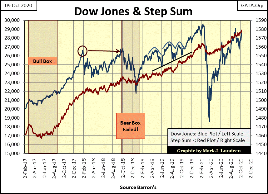
Moving on to the Dow Jones and its step sum chart below, the bear box that was developing appears to be failing. In other words, the advancing (bullish) red step sum plot (market expectations) is proving to be correct as the Dow Jones itself (market reality) stopped going down and is making gains on last February’s last all-time high.
This is why I don’t consider a box to be valid until it goes on for a minimum of eight weeks, with twelve or even sixteen weeks all the better. The question now is how high above 30,000 will the Dow Jones advance from here?
The truth is, no one knows. We’re in a vicious presidential election year and, no matter whether it’s President Trump or Joseph Biden who claims victory on election night (November 3rd), or maybe both, the shit is going to hit the fan. That is never good for the stock market, but frequently is for precious metals assets.
Looking at gold in its step sum table below, the selloff that began in early August appears to be waning. Where before we’d see multiple down days, we’re now seeing multiple up days in the gold market. Gold’s 15 counts is bouncing off of its -5 from late September, closing the week at a +1. We should see higher positive values next week for gold’s 15 count. Also, gold’s step sum is back at 290. It peaked at 293 on August 20th. Should it take that out in the weeks to come, gold may have begun its next advance into market history.
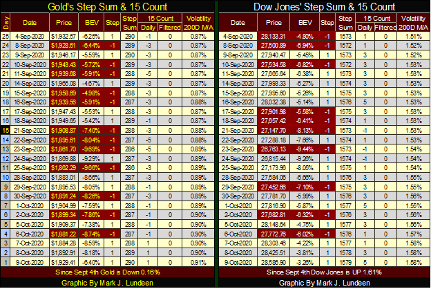
The thing about a rising step sum is that unless it drags the price plot up with it, it’s not doing anything for investors. A cursory look at gold and the Dow Jones step sum tables above, shows the Dow Jones is seeing more advancing days than has gold. Its 15 count closed the week at a +5 and its step sum has advanced by a net of six advancing days since September 4th; that’s a lot.
So why has the Dow Jones advanced by only 1.61% in the past twenty-five NYSE trading sessions, and is still 3.26% from its last all-time high of last February?
Yes, why is that?
__
(Featured image by Buffik via Pixabay)
DISCLAIMER: This article was written by a third party contributor and does not reflect the opinion of Born2Invest, its management, staff or its associates. Please review our disclaimer for more information.
This article may include forward-looking statements. These forward-looking statements generally are identified by the words “believe,” “project,” “estimate,” “become,” “plan,” “will,” and similar expressions. These forward-looking statements involve known and unknown risks as well as uncertainties, including those discussed in the following cautionary statements and elsewhere in this article and on this site. Although the Company may believe that its expectations are based on reasonable assumptions, the actual results that the Company may achieve may differ materially from any forward-looking statements, which reflect the opinions of the management of the Company only as of the date hereof. Additionally, please make sure to read these important disclosures.

-

 Biotech2 weeks ago
Novo Nordisk: Stable Growth and Defensive Biotech Stock for DACH Investors in 2026
-

 Impact Investing1 day ago
Ridemovi Secures Financing to Drive European Expansion and Sustainable Mobility Growth
-

 Impact Investing1 week ago
Antarctica Warming Reshapes Global Atmospheric Circulation
-

 Business4 days ago
Anemic Labor Market and the End of Passive Money Flows


