Markets
Markets on Borrowed Time Amid Economic Cracks and Global Uncertainty
Since 2000, money supply and debt have fueled economic and market growth, raising questions about sustainability. Weak June job data hinted at underlying economic slowdown despite positive framing. Markets rose showing topping patterns and fragility. Falling oil prices, ongoing geopolitical tensions, and a gold rebound add uncertainty, suggesting markets may be nearing a turning point.

Money makes the world go around. And there is nothing like a lot of money to push up the stock market. Whether or not we think the market could be topping, it is questionable whether the stock markets would have gone up as much as it did without pump priming or, as we note, rising debt, rising money supply, and rising margin debt. Money is the lifeblood of the stock market.
In 2026, the S&P 500 has jumped 9%, the NASDAQ is up 11.7%. But when one measures them from the important 2022 low the S&P 500 is up over 100% while the NASDAQ is up almost 150%. The big star and the leader of the MAG7 has been Nvidia, up over 1,500%. One could argue that the rally has been one for the ages. Has it all been stocks? Of course not. Despite the recent setback, gold is still up almost 150% in the same time period.
Money for the stock market comes from different sources. The U.S. debt is up $11.4 trillion since Trump left office the first time in January 2021. It’s hard to believe that the total U.S. federal debt was only $1.2 trillion when Jimmy Carter left office in January 1981 and now it’s $39.3 trillion. U.S. debt has been rising on an unprecedented scale, equivalent to or higher than its rise in wartime, specifically World War II. All presidents add debt, some more than others. But what we’ve seen is an unprecedented 3,175% increase in the debt since Carter left office.
On a percentage basis, the big winners were the two Bush presidents along with Ronald Reagan. On a dollar basis, Obama’s gain over eight years was the largest, but then he dealt with the aftermath of the 2008 financial crisis. But then he only averaged $1,237.50/year. Then along came Trump and over a four-year period he added on average $2,000 billion/year. So did Biden but he had the 2020 pandemic to deal with. The current Trump reign is expected once again to add on average over $2,000 billion/year over his four-year term.
For the record, here’s how each president increased the debt:
| President | Debt increase (%) | Total debt ($) over term in office | Average debt ($) per year |
| Reagan | 125% | $1.5 trillion over 8 years | $187.5 billion |
| Bush 1 | 51.9% | $1.4 trillion over 4 years (Gulf War 1) | $350 billion |
| Clinton | 41.5% | $1.7 trillion over 8 years | $212.5 billion |
| Bush 2 | 72.4% | $4.2 trillion over 8 years (Gulf War 2, Afghanistan) | $525.0 billion |
| Obama | 40.0% | $9.9 trillion over 8 years (2008 financial crisis) | $1,237.5 billion |
| Trump 1 | 81.9% | $8.0 trillion over 4 years | $2.0 trillion |
| Biden | 29.7% | $8.3 trillion over 4 years (2020 pandemic) | $2.075 trillion |
| Trump 2 (to June 2026) | 8.6% | $3.1 trillion over 1.5 years to date, 4-year projection $8.3 trillion or 23% | (projected) $2.075 trillion |
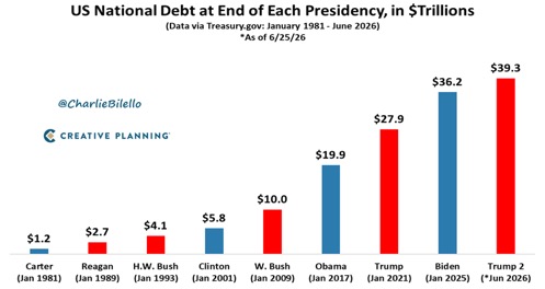
In total, U.S. debt has increased 3,175% since January 1981. The S&P 500 is up 5,485%. While the growth in U.S. federal debt has most likely played a part, there are other factors that have played a large part. GDP is up only 967% or $28,880.1 trillion since January 1981. U.S. federal debt has increased at three times the rate of GDP. That tells us that it takes more and more money to purchase a dollar of GDP. It also leaves a lot of money sloshing around in the financial system. And where does it go?
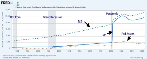
Money supply (M1) has increased sharply, particularly since the 2020 pandemic. M1 is up $15.4 trillion since March 2020. M2 has jumped $7 trillion while the Fed’s balance sheet is up $2.6 trillion but was up as much as $4.7 trillion until the Fed started dropping its assets by applying quantitative tightening in 2022.
But what has really caught our attention is massive growth in margin debt. Margin debt, according to the Financial Industry Regulatory Authority (FINRA), has jumped 53.7% in the past year including an 8.5% jump in May 2026 alone. Margin debt has grown to $1.2 trillion, a record level. Curiously, the S&P 500 is up 21.1% in the past year while the NASDAQ has gained 29.5%.
Again, despite its recent setback, gold is up 21.9%, down from over 60% at its January 2026 top. The Consumer Price Index (CPI) is up only 3.7%. Politically, inflation in the economy is bad but inflation in the stock markets is good. That is, until the bubble bursts.
Money Supply M1, M2 plus Fed Assets 2001–2026
Other sources of fuel for the stock market come from savings and banks. Commercial and industrial loans have leaped 167% since 2000. Increases in bank funds show up in money supply. Other sources include private credit funds.
Long term, the U.S. stock market returns roughly 10% annually or, after adjusting for inflation, 7%. The current stock market is double (+21.1%) the long-term average return (+10.0%). We have noted that over time everything returns to the mean. That suggests that we should go through a period of adjustment.
87%–93% of the stock market is owned by roughly 10% of the population. That 10% includes individuals and institutions. Institutions tend to dominate. Since institutional ownership is in funds and ETFs, the public does benefit (individual clients and retirement accounts) if the institution does well. The implication is that the bottom 90% own only 7%–13% of the stock market. There are large players in the market including BlackRock, the Vanguard Group, and State Street Global Advisors. These are large private equity firms.
So, who controls the money supply? The Federal Reserve is now under a new leader, Kevin Warsh. Warsh appears to have abandoned “forward guidance” that was a regular of the Jerome Powell Fed. He seems inclined to reduce the Fed’s balance sheet that he believes has become bloated. That implies potential Fed tightening. He also believes in the market to straighten things out. Does that mean we might not see the kind of bailout that materialized after the 2008 financial crisis or the 2020 pandemic if another financial crisis broke again?
Since 1971 when the world abandoned the gold standard, we have seen a series of financial crisis that required the intervention of the Fed. They include the Arab Oil Embargo collapse 1973-1975, the early 1980’s collapse, the Gulf War 1990, the Asian financial crisis 1997, the Russia/LTCM collapse 1998, the dot.com crash 2000-2002, 9/11 2001, the 2008 financial crisis, the EU/Greek crisis 2013-2019, the pandemic 2020 and the inflation crisis 2022.
How close to another one are we? Naturally that remains to be seen. Warsh believes that improving productivity and emphasizing artificial intelligence (AI) could help smooth the economy rather than relying on the bailouts of the past. That said, Warsh is one vote on the FOMC.
Notably, shrinking the Fed balance sheet could put upward pressure on interest rates. The U.S. already pays more than $1 trillion annually in interest costs. Huge budget deficits under Trump averaging up to $2 trillion/annually would also accomplish the same thing. The markets might see increased volatility as a result.
Once again, we can’t help but note the elevated level of the Buffett Indicator. It’s making all-time highs again. It’s well above the peak of the dot.com bubble, above the peak of the 2008 financial crisis, which itself was below the peak of the dot.com bubble, and above the peak made after the pandemic before the 2022 bear market correction. When and how it peaks this time is to be determined.
But the odds favour us moving closer to a peak than to the beginning of new bull market. The clue is the already shaky semiconductors and the MAG7. They are currently underperforming the market. The question, of course, is what the trigger will be to set off at best a serious correction à la 2022 or a collapse à la 2008–2009. Tension is building.
Money makes the world go around. Until it doesn’t.
FINRA Margin Debt vs. S&P 500 1997–2026
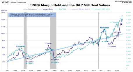
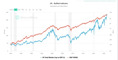
Chart of the week
U.S. Job Numbers
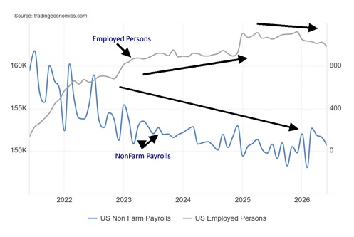
NonFarm Payrolls and Employed Persons 2021–2026
The early release of the June labour numbers was a surprise, especially with a holiday on Friday, July 3. Nonetheless, they came out and the next surprise was that June nonfarm payrolls (NFP) were lower than expected. The NFP came in with a gain of 57,000, below the expected 110,000 and below the downwardly revised 129,000 for May. Altogether, the past three months were revised down by 79,000.
Health and private education were the big gainers. The unemployment rate (U3) also fell to 4.2% from 4.3%. The U6 unemployment rate (all persons marginally attached to the labour force, plus total employed part-time for economic reasons, as a percentage of the civilian labour force, plus all persons marginally attached to the labour force) also fell to 7.9% from 8.1%.
Markets reacted. Gold rose, stocks rose, and the US$ Index fell. Oil fell as well but that’s another story. Dig a little deeper and a weaker picture emerges. The civilian labour force fell by 720,000. The employment level was down 527,000 with full-time employment down 514,000 and part-time employment down 53,000.
The labour force participation rate fell to 61.5% from 61.8% and the employment population ratio was down to 59.0% from 59.2%. Even the unemployment level fell by 213,000. The fall alone in the civilian labour force and drop in the labour force participation rate helps explain why the unemployment rates (U3 and U6) both fell. Dropouts and fewer people working all weigh on the unemployment rate, causing it to fall.
The not in labour force category also fell 285,000. This is against the backdrop of the population level (meaning all those who could, in theory, work), which rose 112,000. The not in labour force category includes retirees, disabled people, full-time students, and others. Those categorized as not being in the labour force but wanting a job rose 138,000.
The picture that emerges is, despite the drop in the unemployment rate (U3 and U6), the employment picture is weakening. The preceding chart shows that nonfarm payrolls have been on a steady downward path since last peaking in 2021, while the number of employed persons peaked in late 2024 and has now been falling.
We suppose a bit of positive news is that the number unemployed 27 weeks or longer fell 98,000, the average weeks unemployed fell to 25.5 weeks from 26.0, and the median weeks unemployed dropped to 8.8 weeks from 11.8 weeks. However, the number of multiple job holders jumped 126,000.
This is a weak report. Still, it won’t spark the Fed to cut interest rates as inflation remains stickily elevated. More evidence would be needed. But the overall direction is not positive.
Stocks
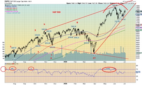
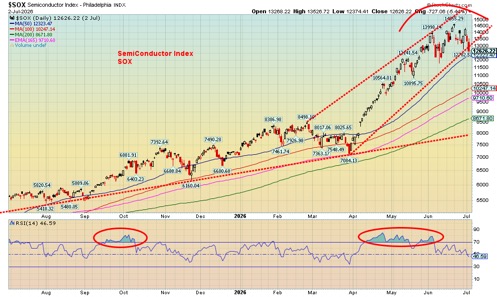
The stock market, it seems, still lives in la-la land. It’s not making new highs except for the Dow Jones Industrials (DJI), but it goes up as it believes that a Fed rate hike is not in the offing, and it seems okay with the weak job growth. Nonetheless, chipmakers and the semiconductors are still suffering a bout of profit-taking. The SOX Semiconductor Index fell 4.4% this past week, the second weekly drop in a row. The S&P 500 was up 1.8% while the DJI, making new all-time highs, gained 2.0%.
The Dow Jones Transportations (DJT) was up 0.9% and the NASDAQ gained 2.1%. The NY FANG Index didn’t follow the SOX as it gained 3.3%, thanks to gains for the MAG7. The S&P 500 Equal Weight Index joined the DJI making new all-time highs, up 1.1%. And so did the surging mid-cap and small-cap markets, despite the S&P 400 (Mid) falling 0.4% and the S&P 600 (Small) dropping 0.9%. Nonetheless, both indices made all-time highs this past week.
Yes, it was an impressive week for the MAG7 as all seven gained with Apple leading the way, up 8.9%. However, all remain off their all-time highs. SpaceX jumped 5.6% and even Trump Media (DJT) gained 15.3%. Will that last for DJT? Micron, a key component of the SOX Index, fell 14% on a bout of profit-taking following a big up move and good profits.
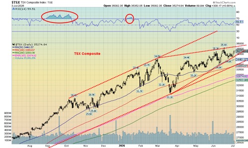
Elsewhere, in Canada, the TSX Composite gained 0.8%, thanks to strengths in the materials, up 0.9%, while the TSX Venture Exchange (CDNX) gained 4.7% following a few down weeks. In the EU, the London FTSE was 1.6%, the EuroNext gained 2.2% to all-time highs, the Paris CAC 40 was up 1.5% and the German DAX also made all-time highs, up 4.5%. In Asia, China’s Shanghai Index (SSEC) was up 0.4%, the Tokyo Nikkei Dow (TKN) gained 0.6%, Hong Kong’s Hang Seng (HSI) rebounded up 3.0%, and India’s Nifty Fifty was up 0.9%. A good week all around.
In Canada, ten of the 14 sub-indices gained on the week with Materials (TMT) leading the way, up 4.5%. Health Care (THC) was up 4.2% and Golds (TGD) gained 4.1%. Industrials (TIN), Financials (TFS), and Utilities (TUT) all made all-time highs. However, TUT closed down on the week, off 1.2% after making that high. Consumer Staples (TCS) led the losers off 3.5%.
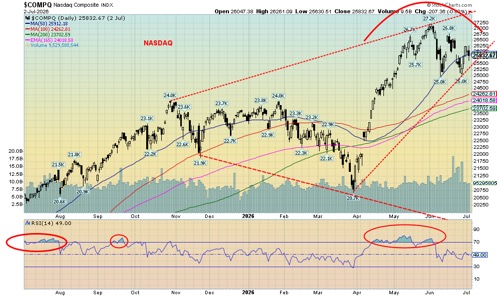
Both the S&P 500 and the NASDAQ continue to exhibit possible ascending wedge triangles (bearish), even as the parameters shifted slightly this past week thanks to the rebound on the week. The TSX also has what may be a wedge triangle, although not as pronounced. This time the S&P 500 breaks at 7,400 but needs to break 7,200 to confirm a high. The NASDAQ needs to break under 25,500, but only under 25,000 do we confirm a top and a breakdown.
The stock markets continue to show topping, but we need to confirm that and only under the points we noted do we start to see confirmation. The SOX Index may be the canary in the coalmine. July is usually a good month for the stock market. Will it be this time? However, August and September are usually the worst months of the year. October is crash month. The stock markets are still alive, but may be on borrowed time.
Bonds
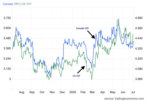
After jumping to 4.49%, the 10-year U.S. Treasury note eased slightly from 4.50% on Thursday after the release of the weaker than expected job numbers. However, on the week, the 10-year gained 11 bp. It seems that while the actual job numbers were soft, the JOLTS job openings were much higher than expected. They came in at ,7549 thousand vs. an expectation of 7,400 thousand. Bond yields rose. Fears of a Fed hike eased. The U.S. 2-year Treasury note closed at 4.18%, up 9 bp on the week but off the highs.
It was mostly the JOLTS report that sparked yields higher. Also, Challenger job cuts were much lower than expected at 45,849 vs. expectations of 85,000 and the previous month’s 97,006.
In Canada, it was much the same as the Canadian 10-year Government of Canada (CGB) rose to 3.45% from 3.39%. Canada reports its job numbers this coming Friday, July 10. Expectations are that job growth will be up 10,000 after last month’s big jump of 88,000. Unemployment is expected to rise to 7% from 6.6% as more seek jobs. Otherwise, there are not a lot of key numbers that usually shape the market out this coming week.
Expect a quiet week. It’s summer.
Spread between CCC-Rated Corporate Bonds and BBB-Rated Corporate Bonds 2023–2026
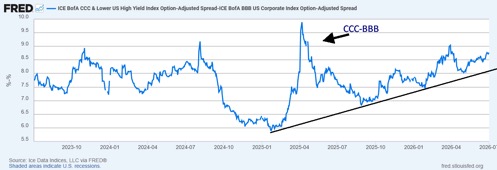
We thought we’d note the rising spread between BBB-rated corporate bonds and CCC-rated corporate bonds. It has been rising steadily since early 2025 and more recently mid-2025. It now stands at 877 bp. What it means is that the risk trade is increasingly under pressure as investors prefer well-rated, safer securities – in this case BBB-rated vs. risky bonds that are CCC and lower. It briefly jumped up in early 2025 because of Trump’s tariffs but when those abated it came down quickly. Now it has been rising again. Investors should pay attention.
Gold and silver
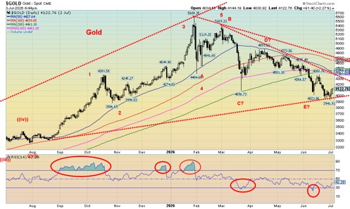
Gold caught a break this past week. First there were the soft job numbers that came out Thursday. Lower energy prices helped ease inflation concerns. The US$ Index slipped on the lower jobs and energy numbers. And finally, it seems less likely now that the Fed will hike interest rates. Put it all together and gold rose this past week by 1.3%. Silver did better, up 3.7%, while platinum gained 0.5%.
Of the near precious metals, palladium was up almost 5.0% while copper was disappointingly flat. The gold stock indices were up with the Gold Bugs Index (HUI) gaining 2.1% and the TSX Gold Index (TGD) doing better, up 4.1%. In all, the gold market broke a four-week losing streak.
Yes, we are still down on the year with gold off 4.4%, silver down 14.4%, and platinum off 20.5%. Only copper is up 8.5%. The HUI is down 4.9% while the TGD is off 1.4%. That the gold stocks are holding in well suggests we may be approaching a bottom here. Naturally, bottoms need confirmation. Gold needs to take out $4,400. Better still, it needs to break above $4,700. Above $4,800 and we are fully confirmed for a bottom. Silver needs to take out $65, but above $75 we have a confirmed low. The TGD above 900 is improving considerably while the HUI above 750 is looking up.
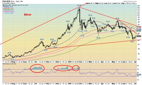
We are encouraged by silver making a lower low, even as gold made new lows. A divergence? The TGD also made a higher low, although the HUI joined gold in making small new lows. Momentum has slowed sharply. At one point all – gold, silver, HUI, and TGD – saw the RSI dip under 30 oversold. $4,000 is proving to be a key support zone for gold while silver is seeing support near $56. We could consider silver’s low as a test of the old highs near $50 that were seen in 1980 and 2011.
A lower US$ Index, continued low oil prices, fears of a Fed interest rate hike abating, are all positive for gold. As well, evidence suggests that central banks are still buying. The only fly in the ointment we see is that long bond yields ticked higher this past week, but gold didn’t appear to react to that. There are signs that the gold stocks are once again being accumulated, including the junior gold miners that trade primarily on the TSX Venture Exchange (CDNX).
Many analysts, ourselves included, have viewed this drop as an overdue correction following the huge run-up in gold prices from 2022 to the top in January 2026 where gold leaped 247%. A 30% correction shouldn’t be a surprise. The bull run lasted just over two years. This correction has been on for about six months. An encouraging divergence: while gold fell 30% and silver was down 54% the gold stocks were actually underperformers with the HUI down 37% and the TGD off 33%. In previous sharp correction, a drop between 50% and 75% was not unusual for the HUI and TGD. We consider that another positive divergence.
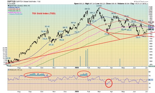
Signs for the most part are positive. Gold stocks are once again being accumulated. Investors should note.
Oil and gas
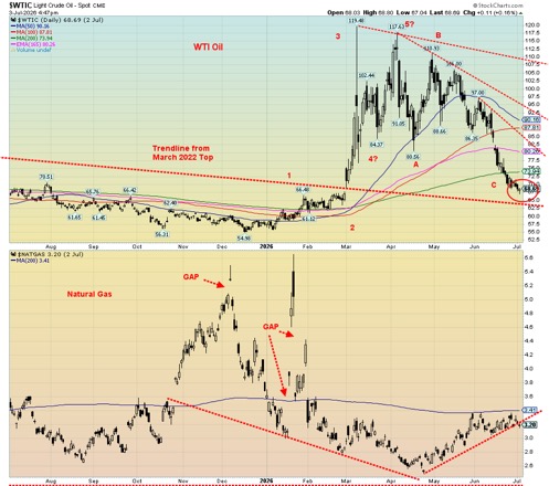
The oil market doesn’t know what to do. It seems to want to believe that everyone will come to their senses and make peace and get the Strait of Hormuz open again, thus allowing the oil to flow. Are they being optimistic? Or delusional? That, of course, remains to be seen. In the interim, WTI oil prices have fallen close to levels seen just before the outbreak of hostilities on February 28, 2026. On February 27, 2026, WTI closed at $67.02. On Friday, July 3, 2026, WTI closed at $68.69 after hitting a low at $67.04. In trading parlance, that’s a round trip.
While Iran and the U.S. continue to negotiate and there is every reason to say they should and come to an agreement, one potential roadblock lies in Lebanon where the Israel/Lebanon/Hezbollah ceasefire almost seems nonexistent. Iran has insisted on an end to hostilities in Lebanon as a key to end the war.
For the most part, oil prices were pretty calm this past week after going through their period of volatility. Maybe everyone is just tired. The trouble is, if things fall apart again, we’ll quickly see a big jump in oil prices. In the interim, we see clues of at least a bottom. The WTI market is oversold with the RSI trending consistently below 30 for the past two weeks. Also, on Friday, the WTI market left an interesting Japanese candlestick pattern on the charts.
It’s called a hammer. In a hammer, the body is at the upper range while the tail is longer. Sometimes the upper body is very small. On Friday, WTI opened at $68.03, hit a low of $67.04, a high of $68.80, and closed at $68.69, close to the high of the day. That left an upper body and long tail. Its interpretation is that the market could be at a low. Naturally, that needs to be determined. The last significant high was at $97 seen in early June. Right now, regaining $80 could be a sign the low is in.
On the week, WTI oil fell 1.1%, while Brent crude was down 0.3%. The energy stocks were positive with the ARCA Oil & Gas Index (XOI) up 0.6%, while the TSX Energy Index (TEN) gained 0.8%. What’s been interesting is that the energy indices have diverged with oil. While oil prices were plunging to new lows, the energy stocks were mostly making higher lows.
The TEN fell 18%, while WTI oil fell almost 43% high to low. Another divergence. We view the better performance of the energy stocks as a positive, suggesting that oil prices should once again go higher. Does that mean war breaks out again? It could, as any deal remains tenuous. They’ve already hurled missiles at each other during the negotiations.
Natural gas (NG) at the Henry Hub fell 2.7%, but NG at the EU Dutch Hub rose 9.8%. Better supplies helped the Henry Hub while the heat wave gripping the EU sparked higher NG prices.
Gasoline reserves have been rising, but oil reserves are still trending along five-year lows and need to be replenished.
Where do we go from here? Our suspicion is we have made a low, but we await some sort of confirmation. Regaining $80 would help.
Markets and Trends
| % Gains (Losses) Trends | ||||||||
| Close Dec 31/25 | Close Jul 3/26 | Week | YTD | Daily (Short Term) | Weekly (Intermediate) | Monthly (Long Term) | ||
| S&P 500 | 6,845.50 | 7,483.74 | 1.8% | 9.3% | up (weak) | up | up | |
| Dow Jones Industrials | 48,063.29 | 52,900.07 (new highs) * | 2.0% | 10.1% | up | up | up | |
| Dow Jones Transport | 17,357.19 | 22,015.11 | 0.9% | 26.8% | up | up | up | |
| NASDAQ | 23,241.99 | 25,832.67 | 2.1% | 11.2% | down (weak) | up | up | |
| S&P/TSX Composite | 31,712.76 | 35274.84 | 0.8% | 11.2% | up | up | up | |
| S&P/TSX Venture (CDNX) | 987.74 | 938.28 | 4.7% | (5.1)% | down | down | up | |
| S&P 600 (small) | 1,467.76 | 1,781.90 (new highs) * | (0.9)% | 21.4% | up | up | up | |
| ACWX MSCI World x US | 67.18 | 75.23 | 0.3% | 12.0% | neutral | up | up | |
| Bitcoin | 87,576.98 | 62,186.29 | 4.0% | (29.0)% | down | down | neutral | |
| Gold Mining Stock Indices | ||||||||
| Gold Bugs Index (HUI) | 701.49 | 667.03 | 2.1% | (4.9)% | down | down | up | |
| TSX Gold Index (TGD) | 817.76 | 806.43 | 4.1% | (1.4)% | down (weak) | neutral | up | |
| Bonds% | ||||||||
| U.S. 10-Year Treasury Bond yield | 4.17% | 4.49% | 2.5% | 7.7% | ||||
| 3.3Cdn. 10-Year Bond CGB yield | 3.44% | 3.45% | 1.8% | 0.3% | ||||
| Recession Watch Spreads | ||||||||
| U.S. 2-year 10-year Treasury spread | 0.69% | 0.31% | 6.9% | (51.9)% | ||||
| Cdn 2-year 10-year CGB spread | 0.85% | 0.69% | 6.2% | (18.8)% | ||||
| Currencies | ||||||||
| US$ Index | 98.26 | 100.87 | (0.5)% | 2.7% | up | up | down (weak) | |
| Canadian $ | 72.87 | 70.51 | flat | (3.3)% | down | down | down | |
| Euro | 117.48 | 114.32 | 0.4% | (2.7)% | down | down | up | |
| Swiss Franc | 126.21 | 124.47 | 0.8% | (1.4)% | down | down | up | |
| British Pound | 134.78 | 133.48 | 1.1% | (1.0)% | down (weak) | down | up | |
| Japanese Yen | 63.83 | 62.08 (new lows) | 0.4% | (2.7)% | down | down | down | |
| Precious Metals | ||||||||
| Gold | 4,311.97 | 4,122.76 | 1.3% | (4.4)% | down | down | up | |
| Silver | 71.16 | 60.93 | 3.7% | (14.4)% | down | down | up | |
| Platinum | 2,046.90 | 1,628.10 | 0.5% | (20.5)% | down | down | up | |
| Base Metals | ||||||||
| Palladium | 1,619.50 | 1,272.50 | 5.0% | (21.4)% | down | down | neutral | |
| Copper | 5.64 | 6.12 | flat | 8.5% | down | up | up | |
| Energy | ||||||||
| WTI Oil | 57.44 | 68.69 | (1.1)% | 19.6% | down | neutral | up (weak) | |
| Nat Gas | 3.71 | 3.20 | (2.7)% | (13.8)% | up (weak) | neutral | neutral | |
Copyright David Chapman 2026
__
(Featured image by Pepi Stojanovski via Unsplash)
DISCLAIMER: This article was written by a third party contributor and does not reflect the opinion of Born2Invest, its management, staff or its associates. Please review our disclaimer for more information.
This article may include forward-looking statements. These forward-looking statements generally are identified by the words “believe,” “project,” “estimate,” “become,” “plan,” “will,” and similar expressions, including with regards to potential earnings in the Empire Flippers affiliate program. These forward-looking statements involve known and unknown risks as well as uncertainties, including those discussed in the following cautionary statements and elsewhere in this article and on this site. Although the Company may believe that its expectations are based on reasonable assumptions, the actual results that the Company may achieve may differ materially from any forward-looking statements, which reflect the opinions of the management of the Company only as of the date hereof. Additionally, please make sure to read these important disclosures.
David Chapman is not a registered advisory service and is not an exempt market dealer (EMD) nor a licensed financial advisor. He does not and cannot give individualised market advice. David Chapman has worked in the financial industry for over 40 years including large financial corporations, banks, and investment dealers. The information in this newsletter is intended only for informational and educational purposes. It should not be construed as an offer, a solicitation of an offer or sale of any security. Every effort is made to provide accurate and complete information.
However, we cannot guarantee that there will be no errors. We make no claims, promises or guarantees about the accuracy, completeness, or adequacy of the contents of this commentary and expressly disclaim liability for errors and omissions in the contents of this commentary. David Chapman will always use his best efforts to ensure the accuracy and timeliness of all information. The reader assumes all risk when trading in securities and David Chapman advises consulting a licensed professional financial advisor or portfolio manager such as Enriched Investing Incorporated before proceeding with any trade or idea presented in this newsletter.
David Chapman may own shares in companies mentioned in this newsletter. Before making an investment, prospective investors should review each security’s offering documents which summarize the objectives, fees, expenses and associated risks. Although Artificial Intelligence (AI) may be deployed from time to time, AI output is monitored and adjusted, if necessary, for accuracy. David Chapman shares his ideas and opinions for informational and educational purposes only and expects the reader to perform due diligence before considering a position in any security. That includes consulting with your own licensed professional financial advisor such as Enriched Investing Incorporated. Performance is not guaranteed, values change frequently, and past performance may not be repeated.













French Fintech in 2026: A More Selective Market Driven by Mega-Rounds, Consolidation, and Sector Maturity
French fintech reached a new phase in 2026, with €1.25 billion raised despite fewer deals, reflecting stronger investor selectivity. Major...


Cameroon’s 2026 Economic Outlook: Growth, Debt Strategy, and Policy Priorities
Cameroon economy in early 2026 was shaped by budgetary and monetary signals, including a fiscal roadmap prioritizing IMF engagement, debt...


Germany’s Cannabis Clubs Enter New Phase as Legal Harvests Begin
Germany’s cannabis legalization is entering a practical phase as cultivation associations begin producing legal cannabis flowers. In Thuringia, clubs have...


Morgan Stanley Launches Crypto ETFs as AI and Security Risks Rise
Crypto markets showed modest moves, with Bitcoin near $64,000 and ETF outflows continuing. Morgan Stanley launched Ethereum and Solana ETFs...


TotalEnergies Challenges Landmark Climate Ruling and Disputes Customer Liability for Emissions
The French energy company TotalEnergies is appealing a decision by the Paris Judicial Court, which, for the first time in...
 |
|
 |  |
 |
|
-

 Fintech1 week ago
FinTech Matures as AI and Infrastructure Drive the Next Growth Phase
-

 Cannabis7 days ago
Switzerland’s Medical Cannabis Reform Advances Access, But Barriers Remain
-

 Biotech2 weeks ago
Emily.AI: Personalized Oxygen Therapy Earns Global AI Recognition
-

 Africa2 days ago
BMCE Capital Markets Launches Carbon Market Offering for Moroccan Transport Operators