Business
Modern Monetary Theory Has no Place for Supply and Demand Fundamentals
All big market declines in the Dow Jones occurred with all-time highs in Dow Jones trading volume. A complete inversion of market logic prior to Alan Greenspan’s administration of the Fed (August 1987 to March 2006), because before Greenspan, the FOMC didn’t “inject liquidity” into the market whenever its valuation declined below “policy’s” set parameters.

Last Tuesday night, with the Dow Jones closing with a BEV value of -4.79%, I didn’t think it could happen, that the Dow Jones would close each following day within scoring position, within 5% from its last all-time high. But after this Friday’s close, with a BEV value of -2.32%, that’s what happened.
For your information, the last day the Dow Jones closed outside of scoring position in its BEV chart below was last November 4th, with a BEV of -5.77%. That was over ten months ago, ten months of the Dow Jones closing at a new all-time high (42 of them so far), or within 5% of one. That is one heck of an advance, but nothing lasts forever.
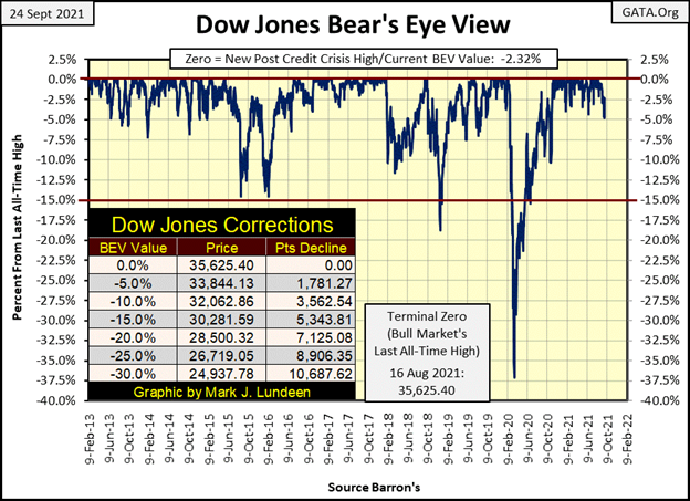
But there are those who, maybe, would disagree with that; that this advance in the stock market has much more to go before it comes to an end. And who might that be? The idiot savants dictating “monetary policy” at the FOMC. This week, with the Dow Jones at the edge of declining more than 5% from its last all-time high for the first time in over ten months, the idiots decided to “inject” another $91.18 billion dollars into the financial system. (red circle chart below)
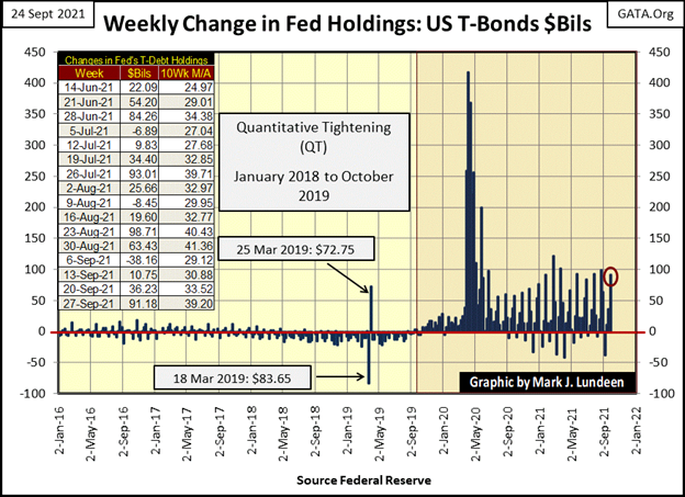
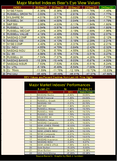
As seen above, since Fed Chairman Powell began his Not QE#4 in October 2019, there have been weeks with much larger “injections of liquidity” from the FOMC. That’s true since last November 4th too. No matter, “injecting” another $91.18 billion into the financial system this week calmed all the credit junkies on Wall Street, as seen in my major market indexes BEV values table below.
On Tuesday I was watching CNBC for the first time in years. Long ago, seeing the market (Dow Jones) down from an all-time high by more than 5% was no big thing. More times than not, it was. But that was then, while this is now. I was really enjoying the distress I saw in the eyes of CNBC’s “market experts.”
In the table below, some indexes bottomed on Monday. Others on Tuesday. But from Wednesday to Friday’s close, the bulls once again began running wild and free on Wall Street. That was especially so for the financial indexes. The NYSE Financial Index (#1 table below) advanced just short of 4 BEV points this week, and the NASDAQ Bank Index (#16) moved from a BEV of -10.28% back into scoring position, closing the week with a BEV of -4.93%. That’s a big move!
The one standout that didn’t benefit from this week’s “injection of liquidity” was the gold miners in the XAU (#20 below), which is something we should have expected.
Friday night last week, as I was finishing my article, I regretted I hadn’t purchased a few NASDAQ Composite or NASDAQ 100 out-of-money puts. On Monday night, I was kicking myself in the pants for not doing so. I just knew something big to the downside was going to happen. Then came Wednesday, and once again I became clever in my own eyes for not purchasing any NASDAQ Composite or NASDAQ 100 out-of-money puts last week.
It’s stuff like this, the ease with which the FOMC can implement their programs of bear-market interruptus with a generous dose of “liquidity,” that makes technical market predictions; from studying charts or tables on the market, ill-advised for market prognosticators such as myself.
Market watchers instead should read Edward Gibbon’s “Decline and Fall of the Roman Empire.” An 18th century study of many things Roman, including their “monetary policy” of unceasing inflation that ultimately took down Rome’s Western Empire in the fifth century AD, and then Byzantium, Rome’s Eastern Empire many centuries later. It’s been known for centuries that when politicians get their meat hooks into the money supply, bad things happen.
Look at the daily bar chart for the Dow Jones below. Until Tuesday this week, what a setup for a perfectly normal 10% to 15% correction in a market advance, or possibly the start of something big for Mr Bear. Instead after Monday’s big down day, the idiots at the FOMC decided to put a stop to this. On Tuesday, they nailed the bottom to the move. Then beginning on Wednesday to Friday’s close, the FOMC began doing what they do so well; inflating market valuations via “injections” of monetary inflation.
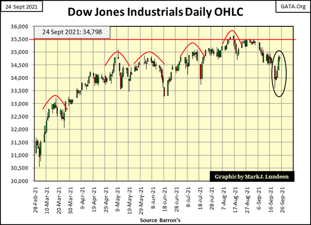
The last time the idiot savants lost control was in March 2020, when the Dow Jones deflated 37% from an all-time high in only twenty-seven NYSE trading sessions. I haven’t researched it, but I believe that was the fastest the Dow Jones lost 37% of its valuation from an all-time high since 1885.
The problem? In March 2020 the corporate bond market was melting down, as seen in the yield spikes in Barron’s Best and Intermediate Grade Bonds below. The response from the FOMC was immediate; the largest “injections of liquidity” in the history of central banking. On March 20th, Chairman Powell announced the Federal Reserve was beginning a program of monetizing corporate bonds, something the Federal Reserve had never done before.
And they had to. How else could big-name corporation share prices trade at near all-time highs, as they were in February 2020, when their bonds began selling off as junk grade credits in the bond market? Geeze Louise – Look at the yield spikes in corporate bonds in March 2020 below.
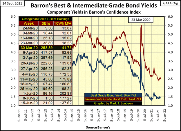
Eight months later, in November 2020, the Dow Jones was once again making new all-time highs. Since then, it has never closed more than 5% from one of those new all-time highs. But Fed Chairman Powell’s Not QE#4 is just the FOMC’s latest assault on natural market operations.
How the stock market (and Federal Reserve System) worked changed greatly after Alan Greenspan became Fed Chairman in August 1987. Before Greenspan, Fed Chairmen were camera shy, usually avoiding the media as best they could. That changed with Greenspan, who would become one of the world’s best-known media personalities during the 1993-2000 high-tech bubble. And why not? Everyone knew it was Greenspan who was inflating a bubble in the stock market, making the big bucks for everyone.
With the 2000 – 2002 bust in the high-tech boom, then also came another fundamental change in the stock market; the relationship between trading volume and market valuations. Trading volume is best understood as demand, or lack of demand for what Wall Street is selling; fractional ownership of the companies trading in the stock market.
The chart below plots the indexed values of NYSE trading volume (Blue Plot) with the Dow Jones (Red Plot) from 1926 to 1943.
From October 1926 to September 1929, market valuations inflated as NYSE trading volume increased; as with increased demand came increased prices. During the Great Depression market crash (October 1929 to July 1932), market valuations deflated as NYSE trading volume contracted; as with lower demand came lower prices.
From the Dow Jones’ July 1932 bottom until March 1937, the Dow Jones enjoyed an excellent, 371% market advance. During this five-year advance, trading volume increased, seeing two spikes in trading volume during these five years. But March 1937 was a top. A year later in March 1938, the Dow Jones’ valuation deflated by 49% from its high of a year before, as trading volume trended down.
The Dow Jones’ March 1937 high was followed by two bear market bottoms, which were distinct from each other. The March 1938 -49% bear market bottom was a Great Depression event, with people more concerned about employment and job security.
The April 1942 -52.2% bear market bottom was a world-war market event. Americans were more concerned about Nazi Germany’s invasion of the USSR and Japan’s invasion of the Philippines than they were of yet another bear market on Wall Street. By April 1942, the general population had long ago lost all interest in the stock market. NYSE trading volume would bottom, and begin rebounding in October 1942, five months following the bottom in the Dow Jones.
Take a moment to study the plots below for market valuations and trading volume before looking at the next chart.
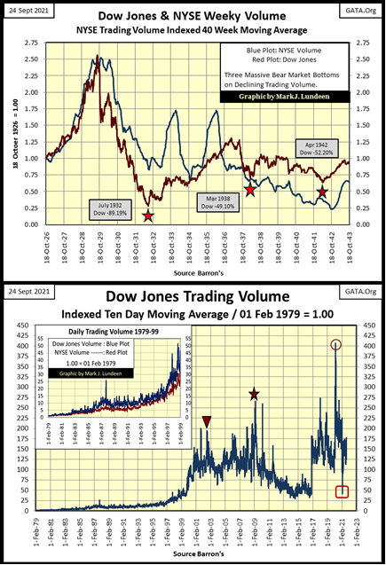
I didn’t plot the Dow Jones with its volume in the chart’s main body, as they didn’t visually go together. But I did mark the bottoms of the;
- High Tech Bear Market, October 2002 (Triangle)
- Sub-Prime Mortgage Bear Market, March 2009 (Star)
- The March 2020 37% Flash Crash (Circle)
All of these big market declines in the Dow Jones occurred with all-time highs in Dow Jones trading volume. A complete inversion of market logic prior to Alan Greenspan’s administration of the Fed (August 1987 to March 2006), because before Greenspan, the FOMC didn’t “inject liquidity” into the market whenever its valuation declined below “policy’s” set parameters.
What is the Red Square in the chart above? That was 25 February 2021. The Dow Jones had just made its 17th new all-time high in its current advance on this low volume. Nothing surprises me anymore.
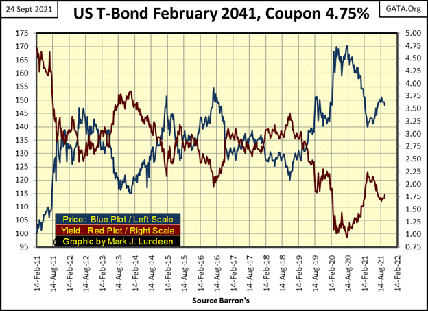
I haven’t published a chart for a T-bond for a while, so here’s a 30-year T-bond issued in February 2011. Now in September 2021, it’s actually a 20-year bond. T-bond yields bottomed in August 2020, and are up a bit in the past year.
What’s noticeable in the chart below; when the corporate bond market was selling off in March 2020 (corporate yields spiked up / prices spiked down), yields in the Treasury bond market went down, and T-bond prices spiked up. That was because flight capital from the corporate bond market fled into the “safety of the Treasury market.”
I’m anticipating a coming day when the corporate bond market will sell off with the Treasury bond market, with flight capital fleeing into gold, silver, and the precious metals mining shares. I guess our “Masters-in-Washington” have more work to do, trashing everything they touch before we see that day. But with patience, we will see that day come.
When it does, I don’t know if we gold bulls will enjoy it. Our world is run by corrupt criminals, working hard to destroy the world we live in. They plan to build their New World Order on the ashes of ours. What good is money in a hungry world with nothing good to buy?
I don’t want to leave my readers with a sense of hopelessness. I’m actually very optimistic about the future, as in the end good wins, because God is good. But I’m not a peddler of sugar & spice and everything nice. Like me, my readers need to keep their eyes open.
On that thought; how did gold do this week? Let’s take a look at gold’s BEV chart below. We were looking at gold’s BEV -15% level ($1752.22), and this week gold broke below this critical level, closing the week at $1744.77. This may be annoying, but no reason to panic. That would be true even if gold collapsed below its BEV -20% or even its BEV -25% lines.
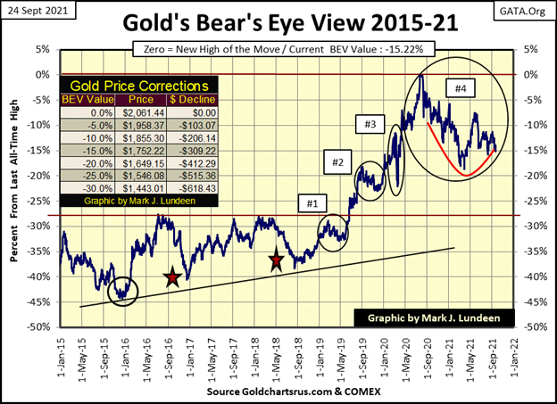
Why would that be? Because all prices seen today are merely manifestations of the executions of “policy” by central bankers. Supply and demand fundamentals have no place in Modern-Monetary Theory. One of these days they are going to lose control over the economy they’ve captured. You’ll then be glad you have gold, silver, and precious metal mining shares.
But I’m feeling optimistic tonight. Looking at gold’s BEV chart above, the question that occurs to me is, which BEV line does gold now cross; its BEV -15% or -20% lines? I’m expecting gold will soon advance above its BEV -15% line in the not-too-distant future.
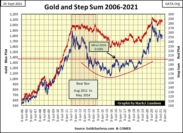
Next is gold’s step sum chart, a historic ten-year teacup with a handle chart formation. This is exactly the sort of chart formation where one should expect an explosive break out in the market. Another thing this chart illustrates; the “policy makers” have limits to what they can, and cannot do. If the “policy makers” were all powerful, gold last August would not have seen a new all-time high nine years after its last all-time high in August 2011.
If the “policy makers” were all-powerful, gold in December 2015 would have not bottomed but continued going down. From December 2015 to June 2019, the “policy makers” were successful in keeping gold below its $1360 level (Red Line), but following June 2019, gold advanced to a new all-time high one year later.
So, what is to come for we gold bugs in September 2021? I’m out of the making market predictions business. I’m always wrong when I do, so I give up. But I’m looking at the chart below, and it’s a fifteen-year chart full of surprises, both good and bad, for everyone, including the “policy makers.”
Should gold sometime in the weeks or months to come suddenly bolt up, and soar far above its current last all-time high of $2061 of 06 August 2020, I wouldn’t be surprised. I may have a heart attack, possibly a stroke, but I wouldn’t be surprised. And about me having a stroke or heart attack? Think of those as two more predictions that will fail to come true. Sometimes it’s good to always be wrong.
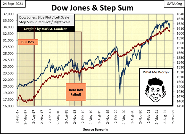
The Dow Jones and its step sum plot below shows the recent decline to its BEV -5% line. But its mid-week recovery is a bit hidden in it. What I see below is an eighteen-month market advance in need of a double-digit percentage correction. Whether or not the Dow Jones gets its correction is up to the idiots at the FOMC contriving “monetary policy.” In September 2021, I’m not holding my breath. But come October who knows? Until then, I’m waiting for another new all-time high for the Dow Jones.
Since August 20th (step sum table / below the next chart), gold’s step sum is down by four steps. But gold closed the week with a 15 count of -3, so it’s not an oversold market. As I’ve said before, what gold and silver need now is a big increase in volatility. This week closed with gold’s daily volatility’s 200 day moving average at 0.65%. So, a big increase in daily volatility is one thing not currently happening in the precious metals market. Not yet anyway, but that can change quickly.
Here is a chart plotting gold’s annual days of extreme market volatility (3% days) since 1970. Gold had a good year in 2020, seeing a new all-time high in August of last year. Something that wasn’t surprising when we see how gold began a pickup in days of extreme market volatility (3% days) for the first time since 2016.
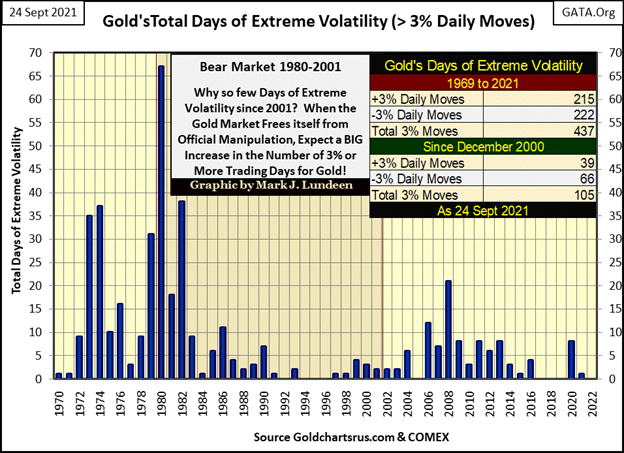
But except for one 3% day for gold last January, and a negative one at that, this year has so far been free of any significant volatility in the gold market, and everyone eager for a pickup in the precious metals market is grumpy for lack of it.
The Dow Jones’ step sum is also down by four steps since August 20th. But with its 15 count closing the week at a -9, the stock market is very oversold and due for a rebound in the weeks to come.
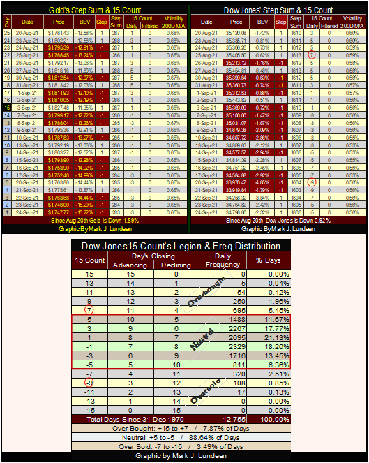
How oversold is a 15 count of a -9 seen in the Dow Jones frequency table above? Since 1970, the Dow Jones has seen a 15 count of -9 for only 108 daily closings, and two of those were seen this week. Typically, a 15 count of -9 is a sign of a climatic sell off in a market correction or bear market; in other words, a strong buy signal.
But the Dow Jones hasn’t seen a decline of more than 5% from an all-time high for the past ten months. Why is the Dow Jones now seeing a 15 count of -9 during such an advance? Why not a 15 count of +9, which would make more sense. I’m going to blame this perplexing situation on the idiot savants at the FOMC; the market itself want to go down, but they are doing everything necessary to ensure it continues going up.
__
(Featured image by sergeitokmakov via Pixabay)
DISCLAIMER: This article was written by a third party contributor and does not reflect the opinion of Born2Invest, its management, staff or its associates. Please review our disclaimer for more information.
This article may include forward-looking statements. These forward-looking statements generally are identified by the words “believe,” “project,” “estimate,” “become,” “plan,” “will,” and similar expressions. These forward-looking statements involve known and unknown risks as well as uncertainties, including those discussed in the following cautionary statements and elsewhere in this article and on this site. Although the Company may believe that its expectations are based on reasonable assumptions, the actual results that the Company may achieve may differ materially from any forward-looking statements, which reflect the opinions of the management of the Company only as of the date hereof. Additionally, please make sure to read these important disclosures.

-

 Crypto2 weeks ago
Ultimate Convenience: Why Consumers Expect Instant, Secure, and Borderless Payments
-
 Crypto2 days ago
BlackRock’s $94M Crypto Move Signals Rising Institutional Momentum
-

 Crypto1 week ago
XRP vs Solana ETFs: Retail Hype Meets Institutional Interest
-

 Fintech4 days ago
Swiss Fintech Sector Enters Maturity as AI and Infrastructure Take the Lead


