Featured
Mr Bear Ain’t Going Nowhere
Since May 26th Mr Bear has been a very bad bear. We’ve seen three NYSE days of extreme market breadth in the past month. During bull markets, days of extreme market breadth are even rarer market events than are days of extreme volatility. So, why in the past month have we seen three of these extreme days at the NYSE; possibly because we’re in a bear market?

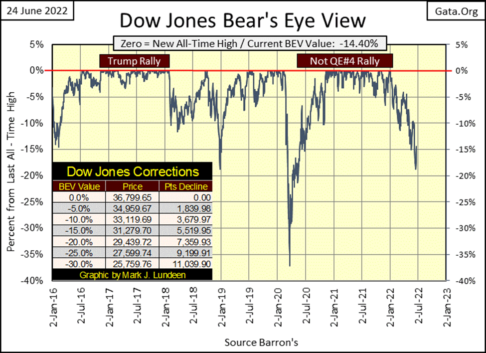
Last week saw the Dow Jones close just 1.23% away from breaking below its BEV -20% line below, and the bulls knew not what to do. This week, the financial markets saw a nice bounce resulting in the Dow Jones closing above its BEV -15% line, and once again the world took on a rosy glow in the view of the bulls.
However, I see things a bit differently. It’s as I’ve said before; bear markets see lots of up days, and big ones too. This week the Dow Jones saw two positive Dow Jones 2% days. An advance from a previous day’s close of +2.15% on Monday, June 17th, and a +2.68% daily advance on Friday, June 24th.
A day of extreme volatility, a Dow Jones 2% day is a rare market event in a bull market. Yet, in the past ten NYSE trading sessions, we’ve seen five days of extreme volatility, a sure sign Mr Bear is on the prowl, seeking the unwary as his prey.
Next is Mr Bear’s report card, and since May 26th Mr Bear has been a very bad bear. We’ve seen three NYSE days of extreme market breadth in the past month. During bull markets, days of extreme market breadth are even rarer market events than are days of extreme volatility. So, why in the past month have we seen three of these extreme days at the NYSE; possibly because we’re in a bear market?
I placed a red box around the last ten trading days for the Dow Jones 2% days, aka days of extreme market volatility. On average, in the past ten days every other day was an extreme day of market volatility, making this a big pile of bear scat right in the middle of Wall Street.
That the last two were positive isn’t bullish. Just ask the retail investors who on last week’s market decline decided to profit on the bear market by purchasing option puts, or actually shorted stocks. At the close of this week, how are those guys feeling after Mr Bear mauled their bear-market positions.
You have to understand something about Mr Bear; he’s a psycho who hates every one; bull and bear alike. On the big down days seen in the red box below, he mauled the bulls as he enticed retail investors into taking a bearish position in the market. On the big up days, it’s now the bears’ turn to be mauled, as Mr Bear lures the bulls back into the market for his next big-bear market decline.
There are those who really are artful dodgers on Wall Street, traders who really know how to come into and out of the market profitably in all sorts of markets.
But for most retail investors, the only way to make Mr Bear happy is to make an end of it by taking on one huge leverage bet on the market. Leveraged to the up or downside of the market makes no difference, and wait until he comes to take it all away, leaving them destitute. Of course, I don’t recommend anyone does this. But if you insist on playing games with Mr Bear, thinking you’ll come out ahead, go for it.
That is just the type of guy Mr Bear is, and why I’m still sitting in the cheap seats, high above the market action, feasting on peanuts and swilling beer as I watch the show below. It is just so much safer up here for people like me. At times like this, dangerous times in the market, being able to get a good night’s sleep is more important than looking for any short-term gain in a bear market.
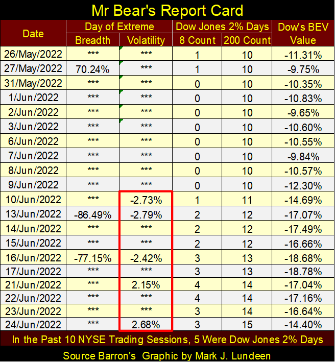
Let’s look at the other items in Mr Bear’s report card above. The 8-count, counts the number of Dow Jones 2% days, up and down in a running 8-day sample. Friday closed with an 8-count of only 3, as the 2% days seen on June 10th & 13th had just gone outside Friday’s 8-day sample.
The 8-count is an excellent indicator of the intensity of Mr Bear’s goring of invested funds on Wall Street. Seeing how in the past week, the 8-count increased to a 4 is a good indication of the level of pain seen by someone in the markets.
As this bear market progresses, we’ll see this indicator increase up into 6s and 7s during intense attacks by Mr Bear. It increased to an actual 8 in October 1933, actually NINE CONSECUTIVE Dow Jones 2% days in a row ranging from -5.34% to +5.37%. I guarantee you that got everyone’s attention!
It again saw an 8 again in March 2020 during the March 2020 flash crash. That 8-count of 8 occurred exactly when the FOMC decided to “inject” the market with trillions of dollars of “liquidity.” In March 2020, the FOMC saw the stock market required some serious “stabilizing” as seen by that 8-count of 8.
On these two occasions, October 1933 and March 2020, seeing an 8-count of 8 actually provided a good entry point back into the market. Whether it will again I wouldn’t care to speculate on. In June 2022, it’s just too early for most people to be thinking of coming back into this market.
The 200-count is a longer-term market indicator of the intensity of the bear market as a whole. During the Great Depression Crash, the 200-count peaked at 103 in May of 1932, or 103 Dow Jones 2% days in a running 200-day sample. The next highest 200-count occurred during the sub-prime mortgage bear market (October 2007 to March 2009). This bear market decline was also the second deepest percentage decline the Dow Jones has seen since February 1885. In April 2009, the 200-count increased to 84, or 84 Dow Jones 2% days in a running 200-day sample.
Seeing the 200-count peak, and then begin decaying back towards zero is a darn good indicator the bear-market’s bottom is in. At such times, the market is not only cheap, but once again has become a reasonably safe place for people like me to risk my money in.
This week’s 200-count close of 15 tells me this bear market has much more to go to the downside before I stop eating peanuts and drinking beer up here in the market’s cheap seats. I want to see market valuations deflate a whole lot more before I decide to stop watching, and start buying.
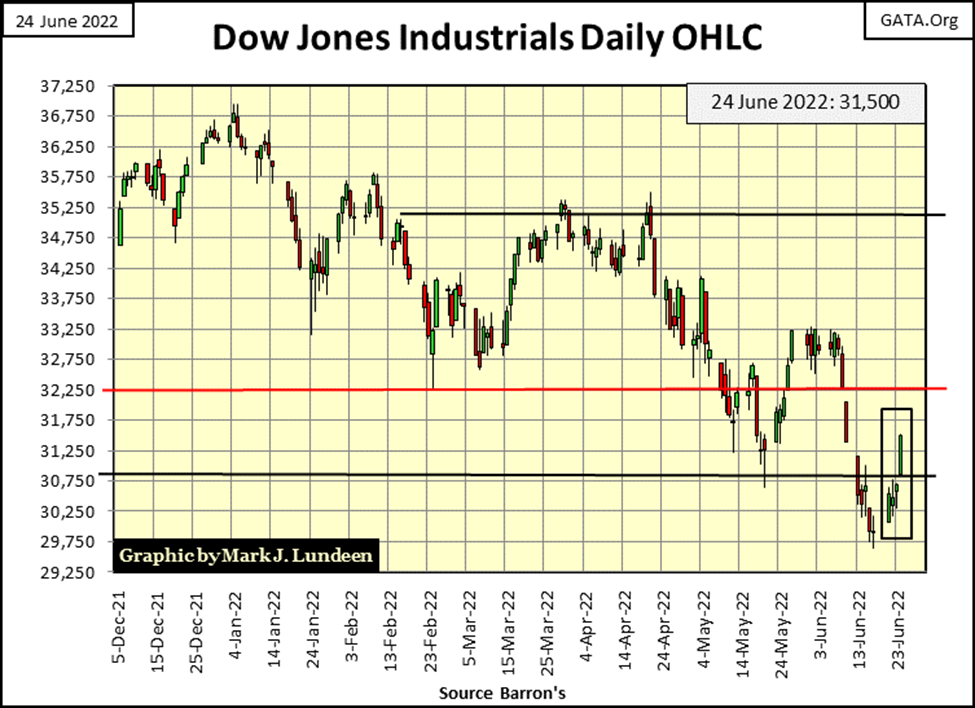
Here is the Dow Jones in daily bars. It was a good week. Friday saw the Dow Jones up 823 points; one of those extreme-volatility days. Might see some more of those, big 2% daily advances in the weeks to come. In fact, I’d count on that happening. As I see the chart below, any advance from here is only Mr Bear setting up the bulls for even greater market declines in the months to come.
No doubt there are “market experts” who would disagree with me. But to this market enthusiast, I don’t like what I see below. For me, the only thing I’m buying right now is more peanuts and beer. That’s not exactly right. If I had the money, I’d buy more gold, silver and precious metal mining shares.
Here is a big problem I believe most of the bulls in the stock market still don’t appreciate; currently the bull market action isn’t in financial assets (stocks, bonds & real estate) but in commodities, as seen in the tables below.
Since the first week of last November, the difference in market performance between the two; stocks and commodities is shocking. In the past seven months, the only major market index that remained positive was the Dow Jones Utilities Average (#1 left table). Compare the gains (and losses) from the stock market on the left with commodities on the right.
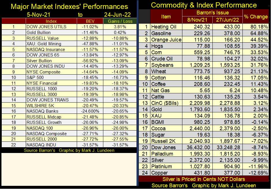
The data seen above is very bearish for the stock market, as rising commodity prices are now impacting the bond market, with rising yields (deflating prices), as seen below. Since the first week of last January, bond yields have blasted off!
In the years to come, I believe market historians will look at the same data seen above and below, and ask themselves; “what were the bulls of 2022 thinking!”
Rising commodity prices (rising CPI inflation), and bond yields, HAVE NEVER BEEN POSITIVE factors for the stock market. Any near-term advances from this point on (next few weeks or months) in the stock market most likely will prove to be transitory.
How goes the FOMC’s QT? I really can’t say. The idiot savants at the FOMC promised last winter; a reduction in their balance sheet of $50 billion a month, month after month beginning in May. Then this spring they postponed their first $50 billion withdrawal until June. And now in late June (summer / Red Box below), the idiots decided to remain silent as they apparently postponed their first monthly reduction of $50 billion to no sooner than July.
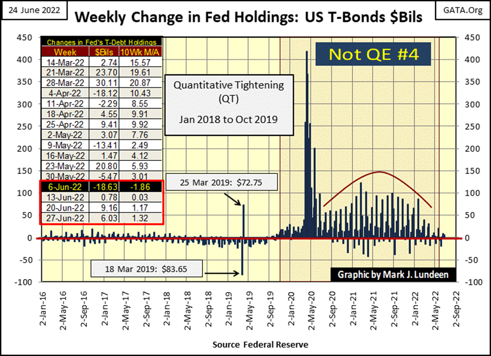
With July less than a week away, maybe the idiots are having 4th thoughts about their Quantitative Tightening (QT). Maybe, if they stopped saying anything about draining “liquidity” from their balance sheet. And maybe if they never, never ever again mention “QT” as some kind of “monetary-policy initiative”, maybe then everyone will forget about the whole thing. They could then just keep things as they are (chart below). So, how goes the QT? It’s like I said, I really can’t say.
I see their point. Considering everything, I wish my retirement funds grew as much the Fed’s balance sheet had since 2009. So, what is wrong with things as they are?
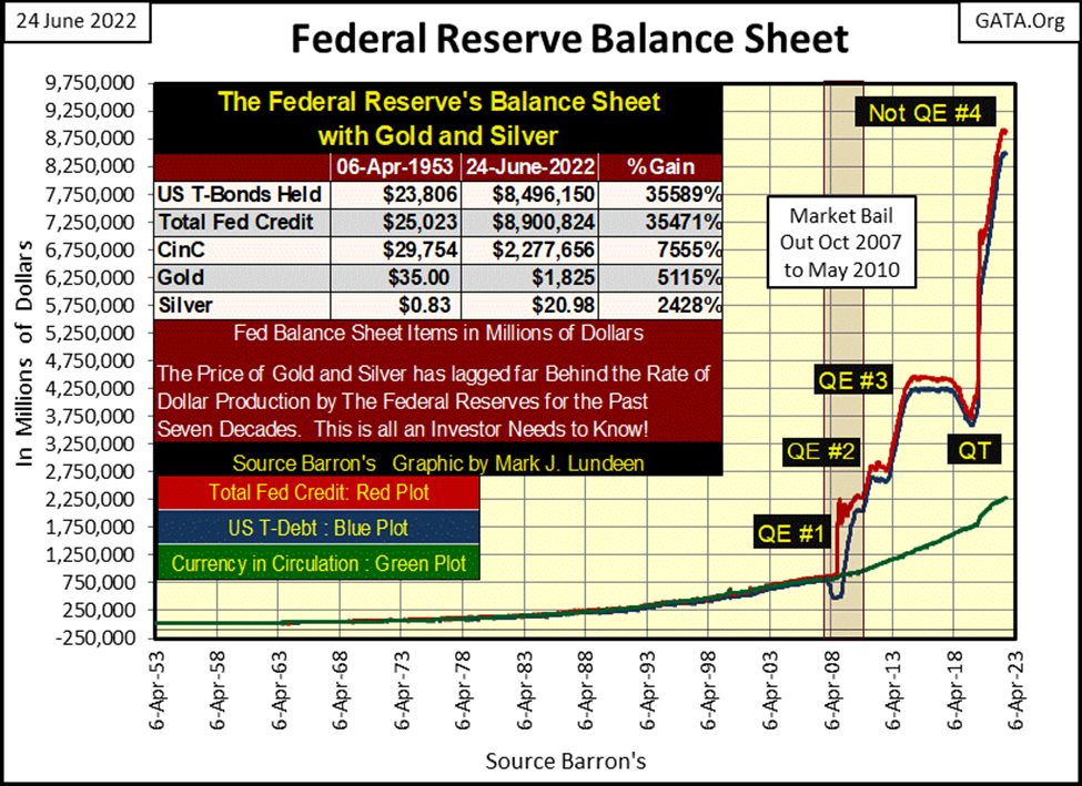
Here are a few words of wisdom for the idiots from Dr. Gono, past Chairman of the Reserve Bank of Zimbabwe, (courtesy of Marc Farber of the Gloom, Doom & Boom Report) made around the time of Dr. Bernanke’s QE #1 above;

A huge problem the idiots have, is they have competitors in draining “liquidity” from the financial system; individual investors reducing their margin debt (below). This is totally understandable, as since December, the stock market has peaked, and is now activly deflating, even without the idiots’ QT.
In May, the original month planned for a $50 billion reduction by the FOMC, margin accounts below saw a reduction of $20 billion from April. Small wonder the idiots postponed their QT’s start month to June. Considering their reluctance to begin their QT now again in June, I have to wonder how much NYSE Margin Debt has been reduced so far in June?
The public won’t know that until late July. But you can be sure the FOMC follows this data weekly, daily, or even by the hour if need be. As things stand now, I suspect June’s reduction in margin debt will prove to be another $20 billion, or more.
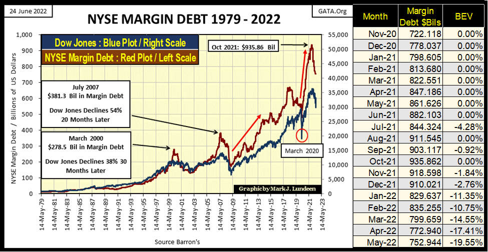
In the chart above, I’ve posted the specifics going back to November 2020. NYSE Margin Debt peaked in October 2021 at $935 billion. In the past seven months, margin debt has contracted by $183 billion, and I expect that amount will increase to something over $200 after this month’s data (June) when published a month from now.
If so, this presumed $200 billion reduction in NYSE Margin Debt since last November, is the equivalent to four months of the proposed, and much-delayed QT by the FOMC. That has to tell us something about the market – such as how fragile market valuations, the idiots currently fear them to be.
But, fragile market valuations is specific to financial asset valuations; stocks, bonds, and real estate. However, market valuations in commodities remain robust, and not likely to deflate anytime soon. As I see retail investors’ current situation; their assets are deflating, as their liabilities (cost-of-living/commodities) inflate. This is not a good place for anyone to be in.
It’s a vice-like situation central banking has placed those dependants on their dubious services into many times before. There are always variations to this theme, but in the main whenever a central bank, such as the Federal Reserve, begins inflating the supply of money, it’s universally greeted with appuse for the bull market (inflating valuations) that results.
But during the downside of this cycle (and it is a cycle, a boom/bust cycle), comes a deflationary bust in those same market valuations that formerly made everyone feel rich. Let’s call it what it is; a bear market on Wall Street, which ultimately impoverishes those who once thought they were getting rich during the bull market (boom) phase of the cycle.
Let’s move on to gold’s BEV chart. If you go back to my tables for the performance comparison between the stock market indexes and commodities above, precious metal assets have done much better than most stock indexes, but much less than most commodities. That gold and silver, both commodities, should perform so poorly since last November is very odd.
You know what I think. The “policy makers” continue using dubious, and most likely illegal trading practices to contain the price of gold and silver within their “policy parameters.” With their Federal “Regulators” deep into their pockets, don’t expect any help from the CFTC or DoJ. As a private citizen, I can’t prove a thing, but that is what I believe.
Anyway, gold’s BEV chart below looks a whole lot better than the Dow Jones’ does above. In March, gold made a failed attempt to break above its last all-time highs of August 2020 – but got whacked by the COMEX goons to below its BEV -10% line below. In the past few months, gold and the goons have been slugging it out around the BEV -10% line below. When it clears this level, I expect gold to once again take off to its BEV Zero line once again, some time this summer hopefully.
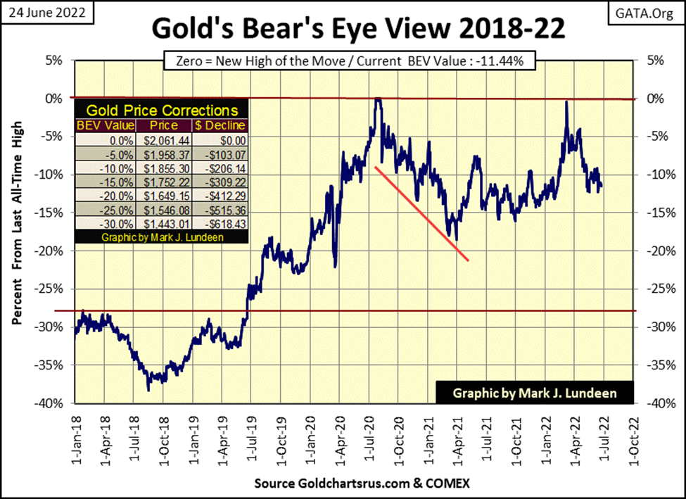
I know I said in past weeks that gold, like the Dow Jones was in a bear box. But with each passing week, its getting harder and harder to see this presumed bear box. So, unless the price of gold begins breaking down in the weeks to come, I’m going to forget I said anything about it being in a bear box.
I’m revising my past gold-bear box commentary, as gold’s step sum chart below keeps looking better and better to me. Look at how cocksure market expectations for the bulls are below (rising step sum / Red Plot), as gold remains above its ascending trend line, as it has since February 2021.
As long as this situation remains THE situation, I think I’ll remain bullish on gold. I’m just recognising the fact that gold (silver too) is a commodity, and commodities are in a bull market. People can be so impatient. Give gold and silver some time.
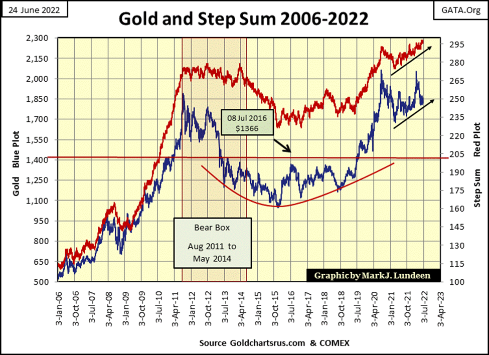
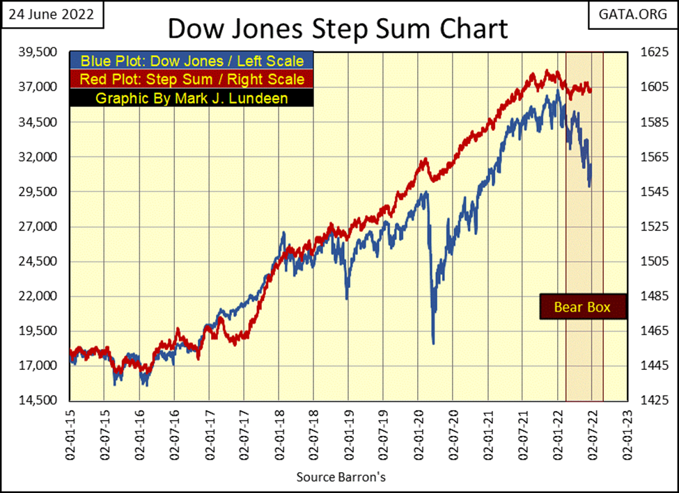
You want to see a step sum bear box? There is one under construction in the step sum chart for the Dow Jones below. They (meaning singular me) don’t call them bear boxes without a reason. A reason that will become painfully apparent to all (everyone except me) by the end of this summer. Or so they (singular me) likes to believe.
In the step sum tables for gold and the Dow Jones below, it’s easier to follow the development of these bear boxes. On May 19th, gold’s step sum was 293 as it closed at $1841. At this week’s close its step sum advanced by a net of four advancing daily closes, as it price declined down to $1825. This is what happens in a bear box; market valuations declines in the face of more daily advances than daily declines.
But for right now, let’s forget about that for the gold market and look at the Dow Jones side of the table. Ironically, just looking at the data included in the table, the Dow Jones at this week’s close is now advancing as its step sum increased by two steps since May 19th. It’s just one of those things that I’m once again going to ignore, as the bullish case for the stock market falling apart every week as 2022 progresses.
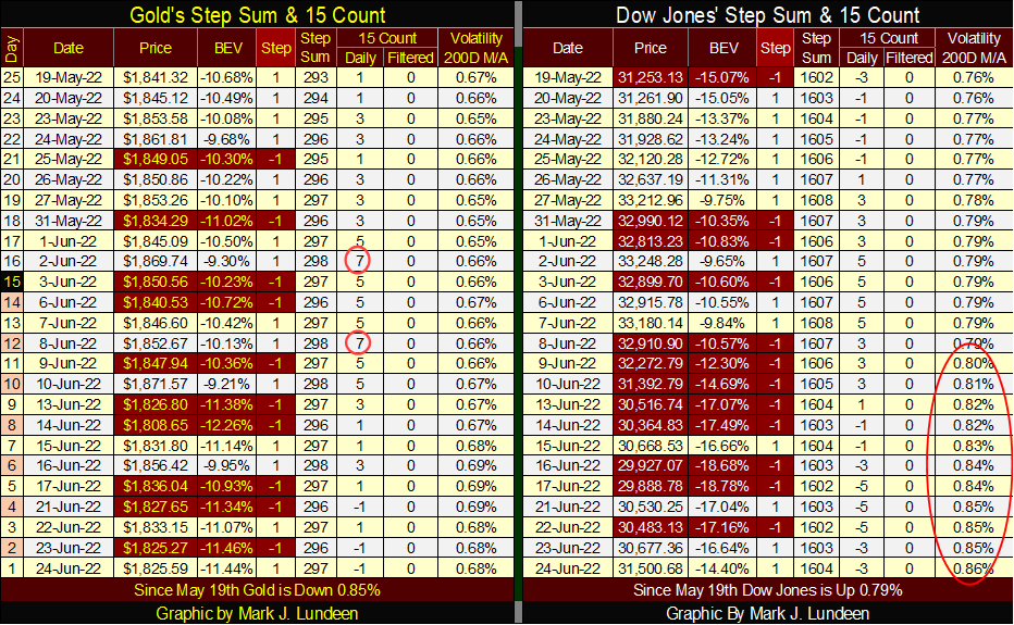
Look at the Dow Jones’ daily volatility’s 200D M/A; it closed the week at 0.86%. All those Dow Jones’ 2% days we’ve seen since the first week of last November (14 so far) are having an impact on the stock market.
For the stock market, a rising trend in daily volatility is NEVER bullish. Something that has been true for the Dow Jones since it was first published in February 1885. If we are actually in a bear market, we will see Dow Jones’ daily volatility’s 200D M/A increase far above 1.0%, as Mr Bear claws back much, if not most of the gains the Dow Jones has seen in these past four decades.
The decades-long inflationary boom of the historic 1982 to 2022 boom/bust cycle has exhausted itself. In this world, nothing goes on forever. For Wall Street in the coming months and years, it will mostly be a deflationary bust, with a few bullish corrections that Mr Bear hopes will confuse the investing public of exactly what he has planned for the stock market.
That’s the market theory I’m currently operating under. We’ll see how it works out as 2022 advances towards 2023.
__
(Featured image by Daniele Levis Pelusi via Unsplash)
DISCLAIMER: This article was written by a third party contributor and does not reflect the opinion of Born2Invest, its management, staff or its associates. Please review our disclaimer for more information.
This article may include forward-looking statements. These forward-looking statements generally are identified by the words “believe,” “project,” “estimate,” “become,” “plan,” “will,” and similar expressions. These forward-looking statements involve known and unknown risks as well as uncertainties, including those discussed in the following cautionary statements and elsewhere in this article and on this site. Although the Company may believe that its expectations are based on reasonable assumptions, the actual results that the Company may achieve may differ materially from any forward-looking statements, which reflect the opinions of the management of the Company only as of the date hereof. Additionally, please make sure to read these important disclosures


PayPal’s Slowdown: From Fintech Leader to Low-Growth Dividend Stock
PayPal has shifted from fintech leader to low-growth, value-style stock, losing over 25% in market value and trading at a...


Tilray (TLRY) Falls as Bearish Momentum Persists Despite Marketing Push
Tilray (TLRY) fell 3.32% to $4.44, remaining below key moving averages and signaling continued bearish pressure. Despite a £1 million...


ESG Gap Persists as Firms Struggle to Link Sustainability to Financial Value
KPMG’s Global Survey shows a major gap between ESG awareness and financial integration. While 72% of managers understand sustainability strategies,...


Bitcoin and Ethereum Slide as Market Pressure Builds Amid Strategy Concerns and Layer 2 Disruptions
Bitcoin fell below $60,000 with heavy ETF outflows, pressured by concerns over Strategy’s finances and its STRC stock decline. Ethereum...


AI Venture Builder Launches €600K Crowdfunding Round to Scale Secure AI Solutions
AI Venture Builder, an Italian-British firm developing AI applications and vertical startups, returns to CrowdFundMe with a equity campaign. After...
 |
|
 |  |
 |
|
-

 Crowdfunding4 days ago
Ithaca: Climate Road Trip RPG on Climate Resistance
-

 Fintech2 weeks ago
Fintech and AI: Adoption Grows, but Profits Favor Agile Innovators
-
 Fintech2 days ago
PayPal’s Slowdown: From Fintech Leader to Low-Growth Dividend Stock
-

 Impact Investing6 days ago
Edison Accelerates Renewable Growth and ESG Impact in 2025