Business
NYSE Buy & Sell Stampedes
The NYSE saw a 52Wk H-L Net of +661 on May 10th. As far as buying stampedes go, that’s about as good as it gets. Seeing a NYSE 52Wk H-L net of +661 just a month ago suggest the current advance is approaching a top, but no one really knows? Daily volatility for the Dow Jones has also declined to 0.70%, but that’s a positive for the bulls running wild and free on Wall Street.
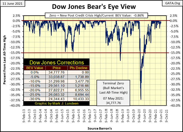
It’s been twenty-four NYSE trading sessions since the Dow Jones saw its last BEV Zero on May 7th. It could be better. Then it could also be worse, after all since May 7th the lowest daily closing BEV value seen by the Dow Jones was only -3.42%, well within scoring position. Most of the other daily closings were less than -1.00% from the Dow Jones last all-time high.
That has also been true since the Dow Jones began its latest series of BEV Zeros in Mid-November of last year. The daily closes for the Dow Jones have either been a new all-time high, or less than 5% from one for the past half year. Since mid-November the Dow Jones has advanced 4827 points, or 16.12%.
Still, I want to complain the Dow Jones isn’t doing anything, but should I? Dag-burn it, I’m an American. Though I haven’t a plug nickel at risk here, if I want to bitch, moan, and grown about the lousy market action for the Dow Jones, I can and I will. And I am because for the past twenty-four NYSE trading sessions, the Dow Jones has failed me in a very personal way by not closing at a new all-time high.
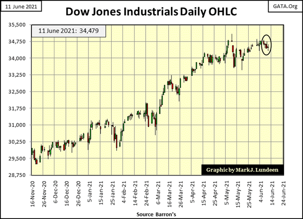
Here’s the Dow Jones in daily bars below, covering the market since early last November. Okay, so the market action for the past half year has been pretty good, up to the beginning of May anyway.
So, am I getting bearish? No, just bored with a market that can’t go up and refuses to go down for the past month. However, with a market in an established advance, as the Dow Jones has been since 23 March 2020, it’s best assuming the advance will continue until we begin seeing the dreaded days of extreme volatility (Dow Jones 2% days), which so far, we haven’t seen.
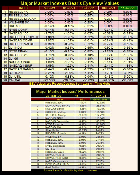
Below are the Bear’s Eye View values for the major market indexes. The market is beginning to see more BEV Zeros; five at this week’s close. I note those that didn’t close the week at a new all-time high closed in scoring position, within 5% of one. Which excludes the Dow Jones Utility Average (#19 / BEV -5.00%). Sorry, but technically speaking a BEV of -4.99% is the farthest an index can deflate from a BEV Zero and remain in scoring position. The XAU (#20) with a BEV of -30.08% is definitely out of scoring position.
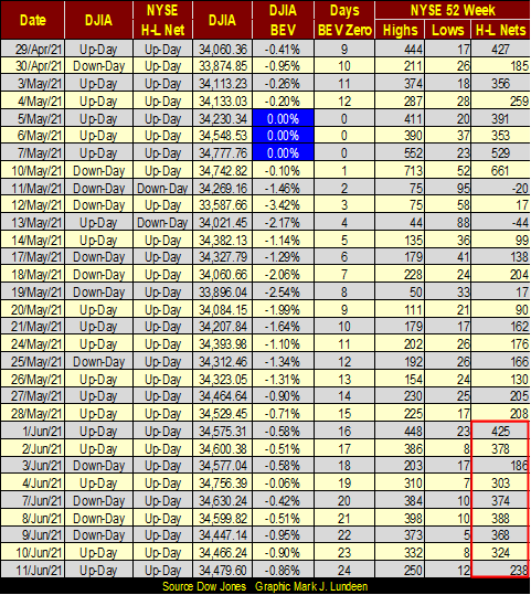
Every BEV Zero is not only a new all-time high, it’s also a 52Wk high. However, not every 52Wk high is also a new all-time high. I’m making this point as I’m wondering, since April 29th (table below) how many of the NYSE 52Wk highs are also new all-time highs? It’s a point to ponder. My guess is many, if not most of them are. Also, since June 1st the NYSE (table below / Red Square) has seen seven of nine trading sessions brake above my threshold of 300 net 52Wk Highs.
If this week the major market indexes aren’t pumping out BEV Zero’s as they were earlier this year, individual issues trading on the NYSE are, for no particular reason other than the massive levels of “liquidity” being “injected” into the financial system.
So, why a threshold of +/- 300? Three hundred is a nice round number that works, signaling when a buying or selling stampede is in progress. Look at the chart below plotting NYSE 52Wk H-L nets since 1980 using my +/- 300 threshold. Without this threshold, the chart displays much noise that’s confusing. With it, identifying those times when the market was actively inflating or deflating is easy to visualize.
Since January 1980, the highest positive 52Wk H-L Net was +665 seen on 26 April 2010. In the table above, the NYSE saw a 52Wk H-L Net of +661 on May 10th. As far as buying stampedes go, that’s about as good as it gets. Seeing a NYSE 52Wk H-L net of +661 just a month ago suggest the current advance is approaching a top, but no one really knows? Since August 1987, when Alan Greenspan became Fed Chairman, one can’t be sure if a top is the last top of a market advance because the Federal Reserve may not want the advance to stop.
If you had ever wondered whether greed or fear is the stronger emotion in the financial markets, the chart below answers that question: fear is. When the NYSE sees a 52Wk H-L net of +600, which doesn’t happen often, assuming the NYSE has about 3,000 issues trading daily, that net is about 20% of the issues trading on the NYSE for that day. Since this bull market began in August 1982, fear of deflating market valuations has always had a bigger impact on the market, as seen by the frequency, and intensity of the NYSE 52Wk H-L nets below -1,000 below.
Note how last March’s (2020) twenty-seven day, 37% market decline (Red Circle) produced this data series second deepest plunge in NYSE 52Wk Lows in the past four decades. What’s with that? I’ll tell you: FEAR at the FOMC as they discovered they are no longer “Masters-of-the-Universe.”
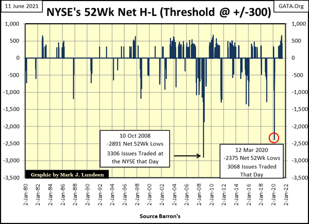
Look at the clusters of +/- 300 Net 52Wk H-L in the chart. The first half of it, 1980 to 2002 saw significantly fewer +/- 300 nets than the second half of the chart. Being me, I wondered what happened after 2002 that changed both the frequency and intensity of these buying and selling stampedes at the NYSE.
October 2002 saw the bottom of the Tech Wreck bear market. A month later, one Benjamin Bernanke of the FOMC gave a speech to the New York Economic Club, which contained the following quote on “positive inflation” that for the most part has been forgotten two decades later. But I haven’t forgotten it.
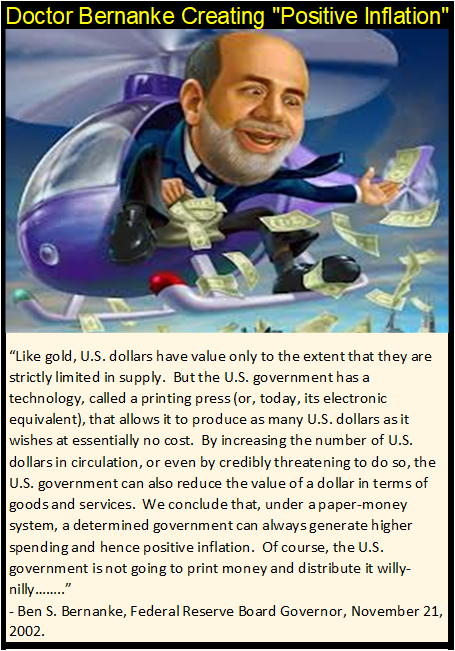
In November 2002, the “policy makers” decided to reflate their bubble in the stock market with massive “injections of liquidity” into the single-family home mortgage market. Take a moment and look at buying and selling stampedes at the NYSE following this November 2002 speech (NYSE 52Wk H-L Net chart above). Yeah, BIG difference before and after November 2002!
Bill Murphy at Le Metropole Café published an excellent article by Michael Pento called The Fed’s Tools are Broken. I have a quote from it below.
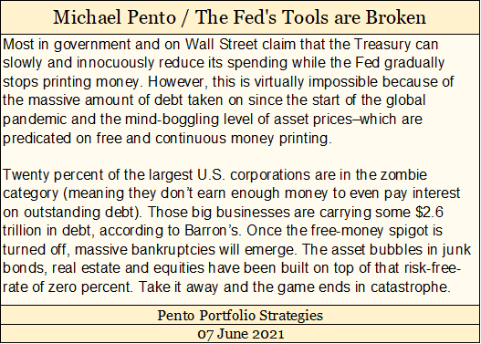
What, twenty percent of the largest US corporations are “zombies”, potentially defaulting on $2.6 TRILLION DOLLARS OF DEBT sometime in the future? Wow! Go back and read that again!!
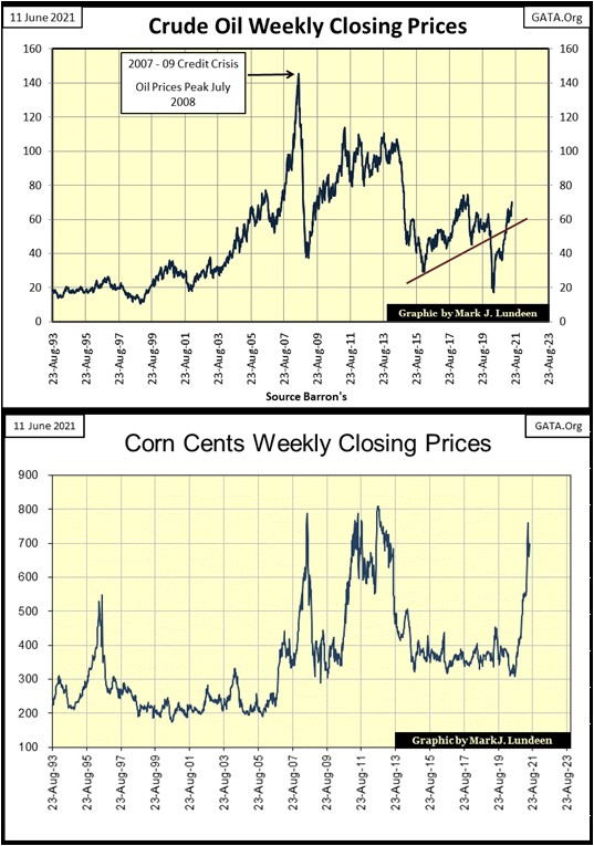
We can be sure Wall Street bundled interest rate derivates to most, if not all of that. Meaning an increase in current bond yields (below 3% / see chart below) to levels seen prior to the sub-prime mortgage crisis (greater than 5%) triggers a debt implosion in the corporate bond markets. Such an event in the corporate bond market would result in massive counter-party failures in the FOMC’s banking system, due to the big banks specific-performance obligation in the interest rates derivative market.
What would it take for me to become bullish on anything not gold or silver related? I’m waiting for this exact thing to happen, triggering shock-waves of human misery in the global financial markets. I’m not cheering Mr Bear on. But facts are facts, and it’s a fact the current economic regime is fatally flawed. So, someday it must come tumbling down, and I want to be as far away as possible when this pyramid of debt comes to its tragic end.
Until we see this pending bottom bloom in its full bleakness (think another Great Depression bottom), I’m avoiding financial market assets like stocks and bonds, favoring instead precious metal assets instead.
How long will it take for this to happen? In terms of weeks, months or years I haven’t a clue. But looking at increases in current commodity prices, as seen below in crude oil and corn, the fuse to this bomb in the financial markets has been lit.
Statisticians employed at the US Department of Labor can fudge their numbers all they want; Consumer-Price Inflation (CPI) is rising. The corporate bond market can’t have low single digit yields when annual CPI inflation is soaring towards double-digits. That is unless the FOMC is willing to become the sole purchaser of corporate bonds, when no one else is willing to pay absurd bond prices for yields that can’t compensate them for rising CPI inflation.
Such a “monetary policy” dooms the dollar. But the idiot savants at the FOMC are fully aware of that. In any “modern” (post gold standard) financial system, its ultimate objective is to save the banking system at all costs, no matter how blockheaded management of the big banks have become. If the FOMC has to totally ruin the dollar to save JP Morgan and Goldman Sachs, then the dollar has to go.
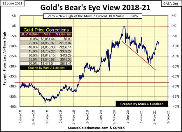
The market action for gold is much like that for the Dow Jones; the bulls can’t get the price of gold to advance and the bears are having no success in dragging it down. Or so it seems. But looking at gold’s BEV chart below, I feel good about the precious metals market. If the bears can’t drag gold below its BEV -10% line ($1855), its only a matter of time before the bulls advance gold up to, and above its BEV -5% line ($1958).
Noting all the negative items seen earlier in this article:
- zombie corporations with their $2.6 TRILLION dollars in debt,
- CPI inflation breaking out,
this is not the time to become bearish on gold, silver or the companies that mine them. So, I’m still looking for a new all-time high for gold sometime this summer, even if everyone else commentating on the gold market is in a funk.
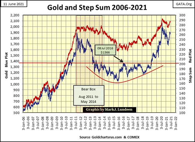
Note; for all the frustration we’ve had to endure in gold, its step sum chart below is unchanged since last week. True, in a longer-term chart as seen below, a single week has little impact on the plots unless something drastic occurred. But a longer-term chart, as seen below, looks at the big picture. The big picture seen below for the gold market is it is advancing after a very hard bear market (-45%) bottom.
From August 2011 to May 2014 there was a massive bear box. During this bear box the bulls saw every decline as a buying opportunity, until gold had declined 33% in May 2014. When the step sum began collapsing (May 2014), it tells us the bulls had a change of heart, and now saw every advance in gold as an opportunity to SELL.
By the time both gold’s price and its step sum bottomed in December 2015, bulls in the gold market were near suicidal. I’d get letters from readers telling me they were OUT, warning me my credibility was at risk for being bullish on gold.
At the December 2015 bottom I wasn’t feeling good either, but all hard bottoms have two things in common; they are bleak and desperate times for former bulls in a market. They are also the best time to become bullish and buy. They just are, and nothing has changed in the gold and silver markets that would justify altering my bullish opinion on the old monetary metals.
What would? In a market where “market regulators” allow the bears to cheat, like in gold and silver, because if they didn’t cheat, prices would soar far above where they closed this week. I can’t think of anything that would make be bearish on gold and silver.
Case in point; the FOMC’s current campaign to keep the financial market valuations inflated via their Not QE#4 below. How can anyone who follows this data series, published by the FOMC itself, be bearish on precious metals? How long before we see their Not QE#5?
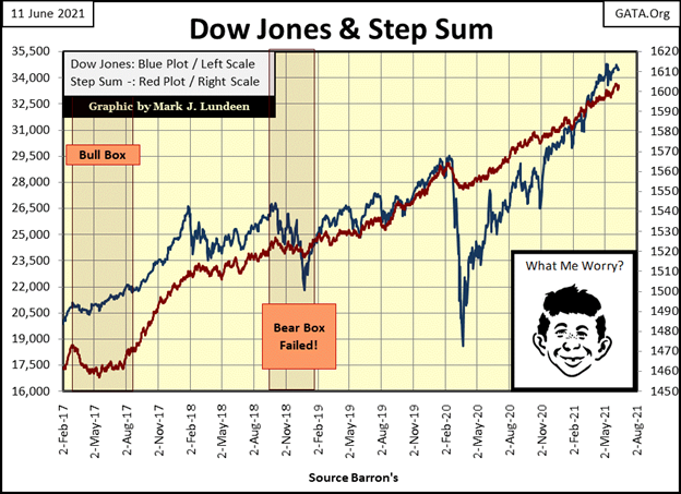
The step sum chart for the Dow Jones below also remains bullish. And seeing how the FOMC will come to the rescue of the bulls running wild and free on Wall Street (chart above), I wouldn’t be surprised seeing the Dow Jones breaking above 40,000 before everything comes tumbling down.
Of course, this all depends on bond yields remaining where they are now (less than 3%), and not going back up to where they were before the 2007-09 sub-prime mortgage bear market (over 5%).
Momentum in the gold market is slowing down, as seen in its declining 15 count (table below). What is missing are some days of extreme market volatility, which for gold are days gold has moved +/- 3% from a previous day’s closing price. We’re half way through 2021 and we’ve only seen one 3% day so far, that was on January 8th, a -3.56% day.
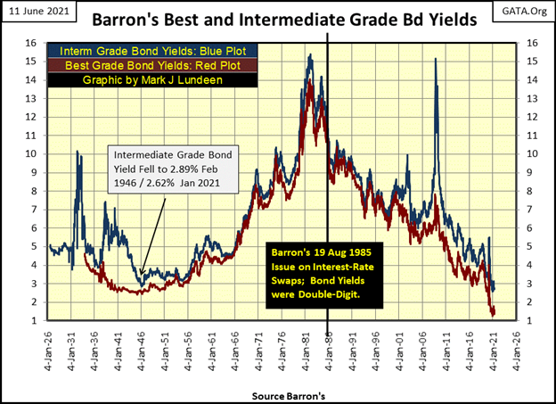
If there is a bellwether data series that best displays how goes the struggles in stock and gold markets, something that given a small change in it could produce oversized results in the valuations traded on Wall Street and in the precious metals markets; I’d guess that bellwether data series is Barron’s Best and Intermediate Grade Bond Yields (five charts up).
When in March 2020 these bond yields spiked up by a few percentage points, all hell broke loose on Wall Street and the FOMC began “injecting liquidity” into the financial system as it had never done before with its Not QE#4.
When Barron’s Best and Intermediate Grade Bond Yields once again rise above 5%, you won’t need me or CNBC to tell you what is going on in the markets. Total market chaos is going to be the order of the day, and everyone will know it.
Gold’s daily volatility’s 200 day M/A declined to 0.71%. Until that reverses, and begins trending towards 1.00%, I’m not expecting much excitement in the old monetary metals; gold and silver. That doesn’t mean the metals can’t advance with low volatility. They have been since December 2015. But when things get crazy, as they did in the late 1970s with that precious metals bull market, daily volatility is going to spike.
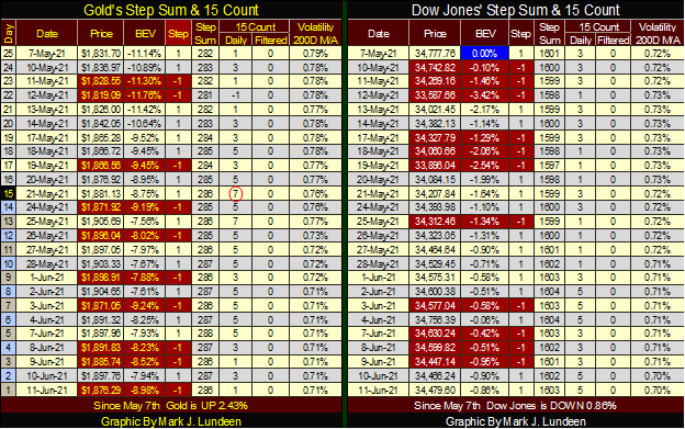
Daily volatility for the Dow Jones has also declined to 0.70%, but that’s a positive for the bulls running wild and free on Wall Street.
To sum up my views on the stock and gold market at the end of this week; in spite of my less than glowing views on both markets, both markets are in established up trends, and should continue advancing in the weeks and months to come. That is until bond yields and daily volatility once again rise. Rising bond yields and volatility will be bad for the stock market, but positive for gold, silver and their miners. That’s it until next week.
—
(Featured image by Cara Willenbrock via Unsplash)
DISCLAIMER: This article was written by a third party contributor and does not reflect the opinion of Born2Invest, its management, staff or its associates. Please review our disclaimer for more information.
A majority of the source material for this article was obtained via BBC. In the case of any discrepancies, inaccuracies, or misrepresentations, the source material will prevail.
This article may include forward-looking statements. These forward-looking statements generally are identified by the words “believe,” “project,” “estimate,” “become,” “plan,” “will,” and similar expressions. These forward-looking statements involve known and unknown risks as well as uncertainties, including those discussed in the following cautionary statements and elsewhere in this article and on this site. Although the Company may believe that its expectations are based on reasonable assumptions, the actual results that the Company may achieve may differ materially from any forward-looking statements, which reflect the opinions of the management of the Company only as of the date hereof. Additionally, please make sure to read these important disclosures.


The TopRanked.io Guide to 2026’s Biggest and Best Affiliate Opportunities
Want to earn affiliate commissions on literal billions of dollars worth of revenue? Then this week, we've got something special...


Eni Advances Energy Transition with Major Investment and Emissions Cuts
Eni showcased its “Just Transition” report in Rome, highlighting stakeholder collaboration and progress toward decarbonization goals. The company invested over...


The German Fintech Market Shows Resilience and Strong Investment Growth in 2026
Germany’s fintech sector remained resilient in 2026 despite economic crisis and rising insolvencies. Investments reached €14.2 billion, showing strong investor...


Cannabis Legalization in Germany: A Mixed Interim Assessment
Germany’s cannabis legalization has reduced criminal cases and eased pressure on the justice system, while the black market is slowly...

Sustainable Restoration of the Haus Hövener Garden in Brilon
The Brilon Construction Workers Association is restoring the Haus Hövener garden into a cultural community space, funded through a €10,000...
 |
|
 |  |
 |
|
-

 Crypto1 week ago
Cardano in Decline as Hoskinson Distances Himself Amid Growing Uncertainty
-
 Markets5 days ago
Jobs Strength Triggers Market Reversal as Inflation and Rates Take Focus
-

 Markets2 weeks ago
Cotton Prices Decline Amid Improved Weather and Market Uncertainty
-
 Crypto3 days ago
Institutional Bitcoin Buying and LiquidChain Presale Signal Market Optimism