Business
How to optimize your landing pages to get better conversion rates
You’re at your wit’s end. You ask yourself, “What on earth is happening?”

You spent hours designing a beautiful looking website, launching PPC advertisements, and creating a content calendar that’s designed to bring you truckloads of traffic. And yet, you’re not seeing a huge spike in sales (or traffic) from your online store.
Friends, if you’re experiencing the exact same thing, I want to tell you that you aren’t alone.
If you’ve built a landing page for your website, the chances are good that people from Google, social media, advertisements, or your email campaigns are arriving there when they click your links.
However, if your landing page falls short when it comes to convincing people to journey through your sales funnel, you’ll never see your business grow or generate more revenue.
In fact, according to Matt Janaway, Founder of Marketing Labs, “some people often miss the point. They fail to see that getting truckloads of web traffic doesn’t always translate to them getting more sales. Website conversion and relationship building, that should be their goal — and not merely generating traffic.”
Whether you have an existing landing page on your website that isn’t converting, or you are interested in creating a landing page that converts, this article will guide you in optimizing it so people take action.
So, let’s take a look.
1. Create a killer headline
The headline of your landing page is likely the first thing people see when they visit your webpage.
And if you do it right, your landing page’s headline will grab your site visitors’ attention, pique their interest, and make them understand what your brand is all about.
In fact, your landing page’s headline should do the following:
Grab people’s attention right away using power words
- Tell the site visitor what your product or service is all about
- Guide users through your sales funnel by encouraging them to take the next step
If you need help creating the perfect landing page headline, check out the free CoSchedule Headline Analyzer.
Just enter your headline, check out the results, and make improvements if you need to.
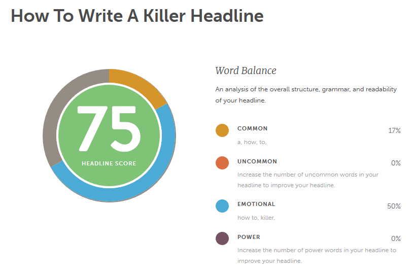
Having a strong value proposition in your landing page’s headline is the key to getting people to convert.
It should be short, to the point, and excite people to click your call to action button and move forward.
2. Add relevant imagery
It’s not enough to add just any stock photo to your landing page as a way to make your site more visually appealing.
Even though people’s brains process images 60,000 times faster than text, a strange image added to your landing page won’t convince your customers to convert.
Here are some image best practices you should follow when designing your site’s landing page:
- Make the images large and bold; you want them to grab people’s attention but not distract from the value proposition
- Ensure the image is relevant to what you’re selling so you don’t confuse potential customers
- Use high-quality images that will render well on any size device
- Incorporate images from the beginning; don’t add one last minute in hopes it will help your landing page conversion rates
Since the images on your landing pages are the first things people will process when they arrive at your landing page, you want to make sure they work for you, not against you.
If you want to create your own original images for your landing page, check out Canva.
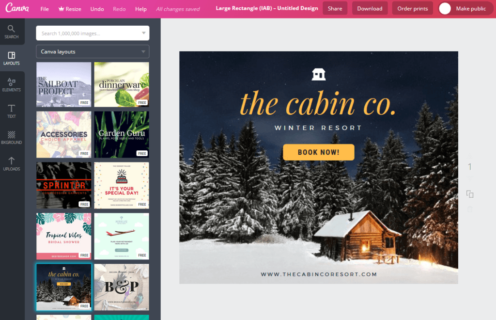
This free online tool helps you create all kinds of image types and even comes with pre-designed templates to get you started.
And since you design them, you’ll know your landing pages are one-of-a-kind.
3. Include a lead magnet
Whether you want people to sign up for your email list or make their way to your newly launched eCommerce shop and buy something, offering a lead magnet can help get people to take action.
A lead magnet is something of value you offer site visitors in exchange for their email address.
That way, even if your site visitor abandons your site before making a purchase, you have their information and can reach out to them in an email campaign to encourage them to come back.
There are plenty of different kinds of lead magnets you can offer, depending on your target audience and the goal of your landing page:
- Book
- Checklist
- Free template
- Coupon or discount to your online shop
- Case studies or white papers
- Free consultation
- Resource List
- And much more
One of the best tools for creating a killer landing page is OptinMonster.
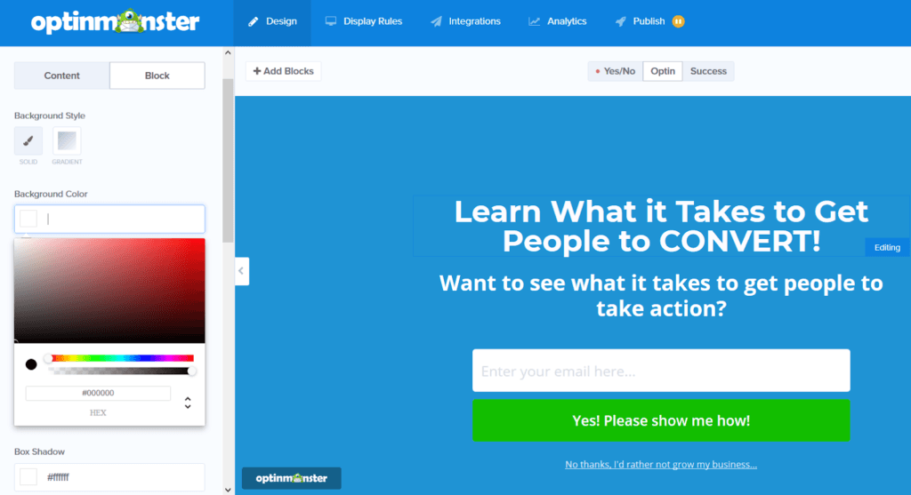
With OptinMonster, you can instantly boost your leads and grow your revenue with the website traffic you already see on a daily basis.
Customize your landing page to meet your needs by adding unique elements such a countdown timer, a standout CTA button, a compelling value proposition, and even images to show off what you have to offer.
4. Optimize your site for speed and performance
Designing your landing page is only half the battle when it comes to getting people to engage with your products and services and convert into a paying customer.
In fact, nearly 40 percent of people will abandon your website if it doesn’t load within 3 seconds or less – regardless of what you have to offer.
Because of this, it’s essential you optimize your website, landing pages included, for speed and performance, so people aren’t tempted to leave your site because it loads too slow.
One of the best ways to measure how fast your website loads is to enter your URL into the free Google PageSpeed Insights tool.
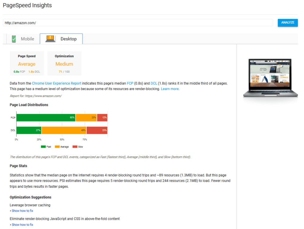
With this tool, you not only find out how fast your desktop and mobile sites are running, but you also get suggestions from Google for optimizing your website to make it even faster.
For example, Google might suggest that you:
- Enable browser caching
- Minify CSS, JS, and HTML files
- Compress images into smaller file sizes
- Clean up your database
- Reduce server requests
Lastly, you can use a CDN to deliver site content to users as quickly as possible. With a content network delivery, your site’s data is stored on multiple servers throughout the globe.
Then, when a site visitor clicks on your landing page, the server geographically closest to your site visitors will serve up your site’s content.
Doing this reduces latency and ensures blazing fast loading speeds.
It also gives your site visitors the best experience while on your website, so they feel less likely to abandon right away out of frustration.
Final Thoughts
In the end, there’s a lot that goes into creating a highly converting landing page.
If you want to turn more users into subscribers or paying customers, you have to pay attention to more than just the design of your landing page.
You have to think about what you’re offering people that they can’t get anywhere else, how you’re better than your competition, and how site visitors will feel once they land on your website.
If you can create a strong value proposition that encourages site visitors to want to know more, create a website that not only functions right but performs well, and write copy that will get people to take action, you’ll notice your business growing in no time.
(Featured image by Nong Mars via Shutterstock)
—
DISCLAIMER: This article expresses my own ideas and opinions. Any information I have shared are from sources that I believe to be reliable and accurate. I did not receive any financial compensation for writing this post, nor do I own any shares in any company I’ve mentioned. I encourage any reader to do their own diligent research first before making any investment decisions.

-

 Cannabis1 week ago
Aurora Shifts Strategy Toward Global Medical Cannabis Markets
-

 Markets3 days ago
Dow Jones Tests Correction Zone Amid Bullish Momentum and Bubble Concerns
-

 Crowdfunding2 weeks ago
Peru’s Crowdfunding Sector Shrinks Amid License Revocation
-

 Crowdfunding1 week ago
Cyberpunk Trading Card Game Surges Past Goals on Kickstarter


![Kevin Harrington - 1.5 Minutes to a Lifetime of Wealth [OTC: RSTN]](https://born2invest.com/wp-content/uploads/2023/12/kevin-harrington-400x240.jpg)
![Kevin Harrington - 1.5 Minutes to a Lifetime of Wealth [OTC: RSTN]](https://born2invest.com/wp-content/uploads/2023/12/kevin-harrington-80x80.jpg)


