Featured
Overall inflation remains low and conditions for the stock market remain positive
Gold bull and bear markets is the theme of our opening piece this week. And what does all this money being pushed into the financial system mean? Hyperinflation as some are calling for? The U.S. job numbers were much better than expected. But were they? Underneath there is rot. We look at that. Our Chart of the Week looks at the S&P 500 on an inflation adjusted basis.

Gold Bull and Bear Markets 1971–Present
| Beginning Date Price | Ending Date Price | Bull % Gain Days | Bear % Loss Days |
| 17Aug71 43.28 | 29Jun73 123.50 | 185.4% 684 | 27.1% 150 |
| 26Nov73 90.00 | 10Apr74 177.00 | 96.7% 135 | 25.7% 86 |
| 5Jul74 131.50 | 30Dec74 197.50 | 50.2% 178 | 47.8% 610 |
| 31Aug76 103.05 | 21Jan80 843.00 | 718.0% 1238 | 45.1% 57 |
| 18Mar80 463.00 | 23Sep80 748.50 | 61.7% 189 | 60.3% 636 |
| 21Jun82 297.50 | 8Sep82 509.00 | 71.1% 79 | 23.4% 26 |
| 4Oct82 390.00 | 15Feb83 520.00 | 33.3% 134 | 45.7% 741 |
| 25Feb85 282.60 | 7Oct86 445.50 | 57.6% 589 | 15.5% 50 |
| 26Nov86 376.50 | 14Dec87 507.40 | 34.8% 383 | 29.0% 543 |
| 9Jun89 360.50 | 5Feb90 430.30 | 19.4% 241 | 19.1% 129 |
| 14Jun90 348.20 | 23Aug90 425.00 | 22.0% 70 | 23.3% 930 |
| 10Mar93 325.80 | 2Aug93 414.00 | 27.1% 145 | 17.1% 42 |
| 13Sep93 343.00 | 2Feb96 419.70 | 17.2% 872 | 39.7% 1264 |
| 20Jul99 253.20 | 5Oct99 337.50 | 33.3% 77 | 24.2% 545 |
| 2Apr01 255.80 | 5Feb03 384.50 | 50.3% 674 | 16.7% 61 |
| 7Apr03 320.10 | 11May06 728.00 | 127.4% 1130 | 22.9% 34 |
| 14Jun06 561.50 | 17Mar08 1033.90 | 84.1% 642 | 34.1% 222 |
| 24Oct08 681.00 | 6Sep11 1923.70 | 182.5% 1047 | 20.8% 114 |
| 29Dec11 1523.90 | 28Feb12 1792.70 | 17.6% 61 | 14.8% 78 |
| 16May12 1526.70 | 5Oct12 1798.10 | 17.8% 142 | 34.4% 266 |
| 28Jun13 1179.40 | 28Aug13 1434.00 | 21.6% 61 | 17.6% 125 |
| 31Dec13 1181.40 | 17Mar14 1392.60 | 17.9% 76 | 18.8% 235 |
| 7Nov14 1130.40 | 22Jan15 1307.80 | 15.7% 76 | 20.1% 315 |
| 3Dec15 1045.40 | 6Jul16 1377.50 | 27.9% 216 | 18.4% 162 |
| 15Dec16 1124.30 | 11Apr18 1369.40 | 21.8% 481 | 14.8% 127 |
| 16Aug18 1167.10 | 9Mar20 1704.30 | 46.0% 571 | 14.9% 7 |
| 16Mar20 1450.90 | 7Aug20 2089.20 | 44.0% 144 | 19.4% * 210 * |
| 5Mar21 * 1683.00 * | |||
| Average | 77.9% 383 | 26.6% 291 |
Note: * To date, Not included in averages
“In all my 60 years in the stock market, I never found anyone whose opinion
Bull and bear markets are a normal part of cycles. The question has always been, how does one determine the timing of the bull and bear markets? One of the great features of the Stock Trader’s Almanac (www.stocktradersalmanac.com) is that it provides tables of bull and bear markets for the Dow Jones Industrials (DJI), S&P 500, and NASDAQ. These can prove quite useful, especially from a historical perspective. But they do not provide one for gold and silver as the emphasis of the Stock Trader’s Almanac is on the stock market. Nor do the tables give any clue as to timing of bull and bear markets.
We have calculated one for gold. We’ll attempt to get one done for silver as well. We have applied basically the same principles to gold as were applied to the bull and bear markets for the stock markets. We are starting this with former president Richard Nixon ending the gold standard on August 15, 1971. After that, gold became free trading and in 1974 gold started trading on the Chicago Mercantile Exchange (CME). We have used 15% to define our bull and bear markets. Admittedly, we have three bear markets defined above that were marginally less than 15% but we thought them significant enough to include.
Surprisingly, the rapid decline in March 2020 over a 7-day period only took gold down 14.9%. But it was a significant event. Similarly, the drop from April 2018 to August 2018 only saw gold lose 14.8% but it too was significant as the August 16, 2018 low marked a 31.3-month cycle low. The same applied to the drop from February 2012 to May 2012 as the May 16, 2012 low was an important swing low that year.
The greatest bull moves for gold occurred in the 1970s following the end of the gold standard. Gold never experienced moves like that again until the bull market of 2008–2011 unfolded. But the percentage move was nowhere near those of the 1970s. The moves from 1971 to 1974 were powerful, gaining 356% overall, but they were interrupted twice with 15%+ drops. The rise from 1976 to 1980 was truly spectacular in that were no pullbacks exceeding 15%. It was the greatest bull market ever for gold. Could it happen again? The return of 718% was eye-popping. Silver did even better. But those two huge up moves that lasted each time over three years ended abruptly. They were quickly followed by a vicious bear market for gold with drops of 48% during 1974–1976, 45% in 1980 from January to March, and 60% from September 1980 to June 1982. Does anyone remember the lineups around the corner in late 1979 to buy gold? The 1976–1980 bull run played out for over three years. We didn’t see a run like that again until 2003–2006.
Overall, the 1980s and the 1990s saw the most vicious bear markets for gold and the longest as well. The worst was the decline from February 1996 to July 1999 that lasted over three years and saw gold plunge 40%. The plunge from September 2011 to the final low in December 2015 saw gold lose almost 46% overall and it did last over four years, but it was punctuated by some tradeable bear market rallies that saw gold rise over 15%. So, it wasn’t just one long collapse.
What does it say about the current bear market for gold? Well, in terms of length of time it is pretty average so far, having lasted about 210 days vs. the long-term average of 291 days. As well, the decline of roughly 19% is, for a bear market in gold, fairly low. But, as we have noted, gold prices often closely align with bond yields and the value of the US$ Index. Since the gold top on August 7, 2020 the price of the U.S. 10-year treasury note has fallen 4.4% (the U.S. 30-year treasury bond has fallen over 11%) while the US$ Index has actually fallen almost 3%.
So, what gives? If the US$ Index is down, why is gold falling? Surely a rise of under 3% since the bottom for the US$ Index in early January is insufficient to drag gold prices down? The biggest drop in bond prices has occurred since the beginning of the year. Also, optimism about the economy is rising, especially given an announcement that all Americans should be vaccinated by the end of May. Some are even calling the coming period the return of the “Roaring Twenties.” That sounds like hyperbole, especially given debt-laden corporations and consumers. But it is raising optimism as to how much GDP will grow in 2021. As well, some are banking on the huge savings piled up in financial institutions since the pandemic got underway to unleash a spending spree. But what if none of this happens? Or at least a lot less than the optimistic predictions?
“The only function of economic forecasting is to make astrology look respectable.”
—John Kenneth Galbraith, Canadian-American economist, diplomat, public official, intellectual, proponent of 20th century liberalism, author New Industrial State (1967) and others; 1908–2006
Gold bugs are frustrated. Whenever we get sell-offs as we have seen over the past few months, there come cries of suppression and manipulation. After all, gold should be going up. Okay, there was a nice little move off the November 30, 2020 low but it topped on January 6, 2021 at $1,962 for a gain of 11%. Not enough to call it a bull market. Since then, gold has fallen about 13% and printed new lows below the November 30 low. However, silver, platinum, and copper did not move to new lows. A divergence? Silver usually leads both in bull and bear markets, but silver isn’t acting like it’s in a bear. Silver rallied 38% from its November 30, 2020 low and has since than given back about 16%. Silver printed a new high for the move at $30.35 on February 1, 2021. Not what we would call bearish for silver.
Gold supposedly checks all the boxes as to what should make it rally. We’ve had a weak U.S. dollar, even if it has rallied from its lows; we have rising inflation expectations; we have unprecedented money printing as M2 money supply has expanded $3.4 trillion since March 2020; the Fed’s balance sheet has leaped by $2.9 trillion in the same period; and U.S. government debt has jumped $4.7 trillion, now topping $28 trillion. We have also had political turmoil with the contested election and the raid on Capitol Hill on January 6, 2021. How ironic that was also the day that gold topped.
But optimism over the economy has also gone up. U.S. (and Canadian) households have seen their savings leap about $1 trillion since the pandemic and recession got underway. Economists believe it could unleash a wave of pent-up spending. However, what if people decide that paying down debt and building their savings is more important? Bond yields have also shot up as we noted earlier. Rising bond yields at the longer end of the yield curve have brought out chatter that the Fed might cap yields. The way they do that is to bring back what was known as Operation Twist. Operation Twist was last employed in 2011 and extended basically from September 2011 to September 2012. The Fed sells short-term treasury notes and buys longer dated treasury notes and bonds. This is to help dampen the yield in the long end of the market. It is an operation that has been employed in the past as well in 1961.
It worked in 2011 as bond prices and the stock market soared while gold topped ironically in September 2011, then fell sharply until December 2011. Throughout 2012 gold chopped around in a range roughly between $1,525 and $1,800, never again reaching the highs of September 2011. As the gold bugs too painfully remember, it led to the April 2013 massacre that saw gold collapse $200 in the space of three days. Maybe that’s not what the gold bugs want to hear.
Central banks and governments have stated and are prepared to do whatever it takes to support people and businesses so that the world doesn’t fall into the Great Depression II. Already it is estimated that governments have pumped $14 trillion into the global economies, primarily the Western G7 nations. The U.S. is pushing through an additional $1.9 trillion of stimulus spending. While there are those who are freaking about the huge rise in debt, one should consider that a great deal of it is being purchased by the central banks. Debt monetization is both good and bad. Good because it means governments can enact expansionary fiscal policies without concerns about the growing liability. Bad because it forces the central bank to abandon its goals and could result in a loss of confidence and give rise to inflationary expectations. It also creates a vicious cycle that is difficult to end. The scariest example of debt monetization gone awry was Weimar Germany in 1921–1923 that led to huge hyperinflation and collapse. The resulting political instability gave rise to the Nazis.
So far there is little sign of any significant price inflation. What we have experienced is asset inflation in the stock market, the housing market, collectibles, and more. The Fed is committed to its purchase of $120 billion per month in a mix of U.S. treasuries and mortgage debt. Monetary expansion could lead to hyperinflation, placing billions on to the banks’ balance sheets. Those funds can then be loaned out, used to purchase assets or placed back with the Fed as reserves. All this money at the banks could lead to unintended consequences such as the banks not wanting any more funds. A way to discourage deposits is negative interest rates. The Fed can also pump more money into the system by not rolling over treasury bills. The banks are then forced to do something else with the funds.
So, is this a disaster waiting to happen? Everyone looks at Japan who after 30 plus years is still not experiencing any sign of hyperinflation, despite having the highest government debt level to GDP in the world. Most of the debt is purchased and owned by the Bank of Japan (BOJ). The BOJ discount rate is also negative as are deposit rates. The Japanese 10-year bond (JGB) is currently at 0.11% but has been negative in the past. The consequences of negative interest rates could be to drive the currency lower and gold higher. All of that might be the spark for the next gold bull.
So how does the current gold bear end? Experience tells us that, while it might not end with an exact spike low (a scary plunge followed by a sharp upside reversal) as it did in March 2020, we note that gold bottoms often play out over a few days to a week or so before gold rises once again. Gold has considerable work to do to regain confidence. Prices to be overhauled include $1,760, $1800/$1825, and $1,850/$1,860. Above $1,875 it would probably be safe to say a low is in. The question, is do we go lower first?
The Pandemic Rages On!
The COVID-19 numbers continue to down from the highs with the 7-day average of cases at around 392,000 vs. 725,000 at the peak. 7-day average of deaths are 8,800 vs. over 14,000 at the recent peak. The world added over 3 million cases in the past and is now over 117 million. Deaths have topped 2.6 million. In the U.S. many states are opening despite cries from health authorities that it is the wrong thing to do. Cases are approaching 30 million while deaths are now well past 500,000 and could be as high as 650,000 by mid-April at the current pace. It was estimated that 650,000 died in the U.S. during the 1918-1920 pandemic. The 7-day average of cases is just over 62 thousand while the 7-day average of deaths is roughly 1,800. At the peak the averages were over 255 thousand cases and over 3,400 deaths daily. In Canada the pace has slowed as well to just over 2,800 cases daily vs. almost 8,900 daily at the peak. Deaths have also slowed with 36 daily vs. 159 daily at the peak. No wonder the cry is to open up.
Sunday March 7, 2021 – 15:29 GMT
World
Number of cases: 117,199,686
Number of deaths: 2,601,781
U.S.A.
Number of cases: 29,659,019
Number of deaths: 537,137
Canada
Number of cases: 884,086
Number of deaths: 22,213
Source: www.worldometers.info/coronavirus
Chart of the Week
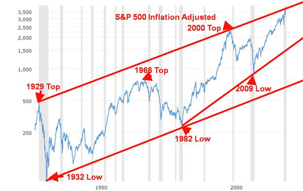
With all the talk about inflation, we thought we’d look at the S&P 500 on an inflation-adjusted basis. The chart above from Macro Trends (www.macrotrends.net) goes back to 1928. What was intriguing about it is first we connected the 1932 low to the 1982 low to form the bottom of the channel. Then we connected the 1929 top to the 1999/2000 top. The top channel line lined up parallel with the bottom channel line. The current market is now coming in at the top of the channel.
On a nominal basis, the low in the 1970s was made in 1974. But on an inflation-adjusted basis, the real low was seen in 1982. That low came in below the high of both the 1929 and 1937 top. The 2008 financial crisis did not see the low touch the bottom of the channel. Instead, it made a higher low. Connecting the 1982 low to the 2009 low gives rise to a potential formation of a huge ascending wedge triangle. However, the good news is that there appears to be more room for the market to move higher within the ascending wedge triangle. The current bottom of the channel is around 1,500. A decline to that level would give rise to a 50% drop for the S&P 500.
But it is not just the low that is impacted on an inflation-adjusted basis. The nominal high for the stock markets during the 2000s came in 2007. But the inflation-adjusted high was seen much earlier in 1999/2000. That explains why, on an inflation-adjusted basis, the 2007 top is much lower than the 1999/2000 top.
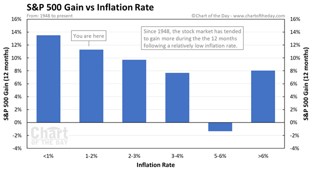
Concerns over the potential for rising inflation have steadied the market recently and increased volatility. The Chart of the Day newsletter took a look at the S&P 500 vs. inflation gains. Their study was revealing.
It was no surprise really to see that the best performance for the stock market was in a low inflation environment. With an inflation rate currently under 2% it is ideal for stocks. According to the table below, performance of the stock market doesn’t become materially impacted until inflation reaches the 5–6% level. An inflation rate over 6% saw markets perform better than in a 5–6% inflation environment; at least, that is what the table indicates. Performance is diminished in levels between 1–2% and 5–6% but not significantly. The 1970s saw stock markets perform poorly. Not surprisingly, the average inflation rate for the decade was 6.8%. While the 2000s resulted in poor stock market performance, it is noteworthy that the inflation average for the decade was only 3.36%. The current rate of inflation is 1.4%, which, according to theory is ideal for stocks. For the past decade the average inflation rate has been 1.8%. Maybe that is another reason why stock markets have done so well since the 2008 financial crisis. That, and oodles of money pumped into the financial system.
U.S. Job Numbers February 2021
With leisure and hospitality leading, the February nonfarm payrolls unexpectedly added 379,000 jobs. Leisure and hospitality added 355,000. The market had expected only a rise of 182,000. A big chunk of these jobs were part-time. No surprise that the number employed part-time for economic reasons (meaning they’d rather work full-time) rose by 162,000 in February. The number who work part-time rose by 482,000 in February. This reflects the early opening up in some states. Jobs in construction fell, probably reflecting the negative impact of storms in Texas and elsewhere. More discouraging perhaps was that the number who are employed full-time actually fell 122,000.
They also revised the January numbers higher but revised the December numbers lower. It is noted that the number unemployed for 27 weeks or longer rose to 4.15 million, the highest level since 2013. Joblessness rose amongst Black Americans but fell for Asians, Latinos, and White Americans.
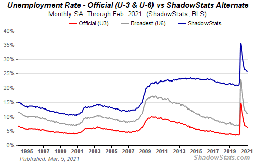
The unemployment rate (U3) slipped to 6.22% in February from 6.32% in January. The unemployment rate (U6)—which is the U3 rate plus those working part-time who want full-time work and discouraged workers under one year—slipped to 11.07%, down from 11.11%. But the Shadow Stats (www.shadowstats.com) unemployment number—which is U6 plus discouraged workers no longer counted in the labour force and as defined out of the labour force in 1994—actually rose to 25.8% from 25.7%. Maybe that number better reflects the real situation.
The labour force participation rate, as reported by the Bureau of Labour Statistics (BLS), was unchanged at 61.4% while the employment population ratio rose slightly to 57.6% from 57.5%. The civilian labour force grew by 50,000 in February while the number employed rose 208,000. The number of those counted as not in the labour force was at 100,910 thousand down 708 thousand in February.
One can take solace, we suppose, from the big jump in nonfarm. But we also note that the number of hours worked fell to 34.6 from 34.9 vs. an estimate of 34.9. That’s the lowest since April. Average hourly earnings rose 0.2% month over month and 5.3% year over year. However, average weekly earnings fell 0.6% month over month but were up 5.9% year over year. As it stands now, the U.S. lost 22,362 thousand jobs in March and April 2020 and has now recovered 12,887 thousand of them or 57.6%. They are still short 9,475 thousand jobs.
There is little in this report to be overly optimistic about. Once again, the BLS admitted that 799,000 were misclassified as employed when they are really unemployed. Add them back in and the U3 unemployment rate rises to 6.7% from 6.2%. With some 4.237 million people who have dropped out of the labour force in the past 12 months, the unemployment rate becomes 8.6% and rises to 9.1% if one adds others who did not look for work because they thought (knew?) there were none available. Some 18.026 million are actually collecting unemployment benefits. That number translates into an unemployment rate of 11.3%.
Despite opening up, all that could be created were tens of thousands of part-time, low-wage jobs while full-time, higher-end jobs declined. All this suggests that the L recovery on Main Street should continue. The rise in the economy remains the elevated stock market that rallied following the release of the numbers. All they see is nonfarm payrolls up 379,000. That it did settle back following an initial spike probably reflects the reality of part-time, low-wage jobs. The unemployment rate also does not reflect how women and blacks have suffered the most during the pandemic. In the past year some 2.3 million have left the labour force vs. only 1.8 million men. Black women saw their unemployment rate rise to 8.9% in February vs. 8.5% in January.
The market eventually shrugged it all off and rose. The U.S. economy is stuck in structural decline with low-wage jobs and debt-laden corporations and households (zombie economy with zombie corporations). The Fed, along with government deficit spending, primarily benefits Wall Street and that could continue to buoy stock prices going forward, even at the risk of some increased inflation. All of the action should result in the debasement of the currency that should eventually benefit gold and silver.
Canada reports their job numbers next Friday, March 12, 2021.
MARKETS AND TRENDS
| % Gains (Losses) Trends | ||||||||
| Close Dec 31/20 | Close Mar 5/21 | Week | YTD | Daily (Short Term) | Weekly (Intermediate) | Monthly (Long Term) | ||
| Stock Market Indices | ||||||||
| S&P 500 | 3,756.07 | 3,841.94 | 0.8% | 2.3% | neutral | up | up | |
| Dow Jones Industrials | 30,606.48 | 31,496.30 | 1.8% | 2.9% | up | up | up | |
| Dow Jones Transports | 12,506.93 | 13,627.98 | 2.2% | 9.0% | up | up | up | |
| NASDAQ | 12,888.28 | 12,920.15 | (2.1)% | 0.3% | down | up | up | |
| S&P/TSX Composite | 17,433.36 | 18,380.96 | 1.8% | 5.4% | up (weak) | up | up | |
| S&P/TSX Venture (CDNX) | 875.36 | 918.36 | (9.8)% | 4.9% | down | up | up | |
| S&P 600 | 1,118.93 | 1,302.12 | 1.8% | 16.4% | up | up | up | |
| MSCI World Index | 2,140.71 | 2,159.52 | (0.4)% | 0.9% | down | up | up | |
| NYSE Bitcoin Index | 28,775.36 | 48,089.22 | 1.3% | 67.1% | up | up | up | |
| Gold Mining Stock Indices | ||||||||
| Gold Bugs Index (HUI) | 299.64 | 261.89 | 4.7% | (12.6)% | down | down | up | |
| TSX Gold Index (TGD) | 315.29 | 280.11 | 3.8% | (11.2)% | down | down | up | |
| Fixed Income Yields/Spreads | ||||||||
| U.S. 10-Year Treasury Bond yield | 0.91 | 1.56% (new highs) | 10.6% | 71.4% | ||||
| Cdn. 10-Year Bond CGB yield | 0.68 | 1.50% (new highs) | 10.3% | 120.6% | ||||
| Recession Watch Spreads | ||||||||
| U.S. 2-year 10-year Treasury spread | 0.79 | 1.42% (new highs) | 10.9% | 79.8% | ||||
| Cdn 2-year 10-year CGB spread | 0.48 | 1.20% (new highs) | 13.2% | 150.0% | ||||
| Currencies | ||||||||
| US$ Index | 89.89 | 91.99 | 1.2% | 2.3% | up | down (weak) | down | |
| Canadian $ | 0.7830 | 0.7900 | 0.4% | 0.8% | up (weak) | up | up | |
| Euro | 122.39 | 119.15 | (1.3)% | (2.7)% | down | up (weak) | up | |
| Swiss Franc | 113.14 | 107.40 | (2.4)% | (5.1)% | down | down | up | |
| British Pound | 136.72 | 138.41 | (0.6)% | 1.2% | neutral | up | up | |
| Japanese Yen | 96.87 | 92.27 | (1.7)% | (4.8)% | down | down | neutral | |
| Precious Metals | ||||||||
| Gold | 1,895.10 | 1,698.50 | (1.8)% | (10.4)% | down | down | up | |
| Silver | 26.41 | 25.29 | (4.4)% | (4.2)% | down | up (weak) | up | |
| Platinum | 1,079.20 | 1,128.30 | (4.8)% | 4.6% | down (weak) | up | up | |
| Base Metals | ||||||||
| Palladium | 2,453.80 | 2,327.90 | 0.8% | (5.1)% | down (weak) | up (weak) | up | |
| Copper | 3.52 | 4.09 | (0.2)% | 15.9% | up | up | up | |
| Energy | ||||||||
| WTI Oil | 48.52 | 66.09 (new highs) | 7.5% | 36.2% | up | up | up | |
| Natural Gas | 2.54 | 2.70 | (2.5)% | 6.3% | down (weak) | up | neutral |
New highs/lows refer to new 52-week highs/lows and in some cases all-time highs.
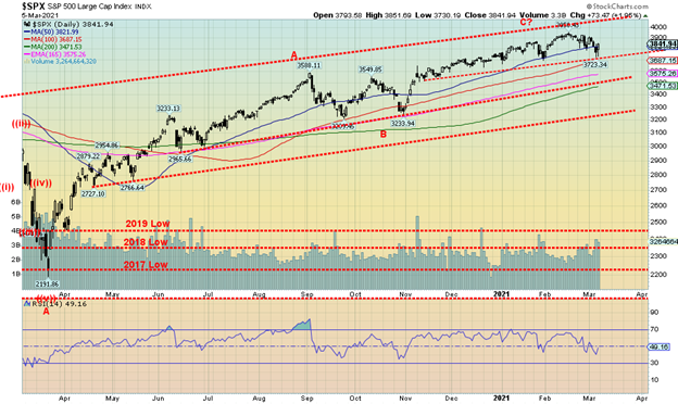
Pushed by higher bond yields, stock markets appeared poised to break down. But stronger than expected nonfarm payrolls on Friday gave the stock market new life and the S&P 500 finished the week up 0.8%. It was irrelevant, it seems, that the strong job numbers were pretty well all part-time low wage jobs and there were other negative signs that the job market is not as rosy as the market would like to make out. But this is now so the market goes up. There is no expectation of any rate hikes and the Fed continues to pump funds into the financial system through QE, Congress is passing the $1.9 trillion stimulus bill, needles are making their way into arms, and a number of states are opening up, despite the cries of health officials that it is too soon. Pandemic be damned.
The Dow Jones Industrials (DJI) gained 1.8%, the Dow Jones Transportations (DJT) was up 2.2%, but the tech-heavy NASDAQ was a loser, down 2.1%. A divergence? The small cap S&P 600 gained 1.8%. No index made new all-time highs this past week. In Canada, the TSX Composite gained 1.8% but the TSX Venture Exchange (CDNX) lost 9.8%. Elsewhere, the MSCI World Index dropped a small 0.4%. In the EU, the London FTSE was up 3.3%, the Paris CAC 40 gained 1.4%, and the German DAX was up 1.0%. In Asia, China’s Shanghai Index (SSEC) lost a small 0.2% while the Tokyo Nikkei Dow (TKN) dropped a small 0.4%. Bitcoin remains in a bull market but off its highs and under $50,000 as it gained 1.3% on the week.
With the $1.9 trillion stimulus package being passed, the economy opening up, and huge savings accumulating in accounts, some expect this could unleash a new wave of buying and propel the stock markets to even higher highs. Higher bond yields be damned and besides, stocks historically have done well during periods of rising rates. It is only when an accident happens that the stock markets drop. The collapse of a few sub-prime funds in 2007 started the 2008 financial crisis. In the interim, new highs cannot be ruled out.
The correction this past week was only about 6%. Pretty shallow. The S&P 500 needs to regain back above 3,900 to suggest new highs ahead. Thursday’s low was at 3,723 so a break of that level could spark a further sell-off down to support near 3,500. Major support is now down to 3,300 and a major break under that level could spark a panic. At this point we put little faith that would occur. Given everything that went on this past week and with the stimulus package about to become reality, the odds favour the upside once again. Just keep the downside break points in mind. For the DJI the downside break could occur under 31,000.
Indicators remain generally positive with breadth indicators showing no divergences with the price. The put/call ratio is at 0.60 which is still mildly bullish.
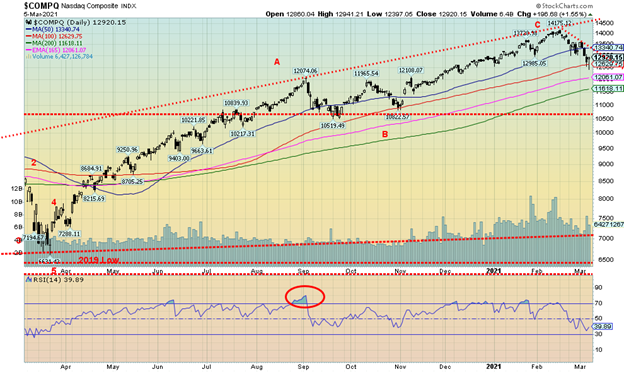
Tech stocks led the way up and now could they be leading the way down. The NASDAQ is now off about 9% from the recent high seen at 14,175 on February 16, 2021. In holding above the 100-day MA, currently near 12,630, the NASDAQ avoided the potential—for the moment, at least—of falling further towards the 200-day MA near 11,600 and the bottom of a channel near 10,700/10,800. A close under 11,600 sets up the possibility of a decline to the bottom of the channel. At that point the NASDAQ will be down almost 25% from its highs. The tech stocks were whacked this past week although some hung in. Facebook was one of the few that gained, up 2.7%. Google was a big winner, up 3.5%. Apple could also be considered a winner as it fell only about 0.1%. But Amazon lost almost 3.0%, Netflix was down 4.1%, and Microsoft was off 0.4%. The big losers were Elon Musk and Tesla, down 11.0% (Musk is no longer the richest man in the world) and Twitter (which had been making all-time highs), losing 13.1%. If tech fell, the value stocks rose as Berkshire Hathaway gained 5.3% to new all-time highs. The NASDAQ dodged a bullet this week so we’ll see if it can climb out of its current hole. The NASDAQ needs to regain back above 13,500/13,600 to suggest that a low is in.
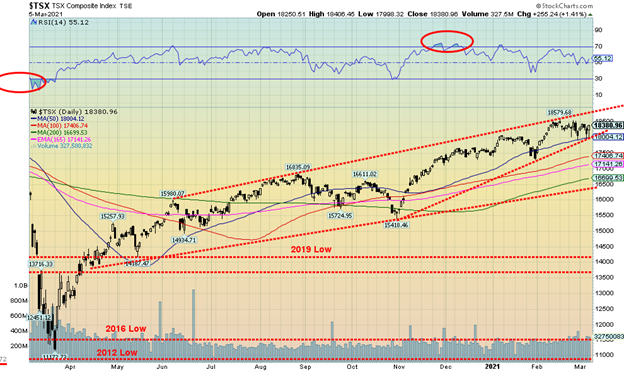
The TSX Composite rose 1.8% this past week despite rising interest rates and some volatility in markets. The small cap TSX Venture Exchange (CDNX) did not fare as well, losing 9.8%, its sharpest drop since the rally got underway in March 2020. Still, the CDNX remains up 178% during that period even if it is off 17.5% from the recent high. Only three of the 14 sub-indices fell this past week led by Information Technology (TKK), falling 4.9%. TKK, the former leader, is now leading to the downside. Health Care (THC) fell 4.4% while Utilities (TUT) dropped 0.8%. Leading the way to the upside was Energy (TEN), up 10.3% on the week to fresh 52-week highs. Also making 52-weeks were Financials (TFS), up 3.5% and Consumer Discretionary (TCD), up 2.5%. Consumer Staples (TCS) gained 4.1% while Telecommunications (TTS) was also a big winner, up 5.3%. Golds (TGD) surprised, gaining 3.8%. The TSX previously hit the top of its channel back on February 16, 2021. Now it is testing the bottom of a channel. The TSX may have been forming a potential ascending wedge triangle. A breakdown under 18,000 could send the TSX down to test major support at the 200-day MA, currently at 16,700, and a channel line just below near 16,500. If the TSX manages to rebound once again, the top of the channel is just above 18,800 near 18,850.
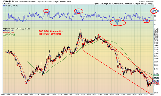
We wanted to emphasize our thoughts that a switch to commodities over the general stock market is underway. Above is a chart of the S&P GSCI Commodity Index/S&P 500 ratio. It has recently broken out of the long down trend from 2011. There remains considerable work to be done as the 4-year MA is above at 0.142. That level needs to be overhauled to suggest that the new commodity bull is underway. Notice how it broke above the 4-year MA in 2000 but then there was a test of the average in 2001/2002 before a bigger move got underway that peaked eventually in 2008. 2011 proved to be last hurrah and since then the S&P 500 or the stock market has outperformed commodities. In some ways this ratio is like the Dow/Gold ratio. We have seen longer dated ones going back to 1900, primarily of the Goldman Sachs Commodity Index/Dow Jones Industrials (DJI) ratio. Besides 2008, major peaks were seen in 1990 at the height of the Iraq War, 1974 during the Arab oil crisis, and in the 1930s when commodities soared even as the stock market plunged. Lows have been more dragged out with the chart above showing the low seen in 1999. Previous major lows were seen throughout the 1950s and 1960s before a big commodity boom got underway during the 1970s that generally peaked by 1990, although there were some sharp ups and downs. But we are watching this one carefully. Commodities include energy, agriculture, plus industrial and precious metals. No surprise that with both oil and copper prices rising they are helping the commodity indices rise.
U.S. 10-year Treasury Bond/Canadian 10-year Government Bond (CGB)
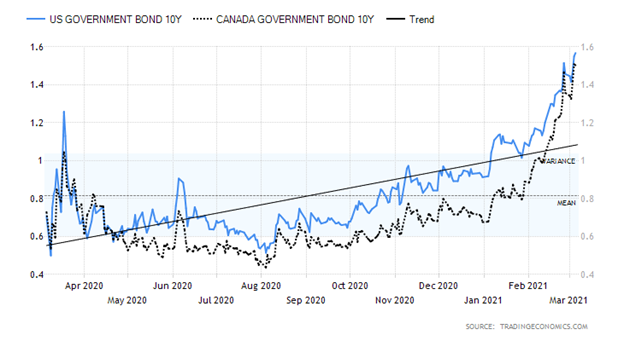
With optimism over the economy growing as the vaccines are administered and higher than expected job numbers reported on Friday, the U.S. 10-year treasury note rose to 1.57% this past week. That’s up from 1.41% the previous week and at one point hitting a high of 1.60%. The Canadian Government of Canada 10-year bond rose to 1.50%, up from 1.36% the previous week. The 30-year treasury bond yield rose to 2.30%, up from 2.10% the previous week. Prices, which move inversely to yields, fell. The knock-off effect of rising longer dated yields is that interest sensitive stocks such as utilities, telecommunications, income trusts, and real estate were also hurt. As well, we read that some lenders are raising mortgage rates which could have the effect of cooling the hot housing market. Besides the stronger than expected nonfarm payrolls on Friday, other economic numbers were released this past week: the ISM manufacturing index for February was 60.8 vs. 58.7 in January and an expectation of 58.5; the Markit Composite PMI came in at 59.5 vs. 58.7 and an expectation of 58.8; jobless claims for the previous week were 745,000 vs. 736,000 the previous week and below expectations of 750,000; factory orders for January rose 2.6% vs. 1.6% in December and an expected 1.7%; ADP employment change for February was below expectations at 117,000 vs. the previous month of 195,000 and expectations of a gain of 177,000; and the balance of trade for January was a huge deficit of $68.2 billion vs. $67.0 billion and an expectation of $67.5 billion deficit. The U.S. trade deficit keeps on rising despite, supposedly, all the trade wars with China and others. It has gone in the opposite direction to what was advertised. Fed Chairman Jerome Powell spoke this week and he said nothing to calm the fears in the bond market of a rise in yields at the long end of the curve. He noted: “We expect that as the economy reopens and hopefully picks up, we will see inflation move up through base effects. That could create some upward pressure on prices.” That helped to push yields higher. The expectation was then that stocks would fall. Of course, most fail to grasp that throughout the last period of rate increases in 2017–2018 the stock market kept going up.
We continue to believe that our ultimate target is potentially up to 2.00%. We have heard some rumours of some bond funds in trouble but nothing concrete at this stage. Some issues have gone awry including an undersubscribed 7-year bond auction recently. But with the Fed buying up huge chunks of the government issues and buying back corporate issues there has been sufficient liquidity for the banks to take on new issues.
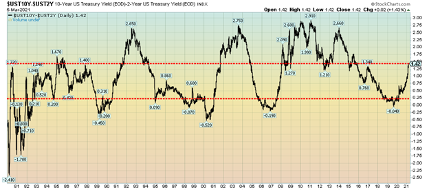
Given the sharp rise in spreads we thought we’d look at our old favourite: the 2–10 spread or more correctly the spread between the U.S. 2-year treasury note and the U.S. 10-year treasury note. On Friday the spread closed at 1.42, the highest level seen since 2014. Since 1980, the range for the spread has been negative 2.41% (seen in 1980) and a high of +2.91% in 2011. The general interpretation is that a negative spread is a warning sign of an impending recession while a high spread is associated more with a coming boom period. As the boom period unfolds, the spread gradually starts to decline until it once again becomes negative, forecasting a coming recession. Once again, the decline to negative 0.04% in 2019 forecasted the recession that eventually showed up with the pandemic recession. At current levels based on previous observations the spread is not quite at levels that would forecast a coming economic boom (if you want to call it that these days). But it is nowhere near forecasting a recession, either. Our expectations are that this spread could widen further, which suggests that the 10-year yields could rise more, given that the odds of Fed hiking the short rates any time soon are about nil. We have noted the potential for the 10-year to rise to 2.00%. At that level the 2–10 spread would be at about 1.80%–2.00%. That’s still not as high as we saw in the early 1990s, early 2000s, and early 2010s before an economic boom of sorts got underway.
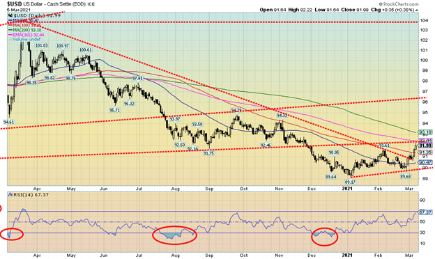
The US$ Index rose 1.2% this past week to its highest level since late November 2020. The high on the week was Friday at 92.22. There is resistance here at 92 up to 92.50 from an old support line and from the MAs. The 200-day MA is somewhat higher currently at 93.18 so it is possible to reach to that level this coming week. The major currencies suffered as the euro fell 1.3%, the Swiss franc was hit hard, down 2.4%, the pound sterling was off 0.6%, and the Japanese yen dropped 1.7%. Only the oil-driven Canadian dollar managed a gain of 0.4%. As well for the Canadian dollar, Canada reported an unexpected large balance of trade surplus of $1.4 billion when it was expected to be a $1.4 billion deficit. Quite the swing.
It is possible that the US$ Index is completing a potential ABC correction to the down move to 89.17 seen in early January. We are at or close to a normal correction of the entire move down from March 2020. Above 92.25 the US$ Index could next make a move to 94.50/95. We cannot rule that out, at least until we break back under 89.68, the last low we saw in late February. A breakdown under 89.68 would suggest we are on a new move to the downside below 89.17 the January 6 low with potential targets down to 86/86.50.
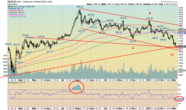
It was another bad week for gold as it fell $31 or 1.8%. The precious metals were all hit as silver also fell, down 4.4%, and platinum was off 4.8%. Palladium, more an industrial metal with some PM properties was up 0.8% and copper was off a small 0.2%, holding above $4. Gold prices were being pressured lower by a rising U.S. dollar, rising bond yields, and optimism over the economy as the vaccines are administered.
Gold fell into a confluence of support lines that range roughly from $1,660 to $1,700. We had previously anticipated that would happen once we broke under $1,800. Gold is now down over $390 from the August high or around 19%. We couldn’t help but notice that the daily RSI has now gone under 30 (currently 27.77). The daily sentiment index at www.trade-futures.com is at 12%, the lowest level since November 2018 which coincidently was the period of the last 31.3-month cycle that actually occurred in August 2018. We are now roughly 30 months from the August 2018 low and in the vicinity of making our next 31.3-month cycle low. No, it doesn’t mean we have the final low although there is a possibility, we are in the process of making that low. The cycle low was to range around April +/- 5 months so the negative impact could in theory last out until August/September 2021 before the market really takes off. What we could experience is a rally out of the current low, followed by another pullback to test those lows a few months out before a stronger rise gets underway later in the year. Irrespective of this, because we have not confirmed a low any breakdown below $1,670 could set off a panic drop towards the $1,500/$1,550 zone. Gold has resistance in the $1,750 area, then up to$1,800/$1,825. Gold needs to regain above $1,850/$1,875 to confirm this low. Further resistance can be seen at $1,950/$1960 and up to $2,000. Over $2,000 new highs over the August high of $2,089 are probable. We are optimistic that we are in the vicinity of at least a tradeable low. It is too early to determine that we are making our final 31.3-month cycle low; however, there is a reasonable chance it could turn out to be.
Once this low is determined, gold should embark on a move that could take us the $2,220/$2,400 to the crest of the longer 7.83-year cycle and the 23–25-year cycle. Once that crest is determined, the biggest drop of the past decade could get underway.
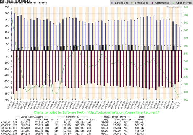
The commercial COT for gold improved this week to 23% from 21%, the best move in weeks. The last time the commercial COT was this good was well over a year ago. Long open interest rose almost 3,000 contracts while short open interest fell almost 27,000 contracts. The large speculators (hedge funds, managed futures, etc.) saw their COT fall to 78% from 81%, the lowest level seen in weeks. They saw long open interest fall almost 19,000 contracts while short open interest rose almost 8,000 contracts. Overall open interest fell 14,000 contracts suggesting that, overall, the market was covering shorts in a down week. This is the most bullish we’ve seen the commercial COT in some time and hopefully it is a sign that we may be finally approaching a low.
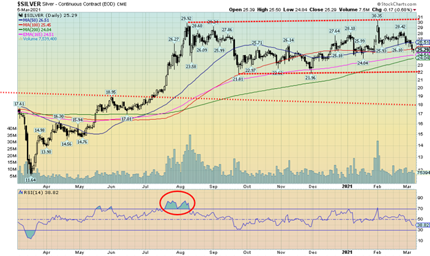
Is silver breaking down? Silver prices plunged through $26 this past week and even briefly plunged through $25, suggesting that we are in the throes of a major meltdown for silver. Silver lost 4.4% on the week, one of its worst in weeks. Despite it all, we are still above the 200-day MA, currently near $24. The bottom of a trading range channel is near $22. A breakdown under $22 would be fatal for silver prices and could project down to $13/$14. We doubt that but did want to note it and not dismiss that it couldn’t happen. To begin to suggest to us that a low might be in, silver prices need to regain first above $26.50 then above $28.50. Above $28.50 could suggest that we might at least test the recent high at $30.35. While the bears we follow suggest a rebound to possibly $25.60-$26.40, they ultimately believe we will find our way down to major support near $22. A move like that cannot be ruled out until we regain back above $27 at a minimum. While we are optimistic that we might be within the range of a low, we cannot determine just yet that we have made a final low.
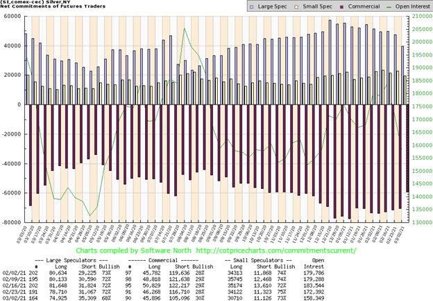
The commercial COT for silver improved this week to 30% from 28%. It was the first time back at 30% in at least 16 weeks. It also may be a sign that silver is approaching or at a low. Long open interest didn’t change much but short open interest fell almost 12,000 contracts. The large speculators COT fell to 68% from 72% as they slashed their long open interest by about 4,000 contracts while adding over 4,000 contracts to short open interest. As well, total open interest fell by over 14,000 contracts, suggesting to us that the market was covering shorts. In a down market, we consider that bullish. The silver COT like the gold COT is giving signs, finally, that we may be in the throes of a bottom.
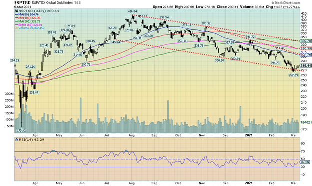
Are the gold stocks leading the way? Unlike gold and silver, the gold stocks represented by the Gold Bugs Index (HUI) and the TSX Gold Index (TGD) both gained this past week. The HUI was up 4.7% while the TGD gained 3.8%. Both remain down on the year with the HUI off 12.6% and the TGD down 11.2%. The TGD did make new lows this past week for the move down, but reversed and closed the week to the upside. We have to consider that to be bullish for not only the gold stocks but ultimately for gold and silver as well. Of course, there is no confirmation that we have put in a final low but the up week was encouraging. The TGD was trending along the bottom of a bear channel but failed to firmly break down below it. The reality is, however, that the TGD needs to regain above 305 to suggest that a low is in. The major breakout point is up at 340, some 60 points or a 21% move away. We are under no illusions that there is considerable work to be done to repair the damage done on the bear move that got underway in August. The TGD is down almost 33% from the August high. In terms of corrections the move has been fairly normal. Before that the TGD had gained 140% off the March 2020 low. The TGD has corrected back 61.5% of the entire move from March 2020 to August 2020. That is very close to the Fibonnaci 61.8% that would be considered a normal correction. Only a move below 230 for the TGD would suggest to us that the March 2020 lows could be tested or even see new lows. The first area the TGD must return to is 290 then regain over 305. That would give us hope that a final low is in.
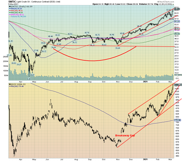
Leave it to OPEC. OPEC surprised the market this past week by not easing off on the current level of oil production. For whatever reason it was thought they would raise production. They didn’t and oil prices shot up. WTI oil finished the week gaining almost $4.60 or 7.5% and once again reaching 52-week highs. Brent crude gained over $5 closing near $70. Natural gas (NG) didn’t fare as well as it fell 2.5%. But the energy stocks soared, all hitting 52-week highs with the ARCA Oil & Gas Index (XOI) gaining 10.4% and the TSX Energy Index (TEN) up 10.3%. The energy stocks, who were the worst performers in 2020, are now the best performers in 2021.
What OPEC did was extend the current cuts through to the end of April. For sure, there were some seasonal adjustments made in Russia and Kazakhstan, but the Saudis kept their cuts in place. We note as well that maintenance at three oil sands upgraders in Canada is also taking some 500,000 bpd off the market adding to the tightness. The market, for whatever reason, was surprised by the move. Oil companies are chortling as they expect record cash flows. Couple that with limited spending plans and along with the massive cuts they have already made and the expectations are that it could raise their profits.
One thing that caught our attention was an industry meeting where the companies all spoke positively about transitioning to a lower-carbon world. If there is the so-called “Great Reset,” then it appears that the oil companies are a part of it. The emphasis is on carbon capture. The world will still need and rely on fossil fuels. They are not going to disappear overnight. They are also being pushed by their lenders and large investors to take a more serious turn on “going green.”
With the gains this week, WTI oil and the energy indices have all seen their RSIs rise over 70 on both their dailies and weeklies. WTI oil has also entered a congestion zone that ranges between $55 and $75 with particular resistance into $65. This suggests to us that a correction/pullback could soon be upon us. We appear to be reaching the top of channels as indicated in the chart of WTI oil and the XOI above. We’d be cautious chasing rising momentum at this stage.
NG prices could remain firm because of withdrawals to deal with the crisis in Texas. Some believe it will help boost prices later in the year.
A sharp rise that has taken us into significant resistance zones, coupled with overbought conditions on both the dailies and weeklies suggests to us that some caution would be warranted going forward.
_
(Featured image by PublicDomainPictures via Pixabay)
DISCLAIMER: This article was written by a third party contributor and does not reflect the opinion of Born2Invest, its management, staff or its associates. Please review our disclaimer for more information.
This article may include forward-looking statements. These forward-looking statements generally are identified by the words “believe,” “project,” “estimate,” “become,” “plan,” “will,” and similar expressions. These forward-looking statements involve known and unknown risks as well as uncertainties, including those discussed in the following cautionary statements and elsewhere in this article and on this site. Although the Company may believe that its expectations are based on reasonable assumptions, the actual results that the Company may achieve may differ materially from any forward-looking statements, which reflect the opinions of the management of the Company only as of the date hereof. Additionally, please make sure to read these important disclosures.

-

 Africa2 weeks ago
Bank Al-Maghrib Launches Reforms to Boost Credit via Non-Performing Loan Market
-

 Cannabis6 days ago
Poland Proposes Cannabis Decriminalization: 15 Grams and One Plant Without Penalties
-
 Fintech3 days ago
Credibur Scales Rapidly: €2 Billion in Structured Debt Facilities in Six Months
-

 Impact Investing1 week ago
Ridemovi Secures Financing to Drive European Expansion and Sustainable Mobility Growth


