Featured
Possible Ka-Booms as Far as the Eyes Can See
Explosive growth in Silver and Gold are but one of many indicators of an overbought market, with large banks and corporations alike making irresponsible decisions baking themselves into a corner, the most likely result is clear: ka boom. Our market analytics breaks down the trends and examines possible outcomes to bring you often overlooked perspectives and advice for your investing decisions.

This is the USS New Jersey (BB-62) firing a nine gun broadside at dusk in the Gulf of Thailand, August 1986. How do I know that? I was stationed on the “Big J” at the time. The Command kindly passed out this photo to the Chief’s Mess, and now I’m sharing it with you. You’re looking at 8,100 pounds of black powder burning in less than a quarter of a second to propel nine 2,700 pound, 16” shells over 20 miles.
Here’s an interesting fact not widely known; after these guns fire it smells exactly like the 4th of July after a fireworks display.
One picture is worth a thousand words, and this photo is a damn good analogy of what we saw this week in the gold and silver markets. But before we cover the Ka-Boom seen above, let’s first look at what’s going on with the Dow Jones; my proxy for the broad-stock market.
After a two month pause, the Dow Jones is finally making a move to take out its -6.7% BEV high of the post March 23rd advance made in early June. To do so from Friday’s close it would have to advance less than a half of a percent (140 points). This would be an easy move this coming Monday, but I’ll give it until the end of next week or the week thereafter to get this done.
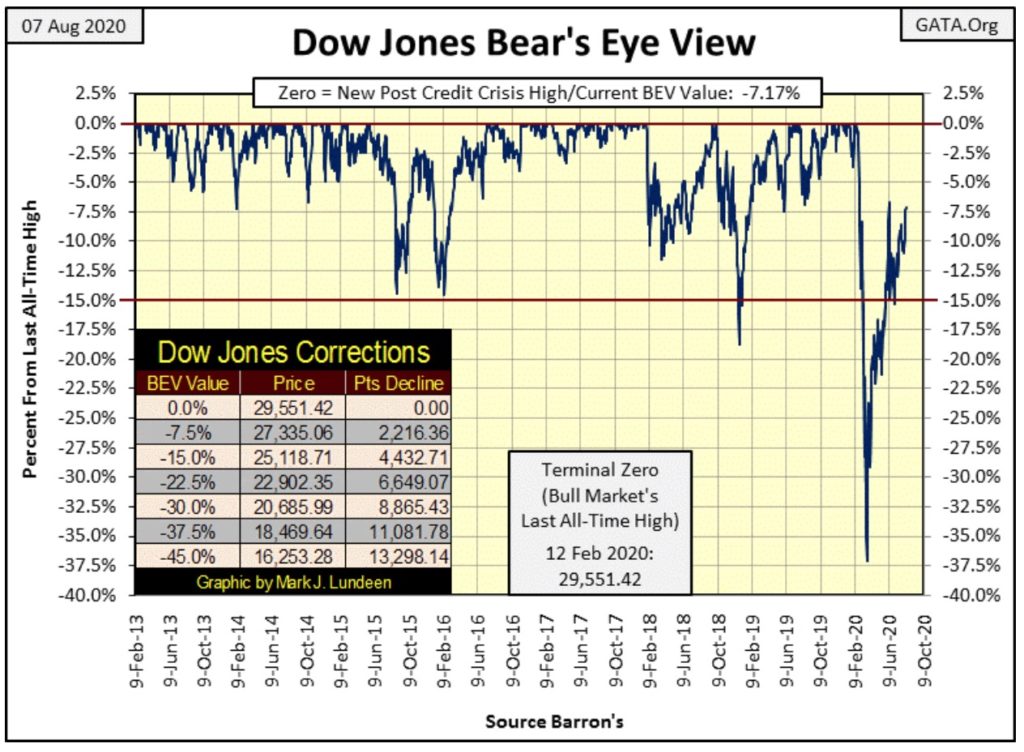
Failing that, should the Dow Jones then break below its -10% BEV line above; that would be a problem. But let’s stay positive and believe the Dow Jones will see at least one more BEV Zero, and possibly many more before the bottom falls out of the humongous inflationary stock market bubble which began in August 1982 when the Dow Jones last traded under 800.
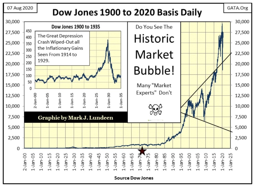
The valuation bubble inflated in the Dow Jones is humongous! Seen below, the 2002 high-tech bear market bottom, a 38% decline, and the 2009 sub-prime mortgage bear market bottom, a 54% decline, the second deepest bear market since 1885, appear as normal bull market corrections in this chart. There is something so wrong with that.
So, what if from here the Dow Jones actually inflates up to 35,000? That would be a 27% advance from today’s close. When one realizes that at the close of this week, the Dow Jones is up 48% from its March 23rd bottom, a 27% advance from here seems like small potatoes when considering the potential risks of share ownership at the top of the monster bubble seen below.
Let’s take a look at the Bear’s Eye View values of the major market indexes I follow in the table below. Some saw BEV Zeros from Monday to Thursday, but none did on Friday. That’s just how things go in a market advance.
But look at the XAU (#19); the gap between it and the NASDAQ Banking index (#20) continues to expand AND on Tuesday and Wednesday the XAU had actually moved above the NYSE Financial Index (#18). What’s with that?
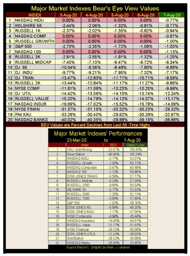
The answer to that question is seen above in the performance table. From their March bottoms, the XAU closed the week at #1 (up 106.45%) in the table above with the NYSE Financial Index at #19 (up 40.09%) and the NASDAQ Banks at the bottom of the list at #22 (up 30.45%).
But to appreciate what is happening, we have to see where these indexes were at their March 23rd market bottom four months ago:
- NYSE Financials: -49.55% BEV
- NASDAQ Banks: -51.45% BEV
- XAU: -69.73% BEV
Falling into a -70% BEV bottom, as the XAU did last March, is a very deep hole to work one out of. A BEV -70% market bottom typically requires years or possibly decades to work out of. So what’s with the XAU advancing 106% in only four months, and now threatening to overtake the NYSE Financial Index? Ditto with silver at #2, which is working itself out of a -75% BEV hole since March.
I can’t think of another major-market sector, which gold mining certainly is and has been for decades, in American market history that has seen a triple digit percentage advance in only four months.
In other words: Ka-Boom!
This should be big news. But the mainstream- financial media will never cover this story properly as they are the controlled-opinion outlet for the financial establishment. They’ll never, NEVER approve of precious-metal investments in retail-investors’ portfolios. The “policy makers” prefer their sheeple penned in high-tech investment ghettos.
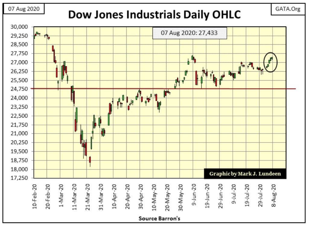
I stopped covering Dow Jones days of extreme volatility, as we haven’t seen any since July 14th. As seen in the Dow Jones daily bar chart below, this week it advanced with tiny-baby steps, as is typical of Dow Jones’ bull markets. As long as it does, all will be well for the bulls.
Uncertainty isn’t a positive factor for the stock market, but can be for gold and silver investments; possibly Ka-Booms as far as the eyes can see.
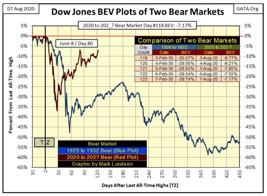
Here’s my comparison between ours and the Great Depression bear markets. At week’s end the Dow Jones is only 7.17% away from making a new all-time high (BEV Zero). After rebounding from a 38% market bottom last March, there’s no excuse for the Dow Jones not to make market history in the weeks to come.
But first there is the little matter of breaking above its -6.70% BEV peak (27,572) of June 8th. If next week we find the Dow Jones couldn’t advance the 140 points required to take out this high from last June, or day 80 in the chart below, well what’s with that?
Next is gold’s BEV chart going back to 1969, from where gold was trading at $43.5 in 1969 to where gold was trading at $2061.44 on Thursday this week. That’s an advance of 4,535% in the past half century.
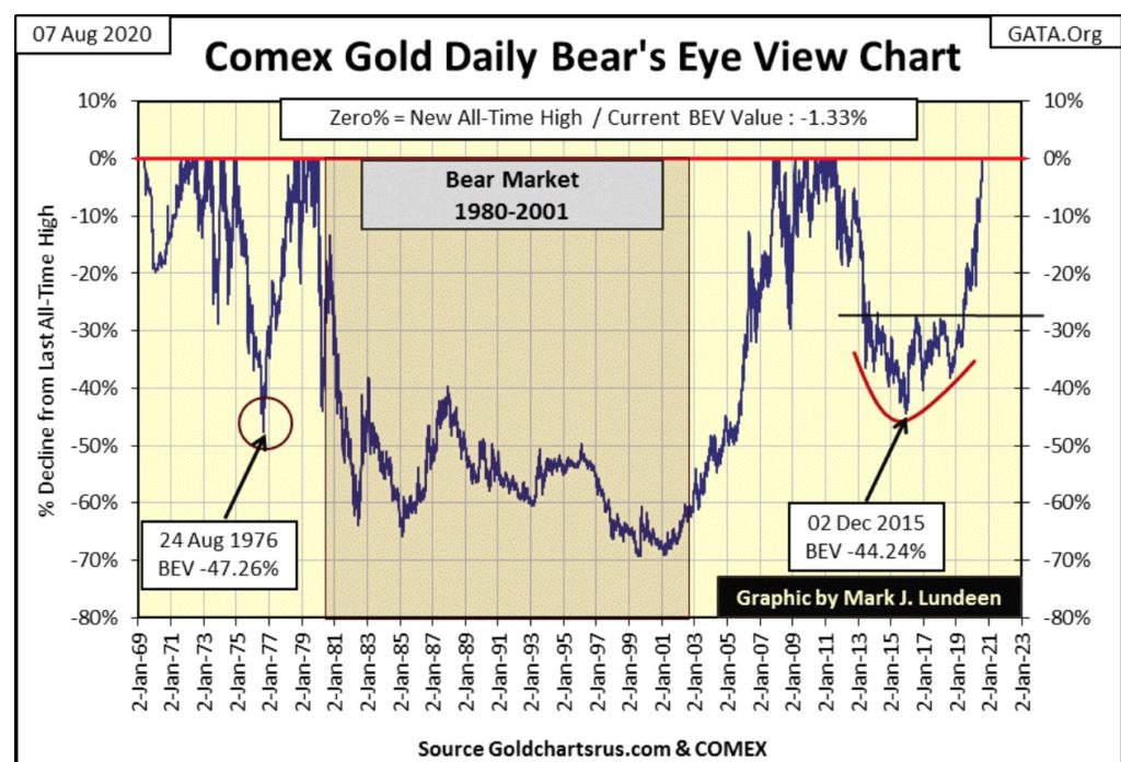
That’s a big valuation advance. But what’s odd about gold’s BEV chart is how few BEV Zeros it took to push gold up this far. Gold sees periods where it’s making market history; twice from 1969 to 1980 we see clusters of BEV Zeros on the 0.00% red line, and so far only one such cluster of BEV Zeros after 2001. And now in the past two weeks gold has made nine new BEV Zeros in the chart above. But historically, these periods are short-term market events followed by deep market corrections that go on and on for years.
Look at the Frequency Distribution table (below) for Gold’s BEV chart above. Adding the values for the 0% rows (BEV Zeros aka new all-time highs) in the two tables, gold has made only 412 BEV Zeros since 1969, and closed within 5% of a BEV Zero for less than 10% of its daily closings (rows in Red Box / the 0% plus the -0.000001% rows) of its 12,968 COMEX trading sessions since January 1969.
That’s not much considering the Dow Jones has made 769 new BEV Zeros, and has been within 5% of a BEV Zero for 50% of its daily closings since 1982.
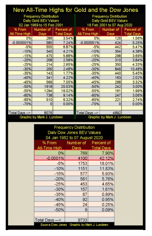
What’s the difference? I think history will ultimately show that for decades advances in the stock market have had the full support of the “policy makers”, while gold, silver and their miners were suppressed to the fullest extent possible by these same people.
And then this week the precious metals went Ka-Boom!
We may be disappointed expecting a repeat performance in the week(s) to come, but we might. If we do, the market is telling us something, most likely the “policy makers” are losing their grip on the financial markets, motivating the smart money to begin transferring their wealth into precious metals assets.
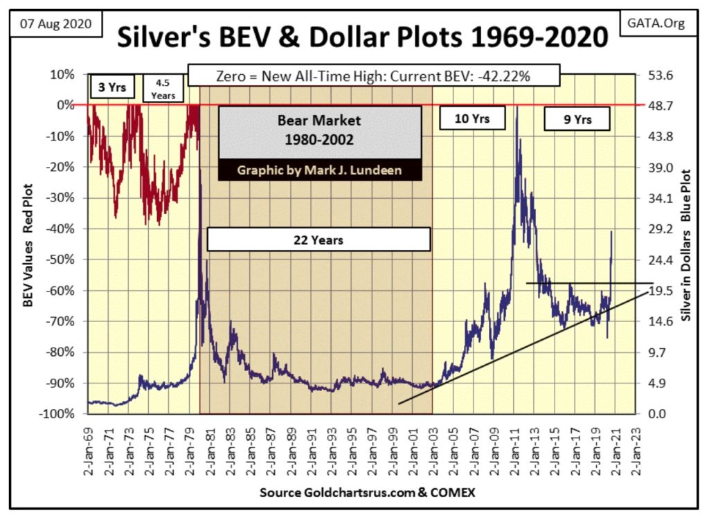
Silver, a market whose last all-time high was in January 1980, is making up for lost time in its combo BEV (left scale) / Dollar (right scale) chart below. Silver last March found itself at a BEV -75% market low. Seeing silver last week almost breaking into the BEV -30% range in just the past four months is stunning.
Or in other words: Ka-Boom!
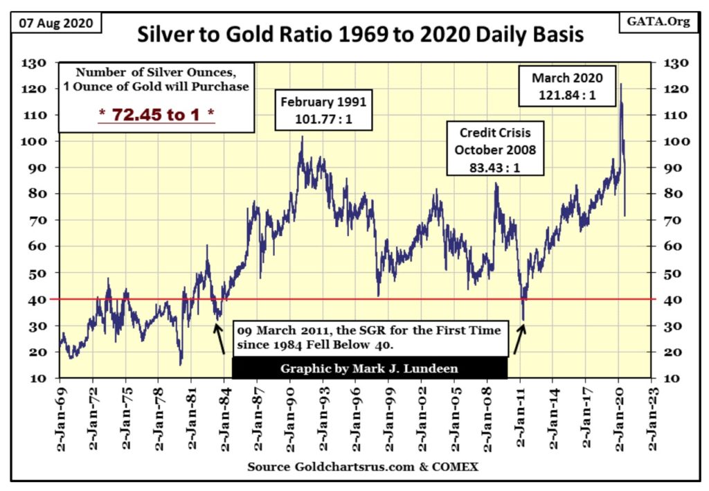
Check out the Silver to Gold Ratio (SGR) below, which everyone else calls the Gold to Silver Ratio for reasons I don’t understand as we’re looking at ounces of silver to one ounce of gold.
Be-that-as-it-may-be, since March the SGR has collapsed from 122 to just 73 at the close of this week. In less than five months an ounce of gold now purchases fifty fewer ounces of silver.
In other words: Ka-Boom!
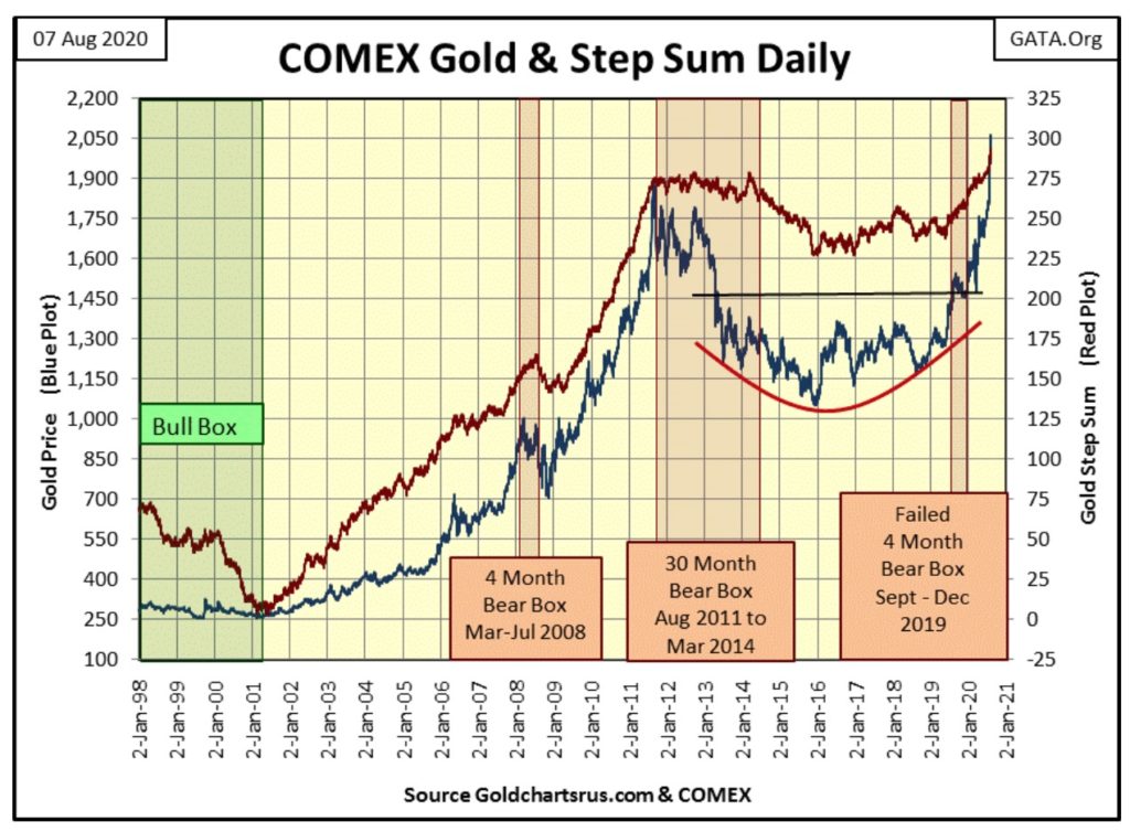
For the past years gold’s step sum chart (below) has been reassuring to us gold bulls; promising better things to come in the foreseeable future. If I were to take one of my charts to have framed and hung in my office – this would be the one as for the first time since August 2011, the price of gold (Blue Plot) and its step sum (Red Plot) are advancing briskly upward into the unknown in a very bullish fashion.
In other words: Ka-Boom!
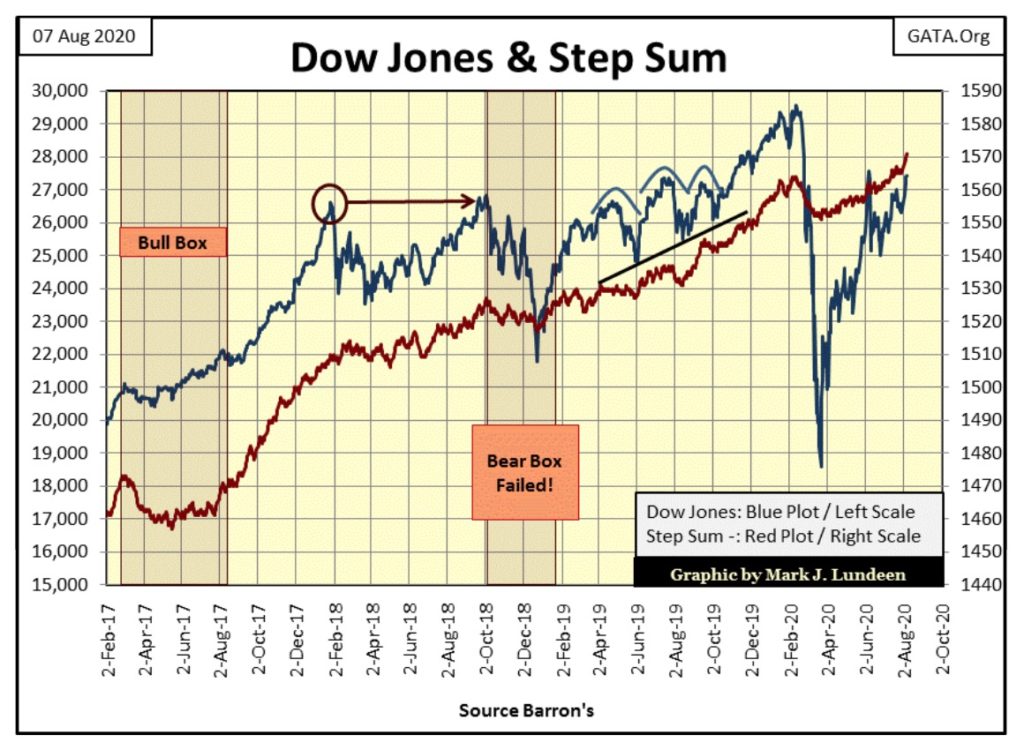
As far as the Dow Jones’ step sum chart below goes, it’s not really negative, but it’s not all that positive either. As I read this chart, it’s up to the “policy makers” and Mr Bear to decide whether the Dow Jones ends 2020 on a bullish or bearish footing.
Personally, I really don’t care one way or the other as my market exposure is in the precious metals markets.
In gold’s step sum table below, we see that in the past eleven days, gold has seen nine new BEV Zeros. We may see gold trade in the $1900s again, but I believe we’ll never again see gold selling below $1900. But I’ve been wrong before, so take that with a grain of salt.
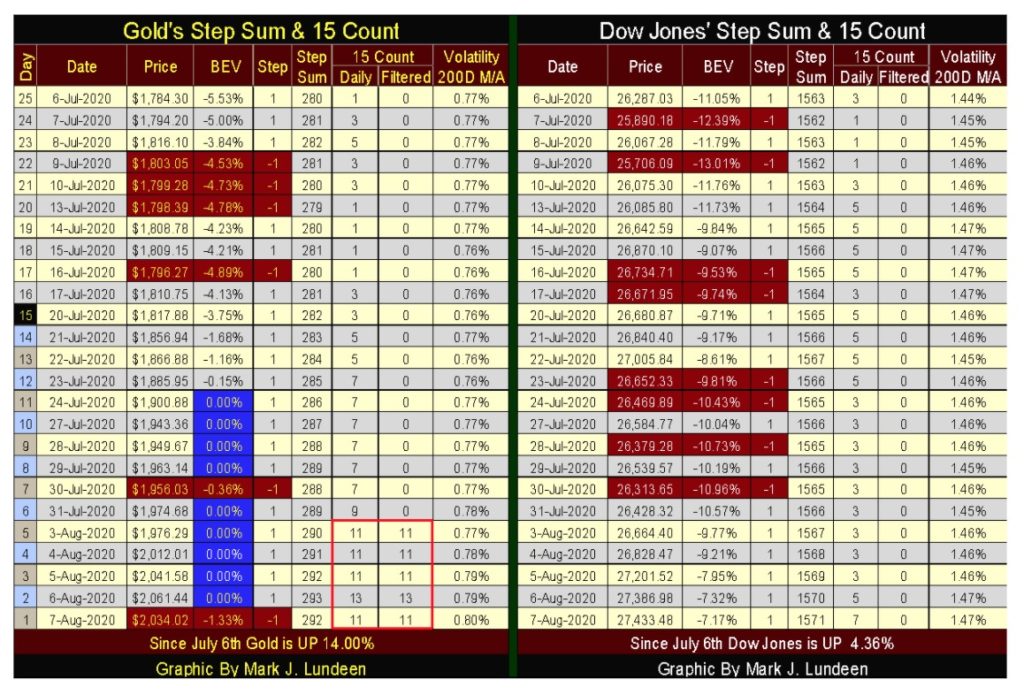
Since July 6th gold step sum has advanced by a net of twelve advancing days, which is huge, and gold’s daily volatility’s 200 Day M/A closed the week above 0.80%. The gold market may go absolutely berserk before its daily volatility increases to 1.00%.
But the one thing I want to draw your attention to is gold’s 15 count. On Thursday the count was 13, or only one daily decline in a fifteen day sample. What does that mean? Let’s look at the table below.
Since 31 December 1970, gold’s 15 count has seen a +13 only once in the 12,470 COMEX trading sessions of the past fifty years; which was last Thursday.
In other words: Ka-Boom!
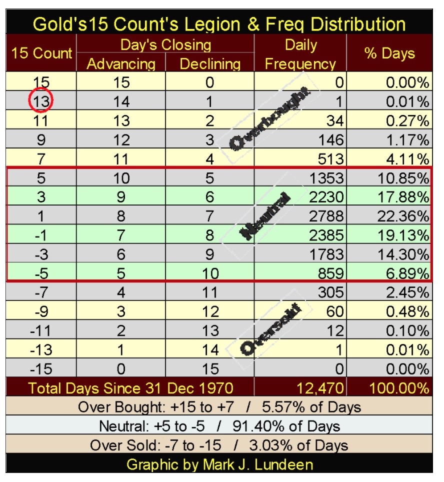
Gold, with nine BEV Zeros in the past two weeks, and a double-digit 15 count, is now wildly overbought and is due for a pullback.
But the big banks, who for decades have manipulated the price of gold down with COMEX gold contracts are not only massively short gold, but have in the past month seen their capital accounts at the COMEX gold future market bleed. What they need to do is to lower their short-side exposure in the gold market to stop the pain. But doing so would require them to BUY gold at the COMEX, which they are loathed to do as it could send the price of gold (and silver) to levels they fear.
In other words: Ka-Boom!
I haven’t a clue what gold, silver and the XAU will do in the weeks to come. Technically they are all overbought and due for a pullback, which at this point would be normal bull market action. But the big banks now find themselves in a pickle because of their corrupt activities in the gold futures market. At some point in the future these banks MUST close out their massive short-side positions and BUY at a market top.
Bill Murphy of GATA has talked about a pending Commercial Signal Failure in the gold market since the late 1990s. Bill, it has taken over twenty years, but it looks like you’re finally going to see your CSF in 2020, and I hope the bastards begin spitting up blood for every short side contract they are forced to cover. I know this isn’t very Christian of me, but Wall Street’s trading desks are staffed by vile people who have earned the contempt of the public.
I haven’t taken a comparative look at gold and silver’s step sums for years, so let’s do it now.
First, what is a step sum? A step sum is a single item Advance – Decline Line of a market series such as the Dow Jones or for gold or silver. Each daily advance is a +1 step, a daily decline is a -1 step. The step sum itself is the sum total of all the daily steps over time. It’s much like an A-D Line for the NYSE’s daily breadth, except with the NYSE’s A-D Line, one is looking at daily advancing and declining shares traded on the NYSE.
For your information, the NYSE sees over 3,000 issues trading daily. However, with a step sum we’re only looking at the daily advancing and declining steps for a single market series; like the daily ups and downs for gold or silver below.
Since 02 January 1969, the COMEX has seen 12,968 trading sessions. Silver’s step sum has advanced 490 steps (a net of 490 advancing days) since 02 January 1969, while gold’s step sum has advanced by 293 net daily advances in the past fifty years. That’s not much. But it’s just a fact that during bull markets, any market series will see plenty of down days, as during a bear market a market series will see plenty of advancing days.
Keep in mind the purpose of investing, or speculating, is to come out with more money than one came in with, so always keep your eyes on your profits and losses, not an investment’s step sum. One axiom of step sum analysis is the price trend is usually (but not always) a superior predictor of future prices than is the trend of the step sum itself.
Silver’s step sum may have advanced by 490 in the past fifty years, but since January 1969, its valuation has increased by a factor of only 15.56 at the end of this week, while gold has increased its valuation by a factor of 47.39 with an increase in its step sum of only 293.
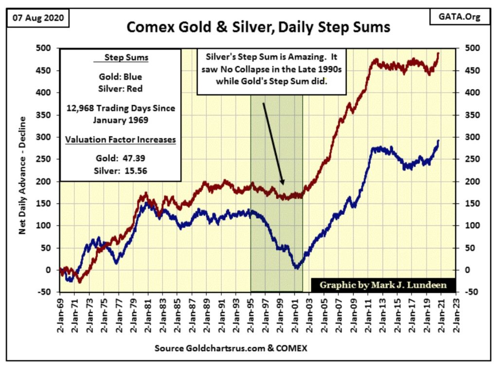
So what is a step sum good for? It’s a gauge of market sentiment by those who matter the most in any market; of those who are in the market each day buying and selling.
In an advancing market (a bull market), after a bad day bulls return the following day to take advantage of discounted prices, because market declines in bull markets are seen as BUYING OPPORTUNITIES. So, in an advancing market we expect to see the valuation and step sum plots advancing upward together, as in a declining market these trends should decline together.
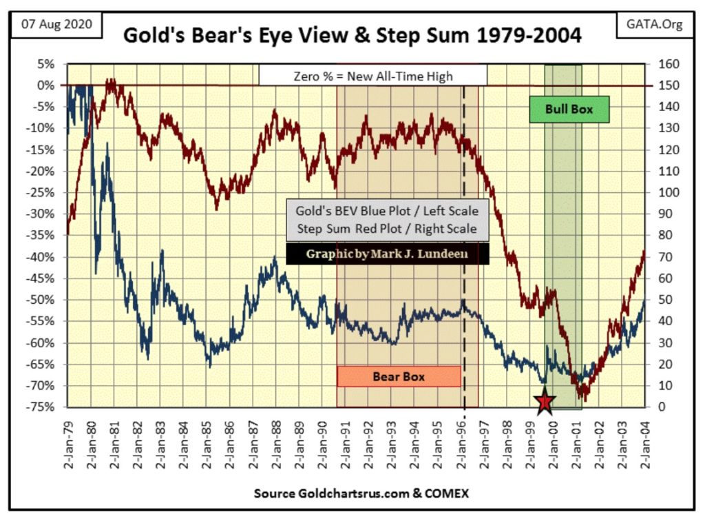
But sometimes a market sees its valuation and step sum plots decouple, as was the case for gold from 1991 to 1996 in the chart below.
From the 1980 bull market top (start of bear market) to 1991, gold’s valuation (Blue Plot) and step sum (Red) plots were coupled together. But gold bulls are emotional creatures. Reading the tea leaves in this chart as best I can, the bulls in 1991 decided the BEV -65% bottom of February 1985 was the bottom. Heck, the bear market was already eleven years old; how much worse could it get? In fact the worse of gold’s decline had passed. But gold wasn’t going to do what the bulls wanted it to for another ten years – advance towards a new all-time high.

So, within the bear box above, gold’s valuation and step sum plots decoupled for five years, and not just any five years, but the first five years of the monster NASDAQ High-Tech Bull market. However the gold bulls couldn’t let it go.
Within the bear box above, during these five years the bulls saw every daily decline as a buying opportunity in a bear market. As expected, gold did little for them as they saw everyone else making a fortune with High-Tech. It had to hurt. But for these five years the gold bulls refused to sell and move into the NASDAQ.
In early 1996 gold’s step sum began collapsing, marking a shift in market sentiment to where declining days were no longer seen by bulls as buying opportunities, but by former gold bulls seeing advancing days as “SELLING OPPORTUNITIES”. With the collapse in the step sum began what is called capitulation; the total and unconditional surrender by the bulls to Mr Bear.
The Red Star marks Brown’s Bottom, the absolute bottom of the 1980 to 1999 gold bear market. On 19 July 1999 the price of gold collapsed to $253.70, a 69.27% market decline from gold’s January 1980 top. Gold and its step sum saw a rebound in the next few months, but in January 2000 gold’s step sum once again began collapsing. This formed a bull box, as the market continued seeing daily advances as selling opportunities as the price of gold itself refused to break below that of Brown’s Bottom for the best part of the next two years.
And so it went until late May 2001, when gold’s step sum bottomed, and then recoupled with the gold valuation plot above, which turned up in February of 2001, signaling a very profitable entry point of our current bull market in gold and silver.
This same step sum chart pattern of a prolonged bear box followed by a collapse in market sentiment, as seen in a collapsing step sum happened again following gold’s 2011 market top, as seen below. A thirty month bear box, where the bulls saw each down day as a buying opportunity in a declining market, followed by a collapse in the step sum, marking the change in market sentiment, from seeing declining days as buying opportunities to seeing advancing days as selling opportunities.
At gold’s (and silver’s) December 2015 bottom, market sentiment was BLEAK! Like the bottom of the 1980 to 2001 gold-bear market, step sum analysis identified what I call a hard bottom, the point of total capitulation where the bulls surrendered unconditionally. A hard bottom is absolutely the best time to buy in any market.
But buying into a market that has just undergone a prolonged bear box and step-sum collapse, as seen above and below, is a scary thing to do. It’s a market that has stunned and traumatized bulls in it. So don’t expect someone to hold your hand should you decide to buy what the world now believes to be toxic waste.
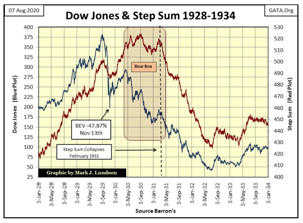
The Great Depression Crash for the Dow Jones is another excellent example for a prolonged bear box followed by a collapsing step sum. I’ll let my readers do their own analysis of the chart below. I’ll just say these prolonged bear boxes and step sum collapse formations seem to appear in markets where the bulls become emotionally attached to their losing positions. This is exactly what happened on Wall Street following the Roaring 1920s bull market. The same for the gold market in the 1990s and again during the 2010s.
That all I have to say for this week. But as I finish these commentaries on Saturday, I’m dying to know what the Dow Jones and the old monetary metals are going to do next week:
- Can the Dow Jones take out its June -6.7% BEV peak? It’s only a 140 point move!
- Will gold, silver and their miners continue advancing in a historic, Ka-Booming Fashion for another week?
I can’t say much about these delicate points in the market right now, but next week I will tell you all about them.
—
(Featured image by Nick Chong via Unsplash)
DISCLAIMER: This article was written by a third party contributor and does not reflect the opinion of Born2Invest, its management, staff or its associates. Please review our disclaimer for more information.
This article may include forward-looking statements. These forward-looking statements generally are identified by the words “believe,” “project,” “estimate,” “become,” “plan,” “will,” and similar expressions. These forward-looking statements involve known and unknown risks as well as uncertainties, including those discussed in the following cautionary statements and elsewhere in this article and on this site. Although the Company may believe that its expectations are based on reasonable assumptions, the actual results that the Company may achieve may differ materially from any forward-looking statements, which reflect the opinions of the management of the Company only as of the date hereof. Additionally, please make sure to read these important disclosures.

-

 Crowdfunding3 days ago
Italy Extends SME Guarantee Fund to Crowdfunding with New 2026 Framework
-
 Markets2 weeks ago
Markets Rally Amid Uncertainty and a Widening K-Shaped Economy
-

 Crypto9 hours ago
Bitcoin Leads Modest Crypto Rebound Amid Mixed Signals
-

 Crypto1 week ago
Bitcoin Strong as Market Sentiment Turns Bullish Amid Industry Developments


