Business
Primer on the Bear’s Eye View
I’ll let my readers study the above, but what catches my eyes is how Dow Jones daily volatility’s 200D M/A has increased to 0.73%. Increases in daily volatility in the stock market is always a bear market phenomenon. It’s as I always say: you won’t need me telling you the stock market is selling off when this volatility metric reaches 1.00%. Maybe this time, that will prove true when it reaches 0.90%.

I haven’t covered the Bear’s Eye View (BEV) charting technique for a while. As I’m sure I have new readers, this is a good time for a little technical talk on how Mr Bear looks at the markets. And the various market insights the BEV provides investors before I go on into my weekly comments on the markets.
And how does Mr Bear look at a market? With each daily close at a new all-time high worth only a big-fat zero (0.00%), as that is what he thinks of each of them; BIG FAT ZEROS, and never more.
All other daily closes, not at a new all-time high, register as percentage claw backs from their previous all-time high, with a BEV of -100% a total wipe out in valuation. So, the Bear’s Eye View (BEV) of a market displays that market in percentage terms spanning only 100 possible percentage points, bound between;
- 0.00% = New All-Time High,
- -100% = Total Wipeout in Valuation,
And don’t send me any more questions like “what if someone’s position was bought on margin?” Well then, Mr Bear would be happy to deliver to their capital account a BEV of more than -100% on that position; meaning an investor lost more than their original investment. On a margin account, debt was used to leverage both the gains and losses. Be-that-as-it-may, the valuation for the stock being leveraged in a margin account can only go down to Zero, which is a Bear’s Eye View of -100%.
Understanding market data in BEV terms, whether from the 1890s or 2020s is a sound understanding of the market. A new all-time high (BEV Zero), is a reason to bring joy to the hearts of all regardless of when it occurred. For investors from the 19th or 21st century, there is no difference between losing 10% or 30% of one’s invested funds, regardless of the quantity of dollars it took to accomplish that loss.
Let’s take a look at the Dow Jones plotted in dollars below from January 1900 to April 2022 (below). There’s a Red Star at August 1971, fixing the date when the Federal Government took the Dollar off the Bretton Woods’ $35 gold peg. As expected, freed from the discipline of a metallic dollar, the politicians, bankers and academics, the wise guys from the Ivy league who now devised “monetary policy” began a monetary policy of monetary inflation, the effects of which can be seen on the Dow Jones in this chart.
But the dollars seen below valuing the Dow Jones for these 122 years are not standardized dollars. A dollar in 1900 had immense purchasing power. When Henry Ford increased the daily wage of his factory workers to $5 a day, it created shockwaves in American business. But those dollars from 1914 were not the same dollars wage earners labor for today, or the Dow Jones now trades for in 2022, thanks to those I call the “policy makers.” Those who do what they damn well please, in total disregard to the laws of both God and man.
In the chart below plotting the Dow Jones in dollars, where is the Roaring 1920s’ Bull Market, or Great Depression Crash of the 1930s? Oh, they’re there. It’s only that monetary inflation of the past century has made them insignificant in dollar terms, if not in cultural and economic understanding.
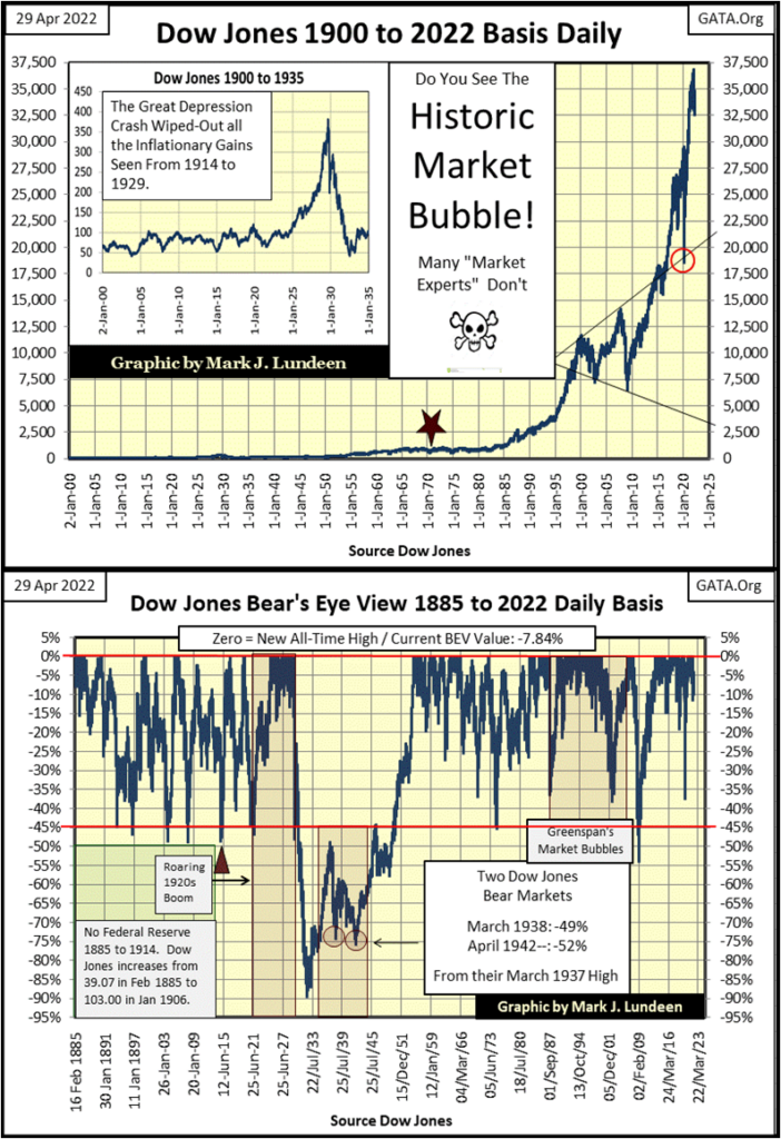
Above, I’ve plotted in BEV terms, the same Dow Jones’ data seen in the top chart, but going back to 1885. In BEV terms, dollar values are squeezed into a range of only 100 possible percentage valuations. Each new all-time high since February 1885 is seen as a 0.00% on the upper red line, and never above it. Those daily closings not a new all-time high, are seen as a percentage claw back from those new BEV Zeros (all-time highs).
The Roaring 1920s is easily identified by the largest cluster of BEV Zeros on the red line since 1885. The Great Depression Crash created a crater of valuation deflation in the middle of the chart that has since never been repeated.
Looking at the past 137 years of the Dow Jones’s history above (1885 to 2022), as Mr Bear does, something unique stands out at the BEV -45% line; any time the Dow Jones has deflated by 45%, since 1885 it has been a Strong Buy Signal for investors. The only exception to that 137-year rule of thumb was the Great Depression Crash.
During the Depressing 1930s, had someone jumped back in the market when the Dow Jones was down 50% in October 1930, and rode the market down to its July 1932’s 89% bottom, they would have lost 78% of their invested funds.
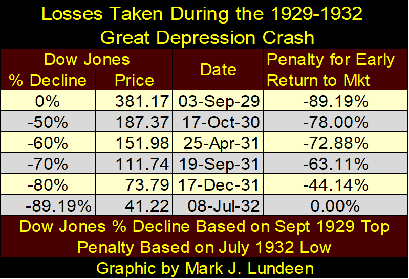
Big-Bear Mathematics, as seen above, can produce grizzly returns, sad but true! But, should we living in 2022 fear a repeat of something that happened in the Depressing 1930s?
The Federal Reserve was created in 1913. The Roaring 1920s didn’t roar just because of bootlegged liquor. Monetary inflation flowing from America’s then new central bank; the Federal Reserve, was a huge factor in financing the good times of the 1920s, and its booming stock market (see chart insert of dollar Dow Jones above). If you believe every inflationary-market boom must be followed by a deflationary bust, then the Depressing 1930s was an inevitable consequence of the booming 1920s. Do I believe that? Absolutely!
I believe a similar situation, one of grossly inflated market valuations seen in the 1920s, is again our market reality. If so, is another decade like the Depressing 1930s avoidable? Can’t the “policy makers” “stabilize” market valuations, and government regulators “regulate” the markets’ inner workings to prevent such a catastrophe from happening again?
As for the market regulators; the SEC and CFTC have proven themselves worthless in protecting the public from people like Bernard Madoff, or precious metals price manipulation by the big Wall Street banks.
As for market “stabilization”, such efforts are only another round of “injecting liquidity” (monetary inflation) into the market to artificially increase demand in a deflating market. The “policy makers”, using monetary inflation, are only buying financial assets, at prices no one else is willing to pay, to reinflate market valuations.
The inevitable bust that follows the boom, any boom is not eliminated, only deferred. Made worse for the additional monetary inflation used in manipulating the market, or the false sense of trust the public has from trading in a “regulated market place.”
Let’s delve deeper into the Dow Jones’ BEV data in the three frequency distribution tables, (aka: freq tables) below;
- February 1885 to April 2022,
- February 1885 to August 1982,
- August 1982 to April 2022.
First a little info on these freq tables, containing daily Dow Jones’ BEV values of the past 137 years. BEVs of 0.00% (new all-time highs), and only 0.00% have been isolated into the 0% row by including the -0.0001% row. Without this odd-looking row, the 0% row would contain all daily BEV values from 0.00% down to -4.99%. With its inclusion, the -0.0001% row contains all daily BEV values just short of being an all-time high, down to -4.99% from one.
I call all daily BEV values in the -0.0001% row as closes in * Scoring Position *. In all bull-market advance, many new BEVs of 0.00% are seen. But actually, most daily closes during these bull market advances are in the -0.0001% row; less than 0.00%, but not more than 5% from making a new all-time high. Hence, BEV values ranging from -0.01% down to -4.99% are in scoring position, in position for making additional new all-time high during a bull market advance.
Note the red box surrounding the 0% and -0.0001% rows, they contain all the daily closings at, or within 5% of a new all-time high. Taking the sum of these rows tells us much about the impact of monetary inflation in the markets over the decades.
The freq table on the far left contains every Dow Jones daily closing since February 1885, or 37,536 NYSE trading sessions. Of these, the Dow Jones made 1,514 new all-time highs, along with 8,302 daily closings in scoring position. From this, I’m going to infer that during these 137 years, the Dow Jones was advancing in bull markets for 26.13% of its daily closings.
In the middle freq table, containing every daily closing from 1885 to 12 August 1982, there are 27,523 NYSE trading sessions. Why 12 August 1982? It was on 12 August 1982 when the Dow Jones closed at 776.92, a bottom from where the Dow Jones soon closed above 1000 in the months to come, never to close below 1000 again. So, I believe our current bull market actually began on 12 August 1982, a forty-year bull market. Though I know there are those who would disagree.
In this freq table (middle), spanning from 16 February 1885 to 12 August 1982, the Dow Jones made 690 new all-time highs, along with 3920 daily closings in scoring position. So, the Dow Jones was advancing in bull markets for 16.75% of these daily closings.
That is a significant reduction from the data seen in the first table. Why the difference? Because unlike the freq table at the left, the middle table does not contain the data, or the “injected liquidity” from the FOMC contained in the right freq table.
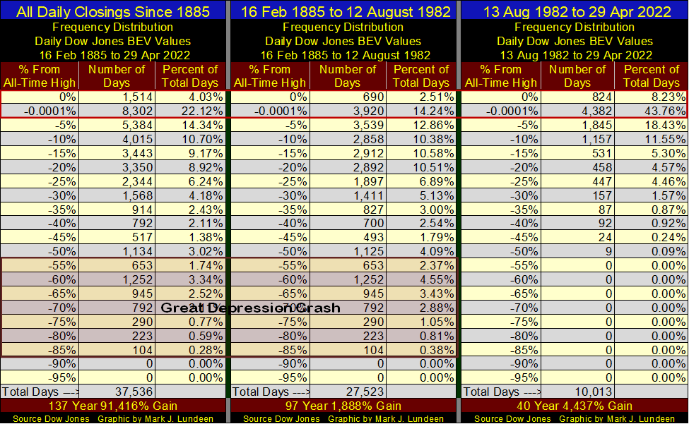
In the right freq table, containing the BEV data for the past forty-years, the Dow Jones daily closed at a new all-time high, or in scoring position of one, for 51.99% of the 10,013 daily closing. This is an astounding statistic, but what does it mean?
Here’s the freq tables leading up to the Roaring 1920s bull market (1885 to 30 December 1924), and the 1920s bull market itself. Before the Federal Reserve began “injecting liquidity” into the financial system, the freq table on the left, the Dow Jones closed at a new all-time high, or was in scoring position for making one for 12.28% of the 11,851 daily closes used in this sample. That is actually very close to what we saw in the middle freq table above.
During the 1920s Roaring Bull Market itself, the Dow Jones was at a new all-time high, or within scoring position for 75.52% of the 1,397 daily closes used in this sample.
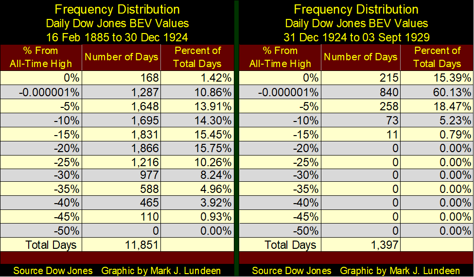
That was insane, much worse than our post August 1982 table’s 51.99%. But the Roaring 1920s Bull Market boom lasted for less than five years before the Depressing 1930s bust.
Our boom has been going on since August 1982 – forty years! Children were born in August 1982, raised and went to school, entered the economy and became skilled mechanics and CEOs of corporations during this booming bull market in monetary inflation. Most people remain clueless of the pending inflationary mayhem the idiot savants from the FOMC have thrust upon the world, as after forty years, it all appears so normal. But it’s not, and it can’t continue forever.
When this bubble goes bust, what does that mean? What will be the economic and human consequences for such a prolonged period of monetary inflation? I don’t know, and I doubt anyone else does either. Particularly the economists and “market experts” offered to the public on main-stream financial media outlets.
Yea, I’m a big bear. And now you can see one, and a big one of my reasons why.
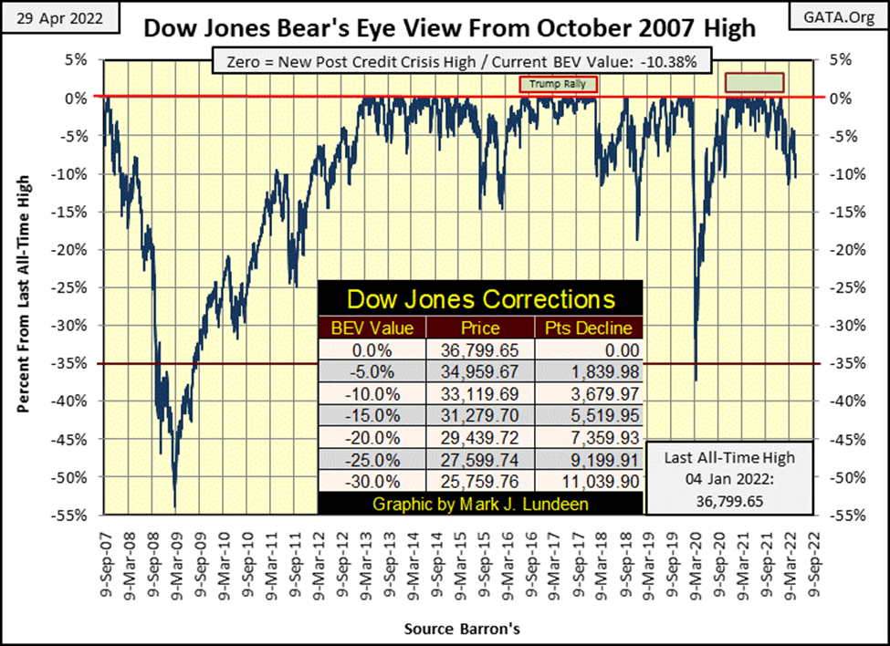
But the market isn’t crashing just yet, so let’s move on to my weekly market comments, starting with a BEV chart for the Dow Jones. The Dow Jones closed this week in double-digit BEV values; -10.38%. Since the first of the year, the Dow Jones has been there before, closing with a BEV of -11.32% on March 8th, from which it recovered above the BEV -5% line in the chart below.
If in the next few weeks, or before next Friday, should the Dow Jones take out that BEV of -11.32% from March 8th, that would not be good. Though I doubt it would trigger a selling panic in the stock market. But, it’s appearing that the last all-time high of January 4th of this year, will become the “Terminal Zero” (TZ), the last BEV Zero of the post March 2020 market advance.
I like using the Bear’s Eye View, but other charts are useful too. As is this chart for the Dow Jones in daily bars below. I placed a black rectangle over last week’s trading. For the bulls on Wall Street, this is a very weak chart.
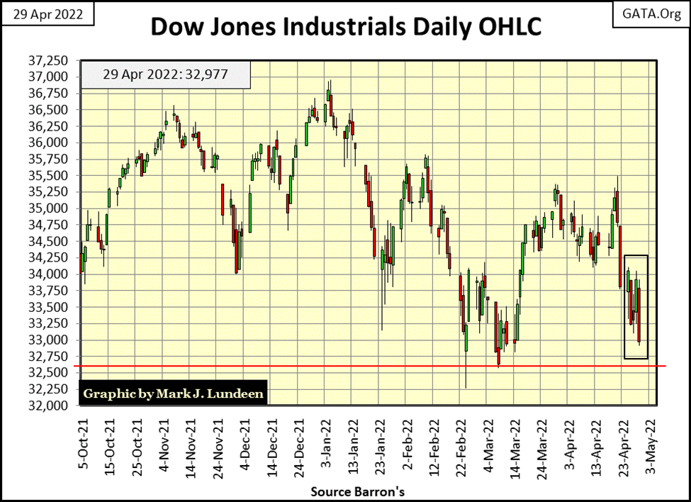
I’m looking at the red line at 32,600, wondering just how much support will it provide on this market decline. This is exactly the type of market where the Dow Jones could hit an air pocket, and just collapse below the support level we see above.
Another benefit of using the Bear’s Eye View data for analyzing the market can be seen in the table below. In dollar terms, the Dow Jones closed this week at 32,977, while the gold miners in the XAU closed the week at 142.61. How does one go about making a comparison between two such market indexes whose valuations are separated by over 30,000 dollars?
I’m sure there are other ways of doing so. But I like using these indexes’ BEV values; BEV Zeros and percentage claw-backs from them to make my comparisons, as seen in the table below listing the major stock indexes I follow.
Wednesday of last week, the Dow Jones Utilities (#1) closed at a BEV Zero. Now, seven NYSE trading sessions later, it has deflated 6.70% on Friday’s close. Also, as recently as last November, except for the XAU, and the Dow Jones Utilities, all these indexes were at a new all-time high or in scoring position; with BEVs from 0.00% to no lower than -4.99%, and most with BEVs of less than -2.5%.
Now look at them. They’re all sinking. Many having sunk into double-digit BEV values! In the past six months, being bullish on the stock market has become an expensive hobby.
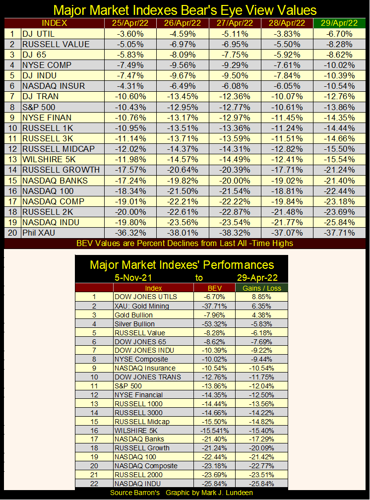
In the table above, we see the declines from early November, and it’s not pretty. There is a technical term used to describe what is seen in the tables above; “the market is upchucking dollars.”
What’s needed now is for the idiots at the FOMC to “inject” a few tens-of-billions of dollars into the financial system. However, the idiots have promised to begin a program of quantitative tightening (QT) beginning in May (next week), draining fifty-billion dollars a month, month after month from the financial system. That plus aggressively raise their Fed Funds Rate in increments of fifty basis points several times this year.
The last time the idiots implemented a QT (January 2018 to October 2019), the FOMC also implemented a crash in the stock and corporate bond market. See below, where in early 2020, FOMC emergency vehicles rushed to lower Manhattan to “inject” massive levels of “liquidity” into Wall Street. A couple of weeks in April 2020 they “injected over $300 billion in each.
That made Wall Street’s credit junkies happy, as the market stopped upchucking dollars. To keep these junkies happy, the idiots administered weekly maintenance “injections”, as seen under the red curve in the chart below.
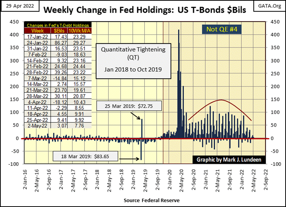
But since this January, these maintenance “injections” have been greatly curtailed. The results of this decrease in “liquidity” can be seen in the Major Market Index’s BEV Values Table above; Wall Street is once again upchucking dollars.
It’s important to note the idiots at the FOMC haven’t even begun draining “liquidity” from the financial system yet. What happens when they do, fifty billion dollars a month, month after month? This summer, or maybe in the weeks to come, we may see another Panic in Needle Park.
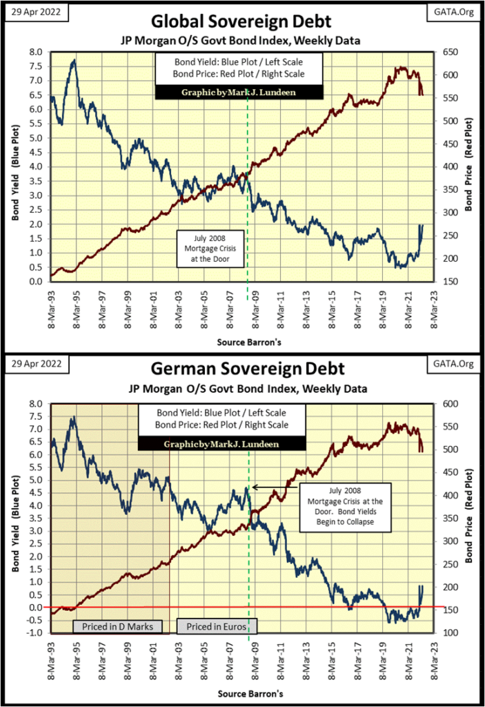
Deflation in market valuations isn’t a problem seen only in the United States. Valuations (Red Plots) in the global bond market are also deflating, as seen in the two charts below.
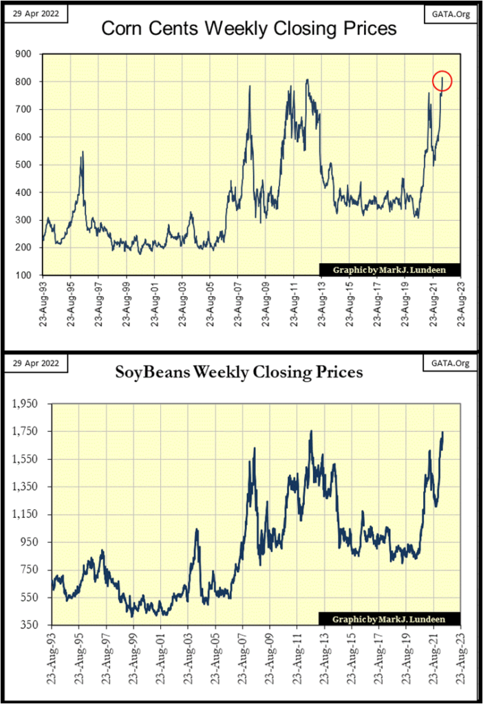
One market sector not at risk of deflation is commodities. “Market Experts” frequently use the terms inflation and deflation as universal market events. If this is deflating, then that can’t inflate. But of course it can.
The fact is, since August 1982, or thereabouts, the global economy has endured massive levels of monetary inflation. But the “policy makers” were very successful in directing this inflation into areas they wanted it to go into; financial assets and real estate – NOT commodities.
Forty years later, this inflation now circulating within Wall Street’s stock and debt markets, is at risk of breaking out and flooding into commodities. In fact, this is already happening, as seen in the price of corn and soybeans below.
I expect the next big thing in investing for retail investors, will be avoiding deflation in financial assets, and taking full advantage of inflation in commodities in years to come.
There is no better way of doing that, than with gold and silver bullion, and investing in the mining companies that produce them. One could also use the futures markets, for grain, energy and the metals. There’ll be lots of money to be made there too. But personally, I don’t like commodity contracts, as to do so properly, one has to make a real commitment to be successful.
I just want to keep things simple for myself, and stick to precious metal bullion and the mining shares.
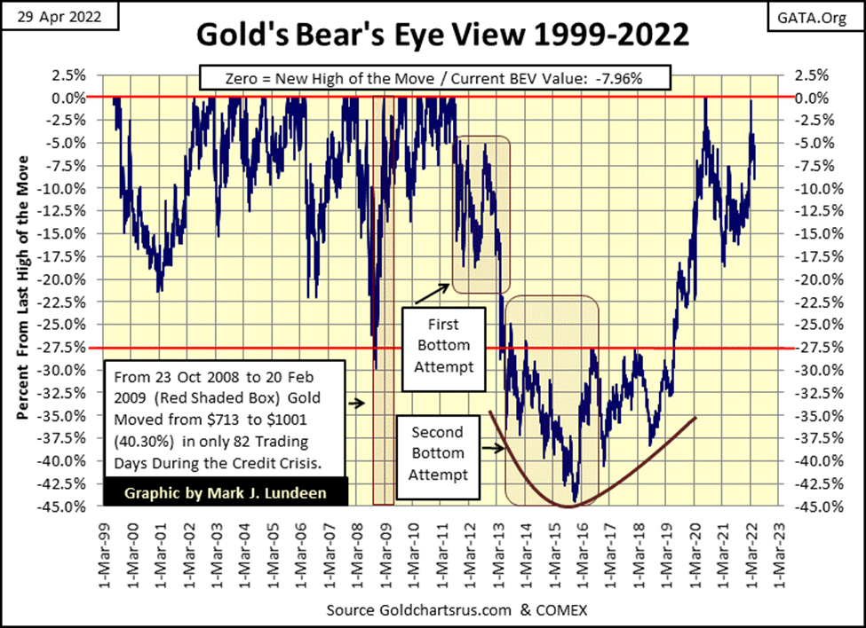
Here is gold’s BEV chart. Gold is coming off the bottom of a 45% bear market bottom, a bear market that began in August 2011. Since then, gold has seen only nine BEV Zeros in July / August 2020, before it began a 17.5% correction seen below. Gold can hardly be considered to be overvalued, and is nicely positioned for the coming flows of refugee dollars fleeing deflation that will soon dominate the stock and bond markets.
From a perspective of over or undervaluation; silver is even cheaper than gold. Silver’s last all-time high was in January 1980. It came close to taking that BEV Zero out in April 2011, but came a few pennies short of doing so.
Look at silver’s bear market lows of the 1990s; silver’s valuation deflated by over 90%. Then following its high of April 2011, silver deflated again by 70%. This is why most bulls on the precious metals warn investors of the problems with volatility in the silver market – and they are right to do so, and steer their followers into owning gold. As seen above with gold’s BEV chart, gold isn’t going to take a dollar and turn it into a dime or thirty cents six months later.
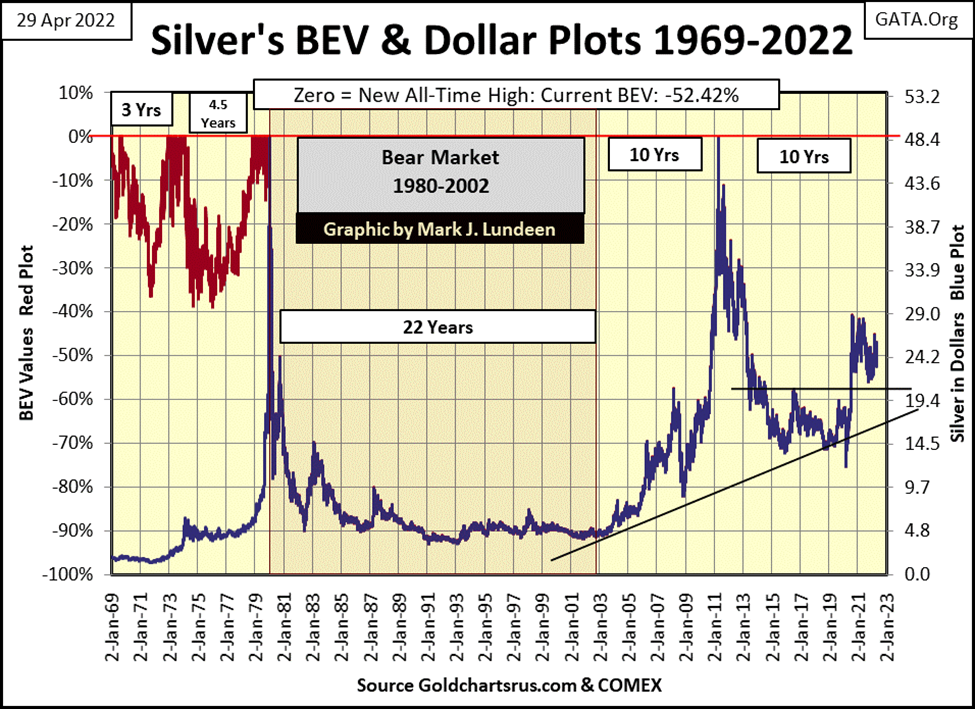
That said, and the mandatory warning on the volatility problem in the silver market given, I still like silver more than gold. Why? Silver is incredibly cheap in the last week of April 2022. It’s cheap in its BEV chart above, and its cheap in terms of gold in the Silver to Gold Ratio (SGR) chart below.
Get this! As of this week’s close, for the price of a single ounce of gold, an investor can purchase 83.46 ounces of silver. That’s over five pounds of silver for the price of a single ounce of gold.
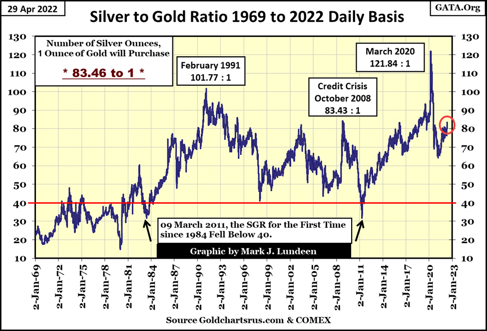
The precious metals market has been here before; a SGR of plus 80. Purchasing silver with these elevated SGRs are usually safe purchases from the perspective of profit or loss. But the big payoff we silver bulls have been patiently waiting for has yet to come.
But I have faith it will, that one day the SGR is destined to decline far below its 40 line, and continue going down, making silver purchased today, wildly more profitable that gold on the ride down the SGR.
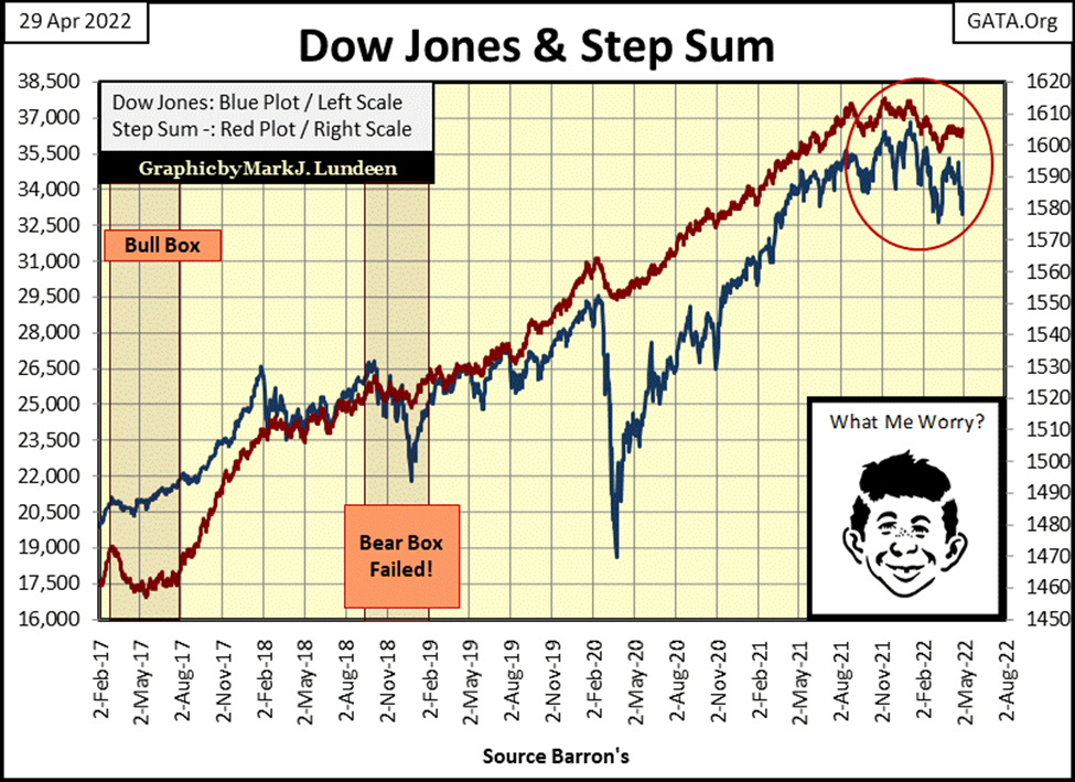
Looking at the Dow Jones step sum chart below, both market sentiment (Red Step-Sum Plot), and market reality (Blue Dow-Jones Plot) have topped, and are now breaking down, after peaking in early November. This is yet another bearish development in the stock market.
Then seeing NYSE Margin Debt (below) beginning to decline following its peak last December isn’t a good development for the bulls either.
Both the High-Tech, and the Sub-Prime Mortgage bear markets were proceeded by a similar peaking in NYSE Margin Debt. So too did the March 2020 Flash Crash (Red Circle) followed a peaking in the NYSE Margin Debt.
In the chart below, we see four peaks in NYSE Margin Debt, with the first three followed by a major market decline in the stock market. Will the last, our peak in NYSE Margin Debt, prove any different?
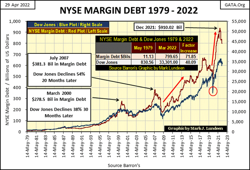
One alarming feature in the chart above is how rapidly NYSE Margin Debt has risen (Right Red Arrow) following the bottom of the March 2020 flash crash (Red Circle). In a selling panic, we might see this NYSE Margin Debt decline just as, or faster than it advanced from its April 2020 bottom. That would be bad, as such declines in margin debt are the result from forced selling by brokerages of their margined accounts, because these brokerages need to get out of these positions at any price.
Last but not least, here is my step sum tables for gold and the Dow Jones.
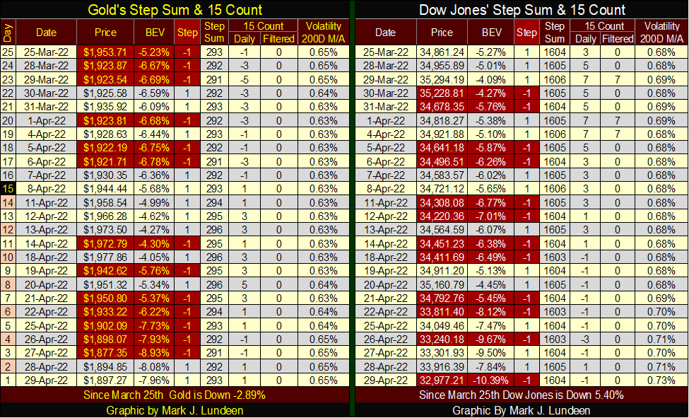
I’ll let my readers study the above, but what catches my eyes is how Dow Jones daily volatility’s 200D M/A has increased to 0.73%. Increases in daily volatility in the stock market is * ALWAYS * a bear market phenomenon. It’s as I always say: you won’t need me telling you the stock market is selling off when this volatility metric reaches 1.00%. Maybe this time, that will prove true when it reaches 0.90%.
__
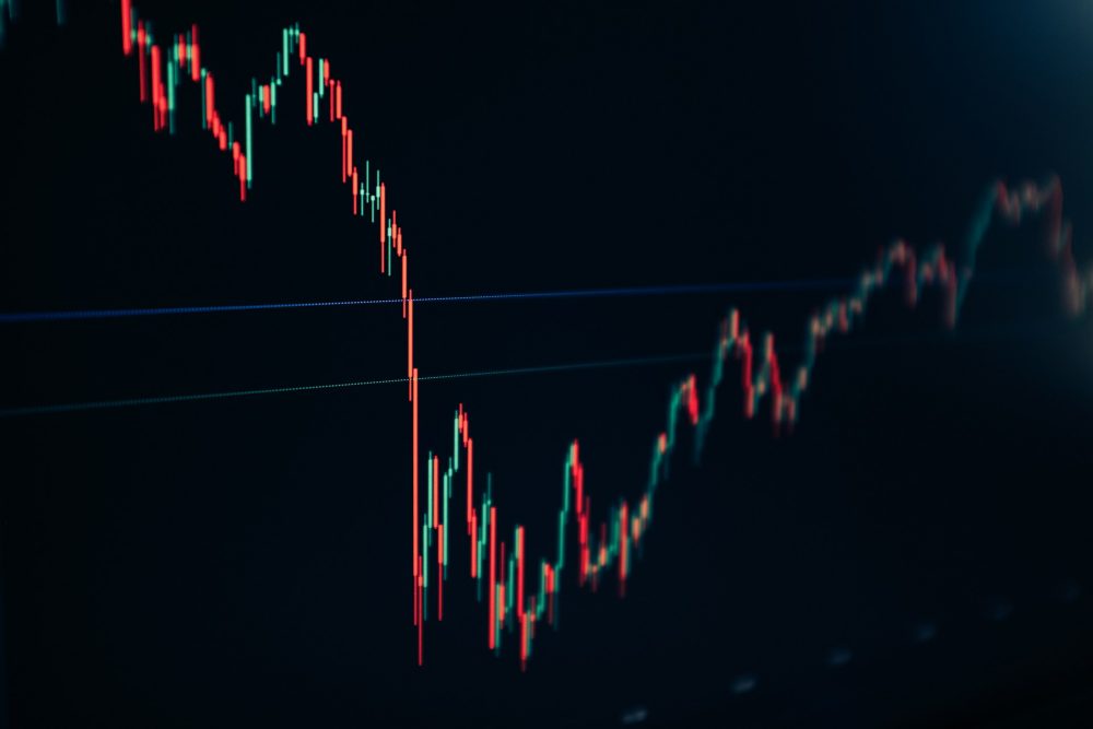
(Featured image by Thomas Lefebvre via Unsplash)
DISCLAIMER: This article was written by a third party contributor and does not reflect the opinion of Born2Invest, its management, staff or its associates. Please review our disclaimer for more information.
This article may include forward-looking statements. These forward-looking statements generally are identified by the words “believe,” “project,” “estimate,” “become,” “plan,” “will,” and similar expressions. These forward-looking statements involve known and unknown risks as well as uncertainties, including those discussed in the following cautionary statements and elsewhere in this article and on this site. Although the Company may believe that its expectations are based on reasonable assumptions, the actual results that the Company may achieve may differ materially from any forward-looking statements, which reflect the opinions of the management of the Company only as of the date hereof. Additionally, please make sure to read these important disclosures.


Bitcoin Stalls Near $60K as Strategy Moves, ETFs Outflow, and EU MiCA Rules Take Effect
Bitcoin hovers near $60,000 with ETF outflows, while Strategy boosts reserves, sells BTC, and raises dividends to reassure investors. Ethereum...


Cannabis Dominates Global Drug Use: Trends, Risks, and Shifting Markets
Cannabis remains the world’s most widely used illicit drug, with 256 million users in 2024, surpassing all others combined. Growth...


Italy Approves First Hydrogen-Powered Train for National Rail Network
ANSFISA has approved Italy’s first hydrogen-powered train, the Alstom HMU214, for use on the Brescia–Iseo–Edolo line. Capable of 140 km/h,...


Cotton Market Weakness Persists Despite Brief Rebound
Cotton prices fell to new lows last week before a modest rebound. USDA data shows crop conditions remain worse than...


Eli Lilly Hits $1 Trillion Valuation Amid Strong Bullish Momentum
Eli Lilly stock hit a record high, surpassing $1 trillion market value after strong product demand. Shares surged over 7%,...
 |
|
 |  |
 |
|
-

 Biotech2 weeks ago
AseBio 2025 Report Highlights Growth and Future Potential of Spanish Biotechnology
-
 Cannabis5 days ago
Tilray (TLRY) Falls as Bearish Momentum Persists Despite Marketing Push
-

 Biotech1 week ago
New Gene Therapies Transform Rare Disease Care, but Gaps Remain
-

 Crowdfunding7 days ago
Ithaca: Climate Road Trip RPG on Climate Resistance