Featured
What’s the problem with the Dow Jones? Maybe it’s overvalued
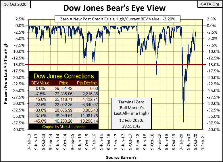
So far, the Dow Jones has yet to exceed the high of its current advance on August 3rd. Who knows what is to happen in the months to come? Not me! But should the Dow Jones break below its BEV -15% line, and one day it will, I’d be very concerned, especially should bond yields begin to rise. The Dow Jones became oversold last Monday October 12th.

The Dow Jones continues trading in a tight range in its BEV chart below. For the past three months, it refuses to rise up to a new all-time high and is incapable of deflating below its BEV -10% line. The longer the Dow Jones remains in this trading range, the more significant it will be when it does breaks out, be it upwards to new all-time highs, or breaking below its BEV -10% line.
Should I care to guess which way the Dow will break out, I’d have to factor in what the FOMC is doing in the market place; “injecting liquidity” into it as they deem fit.
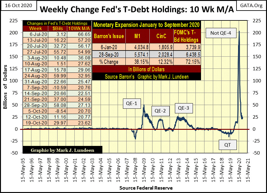
Last week they deemed fit to “inject” $29.97bil into it, as seen below. Since July 6th, they’ve “injected” $356bil (1/3 of a trillion dollars in just sixteen weeks) into the financial system. That’s a lot of “liquidity” to be “injecting” into the banking system, and yet the Dow Jones remains range-bound between its BEV -10% and BEV Zero lines above?
Nope, I don’t think I care to hazard a guess of what’s next to come for the Dow Jones. That’s something best left to the “market experts.”
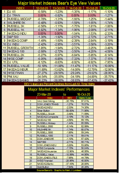
Moving on to the Bear’s Eye View values for the major market indexes I follow below, we see five new all-time highs last week, at least one a day, until Friday when the indexes all closed a least 1% from their last all-time high.
This lackluster performance isn’t going to change until the FOMC decides to do something about it. But do they really want the market’s bulls charging up the hill once again, or maybe they currently want exactly what we are seeing below; the market maintaining its current status quo of running in place.
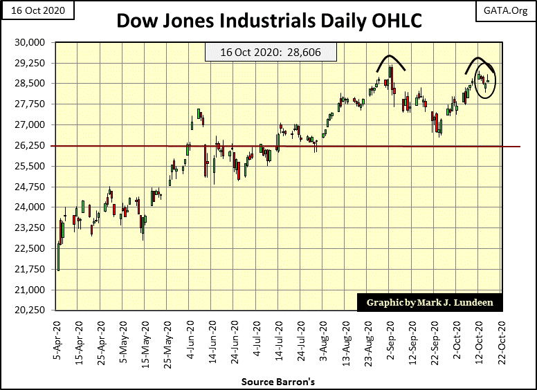
It’s too early to call for one, but not for considering the possibility of a double top being formed in the Dow Jones daily bar chart below. We’ll know more by next week, and even more the week following that.
Somehow today these promises of future market certainty aren’t all we would want of them. But that’s what makes following the markets such a challenge.
So far, the Dow Jones has yet to exceed the high of its current advance on August 3rd. Who knows what is to happen in the months to come? Not me! But should the Dow Jones break below its BEV -15% line below, and one day it will, I’d be very concerned, especially should bond yields begin to rise.
I like publishing the following three charts a couple of times a year to keep a sense of history with my work. The first is the indexed values for Currency in Circulation (Green Plot: CinC / Paper Money in Circulation), the Dow Jones (Red Plot) and the Barron’s Gold Mining Index (Blue Plot: BGMI).
The effects of monetary inflation on market data are obvious. These plots are indexed to 05 January 1920 = 1.00, and in the past century they’ve inflated by a factor of:
- CinC: 454;
- BGMI: 90;
- Dow Jones: 262.
In the main body of the chart, the three series don’t appear to have done anything until 1965. So, I’ve inserted a chart plotting these series from 1920 to 1970 to provide information on these five decades.
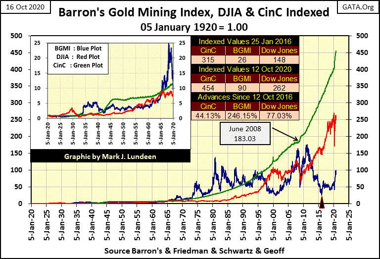
Note above how the Dow Jones exceeded the rate of inflation (Red Plot rising above the Green Plot) only once since 1920, during its Roaring 1920s Bull Market. For two weeks in May 1965 the Dow Jones matched the rate of CinC inflation, not exceeding it, but hasn’t since.
Never again has the Dow Jones risen up to touch the green CinC plot in the chart above, though it came close twenty years ago in 2000. However, since 2000 the rate-of-inflation (as measured by CinC) has far exceeded any increase in the Dow Jones. I expect that’s also true for the majority of the shares trading in the American stock exchanges, though I’m sure there are exceptions.
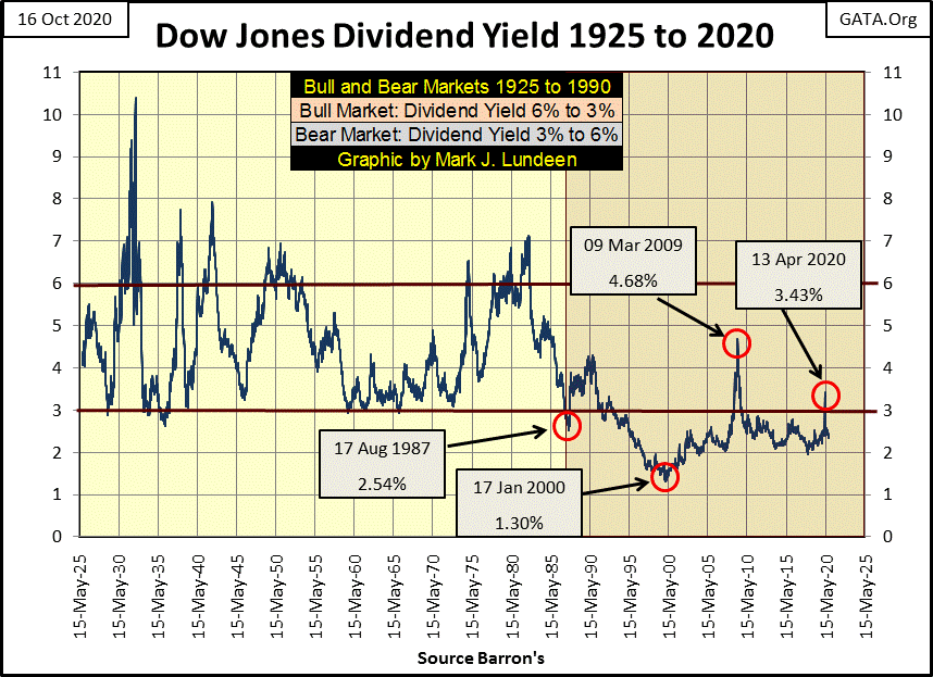
What about dividends boosting stock market returns? That brings up my second chart I like publishing a few times a year; the dividend yield for the Dow Jones going back to 1925.
Since 1992 the Dow Jones, except during the 2007-09 credit crisis bear market, and again last Spring, has yielded less than 3% (see chart below). After income taxes it’s been less than that.
So, returns in the broad market, including dividends, haven’t compensated investors for inflation risks. But keep in mind money invested in the stock market has outperformed money deposited in a bank since Doctor Bernanke lowered his Fed Funds Rate to zero in 2008. Not only did one’s investment grow in the stock market, so did dividend payouts. And blue-chip stock dividend yields were higher than the interest rates offered for savings accounts at banks. This wasn’t hard as banks today offer only a few basis points (0.01% = 1 Basis Point) on deposited funds.
If Grandma wants to receive 5% on her life’s savings, something that was once easily done with a savings account at a bank, she best “invest” in junk bonds as many “market experts” would advise her. For myself, an established dividend paying miner of precious metals seems the way to go for those in search of income in today’s uncertain world.
Take a moment to study the Dow Jones’ dividend chart above; it tells an important story of market manipulation we need to be aware of. From 1925 to 1987 (sixty-two years), dividend yields for the Dow Jones oscillated between 6% at bear market bottoms down to 3% at bull market tops.
Then in August 1987 Alan Greenspan was appointed Chairman of the Federal Reserve. Within the first few years of the Greenspan Fed, bear markets were outlawed, as seen in the yields for the Dow Jones; they were prevented to rise above 3% as a matter of official “monetary policy.”
Was the Federal Reserve specifically targeting Dow Jones’ dividend yields? Maybe, and quite possibility not. But it doesn’t matter, as for whatever reason the post August 1987 yields indicates the Dow Jones for the past thirty-three years has remained historically overvalued. Except when market valuations were being aggressively clawed-back by Mr Bear, as seen in March 2009 and again just last spring, the Dow Jones has yielded less than 3%. Take a look at the chart above; since 1992 does this look normal?
The March 2009 market bottom saw the Dow Jones dividend yield rise up to 4.68% as the Dow Jones deflated 54%. Last March, the Dow Jones deflated 37%, as its dividend yield increased to only 3.43%, nowhere near its historic, pre Greenspan 6% threshold for a bear-market bottom.
In both cases, had the market been allowed to deflate as it had before the Greenspan Fed, the Dow Jones would have seen at least a 60% market decline, possibly more to achieve a 6% dividend. (See table below) Who’s to say these bear markets would have bottomed at a 6% yield, or that dividend payout would remain uncut during a big economic recession?
Why not a 7% or 8% dividend yield for the Dow Jones or a 30% cut in payouts? At these market bottoms, had the stock market been allowed to deflate unhindered, as they had before Greenspan set his meat hooks deep into the market’s pricing mechanism, how far would have Mr Bear took them down? That’s a question we’ll never see answered.
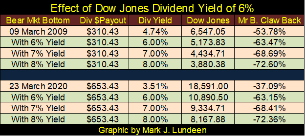
In both cases, March 2009 & March 2020, the stock market was, and continues to be obscenely overvalued. Anytime Mr Bear attempts to restore the market to its natural balance, the “policy makers” “inject” humongous amounts of “liquidity” into it to prevent current valuations from deflating.
The Dow Jones closed the week yielding 2.15% and paying out $615.04. Should you divide the Dow Jones’ payout by its yield, you can calculate where the Dow Jones closed the week (615.04 / 0.0215 = 28,606). Using this formula for dividends, I constructed the table below listing the Dow Jones’ valuation at various yields and payouts.
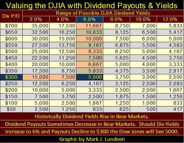
Call me old-fashioned, but until the Dow Jones’ dividend is yielding something greater than 6%, possibly greater than 8% as it sometimes had at the bottom of pre-Greenspan Era bear markets (see chart above), I’m not interested in the stock market. I’ll not be missing much, as I expect there is better game to be found in gold and silver mining.
My next chart is derived from the same data as seen above, except the Dow Jones and the BGMI plots below are ratios to CinC. In other words, the indexed weekly values for the Dow Jones plotted two charts up are divided by that week’s indexed value for CinC, and the same for the BGMI.
What’s plotted below are the performances for the Dow Jones and BGMI relative to the rate of CinC inflation since 1920, with the 1.0 (Green) Line equal to the rate of CinC inflation. As seen below, the Dow Jones’ performance during much of the 20th century was subpar to inflation, and the BGMI. But post August 1971, volatility for the BGMI became psychotic, but never underperforming CinC inflation until 1991; twenty years later.
The Dow Jones is my proxy for the general-stock market. Seeing how it has performed for the past 100 years relative to CinC, I doubt investors will find the stock market a suitable hedge against pending CPI inflation in the years and possibly decades to come. This is not so for the BGMI, which twice in the 20th century responded to monetary inflation by out running CinC inflation by significant margins.
If the BGMI currently is only at 0.20 in the chart below, in my opinion it’s only because its countdown to its 3rd blastoff has yet been completed.
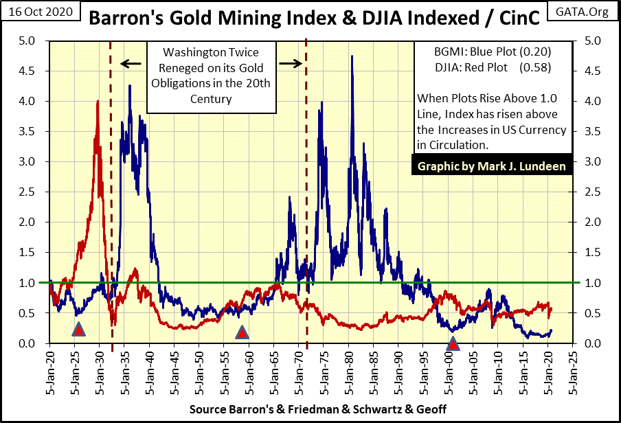
I have three Red Triangles in the chart above. The first marks the failed attempt for the United Kingdom to restore its pre WWI gold standard for their pound. According to Allan H. Meltzer’s “A History of the Federal Reserve 1913 – 1951” University of Chicago Press (with forward by Alan Greenspan), then Chancellor of the Exchequer, Winston Churchill, attempted to restore the British pound to its prewar value in terms of gold, ignoring the huge inflationary increase in paper currency used in funding Britain’s war efforts.
A monetary mess resulted, which the US’s Federal Reserve attempted to remedy with an at the time ASTOUNDING $200 million dollar loan to the Bank of England.
This week the FOMC “injected” $29.97bil into the financial system – and not much happened. In May of 1925 it only took a $200mil loan to kick-start the Roaring 1920s Bull Market (Red Plot), as seen above.
Beginning in 1925 the BGMI (Blue Plot) also began inflating. But the gold mining companies’ share prices didn’t really begin to inflate until the Dow Jones was greatly deflated, and President Roosevelt’s Federal Reserve had the US dollar devalued to $35 an ounce from $20.67, a 70% devaluation in 1934.
The second triangle marks 1957. After twelve years of issuing paper dollars in excess to its gold reserves, a run on the US gold reserves began in 1957, which ultimately resulted in the price of gold to rise from the Bretton Wood’s gold peg price of $35, to above $800 an ounce in January 1980. The BGMI increased from 28.59 in December 1957 to 1285.16 in October 1980.
The third triangle marks the beginning of the 2002-08 single family real estate bubble. It could also mark the following speech made by Doctor Benjamin Bernanke, and the end of the twenty-two year bear-market, and soon rebound of gold, silver and the BGMI.
“Like gold, U.S. dollars have value only to the extent that they are strictly limited in supply. But the U.S. government has a technology, called a printing press (or, today, its electronic equivalent), that allows it to produce as many U.S. dollars as it wishes at essentially no cost. By increasing the number of U.S. dollars in circulation, or even by credibly threatening to do so, the U.S. government can also reduce the value of a dollar in terms of goods and services. We conclude that, under a paper-money system, a determined government can always generate higher spending and hence positive inflation.
*** Of course, the U.S. government is not going to print money and distribute it willy-nilly……..” ***
– Ben S. Bernanke, Federal Reserve Board Governor, November 21, 2002.
I love the last line of this 2002 speech by Doctor Bernanke; it proves even a Ph.D in Economics can have a sense of humor.
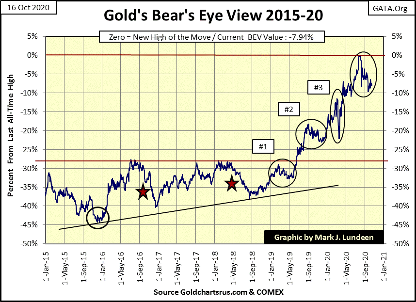
Here’s gold’s BEV chart; like the Dow Jones it too is ranged bound between its BEV Zero and BEV -10% lines. But unlike the Dow Jones who the FOMC is supporting with vast “injections of liquidity”, precious metals are being suppressed by these same people.
Damn it! Just as Winston Churchill discovered in a hundred years ago; our FOMC is rediscovering gold doesn’t respond well to central-bank inflation, as ultimately more “liquidity” equals higher gold prices no matter what laws and financial regulations are imposed on the gold market. From a “monetary” perspective it’s so unfair they don’t even like to speak of it.
Do I care to hazard a guess what is to happen in the coming weeks in the gold market? Not really. But in the coming years the increases in the price of gold, and silver bullion, and let’s not forget the gold mining shares, are going to astound even members of the FOMC.
A little update on Eskay Mining; last summer it was trading at $0.10 a share with light daily trading volume. Today it closed at $0.75 with 187,800 shares changing hands. What’s happening?
I know it could be months before this summer’s drilling program assays are completed. So actual knowledge of the company’s discovery of a second Eskay Creek ore body is impossible for ANYONE to know on the basis of hard data, and in fact Eskay Mining’s drilling program for 2020 could be disappointing.
Another thing I know is I’m not a “market expert.” I also know nothing of geology. But up in Canada there are plenty of geologists and analysis of mining companies who are familiar with the history of British Columbia’s Golden Triangle, people who are fully aware of the potential for what Eskay Mining has deep under its mining claims (Green Areas).
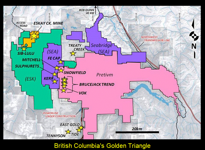
Eskay mining’s website contains plenty of technical information for the public, or geologists to study. Obviously someone liked what they saw and now want in. To get in, this week they are willing to pay 600% above what Eskay Mining was trading for just a few months ago.
Here is a link to Jay Taylor’s October 4th interview with Eskay Mining’s technical advisor; Dr Quinton Hennigh. It’s about fifteen minutes long.
For myself, I sold some this week to pay next year’s property taxes and to help Santa pay his elf’s ever increasing wages. Other than that; I’m holding on for the ride, and praying to Jesus every night that he be generous with the owners of shares of Eskay Mining. We all took on huge risks as Eskay Mining is in mineral exploration. God willing, we’ll now receive our reward for doing so.
I best not forget to show some appreciation for Mac Balkam, Eskay Mining’s CEO. For over a decade he worked his ass off to keep Eskay Mining a going concern. No matter what comes from this point on – Thanks Mac!
Hey, this just came up on Eskay Mining’s website, their press release of October 16th:
https://eskaymining.com/news/news-releases/eskay-mining-completes-productive-tv-jeff-diamond-1837/
Like I said, I’m no geologist, but the above press release looks pretty exciting. I expect some excitement for Eskay Mining shares come this Monday, and if so I won’t be selling.
But I know this is a speculation, not a long term investment to hold as one’s core position. Should things become exciting, don’t be in a hurry to sell, but at some point people need to sell and transfer the proceeds into more mature gold and silver mining companies. What companies would that be? For a start, I like the other companies in the Golden Triangle.
The link below is for Eskay Mining’s trading action. If you want to see the action on Monday, or lack of it, click here: https://www.barrons.com/quote/stock/us/ootc/eskyf
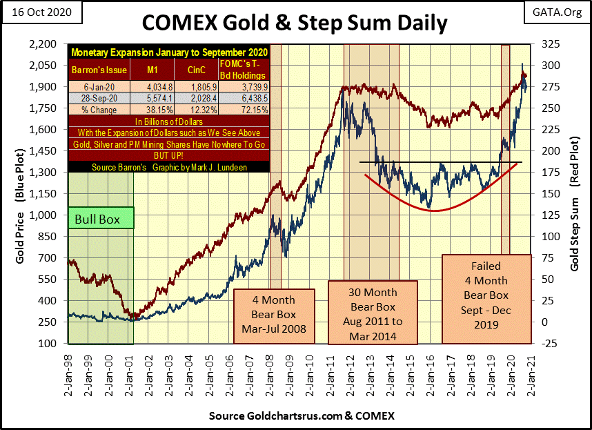
Next is gold’s step sum chart going back to 1998. No sign of a breakout in gold seen below, but what a powerful chart gold and its step sum makes below. Whenever gold does decide to move, I’m expecting it will be moving up with power.
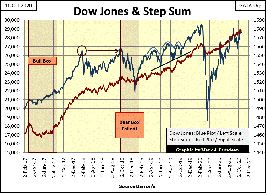
The Dow Jones and its step sum below are looking very constructive. A new all-time high for the Dow Jones in the weeks to come, and maybe next week is a possiblility.
Gold, as seen below, is under pressure with down days overwhelming advancers. Yet with all those down days the bears have still failed to drive it below its BEV -10% level.
The Dow Jones 15 count reached a +7 on Monday’s close, indicating the Dow Jones is overbought.
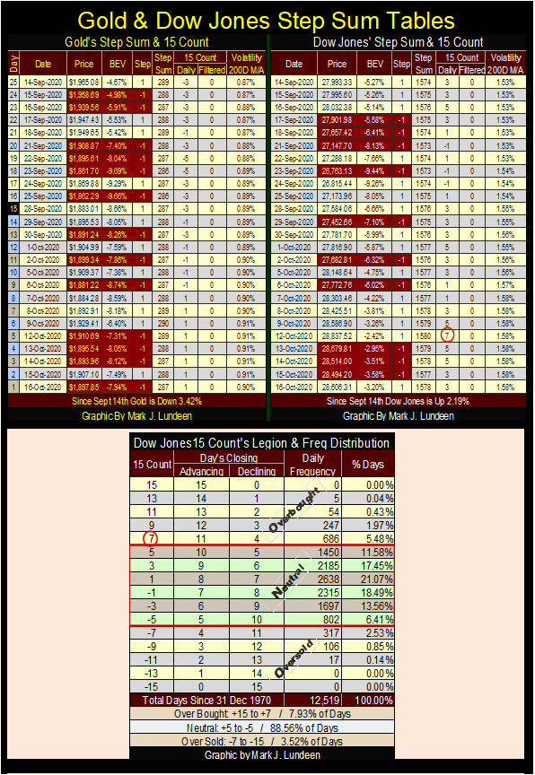
As seen in the table above, since December 1970 the Dow Jones has closed with a 15 Count of +7 in only 686, or 5.48% of all daily closings. That’s not many.
Here’s a new chart plotting gold’s (Blue Plot) and the Dow Jones’ (Red Plot) 15 counts. We see how gold’s 15 count reached a +13 on August 6th. This is an extremely overbought condition, which occured as gold saw its peak of the move. Following gold’s +13 for its 15 count gold has been correcting, but this too shall pass.
What I’d like to see below is for gold’s 15 count to generate a -7 rendering it oversold. This doesn’t have to happen before gold resumes its bull market advance, but it would certantly mark the current correction as becoming stale.
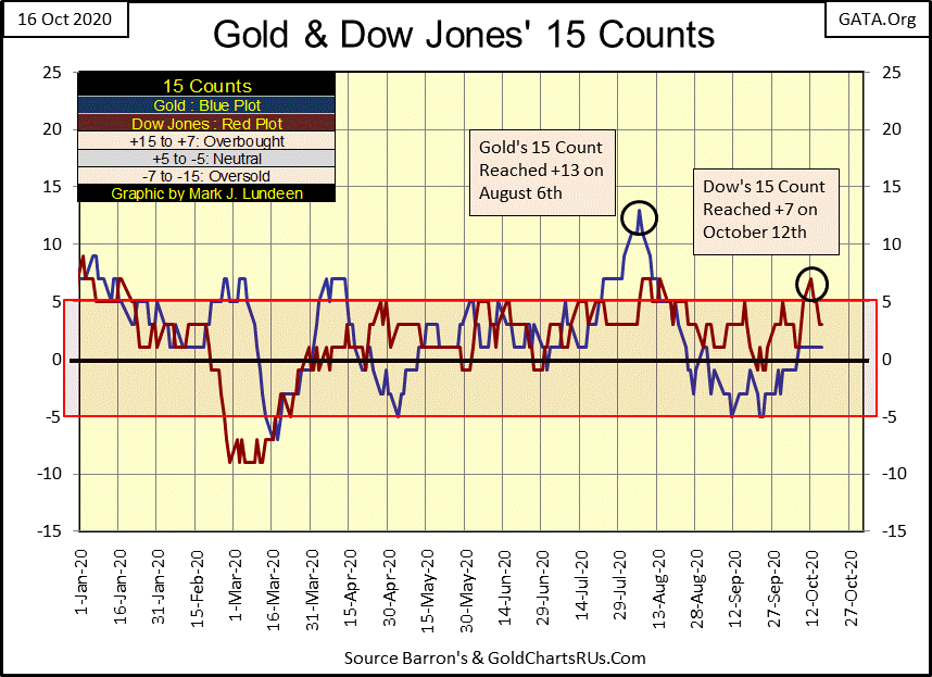
The Dow Jones became oversold last Monday October 12th in the chart above. Now we watch to see what comes next.
—
(Featured image by skeeze via Pixabay)
DISCLAIMER: This article was written by a third party contributor and does not reflect the opinion of Born2Invest, its management, staff or its associates. Please review our disclaimer for more information.
This article may include forward-looking statements. These forward-looking statements generally are identified by the words “believe,” “project,” “estimate,” “become,” “plan,” “will,” and similar expressions. These forward-looking statements involve known and unknown risks as well as uncertainties, including those discussed in the following cautionary statements and elsewhere in this article and on this site. Although the Company may believe that its expectations are based on reasonable assumptions, the actual results that the Company may achieve may differ materially from any forward-looking statements, which reflect the opinions of the management of the Company only as of the date hereof. Additionally, please make sure to read these important disclosures.

-

 Impact Investing2 weeks ago
Ridemovi Secures Financing to Drive European Expansion and Sustainable Mobility Growth
-

 Crypto16 hours ago
Crypto Holds Steady as Tensions Rise and Regulatory Concerns Grow
-

 Crypto1 week ago
Bitcoin Slides, Ethereum EEZ Emerges, Worldcoin Hits Low
-

 Africa5 days ago
Casablanca Stock Exchange Profits Surge in 2025 as Growth Momentum Strengthens


