Featured
Record gold prices continue apace and silver hits its price target
Gold prices continue to soar and silver is slowly beginning to break out of a multi-year channel. Precious metals bulls believe that we could see silver go from a record low to a high overnight, but it will be an uphill climb. The S&P 500 also appear to be just days away from a new all-time high and the Fed’s balance sheet is slowly contracting.

Whenever I go away something always seems to happen. So, what happened? Well, gold soared through $1,900, making new all-time highs. And, as soon as I got back, gold did it again, soaring through $2,000. Silver had already started its move as I was packing up having taken out finally the 2016 high of $21.23. Silver has now achieved our target of $29 noted in this column a few weeks ago.
What’s going on? Have gold and silver entered the mania phase? It is possible. I was around for the mania phase of gold and silver in 1979 when gold soared from $200 in November 1978 to peak at $875 in January 1980. Being somewhat younger and of limited means, I only witnessed it. But I do remember the lines around the block to buy gold. Silver did the same, soaring from $6 to $50. A similar move today from a low in November 2019 of $1,446 for gold could see gold go to over $6,300 and silver go from a low of $16.70 to $139. Impossible?
Well it is not difficult to find those who believe both gold and silver could do just that. And the markets for gold and silver are actually quite small. The total gold market is estimated to be about 197,576 metric tonnes (World Gold Council) giving all the gold in the world a value of roughly $12.7 trillion. Of that, an estimated 47% is jewellery. The Fed’s balance sheet is over $7 trillion. All the stock market exchanges in the world are estimated to be about $90 trillion and global debt is estimated at $255 trillion.
Our table below summarizes the size of the gold and silver market compared to other markets. This is based on an excellent series of charts from Visual Capitalist, published in May 2020. The chart was far too big so we condensed it in a table with some revisions to the numbers and the context.
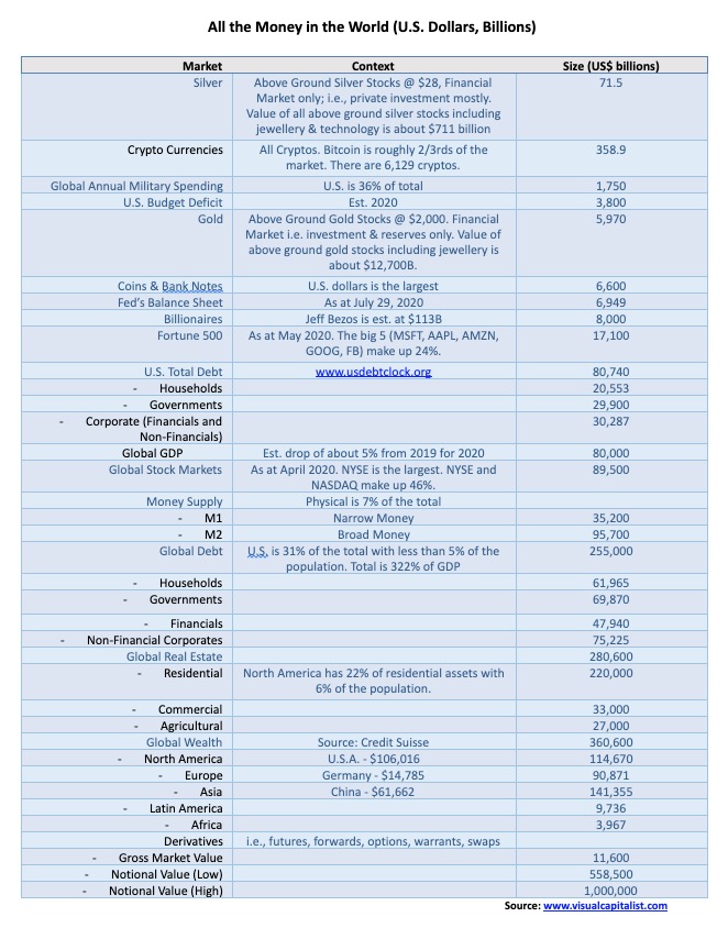
The investment value of gold and silver makes up only about 1.7% of global wealth. It is a pretty small market. All the gold and silver mining companies in the world are only worth about $500 billion. Amazon alone is worth about $1.6 trillion. If a mere ¼% of the world’s wealth is shifted into gold and silver, there isn’t enough in the world to satisfy the demand.
So, what’s going on? According to Mark O’Byrne of GoldCore (www.goldcore.com), there are a number of reasons:
- Concerns over the outlook for assets and currencies (all fiat currencies)
- Concerns over the growing number of global cases for COVID-19. It is currently estimated that approximately one million new cases are added every four days. There are currently over 5,000 deaths every day
- Concerns over the record deficit spending by governments and central banks’ purchases of bonds and other assets
- Concerns over the potential for global war, given the rising tensions (including military) between the U.S. and China. The explosion and destruction in Beirut highlighted the risk of war in the unstable Middle East—regardless of whether the explosion was deliberate or accidental
- Concerns over the growing domestic divide in a number of countries, giving rise to clashes on the streets—not only in North America but also in Europe, Asia (Hong Kong), and Latin America
- Concerns over the risks to the global financial, economic, monetary, and geopolitical systems
- Concerns over the value of the U.S. dollar and other currencies, due to currency creation on a scale not seen since the collapse of the Weimer Republic (Germany) after WW1. Savers are not getting any yield on bank deposits and are facing negative rates on depreciating currencies
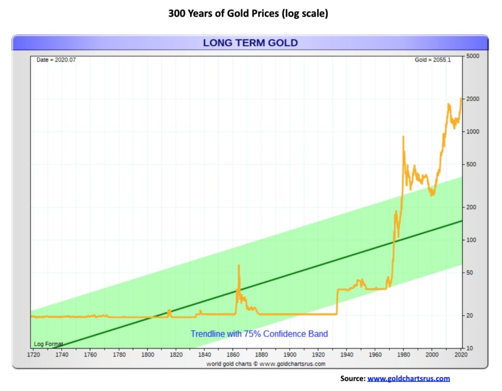
Gold has a long history of being connected to money. However, we freely admit that gold is not necessarily money as mediums of exchange have varied over the centuries. Since 1971, with the collapse of Bretton Woods and the regime of fixed exchange rates linked to the U.S. dollar and gold, the world has seen an explosion in debt and ongoing financial and currency crisis and economic instability. Today, all currencies are fiat currencies—meaning, money is set by government fiat and has no intrinsic value. It is essentially an I.O.U. backed by nothing but the good faith of the government. If faith is lost in governments, investors will flee to gold, private assets i.e. stocks and land (property).
It is not as if the gold standard was the answer to preventing financial instability. History is rife with economic depressions and financial collapses. Gold has a history of being money for upwards of 2,000 years. The first known gold coins were issued in the 6th century B.C. in Lydia, an iron-age kingdom in Western Asia Minor that is now a part of Western Turkey. The earliest coins were made of electrum, a naturally occurring alloy between gold and silver.
Gold has been free floating only since the end of Bretton Woods in August 1971. Before that, Bretton Woods had set the value of gold at US$35/ounce. Gold was revalued up in 1934 with the Gold Reserve Act raising the price from $20.67 to $35 a 70% increase. If the gold price was set to the value of U.S. money supply (M1) it would currently require a gold price of over US$20,000/ounce (based on U.S. gold reserves of 8,133.5 metric tonnes). Or if it was just set to back the total of notes and coins in circulation in the U.S., the price of gold would need to be set at about $6,500.
$6,500? Only about $4,000 to go!
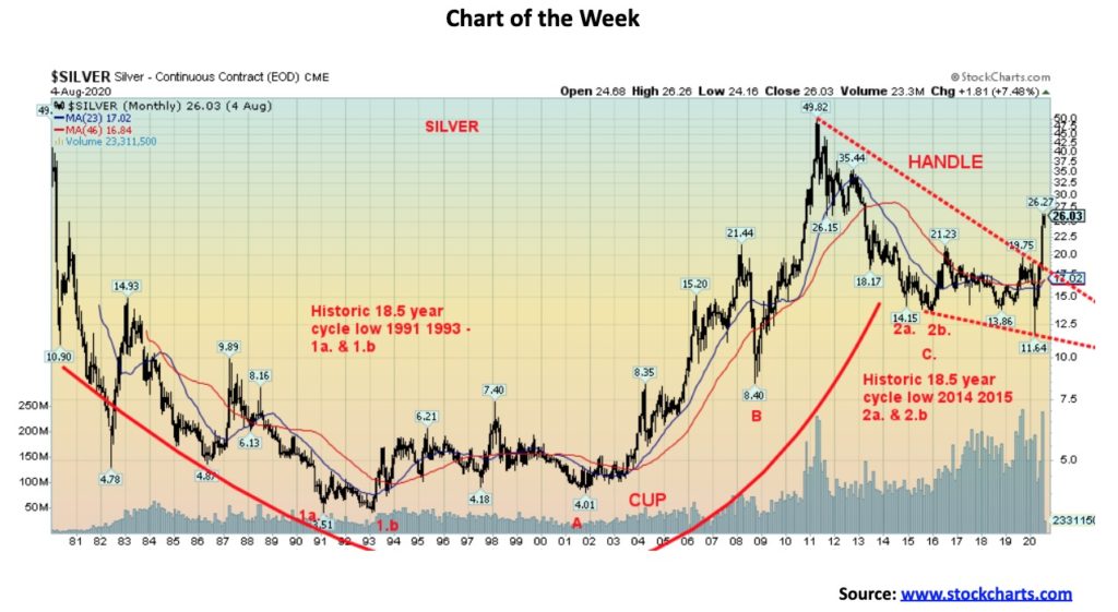
Silver has broken out of a multi-year down channel. Our monthly chart of silver shows what appears to be a huge multi-year cup and handle pattern. It is multi-year as the cup started with the high of January 1980 and ended with the high of April 2011. Silver started and ended at/near $50. What we have been experiencing for the past nine years is the handle for the cup. If the pattern is correct, then our minimum target could be up to around $65, based on the 2011 high of $49.82 and the 1991 low of $3.51. If silver were to successfully break above $65 then the next target could be up to $95.
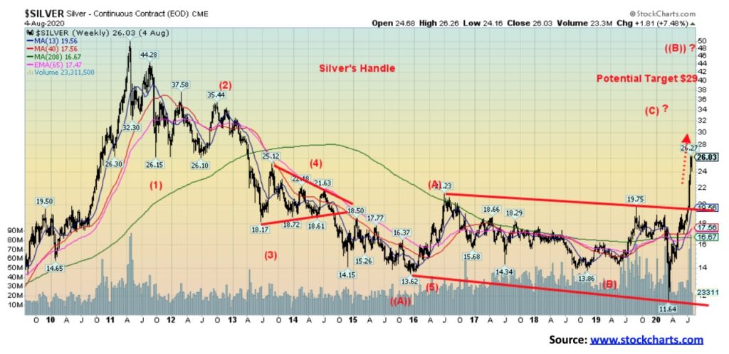
But we don’t want to get ahead of ourselves. The final part of the handle played itself out after the multi-year 18.5-year cycle low seen in December 2015. The channel that formed from 2015 to the present should now hold any pullbacks. It is unlikely we’ll fall back into that channel any time soon. As we have noted previously, the target for the breakout of the channel was up to around $29. With a high so far of $29.92 we achieved the target. The next target above that could be up to $35 once $29 is firmly taken out.
The multi-year cup and handle pattern is intriguing. However, be aware it won’t be a straight up move. Silver has a record that suggests a long-term 18.5-year cycle with the first one shown in 1991 and 1993 and the second shown to have occurred in 2014 and 2015. That means the next one shouldn’t occur until 2032–2034. Silver’s interim cycles are roughly every 7 years and from the 1991–1993 lows we saw lows in 2001 and 2008, followed by the major low in 2015. The next one is due possibly into 2022 or late 2021. Currently, the cycle is bullish given that we successfully took out the 2016 high. The 7-year cycle subdivides into roughly two 40-month cycles and the first one, we suspect, occurred with the low in November 2018. The sudden jerk down low of March 2020 was probably the half-cycle of the 40-month cycle, given it was roughly 16 months from November 2018, so it fell within the orb of the 20-month cycle which was due July 2020 +/- 4 months.
None of this is to suggest that silver will hit that potential target of $65 on this move, but it is certainly possible. A crest could certainly come in either late 2020 or early 2021 and then fall into the 40-month cycle low. The next 20-month cycle low would now be due October 2021 +/- 4 months. And that could also be a 40-month cycle low. But given the breakout from the cup and handle pattern and the breakout from the channel that formed 2015–2020, silver is embarking on an exciting move that could see much higher prices in the months ahead.
We also note that the gold/silver ratio peaked recently in March 2020 and that too was a bullish signal for silver as well as for gold. The gold/silver ratio could be headed for 70 down from a peak of almost 130 in March. Exciting times for silver going forward. But it won’t be straight up.
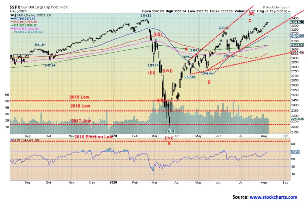
With the S&P 500 breaking to the upside once again, the implication is that new all-time highs are mere day(s) away. Trying to explain why this happening—against the backdrop of a pandemic with the U.S. recording the worst numbers of any country, official unemployment over 10%, and real unemployment 30%, rising bankruptcies, bank provisions for loan losses higher than that seen during the 2008 financial crisis, plus divisiveness in politics and riots on the streets—is really just a lesson in futility. Instead, we point to the massive amount of Fed injections, government stimulus programs, record debt, and record government spending. Of that money, 90% is probably not reaching Main Street but is lining the pockets of the institutions who, instead of lending it out are buying stocks. Even Warren Buffett is buying back his own stock—apparently a record $5.1 billion in May and June. Maybe he knows a good investment when he sees it.
With the stock market soaring, Wall Street and the 1% are enjoying the gains while Main Street wallows in riots, divisiveness, and a pandemic. As one pundit quipped, “it is socialism for the rich and capitalism for the poor” (apparently attested to Howard K. Smith during the ABC evening news in 1968, and thanks Jack). The implication is that the government takes care of the rich and everyone else fends for themselves. And with nowhere to put their money (how many yachts can one own?), they invest in the stock market.
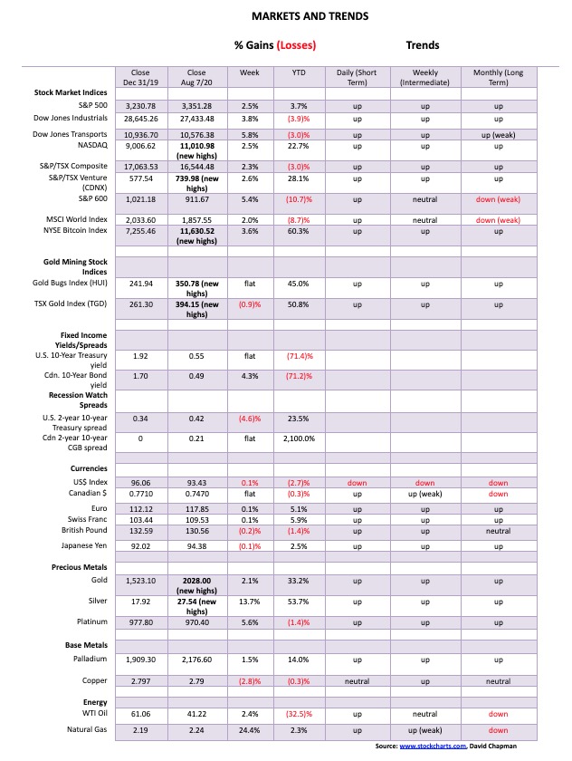
This past week the S&P 500 gained 2.5% and is now positive on the year, up 3.7%. The Dow Jones Industrials (DJI) was up 3.8% but is still down 3.9% in 2020, the Dow Jones Transportations (DJT) gained 5.8% but remains down 3.0%, while the NASDAQ crossed 11,000, gaining 2.5%, and is up 22.7%. Okay, the NASDAQ still has a way to go to catch the Gold Bugs Index (HUI) that is up 45% in 2020. The small cap S&P 600 also gained up 5.4% but is still down 10.7% in 2020. In Canada, the TSX Composite gained 2.3% but is still down 3.0% while the TSX Venture Exchange (CDNX) continued its winning ways, up 2.6%—making new 52-week highs and up 28.1% on the year.
In Europe, the London FTSE gained 2.3%, the Paris CAC 40 rose 2.2% and the German DAX was up 2.9%. In Asia, China’s Shanghai Index (SSEC) eked out a gain of 1.3% while the Tokyo Nikkei Dow (TKN) was up 3.3%. All in all, a good week for everyone.
Where this stops is anyone’s guess now as new all-time highs seem to be in the cards for the S&P 500 and quite possibly the DJI too. The mindset seems to be, forget that the market is rising on the backs of roughly 6–10 stocks, just enjoy the party and who cares about the riots, pandemic, and divisions. Oh, and also the rising tensions between the U.S. and China with the latest salvo over Tik-Tok, a social media phenomenon used primarily by teenagers. And, lest we forget, the massive number of U.S. military bases encircling China, estimated at some 400 with warships and nukes. China has supposedly 30, tops.
The collapse in March 2020, primarily due to the pandemic, came as a shock. It was the swiftest 30%+ decline ever recorded, occurring in a mere 32 days as the S&P 500 fell 35.4%. But now the S&P 500 is up about 53% from that low. Quite a ride. Volatility shot through the roof, rivalling the type of volatility seen in 1929, Black Monday October 1987, and the financial crash of 2008. But authorities moved quickly as they deployed very aggressive monetary stimulii, pumped the banks full of money, and brought out stimulus programs for both people and industries.
Too bad they can’t get the handling of the pandemic right as the U.S. regularly sees 50,000–70,000 new cases every day and over a thousand deaths every day. Yet culture wars dominate the pandemic as well with division on such things as using masks and doing social distancing, or staying in lockdown (vs. opening up), accepted primarily by Democrats and rejected mostly by Republicans. Even Canada can’t seem to escape that either with similar divisions (Liberal vs. Conservative). But anticipation of a vaccine sooner rather than later helps spur the markets. And, while earnings are taking a hit, the market seems to be looking past that. Besides, with interest rates suppressed and not going anywhere, the stock market is where the action and the returns are. The ultra-low interest rates are spurring on record borrowings, not just by governments but also by corporations. Even the housing markets are rebounding, thanks to ultra-low interest rates and an expectation that they won’t rise any time soon.
So where do we go from here? Indicators are through the roof. Complacency is rampant. Bullish sentiment is extreme. Yet where does one put their money? Can’t seem to spend it (except for the poor—well, they can as they have to). The risk/reward ratio seems clear: it’s risk over reward. Trouble doesn’t appear until we drop under 3,200 and real trouble only develops under 2,950. Other than that, new all-time highs seem imminent. But beware—things could change quickly.
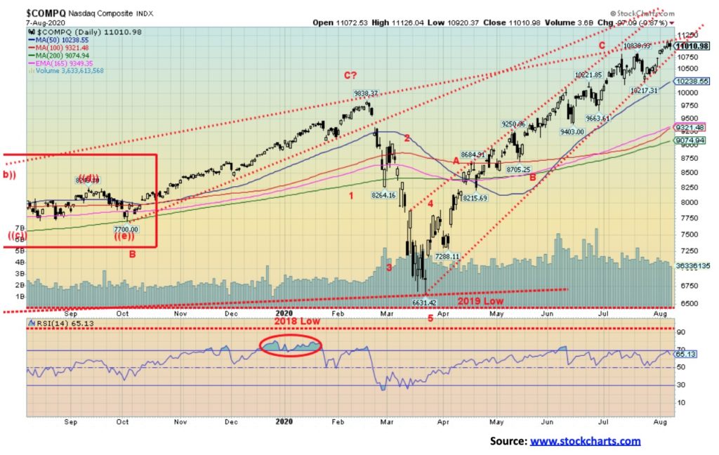
The NASDAQ has been soaring, reaching over 11,000 for the first time ever. Yes, it is going up on the backs of the big five or is it six: FB, AAPL, AMZN, NFLX, GOOG and MSFT. This past week the NASDAQ gained 2.5% to new all-time highs. But FB also made new all-time highs up 5.8%, so did AAPL up 4.6%, and so did MSFT up 3.6%. AMZN gained a mere 0.1%, NFLX was up 1.2%, and GOOG jumped 0.8%. Warren Buffett’s Berkshire (BRK.A) was up 7.1% while Tesla (TSLA) gained 1.5%. If there is a cautionary note on the NASDAQ, it is that it appears to be hitting the top of an old channel but if busts through 11,250 then the next channel top is way up near 13,000. We could argue that the next target appears to be around 11,400 but then as the NASDAQ goes higher, they are just numbers. Best to focus on the breakdown points and right now the first sign of trouble is under 10,200. A break there could see a swift drop towards 9,000. Right now, that is long-term support. But at 11,000+ we are nowhere near there yet.
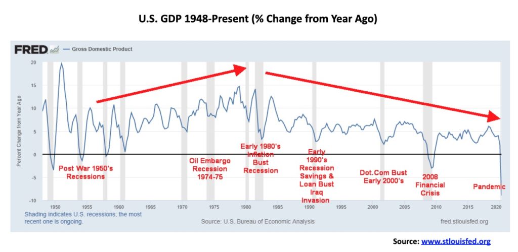
The second quarter saw U.S. GDP shrink by 32.9%. That was actually better than forecasts of a 34.1% collapse. It was the worst on record since the Great Depression. The Q2 GDP numbers effectively shed five years of headline economic growth. Year-over-year the U.S. economy shrunk by 9.5%, again one of the worst ever recorded since the Great Depression. Similar numbers were seen in the EU, Canada, and elsewhere. Many businesses including restaurants, cafes, bars, retail stores, and even factories were forced to close. Airlines took a big hit as flights were grounded. Transit systems saw a huge collapse in ridership, putting many of them in financial peril. Many businesses closed as they were deemed non-essential. The big question is, if they were non-essential, will they ever recover or will they ever be essential again? Will people return to them even when they re-open? In the U.S. many did and the result was another surge in COVID-19 cases, often overwhelming the health care system.
What is interesting about this chart is that GDP on the whole was on the rise until the early 1980s recession hit. That appears to have been a turning point. Since then, the year-over-year changes in GDP have seen a series of lower highs and generally lower lows. Yet it was during this period that some of the biggest stock market gains were seen. If, on top of GDP, one imposed the rise in money supply (M2), debt, and the velocity of money they would have discovered why GDP has been on a downtrend since 1980. Money growth and debt growth have been mind-boggling.
Since 1980, GDP has grown over 700% but debt has exploded up over 1,800%, M2 has exploded up over 1,100% but the velocity of money (how quickly money turns over in the economy) has fallen 41%. More and more money (printed) has resulted in slower and slower GDP growth as the money is not going into the economy. Where’s it going? Into speculation as the S&P 500 has grown over 3,000%.
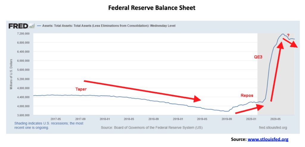
The Fed balance sheet appears to be continuing to contract. From a low in September 2019 of $3.9 trillion the Fed balance sheet grew as a result of a repo program. It was never fully explained why the repo program was necessary. In March 2020, as a result of the pandemic, the Fed balance sheet took off into the stratosphere as a result of what many are calling QE3. The Fed was buying U.S. treasuries and corporate debt to pump funds into the financial system. The Fed balance sheet peaked about mid-June at $7.2 trillion. Since then, the Fed balance sheet has been contracting and, at latest reports, stands at $6.9 trillion, a decline of almost $224 billion from the peak. This decline has yet to feed into the stock market but it is certainly something to consider going forward.
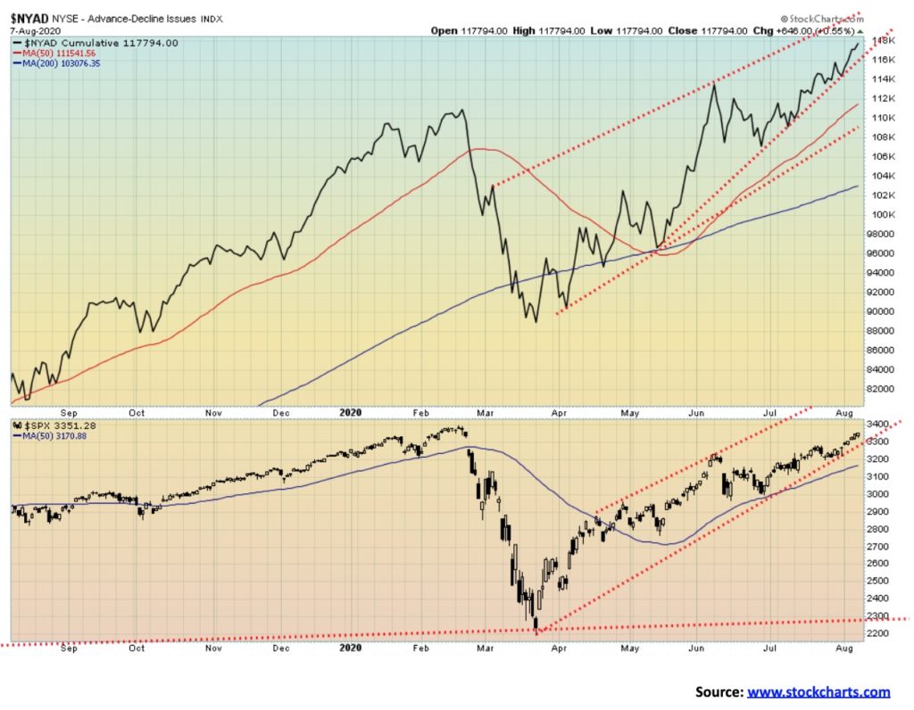
The bulls’ great hope. The NYSE advance-decline line keeps chugging to new highs, even as the S&P 500 hasn’t quite made it to new highs. However, new all-time highs for the S&P 500 appear to be in the offing, given the level of the advance-decline line. We prefer to see divergences at major tops with a declining advance-decline line even as the index keeps rising. Currently none is present. The implication is we are going higher.
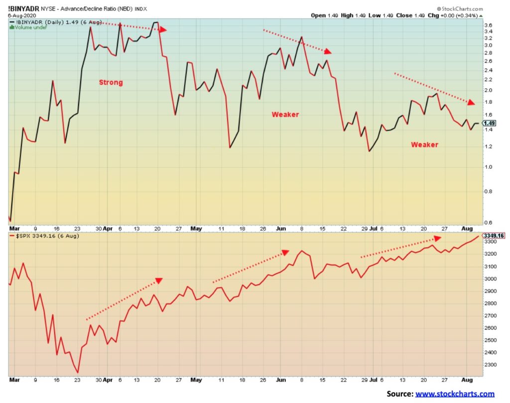
If there is a warning about the advance-decline line, it is looking at the advance-decline ratio index. Each thrust is weaker than the previous one and the current thrust is the weakest seen since the rally began in March 2020. As with many indicators, it is a sign for a potential decline and not a signal that the top is in. Consider it a warning.
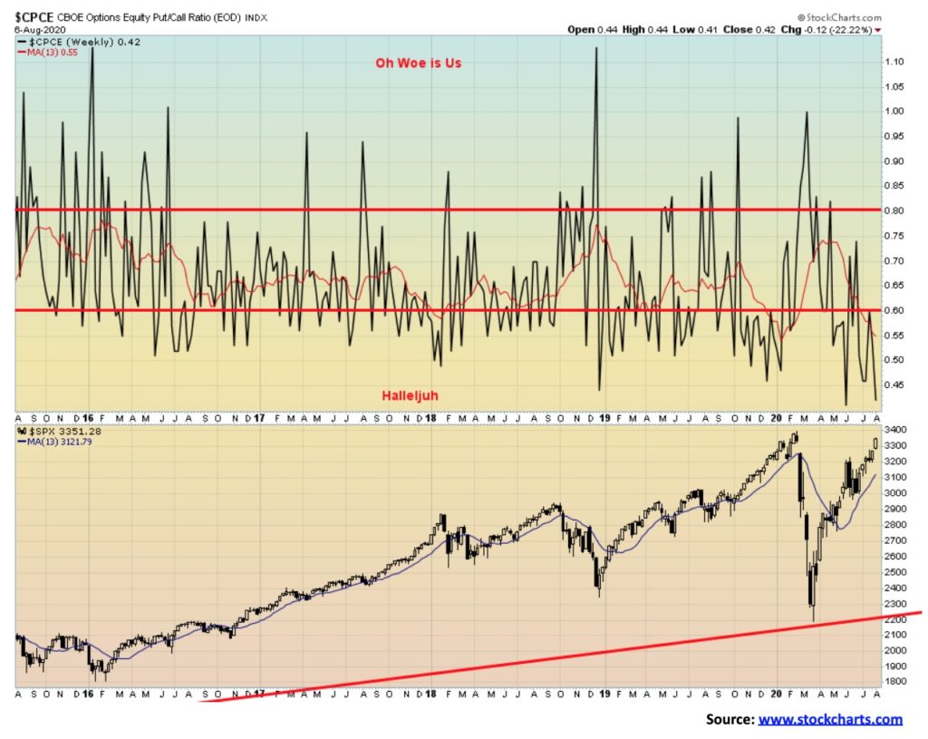
The stock market remains very complacent, as measured by the CBOE options put/call ratio. With a ratio of 0.42 the put/call ratio is near the lows seen in June when it fell to a record low of 0.40. This market remains very complacent. Hallelujah!
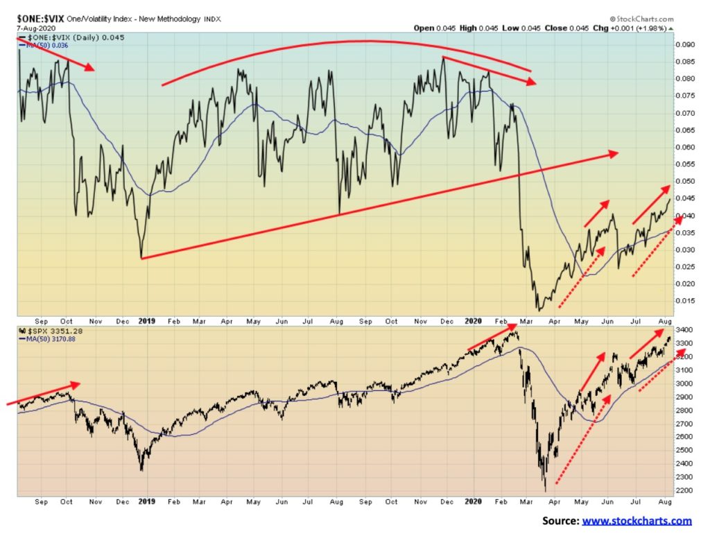
With both the VIX and the S&P 500 pointed up, we can only presume that the rally is not yet over. Typically, we see divergences between the two at significant tops. Currently there are no divergences, although the S&P 500 is closer to making new all-time highs than is the VIX. But the VIX reflects volatility in the market and a very high VIX (this is an inverted chart) implies that volatility is very low and complacency has set in.
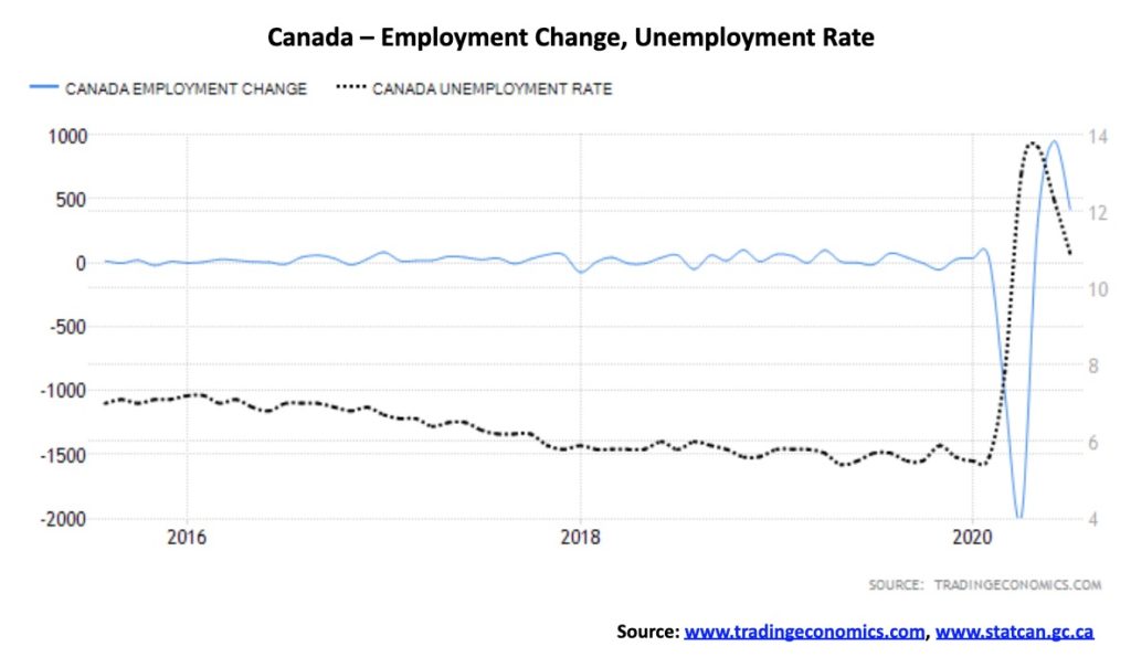
Canada surprised to the upside, reporting that 418,500 jobs were created in July 2020. That was roughly half of the 952,900 jobs created in June. Since the pandemic got underway in March 2020, Canada lost 3,004,500 jobs and has now regained 1,661,000. That still means that 45% of those who lost their jobs remain unemployed. That number is better than the U.S. where 58% of those who lost their jobs remain unemployed. The number was slightly better than the expected 400,000 gain. That’s the good news. The bad news is that 345,000 of the job gains were part-time with only 73,000 added to full-time positions. The gains were primarily in the service sector that jumped 348,000. Retail trade led with 101,000 while accommodation and food services were also up 101,000. Gains were also seen in professional and technical services (33,000), construction (34,000), and manufacturing (29,000).
The unemployment rate fell to 10.9% which was marginally better than the expected 11%. But it was a big drop from June’s 12.3% and well down from April’s 13.7%. The labour force participation rate rose slightly to 64.3%, up from 63.8% and well up from April’s 59.8%. That remains down from the pre-pandemic levels of 65.5%. Canada’s highest measurement of unemployment is R8 which adds in discouraged job searchers and involuntary part-timers. It is similar to the U.S.’s U6 unemployment. R8 unemployment in July actually rose to 15.6%, up from June’s 15.5%. A year ago, the R8 rate was 8.7%.
Ontario led the provinces with a gain of 151,000 jobs of which 68,400 jobs were created in Toronto. We note that CERB ends in August, with a new program to be created through EI. The self-employed, gig workers, etc. numbered some three million before the pandemic and were hard hit as a result of the collapse.
The recovery is on. Well, maybe not so much. The July 2020 nonfarm payrolls came in at 1,763,000 which was better than the expected 1.6 million. Of that total, private payrolls added 1,462,000, leaving the remaining 301,000 for the government sector. Earlier in the week the ADP employment reported a rise of only 167,000, well below the estimate of 1.5 million. That led a number of economists to believe that the nonfarm payrolls might be worse than expected. Initial jobless claims then came in below expectations at 1,186,000 when the market had expected 1,415,000. Continuing jobless claims were 16,107,000 vs. an expectation of 16,720,000. That was down from the previous week’s 16,951,000. There are still a lot on the unemployment lines.
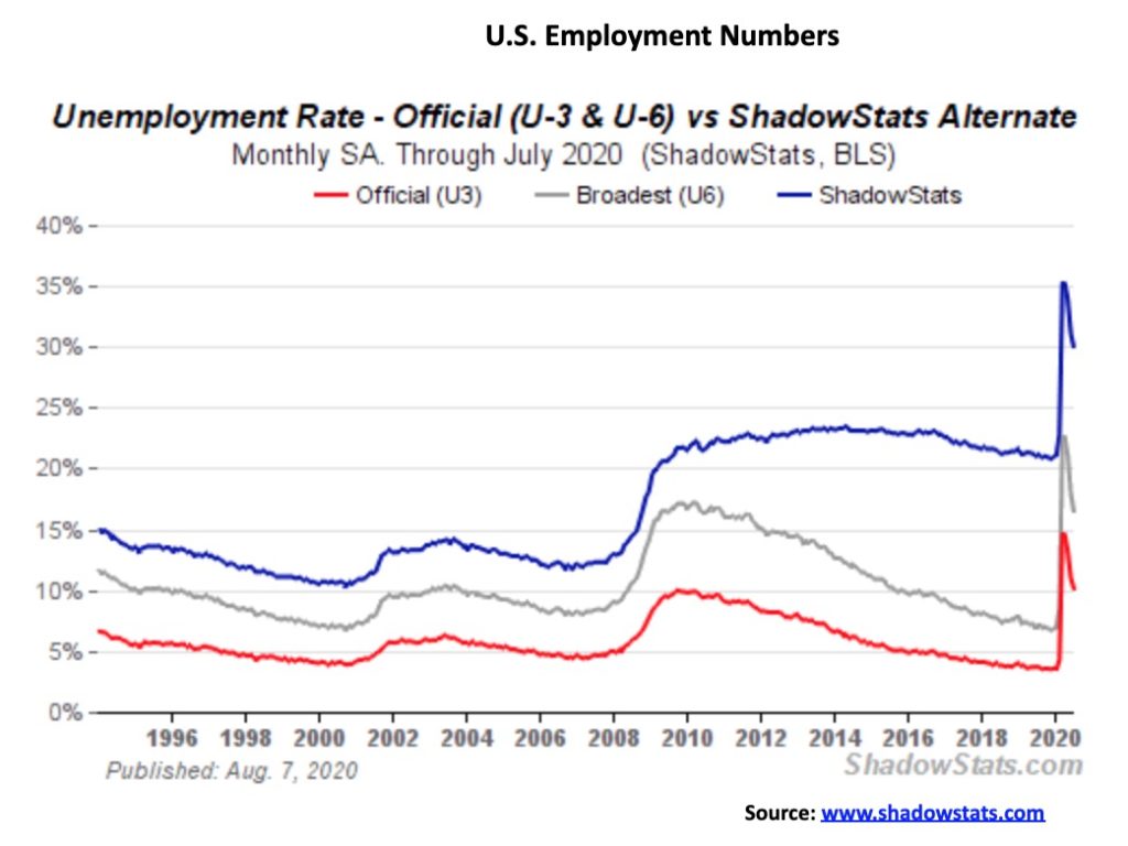
The numbers remain well shy of a recovery. During March and April, the U.S. lost 22,160,000 jobs. So far, only 9,262,000 have come back or 42%. Canada’s performance has been far better. The numbers issued by the Bureau of Labour Statistics (BLS) are, by their own admission, disrupted and distorted because of the pandemic. Nonetheless, the big gains were seen in leisure and hospitality, government, retail trade, professional and business services, and health care. The official headline unemployment rate fell to 10.2% down from 11.1% in June. The U6 unemployment rate, the BLS’s broadest measure that includes short-term discouraged workers, other marginally attached workers, and those forced to work part-time even though they want full-time fell to 16.5%, down from June’s 18.0%. The Shadow Stats (www.shadowstats.com) number that is the BLS’s U6 number plus discouraged workers unemployed more than one year who are no longer counted in the BLS’s calculations came in at 30.0%, down from 31.2%. That’s still an ugly number and in many ways more reflective of the real situation in the U.S.
Those defined as not in the labour force are at 100,498,840 of which almost 55 million are retired and another 9.8 million are disabled. Overall, the total number employed barely changed on the month, according to figures from the St. Louis Fed. There are 16.3 million defined as unemployed, down from 17.8 million the previous month; however, when one includes those wanting to work but not counted plus those that are receiving some kind of Federal unemployment benefit, the actual number of those unemployed rises sharply to 31.3 million. 23.3 million of the workforce who are actually working are part-timers or 16.3%. Officially, the report is painted as quite good. However, the reality is the situation remains poor despite the improvement.
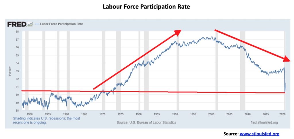
The labour force participation rate continues to falter, coming in at 61.4% vs. 61.5% in June. That tells us that fewer people were actually looking for work and that helps lower the unemployment rate. The labour force participation rate has fallen to levels last seen in the early 1970s before women came into the labour force in larger numbers. Women and visible minorities have been hit the hardest in this recession and, until a vaccine is found, it is expected that the numbers will continue to be dismal. Many, particularly visible minorities, were working in industries that require them to be on site so they are not able to work remotely. There is also a looming child care crisis, something that is present here in Canada as well.
There is the feeling that many will never be able to find jobs again. Bankruptcies and the shutdown (for many permanently) of restaurants, etc. are leading to a potentially large imbalance between companies and workers. In February, before the pandemic fully hit, the labour force participation rate was 63.2%. Its peak was seen in 2000 at 67%. According to one survey, some 47% of those unemployed believe their job is gone for good. The stuff will hit the proverbial fan when the employment benefits run out. There is an estimated $21.5 billion of unpaid rent.
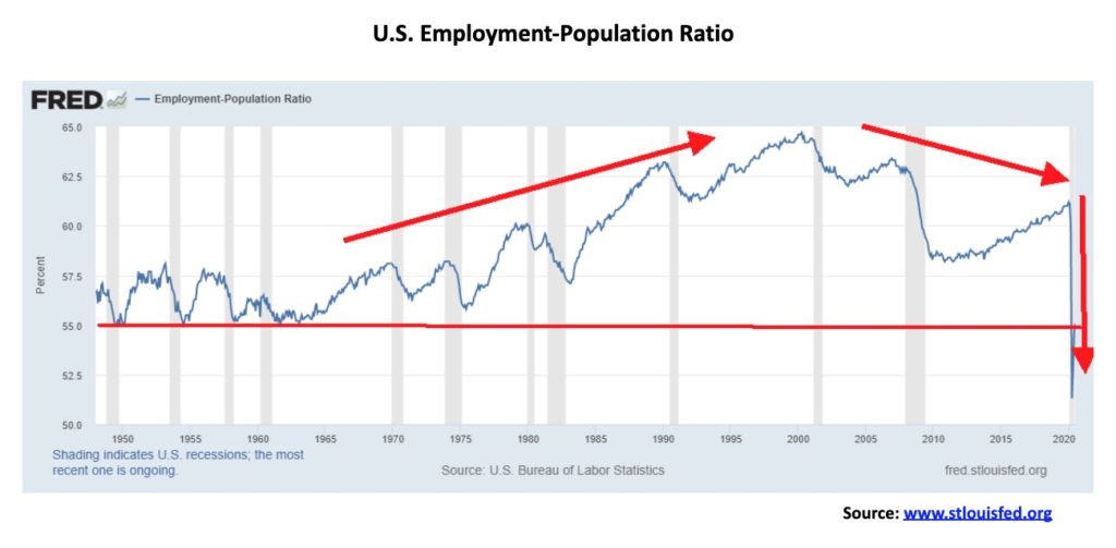
Fewer in the population are actually working. Here the situation looks particularly grim. The employment-population ratio for July was 55.1%. That number reflects the percentage of those working who are 15 years of age and older. They are considered to be the working-age population. So just over half are employed. Of course, many are retired, disabled, or students. However, looking at the chart below, the ratio has fallen below levels seen during the 1950s and 1960s. That is grim. In January 2020 the ratio was 61.2% and the peak was seen in 2000 at 64.7%. The gravy days are far behind.
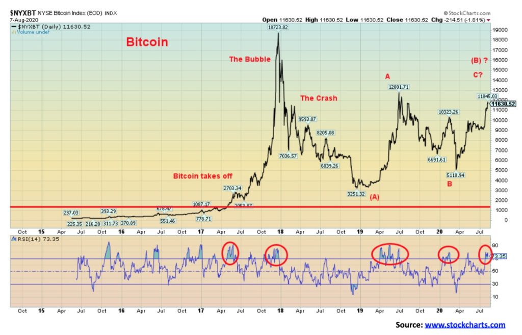
It has been some time since we mentioned Bitcoin, probably because, over time, it appears to have become less relevant. When it was new it was the talk of the town. Bitcoin became one of the biggest bubbles in history, rising a mind-boggling 8,036% from 2015 to its peak in December 2017. That gain was bigger than the Tulip mania of the 17th century. By late 2018 Bitcoin had crashed 83%, rivalling the Dow Jones Industrials (DJI) crash of 1929–1932. We labelled that (A) wave down. Next comes the (B) wave. That appears to be unfolding as a classic ABC-type corrective flat pattern. Has Bitcoin topped? Hard to say, but given that the RSI has once again reached over 70, a level often associated with significant tops, the odds suggest that it could be in the process of finding a top. Both Bitcoin and the DJI continue their dance together as Bitcoin bottomed in March 2020 along with the rest of the market (the B wave down). Since then both have been rising together. Once this wave is complete, we should start the (C) wave down. It could play out over a few years and most likely will not be a straight down collapse. The previous high is at 12,801 so that should provide a level of resistance. The final high could be just short of that level or we could see a new high. The excitement that accompanied Bitcoin and the cryptos into the bubble top in December 2017 just isn’t there any longer. All that tells us that this is merely an impressive correction to the crash that took place between December 2017 and December 2018.
For the record, according to Coin Market Cap (www.coinmarketcap.com), there are now 6,268 cryptos with a market cap of $357.2 billion. Bitcoin totally dominates the market with a market cap of $217.7 billion or almost 61% of the market. Three cryptos—Bitcoin, along with Ethereum and XRP—are 77% of the market. There are 20 cryptos with a market cap in excess of $1 billion and together they make up 91% of the entire crypto market. Doesn’t leave much for the other 6,248 cryptos. Our old favourite, Dogecoin, still has a market cap of $443.7 million and ranks number 32.
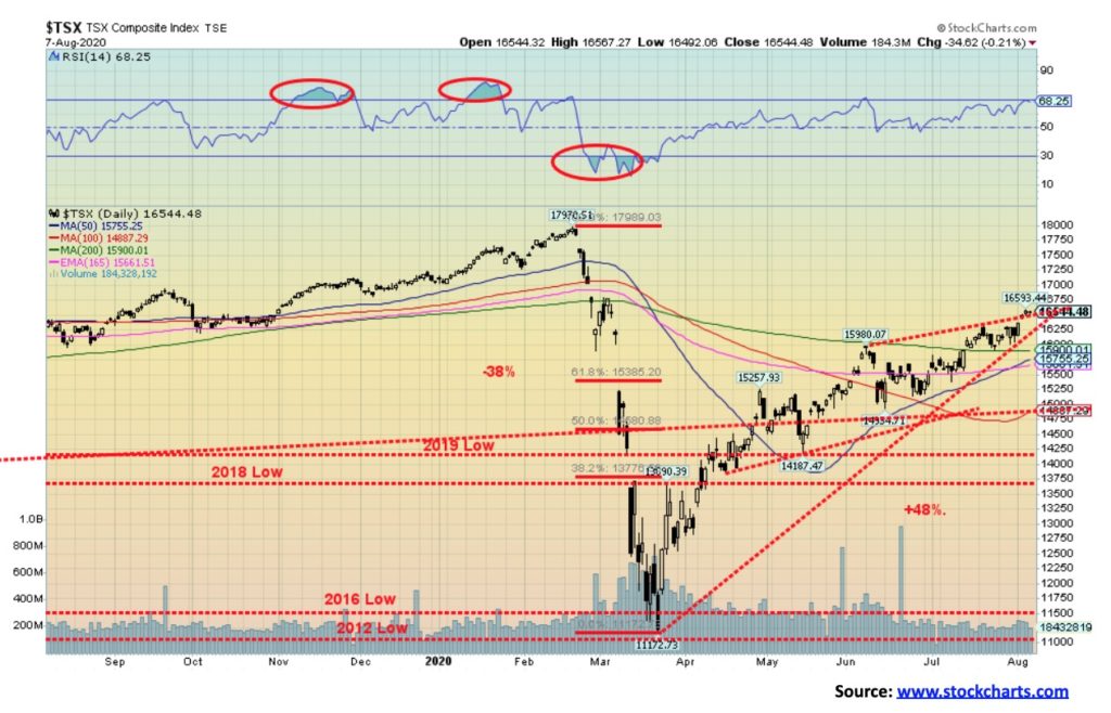
The TSX Composite keeps on partying with the U.S. indices gaining 2.3% this past week. But the return was mixed. Three of the 14 sub-indices were down on the week, led by Health Care (THC), off 4.0%. Golds (TGD) made new 52-week highs and then reversed, closing lower off 0.9%. Utilities (TUT) dropped a small 0.2%. Leading the way to the upside was Energy (TEN), gaining 9.8%, especially because natural gas was strong. But TEN remains well off its recent highs. Financials (TFS) gained 3.2% but all the other sub-indices were around 2% or less for the week. Four made new 52-week highs. Besides Golds (TGD), the others were Metals & Mining (TGM), Materials (TMT), and Information Technology (TTK). Ironically, these are the areas we have touted as the place to be. But, as we note with Golds, both Metals and Mining and Materials and even Info Tech appear toppy and could all be vulnerable to a near-term corrective decline.
The TSX Venture Exchange (CDNX) gained 2.6%, continuing its winning ways. Numerous junior gold mining stocks have doubled, tripled, and even quadrupled or quintupled during this rally. And they still remain cheap. But the CDNX also appears poised for a correction.
We can’t tell whether the TSX is hitting the top of a channel or is breaking out. A move over 16,600 would confirm a breakout. A move back down and a break under 16,250 could start a decline. The vulnerable breakdown point is between 15,600 and 15,900. We’d like that to hold on any pullback. The TSX has enjoyed a good ride to the upside from the March lows; however, it has been uneven with Golds, Materials, Metals and Info Tech all with double-digit gains while Energy, Health Care, Income Trusts, Financials, and, Real Estate have all seen double-digit losses.
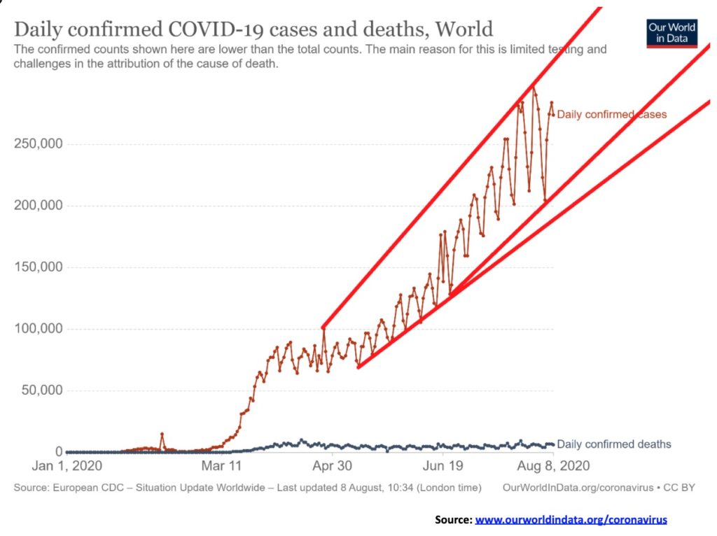
The number of global cases just keeps on rising in an irregular fashion. Oddly the number of deaths has remained fairly consistent around 5,000/day. At current rates a million new cases are added every four days. Keep that pace up and by year end we are looking at 56-60 million cases by year end. The pace keeps up on deaths and the toll by year end could be at least 1.5 million. Ok that’s not Bubonic plague or plague of Justinian numbers or even Spanish flu numbers. More in line with the Asian flu of the late 1950’s. No, we are not in danger of wiping out half the population of the world. Yet this plague has caused extensive economic chaos and damage. Generally, Asia is doing well with the exception of India. Africa appears to be also doing ok with the exception of South Africa. So why is Asia doing so well vs. North/South America and Europe? In Asia the collective or community takes precedence over the individual. In North/South America, Europe, individual rights take precedence. No, it is not consistent as some have been able to get their numbers down by emphasizing the collective and obtaining mostly co-operation.
COVID-19 Cases and Deaths August 9 11:53 GMT
Number of Cases: 19,834,735
Number of Deaths: 730,210
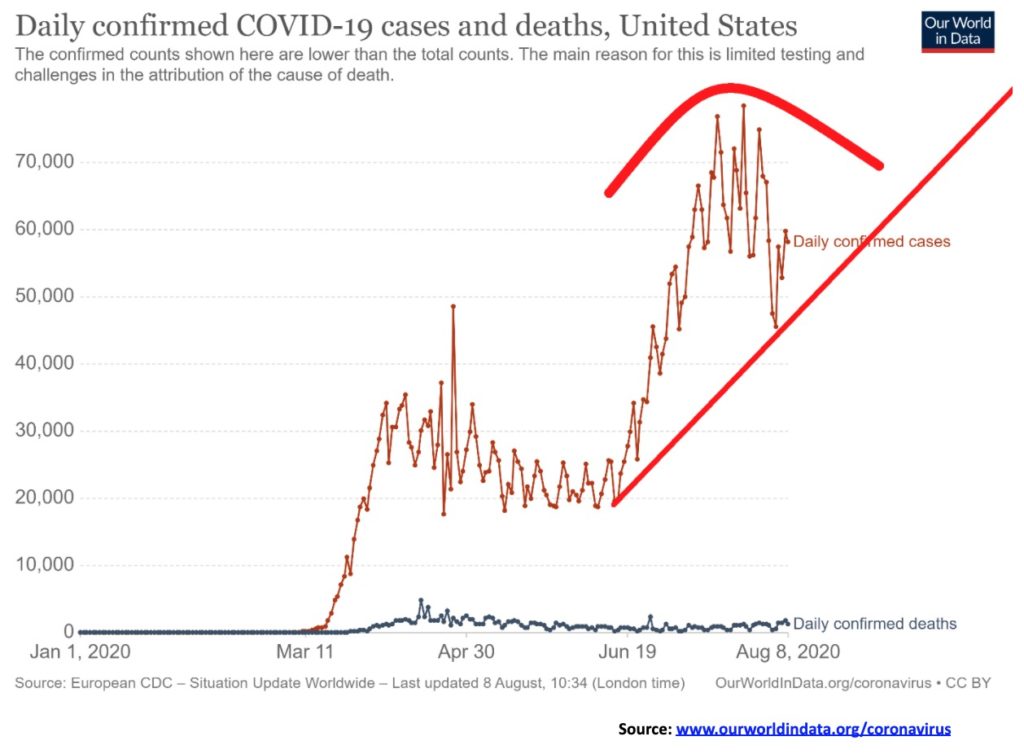
Could the U.S. be topping? Or was the recent improvement merely a Wave 4 correction before we take off again? Hard to say. But the U.S. continues to lead the world in cases and deaths and the country is deeply divided along political lines when it comes to wearing masks or social distancing. Maybe they’ll develop herd immunity. Question is how many will die to develop it. Or maybe a vaccine will miraculously appear. The optimists say soon. The realists say next year sometime. It takes a lot of work to develop a proven vaccine. By year end at the current rate the U.S. could have 14-15 million cases and 350,000 deaths.
COVID-19 Cases and Deaths August 9 11:53 GMT
Number of Cases: 5,150,060
Number of Deaths: 165,074
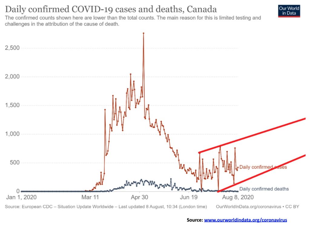
Generally, Canada has been able to bring the numbers down with generally followed instructions to wear masks and social distancing. However, after bringing the numbers down sharply into June the pace has picked up somewhat once again although not to the same extent as was seen back in March and April. Could the numbers rise again? Well there is currently an upward sloping tendency. Or it could just be a lot of bottom bouncing. The number of deaths has been brought down sharply.
COVID-19 Cases and Deaths August 9 11:53 GMT
Number of Cases: 119,221
Number of Deaths: 8,976
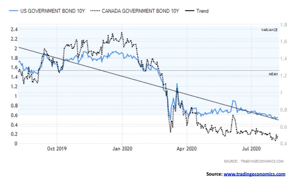
There remains little chance that interest rates are about to rise. It may happen at some point, but more than likely it will be caused by some outside event. The Fed is maintaining its rate at 0–0.25%. The BofC is maintaining its rate at 0.25%. With unemployment numbers in the stratosphere and the pandemic still raging, the odds of the economy returning to 2019 levels anytime soon are slim to none. The result is, don’t expect a rise in rates. As well, the central banks are continuing with their bond purchases—or monetizing the debt, as we put it. All this helps keep interest rates suppressed. And low interest rates remain a factor in helping to push funds into the stock market (risk-on). Low interest rates also make borrowing cheap for arbitraging into the stock market (risk-on). The reality is banks aren’t lending so the purchase of things or actual good economic investment is not expected to happen. Finally, low interest rates help governments keep their interest payments down. There is sufficient demand for debt given its safety, and many institutional buyers are forced to buy debt, particularly government debt, for safety reasons.
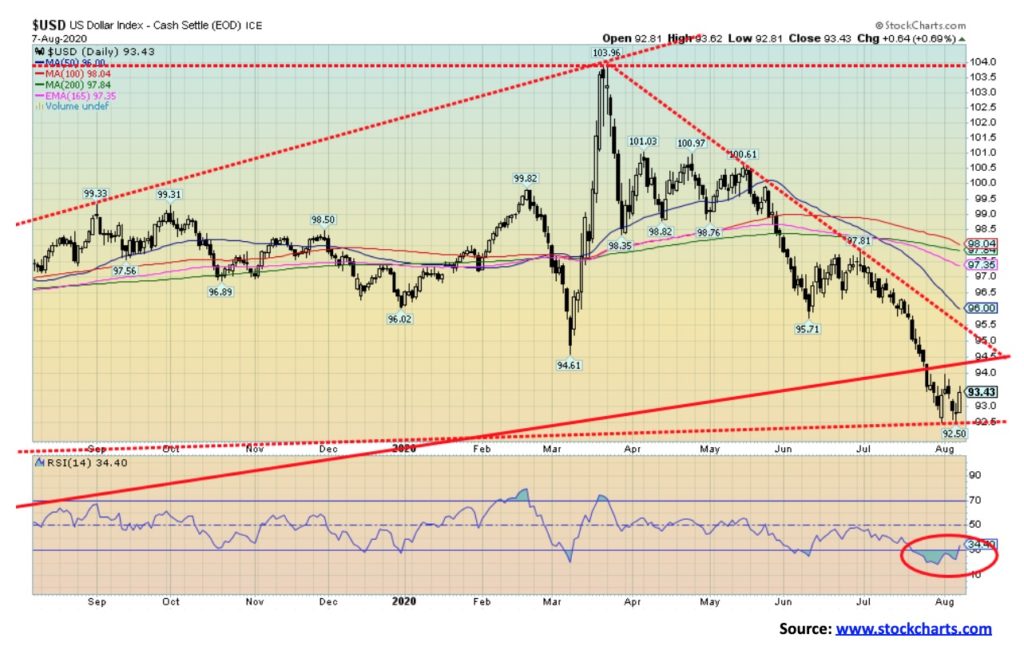
The US$ Index appears to be trying to find support at major long-term support levels. With an RSI that reached down to 20 in late July, the US$ Index appears poised for a rebound rally. If that’s correct, then that could have negative implications for gold as gold tends to rise when the U.S. dollar falls and falls when the U.S. dollar rises. The US$ Index has fallen just over 5% since June while gold is up over 20%. Initial resistance is at 94.50 with further resistance up to just over 95. These appear to be at least minimum objectives on any rebound. The US$ Index rose a mere 0.1% this week as, overall, the currencies were pretty quiet. The euro was up only about ½% as was the Swiss franc while the pound sterling fell 0.2% and the Japanese yen fell 0.1%. The Canadian dollar was essentially flat. The euro has been as bullish as the US$ Index is bearish with sentiment towards the euro around 88%. Again, all of this suggests that the US$ Index is due for a rally. A breakout over 95.50 could imply even higher levels for the US$ Index with targets up to major resistance near 98. A move over 100 would imply even higher levels. The US$ Index has been weak, given the weak U.S. economy and the outrageous numbers emanating from the COVID-19 pandemic. The ongoing divisiveness in the U.S., with riots in the streets and political dissension, is also playing a role as are the rising tensions between the U.S. and China. Once this rebound rally is finished, the US$ Index should begin another descent to the downside with ultimate targets down to around 88. The only question we have is, what will the extent of the rebound be? We could correct the entire drop from 104. If so, potential targets could be up to almost 100. New lows below 92.50 would probably not trigger a further sharp drop but would result in only marginally lower lows instead.
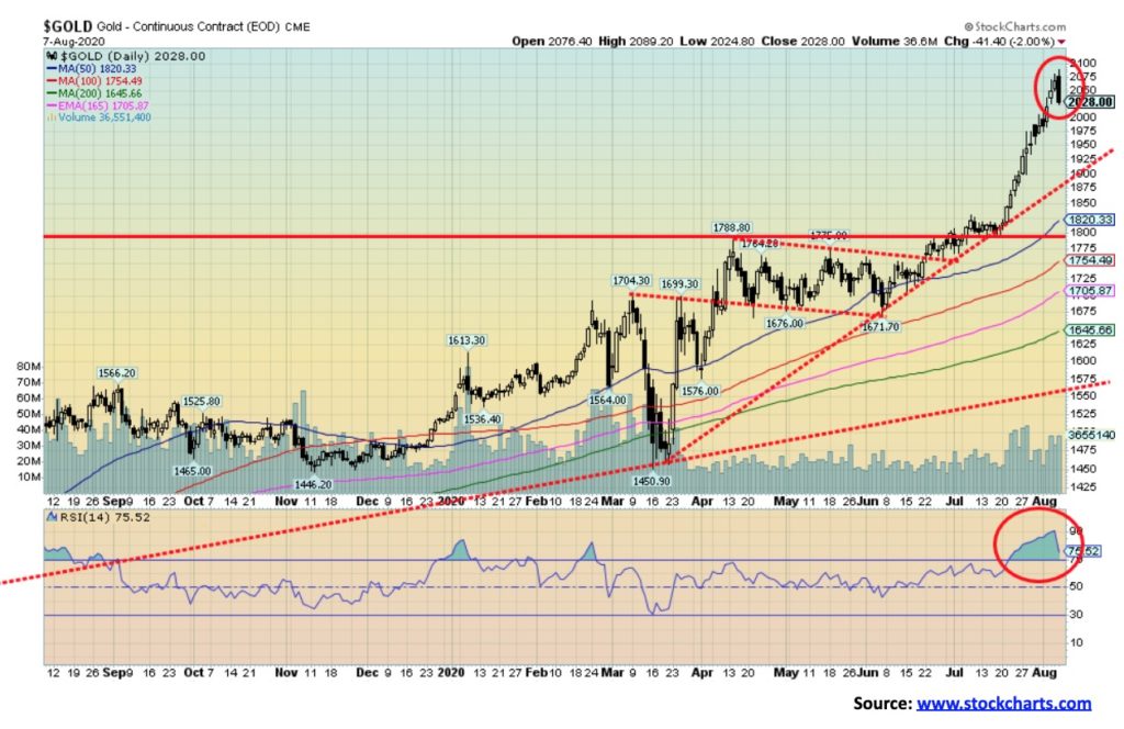
Once again gold made new 52-week and all-time highs this past week, hitting a high of $2,089 which was about on our next target of $2,090. That we failed to exceed it and close over that level, coupled with what appears as a potential outside day key reversal, implies that we could be entering a correction period. Since a low in June 2020 we have soared $357. A very normal correction of that June/August move could see gold fall back to $1,830. Significant support is seen at $1,900 so a break under that level would imply further losses. Major long-term support can be seen all the way down at $1,550. We don’t believe we’d fall that far. If gold were to correct the move from the March 2020 low it could imply a decline to around $1,700. Again, we don’t believe that would happen but we don’t want to rule out worst case scenarios.
It is noteworthy that gold only saw a couple of corrections on its way to a record high in September 2011. The move started in October 2008. The two corrections were shallow of about 15%. A drop of that magnitude today would imply a decline to just under $1,800. The February/March 2020 drop was only 15%. Two earlier declines saw gold fall only about 8%. We have wondered if gold is still in the throes of a blow-off move as we saw in 1979. That move saw gold quadruple from its low in November 1978. A similar move today would take us to about $4,700 based on a low seen in August 2018 at $1,167. We don’t want to get ahead of ourselves for something that is still in theory. Despite the reversal on Friday the week did not see a reversal and gold closed up 2.1% on the week. Silver was a big performer, gaining 13.7%. Platinum was also up 5.6% while palladium rose 1.5%. Copper, on the other hand, fell 2.8%. The gold stocks, as represented by the Gold Bugs Index (HUI) and the TSX Gold Index (TGD), were negative on the week with the HUI flat and the TGD down 0.9%. The gold stocks were signaling to us that a possible correction is in the works. Sentiment remains at or near extremes over 90% bullish. Gold fever can be tough to break but when it does it can and will be dramatic. After topping in September 2011 gold promptly fell over 20%. In 1980 gold did the same, falling 25% on a close basis and over 40% from the top of January 1980. So, a drop of 10% is not out of the question. But a drop of over 30% would signal a final top is in.
One thing that is overlooked for gold is the surge in demand for coins and bars. We note at SilverGoldBull (www.silvergoldbull.ca) that premiums for Canadian Gold Maple Leafs are about 7% while premiums for Canadian Silver Maple Leafs are over 27%. There are apparently shortages at some mints. And we are not what we would call into gold mania, yet. Apparently, reductions due to COVID-19 at mines in Mexico and Peru, two of the world’s largest producers, are not helping the silver situation. Silver mines in Peru and Mexico account for 40% of world production.
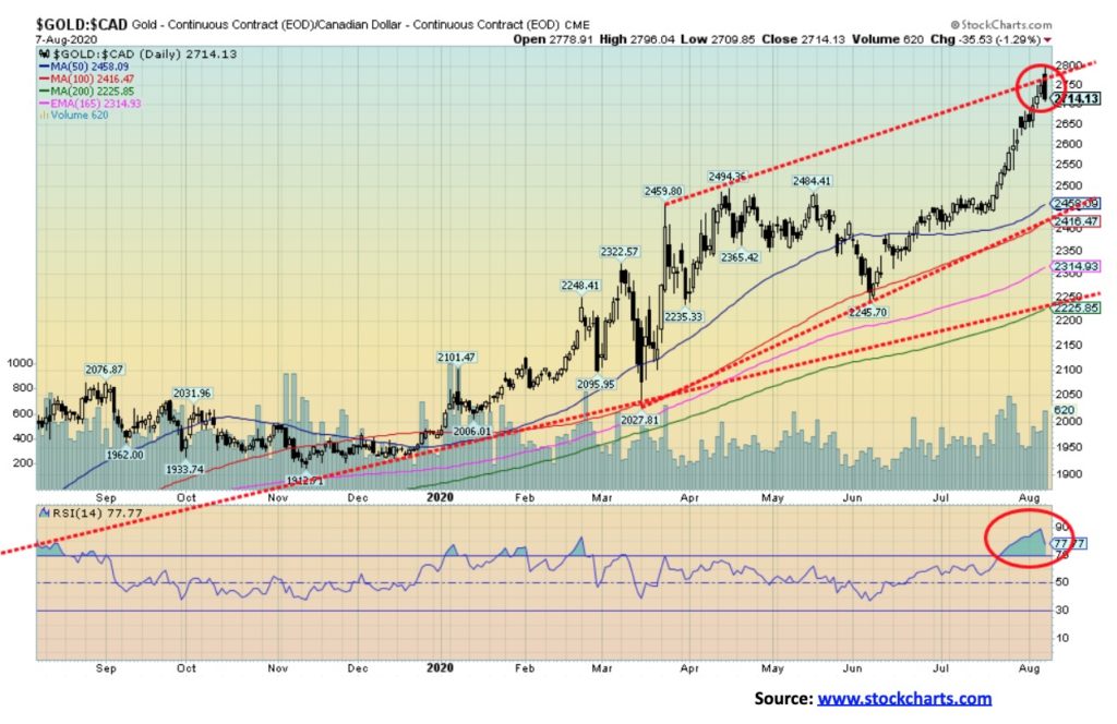
Gold soared once again to new 52-week and new all-time highs in Canadian dollars this past week, hitting a peak of $2,796 before reversing and closing down $35 on the day. As with the U.S. futures, gold in Cdn$ also made a potential outside day key reversal on Friday. So, is this the end? Well, as with gold in U.S. dollars, it is not necessarily the end of the world but it is a cautionary note. A temporary top may be in. With an RSI screaming over 80 (currently 78), a correction is badly needed to take away some of the excessive bullishness. Gold in Cdn$ also hit what appears to be the top of a channel, so a pullback would not be unusual. Gold in Cdn$ has soared $479 since June or about 21%. A normal correction could take us back as far as $2,450 and we would still remain in a bull market. A break under $2,400 would be more negative and imply a drop to at least $2,200. A break under $2,000 would be quite negative and we would have entered a bear market.
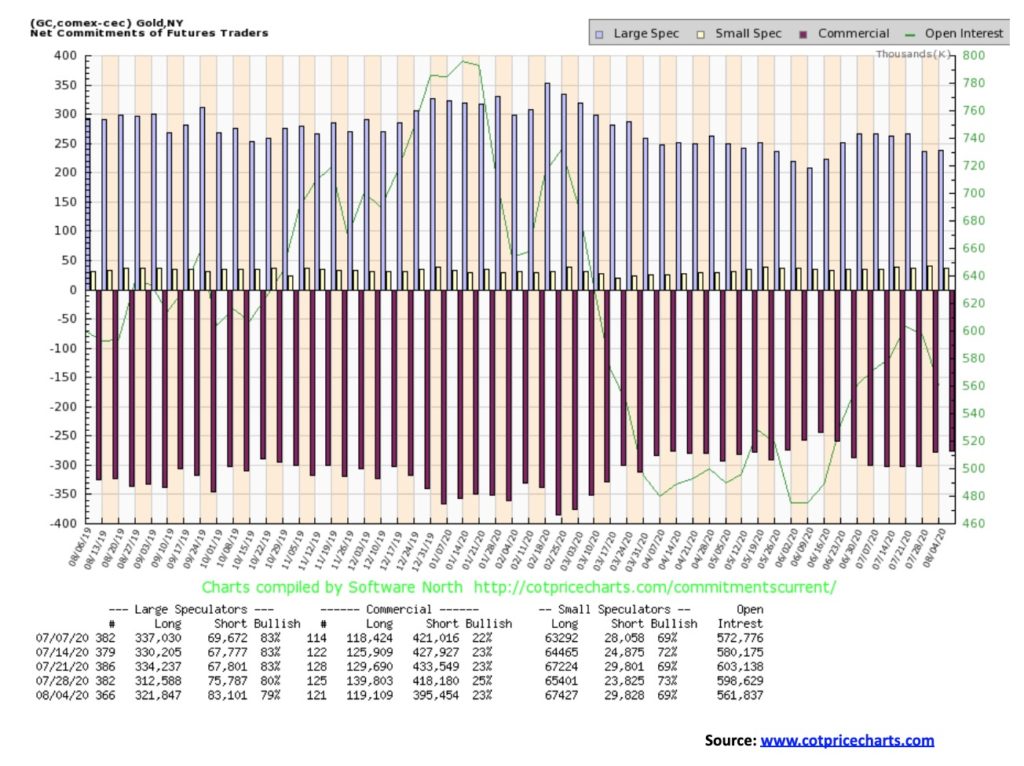
The gold commercial COT slipped this past week to 23%, falling back to levels seen two weeks earlier. However, it was a covering decline as long open interest fell over 20,000 contracts and short open interest dropped almost 23,000 contracts. The large speculators COT (hedge funds, managed futures, etc.) slipped to 79% even as long open interest rose over 9,000 contracts but short open interest also went up by roughly 7,000 contracts. Overall, open interest fell some 37,000 contracts as gold prices rose. This suggests a pause coming to the market. Rising prices with rising open interest is bullish, but rising prices and falling open interest is somewhat negative.

As with gold, silver spiked this past week to fresh 52-week highs at $29.92, then reversed and closed down $0.86 at $27.54. By trading over $29 silver achieved our targets set here a few weeks ago after silver broke out of the long sideways pattern seen from 2015 to just recently. We achieved the target a lot faster than we anticipated. That’s both good and bad. Bad because spikes need some consolidation and the reversal on Friday could imply that, as with gold and the gold/silver stocks, we need to go through a corrective period. While our “Chart of the Week” featured silver and its potential for considerably higher prices, this will not be achieved overnight. Periods of corrections and consolidation will occur. One may be upon us. Silver has made a rather dramatic rapid move, gaining 72% in a matter of a couple of months. So, a corrective is not out of the question. A normal correction could take us back as low as $18.60 based, not on the move from May, but from the March low of $11.64. Based on the May low of $17.38 a normal correction could take us back to $22.20. It is noteworthy that the big move from October 2008 at $8.40 to silver’s ultimate high of $49.82 in April 2011 saw at least four corrections of some significance. Each correction was at least 20%. A 20% correction today would take silver back to $24. It is noteworthy that when silver finally broke in 2011 the drop was 35%. So, using 20% with an outside 25% would not be out of place and still maintain a bull market going forward. A drop of over 30% would, however, be a negative sign and raise the possibility of a final top. With an RSI in excess of 80 and bullish sentiment over 90%, a correction at this time would not be unusual. Silver is still showing potential to rise into the $30s and possibly to our next target level of $35. But first a pause would be positive for the bullish scenario going forward. A break under $23 would imply a potential decline to at least $21. Under $21 would be far more problematic and we would question the bull market.
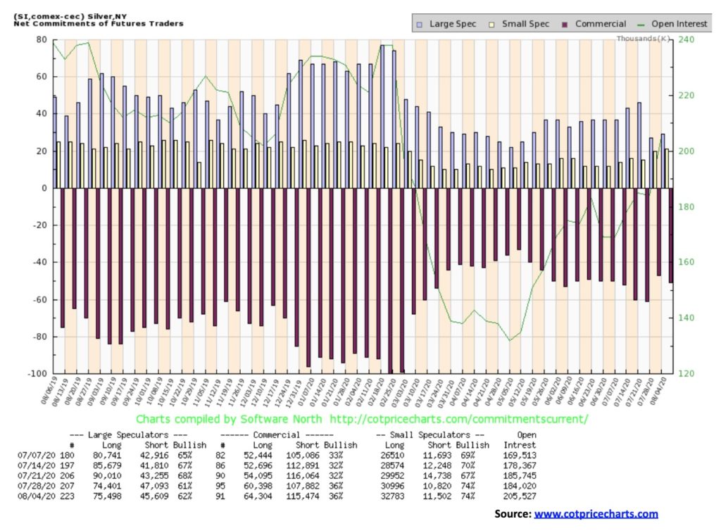
The commercial COT for silver improved to 36% two weeks ago and has remained at that level this past week. Short open interest did rise roughly 8,000 contracts while long open interest jumped about 4,000 contracts. Overall, short open interest is about where it was two weeks ago but long open interest is up roughly 10,000 contracts. The large speculators COT rose slightly this past week to 62%, but that is down from a high of 68% only three weeks ago. We view the current silver COT as encouraging for the bulls even as it is not overly bullish. But it is not very bearish either.
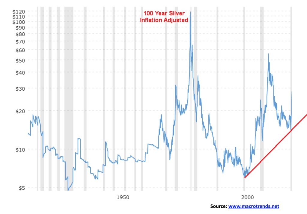
Inflation-adjusted charts always tell us an interesting story. According to this chart (base today), the high for silver was in January 1980 at $118.48. The 2011 high fell short of that level. The 2011 high came in at $43.73. Today we are only at $28. Gold’s 1980 high was at $2,246.79 while the 2011 high came in at $2,076.85. So right now, we are on the cusp of taking out the 2011 high on an inflation-adjusted basis but remain short of the 1980 high. The Dow Jones Industrials (DJI) by contrast made new all-time inflation-adjusted highs in late 2019. The DJI is currently just under that high. The NASDAQ and the S&P 500 have far exceeded their all-time highs on an inflation-adjusted basis. We believe that, at some point, both gold and silver will set new all-time highs on an inflation-adjusted basis. The all-time low was set in 1931 at $4.70. Based on inflation levels and current levels, silver remains very cheap.
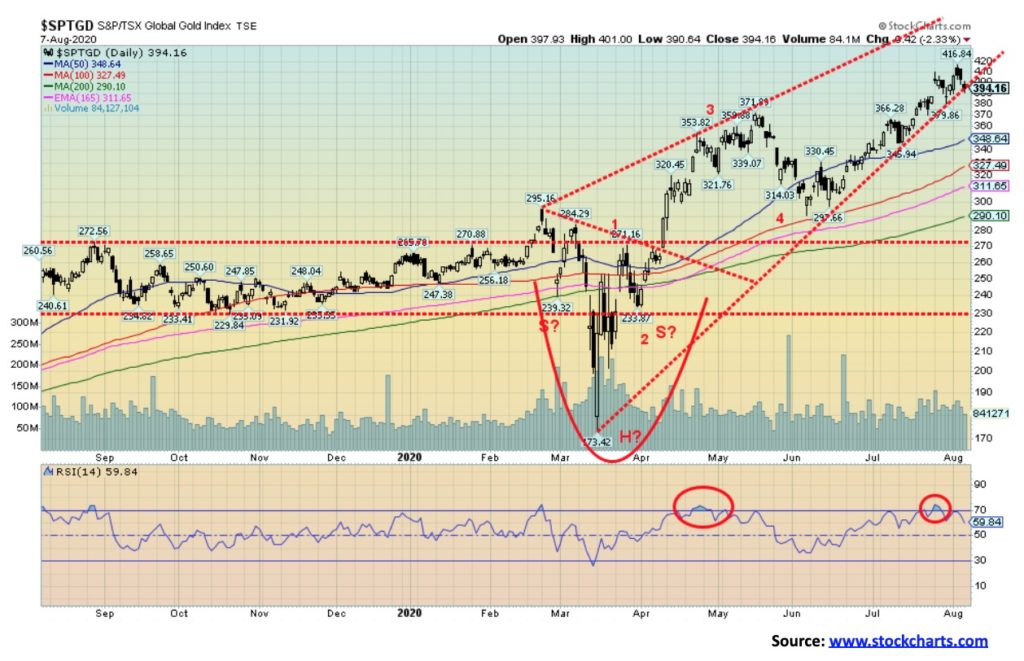
This past week the TSX Gold Index (TGD) jumped to new 52-week highs, then reversed and closed lower on the week off 0.9%. The Gold Bugs Index (HUI) also hit new 52-week highs, then reversed but still managed to close flat on the week. At a high this past week of 416.84 the TGD Is, amazingly, not far from its all-time high of 455 set in 2011. It has been a long time crawling back to those lofty levels. Many producing gold miners appeared poised to go through at least a corrective period. None of this is to suggest that we have made a final top. At this time, we do not see evidence of one but another short-term top may be at hand. A drop under 380 would suggest that a decline to at least 350 support could be underway. The current rally got underway from a low in September 2018 at 147. Since then we note four corrections of some significance. March 2019 to May 2019 saw a drop of 14%. August 2019 to October 2019 a drop of almost 16%. The worst one was the drop from February 2020 to March 2020 when the TGD fell 41%, and finally there was a decline from May to June 2020 of almost 22%. The average was 23% so a drop of that magnitude now would take the TGD down to about 320. The 200-day MA is at 290 so only a sustained decline through that level would turn this into a prolonged bear market. 290 also marks the June 2020 low so we do not want to see that level fall. A series of higher highs and higher lows defines the uptrend, setting aside the spike low in March 2020. The possible head and shoulders bottom that formed from February to April 2020 implied a move to at least 385. Since we exceeded that number, the next potential target was up to 460 with minimum objectives of 414. We achieved the minimum objectives this past week. New highs above 417 could imply a move to the next objective of 432. But for now, a drop under 380 would imply that at least a temporary top is in. The TGD is up roughly 50% on the year, so a pause to work off some of the excesses would be positive.
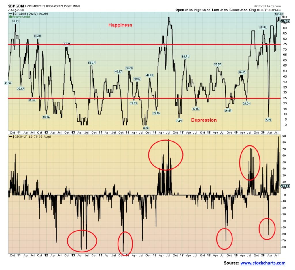
Sentiment is important and here the sentiment towards the gold mining stocks remains at or near record levels. The Gold Miners Bullish Percent Index (BPGDM) is at 96.55, just off the maximum high of 100 which has been hit a few times over the past few weeks. And now we note the Gold Miners New Highs – New Lows Percent Index (GDXHLP) had spiked to 90 which is the highest level we have ever seen. It has come off to 13.79 but the spike is a warning. Maybe it has come off sufficiently but, combined with the BPGDM, it tells us some caution should be used towards the gold mining stocks at this time, at least until the excess bullishness eases.
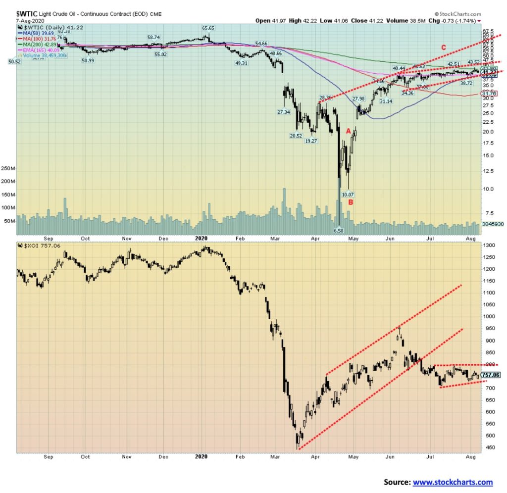
Oil prices ended higher this past week as inventory draws were higher than expected, but fears of a second wave of COVID-19 sent prices back down again. Still, WTI oil ended the week up 2.4%. However, there is little to be excited about as WTI oil remains down 32.5% on the year. Prices remain locked in a sideways trading pattern that should soon break one way or the other. Beware of a false upside breakout followed quickly by a downside reversal. We’ve seen that pattern before coming out of these sideway patterns. WTI oil continues to trade just below its 200-day MA and its continued failure to break out over it suggests to us that the most likely next move is downward. But first it could give the false upside breakout. That false breakout could even take us to the top of a possible channel up near $60 before reversing and falling once again. The performance of the energy stocks remains underwhelming, even as the ARCA Oil & Gas Index (XOI) gained 2.1% this past week and Canada’s TSX Energy Index (TEN) was up 9.8% (thanks to natural gas). Both remain sharply down on the year with the XOI off 40.4% and the TEN down 43.7%. The energy stocks appear to be signaling that WTI oil prices will not remain at these levels much longer.
Factors helping to push up natural gas (NG) prices appear to be hot weather, resulting in higher demand for air conditioning and possible effects from Hurricane Isaias. The result is, this big gain last seen of 24.4% may not last. Still, it helped push NG prices into the black for 2020, up 2.3%.
—
(Featured image by StockSnap via Pixabay)
DISCLAIMER: This article was written by a third party contributor and does not reflect the opinion of Born2Invest, its management, staff or its associates. Please review our disclaimer for more information.
This article may include forward-looking statements. These forward-looking statements generally are identified by the words “believe,” “project,” “estimate,” “become,” “plan,” “will,” and similar expressions. These forward-looking statements involve known and unknown risks as well as uncertainties, including those discussed in the following cautionary statements and elsewhere in this article and on this site. Although the Company may believe that its expectations are based on reasonable assumptions, the actual results that the Company may achieve may differ materially from any forward-looking statements, which reflect the opinions of the management of the Company only as of the date hereof. Additionally, please make sure to read these important disclosures.


Bitcoin Stalls Near $60K as Strategy Moves, ETFs Outflow, and EU MiCA Rules Take Effect
Bitcoin hovers near $60,000 with ETF outflows, while Strategy boosts reserves, sells BTC, and raises dividends to reassure investors. Ethereum...


Cannabis Dominates Global Drug Use: Trends, Risks, and Shifting Markets
Cannabis remains the world’s most widely used illicit drug, with 256 million users in 2024, surpassing all others combined. Growth...


Italy Approves First Hydrogen-Powered Train for National Rail Network
ANSFISA has approved Italy’s first hydrogen-powered train, the Alstom HMU214, for use on the Brescia–Iseo–Edolo line. Capable of 140 km/h,...


Cotton Market Weakness Persists Despite Brief Rebound
Cotton prices fell to new lows last week before a modest rebound. USDA data shows crop conditions remain worse than...


Eli Lilly Hits $1 Trillion Valuation Amid Strong Bullish Momentum
Eli Lilly stock hit a record high, surpassing $1 trillion market value after strong product demand. Shares surged over 7%,...
 |
|
 |  |
 |
|
-

 Impact Investing2 weeks ago
AI Adoption in Italian Retail Stalls Despite Strong Experimentation
-
 Cannabis20 hours ago
Cannabis Dominates Global Drug Use: Trends, Risks, and Shifting Markets
-

 Impact Investing7 days ago
EU Weighs More Free Emission Permits in ETS Review to Boost Industry Competitiveness
-

 Impact Investing2 weeks ago
SBTi Net-Zero Standard 2.0 Enhances Corporate Climate Action