Business
When You Finally Understand the Rules Someone Always Changes Them
These past few weeks, bond yields are going down (bond valuations are going up). However, after seeing yields rise as they have since August 2020, it’s expected seeing a correction in this rising trend. This correction could last for the next year. Still, I believe it is only a correction in a continuing bear market in debt, that has a long way to go.
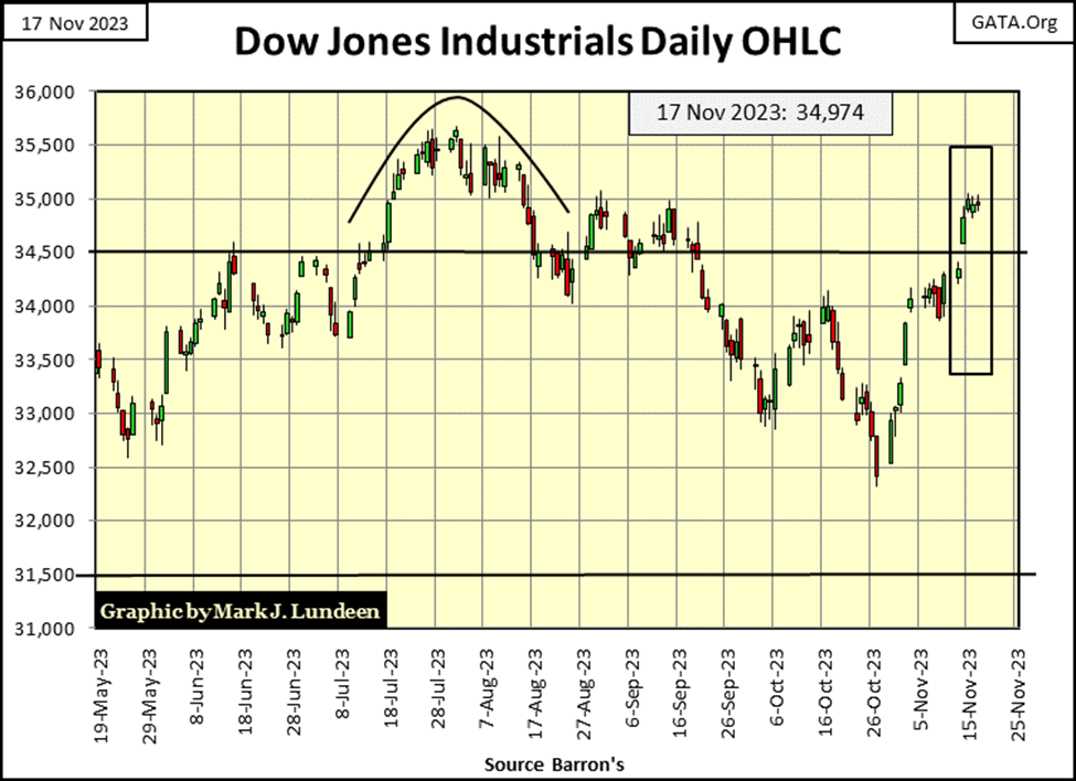
I kept saying it’s going down. But damn it, it keeps going up. I’m talking about the Dow Jones in its BEV chart below. So, what’s wrong? Clearly, it’s a case of; when you finally figure out the rules in the market, someone else always changes the rules.
So, what rules am I talking about? In early 2022, 21 months ago, the idiots made it known in a very public manner, that they were going to begin a QT to shrink the Federal Reserve’s balance sheet, and begin raising interest rates beginning in May 2022. In the past, either of these actions would prove to be very bearish on the stock market. Doing both at the same time almost guaranteed a big bear market decline. But that didn’t happen.
Oh sure, the Dow Jones corrected down below its BEV -20% line in autumn of 2022, in its BEV chart below. But after the idiots increased their Fed Funds Rate from 0.08% in March 2022, to its current 5.33%, and drained $1,097 billion ($1.09 trillion) from their balance sheet (a 12% reduction), that 22% market decline from a year ago wasn’t much of a bear market decline. According to the rules that have been in place for decades, there is no way the Dow Jones should be anywhere near its BEV -5% line, just 5% from a new all-time high at this week’s close.
But there it is in the BEV Chart below; the Dow Jones closed the week just 0.04 BEV points from scoring position.
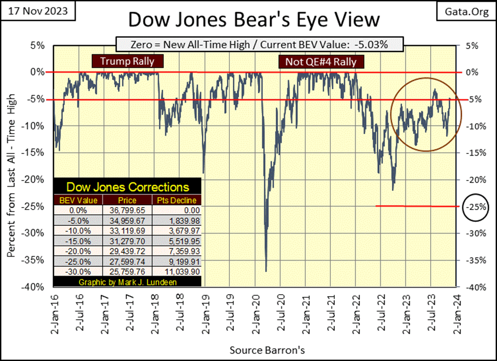
Still, the Dow Jones has been struggling since its last all-time high, the 04 January 2022 Terminal Zero of the Powell Not QE#4 market advance. Compare the last two years for the Dow Jones, with the Trump Rally above, where the Dow Jones closed in scoring position (BEV -0.01% to -4.99% / above its BEV -5% Red Line) and stayed there, making one new BEV Zero (new all-time high) after another for almost two years.
Then there is the Not QE#4 Rally, where for a year the Dow Jones closed in scoring position, making many new all-time highs (BEV Zeros) for that year. But since January 2022, almost two years now, seeing the Dow Jones close in scoring position has become a rare market event. And not a single BEV Zero to be seen in the Dow Jones BEV chart above since January 2022.
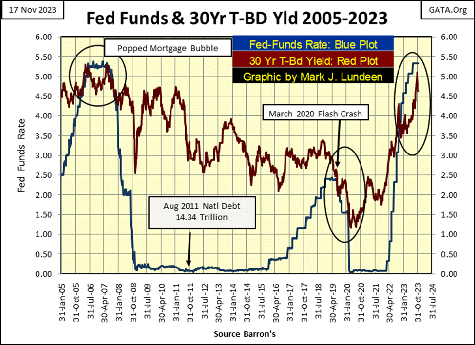
Another multi-decade rule has been set aside; when an inversion in the yield curve takes place (Fed Funds Rate rises above the yield for the US Long Bond), a big bear market in the stock market follows. In the chart below, that is what happened to trigger the sub-prime mortgage bear market, and again for the March 2020 Flash Crash. And note both of those yield inversions were wimpy, when compared to our current inversion in the yield curve.
Currently, the yield curve has been inverted for the past year, an entire year since Barron’s 28 November 2021 issue, not that anyone following the Dow Jones would notice.
Below are some historic yield curves. The top Blue Plot was the largest yield inversion in the miserable history of the Federal Reserve. Double-digit CPI inflation of the late 1970s and early 1980s, drove Treasury Debt yields into double digits. In July 1981, when then FOMC primary idiot, Paul Volcker, increased his Fed Funds Rate to 22% to pop the bubble in consumer prices the FOMC had inflated into the economy. But this bubble wasn’t in the stock or bond market, but in consumer prices, which he was successful in popping a year later, because of what is seen below.
The bottom Green Plot was the yield curve for August 2020. The idiots at the FOMC had depressed the cost of money (interest rates and bond yields) down to nothing three years ago, and that is how things were since the subprime mortgage bubble had popped, as seen in the blue Fed Funds plot in the chart above.
Look at the decline in the Fed Funds Rate, and bond yields from July 1981 to August 2020 in the chart below. How did that happen? Oh, that is easy to answer; the “policy makers” insisted anyone employed at the FOMC was, and still is, a certifiable-monetary lunatic.
No shortage of these. Ivy League Universities spits these lunatics out by the dozens every spring, to be employed by Wall Street, corporate America and the FOMC to do what is seen below. From July 1981 (Blue Plot) to August 2020 (Green Plot); these lunatics provided ever cheaper money, to buy cheap thrills on Wall Street, with no adult supervision.
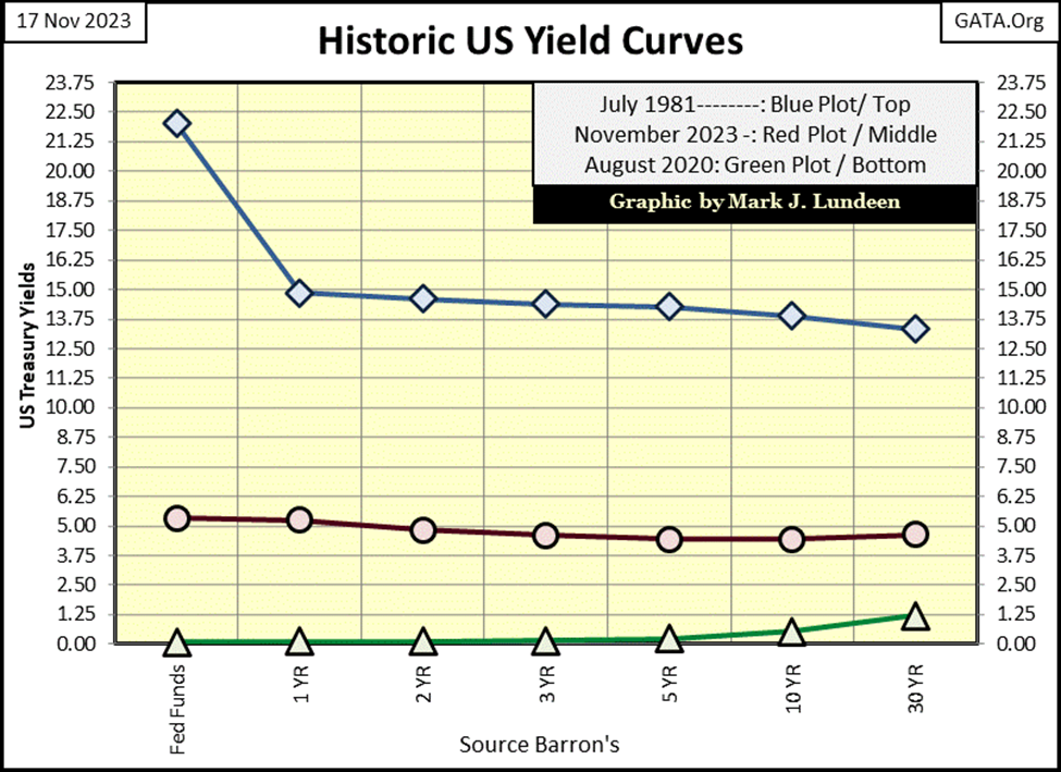
Now let’s look at the yield curve above for the close of this week; the Red Plot above. This inevitable bounce off the bottom of the lows of August 2020 resulted in a massive bear market in bonds. For this 30yr T-Bond issued in February 2020, chart below, these yield increases resulted in a 54.87% decline in market valuation from August 2020 to just last month.
Not to this extent, but the entire debt market, for all bonds maturing a few decades out, has seen market valuation deflate by at least 30%. Yet somehow, the Dow Jones closed this week almost in scoring position?
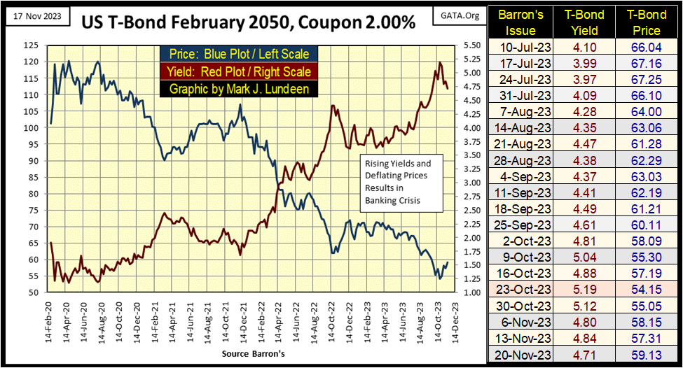
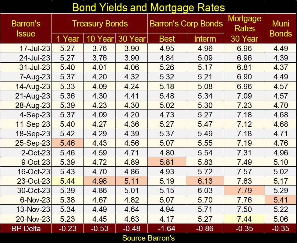
Here are some bond yields and the mortgage rate as published by the St. Louis Federal Reserve Bank. These past few weeks, bond yields are going down (bond valuations are going up). However, after seeing yields rise as they have since August 2020, it’s expected seeing a correction in this rising trend. This correction could last for the next year. Still, I believe it is only a correction in a continuing bear market in debt, that has a long way to go.
Let’s look at the Dow Jones in daily bars next. I doubted the Dow Jones could do it; make a move to its 35,000 level. So far, no daily close at, or above 35,000, but one such day is knocking at the door. The trend of the past month, of declining bond yields seen above, no doubt is helping the Dow Jones. But valuations for the Dow Jones, as for everything in the stock market (except for the gold and silver mining stocks) are bloated, and in need of some deflation.
But that is me talking. What really matters in this market is what the idiots at the FOMC think this market needs. Obviously, what they are thinking is more inflation in market valuations is needed, even as they continue draining “liquidity” from their balance sheet. I find this amazing, or possibly something simple as fraudulent accounting at the Federal Reserve. Think Enron, where their actual balance sheet was quite different from their published one, so, they kept their illiquidity problems a secret from everyone – for a while anyway.
Mark, are you accusing the Federal Reserve of fraudulent accounting? Oh, good grief no, for the simple reason no one, not even Congress can audit the Federal Reserve’s books. Who wrote that rule? Why, Congress did! This is one rule that really has to be changed.
They, the idiots, are now also talking about lowering interest rates. Are they going to terminate their QT too, as if they haven’t already. Would that matter? Maybe, and maybe not. Still, for the Dow Jones to make a new all-time high, it would have to close above its last all-time high of 36,799.
Can the idiots get that done? And if they do, what then? A Dow Jones close at 40,000 would only be an advance of 8.69% from the current all-time high. That small return doesn’t seem worth the risks of assuming a position in this massive bubble in the market.
A bit late in my market commentary, but here are the BEV values for the major market indexes I follow. The NASDAQ Insurance index (#1) keeps closing in scoring position, but hasn’t seen a new all-time high (0.00% / BEV Zero) since last February. And now, the NASDAQ 100 (#2) is closing in scoring position too. The last time the NASDAQ 100 made a BEV Zero in the table below was in November 2021, two years ago. Will it make a new all-time high (0.00%) anytime soon?
If the current trend of inflating market valuations seen this week in the table below continues, maybe it will. The Average for this table (#14) moved up almost 3 BEV points from Monday’s close. Even the XAU (#21) was up by 3 BEV points this week.
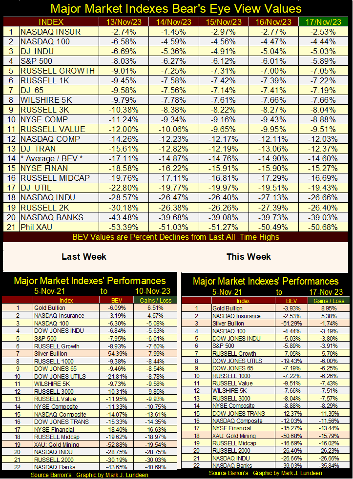
Looking at the performance tables above, gold remains at the #1 spot, and silver reclaimed its #3 position. So, why is the XAU down at the #18 spot? Because that is one rule the idiots haven’t changed yet; no matter what gold and silver bullion do, their rule is the gold miners must remain in an economic depressed state.
Like all rules, that one too shall change. If not by the idiots at the FOMC, then by Mr Bear when it returns to claw back the bloated market valuations seen in these stock indexes. And what about the exploration plays like Eskay Mining? Like anything else, the best time to buy is when there is blood on the streets.
Keep in mind that all exploration plays are speculations; high risk, and hopefully high rewards. So, don’t bet money needed for your rent on mineral exploration. But in the past three years, Eskay has made big strides towards finding another, or possibly a few high-grade Eskay Mine type ore bodies on its massive property. I sold a small portion of my holdings as I needed to raise cash to hold me over the next year. But I still have my position in the company, and I ‘m looking forward to what Mac Balkam and company have planned for 2024.
Especially should (when) gold make a break for $3000, and silver for $100 an ounce, money will come flooding into these precious metal miners and exploration stocks.
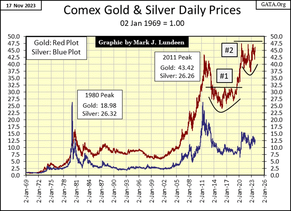
As I’ve mentioned previously, my crystal ball is malfunctioning a bit these days. On a good day, billowing clouds of smoke is all I usually see in it, so I don’t like to be too specific with my prediction. But looking at this chart below for gold and silver, indexed to 1.00 = January 1969, I feel optimistic about the future of precious metal assets.
Gold wants to increase to much higher levels. It’s just that every time gold attempts breaking above its 47.5 level, ($2061.44 in dollar terms), a bunch of goons at the COMEX jump on it. This won’t last forever.
When that rule changes; the current rule placing a 47.5 line-of-death for the gold market seen below, seeing gold rise to an indexed value of 70 would not be unreasonable. Gold rising to $3000 an ounce, would be an indexed value in the chart below of 68.97. Silver at $100 would be an indexed value of 54.05 on this chart.
We live in a world dominated by a bunch of idiots on Wall Street, and in Washington DC. These are not the people who built the United States of America. History will record they are the people who took America down. So, we can, and should expect unpleasant surprises in the year(s) to come. For the goons at the COMEX, in a crisis, seeing gold trading over $3000 and silver above $100 may just be two unpleasant surprises for them. Bad times at the COMEX, would be good news for the market valuations for the gold and silver miners.
Here is a quick note of the technical set up for today’s gold market; compare completed setup #1, with setup still in the making, #2 in the chart below. The bowl-shaped correction following a new all-time high, and a line-of-death capping any advance that approaches this line, until the market breaks above and then stays above the line, which completes the setup.
I’m very optimistic that in the next year, possibly before Christmas, but most likely not, gold will take out this line at 47.5 ($2061), and keep going up.
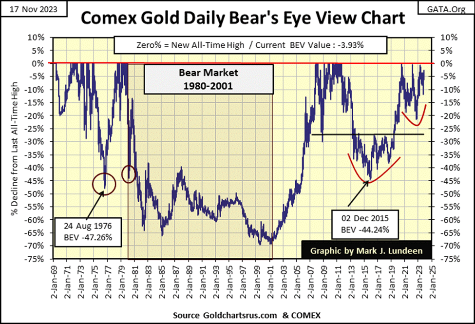
To go along with my chart of indexed values for gold and silver above, this week I’m publishing a BEV chart for gold that also goes back to 1969. Same data, the difference being the chart above is in indexed dollar valuations. The chart below is in Bear’s Eye View format; where each new all-time highs register as 0.00%, and never more. Any data point not a new all-time high, registers as a negative percentage claw back from their last all-time high, so;
- 0% = New All-Time High,
- -100% = Total Wipeout in Valuation,
- and everything in between
As with the dollar chart above, below we see two bottoming patterns, the first (#1) with December 2015 as its bottom. This pattern also had a line-of-death at its BEV -27.5% level, about $1340. When gold finally broke above this line-of-death in the summer of 2019, few then believed it possible, but two years later gold closed at a new all-time high of $2061 in August 2020.
I expect forward thinking people are looking at these gold charts, above and below, and are thinking the same thing for our current gold market when gold finally breaks above, and stays above its current line-of-death at $2061.
For gold in its step sum table below, since October 16th gold has seen no shortage of down days in its trading. But note during this time, since October 18th, gold closed in scoring position, except for the two days enclosed in a red box. Apparently, the goons at the COMEX aren’t having an easy time keeping the price of gold down.
We’re due for a spell of advancing days overwhelming declining days in the gold market, as seen on the Dow Jones side of the table. What happens then, gold at new all-time highs? Maybe, but I still believe we’ll need a big increase in daily volatility before gold will finally clear $2061, and stay there. Days where gold moves (+/-) 3% or more from a previous day’s closing price, before gold makes its next big push into market history; $3000 an ounce?
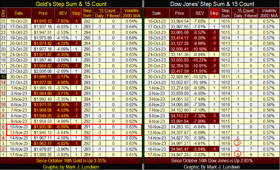
This week the Dow Jones became overbought, with a 15-count of +7 on Wednesday, and closing the week with a very overbought +9. Markets don’t like being very overbought, so I’m expecting the Dow Jones may see an increase in daily declines to work off that +9.
It will be interesting to see if the bulls running around Wall Street can protect the Dow Jones’ valuation, as well as the gold bulls did above, when they had to deal with declining days overwhelming daily advances. In the step sum table above, gold demonstrated remarkable strength this past month.
It appears the Dow Jones bulls will soon get an opportunity to show the world if they have the same resilience the gold market has shown this past month.
America is entering its holiday season; the five weeks spanning Thanksgiving to New Year Day. Usually, this is a happy time for myself, and many other Americans. But this year is different.
__
(Featured image by Markus Spiske via Unsplash)
DISCLAIMER: This article was written by a third party contributor and does not reflect the opinion of Born2Invest, its management, staff or its associates. Please review our disclaimer for more information.
This article may include forward-looking statements. These forward-looking statements generally are identified by the words “believe,” “project,” “estimate,” “become,” “plan,” “will,” and similar expressions. These forward-looking statements involve known and unknown risks as well as uncertainties, including those discussed in the following cautionary statements and elsewhere in this article and on this site. Although the Company may believe that its expectations are based on reasonable assumptions, the actual results that the Company may achieve may differ materially from any forward-looking statements, which reflect the opinions of the management of the Company only as of the date hereof. Additionally, please make sure to read these important disclosures.


Ecobnb Turns Sustainable Tourism Into Measurable Impact
Ecobnb’s sustainable tourism platform generated significant environmental and social impact in 2025, avoiding 58,207 kg of CO₂ and adding 583...


Sugar Markets Balance Biofuel Demand and Global Supply
Sugar markets in New York and London were mostly unchanged as the Iran conflict renewed interest in biofuels. Drought concerns...


The $40 Trillion Trap: Disinflation Is Not Deliverance
U.S. debt has reached $40 trillion, with $24 billion weekly interest, while deficits accelerate. Despite disinflation in CPI, from cooling...


FinTech Matures as AI and Infrastructure Drive the Next Growth Phase
Fintech markets are entering a mature phase, shifting from rapid growth to consolidation, specialization, and sustainable business models. Zurich and...


Bitcoin, and Ethereum Rise, While Cardano Enters Transition
Bitcoin and Ethereum posted modest weekend gains, supported by ETF inflows. A new proposal may protect Bitcoin from quantum threats....
 |
|
 |  |
 |
|
-

 Biotech2 weeks ago
BIP Sells BIC Incubator to Innova, Refocuses on Core Innovation Areas
-
 Impact Investing5 hours ago
Ecobnb Turns Sustainable Tourism Into Measurable Impact
-

 Fintech1 week ago
Robinhood Chain Surges with Rapid Adoption and Billion-Dollar Trading Volume
-

 Cannabis2 weeks ago
Virginia’s Cannabis Journey: A Lesson in Why Legalization Requires More Than a Law