Featured
The CPI report shows a new jump in inflation
The CPI report is the subject of our Chart of the Week. Pundits are screaming Weimer Republic hyperinflation. But the bond market rallied doing the opposite to what might be expected. This week brings us the FOMC. Interest rates will be unchanged and the market will hanging waiting to hear the Fed on inflation and tapering. Oh yes tapering. So why is the Fed still doing record reverse repos?
We are now approaching a year and half since one of the deadliest pandemics ever recorded got underway. Yes, deadly because the COVID-19 now ranks amongst the top 10 deadliest pandemics of all time. The problem with that assessment, however, is that counting the number of dead from ancient and medieval plagues is extremely imprecise. It’s only in the past 100 years or so that more accurate numbers have been kept and even they appear to be undercounting the actual cases and deaths. One thing we do know is that the total number of deaths being recorded in countries has been well above what would normally have been expected based on pre-pandemic numbers, not only in the Western nations but in Asia, Africa, and Latin America as well. Whether they can be attributable to COVID-19 is not known. It is noteworthy that, while COVID-19 has officially claimed over 3.7 million lives, the AIDS pandemic that got underway in the early 1980s has killed an estimated 30–40 million worldwide and remains an active pandemic.
So, no, the COVID-19 pandemic doesn’t quite rank up there with the Plague of Justinian in the 6th century, the Black Plague of the 14th century (that recurred with some regularity into the 19th century with even some cases into the 20th century), or the smallpox plagues that were estimated to have been a factor in the deaths of upwards of 80–90% of the native American populations from the 16th to the 19th century and even into the 20th century. The so-called Spanish flu of 1918–1920 was estimated to have killed upwards of 50 million. While COVID-19 cracking the top 10 could be considered historical, this pandemic remains well off the greatest plagues in history.
Arguably one of the biggest negative impacts of the pandemic has been the impact on the global economy. The year 2020 saw almost the entire world slide into a deep recession with millions unemployed and businesses failing. This is the second tumultuous crisis of past year and half.
The job market imploded as governments desperately tried to wrestle the pandemic to the ground. Millions suddenly found themselves unemployed at worst, or in temporary layoff (with unknown return) at best. The resultant negative impact on thousands of small businesses is still being calculated. At its peak, over three million lost their jobs in Canada and over 22 million in the U.S. A year and half later they are nowhere near recovering the lost jobs and millions remain unemployed. Many expect a surge in bankruptcies.
The result was that government support programs ramped up and deficits and debt exploded. Since January 2020 the Fed’s balance sheet has exploded upward by almost $3.8 trillion (+90%). U.S. Federal debt has increased by $4.9 trillion (21%). All U.S. debt including government, corporate, and consumer is up over $8.0 trillion (11%). As to GDP, well, it is up $24.5 billion or 1.4%. Canada’s government debt has increased by roughly $500 billion or about 40%. Meanwhile, the Bank of Canada’s (BofC) balance sheet exploded by over $360 billion or 200%. Canada’s GDP is up $142 billion since 2019 or about 8%. As we say we have spent a lot of money and ramped up a lot of debt to stand still economically even as millions remain unemployed.
The third significant disruption was in politics, at least for the U.S. The U.S. election took place against the backdrop of a deadly pandemic. The election was extremely contentious and divisive. It resulted in a record turnout. When the election was over there were claims of fraud as the sitting president refused to concede the election. While numerous legal challenges were mounted in numerous states, almost all were dismissed by the courts. The contentiousness culminated on January 6, 2021, the day that the U.S. congress and senate were to confirm the election results. On that day a mob supporting the sitting president stormed Capitol Hill, resulting in a riot, clashing with police, leaving five dead either during the riot or afterwards and dozens injured, disrupting the counting of the electoral votes, forcing legislators to flee and hide, and followed afterwards by hundreds of arrests.
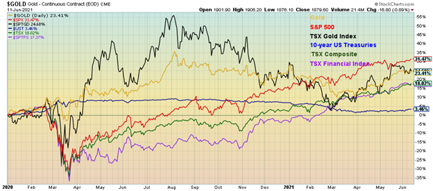
Yet, against that backdrop—pandemic, imploding job market, and political chaos—the stock market rose. The S&P 500 has gained 31.5% since January 1, 2020. Since the depths of the March 2020 pandemic crash the S&P 500 is up over 83%. Our chart below shows the performance of the S&P 500 vs. Gold (+23.4%), the TSX Gold Index (TGD) (+24.7%), the TSX Composite (+18.0), the TSX Financials Index (TFS) (+17.4%), and the 10-year U.S. treasury note (+3.5% before interest).
Performance January 1, 2020 – Present
The rich get richer? Inequality grows? It certainly seems that way. It was estimated that workers lost $3.7 trillion during the pandemic while billionaires gained $3.9 trillion, thanks to the stock market rise. This was a huge wealth transfer, although the workers were for the most part cushioned by government support and unemployment programs.
Inequality, already wide before the election, widened even further. Depending on the source, the Gini coefficient (a statistical measurement of economic inequality and wealth distribution amongst a population) for the U.S. is anywhere from 41.5 to 48. Most measurements are at least 2 years old now. The U.S. Gini may have widened further since then, particularly during the pandemic. In Canada, the Gini coefficient is approximated at 30 but that data is at least 3 years old and more likely in the mid-30s today. The U.S. is the highest of the G7 and ranks the country with African and Latin American developing countries.
As we have noted before, the distribution of stock ownership largely favors the wealthy. In the U.S. the 1% own 38% of all equities and 51% of directly owned stock. The top 10% hold 84% of all equities and 91% of all directly owned stock. The bottom 50% hold roughly 1% of all equities and virtually no directly owned stock (source: Survey of Consumer Finances www.federalreserve.gov, www.nytimes.com). Numbers are similar in Canada. With stock markets on fire since the March 2020 pandemic crash, no wonder the benefits went primarily to the wealthy, thus contributing to the widening of the wealth gap.
The great divide of Main Street vs. Wall Street. Main Street struggles. Wall Street counts its winnings. Meanwhile, the debate rages over the large number of job openings and jobs supposedly going unfilled. According to the Bureau of Labour Statistics (BLS), the number of job openings, known as JOLTS, reached a record in April at 9.3 million. Many claim that the reason there are so many job openings going unfulfilled is that unemployment benefits are too generous. Twenty-five states have passed legislation that will effectively end benefits early. While, on the surface, that may be playing a role, the reality is most likely quite different.
Note that the labour force participation rate has fallen to 61.6% down from 63.4% pre-pandemic. That tells us that a lot of people are either no longer counted as being a part of the labour force or have dropped out because they believe there are no jobs that match their skills out there or they have dropped out for economic reasons.
Many older workers have taken early retirement. It is estimated that over 2 million workers in the U.S. have effectively dropped out of the workforce because they are older and see no clear path to employment again. The number of workers over 55 has fallen 5% since the pandemic began vs. only 2% for workers 35-54. Many of these people are retiring into a very insecure future, given low savings. Many women, as primary caregivers, have dropped out to care for young school-age children not going to school because the school is closed or to care for elderly parents. There remains a fear of COVID, particularly for the leisure and accommodation industry, the industry with the largest job openings. Low pay also plays a role. There remains a large mismatch between skills and job requirements and geographical location. There is a large reluctance to move and many can’t afford to move. A job in the hospitality industry in a high-rent city like San Francisco will have trouble recruiting workers with low pay and because these workers can’t afford the rents near the job, they are forced to live too far away and lack the means to get there in a timely fashion.
Meanwhile, the stock market toys with either going higher or failing here for a much-needed correction. We can warn, but we will only know the stock market is breaking down once it breaks key points. Indicators continue to be in the stratosphere. We have previously mentioned the Shiller S&P 500 PE at 37.62, the highest level it has seen since the December 1999 dot.com bubble peak. The S&P 500 dividend yield is at 1.36%, the lowest level seen since the Great Recession of 2007–2009. Stock buybacks have played a big role in not only pushing the stock market higher but also lowering the dividend yield as capital gains are preferred over dividends. Overall, the dividend yield is the lowest seen since the dot.com bubble peak in 2000 (1.11% in August 2000) which in itself was an historically low level. The same is being seen with earnings yields that are also at their lowest levels (2.22%) since the Great Recession of 2007–2009 (lowest was May 2009 at 0.81%). Margin debt is at record levels ($887 billion as of April 2021).
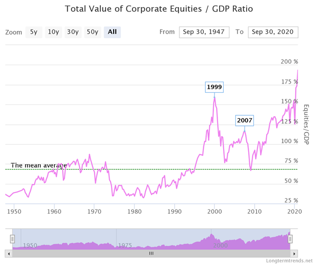
If market cap to GDP is to be a measurement of frothiness in the stock market, then the current value of corporate equities (known as the Buffett Indicator) to GDP is at record highs. This indicator has only been in play since the late 1940s, but it has successfully noted tops in the 1960s, 1999, and 2007. Today’s level is beyond any of those important tops. By this measurement, valuations are in the stratosphere.
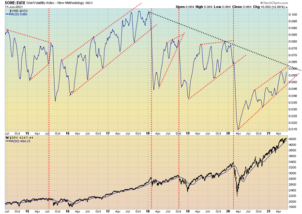
Volatility is a measurement of complacency in the market. Extreme complacency leads to all sorts of crazes. Think cryptocurrencies (Bitcoin, Dogecoin, etc.), SPACs, and recently “Meme Stocks” (i.e., GameStop and more recently AMC). But our chart below of the VIX Indicator (inverted) vs. the S&P 500 shows a rather interesting growing divergence. Yes, the inverted VIX Indicator has been rising with the S&P 500 but the indicator is nowhere near the levels seen in 2016, 2018, and 2019 even as the S&P 500 makes new all-time highs, a divergence. While the formation of the inverted VIX Indicator is incomplete like the previous periods, it appears to be forming a rising wedge triangle which is bearish. While it is noted that the market could still make a higher high, the current struggle could be a sign that it is getting tired.
Inverted VIX vs. S&P 500
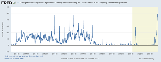
The market’s current hesitation could be related to the potential for growing inflation (see Chart of the Week) and the current confusion caused by the Fed over its ongoing reverse repo program. Once again, the Fed conducted reverse repos in the markets, with a record $547 billion on June 11. Every day seems to bring a new record. Reverse repos are the opposite of repos in that they drain cash from the markets and appear as a liability on the Fed’s balance sheet—money owed to counterparties. All of this is strange in that the Fed is continuing with its QE program to the tune of $120 billion/month (puts money into the financial system) while draining excess reserves from the financial system with the reverse repos. Reverse repos are often employed at quarter ends and year ends to balance the financial system. However, this has been occurring in the middle of the quarter.
We continue to wonder if there is a problem as it seems the Fed is giving with one hand (QE) while taking with the other (reverse repos). Next week is the FOMC meeting and the interest rate decision (nothing expected) along with economic projections. Expect some comments on inflation and possibly even taper talk. The Fed is walking a tight rope. Hike interest rates and the markets freak and the stock market could crash and send the economy back into recession (officially, it has never left it). So, to prevent this the Fed has to keep up QE. But it risks more asset inflation. And the Fed doesn’t want the overnight rate to go negative. So, the Fed is required to mop up all that excess liquidity through reverse repos. As we say, the Fed giveth (QE) and taketh away (reverse repos). But the other side of this is that the banks have too much money and don’t know what to do with it. Loans have actually been falling. So, what that also tells us is that any improvement in the economy is illusionary. Bond yields are falling, not rising. We’d be a bit nervous about the stock market as a result.
Overnight Reverse Repos
It has been quite the year (and a half). Pandemic, job implosions, political chaos, and a roaring stock market. A correction is coming, starting either this month or into July but one is coming. The question is, how deep? No, we do not expect a crash yet. Few bear markets start with a crash as they did in 1929 or even as we saw in 1987 and 2020. More likely is a shallow pullback (10%–15%?) as we saw in 2000 and again in 2007 before a larger decline gets underway. The current bull market is 12 years old. In theory, that has only been surpassed by the 1982–2000 bull market. With the exception of the March 2020 pandemic panic which proved nasty but short-lived, all of the corrections (2011 and 2015/2016) have been shallow, under 20%. The 1982–2000 bull market saw one nasty correction (1987) and three shallow corrections (20% or less) in 1984, 1990, and 1998. All signs continue to point to another correction coming, starting either this month or, at the latest, in July.
The Pandemic Rages On!
Things are slowing down. Restrictions are coming off. Things are opening up again. Breath a sign of relief. And hope that variants don’t flare sufficiently enough to take us all into lockdown again. The 7-day MA of cases is down to about 381 thousands/day. Deaths down to 10,500/day which is still high but off the highs of almost 15,000/day. In the U.S. the same. Daily cases down to less than 16,000/day. A far cry from the 251 thousand cases/day recorded in January 2021. Deaths down to under 400/day from a peak of about 3,500/day. In Canada the same – cases down to around 1,400/day and deaths down to around 30/day. We can all breath a sign of relief. But its not over yet even as those vaccinated rise. And the western world is donating a billion vaccines to the developing world.
Sunday June 13, 2021 – 15:17 GMT
World
Number of cases: 176,548,816
Number of deaths: 3,813,286
Cases per million: 22,650
Deaths per million: 489.2
U.S.A.
Number of cases: 34,316,005
Number of deaths: 614,958
Cases per million: 103,101
Deaths per million: 1,848
Canada
Number of cases: 1,401,006
Number of deaths: 25,914
Cases per million: 36,815
Deaths per million: 681
Source: www.worldometers.info/coronavirus
Chart of the Week
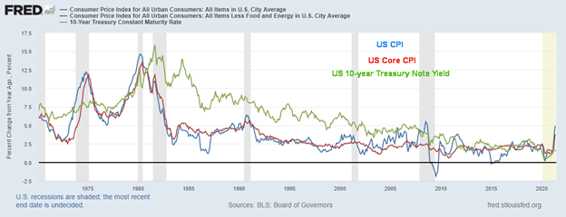
There is no denying that the inflation hysteria pundits are ruling the day, given the latest CPI report. Once again, we heard how we are about to enter the new Weimar Republic hyperinflation. And that despite the fact that we are nowhere even near the inflation of the 1970s. The CPI report released on June 10 did come in slightly above expectations. The May CPI rose 0.6% vs. a rise of 0.8% in April. The market had expected at least 0.5%. The year-over-year CPI rose 5.0% vs. an expectation of 4.7%. But again, as in April, the year-over-year change was coming from a deep pandemic low. Next month might be more telling. The core inflation rate (ex food and energy) rose 3.8% year over year vs. an expectation of 3.4%. It is the core inflation rate that Fed focuses on. The CPI rate increase is the highest since 2008.
If anyone took the time to examine the inflation numbers, they’d discover that 70% of the rise of 5% is attributable to just five items. The big five were: energy/commodities, used cars and trucks, food away from home, car and truck rental, and airline fares. They each contributed 41.6%, 0.18%, 0.05%, 0.04%, and 0.03% respectively to the rise in the CPI. Note that food prices were not amongst the big five. With everyone fixated on oil prices (up 45% in 2021 so far) it is noteworthy that the volatile energy component contributed so much. Many commodities have been facing supply problems as opposed to a sudden surge in demand. Oil is plentiful but major producers such as Saudi Arabia have been holding back and cut production to help push oil prices higher. However, Saudi Arabia has also been at the center of price wars as they are the ones that have the capacity to flood the market and bring prices down sharply if they choose.
Others such as car rentals surged because of notable bankruptcies in the past year. Airline fares surged as tourism collapsed and airlines were placed in dire financial straits because of the pandemic. Airlines sold off planes to survive. Is flying a necessity? The same for food away from home as restaurateurs tried to make up for closings. But again, is take-out food a necessity? Car and truck purchases can be deferred. Chip shortages from Asia have played havoc for the automobile industry. As well, there have been factory shutdowns, no new inventory has come on the market, and car rental companies sold off inventory to survive.
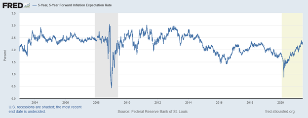
Inflation expectations are rising as is noted in the next chart of 5-year, 5-year forward inflation expectations. Again, it is noted that a great deal of inflation expectations centers around oil prices or, more specifically for consumers, the price of gasoline at the pump. Today, those expectations remain below levels seen back in 2010 to 2014 even if they are rising.
5-year, 5-year Forward Inflation Expectations 2003–2021
Many of these prices increases noted were due to the pandemic and are cyclical. As the world returns to normal, supply chains could correct themselves. We are sure the Fed will take these and others into consideration when looking at these numbers and they are highly unlikely to overreact. The FOMC meets this coming week and inflation and tapering are sure to be on the agenda.
Finally, there is the real oddity. Instead of going up as many would have expected, the 10-year bond yield actually went down. The U.S. 10-year treasury note fell to 1.46% this past week (see later comment on bonds), down from 1.56% last week and a recent peak of 1.74%. If there was fear of inflation, why is the bond market doing the opposite to what might be expected? Bonds tend to lead and what the bond market appears to be suggesting is that inflation indeed might be transitory and the expectations is for a slowing of the economy in the coming months and into 2022. The stock market rose as it too seemed to accept that whatever inflation there is, is beneficial and due to re-openings. Risk on. As to Weimar Republic hyperinflation, phooey!
MARKETS AND TRENDS
| % Gains (Losses) Trends | ||||||||
| Close Dec 31/20 | Close Jun 11/21 | Week | YTD | Daily (Short Term) | Weekly (Intermediate) | Monthly (Long Term) | ||
| Stock Market Indices | ||||||||
| S&P 500 | 3,756.07 | 4,247.44 (new highs) | 0.4% | 13.1% | up | up | up | |
| Dow Jones Industrials | 30,606.48 | 34,479.60 | (0.8)% | 12.7% | up | up | up | |
| Dow Jones Transports | 12,506.93 | 15,327.39 | (0.9)% | 22.6% | down | up | up | |
| NASDAQ | 12,888.28 | 14,069.42 | 1.9% | 9.2% | up | up | up | |
| S&P/TSX Composite | 17,433.36 | 20,138.35 (new highs) | 0.6% | 15.5% | up | up | up | |
| S&P/TSX Venture (CDNX) | 875.36 | 979.70 | 0.2% | 11.9% | up | up | up | |
| S&P 600 | 1,118.93 | 1,396.25 (new highs) | 0.9% | 24.8% | up | up | up | |
| MSCI World Index | 2,140.71 | 2,379.32 (new highs) | 0.9% | 11.2% | up | up | up | |
| NYSE Bitcoin Index | 28,775.36 | 37,280.74 | 1.6% | 29.6% | down | neutral | up | |
| Gold Mining Stock Indices | ||||||||
| Gold Bugs Index (HUI) | 299.64 | 307.37 | (1.9)% | 2.6% | up (weak) | up | up | |
| TSX Gold Index (TGD) | 315.29 | 325.80 | (0.5)% | 3.3% | up (weak) | neutral | up | |
| Fixed Income Yields/Spreads | ||||||||
| U.S. 10-Year Treasury Bond yield | 0.91 | 1.46% | (6.4)% | 60.4% | ||||
| Cdn. 10-Year Bond CGB yield | 0.68 | 1.37% | (6.2)% | 101.5% | ||||
| Recession Watch Spreads | ||||||||
| U.S. 2-year 10-year Treasury spread | 0.79 | 1.31% | (7.1)% | 65.8% | ||||
| Cdn 2-year 10-year CGB spread | 0.48 | 1.04% | (9.6)% | 116.7% | ||||
| Currencies | ||||||||
| US$ Index | 89.89 | 90.55 | 0.5% | 0.7% | neutral | down | down | |
| Canadian $ | 0.7830 | 0.8220 | (0.8)% | 4.9% | up (weak) | up | up | |
| Euro | 122.39 | 121.07 | (0.5)% | (1.1)% | neutral | up | up | |
| Swiss Franc | 113.14 | 111.30 | 0.1% | (1.6)% | up | up (weak) | up | |
| British Pound | 136.72 | 141.14 | (0.4)% | 3.2% | up (weak) | up | up | |
| Japanese Yen | 96.87 | 91.18 | (0.1)% | (5.9)% | down | down | down | |
| Precious Metals | ||||||||
| Gold | 1,895.10 | 1,879.60 | (0.7)% | (0.8)% | up | up | up | |
| Silver | 26.41 | 28.15 | 0.9% | 6.6% | up | up | up | |
| Platinum | 1,079.20 | 1,151.10 | (1.1)% | 6.7% | down | up (weak) | up | |
| Base Metals | ||||||||
| Palladium | 2,453.80 | 2,780.80 | (2.2)% | 13.3% | down | up | up | |
| Copper | 3.52 | 4.54 | 0.2% | 29.0% | neutral | up | up | |
| Energy | ||||||||
| WTI Oil | 48.52 | 70.91 (new highs) | 1.9% | 46.2% | up | up | up | |
| Natural Gas | 2.54 | 3.30 | 6.5% | 29.9% | up | up | up |
New highs/lows refer to new 52-week highs/lows and in some cases all-time highs.
We can only surmise that it is inflation fears, but maybe not inflation fears. Instead of freaking out over the inflation numbers, the S&P 500 went up (risk on) making new all-time highs. Okay, barely. So, we won’t get too excited yet. Nobody else joined the S&P 500 unless one counts the Value Line, the NYSE Composite, the AMEX, S&P 100, S&P 600, and the Wilshire 5000. Oh yes, and the Russell 1000, 2000, and 3,000. So yes, the S&P 500 was not alone. But the other major indices did not—a divergence. The Dow Jones Industrials (DJI) actually fell 0.8% and the Dow Jones Transportations (DJT) dropped 0.9%. So, who’s right? If all follow to the upside this coming week then the party continues. A warning that all those new all-time highs were barely above previous levels. Not exactly barn burners. In another divergence, the S&P 500 Equal Weight Index actually fell 1.1% after making new all-time highs. A message? But with small cap stocks enjoying a good week the message was very mixed as in a bull market the small caps usually lead.
Elsewhere, the TSX Composite joined the party with an all-time high, up 0.6% and the TSX Venture Exchange (CDNX) gained 0.2%. The MSCI World Index also made fresh all-time highs, up 0.9%. In the EU, the London FTSE was up 0.8%, the Paris CAC 40 joined the all-time highs list, up 1.3% while the German DAX made new all-time highs but closed the week flat. In Asia, China’s Shanghai Index (SSEC) was down a small 0.1% while Japan’s Tokyo Nikkei Index (TKN) was flat on the week. Bitcoin continued to consolidate here, gaining 1.6%; however, we believe it is a bear consolidation and once Bitcoin breaks under $30,000 a decline into the low $20,000s should get underway.
The driver to send the S&P 500 to new heights was a strong performance from the tech stocks. That U.S. treasury yields fell rather than rose in the face of the inflation numbers also helped propel the market higher as the risk of inflation was dampened. The big inflation gainers were cars, airfare, hotels—all areas that were expected to rise as the economy opened up. Thus, thoughts that inflation will be transitory. All eyes will be on the FOMC meeting this week with expectations that interest rates will remain where they are and taper talk will just be that, talk. We don’t really expect anything to happen on the taper front until at least the end of summer/fall possibly the September meeting September 21–22. Also, the annual Jackson Hole symposium takes place August 26–28.
The other interesting aspect of this past week was what appeared to be a shift out of value stocks (Berkshire Hathaway fell 2.0%) and back into risk assets (high-tech as Amazon rose 4.4% and Google was up 2.5%). Has the market regained its confidence? It appears that way, which might pave the way to higher prices once again this coming week. But, overall, all eyes will be on the FOMC meeting and wait with bated breath the words of wisdom from the Fed.
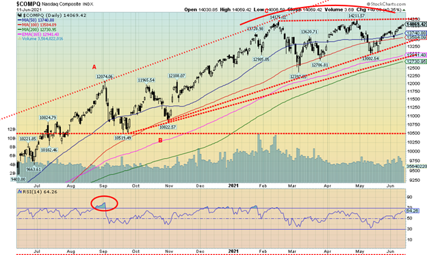
The NASDAQ continues to diverge with the other major indices in that it has not made new highs, even as the others did. However, it diverged again but in a different manner. The NASDAQ rose 1.9%, even as the Dow’s (Industrials, Transportations) fell. The S&P 500 rose but then some of the same stocks that are in the NASDAQ are also in the S&P 500. The big tech names had a mixed week but a couple made new all-time highs. Facebook was up 0.3% and Google gained 2.5% as both made new all-time highs. Other gainers were Apple +1.2%, Amazon +4.4% (as Jeff Bezos flies into space), Microsoft +2.8%, Tesla +1.8%, Twitter +2.5%, and Nvidia +1.4%, which also hit a new all-time high. Losers were Netflix -1.2%, Baidu -2.8%, and Alibaba -3.4%. It’s significant that the major value stock Berkshire Hathaway fell this past week, off 2.0%. Could the NASDAQ be headed for a triple top? Except triple tops are rare, so instead we could break through to new all-time highs. Volume has tailed off but a firm break above 14,250 would send the NASDAQ soaring once again. The trouble starts under 13,600, gains traction under 13,500, and collapses under 12,900. So, it is a triple top, but maybe not a triple top.
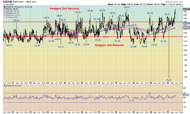
The SKEW Index is a generally overlooked sentiment indicator. So, what is the SKEW Index? The SKEW Index is measure of financial risk in financial markets. In some ways it is like the VIX Volatility Index, just not as well known. It is a proxy for both sentiment and volatility. The SKEW Index measures tail-risk in the S&P 500. Tail-risk is what is known to statisticians as the far edges of the normal distribution curve. Being at the tail of a normal distribution curve has low probability. A colleague once described the tails of the normal distribution curve as follows. If the observations fall within 90% of the normal distribution curve, everyone gets rich. If they fall into 10% of the tails (5% on either side), everyone is bankrupt. Okay, maybe that’s an exaggeration but only slightly. That principal applied during the 2008 financial crash. They never thought that sub-prime mortgages would go into the tails. Generally speaking, if the SKEW Index rises above 140, hedgers get nervous and start battening down the hatches. If the SKEW Index goes under 120, hedgers are relaxed; in other words, it is safe to buy. Currently at 159.28, the SKEW Index is as high as it has been in the past decade or so. Hedgers are nervous. Incidently, the outlier print of 79.25 on the chart is probably just that—an outlier print that may also be a misprint as it is so out of line. The message from the SKEW Index is caveat emptor.
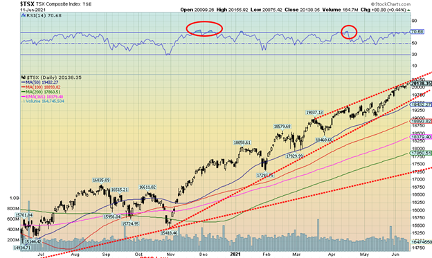
Once again, pop open the champagne as the TSX continues to defy and hit another all-time high at 20,156. Nine of the TSX sub-indices rose this past week and five of them hit either fresh 52-week highs or new all-time highs. The big winner on the week was Health Care (THC), up 5.2%. New highs were seen for Income Trusts (TCM) +1.3%, Energy (TEN) +1.5%, Industrials (TIN) +0.7%, Real Estate (TRE) +2.3%, and Telecommunications (TTS) -0.4%. Yes, Telecommunications fell after making new highs. Other losers were Consumer Discretionary (TCD) -0.7%, Financials (TFS) -0.7%, Golds (TGD) -0.4%, and Metals & Mining (TGM) -0.6%. The small cap TSX Venture Exchange (CDNX) eked out a small 0.2%. The TSX continues to trade along what appears to rising channel. A serious breakdown doesn’t occur until under 19,450. Daily, weekly, and monthly indicators are generally in overbought territory. The message is yes, we could still go higher, but don’t get complacent. Taking profits and lowering risk at these levels is not a sin.
U.S. 10-year Treasury Bond/Canadian 10-year Government Bond (CGB)
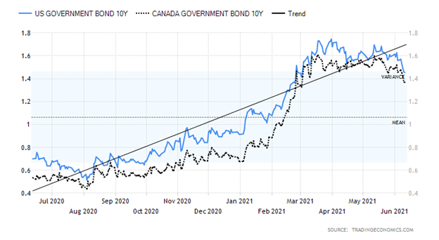
While the stock market is extremely important, the bond market is even more important. Yet, almost universally, pundits talk about the stock market and generally ignore the bond market. However, the bond market is larger than the stock market—estimated globally at $106 trillion vs. $95 trillion for global stock markets. So, while one should watch the stock market one should listen to the bond market. And what the bond market is telling us right now is that inflation fears are misplaced. If we were facing a huge inflationary cycle, then why are bond yields falling when they should be rising? Bond yields went up before the news on inflation came out. When the news came out, bond yields started to fall again. Buy the rumour, sell the news.
No, we are not suggesting that bond yields are about to completely collapse again, and we still cannot rule out an eventual rise for the 10-year towards 2.00%, but the recent drop in bond yields under 1.50% has probably caught a few by surprise. Here we are anticipating that could happen given the roll-over seen over the past few weeks. The U.S. 10-year treasury note fell to 1.46% this past week from 1.56% the previous week and down from a high of 1.74% in March. The next level to break is down around 1.35% and if that happens then we could fall further towards 1.20% and even 1.00%. The Canadian Government of Canada 10-year bond (CGB) fell to 1.37% from 1.46%. The CGB hit a high of 1.60% in March. Even the 2–10 spread (2-year notes less 10-year notes) spreads have narrowed with the U.S. 2–10 spread down to 1.31% and the Canadian 2–10 spread down to 1.04%. No, they are not signaling an impending recession. Usually, they go negative for that to happen. But, on the other hand, the 2–10 spreads are not as high as they have been in previous periods at over 2.00%. We still have a way to go to the downside to signal to us that things may not be as rosy in the economy as many would like. Rising bond yields are not necessarily a sign of trouble for the stock market as there are many instances when both bond yields and the stock market were rising together. However, falling bond yields have sometimes premised a stock market about to fall, especially when the stock market has been on a steady rise and bond yields turn down.
We suspect many were surprised this past week that bond yields fell despite the announced rise in the CPI. That was the opposite to what everyone might have expected. The bond market appears to be signaling that inflation is not a worry but that it might be more concerned about recession that never ends.
AAA, BBB, and, CCC Spreads to U.S. Treasuries 1997–2021
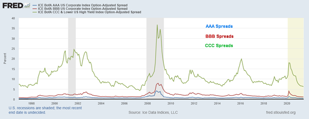
The market remains complacent to extremely low credit spreads. CCC credit spreads, junk bonds, and worse, at 6.14% are lower today than they were in 2006 at the height of the housing credit bubble and the sub-prime mortgage meltdown. BBB credit spreads, the lowest level for investment grade bonds, at 1.12% are also as low as they were in 2005/2006. Finally, AAA credit spreads at 0.47% are lower today than they have ever been in the past 25 years. Credit spreads have only one way to go and that is up. Corporate bond buyers beware.
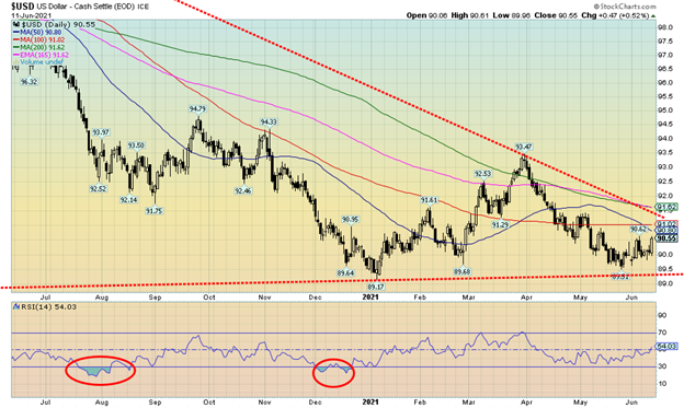
The US$ Index put in a good week, jumping 0.5%. The currencies suffered as the euro was down 0.5%, the Swiss franc eked out a 0.1% gain, the pound sterling was off about 0.4%, while the Japanese yen was down a small 0.1%. The Canadian dollar may have made a top as it fell 0.8%. A break now of 82 would tell us a top is in and we could fall back towards 80.5 support. A break under 80 would suggest further declines. The US$ Index bounce this past week could still go up a bit further but there is considerable resistance from 90.60 to 90.80 and then up to 91. Above 91 and especially above 91.50 the US$ Index would be breaking out. However, the rise this past week appears to be a part of a possible bear flag formation and, once it breaks back under 90, the next move to the downside should get underway. A break under 89.50 would signal the next downside move is underway with potential targets down to 88.00/88.50. The US$ Index rose on the inflation expectations and the potential for rising interest rates. A dovish FOMC this week could dampen the enthusiasm for the U.S. dollar.
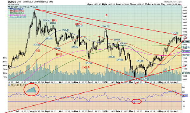
For the second week in a row gold had no traction. This past week gold was down 0.7% as the market continued to reject $1,900. Silver, however, diverged and gained 0.9% on the week, the only precious metal to do so. Platinum fell 1.1%. Metals with precious metals characteristics were mixed. Palladium fell 2.2% but copper rose 0.2%. The gold stocks were soft as well as the Gold Bugs Index (HUI) fell 1.9% and the TSX Gold Index (TGD) was down 0.5%.
Despite the soft week we remain positive on the precious metals going forward. The prime reason is that the Fed is now caught between a rock and hard place. Given inflation pressures, there will be those who believe that the Fed will be forced to raise interest rates and begin to taper. If that happens, the very sensitive economy would react negatively and the stock market could fall and unemployment could rise. Do nothing to speak of and inflationary pressures will grow; however, as we have noted we don’t believe it will get out of hand. Given the huge amount of debt in the economy, any hike in interest rates could have devastating effects. It is that sensitive.
Still, that doesn’t mean gold won’t suffer a further pullback. The 200-day MA near $1,845 could be a magnet to test, so that is not out of the question. While a break under $1,875 would snap the current uptrend, it is not a killer. The $1,790/$1,810 zone is far more important. Under that level a bear market would follow. What’s key is getting through $1,900/$1,920 to suggest to us that gold could test its next resistance zone at $1,950/$1,960. Above $2,000 new highs are probable.
So far, these past two weeks appear to us as another consolidation within the context of an uptrend. That last rise saw gold go up roughly $160 from an April low. The pullback has only been about 3%. Not exactly a barn burner. We appear to be forming a pennant but it could still morph into something else. What’s key could be this coming week and the FOMC meeting.
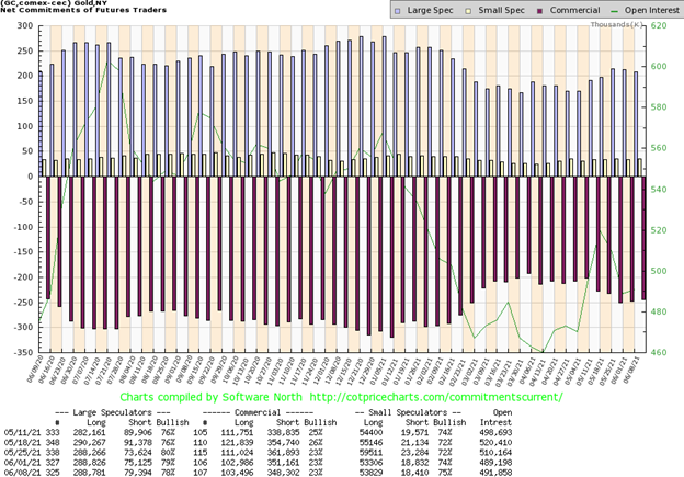
The commercial COT (bullion companies and banks) was unchanged this past week at 23%. There was little movement in open interest. Long open interest was up roughly 500 contracts while short open interest fell about 3,000 contracts. We have to view that as somewhat positive on a week where gold prices were soft. The large speculators COT (hedge funds, managed futures, etc.) slipped to 78% from 79% as the group became a little nervous about gold’s failure to rise. Short open interest was up over 4,000 contracts while long open interest was relatively unchanged. Overall, open interest rose over 2,000 contracts on a week that gold was off slightly. The gold COT remains somewhat bearish at 23%.
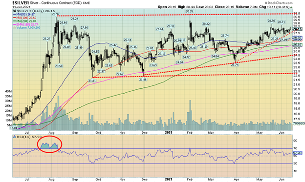
Silver continues to trade in a frustrating range, roughly between $27 and $28.50 with some outlier highs at $28.70 and $28.90. This past week silver held above $28, gaining 0.9% on the week. That was a divergence with gold that lost 0.7% this past week. Given our preference to see silver lead, the gain for silver bodes well going forward. Silver continues to form what appears to be an ascending triangle. We can’t pretend it is a perfect one but we do have a relatively flat top (highs at $29.92 and $30.35) and rising lows: $21.81, $21.96, $23.74. Silver had a nice rise, gaining almost 22% from March to May but has since stalled. The range trading has continued into June. This emphasizes for us the support and resistance points. As long as silver holds above $27, we should regroup and rise. A breakout over $29 would seal the deal and suggest that the potential to see new highs above $30.35 is good. The first sign of trouble would be a break under $27.50. The final zone of support is at $26. A break under that level would send silver into a bear market. Indicators are fairly neutral here in keeping with the range trading of the past month. Silver appears to be coiling for a upside break, but we should remain aware of downside break zones.
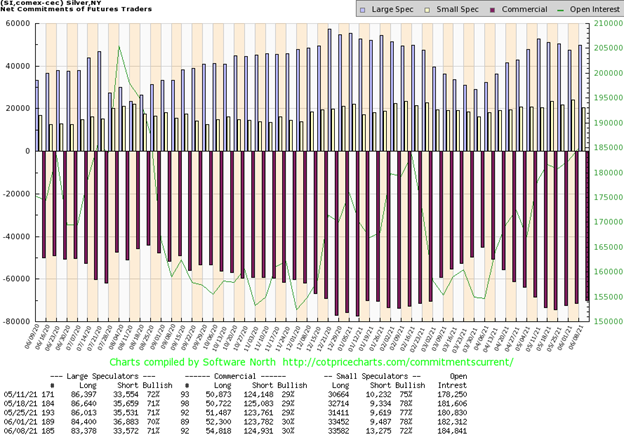
The silver commercial COT was unchanged this past week at 30%. There was little movement in both the long and short open interest. The large speculators COT was up to 71% from 70% as they shed just over 3,000 contracts of short open interest but also shed roughly 1,000 contracts of long open interest. Altogether, open interest rose over 2,000 contracts on a week that silver prices were up. That is encouraging as it appears to be showing some strength.
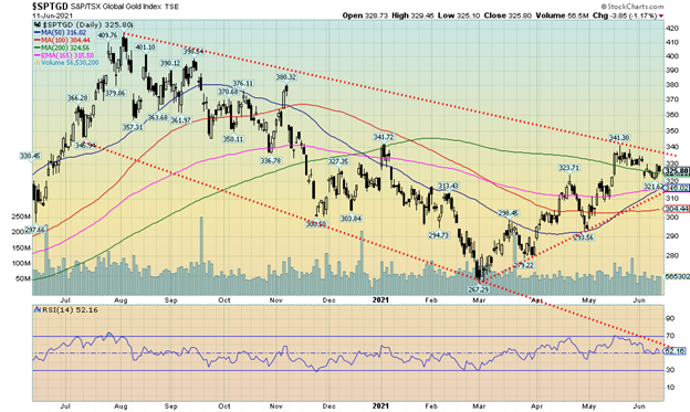
The gold stocks continue to struggle. This past week both the TSX Gold Index (TGD) and the Gold Bugs Index (HUI) fell with the TGD down 0.5% and the HUI off 1.9%. Both remain up on the year: 3.3% and 2.6% respectively. It was the second consecutive weekly loss. The losing week leaves both indices shy of their recent highs. The good news is, so far at least, the TGD appears to be trying to hold the 200-day MA. However, a breakdown under 316 would be problematic and suggest that the uptrend is over. To the upside, a firm breakout over 340 and especially over the recent high at 341 would suggest that the next leg to the upside is underway. The TGD is up a healthy 22% from its early March low. At this point the TGD is far from being overbought. The pullback has brought most indicators back to neutral. The Gold Miners Bullish Percent Index (BPGDM) is at 73—high, but nowhere near overbought levels. A pause into June is not that unusual. But it would be important for the TGD to hold not only the 316 level but definitely not fall back under 305. Volumes have tailed off on this pullback which is typical of corrective periods. Most indicators are fairly neutral here so they are not giving us many clues as to the next direction. At that low in March the TGD was down 36% from its August 2020 high. By any definition the gold stocks were in a bear market. Sentiment was ebbing near lows but still well above absolute bearish sentiment. What we like about the current rally is, so far, it has good ebb and flow with a rise followed by a good pullback to ease any growing euphoria. The current pullback has seen the TGD fall roughly 6% and in April the TGD pulled back 10%. Markets that ebb and flow like this are usually showing strength. The 2018–2019 leg of the most recent bull market started out much like this one with a rise, pullback, rise, pullback, etc. It was only in the latter stages that the market took off with only brief shallow pullbacks. That one culminated in the March 2020 collapse that saw the TGD lose over 40% in a hurry. The March 2020 to August 2020 bull did see a 21% correction in the middle of the rally even as overall the TGD was up 140%. A firm break over 340 could next project the TGD up to 380 and 400. Key is to hold above 316 and especially above 305. Under 290/300 a bear market would be underway. Overall, however, the gold stocks are holding well and we should be poised for a summer rally.
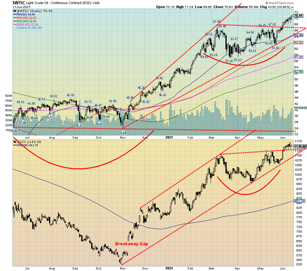
WTI oil prices appear to have broken out and this past week reached new 52-week highs, closing over $70 for the first time since 2018. Oil prices are rising on renewed optimism of rising demand as the pandemic eases and vaccinations abound. With oil prices rising, this prompted the International Energy Agency (IEA) to actually tell OPEC to open the taps to meet growing demand and presumably lower the rising price of oil. Higher oil prices are a boon for countries like Saudi Arabia in order to meet their expenditures. It also encourages more production, particularly in fracking and possibly even opens up Canada’s oil sands once again. Both have required higher prices over $80 to be viable.
This past week WTI oil rose 1.9% to fresh 52-week highs, closing just under $71. The really big winner on the week was natural gas (NG) that jumped 20 cents up 6.5% on the week. The energy stocks responded as both the ARCA Oil & Gas Index (XOI) and the TSX Energy Index (TEN) rose to new 52-week highs. The XOI, however, reversed and closed down a small 0.3% on the week while the TEN held its gains, up 1.5%.
WTI oil appears to have broken out of an awkward-looking head and shoulders bottom pattern. We say awkward as usually the pattern is more symmetrical. Instead, it has a very brief left shoulder and an extended right shoulder. The head, rather than appearing somewhat centered is instead left-skewed. If the pattern is correct, then it could project up to around $78 for WTI oil. Oddly, the high seen in October 2018 came in at $76.90 so there is resistance from here up to $77 and the potential target of $78. As well, from 2011 to 2014 before oil prices broke down the zone from roughly $70 to $76 provided key support.
A breakdown below $67 would put the rise in question and under $65 the oil rally would be over. The XOI also broke out of an awkward-looking bottom pattern that could in theory take it up to about 1,265. The TEN could have targets up to 145. Neither target is that far away. Some indicators have moved into overbought territory on both a daily and weekly basis, but appear to have room to move higher on a monthly basis. Overbought conditions are a warning and not a statement that a top is in.
Oil and gas prices and the energy indices all appear to have some room to move higher, but caution is advised due to growing overbought conditions. What’s key is to heed breakdown zones and for WTI oil that is at $67 and $65. For the XOI, a break under 1,055 would be negative and for the TEN under 123.
__
(Featured image by Austin Distel via Unsplash)
DISCLAIMER: This article was written by a third party contributor and does not reflect the opinion of Born2Invest, its management, staff or its associates. Please review our disclaimer for more information.
This article may include forward-looking statements. These forward-looking statements generally are identified by the words “believe,” “project,” “estimate,” “become,” “plan,” “will,” and similar expressions. These forward-looking statements involve known and unknown risks as well as uncertainties, including those discussed in the following cautionary statements and elsewhere in this article and on this site. Although the Company may believe that its expectations are based on reasonable assumptions, the actual results that the Company may achieve may differ materially from any forward-looking statements, which reflect the opinions of the management of the Company only as of the date hereof. Additionally, please make sure to read these important disclosures.
David Chapman is not a registered advisory service and is not an exempt market dealer (EMD) nor a licensed financial advisor. We do not and cannot give individualised market advice. David Chapman has worked in the financial industry for over 40 years including large financial corporations, banks, and investment dealers. The information in this newsletter is intended only for informational and educational purposes. It should not be considered a solicitation of an offer or sale of any security. Every effort is made to provide accurate and complete information. However, we cannot guarantee that there will be no errors. We make no claims, promises or guarantees about the accuracy, completeness, or adequacy of the contents of this commentary and expressly disclaim liability for errors and omissions in the contents of this commentary. David Chapman will always use his best efforts to ensure the accuracy and timeliness of all information. The reader assumes all risk when trading in securities and David Chapman advises consulting a licensed professional financial advisor before proceeding with any trade or idea presented in this newsletter. David Chapman may own shares in companies mentioned in this newsletter. We share our ideas and opinions for informational and educational purposes only and expect the reader to perform due diligence before considering a position in any security. That includes consulting with your own licensed professional financial advisor.


Dolci Palmisano Issues Its First Minibond of the F&P “Rolling Short term” Program
Dolci Palmisano Srl issued its first €300K Short Term Minibond at 5.5%, fully subscribed on launch. Structured by Frigiolini &...

Bitcoin Traders on DEXs Brace for Downturn Despite Price Rally
Despite Bitcoin’s recent rally, over 70% of BTC options volume on DEXs like Derive.xyz are puts, signaling trader caution. Many...


Dow Jones Nears New High as Historic Signals Flash Caution
The Dow Jones is nearing a new all-time high despite past resistance, with a current BEV of -2.65%. A potential...


Stock Markets Surge Amid Global Uncertainty, But Storm Clouds Loom
The stock market hit new highs despite global tensions, with the S&P 500, NASDAQ, and TSX leading. Oil collapsed amid...


The TopRanked.io Weekly Digest: What’s Hot in Affiliate Marketing [NordVPN Affiliate Program Review]
There's a bit of a vibe in the EU right now that's slowly taking hold of everyone, from everyday consumers...
 |
|
 |  |
 |
|
-

 Biotech5 days ago
Pfizer Spain Highlights Innovation and Impact in 2024 Report Amid Key Anniversaries
-

 Cannabis2 weeks ago
Germany’s Cannabis Crossroads: Progress, Profits, and Public Concern
-
 Markets10 hours ago
Stock Markets Surge Amid Global Uncertainty, But Storm Clouds Loom
-

 Cannabis1 week ago
Aurora Cannabis Beats Expectations but Faces Short-Term Challenges