Business
The Dow Jones’ 15-Count Hit a +9 This Week
Since the 1990s, we’ve been here all too many times before, with market valuations being inflated by the FOMC. It didn’t end well for the high-tech bubble of the 1990s, or the sub-prime mortgage bubble market in the 2000s. If you think this bubble market will end any differently, Mr Bear will be very happy to prove you wrong for a third time.

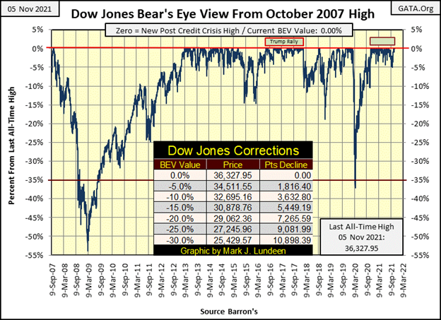
This week there was plenty to comment on in the stock market, such as the Dow Jones closing at a BEV Zero (new all-time high) for four of five days. Nothing wrong with that, as long as one keeps one’s market analysis at a superficial level.
Be-that-as-it-may, in the past year the Dow Jones has made forty-nine new all-time highs. And those days not closing with a BEV Zero, closed within scoring position in the BEV chart below, or within 5% of their previous all-time highs. One has to go back to the Trump Rally of 2016 to 2018 (see below) to see a more bullish period of market history.
This week it wasn’t just the Dow Jones making new all-time highs in the market. As evident in my table below, listing daily BEV values for the major market indexes I track, there were sixty-two of one hundred possible new BEV Zeros to be seen. Those daily closings that weren’t BEV Zeros were in scoring position; or within 5% of making a new all-time high. Except for the gold and silver miners in the XAU of course.
I don’t recall a similar week with so many BEV Zeros in these major-market indexes.
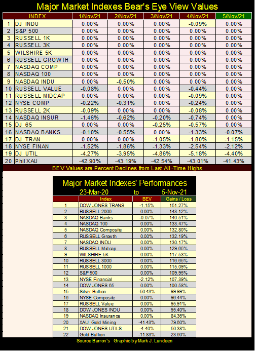
In the table above, listing the gains of these indexes from their March 2020 lows, most have doubled, and then some in the past twenty months. But these amazing gains are only inflation flowing from the FOMC. That plus momentum speculators making leveraged bets, driving valuations higher. My best guess is this advance will continue for the foreseeable future.
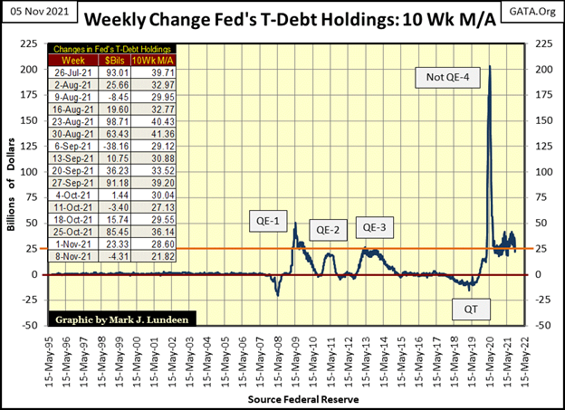
Look at the effort the idiot savants at the FOMC had to make to reinflate the market off its lows of March 2020 (chart below); Chairman Powell’s Not QE-4. This plot is a 10Wk M/A, and since the summer of 2020, to the close of this week, this 10Wk M/A has remained at levels seen during Doctor Bernanke’s QE 1-3. This is the “monetary policy” of a banana republic. This is not going to end well, and the dollar’s future failure will impact everyone.
Today, the idiots keep talking about future “tapering” (reductions of what is seen below), and future increases in interest rates. The last time that happened was during the period seen below called the QT. In case you’ve forgotten what happened then, I’ll remind you; the Dow Jones crashed 37% in only twenty-seven NYSE trading sessions, as corporate bond yields more than doubled. It was total mayhem in the market, forcing the FOMC to “inject” a historic amount of “liquidity” seen below with their Not QE-4, that continues today.
Take a moment to study this chart; it’s a mess! What it took to inflate the high-tech bubble of the 1990s, and the sub-prime mortgage bubble (2001-2007). The “monetary policy” of those bull markets barely registers in the plot below. It’s very evident that in the wake of the sub-prime mortgage debacle, the Federal Reserve System has never recovered. They don’t know what to do. So, they keep bullshitting Congress and the public about “market stability” and “normalizing” interest rates and “monetary policy” for yet another day.
Since the 1990s, we’ve been here all too many times before, with market valuations being inflated by the FOMC as the bulls run wild and free on Wall Street without a care in the world. It didn’t end well for the high-tech bubble of the 1990s, or the sub-prime mortgage bubble market in the 2000s. If you think this bubble market will end any differently, Mr Bear will be very happy to prove you wrong for a third time.
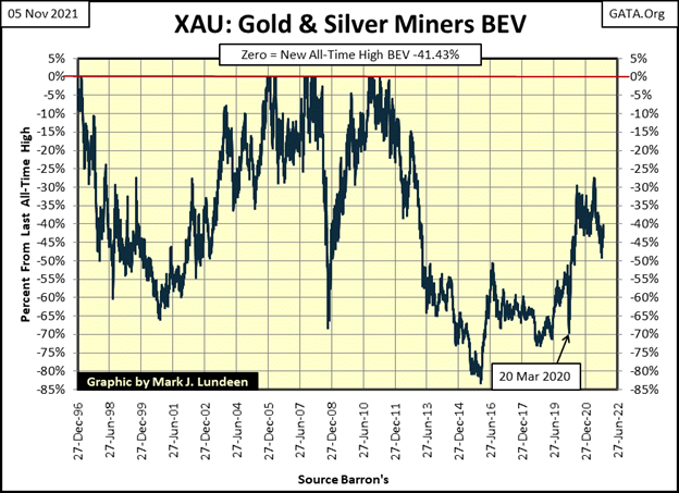
The sore point for the week was the XAU index of gold and silver mining companies, closing the week with a BEV of -41.43%, or 41.43% from its last all-time high seen in April 2011. It’s been over ten years since the XAU saw its last all-time high. Still, from its lows of March 2020 the XAU (#20 above) has advanced 79.6%.
So, what is wrong with the XAU? Actually nothing, except the gold and silver miners used in its construction are deliberately being denied “liquidity” flowing from the FOMC as a matter of “policy.” So, unlike the hot NASDAQ indexes, or the S&P 500 and Russell indexes above, there isn’t much in the way of leveraged speculation in the gold miners these days.
Which, as a matter-of-survival in the coming festivities planned for Wall Street by Mr Bear, the XAU is where investors want to have their money. That’s not to say in the initial impulse of deflation in the big one to come, the XAU can’t go down. I’d expect it will. But the XAU closed the week with a big-bear market BEV of -41.43%. In January 2016, it had a BEV of -80% plus (see XAU BEV chart below). As I read these tea-leaves, the potential for deflationary losses in gold and silver mining are limited, as the XAU’s valuation currently isn’t inflated.
As I see it, ultimately, as the rest of the stock market deflates deep down into market history, the XAU and precious metals mining are going to make market history to the upside.
But that didn’t happen this week, and most likely won’t next week either. So, let’s go back and further examine this week’s stock market.
We saw the impressive numbers of BEV Zero all during this week, but what does that actually mean? On a superficial level, the stock market is doing really good. But is it?
Back in the 1970s and 80s, the big complaint about using the Dow Jones as a proxy for the broad market, was the Dow was a mathematical average of the share prices of only thirty big blue-chip, dividend yielding stocks. Back then, IBM (big blue) didn’t desire to have a stock split, so its then huge share price overwhelmed the Dow Jones’ valuation.
Five decades ago, the Standard & Poor’s 500 was favored by money managers, as it was an index of the MARKET CAPITALIZATION of the 500 largest companies trading on Wall Street. Back in 1975, no one company’s market cap could overwhelm an index of 500 companies.
But that was then, and this is now. And now in November 2021, there are companies with market caps that can overwhelm the S&P 500 and other indexes. Below is a table listing the market caps for the largest companies trading on Wall Street in October 1975 and January 2020. I’ll update this table, maybe in January, but for now data from January 2020 will do.
Back in January 2020, there were only two trillion-dollar market caps; Apple and Microsoft. I’ve recently heard that Tesla and Facebook now also have trillion-dollar market caps, and I’m sure there are others, such as Amazon and Alphabet Inc (Google). So, let’s assume at the close of this week, there may now be ten companies trading on Wall Street with trillion-dollar plus market caps.
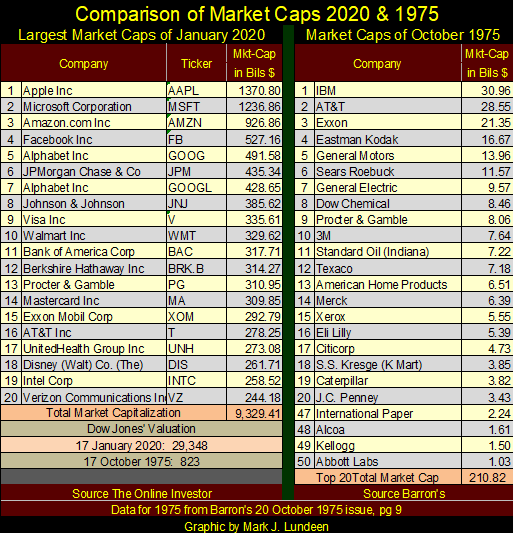
Today, these trillion-dollar corporate behemoths are doing what money managers thought was impossible in 1975. As IBM did to the Dow Jones decades ago, these trillion-dollar market cap companies now dominate the major stock indexes, and that can be seen in the table below showing NYSE 52Wk Highs and Lows.
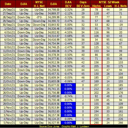
Above, the last eight Dow Jones BEV Zeroes are highlighted in royal blue and white. But this week at the NYSE, there are around 3,500 issues trading daily. Looking at NYSE 52Wk Highs above (inside red box), the number of companies making new 52Wk highs is not what I would expect them to be in a “hot market.”
Going back to the table displaying the major market indexes BEV values, this
week was dominated with new all-time highs. Yet, in the table of NYSE 52Wk Highs and Lows (table directly above), this same week (November 1st to 5th) the NYSE saw a mediocre quantity of companies closing with 52Wk Highs.
So, if someone was looking for a reason not to like this market, and I’m that sort of guy, seeing so few NYSE 52Wk Highs during a week where the major market indexes made so many new all-time highs, really sticks out as something to be aware of. That possibly, this big-bull market is only a private affair, concerning only those companies with trillion-dollar plus market caps, with the rest of the market getting along as best it can.
Then the problem with inflating commodity prices continues.
In my article for the first week of May this year, I covered the price inflation problem in commodities, due to “liquidity” flowing into them from the Federal Reserve. Some of these commodities I have weekly price data going back to January 1957. In each of these long-term data series, it’s possible to identify certain events in “monetary history” by what I call base-line shifts (BLS) in their prices.
What’s a BSL? Commodity prices tend to trade within a range, bounded by high prices that form an upper barrier called resistance, and lower prices that form a lower barrier called support. What I’m attempting to describe with some difficulty here is easily seen in the commodity charts below. A base-line shift in commodity prices occurs when old resistance high prices become new support low prices.
The first BLS in my data occurred soon after the “policy makers” terminated the Bretton Woods’ $35 gold peg in August 1971.
I must be one of the few market commentators on the internet who time and time again makes a big deal out of something that other market commentators seem not to care about at all; the August 1971 termination of the Bretton Woods’ $35 gold peg. But most market commentary is based upon data that goes back a few months, maybe a couple of years.
But I like looking at markets going back as far as I can. As Barron’s data set (my source) does go back an amazing long time, to the Great Depression and before in some of their data series, I can see things. What sort of things? Apparently, things not taught at major American universities.
I was an Interior-Communications Electrician Chief Petty Officer, or an “ICC” in Naval jargon. On navy ships, the Chief’s Mess and Officers’ Ward Room are frequently on easy terms. On my last ship (USS Kansas City / AOR-3, a fleet oiler), I was on good terms with the ship’s Supply and Disbursing Officers as we were all very interested in the markets.
The disbursing officer (the ship’s paymaster) had a major in economics from Illinois’s Northwestern University. I don’t know the academic background for the supply officer. But, as he was responsible for the logistics of keeping a carrier task force refueled (a big job), I’m sure his background was similar.
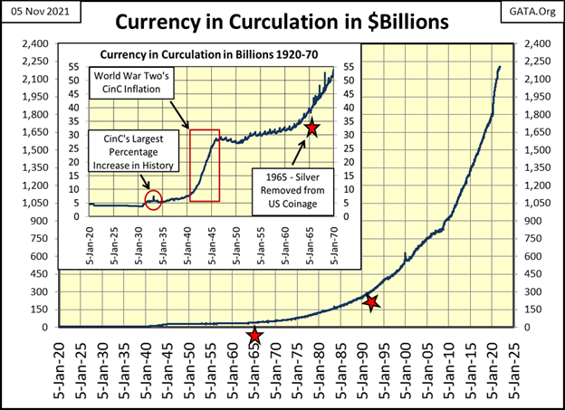
At that time, I had compiled currency-in-circulation (CinC) data going back to the late 1970s. I made a chart of CinC and showed it to these officers. Neither had seen this data before. Both were taken aback by how much CinC had expanded; from around $100 bil to over $300 bil during a fifteen-year period of “low inflation.” At the time, I was taken aback that I possessed data that Northwestern University’s economic program didn’t include in its curriculum; a multi-year chart of US CinC.
I think it’s likely, the long-term chart of CinC (below), still isn’t included in most college economic programs. It would be an embarrassing chart to have to explain to undergraduate students. The right star seen in it, is about when I retired from the Navy. CinC was just over $300 bil.
To any rational person, this chart is actually alarming. After seeing the post-August 1971 explosion of dollars below, then hearing Federal Reserve officials describe our current spike in commodity prices as “temporary”, tells us exactly who we are dealing with at the FOMC; deceitful people at the highest levels of “policy making.” That the financial media goes along with this nonsense says much about them too.
I frequently bring up the August 1971 termination of the Bretton Woods’ $35 gold peg, as I see the consequences of it in my data that goes back many decades, as seen in the charts above and below. Being aware of the inflationary consequences of the termination of the Bretton Woods’ $35 gold peg is a required prerequisite in any investment strategy, or so one would think.
Below, I have charts for corn, soybeans, hogs, copper, gold and silver. They all developed base-line shifts shortly after;
- the August 1971 termination of the $35 gold peg.
- the implementing of Doctor Bernanke’s QE#1 in 2008.
Currently, it appears the commodity market is developing its third Base-Line Shift, following the huge, and continuing “injection” of “liquidity” of Fed Chairman Powell’s Not QE#4.
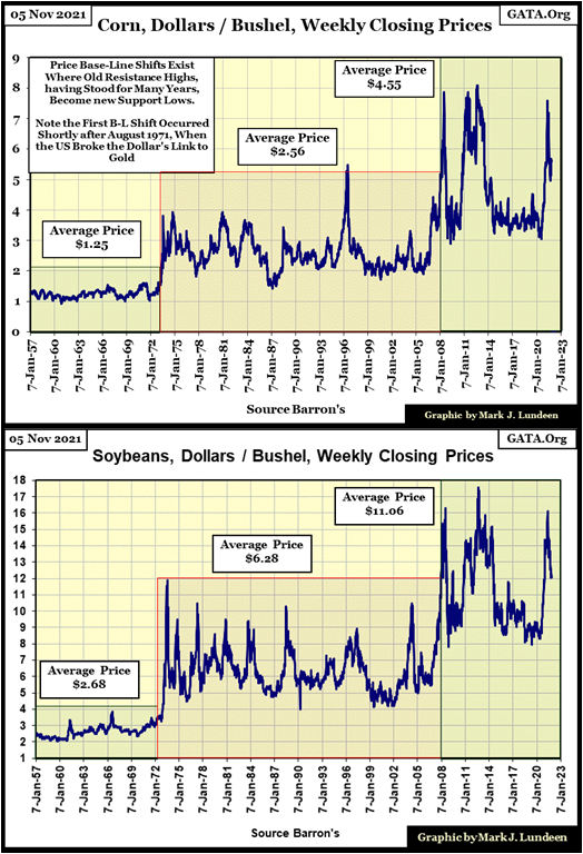
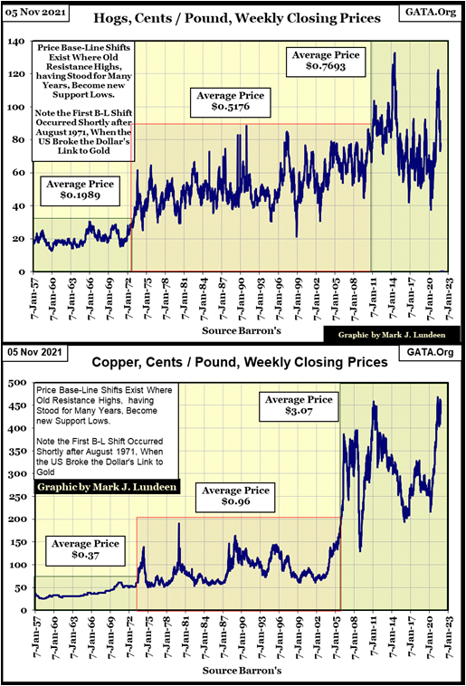
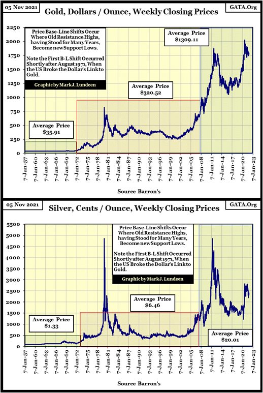
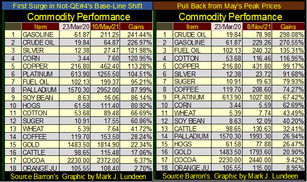
The charts above all show the first valuation surge in what I expect will be the next BLS (see their 07-Jan-20 date lines). Since then, they have had a pull back to one degree or another. But these are only for six of the eighteen commodities I follow. To get a better understanding of what is happening in the commodity market, I made the following graphic below.
The left table is for the price action from the crisis lows of March 2020 to early May 2021. The table on the right is from the crisis lows of March 2020 to the close of this week, looking at an additional six months of market action. Some commodities haven’t had a pullback from their highs of last May. For the energy group, and cotton, they’ve continued to inflate, while others have seen a pullback.
If I’m correct, that a third post Bretton Woods’ base-line shift in the prices of commodities has begun, all of these commodities will continue advancing in price in the months and years to come. This will ultimately result in rising bond and stock yields, and deflation in market valuations for financial market valuations, such as for stocks and bonds.
So, how did gold do this week? It closed with a BEV of -11.83% ($1,817.66), which is as well above the critical BEV -15% line, and just short of September 3rd, when it closed with a BEV of -11.23% ($1,827.48). The thing to do now is see if gold can manage to close the gap between this week’s close and its BEV -10% line ($1,855.30).
That’s a gap of only $37.64. In a good market, this is something gold could easily advance by the close of next week. Is this a good market for gold? I have my doubts the market will prove to be that good.
I’m not going to kid myself; right now, I’m suffering from battered-bull syndrome (BBS), an affliction held by most who come into a bull market in its early stages. Sufferers of BBS remember the pain of the bear market’s decline before the market bottomed. So, its completely understandable they are emotionally and painfully aware of what’s below, more so than the potential of what’s above. So, if next week gold closes above its BEV -15% line ($1,752.22), I’ll be happy and leave it at that.
It pains me to study gold’s BEV chart below, the impossibility of gold advancing another 11.83% to make a new all-time high. What’s stopping gold from crashing down below where it was in December 2015? Nothing. Or for gold to deflate down to a BEV value of -100%, to total worthlessness. It could happen; where people throw their gold out to the streets, as bystanders watch, not bothering themselves to pick up this worthless metal.
Oh! Battered-bull syndrome is such a bitch!! What to do?
Excuse me as I reexamine the 100-year chart of CinC above to regain my composure. Ahh, that’s better. Now I take a fresh look at the commodity charts with their base-line shifts. Yes, I think now I have the strength to once again cover gold as a bull; gold’s BEV chart below looks good. I mean really good.
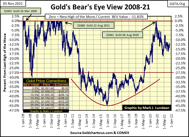
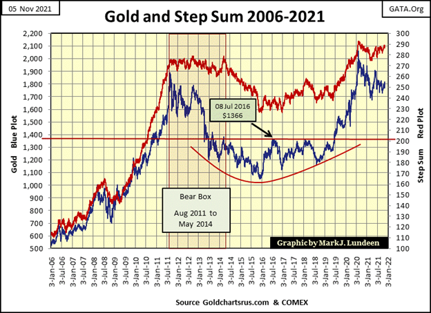
As always, gold’s step sum chart (below) holds great promise for the bulls. From its highs of August 2011, to the December 2015 bottom of a 45% bear market, was a traumatic experience for the bulls. It then took three and a half years for it to break above, and stay above its $1366 line of resistance, before breaking into new all-time highs in August 2020. Since then, there has been fifteen months of consolidation in the gold market.
But I really like this chart, as it’s a promise that in the main, and unlike the stock market, how in November 2021, the public and managed money is nowhere to be found in the gold market. And that is an important point to be aware of, as the big money is only made by those who get in early, before the horde arrives to bid up prices.
As the horde is now to be found in the stock market, with none of them suffering from BBS, it’s reasonable to be patient. To wait until Mr Bear once again pays Wall Street a visit, to provide today’s bulls the motivation to come our way with what remains of their stock market investments.
It’s a sorry fact of life; most people lose money in the stock market as they don’t know when to leave. When should people leave? When they can get top dollar for their investments, like this week.
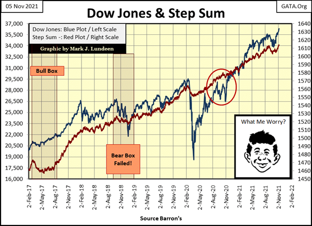
The step sum chart for the Dow Jones (below) also looks good. But, at the top of any bull market, the view from its lofty heights is always inspiring, even as the potential for further gains approaches zero. How much more milk do people think they’ll get out of this aging cow? In the risk-reward ratio for the stock market, I believe it’s all risk, with little to offer investors for rewards.
Still, the Dow Jones could break above 40,000. But I don’t think the potential for a 10.1% gain from this week’s close compensates investors’ risk to an explosive deflationary-market event now present in the market. It’s best to get some popcorn, and maybe a hotdog, and enjoy the game being played below from the cheap seats in the peanut gallery.
On gold’s side of the step sum table below, things are looking up, even with my chronic BBS. Since October 4th, its step sum has advanced by a net of four daily advances. And gold closed the week with a 15-count of +3, meaning on a short-term basis, gold isn’t overbought. What gold really needs is to have its daily volatility’s 200 Day M/A increase to above 1.00%, from its current low 0.60s%.
When the stock market begins feeling the hot breadth of Mr Bear on the back of its neck, that will happen real fast. Until then, I’m contented seeing gold stay above its BEV -15% line.
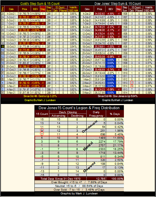
It’s a completely different story for the Dow Jones. Its step sum has advanced by a net of eight daily advances in only twenty-five trading days. That’s a whopping advance. But since October 4th, the Dow Jones has made good use of its overwhelming daily advances by moving the Dow Jones up by 2325 points, or 6.84% in only twenty-five NYSE trading sessions.
How much longer can an old cow run up the hill like this?
But, the biggest fly in the market’s ointment for the week is; the Dow Jones 15-count increased to a very overbought +9. On a short-term basis, the Dow Jones is VERY overbought. Just how overbought the Dow Jones got this week is seen in the table above. Since 31 December 1970, the Dow Jones closed with a 15-count of +9 in only 251 daily closes, or for only 1.96% of its 12,785 NYSE trading sessions of the past fifty-one years.
Should the Dow Jones continue seeing daily advances until next Thursday, its 15-count could increase to a +11, which as you can see has happened in only 54 daily closes since December 1970. Could this happen? Sure, it could. But most likely won’t.
So, I’m going to assume that next week, the stock market is going to take a break, begin seeing more down days than advances, and this will continue until the Dow Jones’ 15-count goes negative. What happens to the Dow Jones’ valuation during this decline in its 15-count will be very informative.
Should the Dow Jones’ valuation deflate by only a few percentage points, this break in the bullish advance could then prove to be the pause that refreshes before it goes on to 40,000. BUT, if the Dow Jones begins seeing a series of its dreaded Dow Jones 2% days, days of extreme market volatility. And the NYSE also begins producing its days of extreme market breadth (NYSE 70% A-D days) as the Dow’s 15-count goes negative, then today’s new all-time high may be the last for quite a while.
We’ll know more by next Friday. Until then, May the Good Lord be with you.
—
(Featured image by dflorian1980 CC BY-SA 2.0 via Flickr)
DISCLAIMER: This article was written by a third party contributor and does not reflect the opinion of Born2Invest, its management, staff or its associates. Please review our disclaimer for more information.
This article may include forward-looking statements. These forward-looking statements generally are identified by the words “believe,” “project,” “estimate,” “become,” “plan,” “will,” and similar expressions. These forward-looking statements involve known and unknown risks as well as uncertainties, including those discussed in the following cautionary statements and elsewhere in this article and on this site. Although the Company may believe that its expectations are based on reasonable assumptions, the actual results that the Company may achieve may differ materially from any forward-looking statements, which reflect the opinions of the management of the Company only as of the date hereof. Additionally, please make sure to read these important disclosures.


PayPal’s Slowdown: From Fintech Leader to Low-Growth Dividend Stock
PayPal has shifted from fintech leader to low-growth, value-style stock, losing over 25% in market value and trading at a...


Tilray (TLRY) Falls as Bearish Momentum Persists Despite Marketing Push
Tilray (TLRY) fell 3.32% to $4.44, remaining below key moving averages and signaling continued bearish pressure. Despite a £1 million...


ESG Gap Persists as Firms Struggle to Link Sustainability to Financial Value
KPMG’s Global Survey shows a major gap between ESG awareness and financial integration. While 72% of managers understand sustainability strategies,...


Bitcoin and Ethereum Slide as Market Pressure Builds Amid Strategy Concerns and Layer 2 Disruptions
Bitcoin fell below $60,000 with heavy ETF outflows, pressured by concerns over Strategy’s finances and its STRC stock decline. Ethereum...


AI Venture Builder Launches €600K Crowdfunding Round to Scale Secure AI Solutions
AI Venture Builder, an Italian-British firm developing AI applications and vertical startups, returns to CrowdFundMe with a equity campaign. After...
 |
|
 |  |
 |
|
-

 Africa1 week ago
Egypt’s Net Foreign Assets Rise as External Position Continues Gradual Strengthening
-

 Markets4 days ago
Cocoa Market Faces Mixed Trends Amid Rising Supply and Weak Demand
-

 Crypto2 weeks ago
Bitcoin Rises on Iran Deal as Crypto Markets React to AI and SpaceX News
-

 Africa2 days ago
Bank of Africa Expands Sino-African Trade Partnerships in Beijing