Featured
The pending bond market’s time of woe
The world really was a much better place when my grandfather could save 10% of his wages at 4% at a local bank to provide for himself and my grandmother in retirement. But that works only if the money being saved is in a stable currency, which the dollar hasn’t been since before WWII. Today we all have to swim with the sharks in the financial markets to get anywhere.

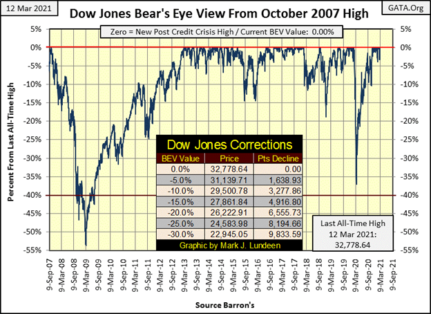
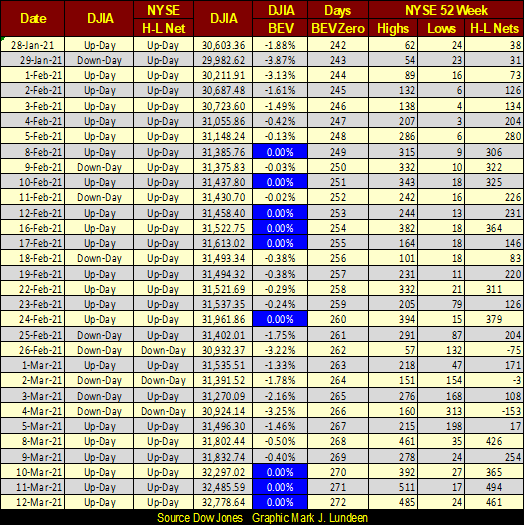
This week the Dow Jones saw three additional BEV Zeros (new all-time highs) for the post-March 2020 advance, of which there are now twenty. The last time the Dow Jones was down more than 5% from its last all-time high was on November 4th, over four months ago. Eight trading days later the Dow Jones made the first of its twenty new all-time highs.
Long strings of new all-time highs happen, as from late 2016 to early 2018 below. The Dow Jones went from one new all-time high to the next; 100 of them exactly, without correcting even 5% during Trump’s first year in office.
Are the guys back at the FOMC going to do the same for Old Joe Biden’s first year in office? We’ll just have to wait to see what happens. But if commodity prices continue to rise, and bond yields increase to an unknown threshold, we may see this market decline faster than it had risen off its lows of a year ago.
Here are the major market indexes’ BEV values in the table below. We can just see the “liquidity” flowing into the stock market in it. Only two indexes are down by double digits from their last all-time highs;
Dow Jones Utility Average / -12.07%
XAU (Precious Metals Mining) / -38.97%
Keep in mind the upper portion of the table are Bear’s Eye View values, or the percentages from last all-time highs. Seeing the XAU at the bottom of the table with a BEV of -39% is a bit disheartening.
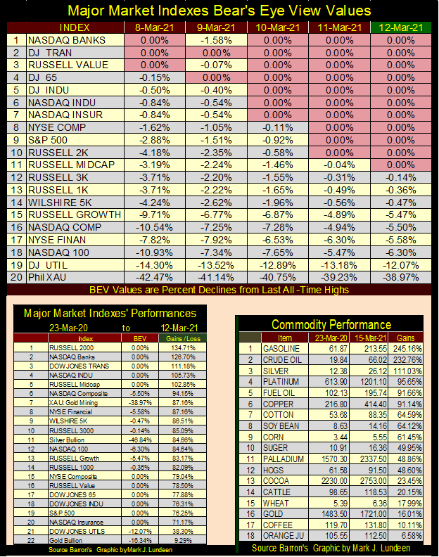
But looking at the performance of the XAU in the table at the lower left hand side above, we see the XAU coming in at #7 of 22 indexes. But the XAU has been here before, many times since it began trading in May 1983. For most of the past four decades, it likes to trade between 50 & 150. Then, before and during the sub-prime mortgage debacle it twice broke above 200, before correcting back down to 50.
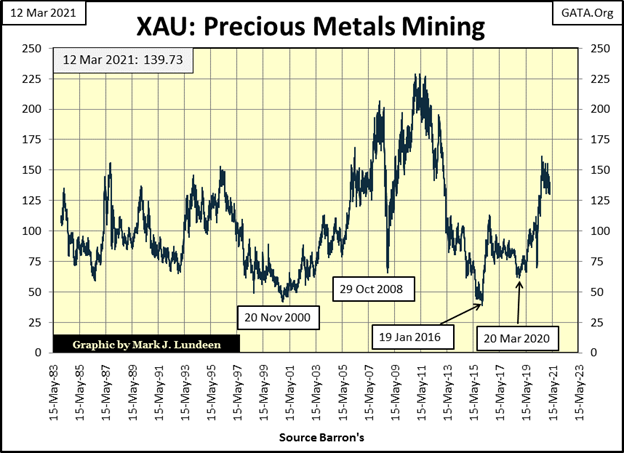
So why should anyone invest in gold and silver mining? Because unlike everything else that can be bought and sold in the financial markets, mining shares as well as the gold and silver they mine are not overvalued and over owned by the public.
Since August 1982, when the Dow Jones began its historic advance, there have been four major financial bubbles inflated into the market by the FOMC:
- Junk Bond, Leverage Buyout bubble (1984 to 1988)
- High-Tech, Internet bubble (1993 to 2000)
- Single Family Mortgage bubble (2003 to 2008)
- The Everything above is again in a bubble (2010 to today)
Does the financial head line below about a high-tech IPO jumping up 41% in its first day of trading remind you of the late 1990s? It sure does to me.
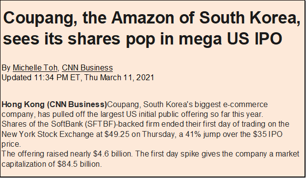
https://www.cnn.com/2021/03/11/investing/coupang-ipo-us-stock-korea-intl-hnk/index.html
And with mortgage rates near historic lows, millennials are taking advantage of the borrowed money from the banking system to invest in “long-distance real estate.” What could go wrong with that?

https://finance.yahoo.com/news/millennials-scared-stock-market-might-162725395.html
Poor millennials; they know enough not to trust the stock market. But to be young is to be dumb; but long-distance real estate? I didn’t even finish reading the article as I fear it’s just another big scam to take from the poor and give to usual suspects, leveraged with a huge loan from a bank.
The world really was a much better place when my grandfather could save 10% of his wages at 4% at a local bank to provide for himself and my grandmother in retirement. But that works only if the money being saved is in a stable currency, which the dollar hasn’t been since before WWII. Today we all have to swim with the sharks in the financial markets to get anywhere.
So how are the bait fish doing in the stock market? Not bad, as seen below with the NYSE 52Wk H-L Nets. Since February 8th the high-low nets have seen multiple +300, indicating it’s not just the 30 blue-chip stocks in the Dow Jones that are seeing new 52Wk Highs. I’m sure as is the case for the Dow Jones, many if not most of these 52Wk highs are also new all-time highs too.
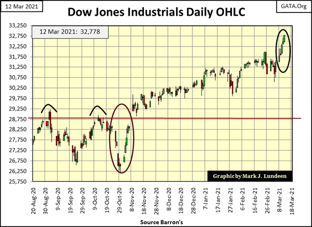
Here’s the Dow Jones in daily bars below. This was a BIG WEEK in the stock market; still the higher it goes the less I like it. It’s just a fact that every advance ultimately sees its last all-time high before it has a day of reckoning with Mr Bear. Investors who now come in late in the advance have already missed out in most of what they came in to get – profits. But it’s fun watching the bulls run wild and free on Wall Street.
What could spoil the party seen below? If you go back to my Major Markets BEV Table above, I have a commodity price performance table in its lower half. Crude Oil is up 232% in the past year. There is a threshold level in the crude oil market; somewhere above (over $80?) that may spoil the party. But rising long-bond yields and mortgage rates are also problems. We currently have a geriatric dementia patient signing executive orders in the Oval Office for reasons he admits he knows not what for. That also could be a problem.
But the real problem with this market is that it is just overvalued. When it all comes tumbling down, “market experts” will find multiple reasons why the market is deflating, but never the real reasons for why all big market advances end; the market advance became:
- overvalued,
- over leveraged,
- over owned.
If the current advance in the stock market lasted for another year, I’d be amazed. On that note, let’s take a long-term look at the corporate bond market.
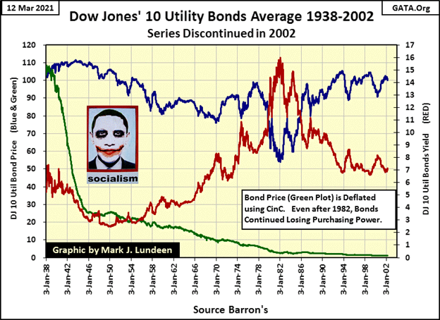
The Dow Jones 10 Utility Bond Average (DJ10-UBA below) is an antique market series Barron’s and Dow Jones had published for decades, and then dropped as they no longer seemed relative in the 21st Century. I believe the DJ10-UBA’s problem was it was a simple average that for decades, was computed using pencil on paper, not a modern index computed using a CPU and software. Whatever fault it had, it proved to be fatal, and was discontinued in 2002. But from 1938 to 2002, the DJ10-UBA told a story of the American debt market that was unique.
The plots in the chart are blue for published price (left scale), red for yield (right scale) and green for inflation adjusted price (left scale), which I computed using US Currency in Circulation (CinC) as the deflator.
Bonds are fixed income, or contracts for debt. A corporation wants to borrow money, for say twenty years to build a factory and contracts its funding with the bond buying public to accomplish that. The corporation will sell bonds with a coupon, say 5% on the par value (face value) of $1000, the issuing price of the bond. So for twenty years the corporation is committed to pay $50 annually to the bond holder, and after the bond matures in twenty years return the $1000. That’s the contract.
But twenty years is a long time. What if the bond’s owner wants to sell his bond and get his money back? Well, the contract with the corporation is for twenty years, and they aren’t going to return the $1000 until then. But there is an active after market for corporate bonds, where bonds are bought and sold, and this is what we see in the chart below, the prices and current yields for these utility bonds being bought and sold in the bond market.
Bonds aren’t stocks. For example, a share of General Electric from 1938 to 2002 remained the same for these sixty-four years; a percentage of ownership of the General Electric corporation. But a 20 year bond issued by General Electric in 1938 matured in 1958. If General Electric issued a new bond in 1958 it was an entirely different bond, a different coupon payment that isn’t exactly comparable with General Electric’s bond issued in 1938.
What Dow Jones (the publishing company) did was to replace utility bonds in the average with newer bonds of different coupons after the older bonds had aged, to keep the bonds in this average with maturities of over 10 years or so. So the prices plotted are not perfect, but good enough to tell the sorry story of the 20th century bond market.
Looking at the blue price plot, from 1938 to the end of WWII the DJ10-UBA advanced a bit as its yield declined. Yields continued declining until 1950. Had this been one bond, we would have seen its price continue to advance as its yield declined. But in fact for this 10-bond average saw its price slightly decline with its yield, as newer bonds with lower coupons replaced older bonds.
From 1950 to 1982 yields for the DJ10-UBA increased from below 2% to over 15%, as its price decreased from 105 to 54. Had this been a single bond, the losses taken would have been more. But over these thirty-two years, different bonds with higher coupons continually came into the DJ10-UBA to replace older bonds.
From 1982 to 2002, yields decreased from over 15% down to 7%, leaving the price for the Dow Jones 10-UBA during these sixty-four years almost exactly where it was in 1938; about a hundred dollars.
Using the prices for the Dow Jones Industrial Average from the same issues I got the DJ10-UBA data, the Dow Jones was at 102.85, almost the same price as the DJ10-UBA in January 1938. In the last issue of Barron’s to publish the DJ10-UBA, the Dow Jones had increased to 10,271.64, a hundred fold increase gained from investing in the stock market rather than in utility bonds.
Truth be told, people who purchased these bonds in 1982, when they were yielding 15%, did damn well by 2002. They locked in a 15% annual rate of return, and got paid back $100 on something they bought for $50. But from 1938 to 1982, parasitic-monetary inflation flowing from the Federal Reserve diluted fortunes invested in the bond market by an obscene amount.
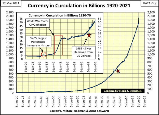
How much? Take a look at the green plot for the DJ10-UBA’s inflation adjusted price, adjusted using CinC seen in the chart below. When Barron’s first published the DJ10-UBA in January 1938, total paper money in circulation (CinC) was $6.57 billion dollars. When Barron’s last published the DJ10-UBA in April 2002 CinC had increased to $642.50 billion dollars (Red Star), a hundred fold increase in the money supply (the same gains seen by the Dow Jones), which greatly impacted what a dollar could purchase from 1938 to 2002.
So, for the stock market (using the Dow Jones as my proxy) the gains really weren’t 100 fold, but only a break even situation when taking monetary inflation into consideration. As far as using blue-chip stocks for income, unlike fixed income from bonds, dividend payouts from the Dow Jones increase nicely from 1938 to 2002 (see table below).
Consider the following; for a family with a million dollars in 1938, to have invested in high quality utility bonds until 2002 would have left them with the million dollars they began with. In 1938 a million dollars was a vast sum, a fortune that allowed one, and their family to live in luxury. In 2002 a million dollars no longer did, and its owner most likely also had a day job to make a middle-class lifestyle’s ends meet.
For a family in 1938 with a million dollars to have chosen to invest in dividend paying blue-chip stocks, of the type selected for the 30 Dow Jones Industrial Average, in 2002 their million dollar investment would have increased to 100 million dollars, as dividend income from their stock portfolio increased.
Let’s compare the DJ10-UBA with the Dow Jones in the table below, from the Barron’s issues that first and last published the DJ10-UBA as CinC increased a hundred fold from January 1938 to April 2002.
Payouts for the DJ10-UBA were calculated using the bond average’s own price and yield, while the dividend payouts for the Dow Jones are as published by Barron’s.
Here’s the fatal flaw bonds have in an inflationary economy; they are contracts for debt offering a fixed income, while dividend payouts for blue-chip stocks increase over time as monetary inflation erodes the unit of account, or dollars in this example.
The fact is bonds are a relic from an era when money was fixed to a gold standard. A gold standard, if honestly administered, prevents the money supply from growing as we see in CinC’s chart above and table below, preserving the purchasing power of the dollars invested in bonds over decades.

So why do people and money managers continue buying bonds? One big reason is because college professors teaching economics continue to misinform their students that bonds in the post Bretton Woods $35 gold peg era remain a viable investment class. While history, as published in the dusty old pages of Barron’s, proves that they are not. Back in the late 1970s and early 1980’s, it was for good reason bonds were called “certificates-of-confiscation”, as rising bond yields only lost money for bond owners.
Seeing corporate bond yields now at their lows for the past 100 years in the chart below is concerning. Especially so since commodity prices are once again on the rise. Rising commodity prices are a market event that will one day pull up bond yields and pull down bond prices.
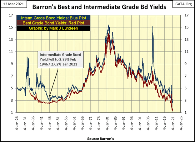
And there are many, many trillions of dollars of bond-market valuations that will evaporate from people’s monthly statements for their pension, mutual funds and brokerage accounts when bond yields once again begin to rise, as one day they must.
Maybe the millennials, with their investing in long-distance real estate are on to something, as that might have a 1% or 2% probability of working out. Looking at the history of the bond market as recorded in Barron’s since the 1920s, as seen above, wealth exposed to the bond market has a zero percent chance of surviving intact when bond yields once again begin to rise towards double-digits.
Take a look at Barron’s Intermediate Grade Bond Yields during the sub-prime mortgage crisis. They swiftly spiked from 7% to over 15% in less than a year. Then exactly last year in March, Barron’s Best and Intermediate Grade bond yields doubled in a week, forcing Fed Chairman Powell to begin purchasing corporate bonds to “stabilize” the debt markets.
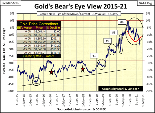
Time to move on to gold and its BEV chart below; this week the bears failed to drag gold below its BEV -20% level. What does that tell us? That the bears get another chance to force gold down below $1649 (gold’s BEV -20% line) next week? I guess so.
But don’t get too depressed. The prices seen below are from the COMEX futures markets where vast tonnage of non-existing digital gold and silver are traded daily. Then the financial fake news outlets publish these prices as if they had something to do with actual gold and silver prices.
Do yourself a favor and look at actual gold and silver prices for ounces of metal for sale. You’ll discover that dealers are charging big premiums above COMEX futures prices.
In gold’s step sum chart below, market reality (Blue Plot / gold price) is still correcting. Market sentiment (Red Plot / step sum) isn’t fighting gold’s decline as it did from August 2011 to May 2014. I’d like to say we are near the bottom, and maybe we are. But before we do see the bottom we may first see a gap down in the price of gold as the weak hands in the gold market begin upchucking their positions at much lower prices.
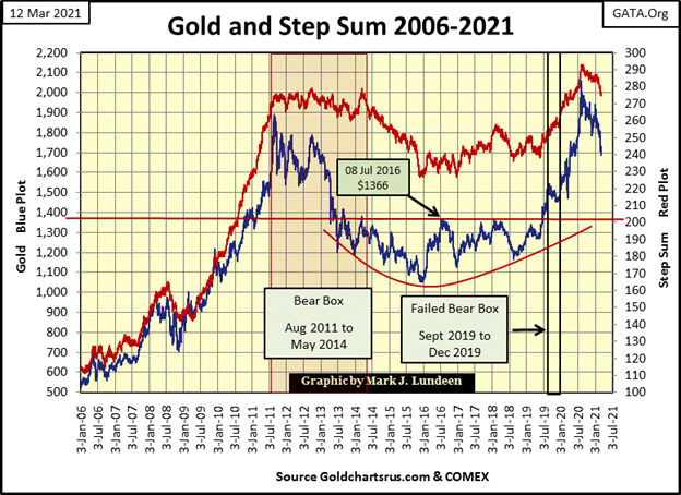
As with the stock market, where it’s too late to buy into the current advance, I think with gold, silver and their miners it’s too late to sell into the current decline.
You know there is a connection here, between the stock and bond market with precious metals assets. Sometimes the connection is weak, other times it is strong, and right now I believe the connection is strong, and will one day be stronger still. The connection between these two markets is the better one looks to investors, the less the other appeals to them.
In other words; financial and precious metal assets are countercyclical to each other.
Right now, with everything in a raging bull market; stocks, bitcoin, and real estate, precious metal assets aren’t appealing to the broad mass of investors, now occupied elsewhere. But in March 2021 bond yields and commodity prices are rising, and at some point they will trigger a big decline in the financial markets, and once again gold, silver and their miners will attract flight capital fleeing over valued financial assets.
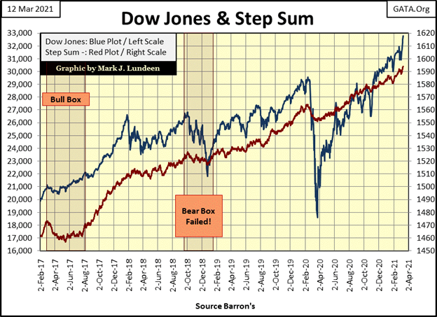
I don’t know when this is going to happen, only that someday it will, though not likely next week if I’m reading the below Dow Jones’ step sum chart correctly.
Moving on to gold’s step sum table (two graphics below), selling pressure on the gold market continues. Yet, after all that for the past five weeks, for the week gold closed up $24 from last Friday’s close.
Typically, a market bottom can be identified by a final big decline in price, the capitulation of the last wavering bull standing, who in frustration finally sells at any price at the bottom. Capitulation; will that happen at the end of this correction in the gold market? Maybe, and then maybe not.
It’s not just me looking at the FOMC’s open market operations, where since 2008 they have been “injecting” massive amounts of “liquidity” into the financial system. In the past year they’ve “injected” $3.125 trillion into the economy, and some of this “liquidity” is now flowing into consumer prices, resulting in higher bond yields.
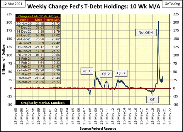
For retail investors who want to buy some gold and silver coins it’s becoming more difficult to fill an order. Maybe they wanted Silver Eagles minted in 1989, but had to settle taking silver rounds from a private mint.
But for someone with immense wealth; can they still purchase gold by the ton? I don’t know, but at some point it will become impossible for them to do so at any price. Take a good long look at the chart above and be afraid, be very afraid of what the idiot savants at the FOMC are doing to your money every week.
Back to gold’s step sum table below. The gold market became oversold when its 15 count fell to -7, and much more oversold when it then declined to a -9. Gold has been selling off since the end of January when its 15 count turned negative and has stayed that way to the close of this week. And for all that gold remains above its BEV -20% line, or $1649 in dollar terms. I think the bears in the gold market are as frustrated as are the bulls.
My advice to my readers is a quote by James Dines about times such as this:
* Keep an iron hand on the tiller! *
Now on to the Dow Jones’ step sum table. Lots of pretty blue BEV Zeros (new all-time highs) on the Dow Jones side of the table, but the Dow Jones’ 15 count has been positive since early February, peaking at +7s & +9s. Daily volatility remains 0.80s%, as its step sum continues to rise up with the Dow Jones valuation.
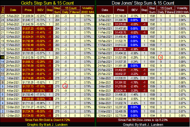
All in all the Dow Jones is currently seeing a solid advance; what could go wrong? Sometime in 2021 I suspect we’ll all learn what that will be. And as hard as whatever that is on the bulls now running wild and free on Wall Street, it will be a big positive for gold, silver and their miners.
_
(Featured image by Pixabay via Pexels)
DISCLAIMER: This article was written by a third party contributor and does not reflect the opinion of Born2Invest, its management, staff or its associates. Please review our disclaimer for more information.
This article may include forward-looking statements. These forward-looking statements generally are identified by the words “believe,” “project,” “estimate,” “become,” “plan,” “will,” and similar expressions. These forward-looking statements involve known and unknown risks as well as uncertainties, including those discussed in the following cautionary statements and elsewhere in this article and on this site. Although the Company may believe that its expectations are based on reasonable assumptions, the actual results that the Company may achieve may differ materially from any forward-looking statements, which reflect the opinions of the management of the Company only as of the date hereof. Additionally, please make sure to read these important disclosures.

-

 Business2 weeks ago
Understanding the Bear’s Eye View: A Clearer Perspective on Market Trends
-

 Biotech10 hours ago
Major Pharma Advances: EU Approvals, Vaccine Progress, and Breakthrough Clinical Results
-

 Cannabis1 week ago
Cannabis Stocks Show Signs of Rebound as Policy Shift Sparks Optimism
-

 Crowdfunding3 days ago
Italy Extends SME Guarantee Fund to Crowdfunding with New 2026 Framework


