Featured
The untold story of Nixon and the $35 gold peg
One gold standard fact known to all is that it was terminated by President Nixon in August 1971.

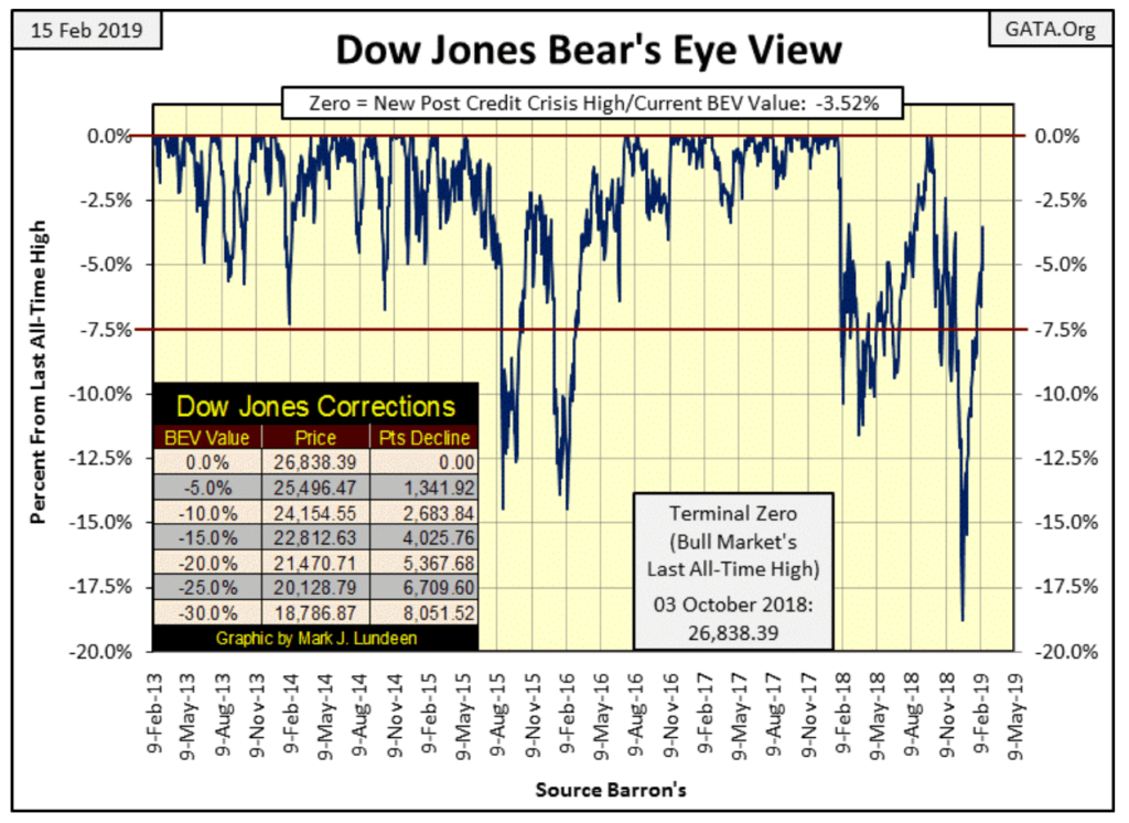
The Dow Jones in its BEV chart below is charging up the hill with eyes fixed on making new all-time highs. In the past week, it has advanced 2.9% BEV points, leaving only 3.52% BEV points to go before it once again makes stock market history. Another couple of weeks of this and the Dow Jones will once again be in record territory.
This is a very strong advance, but there’s something wrong with it. This advance comes after the -18.77% correction bottom on 24 December 2018, the deepest correction since the 09 March 2009 bear market bottom. Compare it to the other -7.5% corrections (declines below the Red Line) seen below. They too went on to new BEV Zeros, but unlike the current advance, they all saw significant corrections to the downside before doing so.
Oh sure, since late December there have been down days for the Dow Jones. But looking at the BEV chart below, it’s obvious the Dow Jones has advanced an uninterrupted 14.92% BEV points in the past two months, and that’s unusual.
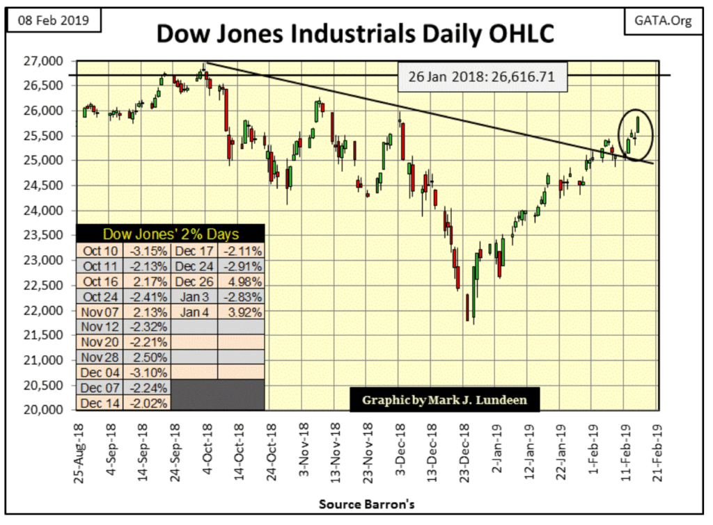
In the daily bar chart for the Dow Jones below, the Dow has finally broken above the declining trend line that goes back to October 3rd.
This chart illustrates how the current advance has seen no corrections since December 24th. Other than the -2.83% day of extreme volatility seen on January 3rd, the Dow Jones has for the most part only seen daily advances, with daily declines of the past two months of no importance.
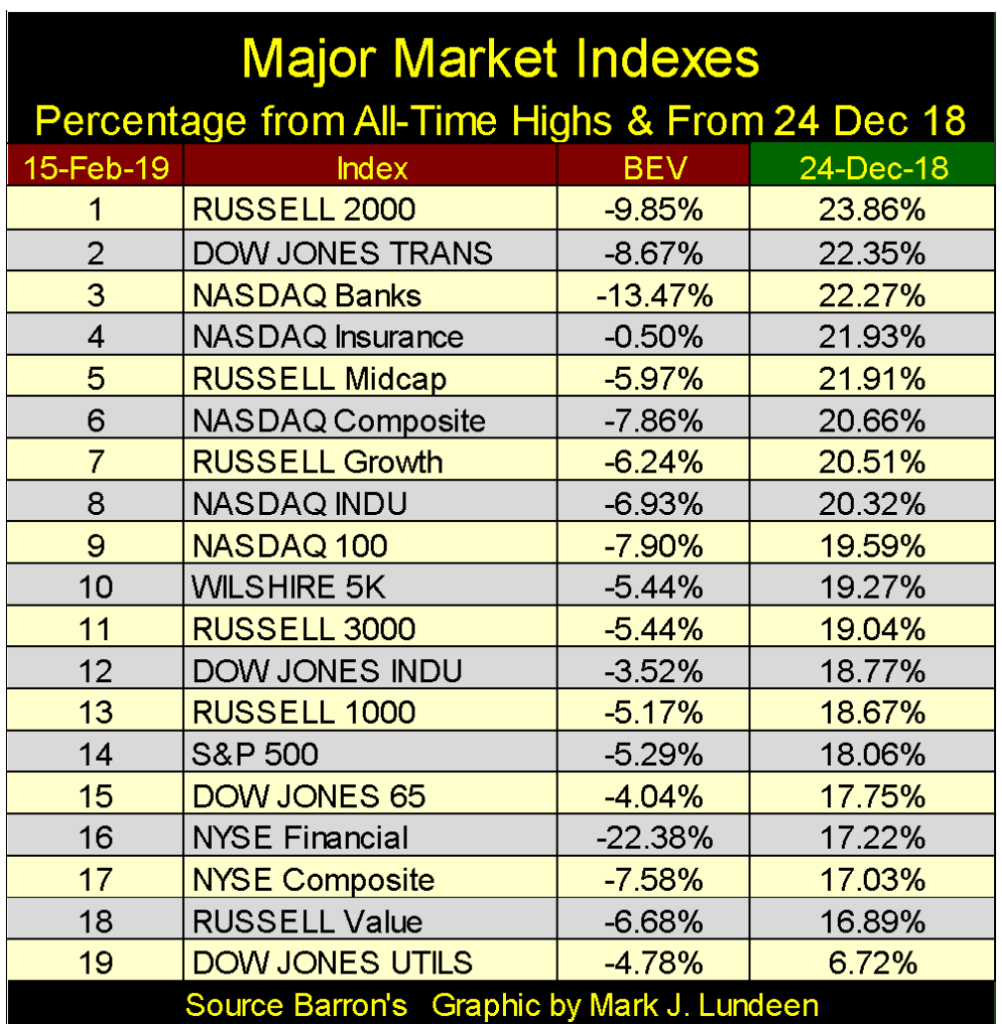
This is strong market action, but how have the other major market indexes performed since the December 24th correction bottom? Let’s look at the table below.
The table is sorted by the green tab, which gives the advances since the market close on December 24th. The BEV data column is based on last all-time highs, which for most of the indexes are from early October 2018. But that is not true for the NYSE Financial index, whose last all-time high was on June 4, 2007 (9,982.83).
The financial companies in the NASDAQ indexes are doing well. However, the companies in the NYSE Financial index (#16) have yet to fully recoup their losses from the Sub-Prime Mortgage debacle. Twelve years later and untold trillions of dollars the policymakers have injected into them, the NYSE Financial index is still -22.38% below its last all-time high June 2007.
These companies were the actual triggering device for the last bear market (October 2007 to March 2009). Looking at how they’ve performed since, like damaged goods, they may again trigger the next.
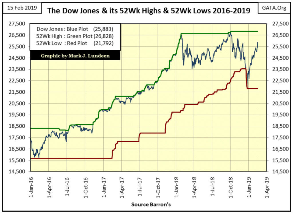
Here’s the Dow Jones with its 52Wk High & Low lines. Daily 52Wk highs at the NYSE have yet to break into triple digits since this advance in the stock market began. Looking at this chart for the Dow Jones and its 52Wk Lines you can see why. It takes time for the Dow Jones, or anything else to travel from one 52Wk extreme to the other.
In the weeks and months to come, I expect the NYSE will once again be producing +300 daily 52Wk Highs, as well as seeing the Dow Jones below pushing its green 52Wk High Line ever higher.
The US National Debt broke above $22 trillion this week; not that anyone cares except worrywarts like me. But it wasn’t always that way.
In the chart below plotting the US National Debt since 1952, I’ve added the yields for the US Treasury long bond at certain points. The first was for December 1952, when the US National Debt was only $267 billion with the T-long bond yielding only 2.71%. In the following decades, the National Debt soared to $1 trillion dollars in September 1981, and the bond market freaked out! Bond buyers were wondering how the US Treasury could ever pay back a trillion dollars; not seeing a good answer to that question the US T-long bond yield spiked to 15.04%.
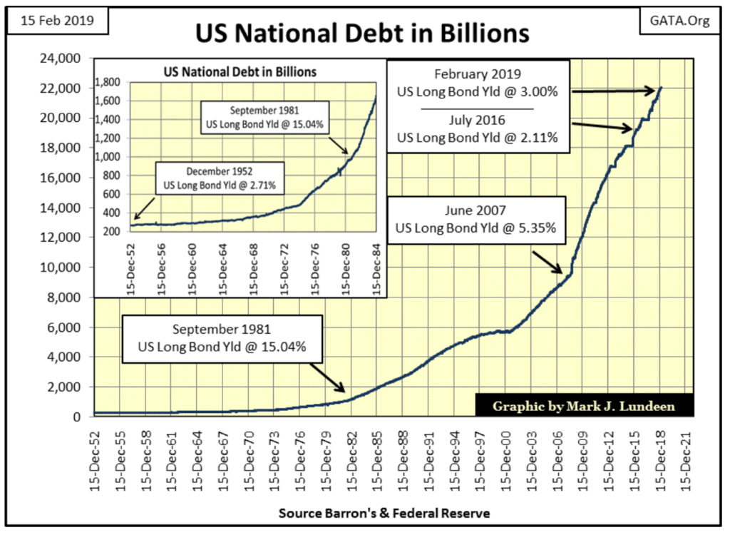
In the following decades, people have stopped asking such questions. Really they did. Proof of that can be seen in July 2016 when US T-long bond yields collapsed to 2.11% as the National Debt approached $20 trillion. But that was three years ago, and since then, T-bond yield has increased as Congress continues spending borrowed money with total disregard to the nation’s solvency. US T-long bond yields have been at or slightly above 3% since February 2018. They won’t stay there forever.
The below 30-year bond was issued in February 2011 with a coupon of 4.75%. In July of 2016, its yield (Red Plot) bottomed at 1.94%. I expect that low yield will never be seen again in the US Treasury market for a similar maturity, and before this bond matures in February 2041 it will have yields deep into double digits.
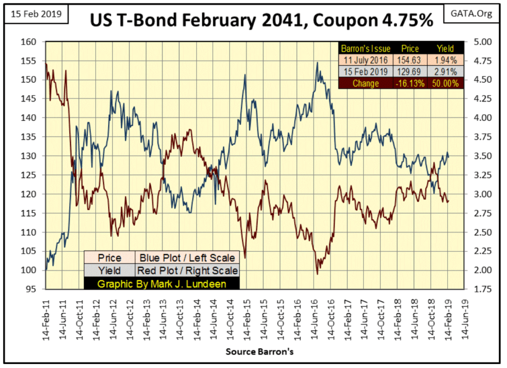
The current mismatch between price and risk in the bond market is a perfect setup for gold and silver to go to levels few people would believe possible today. I expect before the coming bull market in gold and silver concludes, we’ll see gold trading for far above $30,000 dollars and silver well above $3000.
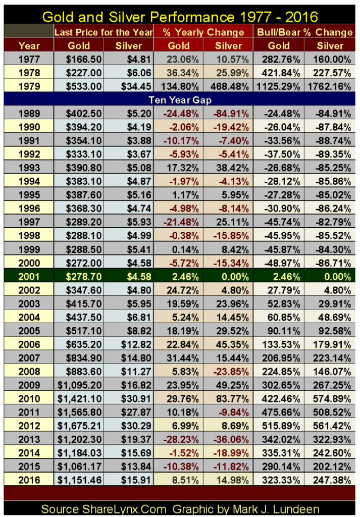
People are still trading their precious metals for dollars, pesos, pounds, and yen. So, at the end of the week, how is gold doing in the global market place? Since January 2001 (eighteen years ago) not bad, as seen in the table below.
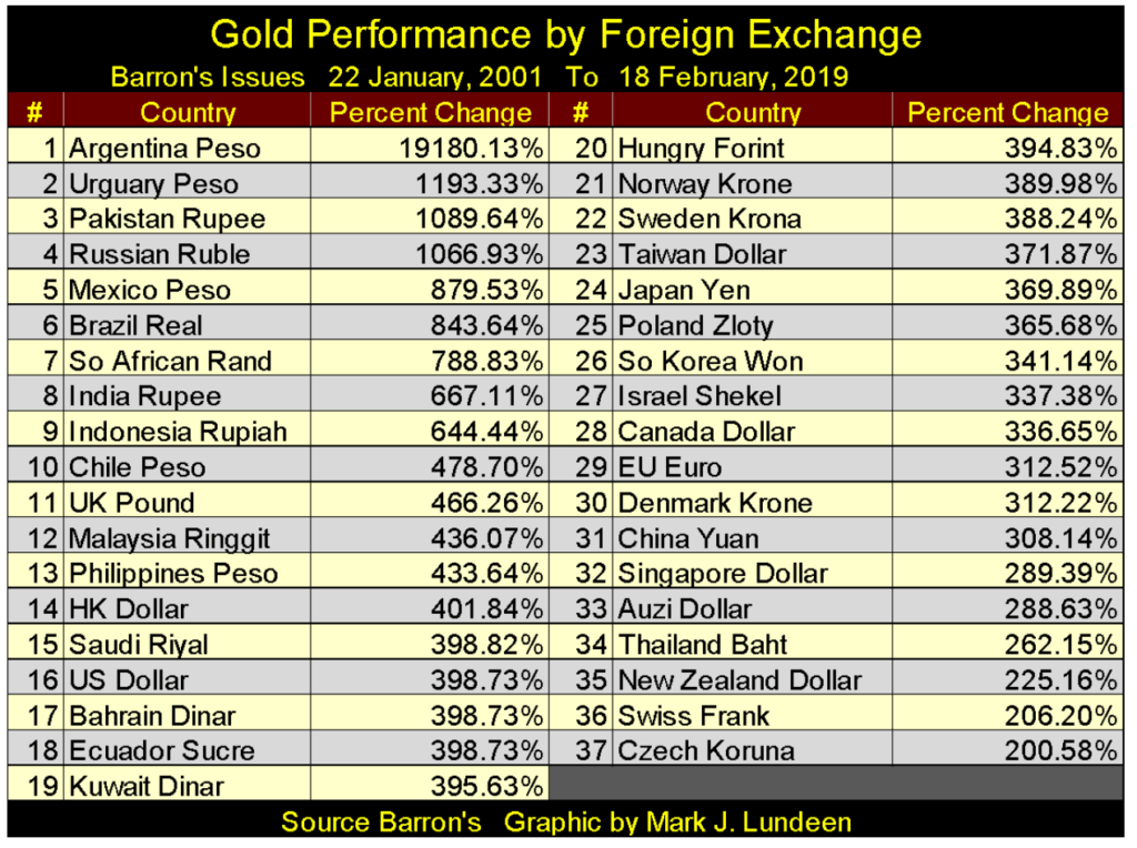
But then gold and silver could be doing a lot better too. However, considering the thousands of tons of paper gold sold in the paper futures market at the COMEX (promises to deliver tons of metal that are never kept) the performances seen in the table above are not all that bad either. In time all this will change.
Gold is looking good in its BEV chart below. It’s still in no hurry, but it has cleared my rising trend line and is about to break above its BEV -30% line. What I’m interested in is gold’s BEV -27.5% line ($1360). Since August 2013 (six years) this line has become the line-of-death for the gold market; six years of seeing any advance in the price of gold stopped dead in its tracks on any attempt to rise above it.
What I’d like to see is gold breaking above its BEV -27.5% line, and then quickly take out its BEV -25% line ($1416) soon after. But then this is from a guy who would like Santa to give him a new SUV for next Christmas too! Maybe if 2019 is the year for gold to break out of the funk it’s been in since August 2011, I’ll see both gold above its BEV 15% line ($1605) and a new SUV before 2019 is through.
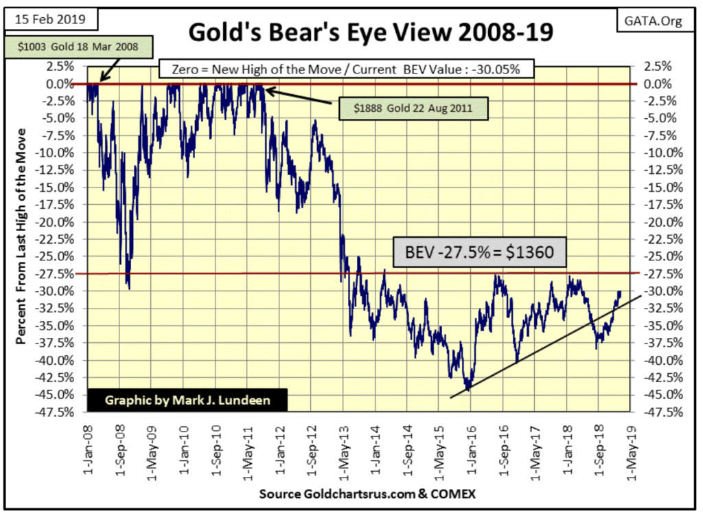
In gold’s BEV chart above, it closed this week only 30.05% from a new all-time high. Has gold ever moved 30% or more in a single year? Why yes it has, as seen in the table below, and we can rest comfortably tonight knowing how in the years to come it will do so again. With most of 2019 yet to pass, why not be optimistic?
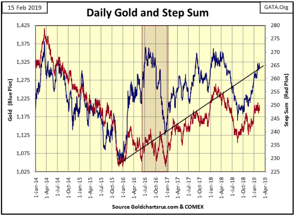
Gold’s step sum chart is excellent. Like the Dow Jones, it too has broken above a line of resistance. Note since January 1st the price of gold (Blue Plot / Market Reality) has advanced about $50 as the step sum (Red Plot / Market Sentiment) has done nothing, trending sideways for the past month and a half. That’s very constructive market action for the bulls, seeing gold climbing a wall of worry.
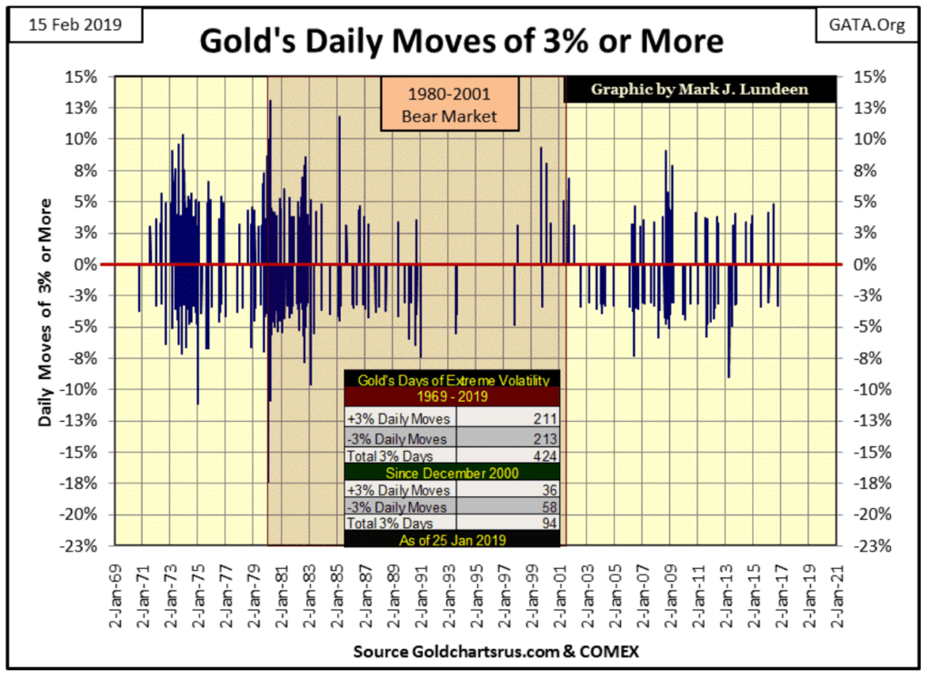
The big problem for the bulls is that at present, the gold and silver markets have very low volatility. While a positive for the stock market, low volatility in the precious metals markets are negative. It’s been over two years since gold or silver have seen a day of extreme volatility. That’s a move from a previous day’s close to the next of +/- 3% for gold and 5% for silver. Everyone will know when the old monetary metals are once again on the move because daily volatility in the metals will demand everyone’s attention.
Of course, with gold and silver, an increase in volatility also occurs on market declines, as seen below. However, gold is coming off the bottom of a very nasty correction, seen in December 2015. For this reason, I expect the next big move will be to the upside. We’ll be able to identify precisely when the next phase of the bull market begins when after a pause of over two years we once again see daily moves of +/- 3% in the chart below.
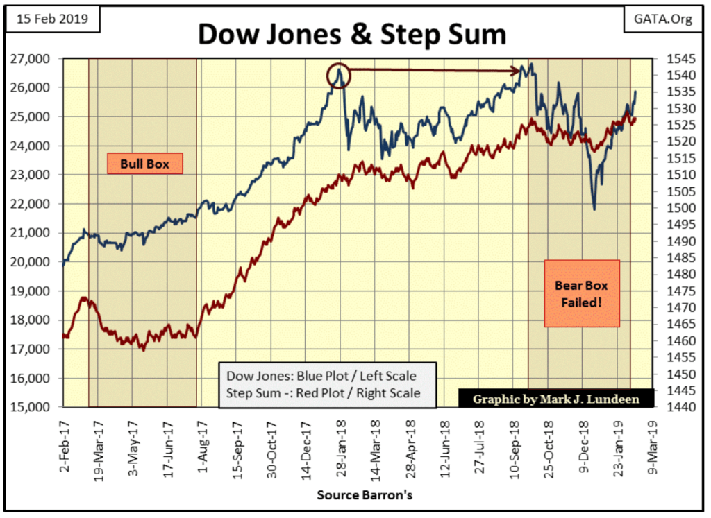
This week I gave the bear box below a failing grade. With bear boxes in a step sum chart, it’s the bears who are supposed to win. But with the Dow Jones moving ever closer to a new all-time high, this box miserably failed its final exam. The problem is that we’ll never see its red step sum plot collapse along with the blue price plot signaling that the bulls have surrendered to Mr Bear.
In gold’s step sum table below, gold’s step sum is having difficulty rising above
This is the lowest volatility since the 2001 start of the current bull market, which is why precious metals have so few followers. This isn’t necessarily a bad thing — if you’re buying and have the self-discipline to hold your position until the market turns.
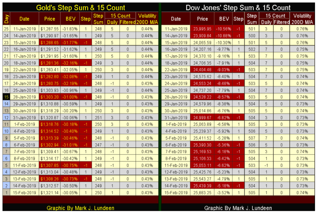
The Dow Jones step sum table is looking good too. There’s a lot of information displayed in the table, but the most bullish thing to note is that since January 11th the Dow Jones has advanced from 23,995 to 25,883 (7.87%) at the close of this week. On the other hand, gold has advanced only 2.64% in the past twenty-five trading sessions. And that is why the financial media can ignore a rising gold market, as the big story is the stock market.
One gold standard fact known to all is that it was terminated by President Nixon in August 1971. Well yes, and that’s what everyone says because it’s true, but that’s far from the whole truth of why gold no longer trades at $35 an ounce.
A note about the data used in the charts below; with the exception of the war years in the 1940s, Barron’s published weekly data on the US gold reserves since their 05 January 1925 issue and US paper dollars in circulation (CinC) since their 23 February 1931 issue. To fill in the six-year gap between these data series I used annual CinC data from Milton Friedman and Anna Schwartz’s Monetary History of the United States.
The first of three charts plotting US Gold Reserves and CinC data cover the years from 1925-37. CinC in $billions is plotted in blue, gold reserves in $billions in red.
As expected in a functioning gold standard, the red gold reserves exceeded the supply of paper dollars in circulation. To know when the United States actually went off the gold standard, one only has to see when the blue CinC plot rose above the red gold reserves plot — September 1931. This was forty years before “Nixon terminated the gold standard” when Herbert Hoover sat in the Oval Office.
Maintaining paper money in circulation below their gold reserves was a gold standard necessity, as anyone could exchange a sum of paper money for its equivalent in gold coin. Previous to the Great Depression it was understood by all that legally only gold coin was money and paper money denominated in dollars were only claims on real money — gold coin.
This option for holders of US paper money to convert their paper money into gold coin, be they common citizens or foreign central banks was known as “convertibility.” Convertibility prevented the US Treasury from issuing more paper currency into circulation than they had gold to back these paper claims for gold. It was an effective check on paper money inflation, as the day it was discovered that paper money could no longer be converted into gold coin was the day the US Treasury would have to declare bankruptcy.
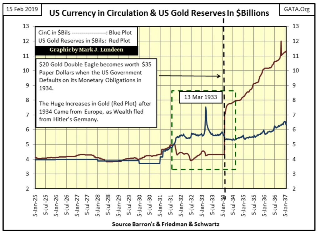
Until September 1931, the US money supply always had more gold than claims on it; more gold coinage than paper money in circulation (CinC). Shortly after September (Green box) a run on the US gold reserves began when the US Treasury attempted to print its way out of the Great Depression’s deflationary collapse. In other words, in less than twenty years after its creation, the Federal Reserve had brought the United States to the brink of collapse and had to be bailed out by the US Treasury.
The Federal Reserve was created by legislation in December 1913. Credit creation by the Federal Reserve financed much of the allies’ efforts during WWI, as well as the inflationary bubbles in real estate, the stock market and consumer consumption during the 1920s.
Singer Sewing Machine Company’s jingo of “buy now — pay later” was made possible by credit flooding into America’s banking system. Because of this, we don’t see paper money inflation in the chart above until 1931. By 1931 the American banking system had bankrupted its clientele by extending more credit to them than they could service. The crumbling economy only made it worse. If President Hoover wanted to reflate market values in 1931, he’d have to do it the old fashion way by printing paper money in excess of Treasury’s gold reserves.
What was needed was more dollars in gold than claims on it in paper money. The proper thing the monetary authorities should have done was to declare the Federal Reserve an insolvent bank, liquidated its assets and withdraw its Federal Reserve Notes (paper money) from circulation. But that didn’t happen.
President Roosevelt was sworn into office in January 1933, with the United States in a deflationary collapse created by the then new Federal Reserve System. One of the first acts of his office was to withdraw, not paper money but gold coin from circulation. American citizens were ordered to surrender their gold at a rate of $20.67 per ounce by May 1, 1933, on pain of a $10,000 fine or ten years in prison or both.
In early 1934, the dollar was devalued to $35 an ounce, a 70% devaluation from its previous $20.67 an ounce. This devaluation of the US dollar is easily seen in the chart above. With a stroke of FDR’s pen, the US Treasury now had more dollars in gold than paper money circulating, and the domestic paper money in circulation were no longer a claim on the Treasury’s gold. This was the US Treasury’s first 20th-century default.
After devaluing the dollar to $35 an ounce, gold began flooding into the United States. This inflow of gold was reported at the time in Barron’s, was European gold fleeing the coming perils of Hitler’s Germany. But note the gold bars and coins this flow of European central gold represents came not before, but after the devaluation of the dollar.
The chart above covers only US gold and CinC from 1925 to 1937, but it completely misses the point of exactly what the Federal Reserve did to create the inflationary boom of the 1920s, and the deflationary bust of the 1930s — the expansion and contraction of bank credit within the economy.
An excellent example of that can be seen in NYSE margin debt from 1926 to 1935. Below we see the Dow Jones (Blue Plot) and NYSE margin debt (Red Plot). The chart is self-explanatory. The Roaring 1920s stock market was fueled by margin debt (credit from the Federal Reserve System). After the Dow Jones peaked in early September 1929, the following bear market was intensified by the withdrawal of margin debt from the NYSE.
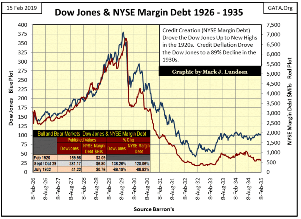
The table in the chart sums up the Roaring 1920s boom and Great Depression crash in the stock market. From February 1926 to autumn 1929, the Dow Jones advanced by 138% as NYSE margin debt increased by 120%. During the Great Depression crash, both the Dow Jones and NYSE margin debt declined by 89%.
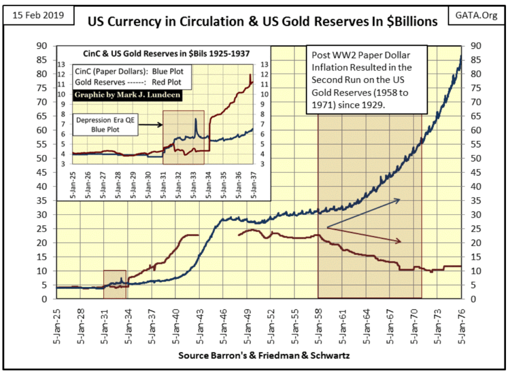
My second chart of CinC and US Treasury gold extends these plots to 1976, and the expansion of monetary inflation seen in it is remarkable. The flood of foreign gold from 1934 to 1941 increased the US gold reserves from $7.73 billion to $22 billion, an increase of $14.27 billion dollars of gold at $35 dollars an ounce of gold.
The inflation of CinC from 1941 to 1946 was the largest percentage increase in the supply of paper money in the history of the US Treasury; WWII like WWI was financed by monetary inflation. Here’s a quote from Barron’s Editorial, December 31, 1951 issue:
“November 15, 1951 reached a new low of 53 cents in terms of 1935-1939 dollar value. In extended comment on the shrinkage of the dollar, the National City Bank’s December Letter says: “From the standpoint of the creditor—the buyer of Savings bonds, the pensioner, the insurance beneficiary, the school teacher with lagging pay—the experience during and since World War II has been disheartening. Inflation is a concealed type of tax and these are the people who took the brunt of it.” In line with the repeated views of Professor Sumner H. Slichter, the City Bank adds: “People reconciled to a dollar of wasting value look around for real estate or other equity investments as a hedge against price inflation and dollar shrinkage.”
Looking at the blue CinC plot below from 1935 to 1946, the reason for this price inflation is on full display.
In 1945, the United States, along with its allies convened the Bretton Woods Monetary Accords (BWA) for the post-war monetary system. It was not a return to the pre-WWI gold standard. Convertibility of paper money to US Treasury gold was limited to central banks. While the US dollar (not gold) was designated as the reserve currency for monetary reserves of other nations money. The BWA also created the World Bank and the International Monetary Fund (IMF) to safeguard the post-war monetary system from rampant monetary inflation.
It sounded good, but then most government-sponsored initiatives executed by academics do. And like President Johnson’s War on Poverty in the 1960s, the Bretton Woods Monetary Accords did not perform as promised.
Here is my grip with those who place the blame of terminating the Bretton Woods $35 gold peg solely on President Nixon in 1971, much of the paper money inflation that resulted in its termination happened previous to the Nixon Administration. See the table below.
The London Gold Pool ceased operation in 1968 when President Johnson was in office, yet from 1945 to 1968 a monetary system with a $35 gold peg had $135.01 paper dollars in circulation for every ounce of gold the US Treasury held as reserves.
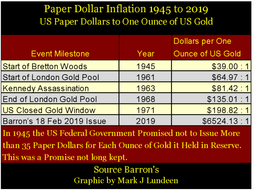
Small wonder a run on the US Treasury’s gold began in 1958. Remember: most of the gold held by the US Treasury was, in fact, European gold that fled WWII. Had the US Government not inflated its supply of paper money, these central banks were happy to have the US government pay the cost of storage for their gold. But as it was these central banks lost faith in the Bretton Woods monetary system, and began demanding their gold back.
By August 1971, there were $198.82 paper dollars in circulation for every ounce of gold held by the US Treasury for monetary reserves. As it took only $35 paper dollars for a central bank to demand an ounce of gold from the US Treasury, President Nixon, and the entire Washington establishment knew the pretense of the Bretton Woods’ $35 gold peg was over. So in August 1971 “Nixon terminated the gold-backed dollar” — the second 20th century, US Treasury default.
Without a link to gold, the expansion in the supply of dollars in both paper and credit (bank loans) has become totally uncontrollable. The chart below is one you’ll never see in a college economics 101 course when they cover the money supply.
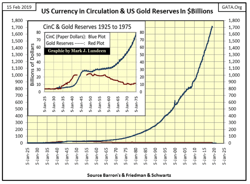
The chart above illustrates why since 1971 the American economy has suffered a continuous train of booms followed by busts, the US monetary system has become a great engine of inflation.
- In the 1970s it was in commodities, gold, and silver.
- The 1980s saw a monetary bubble inflate in the bond market that is only now slowly deflating, as well as leverage buyout (credit based corporate takeovers) in the stock market
- The 1990s saw an inflationary bubble form in the High-Tech NASDAQ exchange.
- The 2000s saw the sub-prime mortgage debacle.
- And the 2010s now has an inflationary bubble in everything — except for gold and silver and commodities.
It’s not hard predicting what comes next: the 2020s will be the decade when gold, silver, and commodities see a monster bull market as everything financial begins to deflate.
Many people will suffer from the coming deflationary bear market in financial assets. Take steps to protect yourself and family by acquiring some gold and silver. Just buy it, and forget about it. Someday you’ll be glad you did.
(Featured image by allstars via Shutterstock)
—
DISCLAIMER: This article expresses my own ideas and opinions. Any information I have shared are from sources that I believe to be reliable and accurate. I did not receive any financial compensation for writing this post, nor do I own any shares in any company I’ve mentioned. I encourage any reader to do their own diligent research first before making any investment decisions.

-

 Impact Investing7 days ago
ITAS Mutua Reports Strong 2025 Growth and Sustainability Progress
-

 Africa2 weeks ago
Morocco’s Banking Shift: From Digital Adoption to Digital Expectation
-

 Markets2 days ago
Cocoa Markets Steady as Weak Demand and Rising Supply Signal Potential Surplus
-

 Crowdfunding1 week ago
ProQuote Launches Crowdfunding to Continue Media Gender Census


