Featured
How long will the bull market last amid a below-average economy growth?
The bull market is at its longest yet while Bitcoin remains unchanged, silver and gold do well, and oil rebounded strongly this week.

“Turning and turning in the widening gyre
The falcon cannot hear the falconer;
Things fall apart; the centre cannot hold;
Mere anarchy is loosed upon the world,
The blood-dimmed tide is loosed, and everywhere
The ceremony of innocence is drowned;
The best lack all conviction, while the worst
Are full of passionate intensity.”—William Butler Yeats, The Second Coming, 1919
“A banker is a fellow who lends you his umbrella when the sun is shining, but wants it back the minute it starts to rain.”—attributed to Mark Twain, author
“Recession is when a neighbour loses his job. Depression is when you lose yours.”
—Harry S. Truman, U.S. President, 1945–1953
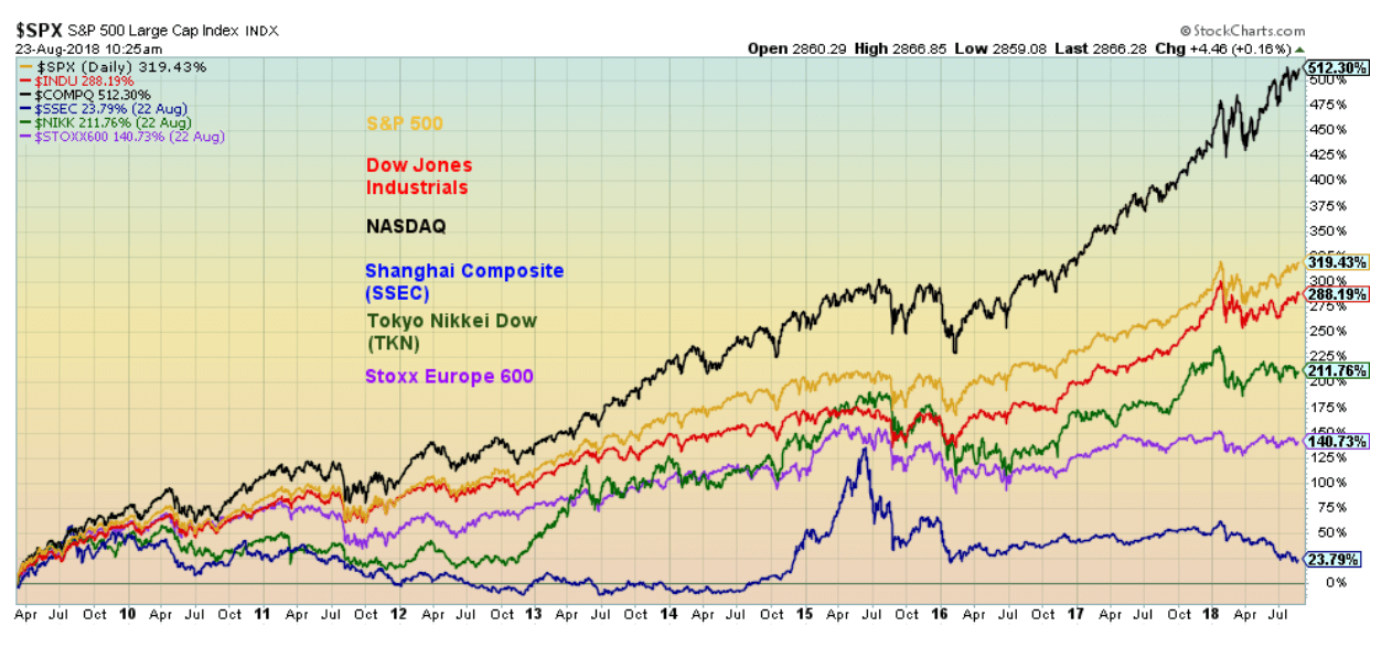
Three-thousand, four-hundred and fifty-five days. That is how long this bull market has run without a 20 percent or more correction (to August 24, 2018). The bull got underway with the bottom on March 9, 2009. There were two significant corrections along the way in 2011 and 2015/2016. Neither market, as measured by the Dow Jones Industrials (DJI), saw a 20 percent correction. However, if one looks at other markets such as the NASDAQ, the NYSE, the Dow Jones Transportations (DJT) and even the S&P 500, they all fell 20 percent or more in 2011 while the DJT fell over 30 percent during the 2015/2016 decline. So, defining this as the longest bull market depends on which market you are looking at. The benchmark is the DJI. For the record, the bull market of the 1990s lasted 3,382 days as measured by the DJI without a 20 percent or more correction. Again, however, there were other indices that fell more than 20 percent during that run.
There are numerous arguments about the length of the bull market. If the DJI doesn’t take out its January 2018 high, then it could be said the bull ended there. That was only 3,245 days. It also depends on which market you want to benchmark as well. The NASDAQ, Russell 2000, and others topped later and some markets are still making new all-time highs. Arguing about which market is the longest bull often proves to be moot depending on which market you are measuring.
The S&P 500 and the NASDAQ made new all-time highs again this past week. So, the bull is not dead. But the DJI has still not made a new all-time high. A non-confirmation? We like all markets to make new highs at least within a reasonable time of each other. We had previously noted that following that initial plunge into February 2018 (an 11.8 percent correction for the S&P 500) new highs were possible on the return action. So far, we haven’t been disappointed. The FAANGs led the way and the small-cap stocks that dominate the Russell 2000 seemed immune to the troubles of the large-cap markets. We have noted numerous non-confirmations of indicators in the markets despite the new all-time highs. So being led higher by a few stocks is not unusual. It has happened before. Below is a chart of the performance of a number of markets since the March 2009 low.
© David Chapman
So, is this the longest bull market in history? Well, the pundits have declared it so and, yes, it has been quite lengthy. But it rose on a sea of quantitative easing (QE), sub-normal interest rate down to zero, and massive amounts of new debt. The economy responded with below-average growth and official unemployment (U3) has fallen to multi-year lows (3.9 percent). The size of the U.S. workforce has grown by 11.5 million since 2008, but then the population grew by 23.7 million. More tellingly, those considered not in the labor force grew by 15.9 million. Some of those are retirees but retirees have only grown by 11 million since 2008. Not all of the remaining 4.9 million are students and stay-at-home mothers. The number of official unemployed (U3) fell by 3.3 million.
Many of the new jobs were part-time, no benefits, and low wages. The labor force participation rate has fallen from 66.1 percent in August 2008 to 62.9 percent today. What that means is the unemployment rate (U3) has been highly influenced by people effectively dropping out of the labor force. A higher labor force participation rate would translate into a higher unemployment rate. On a percentage basis, there are fewer people working today than there were in 2008. The same is seen in the civilian population employment ratio that has fallen to 60.5 percent from 62 percent back in August 2008.
Total U.S. debt has exploded by $20.5 trillion since 2008. Global debt has increased by upwards of $100 trillion. The U.S. national debt has leaped by $10.9 trillion since 2008, $1.5 trillion since President Trump took over in January 2017. The massive debt increase was a direct result of bailing out the financial system following the crash of 2008. GDP has grown by only $6.5 trillion during the same period, suggesting it took $3.15 of new debt to purchase $1 of GDP.
The same scenario has, for the most part, played itself out in the rest of the world. China’s growth has been solid over the past nine years, but it too has been built on a sea of debt. Most tellingly, to gain competitive advantages, the world embarked on currency wars, starting in 2010. Of late, the currency wars have intensified with competitive devaluations, sanctions and tariffs.
The U.S. President has embarked on criticizing Fed Chairman Jerome Powell for hiking interest rates and allowing the U.S. dollar to rise to what he terms unacceptable levels. While President Trump’s attacks on the Fed Chairman are not without precedent, markets consider political interference with the Fed unacceptable. The U.S. dollar has fallen, and the stock markets have steadied since Trump’s musings. The Fed, however, has made it pretty clear that they are staying the course. Could that set up a clash between the Fed and the President?
Could the markets go even higher? Yes! That would shock many, particularly bears, but as long as the U.S. economy continues to at least muddle along and the Fed remains measured and inflation remains tame, then it could move higher still into 2019. There are also the hundreds of millions, even upwards to a $1 trillion still to be repatriated from overseas by U.S. companies. Much of that money could go into stock buybacks that would help propel the markets higher. It’s a poor use of the funds as it is not an investment in plants and it is definitely not a job creator, but it would please shareholders and make a shamble of the bears.
Turkey remains in the news. The tit-for-tat tiff that has broken out between the U.S. and Turkey, both NATO members, continues. Yes, the Turkish lira has taken a pounding, falling 20 percent alone in August. That increases the value of the U.S. dollar loans that Turkey has. It also increases inflation and threatens the Turkish banking system. Since many of the loans are held by EU banks, it also threatens them. Falling currencies have become a contagion. Other falling currencies include the South African rand, the Argentina peso, the Indian rupee, and the Russian ruble. Venezuela massively devalued the bolivar.
Argentina hiked interest rates to combat the falling peso. Turkey refuses to do the same. Argentina, along with Egypt, has taken loans from the IMF and neither of them has a current account deficit anywhere near the size of Turkey’s. Turkey is unlikely to go to the IMF as they would not want to be controlled by a U.S.-dominated institution. Qatar provided them some relief. Further relief is more likely to come from Russia and China. That’s the opposite of what the U.S. would want.
The trouble is Turkey is not the only country on the edge.
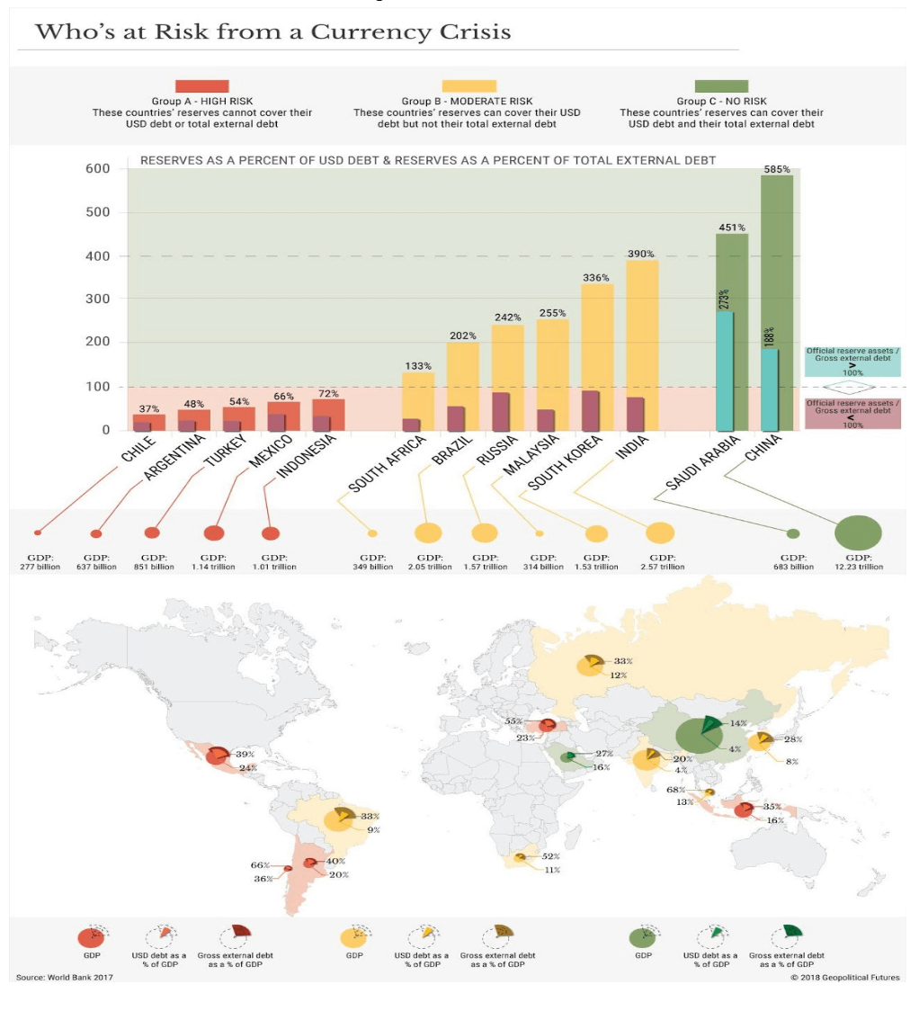
What this chart (below) from Geopolitical Futures shows is these countries are sitting on a potential time bomb of U.S-dollar denominated debt. A Bank for International Settlements (BIS) report of March 2018 showed that there was potentially $11.5 trillion of U.S. dollar denominated debt in foreign countries. A number of these countries don’t have the wherewithal to withstand a serious debt crisis. That Argentina and Turkey are in the category of high risk is no surprise. What was a surprise was the inclusion of Chile, Mexico, and Indonesia. It is no surprise that China is categorized as no risk along with Saudi Arabia. But Russia, Brazil, and India are included amongst those with moderate risk.
© David Chapman
One could argue successfully that all of this is just noise. As long as the economy hums along, earnings remain stable, inflation remains low and cash is available, the markets could well keep on rising. The potential for sovereign defaults is just that, potential. The 1997 Asian contagion had minimal impact on North American markets. The 1998 Russian default and collapse of the hedge fund Long Term Capital Management (LTCM) almost brought down the global banking system. In 2008, Lehman Brothers collapsed and the markets required the biggest bailout in history. So, what could happen this time? If any crisis is contained it might be no worse than the 1997 Asian contagion. But a bust on the scale of Lehman Brothers could once again see the world’s financial system on the brink of collapse. A collapse of say Deutsche Bank would pale the collapse of Lehman Brothers.
Contagion is funny in that it could be limited to one country or a few countries, or it could spread and once again threaten the entire global financial system. Another wildcard is the political travails of President Trump. Again, this is something that could remain just noise in the background or it could erupt into a hurricane if, for example, he made moves to fire special prosecutor Mueller and Attorney General Sessions. Other noise includes saber rattling with Iran, Russia and China. As long as it remains “jawing” with no real action, the markets are okay with it.
With the fundamentals still appearing to favor the markets, one has to turn to the technicals to tell us when the market might break. The last significant low in the markets was the double bottom of August 2015 and February 2016. Ray Merriman of MMA Cycles believes that was most likely a 6.5-year cycle trough. The range is five to eight years. Depending on whether one counts the next 6.5-year cycle from the 2015 low or the 2016 low, this would target 2020–2023 or 2021–2024 as the next major cycle low. The crest of the current cycle, therefore, could still extend into 2019.
There is also a well-known four-year cycle that has a range of 36–56 months. Again, using the August 2015 low and the February 2016 low, the time band for that low is between February 2019 to April 2020. So, there is some overlap with the 6.5-year cycle.
Merriman’s longest cycle is 75 years with half-cycles at 37.5 years and a quarter-cycle at 18.75 years. The 2008/2009 major low came 76/77 years following the 1932 low, 34/35 years following the key 1974 low, and 21/22 years following the 1987 stock market crash, an important low. There was also an important low in October 1990 and the 2008/2009 low was 18/19 years from that key low. The most recent lows all fell within an acceptable range of the projected cycle lows.
Some believe there is evidence of a 90-year cycle as well. It is interesting here to note that there was a major financial crash and panic in 1837 that culminated in a major low in 1843. The period also saw a major depression. It was followed by the Mexican/American War of 1846–1848. Roughly 90 years later saw the crash of 1929 followed by the Great Depression and the major low of 1932. It too was followed by a war, WW2 1939–1945. Wars have a way of ending depressions.
Ninety years later takes us to 2019. Naturally, we’d be loath to think that we could have a panic and crash on the scale of 1837–1943 or 1929–1932. But there are numerous pundits predicting it will happen. They are often referred to as charlatans or worse. But there are conditions in the background that could trigger such a crash. Unlike 2008/2009, the central banks of the world do not have the wherewithal to bail out the financial system. Something to keep in mind as the stock markets continue their historic rise.
Bitcoin watch
© David Chapman
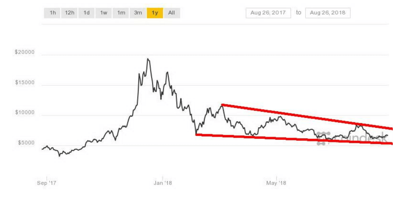
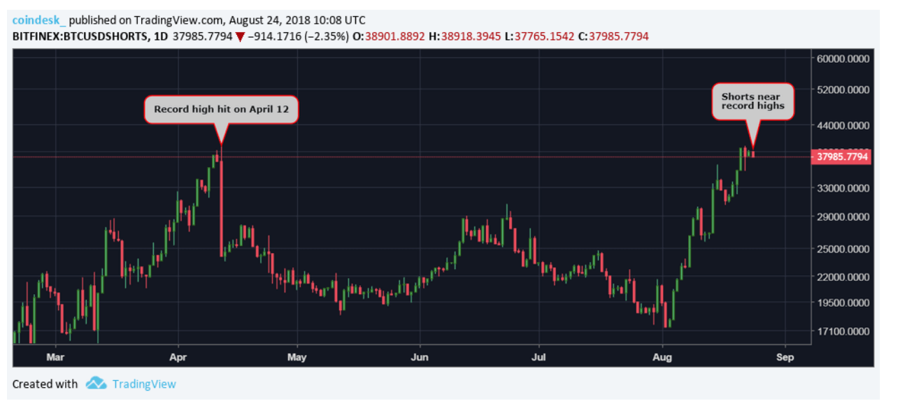
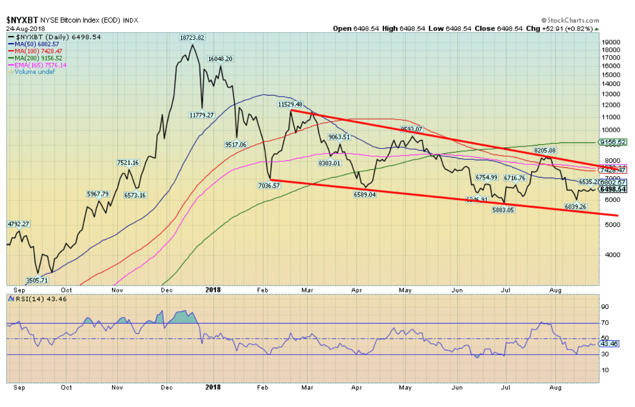
Bitcoin and many of the other cryptocurrencies are largely unchanged this week. The stabilization in the price has once again brought out the crypto bulls declaring that the base is building, and it is just a matter of when, not if, that Bitcoin and the other cryptos break out to the upside. Bitcoin did find support down to about $6,000 and since then has range traded up to just under $6,800. Numerous analysts are calling for a major upside breakout, citing record short positions as a strong reason as to why the cryptos should rise.
Except record short positions are just that. Yes, it could translate into a great deal of short covering if Bitcoin and the cryptos were to break out. But it doesn’t necessarily translate into a big move. Otherwise, many stocks with huge short positions wouldn’t just keep on going down. What has failed to happen so far since the correction/mini-bear got underway last December 2017 in the cryptos is that we have not seen capitulation—yet. In a bear market, capitulation is often needed to cleanse the market once and for all and set up the next good buying opportunity. Given Bitcoin is down some 66 percent from the December 2017 high, it doesn’t mean it can’t fall 80 percent or even 90 percent before the final low is hit. Even the NASDAQ went through some periods of consolidation on its way down 83 percent from its record high in March 2000.
© David Chapman
Above is a chart of the Bitfinex:BTCUSDSHORTS dating back to March. The chart notes the high short position in April. It did roughly coincide with a bottom at the time for Bitcoin that subsequently put in a $3,000 rally. So, it could translate into another rally. We note that significant resistance is seen up to $7,700 and above that up to $9,200. Since topping in December 2017, Bitcoin has been making a series of lower highs and lower lows, the definition of a downtrend. Bitcoin has been forming a possible descending triangle. So far on this move down, we have not yet made new lows. Just because we are at or near record highs in shorts doesn’t mean that the record short position couldn’t get larger.
Bitcoin and the cryptos continue to have trouble with regulators. The SEC, in particular, has been sticky, especially when it comes to creating new crypto ETFs. But the SEC has agreed to review it all again, giving hope to the bulls. We also picked up a story on Bitcoin.com that recounted an individual had made a big profit on a cryptocurrency and that a bank in London froze all his assets as a result. Seems that dealing in cryptos was akin to money laundering or something. It’s moot as to whether it was right or not. But it is a sign as to how institutions are treating trading in cryptocurrencies. Others have run into similar problems with their crypto gains and financial institutions. There is also some fear that those trading in cryptos are also evading taxes and the financial institutions are worried about inspections by tax agents.
The crypto universe has expanded to 1,889 different cryptos according to Coin Market Cap. That is an incredible leap of 137 in the past week. Who buys all this stuff? The market cap of all cryptos was $212 billion, actually down some $61 billion in the past week. More cryptos, lower market cap. Interesting. There were 905 dead coins listed at Dead Coins, up from 889 the previous week. More cryptos are giving birth than are dying. Finally, there were only 15 cryptos listed that had a market cap of $1 billion or higher. It is led by Bitcoin at almost $113 billion. No one else is even close. A week ago, there were 18 cryptos with a market cap of $1 billion or higher. The billionaires are dropping off as well.
We continue to hold that there is no final low in this market until we get capitulation. There could be another temporary rise coming, but we believe like previous attempts it too will fail.
© David Chapman
Markets and trends
Note: New highs/lows refer to new 52-week highs/lows. © David Chapman
© David Chapman
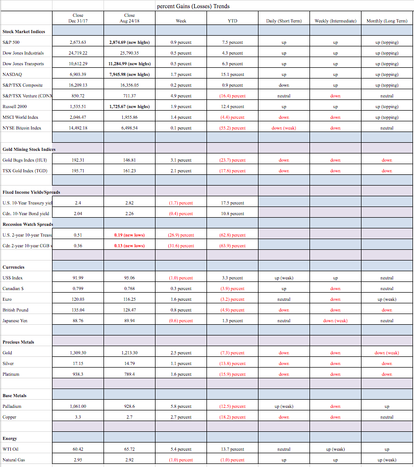
With the Fed signaling a strong economy with benign inflation and measured interest rate hikes, the stock markets leaped to new highs this past week. A lower U.S. dollar helped ease the emerging market crisis but only marginally. Doesn’t matter, the markets take any reason to move higher.
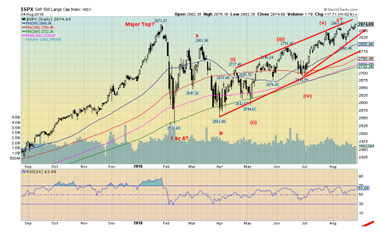
The S&P 500 gained 0.9 percent this past week. Others joined the party making new highs, including the NASDAQ, the Dow Jones Transportations (DJT), the S&P 400 (mid-cap), the S&P 600 (small cap), the Russell’s 1000, 2000, and 3000, and even the very broad Wilshire 5000. The DJI gained 0.5 percent but did not make new all-time highs. The DJT was up 0.5 percent while the NASDAQ gained 1.6 percent. Outside the U.S., markets also saw gains. The MSCI World Index did gain 1.4 percent, London FTSE was up 0.2 percent dragged down by BREXIT, the Paris CAC 40 jumped 1.6 percent, the German DAX was up 1.5 percent as was the Tokyo Nikkei Dow (TKN). The Chinese Shanghai Index (SSEC) gained 0.9 percent. The SSEC is nowhere near its all-time highs.
The S&P 500 continues to rise in what appears as an ascending wedge triangle. It breaks under 2,825. A major trendline is seen at 2,775 while major long-term support is down at 2,500/2,550. Volume has been falling on the rise, suggesting to us that momentum is falling. We note the S&P Technology Index is not making new highs so this might be a negative sign. Other sub-indices not making new highs are Financials and Industrials. It seems that the index is being dragged higher by fewer and fewer stocks. We noted last week the number of stocks trading over the 200-day MA is sharply below the levels seen at the January 2018 top.
Lurking in the background are the political travails of President Trump. The market didn’t really react to the convictions this past week of Trump aides Cohen and Manafort, but they would react to any major firings such as Attorney General Jeff Sessions or Special Prosecutor Robert Mueller. Their firing would be the equivalent of Richard Nixon’s Saturday Night Massacre. Something to keep in mind going forward.
© David Chapman
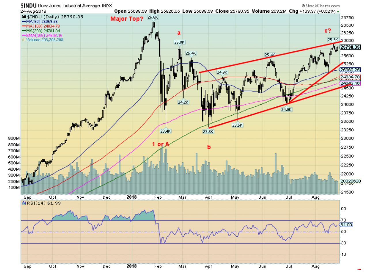
Indices are making new highs but not the most followed index in the world, the Dow Jones Industrials (DJI). The DJI remains 3.1 percent below the January 2018 high. Unless the other markets continue to move higher pulling the DJI with them, then the DJI could fail to make new highs. As we note below the Dow Jones Transportations (DJT) did make slight new highs this past week, a significant divergence with the DJI.
As we have so often noted, we prefer the indices confirm each other. Failure to confirm is usually a negative sign and the next move is one in the opposite direction—in this case, down. As with other indices, the DJI appears to be forming an ascending wedge triangle. The breakdown is around 25,250. The major trend line is seen around 24,600 and the April 2018 low around 23,300. Those levels are the ones to keep in mind if the market were to break down. The 200-day MA is currently around 24,800. A breakdown under that level could also signal the start of a more serious bear market.
© David Chapman
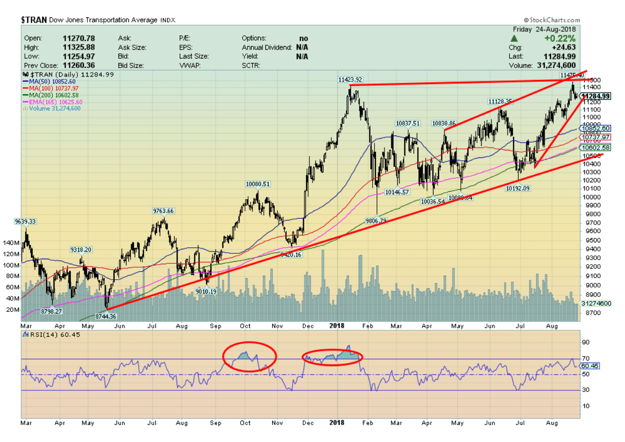
This past week, the Dow Jones Transportations (DJT) made new all-time highs—barely. But as we noted, the DJI did not. Dow theory says the indices must confirm each other. This is a potential significant divergence. The DJI has diverged with other indices but now it is with the DJT. We note that the DJI is nowhere near its earlier highs despite the slight new high from the DJT. It could also be a double top for the DJT, but that remains to be seen. The major breakdown zone is at 10,500. The DJT could also be forming a rising wedge triangle. It breaks down under 11,200 and, at minimum, it would signal a decline to the major breakdown zone at 10,500.
© David Chapman
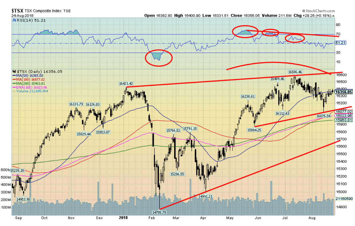
The TSX Composite gained a small 0.2 percent this past week and has rallied back to the 50-day MA. Volume has not been overly impressive. We note a series of declining highs on the RSI even as the TSX Composite made new highs each time. This divergence suggests to us that the next move for the TSX Composite should be down. There appears to be some decent support down to around 16,000, but below that level, a strong decline could get underway. Major trendline support is seen at 15,700. A move that takes us back above 16,500 would suggest, however, that new highs lie ahead. The TSX Composite has not kept up with some of the U.S. indices and while that happens, we do like to see markets, especially closely related markets like Canada and the U.S., making new highs together.
© David Chapman
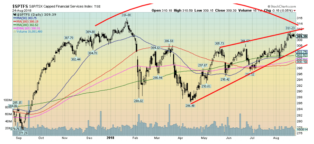
The financials may be a clue. Here the TSX Financial Index (TFS) lags new highs. The TFS is an important component of the TSX and if it is lagging then the TSX is probably lagging as well. The TFS needs to break out over 312 to suggest that new highs above 316 are possible. Otherwise, the downside break comes at around 304 and especially under 300. We’d be cautious with the financials going forward.
© David Chapman
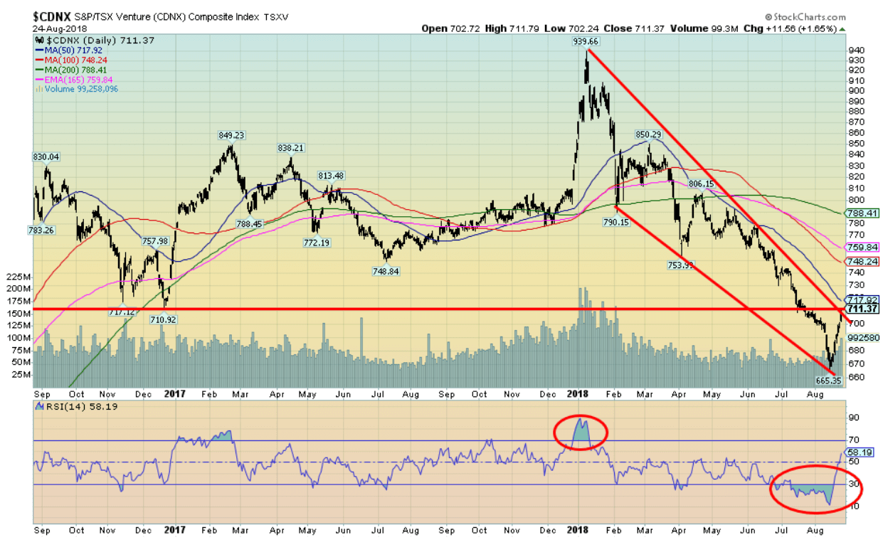
Finally, an up week for the TSX Venture Exchange (CDNX). And it was a pretty good one as well as the CDNX jumped 4.9 percent this past week, regaining back above 700 and testing previous support at 710/712. The CDNX appears to be making a V bottom. Not unusual as look to the top back in January and you will see the same V, only inverted. The CDNX is rallying out of miserable sentiment and grossly oversold conditions. Lots of work to be done, however, as there are hurdles all the way up until we break out over 790. The CDNX can make wild swings. So, after falling roughly 30 percent from that January high, the rebound could be equally dramatic. The CDNX is made up of roughly 50 percent junior mining stocks with the rest in energy, industrials, technology and health care. It will be mining stocks that make or break the next move.
© David Chapman
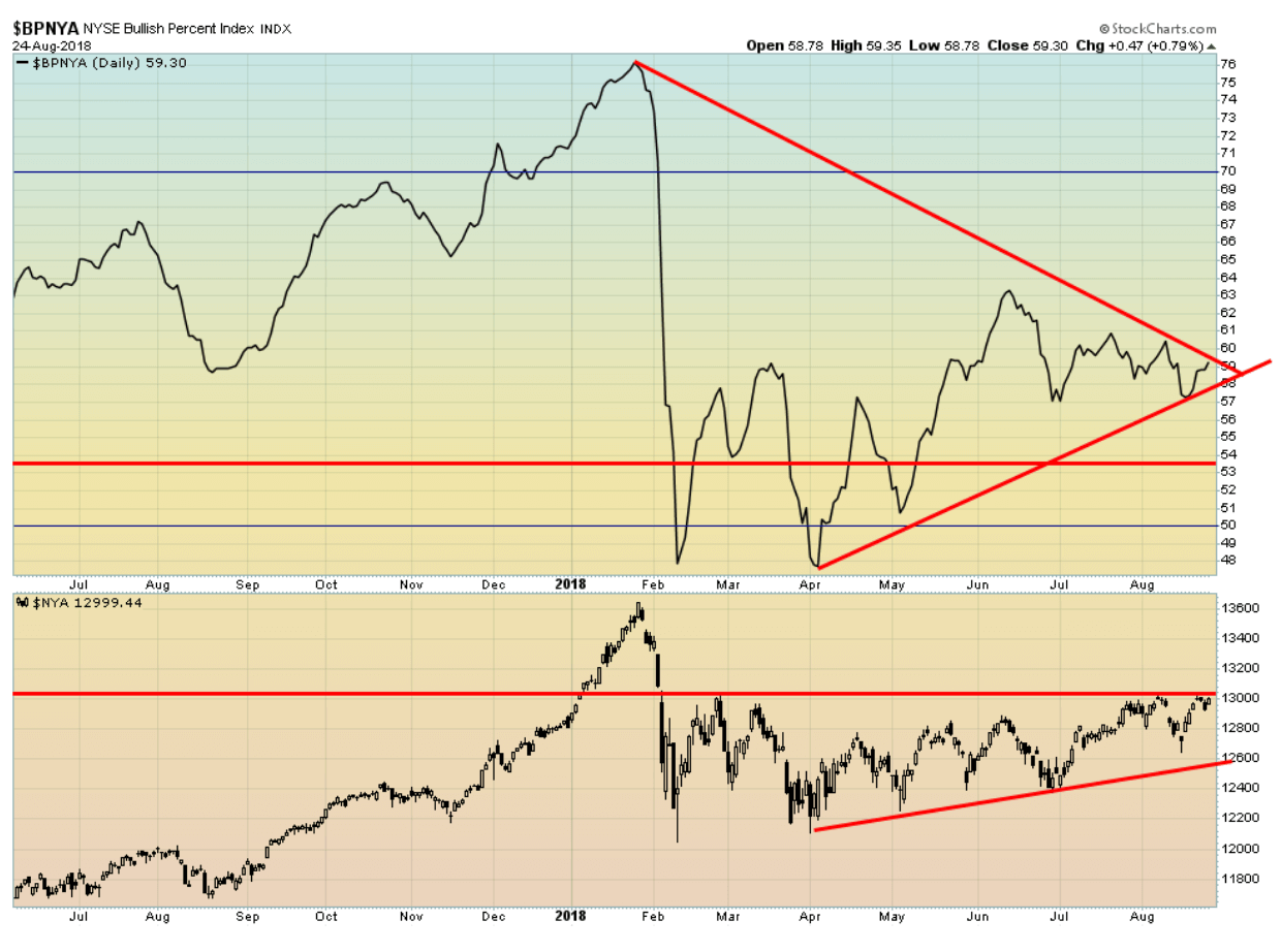
Above is the NYSE Bullish Percent Index. Like the NYSE itself, it remains sharply below its January 2018 highs. While the NASDAQ, the S&P 500 and some others are making new all-time highs, the NYSE remains sharply below its highs. This is a significant divergence that we shouldn’t ignore. We have often noted that markets need to make new highs more or less in tandem. Failure to do so is a divergence that needs paying attention to as it potentially signals that a decline could be coming.
© David Chapman
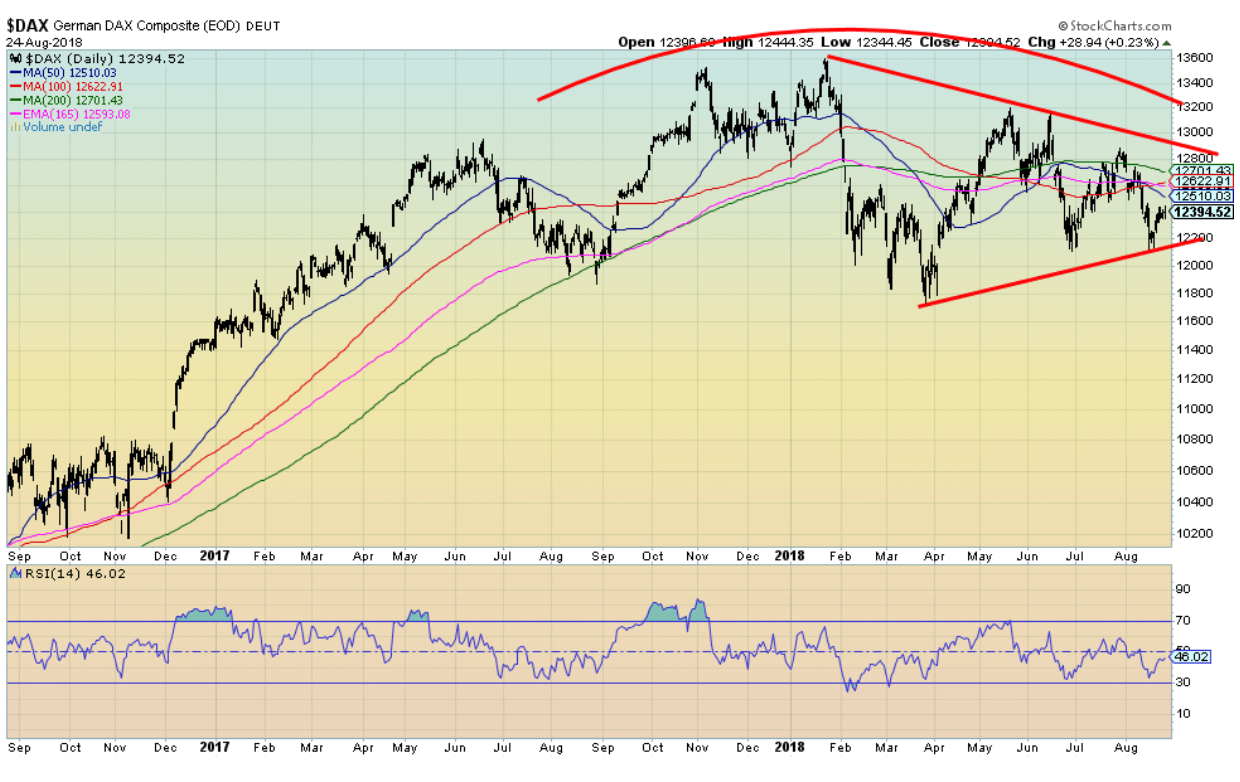
The German DAX is one of the key EU indices. The DAX is nowhere near its previous high seen in January 2018. The DAX continues to trade below its key 50-, 100-, and 200-day MA. The DAX appears to be forming a symmetrical triangle top pattern. It should break to the downside. Only a move above 13,000 might change this scenario. The breakdown is just under 12,300. It also has the appearance of a very large head and shoulders top. It has a downward slanting neckline around 11,600. A breakdown under that level would project down to around 9,800. The EU indices are not looking good, and they could be a leading indicator for the U.S. indices.
© David Chapman
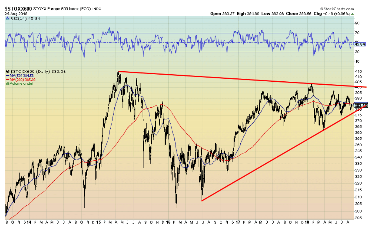
The Stoxx Europe 600 Index is the equivalent of the S&P 500—a broad-based large-cap index. The Stoxx topped back in 2015 and hasn’t been there since. That was quite a drop into February 2016. While the Stoxx has rallied back, the last two years have seen range trading roughly between 375 and 395. Churning going nowhere. The Stoxx appears to be forming a potential head and shoulders topping pattern, although with an odd downward slant for the neckline rather than the normal downward slant. A breakdown under 365 would spell trouble and a potential decline down to 300/325. Only a firm move above 390 might change this growing bearish scenario.
© David Chapman
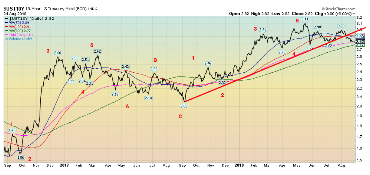
The 10-year U.S. Treasury notes continued their downward trend this past week, falling to 2.82 percent from 2.87 percent the previous week. U.S. Treasuries have been the go-to place for funds fleeing problems elsewhere (Turkey, Venezuela, Argentina, the EU, Russia, etc.). This past week saw the Jackson Hole symposium as well as Fed minutes. The minutes highlighted that the Fed expected further gradual increases in its key target rate for Fed Funds. They cited continued economic expansion, strong labor conditions, and inflation around the Fed’s target of 2 percent. But that impacts the short end of the curve, and if buyers are snapping up bonds at the 3 percent level believing they have topped out along out with some flight to safety, then the yield curve will continue to narrow.
Recession watch spread
© David Chapman
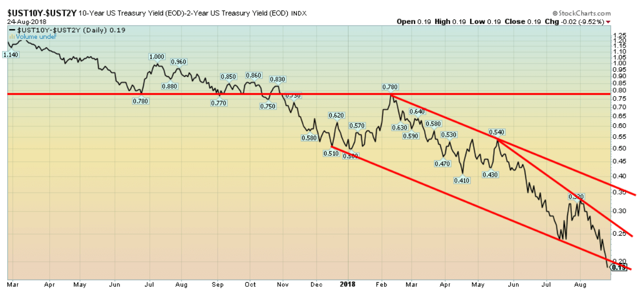
The recession watch spread known as the 2–10 spread continued to narrow this past week (10-year U.S. Treasury notes less two-year U.S. Treasury notes). The spread fell to 0.19 percent this past week from 0.26 percent the previous week. It was one of the biggest drops in weeks. The Canadian 2–10 spread also narrowed, falling to 0.13 percent from 0.19 percent. The pressure on the spread is coming from the Fed’s desire to hike short-term rates and falling long-term rates from flights to safety.
What this is telling us is that we may only be a few rate hikes from a negative (inverted) yield curve. It is becoming so precipitous that even a rate hike in September of 25 bp that is expected could result in a negative yield curve. If not at the September rate hike, then more likely the December rate hike that could see another 25 bp rise. Even if we went to a negative yield, we would probably need at least six months of an inverted curve before a recession gets underway. We continue to appear on target for a recession to start sometime in mid- to late-2019.
© David Chapman
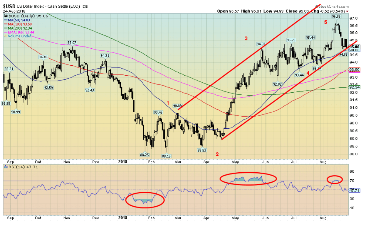
The US$ Index fell this past week, suffering its biggest drop since February. The US$ Index was down 0.9 percent. The main beneficiary was the Euro rising 1.6 percent. The British Pound, despite Brexit, rose a smaller 0.8 percent. The Japanese yen actually fell 0.6 percent.
The catalyst for a lower U.S. dollar were statements from the People’s Bank of China (PBOC) and the Fed. PBOC wanted to use interest rates to stem the recent decline in the yuan while the Fed noted that inflation remained tame and expected it to continue to hover around their 2 percent target.
China and the U.S. are locked in a potentially dangerous trade war. Talks went nowhere and another round of tariffs came into effect. With China fixing and the Fed dovish the U.S. dollar took a dive. That ought to please Trump who wants a lower U.S. dollar. But the Fed, while not commenting on Trump’s comments, effectively dismissed them. It would be unprecedented for there to be political interference in the Fed. For the record, PBOC last targeted the yuan back in May 2017, and the U.S. dollar promptly fell 3.5 percent over the next several weeks.
Russia announced this week that they were done with using the U.S. dollar for trade. Russia has been selling their U.S. Treasury securities and buying gold. The German foreign minister also expressed exasperation with the U.S.-dominated SWIFT payments system and called for the creation of new one independent of the U.S. system. Odd, as that is what Russia and China also want to do. Countries like Iran would immediately join. The German finance minister also expressed exasperation with the U.S.-dominated IMF, calling for the creation of a European Monetary Fund. Funny, as that is what Russia and China are already trying to create.
All of these are potential attacks on the U.S. dollar. A lower U.S. dollar would also help emerging markets that have been suffering from a high U.S. dollar making their U.S.-dollar denominated debt more expensive. The Europeans poked the eye of the Americans again with a $20 billion-plus loan to Iran. The Europeans have not been very happy with the U.S. over their exit from the Iran nuclear deal. The US$ Index breaks down under 94 and especially under 92.50. Regaining 96 would be positive and suggest that new highs were possible.
© David Chapman
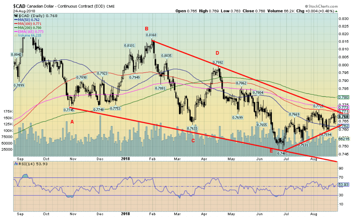
The Cdn$ appears to be in a choppy uptrend after bottoming back in June at 74.81. The June low may have seen the culmination of a downtrend that appeared to fall in an ABCDE type of pattern. The action is choppy and there remains considerable resistance up to 78. Above 78 the Cdn$ could rise to 80 to 82. The Cdn$ may benefit from political turmoil in the U.S. if this past week’s revelations following the convictions of former Trump aides Manafort and Cohen results in increased political uncertainty. There appears to be a support down to 76. Below that a return to the low is possible. The breakout point is at 77, but we’d prefer to see the Cdn$ over 78 to suggest that move to 80/82. Higher oil prices also helped the Cdn$ this past week.
© David Chapman
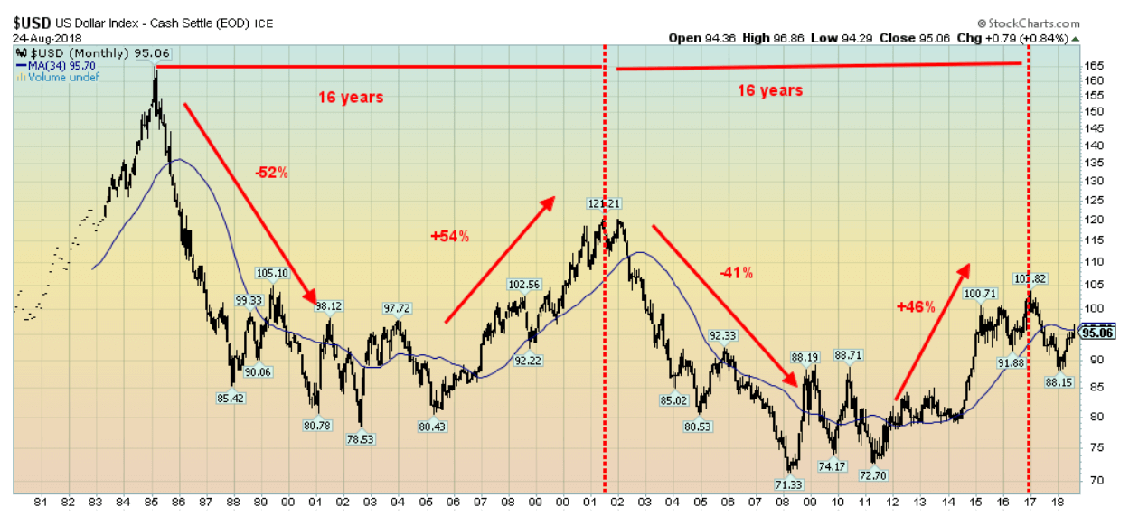
It is always interesting to look at a long-term chart of the US$ Index. It tells a story. The Plaza Accord of 1985 marked a very important top for the US$. A long decline got underway and didn’t bottom until 1992 when the opposite to the Plaza Accord occurred, with the U.S. and Japan deciding the yen was too high and the dollar too low. Another long US$ rally got underway. Interestingly, it peaked in 2001, roughly 16 years after the Plaza Accord. At that point, another long decline was underway for the US$ that bottomed in 2008 at 71.33. It was choppy for a few years, but after making a final low in 2011, the US$ took off once again and, sure enough, roughly 16 years after the 2001 peak, the US$ Index peaked in 2017.
After falling to 88.15 in early 2018, the US$ Index has been rallying once again but has now run into resistance at the 34-month MA. Note there is even some symmetry to the up and down moves as well in terms of percentage gains and losses. If history is any guide, the US$ Index could fall as low as 50/60 on this next move to the downside. That would have grave implications for the U.S. economy and the world if it actually fell that low.
© David Chapman
Gold made a strong upward reversal this past week and, in turn, it may have confirmed at least a temporary low. Gold gained 2.5 percent on the week. Silver was a laggard, gaining 1.1 percent while platinum was up 1.6 percent. The star was palladium jumping 5.8 percent.
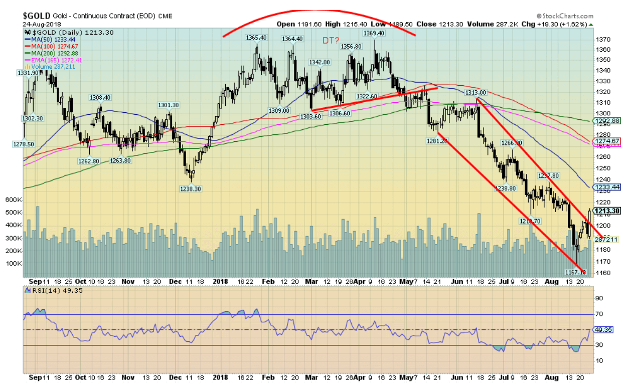
Gold cleared one hurdle when it closed over $1,200 this past week. But there is more work to be done. The next resistance zone to clear is seen at $1,230/$1,240. Once above that level, a run to $1,290/$1,310 is possible. But major resistance remains all the way up to $1,370, a point that has been in place since 2016. We have noted gold appears to be forming a potential powerful head and shoulders bottom with the head at the December 2015 low of $1,045. The neckline is at $1,370 so a firm breakout over that level and especially over $1,400 could project in a best-case scenario up to around $1,700. The catalyst for gold this past week was the oversold conditions, the extreme negative sentiment, the growing bullish COT, and a falling US$ Index.
Thanks to President Trump and his musings about the Fed and also thanks as we noted to PBOC and the Fed for helping to take the US$ lower. We also note that gold appears to have completed five waves down from the last top near $1,369 in April 2018. The past week or two has felt like a panic sell-off. Panic sell-offs are often replaced by equal and strong reactions to the upside. Support now comes in around $1,190. A break under $1,180 would probably result in new lows below $1,167. But the strong rebound this past week along with other indicators suggests to us that we may have hit a bottom. We now need to see follow-through that should come this week.
© David Chapman
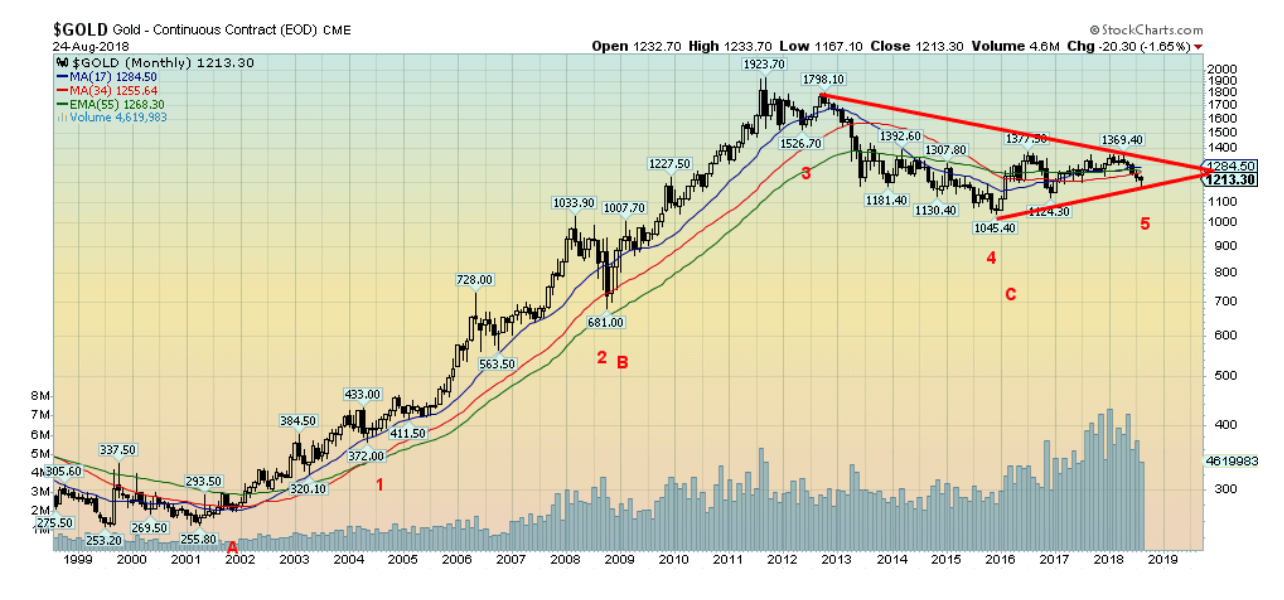
We are showing once again the long-term chart of gold since the major low in 1999/2001. As we have often noted, we believe this was an important long-term cycle low. As Ray Merriman of MMA Cycles has noted, gold has a 7.83-year cycle that subdivides a long-term cycle of roughly 23 years although that cycle can range from 19–27 years. We note from 1976 it was 25 years to the next major low in 2001. There are three 7.83 cycles in the long-term 23-year cycle. From 1976, we noted cycle lows in 1985 and 1993 before the 2001 low. The 7.83-year cycle can have a range of six to nine years.
Pretty well on schedule, the 2008 low was roughly seven years after the 2001 low, and the 2015 low came in roughly seven years after the 2008 low. The 7.83-year cycle subdivides normally into two 34-month cycles, but it can range out to around 42 months. From the 2001 low, we noted lows in 2004 and 2008 followed by important lows in 2011 and 2015. We appear to now be in the throes of making another cycle low. Naturally, we can’t say we are making that 34-month low until we take out points to the upside. The major resistance at $1,370 is the hurdle that needs to be cleared to confirm that cycle low.
© David Chapman
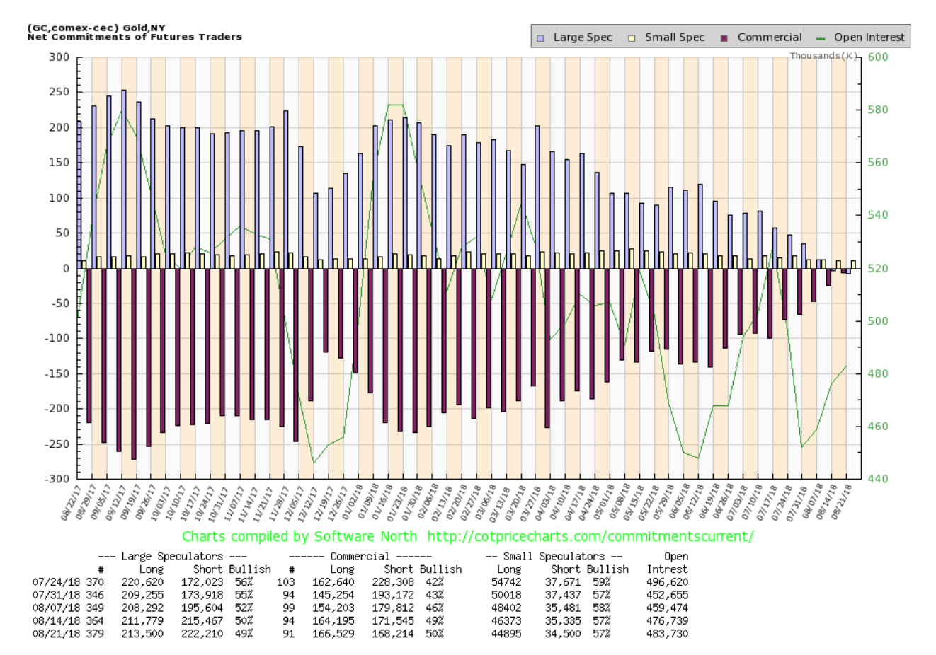
The commercial COT for gold improved to one of the best we have ever seen this past week. The commercial COT for gold jumped to 50 percent from 49 percent with the longs and the shorts almost equal. Long open interest rose over 2,000 contracts while short open interest fell roughly 3,000 contracts. No surprise the large speculators COT (hedge funds, managed futures, etc.) fell to 49 percent from 50 percent. Managed futures are holding a record short position. This has the potential to be a huge source of buying as they are forced to cover those shorts as gold prices rise.
© David Chapman
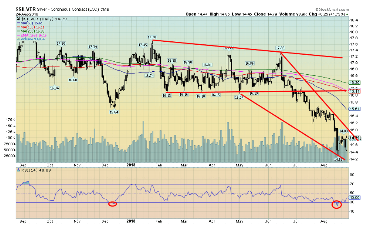
Silver, as with gold, enjoyed a positive week, gaining 1.1 percent. Overall, it was disappointing when compared to gold’s 2.5 percent gain. Our preference is that silver leads not follows gold. Most of the gain was accomplished with Friday’s upside reversal that saw silver mostly put in an outside day reversal on increased volume. As we have previously noted, we still need to regain above $15 to suggest to us that a low is in. There is further considerable resistance up to $15.40/$15.60 that also needs to be overhauled. This week’s up move was encouraging, but the reality is we still don’t have confirmation of a low. Support is down to $14.50. A break under that level could suggest new lows ahead. But, overall, given the negative sentiment, oversold indicators, and the bullish COT, we believe silver is poised for an upward move. Breaking out over $15 this coming week would be a good confirmation.
© David Chapman
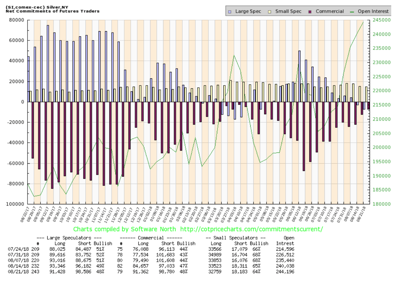
The silver commercial COT improved this past week to 48 percent from 47 percent. This is the best level seen since March/April 2018, just before another upward move by silver. Long open interest jumped roughly 7,000 contracts while short open interest was up just under 2,000 contracts. No surprise the large speculators COT fell to 48 percent from 49 percent as managed futures continued to be quite short. This continues to be a bullish report and we should see it translate into higher silver prices.
© David Chapman
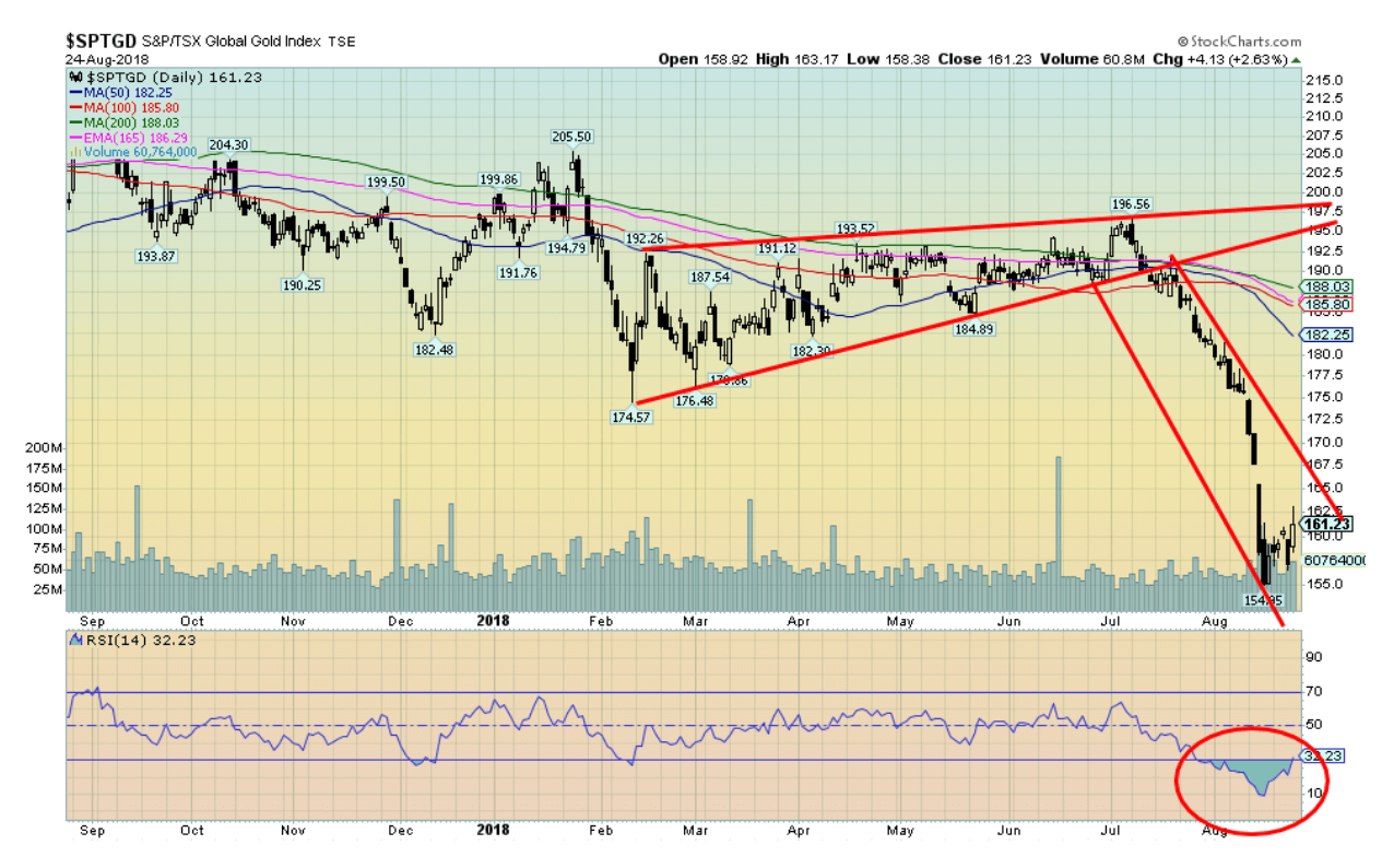
Following the miserable decline the previous week for gold stocks, as represented here by the TSX Gold Index (TGD), the oversold conditions and highly negative sentiment resulted in a rebound this past week. The TGD jumped 2.1 percent this past week while the Gold Bugs Index (HUI) was up 3.1 percent. We note that the HUI has actually performed worse than the TGD as it remains down 23.7 percent on the year to the TGD being down 17.6 percent. But there remains considerable work to be done. There is a gap roughly between 165 and 167.50 that needs to be filled. Regaining 165 would be positive, but the gap needs to be filled by taking out and closing over 167.50. There is further resistance up to 175 and even bigger resistance up to 182/188. On the positive side we can say we are up 4 percent from the low. And, as with the CDNX, we could be forming a V bottom. V bottoms are hard to predict as they turn very quickly. If that gap can be filled this coming week we would at least know that a low is in for the time being. But we have a lot of work to do before we can declare the next bull move is underway. Support is down to 158. Below that new lows are possible.
© David Chapman
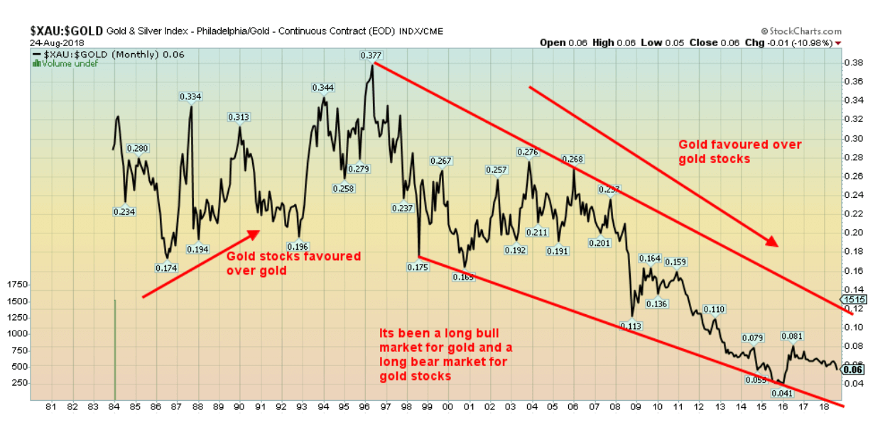
We have sometimes shown a chart of the Gold/HUI ratio indicating that gold stocks (HUI) are quite undervalued compared to the price of gold. This chart of the XAU/Gold ratio shows that gold stocks have been falling in value in relation to gold for over twenty years now. Since that peak in 1996 (which, incidentally, came at the height of the Bre-X mania) gold stocks have been largely out of favor. Oh, there have been periods such as 2000–2005 and briefly from 2008–2011, but for the most part it has been a long downward decline for the gold stocks. Naturally, it is probably too soon to say that is about to change but starting from the low in late 2015 there has been at least some general tendency towards the gold stocks. The last two years have been drifting mostly lower but only mildly lower. If the ratio were to break out over 0.08, then a run to at least that downtrend line near 0.12 is clearly possible. The rebound from that 2015 low appears to us as an A wave up and currently we are in the B wave down. But when that is finished the C wave up should carry us higher. It suggests that owning gold stocks could be favourable going forward.
© David Chapman
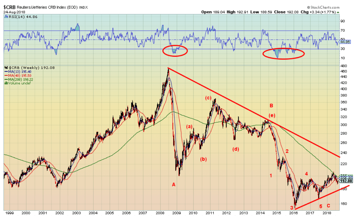
Here’s a long-term chart of the CRB Index. The CRB Index is the most widely followed index of commodity futures. It is a basket of 19 commodities with a 39 percent allocation to energy, 41 percent to agriculture, 7 percent to precious metals, and, 13 percent to industrial metals. We think the CRB Index has been in a major corrective mode since the top in 2008. We may now have completed a huge ABC type correction pattern spanning multiple years. While we didn’t indicate it on the chart the CRB appears to turn roughly every three years. From the peak in July 2008 we note the next peak occurred in May 2011 while the next peak after that occurred in June 2014. Finally, a low occurred in June 2017 (marked 5 on the chart). Since then the CRB has turned up. There is work to do as it has hit the 4-year MA (green line) and appears to be turning back down. But a firm break over the 4-year MA currently near 198 could start a more significant rally to the upside. Only a breakdown under the wave 5 low near 166 could change this scenario.
© David Chapman
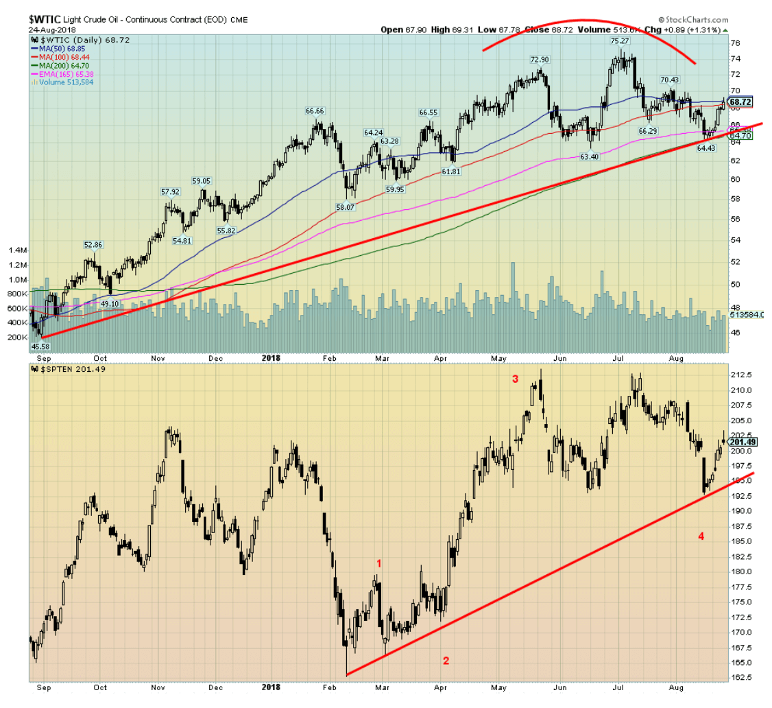
After testing once again down to the 200-day MA WTI oil rebounded strongly this past week, gaining $3.50. Volume picked up even if it was marginal. WTI oil was helped by a falling US$ as were other commodities. WTI oil closed the week at the 50-day MA so it still needs to hurdle that point to suggest we could once again test the highs. There is also resistance at $70/$71, but once over that level a run to $75 is highly probable. It is possible as well that the energy stocks, as represented here by the TSX Energy Index (TEN), have completed a corrective period. We are headed into the storm of hurricane season and that period sometimes plays havoc with both oil and gas prices, depending on where it hits. The short-term daily trend turned to neutral this past week from down. We note that both the intermediate (weekly) and long-term (monthly) trends never turned down. Support has developed around $64/$65 and that area should continue to act as support. Only a break under $64 would change the positive scenario. But key could be the US$, especially if it continues to weaken as it did this past week. The threat of any war in the Persian Gulf remains at best low, despite noise and rhetoric from both sides.
Chart of the week
© David Chapman
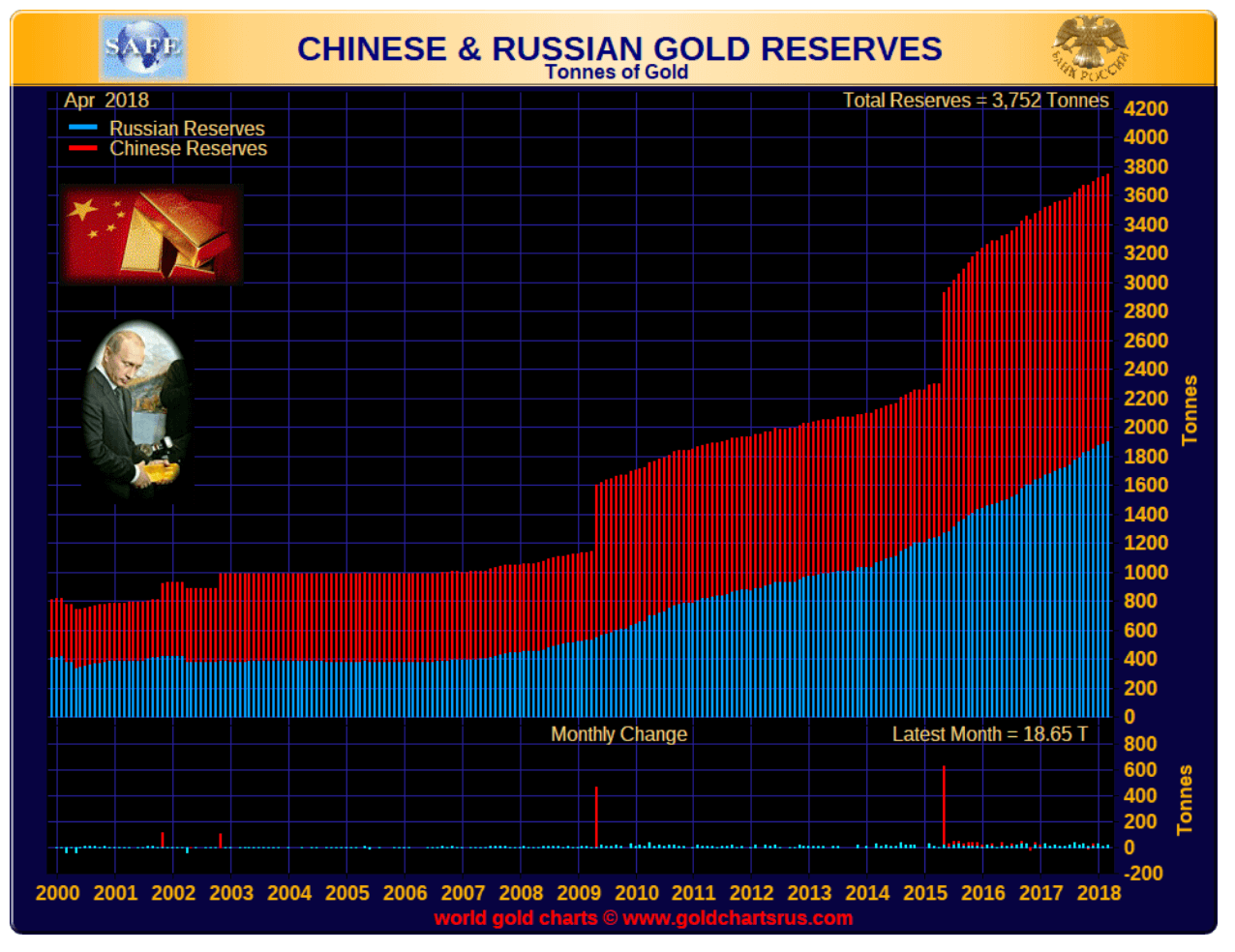
Chinese and Russian gold reserves continue to grow. In July, Russia added 26.1 metric tonnes to its gold reserves. That’s the equivalent of 839,135 troy ounces. The data comes courtesy of the IMF. That raises Russia’s gold reserve holdings to 2,170 metric tonnes. At current prices that puts Russia’s gold reserves at $83.7 billion. Russia has also been selling its U.S. Treasuries. At one point they held over $100 billion. Russia’s foreign exchange reserves stand at around $458 billion as of July 2018.
Oddly, the U.S.’s foreign exchange reserves are only $125 billion. The U.S. holds 8,133.5 metric tonnes of gold in its reserves. That’s equivalent to about $314 billion at today’s prices. So why are the U.S. foreign exchange reserves so low? Seems that the U.S. carries its gold on its books at a price of $42.22 or $11 billion. China’s foreign exchange reserves are estimated at $3.1 trillion, the largest in the world. That includes $1,178 billion of U.S. Treasuries, also the largest holding of U.S. Treasuries of any foreign entity. China, at least officially, holds 1,842 metric tonnes of gold but many suspect it is actually a lot higher.
So why is Russia building up its foreign reserves? Quite simply, it allows Russia to break out from under U.S. dollar hegemony. They are getting out of U.S. dollars and buying gold. It allows Russia to insulate themselves from U.S. dollar freezes and sanctions. If one doesn’t want exposure to the U.S. dollar, one holds gold.
Russia and China also want to build their national currencies under a gold standard whereby the yuan and the ruble could be linked to the price of gold. One would think all of this buying would help the price of gold. It hasn’t because the gold market is not dominated by physical gold, it is dominated by paper gold. And here the international banks and the central banks led by the Bank for International Settlements (BIS) and the U.S. Federal Reserve dominate. Gold is anathema to bankers who dominate paper trading markets in foreign exchange and derivatives. One doesn’t have to find a mine to find gold. They just have to issue paper. Gold derivatives include forwards, futures, and options. Gold derivatives are estimated to be at least 10 times the size of the physical gold market.
The U.S.’s gold holdings represent some 75 percent of all of its foreign exchange reserves. By comparison, Russia’s gold holdings are only around 17 percent of its foreign reserves and China’s gold reserves make up even less just over 2 percent. China has stated that they would like to build their reserves to at least the equivalent of the U.S.’s gold reserve holdings. They have a long way to go.
China is the world’s largest gold producer, producing an estimated 426 metric tonnes annually. It is believed that China’s gold production goes largely to building up its foreign exchange reserves. Russia is the world’s third-largest gold producer, producing some 270 metric tonnes. Canada comes in at number five. Oddly enough, Canada sold off all of its gold reserves believing it to be better to hold only fiat currencies led by U.S. dollar reserves. China is believed to have an estimated 2,000 metric tonnes in gold reserves and Russia 5,500 metric tonnes. (Note: these reserves in the ground and are not to be confused with their foreign exchange gold reserves).
Other countries that have tried to build their gold reserves include Turkey who, as with Russia, is facing U.S. sanctions. The Turkish lira has collapsed over 60 percent in 2018. But its valuation of its gold reserves would rise in terms of the lira.
The price of gold is, as some would claim, an instrument of financial warfare. It remains one of the prime reasons why the price of gold can be manipulated using the paper gold market.
(Featured image by Marco Verch via Flickr. CC BY 2.0.)
—
DISCLAIMER: David Chapman is not a registered advisory service and is not an exempt market dealer (EMD). We do not and cannot give individualized market advice. The information in this article is intended only for informational and educational purposes. It should not be considered a solicitation of an offer or sale of any security. The reader assumes all risk when trading in securities and David Chapman advises consulting a licensed professional financial advisor before proceeding with any trade or idea presented in this article. We share our ideas and opinions for informational and educational purposes only and expect the reader to perform due diligence before considering a position in any security. That includes consulting with your own licensed professional financial advisor.

-

 Crypto2 weeks ago
Crypto Holds Steady as Tether Backs DRIFT and Schwab Eyes Market Entry
-

 Impact Investing1 day ago
EU Parliament Advances ETS2 Plan to Stabilize Carbon Market for Transport and Buildings
-

 Biotech1 week ago
AI and Innovation Transform Clinical Practice in Spanish Hospitals, Despite Ongoing Challenges
-

 Crypto4 days ago
Germany’s Crypto Tax Rules and Bitcoin Outlook Shape Investor Strategy


You must be logged in to post a comment Login