Featured
Wall Street is experiencing a V recovery with a new all time high
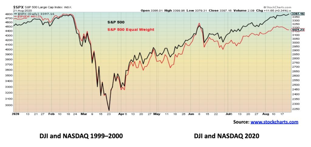
The most hated bull market saw another record this week. The S&P 500 finally joined the NASDAQ in record territory. The rich (Wall Street) get richer while the rest (Main Street) get poorer. Five companies represent 25% of the S&P 500. While 62% of the index has a negative return so far in 2020. The S&P 500 equal weighted index is down on the year even as the S&P 500 is up on the year.

Hallelujah! Happy days are here again. This week the S&P 500 ended its week-long suspense by making new all-time highs. Barely. Grudgingly. It joins the NASDAQ. But we note that we are still waiting on the Dow Jones Industrials (DJI) and Dow Jones Transportations (DJT). It was the shortest bear market in history—a mere 33 days. But yes, the S&P 500 fell 35.4%. Short but deep. In terms of the decline it was comparable to the 1987 stock market crash that ended on October 19, 1987, the day of the crash. At that time the DJI fell 36.1% from the high on August 25, 1987, making the entire decline only 55 days. The S&P 500 lasted a bit longer, not bottoming until December 4, 1987, diverging with the DJI. That lasted 101 days as the S&P 500 lost 33.5%.
We are reminded that it took the stock markets until October 1990 before the final low was made on what was a rising correction. Could we do something similar this time? Out of the lows of October/December 1987 the markets rose until July 1990. Some would say it was just a resumption of the 1980s bull market and in many ways it was. No recession occurred out of the 1987 stock market crash. The official recession didn’t occur until July 1990 and it lasted only 8 months to March 1991. It was a shallow recession with official unemployment peaking at 7.8% and the U.S. economy contracting only 1.4%. The current recession is already in its sixth month and unemployment peaked, so far, at 14.7%. The final numbers are not yet in for the contraction, but the U.S. economy contracted at a 5% rate in Q1 and a 32.9% rate in Q2. The expectation is that 2020 will see a contraction of 5.3%.
As we have so often noted, Wall Street has experienced a V recovery. On the other hand, Main Street is experiencing an awkward L recovery with upwards of 30 million unemployed, a pandemic, protests and riots on the streets of numerous cities, and—a mere 71 days away—an extremely contentious, divided election that appears destined for the courts.
The rich have gotten richer. As for the poor, well, they are not even sure they will be getting more stimulus cheques. Those that had good jobs in banking, securities, insurance, health care, high tech, marketing, etc., or even in government prior to the pandemic and the onset of the recession are still employed. Those who were in precarious jobs in retail, leisure & hospitality, airlines, gaming, and (lest we forget) the oil & gas industry have been negatively impacted. And, within these sectors, the biggest impact is felt by women, people of colour, gig economy workers, the self-employed, and seasonal workers, who now face dim job prospects. It is estimated that there are upwards of 14 million more people looking for work over and above available jobs.
Wall Street benefitted from the trillions in stimulus provided by the Fed and the Treasury while Main Street tried to survive on the stimulus cheques. That helped stabilize things as retail sales rebounded sharply from the depths of April, but with the end of the cheques tied up in partisan bickering, they could plummet again. Millions face potential eviction that could add to the economic woes on Main Street. Twenty-eight million Americans have no health insurance. Going back to some old terminology from the Great Depression we could see the rise of shanty towns once again. Back then they were called Hoovervilles after former president Herbert Hoover. What would they be called now? Bankruptcies are occurring at a record pace, faster than during the Great Recession of 2007–2009. The number one reason for bankruptcy is no surprise—no health insurance, which is especially disastrous during a pandemic. Anchor tenants of malls are folding, leaving many malls in a precarious position where they could become ghost towns.
While 40 million were applying for unemployment during the pandemic, the U.S. billionaires saw their net worth rise by over $600 billion dollars. Figures to the end of June saw Jeff Bezos’ (Amazon) net worth rise by an estimated $48 billion. Microsoft CEO Steve Balmer saw his go up by $15.7 billion. Elon Musk (Tesla) saw his go up $17.3 billion. We could go on. Following the Great Recession of 2007–2009 the incomes of the bottom 99% grew by a paltry 0.4%. For the top 1% their incomes grew over 31%. That was 2009–2012. Extrapolate it further to 2020—it likely didn’t change much and more than likely widened.
We have often noted that the rise in the stock markets has been primarily because of a few stocks. When one looks at the S&P 500 as a whole you discover how the rise has been overwhelmingly due to a few select tech companies. According to a study by Visual Capitalist (www.visualcapitalist.com), of the 505 companies represented in the index, five companies represent 25% of the index—Apple (AAPL), Microsoft (MSFT), Amazon (AMZN), Facebook (FB), and Alphabet (GOOG). Another 185 companies have had a positive return in 2020 while a staggering 314 companies, representing 62% of the companies in the index, have actually posted negative returns for 2020. Overall, the S&P 500 index is up 4.5% on the year (August 10, 2020), but AAPL is up 52%, MSFT +31%, AMZN +68%, FB +24%, and GOOG +11%.
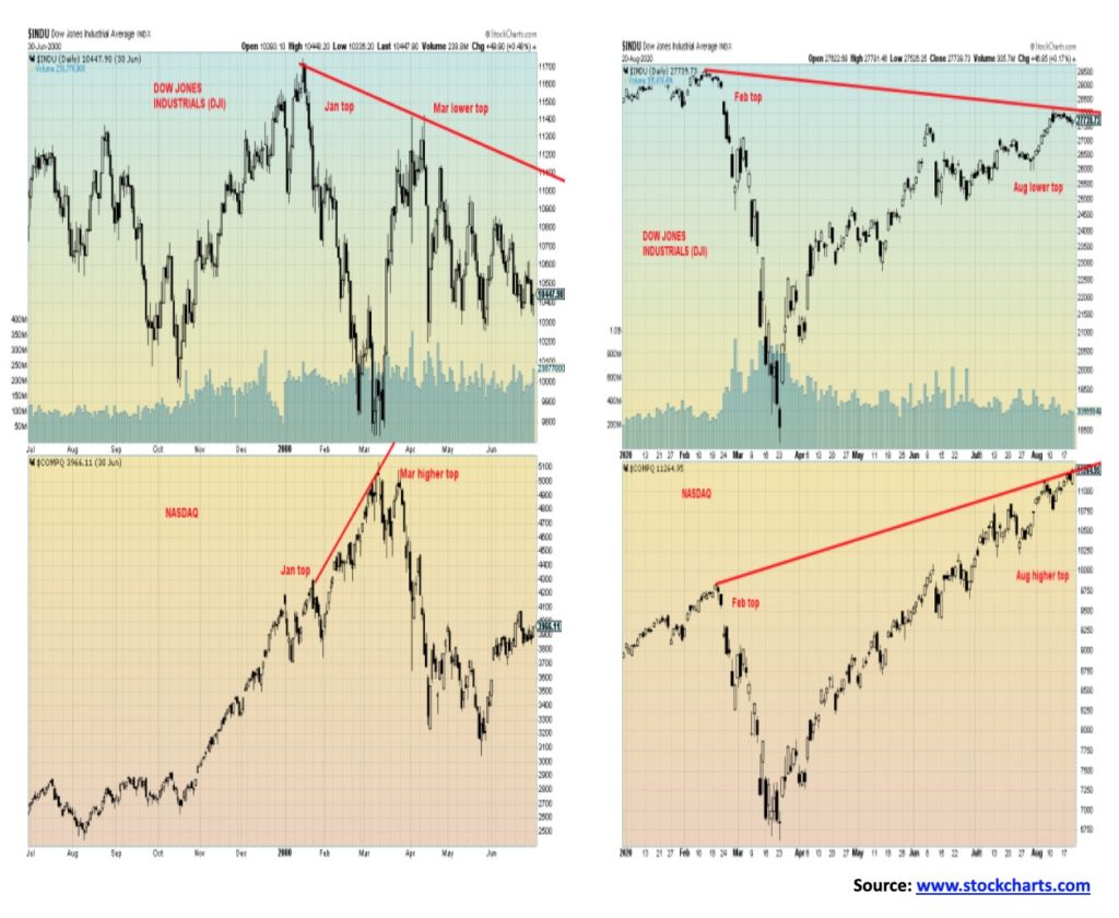
Our chart below compares the S&P 500 with the S&P 500 Equal Weight Index. Updated to August 21, 2020 the S&P 500 is up 5.2% but the S&P 500 Equal Weight Index is down 5.5%. Quite a differential. The NASDAQ of 2020 is beginning to look like the NASDAQ of 1999/2000. The NASDAQ run from 1990 to the top in March 2000 saw the index gain 1,010%. This time, starting in 2009, the low of the 2008 financial crash the NASDAQ is up 585%.
Another comparison with the 2000 market top and today’s market is that, in both cases, the NASDAQ diverged with the DJI. In 2000 the DJI topped in January but by March, when the NASDAQ topped, the DJI made a lower top. It was to prove fateful as the NASDAQ fell 78% while the DJI was down 39% into the final bottom of October 2002. While both the NASDAQ and the DJI topped in February 2020 since the bottom in March, the NASDAQ has soared to new all-time highs while the DJI remains off its February 2020 high.
The market is also becoming quite euphoric as this next chart shows. This panic/euphoria chart suggests that the markets are now approaching the euphoric levels seen in 1999/2000 at the top of the dot.com/high-tech mania. That’s even higher than it was at the top of the housing bubble of 2006–2007 before the financial crash of 2008. The chart incorporates the 12-month forward return and the P/E ratio. Yes, the markets could still go higher, but the odds of success are diminishing. Fund managers have raised their equity profile to the highest levels seen in two years—they’re fearful, it seems, of missing out.
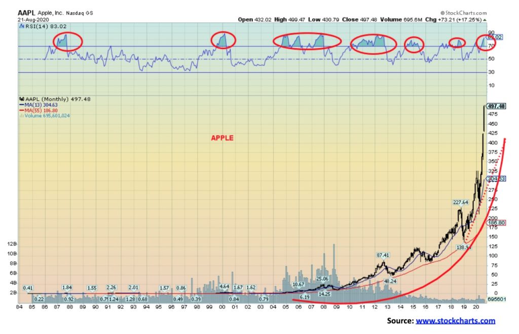
Apple has become the world’s first $2 trillion company. From humble beginnings back in the 1980s it has grown into the behemoth it is today. Yes, you could really buy Apple at 22 cents way back in 1985. Now it’ll cost you $497. The chart is beginning to resemble numerous mania charts we have seen over the years. Yes, it would look so much better if one used a log chart. Remember a move from 22 cents to 44 cents is the same percentage move as one from $200 to $400. But, when depicted on a linear chart, the rise is much more dramatic. The RSI has moved into extreme overbought territory on this monthly chart. Apple has done that a number of times over the years. And, while it usually took a while, the end result was a sharp correction. Buying it at these levels could be somewhat suspect at this time. Sharp rises like this are often followed by equal but opposite reactions. Still, there is something impressive about buying Apple at the bottom of the 2008 financial crash at $9.65 and seeing it today at $497. Apple has become a metaphor for the soaring stock market and the growth of wealth inequality. History suggests that when the correction hits, the drop is 40% to 50%.
Wall Street is euphoric. Main Street is depressed. One of them is wrong. When wealth inequality gets seriously out of whack, that’s when revolutions and civil wars occur.
Our history of the U.S. dollar begins with the “Nixon shock” of August 1971 when the U.S. closed the gold window, suspending the convertibility of the U.S. dollar into gold and effectively ending the Bretton Woods system of international financial exchange. By 1973 the Bretton Woods system was truly gone, replaced by a system of freely-floating fiat currencies, with the U.S. dollar set as the reserve currency. That immediately set off what was then an overvalued U.S. dollar going into a plunge that didn’t bottom until 1978.
Since the end of the gold standard and the start of freely-floating fiat currencies, the world has been through a series of financial crises, each more severe, for the most part, than the previous one. The world has also seen an explosion in government, corporate, and household debt that has reached untenable heights. This has set in motion a roller coaster ride for the U.S. dollar and the fiat currencies and a series of currency crises that have shaken governments. Along with the roller coaster ride, the purchasing power of currencies has been on a downward spiral that some would term a death spiral.
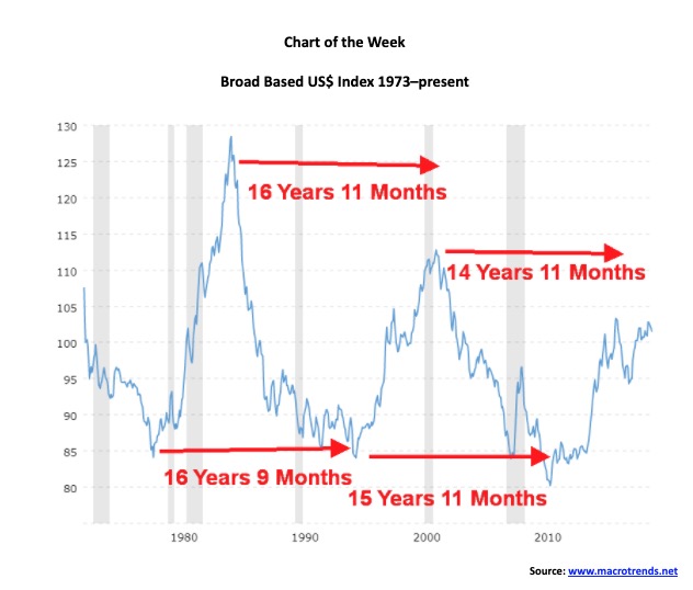
Since we love to look for symmetry, we have been struck by the apparent symmetry of the U.S. dollar, as represented here by the broad-based US$ Index published by the Fed. The broad-based US$ Index differs from the US$ Index (DXY) we show each week in that the broad-based US$ Index is based on a broad group of major U.S. trading partners and contains 26 currencies. On the other hand, the US$ Index (DXY) is basket of 6 major trading partners only (euro, Swiss franc, pound sterling, Cdn$, Swedish kroner, and Japanese yen). Given that the broad-based index also includes major trading partners such as China, India, Saudi Arabia, Russia, plus many more, this index is more reflective of the global trading system.
What is fascinating about it is that the time between major highs (tops) and major lows (bottoms) in the index appears to have a cycle of around 15–17 years. If that is correct, recognizing that it is based only on a few observations, this suggests to us that the next top might not occur until 2032 to 2034 while the next trough might occur somewhere between 2026 to 2028. The US$ Index last bottomed in August 2011 and topped in January 2017.
Since that bottom in 2011, the world has embarked on what many have called currency wars, where countries seeking trade advantage vis-à-vis their trading partners deliberately depreciate the value of their currencies to stimulate their economies. Much of this followed the financial crisis of 2008 and the devastating Great Recession of 2007–2009. Now we seem to moving into the next phase of currency wars that is, in many ways, at the heart of the U.S./China tensions.
With the U.S. dollar as the world’s reserve currency commodity, importing countries must keep much of their central bank reserves in U.S. dollars. China has replaced the U.S. as the world’s biggest importer of commodities, including importing at least 11 million barrels of oil every day. All commodities are priced in U.S. dollars and the normal way of paying for them is also in U.S. dollars.
However, the U.S./China trade wars, along with growing sanctions being placed on China, Hong Kong, and many others, are changing how the world deals with the U.S. and the U.S-dominated global financial insitutions—such as the World Bank, the IMF, and the global payments system for U.S. dollars through SWIFT. The U.S. is even trying to bar China, Russia, Iran, and others from using SWIFT. That, in turn, sets off a scramble to create alternative systems and use alternative currencies, primarily the euro. Bizarrely enough, being anti-China/Russia/Iran is not a bipartisan issue in the highly polarized U.S. Regardless of who wins in November, the approach towards these countries in terms of trade, sanctions, etc. will not change one bit.
All of this is creating tension with regard to the U.S. dollar. If you couple this with the response of the U.S. to the pandemic, you have the basis for the latest downward tilt of the U.S. dollar. Yet booting China/Iran/Russia out of the U.S. dollar system seems highly unlikely. That would set off a tsunami that would make the Lehman Brothers collapse of 2008 look like a Sunday school picnic. As well, it would grossly undermine the U.S. dolllar as the world’s reserve currency as demand for U.S. dollars would collapse. All of this is having some analysts suggest the U.S. dollar is a bomb waiting to go off.
So China, as the main target of the U.S., has four choices, as Gavekal Research (www.gavekal.com) has pointed out:
- Keep using the U.S. dollar—likely
- Be cut off by the U.S.—unlikely—given the massive disruption that would cause
- Pay for commodities using the yuan, freely tradeable into gold—possible. This would also raise the profile of gold as a potential reserve currency
- Pay for commodities usuing a freely-trading yuan—possible. This would be bullish for yuan bonds and conversely bearish for U.S. bonds
China, like Russia and Iran, could also move to the euro. However, given China’s desire to raise the profile of the yuan (or as some refer it, the renminbi) in the global trading system, shifting to the euro is also unlikely. The Chinese yuan makes up only about 4.3% of all FX trading and ranks only 8th in the world in FX trading behind the U.S. dollar, euro, Japanese yen, pound sterling, Australian dollar, Canadian dollar, and Swiss franc. The U.S. dollar makes up 60% of all FX trading and also makes up 40% of all global debt, both ensuring huge demand for U.S. dollars. All commodities are priced in U.S. dollars.
Rising U.S./China tensions are making the world’s central banks nervous. While China wants to shift away from the U.S. dollar (Russia and China already trade in yuan and even rubles) it is an ongoing process and it can’t happen overnight. As well, building an alternative payment system to SWIFT can’t be accomplished overnight, despite the fact they have already been working on that. But one thing stands out in this deepening war between the world’s two largest economies and that is—gold. Gold has been a hedge against political and currency uncertainty for centuries, and in the past has acted in support of the value of national currencies and as a guarantee to pay depositors. Gold is also a store of value: there is just not that much of it.
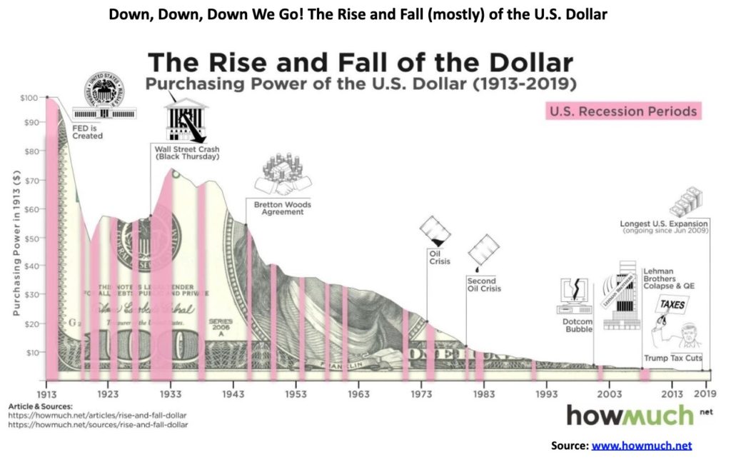
A US$100 in 1913 is worth only US$3.84 today. A $100 in 1913 would have bought you 4.84 ounces of gold. Today a $100 would only buy you 0.051 ounces of gold. The 4.84 ounces purchased in 1913 would give you $9,438 today (at U.S$1,950/ounce).
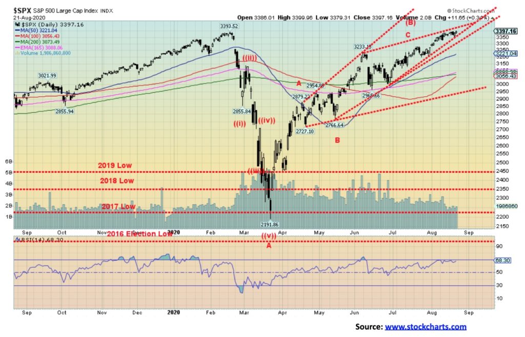
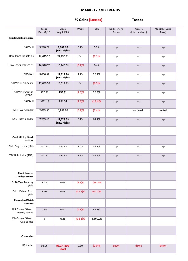
Markets marked time this past week, even as the S&P 500 finally made new all-time highs. The S&P 500 gained 0.7% this past week. Others followed to the upside but not necessarily to new all-time highs. The NASDAQ certainly did, rising 2.7% thanks once again to the big six that have dominated the market. But something funny happened on the way to all-time highs—not everyone is joining. Some even fell this past week. The Dow Jones Industrials (DJI) remains below its all-time high and was flat on the week. The Dow Jones Transportations (DJT) actually fell off 0.2%. So did the S&P 600 (the small cap index) as it too fell down 2.5%. We repeat our old lament: the averages must confirm each other. But they are not.
In Canada, the TSX Composite was also flat on the week while the TSX Venture Exchange (CDNX) faltered, off 1.0%. In the EU, the London FTSE was off 1.1%, the Paris CAC 40 dropped 1.3%, and the German DAX was off 0.9%. In Asia, China’s Shanghai Index (SSEC) gained 0.6% but the Tokyo Nikkei Dow (TKN) fell 1.6%. The World MSCI Index was also down off 0.9%. Bitcoin made new 52-week highs, up 0.2% on the week.
But the most significant divergence is what we noted in our weekly essay. While the S&P 500 was rising 0.7% and making new all-time highs, the S&P 500 equal weighted index fell 1.5%. This is a significant divergence and shows how weak the S&P 500 really is, dominated as it is by a handful of stocks. The markets were encouraged by some good economic numbers. We highlight below housing starts and building permits and note the strong performance of existing home sales. Opening up may be helping the economy, but it is not doing the population any good as the number of COVID-19 cases keeps rising, as do the deaths. The U.S. now has over 5.8 million cases and almost 180,000 deaths, both the highest in the world.
We are now just over two months away from what could be the most contentious and violent election in American history. We have a sitting president who suggests he may not honour the results if he loses. He appears to be openly buying into conspiracy theories espoused by QAnon and loudly supporting candidates who back QAnon. There may be government interference in the postal system, weakening its ability to handle the potentially large volume of mail-in votes; as well, mail-in votes may be deemed fraudulent, setting up the potential for endless lawsuits. Right wing militia groups are threatening to surround the White House if the president loses to prevent him from actually having to leave. And the latest the suggestion is that U.S. troops would be deployed at ballot stations, leading to potential intimidation of voters. Against this backdrop the U.S. has record unemployment, with protests and riots on the streets that could hit a fever pitch by election time, justifying the use of federal troops to suppress them. Markets do not respond well to political uncertainty.
Given all the significant divergences seen on the charts, a corrective period could be imminent. But will it be a shallow correction or a steep one? A shallow one might see the S&P 500 fall back to about 2,900. Below 2,900 the market would become more dangerous. Once under 2,700 the market could then be set up for new lows below the March low of 2,192. The S&P 500 also appears to be forming a bearish ascending wedge triangle. It breaks below 3,350 and is confirmed with a break under 3,300. Significant support can be seen down to 3,000. New highs could change this scenario. But the odds are increasing that the next significant move for this market could be down, not up. The question is, how deep could it go?
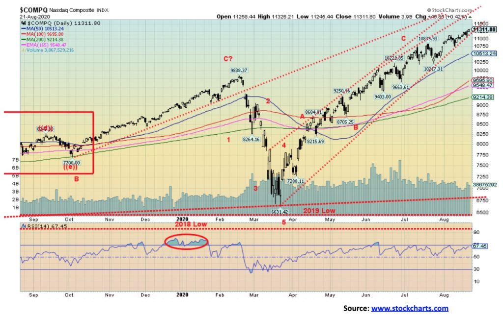
New all-time highs for the NASDAQ are becoming old hat. It all reminds us of the dot.com mania seen in the late 1990s—early 2000s. But remember the NASDAQ is doing this on the backs of roughly a half-dozen stocks: the FAANGs plus Microsoft. On Friday, despite the NASDAQ making new all-time highs, apparently only 29% of the stocks advanced. The rest were down. This shows up in our NASDAQ advance/decline line we show below.
Speaking of the FAANGs, two stand out this past week for making new all-time highs: Apple and Tesla. Okay, Tesla is not a member of the FAANGs but it has been soaring. Apple gained 8.2% this past week, but Tesla soared up 24.2% on the week and is now up 390% in 2020. Seems that, despite the president’s slogging of green automobiles and support of gas guzzlers, green is winning. Everybody gained this week with Facebook up 2.2%, Amazon gaining 4.3%, Netflix up 2.0%, Google up about 4.8%, and Microsoft up about 2.0%. The rich get richer. Okay, Warren Buffett didn’t as his Berkshire Hathaway fell 1.6%. So, all billionaires don’t get instantly richer. Elon Musk of Tesla is trying his best to catch up to Jeff Bezos as the world’s richest man. However, we remind him that Bill Gates still stands between them. With a net worth of roughly $84 billion for Elon Musk, he is as big as the Dominican Republic or Sri Lanka. Jeff Bezos, on the other hand, is challenging Qatar and New Zealand. Poor Donald Trump. Musk could eat him for lunch and still have billions left over.
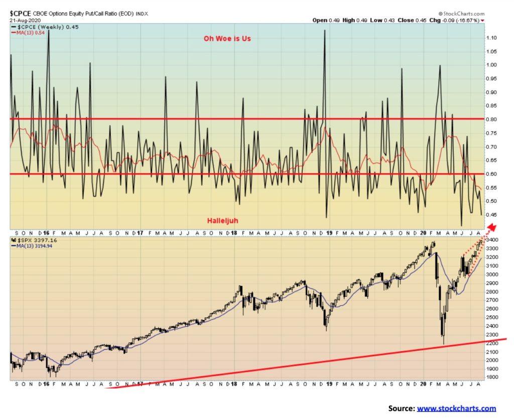
Absolutely amazing that the put/call ratio has remained in bullish territory for such a long time. The put/call ratio closed Friday at 0.45, not far from its record low of 0.40 seen in early June. We have rarely seen the put/call ratio remain so bullish for such a prolonged period. The market’s complacency is astounding.
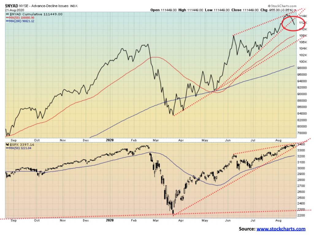
We finally may have our divergence. This week the NYSE advance/decline line fell, even as the S&P 500 rose to new all-time highs. As well, the NYSE advance/decline line appears to have broken the uptrend from the March lows. We have been waiting for a divergence for some time and this may be it. Naturally, it is not yet confirmed. To confirm we need follow-through with the advance/decline line falling further and the S&P 500 turning down as well.
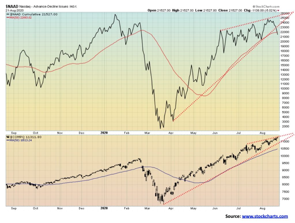
Like the NYSE advance/decline line, the NASDAQ advance/decline line fell this past week despite the NASDAQ rising to new all-time highs. As with the NYSE advance/decline line it appears to have broken under the uptrend line from the March lows—a divergence we should be paying attention to.
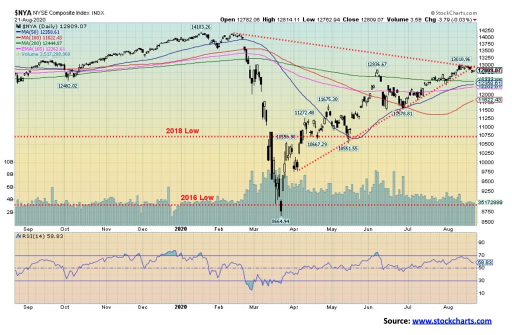
The NYSE is a prime example of indices that are diverging sharply with the record-breaking NASDAQ and S&P 500. The NYSE is barely above its 200-day MA and remains almost 10% below its February top. This is a significant divergence to both the NASDAQ and the S&P 500. Also diverging are the DJI and DJT. If they can’t make new highs along with the NASDAQ and S&P 500, then this market is actually having trouble and is not as bullish as many would like us to believe. The NYSE breaks down under 12,400.
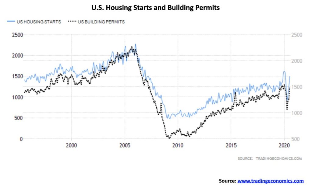
U.S. housing starts rebound sharply in July, jumping 22.6% annualized to 1,496 thousand, well above forecasts of a gain of 1,240 thousand. Building permits also surged, coming in at 1,495 thousand vs. an expectation of 1,331 thousand. June was also revised upwards. Altogether, it brought housing starts almost back to where it was before the swan dive as the pandemic got underway. Start-ups were all over the country with the Northeast experiencing the biggest gains. Existing home sales were 5.86 million in July, above an expectation of 5.2 million and the previous month’s 4.7 million. Despite the impressive gain, all numbers, starts, permits, and existing sales remain sharply below the housing bubble numbers seen in the early 2000s. It is suggesting that the U.S. is rebounding to its pre-pandemic levels. But will that last?
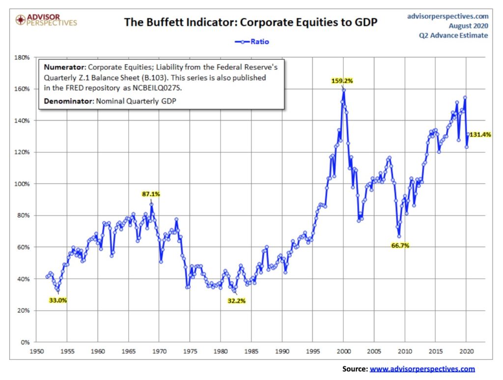
We thought we’d take at look at the Buffett Indicator, which measures the value of corporate equities as a ratio of GDP. The current reading is 131.4% which is historically high going back to 1950. The peak was seen at the top of the dot.com mania as the indicator reached a level of 159.2%. The most recent low was the financial crisis and crash of 2008 when it fell to 66.7%. The peak during the bull market of the 1950s and 1960s came with the top in 1966 at 87.1% while the bottom came at the bottom of the lost decade of the 1970s with a low of 32.2% in 1982. A better measurement might come in using a broad-based index such as the Wilshire 5000. If we used that index instead the Buffett Indicator, it is into the stratosphere at 152.8%, well above the dot.com mania peak of 136.9%. By these measurements, this market is quite overvalued. No wonder Warren Buffett said he could find nothing to buy. Until he bought into Dominion Energy a company in the business of gas transmission and storage assets. Seems he saw value in the beat up energy industry.
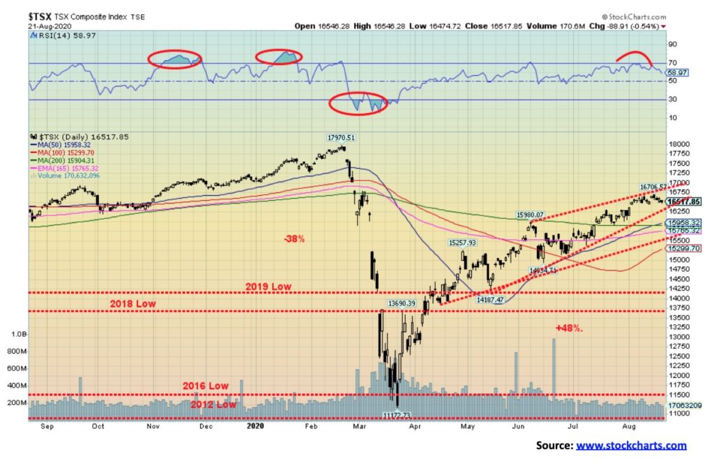
The TSX was flat this past week, gaining a paltry 0.02%. The large cap TSX 60 fared better, gaining about 0.1%. Nine of the fourteen sub-indices gained on the week led by Golds (TGD), up 1.8%. It would have been better as the TGD was up even more, earlier in the week, but it faded as the week wore on. Information Technology (TKK) was next, up 1.7%. The big loser was Energy (TEN), down 6.2% while Health Care (THC) fell 4.1% and Financials (TFS) was off 1.2%. The TSX could now be rolling over. Unlike the S&P 500 and NASDAQ, the TSX is nowhere near its highs seen in February. The index also appears to be forming a potentially bearish ascending wedge pattern. Breakdown occurs at 16,250 and is confirmed with a breakdown under 15,500. Under 15,300 the TSX could once again enter bear market territory. The S&P 500 and the NASDAQ may be suggesting that the bear market is over, but the TSX has not yet confirmed that.
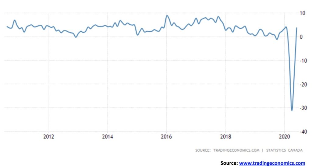
Retail sales in Canada jumped 23.7% in July, bringing retail sales on a year-over-year basis back into positive territory and effectively wiping out the huge drop seen in April and May. On a year-over-year basis, Canadian retail sales gained 3.8%. It was better than the expected gain of 2%. So, is Canada’s recession over? It was one of the largest gains for retail sales ever seen. Is it pent-up demand after the pandemic drop in April and May? Many sectors benefited with auto and auto parts up 53.4%, clothing and accessories up 142%, gasoline up 26.3%, health and personal services up 11.7%, general merchandise up 8.6%, electronics & appliances up 4.4%, and food & beverage up 1.5%. Since all regions were opening up from the earlier lockdowns, every province saw gains with eight of them returning to pre-pandemic levels. We’ll see how this pans out when we get GDP numbers this coming Friday, August 28. It is expected that the month-over-month gain will be 5% but the annualized rate to the end of Q2 will show a decline of 38%.
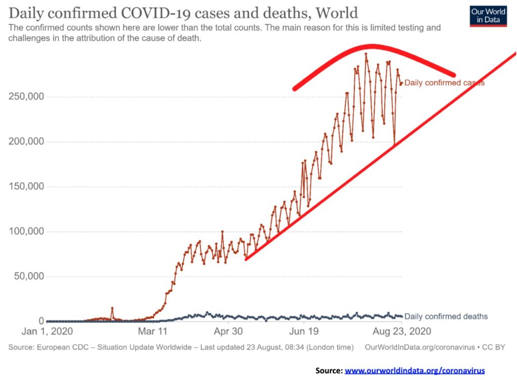
The best we can say is that the world’s daily cases are stabilizing somewhere in that 200,000 to 280,000 new cases per day range. The leaders remain the U.S., Brazil and India with India now recording the highest number of daily cases. Deaths have stabilized as well with roughly 5,000 – 6,000 recorded every day. Other countries with high number of daily cases are in Latin America (Colombia, Peru, Argentina, Mexico) while some south Asian countries such as Bangladesh, Pakistan and Indonesia are seeing rising cases. The U.S., Brazil and India are also the leaders in daily deaths. Note how the recent drop in cases held the uptrend line. A drop under 200,000 daily cases would be positive and could be an indication that the pandemic is coming under control. The world continues to add roughly a million new cases every four days and 10,000 deaths every two days.
Cases and Deaths 16:17 GMT August 23, 2020
Number of Cases: 23,466,367
Number of Deaths: 810,180
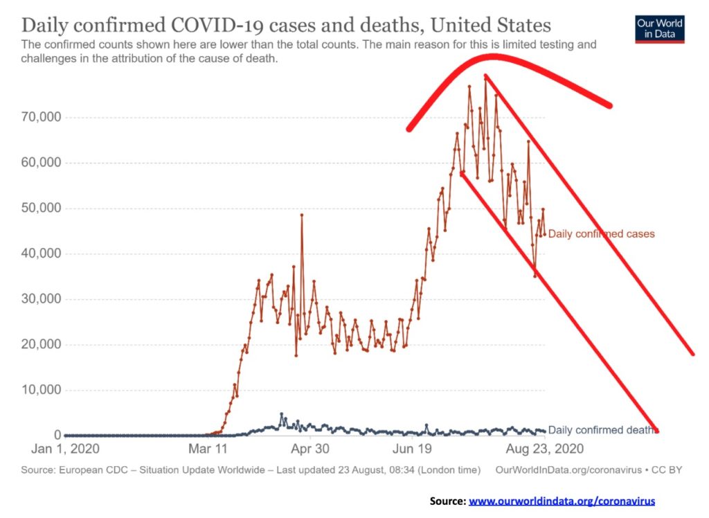
Could the U.S. finally be on a downward trajectory to fewer daily cases? Daily new cases have now entered a down channel. Must be a welcome relief but it continues to be elevated with between 40,000 to 50,000 new cases every day and generally over 1,000 dead every day. But the shift in direction must a welcome relief. Most countries continue to bar Americans even in America there are sometimes restrictions on entry from those out of state. California, Texas and Florida are all over 600,000 cases while New York has the highest number of deaths although that has slowed sharply now.
Cases and Deaths 16:17 GMT August 23, 2020
Number of Cases: 5,851,809
Number of Deaths: 180,304
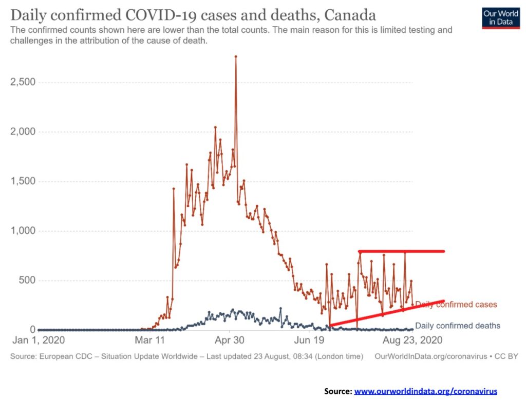
The best that can be said for Canada is that daily new cases has stabilized somewhere between 300-700 daily. Deaths have also stabilized with often less than 10 in a day. Some restrictions still remain on travel particularly from the U.S. and sometimes between provinces with bans into the Maritimes. Recovery rates are now consistently over 95%.
Cases and Deaths 16:17 GMT August 23, 2020
Number of Cases: 124,818
Number of Deaths: 9,072
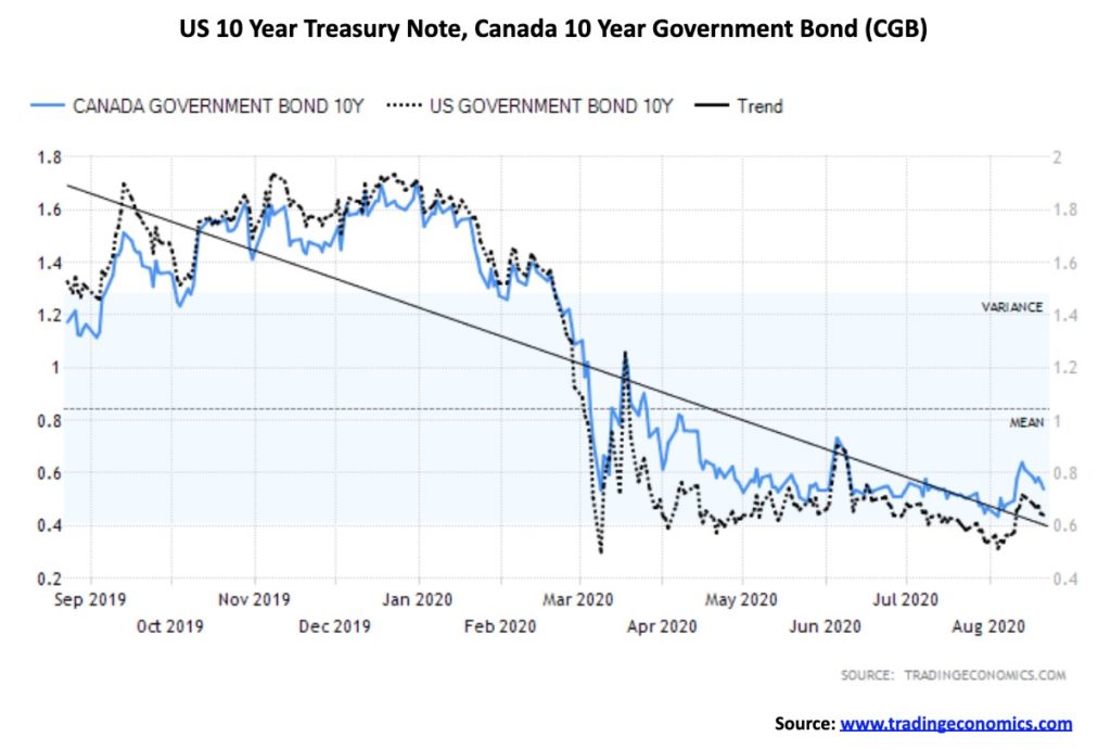
Interest rates turned back down this past week as the U.S. 10-year U.S. treasury note fell 6bp and the Canadian 10-year Government of Canada bond (CGB) dropped 5bp. The decline in rates was against the backdrop of some positive economic numbers, particularly the housing starts in the U.S. and retail sales in Canada. However, it is keeping with our thoughts that interest rates are not going anywhere. We expect that the Fed will suppress interest rates, keeping them low not for months but possibly for years. Speaking of the Fed, the Fed’s assets grew by some $53.3 billion this past week but remain down $158.3 billion from their high level seen in June 2020.
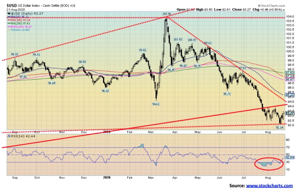
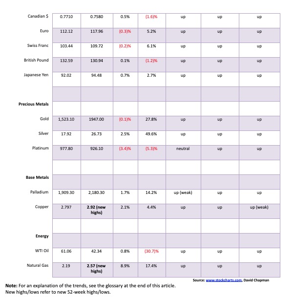
The US$ Index fell to a major support line this past week at 92.14, then reversed and closed mildly higher on the week. The US$ Index gained 0.2% while other currencies floundered. The euro fell 0.3%, the Swiss franc was off 0.2%, the pound sterling did gain a small 0.05%, while the Japanese yen was the star, up 0.7%. The Canadian dollar gained 0.5%. The US$ Index was rebounding from being severely oversold and the low this week saw the indicators diverge with indicators making higher lows even as the US$ Index made fresh 52-week lows.
The US$ Index fell to our last major line of support this past week near 92. The support line comes up from the major low seen back in 2018. That the US$ Index managed to close higher on the week portends well for higher prices going forward. A rising US$ Index would be negative for gold. Initial resistance is up around 94, but above 94.50 the US$ Index would break out and potentially target up to 98. If we are correct, we believe this could be a fourth wave correction down from the consolidation pattern that formed between March and June this year. The June top for the US$ Index at 100.61 also coincided with a low for gold. Regaining firmly above 98 would suggest a more significant low is in place for the US$ Index. Only new lows might change this somewhat positive outlook going forward. The euro, which is the largest component of the US$ Index, is exhibiting some classic bearishness. The commercial COT for the euro has fallen to 36% and has been consistently at the lowest level seen in some time. At the other extreme, the large speculators COT is at 81% and they are holding the largest bullish position in a while, opposite to the commercial traders. This points to a potential decline for the euro.
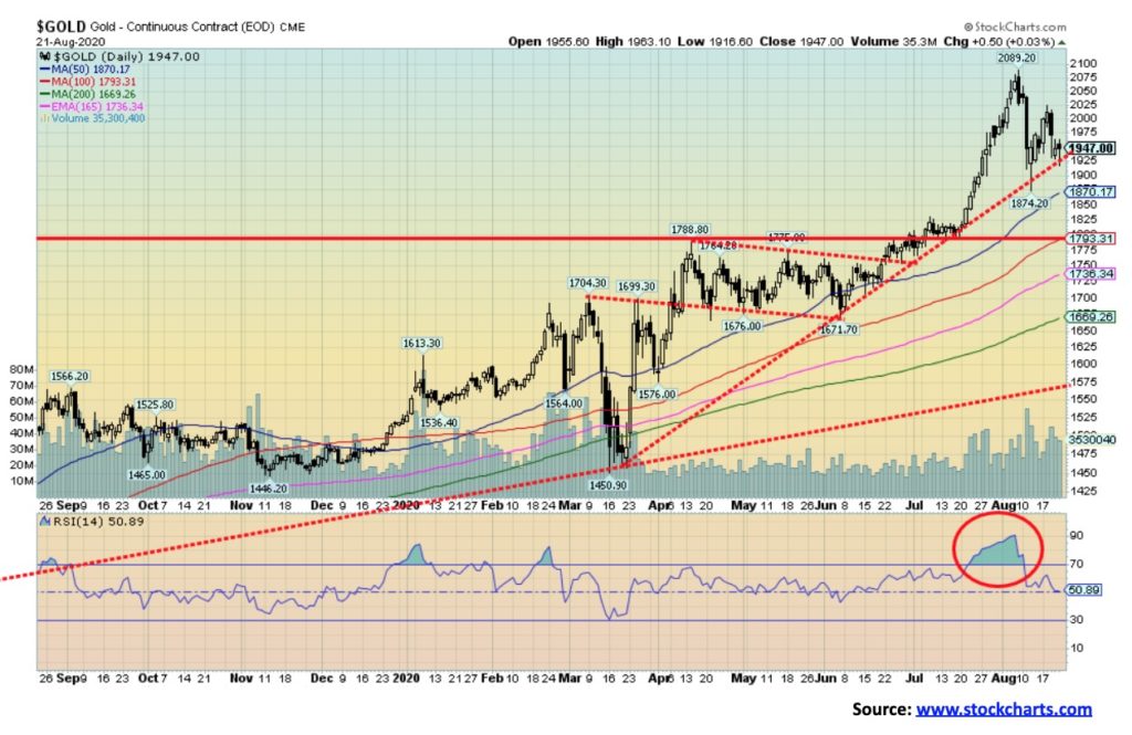
A strange week for gold with Monday, August 17’s leap sparking gold to a gain of 2.5%; however, by week’s end we were off about 4% from the week’s high, closing just about on the trendline, up from the March 2020 low. We could well break that trendline this coming week. If it fails to hold, the next target could be a move down towards $1,800. Gold fell 0.1%, diverging somewhat with silver’s gain of 2.5%. Platinum continued its woes, losing 3.4%. Palladium was up 1.7% and copper seems to be in demand as it jumped 2.1%, making new 52-week highs.
The leap earlier in the week appears to have been a set-up for the fade that followed. Gold needs a consolidation to lower the excessive bullishness and to work off overbought indicators. While, ultimately, gold should move even higher, given negative interest rates that are not about to turn positive, along with ongoing currency devaluation, growing global tensions between the U.S. and China, and the sharply polarized state of politics in the U.S. All this against the backdrop of the pandemic where the U.S. is number one by far in cases and deaths and most of the world is barring U.S. citizens from visiting their country.
Our expectation is that this correction period could last into September and we will see at least an ABC flat or a more complex ABCDE type of correction. While there is some risk that gold could fall as low as $1,800, the drop dead line is at $1,672, the June low. Any break below that level would tell us that gold may be entering a bear market. Despite all the bullish forecasts for gold, we are reminded that bear forecasts also exist and, while we have every reason to believe gold should move higher, we can’t ignore the potential for gold to do the opposite, at least for a short period. If the stock market were to break down, then we could easily see gold following, taking silver and the gold stocks down with it. We are reminded that, during the stock market crash of 2008, gold fell sharply as well and during the March pandemic panic gold was off again, losing 15% in short order. A 15% correction now would take gold down to $1,775. If $1,800 is plausible, $1,775 is not that far away. Gold fell 34% during the 2008 financial crash (vs. 55% for the stock markets). A 35% drop now would take gold back to $1,370 and the major breakout line seen in 2019. Complacency that nothing can stop gold is our most dangerous thought.
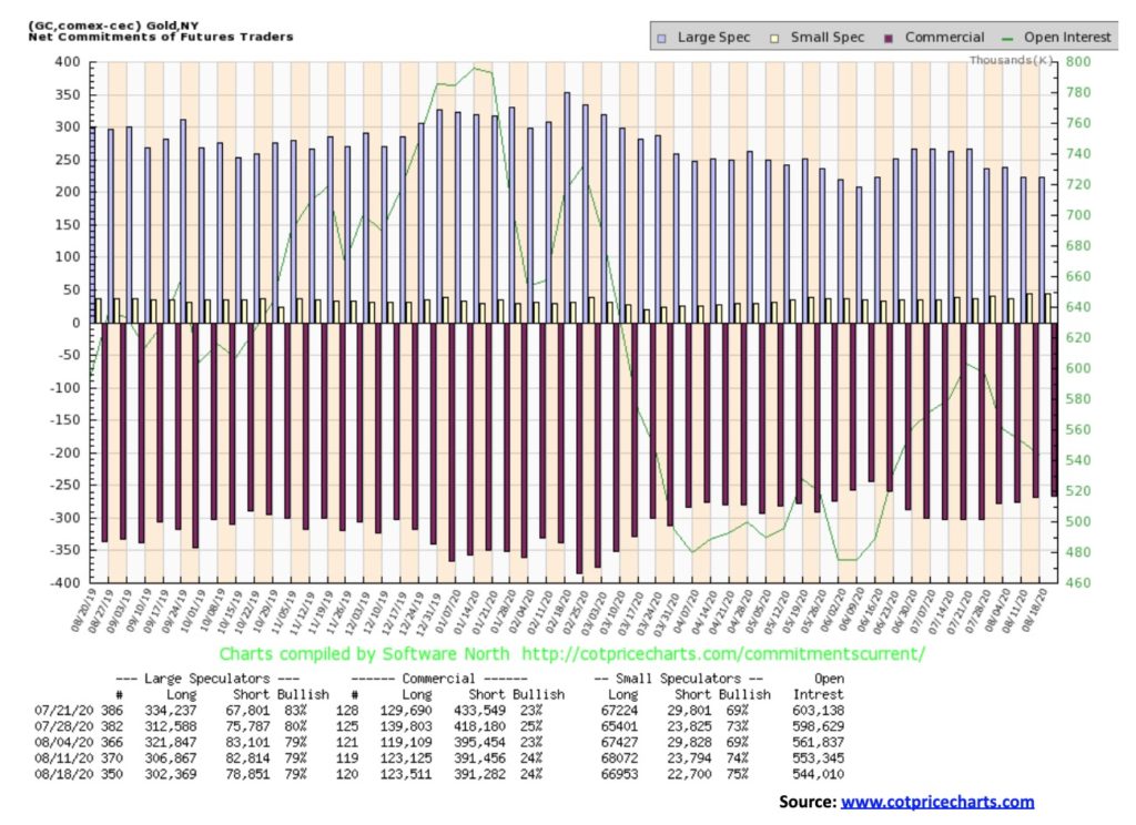
The gold commercial COT was steady this past week at 24%. Both long and short open interest were basically unchanged, an abnormal event in itself. But the commercial COT hasn’t fallen so that’s positive. The large speculators COT (hedge funds, managed futures, etc.) was also unchanged at 79%. However, here long open interest fell roughly 4,500 contracts while short open interest was down about 4,000 contracts.
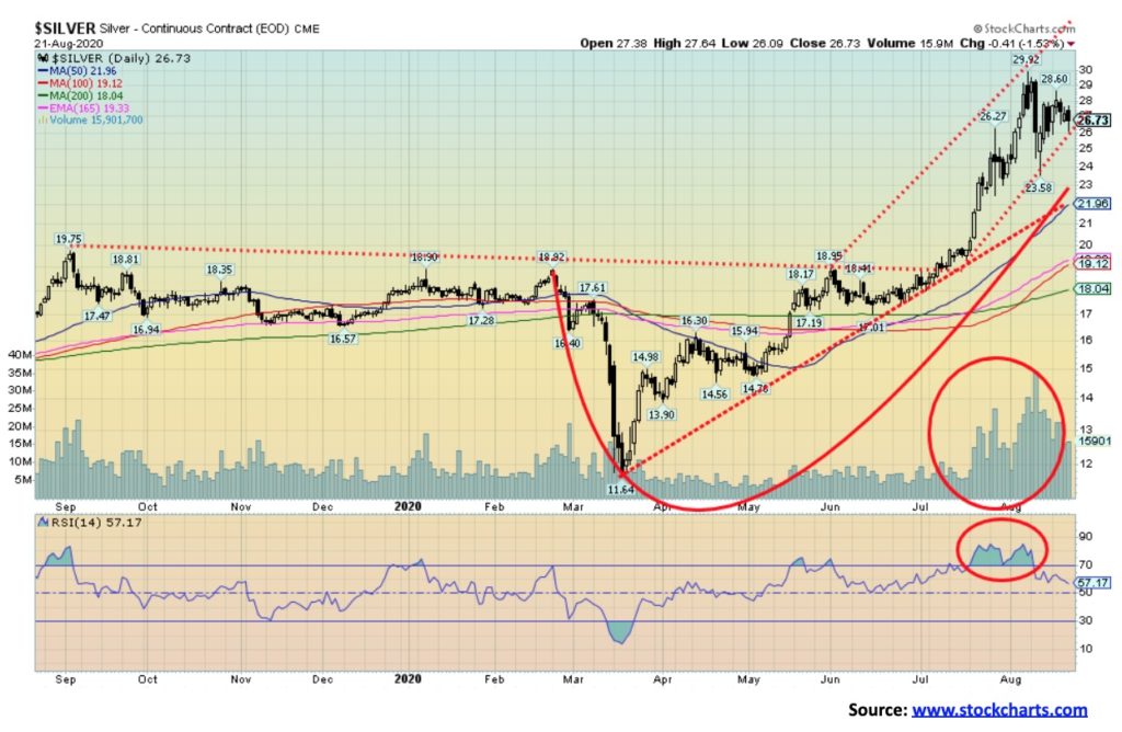
Silver managed to gain 2.5% this past week, despite fading from the August 17 leap when silver jumped 6.1%. The next day silver made its high for the week at $28.60. Silver then faded, closing some 6.5% below that high. Silver’s drop back on August 11 still portends a period of consolidation. We say consolidation rather than breakdown, but that stays in place as long as silver can hold above $22. A break under $22 is not the end of the world, but it could see silver fall further towards $18. Nonetheless, there is good trendline support and moving average support at $22. To the upside, a break above this week’s high at $28.60 could suggest a firm test of the recent high of $29.91. Above $30 silver should be on its way to our next target, up around $35. But we would first like to see silver consolidate some of the gains and, like gold, look for a possible low in September.
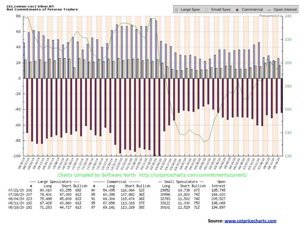
The silver commercial COT improved again this week to 38% from 37%. Long open interest rose about 1,500 contracts while short open interest was relatively flat. New longs is a positive development. The large speculators COT was steady at 61%. We view the continued improvement in the commercial COT as positive for silver going forward.
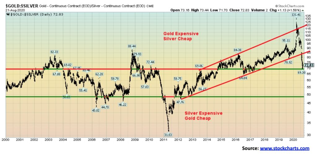
The gold/silver ratio fell to our target level of 70 this past week (low was 69.30), suggesting that we might run into some consolidation at these levels. However, if we were to firmly break below 70, then our next target could go down to 65, then 55. At 72.83 close this past week it is a far cry from the peak of 131.41 seen earlier. Silver finally caught up to gold and it may not be finished yet. However, the decline was rapid. A period of consolidation would be healthy and help define where we might go next.
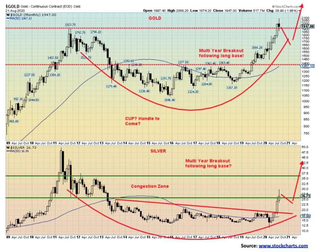
We remain very long-term bullish on both gold and silver, and it is this monthly chart that encourages our bullishness. Gold made a multi-year breakout in 2019 after six years of base forming. Silver did the same except it waited longer, not breaking out until this year after seven years of base building. Gold surged following the breakout, soon achieving our targets up around $1,750, but then it didn’t stop and kept right on going to $2,000. Silver’s breakout is fresher so it may not yet have peaked for any temporary pullback. Although if gold pulls back, silver will likely also pull back. Gold’s breakout initially targeted around $1,750. But when that level fell, gold kept on rising. Its next potential target was $1,990. Gold hit that target and beyond. In moving past the target, it suggests to us that, after a consolidation, gold should move higher again. Once through $2,100 targets could be up to $2,375.
In breaking out, silver was targeting initially at least to $29. Its next target above that level could be $35, but, ultimately, we have a target up at $65. Following these breakouts, a consolidation usually occurs. Gold could correct back to $1800/$1,825 and silver back to around $23 and both would still remain in a bull market.
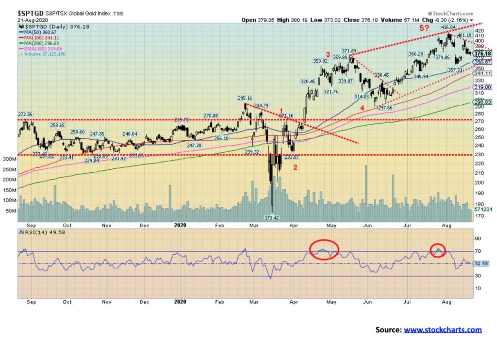
The gold stocks managed to look both bullish and bearish this past week. That’s quite a feat, but on August 17 the TSX Gold Index (TGD) gapped to the upside, leaving what might be an island reversal on the charts. But an island reversal can stay that way only if the TGD were to fail to fill the gap. Following that sharp up move the next day the TGD jumped higher, then reversed and closed lower. By week’s end the TGD was moving down into the gap. A break under 370 would seal it for the TGD and, instead, the TGD would make a move to the downside.
The TGD did gain 1.9% this past week and the Gold Bugs Index (HUI) was up 2.0%. But on August 17 the TGD leaped 6.3% and the HUI was up 6.9%. It didn’t last long and the gold stocks spent the rest of the week fading. Volume was unimpressive, making Monday’s sharp up move somewhat suspect. If the TGD does break under 370, the next stop could be down to 340 and even down to 320. The TGD is still up 43.9% on the year, but it is far cry from the 50% it was before the recent pullback. A break of the recent low at 357 would be more negative and then 340 would not be so far fetched. If the broad stock market falls into a corrective mode the gold stocks are sure to follow. However, as we noted for both gold and silver, we believe a low could be found in September, but at the latest October.
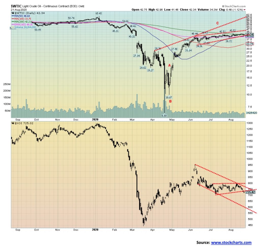
The failure of oil to break out from the three-month sideways trading pattern bodes poorly for black gold going forward. As well, with the energy stocks seeming to be in breakdown mode despite oil prices at least holding up and natural gas (NG) making fresh 52-week highs, this also bodes poorly for the market going forward. This past week WTI oil gained 0.8% and NG leaped 8.9% to new highs but the energy stocks went in the opposite direction. The ARCA Oil & Gas index (XOI) fell 6.4% and the TSX Energy Index (TEN) was down 6.2%. Steep declines considering that energy prices were up on the week.
Could the energy stocks be forecasting an eventual decline in oil prices and possibly even NG prices as well? Oil has had some bullish news but can’t seem to gather the steam to break out. The market has gone contango, meaning spot prices are now higher than front month futures. There may be a bit of supply squeeze immediately, but going forward the indication is that prices could fall. Despite the recent improvement in NG prices there is little sign that activity is about to pick up. So that doesn’t bode well for NG prices either.
WTI oil begins to break down under $40. Regaining $43 and holding above that level could suggest a move towards $45. However, the odds of an upside breakout are fading, primarily because oil has spent so many weeks with opportunities to break out and hasn’t. NG’s first break would be under $2.35. A breakdown is fully under way below $2.10. Until then the trend is firmly to the upside.
—
(Featured image by Aditya Vyas via Unsplash)
DISCLAIMER: This article was written by a third party contributor and does not reflect the opinion of Born2Invest, its management, staff or its associates. Please review our disclaimer for more information.
This article may include forward-looking statements. These forward-looking statements generally are identified by the words “believe,” “project,” “estimate,” “become,” “plan,” “will,” and similar expressions. These forward-looking statements involve known and unknown risks as well as uncertainties, including those discussed in the following cautionary statements and elsewhere in this article and on this site. Although the Company may believe that its expectations are based on reasonable assumptions, the actual results that the Company may achieve may differ materially from any forward-looking statements, which reflect the opinions of the management of the Company only as of the date hereof. Additionally, please make sure to read these important disclosures.


RLUSD Launch in Japan Amid XRP Price Decline and Uncertain Outlook
Ripple and SBI launched the RLUSD stablecoin in Japan after JFSA approval, signaling strong progress in tokenization. However, XRP fell...


Youth Cannabis Use in Colorado Is Falling — But the Full Story Is More Complex
The 2026 Colorado survey shows teen cannabis use fell to 10 percent in 2025, down from 21 percent in 2015....


Morocco’s Growth Holds at 4.6% as Agriculture Offsets Economic Pressures
Morocco’s economy grew 4.6% in Q1 2026, driven by a strong agricultural rebound offsetting declines in industry. Services expanded moderately...


Abivax Shares Surge as New Trial Data Eases Safety Concerns Over Ulcerative Colitis Drug
Abivax shares surged nearly 36% after positive updated trial results for its ulcerative colitis drug obefazimod reassured investors following earlier...


El Dorado Raises $9M to Expand Cross-Border Fintech Platform
El Dorado, a Latin American fintech improving cross-border financial services, raised a $9 million Series A led by Paradigm with...
 |
|
 |  |
 |
|
-

 Impact Investing6 days ago
ESG Gap Persists as Firms Struggle to Link Sustainability to Financial Value
-

 Crowdfunding2 weeks ago
Temotiva Launches Crowdfunding Campaign to Advance Preventive Mental Health
-
 Fintech1 day ago
El Dorado Raises $9M to Expand Cross-Border Fintech Platform
-
 Crypto1 week ago
Bitcoin Holds Steady as Microtransactions Surge and ETF Inflows Continue