Featured
Will December 2019 gift us a Santa Claus rally?
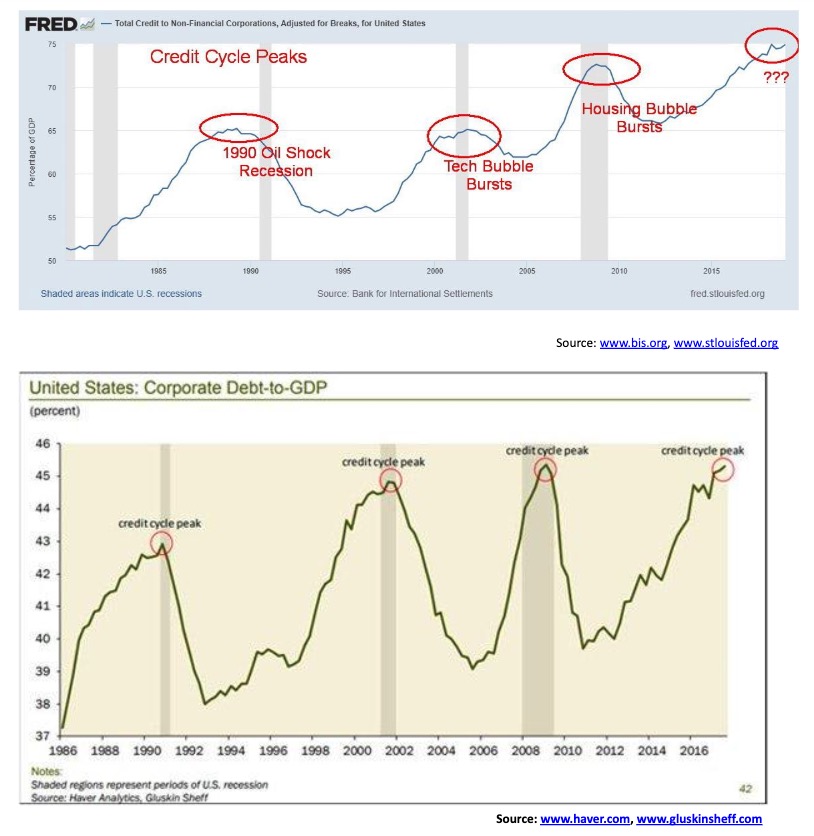
There are still few signs of recession but there is a slowdown going on. The Fed continues its repo program and the bulls are seeing nothing but blue skies even as the DJI has hit another milestone at 28,000. Our “chart of the week” looks at what could be the end of the credit cycle as corporate debt to GDP is at an all-time high. So are many stock markets.

The Fed is very smart, but it doesn’t run the markets. In the end, the markets will run the Fed. The markets are bigger than any man or any group of men. The markets can even break a president.
Richard Russell, American writer on finance, author of Dow Theory letters 1958–2015; 1924–2015
From Too Big to Fail, 2011 TV movie, Evan Handler as Lloyd Blankfein, Chairman and CEO, Goldman Sachs during the 2008 financial crisis
Lloyd Blankfein’s Assistant: “I don’t think I can take another day of this.”
Lloyd Blankfein: You’re getting out of a Mercedes to go to the New York Federal Reserve. It’s not a Higgins boat on Omaha Beach.
Stock market bubbles don’t grow out of thin air. They have a solid basis in reality, but reality as distorted by misconception.
George Soros, Hungarian-American investor and philanthropist; b. 1930
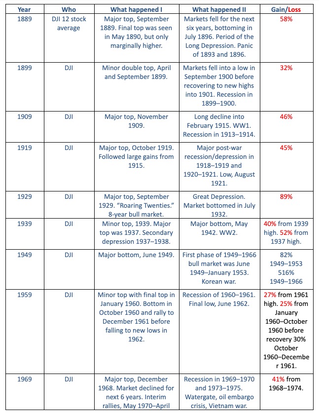
We were always curious as to why years ending in 9 seemed to mark significant turns in the market. Part of it was because of the famous 1929 stock market crash that ushered in the Great Depression. Others that stand out are the Tokyo Nikkei Dow (TKN) that topped out in 1989 (actual final high was first week of 1990), the major lows seen in 1949 and 2009, and the major top in the DJI/Gold ratio in 1999. But other years ending in 9 also seemed to mark turns as well.
Just as we contemplated doing some research, Elliott Wave International came out with their own observations in their latest Elliott Wave Theorist (November 26, 2019). It was shown as a series of charts. We were intrigued and decided to take it a step further; however, without the charts. We tabulated all of the years ending in 9 going back 130 years since the founding of the Dow Jones Industrials (DJI) in 1885. Originally it was known as the Dow Jones Average (DJA) and was made up predominantly rail stocks. It became known as the Dow Jones Industrials Average (DJIA) in 1896.
What we discovered surprised us, as even the years 1889 and 1899 saw a major turn and a minor turn in the market. Given the propensity of the markets to record a major turn, although sometimes it was only a minor turn, in a year ending in 9 we decided to put together a table showing what happened in the year ending in 9 and what happened after. The pattern was consistent with major turns, whether a high or a low, seen in 1889, 1909, 1919, 1929, 1949, 1969, 1979, 1989, 1999, and 2009. Minor highs or lows (intermediate top or bottom) were seen in 1899, 1939, and 1959. Sometimes there was a short lag—meaning the actual high or low occurred in January of the following year. But it was close enough to count as being a major event for the year ending in 9.
As Elliott Wave International notes, we have a propensity to speak of decades having personalities; i.e., “the 20s”, “the 30s”, “the 40s”, “the 50s”, “the 60s”, “the 70s”, “the 80s”, “the 90s”, etc. Each has a distinct personality and characteristics which are reflected even in the stock markets. And, it seems, eras come to an end with years ending in 9.
Phenomenon of the Year Ending in “9” – ©David Chapman
At this stage we don’t know what 2019 will bring. Maybe the phenomenon will be broken or we will see an intermediate top as we did in 1899, 1939, and 1959. Often these things are seen only after they happen. It could also spell the end of an era and we could get a major turn as we move into “the 20s.” One hundred years ago, “the 20s” were known as the “Roaring Twenties.” But they were book ended by the period of 1910–1919 which included WW1, deep recessions, and the “Dirty Thirties” of the Great Depression. Of the thirteen years ending in 9 since 1889, seven saw major tops, three saw major lows, and three were minor or intermediate tops.
It’s 2019 and the market is rising and has been for 10 years. Could the decade end in a major top? Many don’t think so and believe we will soar into 2020 and beyond. But could history and the phenomenon of years ending in “9” be against them?
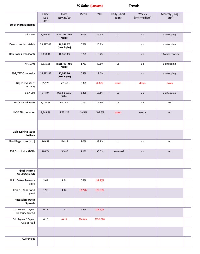
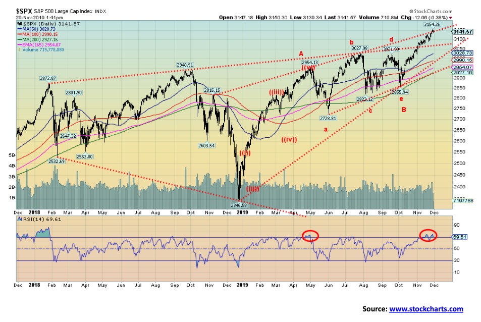
The records keep on falling. And with records falling and many proclaiming new breakouts, the bulls are in full charge-ahead mode. This past week, records fell again as the S&P 500 gained 1.0%, the Dow Jones Industrials (DJI) was up about 0.7%, and the NASDAQ jumped 1.7%. All made new all-time highs. Joining those three indices in the all-time high party were the Value Line, the NYSE, the Dow Jones Composite (DJC), the NASDAQ 100, the S&P 100, and the Wilshire 5000. Not joining the party were the S&P 400, the S&P 600, the AMEX, the Dow Jones Utilities (DJU), and the Dow Jones Transportations (DJT).
Internationally, it was also a mixed bag. The TSX Composite gained 0.5% and made a new all-time high. Few others made new all-time highs. Joining the all-time high party were Australia’s All Ordinaries and India’s Nifty Fifty Index. Others were close. The London FTSE was up 0.4% on the week but remains short of its all-time high. The Paris CAC 40 gained 0.2%, the German DAX was up about 0.6%, China’s Shanghai Index (SSEC) fell 0.5%. and Japans Tokyo Nikkei Dow (TKN) was up 0.8%. Hong Kong’s Hang Seng fell 0.9%. The MSCI World Index gained 0.5%. None of them were making new highs.
Not all the FAANGs are joining the party. Apple and Google made new all-time highs this past week; the other FAANGs did not.
Some extremes are being seen. Investor’s Intelligence Advisor’s Survey hit 58.1% bulls this past week, a 13-month high. Bloomberg says the bull-bear spread ranks in the 95th percentile of the data going back 30 years. There are those who say this doesn’t matter. QE to infinity and continued ultra-low interest rates will keep the market going higher. They are right. It doesn’t matter—until it does. Market highs do come amongst a high rate of optimism and the markets right now are at an optimistic high. Until the next negative tweet from the President about China, that is.
The VIX volatility indicator has fallen below 12. No, it is not a record low as it was in 2017. But it is another sign of the high optimism in the market. Sentiment and momentum indicators are pointing to a potential high. The NYSE advance-decline line hit another record high this past week so that one is keeping the bulls alive. The McLellan Summation Index ratio adjusted (RASI) slipped to 560 this past week, well off of highs seen last February at over 1,200. The RASI has been slowly sliding with a series of lower highs since July. The NY Arms Index is at 1.33 which is slightly negative. The put/call ratio is still favouring calls over puts so the market remains optimistic.
The rally since September has seen a gain of 299 points. In the first phase up from December 2018 to the top in late April 2019 the market gained 608 points. So, this rally is roughly 50% of the first phase up. As well, the first phase up saw a gain of 25.9% vs. the current rally a 10% gain from September. That relationship is 38.6%. Both are close to Fibonacci relationships of 50% and 38.2%. So, we’ll see. A breakdown under 3,100 would be the first sign of a potential top. A confirmation of a top would come with a close under 3,000. The S&P 500 is touching up against the top of a potential ascending wedge channel. We did break out over what might have been a broadening channel. That finished the broadening top theory. But the ascending wedge potential has not been realized. A firm close over 3,200 would end thoughts of an ascending wedge. The RSI has been over 70 and other indicators are overbought as well. At minimum, a pullback is due to ease the overbought conditions. As long as we hold above 3,100 then the market could move higher again.
It’s December and investors may start thinking about the “Santa Claus Rally” and the January effect. December is normally a good month for stock markets. December 2018 was an exception. December ranks number one for the S&P 500 and number 2 for the DJI, and the NASDAQ. But in a pre-election year December ranks number three. Small caps tend to outperform mid and large caps. The so called “Santa Claus Rally” usually starts near the middle of the month and can last into the first week of January. Mid-December also tends to mark the beginning of the so call January effect. The December options expiration tends to be the most bullish triple-witching week. Despite all this bullishness there is another old saying that says “If Santa Claus should fail to call, bears may come to Broad and Wall.”
There is lots to be concerned about. Protests, often violent, seem to be an everyday occurrence. Fires are burning year-round as the effects of global warming intensify. Add constant flooding and devastating storms to the menu and all of this eventually could have a negative economic effect. Venice, a world-renowned tourist attraction is not only sinking it is becoming uninhabitable. The trade tensions between the U.S. and China have not abated and can swing from good to bad on a Presidential tweet. Investment is lagging and trade is also beginning to shrink. The world is burdened with $250 trillion of debt. The only way out is more debt. No wonder they want to keep a “lid” on interest rates. The authorities lean on monetary policy to solve the problems when what is really needed is more aggressive fiscal policy and investment.
Despite all of this, investors seem to be impervious to the problems and believe the good times will continue into 2020. But will they?
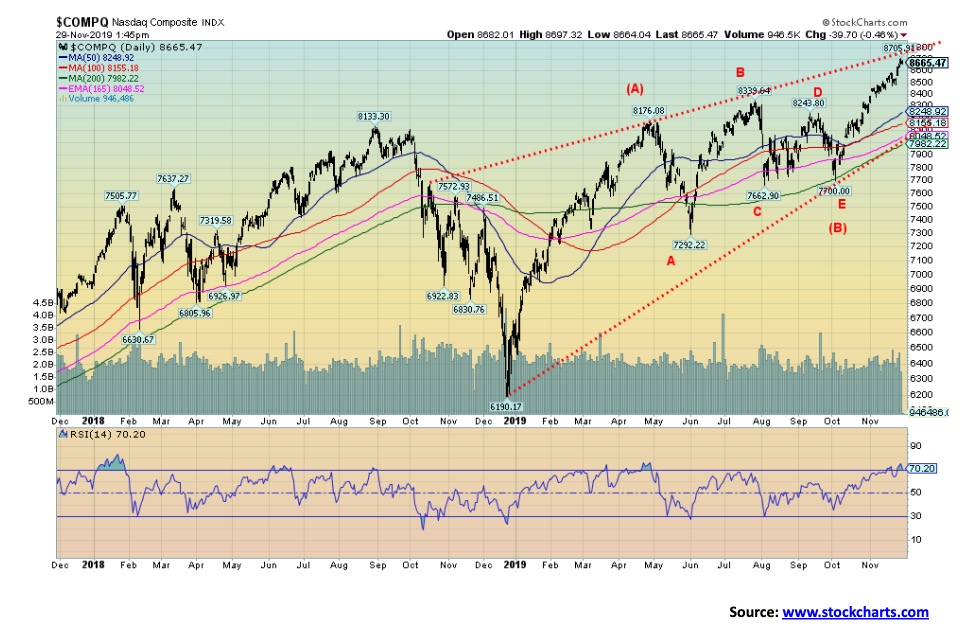
Like the S&P 500 and the DJI, the NASDAQ made a new all-time high again this past week. The RSI has reached over 70, a level often associated with tops. The NASDAQ has reached the top of what may be a huge ascending wedge triangle. A breakdown under 8,500 would be the first sign of trouble; however, confirmation of a top would only come with a breakdown under 8,250. As we have noted, it is possible that the markets, including the NASDAQ, will merely pull back from current levels, easing the overbought indicators before making another assault on the all-time highs. The market is up 12.5% from the early October low so, in some respects, it has already been quite a run during a period when markets are usually weak. The old adage of sell in May and go away seems to be alive as from May to October the NASDAQ gained only 2.6%. Since November 1 the NASDAQ is up about 4.4%. Last year the November to April period did see a gain of 10.8%, but then everyone had to endure the collapse into December 2018. It is noteworthy that last year’s collapse really got going from a high on December 3. A negative Presidential tweet about the U.S./China trade war and the market could quickly give back its gains.
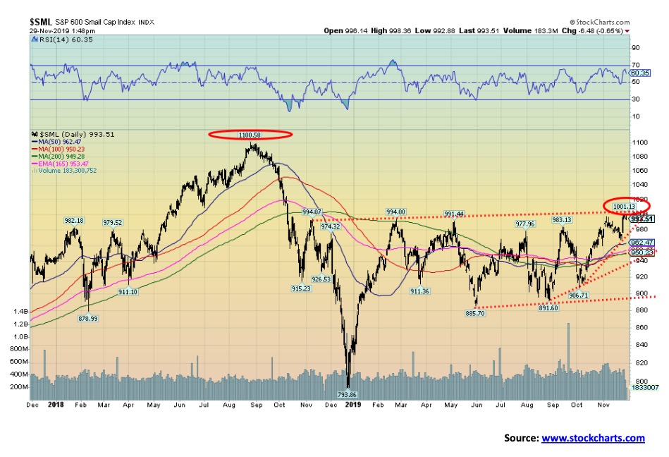
The S&P 600 (small cap) made a new 52-week high this past week, but remains well short of its all-time high seen back in August 2018. This is a divergence with the S&P 500 (large cap) index. Dow Theory says the indices should confirm each other. On the other hand, the S&P 400 (Mid-Cap) is close to its all-time high, closing at 2,010.15. The all-time high was seen in August 2018 at 2,053. The high this past week was at 2,031. On Friday, the 400 fell 1% while the 600 was off 0.7%. The large cap 500 was down only 0.4% on Friday. So, the mid and small cap continue to underperform the large cap. In a strong bull market, the mid and small cap should be leading, not lagging.
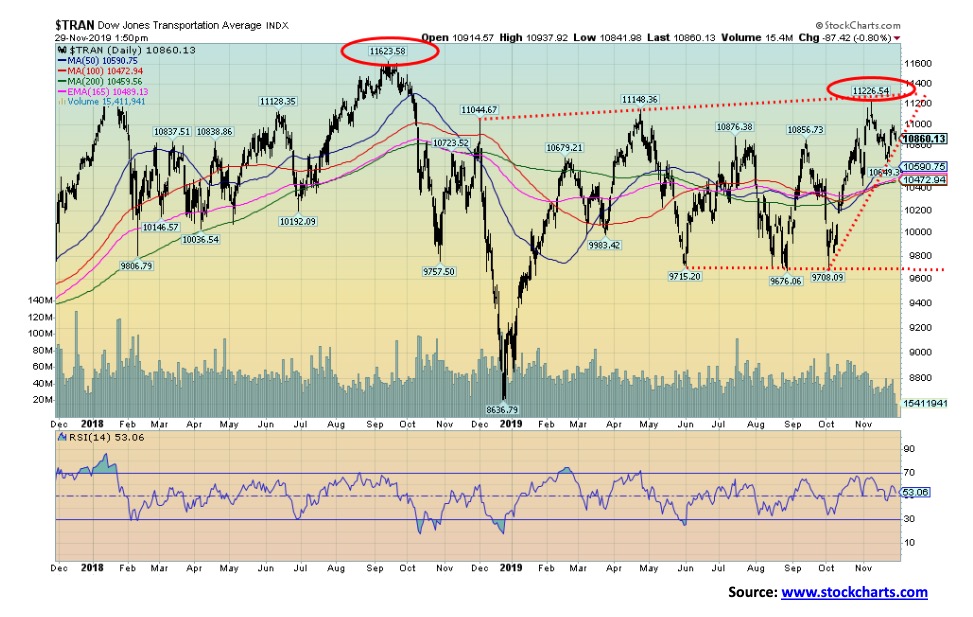
The Dow Jones Transportations (DJT) continues to fail to make new highs confirming the DJI. Dow Theory says that the averages must confirm each other. This is one of the basic tenets of Dow Theory. As well, volume must confirm the trend and, if anything, the volume on the DJT has been sliding. The DJT couldn’t even reach the high seen back on November 8, let alone make new all-time highs along with the DJI. At some point this divergence should be resolved—the question is, when. And resolution in these cases usually means a top in the market and a decline to come. A breakdown under 10,800 would signal a possible top on the DJT. Confirmation would come with a breakdown under 10,650. Only regaining the November 8 high of 11,226 would break this potentially negative pattern.
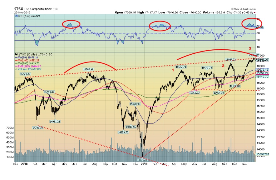
The TSX Composite hit another record high this past week, but failed once again to break out over the top of what may be a broadening channel. The TSX finished the week up 0.5% but fell 0.4% on Friday. Except for the Energy sub-index (down 1.1%) and the Utilities sub-index (down 0.3%), the other 12 sub-indices were up on the week. Leading the way was Consumer Staples with a 2.7% gain. Information Technology was up 2.4% and Consumer Discretionary gained 2.3%. Financials were flat but also made a new record high. The TSX Composite has now made three thrusts towards the top of the channel, with each thrust slightly higher than the previous one. We call these three thrusts to a high and, unless the TSX can break out over the channel, the odds favour a decline from here. A break under 16,900 would be the first sign of a top. However, confirmation would not come until the TSX broke under 16,675. A major breakdown occurs under 16,400. On the bullish side a breakout over 17,200 would confirm that the TSX is headed higher. While there is, no doubt, considerable excitement that the TSX has broken out, one needs a confirmation. A breakout over 17,200 would confirm a move higher as that level would firmly break above the channel line and also a possible ascending wedge pattern. Volume has not been impressive, although it should pick up a bit this coming week now that U.S. Thanksgiving is behind us.
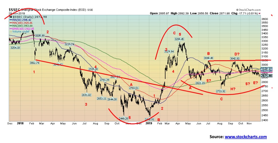
Despite a down week for China’s Shanghai Index (SSEC) and plenty of negative news in the background, the chart is starting to look somewhat positive. Okay, we are nowhere out of the woods. The SSEC lost 0.5% this past week. The negative background news keeps coming. China keeps getting knocked on the trade front. Trade has slowed. Banks are in trouble because of an overload of debt from consumers and corporations. Defaults are rising in the consumer and corporate sectors because of bad loans. Growth is slowing and forecasts are now for growth to slide under 6% in 2020. A study showed that 586 of the country’s 4,400 plus lenders were in financial trouble. Household debt to GDP is the highest it has ever been, even as it is half of what Canada’s is. Corporate debt is 165% of GDP. There are serious problems in China’s shadow banking system. Yet China’s central bank the People’s Bank of China (PBOC) has considerably more room to maneuver than even the Fed does when it comes to being able to bail out sectors and provide things like China’s version of QE. This past week the closely watched purchasing managers’ index of manufacturing rose to 50.2 for November. The expectation was for a reading of 49.5. That was up from 49.3 in October. A reading on the PMI below 50 indicates recessionary conditions. So, the reading of over 50 was clearly welcomed. The chart of the SSEC looks negative on one hand as it dips under the 200-day MA. But on the other hand, the SSEC could be forming a head and shoulders bottom pattern. What’s key will be that, first, it does not take out the June low of 2,822 (currently 2,871) and, second, it rebounds and breaks over the potential neckline near 3,050. That alone is a fair number of ifs. But, against a background of negative news, that is often where rallies develop.
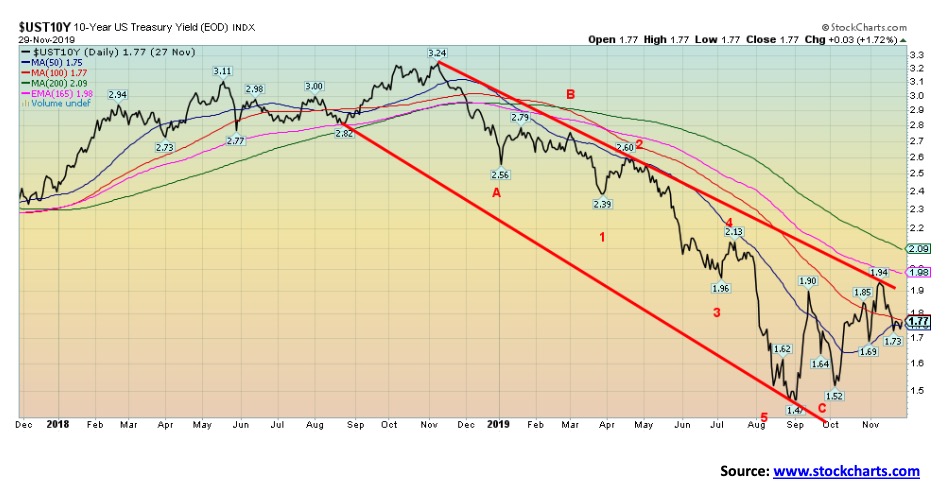
It was a pretty quiet week for bonds with Thanksgiving and shortened Friday trading. Overall, the U.S. 10-year Treasury note gained 1 bp to 1.78%. That was rather meaningless. The excitement continues in the repo market as the Fed continued unabated. The Fed is trying to dampen interest rates, particularly as we head into year-end where the demand for funds can spike. Some participants have been locking in rates for year-end now. The Fed balance sheet jumped roughly $22 billion this past week and now stands at $4,052 billion, up from $3,760 billion in late August 2019.
The Fed has now basically undone whatever they did in lowering their balance sheet following their announcement that they would be allowing their portfolio to mature and selling bonds back to the market (quantitative tightening QT). That, in turn, has put upward pressure on U.S. Treasury yields as the 10-year has gone from 1.47% in late August to a high recently of 1.94%. The repo programs are designed to try and dampen those rate increases. The Fed does not want interest rates to rise much. No wonder given the mountain of debt in the U.S.
The U.S. did release the Q3 GDP and it came in at up 2.1%. That was better than the expected 2% and better than the previous release of 1.9%. This is the 2nd estimate with one more, the final one, to come. Personal income and spending was also out this past week with personal income flat when they expected a gain of 0.3% while personal spending was up 0.3% on expectations. Those numbers helped keep some upward pressure on bond yields and helped the U.S. dollar. For this coming week, the ISM manufacturing numbers are out on Monday while nonfarm payrolls and the employment numbers come out on Friday. The market is looking for a gain of 180,000 nonfarm payrolls. Also, watch for the Michigan Sentiment indicator, also out on Friday.
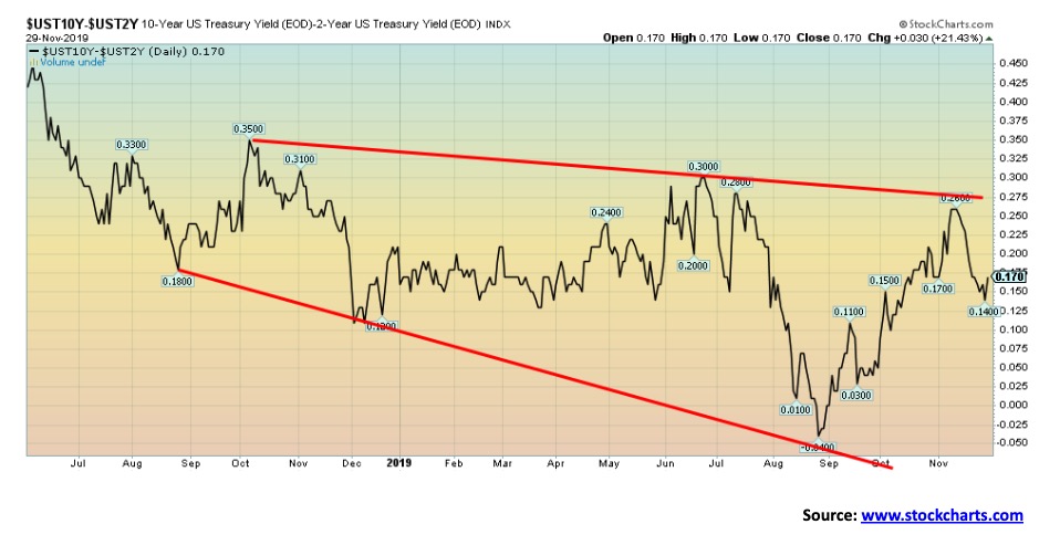
The key 2-year Treasury note—10-year Treasury note spread rose slightly this past week to 17 bp from 16 bp the previous week. The recession spread has not been a particularly strong indicator of an impending recession of late. The 2–10 spread was barely negative for a short time in August before turning positive again.
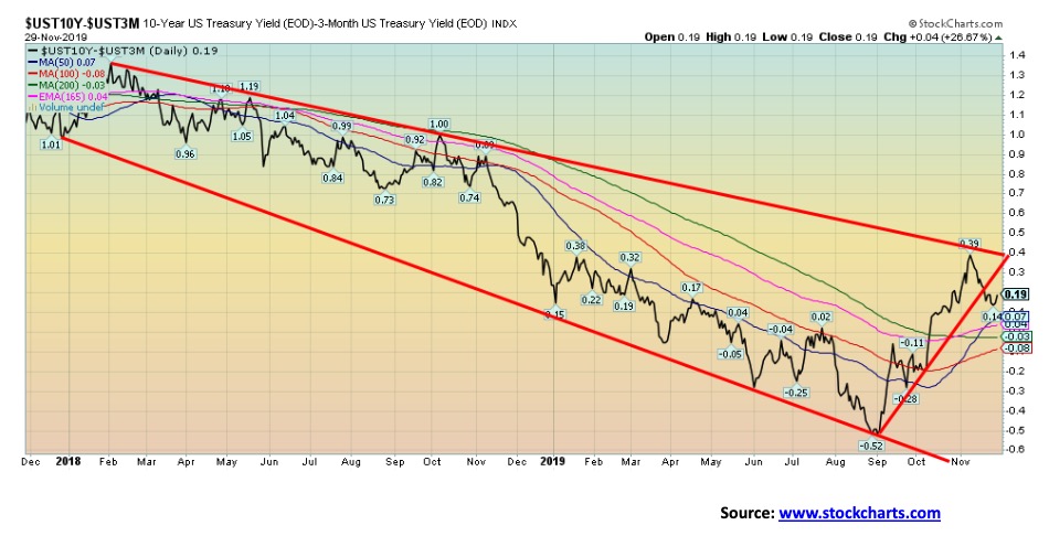
The 3-month U.S. Treasury bill—10-year U.S. Treasury note spread broke trend-line support this past week, then fell as low as 14 bp before rebounding and closing at 19 bp. That is a far cry from the negative 52 bp seen back in late August. As we have noted, a negative spread has normally been a precursor to a recession. The yield curve turned negative in June and bottomed at negative 52 bp in late August. Since then it has turned positive in October. Turning positive again after a period of being negative is often a better sign of a coming recession. This one is now indicating that one could hit sometime in 2020.
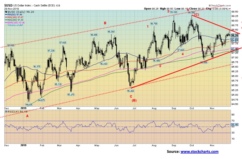
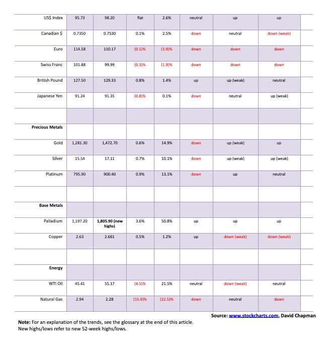
The US$ Index spiked to 98.50 this past week before turning down and closing lower on the day on Friday. Over the week, the US$ Index was essentially flat. The euro fell 0.1%, the pound sterling was up 0.8%, the Swiss franc dropped 0.3%, the Japanese yen was off 0.8%, while the Canadian dollar gained a small 0.1%. The trends for the US$ Index remain to the upside even as the trends are weakening. Resistance has appeared at 98.50 and there is further resistance up to 99. There is support at 98 and then down to 97.35. A breakdown under 97.35 could see the US$ Index fall to major support now at 96.75. A breakdown under 96.75 could signal a new bear market for the US$ Index. The US$ Index appears to be making a potentially complex topping pattern. The pattern is not yet complete and we cannot rule out another upward thrust that could test 99 once again. But momentum is badly waning and we believe it is when, not if, the US$ Index could fall.
Gold and the precious metals enjoyed an up week with gold gaining 0.6%, silver up almost 0.7%, and platinum up 0.9%. For near precious metals that are also industrial metals, palladium once again hit a record high, rising 3.6% on the week while copper was up 0.5%. On another note there was no COT on Friday due to the Thanksgiving holiday. The CFTC should release the COT on Monday December 2. Watch our twitter feed for updates: Twitter @Davcha12.
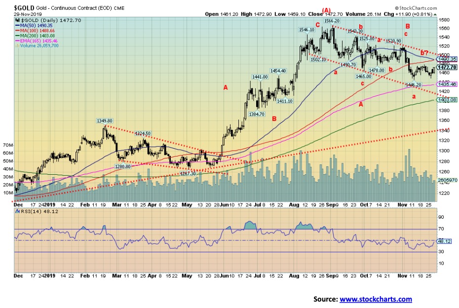
Gold continues in what appears as a large bull flag formation. It also appears to be forming what we call a double zig-zag abcabcabc. If that’s correct, then we need to complete the c wave of the final third abc. That could carry gold prices down to as low as $1,420. We have always viewed the current pullback as a correction within the context of a new up-leg. After finding resistance at $1,350 to $1,370 from 2013–2018, it was inevitable once we broke out that the breakout might be tested. The high during that period was a $1,430 and that would appear to be a minimum objective to the downside. So far, the low has been $1,446. That could be it but another thrust to the downside would not surprise us. Look for a possible low somewhere between December 9–15. Also, the winter solstice on December 21 often signals a change in direction for gold where we typically get a rally that carries us into PDAC in the first week of March. These rallies can vary from year to year. We still have unfilled targets up to $1,725 for gold, based on the huge bottoming formation that appears as a multi-year head and shoulders. The neckline, of course, was at $1,350/$1,370 with the low at $1,045 and the high that spike rebound in 2013 at $1,430.
If it’s correct that we do have another leg to the downside to complete the pattern, then ideally, we would look for one of either gold or silver to make new lows, but not both. These divergences often show up at important lows and highs. As well, we’d like to see sentiment lower to set up a potential buy. Key as well will be the U.S. dollar. A lower U.S. dollar does help push gold higher. Resistance is up to $1,500 with further resistance up to $1,525. Above $1,550 new highs are probable.
One trade that caught our attention this past week was that someone (hedge fund?) bought 5,000 options on gold, hitting $4,000 by June 2021. The bets were sold at $3.50/ounce. Each option represents 100 troy ounces so effectively the buyer bought 500,000 ounces. The cost of the purchase was $1,750,000. That’s quite a bet. As someone described it, it is like purchasing an 18-month term life insurance policy. Will the buyer win his bet? Buyers of options usually lose their entire investment. But when they win, the payoff can be handsome. Even a sharp spike before June 2021 could result in a handsome profit as the options increase in value even if gold is not at $4,000.
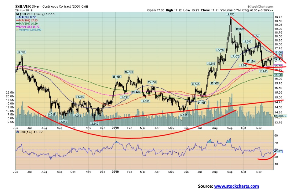
Silver rose about 0.7% this past week. Silver also made a slightly higher low and indicators, as represented here by the RSI, are starting to turn up. We also appear to be forming a potential descending wedge triangle (bullish). A breakout over $17.50 could project silver up to $20.60. The potential descending wedge may not be finished yet as silver has more room to move lower within the wedge. There is support down to $16.70 and further support down to $16.50. But a breakdown under $16.50 would be negative and could have silver fall to the next major support near $16.20. Another decline to the downside would not be the end of the world, but we’d prefer it if $16.50 contained any decline. Also, on the next decline, we would like to see gold or silver make new lows, but not both. As with gold, there was no COT this past week due to the Thanksgiving holiday.
The gold stocks continue to perform well vs. gold and silver. The gold stocks, as represented by the TSX Gold Index (TGD), gained 1.1% this past week while the Gold Bugs Index (HUI) jumped almost 2.0%. The TGD is up 30.5% on the year while the HUI has gained 33.8%. Overall, the gold stocks have outperformed the large cap indices with one month to go in 2019. That hasn’t been the case for the junior mining exploration stocks. While no index exists for them, it is noteworthy that the TSX Venture Exchange (CDNX) that is dominated by the junior mining stocks is down 4.6% in 2019. That situation shouldn’t last and, if gold prices were to clear $1,550 once again, we believe we could see the start of a strong rally in the junior gold mining exploration stocks.
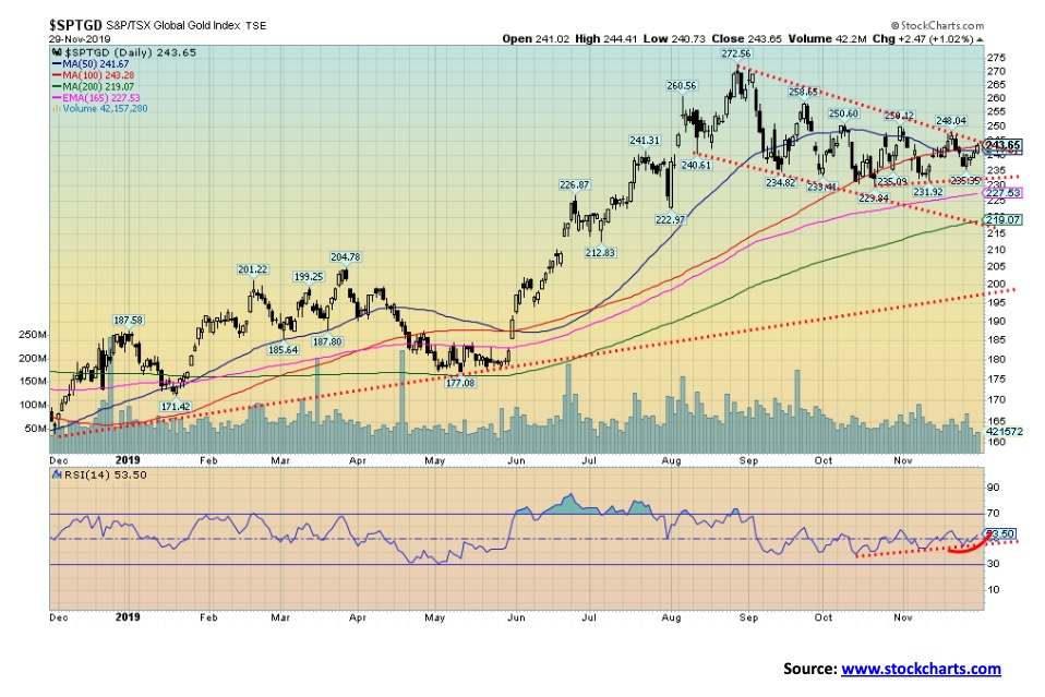
The TGD continues in what appears as a possible flag formation. Indicators have started to turn up. The TGD could be poised for a breakout as early as this coming week. A firm break over 245 could trigger a rally. Ideally, we would need to break out over 258 to confirm the rally and suggest new highs above 272.56. To the downside, the TGD has support forming at 230/235 but a break under 230 could send the TGD lower towards 220. The chart looks positive, but we will be more comfortable once we start confirming a breakout to the upside.
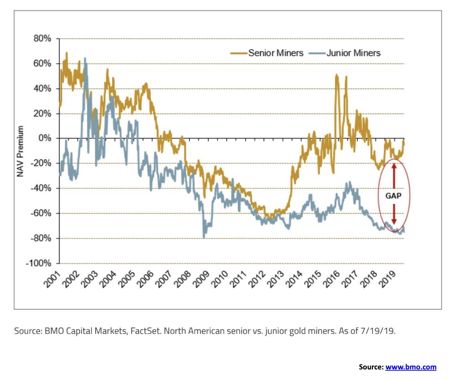
This is an interesting chart, suggesting that the valuation gap between senior vs. junior gold miners is as wide as it has ever been since 2001. While the chart doesn’t say this, we assume the gap would be the difference between gold stocks listed in the GDX vs. the GDXJ. We doubt this chart would include junior exploration stocks that one would typically find on the TSX Venture Exchange (CDNX). What the chart does tell us is that junior gold mining stocks should be more favoured going forward over seniors. In other words, favour the GDXJ vs. the GDX.
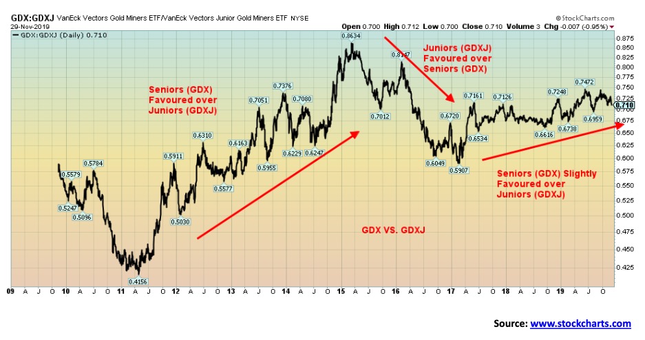
Here’s another way of looking at the senior vs. junior gold miners. This is the ratio of the GDX and GDXJ. From 2011 to 2015 the senior gold miners outperformed. This is not surprising as this was the sharp down period for all gold stocks. During those periods, seniors tend to outperform, meaning they don’t fall as much or as fast. When the gold stocks had a strong rally into 2016 it was the juniors that led the way. Since 2017, the seniors have generally outperformed although a shift could be on. If we do get a strong rally into 2020 it will be the juniors that lead.
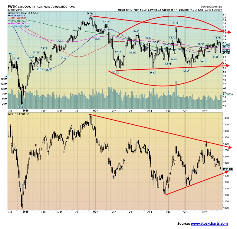
Natural gas (NG) prices crashed this week, losing 15.9%. That’s significant. WTI oil fell as well, off 4.5%. We don’t normally mention NG, but the drop this week caught everyone by surprise. Seems warm weather will do it. Traders were expecting increased demand; instead, what they may be getting is weakened demand. NG inventories usually start to draw at this time of year and that normally puts upward pressure on prices. Weakness popped up elsewhere too, as exports to Mexico slid and production is expected to fall.
Oil prices fell after the EIA reported that inventories increased far more than expected. Distillates rose as well. Traders expected a decline of 350 thousand barrels. Instead, they got a rise of 1.4 million barrels. Brent crude inventories also jumped this past week.
So, just as it appeared that oil prices might jump higher, they plummeted and closed under all the key MAs of 50-, 100-, and 200-day. So, does that mean we are about to collapse further? It’s hard to say. Oil continues to trade in a range. It can’t seem to make any headway to the upside but it doesn’t collapse, either. We are moving into a period of positive seasonals that could see oil rise during the period December to June. A break under $55 could send us lower towards $50 once again. But only a major breakdown under $50 would be a concern and signal a decline into the low $40s.
The energy stocks were poor performers this past week with the ARCA Oil & Gas Index (XOI) falling 1.7% and the TSX Energy Index (TEN) off 1.1%. As we wind down into the final month of 2019, the energy sector has been one of the poorest performing. If the seasonals get wound up, we could see a better 2020 at least in the early months. But, to convince us, we need to see WTI oil trading over $58 once again. And, even then, there is considerable resistance up to $60.
Trying to get a handle on corporate debt in the U.S. is not as easy as we thought. According to the Federal Reserve, non-financial total debt securities outstanding is $6.4 trillion. U.S. corporate debt instruments rated by S&P Global Ratings total $9.3 trillion as of January 1, 2019 with $7.1 trillion from non-financial companies and $2.2 trillion from financial services companies. Others peg it as high as $15.5 trillion; that includes many medium-sized businesses not necessarily included in the other figures. No matter; it is high and it is growing.
Total U.S. debt stands at $74.2 trillion, according to the Federal Reserve. Of that, $23.1 trillion is U.S. federal debt, $20.0 trillion is personal debt which includes mortgages, personal loans, student loans, and credit card debt, and $3.1 trillion is U.S. state and municipal debt. That leaves $28 trillion for corporate and bank debt. U.S. GDP is estimated at $21.6 trillion, so total debt to GDP stands at 343%. Current global GDP is estimated to be around $86 trillion. With global debt outstanding estimated at $250 trillion, the global debt to GDP is 291%. Is that sustainable?
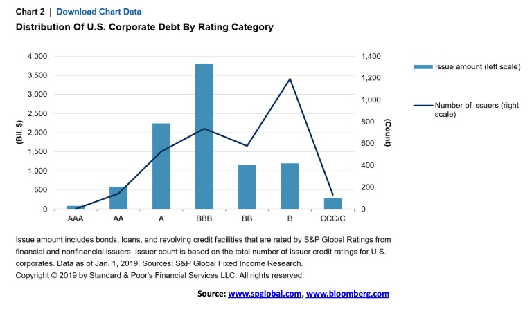
According to the Fed’s numbers in our first chart above, total credit of non-financial corporations’ ratio to GDP is 74.9%, implying that there is $16.2 trillion of non-financial corporate debt outstanding. What is concerning is that, according to the distribution of U.S. corporate debt by rating category, the B level of debt has some 1,200 issuers with $1.2 trillion outstanding. BBB is the highest category dollar-wise with $3.8 trillion outstanding. Of the $9.3 trillion of debt rated by S&P, $278 billion is CCC or lower, $6.8 trillion is investment grade and $2.6 trillion is speculative grade. Anything below BBB is speculative grade. That is the worrying part because, if the U.S. and global economy were to falter and fall into a recession, some percentage of the BBB category could fall into speculative grade. This means the funds and investors holding this debt may be forced to sell because they are not allowed to hold paper that is below investment grade.
That is just the U.S. Countries like China also have a corporate debt problem, particularly in their shadow banking system. Many economists, including Martin Armstrong of Armstrong Economics and John Williams of Shadow Stats believe that the next major debt collapse will be sovereign debt. All financial collapses are debt-related. During boom periods debt builds up. With record-low interest rates as we have experienced over the past decade, the debt build-up has been at a record pace. The bulls can only hope that it keeps growing because, when it falters and collapses, the collapse could make the previous three credit cycle peaks pale in comparison. No wonder the Fed is conducting a repo program designed to keep interest rates down.
—
(Featured image by Austin Distel via Unsplash)
DISCLAIMER: This article was written by a third party contributor and does not reflect the opinion of Born2Invest, its management, staff or its associates. Please review our disclaimer for more information.
This article may include forward-looking statements. These forward-looking statements generally are identified by the words “believe,” “project,” “estimate,” “become,” “plan,” “will,” and similar expressions. These forward-looking statements involve known and unknown risks as well as uncertainties, including those discussed in the following cautionary statements and elsewhere in this article and on this site. Although the Company may believe that its expectations are based on reasonable assumptions, the actual results that the Company may achieve may differ materially from any forward-looking statements, which reflect the opinions of the management of the Company only as of the date hereof. Additionally, please make sure to read these important disclosures.


Cannabis Clubs Approved in Hesse as Youth Interest in Cannabis Declines
Ten cannabis clubs in Hesse, Germany, have received approval to legally cultivate marijuana under strict regulations. Despite broader access, youth...


Robinhood Expands to Europe with Tokenized Stocks and Perpetual Futures
Robinhood is expanding in Europe by offering tokenized stocks and perpetual futures. Tokenized shares enable fractional, 24/7 trading of real...


Ecnoglutide Shows Promise as Next-Generation Obesity Treatment
Ecnoglutide, a once-weekly GLP-1 receptor agonist, showed up to 13.2% weight loss over 40 weeks in obese or overweight adults...


Coffee Prices Decline Amid Rising Supply and Mixed Harvest Outlooks
Coffee markets fell last week amid ongoing harvests in Brazil, Indonesia, and completed harvests in Vietnam. Despite cold weather in...


Dolci Palmisano Issues Its First Minibond of the F&P “Rolling Short term” Program
Dolci Palmisano Srl issued its first €300K Short Term Minibond at 5.5%, fully subscribed on launch. Structured by Frigiolini &...
 |
|
 |  |
 |
|
-

 Crowdfunding7 days ago
Savwa Wins Global Design Awards and Launches Water-Saving Carafe on Kickstarter
-

 Biotech2 weeks ago
Asebio 2024: Driving Biotechnology as a Pillar of Spain and Europe’s Strategic Future
-

 Business2 days ago
Dow Jones Nears New High as Historic Signals Flash Caution
-

 Business2 weeks ago
Fed Holds Interest Rates Steady Amid Solid Economic Indicators