Business
6 CRO strategies that can help e-commerce entrepreneurs hit their sales goals
Cart abandonment is a threat to an entrepreneur’s sales targets, but that could be a thing of the past with these conversion rate optimization strategies.

Cart abandonment is an inevitable part of e-commerce, much like death and taxes. But just because it’s normal, doesn’t mean you shouldn’t try to keep it from happening.
Just think of your online store’s daily traffic. Not everyone buys, and you’ve learned to live with that too. But again, that doesn’t mean you shouldn’t set up more effective conversion rate optimization (CRO) strategies to get more sales and leads.
But what if you could use these CRO strategies while also reducing your shopping cart abandonment rate? Sounds like a dream, doesn’t it? Well, it’s possible, and we’re showing you how.
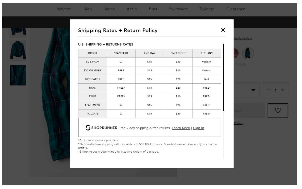
1. Be transparent about shipping
A Forrester study revealed that some 22 percent of customers abandon their carts because sellers failed to mention the shipping costs.
This is quite a high number. But the same report also shows that 44 percent of customers ditch their shopping carts because shipping fees were just too steep. So what do these two statistics mean for you?
First of all, there’s really no good reason for hiding shipping costs.
If you want to build customer trust, they need to feel like your online store won’t have hidden charges.

© Jimmy Rodela
If you’d really like to boost your conversions, however, and can afford to take this approach, offer FREE Shipping. Let the customers pay for the product and nothing else. They’ll appreciate this a lot and are sure to return to your online store for more purchases.
2. Optimize your page loading time
You’d be surprised at how just improving your website’s loading time can dramatically increase conversion rates, especially if you’ve been having slow, unoptimized pages since the beginning.
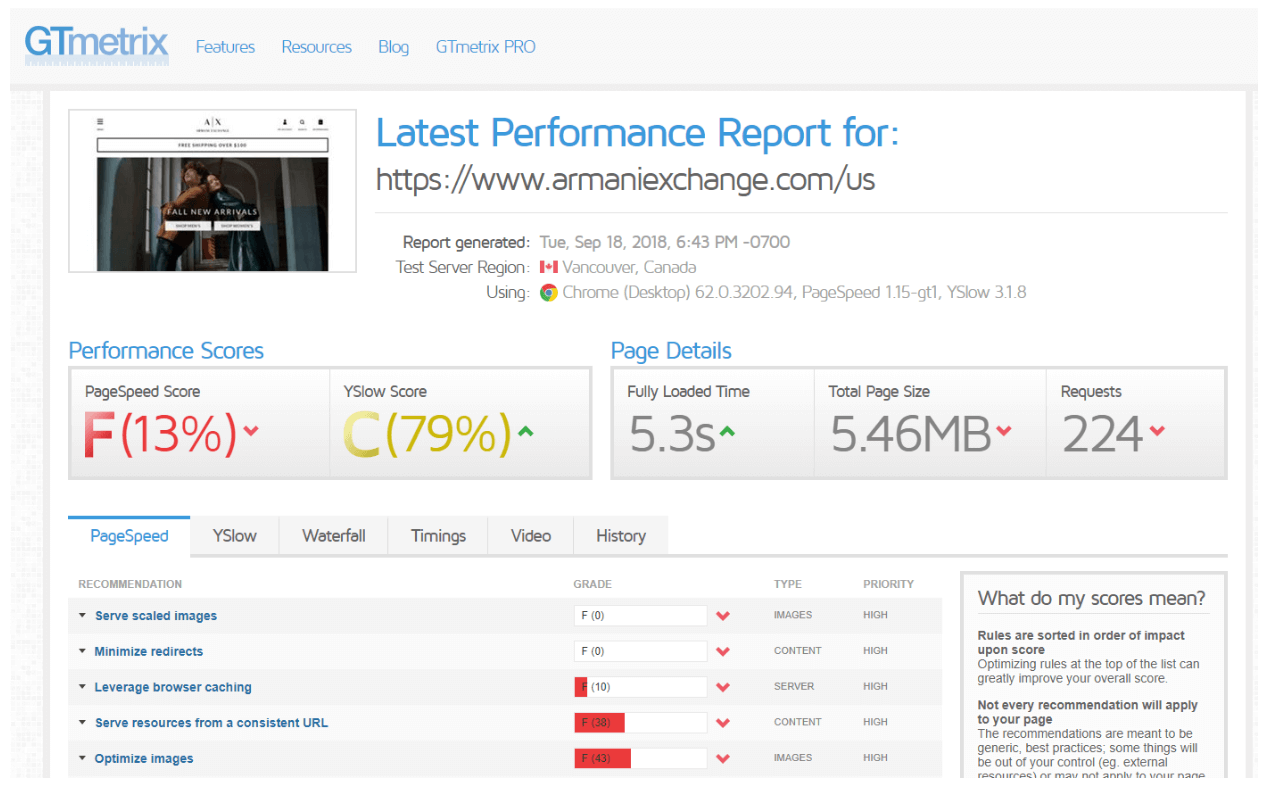
But before you can optimize, you first have to analyze. Are you really hurting your sales with slow pages? To answer that question, you’ll need to use GTmetrix.

© Jimmy Rodela
GTmetrix is an online tool that tells you a lot about your website’s performance. After it generates a report, it also tells you what your site’s main problems are.
We highly recommend you follow the suggestions offered to improve overall user experience on your site. Some of the most common optimization suggestions include enabling browser caching, HTTP compression, and managing page redirects — all of which require you to perform .htaccess modifications accessible from your hosting provider’s control panel.
Lastly, you can also consider using a content delivery network (CDN) to reduce latency for traffic, especially if your traffic sources are spread out from different areas of the world.
Although you’ll be paying extra using a CDN service, the benefits you get are worth it. Not only does it improve page loading for users, but it also improves your online store’s security.
3. Offer more payment options
Different customers have different preferred options for paying. And we don’t just mean the type of credit or debit card they want to be charged on.
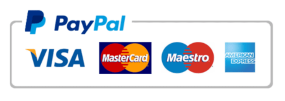
If you haven’t already, consider adding third-party online payment services like PayPal. Larger e-commerce stores like Walmart even accept checks.

© Jimmy Rodela
You may not realize it, but customers may be adding items into their shopping carts fully ready to pay for it at the checkout page. But, to their disappointment, the only payment method they would have wanted to use just wasn’t available. So, they end up on your competitor’s website.
Also, don’t be afraid to go a step further. You can display all the payment options at every product page just before they can add items to the cart. This is sure to improve their experience, as well.
4. Have a ‘special price’ section
Ecommerce websites can always benefit from having a section with all their discounted items. And it shouldn’t be a surprise. People want to shop items for less. So have an entire category of items that are on sale or being sold in an affordable bundle.
These special price sections also work wonders when you pair them up with a time-constraint (i.e. flash sales, limited time discounts).
When showcasing discounted items, take it up a notch by using visual content like banners and posters. It’s easy to create them with tools like Canva, or you could hire a freelance graphic designer to do the heavy-lifting for you.

With Canva, you get more than a dozen different design templates for numerous graphic content needs such as campaign posters, PDF covers, and product sale banners. © Jimmy Rodela
5. Shorten the checkout process
Do customers really need to go through six different pages from adding an item to paying for it on the checkout page?
Because we already mentioned how pages that take too long to load just drive customers away. Customers want convenience. And a long checkout process isn’t exactly what they would call a fast and easy experience, especially if it includes filling out forms all the time.
Let customers save their ‘Bill to’ and ‘Deliver to’ address so they can just choose it as an option for future purchases. Don’t make them type everything out for every purchase.
Also, reduce the number of pages they go through to only three, if possible. They’ll be so happy they finished their online transaction faster on your site that they’ll want to buy more.
6. Minimize distractions
The declining attention span of online users is truly an increasing challenge for marketers and advertisers.
This is why you want to strip down the pages of your checkout process to only the bare essentials. Don’t blast them with more advertising that interrupts them as they’re about to pay for items. Although having engaging content around your pages is good, don’t forget what the main goal of your pages is: increasing sales.
Because let’s face it, online users are already too distracted as it is. From external elements demanding their attention, to their uncontrollable urge to multitask all the time.
So help them focus. It helps you get more sales and helps them to actually finish a transaction they really meant to do.
Although you can easily outsource freelancers to help you with the necessary design work, most modern e-commerce platforms and content management systems utilize easy-to-learn tools. You should be able to implement the needed changes on your site without any help from professionals.
Besides, the internet is chock-full of learning resources and front-end web development courses. Use them to your advantage to up your web design game and be more hands-on with your online store’s expansion.
Final thoughts
The job of an online store owner is never easy. In fact, the average conversion rate for e-commerce sites is less than 3 percent, which really isn’t much.
And one of the reasons why the conversions aren’t happening is because people tend to leave their shopping carts. They forget about them and never end up completing their purchase.
But if you follow the suggestions we’ve shared in this guide, you’ll understand why so many marketers start an e-commerce business. It’s definitely one of the most profitable online business ideas today, and the secret often lies in improving your potential buyers’ experience to generate more sales and keep them coming back for more.
What’s next?
Are there other strategies you can share about reducing an e-commerce site’s shopping cart abandon rate?
If you answered with a “yes,” then feel free to share your ideas in the comments section below. Cheers!
(Featured image by DepositPhotos)
—
DISCLAIMER: This article expresses my own ideas and opinions. Any information I have shared are from sources that I believe to be reliable and accurate. I did not receive any financial compensation for writing this post, nor do I own any shares in any company I’ve mentioned. I encourage any reader to do their own diligent research first before making any investment decisions.

-

 Crypto4 days ago
The Iran War Tests Bitcoin and Crypto Market Resilience
-

 Crypto2 weeks ago
Oil Surge and Iran War Lift Bitcoin as Crypto Sentiment Improves
-

 Crypto1 day ago
Crypto Markets Volatile as Bitcoin Hovers, Solana Eyes AI Integration
-

 Cannabis1 week ago
Germany’s Medical Cannabis Market: Legal Reform, Falling Prices, and Rapid Expansion


![Kevin Harrington - 1.5 Minutes to a Lifetime of Wealth [OTC: RSTN]](https://born2invest.com/wp-content/uploads/2023/12/kevin-harrington-400x240.jpg)
![Kevin Harrington - 1.5 Minutes to a Lifetime of Wealth [OTC: RSTN]](https://born2invest.com/wp-content/uploads/2023/12/kevin-harrington-80x80.jpg)


You must be logged in to post a comment Login