Featured
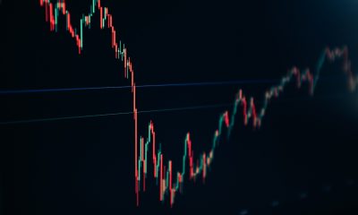
Dow Jones continues to experience extreme volatility
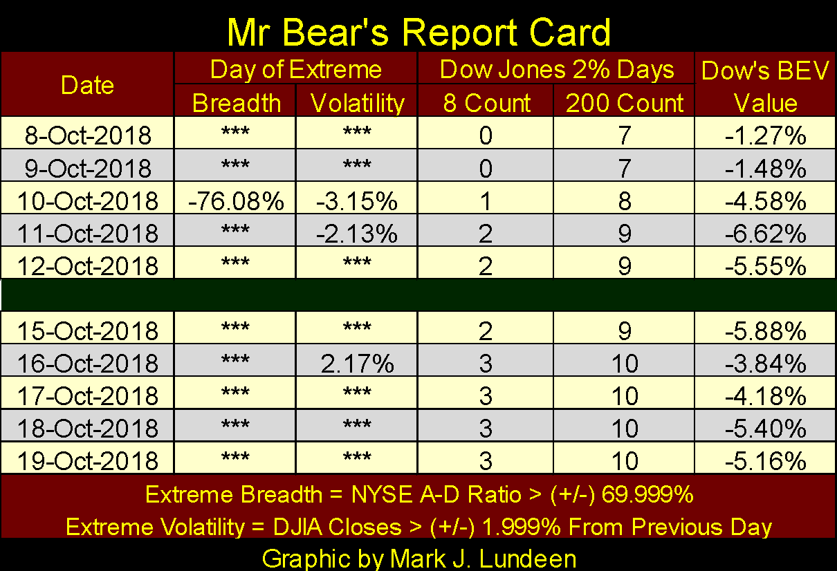
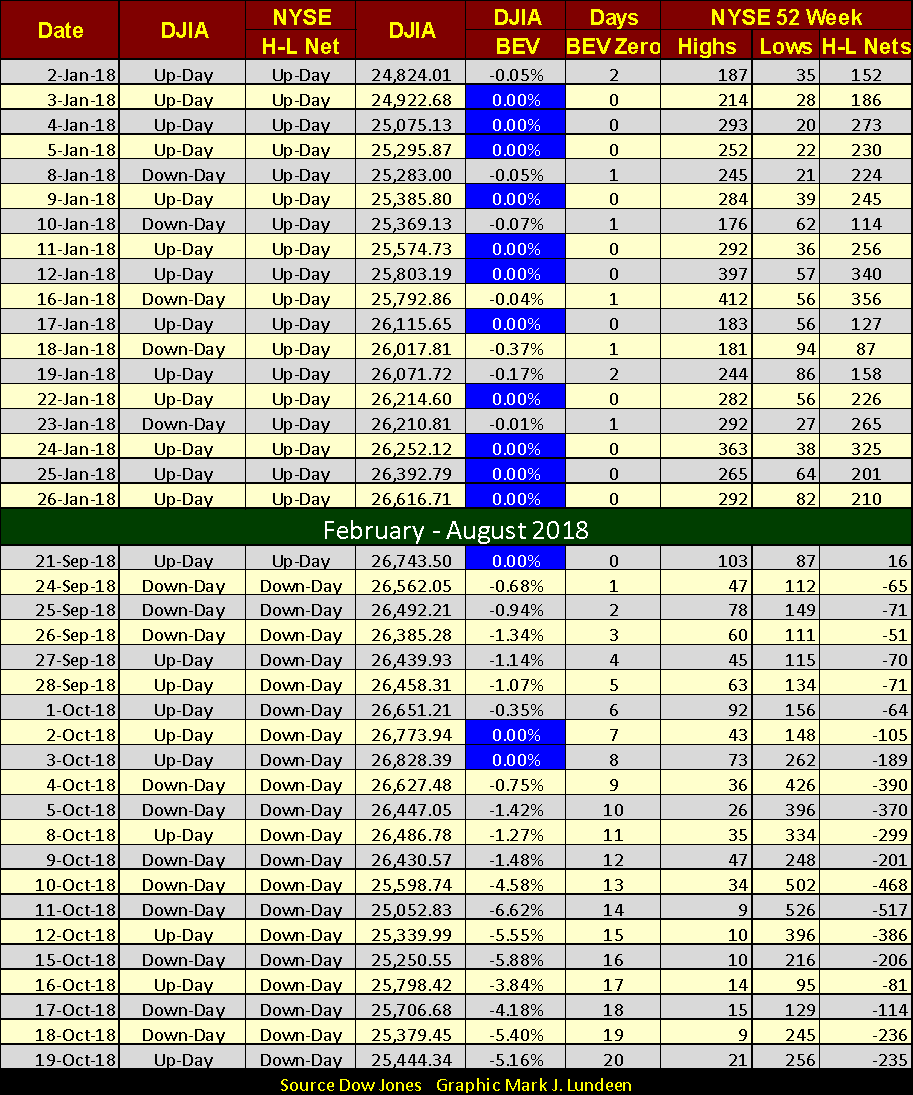
The stock market saw its third day of extreme volatility in the past two weeks, with Dow Jones just 5.61 percent away from its new all-time high.
Extreme volatility (Dow Jones 2 percent Days) continues being a major feature in the market; Tuesday of this week saw the Dow Jones close 2.17 percent above the previous day’s close. Yes, this was a big daily gain, but big daily percentage gains are events usually seen in bear markets. So, that’s the third day of extreme volatility in the past two weeks (see Mr. Bear’s Report Card below), and that isn’t normal, or bullish.
Of course, that doesn’t mean that the market is on the cusp of a major crash in valuations. The Dow Jones closed the week only 5.61 percent away from making a new all-time high, and I wouldn’t be surprised if sometime in the next month the Dow Jones finds itself once again rising into record territory. So, I take the current trend in rising volatility as the market’s way of telling us as we go forward, risks are increasing as the potential for profits decline.
So far we’ve seen only one NYSE Day of Extreme Market Breadth (NYSE 70 percent Day). If the market is entering a bear market, we’ll see more of those, both positive and negative in the weeks and months to come.
©Mark Lundeen
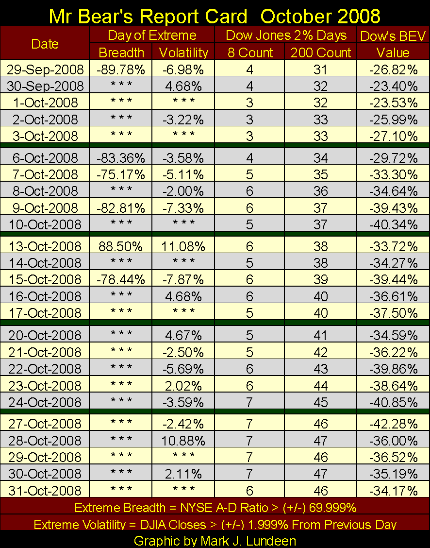
Next is Mr. Bear’s Report Card from October 2008, a time when Mr. Bear was running amok on Wall Street. Of the 25 NYSE trading sessions seen below, the Dow Jones saw only seven days when it moved less than 2 percent from a previous day’s close. And note the two largest daily moves, October 13th and 28th, were double-digit percentage ADVANCES. In fact during the entire sub-prime bear market (the #2 deepest Dow Jones Bear Market since 1885), from October 2007 to March 2009, the Dow Jones never saw a double-digit percentage decline from a previous day’s close. The largest daily percentage decline occurred on October 15th, the -7.87 percent decline seen in the table below.
©Mark Lundeen
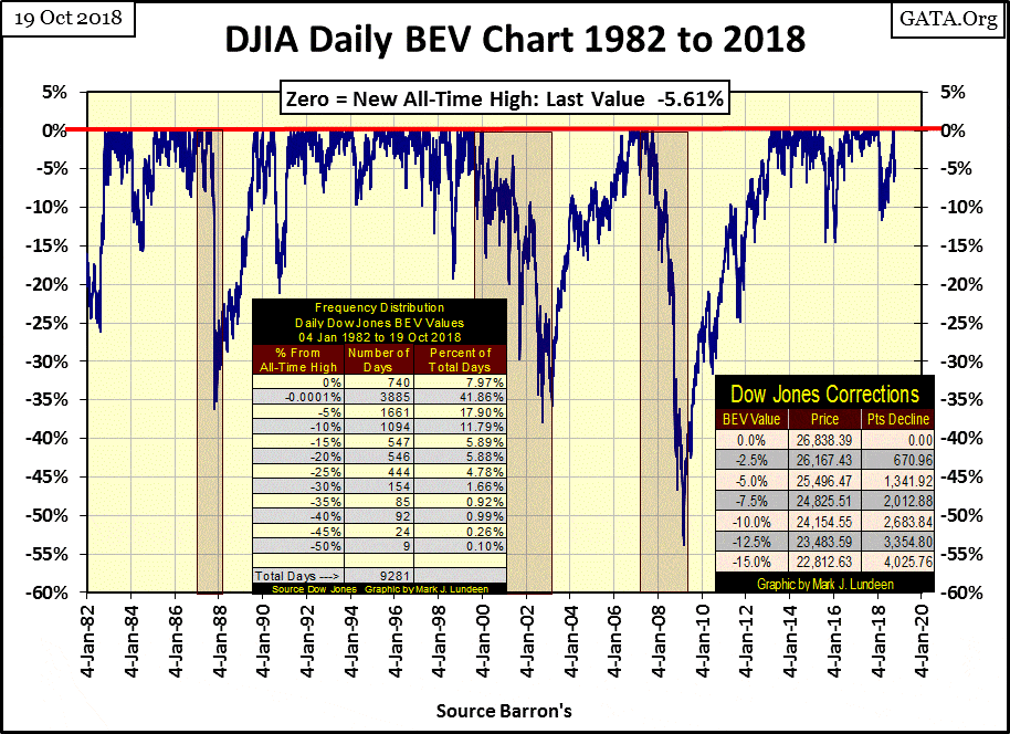
Next is the Dow Jones’ BEV chart, and as noted previously, the Dow Jones closed the week down 5.61 percent from its last all-time high, within easy scoring position for another BEV Zero should the bulls decide to make a go of it.
I went back to January 1982 for this chart to point out that since 1982, the stock market has actually been one continuous bull market. That’s not to say that this bull market hasn’t seen its leadership change over the past four decades.
- In the 1980s, the market was dominated by Leveraged Buyout Artists, as they were called at the time, private equity firms using junk bonds to finance their acquisitions in the market. The 1987 movie Wall Street starring Michael Douglas and Charlie Sheen has the flavor of the times in it—“greed is good.”
- The 1990s was the high-tech decade, a time when small high-tech companies, such as Apple and Microsoft, came to dominate not only the stock market but our vision of the future. Smoke stacks were out—microprocessors were in!
- Then came the sub-prime mortgage bubble (2002-07). Though this bubble was actually a real estate bubble, it had an impact on Wall Street too, both the boom and the bust.
- And lastly, the post March 2009 bubble where just about everything but the values of gold, silver and their mining shares have been inflated to obscene levels.
The BEV chart below has an interesting feature; each of the first three bubbles listed above was terminated by a major market decline in the Dow Jones. I placed a shaded box over these market declines, and it should be noted that each succeeding decline was deeper than the previous ones. This is only to be expected, as the higher one flies the farther one has to fall.
Our current market advance, the post March 2009 market has yet to see a significant market decline. But if this pattern of ever greater market declines holds, the next bear market could be a real whopper!
©Mark Lundeen
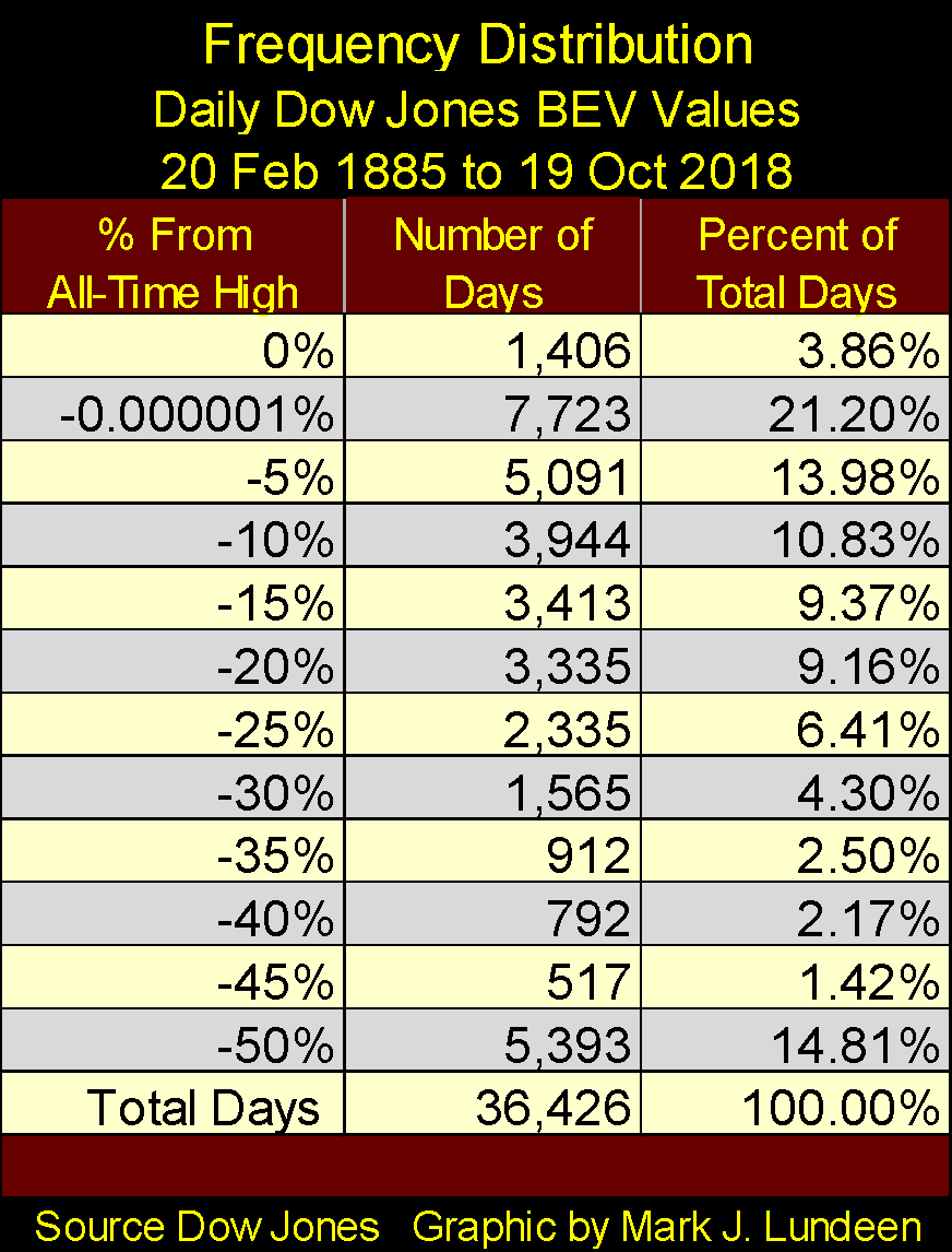
Is that likely? Looking at the Frequency Distribution Table in the BEV chart above, I think it is. The first two rows in the table:
- 0 percent = Daily New All-Time Highs
- -0.0001 percent = Daily Closes just short of an all-time high down to -4.999 percent from one.
The frequency distribution table’s top two rows include all the Dow Jones daily closings from January 1982 to today that were new all-time highs or within 5 percent of making one. Incredibly, 49.84 percent of the 9,281 daily closes during these four decades were within 5 percent of their last all-time highs.
Comparing the post January 1982 performance to the frequency distribution for the Dow Jones going back to February 1885 (below), the last four decades have been wildly, and I believe abnormally bullish!
©Mark Lundeen
How is that? Simple, the Federal Reserve’s unspoken mission became one of inflating, and sustaining bubbles (aka Bull Markets) somewhere in the financial markets. Since Alan Greenspan became Fed Chairman in August 1987, every time the stock or real estate markets saw a significant market decline, all eyes turned to the Federal Reserve inquiring (begging) them to halt the deflation (stop the pain), and reflate the market to new highs.
Consider this: Of the 1,406 daily new all-time highs the Dow Jones has made since February 1885 (133 years), 740 (52.6 percent) of them were made after January 1982 (36 years), with four of those made in the past month.
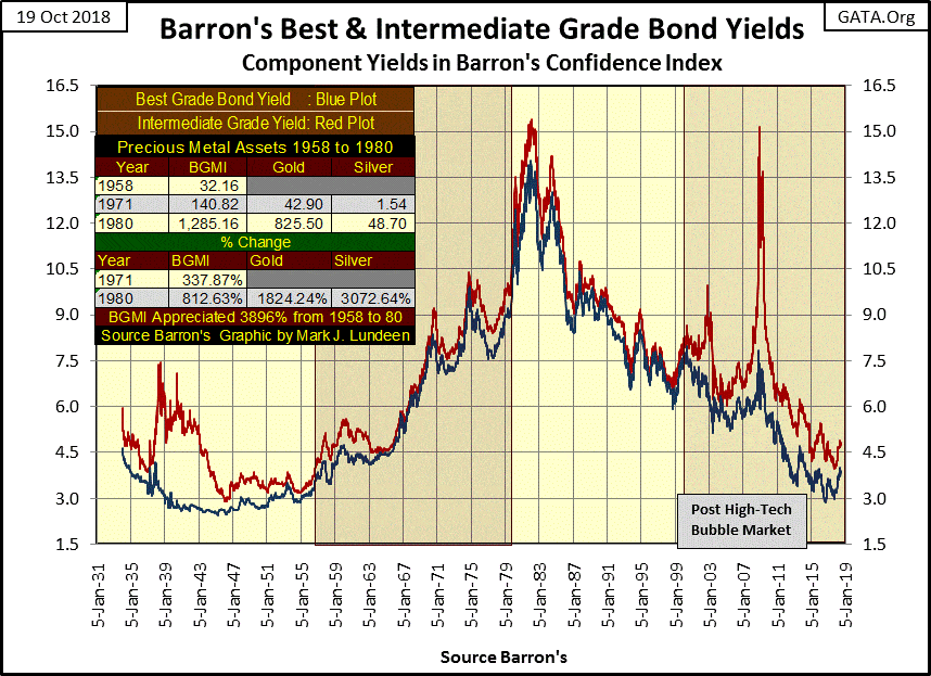
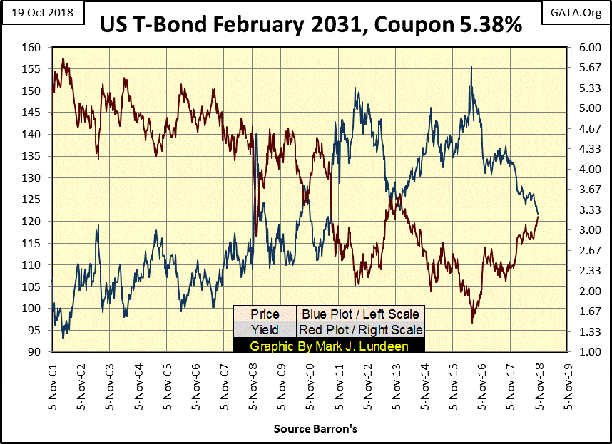
Abnormally bullish? Well, yes. But how much longer can this continue? Look at bond yields during this period (chart below). From the early 1980s to 2016, yields were declining from double-digits to less than 5 percent. How hard was it for inflation flowing from the Federal Reserve to flow into stock and bond valuations as rates and yields declined? Not hard at all.
The asset class that didn’t benefit from declining rates and yields were precious metal assets. They were in a bear market from 1980 to 2001, and have advanced with difficulty since 2001.
©Mark Lundeen
Rates and bond yields bottomed in the summer of 2016, and have been rising since. Though the stock market has yet to react to this momentous development in the debt markets, at some point, a currently unknown threshold, it will.
What did the stock and bond markets do as rates and yields increased from 1958 to 1981? The bond market endured a three-decade long bear market that devastated the wealth invested in fixed income investments. The stock market may have seen positive returns in nominal dollar terms. However, in inflation adjusted terms investors ended up paying income taxes on their capital gains that all too frequently failed to keep up with the annual rate of consumer price inflation.
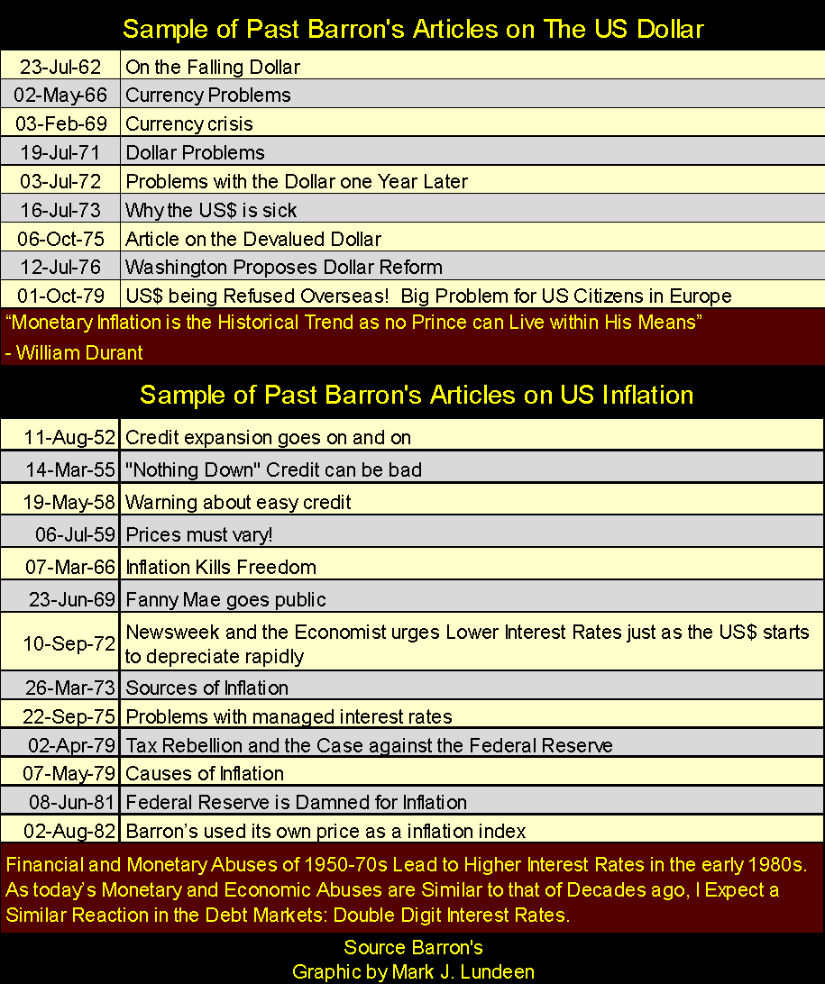
Long forgotten today, rising consumer price from the 1950s to the early 1980s went hand in hand with rising interest rates and bond yields. The table below provides a sample of past articles on the depreciating U.S. dollar and rising consumer price inflation from the dusty old pages of Barron’s.
©Mark Lundeen
The investment that outperformed consumer price inflation from 1958 to 1980 was the Barron’s Gold Mining Index (BGMI), and after 1971 gold and silver bullion. See the table in the chart above.
If you’re reading market information seeking guidance for what to do with your investment funds, it’s important to know the basis of any particular writers’ opinions. For me, it’s easy and you can see it all in the chart above.
- Rising rates and bond yields are BAD for stocks and bonds but GOOD for precious metals assets.
- Declining rates and bond yields are GOOD for stocks and bonds but BAD for precious metals assets.
If you expect rates and yields to continue going down, stay in the financial markets and avoid gold, silver and their miners. But if like me you expect them to continue rising as they have since July 2016, you’ll be wary of stocks and bonds, and want a significant portion of your investment capital in precious metal assets.
This investment strategy isn’t for those seeking instant gratification as the-powers-that-be are opposed to rising gold and silver prices. However, in the months and years ahead of us, I expect it will prove to be very profitable to those who understand the dynamics at play here, and can manage to keep an iron hand on the tiller.
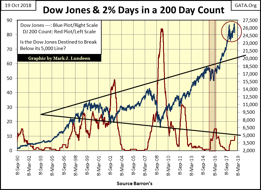
BEV charts for the Dow Jones are always interesting, but I like seeing the Dow in dollar terms too, as seen below with its 200 count plot. The Dow Jones currently has a double-top formation (Red Circle), which isn’t good news for the bulls. The solution to this problem is for the bulls to take the Dow Jones up above 28,000 and that double-top goes away.
The problem I see with this strategy is the Dow Jones 200 count (Red Plot below) this week increased to 10 (see Mr. Bear’s Report Card above). Seeing the Dow Jones entering into a period where it sees daily double-digit percentage moves (up or down) has never been bullish. Unless the daily percentage moves in the Dow Jones diminish in the weeks and months ahead of us, the Dow Jones is more likely to decline than advance.
©Mark Lundeen
One more comment on the chart above. The advance in the Dow Jones since March 2009 is simply amazing. How much more can reasonable people expect from the stock market? That plus corporate management has (in my opinion) frequently been criminal since March 2009.
Corporate insiders have used their share buyback programs to line their own pockets via options—burdening the companies they manage with debt to fund buybacks. When Mr. Bear returns, we will all see which widely known BIG NAME companies have seen their financial positions looted by management as they file for “reorganization”—aka screw their bond holders.
Looking at the lower trend line lining up on the lows of the 2002 and 2009 bear markets, we see the potential for the pending bear market to take the Dow Jones down to 5000 (an 81 percent decline). Should we enter an economic dislocation deep enough to force today’s corporate highfliers into bankruptcy for failure to make bond coupon payments, 5000 on the Dow Jones may prove to be wildly optimistic.
Is this likely? I think it is as that is what Mr. Bear does, he stress tests financial assumptions made during the good times to see if they are viable when the economy turns down. In the process, market valuations are deflated, and unviable debt is written off. Today that could mean tens or even hundreds of trillions of dollars, yen, euros and yuan deflate to nothing in the global debt markets.
The NYSE continues seeing 52Wk Lows overwhelm 52Wk Highs. Why is this happening? Because money is exiting the stock market and going somewhere else. If this continues, I expect gold and silver valuations will begin to rise.
©Mark Lundeen
Here’s a 30 Yr. T-Bond issued in February 2001. It has about 12 years before maturity, so its yield is acting more like a 10-year bond as of 2018.
The point of this chart is to illustrate bond yields bottomed (bond prices topped) in the summer of 2016, and yields have been rising (prices falling) ever since. No one speaks of it in polite company, but the bond market has been deflating for over two years now (blue plot).
©Mark Lundeen
“Reasonable people” today have little doubt the debt incurred today will be serviced tomorrow. But I have a little doubt these debts, including the entire US Treasury market are going to be defaulted on in full or in part before this cycle of rising bond yields tops out.
And when bond holders learn their bonds at best will only pay back ten cents on the dollar, what happens to bond yields then? To the Moon, with the valuations of gold and silver following close behind!
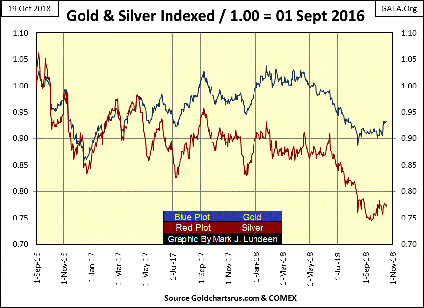
In times of uncertainty, gold and silver have always proven to be safe harbors in the storm, so let’s look at them in the chart below. We’re looking at gold and silver indexed to 1.00 = September 2016, so you can compare them to each other as if in a horse race.
It’s interesting to note that bond yields have been rising since 2016, and not only has the stock market so far ignored deflation in the bond market, but so too has gold and silver. It’s as I’ve said before, we may not see much excitement in the old monetary metals and their miners until we see panic at the NYSE. But two things are certain in today’s markets;
- Valuations in stocks and bonds are wildly overvalued,
- Valuations for gold and silver are deeply depressed.
©Mark Lundeen
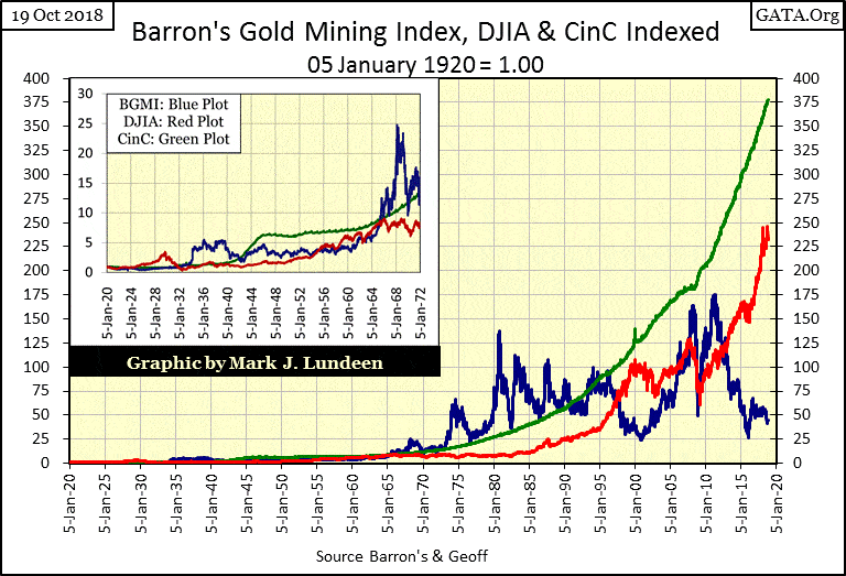
The chart below plots the indexed values of Currency in Circulation (CinC) the Dow Jones and the BGMI makes my point. Since 1920, the volume of paper dollars circulating in the economy (Green Plot) has exploded. While valuations for the Dow Jones (Red Plot) is benefiting from this inflationary tide from the Federal Reserve, it’s still lagging behind the production of dollars.
Actually, if you study this chart, you’ll see how the Dow Jones only once exceeded the production of dollars from the Federal Reserves—during the Roaring 1920s bull market.
Currently, the valuation for the BGMI are at levels seen in 2002, near the bottom of the 1980-2001 precious metals bear market. Still, since 1920, the BGMI has exceeded the growth of dollar production for much of the past 100 years. This indicates gains in the gold mining shares have frequently exceeded any inflationary loss in dollars they are denominated in. In other words, the gold mining shares during their advances have provided a true inflationary hedge for their investors, and I expect they will once again when the bull market in gold and silver resumes.
If the secret of making money is buying low and selling high (and it is), then as 2018 draws ever closer to 2019, the stock market should be shunned in favor of precious metal assets.
©Mark Lundeen
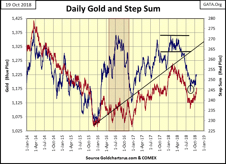
Here’s gold’s step sum chart. For the past seven trading sessions, the price of gold has been ranged bound from $1,220 to $1,225, but its step sum is advancing nicely. The next few weeks should tell the tale, does gold break out towards $1,250 or test the low of August 15th ($1,165.50).
©Mark Lundeen
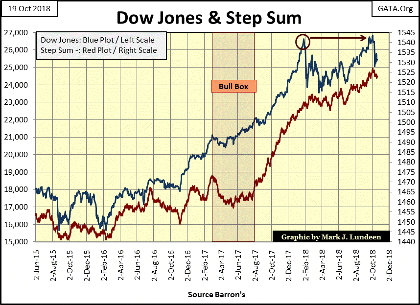
In the step sum chart for the Dow Jones, we see the double-top formation. A few weeks ago the Dow Jones made four new all-time highs, and then apparently broke from the strain.
As I’ve said, this doesn’t mean the Dow Jones has seen its last all-time high of the move. But the burden of proof that the Dow Jones has more to go to the upside is completely on the bulls because it’s completely possible that Mr. Bear could resume his work of deflating overvalued market assets any day now.
Speaking for myself, the stock market is only a spectator sport, as ultimately it’s a game that the bulls can’t win.
©Mark Lundeen
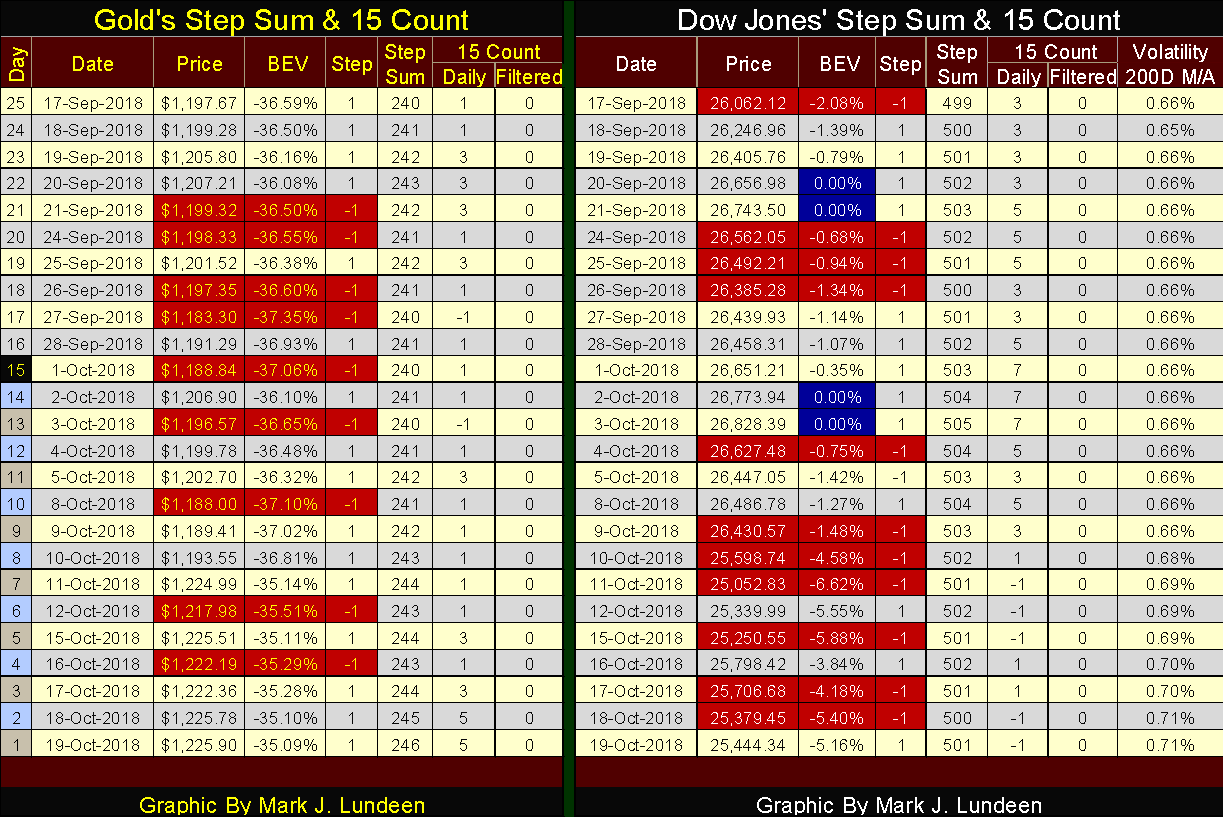
Here are the step sum tables for gold and the Dow Jones. The step sum for gold is finally rising along with the price of gold. Also at the end of the week gold’s 15 count has increased to a +5. Money is moving into the gold market, hopefully in the weeks to come it will drive the price of gold up to and above $1,250.
©Mark Lundeen
The step sum table for the Dow Jones is becoming bleak. Its 15 count increased to +5 and +7s as it made its last all-time highs. But after October 3rd (in the words of Al Gore as he made his presidential bid in 2000), “Everything that should be going up is going down, and everything that should be going down is going up.”
That pretty much sums up the Dow Jones in the table above, particularly the Volatility’s 200 Day Moving Average (far right column). Daily volatility’s 200 day M/A was stuck at 0.66 percent for most of the past month, but those three Dow Jones 2 percent days seen in the past two weeks has kicked this up to over 0.70 percent at the end of the week.
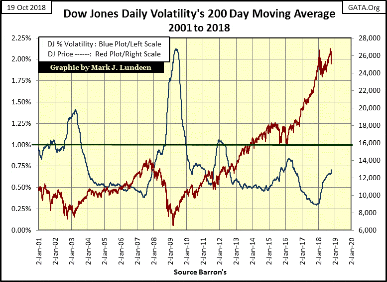
Since the end of the 19th Century, rising daily volatility has been the pure poison for the Dow Jones. Here’s a chart for the Dow Jones (Red Plot) and the 200 day M/A for its volatility.
©Mark Lundeen
Rising daily volatility was a feature for both the High-Tech and Sub-Prime Mortgage bear markets. As declining daily volatility was a feature of the historic advances that followed these big-bear market bottoms.
And in the past year the 200 day M/A for daily volatility for the Dow Jones has increased from 0.32 percent to 0.71 percent at the close of this week. Look at the chart above, what do you think?
I think the Dow Jones has shrugged off rising bond yields for the past two years and rising daily volatility since September 2017, but I also think I’m beginning to feel the hot breath of Mr. Bear on the back of my neck.
(Featured image by DepositPhotos)
—
DISCLAIMER: This article expresses my own ideas and opinions. Any information I have shared are from sources that I believe to be reliable and accurate. I did not receive any financial compensation for writing this post, nor do I own any shares in any company I’ve mentioned. I encourage any reader to do their own diligent research first before making any investment decisions.


PayPal’s Slowdown: From Fintech Leader to Low-Growth Dividend Stock
PayPal has shifted from fintech leader to low-growth, value-style stock, losing over 25% in market value and trading at a...

Tilray (TLRY) Falls as Bearish Momentum Persists Despite Marketing Push
Tilray (TLRY) fell 3.32% to $4.44, remaining below key moving averages and signaling continued bearish pressure. Despite a £1 million...


ESG Gap Persists as Firms Struggle to Link Sustainability to Financial Value
KPMG’s Global Survey shows a major gap between ESG awareness and financial integration. While 72% of managers understand sustainability strategies,...


Bitcoin and Ethereum Slide as Market Pressure Builds Amid Strategy Concerns and Layer 2 Disruptions
Bitcoin fell below $60,000 with heavy ETF outflows, pressured by concerns over Strategy’s finances and its STRC stock decline. Ethereum...


AI Venture Builder Launches €600K Crowdfunding Round to Scale Secure AI Solutions
AI Venture Builder, an Italian-British firm developing AI applications and vertical startups, returns to CrowdFundMe with a equity campaign. After...
 |
|
 |  |
 |
|
-

 Biotech4 days ago
Galicia Launches €805M Biotechnology Strategy to Drive Innovation and Competitiveness (2026–2030)
-

 Crypto2 weeks ago
Bitcoin and Ethereum Markets Steady as Strategy and Bitmine Expand Holdings Amid World Cup Crypto Activity
-
 Impact Investing2 days ago
ESG Gap Persists as Firms Struggle to Link Sustainability to Financial Value
-

 Crowdfunding1 week ago
Temotiva Launches Crowdfunding Campaign to Advance Preventive Mental Health
You must be logged in to post a comment Login