Featured
Dow Jones staggers; Gold stocks slide
Dow Jones remains volatile with highs and lows trending in the market. Global gold stocks decline in the trading market by 10 percent.

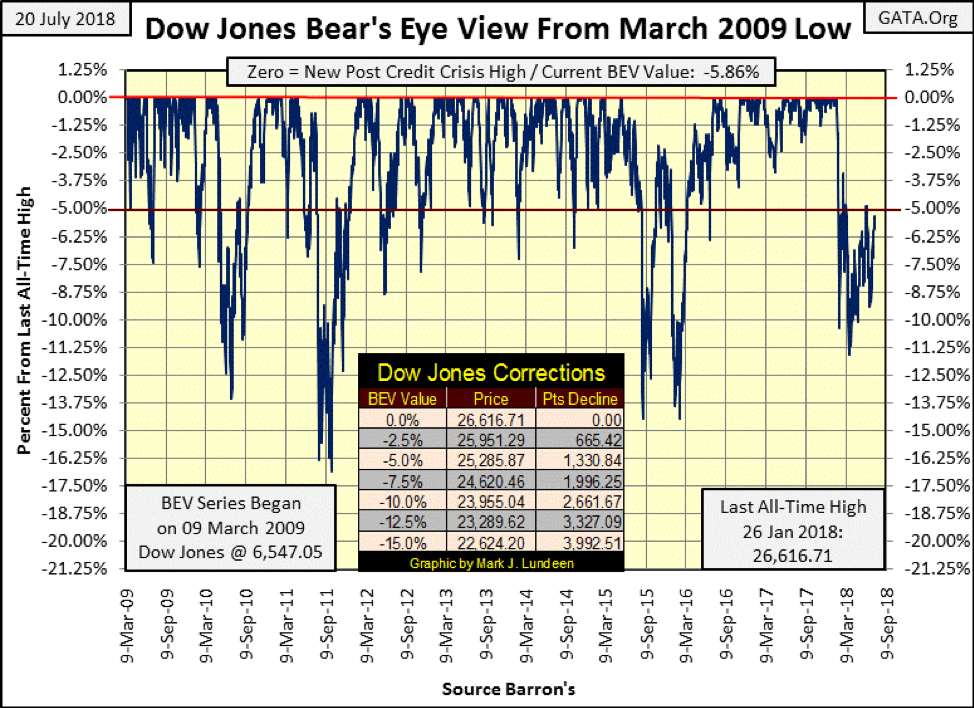
This week’s market commentary, as it has been for the past few months is tedious. But that isn’t my fault. What’s to say about a market which since early March has been four months of hurrying up and waiting? Waiting for what? Looking at the Dow Jones BEV chart below, I’m waiting to see whether the Dow Jones first breaks boldly above its BEV -5% line or collapses below its BEV -10% line. As August approaches, as has been the case for months now, apparently the Dow Jones is in no hurry to do either. However, that can change very quickly, as a quick study of the BEV chart below shows.
© Mark Lundeen
But will the Dow Jones break above its BEV -5% line, and then on to a new all-time high, or will it first dive below its BEV -10% line and continue going down on a rendezvous with Mr. Bear? That’s the big question, which my answer is I’m still thinking the bulls are going to see another BEV Zero in the chart above before this nine-year plus advance is over.
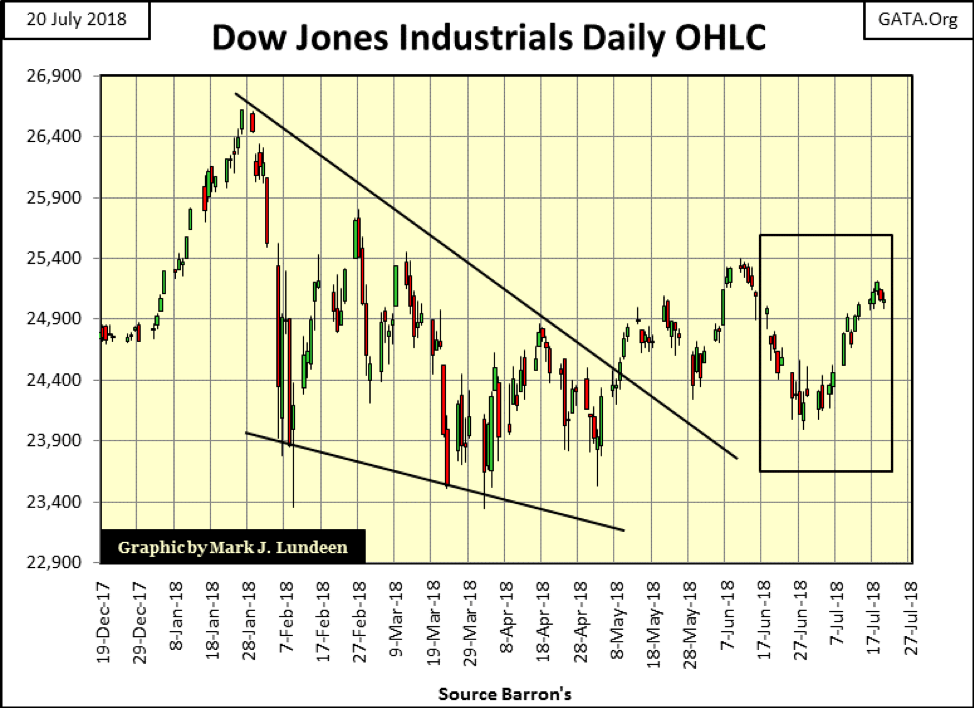
My reasoning for believing that is seen in the diminishing of volatility in the Dow Jones’ daily bar chart below; also seeing the gains of the past three weeks is encouraging. The decline in the Dow Jones since late January could very well prove to be just one more correction in an advance that began on 09 March 2009. All it would take to prove that would be for the Dow to move up by less than 6% from the close of the week and make another new all-time high—how hard could that be?
If it’s still a bull market, another new all-time high is locked in. But if the BEV Zero seen on 26 January 2018 proves to be the Terminal Zero (TZ), the last all-time high of the post Credit Crisis advance in the BEV chart above, then Mr. Bear is just playing with the bulls.
© Mark Lundeen
Considering the bulls’ case, since March 2009, the Dow Jones has advanced 21,000 points. Even if the Dow Jones sees a series of new all-time highs in the weeks and months to come, how much more can they add to what they’ve already seen in the past nine years?
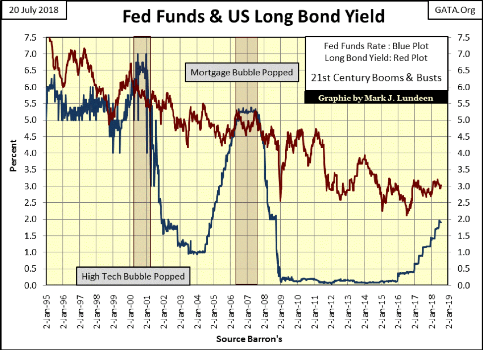
Considering Mr. Bear’s case, interest rates and bond yields are rising. A quick look below shows how the bull markets of the high-tech 1990s and subprime mortgage bubble got popped; the FOMC increased their Fed Funds Rate above the yield for the US Treasury’s 30-year bond. And it’s interesting noting how in both cases, damn few “market experts” cared about the FOMC raising their Fed Funds Rate until all of a sudden they all did as declines in the stock market forced them to.
If you’re a bull, you have to believe it will be different this time; that the narrowing gap between the Fed Funds Rate and US Treasury long bond yields doesn’t matter anymore, or that someone they trust is going to ring a bell when it’s time to exit the market. But the bears know that’s never the case at a market top.
© Mark Lundeen
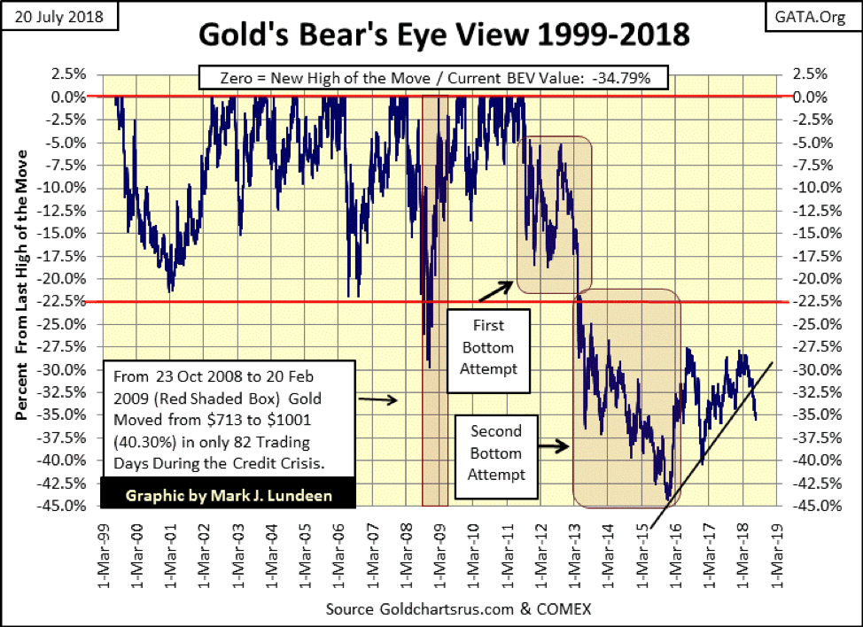
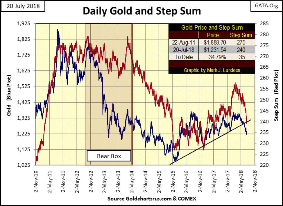
Gold continues declining in its BEV chart below. I spent some time this week on 15 counts used in a step-sum analysis. I was shocked seeing the massive pressure being applied to the gold market by the “policy makers” and “market regulators” since late last winter. Considering everything I cover at the end of this article, gold and silver are doing darn good.
Keep in mind the current decline is nothing like gold and silver saw in 2013. In my opinion, that’s a key insight for the precious metals market in July 2018. Patience is a virtue here.
© Mark Lundeen
Market sentiment (Red Step Sum Plot) is collapsing in gold’s step sum chart below. But for all those net declining days, the price of gold while declining is not in a state of collapse. Take a look at the charts above and below covering 2012-13 to prove to yourself how the current market decline in the price of gold is nothing like the selling panic gold saw after its August 2011 market top. Those were the bad old days; it’s a different world now.
I don’t like it, and there isn’t much any of us can do to stop this engineered decline in the price of gold. But it is markets exactly like this that typically shake out the weak hands in a bull market, preventing them from staying in their positions when future big advances come into play.
© Mark Lundeen
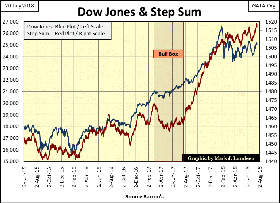
For the Dow Jones below, its step sum has gone onto new highs, leaving the price of the Dow behind. Reminds me of those cigarette commercials they used to have on TV in the 1960s: “smoking more / enjoying less?” In the 1960s, the solution to that problem was pretty simple: stop smoking those nasty Lucky Strikes and switch to satisfying Viceroys cigarettes.
However, in July 2018, the solution to recoupling the lethargic Dow Jones’ price plot to its step sum isn’t so clearly laid out as this aging bull obviously is in need of some rest. To get the old bull off of his butt and charging back up the hill, what this market really needs is a good “injection of liquidity” from the FOMC.
© Mark Lundeen
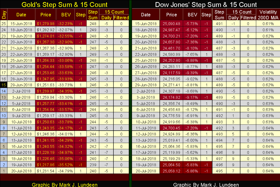
Moving on to the step sum tables below, gold at the close of the week is down 3.78% from June 15. Considering its step sum has fallen eight steps and its 15 count hasn’t been positive for even a single day in these past five trading weeks, and has seen counts of -5s and -7s in its last two weeks, this is actually a resilient market considering the massive selling pressure gold (and silver) has had to endure.
© Mark Lundeen
And then there is the Dow Jones, which at the end of the week is DOWN 0.01% from June 15. Its step sum has advanced to 497 from 491, and looking at its 15 count, for over a week it was high single digits. That’s a lot of daily advances that somehow failed to advance the Dow Jones.
One old market rule-of-thumb had it—if a market refuses to advance, it may soon find itself declining. If this keeps up, maybe it will be time to dump those nasty Lucky Strikes but hopefully not before November.
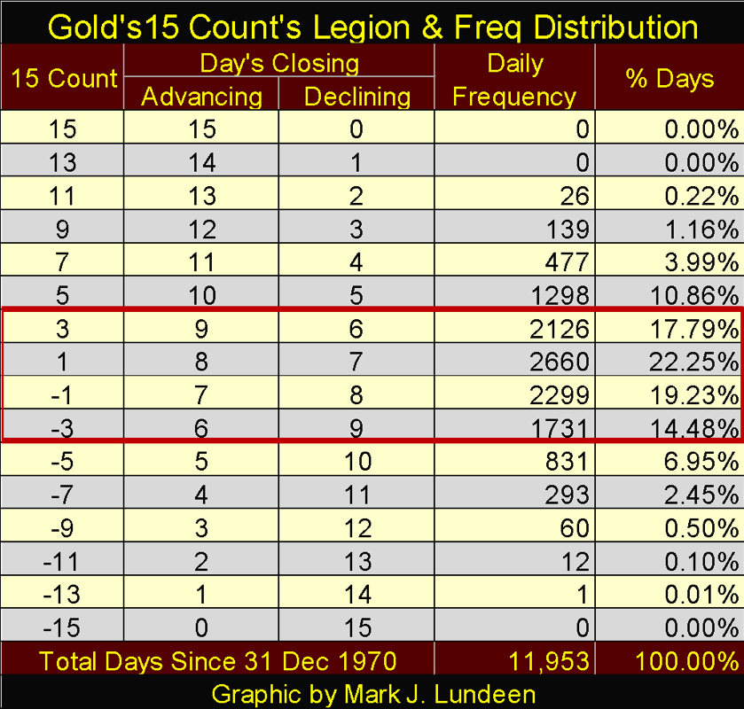
Let’s look at my 15 count for gold and silver, and see what that is all about. But first, exactly what is a 15 count? It’s a measurement of buying and selling pressure using the daily closings (advances / +1s and declines / -1s) of gold, silver or anything else.
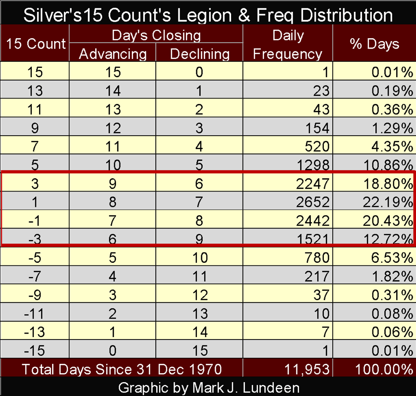
Below is the legion (key) for the 15 count. So, on the extremes, a +15 count indicates how in the past 15 trading days a market has advanced in 15 of them while not declining even once for the past three trading weeks. A -15 count indicates how in the past 15 trading days a market has declined in 15 of them while not advancing in even once for the past three trading weeks. The counts are always odd numbers, and the table below shows the daily advances and declines in a running 15-day sample needed to produce them.
Since 31 December 1970 (11,953 trading sessions ago), the daily occurrences of these counts (frequency distribution) from +15 to -15 forms a bell curve, with 73.75% of them occurring within the range from +3 to -3 (Red Box).
© Mark Lundeen
Typically, a market oscillates between +3 and -3. While in this range, a market may be advancing with a negative count or declining on a positive count. So, when a market’s count is between +3 and -3, there is little to be gained closely following a 15 count.
When a market sees its 15 count in the high single digits (+/- 5,7&9), it’s experiencing higher than normal buying or selling pressure. Seeing a market’s 15 count in the double-digits is a RARE MARKET EVENT, which typically signals a reversal in the market’s trend is at hand. A 15 count of +15 is a bearish market event, signaling a mania peak in purchasing. A 15 count of -15 is a bullish market event signaling a mania peak in selling; however, like all such market rules, there are times when these rules fail.
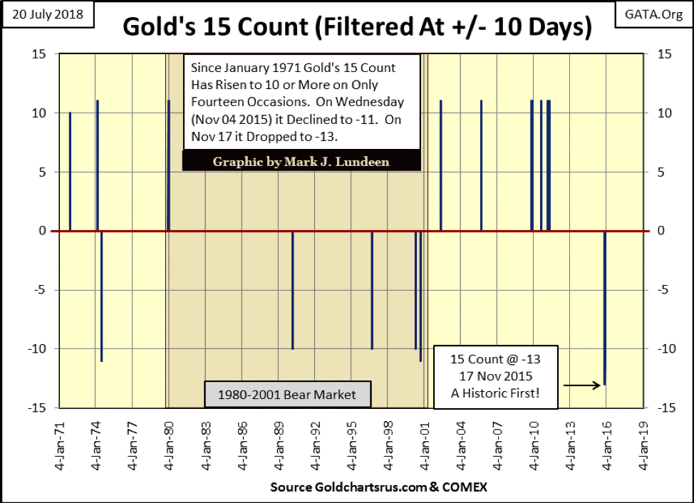
The following chart plots those times since 1970 when gold’s 15 count increased to double digits, which has occurred on only 14 occasions in the past five decades. Looking at the frequency distribution in the table above we see double-digit 15 counts occurring more than these 14 times in the chart below. But these spikes in buying and selling pressure displayed below typically contains multiple days of double-digit 15 counts.
That certainly was true for gold’s 15 count of -13, a one-time event seen on 17 November 2015, a market extreme not seen in the previous five decades. This peak in negative double-digit 15 counts of November 2015 also included nine days with an -11 count, with a -9 count sandwiched halfway during this selling panic.
A month later, the price decline that began in September 2011 bottomed and the price of gold began an advance that in fits and starts has continued ever since.
© Mark Lundeen
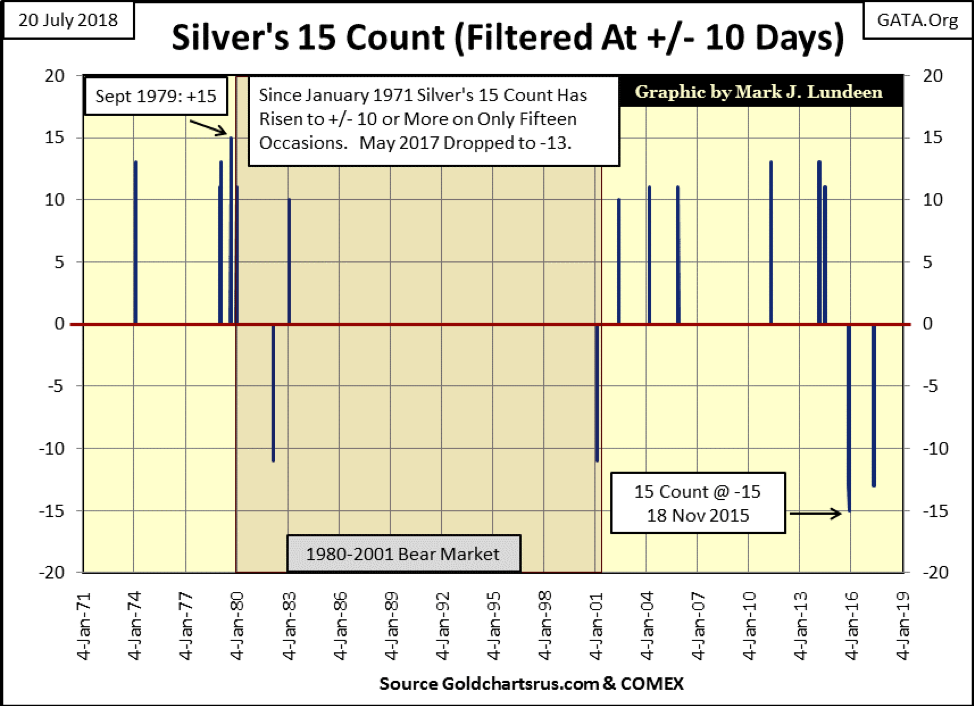
Here’s silver’s 15 count and Frequency Distribution table below. Unlike gold, silver has seen daily counts of 15. However, seeing the silver market with a double-digit 15 count is still a RARE MARKET EVENT that we should take note of.
© Mark Lundeen
Silver’s double-digit 15 counts are plotted below. Bull markets in gold are also bull markets in silver. Still, silver is its own market, which may or may not follow the short-term developments in the gold market. Silver has seen 15 double-digit spikes in its 15 count since 1970, and unlike gold, silver has seen counts of 15 in the past five decades.
© Mark Lundeen
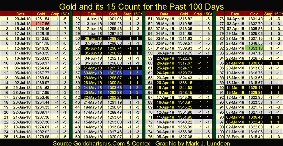
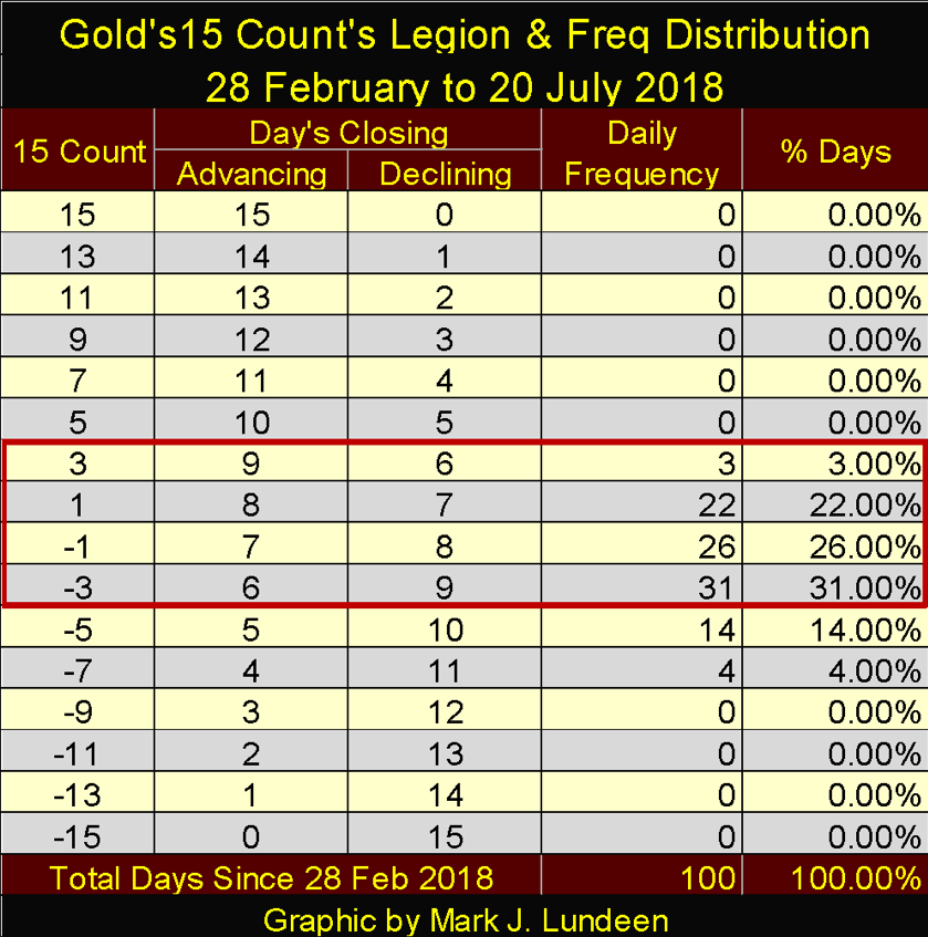
That’s the basics for the 15 count in step sum analysis. Now, let’s take this analysis a step further by examining gold and its 15 count going back to February 28 in the table below. Gold’s peak price in this period occurred on March 26 ($1353.18) and declined to its minimum just this past week on July 19 ($1217.86), for a 10% decline since late winter. How gold lost this 10% is explained in the table below.
© Mark Lundeen
I highlighted those days with a positive 15 count; counts of +1 in black and gold, counts of +3 in blue and gold. In the past 100 trading days at the COMEX, gold has only seen 25 days with a positive 15 count, with no count over +3. You may want to review my table for the construction of the 15 counts below to see just how little influence the bulls have had in the gold market since the end of February.
Now look at the days with a negative count, there are 75 of them, with 18 of them with counts of 5 and 7, that plus the gold market hasn’t seen a positive 15 count since June 8, 30 trading days ago.
© Mark Lundeen
We’re seeing the “policy makers” application of Fud’s Law in the gold market, where if they can just push hard enough they can make the price of gold fall down. Something tells me that for all this effort they were anticipating more than just a 10% decline during these 100 trading days.
So, what are they to do? Continue pushing until the price of gold falls down in panic selling? We’ll see.
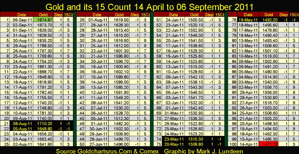
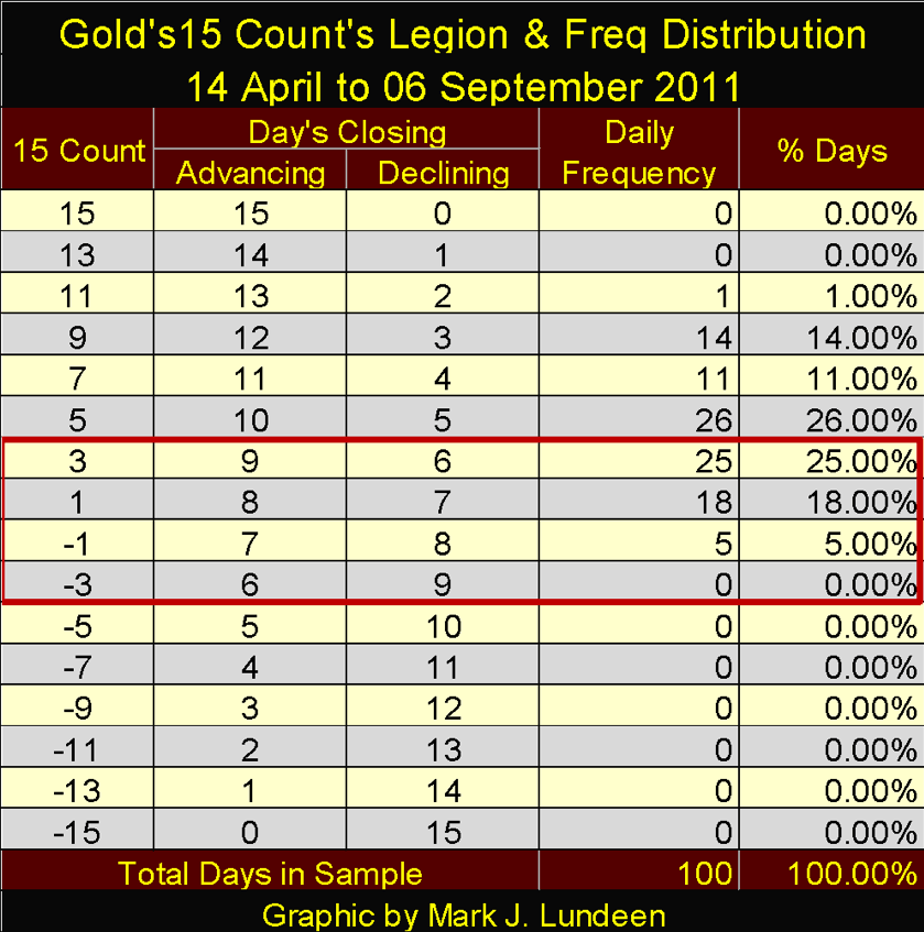
To cheer up my readers here’s a table for gold and its 15 count for the 100 days leading up to its September 2011 top. I highlighted the days with a negative 15 count, which there were only five and none greater than -1.
© Mark Lundeen
Here’s the frequency distribution for the 15 counts above. Note the double-digit count on April 25. Here’s an example where an extreme market event failed to call the turn in a market’s trend in a timely fashion. As it turned out the gold market advanced for an additional ninety-three trading days after April 25.
© Mark Lundeen
After the buying frenzy seen above, came a 52-month, 45% correction in the gold market that bottomed in December 2015. I have no doubt, come the cessation of artificial selling pressure the gold and silver market currently labors under, the precious-metal bulls will once again charge upward as they did in 2010-11.
I hear the South is seeing record demands for electricity. The weather is very nice where I am, but apparently, in July, it gets damn hot in Texas. Too bad I can’t get EP data from Barron’s any more to see what’s happening on America’s electrical grid. That plus the Dow Jones Total Market Group data is gone.
(Featured Image by DepositPhotos)
—
DISCLAIMER: This article expresses my own ideas and opinions. Any information I have shared are from sources that I believe to be reliable and accurate. I did not receive any financial compensation in writing this post. I encourage any reader to do their own diligent research first before making any investment decisions.


The TopRanked.io Guide to 2026’s Biggest and Best Affiliate Opportunities
Want to earn affiliate commissions on literal billions of dollars worth of revenue? Then this week, we've got something special...


Eni Advances Energy Transition with Major Investment and Emissions Cuts
Eni showcased its “Just Transition” report in Rome, highlighting stakeholder collaboration and progress toward decarbonization goals. The company invested over...


The German Fintech Market Shows Resilience and Strong Investment Growth in 2026
Germany’s fintech sector remained resilient in 2026 despite economic crisis and rising insolvencies. Investments reached €14.2 billion, showing strong investor...


Cannabis Legalization in Germany: A Mixed Interim Assessment
Germany’s cannabis legalization has reduced criminal cases and eased pressure on the justice system, while the black market is slowly...


Sustainable Restoration of the Haus Hövener Garden in Brilon
The Brilon Construction Workers Association is restoring the Haus Hövener garden into a cultural community space, funded through a €10,000...
 |
|
 |  |
 |
|
-

 Crowdfunding5 days ago
Historic KiHa 2101 Railcar Restored in Japan Through Community Effort
-

 Fintech2 weeks ago
Barcelona Strengthens Its Position as a Southern European Fintech Hub
-

 Impact Investing2 days ago
EU Approves €23B Italian Renewable Energy Plan to Boost Climate Goals
-

 Biotech1 week ago
Early Use of Tirzepatide Shows Strong Results in Type 2 Diabetes Study
You must be logged in to post a comment Login