Business
5 useful website design tips to help you improve your conversion rate
If you can create a web design that is compelling and highly informative, you will be able to gain organic traffic and increase your conversion rate.
High conversion rate is the primary goal behind every website design strategy. It is the force that drives web designers to create unique web pages and sites.
What is conversion rate?
Conversion rate is the percentage of users who perform desired actions on a website. For instance, an online user will be a successful conversion if he or she makes the following action on a site.
-
Make a purchase
-
Fill out forms
-
Subscribe to services
-
Sign-up for an account
Actions may vary depending on the goal and purpose of a website. Each, however, can add value to the conversion rate if done successfully by online clients.
Impression plays a significant role in increasing conversion rate. One must remember that it only takes a few second to make a good impression.
There are thousands, if not millions, of other websites online that cater the same services and products as you are. Keeping the interest of a person in your site is a crucial task. However, it is not an impossible feat.
If you can create a web design that is compelling and highly informative, you will be able to gain organic traffic and increase your conversion rate.
Below we’ve listed the five most useful website design tips to help you make a site that will produce high conversion rate.
1. Responsive website design
One of the best web design techniques that you should consider is the responsive website design.
2017 is the year of modern technology. Gadgets of varied sizes are everywhere. People are relying more on smartphones to do internet browsing and shopping.
A responsive website design or RWD will allow online users to access your site on any devices. RWD offers ease of access and smooth site navigation on tablets, mobile phones, and other hand-held gadgets.
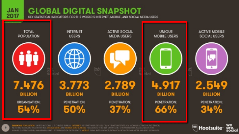
According to the Digital 2017 Global Overview Report by We Are Social and Hootsuite, there are already 4.9 billion smartphone users across the globe. That is more than half of the world’s current population that sits at 7.4 billion as per the same study.
(Source)
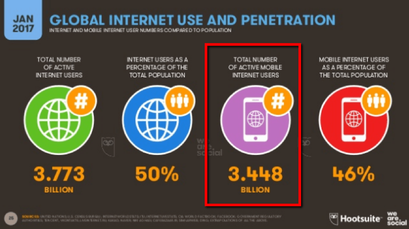
The same survey shows that 3.7 billion people are Internet users. Out of that figure, 3.4 billion are accessing the internet using their phones.
(Source)
Responsive website design is necessary if you want to target a chunk of these users from your location.
If your site is accessible from different platforms, it increases your chance of gathering more traffic. Attracting more audience will always have a positive impact on conversion rate.
Ranking high in mobile search results will produce better site traffic and higher conversion rate.
2. Pay attention to your form
One neglected element of a website is the form. Keep in mind that forms generate leads and affect the conversion rate of any site.
People shop for products or avail services online because it is convenient for them. They do not have the patience to complete transactions that will consume much of their time and effort.
If these clients have to fill out lengthy forms for one transaction, they will leave. You need to give these people the convenience that they need.
Paying extra attention to your web forms is vital. Make it stand out. Create your forms to provide good user experience. You will see that it will not only encourage sign-ups, it will also increase your conversion rate.
Create a form that is unique and user-friendly. Use color to put emphasis on important fields of the form and make it lively. This will ensure that your client will not miss a thing and will make the submission process easier.
Lastly, keep your form concise. Long forms will look tiring for people to fill out. Also, gathering so much information may seem intrusive and can give potential clients an uneasy feeling that might scare them away.
A study conducted by Hubspot on over 40,000 forms suggested that a form with four to five fields generate the most conversion.
If your website needs a long form, make sure that you inform your client of its purpose. As much as possible, divide it into segments that will make them user-friendly to your potential clients.
3. Focus on publishing great content
Always keep your focus on publishing great content. It does not matter if you have a beautifully designed website. Colors and visual effects mean nothing if the overall content of a page adds no value to its visitors.
Content is a vital key in determining the success of a website. If you want to attract the attention of your target market, write content that will be useful to them.
Keyword research is still a crucial factor in writing high-quality content. However, you also need to consider the relevance of your content to the search intent of online browsers.
Optimize your content to satisfy not the search engines but your readers. Integrate keywords into your content in a natural way and avoid over stuffing.
Excessive usage of keywords can get you penalized. Google algorithm use the semantic approach in analyzing the content of a page. It understands synonyms and always look for the relationship between terms and the context of content.
So, if Google sees that your title is “Affordable Houses,” it expects to see the following terms in your content:
-
Real estate
-
Bungalow houses
-
Tiny homes
-
Family homes
-
Apartments
After writing great content, you may now use images and other media to reinforce it. Visuals not only enhance your web page design, but it also helps your visitors remember you site.
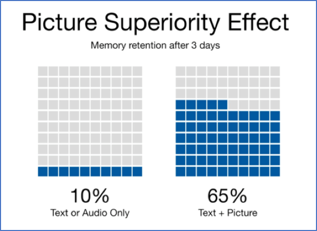
In his book Brain Rules, John Medina, a developmental molecular biologist, and research consultant mentioned that people remember pictures better than words. He called this phenomenon as Picture Superiority Effect.
A study conducted by Medina confirmed the power of images when combined with text. He stated:
“Based on research into the Picture Superiority Effect, when we read text alone, we are likely to remember only 10 percent of the information 3 days later. If that information is presented to us as text combined with a relevant image, we are likely to remember 65 percent of the information 3 days later.”
(Source)
Take advantage of images and use them wisely in your content. Always ensure that you use natural pictures that are related to the content of your website.
If you can hit a high relevance score for your content, your page will appear more on relevant search queries. This will drive more traffic to your site and increase not just your click-through rate but your conversion rate as well.
4. Interactive website design
It is important that you keep your site visitors engaged. It is the first step if you want to turn browsers into successful conversions. One way to do it is by using interactive website design.
Some elements that you can add to your site to make it interactive are:
-
Forums
-
Blogs
-
Social Media
-
Games
-
Maps
These web elements allow visitors to change your website display. It also enables them to interact directly with you or other people and perform a series of tasks.
You can use interactive website design to influence your clients to do actions that will increase your conversion rate. Some of these actions may include:
-
Purchasing products
-
Subscribing to services
-
Chat with your customer support
-
Explore your website pages
Interactive elements on a web page can attract the interest of people. While it is important to pay attention to your target market, it is also a must that you consider casual internet users.
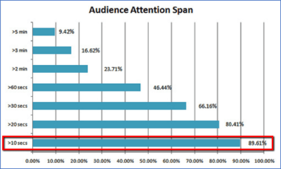
Casual internet users are not deeply engaged with anything in particular. They just surf freely and are not in pursuit of any online activity. This sort of browsers usually spends less than 10 seconds on a page.
(Source)
More than 89% of online browsers are casual internet users. That is a huge figure.
If you can get these passive browsers to stay longer on your page by keeping them engaged, you are reducing your bounce rate.
The storytelling web approach is a good strategy in keeping your visitors engaged. You may use visuals and parallax scrolling technique to tell a story. Eventually, you may use this to lead your audience to do your desired web action.
Use videos and audios in conveying messages. Again, most people prefer visuals over texts. You may also add interesting surveys and questionnaires in your page.
Remember that making people stay on your site is a big challenge. Give your visitors a great user experience through interactive elements. Do this, and you will see a significant increase in your conversion rate in no time.
5. Call to action
Call to action button or CTA is a small but vital part of your website design. It is this small button that will determine if your site visitor will be a successful convert or will just be another passive browser.

(Source)
Every click of your call to action button means an increase in your conversion rate.
There are a thousand types of CTA. You can use them to make users do one of the following common tasks:
-
Download a file
-
Purchase a product
-
Submit a form
-
Go to a service or product page
Since a CTA’s goal is to persuade your audience to do actions that will benefit you, it is important that you make it creative.

(Source)
Use as many CTAs in your page as much as possible. The more buttons you have, the higher the chances of you getting a person to convert.
Put CTA on every page of your website. A client may not convert in your homepage, but who knows? He may always change his mind and convert while visiting another page of your site.
Put your button in a place that it will attract attention. The best position is in the upper-left corner of a web page.
Make your CTA recognizable. It is ok to be creative, but it should not cloud the message of your CTA. Make your button stand out from your page by using outline colors, shadows, or contrasting colors.
Use your call to action to convey value. Instead of telling your audience what they should do, tell them what they will get in return when they click the button. That will be more enticing and exciting.
The actions of your users will determine the success of your web design efforts. Your CTA’s effectiveness lies in your creativity and consistency.
Conclusion
Website designing requires skills, creativity, and a tremendous amount of effort and time. While there are website builders to help you in creating your web page, it could still be a daunting task.
If you are having doubts about designing your own site, you can always seek the help of professionals. Web design outsourcing has a lot of benefits (as well as an increase in conversion rate) that you can take advantage of.
—
DISCLAIMER: This article expresses my own ideas and opinions. Any information I have shared are from sources that I believe to be reliable and accurate. I did not receive any financial compensation in writing this post, nor do I own any shares in any company I’ve mentioned. I encourage any reader to do their own diligent research first before making any investment decisions.

-

 Crypto2 weeks ago
Bitcoin Slides, Ethereum EEZ Emerges, Worldcoin Hits Low
-

 Crypto2 days ago
Bitcoin Stalls as Geopolitical Risks and Crypto Industry Tensions Persist
-

 Africa1 week ago
Casablanca Stock Exchange Profits Surge in 2025 as Growth Momentum Strengthens
-

 Africa4 days ago
Foreign Exchange Markets Walk a Tightrope Amid Geopolitical Tensions and Policy Uncertainty



You must be logged in to post a comment Login