Featured
Italy could be on the edge of a financial disaster
There are warning signs that point to a looming financial crisis for Italy. Meanwhile, gold and the U.S. dollar both climbed, which rarely happens.

“There are three kinds of lies: lies, damned lies and statistics.”—attributed to Mark Twain, amongst others
“Inflation is the modern way that governments default on their debt.”—attributed to Mike Epstein, Adjunct Professor, Massachusetts Institute of Technology (MIT), former President, Market Technicians Association (MTA)
“Anyone who believes that exponential growth can go on forever in a finite world is either a madman or an economist.”—Kenneth Ewart Boulding, economist, educator, peace activist, philosopher
The warnings were stark. Italy is teetering on the edge of a financial disaster. Or is it? One has to wonder. It was in late 2009 that the Greek debt crisis burst onto the stage, triggered by structural issues in its economy and an enormous debt load. Government debt had soared to almost €300 billion in a €200 billion economy, giving them a debt/GDP ratio of 150 percent. Greek bond yields exploded, credit default swaps spreads soared in price, and the Greek economy almost collapsed. The country was plagued with tax evasion and corruption. The Greek economy eventually contracted 10.3 percent in 2011. The euro fell, the US$ rose, the S&P 500 contracted 21 percent in 2011 at the height of the crisis.
Enter Italy. And it is not as if Italy’s problems were unknown. Tax evasion and corruption are also common in Italy as they were in Greece. They have been known for some time. But Italy is not Greece. Greece looks like a mouse compared to Italy. Italy has a GDP of $2.2 trillion (€1.9 trillion), the eighth-largest economy in the world. Italy has an external debt of $2.7 trillion (€2.3 trillion) and a government debt/GDP ratio of 132 percent. Most of the debt is owned by Italian banks. Italy’s private debt to GDP is 169 percent.
Much of the debt is held by Italian banks and insurance companies. Many EU banks also hold Italian debt. Some of the largest holdings are at Dexia (Belgium), BNP Paribas (France), Credit Agricole (France), and Sabadell (Spain). The ECB and Brussels have said they will not bail out the Italian banks, nor is it likely they will bail out others either. The key word is now bail-in, not bailout.
The problem erupted when it was learned that the new Italian populist government wanted to increase Italy’s budget debt levels sharply—well above the euro threshold of 60 percent of GDP. At 132 percent, Italy’s debt/GDP is not far below Greece, a country still considered an economic basket-case. Ever since the anti-establishment, right-wing government took over in June 2018, the Italian stock and bond markets have been unstable. The government also has expressed anti-EU sentiments, raising the specter of Italy pulling out of the EU. An “Italiaexit.”
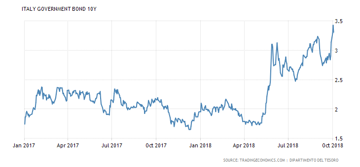
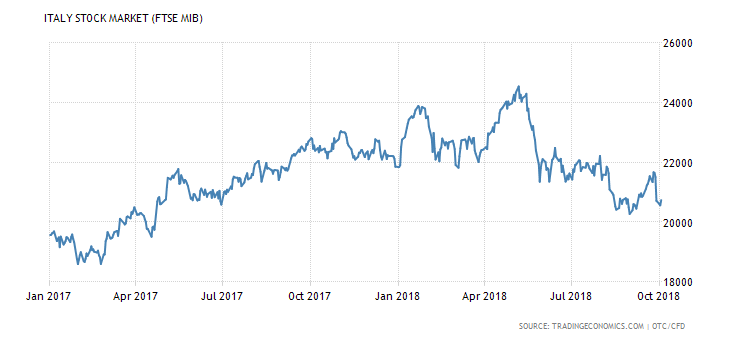
Italian government 10-year bonds have soared from 1.80 percent to 3.30 percent since May 2018. The Italian stock market is down roughly 16 percent since May. Bank shares have been hit even harder.
©David Chapman
©David Chapman
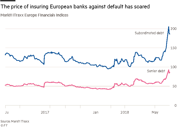
Spreads have widened as well. The spread between Italy’s 10-year bond and Germany’s 10-year bond has jumped from 128 bp to over 280 bp since the beginning of the year. Italian credit default swap spreads have soared over 200 percent in the past year. The chart below shows the sharp increase in insuring European banks against default. Most of the rise has taken place in the past three to six months.
©David Chapman
The potential for an Italian debt crisis shook markets. The euro fell. The U.S. dollar jumped higher, as did gold. The IMF has weighed in that the global economy is at risk of another financial meltdown because of the high levels of debt, not just Italy’s. Furthermore, the world is not prepared if another crisis were to hit. Growth has been mediocre and inequality has grown sharply since 2008. This has helped give rise to populist right-wing governments such as the one that took over in Italy.
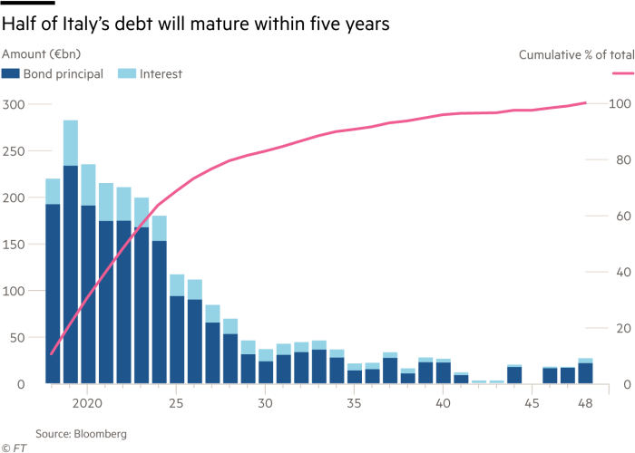
It is quite telling that Italy’s banking and debt crisis can quickly come to the fore. Noteworthy is the fact that half of the Italian debt matures within five years. Rollovers are going to become interesting if this debt crisis persists. And with this hanging over the EU’s markets, it will make it difficult for the ECB to hike interest rates and ease off on an accommodative stance. Italian banks are stuck with a lot of debt and non-performers are estimated at least as 10 percent of total loans. Our chart below shows the maturity schedule of Italian debt.
©David Chapman
After an initial confrontation, the Italian government backed off and optimism rose that Italy and Brussels could work things out. The Italian government indicated they wouldn’t build the debt up as much as it was initially indicated and they would stay within the EU’s 2 percent of GDP level.
So, is the crisis over? Hardly. The Greek crisis unfolded over at least two years. But the Greek crisis was always small compared to the potential for an Italian crisis. The Italian debt crisis will, no doubt, unfold slowly as well as everyone scrambles trying to find a solution to the impossible. Maybe they can inflate their way out this mess. But to do that Italy would most likely have to exit the EU, dump the euro, and revert to the lira. Not likely that’s going to happen any time soon.
Lies, damned lies, and statistics
We guess this was nigh on impossible to resist. President Donald Trump’s well-documented propensity for lying spreads even to his White House Council of Economic Advisors. The council is headed by its chairman, Kevin Hassett. We were struck by a Bloomberg story (“White House Economist Turns to Alternative Data to Boost Trump,” Bloomberg, October 3, 2018) that outlined how Hassett uses “alternative statistics” to boost how well Trump has been performing economically. “Massive” wage growth, an economic surge of historic proportions, record job creation, tax cuts that have paid for themselves and that have triggered massive wage growth are but a few of their wild claims. And, of course, the economy was stagnant until Trump took over from Obama and has since soared.
Not for Hassett, apparently, are the boring economic statistics provided by the Federal Reserve, the Bureau of Labour Statistics (BLS), the Census Bureau, the U.S. Bureau of Economic Analysis (BEA), the Economics & Statistics Administration (ESA), or even the U.S. Treasury and the Congressional Budget Office (CBO). If Kevin were Canadian, he’d be ignoring the Bank of Canada (BofC) and Statistics Canada, amongst others. No matter. Maybe he’s pulled the statistics out of his “arse” for all we know. The article wasn’t clear about where he gets his numbers as Hassett apparently refused to be interviewed.
Hassett is known as a sunny economist with a winning smile. He was the co-author of “Dow 36,000″ in 1999, arguing that stocks were grossly undervalued and on the cusp of a huge rise. Well, 19 years later we are approaching 27,000, so he might eventually be right. In between, he suffered through the high tech/dot.com crash of 2000–2002 and the global financial crisis of 2007–2009. Hassett also told CNN that the economics team of Goldman Sachs at times looks like the Democratic opposition after the firm issued negative reports about Trump’s tariffs and how they might hurt corporate earnings.
Hassett, of course, claims that they are not criticizing traditional economic measures but merely presenting a better way to account for changes in a dynamic economy. Call them alternative facts. It all reminds me of the time we were told not to trust The Economist because it reported only fake insight and opinion on international news, politics, business, finance, and more. There are alternative facts. There are lies, damned lies, and statistics.
Bitcoin watch
©David Chapman
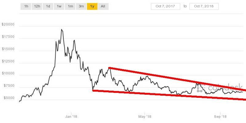
Has Bitcoin become boring? That is the premise of an article that showed up in Bloomberg commenting that Bitcoin had become boring. They have a point. We have even considered whether it is worth our weekly write-up to report on Bitcoin. It was quite fun as Bitcoin screamed to almost $20,000 in December 2017. However, of late, watching Bitcoin is more akin to watching paint dry.
There still remain the weekly ramblings of the bulls, saying that Bitcoin is on the verge of once again taking off into the stratosphere to $50,000 and god knows where. But that train has left the station. Now Bitcoin and the cryptocurrencies are fighting for survival. Once Bitcoin had a market cap of almost $325 billion. Now, the entire cryptocurrency universe has a market cap of only $219 billion. That is actually up about $3 billion from a week ago. Bitcoin alone is slightly more than half that market cap.
The trading range for Bitcoin continues to narrow. This past week the trading range was between $6,400 and $6,700. The range over the past month has only been $732. At the height of crypto-mania, Bitcoin soared 200 percent. Many crypto bulls believe that investors have fled the market because of the prevalence of scams, hacks, and increasing oversight from regulators. That was not supposed to be what cryptos were to be about. It was supposed to be about a method to effectively operate outside the system. That the creators of the crypto craze thought that was going to work long term is rather short-sighted on their part. It is not surprising to learn that a few got very rich, but many lost their entire investment.
With the current craze now being marijuana stocks, our sense is that the same thing will happen there—a few will get rich, but many will lose. Up in smoke!
According to Coin Market Cap, there are now 2,034 cryptos listed. Incredibly, that is up another 31 from the previous week. Obviously, the mania continues in that there is a “sucker born every minute” if they think the latest crypto is going to become the next Bitcoin. Of that total, 405 have no discernible circulating supply. Sixteen of them have a market cap over $1 billion, the same as the previous week. 846 have a market cap under $1,000,000 with, as noted, no discernible circulating supply. 405 of them have no market cap. The number of dead coins listed at Dead Coins finally rose to 929 from 911 the previous week. We’d hazard a guess that 90 percent of the coins listed at Coin Market Cap will eventually join them in the dead and forgotten.
The best we can say about Bitcoin is that it is coiling and in a coiling that usually results in a break one way or the other. A breakout occurs above $6,800. A breakdown happens under $6,300. Above $6,800, a run to resistance at around $7,200 could happen. Under $6,300 and especially under $6,000, a breakdown to $5,000 should occur. We continue to favor the downside.
©David Chapman
The job numbers
It rolls around every month on the first Friday after the end of the month. Yes, the job numbers. Canada’s job numbers usually coincide, but the timing can vary with them sometimes coming out the following week.
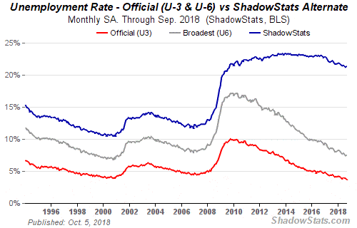
The U.S. September nonfarm payrolls came below expectations at 134,000. The market had expected at least 185,000. The August nonfarm payrolls were revised upwards to 270,000. The unemployment rate (U3) came in at 3.7 percent (3.68 percent), down from 3.9 percent (3.85 percent) in August. For the record, that is the lowest reported unemployment (U3) since December 1969, a period when we were still in university. The U6 unemployment rate (U3 plus short-term discouraged and other marginally attached workers (as well those working part-time that want full-time work) came in at 7.5 percent (7.45 percent), up from 7.4 percent (7.39 percent) in August. The Shadow Stats unemployment (U6 plus discouraged workers defined out of the work force in 1994 plus long-term discouraged workers) also rose to 21.3 percent from 21.2 percent in August.
©David Chapman
Negatively impacting September’s nonfarm payrolls and the U3 unemployment rate was Hurricane Florence. There was an estimated 300,000 away from work due to bad weather. Average hourly earnings were up 0.3 percent in the month, right on expectations. Year-over-year wages were up 2.8 percent vs. 2.9 percent expected. However, in the third quarter wages rose 3.4 percent annually, suggesting that could put upward pressure on inflation and also suggesting that the job market remains tight. At least, it does on paper.
The civilian labor force was up 150,000 in September to 161,926 thousand. Civilian employment jumped 420,000 in the month while the number unemployed fell 270,000. The number employed part-time rose by 142,000. The labor force participation rate remained unchanged at 62.7 percent while the civilian employment-population ratio rose slightly to 60.4 percent from 60.3 percent. All of these numbers can be found at the Federal Reserve.
©David Chapman
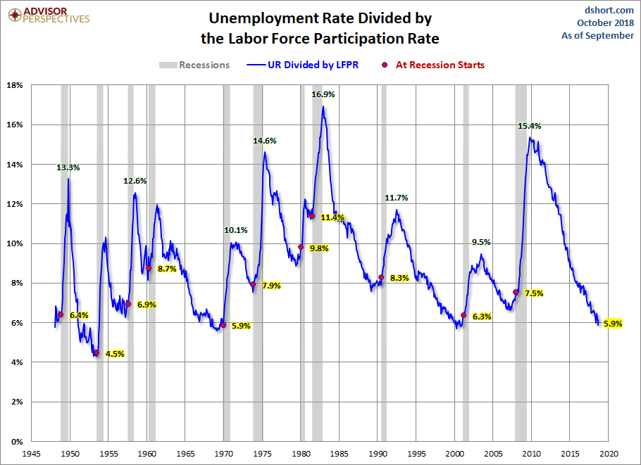
The above chart illustrates the impact of the labor force participation rate. The lower the labor force participation rate, the lower the unemployment rate. All things being equal, the higher the labor force participation rate the higher the unemployment rate. This chart takes the unemployment rate and divides it by the labor force participation. Even by this measurement, unemployment is at or near historical lows since the late 1940s.
The number of those not in the labor force rose by 175,000 to 96,332 thousand in September. The number of retirees stands at 52,603 thousand while those that are disabled stands at 10,254 thousand. The remaining number 33,475 can’t all be single mothers or full-time in school.
None of this should stop the Fed from hiking the Fed rate once again in December. Nor does it stop potentially three more hikes in 2019. Despite the recent hike in hourly wages, the Fed does not see any major problem being pushed by wage increases. The Fed does not see any major risk yet from the trade war with China. It does continue to see advances because of the tax cuts supporting labor demand, but only raising wages marginally.
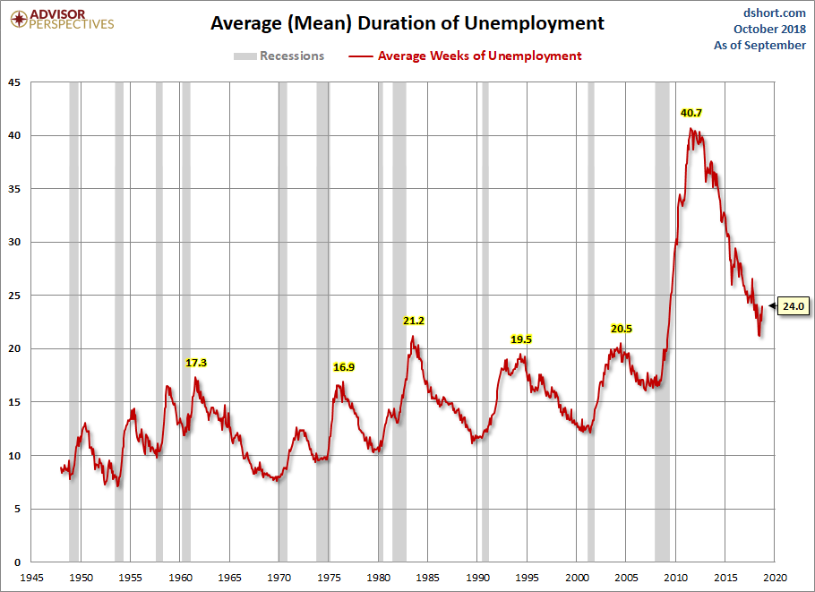
©David Chapman
Above is a rather interesting chart that shows the duration of unemployment or quite simply how long on average are people out of work. The current level is at 24 weeks, a level well above all previous peaks in unemployment dating back to 1950. It is well below the peak level of unemployment of 40.7 weeks at the peak of the 2007–2009 financial crisis. The previous peak was 21.2 weeks at the peak of the 1980–1982 recession. Outsourcing and technology have played a big role in seeing the length of time one is unemployed become longer.
In Canada, employment rose by 63,000. The increase was primarily part-time employment. Over the past year, the Canadian economy has produced 222 thousand jobs. The unemployment rate fell to 5.9 percent from 6.0 percent. Ironically, Ontario added 36,000 jobs after August but saw a drop of roughly 80,000 jobs. It was the third increase in the past four months. The jobs were primarily part-time jobs.
Markets and trends
New highs/lows refer to new 52-week highs/lows. ©David Chapman
©David Chapman
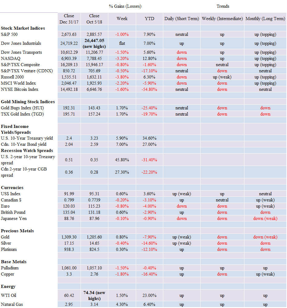
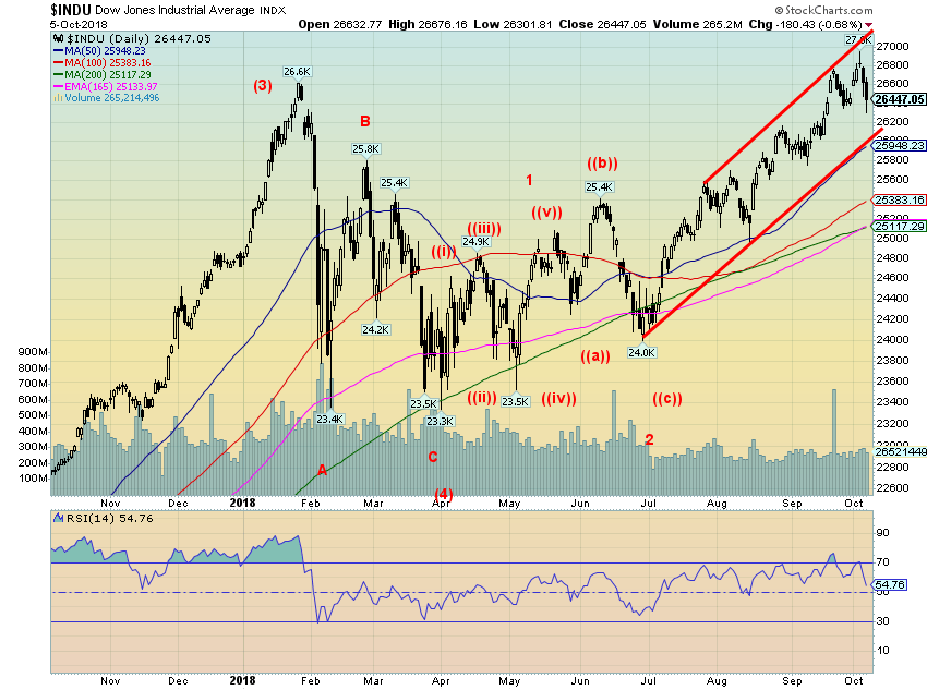
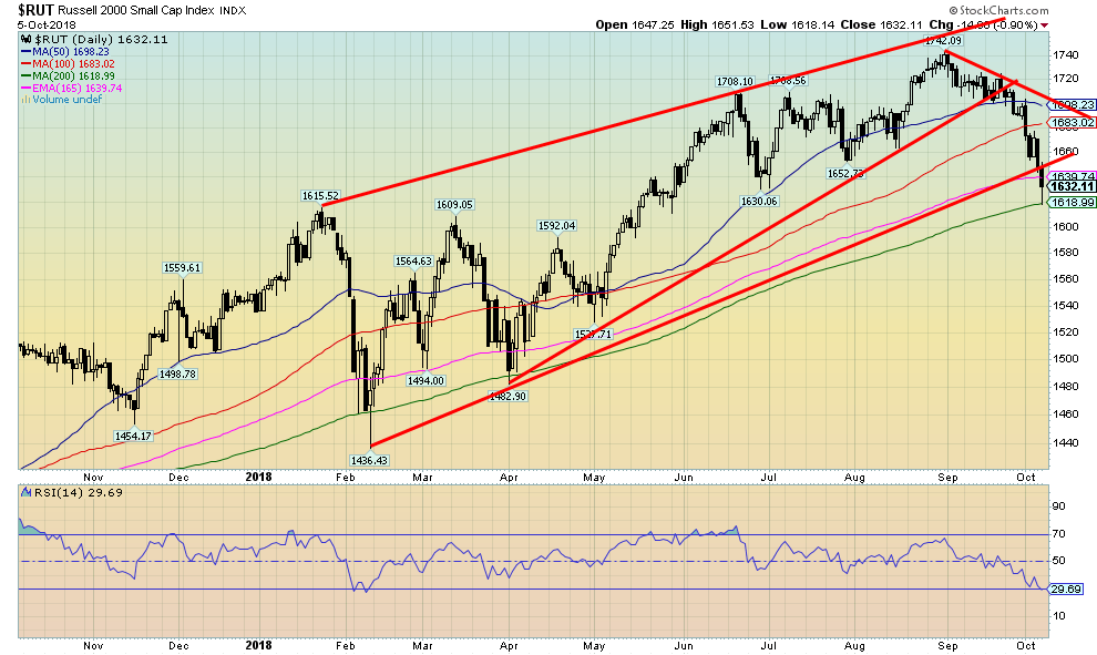
It was a lonely march to the top this past week for the Dow Jones Industrials (DJI). The DJI made a new all-time high this past week at 26,951.81. Nobody rang any bells and no one else joined the DJI for the party. Or maybe everyone is just bored with new all-time highs. Over the past year, there has been a continuous run of them, even as it took a few months before the January 2018 high was finally taken out. The DJI made its new all-time high, then reversed and closed flat on the week. Other indices did not fare as well. The S&P 500 dropped 1 percent, the Dow Jones Transportations (DJT) was off 1.5 percent, while the NASDAQ’s techs took it down 3.2 percent. Small cap stocks were hit as the Russell 2000 fell 3.8 percent.
Elsewhere, the story was much the same. The TSX Composite was down 0.8 percent while the TSX Venture Exchange (CDNX) can’t get out of the way of itself, falling 0.5 percent. Overseas, the London FTSE fell 2.4 percent, the Paris CAC 40 was also off 2.4 percent, while the German DAX dropped 1.1 percent. In Asia, the Tokyo Nikkei Dow (TKN) fell 1.4 percent while the Chinese Shanghai Index was spared because of a week-long national holiday. Can you imagine the U.S. exchanges being closed for an entire week? We can’t either. Although a reminder it wasn’t a holiday that last closed the U.S. markets for a week—it was the events of 9/11.
The DJI did drop below the last low of 26,349 seen on September 26. That suggests to us that there is likely more downside to come. The 50-day MA near 25,950 is sure to offer first good support. However, a break below that level could set up a test of the 200-day MA, currently near 25,100. The markets were shaken this past week by the jump in interest rates but were only mildly disappointed Friday by the job numbers. If the 50-day MA were to hold, then we suspect the markets would regroup and could then make yet another run at new highs. But we couldn’t help but notice that there was a spike in volatility this past week. As well, the NASDAQ broke its 50-day MA and the small cap Russell 2000 fell quickly to its 200-day MA. They may be leading the way.
©David Chapman
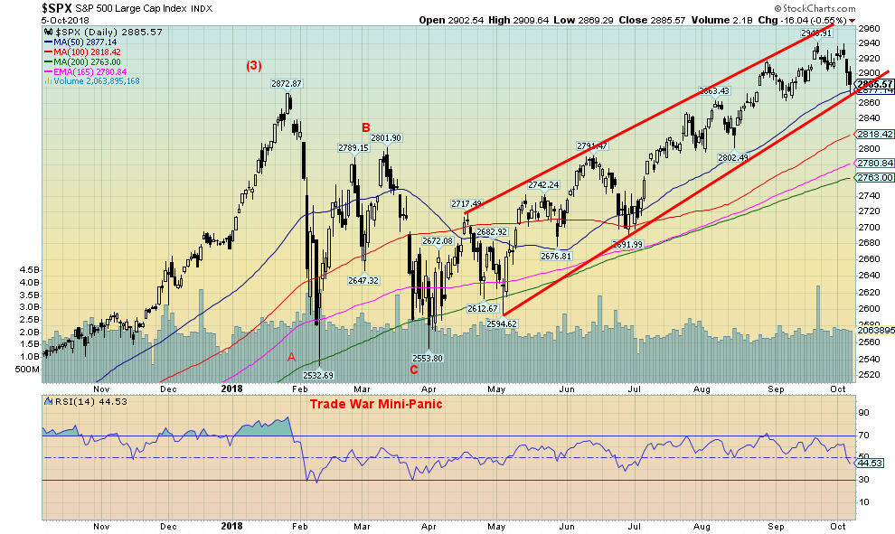
The S&P 500 fell 1 percent this past week and, unlike the DJI, failed to make new highs. The S&P 500 also easily took out its previous daily low at 2,903 seen on September 26, 2018. The question now is: will the S&P 500 fall through the 50-day MA and move lower to test the 200-day MA, currently near 2,760. Because of the failure to make a new high and take out a previous daily low, the S&P 500 is suggesting that it should fall further to potential targets near 2,860. We are not far from that level, but a move to that level would see the 50-day MA fall. Since June, the S&P 500 appears to have been forming a rising wedge triangle. That suggests a decline back to the June 2018 low near 2,690. Only new highs above 2,940 could change even the mildest bear scenario. The jump in volatility suggests to us that there is likely more volatility ahead. That should translate into lower prices. After all, it’s October. The sudden jump in interest rates this past week spooked the markets. Stronger wage growth might suggest that the Fed tightens even more than expected.
©David Chapman
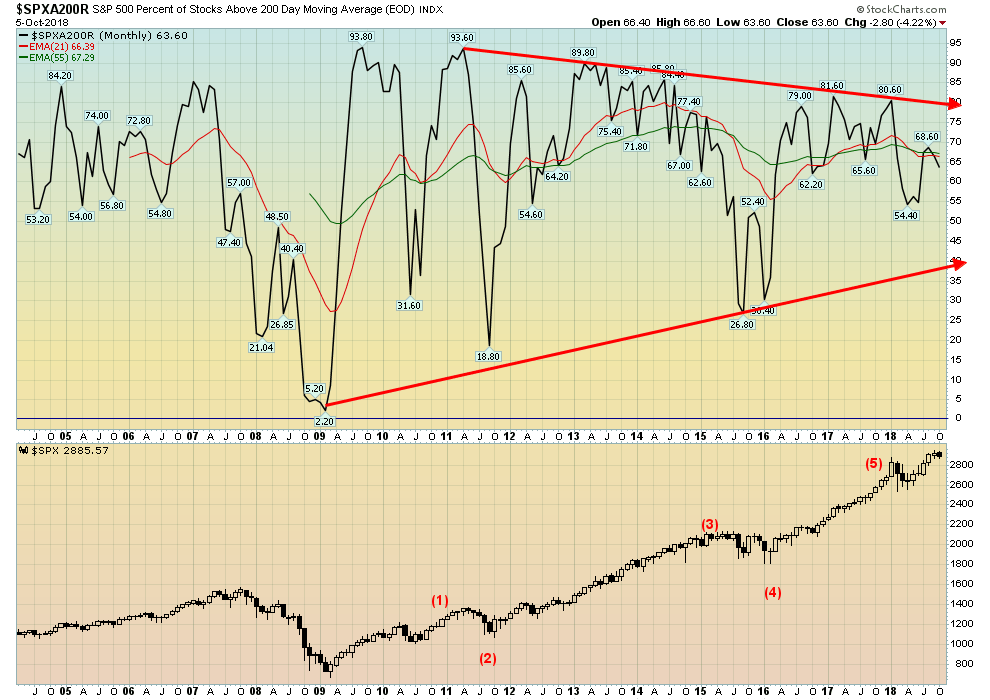
The above chart shows the percentage of stocks trading above their 200-day MA for the S&P 500. It currently stands at 63.6 percent. This ratio has been falling steadily for months since last peaking at 81.6 percent back in February 2017. Yes, that long ago. The drop to 54.4 percent came at or near the low for the February trade war mini-panic. The chart suggests that fewer and fewer S&P 500 stocks are trading above the 200-day MA. One should treat this as a negative omen.
©David Chapman
We noted earlier that the Russell 2000 small cap index had broken down and was now testing its 200-day MA. The Russell 2000 also appears to have broken its uptrend line from the February 2018 trade war mini-panic low. The small cap stocks often lead the market both to the upside and downside. For months we had noted the strong performance of the small cap Russell 2000 vs. the large cap S&P 500 and how it was positive for the markets. Now it is leading the way down. This is another sign that the markets are more likely to go lower rather than higher, at least in the short term.
©David Chapman
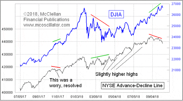
Tom McClellan has some interesting observations. Here, he shows the advance/decline diverging considerably from the DJI. The advance/decline line is sloping down even as the DJI continued climbing. It suggests to us that there are actually more stocks declining than there are advancing or it wouldn’t be pointed down. It is not necessarily fatal for the markets as all it may point out is the obvious—that there is a decline coming. That decline may have started this week.
We have noted in the past that Octobers can be scary for stocks, but it is also a month that sees the end of bears even mini-bears. With all of the political action going on this past week over the Kavanaugh hearings, a potential target date for a low could be the November elections on November 6. It won’t matter who wins as with these things it is “sell the rumor, buy the news.” The markets tend to favor Republicans over Democrats. After all, it was the Republicans that gave the market the massive tax cuts. The subsequent deficits are a problem later, not now.
©David Chapman
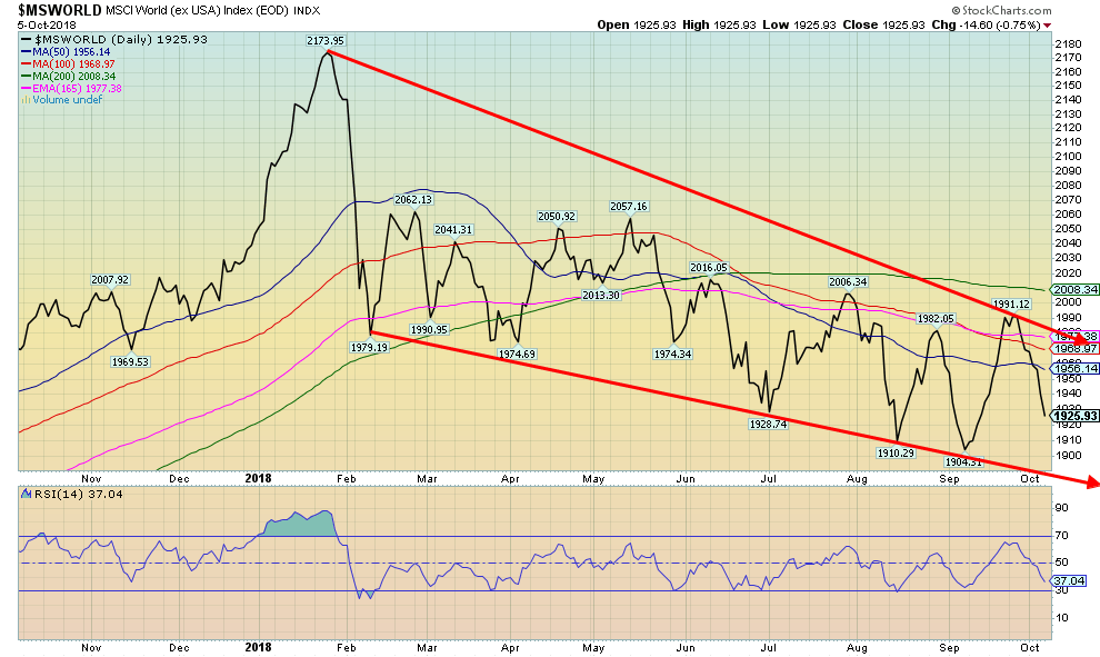
World stocks have been taking a bit of a beating. That’s another sign that the U.S. stock markets can’t defy the rest of the world for too long. Our lead essay noted the troubles in Italy. But Italy is just one potential trouble spot. One could add Turkey, Venezuela, Argentina, and others as other potential trouble spots.
Trump’s trade wars could be feeding into this drop in the foreign stocks as well. But we do note that many foreign stocks are also listed on the NYSE and NASDAQ (i.e., Alibaba, Baidu, Tencent amongst others). Others not necessarily listed on the NYSE or NASDAQ trade in the OTC markets such as the pink sheets just to have a spot to trade their stocks in North American time. Nonetheless, watching these foreign stocks fall does make one wonder when the U.S. stock market follows.
©David Chapman
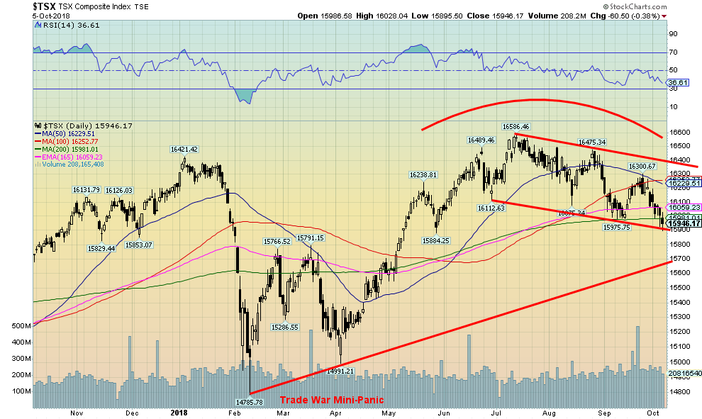
NY may not be falling, but Canada seems to have caught the flu bug along with other foreign markets. The TSX Composite fell 0.8 percent this past week and is now down 1.6 percent for 2018. Materials and Gold have been miserable. Energy did hold the market up, but has of late not caught up to the rise once again in oil prices most likely because Canadian oil is priced a lot lower than WTI oil because of the difficulty in getting it to markets.
Consumer stocks have recently taken a hit and both (Staples and Discretionary) both look toppy. Financials just failed to make new highs and could be rolling over. Health Care and Industrials have been holding up well, but for how much longer if others succumb? Real Estate stocks took a hit this past week as did Income Trusts, Telecommunications, and Utilities.
With bond yields jumping, these sectors are sensitive to rising interest rates. Technology stocks appear to be following their U.S. counterparts which is down. The TSX Composite is currently testing the 200-day MA and a downward sloping trendline. A break below 15,900 could suggest a drop to at least 15,700.
©David Chapman
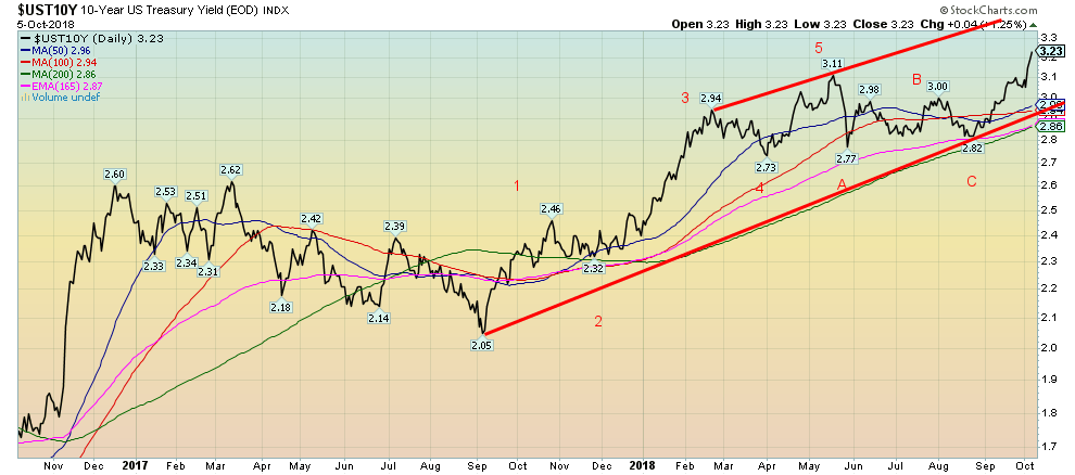
We guess if there were a story this past week, it was the unexpected jump in longer-term bond yields. The 10-year U.S. Treasury note leaped to 3.23 percent from 3.05 percent the previous week. It was one of the worst jumps in months. So, what sparked the bond sell-off (bond prices move inversely to yields)?
Reports that the U.S. economy continues to do better than expected helped. While the job numbers weren’t particularly friendly on Friday, they were written off as being related to Hurricane Florence and therefore temporary.
Earlier in the week, manufacturing indices came in generally somewhat better than expected and while the nonfarm payrolls weren’t great, the unemployment rate fell to an almost 50-year low and the earlier ADP employment report was strong. Fed Chair Jerome Powell stoked the market with his statement that he might move the Fed’s rate past the neutral level (right now it is still below but inching closer to neutral and even with inflation).
Bond traders were also worried about the potential for the China/U.S. trade wars to escalate, particularly after VP Pence laid out Chinese meddling in elections (with no evidence) and Alibaba Chairman Jack Ma expressed concern about how the trade disputes were bad for everyone.
Adding to the tension between the U.S. and China is the drama in the South China Seas where a U.S. warship and a Chinese warship came perilously close to colliding because of their ongoing cat and mouse game (albeit a dangerous one). China is very important to a lot of technology companies and it is no surprise that it was tech stocks that took a beating this past week.
Our new target for the 10-year is 3.45 percent and there are some suggesting a rise to 3.60 percent. The 10-year bond yield is now at its highest level since September 2011 during the EU/Greek crisis. Longer term resistance can be seen up around 3.45 percent/3.50 percent.
Recession watch spread
©David Chapman
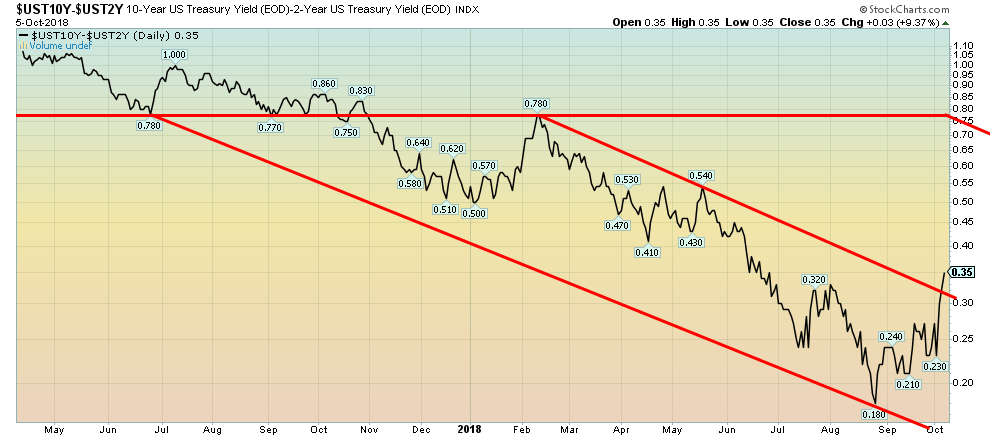
Recession, what recession? This past week, with the jump in the 10-year U.S. Treasury note yield, the spread with the two-year U.S. Treasury note widened to 35 bp up from 24 bp the previous week. We note that nothing goes in a straight line, either up or down. Right now, the 10-year yield is spooked by stronger economic numbers and by Jerome Powell’s comments. But the short rates will catch up as the Fed hikes again in December and are still on record for three more in 2019. Eventually, the bond market will smell recession and suddenly shift in the opposite direction and prices will rise (yields fall) narrowing the spread as the Fed keeps hiking and eventually we will have a negative 2–10 spread. This does not change our view that negative spreads could be seen sometime in 2019.
©David Chapman
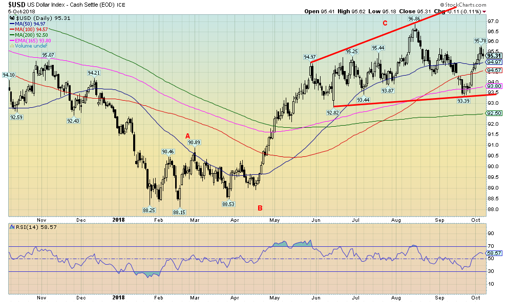
Stronger economic numbers and rising bond yields helped push the US$ Index higher this past week as it gained 0.6 percent. The euro fell 0.8 percent, but the Japanese yen was only off less than 0.1 percent while the pound sterling actually rose 0.6 percent. The Cdn$ fell about 0.2 percent. The US$ Index has now jumped over the 50-day MA and has taken out the high of what we thought might be a left shoulder of a potential head and shoulders pattern at 95.44. The high this past week was at 95.78.
There is potential for the US$ Index to approach the previous high and even take it out. A move above 96.12 would suggest to us that new highs above 96.86 are possible. A move back under 95 would be mildly negative and a move back under 94.50 would tell us we have probably topped and a downtrend would resume.
The rise in the US$ Index is also being helped by the problems with the Italian banks as funds flee the eurozone into the safety of U.S. Treasuries. The worst of that may be over and that could help slow the rise of the US$ Index going forward. Italy’s coming to a truce with the ECB would also help steady the US$ Index and boost the euro. Stronger Chinese economic data would also be negative for the US$. Chinese markets have been closed this past week because of National holidays but they do re-open on Monday.
©David Chapman
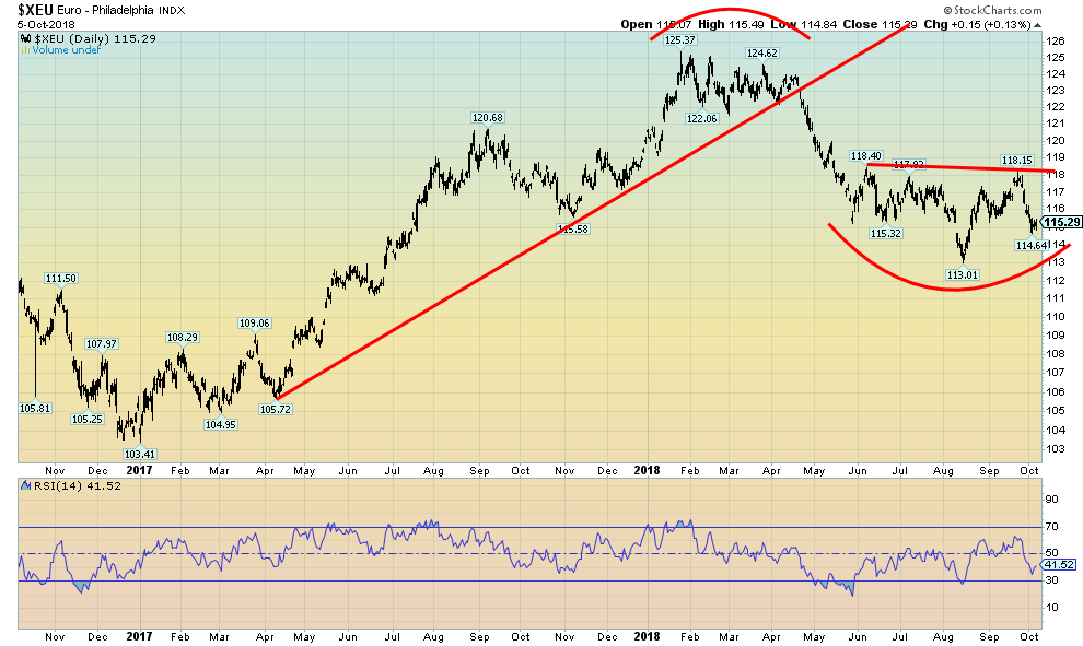
A resolution to the Italian banking crisis, even a temporary truce, could help bolster the euro. We wonder here whether the euro is forming a potential head and shoulders bottom pattern. The neckline is up around 118 and a firm breakout above that level could suggest a move at least 123. It is not a clean H&S pattern as the right shoulder at 114.64 is below the left shoulder of 115.32. The left shoulder is supposed to be lower of the two.
©David Chapman
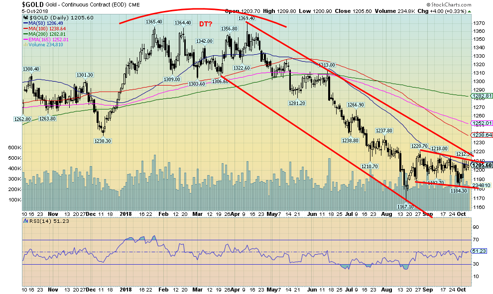
Despite a higher US$ Index, gold rose this past week gaining 0.8 percent. Silver waffled around and was off 0.4 percent on the week. Platinum gained 0.3 percent but palladium fell 1.5 percent while copper was off 1.8 percent. Gold was responding positively to the banking crisis in Italy, but as that crisis eased and some stronger than expected U.S. economic numbers came out coupled with a jump in bond yields, gold steadied and gave up some of its gains.
The high for the week was seen at about $1,213. Once again, gold has failed to break through the $1,210/$1,220 resistance zone. That entire zone is becoming better defined. The 50-day MA is at $1,206 and the downtrend line from the $1,369 April 2018 high comes in around $1,220.
Since rising from $1,167 to $1,220 in August, gold has been generally trading in a slight downward sloping pattern. On one hand, we could view this as positive as it is forming a bull flag, but we have to be aware that a breakdown under $1,185 and especially under $1,180 could set up a better test of the lows and even new lows down to $1,140.
Our cycles still remain somewhat negative possibly into the end of November. That doesn’t stop a rise followed by another pullback into the latter part of November. A firm break over $1,220 could set up a test of $1,250 and even up to the 200-day MA near $1,280. Sentiment remains poor but the commercial (below) remains bullish so we remain optimistic that a significant gold rally could get underway.
Certainly, the conditions are present even if gold is not yet responding. Physical gold remains in demand as Turkey and Poland have been seen as buyers while China and Russia continue to add to their stockpile. But that’s physical gold. Paper gold trades almost 100 times as much as physical and generally controls the market.
©David Chapman
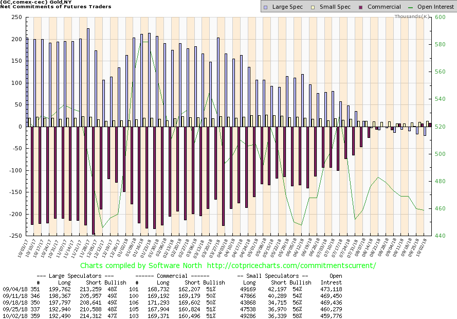
The commercial COT for gold remained at 51 percent this past week, making it five weeks in a row that the commercial COT has been positive, a rarely if ever seen event. Long open interest did rise roughly 1,500 contracts as short open interest fell about 300 ounces (negligible). The large speculators COT fell to 47 percent from 48 percent. Overall the COT remains as bullish as we have ever seen it. Now we just need the accompanying rise.
©David Chapman
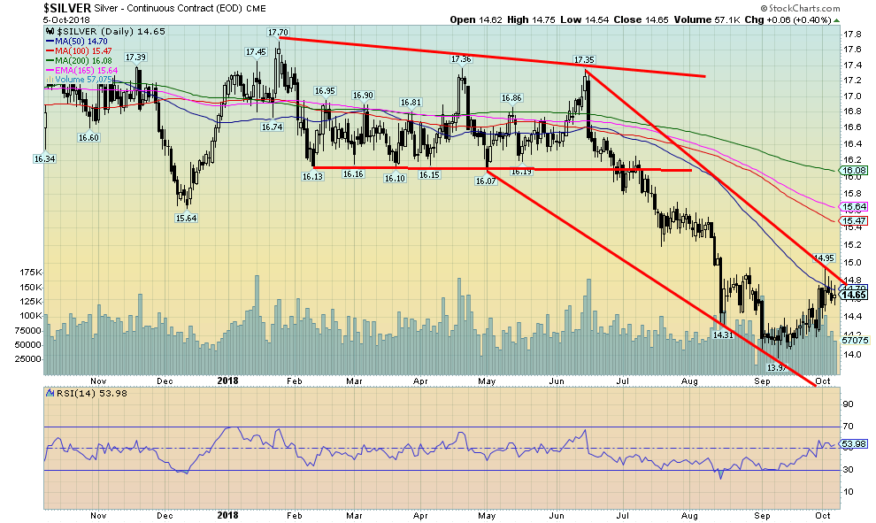
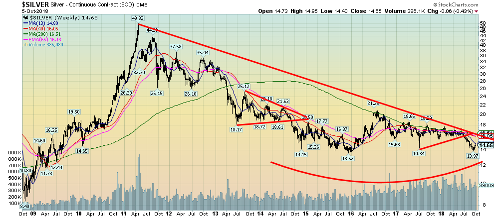
Despite an attempt on overtaking $15 this past week, silver faded and actually closed down on the week by a small 0.4 percent. Silver seemed to run into a bit of resistance at the 50-day MA, currently near $14.70. At one point, it appeared that silver might break above $15, a key resistance point, but it was pushed back. We find it odd considering that September saw a huge jump in the sale of Silver eagles in the U.S., and India has been buying quite a bit of silver. India has doubled its imports of silver in 2018. With silver prices cheap compared to gold, maybe they decided to give silver instead of gold.
The gold/silver ratio at 82.30 it remains historically in the stratosphere. The gold/silver ratio has hung over 70 now for some five years. We have never seen it stay so high for so long. In 2011, the ratio had fallen to 32 when silver soared to near $50 and gold was over $1,900. Failure to break over $15 the first time here is not unusual. We suspect it will happen but silver may need to do some backing and filling first. Support is seen down to around $14.30 and below that down to $14.
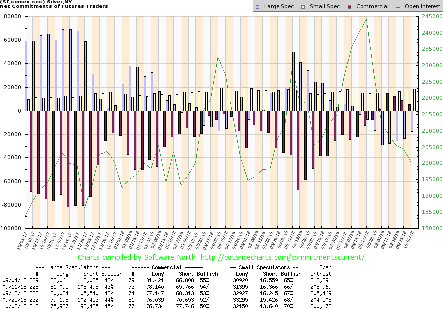
©David Chapman
The silver commercial COT slipped slightly this past week to 50 percent from 52 percent, but remains quite bullish. Long open interest rose slightly by about 700 ounces while short open interest jumped about 7,000 contracts. The large speculators COT rose to 45 percent from 44 percent as they slashed both their long and short open interest. The silver commercial COT has been positive now for six weeks. We continue to view this report as bullish going forward.
©David Chapman
The longer-term chart of silver shows the long decline from the 2011 peak. Thus far, $13.62 remains the low seen in late 2015. We suspect that range from $13.60 to $14 is major long-term support. The four-year MA currently at $16.50 remains long-term resistance. Note how the 2016 rally took silver to the 4-year MA but failed to make any headway over it. Any thoughts of a huge head and shoulders bottom pattern is gone but with the lows at $13.62 and $13.97, we may be forming a long-term double bottom.
We note that in February 1991 and again in February 1993, silver made what appeared to be a long-term double bottom near $3.50. When silver took out the high $4.60 that formed in between silver went on a run to $7.40 by 1998 before succumbing once again and falling back to near $4 by 2001. Silver has been generally down now for seven years, although one could break it up with a long decline from 2011–2015 followed by the strong rebound into 2016 then another decline from 2016 to present.
©David Chapman
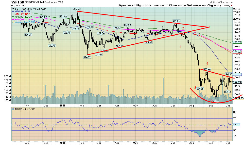
We are trying to be encouraged here by what appears to be a potential head and shoulders bottom forming for the TSX Gold Index (TGD). This past week the TGD rose 1.7 percent as did the Gold Bugs Index (HUI). The rise was a welcome relief. If it is an H&S pattern, then the neckline currently comes in around 160 and could project as a minimum up to 176. We note that there are considerable MA resistance points from 176 to 183. A move to that level would be logical to test these levels following a long decline.
The TGD appears to have fallen in five waves from the triangle that formed between January and July of this year. The triangle suggested a decline to at least 155 for the TGD once it broke under 185. The next target would have been around 136, so with a low thus far of 147 we may have completed the down wave. Naturally, it would be helpful if the 153 level holds. Below that the H&S pattern would be shattered and we could see a test of 147 or even new lows. Overall, we are encouraged but cautiously so. A breakout over 160 and especially over 162 would be helpful.
©David Chapman
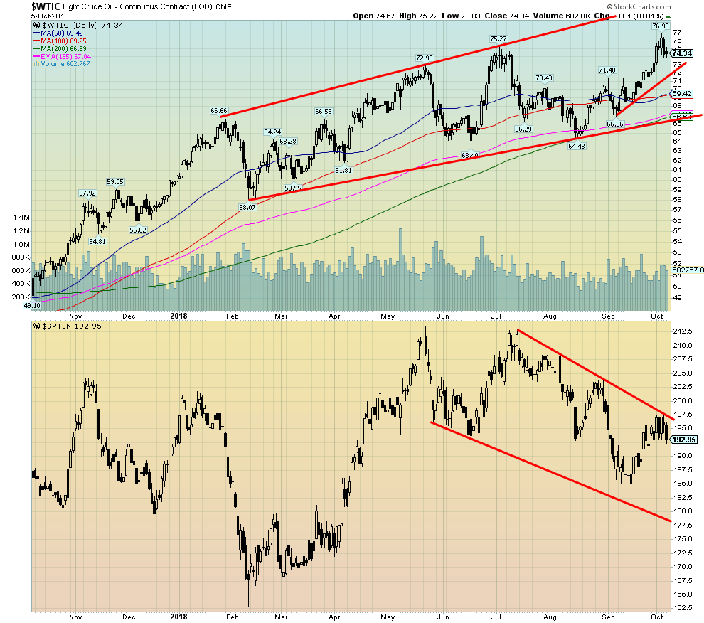
WTI oil prices soared to new 52-week highs this past week, spurred on by fears of supply cutbacks because of U.S. sanctions against Iran. While Saudi Arabia and Russia indicated they might increase some production, it wasn’t a guarantee and it was only partially as both would like to see higher prices.
While U.S. sanctions are no doubt going to happen, we’ve even heard stories that the U.S. is preparing to attack Iran. That is highly unlikely. Simply put, Iran is not Iraq. As well, India has indicated that they have no intention of stopping the purchase of Iranian oil. China also receives Iranian oil as does Japan. Many, including China, Russia, and Germany are looking for ways around U.S. sanctions. It is not something that is standing well with many as EU countries, particularly Germany, had made considerable investments there after the signing of the nuclear treaty.
Only the U.S. has backed out and all of the other signees have pledged to keep working with Iran. That also includes France and the U.K. A clash of wills is sure to follow. But, overall, it is all positive for oil prices. There are many now expecting oil prices to rise to $100. Oil prices have roughly tripled from the $26 low seen in 2016. The TSX Energy Index (TEN) is currently weak because Canadian oil prices are well below WTI oil.
Chart of the week
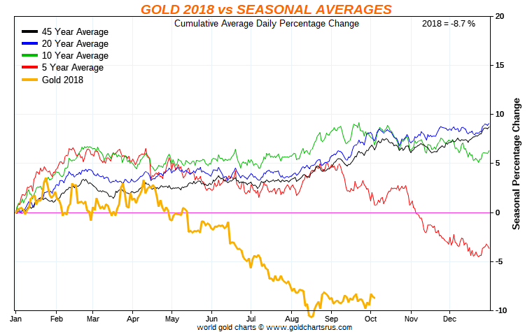
©David Chapman
It has not been a good year for gold. After peaking in April, it has been largely downhill. The August/September bounce has thus far been feeble. The past five years for gold have also been largely downhill. April peaks have largely lined up and a bounce in the August/September has taken place although this year is one of the feeblest.
So, is the glass half full or half empty? The worst may be over, or it may not be. As the last five years have shown, a small peak can be seen in late October, and then it has been largely downhill into December. What the past five years does not do is that those seasonals do not line up well with the 20-year and 45-year average that has tended to see gold rally into year-end and continue into the February/March period of the following year.
So, which is it? We’d love to think that the worst is over. The drop from April to August this year has been stronger than the five-year average. None of this rules out ongoing weakness into November/December. Following a low in August at $1,167 gold has rebounded, but has largely turned sideways over the past several weeks. This has left gold in limbo as we all await a breakout one way or the other.
While the seasonals appear to suggest that the break could be downside the break could just as easily be to the upside even as the weakness continues into November/December with an up followed once again by another downdraft. Naturally, a return to the seasonals that appear to have dominated over the past twenty and forty-five years would be more than welcome. But at the same time, it also points to the fact that the gold buffs may have to be patient for another month or two. Following that, another strong rally should get underway for gold.
(All charts are courtesy of Stock Charts and COT Price Charts.)
(Featured image by DepositPhotos)
__
DISCLAIMER: David Chapman is not a registered advisory service and is not an exempt market dealer (EMD). We do not and cannot give individualized market advice. The information in this article is intended only for informational and educational purposes. It should not be considered a solicitation of an offer or sale of any security. The reader assumes all risk when trading in securities and David Chapman advises consulting a licensed professional financial advisor before proceeding with any trade or idea presented in this article. We share our ideas and opinions for informational and educational purposes only and expect the reader to perform due diligence before considering a position in any security. That includes consulting with your own licensed professional financial advisor.


PayPal’s Slowdown: From Fintech Leader to Low-Growth Dividend Stock
PayPal has shifted from fintech leader to low-growth, value-style stock, losing over 25% in market value and trading at a...


Tilray (TLRY) Falls as Bearish Momentum Persists Despite Marketing Push
Tilray (TLRY) fell 3.32% to $4.44, remaining below key moving averages and signaling continued bearish pressure. Despite a £1 million...


ESG Gap Persists as Firms Struggle to Link Sustainability to Financial Value
KPMG’s Global Survey shows a major gap between ESG awareness and financial integration. While 72% of managers understand sustainability strategies,...


Bitcoin and Ethereum Slide as Market Pressure Builds Amid Strategy Concerns and Layer 2 Disruptions
Bitcoin fell below $60,000 with heavy ETF outflows, pressured by concerns over Strategy’s finances and its STRC stock decline. Ethereum...


AI Venture Builder Launches €600K Crowdfunding Round to Scale Secure AI Solutions
AI Venture Builder, an Italian-British firm developing AI applications and vertical startups, returns to CrowdFundMe with a equity campaign. After...
 |
|
 |  |
 |
|
-

 Crowdfunding1 week ago
Wyrmgold Launches Crowdfunding Campaign for Believe in me! (please)
-

 Crypto5 days ago
XRP Under Pressure Amid Macro Forces, Fed Policy, and Regulatory Shifts
-

 Markets2 weeks ago
Rising Inflation, Fed Uncertainty, and Market Excess Amid War and SpaceX Mania
-

 Markets2 days ago
Commodity Markets Pause as Oil Falls, Metals Correct, and Grains Show Mixed Signals
You must be logged in to post a comment Login