Featured
Mortgage rates are increasing, but what does this mean for the market?
Real estate is in a bull market and mortgage rates have increased 4.72 percent, a level not seen since May 2011.

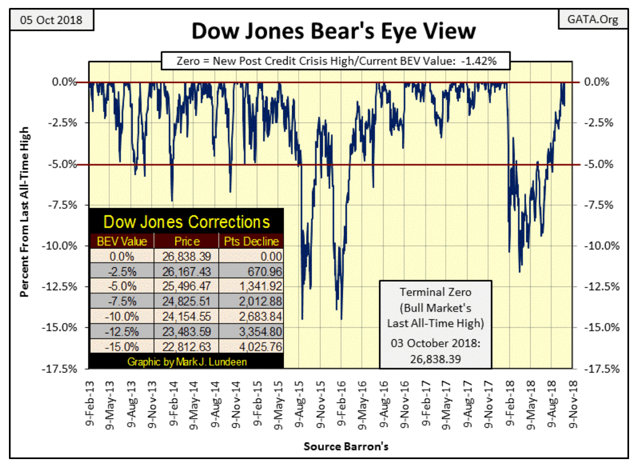
Last week, the Dow Jones on Tuesday and Wednesday closed at all-time highs. That makes four new BEV Zeros in the BEV chart below in the past 10 trading days, and that’s something I can’t complain about.
© Mark Lundeen
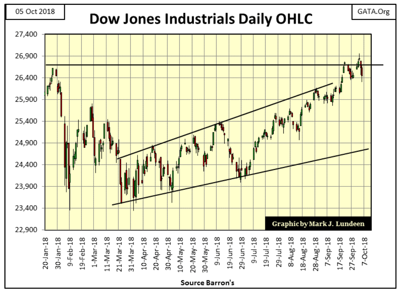
If you compare the four all-time highs of last January in the daily bar chart below, with the four we’ve seen since September 19, the advance of last January appears a little more enthusiastic. But after January 26, it’s as if someone turned off a switch on the market’s advance; the Dow Jones began an eight-month correction. Note the Dow Jones days of extreme volatility; 2 percent days / big daily bars. From February to early April, the stock market saw seven of them, after which the stock market began its recovery.
© Mark Lundeen
The Dow Jones hasn’t seen any additional 2 percent days since April 5, which is good as days of extreme volatility in the Dow Jones are typically bearish market events. Still, we should consider the possibility that the current series of new all-time highs may not lead to large gains in the market in the weeks and months to come but rather prove to be the beginnings of a historic double top in the Dow Jones.
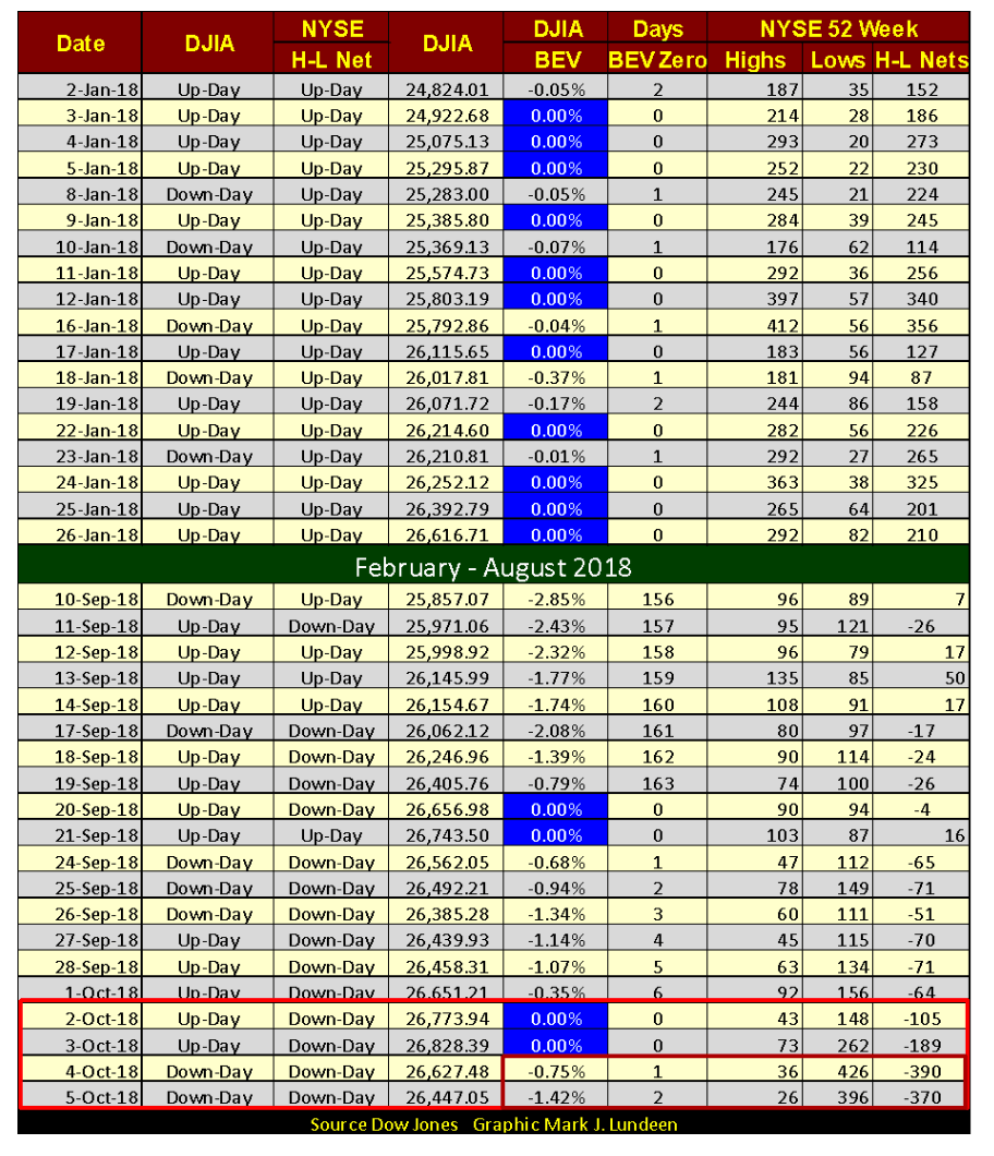
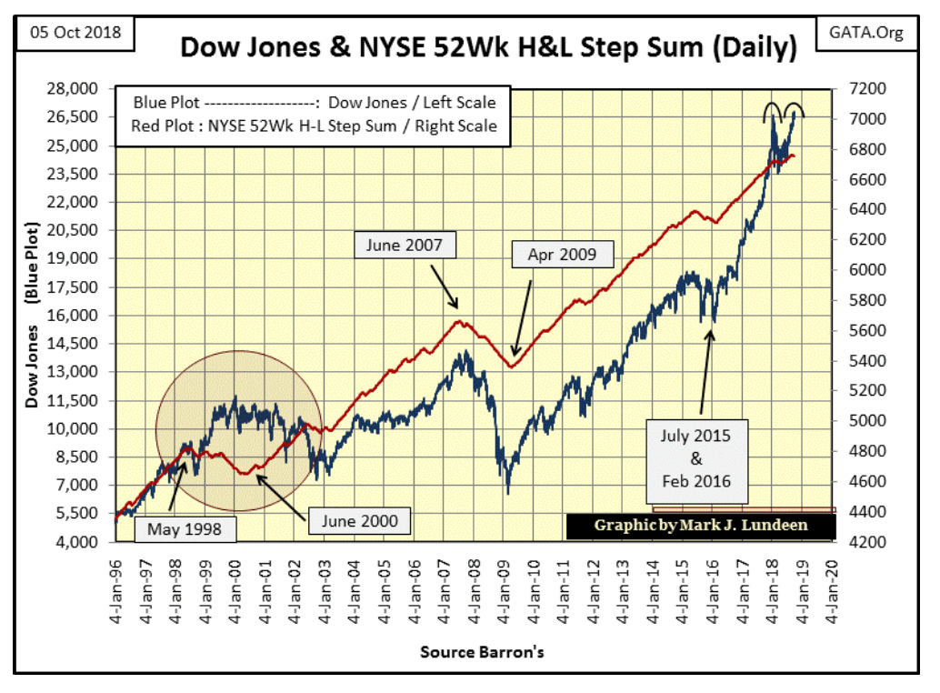
One factor leading me to consider the current Dow Jones advance to new all-time highs to be a transient advance into the record-high territory is at the NYSE; we see a disturbing trend in 52Wk Lows developing in the table below. Over the past four trading days, NYSE 52Wk Lows have spiked. So even if the Dow Jones itself is making new 52Wk Highs, an increasing number of shares trading at the NYSE are doing just the opposite.
© Mark Lundeen
As I’ve pointed out many times, our current advance began at the bottom of the credit crisis bear market on 09 March 2009 (Dow @ 6,547), 9.5 years ago. The Dow Jones has since advanced 20,281 points or 309 percent. That’s huge, but no advance goes on forever. As interest rates and bond yields have increased in the past two years, they’re approaching an unknown threshold that when crossed will have a dramatic and negative effect on the stock market.
© Mark Lundeen
No one really knows what the market will do next; however, at times like this, anticipating what’s possible is good sport and entirely appropriate. Look at the market action on October 3 and 4 in the NYSE 52Wk High & Low table above (Small Red Box). Thursday, the Dow Jones closed down 0.75 percent from its all-time high of the day before with NYSE 52Wk Highs seeing their lowest levels in a month as 52Wk Lows soared to over 400. Come Friday, much the same happened, with both days seeing a NYSE 52Wk H-L Net of more than -300. We haven’t seen a -300 NYSE 52Wk Net since last February.
It’s as if there’s a struggle between the Dow Jones and NYSE 52Wk Highs and Lows. Either the Dow Jones pulls those 52Wk Lows up, or the 52Wk Lows will drag the Dow Jones Down.
Next week could be interesting. If we see a -2 percent day for the Dow Jones with NYSE 52Wk Lows expanding to say 500 or more; that could be it for the 9.5-year Post Credit-Crisis Market Advance. But as always, keep in mind that today’s market values are managed, and it will be that way until the “policy makers” lose control over the market.
And how will we know when that happens? I expect we’ll then see the price of gold and silver break loose and roar upwards towards new all-time highs, not as they are now stuck at #19 & 24 in the table below. Look at the XAU at #27. This gold mining index began 39 years ago in January 1979 at a base of 100. At the time, the Dow Jones traded around 850. Today, four decades later, the Dow Jones is trading over 26,000 as the XAU has declined to 84.65.
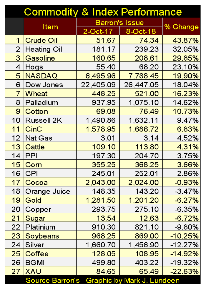
© Mark Lundeen
So what with that? The old saying that gold, silver and their miners benefit from inflation is all wrong. What benefits from monetary inflation flowing from the Federal Reserve System are the financial asset and real estate valuations. The entire Federal Reserve System does everything possible to keep their flow of monetary inflation, and the general public’s investment funds as far away from precious metals assets as they can.
When the FOMC “injects liquidity” into the markets, it’s their euphemism that they’ve created billions of dollars from nothing to purchase bonds and mortgages in the open market to support debt prices and keep yields within “the parameters set by policy.”
This does wonders for the stock market too. After all, the FOMC stands for the Federal Reserve’s Open Market Committee. The only thing the FOMC does in the gold and silver markets is to flood their futures markets with tons of digital gold and silver, metals that don’t exist to crush any bullish sentiment that may have accumulated.
In a rigged market scheme such as ours, we shouldn’t be surprised that as stocks, bonds and real estate soar ever higher, gold, silver and their miners (#19, 24, 26 & 27 in the table above) haven’t done much for their owners.
What drives precious metal asset valuations higher is deflation in the previously inflated financial assets. When inflationary bubbles in the markets begin leaking “liquidity,” flight capital then seeks shelter from the storm. As asset valuations traded on Wall Street deflate, and counter-party risks become apparent to the horror of all, gold and silver having no counter-party risks become very attractive to wealth fleeing deflation in the stock, bond and real estate markets.
Like a barnacle on the side of a whale, the precious metals markets are tiny markets compared to the many tens-of-trillions of dollars that trade daily on Wall Street. How many trillions of dollars, euros, yen, and yuan fleeing deflation in the global stock and bond markets will it take to send the old monetary metals (and their miners: #26 & 27 in the table above) to levels that are simply unbelievable today?
I expect in the next 12 months we are all going to see this come to pass. But first, we’ll see the stock and bond markets deflating, and that is why I find what is happening with NYSE 52Wk Lows in the past few weeks so fascinating. Seeing NYSE 52Wk Lows overwhelming 52Wk Highs (Red Plot below trending lower) is a sure sign of money exiting the stock market.
© Mark Lundeen
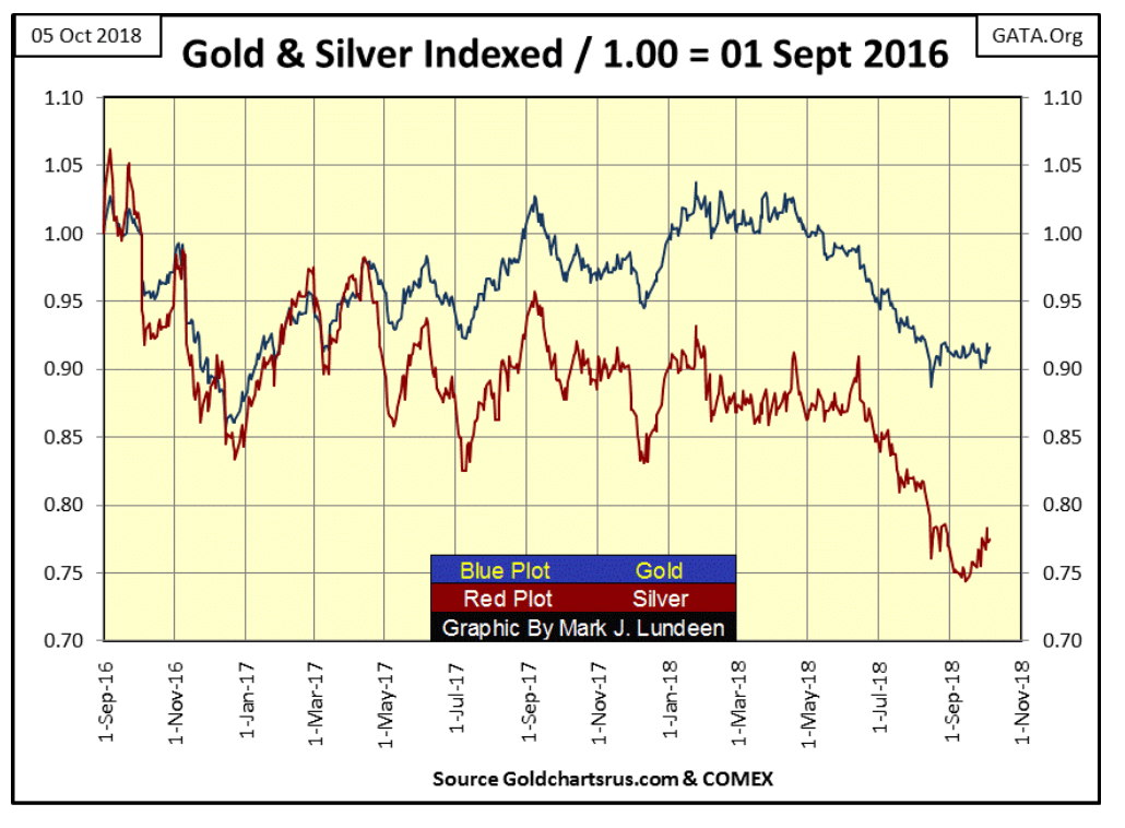
Next is a chart plotting the indexed values of gold and silver with 01 Sept 2016 = 1.00. Comparing these two markets with indexed values allows us to see them as if they were in a horse race. In early October, neither metal appears to be breaking down. Should they begin to rise in the weeks to come, I wouldn’t be surprised if their rising valuations were coincidental with rising NYSE 52Wk Lows. That’s not a prediction on my part, just something I’ll be watching.
© Mark Lundeen
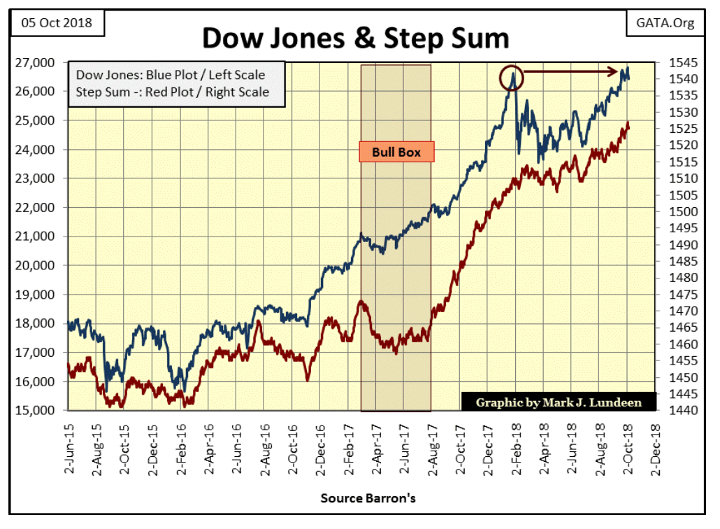
Here’s the step sum chart for the Dow Jones. At the close of this week, nothing alarming to be seen in it as the Dow Jones and its step sum trends upwards in synch with each other. But since September 19, the Dow Jones has seen four new all-time highs. Coming out of an eight-month correction one could expect those four new all-time highs would have taken the Dow Jones a bit more above its January 2018 highs (Red Circle) than they have. Maybe the Dow Jones is forming a double top.
© Mark Lundeen
As for gold and its step sum, nothing much has changed in the past few weeks. I’m just crossing my fingers and hope gold and its step sum plots below break out to higher levels.
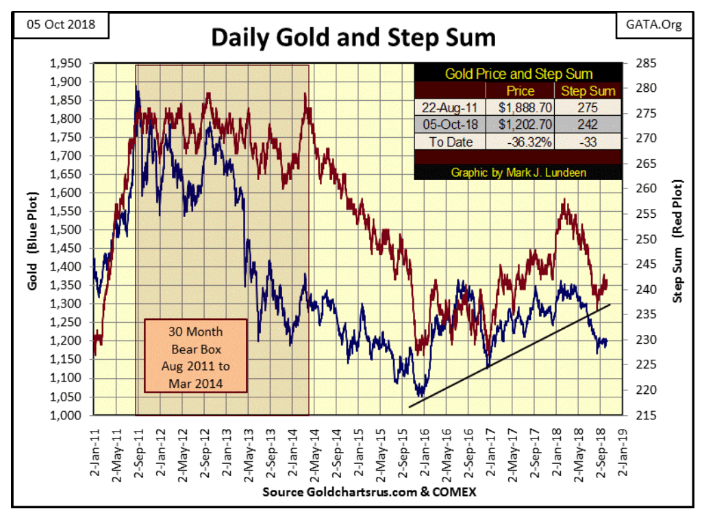
© Mark Lundeen
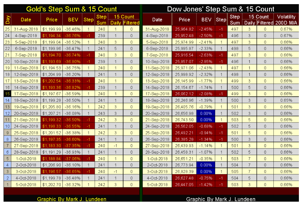
Gold and its step sum below have done nothing in the past month. After 25 trading sessions, gold is up only $2.71 as its step sum advanced by 2. Market action for the Dow Jones was a lot better. From August 31 to October 3 (Wednesday), the Dow Jones itself advanced 864 points as its step sum increased by a net of eight advancing days (497 to 505).
© Mark Lundeen
If it wasn’t for the expansion in NYSE 52Wk Lows we’ve seen in the past few weeks, it wouldn’t be hard for me to be much more positive on the stock market. What we’re seeing in the Dow Jones’ table above is good market action. But going forward to the coming weeks, I really do believe there’s a war going on between the rising Dow Jones and the swelling numbers of NYSE 52Wk Lows. Either the rising Dow Jones will reduce the number of those 52Wk Lows, or an increasing volume of 52Wk Lows will pull the Dow Jones down.
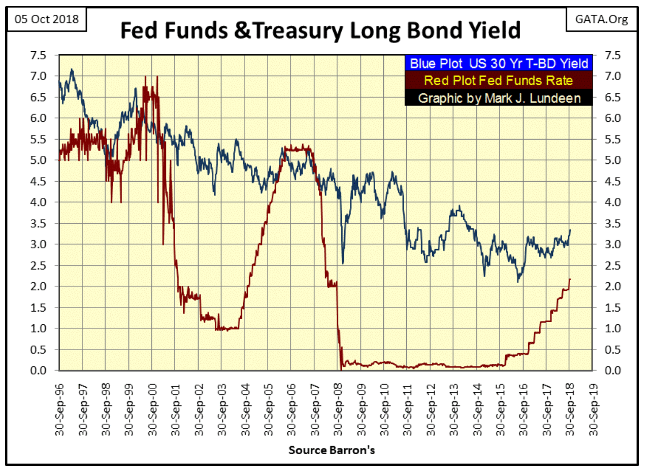
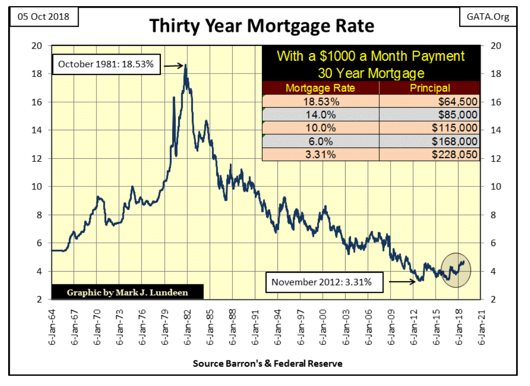
Another item I’m following, that should it continue will prove very bearish for the stock market—rising mortgage rates. They’ve increased to 4.72 percent last week, taking them to levels not seen since May 2011 (chart below).
Rising mortgage rates are not a constructive trend for a continuation of the current bull market in real estate. Rising rates can’t be as real estate as no other market where the public is widely involved in is as heavily leveraged. Today, much of the residential real estate market is more leveraged than the stock market was in 1929. During the 1920s, the public was invited to purchase shares trading on the NYSE with only 10 percent down, with the other 90 percent of the purchase being credit provided by the banking system. How many homes sales today see homeowners offering a 10 percent down payment at closing? Not many!
© Mark Lundeen
Home prices have been rising since World War Two. This was partially due to the severe deflation real estate experienced in the wake of Roaring 1920s. It wasn’t just the stock market that saw an inflationary boom in the 1920s, followed by a horrendous deflation in valuations in the 1930s. After the war, GIs returning home needed housing to start families. The low home prices seen before the war didn’t last long, not with “liquidity” flowing from the Federal Reserve System flooding into real estate.
The following quote from Barron’s in 1954 is insightful.
“The Housing Act of 1954 will turn out to be one of the worst pieces of inflationary legislation ever placed on the statute- books. For the first time, non- veterans will be able to buy a $10,000 house with a down payment of $500, the Federal Housing Administration insuring a 30-year mortgage of $9,500 on such a house. This is a triumph of the Nation’s Home Builder’s Association and a defeat of common sense. Unfortunately, there is no reason to hope that mortgage money lenders will resist the practical consequences of this legislative monstrosity. Throughout the’ first half of’ 1954, most of them have been eager to make VA mortgage loans to home-buyers at no down payment at all.”—Barron’s The World At Work, 05 July 1954, Page 7.
The old gang at Barron’s from decades ago once again proved to be correct. How many of those $10,000 houses of 1954 have seen their valuations inflated to something over $200,000 in 2018? Depending upon location, I’d say most of them unless they’re located within the city limits of Detroit, Baltimore, or some other Democratic Party stronghold.
Returning to the mortgage rate chart above, climbing rates from 1964 to 1981 weren’t disastrous for the housing market; not with the baby-boomers entering the housing market. However, the extremes in the rates seen from 1978 to 1981 didn’t foster a bull market in housing valuations either. What the extreme rates of the early 1980s did (as they declined over the next three decades) was to set up an epic blow-off top to a bubble in real estate valuations that began in 1945.
When prospective “homeowners” discuss a deal with their real-estate agent, the asking price for their home is typically foremost on their minds. But veterans in the financial industry don’t see real-estate deals simply in terms of price. From their perspective, they want to know the likelihood of the prospective “homeowners” ability to service the 360 monthly payments required for the 30-year term of the mortgage.
The Saving & Loan Banks (aka S&Ls) were created in the 1930s during FDR’s New Deal to fund home ownership. However, their business model of using demand deposits from wage earners and retirees to fund 30-year mortgages proved unworkable as interest rates increased in the following decades. By 1980, most of these institutions were either bailed out and closed, or got out of the mortgage business.
Funding “homeownership” is always popular with Washington’s political class, as it is with voters. So as S&Ls and their use of demand deposits to fund mortgage creation were phased out of the mortgage market, a new mortgage infrastructure was created that was funded by “liquidity” flowing from the Federal Reserve.
For the banking system, with the dollar no longer pegged to a gold standard, the only difference between a cashier’s check for $100,000 or a $1,000,000 at a mortgage closing is simply a single zero on the check. However, for prospective “homeowners” who must service their mortgage with their income, the amount of dollars the banking system is willing to lend them will impact them for the rest of their lives.
Think of it this way. With the dollar free from the restraints of the $35 gold peg (officially terminated in August 1971), the Federal Reserve System was allowed to create as many dollars as it wished, at no cost to itself. But such dollars are worthless unless the banking system the Federal Reserve controls lends them to economic entities, such as companies whose shares trade on Wall Street and individuals like you or me. The relationship between the banking system and its underlying economy is basically parasitic. It’s the wealth creators in the economy that gives the Federal Reserve’s fiat dollars value, while in exchange they only offer us debt to burden ourselves.
It’s this coupling of inflation to wealth creation via the debt process that gives these dollars’ value. In the case of a 30-year mortgage, it’s the homeowners’ commitment to volunteer 30 years of their lives to service the 320 monthly payments that make these dollars valuable.
So, it’s the ability of the prospective “homeowner(s)” to service a mortgage contract for the next 30 years that has always been the limiting factor in rising valuations in the housing market. The banking system can’t “inject” more “liquidity” into the real estate market than the “homeowners” can reasonably service by their income. That was true in 1954 for a house selling for $10,000, or in 2018 when the same house may find the banking system willing to write a check for a $250,000 mortgage. To do so risks a collapse in the credit system and widespread deflation in real estate market valuations, as happened in the 1930s and almost did in 2008-09.
In the mortgage rate chart above I’ve placed a table listing the principle a 30 year-mortgage contract at a $ 1,000-month payment could fund at the given rates listed. The tables below have taken the high and low rates from 1981 to today with additional and very interesting information.
I expect most people would believe the $64,500 mortgage from 1981 with its 18.53 percent rate would be a less expensive mortgage than the $228,050 mortgage of 2016 with its rate of 3.31 percent. But in fact both 30-year mortgages cost their “homeowners” the same:
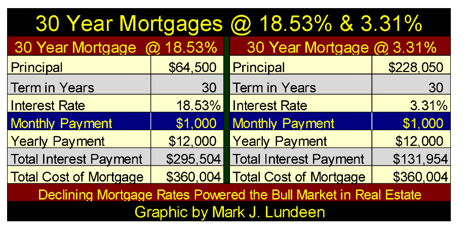
$1,000 a month, for 360 months = $360,000 © Mark Lundeen
The difference between these two mortgages is their Total Interest Payments. The 18.53 percent mortgage cost the “homeowners” $295,504 in interest for their $64,500 mortgage, while the 3.31 percent mortgage cost its “homeowners” only $131,954 for their $228,050 mortgage.
Assuming these two mortgages were written for the same house, the 18.53 percent mortgage in 1981, and the 3.31 percent mortgage 31 years later in 2012, the cost of homeownership for both “homeowners” were identical: $360,004. The increase in market value from $64,500 to $228,050 was only a function of declining interest rates in an amortization table.
I realize the above model is just that—a simplistic model missing many of the real world variables real-estate transactions must deal with. But with all its faults, it makes my case that the decline in mortgage rates from 1981 to 2012 inflated real estate valuations, just as rising mortgage rates will result in real-estate valuation deflation.
You do realize the world isn’t your best friend? Case in point is the 30-, 20- and 15-year mortgage models in the table below. Exactly who decided a 30-year term (far left table) for mortgages was the optimum? For homeowners, it sure wasn’t anyone who loved them. So I’m assuming the 30-year term was settled on by the bankers because it was best for them, not their clients.
Below we see three $300,000 mortgages at a 5 percent rate with terms of 30, 20 and 15 years. So what factor determines the various terms in these mortgages? The monthly payment does.
The 20-year mortgage’s monthly payment is $370 (23 percent) more than the 30-year mortgage. But note that extra $370 a month ($12.33 a day) pays off the $300,000 principle 10 years earlier and saves the “homeowner” over $100,000 in interest payments to the bank.
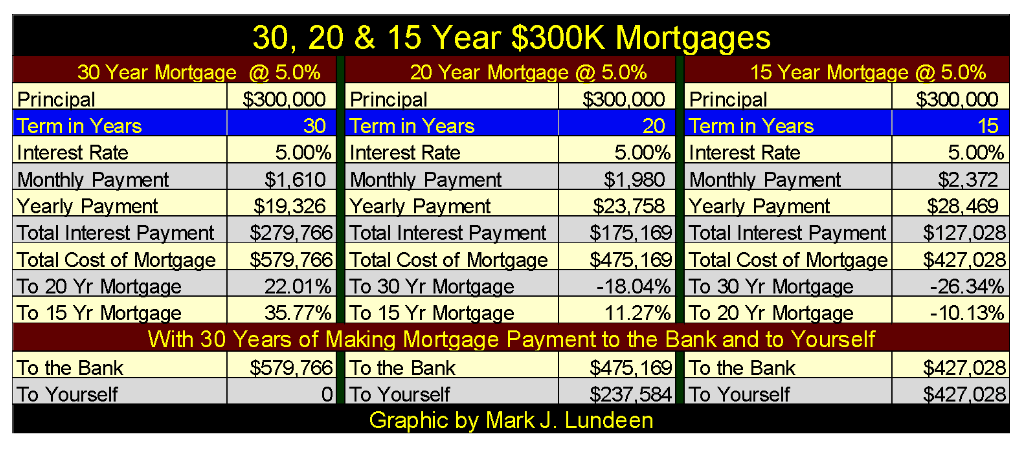
© Mark Lundeen
This is no small thing for someone assuming a long-term debt obligation. For someone 30 years old, a 30-year mortgage will obligate them to service their mortgage until they are 60 years old, an age when people are thinking of filing for Social Security. A 20-year mortgage would liberate the “homeowner” of their obligations to the banking system when they are only 50 years old. If you don’t understand how important that is; you must be under 40.
(Featured image by DepositPhotos)
—
DISCLAIMER: This article expresses my own ideas and opinions. Any information I have shared are from sources that I believe to be reliable and accurate. I did not receive any financial compensation for writing this post, nor do I own any shares in any company I’ve mentioned. I encourage any reader to do their own diligent research first before making any investment decisions.


Bitcoin Stalls Near $60K as Strategy Moves, ETFs Outflow, and EU MiCA Rules Take Effect
Bitcoin hovers near $60,000 with ETF outflows, while Strategy boosts reserves, sells BTC, and raises dividends to reassure investors. Ethereum...


Cannabis Dominates Global Drug Use: Trends, Risks, and Shifting Markets
Cannabis remains the world’s most widely used illicit drug, with 256 million users in 2024, surpassing all others combined. Growth...


Italy Approves First Hydrogen-Powered Train for National Rail Network
ANSFISA has approved Italy’s first hydrogen-powered train, the Alstom HMU214, for use on the Brescia–Iseo–Edolo line. Capable of 140 km/h,...


Cotton Market Weakness Persists Despite Brief Rebound
Cotton prices fell to new lows last week before a modest rebound. USDA data shows crop conditions remain worse than...


Eli Lilly Hits $1 Trillion Valuation Amid Strong Bullish Momentum
Eli Lilly stock hit a record high, surpassing $1 trillion market value after strong product demand. Shares surged over 7%,...
 |
|
 |  |
 |
|
-

 Impact Investing2 weeks ago
AI Adoption in Italian Retail Stalls Despite Strong Experimentation
-
 Cannabis14 hours ago
Cannabis Dominates Global Drug Use: Trends, Risks, and Shifting Markets
-

 Impact Investing7 days ago
EU Weighs More Free Emission Permits in ETS Review to Boost Industry Competitiveness
-

 Impact Investing2 weeks ago
SBTi Net-Zero Standard 2.0 Enhances Corporate Climate Action
You must be logged in to post a comment Login