Featured
Secular bulls, secular bears. What are we in?
This week, we take a look at secular bull and bear markets for the last two centuries including Kondratieff waves. Just because we have had what many are calling a record bull market, it doesn’t mean that it will continue forever. Gains were eked out this past week—but markets are virtually where they were a month ago. The U.S. dollar fell but gold has gained no traction. What does that tell us?

“One of the funny things about the stock market is that every time one person buys, another sells, and both think they are astute.”—William Feather, American publisher, and author, The Business of Life, 1889–1981
“Anybody who plays the stock market, not as an insider is like a man buying cows in the moonlight.” —Daniel Drew, American businessman, steamship & railroad developer and financier, 1797–1879
“Big money is made in the stock market by being on the right side of the major moves. The idea is to get in harmony with the market. It’s suicidal to fight trends. They have a higher probability of continuing than not.” —Martin Zweig, American stock investor, investment advisor, financial analyst, 1942–2013
“Those who cannot remember the past are condemned to repeat it.” —George Santayana, philosopher, essayist, poet, novelist, 1863–1952
Bull markets; bear markets. One seems to follow the other. Just because we have had what many are calling a record bull market, it doesn’t mean that it will continue forever. On the other hand, if this is a secular bull market as appears to be the case, then it could still last for a few more years.
Corrections within the context of a secular bull market are quite normal and since this one got underway back in March 2009, we have been through three: 2011, 2015/2016, and 2018 with a range of 14.5% to 19.5%. The secular bull market of 1949–1966 saw 5 corrections ranging from 13% to 27%.
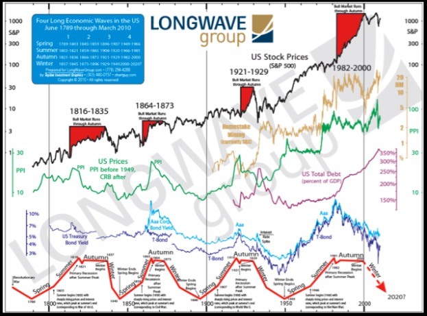
Nicholas Kondratieff (1892–1938) was a Russian economist who studied capitalist economies and discovered, or at least theorized, that capitalist economies went through long cycles that lasted 40 to 60 years. Some believe that those cycles now last even longer.
His cycles became known as “Kondratieff waves,” “super-cycles,” or “K-waves.” His waves are characterized by long periods of evolution and self-correction, brought about by technological innovation that results in long periods of prosperity.
His theories, however, are/were not widely accepted by economists as it was felt they did not conform to accepted orthodoxy. Initially, Kondratieff was praised in Russia, but when he said that these cycles also apply to communist societies he was banished to the Siberian Gulag where he was executed by firing squad in 1938. A high price to pay to say that the “Emperor had no clothes.”
Trying to figure out when one wave ends and another one begins is not necessarily the easiest. Major high and lows in stock markets have often been shown to be the end of one cycle and the beginning of another. Many are in hindsight.
The chart below from the Long Wave Group of analyst Ian Gordon shows the Kondratieff cycles dating from the beginning of stock market trading in the U.S. during the late 18th century. Other analysts have gone back even further and discovered long waves dating from Greek and Roman times. While this ends in 2010 (we have not seen an updated one), the concept remains the same.
Given what has taken place since the major stock market low of March 2009, an argument could be made that the most recent Kondratieff winter bottomed then. The world was saved from another Great Depression with the biggest financial bailout in history through record low-interest rates and massive injections of liquidity from the world’s central banks that continue into today.
The highs of 2007 were firmly taken out in 2013, suggesting that we were embarking on a new secular bull market. Could it be the spring wave of the next Kondratieff cycle? Given that the last one started in 1949 if it ended in 2009 as we surmise it was exactly 60 years, fitting rather nicely with Kondratieff wave theory.
Purists were no doubt disappointed that it didn’t result in another Great Depression. But it did get the moniker of the Great Recession. And for many, the Great Recession continues despite near-record-low unemployment. Shadow Stats’ unemployment rate of 20.9% is more in keeping with a Depression. It is a far cry from the 12.7% Shadow Stats unemployment number see in December 2007.
Economists who have studied Kondratieff waves have noted that each long wave has generally been driven by ground-breaking inventions and innovations. One such study was carried out by Venezuelan scholar Carlota Perez who researched the work of Joseph Schumpeter on Kondratieff waves.
To keep this simple they identified 5 waves so far since the industrial revolution. They fit some extent into the concept of Kondratieff waves. They are:
| Technological Innovation | Kondratieff Waves |
| Industrial Age – 1771 | 1789–1835 |
| Age of Steam & Railways – 1829 | 1835–1873 |
| Age of Steel, Electricity, Heavy Engineering – 1875 | 1873–1907 |
| Age of Oil, Automobile, Mass Production – 1908 | 1907–1966 |
| Age of Information & Telecommunications – 1971 | 1966–2009 |
| Age of Post-Informational and Technology Revolution – 2015 | 2009–? |
Old markets
Kondratieff waves fit into the concept of secular bull and bear markets. Our table below outlines the secular bull and bear markets since 1783. This just about coincides with the beginning of U.S. shares trading in 1781. The NYSE came into being in 1792.
Generally, a secular bull market is defined as one that lasts from 5 to 25 years; a secular bull market usually consists of longer bull markets and smaller or shorter and shallower bear markets. A secular bear market generally refers to a period of falling prices and can consist of sharp downward trends as well as sharp upward trends. No new highs may be seen for years. As with bull markets, secular bears can last from 5 to 25 years.
| Secular Bull Market | Secular Bear Market |
| 1783–1806 (23 years), American Revolution, Industrial Revolution | 1806–1813 (7 years), War of 1812–1814 |
| 1813–1835 (22 years), Era of Good Feelings | 1835–1857 (22 years), Depression, Hungry Forties, Mexican/American War |
| 1857–1873 (16 years), Civil War, reconstruction | 1873–1896 (23 years), Gilded Age, The Long Depression, Indian wars |
| 1896–1929 (33 years), Monopolies, Trusts, Megamergers, WW1, Mass Production, Roaring 20`s | 1929–1949 (20 years), Great Depression, WW2 |
| 1949–1966 (17 years), Korean War, Merger-mania | 1966–1982 (16 years), Vietnam War, Oil Shock, Watergate, Stagflation |
| 1982–2000 (18 years), Merger-mania, End of Cold War, Tech Boom, Gulf war, Balkan wars | 2000–2009 (9 years), War on Terror, Tech Bust, Global Financial Crisis |
| 2009–? (10 years +?), QE, Record Ultra-Low Interest Rates, Massive Debt Growth, Tech Boom (FAANGs) | ??? |
Identifying the markets
Since 1783 we have identified 6 secular bull markets and 6 secular bear markets. The secular bull markets lasted from 16 years to 33 years while the secular bear markets lasted 7 years to 23 years. The longest bull market 1896-1929 saw at least 7 bear markets with 4 of them recording drops of 40% or more.
While these declines were quite sharp, they also didn’t last long. New highs were soon seen and a ragged upward trend developed. Ultimately, the secular bull culminated in the “Roaring Twenties” bull market of 1921–1929. Similar action was seen during the bull market of 1783–1806 where sharp gains were followed by sharp drops even as the market made a series of higher highs and higher lows.
The “Long Depression” of 1873–1896 could arguably be termed as two bears and a bull. A sharp rally took place from 1877–1881 as the era known as the “Gilded Age” took hold. The stock markets gained 141% during that period and new highs were seen. But it didn’t persist. The new high was not sustained and the markets fell sharply into a low in 1896 as the stock markets lost 53%.
The action during the “Long Depression” was also seen during the period from 1835–1857. Following a devastating collapse of 73% from 1835–1843 a long rally took hold from 1843–1852. The market gained 240% but failed to take out the high of 1835. Another 62% decline took place from 1852–1857.
The “Long Depression” and the period known as the “Gilded Age” was quite interesting as the wealthy became wealthier with their gains coming from real estate and railroads, while the vast majority of the population made little or no progress. Child labor was common. It was a period of extreme wealth inequality.
We believe we are currently in a secular bull market, driven as it is through ultra record-low interest rates, quantitative easing (QE), and massive debt growth. The highs of 2007 were firmly taken out in 2013, telling us that the bear market of 2000–2009 was officially over. If that was the case, then that probably signaled the end of the Kondratieff winter and since then we have been going through the Kondratieff spring. The Kondratieff summer period, last seen from 1966–1982, is usually a sustained recessionary period with stock markets going nowhere.
Could the Kondratieff summer be underway, given that since 2018 stock markets have largely gone sideways? Except there has been no recession nor have we experienced a break of more than 20% in the stock markets. Yet the IMF has warned that the world’s financial system is more stretched, unstable, and dangerous than it was on the eve of the Lehman Brothers collapse. It does keep everyone nervous. Since markets climb a wall of worry, this secular bull may have a bit longer to run. But when it stops, it may be jarring.
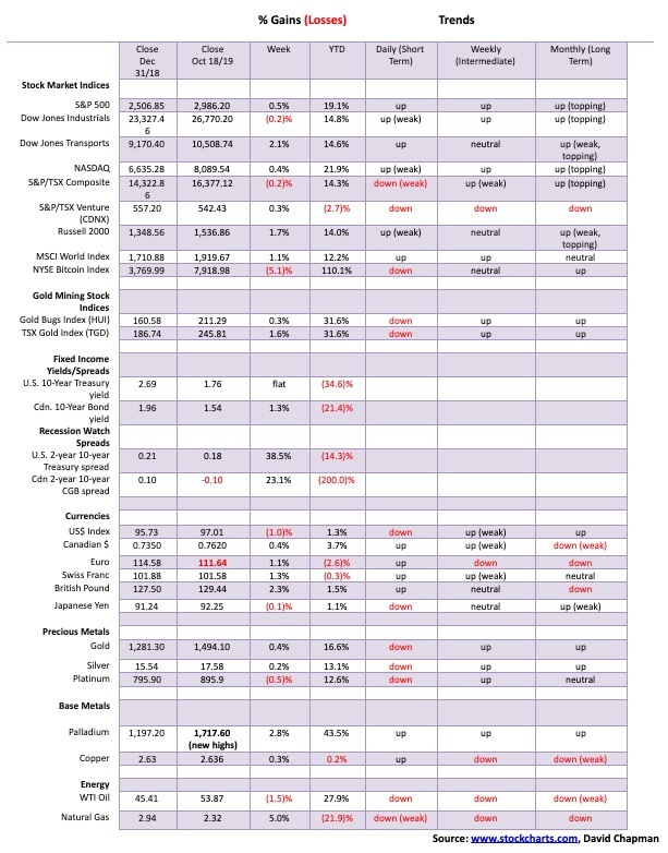
After rallying earlier in the week on supposed positive news on the trade front, stock markets fell on Friday turning what could have been an up week into an essentially flat week. The S&P 500 managed to eke out a gain of 0.5%, but the Dow Jones Industrials (DJI) fell almost 0.2% this past week, a divergence.
The NASDAQ led the way lower as it closed the week up 0.4%. The big winner of the week was the Dow Jones Transportations (DJT) with a gain of 2.1%. However, the DJT remains well down from its all-time highs seen back in August 2018. The small-cap Russell 2000 also put in a good performance, gaining 1.6% on the week.
Weaker earnings, the impeachment crisis, the confusion in Syria, worries about the China/US trade war all conspired to push markets lower on Friday, ending what may have been a more positive week. Looking back, the S&P 500 is only marginally below where it was a month ago. We call it churning.
Elsewhere, the TSX Composite fell a small 0.2% but the TSX Venture Exchange (CDNX) bounced back finally, gaining 0.3%. In the world, the MSCI World Index was up 1.1%, but the London FTSE fell 1.2%, and the Paris CAC 40 was off 0.5% but the German DAX rose 1.0%. In Asia, China’s Shanghai Index (SSEC) fell 1.2% and the Tokyo Nikkei Dow (TKN) was up a sharp 3.2%. The beleaguered Hong Kong Hang Seng Index bounced back, rising 1.6%.
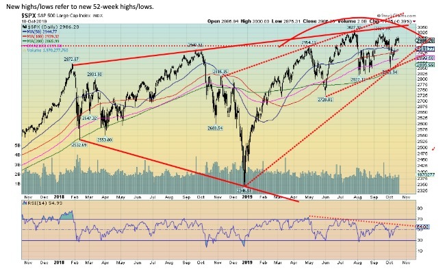
If, as it’s suspected, the S&P 500 has made another lower high we have to lean on the old adage of three strikes and you are out. The July high was at 3,027 while a lower high was made in September at 3,021. The high this time was at 3,008. Naturally this high is not yet confirmed. The S&P 500 needs to break back under 2,950 to confirm.
The major breakdown point is at 2,880, although we would use 2,850 as the breakdown point. New lows below the June low of 2,728 would be a major confirmation of a downtrend in place. The 200-day MA is currently at 2,865.
The pattern of lower highs bodes poorly for the stock market. We remain in the camp that another significant decline may lie just around the corner. The market could fall all the way to the bottom of what appears as a broadening channel near 2,200.
That would be a significant decline. All of this comes against the background of an NYSE advance-decline line that continues to roar to new highs. The McClellan Summation Oscillator Index ratio adjusted, known as the RASI, sits at 500; this is below its highs but not in what we would call bear territory.
As we discussed in our major essay, we believe we are still in a secular bull market. But bull markets can see periods of corrections, even sharp ones. Looking back at the secular bull market of 1949–1966, this period saw five significant corrections. The steepest declines were seen in 1960 and 1962 where the market fell 25% and 27% respectively.
A recession also followed. The period 1949–1966 saw three recessions: 1953, 1957, and 1960–1962. The current run has seen no recessions although there was some slowdown during 2011 and 2015-2016. The economy has also slowed somewhat from 2018 when the U.S./China trade wars got underway, but it has not fallen into an official recession.
The secular bull market of 1982–2000 saw sharp stock market corrections in 1984, 1987, 1990, and 1998. However, the only official recession occurred in 1990, even as slowdowns were recorded during the other market declines. So, declines during secular bulls are not unusual.
An official bear market doesn’t happen until previous years’ lows are busted. That has not yet happened and as long as it doesn’t, the secular bull remains in place. For the record, the 2018 low at 2,346 fell just short of the 2017 low at 2,240. So, for a bear market, one has to keep in mind the 2018 low of 2,346.
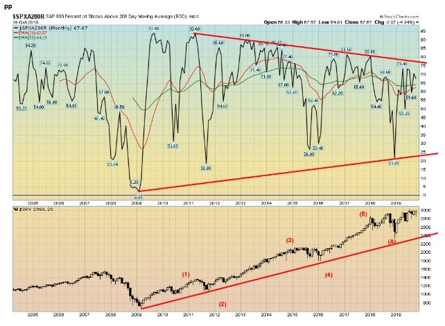
Despite the S&P 500 at or near its all-time highs, the percentage of stocks trading above the 200-day MA continues to diverge, making lower highs. It is at last at 67.67%, well down from the highs seen in 2011 at 93.60%. Even in January 2018, the index hit 80.60%.
The NYSE advance-decline line may be making new highs, but it appears it is being driven by fewer and fewer stocks as a third of the index is trading under its 200-day MA. A negative divergence to consider.
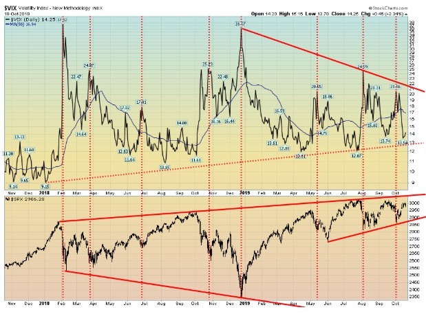
It probably comes as no surprise that as the market rallied, volatility fell. The VIX volatility index recently fell to 13.54, the lowest level is seen since July 2019 when it hit 12.07. The VIX is nowhere near the levels are seen in 2018 when the index regularly registered under 10.
Nonetheless, the VIX made a slightly lower low this past week, even as the S&P 500 may have made a slightly lower high—a divergence. Usually, it is the other way around so this is an odd one. Maybe it means that the S&P 500 will rally to a higher high and the VIX will not make a lower low. The VIX doesn’t break out to the upside until over 17 and the 50-day MA.
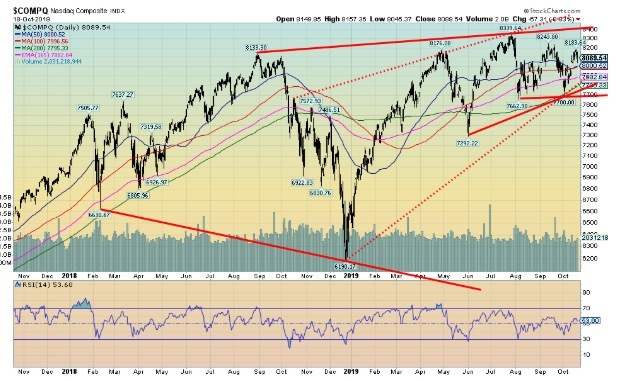
The NASDAQ may have made yet another lower high. The high was seen at 8,340, followed by a lower high at 8,244 and now another lower high at 8,184. The latter one is not yet confirmed, but a break below 8,000 would confirm. Key, of course, for the NASDAQ is the tech sector. Here, the Semi-Conductor Index (SOX) has made three successive slightly higher highs (1,605, 1,625, and 1,629).
We love to call it three thrusts to a high, then down. The breakdown point for the NASDAQ is at 7,700, although the warning sign breakdown is just below 7,900. A breakdown under 7,700 could see the NASDAQ fall to potential targets down to 7,100. A break back above 8,200 could change that scenario.
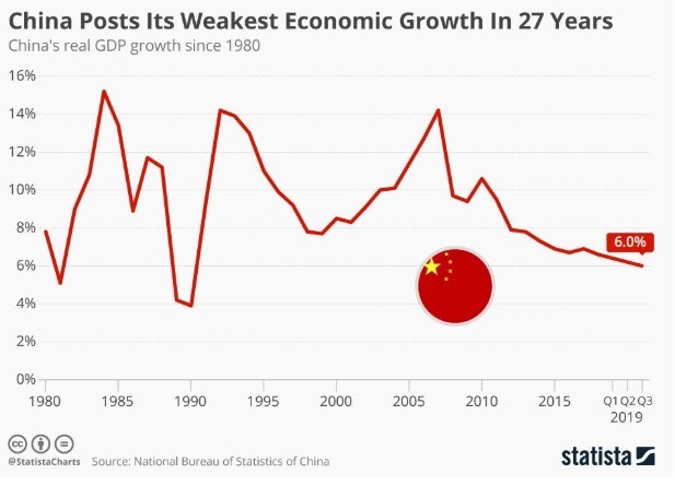
The Chinese economy just keeps on slipping. The 3rd quarter GDP for China grew at 6%, the slowest in 27 years. The 2nd quarter GDP grew by 6.2%. Sounds great, though when one looks at the growth rates in the EU, Japan, and the U.S. Lackluster consumer demand and the effects of the trade war pushed growth levels lower. The lower number continues a trend that has been ongoing now since about 2006.
Despite what many would see as strong growth, the Chinese government stepped in with its own version of QE, announcing a ¥1.3 trillion (U.S.$ 193 billion) stimulus package. While China doesn’t want to talk about it, there have been dislocations in employment because of the trade war. Officially, Chinese unemployment is 3.6%, but as the U.S. the real rate is higher.
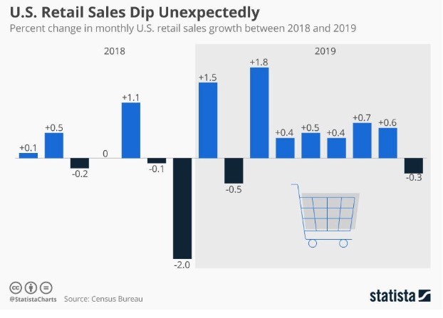
Retail sales in the U.S. fell for the first time in 7 months as September’s fell 0.3%. It came as a surprise as the market had expected a gain of 0.3%. Year-over-year retail sales are still up 4.1%, but that is before adjustments for inflation.
Naturally, these numbers are preliminary and could be adjusted again later. August was revised upwards to a gain of 0.6%. The consumer accounts for at least two-thirds of GDP. So how the consumer goes, so goes America. The decline was caused mostly by lower vehicle and building materials sales.
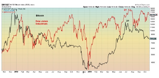
The interrelationship between Bitcoin and the DJI appears to us to still be intact despite attempts by the DJI to try to rally. Bitcoin, on the other hand, has been falling. But in looking back Bitcoin has had a tendency to lead rather than follow. So, despite the pronouncements of the stock market bulls, the odds still appear to favor a coming decline for the stock market to follow Bitcoin to the downside. With Bitcoin falling it has pushed its market cap down to $144.5 billion.
That still represents 66.3% of the market cap of the entire crypto market according to Coin Market Cap. They are listing 3,000 different cryptos. Amazing that they keep on coming. But many of them have no value. Yet there are still 13 with a market cap over $1 billion. The top three—Bitcoin, Ethereum, and XRP—account for over 80% of the market cap of the entire crypto market. It doesn’t leave much for the other 2,997.
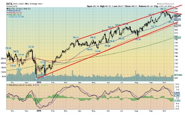
The Dow Jones Utilities Index (DJU) has been the star of the Dow indices. Even as the others (DJI, DJT) have failed to make new highs, it didn’t stop the utility index that made new all-time highs as recently as September 30, 2019. Falling into a brief decline, the index rallied back but failed to make new highs.
The DJU has now fallen again and made a lower low but bounced off of the 50-day MA. The DJU is rallying back but faces resistance at 878. Falling volume suggests it might fail, but a breakout above that level could point to new highs.
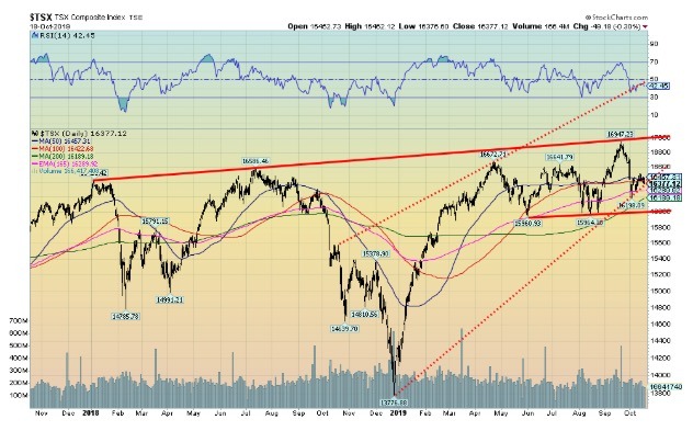
The TSX Composite appears caught in a sideways topping pattern. We say topping because of the spike failure seen in mid-September when the TSX rallied to the top of a channel and it was immediately rejected. The breakdown point remains around 16,000 and could project down to 15,000 once it breaks. Each rally to new highs—December 2017, July 2018, and the most recent highs in April 2019 and September 2019—were made on falling volume and weakening momentum.
Technically, none of that is positive and suggests that once we break under 16,000 the decline could be swift. A move above 16,800 and especially above 17,000 would change that scenario; however, it does not appear to have the momentum to make such a move. The TSX Composite’s bullish percent index is falling and diverging with the index, meaning the bullish percent index made lower highs even as the TSX made higher highs. Financials appear to be one of the more vulnerable areas.
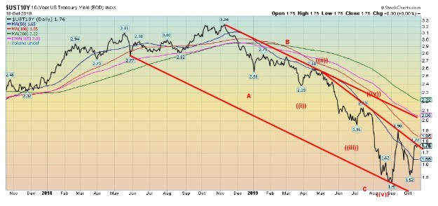
The U.S. 10-year Treasury note was flat this past week at 1.76%. We are just over a week away from the October FOMC meeting where the anticipation of what the Fed might do starts to reach a frenzy. Will they cut or not? The Chicago Fed president says no more rate cuts are necessary. That has also shifted the thinking that the Fed might not cut at the October 28–29 meeting as many had expected.
The economy, while not gangbusters, is not falling apart either. The weak retail sales number may turn out to be a one-off. The job picture remains bouyant with unemployment at a 50-year low. Growth, while not spectacular, is at least positive; well, positive according to official figures. Not so much if one follows John Williams at Shadow Stats.
Williams calculates GDP the way it used to be calculated dating back in the 1990s before they adjusted the methodology to help reflect an upward bias. According to Williams, the U.S. has been in a recession since 2000 except for a brief period in 2003–2004. The official GDP report is a year-over-gain of 2.3%. Williams reports a year-over-year negative of 1.9%.
Consider that part-time workers constitute 17% of the labour force and that many are working at or near minimum wage or holding down two jobs. As well, those not in the labour force total over 95 million, although of that 64 million are either retired or disabled. Right now the 10-year appears poised to fall once again. Our expectations are, however, that the 1.47% low seen in early October will hold.
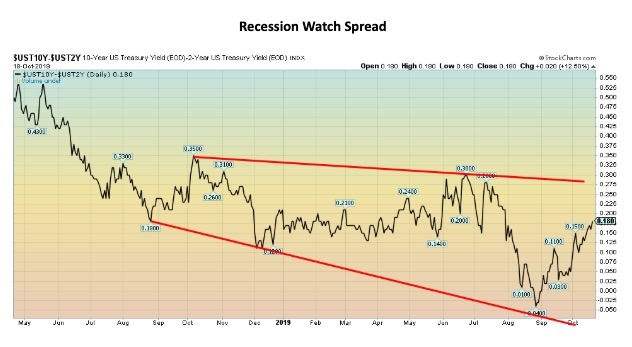
Our prime recession watch spread, the 2–10, rose to 18 bp this past week from 13 bp the previous week. We barely saw the 2–10 spread go negative. Only briefly. So, it is hard to read into this. On one hand, it suggests that a recession is nowhere near.
On the other hand, a recession could be closer as we have observed that, after a period of a negative spreads, when the spreads turn positive again a recession is close by. Irrespective of that, it is now the most anticipated recession ever.
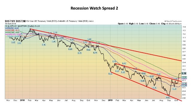
Our other recession watch spread, the 3-month—10-year spread, went from negative to positive this past week. Actually, on the week the gain was only 2 bp but the big jump occurred on October 10 and 11 when the spread went from negative 8 bp to positive 8 bp.
The spread appears to have broken out of a downtrend. We have noted that following a period of negative spreads it was when the spread turned positive again that the potential for a recession rose considerably.
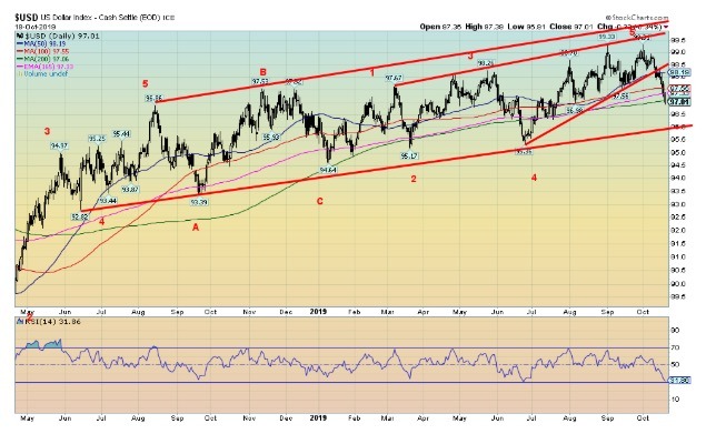
The US$ Index broke this past week, falling back to 97 down 1.0% on the week. The euro benefitted, gaining 1.1%, but a big winner was the pound sterling celebrating the possibility of a Brexit deal as it gained 2.3%. That could quickly unravel if the U.K. parliament rejects the deal and Johnson is forced to seek yet another extension, something that he is loath to do.
We’ll see on Monday, as Parliament sent Johnson back to the drawing board. The Swiss franc gained 1.3% but the Japanese yen fell 0.1%. The Canadian dollar was up 0.4%. The euro has broken out and its pattern implies it could be in for a lengthy up move. That bodes poorly for the US$ Index. Major support is seen at 96. We note that the RSI is down to 32 so it is fast approaching oversold levels once it starts getting under 30.
It doesn’t guarantee a rally, but it does suggest that a counter-trend rally could get underway at any time. Resistance would be at 97.50 and 98. A firm breakdown under 96 could lead to a multi-monthly decline for the U.S. dollar. Interesting that could be coming against the backdrop of the impeachment crisis and outcry of the U.S.’s move out of Syria.
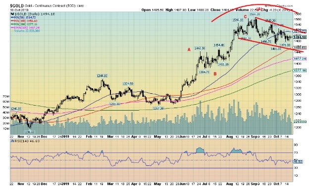
We continue to believe that gold completed an ABC pattern from the May 2019 lows to the recent high of $1,566. That would have completed an A wave up of a larger degree. We are currently undergoing the B wave correction as gold appears to be falling in a zig-zag fashion. Sentiment has fallen; after hitting huge levels of over 90% at the recent top, sentiment fell to 24% although it has rebounded slightly to 33%.
That is still not at levels one would consider quite bearish but it is in keeping with still might be a normal pullback within the context of a developing bull market. If our assessment of an ABC pattern is correct to the $1,566 top and that this is a B wave pullback, the C wave is yet to come. Our breakout over $1,370 following years of consolidation and forming what appears as a multi-year head and shoulders bottom pattern suggests to us that gold could eventually rally to $1,725.
Above that level even higher targets are possible. We have seen some crazy forecasts of $5,000 gold and even higher; however, we are not in that camp at all. Project what seems possible and leave the crazy forecasting to others who have product to sell. A lot depends on the performance of the U.S. dollar which, as noted, broke to the downside this past week although it may have reached a support zone.
Gold was rallying earlier even as the U.S. dollar rose, so gold’s failure to mount much of a rally against the backdrop of the U.S. dollar falling is viewed as a slight negative. Major support for gold is down at $1,440–$1,460. The October 1 low was at $1,465. We remain in a weak seasonal period for gold and we are also looking for our 11-month low. We are currently in the time frame but it could stretch into November or early December.
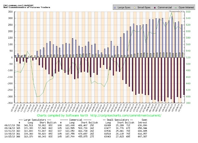
The gold commercial COT improved slightly this past week to 27% from 26%. Long open interest was essentially flat but short open interest fell about 23,000 contracts. The improvement, while welcome, is still not giving us any significant buy signals, suggesting there is more work to be done for gold before it can launch an upward rally once again.
The large speculators COT (hedge funds, managed futures, etc.) slipped to 83% from 85% with a big drop in long open interest of about 15,000 contracts while long open interest rose just over 7,000 contracts. The gold commercial COT remains bearish. We’d like to see it get back into the high 30s at least to suggest that a rally should get underway. Even a move into the 30s would be welcome.
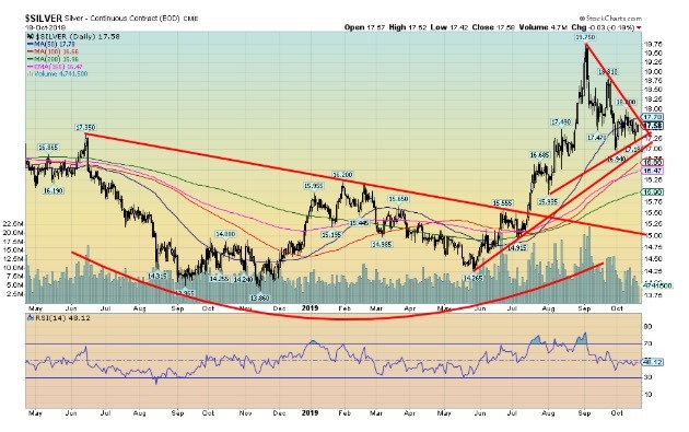
Silver prices continue to be locked in a triangle pattern. The pattern still appears to us to be a consolidating symmetrical triangle. If that is correct, then the breakout should be to the upside. Silver needs to break down under $17 and preferably below $16.90 to suggest to us that we are headed lower. A breakdown under that level could imply objectives down to $13.20.
We doubt that. On the other hand, a breakout to the upside over $17.80 could imply that another up-leg is underway with potential objectives up to $21.60. Such is the nature of symmetrical triangles that usually are consolidation patterns but can also be tops and, very rarely, bottoms.\
The high volume on the way up to the highs of $19.75 suggest to us that we are in the process of a more significant bull move and the breakout should be the upside. The triangle is getting close to being broken so we need to watch how this plays out.
It is also not unusual to see a market waffle through a symmetrical triangle and proceed to form a new symmetrical triangle pattern. It usually occurs on lower volume. Major support can be seen down to $16.
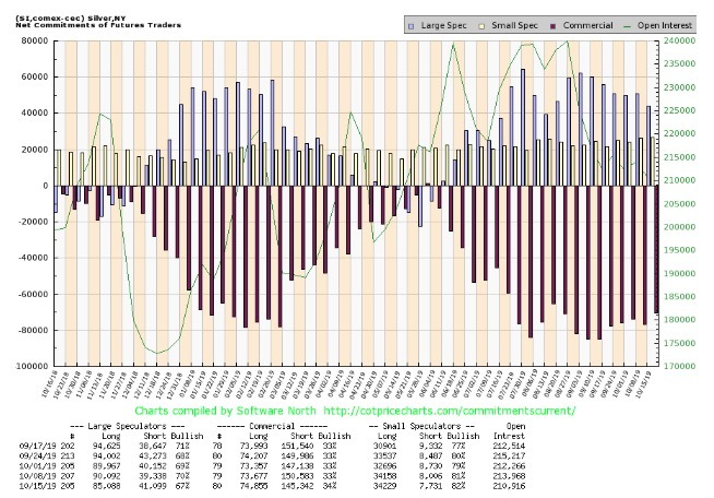
The silver commercial COT improved slightly to 34% this past week from 33%. Long open interest rose roughly 1,000 contracts while short open interest fell just over 5,000 contracts. The large speculators COT fell to 67% from 70% as they decreased their long position and increased their short position.
The silver commercial COT remains bearish despite the improvement this past week. We’d like to see the silver commercial COT in the high 40s before we’d become more bullish, although given the current market a move just in the 40s would also be positive.
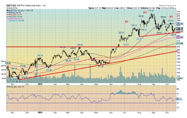
The TSX Gold Index (TGD) still appears to be forming a head and shoulders top. A similar pattern has formed on the Gold Bugs Index (HUI). The neckline for the TGD is at 230. Objectives for any breakdown would be to 180 with minimum objectives for a decline to 218. For the HUI, the objective would be down to 157 with minimum objectives down to 190.
The TGD has considerable MA support between 210 and 220, so that too could be a logical target zone. A decline to the major objective of 180 would be considerable as that would basically wipe out the gains seen from the May 2019 low near 177. The low for 2019 was seen in January near 171. The potential H&S pattern could be busted with a move above 250 and would be confirmed busted with a move above 260. Above 260, new highs are probable.
The bullish consensus for the gold mining stocks has fallen, but is not yet at levels one could call extremely bearish. If we are merely in a corrective mode following the run-up from the May 2019 low, then the bullish consensus for the gold miners is more likely to fall to neutral levels rather than outright bearish levels.
We are approaching neutral levels now. Key is to watch any breakdown under 230. If on weak volume, then it is likely that the breakdown would be a head fake rather than a major collapse. High volume usually accompanies H&S breakdowns (or breakouts).
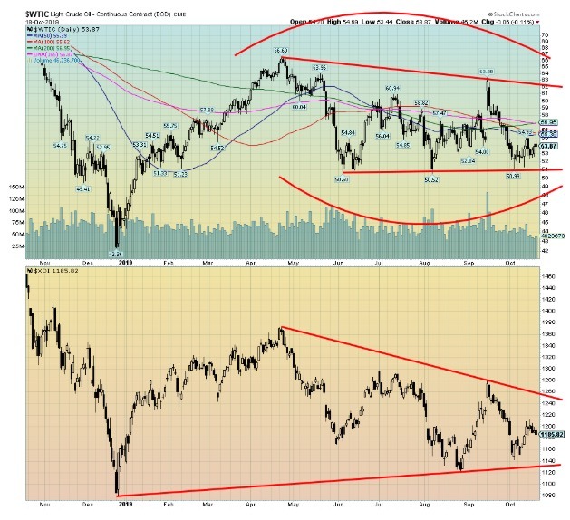
WTI oil prices continue to languish despite Saudi Aramco not being fully back online and sanctions continuing against Iran and Venezuela. WTI oil fell 1.5% this past week but still remains up 27.9% in 2019. The energy indices did not fare any better with the Arca Oil Index (XOI) falling 1.2% and the TSX Energy Index (TEN) off 1.7%. On the year, the XOI has fared better, gaining 2.3%, but the TEN is down 9.2%.
Weighing on oil prices is the slowdown in China, as if one can call 6% growth a slowdown. There is also fear of a global slowdown. U.S. sanctions are also hurting oil as the U.S. in their zeal to sanction anything that moves in relation to Iran or Venezuela means that tanker prices have shot up and shippers are avoiding the companies that have attracted U.S. sanctions such as China’s COSCO.
With freight prices high, the amount of oil shipped by the U.S. to Asia has fallen. Technically, WTI oil remains locked in a trading range between $51 and $61, setting aside that spike to $63 that was not sustained. All we can say is that one has to watch the breaks: to the downside $50 and to the upside, to be safe, $63. The pattern appears more vulnerable to the downside. WTI oil and the XOI remain locked in their weak seasonal period that does not really end until December.
Chart of the Week
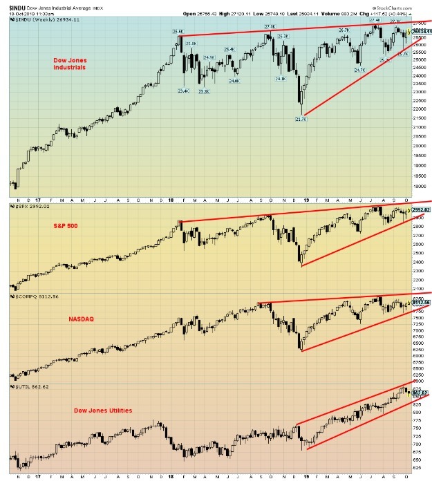
This week’s chart of the week features not one but three charts. The purpose of the charts is to demonstrate that, while some major indices are at or near their all-time highs, others are not. These are divergences as all should be telling the same story. The first group is as follows:
- Dow Jones Industrials (DJI)
- S&P 500
- NASDAQ
- Dow Jones Utilities (DJU)
The DJU has consistently been hitting new all-time highs with the latest one coming three weeks ago. The NASDAQ, DJI, and S&P 500 all made their all-time highs in July 2019.
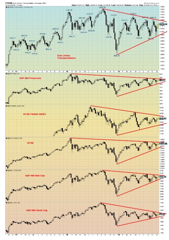
The second group has:
- Dow Jones Transportations (DJT)
- S&P 500 Financials
- NYSE FAANG Index
- NYSE
- S&P 500 Mid-Cap
- S&P 600 Small-Cap
The DJT topped in September 2018 and has been generally down ever since. The S&P 500 Financials topped way back in January 2018 and has been in a gentle downtrend. The NSYE FAANG Index (Facebook, Apple, Amazon, Netflix, Google) topped in June 2018 and appears to be forming a large symmetrical triangle top. The NYSE also topped way back in January 2018. Both the S&P 400 Mid-Cap and the S&P 600 Small-Cap topped in August 2018. Both appear to be forming a large symmetrical triangle top pattern. To give benefit of the doubt, a symmetrical triangle can also be a consolidation pattern, but this pattern is forming following a long bull market. It is more likely to be a top rather than a consolidation pattern. The averages should confirm each other. They haven’t and that is a danger sign.
Our final chart is the TSX 60 Index followed by its four largest sub-indices that constitute over 70% of the index.
- TSX 60 Index
- TSX Financials
- TSX Energy
- TSX Industrials
- TSX Materials
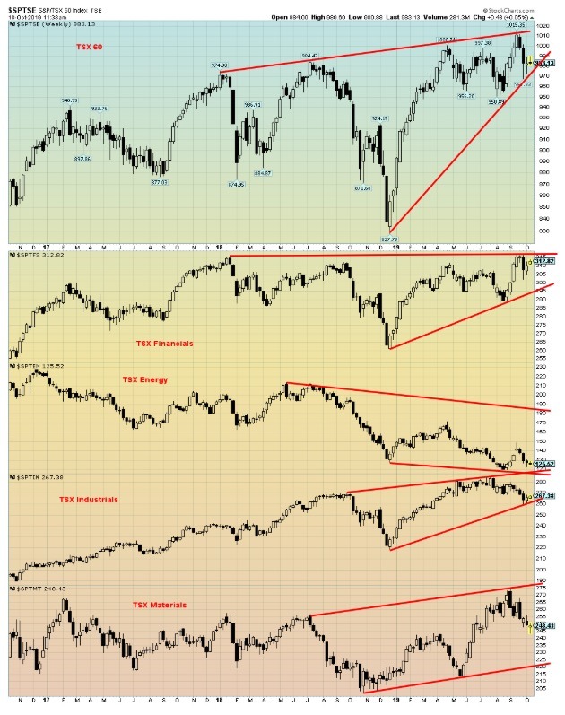
The TSX 60 made its high in September. The Financials also topped in September but its nominal high was seen in January 2018. It has struggled to get past that. Energy topped way back in December 2016 and has been in a steady downtrend. Industrials topped in July and Materials topped in September. Both Materials and Industrials appear to still be in uptrends while the TSX 60 could be forming a large wedge triangle top. Things to keep in mind as we go forward.
—
(Featured image by Carlos Muza)
DISCLAIMER: David Chapman is not a registered advisory service and is not an exempt market dealer (EMD) nor a licensed financial advisor. We do not and cannot give individualised market advice. David Chapman has worked in the financial industry for over 40 years including large financial corporations, banks, and investment dealers. The information in this newsletter is intended only for informational and educational purposes. It should not be considered a solicitation of an offer or sale of any security. The reader assumes all risk when trading in securities and David Chapman advises consulting a licensed professional financial advisor before proceeding with any trade or idea presented in this newsletter. David Chapman may own shares in companies mentioned in this newsletter. We share our ideas and opinions for informational and educational purposes only and expect the reader to perform due diligence before considering a position in any security. That includes consulting with your own licensed professional financial advisor.


XRP Under Pressure Amid Macro Forces, Fed Policy, and Regulatory Shifts
XRP remains under pressure despite easing geopolitical tensions, as macroeconomic factors and Fed policy dominate market sentiment. Liquidations and high...


Edison Accelerates Renewable Growth and ESG Impact in 2025
Edison reports strong 2025 sustainability progress, boosting renewable investments by 90% to reach 2.3 GW toward a 4 GW 2030...


New Gene Therapies Transform Rare Disease Care, but Gaps Remain
Gene therapies are transforming rare disease treatment, enabling normal lives for some patients. However, only about 6% of 7,000 rare...


Temotiva Launches Crowdfunding Campaign to Advance Preventive Mental Health
Temotiva Innovación Lab has launched a crowdfunding campaign through Santander X Explorer, marking a new phase for the University of...


Fed Policy Shift Raises Concerns Over Debt and Inflation Risks
The Federal Reserve is criticized for resuming balance sheet expansion through Treasury purchases despite expectations of tighter policy under new...
 |
|
 |  |
 |
|
-

 Business1 week ago
SpaceX IPO Sparks Déjà Vu as Market Risks Loom and Gold Bulls Stay Hopeful
-

 Business2 weeks ago
Dow Jones Rally Faces Uncertainty Amid NASDAQ Reversal
-

 Crowdfunding5 days ago
Wyrmgold Launches Crowdfunding Campaign for Believe in me! (please)
-

 Biotech2 weeks ago
The German Biotech Industry Faces Funding Crunch Despite Market Stability