Featured
Should investors buckle up for riskier markets ahead?
Gold is expected to resume its bull market while Dow Jones needs new all-time highs.
Last week, the Dow Jones saw new all-time highs on Thursday and Friday, but this week it saw none, closing the week -1.07 percent from last week’s close. Is this the pause that refreshes? It very well could be, and then maybe not.
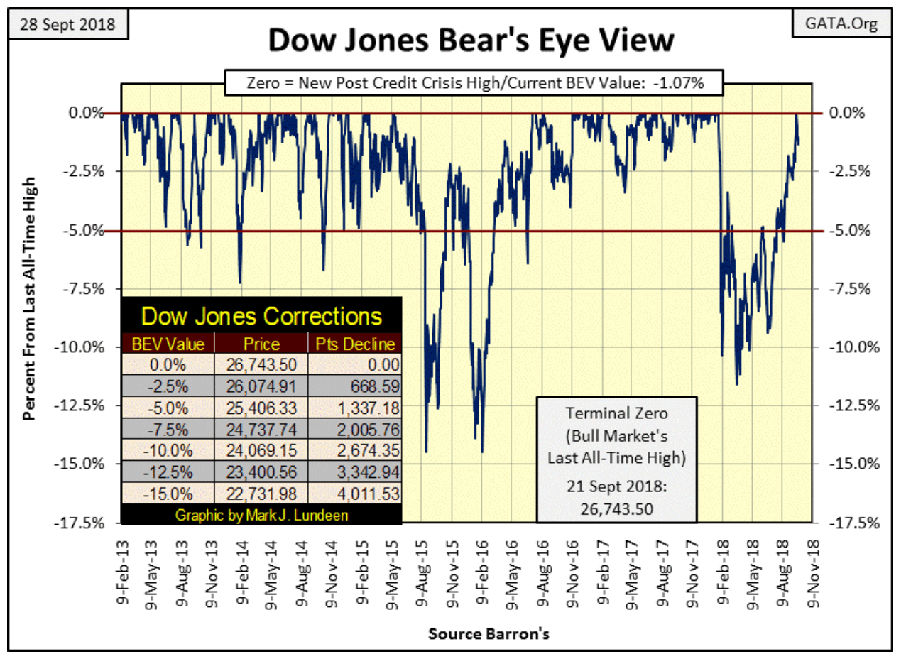
© Mark Lundeen
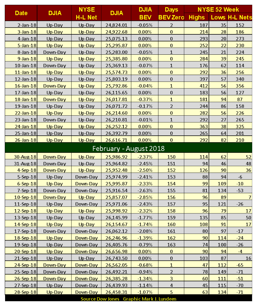
One of the things bothering me about the stock market is what’s happening with new 52Wk Highs and Lows at the NYSE. In the table below, every day except one of the past two weeks closed with more 52Wk Lows than Highs, and since September 4, seeing more daily 52Wk Lows than Highs have been the rule, not the exception.
Compare the current table (lower portion) to how the market was performing in January; there’s quite a difference. This could go on for weeks, seeing the Dow Jones moving higher as the NYSE produces more 52Wk Lows than Highs; it has all September.
© Mark Lundeen
Nonetheless, this isn’t right! Though everything appears normal in the living room, somewhere inside the woodwork, the roaches and termites are on the move. Maybe CBS News has some insight on what’s going on:
“Insiders have been committing lots of money for stock buybacks, and they’re not doing buybacks because they think stocks are cheap. They’re doing to it to pump up the stock so they can sell it,” said David Santschi, director of liquidity research at TrimTabs.”
These insiders are the best-informed investors any company will ever have. They’re the corporate officers possessing intimate knowledge of the company and the industry they operate in.
People who know more about the market than either you or I do are looking ahead, and they don’t like what they’re seeing. Well, I don’t know what they know, but I do know I don’t like the 52Wk H&L action on the NYSE. As we enter October, my gut feeling is the stock market is now offering investors increasingly more risk than reward.
But what really bothers me about this story is how insiders are burdening the corporations they manage (not personally own) with debt service in the bond market to provide themselves with a short-term gain at the long-term expense of their shareholders. And who are those shareholders? Largely financial fiduciaries managing pension and mutual funds, charitable trusts and insurance companies’ financial reserves. Well, this is the world we live in.
Here’s another sad story—fashion models have become debt slaves. Some people will snicker at this story, but it’s a sad tale of little girls who know little about the world and its evil ways becoming entrapped by the glamor and easy money (at attractive rates) of the fashion industry.
Apparently, being a fashion model doesn’t pay much. That plus the number of years a young woman is able to work as a model is limited.
It just irks me there’s no shortage of people my age willing to take cruel advantage of people many years younger than themselves. Ours is a world where being despicable pays better than being virtuous. We each must decide who we are going to serve, manna or the Lord, and act accordingly.
Another factor weighing against the stock market is the FOMC is determined to increase their Fed Funds Rate to higher levels. They’ve increased their Fed Funds Rate to over 2 percent this week, minimalizing the gap between Fed Funds and the 30-yr T-Bond yield to about 100 basis points. That plus they’ve promised to do it again in December.

© Mark Lundeen
Before Alan Greenspan became Fed Chairman in August 1987, the Federal Reserve didn’t make any public announcements concerning “policy” – PERIOD. The secrecy the Fed worked in resulted in a situation where from 1913 to the mid-1970s, many Americans were unaware of the existence of the Federal Reserve.
Back then, the financial system was on sounder grounds, largely because knowledgeable investors and financial institutions feared to become too leveraged in their positions because they didn’t know when or by how much the Fed might change interest rates.
However, that’s not true today. In the post-Greenspan era, it’s the Federal Reserve who now fears what might happen should they surprise the market. No one knows better than members sitting on the FOMC there are bubbles in the financial system as far as their eyes can see.
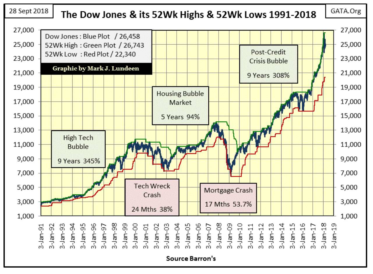
So far “monetary policy” hasn’t resulted in the stock market crashing and burning. However, as seen in the charts above and below, when the FOMC raised their Fed Funds above the 30yr T-bond yield in 2000, that triggered a 38 percent bear market in the Dow Jones and a 78 percent bear market in the NASDAQ Composite. When the FOMC did the same in 2006-07, the Dow Jones declined by 54 percent as the single-family home mortgage market began a decline that almost took out the global financial system.
© Mark Lundeen
Of course, inverting the yield curve, raising the Fed Funds Rate above the 30yr bond yield, didn’t cause those disasters all by itself. Market valuations in 2000 and again in 2008 were inflated far above any point of prudence by years of “liquidity injections” coming from the Federal Reserve. So when the match was struck, there was plenty of dead wood to catch fire.
It won’t be any different this time. And now in 2018, the financial system has even leveraged fashion models with more debt than they have the means to serve. Are there any investments available to people that the global central-banking system hasn’t burden with insupportable debt? Why yes there are—gold and silver bullion.
I called gold’s August 15 close of $1,165.50 the bottom of its current move. I got a letter from a good friend who said he thought I was a pretty smart guy—until I said something that dumb. “Remember Mark the trend is your friend, and right now the trend for gold and silver is down!”
Well, like anyone else who exposes themselves to market risk, I too have my moments of madness. When I fall prey to one of those rare moments while I have my keyboard in front of me, my readers may find me babbling about a specific day and market price as a bottom in the gold market. Anyway, my friend trades silver futures contracts and has made money doing so for years; darn impressive! He’s someone I don’t care to argue the point on.
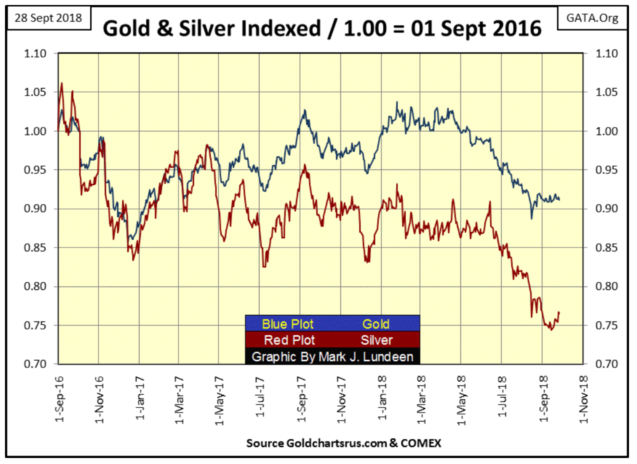
To better see the prospects of the gold market now being past a bottom, I created a chart plotting the indexed values of gold (Blue Plot) and Silver (Red Plot) for the past two years below. A quick glance at this chart is all we need to see how gold and silver haven’t done much, if anything for us precious metals bulls since September 1, 2016; this is especially true with silver.
Gold’s low of the past two years happened in December 2016 as it declined to 0.86 in the chart (14 percent decline). Silver’s low of the past two years occurred early this month. On a decline that began in June, its multi-year low occurred two weeks ago on September 14, down 26 percent.
© Mark Lundeen
This June to September dive in the price of silver has that look of exhaustion selling, aka capitulation. The collapse in price as bulls dump their leveraged positions under duress after being on the wrong side of the market for a prolonged period of time; in this case two years.
My friend may be correct that gold and silver still have a way to go before they see their ultimate bottoms in the current market decline. But I still believe the worse of the decline that began in 2011 is now behind us. So, for people who want to purchase gold and silver bullion, this is a good time. And who knows, we could see some nice gains in gold and silver before 2018 becomes only a memory.
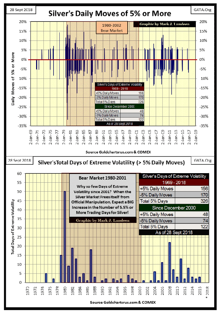
One thing that would bolster my bullish view on the gold and silver market would be if they once again began seeing Days of Extreme Volatility. For gold that means daily moves (up or down) of 3 percent or more from a previous day’s close, and 5 percent for silver. The last 3 percent day for gold happened on October 3, 2016 (-3.30 percent); silver last saw a 5 percent day on November 10, 2016, (-6.66 percent).
Extreme market volatility for gold and silver works a bit differently than days of extreme market volatility for the stock market, or Dow Jones 2 percent days. Bull markets in the Dow Jones see few days of extreme market volatility, as +/- 2 percent or greater daily moves in the Dow Jones are almost exclusively bear market events.
This is not so with extreme days in the gold and silver markets. When the old monetary metals begin seeing multiple days of extreme market volatility (3 percent for gold and 5 percent for silver), the market is on the move and someone is making a lot of money. Whether it’s the bulls or bears profiting, one can’t really tell by the occurrence of these extreme days, one has to scan their price charts to determine which.
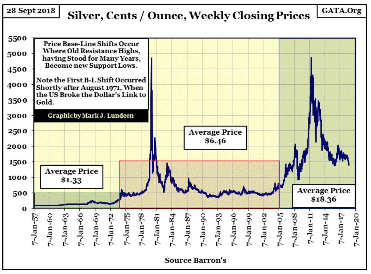
Keep in mind before 1969, gold was fixed by U.S. law at $35 an ounce, and the price of silver could remain unchanged for weeks on end. In fact, from March 1959 to November 1961, the price of silver was unchanged at $0.9138 an ounce. That’s over two and a half years. So keep in mind if the U.S. government and the Federal Reserve System hadn’t flooded the economy with an even larger volume of paper money, gold would still be at $35 ounce and silver trading around a dollar.
© Mark Lundeen
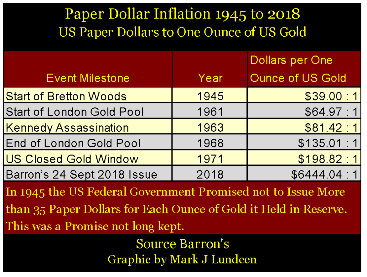
The Bretton Wood’s era began in 1945 with only 39 paper dollars in circulation for each ounce of gold held by the U.S. Treasury. As the ratio of paper to gold dollars (gold fixed by law @ $35 paper dollars an ounce) increased in the 1950s and ’60s, a run on the U.S. gold reserves began in 1958 that didn’t stop until President Nixon “closed the gold window” in August 1971. With 198.82 paper dollars in circulation for each ounce of gold held by the U.S. Treasury, and with foreign central banks requiring only 35 paper dollars to exchange for one ounce of U.S. gold, the U.S. Treasury was forced to terminate the legal fiction of the Bretton Wood’s $35 gold peg in 1971.
What wasn’t terminated was the predisposition of the U.S. government and its central bank (Federal Reserve) to inflate the supply of paper dollars in circulation. In Barron’s latest issue, this ratio has increased to 6,444.04 paper dollars in circulation for each ounce of gold the U.S. Treasury claims to hold. Just knowing this is reason enough to have a good percentage of your capital in gold and silver bullion.
© Mark Lundeen
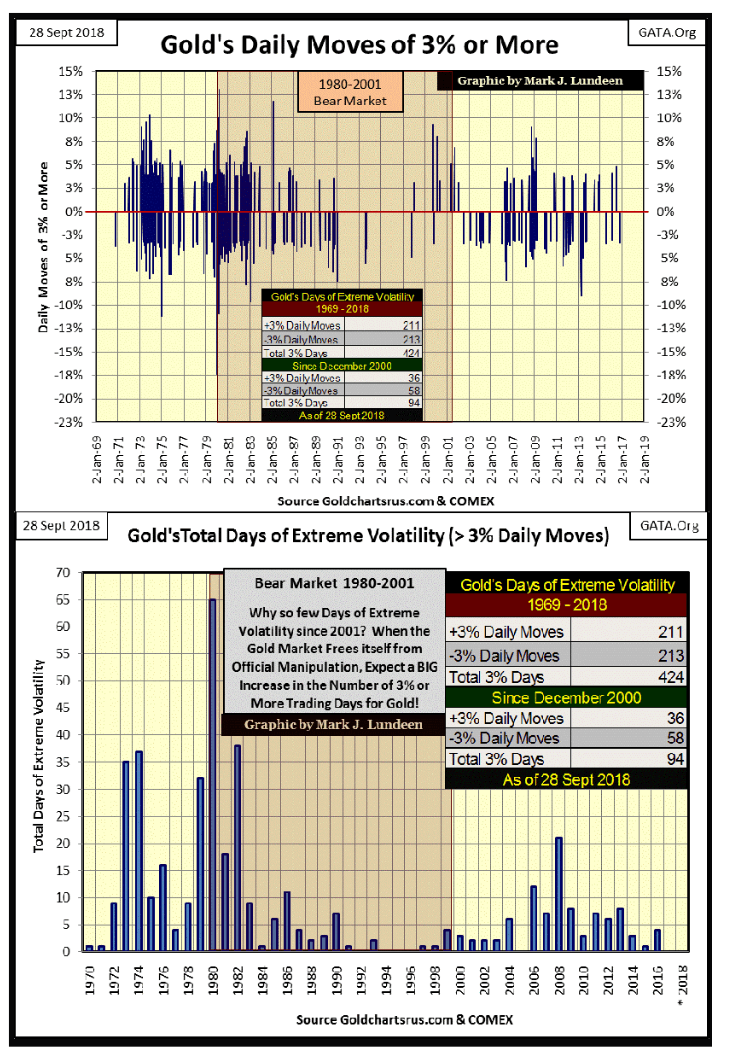
Below I’ve plotted each day of extreme volatility (+/- 3 percent day) in the gold market since 1969. The upper chart plots the specific (+/-) percentages these days moved from their previous day’s closing price; the lower chart plots the total number of extreme days (+ & -) by year since 1970.
It’s interesting noting the bulk of these extreme days occurred from 1973 to 1983. This was a decade that saw gold break into a huge bull market, until mid-January 1980 when a two-decade-long bear market began. As evident in this chart, come bull or bear market gold produces days of extreme volatility during those times when the price of gold moves with authority to either the up or down side.
© Mark Lundeen
We should also note in the bottom chart, gold hasn’t seen a day of extreme volatility since 2016, the last profitable year for bulls in the gold market. The gold market hasn’t seen such a prolonged period of low volatility since 1994 to 1996, another multiyear period that did little for the bulls.
We’re seeing five decades of history in the two charts above, and it’s obvious having a two-year period free of 3 percent days (2017 and 2018) in the gold market is an anomaly. Of course, it goes without saying that should gold see a 3 percent day before New Year, 2017 will lose its companion and become only the fifth year since 1970, free of extreme days in the gold market. Hopefully, we’ll see some 3 percent days in the gold market in the next few months as gold resumes its bull market.
Below are silver’s charts. What I said for gold above also applies to silver below, as does the following comments on silver apply to gold. Look at the yearly totals of extreme days for gold and silver; from the late 1970s to 1983, this decade saw the majority of extreme days in these markets. Since the old monetary metals began their bull markets in 2001-02, neither has produced the volume of extreme days as they did decades ago.
© Mark Lundeen
I have to wonder why this would be. Maybe the 21st century’s dearth of extreme days for the old monetary metals is yet another fingerprint left behind by the “policy makers” as they manage valuations in the gold and silver markets.
When these markets break free of the current market fix they now find themselves in, don’t be shocked should they begin seeing record numbers of extreme days of volatility as their prices rise far above their current all-time highs.
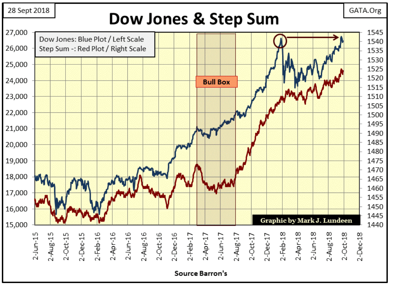
Looking at the Dow Jones and its step sum chart below, other than it has yet to see a new all-time high since last week, not much has changed. And as my friend reminded me, the “trend is your friend” and right now the trend for the Dow Jones is up. But I still don’t like the stock market.
© Mark Lundeen
Here’s gold (Blue Plot) and its step sum (Red Plot). To my eyes, two things jump out at me in the chart below.
- How in the past five years $1,375 has been a powerful resistance level.
- That plus as the price of gold was repulsed from the $1,375 line, each bottoms have been less severe than the one before it.
Assuming my $1,165.50 bottom of August 15th holds, when gold once again attempts to break above the current $1,375 resistance level, this time it might just make it.

© Mark Lundeen
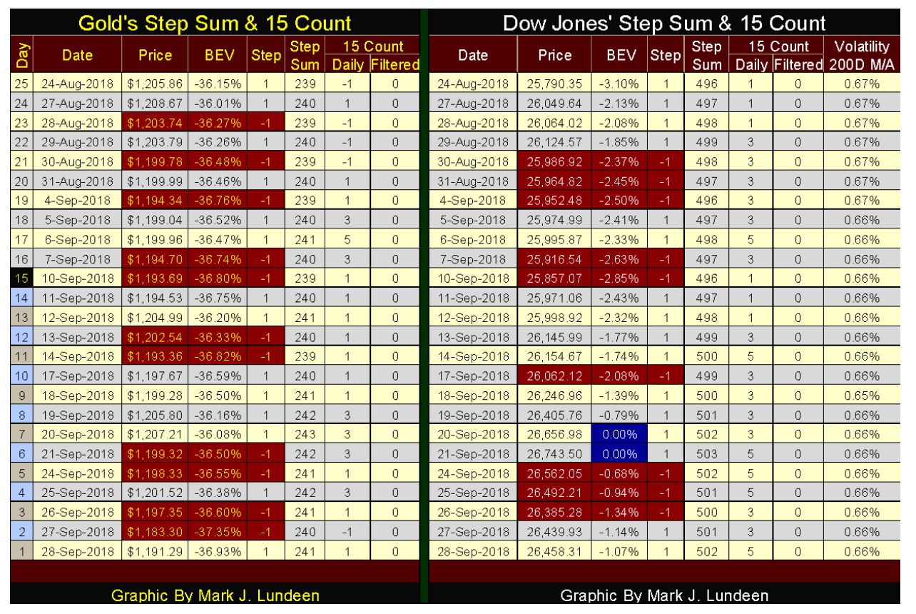
Looking at gold’s step sum table below, while gold’s step sum is advancing its price remains stuck in a trading range. Will this prove to be a case where a market that refuses to go up will eventually go down? If I was a leveraged player trading at the COMEX’s gold futures market, I’d consider that possibility seriously. But I’m not, so I can afford to keep my bullish market outlook for the rest of the year.
© Mark Lundeen
Compare the Dow Jones’ 15 count with that of gold’s. In the past 25 trading days, we see lots of +3 and +5s for the Dow Jones. The valuation of the Dow Jones is advancing as it sees advancing days overwhelm decliners. But what the Dow Jones really needs in the month to come are new all-time highs to keep me on board with this bullish outlook. Seeing NYSE 52Wk Highs once again overwhelm 52Wk Lows would do much to sustain this bullish trend in the Dow Jones. That’s something I’m following closely.
(Featured image by DepositPhotos)
—
DISCLAIMER: This article expresses my own ideas and opinions. Any information I have shared are from sources that I believe to be reliable and accurate. I did not receive any financial compensation for writing this post, nor do I own any shares in any company I’ve mentioned. I encourage any reader to do their own diligent research first before making any investment decisions.


Youth Cannabis Use in Colorado Is Falling — But the Full Story Is More Complex
The 2026 Colorado survey shows teen cannabis use fell to 10 percent in 2025, down from 21 percent in 2015....


Morocco’s Growth Holds at 4.6% as Agriculture Offsets Economic Pressures
Morocco’s economy grew 4.6% in Q1 2026, driven by a strong agricultural rebound offsetting declines in industry. Services expanded moderately...


Abivax Shares Surge as New Trial Data Eases Safety Concerns Over Ulcerative Colitis Drug
Abivax shares surged nearly 36% after positive updated trial results for its ulcerative colitis drug obefazimod reassured investors following earlier...


El Dorado Raises $9M to Expand Cross-Border Fintech Platform
El Dorado, a Latin American fintech improving cross-border financial services, raised a $9 million Series A led by Paradigm with...


Bitcoin Stalls Near $60K as Strategy Moves, ETFs Outflow, and EU MiCA Rules Take Effect
Bitcoin hovers near $60,000 with ETF outflows, while Strategy boosts reserves, sells BTC, and raises dividends to reassure investors. Ethereum...
 |
|
 |  |
 |
|
-

 Biotech2 weeks ago
Bavarian Biotech Sector Expands with Record Funding and Startup Growth in 2025
-

 Africa2 days ago
BOAD Approves Major Funding Boost to Drive West African Development
-

 Business1 week ago
Markets Diverge as Oil Falls, Rates Hold, and Inflation Persists
-

 Impact Investing6 days ago
Coastal Cities Lead as Heat Strains Italy’s Urban Livability
You must be logged in to post a comment Login