Featured
Skepticism in the stock market. It’s crunch time
The Federal Reserve, also known as ‘The Fed’, has been active with their cuts once again. Meanwhile, stimulus packages have been injected into the economy for years, to varying degrees of effectiveness. The stock market has been taken on a ride, thanks to the current economic and political factors. However, margin debt tends to rise sharply along with the stock market.
The Fed rate was cut for the third time this past week and is now down to 1.50%–1.75%. The indication, however, is that they are done for the year. But is the Fed also helping through its activity in the repo market? After all, stock markets tend to thrive in a low-interest-rate environment and monetary stimulus.
The Fed’s activity in the repo market (estimated at least at $60 billion/month plus selected injections) is, we believe, nothing more than QE4. The markets thrived under QE1, 2, and 3. Notice, we said “tend” to thrive. If QE and ultra-low interest rates were a panacea, the Japanese stock market should be at record highs. Instead, it is still down 41% from its all-time high seen way back in 1990.
As we have previously shown, the operations in the repo market have pumped up the Fed’s balance sheet some $260 billion since the end of August 2019. It now stands at over $4 trillion once again for the first time since February 2019. Yet, this activity is at best only being lightly reported in the financial press.
The Fed’s activities are a sign there is stress in the financial markets. However, they are not talking about it. These are the first serious operations (interventions?) in the financial markets since the financial crisis of 2008–2009.
The stock market faces a pile of skepticism. U.S.-China trade war, the impeachment crisis, civil strife in a host of countries, a slowing Chinese economy, the ongoing wars in the Middle East and fear of a recession after 10 plus years of a bull market with no recession.
However, the economy is bumbling along even if it is not soaring, interest rates are low, the markets shrugged off the temporarily inverted yield curve, and, with interest rates so low, the yields in the stock market are far more attractive. So what if we are at or near record valuations?
As long as interest rates are low and the economy bumbles along, everything else is noise. The S&P 500 along with the NASDAQ made new all-time highs and others appear poised to follow.
After 2 years of a sideways market, the stock markets may be poised to move into a blow-off mode. Now, that would be exciting. The trouble is, you can’t tell if we are about to move into a blow-off mode nor can we tell where it will end. History does suggest that when it does end, it will be a nasty fall.
If the activity in the repo market (QE4) is the fuel for a huge stock market rally, it may be that what is behind the activity in the repo market that ultimately becomes the stock market’s undoing. As we and others have asked—is there a liquidity crisis somewhere? That is what it suggests.
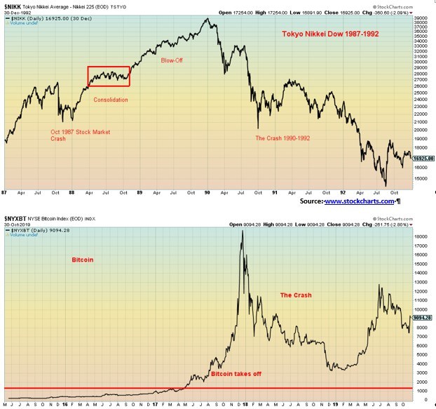
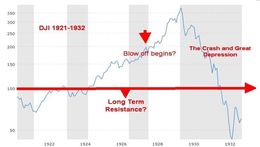
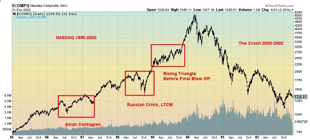
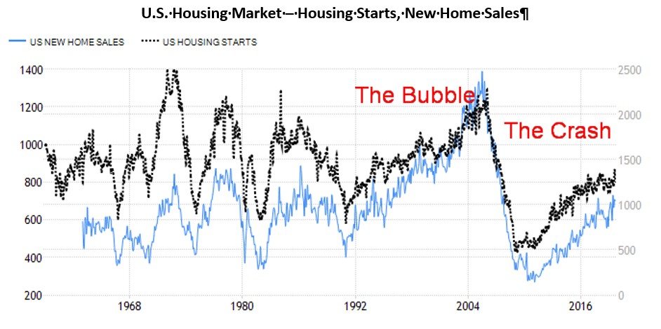
A blow-off, a bubble move. It is not the first time in history. The seven greatest bubbles in history, according to U.S. analyst Nick Maggiulli are: tulip mania in 1637, the South Sea Bubble in 1720, the “Roaring Twenties” culminating in the stock market crash of 1929, Japan in 1989, the dot.com/high-tech bubble in 2000, the U.S. housing bubble in 2007, and bitcoin in 2017. Lesser ones like gold in 1980 and the Chinese Shanghai Index (SSEC) bubble of 2008 didn’t make the cut.
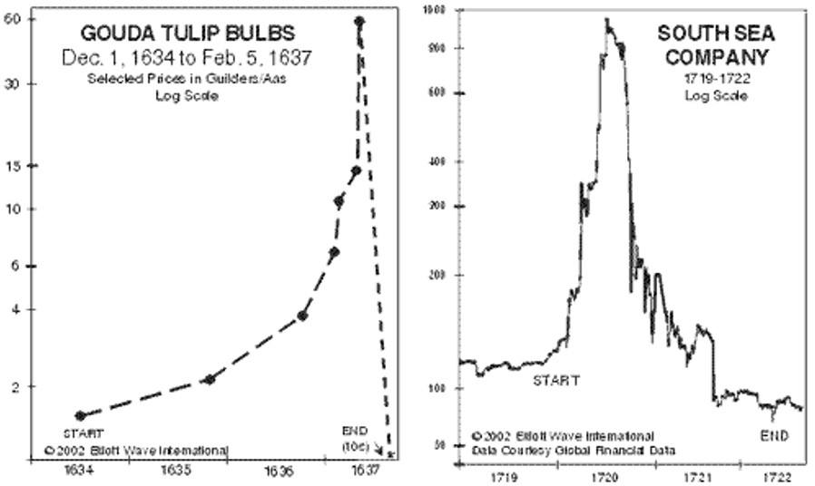
In terms of outright losses, the Japan bubble of the 1980s, culminating in the top and crash in 1990, maybe the granddaddy of them all. Some $2 trillion was lost in the stock market, but an incredible $8 trillion was lost in the real estate market.
Here we are nearly 30 years later and the Tokyo Nikkei Dow (TKN) is still down over 40% from 1990s’ final high. The bitcoin bubble of 2017 surpassed both tulip mania and the South Sea Bubble in terms of gains. Bitcoin gained an incredible 7900% from 2015 to its top in December 2017—it then crashed 82% from December 2017 to December 2018.
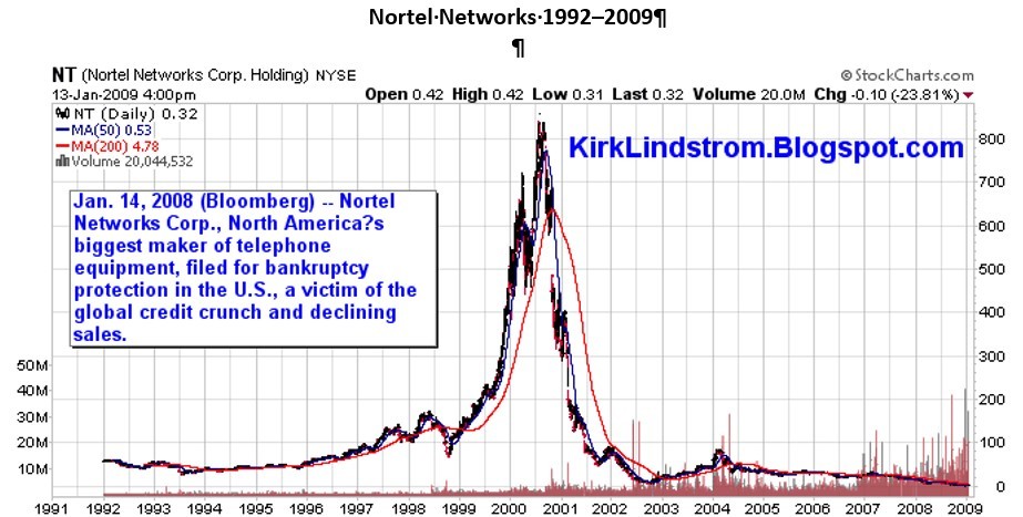
While bitcoin’s crash was impressive, it was the DJI of 1929–1932 that crashed 89%. It could be worse. Remember Nortel? It crashed 100% during the dot.com/high-tech bubble in 2000–2002. Other dot.com/high-tech companies joined Nortel in the trash heap of history.
Blow-off bubbles are spectacular. Yes, it is cheap money, massive monetary stimulus helped by a surfeit of product that fuels the rally. But it is also psychological as everyone scrambles, trying to not miss out, and shorts are forced to run for cover.
Somewhere along the line, there is usually a correction that sparks speculation that the market is about to tank. Then it moves to even higher highs forcing the bears once again to run for cover. But it also often ends on a spike, then a reversal, followed by a crash. And often the spike and reversal occur on what seems to be good news.
None of this is to say that is how things are going to work out. It might not even happen, but the signs are there that could spark a blow-off move. Indeed, it is not unusual that a bull market as we have witnessed over the past decade should end in a blow-off move. Fear is a driver.
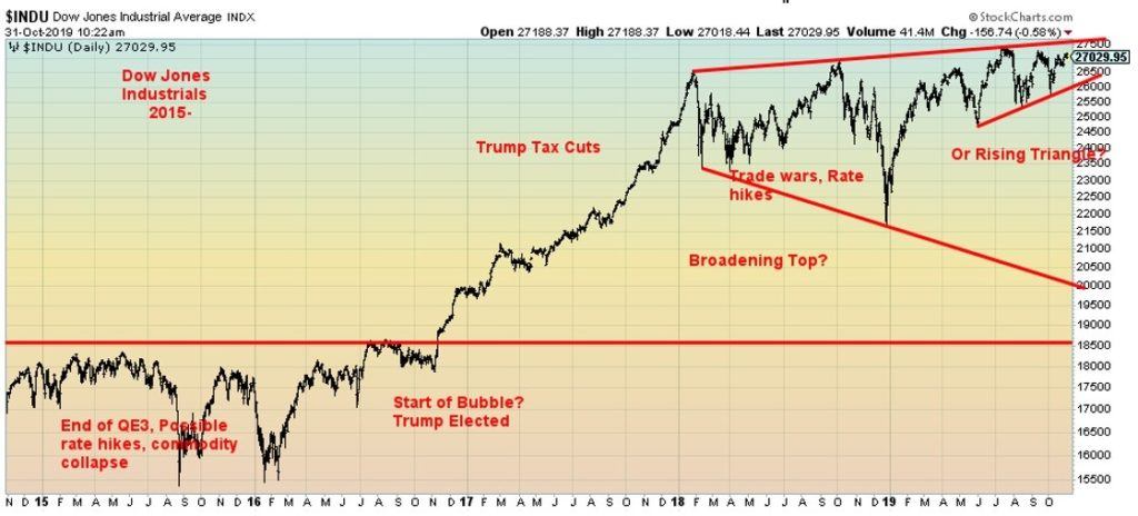
Some might argue that the blow-off has already occurred, starting with the election of 2016. Since January 2018 the market has gone largely sideways, suffering a few 15% to 20% drops along the way. But those have been corrections in a bull market and not a crash such as witnessed in 2008.
While it has appeared that we could be set up for another fall, the stock market, instead, is rising despite the bearish background noise. That, in turn, could be a setup for the blow-off move fueled by QE4 in the repo market.
There is no law that says we should go through another sharp decline at this time even if it had appeared for some time that we could. On the other hand, there is no guarantee we’ll burst to the upside either, despite the massive amount of liquidity being injected into markets.
We have no guarantee that the markets will take off into a potential blow-off. There are many who believe the opposite. However, the conditions are there with easy money and monetary stimulus. And the economy is co-operating by bumbling along.
We are already reminded we are having a debt bubble given that global debt has gone up by over $100 trillion since the financial crisis of 2008. Yet that has not burst. But as we have asked—are the Fed’s actions in the repo market the sign of an impending liquidity crisis? Time will tell.
Hanky Panky
No, we are not referring to the song of Tommy James and the Shondells released in 1966 (okay, maybe some readers won’t know what we are talking about). Instead, this is a different kind of “hanky panky.” It is something that goes on in markets all the time whether one calls it trading on insider information, front running, or something else. It is as old as markets themselves. Someone always trying to get an edge and make a “bundle.”
Somebody, as they say, is either very lucky or incredibly smart, or maybe they really did know something others did not. Vanity Fair wasn’t the only one citing the mystery trades. Other comments were seen on Market Watch (www.marketwatch.com), Business Insider (www.markets.businessinsider.com), Daily Mail UK (www.dailymail.co.uk), and Morning Star (www.morningstar.com). We’ve summarized in table format the Vanity Fair article. Something to think about.
It is crunch time for the S&P 500 and the stock market indices. Either we break out to new highs, or we fail and start what could be a sharp decline. As we discussed in our main essay, the potential is there for a breakout and a blow-off move fuelled by the Fed’s repo program (QE4), a low-interest rate environment, a bumbling-along global economy, and the potential for a trade resolution with China. Things like the impeachment crisis and tensions in the Middle East are mere background noise.
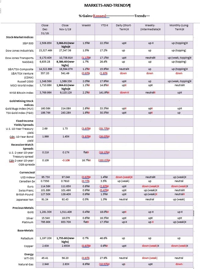
This past week the S&P 500 hit a new all-time high, up 1.5% on the week. The Dow Jones Industrials (DJI) also gained 1.5%. The NASDAQ also hit a new all-time high, up 1.7% on the week. Faltering was the Dow Jones Transportations (DJT), falling 1.1% this past week. The divergence with the DJI continues. The small-cap Russell 2000 rose by almost 2%. The TSX Composite gained 1.2%, but the TSX Venture Exchange (CDNX) can’t get out of the way of itself, falling 0.9%.
Overseas, the MSCI World Index gained 1.1%, the London FTSE fell a small 0.2%, but the Paris CAC 40 was up 0.7% and the German DAX gained 0.5%. In Asia, China’s Shanghai Index (SSEC) rose a small 0.1% and the Tokyo Nikkei Dow (TKN) was up 0.8%. Despite the ongoing strife in Hong Kong, the Hang Seng Index gained 1.6%, a marvelous performance.
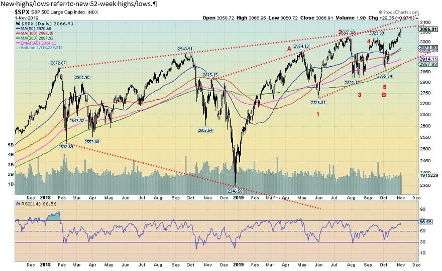
The S&P 500 and the NASDAQ were not the only ones making new all-time highs. Others were the Dow Jones Composite (DJC), the S&P 100, and, interestingly enough, the Wilshire 5000. The NYSE made new 52-week highs but not new all-time highs. All others remain below their previous highs. A firm move and close above 3,100 would tell us it’s the upside. Targets could be up to 3,300.
If the market is going to fall, then watch 3,000 as a break under that level might suggest a top. But we’d really have to break back under 2,950 and especially under 2,900 to confirm a breakdown underway. Of course, it could just fall back to the uptrend line, currently near 2,915. But we thought we had possibly completed a 5-wave correction with the low in early October at 2,855.
We labeled it 1,2,3,4,5, although rightfully it was an ABCDE-type pattern. That is assuming the high at 2,954 was the first wave up. The correction is a rising triangle. That’s a bullish interpretation. There are also bearish interpretations of the rise since December 2018. All of which is why we say we are at crunch time.
November and December tend to be the best months of the year with December ranking either #1 or #2 and November ranking either #2 or #3 in terms of gains. It’s a pre-election year and the fourth quarter has historically seen gains with the DJI averaging up 14.6%, the S&P 500 up 15.4% and the NASDAQ up 22%. Call it fourth-quarter magic.
A negative note is that the large speculator’s COT for the VIX is at record lows. That suggests that the large speculators think volatility is going to remain low going forward. They are usually wrong at critical market turns.
So, as we said, it’s crunch time. Are we seeing a broadening channel and even an ascending wedge triangle? Or will we break out to new highs starting as we muse a blow-off move? This week could prove to be very critical.
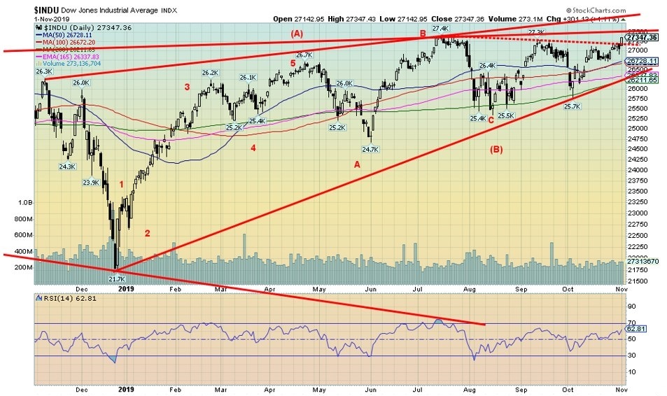
The DJI has not yet made new all-time highs but it is getting close. This week the DJI did close above resistance, suggesting a possible breakout. But the real breakout, we believe, won’t take place until the DJI breaks firmly above 27,500. In that respect, we are getting close. A break back below 26,700 suggests a potential top is in. The major breakdown takes place under 26,200.
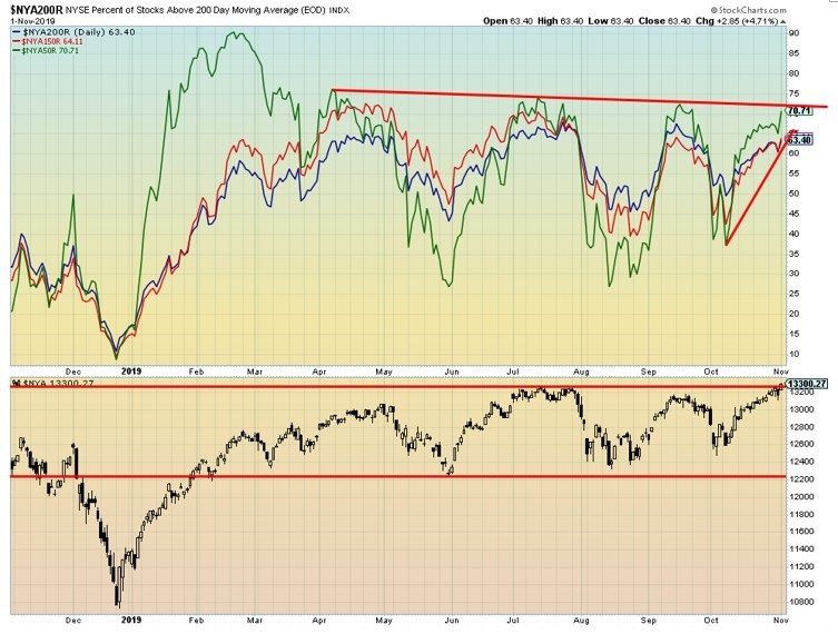
The percentage of stocks trading above their 50-, 150-, and 200-day MAs are rising. Both the NYSE and the % Index appear poised to break out to the upside. The NYSE has been in a sideways pattern now for most of the year and could be poised to break out to the upside. The downside breakdown is at 12,200. Like other indices, we are at a make or break level. We either break through to the upside or we fail and go back down to test the breakdown levels.
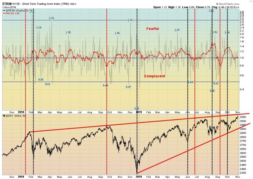
The TRIN Index or Short-term Trading Arms Index is in what we have termed fearful territory. Actually, it is coming down but it has not yet turned complacent. The TRIN rises if the market is falling and falls if the market is rising.
The TRIN is a technical indicator that compares the number of advancing and declining stocks (AD Ratio) to advancing and declining volume (AD volume). It is used to gauge overall market sentiment. It is a predictor of potential future price movements, primarily on an intraday basis. It generates overbought and oversold levels.
We have named the overbought and oversold levels as fearful (oversold) and complacent (overbought). Given the recent rise in the market, we were surprised to see that the TRIN is still in positive territory (+0.76), albeit barely. But it is not in complacent territory below 1, either.
So that suggests to us that we may have room to move lower as the market moves higher. In other words, the market is rising but there are insufficient signs that the market has become too complacent at these levels.
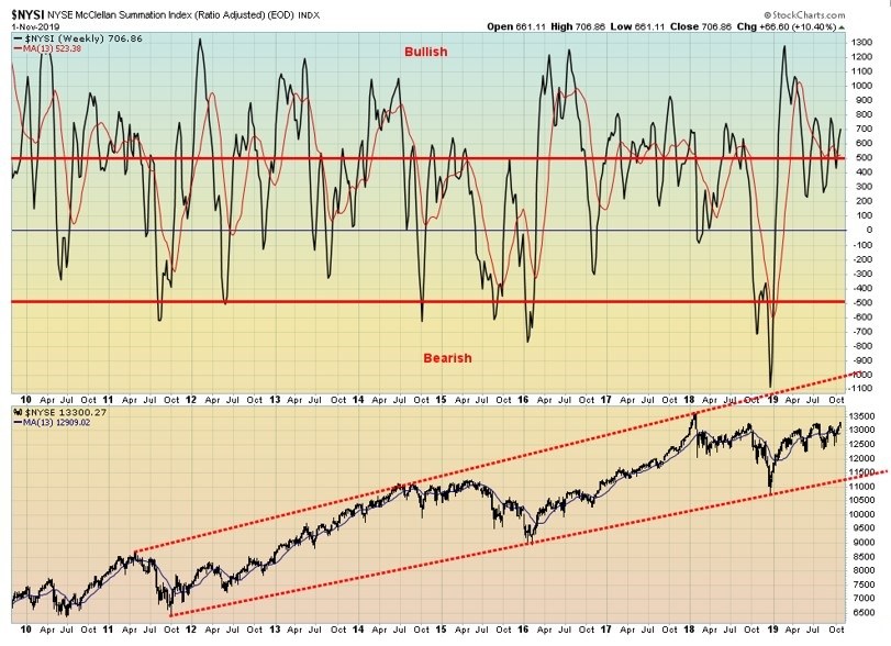
The NYSE McLellan Summation Index (ratio-adjusted) known as the RASI remains in bullish territory, currently at 707. The NYSE is short of its all-time high seen back in January 2018 at 16,337. However, it is rising and this past week it closed at new 52-week highs 13,330. The RASI appears to suggest that the NYSE should move higher.
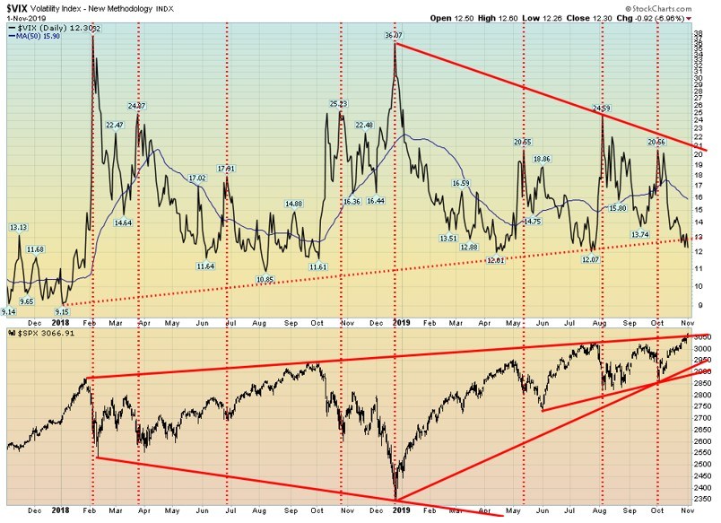
The VIX volatility indicator appears to have broken down under a year-long trend line, signalling that it could fall even lower. If the VIX is falling, then the stock market is most likely rising. After all, the VIX is nothing more than a fear and greed index. The VIX moves inversely to the stock market. A low VIX signals greed and a high VIX signals fear.
The VIX still needs to take out the April and July lows of 12.01 and 12.07. Once they fall, the VIX could fall further to test the lows of 2017 where it was consistently under 10. As we have noted, the S&P 500 is at a make or break level. We either go higher from here or we fail. The VIX appears to be suggesting that we could go higher.
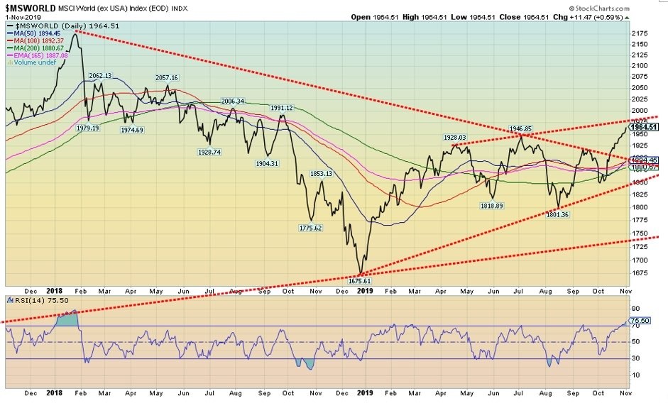
Is the MSCI World Index (ex US) breaking out? The MSCI made new 52-week highs this past week. It appears to be embarking on a new uptrend. A breakout over 1,975 would confirm the breakout. However, the RSI is overbought at 75.50 but it can stay overbought for some time if a strong bull market develops.
We could argue that the MSCI made an inverse head and shoulders. Targets could be up to 2,140. We’d feel better if the MSCI can break out over 1,975 and close over that level. A breakdown under 1,850 would end any thoughts of a strong bull move. But the chart is encouraging and could be harbinger for others.
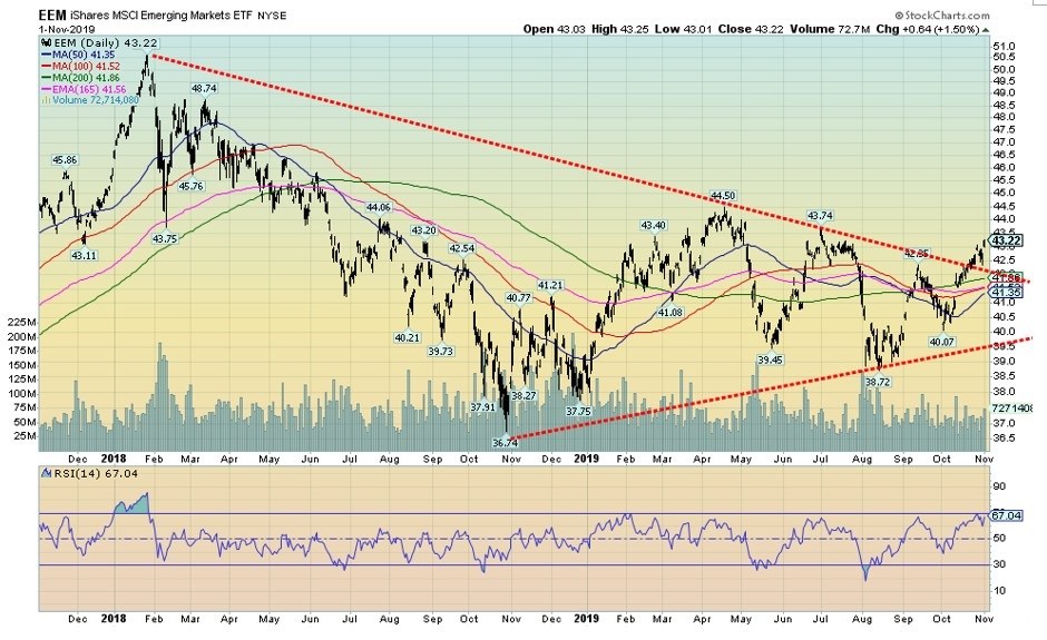
The iShares MSCI Emerging Markets ETF (EEE-NYSE) is a proxy for the MSCI. Like the MSCI, EEE is breaking out; however, it has not yet made new 52-week highs. A firm close over $44.50 would confirm the breakout. We do note that we have seen a few others mention the EEE and have issued buy signals for it.
A break back under $41.50 would be negative and a breakdown under $41 could signal a bear market underway. It was noted in one of the services we follow that someone purchased $1.5 million of the $44 December call options earlier this week. Given they expire next month, that’s a hefty bet and one must wonder that they must be convinced the EEE will rise for that size of the bet. Interesting.
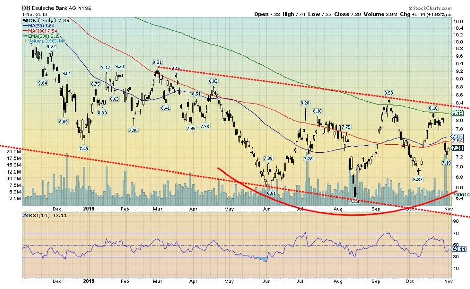
Whither Deutsche Bank (DB-NYSE)? DB fell sharply this past week following a report that its revenue in the bank’s fixed-income trading group tumbled sharply. DB blamed foreign exchange trading and losses on sovereign debt and emerging market debt. DB has broken up its units and has what one calls a “bad bank.”
In the “bad bank,” its pre-tax profit was down 73%. With the Fed’s current repo program and rumors of a possible liquidity problem in the market, DB’s name constantly comes up. DB is also a huge player in the global derivatives market with an actual market exposure exceeding $1 trillion vs. notional of over $46 trillion.
Despite the drop, DB is actually above levels seen in June, August, and early October of this year. We could argue that DB is actually making a bottom pattern. Then again, we also have failed highs in July, September, and again in October so we could be seeing a topping pattern just as easily as a bottom pattern.
A breakdown under $6.44 would send DB to new lows. Volume was quite high on the gap breakdown. We’ll keep a close eye on DB, especially since it is at the center of any potential liquidity crisis.
In some respects, we were surprised that the October employment numbers were released on November 1. Not surprised because normally they are released on the first Friday of the month. However, when the first Friday of the month is also the first day of the month, the numbers usually don’t come out until the following week. But here they are.
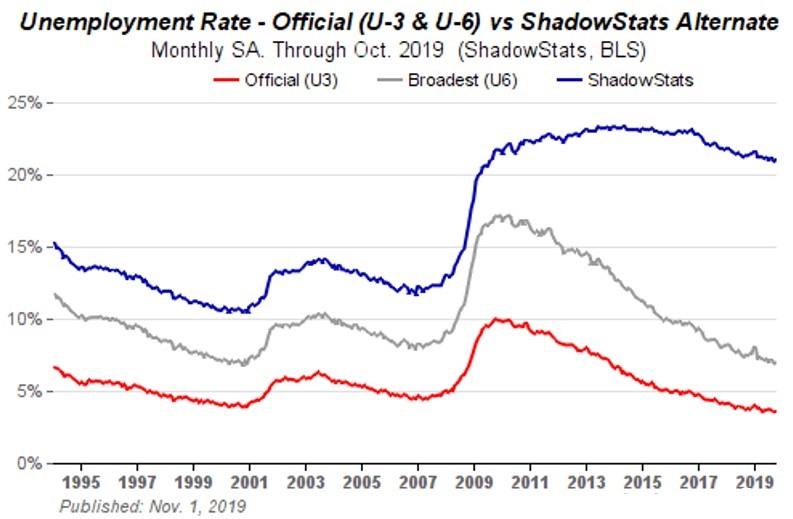
Nonfarm payrolls for October were reported as being up 128,000 which was well above expectations of only 89,000. September was revised upward to 180,000. The unemployment rate (U3) rose to 3.56% from 3.52% while the U6 unemployment level was up to 6.96% from 6.91%. U6 unemployment is U3 unemployment plus marginally attached workers seeking full time and longer-term unemployed out to one year.
Shadow Stats also reports an unemployment number that is the U6 unemployment plus long- term unemployed beyond a year who are now no longer included in the Bureau of Labour Statistics (BLS) numbers. That number was 21% vs. 20.9% in September. Contributing to the rise in the unemployment rate was an increase in the BLS’s labor force participation rate to 63.3% from 63.2%. The higher the participation rate, the higher the unemployment rate.
Those not in the labor force totaled 95,481 thousand in October vs. 95, 599 thousand in September. Of that, some 54 million are retirees and another 10 million are disabled. Of the remaining, many are full-time students. There were listed 1.2 million as available for work and looking but not employed. The actual civilian labor force rose by 325 thousand in October.
Amongst those factors affecting employment numbers this past month was the GM auto strike. Wage increases were subdued.
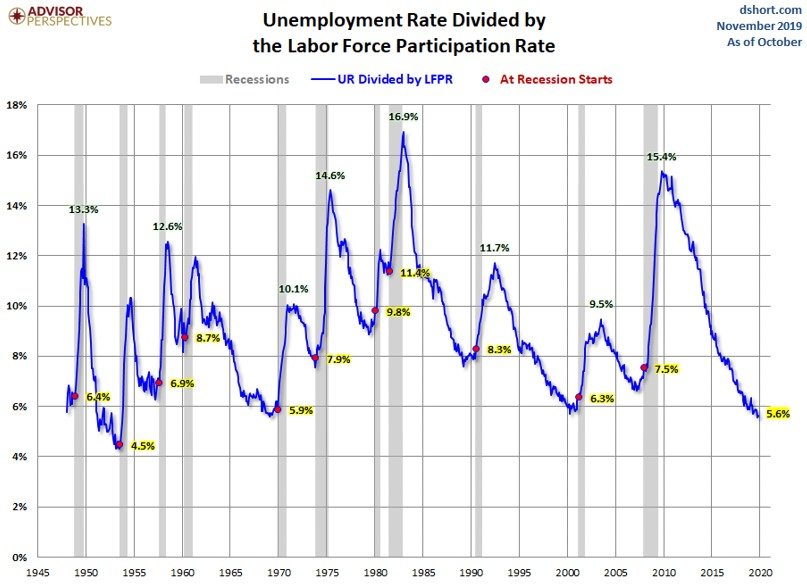
This is an interesting chart as it takes the unemployment rate (U3) and divides it by the labor force participation rate. What the chart seems to be telling us is that a recession usually gets underway when this indicator is already rising off of a bottom. Grant you, we have yet to determine the bottom.
However, at 5.6% it is at levels seen in 1999 and 1970, just before recessions. It is below levels seen before 2007 and the early 1980s recession. Except for the low seen in 1954 the indicator has never been so low.
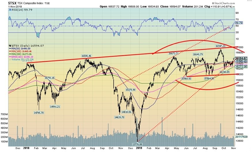
We still can’t decide whether the TSX Composite is making a top or bottom. It looks like a top, but it could be that the pattern is just a consolidation pattern that eventually breaks to the upside. A confirmation would occur over 17,000 and could, in theory, project up to nearly 18,000.
A breakdown under 16,000 would send the TSX in the opposite direction with targets down to at least 15,000. This past week the TSX Composite gained 1.2% and the short-term trend turned up once again. The woes of the TSX Venture Exchange (CDNX) continued as it was down 0.9%. No one seems very interested in the CDNX.
Leading the way this past week was the TSX Industrials up 3.2%, followed by Telecommunications up 2.2%, Metals & Mining up 2.1%, and Information Technology up 1.8%. Almost all of the sub-indices were up this past week with Financials up 1.1%, Materials +1.1%, Utilities +0.8%, Consumer Discretionary +0.5%, Gold +1.5%, Income Trusts +0.9%, and Real Estate +0.3%. As for the losers, Consumer Staples fell 0.4%, Energy was off 0.5% and the moribund Health Care index was down 0.8%.
Financials remain in strong buy mode while Health Care is the opposite in strong sell mode. Everyone else is in an up-mode to varying degrees with some sectors stronger than others. Energy could be bottoming
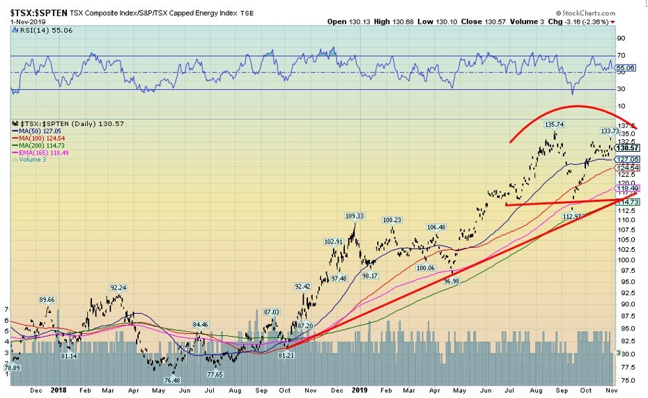
A key for the TSX Composite could be the energy sector. It has been a drag on the index for months. However, our chart of the TSX/TSX Energy (TEN) ratio suggests that it could soon change. Is the ratio of making a double top? It is possible with a high in August at 135.74 and a lower high in October at 133.73. The TEN makes up roughly 16.4% of the TSX Composite.
The largest component is the Financials, making up a whopping 32.4% of the TSX Composite. The financials have been leading the TSX higher of late. If this double top is correct, then the breakdown is at around 114.75 and could project down to around 92. The energy sector has been a major drag on the TSX, but that could soon be changing.
As was widely expected, the Fed cut its key rate by another quarter-point this past week to 1.50%–1.75%. The Fed then hinted that they may be done for the time being. The Bank of Canada (BofC) also made its rate decision this past week which was to leave rates unchanged at 1.75%. The Bank of Japan (BOJ) got in on the act, leaving its key bank rate unchanged at negative 0.1%. The advance Q3 GDP came in at 1.9% versus a consensus of 1.6%.
So, better than expected; however, any rate under 2% suggests that the U.S. economy is not growing but it is not tanking, either. Q2 saw an increase of 2%. As we keep saying, the U.S. economy bumbles along. There are pockets of slowdowns, but, overall, everything keeps its head above water.
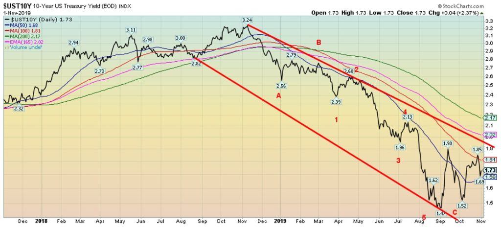
After falling earlier in the week, U.S. Treasury yields bounced higher following the better than expected jobs report on Friday and some potential for a resolution in the U.S.-China trade war. The U.S. 10-year Treasury note ended the week at 1.73%, down from 1.80% the previous week. There is potential resistance up to 1.90%, but above that level rise to 2.20% is possible. A break under 1.65% could send yields lower once again.
U.S. Treasuries have had a good year—the best since 2011. Growth is cooling globally and central banks, especially the ECB, are once again embarking on QE programs. So is the Fed, but they aren’t telling anyone that their action in the repo market is QE in another form.
The BOJ always seems to be in QE mode, yet the Japanese economy remains lethargic at best. All of this could help keep U.S. yields under wraps and we might set up a trading range between 1.50% to 1.80%. The U.S. economy may not be firing on all cylinders, but it doesn’t appear to be headed for the dumpster, either. This coming week a raft of Fed governors are speaking.
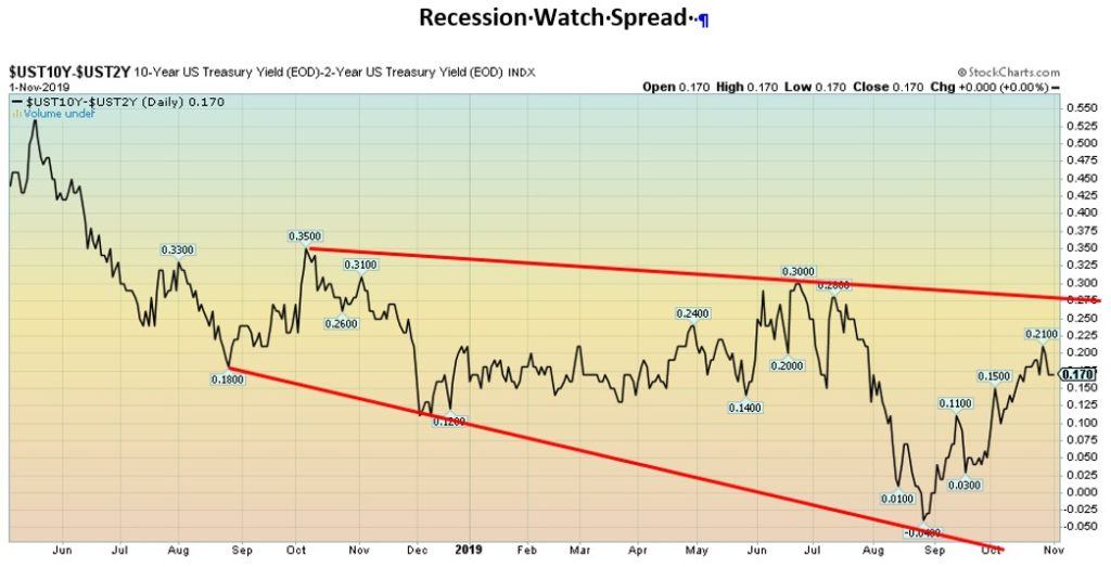
Are we headed for a recession or not? The 2–10 yield curve inverted for only a short period earlier this year and has turned positive once again. The current level is +17 bp. We believe this is in keeping with a U.S. economy that is bumbling along. Growth isn’t great, but a recession is not imminent either. If the channel is correct, the 2–10 spread could rise to 25–27 bp.
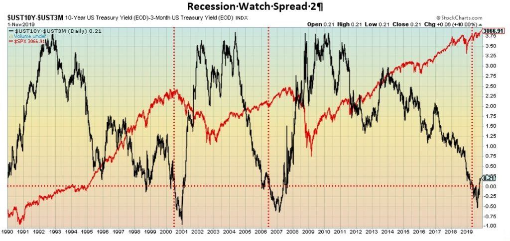
Even the 3-month—10-year yield curve has turned positive once again. A negative yield curve lasted a few months and fell as low as negative 52 bp. It is now positive 21 bp. The yield curve went negative in May 2019 and turned positive again earlier in October. Historically, it has suggested that the stock market could still rise despite a negative yield curve.
That happened in 2007; however, in 2000 the top in the stock market largely coincided with the yield curve turning negative. It was only after the yield curve turned positive once again that the stock market cracked in 2008, and even then, it didn’t happen right away. The yield curve has turned positive again this time and the stock market is still rising.
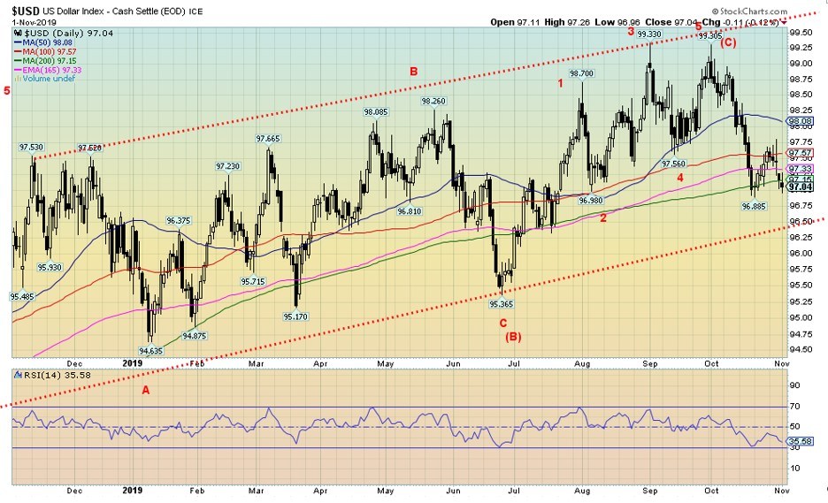
We continue to believe that the US$ Index has topped and could be soon embarking on a prolonged down move. The US$ Index fell 0.6% this past week. The beneficiaries were the euro up 0.8%, the Swiss franc up 0.9%, the pound sterling up 0.9% despite elections and Brexit, and the Japanese yen up 0.5%. The loser? The Canadian dollar fell 0.7% as oil prices remained weak.
After attempting to rally, the US$ Index failed at the 100-day MA and moved back down, closing this past week just below the 200-day MA. That is a potentially bearish close. If that is correct, then the US$ Index could swiftly decline to major support at 96.50. A breakdown under 96 would confirm a major decline underway.
While ultimate swing targets could be as low as 77, minimum targets once we close under 96 could be 85.50. A falling US$ Index would be positive for gold but not necessarily negative for stocks. In the past, the S&P 500 has gone up while the U.S. dollar fell and it has gone up while the U.S. dollar rose. However, eventually, a falling U.S. dollar can prove negative for the stock market but on a delayed basis.
The US$ Index regaining 97.50 would be positive and could suggest a move up to 98 and the next level of resistance. A breakout over 98.50 could suggest new highs. The US$ Index falling under the 200-day MA is not necessarily fatal. Over the past year, three other plunges below the 200-day MA occurred and each time it recovered.
The last one was seen in June 2019 when the US$ Index fell to 95.63. But uptrend lines held each time, which is why this time a firm breakdown under 96.50 and especially under 96 could set off further declines and a bear market for the US$ Index
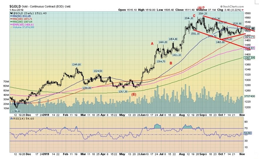
Gold put in a positive week, thanks to a weaker U.S. dollar and the Fed rate cut (which was widely expected). Steadying gold prices was the Fed hinting they may be done for the year and the job numbers which, while not great, were stronger than expected. Gold was up 0.4% on the week while silver gained 0.8%. Platinum was essentially flat on the week; however, palladium continued its record run with a gain of 0.7% to yet another record high. Copper prices were off 0.8%.
Gold appears to be forming a flag or pennant pattern following the run-up (flag pole?) from the May 2019 low. Gold is currently pressing against a breakout of the pattern. The pattern, if correct, could project gold to just over $1,600. We maintain our ultimate targets based on the multi-year bottom pattern could be as high as $1,725.
Others have even higher targets; however, at this point, we don’t see them. Key would be a breakout and close for gold over $1,535. Above $1,550 new highs are probable. The caveat remains a breakdown under the first $1,475 and then under $1,460. A decline to $1,425 could then get underway.
We remain positive for gold going forward and have been looking for what we term our 11-month low. We are in the period although that low could still take place into November or even early December. Positive seasonals kick in after that, carrying us into the New Year February/March. Last year’s run lasted from December to February.
We believe that we have completed the first wave up from the May 2019 low and the past few months has been the B wave correction. A-C wave to the upside should follow.
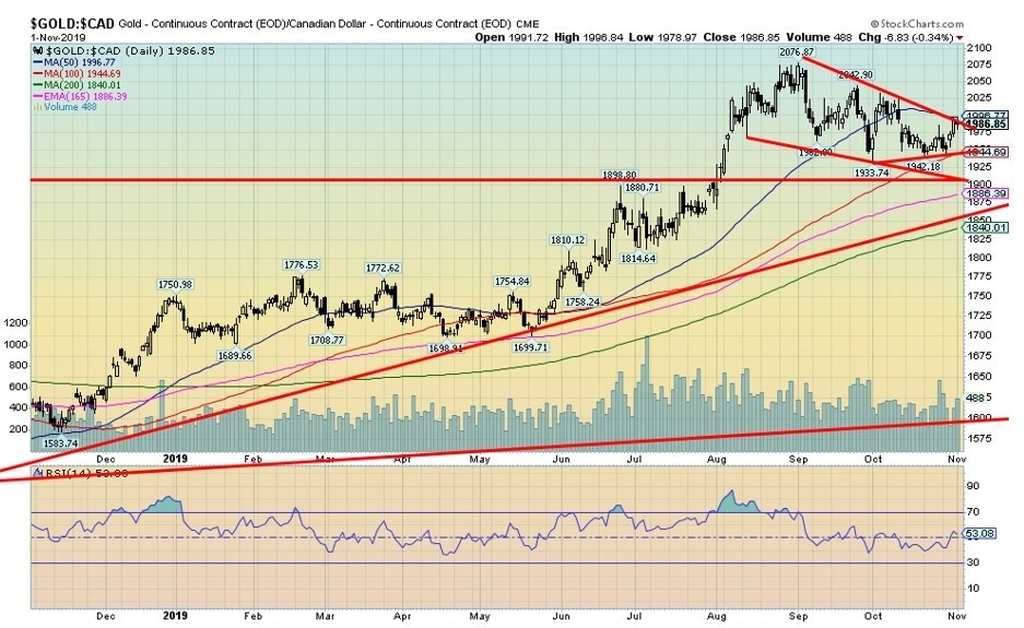
What sets gold in Canadian dollars apart from gold priced in U.S. dollars is that gold in Canadian dollars made new all-time highs earlier this year. That earlier all-time high was seen in 2011 at $1,905. The recent all-time high was at $2,077.
Gold has made all-time highs this past year in a number of currencies. Key ones include the Australian dollar, U.K. pound, euro, Japanese yen, Russian ruble, Indian rupee, Mexican peso, and South African rand. There were many others. In the past when so many were making all-time highs it usually followed that gold in U.S. dollars eventually made a new all-time high as well. That high was seen in 2011 at $1,923.
Gold in Canadian dollars has a similar pattern as gold in U.S. dollars. It is either a pennant or flag formation. A breakout over $1,995 and especially over $2,000 could project gold in Canadian dollars up to $2,140. Gold in Canadian dollars made its low in 2013 at $1,242. That low was seen 2 years before gold in U.S. dollars. By December 2015, gold in Canadian dollars was making a higher low, a distinct divergence with gold in U.S. dollars.
Naturally, gold in Canadian dollars has been making new all-time highs because of the devaluation of the Canadian dollar vs. the U.S. dollar. Since gold in Canadian dollars low in 2013 at $1,242 the Canadian dollar has plunged over 20% vs. the U.S. dollar. Gold in Canadian dollars is up 60% since then. Gold in U.S. dollars is only up 44% from its December 2015 low. Gold is protection against currency devaluation.
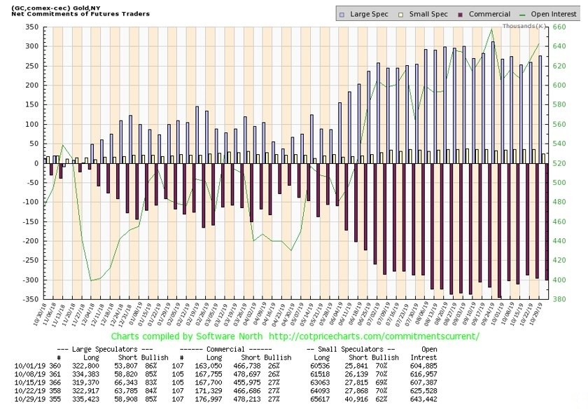
The gold commercial COT remained unchanged this past week at 27%. Long open interest rose just over 5,000 contracts, but short open interest was also up, rising almost 12,000 contracts. The result is that the gold commercial COT remains somewhat bearish. We’d like to see prints into the 30s and even 40s to become really bullish.
The large speculator’s COT (hedge funds, managed futures, etc.) rose to 85% from 84% as their long open interest jumped just over 13,000 contracts while their short open interest fell roughly 5,000 contracts.
All we can say is the gold commercial COT is off the lows but it is not at levels that would get us bullish. Although, as we have seen in the past, a bearish commercial COT does not necessarily stop a sharp rally it helps if it is more bullish.
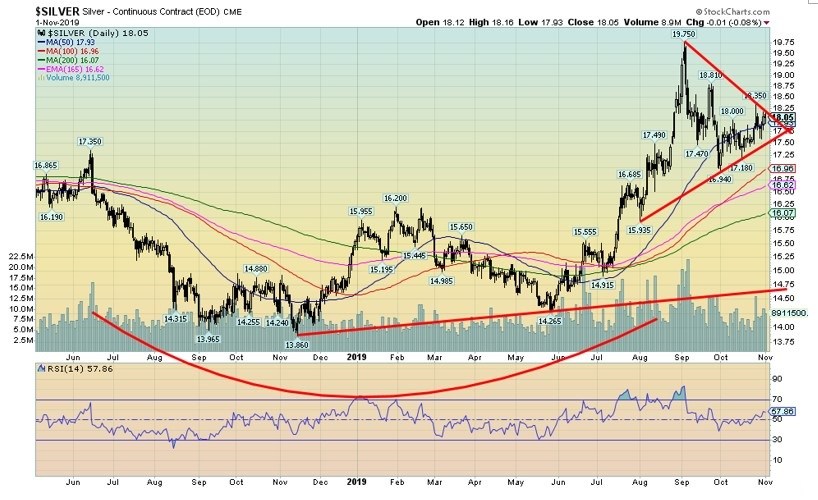
Silver’s symmetrical triangle continues to form. As with gold, this should be a consolidation triangle following a sharp up move. But silver, like gold, needs to demonstrate that it is going to move higher. A move over $18.75 would be quite positive and, if the triangle is correct, could project up to near $21.
On the other hand, a breakdown under $17.25 would be negative. A close below $16.94, the September low would suggest further breakdown ahead. There was good volume on the way up to $19.75 and to no surprise, the volume has tailed off as the triangle forms. There still could be one more push to the downside, but as long as $17.50 holds we should be okay.
The silver commercial COT was unchanged this past week at 34%. There was little movement in open interest with long open interest off just over 1,000 contracts and short open interest down just over 5,000 contracts. We’ll view the decline in short open interest as a positive.
The large speculator’s COT rose to 70% from 68% as their long open interest jumped almost 6,000 contracts. Overall, the commercial COT remains somewhat bearish. We’d prefer to see it over 40% or even high 40s to be really bullish. Just because the commercial COT remains somewhat bearish doesn’t mean the market will fall—but it is a caution sign.
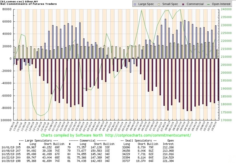
At one point we thought the TSX Gold Index (TGD) could be forming a potential head and shoulders pattern. That is why we call them potential. Until they break key points such as the neckline of the H&S pattern on volume, then they remain just that—potential and nothing more.
Now the H&S pattern is all but gone and instead, in its place, we have what appears as a flag formation. A flag pattern forms following a sharp run-up (called the flagpole), then it consolidates and takes on the shape of a flag or pennant.
Usually, they are 5 points to the pattern as in ABCDE. So far, this appears as a 5-point move to the downside. The result is we could now be poised to break out to the upside. A solid close above 250 would be quite positive and a close above 260 would suggest new highs ahead.
Given that, we would not want to see a return under 238. The breakdown point is currently around 224. If the flag formation is correct, then the potential target could be up to 290/295.
This past week the TGD gained 1.5% and the Gold Bugs Index (HUI) was up 2.3%. The HUI has a similar pattern to the TGD. Numerous gold stocks appear to be forming higher bottoms. With 30% gains already this year, gold has been one of the best performers. A run-up to 295 would make them look even better. But we remain cautious about the downside until we break out. Major long-term support appears to be down at 200.
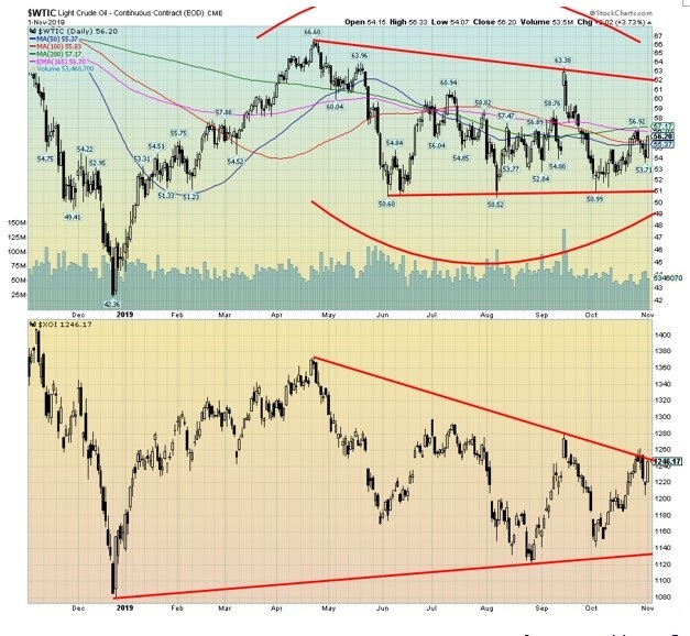
Are oil markets poised to turn? In watching the action over the past several months, we have had mixed feelings as to whether WTI oil was forming a top or a bottom. The low was in December 2018 at $42.36 and following that WTI oil enjoyed a nice run to a high of $66.60 in April 2019. Seasonally, oil’s strongest period is between December and July.
Following the top, the action has been what we would consider typical consolidation following a run-up. We have now had three lows near $50 but have failed to break any higher than the $63.38 seen at the time of the drone attack on the Saudi oil fields.
Going forward, there are a few things that should help oil prices. One is, despite all the bluster on U.S.-China trade talks, the odds are probably that a deal of some sort will be struck. OPEC wants higher oil prices as well; the question is, how well they adhere to cuts given their history of cheating.
Finally, despite all the problems in the Middle East and while it remains in a state of at least low-level war, it is not about to blow up. And no, the U.S. won’t attack Iran, especially given that Russia has sent a warning to the U.S. that they won’t stand idly by while the U.S. attacks Middle Eastern countries.
The days of waltzing into Iraq are over. The only question that remains is, what does the U.S. intend to do in Syria stating that they might keep the oil that effectively doesn’t belong to them? Other parties may have a say, but the odds of the U.S. risking clashes with Syria are probably low.
A drop in the rig count helped WTI oil recover this past week and it ended up only 0.8%. Natural gas continued its recent recovery, gaining 6.9%. The energy indices, however, remained weak with the Arca Oil Index (XOI) off 0.2% and the TSX Energy Index (TEN) down 0.4%.
But seasonals are about to shift and, after spending months underperforming, the energy sector could soon wake up. WTI oil breaks down under $51 but breaks out over $62, although a move above $57 would be positive.
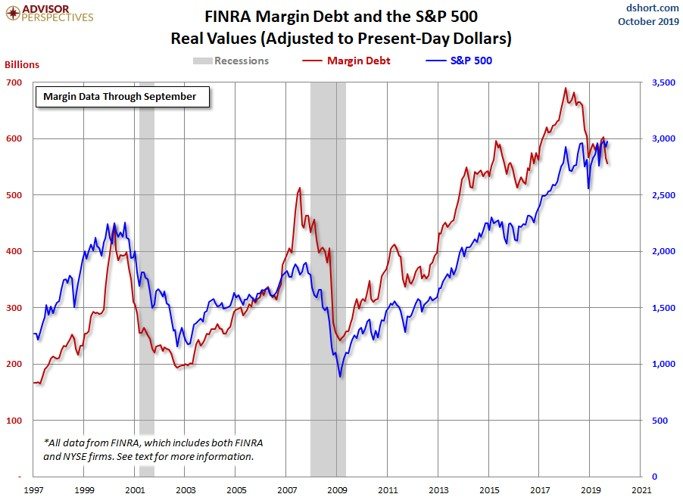
Source: www.dshort.com
If the stock market goes into a blow-off mode, margin debt would play an important role. Our expectations are that margin debt would increase as the market moved higher. Margin debt peaked back in May 2018 and has largely been in a downward trend since. Following a brief period of gains that peaked in July 2019, the margin has begun to dip lower once again.
September (the latest figures available from FINRA), saw a 1.6% decline. October figures are not yet available. However, we wouldn’t be surprised if they were up, given that the S&P 500 gained 2% on the month. Margin debt tends to decline during periods of falling markets and rise during periods of rising markets.
However, margin debt has a tendency to peak before the actual peak in the stock market. We saw that in 2000 as margin debt generally peaked with the market in March 2000 peak and it peaked in July 2007 before the October 2007 peak. With a peak in May 2018, margin debt peaked before the final top in September/October 2018. The opposite often holds true for bottoms as margin debt bottomed in February 2009 just before the actual stock market bottom in March 2009.
Margin debt tends to rise sharply along with the stock market. So, if a breakout were to occur in the stock market our expectations are that we’d see a sharp rise in the use of margin debt. It always seems to happen that way.
—
(Featured Image by Chris Liverani via Unsplash)
DISCLAIMER: David Chapman is not a registered advisory service and is not an exempt market dealer (EMD) nor a licensed financial advisor. We do not and cannot give individualized market advice. David Chapman has worked in the financial industry for over 40 years including large financial corporations, banks, and investment dealers. The information in this newsletter is intended only for informational and educational purposes. It should not be considered a solicitation of an offer or sale of any security. The reader assumes all risks when trading in securities and David Chapman advises consulting a licensed professional financial advisor before proceeding with any trade or idea presented in this newsletter. David Chapman may own shares in companies mentioned in this newsletter. We share our ideas and opinions for informational and educational purposes only and expect the reader to perform due diligence before considering a position in any security. That includes consulting with your own licensed professional financial advisor.


The TopRanked.io Weekly Affiliate Marketing Digest [The Top VPN Affiliate Programs Roundup]
Want to be let in on a little secret about two massive affiliate opportunities you can take advantage of today?...


Sustainable Finance Faces Hurdles as Green Asset Ratio Reforms Fall Short of Full Transparency
The Green Asset Ratio (GAR) measures banks' alignment with the EU Taxonomy but remains low due to methodological flaws and...


XRP Hits New All-Time High Amid U.S. Crypto Policy Shift and Ripple’s Expansion
XRP surged past its 2018 all-time high, reaching $3.65 amid renewed political support for crypto in the U.S. under Trump....


Germany Moves to Curb Medical Cannabis Abuse, Sparking Access Concerns
Medical cannabis imports in Germany have surged, but health insurance-covered prescriptions remain low. Easy online access raises concerns about abuse...


JPMorgan’s Data Fees Shake Fintech: PayPal Takes a Hit
JPMorgan Chase will charge fintechs for customer data, threatening business models reliant on free access. PayPal’s stock plunged 5.7% after...
 |
|
 |  |
 |
|
-

 Crowdfunding1 week ago
PMG Empowers Italian SMEs with Performance Marketing and Investor-Friendly Crowdfunding
-

 Markets5 days ago
Markets Wobble After Highs as Tariffs Rise and Commodities Soar
-
 Markets2 weeks ago
The Big Beautiful Bill: Market Highs Mask Debt and Divergence
-

 Africa2 days ago
ORA Technologies Secures $7.5M from Local Investors, Boosting Morocco’s Tech Independence