Featured
The world is heading towards a new Great Depression
The hits just keep on coming. The job numbers in the U.S. this past week were stunning and forecasts for the shutdown of the economy could extend out not weeks but months. We have a look and the conclusions are anything but rosy. The coronavirus and the reaction to it is causing massive disruptions as the cases and the death toll mounts. We are wondering if are headed to the Great Depression.
April is the best month of the year for the Dow Jones Industrials (DJI). April also brings us April showers that bring May flowers. April also brings us Easter and sunnier weather. It is the first full month of spring. Lovers might get spring fever.
March came in like a lion and went out limping with thorns in its feet and a very bloody nose. The lambs apparently were sacrificed—or was it they were eaten by the lions? March apparently ended what was historically the worst quarter ever recorded for the stock markets. The DJI fell 23.2%. Individual stocks and other indices fell even more. A major bear market is, we highly suspect, underway. Numerous records were set mostly in points for down days. But we also experienced the second biggest percentage drop in stock market history on March 16, 2020, one of 12.93%—surpassed only by October 19, 1987, when the DJI fell 22.61%.
Oh, yes. The coronavirus. COVID-19. The plague that is stalking the world. A reminder, however, that it still has a long way to go to rank with the worst plagues ever. The worst ever? The Black Death bubonic plague of the 14th century is estimated to have killed at least 200 million; the smallpox plagues of the 16th to 19th century wiped out upwards of 90% of the native populations of North and South America; and the Spanish Flu of 1918–1919 is estimated to have killed upwards of 50 million with some estimates as high as 100 million. Plagues have historically had profound effects on civilizations, in some cases leading to the collapse of civilizations. Significant declines were seen for the Greek Empire, the Roman Empire, and the native civilizations of North and South America following the outbreak of plagues. In the case of the native civilizations of North and South America, they collapsed completely. In other cases, they have had profound effects on civilizations, leading to a decline of one and the rise of another. And outbreaks are not just something confined to ancient history as we are currently witnessing.
So just how bad is this one? Well, to date, they have reported over 1,200,000 cases with over 300,000 in the U.S., in a total of 205 countries plus two international conveyances, the Diamond Princess and Holland America’s MS Zaandam. As well, we learn there has been an outbreak with over 100 cases on the USS Theodore Roosevelt, a U.S. navy aircraft carrier. Reported deaths to date are over 64,000. That is just the official numbers. Is there any good news? Some 90% of the cases are considered mild or have fully recovered.
Overall, compared to previous plagues this one is still pretty small, irrespective of questions about the count from China, a lack of information from North Korea, and potentially an unknown number from war zones, refugee camps, the slums of India, Asia, poverty-stricken countries like Afghanistan or the barrios of Latin America. The real count could be a lot higher. According to U.S. intelligence reports, China is concealing the extent of its coronavirus outbreak, under-reporting total cases and deaths. Others dispute that claim, saying there is little evidence. There also might be undercounting from Africa, India, and Latin America where the healthcare systems are lacking or even non-existent although a significant portion of their population that has the means would have access to healthcare. Comparatively speaking, their numbers have been small. Even the U.S. could be undercounting as they lack sufficient testing equipment and, for the millions who are not covered by insurance, they could be avoiding going in for medical help as it would bankrupt them, even with Medi-Cal.
One of the major arguments has centered around the decision to suppress the spread of the coronavirus vs. mitigating the disease. China went into full suppression mode and that is how the West (North America and the EU, plus others) are also trying to deal with the disease. Suppression involves physical distancing and mass shutdowns vs. trying to let things operate as normally as possible (flattening the curve) so that eventually the virus will peak (mitigate). Sweden has chosen to allow things to operate mostly normally. Except the West is not China and the execution has not occurred with the same military precision as China and even others such as Taiwan, South Korea, and Singapore where medical and electronic privacy has been shunted aside. One result could be destroyed economies in the West and the spread of COVID-19 still growing. A game-changer.
There is a political argument occurring over the decision to suppress rather than mitigate. Mitigation appears to have been favored by U.S. President Trump but health officials and others recommended suppression, except, as noted, without the military push favored by China. The result is much more haphazard with cases and deaths still rising sometimes sharply. That is, irrespective of some forecasts suggesting this could peak sometime later in April. But what if it doesn’t? Maybe that’s wishful thinking. The City of Toronto has suspended all events until the end of June, three months away. The province of Ontario has announced this could last two years. Two years under lockdowns accompanied by mass unemployment could eventually result in social disorder, something we are already seeing in some countries.
No, it is not our intention to step into the argument over mitigation vs. suppression except to note that there are those that believe that suppression is another power grab by governments. The COVID-19 presents a big problem and governments have responded accordingly. But history does suggest that the state doesn’t necessarily give back powers once the crisis is over. And that, in turn, could result in fewer freedoms and more surveillance.
The forecasts are not pretty. One from the Federal Reserve Bank of St. Louis (FRED) has warned that unemployment in the U.S. could reach a staggering 32% by June. Others are not as pessimistic. The market was stunned by the 6.6 million initial claims following the previous week’s 3.3 million. That was followed by a stunning 701,000 nonfarm payrolls decline for March. The market was expecting only a 100,000 to 150,000 decline. The initial claims reported this past week along with the previous week add up to over 10 million applications for jobless benefits. That’s worse than the Great Depression. Bring on the Great Depression 2?
Canada has had 2.13 million apply for jobless benefits since lockdowns got underway. GDP forecasts range from a decline of 12% in Q2 to a 30% decline. Everything is being shut down: baseball, hockey, basketball, festivals, schools, restaurants, bars, salons, playgrounds, parks, Olympics and—well, we could go on. Public gatherings of more than five are banned here in Ontario under the Emergency Powers Act. In the U.S., 90% of the states are under “Shelter in Place.” No matter–megachurches in the U.S. Bible Belt are still packed and fundamentalist groups seem to believe they are protected. Doctors and nurses who complain about a lack of supplies or the safety of their workers are being threatened with dismissal. The culture wars also apply to the coronavirus crisis with the same breakdown of Republican/Democrat, Conservative/Liberal although it is far more pronounced in the U.S. than in Canada.
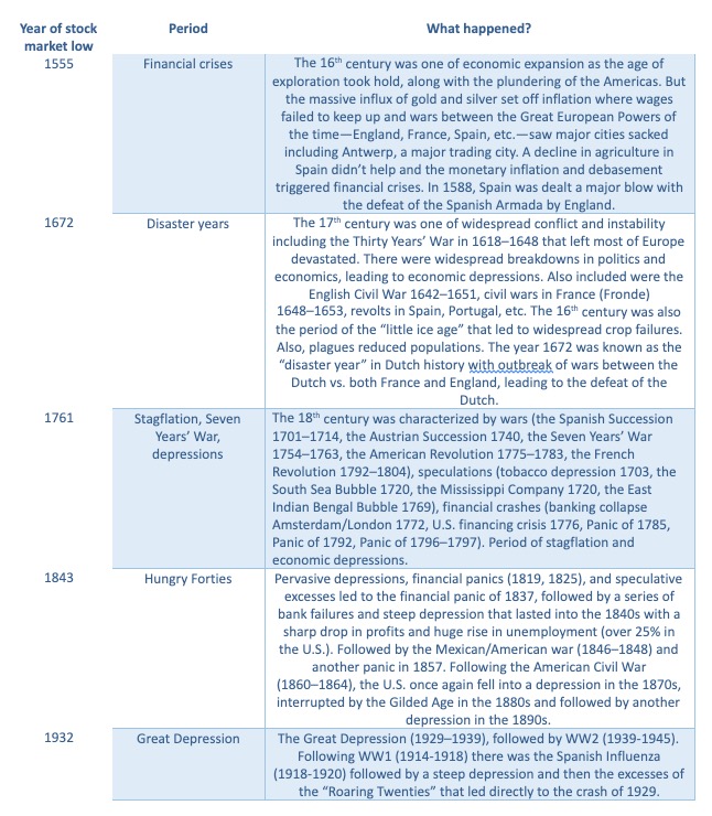
Is the Great Depression 2 even possible? Well, history seems to support that it is possible. Ninety-year cycles don’t come around very often (pun intended). However, there is some evidence to suggest that there is roughly a 90-year cycle of significant depressions. Ray Merriman of MMA Cycles has outlined what he believes is a 75-year cycle of major stock market lows with recessions/depressions. The last one was seen in 2008–2009, that being 77 years from the major 1932 DJI low. The 2009 low also satisfied the 37.5-year cycle (from 1974) and the 18.75-year cycle (from 1987). Merriman has suggested that there is a secondary collapse anywhere from 6 to 20 years following the termination of the 75-year cycle low. So, could that be some evidence of a 90-year cycle? Naturally, we can’t say with certainty, but here are our observations.
The chart below (sorry, it’s not the clearest chart but it’s the best we could find) shows significant stock market lows along with economic depressions in 1555, 1672 (117 years—a bit long), 1761 (89 years), 1843 (82 years), and 1932 (89 years). Ninety years from 1932 is 2022, but the range could easily cover out to 2032. Merriman’s 18.75-year cycle breaks into three 6.25-year cycles. From 2009 the next 18.75-year cycle is due in 2027/2028 but its range is 15–21 years, from 2024–2030. The last 6.25-year cycle was seen in 2016 so the next one is due in 2021–2024. One can see the overlaps.
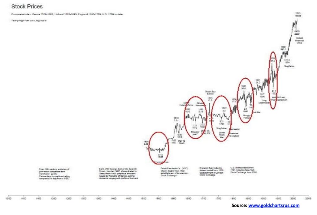
We take a look at each of these periods.
The themes of speculation, bubbles, debt collapse, wars, financial collapse and, yes, even plagues echo through every one these periods. Nothing has changed. The 2000s came in on a wave of speculation and a bubble in high tech and dot.com. A collapse was inevitable as wars pricked the bubble and everyone discovered the emperor (high tech and dot.com) had no clothes. It was followed by a debt and housing bubble that was also pricked when everyone discovered they were holding worthless pieces of paper in sub-prime mortgages, and down came the financial system culminating in the Lehman Brothers collapse in September 2008. Wars dominated the era in Afghanistan, Iraq, and more following the events of September 11, 2001. And then once again, after the financial crisis of 2008, we were followed by the most mind-boggling debt bubble in history, historically low interest rates that encouraged the mass borrowing and a massive program of quantitative easing (QE) that pushed up the price of assets. The wars continued on and on. And now the bubble has burst once again, thanks to the COVID-19. This will most likely be followed by one of the biggest debt collapses in history.
History repeats itself. No not the same, but it does rhyme.
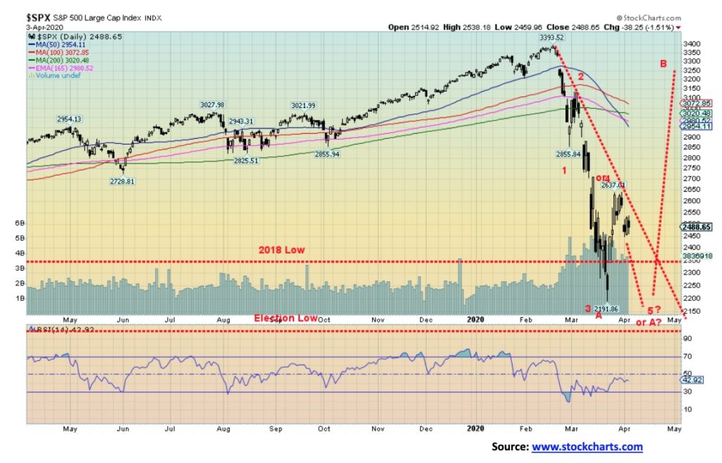
Anatomy of a bear market. Above is a chart of the secular bear 2000–2009. It was the second secular bear market since the Great Depression and War years. The first secular bear was the period 1966–1982. This bear was a three-pronged affair ((A)), ((B)), ((C)). The first prong was the high-tech/dot.com bear of 2000–2002 while the second prong was the recovery rally from 2002–2007. The third prong was the sub-prime/financial crisis bear market 2007–2009. The second prong with its excess speculative build-up, coupled with massive debt growth and the proliferation of specialized derivative instruments, helped set the stage for the third prong.
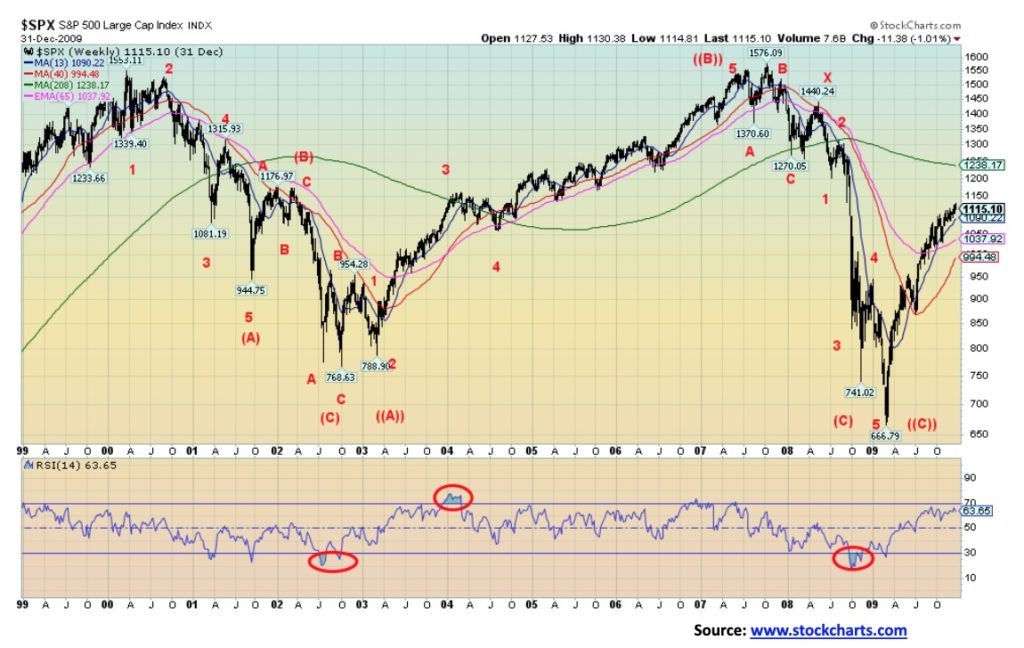
The high-tech/dot.com bear fell in three waves ((A), (B), (C)), bottoming in October 2002. The top was seen in March 2000, although the DJI had peaked earlier in January 2000. The first wave down (A) fell in three waves, the first wave appearing to be a five-wave decline into the September 11, 2001 low. By that time the market had taken out the 1999 and 2000 low and was perilously close to taking out the 1998 low. A sure sign that we had we entered a major bear market. The corrective wave was an ABC affair, peaking in February 2002. The final wave down also appears to have been an ABC affair and, as noted, it bottomed in October 2002.
The rebound rally wave (B) appears as a possible five-wave advance although we could re-label it as double zig-zag affair of ABCXABC and that might be more correct (note: we do not pretend to be an expert on Elliott Wave but observe where we see waves looking for impulse waves labeled 1,2,3,4,5 or corrective waves ABC). The nominal top was seen in July 2007, even as the final top was not seen until October 2007 as our B wave went slightly above the July 2007 high. The first wave down bottomed in March 2008 followed by a rally into May 2008 (wave X?). The final plunge that included the Lehman Brothers collapse also appears to us as an ABC affair, bottoming finally in March 2009 to complete wave (C) down. Altogether, the secular bear was three primary waves ((A)), ((B)), ((C)) taking the S&P 500 back to where it was in 1995. According to Elliott Wave analysts, that completed Cycle Wave 4 up from the 1929–1949 Great Depression/War. Cycle Wave 1 up was 1949–1966, followed by Cycle Wave 2 down 1966–1982, and Cycle Wave 3 up 1982–2000.
We suspect that this may be the start of another major long-term secular bear on the scale of 1929–1949. No, it doesn’t mean it will last 20 years, but it could be a significant bear market.
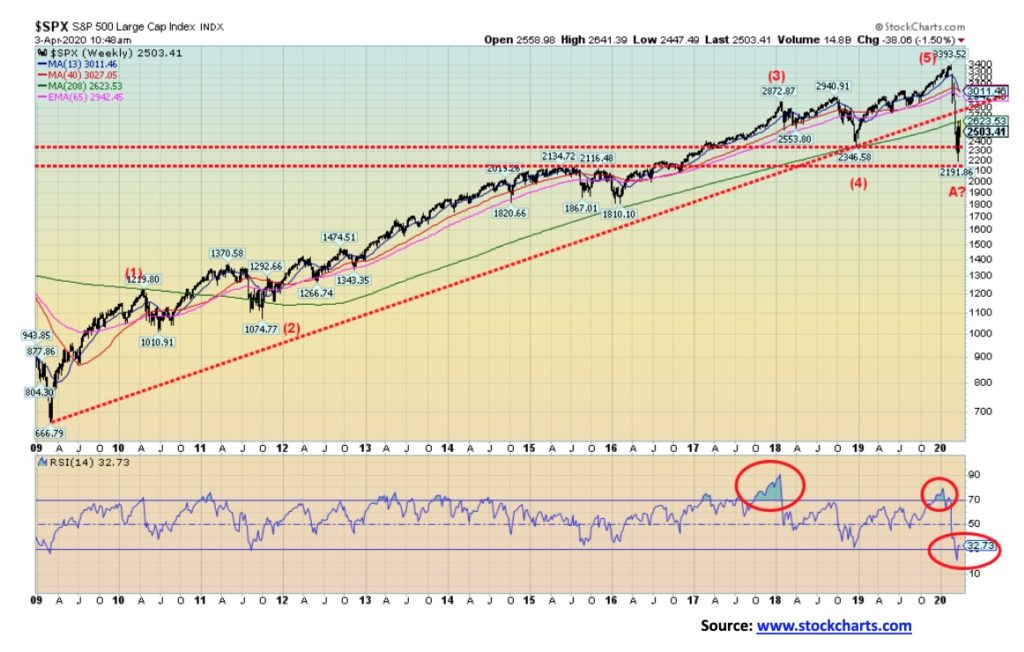
Cycle Wave 5 up lasted from March 2009 to the top seen in February 2020—one of the longest bull markets on record. It was, we believe, a five-wave affair with the wave (1) up topping in April 2010, followed by a rising wave (2) down into October 2011. Wave 3 up lasted until the top seen in January 2018. Wave 4 down was the trade war correction, itself an ABC-pattern bottoming in December 2018. The final wave up was completed in February 2020.
Three things stand out on the recent decline. First, it broke under the uptrend line from March 2009 and second, we broke under and closed under the 4-year MA for the first time since we left it behind in 2011. Third, the wave erased almost all of the gains back to the election of November 2016, easily taking out the lows of 2018 and 2017. We have taken out the lows of prior years 2019, 2018, and 2017, a sure sign that this is no normal corrective wave. This is potentially only the start of a major long-term bear market. Any thoughts of starting a new bull market should be shunted. A corrective wave to the upside that looks spectacular? Yes, that could easily happen. Other indices wiped all the gains back to the 2016 election. We have this as wave A down of a potentially larger ABC decline. The only question on our mind is, have we made the final low for wave A down?
This should be followed by a B wave up that could take us back to the highs of February 2020. The wave should start once we have determined a low for this A wave down. Once the B wave up is complete, we should embark on the C wave down that could take us to new lows but not necessarily to new lows. That is to be determined. Historically, we have seen examples where the A wave down was the steepest decline of the move. As to timing, the final C wave down may not bottom until 2022. We believe the B wave up could most likely top sometime later this year, possibly into September/October. The B wave should not be the start of a new bull market but merely a correction to the sharp A wave down.
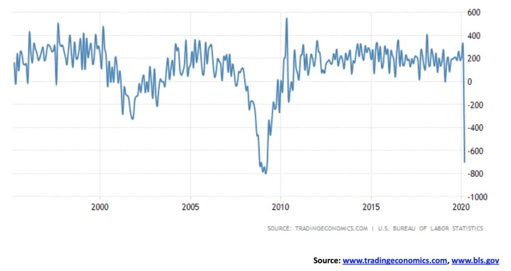
It was positively stunning. The March nonfarm payrolls plummeted by 701,000, the biggest drop since March 2009 at the height of the 2007–2009 Great Recession. The consensus had been for a decline of 100,000, although some thought as high as 150,000. It was off the charts as they say. And this was only for the first two weeks of March. It does not include the monstrous initial claims seen in the past two weeks that have totaled almost 10 million. By that measurement alone, the April nonfarm payrolls could pale this one. It could even exceed 1,000,000 job losses. The February nonfarm payrolls showed a gain of 275,000.
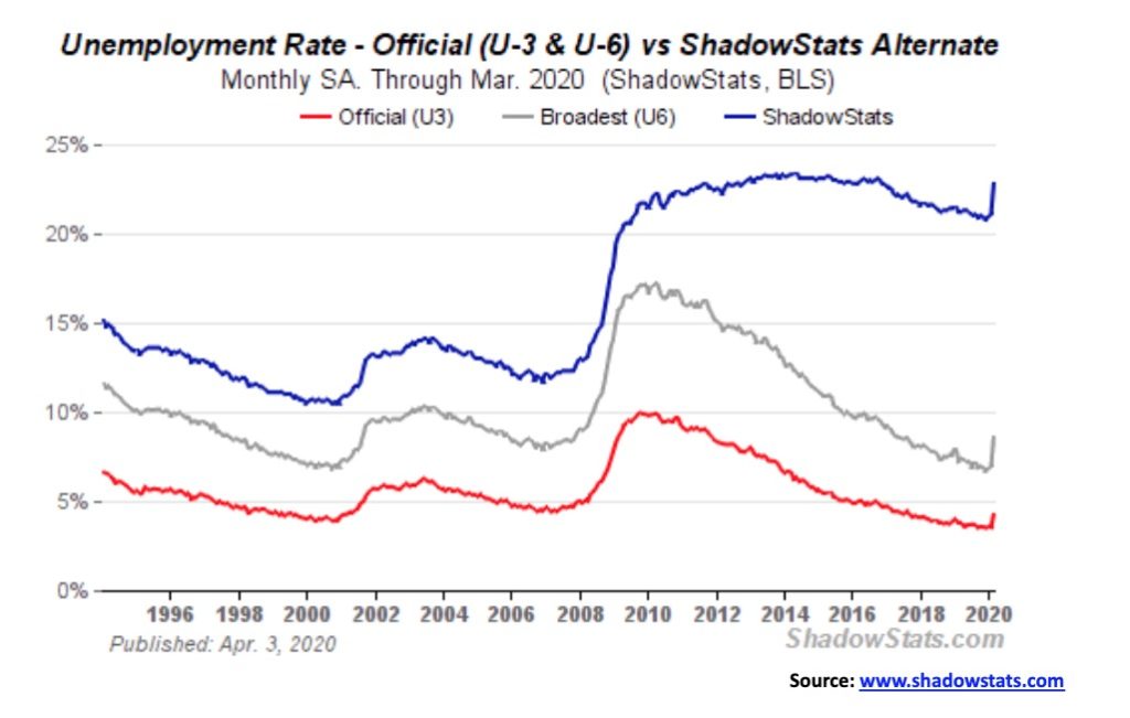
The unemployment rate (U3) leaped from 3.5% to 4.4%, itself a stunning jump and largest gain seen since 1975. The Bureau of Labour Statistics’ (BLS) broadest measurement reported an unemployment rate (U6) of 8.7%, up from 7.0%. The U6 unemployment includes the U3 unemployment rate plus discouraged workers less than one year. The Shadow Stats unemployment rate (the real economy rate) that is the U6 unemployment plus long term discouraged workers over one year defined out of the labour force in 1994 leaped to 22.9% from 21.1%. Not a pretty picture. The U3 unemployment rate is the highest since 2017.
Many now expect the unemployment to surge above 10% in the coming months. Indeed, if the latter part of March with the 10 million initial claims were counted, the unemployment rate (U3) would have leaped to at least 9% by most calculations. Goldman Sachs sees the unemployment rate rising to 15% by mid-year while the Federal Reserve Bank of St. Louis said it may hit 30% this quarter. That is Great Depression levels. As we have noted, is this the beginning of the Great Depression 2? We note that the labour force participation rate fell to 62.7% from 63.4%. That’s a big drop, as people clearly just dropped out, recognizing the hopelessness of the situation. As well, the civilian employment-population ratio fell to 60% from 61.1%. If both were where they were in February the unemployment rate, instead of being 4.4%, would have been closer to 9%. It is not surprising to see that those considered not in the labour force jumped by 1,763,000 in March to 96,845,000. Of those 54,688,000 are retirees and 9,901,600 are disabled. Look for this number to rise in the coming months.
Naturally, there are numerous economists who believe that the markets will snap right back when the COVID-19 crisis is over. The expectation is there is that we should see improvement by the end of April. The question that begs, however, is: how many businesses will never open their doors again as bankruptcies both personal and business grow. And if it is not over or at least noticeably easing by month-end, then what? Employment would then not snap back to where it was anytime soon. Small business typically makes up upwards of 70% of the economy by employment and represents over 40% of GDP. As businesses are just forced to close their doors (estimated to be upwards of 50% within a month of two of this if aid does not reach them) as this drags on, millions of workers will effectively have nothing to go back to. Ergo, the rush to get assistance to them. University and high school students looking for summer jobs are now behind a mass of unemployed waiters/waitresses, bartenders, and countless others. Careers will be dashed. Hope for the future stymied.
The Canadian unemployment situation is potentially just as dire. Canada’s official numbers do not come out until next Friday. Canada has seen a stunning 2.13 million unemployment claims since March 16. That amounts to around 11% of the total labor force. As in the U.S., many of the businesses that let employees go may not come back the longer the lockdowns last. We are witnessing a potential labor disaster of unknown proportions.
As in the U.S., the job losses come primarily from leisure and hospitality but also in professional services, health care (a surprise), social assistance, business services, retail, trade, and construction. While there are aid programs coming in both the U.S. and Canada, the question is: will the funds get to them in time? Upwards of 80% of the working population lives paycheck to paycheck and the rent came due April 1. Thousands were unable to meet April rent and we have already heard of eviction notices.
A steep recession? Absolutely. An economic depression? Highly probable and we are not prepared for it. That is why these numbers are stunning.
Probably nothing shocks anymore. After enduring over a month of market chaos, the promising rally of the previous week appears to have petered out this past week. Oh, for sure there are a few die-hard bulls left out there pointing out divergences between the indicators (VIX, advance-decline line, etc.) and the price action of the S&P 500, but the reality is it doesn’t really matter much. Divergences and positive signs between the indicators and the price action can continue even as the market grinds lower. It’s the same when the market keeps on going higher despite the bears telling everyone—but look, the indicators are no longer confirming the rise in the price. The market is at ridiculous valuations. So, instead, they slowly go bankrupt shorting the market. Bulls may find the same declaring the bear dead as they pile into stocks that keep on going lower. So, is this past week a sign that the market may now just grind lower rather than plunge lower?
We don’t know. We just know this could potentially become, if it hasn’t already, a lethal bear market. The aim is to survive, not to pick bottoms. Typically, down moves are ABC affairs but sometimes we see impulse waves; i.e., 1,2,3,4,5 waves to the downside. We appear to have completed three waves down and possibly a fourth up. Or is it an A wave complete and we now await a corrective up wave? We don’t know yet. Our only downtrend line comes in now at around 2,575, but a move above the recent high would be more telling (2,637). Otherwise, we could grind lower to make it five waves down. That’s not surprising for 5th waves that they just become a grind. We had noted in last week’s writeup that 1,900 might be a logical target zone. After this wave is complete or we break out to the upside, then we would be embarking on the B wave up that could last a few months. That is until the inevitable wave of defaults starts coming.
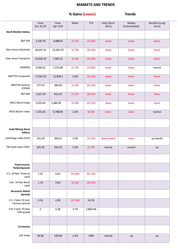
This past week the S&P 500 fell 2.1%, the DJI was off 2.7%, the Dow Jones Transportations (airlines, cruise lines, etc.) fell 5.1% and is now down over 30% on the year, the NASDAQ fell 1.7%, and the tech-heavy index has been probably the best performing one, down only 17.8% on the year so far. The S&P 600 small-cap index was down 7.1% and is now off almost 40% this year. The TSX Composite was a star this week, gaining almost 2.0% but the TSX Venture Exchange (CDNX) slipped again off 1.2%. However, Bitcoin hung in, gaining 2.2%. Naturally, that brought out all the crypto fans claiming the new bull market for cryptos.
Overseas the MSCI World Index fell 3.5%, the London FTSE was off 2.1%, the Paris CAC 40 was beat up, losing 4.5%, while the German DAX was down 1.1%. In Asia, China’s Shanghai Index (SSEC) was a star, down 0.3% but the Tokyo Nikkei Dow (TKN) fell 8.1% as concern rose that Japan could be hit with a wave of coronavirus cases and deaths.
We note that the S&P 500 has given what armchair technical analysts love to site—the death cross. Yes, the 50-day MA has plunged through the 100-day MA, the 165-day EMA, and the 200-day MA. The 165-day EMA has plunged through the 200-day MA. Yes, these are all bear signals, except they usually come too late to act on when the plunge has already happened. We usually note them as confirmation of a bear (or bull to the upside) and a lagging indicator.
Panicking and selling down here after the horses have left the barn is not a wise idea. Best to be patient and await the rebound rally—when it comes. For others more prepared, look for buying opportunities. At least the markets appear to have quieted down a bit. A positive sign.
Historically, April is the best month for the DJI and the second-best month for the S&P 500. Hope for some sunshine and that spring is in the air. Unfortunately, physical distancing will be putting a damper on spring fever for lovers. T.S. Elliot wrote that “April is the cruelest month” in his poem The Wasteland. Let’s hope he is wrong.
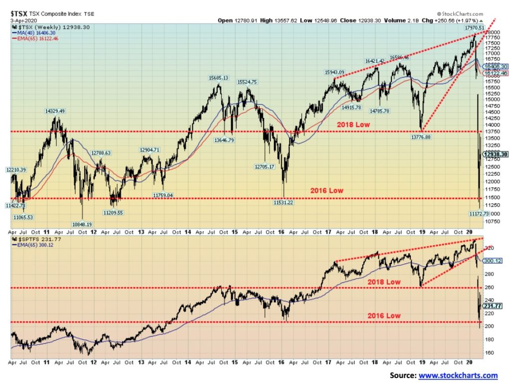
The TSX Composite was a star this past week, gaining almost 2.0%. Of the 14 sub-indices, only 6 were down while 8 were up. Leading the way to the downside was Health Care (THC) down 9.6%, followed by Consumer Discretionary (TCD) off 7.4%. Other losers included Income Trusts (TCM) off 1.9%, Financials (TFS) down a small 0.3%, Real Estate (TRE) down 5.3%, and, surprisingly, Information Technology (TIT) down 2.5%. The big winner on the week was Energy (TEN), leaping a whopping 35.8% on hope. But, no worries; it is still down 56.7% on the year. Other gainers were Consumer Staples (TCS) up 4.0%, Golds (TGD) gaining 5.2%, Metals & Mining (TGM) up 4.3%, Materials (TMT) up 5.1%, Industrials (TIN) up 1.9%, Telecommunications (TTS) up 4.9%, and Utilities (TUT) up 2.0%.
The TSX Composite wiped out all the gains back to 2012 and came close to taking out 2011 as well. The Financials (TFS) has wiped out all the gains since 2014. If those aren’t indications that this is not your garden party bear, then we don’t know what is. The damage done is not going to be repaired with a rally, even if the rally does look impressive. Focus on areas that appear to be good compared to others like Info Tech, Golds, and, to a lesser extent, Metals and Materials. Utilities and Consumer Staples also look good. As for the latter two, we trust the lights have to stay on and we do need to eat. We point to Info Tech because it could come up with solutions and to Golds and Mining—granted, drilling is stopping and plants are under closures because of the virus, but their resources are still there and they are becoming more valuable. There might be certain areas of Health Care that can spring to life but, overall, the sector looks thoroughly beat up with the sub-index down 41.4% so far in 2020.
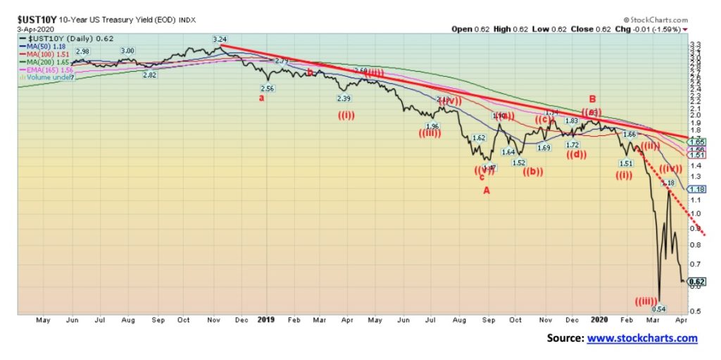
Pushed by money flows leaving the EU and China over nervousness surrounding the coronavirus, the U.S. 10-year treasury note fell from 0.72% to 0.62% this past week. But, even at that level, it is higher yield than one would find in Germany, France, U.K, Japan, Switzerland, and the Netherlands. Still, we question the rally in yields. However, it is possible we see new lows under 0.54% before this is finished. Given the now greater borrowing needs of the U.S. treasury, they need higher yields to sell their requirements to fund all the bailouts. At this stage, a move back over 1.00% could end this rally and send yields up to 1.50%. But the expectation at the moment is that yields could fall further as funds flee elsewhere to get into U.S. treasuries as for some reason, they view them as safer than other assets.
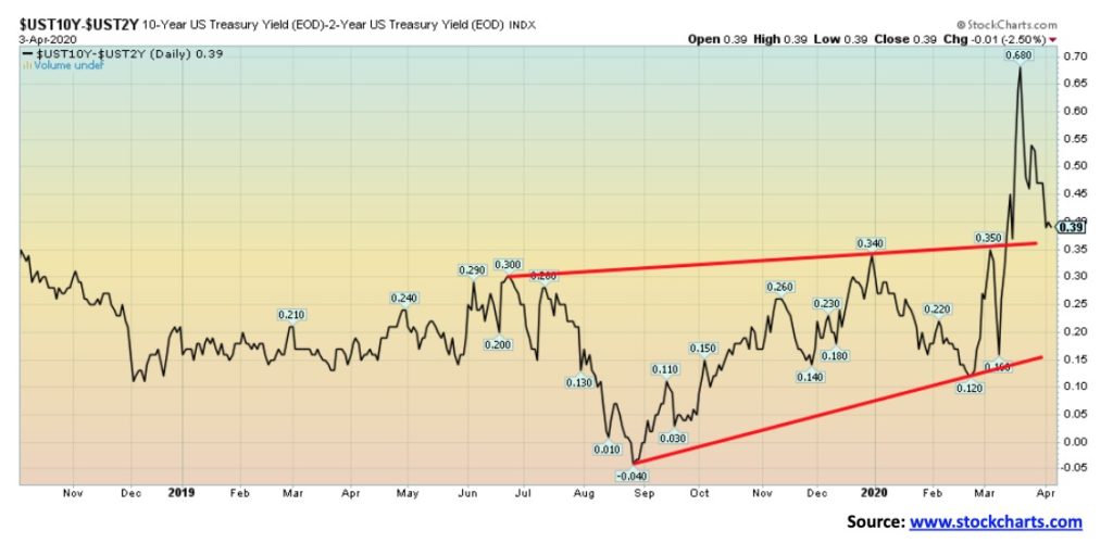
Our recession spread indicator slipped this past week to 39 bp down from 47 bp. As an indicator, it has already done its job having gone negative last year, a good six months before what may be the start of the recession.
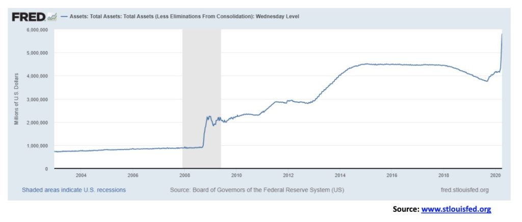
If we thought that the huge leap for both initial claims and nonfarm payrolls job losses was stunning, here’s another one that is stunning. It’s called the exploding Fed’s balance sheet. How much debt is there out there that the Fed could buy? Well, in the U.S. alone, $77 trillion. Maybe the Fed is aiming to own it all. Your mortgage? No worries, the Fed has your back. Over the past several weeks since September, the Fed’s balance sheet has exploded by $2 trillion. From September 2008 to December 2008 during the Lehman moment, the Fed’s balance sheet leaped by only $1.3 trillion. By April 1, 2009, it was still only up by about the same amount. Now we have leaped by $2 trillion and we haven’t even had a Lehman moment—yet. No worries. Just wait. We see $10 trillion coming. Half the U.S. GDP.
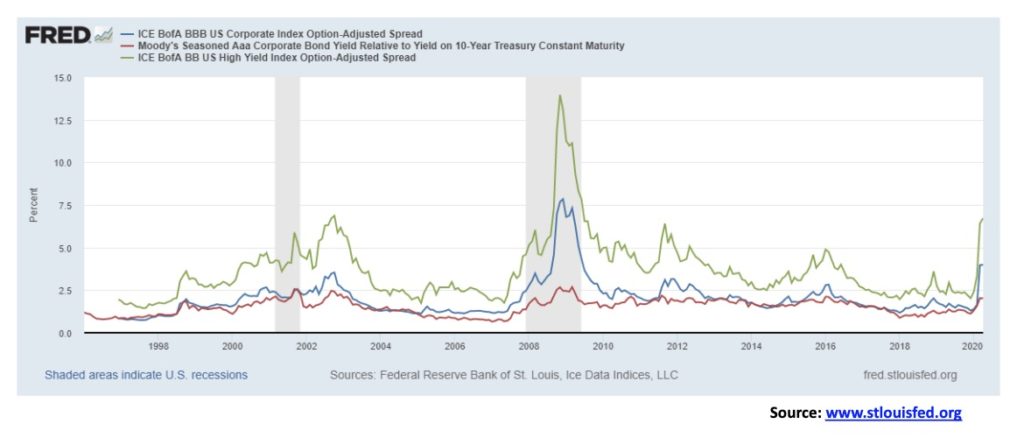
Things quiet down a little and, lo, the credit spreads ease slightly as they did last week. Maybe it’s because the Fed is going to buy all the bad debt. Still, since a low seen in December 2019, Moody’s Aaa corporate bond spread over the 10-year U.S. treasury note has gone from 1.12% to 2.01%. That’s not quite as much as it moved from May 2007 to March 2009, but it’s close. BBB credits, the lowest investment-grade corporate bonds, has gone from 1.30% to 3.99%. Nice. Again, from May 2007 to the peak in December 2008 it moved from 1.20% to 7.84%, so it still has a way to go. BB corporate bonds, the highest junk bond rating, has gone from 2.02% to 6.72%. It has a long way to go to catch up to May 2007 at 1.75% to November 2008 at 13.96% but they are working on it. While the U.S. Treasury debt is a concern, the real concern should be with U.S. corporate debt. We don’t even want to think about CCC rated junk bonds. That is at 18.61% and climbing, having nearly doubled since December 2019. We await the defaults.
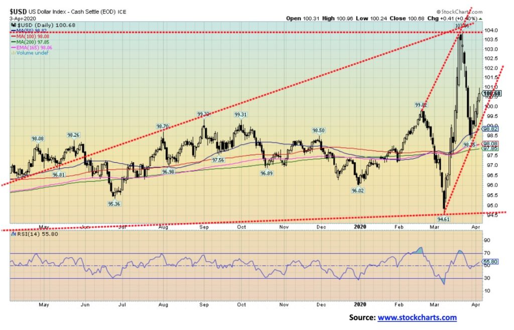
We mused last week that, given the volatility of the U.S. dollar, the US$ Index could rebound and even make new highs once again. Sure enough, the US$ Index rebounded off of support and now is rising once again. Money flows are pushing the U.S. dollar higher as investors flee the shakiness in the EU and even Asia to park their funds in U.S. treasuries. U.S. treasuries are the highest yielding. Of the G7 countries, the U.S. has the highest yields for 10-year treasuries, save Canada and Italy. And no one in their right mind is going to buy Italian bonds. So, it goes to U.S treasuries and that in turn pushes up the U.S. dollar. The US$ Index is back above 100 but still needs quite a push to exceed the March high near 104. It could also double top. The bull case remains in play as long as the US$ Index holds above 98.85. If we break back under that level, the only level of support after that is around 97.85. Under 97 new lows lie ahead.
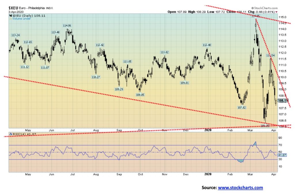
The euro plunged this past week, losing 2.9%. The drop now appears to be setting up new lows for the euro. We are now questioning the survivability of the euro. EU banks are in trouble. The coronavirus is devastating their economies. Members are fracturing. Hungary, an EU member, has effectively turned into a dictatorship, jeopardizing its membership. Other countries have powerful forces that want their country out of the EU and out of the euro. All these parties are right-wing fascist. Even in Germany, who has no appetite to bail out countries in trouble, the rise of the right wing is becoming a major concern. Italy, a country that has been devastated by the coronavirus is seeing a rise in criminal activities, particularly in the south. Ditto in Spain. No one talks about Brexit any more. The survivability of the euro is now in question as is the survivability of the EU. If it fails, would Europe return to the tribal mentality that triggered two world wars in the past century and countless ones before that? The history of Europe is the history of war. And, as we saw in the last century, powerful fascist governments—in Germany, Spain, Italy, and elsewhere, even though some were communist dictatorships. Two sides of the same coin. And on the sidelines is Russia, watching. The ECB is resorting to massive QE once again. And now they want to issue ECB bonds, something that was not done before. There will be considerable resistance to that as no one wants to give up their sovereignty and Germany does not want to bail them out. The conditions are there for a major euro and EU crisis and collapse as the 2020s progress. Meanwhile, gold in euros appears to be headed once again to new highs.
There has been quite a battle going on between the bullion banks and the physical market. In the physical market there has been considerable buying of gold and silver coins and bars and the premiums being paid are the highest we have ever seen. But it is the bullion banks that control the market. And, as some love to say, they control it at the behest of the central banks who are afraid of gold competing with them. There are also shortages developing as companies stop drilling or even producing because of the coronavirus. As well several mints have stopped production as well. That’s leading to shortages in the physical market. Finally, there are weird things going on at the London Bullion Market Association (LBMA) and the NY Commodities Exchange (COMEX). They appear to have a shortage of gold themselves and are discouraging traders from converting their paper gold to real gold (i.e., delivery). Apparently, they have a 400-oz contract but no 400-oz bars to deliver. They say they have supplies but apparently not enough to satisfy orders to deliver except for those already committed. Stuff like that led to the collapse of the London Gold Pool back in the 1960s as their gold reserves were exhausted. That eventually led to foreign demands on the U.S. to take U.S. dollars for gold and then Richard Nixon closed the gold window and set it to float afraid that the demands would strip the U.S. of all of its gold. There simply was not enough gold to back the U.S. dollar. The U.S. knew they couldn’t satisfy all the requests to exchange U.S. dollars for gold. In essence, the U.S. defaulted at the gold window. The U.S. dollar was no longer backed by gold. Set to trade freely, gold soared in the 1970s.
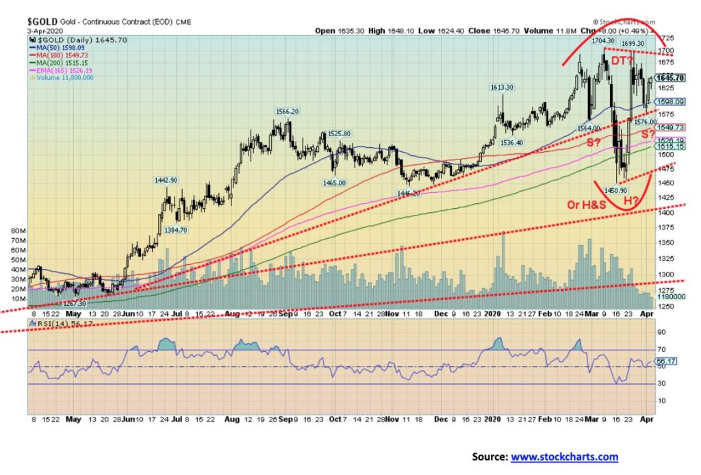
None of this prevents the paper gold bullion banks from engineering a collapse to set themselves up better for what could be a sharp rise in the gold price. Maybe that is why, in looking at the patterns for gold that are developing, we see both a strong bull case and strong bear case. Is that a double top on the charts or is it a potential head and shoulders bottom pattern forming. First, the bull case. A firm breakout over $1,695 (the neckline) could trigger a move towards a potential target up to $1,950. We’d need to see volume come in on that. Volume has been terrible, adding to the anxiety that this is nothing more than a rebound back after the plunge to $1,450 in March.
Now, the bear case. If it is a double top, its neckline is at $1,470 and a breakdown under that level on volume could send us down to targets near $1,200. Things are tight here. A break under $1,565 could bust the head and shoulders pattern. A break under $1,500/$1,515 would set up the test of the neckline at $1,470.
Go with whichever way it breaks. Just remember, a breakdown would move quickly but then so might a breakout to the upside. We do note that there are numerous gold bulls out there and hardly any gold bears. The result is that a breakdown would be a shock to the bulls. A breakout to the upside on the other hand could squeeze the bullion banks.
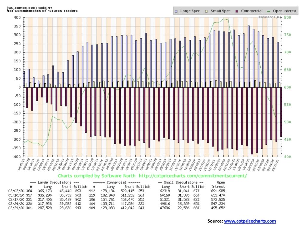
More incremental improvement for gold’s commercial COT this past week. It now stands at 24% vs. 23% the previous week. But there are some concerns. The improvement this past week was the result of short open interest falling roughly 35,500 contracts even as long open interest also fell down about 7,700 contracts. We note volume is also lagging and with open interest falling, even as gold’s price is rising, it indicates to us that the market is weak. In a strong market you want to see rising volume and rising open interest. Still it is indicative that the bullion banks are covering their shorts. The large speculators COT (hedge funds, managed futures, etc.) was steady at 91% but still way too high. And that was despite a 30,400 contract drop for long open interest. Short open interest only fell about 1,000 contracts. We see improvement but the market is weak. We need volume to come into this market if the bulls want to rejoice.
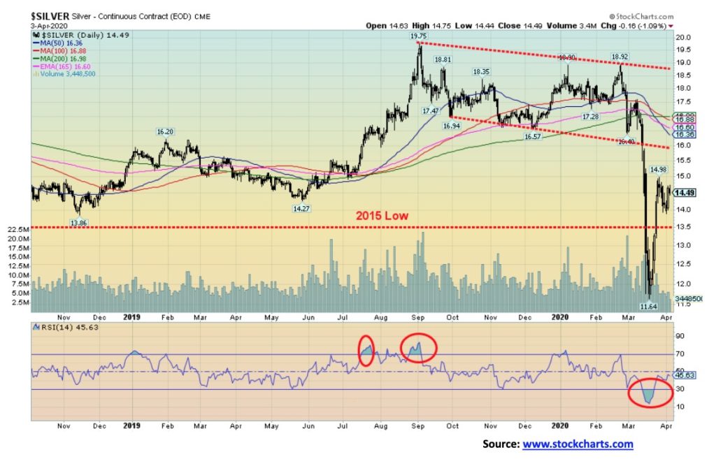
Silver prices slipped slightly this past week, falling 0.3%. Silver remains in a weak uptrend although all the key trends (daily, weekly, monthly) remain down. Silver is still down 19.2% on the year while gold is up 8.1%. At the recent low we could argue that silver diverged with gold, with silver making new lows below its 2015 and 2018 lows. Gold was nowhere near those comparable lows. But the fact remains that silver failed to make new highs even as gold broke out to new highs. So, the divergences continue. At a minimum, we’d like to see silver at least get back to the falling MAs up near $16.25. The death cross has been issued with the 50- and 100-day MAs all crossing to the downside over the 200-day MA. Indicators are improving, but despite the recent sharp upswing, we have no strong buy signals. Volume is poor and we need volume to come into this. Poor volume on the upswing suggests that this may only be a bear market rally. Only above $17.50 would we declare that this bear move is likely over. A breakdown under $13.50 would set up a test of the lows or even new lows.
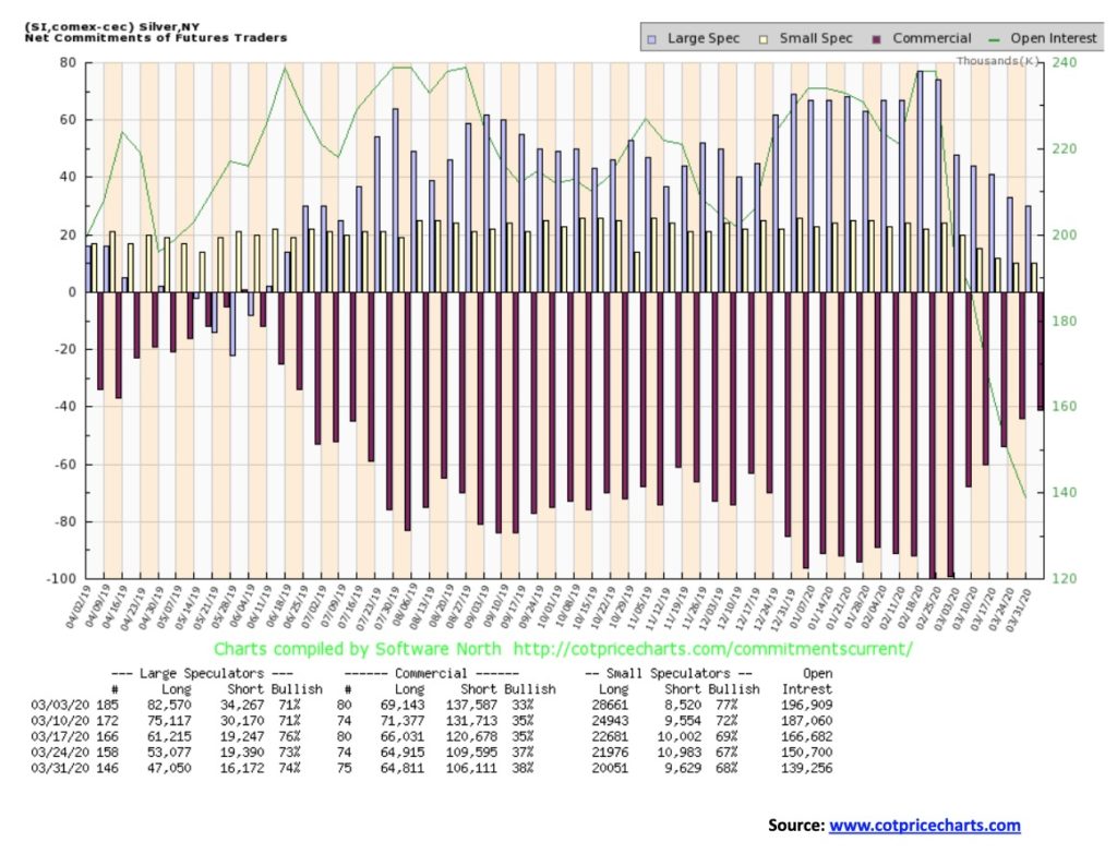
Like the gold commercial COT, the silver commercial COT also improved slightly to 38% from 37%. However, also like gold, it was the result of falling open interest as short open interest dropped roughly 3,400 contracts. Long open interest was relatively flat. The large specualtors COT was also relatively flat at 74%, up from 73%. But once again it was because of falling open interest. Couple that with the weak volume for silver and, like gold, silver prices may be rising but the market is weak. Still, we’ll take the improvement.
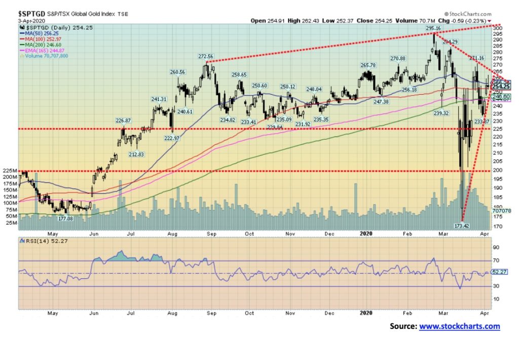
The gold stocks continued to improve this past week. The TSX Gold Index (TGD) was up 5.2% while the Gold Bugs Index (HUI) gained 3.2%. Still, both remain down on the year with the TGD off 2.7% and the HUI down 17.2%. So no, we can’t declare victory just yet. The TGD is getting close to a possible breakout over 265. Over 275 and we could see new highs. Our upper trendline would allow us to reach around 300. That uptrend line is quite steep so a break of 250 could send us tumbling back to 225 or even 200. The TGD is getting squeezed here between rising and falling trendlines—ergo, forming a triangle—so a resolution one way or the other could be coming this week. Go with the break. A break to the downside is not the end of the world. It might just mean more consolidation. However, under 225 we would not view as friendly. And under 200 we could return to the lows. A cautionary note is that the Gold Miners Bullish Percent Index (BPGDM) is again up over 80%. Yes, it has room to move higher. Over 80% suggests it is overbought but, yes, it could still go higher. Highest we have ever seen it is 100% in July 2016. And that proved to be the top. At the recent top the BPGDM reached 88%.
It was the biggest oil surge ever. On Thursday, April 2, WTI oil surged some 25% with further upside follow through on Friday after Trump tweeted regarding a 10–15 barrel/day possible cut between Russia and Saudi Arabia. But beware. What we are hearing is that the Russians want no part of it. Why should they when they starting to get both the Saudis and the U.S. on the ropes because of the low prices. We had noted before that Russia had probably the best capability to withstand a price war. The Saudis need a higher price to pay for all their military and to keep their population happy. U.S. shale producers are starting to collapse with a big bankruptcy announced this past week. Whiting Petroleum (WLL) collapsed, but guess what: they found a way to pay their executives $14.6 million before they declared Chapter 11. Hmmmm. With the Russians and the Saudis still not agreeing we are hearing the meeting for Monday may not happen. If it doesn’t oil prices will “crater” once again.
Alberta is just caught in the middle here. Although the jump in prices helped Western Canada Select to leap to $9.92 up from $4.91. No worries; they still can’t make any money at these prices. More bankruptcies to come and more jobs to be shed. In the U.S., Chevron, Schlumberger, and BP shed jobs and cut spending.
If they are to get cuts, the pain would be distributed between Russia, the Saudis, the U.S., Brazil, and the non-Saudi Gulf states. Our expectations? It will fail. However, we still might have made a low for now.
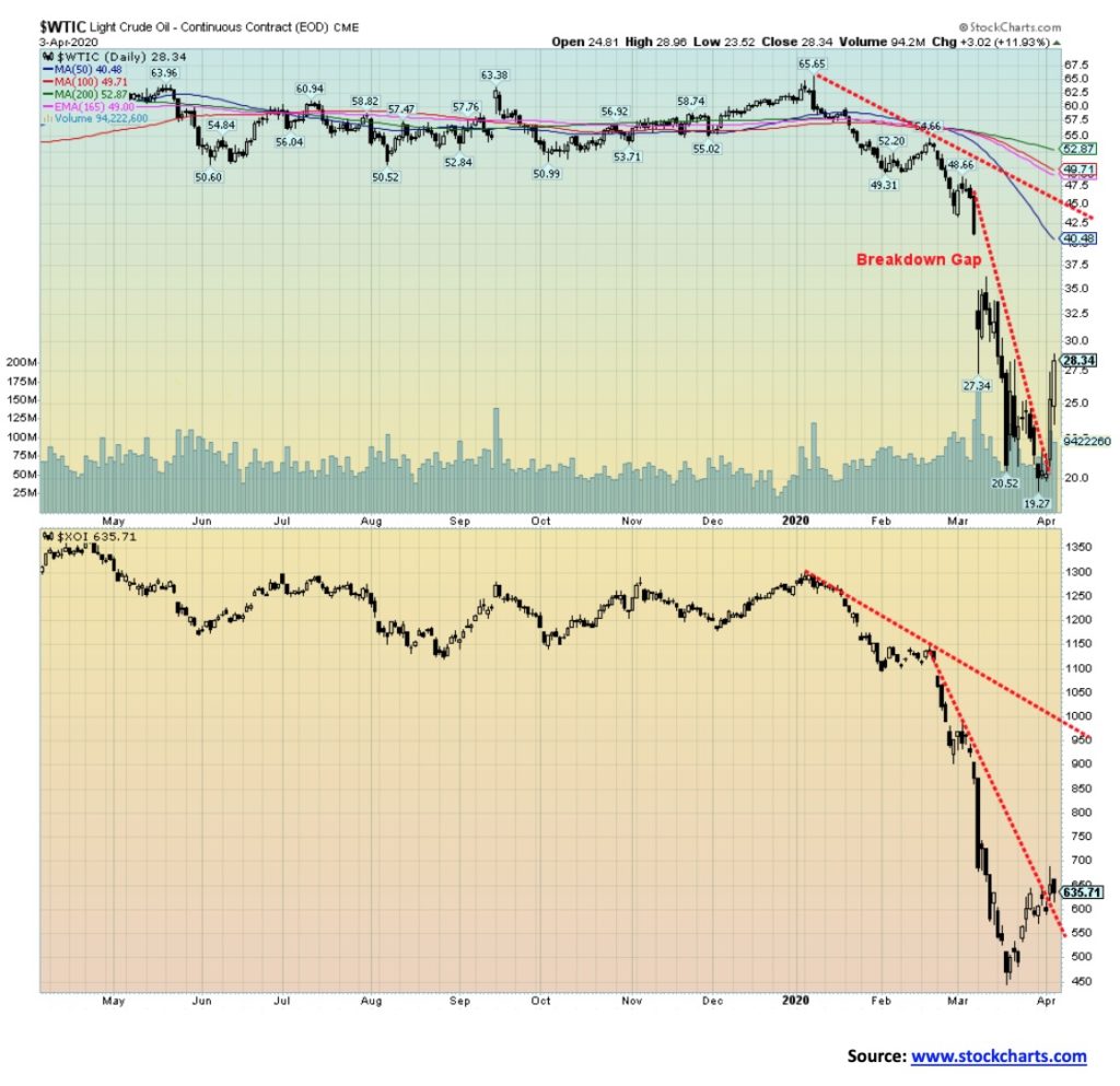
This past week WTI oil rose 31.8% but it remains down 53.6% on the year. The energy stocks exploded upwards, particularly the TSX Energy Index (TEN) that gained 35.8%. The ARCA Oil & Gas Index (XOI), not so much, up 7.5%. Natural gas (NG) inventories leaped so NG fell 4.1%. Both WTI, NG, and the energy stocks remain firmly in the grip of downtrends daily, weekly and monthly.
WTI broke above its steep downtrend line. But it still has a long way to go to reach that breakdown gap at $35. Or the 50-day MA near $40. If the attempts at cuts fall apart, WTI will plunge once again and possibly to new lows. On a positive note, WTI recently made new lows but the XOI did not. A divergence that may have presaged this rebound. It’s good but we wouldn’t be rushing to celebrate just yet.
—
(Featured image by Gerd Altmann from Pixabay)
DISCLAIMER: This article was written by a third party contributor and does not reflect the opinion of Born2Invest, its management, staff or its associates. Please review our disclaimer for more information.
This article may include forward-looking statements. These forward-looking statements generally are identified by the words “believe,” “project,” “estimate,” “become,” “plan,” “will,” and similar expressions. These forward-looking statements involve known and unknown risks as well as uncertainties, including those discussed in the following cautionary statements and elsewhere in this article and on this site. Although the Company may believe that its expectations are based on reasonable assumptions, the actual results that the Company may achieve may differ materially from any forward-looking statements, which reflect the opinions of the management of the Company only as of the date hereof. Additionally, please make sure to read these important disclosures.


The TopRanked.io Weekly Affiliate Marketing Digest [The Top VPN Affiliate Programs Roundup]
Want to be let in on a little secret about two massive affiliate opportunities you can take advantage of today?...


Sustainable Finance Faces Hurdles as Green Asset Ratio Reforms Fall Short of Full Transparency
The Green Asset Ratio (GAR) measures banks' alignment with the EU Taxonomy but remains low due to methodological flaws and...


XRP Hits New All-Time High Amid U.S. Crypto Policy Shift and Ripple’s Expansion
XRP surged past its 2018 all-time high, reaching $3.65 amid renewed political support for crypto in the U.S. under Trump....


Germany Moves to Curb Medical Cannabis Abuse, Sparking Access Concerns
Medical cannabis imports in Germany have surged, but health insurance-covered prescriptions remain low. Easy online access raises concerns about abuse...


JPMorgan’s Data Fees Shake Fintech: PayPal Takes a Hit
JPMorgan Chase will charge fintechs for customer data, threatening business models reliant on free access. PayPal’s stock plunged 5.7% after...
 |
|
 |  |
 |
|
-

 Impact Investing1 week ago
Vernazza Autogru Secures €5M Green Loan to Drive Sustainable Innovation in Heavy Transport
-

 Markets4 days ago
Rice Market Slips Amid USDA Revisions and Quality Concerns
-

 Business2 weeks ago
Legal Process for Dividing Real Estate Inheritance
-
 Fintech12 hours ago
JPMorgan’s Data Fees Shake Fintech: PayPal Takes a Hit