Business
Catch it quickly: Ways to nab a user’s attention
A business site’s landing page should be able to catch the user’s attention quickly.

Just like how a shopper goes inside a store upon seeing something interesting on the window display, the landing page of a website can nab a user’s attention. Through various ways, users can be enticed into clicking the various links and pages they see.
Surfing the web is exactly like window-shopping. There is no stopping a user from clicking and switching websites until they get weary. While retail stores conduct sales or promos to attract as many customers as they can, those who own a website also apply certain web practices to get as many visits as possible.
Most of the time, the trick is to immediately catch the user’s attention through visual content, but it takes more than an attractive photo to do so.
Time.com reported that social media and multi-screen internet use is partly to blame for our shortened attention span. Humans find it difficult to concentrate when dealing with multiple windows. With this harsh truth, web designers and developers are now devising ways to how to keep a user’s attention.
Photos
Images play as huge a part in nabbing a user’s attention as headlines. Social Media Examiner revealed that a post accompanied by an image on Facebook or Twitter is 10 times more likely to receive engagement. They get more likes and retweets, thus attracting interaction with other users.
Coherence
Extravagant visuals attract some users. Still, there is a significant market that looks for aesthetically pleasing platforms. Many apps and website write high-quality content based on trusted sources. They also use high-quality images or videos that immediately tell the story of the article it leads to. These curatorial efforts somehow give the users an idea of what the article is about without the need to read the entire post. It perfectly captures short attention spans while still bringing value.

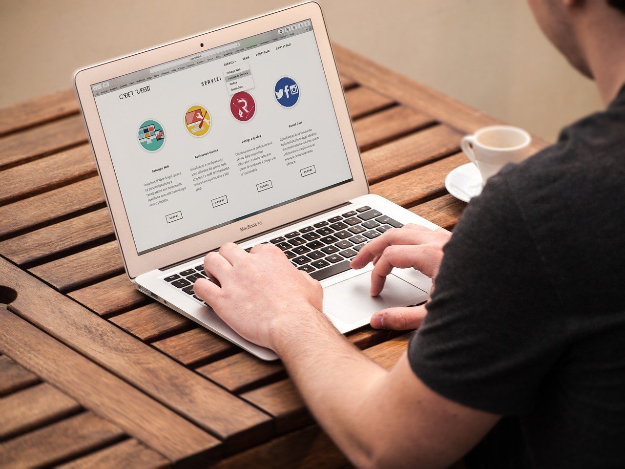
Photos, graphics and a sense of coherence can get a user’s attention. (Source)
Graphics
There are certain kinds of graphics that immediately draw people in. Using cleverly designed elements and interfaces instantly engage communication between the content and the reader.
Gone are the days when readers would be drawn to Flash headers or twinkling texts. Some of the current web design trends are parallax websites and the use of big typography in place of a large photo header or background image. The latter puts all the emphasis on the headline.
All of these strategies bring about visually appealing design. They help make the content become persuasive yet accessible. They provide information and at the same time give value to the reader. When a reader feels smarter, empowered, and more knowledgeable, they gain a feeling of relatability and ease. That is when a user’s attention is captured, held, and kept for a continuing and future relationship.

-

 Africa6 days ago
Bank Al-Maghrib Launches Reforms to Boost Credit via Non-Performing Loan Market
-

 Africa2 weeks ago
Modernizing Traditional Commerce in Fes-Meknes Through Financial Inclusion
-

 Cannabis1 day ago
Poland Proposes Cannabis Decriminalization: 15 Grams and One Plant Without Penalties
-

 Business2 weeks ago
The TopRanked.io Weekly Digest: What’s Hot in Affiliate Marketing [NiftyPM Affiliate Program Review]


You must be logged in to post a comment Login