Business
When to Buy, When to Sell?Look at the Dow Jones Dividend Yield
The next time the Dow Jones Dividend Yield increased to above 3% was during the March 2020 Flash Crash, where the Dow Jones yield spiked to a whopping 3.51%, forcing FOMC Powell to flush trillions of dollars of inflation into the market in a matter of two or three weeks during his Not QE#4, to prevent a devastating collapse in the financial system; having the Dow Jones yield something over 6%.
This week saw no new BEV Zeros in the Dow Jones BEV chart below. So, the total quantity of new all-time highs for this advance (Red Circle) remains at 21. But for the Dow Jones to be taking a pause from making new all-time highs, is also something that happens during an advance.
During such a pause in an advance, the Dow Jones will close daily in scoring position, with BEV Values spanning -0.01% to -4.99%; within 5% of making a new all-time high, and that is exactly what we see below. So, I’m going to assume this advance remains on going, and we’ll see additional BEV Zeros in the weeks and months to come, hopefully taking the Dow Jones well above 40,000 as it does, during this election year.
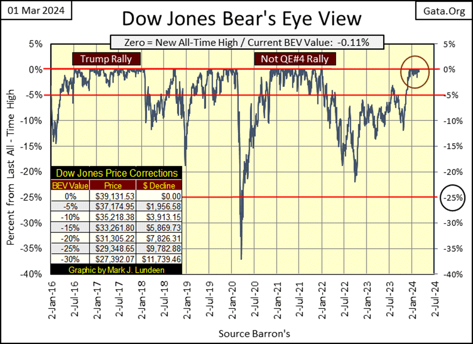
Of course, with any advance there will always come the last BEV Zero, the Terminal Zero (TZ) of an advance. To see what that looks like, study the Trump, and the Not QE#4 rallies above. As the advance begins to lose steam, the BEV plot begins drifting down to its BEV -5% line, and then breaks below it. And on that sad day every market advance eventually sees, the BEV plot breaks below its BEV -10% line.
At this point the market could rebound upwards to new all-time highs, and then again – maybe not. In any case, whatever profits that could have been reaped from an advance from its beginning, are now best seen in the market’s rear-view mirror. So, the best time to exit a market during an advance, is when the BEV plot breaks below its BEV -5% line, and is approaching its BEV -10% line, a situation the current advance in the Dow Jones is nowhere near to at the close of this week.
Is that what I’m planning to do? Nope, as I’ve been out of this market for years, as I believe the market is near a massive, and historic top. I’m not going to return until the market is much, much cheaper than it is now. For more details on that, you can read all about that in this week’s section on dividends for the Dow Jones below.
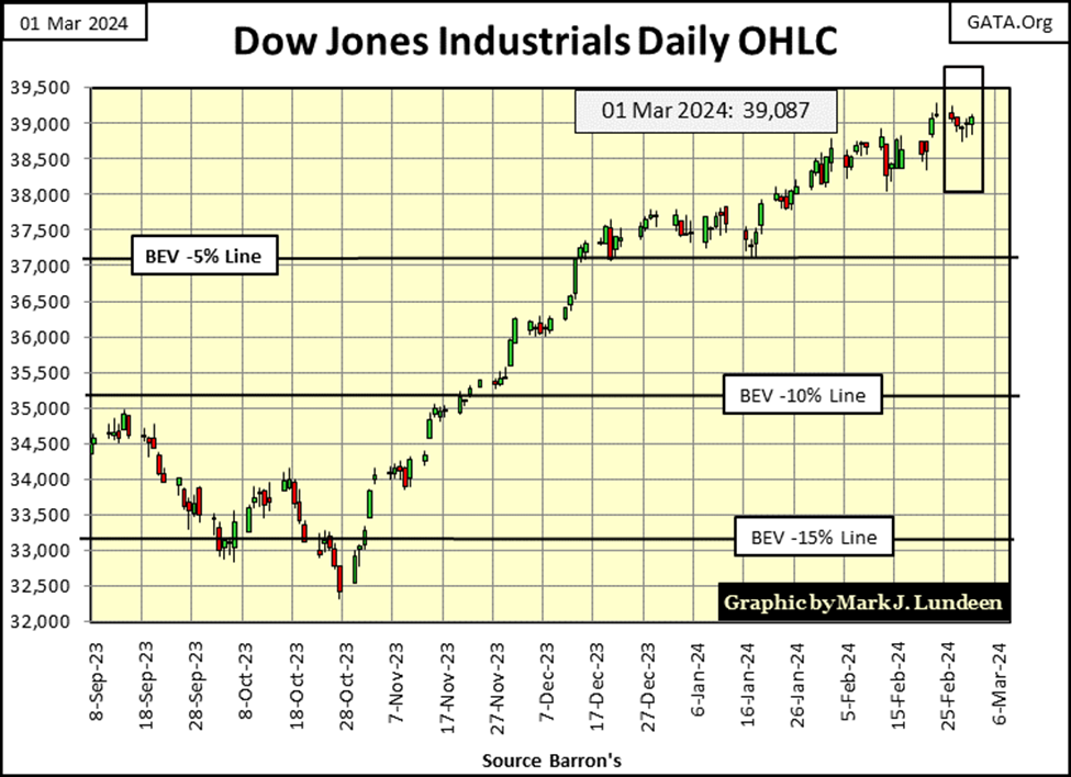
Next is the Dow Jones in daily bars. This week the Dow Jones was down, but only by a bit. It has been advancing steadily since last October without much of a correction. I don’t know for a fact, but just looking at the chart below, seeing the Dow Jones retreat from its current highs could be a healthy thing for the bulls to do.
Looking at the BEV Chart above, the Dow Jones could correct down to 37,175 and remain in scoring position. The dreaded BEV -10% line is found at 35,218 in the chart below. Any decline towards these two levels for the next few weeks or months maybe a healthy thing for the market, or the beginning of the end of a massive bull market that began in August 1982. Which case it will be, is something I don’t care to speculate on in early March 2024.
Here are the BEV values for the major market indexes I follow in the table below. The market is beginning to generate BEV Zeros / 0.00% = new all-time highs for these indexes. On Friday’s close there were nine of them, with the next five indexes in scoring position.
The NASDAQ Banking Index remains at #20 in the table below, with a BEV in the mid -30s%. It’s not a good sign for the future that money is freely flowing into these other indexes seen in the table, as it avoids the banks, way down at #20.
There is a pattern I’ve noticed these past few weeks; the week begins with few, or no BEV Zeros, and then finishes the week strong on Thursday and Friday. What that means I haven’t a clue, I’m just noting that this is happening.
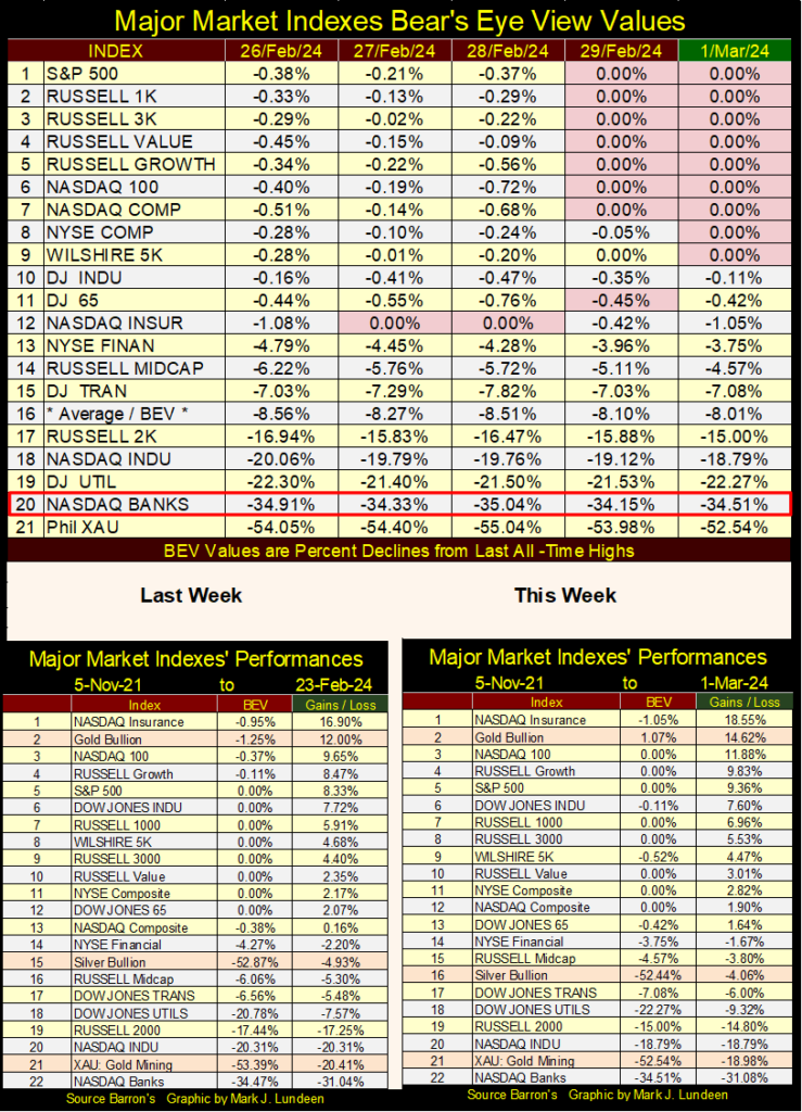
In the performance tables above for us gold bugs, the song remains the same; strong gold, and weak silver and the precious metal miners. This too shall change, hopefully by silver and the XAU rising upwards towards gold. But in truth, until the stock and bond market come under pressure, my expectations for the precious-metal assets are limited.
Let’s look at the commodity market for a bit, with my average of the nineteen commodities I follow on a weekly basis going back to 1993. In the table located at the upper left of the table, the top three places are stock indexes that have advanced by double-digit factors since 1993. The commodities themselves are all single-digit advances, some are very small factors advances for the past thirty-two years of market history seen below.
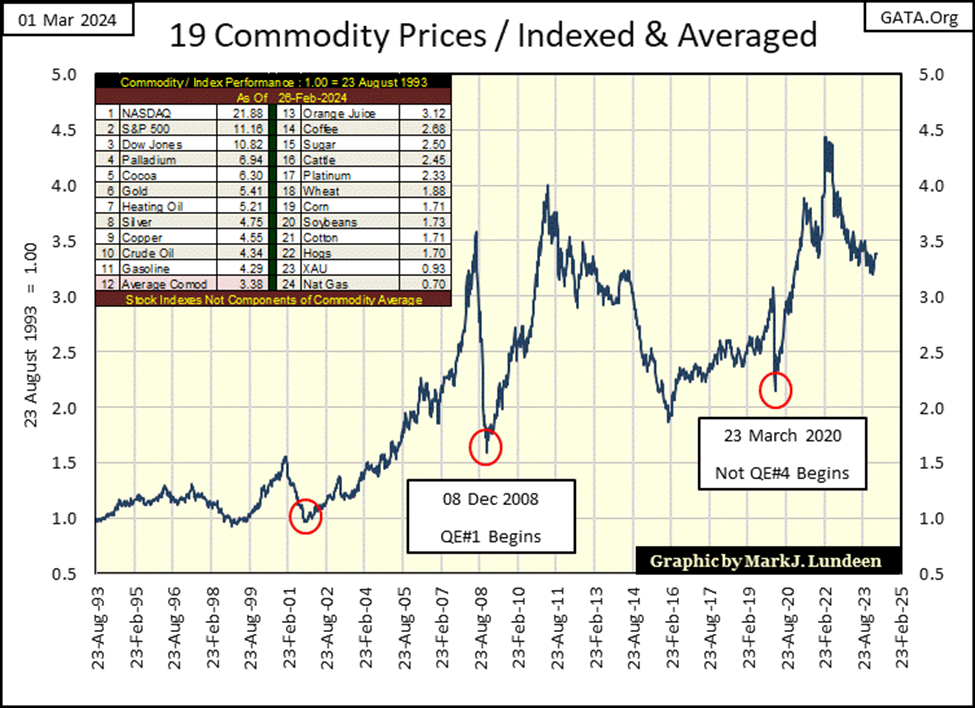
Note the two bottoms (Red Circles) to the right of the chart above. Commodities bottom in December 2008, just as Doctor Bernanke began his QE#1. Something similar happened in March 2020, with commodity prices falling as the March 2020 Flash Crash was happening, resulting in FOMC Powell to implement his Not QE#4. It’s not surprising seeing “monetary policy’s” QE impact on commodity prices.
But why were commodity prices crashing in 2008 and again in 2020? Most likely because the Sub-Prime Mortgage Crisis of 2007-09 and the March 2020 Flash Crash were not just big market events, but also big economic events that promised to kill economic demand for the commodities seen above. The FOMC’s QEs “stabilized market valuations” for more than just stocks, mortgages and bonds.
As it currently is, commodity prices have been going down (as CPI Inflation has been going up) since February 2022. Are we going to soon see some idiotic QE#5? I doubt it, as the current decline in commodity prices has taken two years, not a crash in prices seen in 2008 and again in early 2020. But who knows? The ways of “monetary policy” are strange to mortals such as ourselves.
Over the past few months, I’ve spent a lot of time emphasizing this market is nearing its top. Market tops are bad, as they create a false sense of stability that lures in the wealth of people who aren’t all that knowledgeable of the market. People who don’t realize that prolonged market advances eventually terminate at a market top, where;
- Risk to invested funds is maximum,
- Potential for reward for investing is minimum.
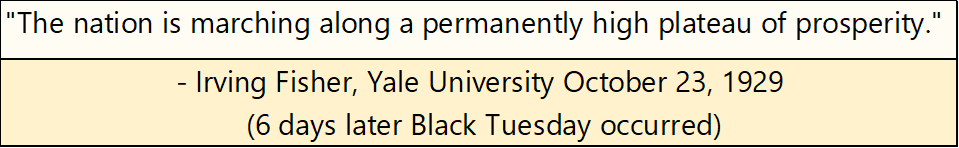
The hidden dangers of a market top have lured the best minds of the market too, such as Irving Fisher, of Yale University in October 1929. Professor Fisher in the 1920s was one of the most famous economists in the world. Six days after the following quote was published, the Dow Jones began a historic crash that didn’t bottom until July 1932.
But just as Professor Fisher failed to see the September 1929 top to the Roaring 1920s’ bull market, I doubt he saw its bottom in July 1932 either. So, let’s look at the Dow Jones dividend, to see what market tops and bottoms have looked like in terms of Dow Jones dividends for over the past 100 years.
As far as the Great Depression bull market looked like in terms of yields for the Dow Jones, when it broke below 3% (2.95%) in Barron’s 24 December 1928 issue, it heralded bad things to come; a market top some nine months later. Yes, in December 1928 the Dow Jones still had 33% to go for its 1920s’ advance, but for those who got out in December 1928, and stayed out, they were grateful they did many years later.
The stock market wasn’t a safe place for wealth for another three years, until the Dow Jones was yielding an incredible 10.38% in Barron’s 11 July 1932 issue. This double-digit dividend yield, for established blue-chip stocks was an extreme not seen since, a yield Professor Fisher would have believed impossible in October 1929. However, following an 89% market collapse in the Dow Jones during its Great Depression Crash, this double-digit yield was market history being made.
With all of idiocy in credit creation seen since Alan Greenspan became part of the FOMC in August 1987, where market valuations have been inflated to extremes never before seen, I wonder where the yield for the Dow Jones will be at the bottom of the pending bear market bottom? Double-digit yields? I wouldn’t dismiss it as a possibility.
But that is getting ahead of my narrative for the Dow Jones dividend yield since 1925, and its reaction to the many bull and bear markets since. It’s fairly simple actually, as seen in the chart below;
- Market tops; sell when the Dow Jones Dividend Yield falls to 3%,
- Market bottoms; buy when the Dow Jones Dividend Yield rose to something above 6%.
For decades, following this simple rule in the stock market could take any 98-pound weakling walking on Main Street USA, who wanted to “play the market,” as they’d say decades ago, and turn him into a colossus standing astride Wall Street, with returns on his invested funds that most professional money managers would envy.
Or so it was until Greenspan became part of the FOMC in August 1987. He became “monetary policy’s” principal in August 1987 when the Dow Jones was yielding only 2.54%. There was a massive flash-crash two months later in October 1987. But, had Greenspan allowed nature to take its course, there should have been much more deflation in market valuations in the months and years that followed.
For the first time in the history of the Federal Reserve, its leader was determined to thwart Mr Bear’s efforts to clean up the malinvestments and mistakes in credit creation by the Federal Reserve System. Clean up dirty balance sheets for banks, corporations, and individuals across the entire economy. That plus remind people that approaching market risk casually is the biggest risk of all.
Bear markets do this via deflation in market valuations, forcing institutional and individual asset holders to greatly reduce their credit (leveraged) positions, and totally write off worthless investments, they once paid top dollar for.
But as you can see below, that didn’t happen in 1987, or any time since, as every FOMC has followed the Greenspan-market model; keep the valuation for the Dow Jones inflated far above the old historical standard, the pre 1987;
- Dividend yield of 3% = bull market top,
- Dividend yield of 6% = bear market was approaching its bottom.
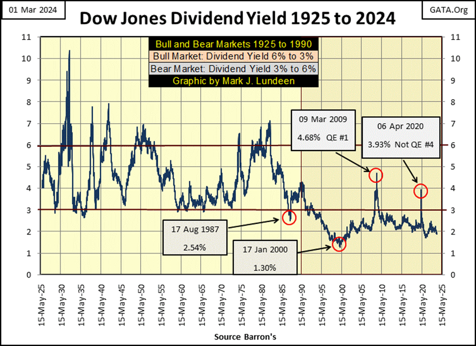
Greenspan inflated valuations for the Dow Jones in January 2000 to the extent that it was yielding only 1.30%, an extreme just as radical as the 10.38% yield the Dow Jones saw in July 1932.
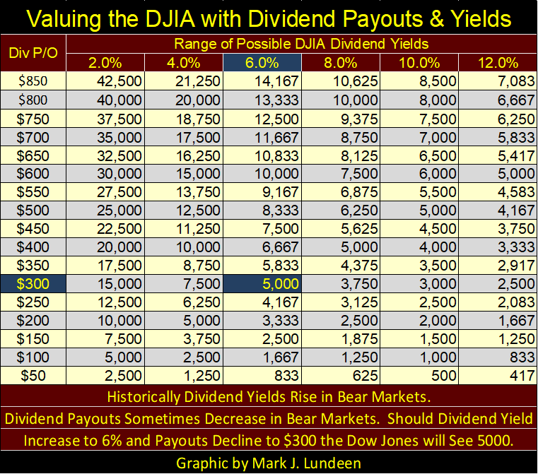
Here is another way of looking at the yield for the Dow Jones (chart below), where we chart how many dollars of Dow Jones valuation it takes to purchase $1.00 of Dow Jones dividend payout.
At market bottoms it would take $15, or less of Dow Jones’ valuation to purchase $1.00 of Dow Jones dividend payout, when market valuations were cheap, and the stock market was a compelling buy.
At market tops, when market valuations were overvalued, when investors were wise to exit the market, if would take $30, or more of Dow Jones market valuation to purchase $1.00 of dividend payout.
But all that changed in August 1982, the red star when the current bull market had begun. Since 1992, the Dow Jones hasn’t traded below $30 of market valuation for $1.00 of dividend payout, except in times of extreme market distress, as at #5 (Sub-Prime Mortgage Crisis), and at #6 (March 2020 flash crash). Both these market bottoms were crisis bottoms that focused the world’s attention on Wall Street.
Both these market panics motivated the then FOMC chief to terminate the bear-market decline via Quantitative Easings; flooding the financial system with massive levels of monetary inflation to stop the pain of valuation deflation.
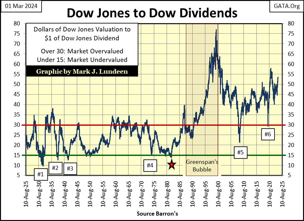
Returning to my chart of Dow Jones dividend yields (two charts up), since 2000, the FOMC has manhandled Dow Jones’ valuation to the point where it has never seen its dividend yield rise above 3%. That is unless the market is in a crisis, as was the case in March 2009 where the Dow Jones was yielding 4.74%, at the bottom of the Dow Jones second deepest bear market bottom since 1885.
The bottom to this bear market decline was a 54% decline from its October 2007 last all-time high (14,164.53). Had the Dow Joens seen just a 6% yield in March 2009, as it would have as a minimum pre-Greenspan, it would have seen a 63.47% bear market decline at a minimum. See table below.
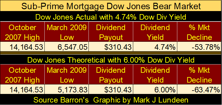
FOMC Bernanke’s response to the above deflation, to prevent the Dow Jones from yielding 6%, was to institute his first of three Quantitative Easings, his QE#1, to reflate market valuations back to, and then above where they were in October 2007.
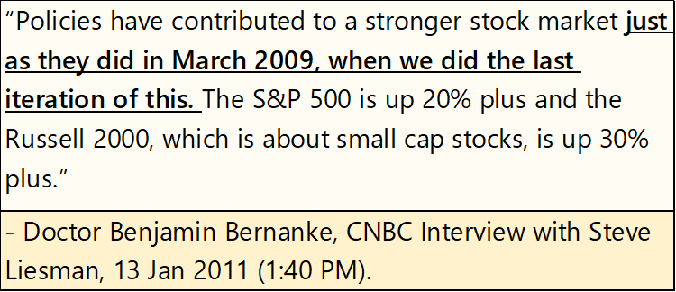
The next time the Dow Jones Dividend Yield increased to above 3% was during the March 2020 Flash Crash, where the Dow Jones yield spiked to a whopping 3.51% (😊), forcing FOMC Powell to flush trillions of dollars of inflation into the market in a matter of two or three weeks during his Not QE#4, to prevent a devastating collapse in the financial system; having the Dow Jones yield something over 6%.
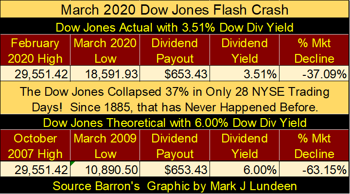
The point of all this is; for a very long time the Dow Jones has wanted to deflate its valuation to where it will yield something above 6%. Likely something much more than just 6%. However, the FOMC refuse to allow that, as a 6% Dow Jones yield would be a historic bear market. How big a bear market? See the table below.
One takes a dividend payout (right axis) to cross over to a dividend yield (top axis) to see the resulting Dow Jones valuation. Currently, the Dow Jones is paying out around $736, yielding 1.88%. Divide the payout by the yield to compute the valuation; $735 / 1.88% = 39,095, or thereabouts for last Friday’s closing.
For our example, let’s call current Dow Jones payout of $750 in the table. To make this $750 payout yield a traditional bear market yield of 6%, Mr Bear would have to deflate the Dow Jones valuation down to 12,500, as seen in the table below. That would be a 68% bear market decline, to once again see the Dow Jones yielding 6%.
It can get worse should the Dow Jones dividend payout contract. During the Great Depression, the payout for the Dow Jones was cut by Mr Bear by 75%. Should our current payout of $750 be reduced by 75%, that would be a Dow Jones payout of $187.5. Let’s call that $200 in the table. That with a dividend yield of 6%, and the Dow Jones valuation is fixed at 3,333 in the table. A bear market decline of 91.48%, greater than the 89% bear market bottom of July 1932.
For some really grizzly bear market mathematics, take the 10% yield from 1932 and apply it to the table, which would deflate the Dow Jones to 2000; a 94.88% bear market decline from its current last all-time high of 39,131.
The impact of rising dividend yields would be devastating to market valuations, when the FOMC lose control over market valuation sometime in the future.
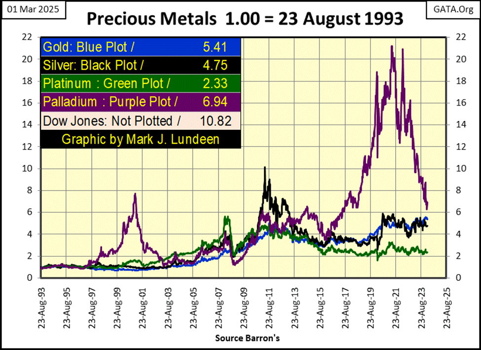
Here is a chart plotting the indexed values of various precious metals going back to 1993. From 2016 to 2021, palladium (Purple Plot) was outperforming the stock market. Since then, it has crashed by 70% since its highs of 2021.
Palladium’s major consumers are automobile manufacturers, who use palladium for their catalytic converters which cleans up the exhaust from gasoline internal combustion engines. The major move now, or a move being pushed by the WEF is to go with electrical cars (EVs). Maybe this move to EVs is why palladium is down so much since 2021.
Electrical cars still have plenty of exhaust gases that goes into the atmosphere. It’s just that EVs exhaust their gases at the smoke stacks of the electrical utility plant that supplies them with electricity, a fact that confuses the simple mined environmentalists who believe EVs are pollution free.
Another problem with EVs is they catch fire, and they then burn like a giant arc welder until their massive batteries are fully discharged. What does it take to discharge a battery with the stored energy sufficient to drive a multi-ton EV at highway speeds for hours of road time? A few hours of intense, blinding fire that firemen will find is impossible to put out until the EV’s battery is fully discharged. The damage to the roadbed, and surrounding area from EV fires are great.

And a huge factor for EV fires is salt water corrosion, like the salt Northern States use on roads in winter, to make roads safe to drive when ice forms in winter. This is going to be a huge problem for these EVs, and the people who own them. Insurance rates for EVs, and for homes they park at, are going to soar for what salt-water corrosion is going to do up in northern United States, and Canada.
Speaking of winter, in cold weather, an EV’s battery will lose much of its ability to hold a charge. It will cost as much to charge an EV’s battery in January, the owner will just receive half its potential milage they would get in July. People are going to be stuck on a road in a discharged EV, in freezing weather.
I’m beginning to hate the global warming’s wrecking crew more and more the older I get. Just one bad idea after another to solve a fiction the world now holds dear; man-made global warming.
So, what does all this have to do with palladium in the chart above crashing 70% since 2021? Most likely nothing, but palladium’s crash provided an excellent segway into something I know people are going to begin to hate; EVs in an economy that lacks the infrastructure to charge them.
When was the last time an electrical utility built a new power plant in your town? Sometime in the 1960s? With our grid as it currently is, and will remain for decades to come; old and failing, we will most likely * NOT * see the roads filled with EVs running around, because North America doesn’t have the electrical grid to support something like that. This is most likely by design.
Moving on to gold’s BEV chart below, gold closed the week strong, only 0.15% away from making its third BEV Zero of the advance (Red Circle), an advance that began in mid-November. A fact that makes this advance very odd; is how gold has remaining in scoring position for months on end, with only two BEV Zeros to show for it. Well, it is what it is; odd, but much better than seeing gold languish far below its BEV -40% line, like silver and the XAU currently are.
Maybe if gold can see some new all-time highs in the weeks to come, we’ll have some excitement in the gold and silver markets as summer approaches. Last time that happened was in the aftermath of the Sub-Prime Mortgage Debacle, where from November 2008 to April 2011, gold, silver and their miners were some of the markets’ top performers. That was thirteen years ago. Maybe 2024 will be the time for the old monetary metals to have some fun again.
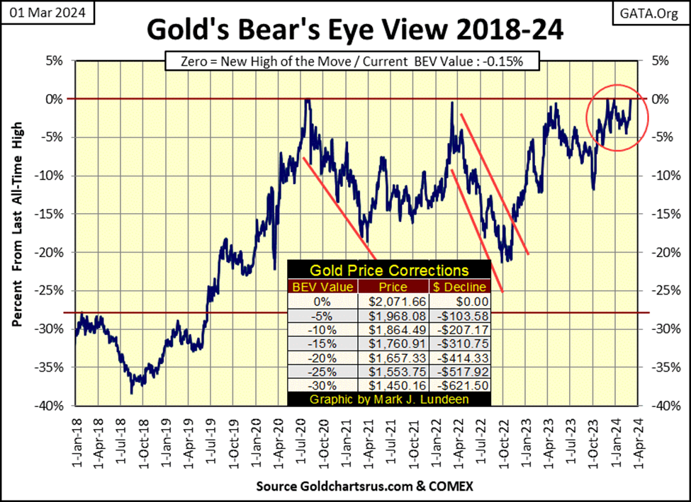
On gold’s side of the step sum table below, gold continues looking good. Daily closes in scoring position, step sum rising from 296 to 302, indicating more daily advances than declines. Looks darn good – but where are all the BEV Zeros?
Maybe what gold is looking for is an increase in daily volatility, where its daily volatility’s 200D M/A is trending upwards to its 1.00% line, instead of falling from it, as it is doing now. Closing the week at 0.54% is very low blood pressure for gold in a rising market.
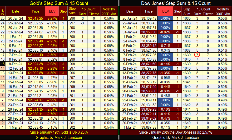
For the Dow Jones on its side of the step sum table, things are looking very good. Every day since January 26th the Dow closed in scoring position, or even more frequently, at a BEV Zero. For us gold bulls, we’d like seeing daily volatility begin to rise. But for the bulls now running wild and free on Wall Street, seeing daily volatility decline from 0.50% at the end of January, down to 0.49% is exactly what they like to see, as bull markets on Wall Street are actually quiet markets.
That is it for this week. I’ll be back next week with more to comment on.
__
(Featured image by Dimitri Karastelev via Unsplash)
DISCLAIMER: This article was written by a third party contributor and does not reflect the opinion of Born2Invest, its management, staff or its associates. Please review our disclaimer for more information.
This article may include forward-looking statements. These forward-looking statements generally are identified by the words “believe,” “project,” “estimate,” “become,” “plan,” “will,” and similar expressions. These forward-looking statements involve known and unknown risks as well as uncertainties, including those discussed in the following cautionary statements and elsewhere in this article and on this site. Although the Company may believe that its expectations are based on reasonable assumptions, the actual results that the Company may achieve may differ materially from any forward-looking statements, which reflect the opinions of the management of the Company only as of the date hereof. Additionally, please make sure to read these important disclosures.


Switzerland’s Medical Cannabis Reform Advances Access, But Barriers Remain
Switzerland’s 2022 medical cannabis reform improved patient access by removing federal approval requirements, but challenges remain. MEDCAN highlights barriers including...


Swisscanto Launches Catastrophe Bond Fund for Portfolio Diversification
Swisscanto launches a Luxembourg UCITS catastrophe bond fund, giving qualified investors access to insurance-linked securities tied to extreme natural events....


AI Agents Transform Payments as Visa, Mastercard, and Qonto Tackle Trust, Liability, and Regulation
Visa and Mastercard are advancing AI-driven autonomous payments, shifting focus to trust, liability, and regulation when agents act without real-time...

Bitcoin ETFs Lead as German Stock Exchange Debuts Mining ETF
Bitcoin and Ethereum remain largely flat, with BTC near 66,600 and ETH around 1,920, while ETFs see steady inflows. A...


Ali G Makes Surprise Wimbledon Appearance with Cannabis-Themed Satire
Sacha Baron Cohen revived his iconic Ali G character at Wimbledon’s men’s final, blending satire with British high society. Dressed...
 |
|
 |  |
 |
|
-

 Crowdfunding2 weeks ago
East Crema Coffee Launches €3.5M Crowdfunding Campaign
-

 Markets3 days ago
Sugar Markets Balance Biofuel Demand and Global Supply
-

 Africa1 week ago
Morocco Cuts Card Fees to Spur Digital Payments, but Uncertainty Remains
-

 Cannabis1 week ago
Virginia Cannabis Market Could Reshape Regional Competition