Markets
Markets at Highs in an Unequal and Unstable Economy
Stocks hit record highs despite Middle East war and rising oil prices, with limited economic impact compared to the 1970s. Gains are concentrated among wealthy investors, while most face rising debt and delinquencies. Housing weakens, inequality widens, and valuations remain extreme. Markets appear disconnected from geopolitical risks, creating an unstable and increasingly uneven economic environment.

If you continue to be baffled as to why the stock market is at record highs but consumer sentiment is in the deep cellar, look at who owns stocks. In the U.S., some 62% of people are estimated to own stocks. In Canada it is lower, around 49%. In other countries the percentage owning stocks is even lower. While many own stocks individually, most are held in mutual funds or retirement funds. That sounds great, but it is hugely skewed. The wealthiest 10% are estimated to hold between 87% to 93% of all stocks. The bottom 50%? Less than 1%.
With the stock market at or near record highs, it explains why some are not feeling the negative impacts of higher prices on a wide variety of goods while the vast majority are. Hence, while consumer sentiment is at record lows, corporate profits are near record highs and roughly 20% of the population is holding things up in terms of retail sales, etc. There also remains considerable liquidity in the economy with growing money supply and debt.
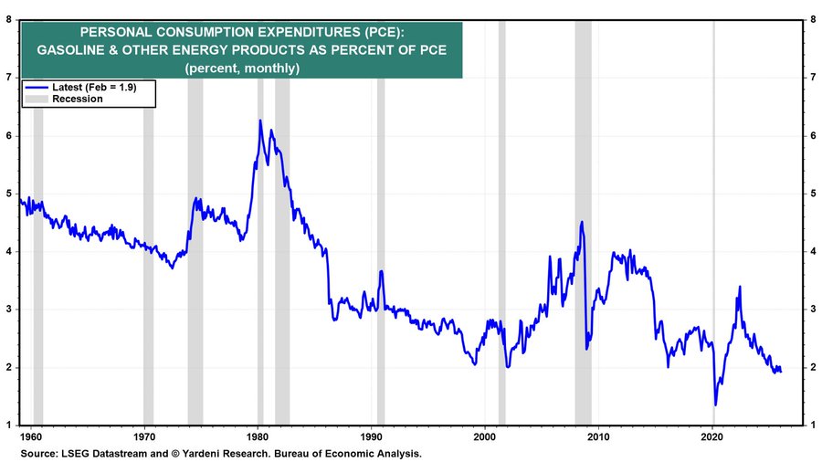
But even retail sales can be misleading as gasoline purchases make up a key portion of retail sales. With gasoline purchases staying at least flat, retail sales rise because of the higher prices for gas, not because more is being consumed. But as we have so often pointed out, gasoline purchases make up a smaller amount of personal consumption expenditures today. Back in the early 1960s, fuel purchases made up roughly 4% to 5% of all consumption. Today it is around 2%. That’s as low as it has been since the pandemic.
Personal Consumption Expenditures (PCE): Gas & Other Energy Products as a % of PCE (1959–2026)
The rich get richer: 20% have increased their wealth. Everyone else, not so much. Yet, that scenario is enough to keep up the appearance that the economy is growing, albeit slowly. The advance (not the final) Q1 GDP for the U.S. rose 2% – below the consensus of 2.3% but better than the Q4 2025 advance of 0.5%. A quick look tells us that personal spending in March rose 0.9% but personal income rose only 0.6%. Both were above expectations.
But note that they are spending at a faster rate than their income is growing. Where do they get the difference? They borrowed it. But not so much for top 20% whose income combined with growing stock portfolios can more than keep up with their spending.
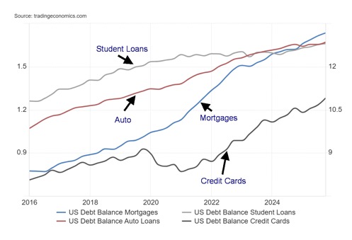
Our chart on loans that include mortgages, credit cards, student loans, and auto loans just keeps on growing. Over the past five years mortgages have gone up 31%, auto loans up 21.5%, student loans up 6.8%, and credit card debt up 56.3%. Total household debt has jumped 29%. Meanwhile, disposable personal income has only increased by 31% while personal savings have collapsed 86% from a peak during the pandemic years.
To keep up appearances, use savings and borrow. However, for the top 20%, that most likely would not be the case as their savings, thanks to stock market growth, would most likely be up. If they borrow, it is to invest, not consume. Their disposable personal income is most likely not suffering much, either.
Despite all the borrowing, U.S. household debt to GDP has actually fallen 11% from 76.6% to 68%. Canadian households have a debt problem as well. Canada’s household debt to GDP has fallen as well from 113.6% to 100.8%. Canada has the third highest household debt in the world, exceeded only by Switzerland and Australia. Bank of Canada Governor Tiff Macklem has warned about Canada’s huge household debt problem, which some economists believe is a bigger problem than government debt.
Loans: Mortgages, Credit Cards, Auto, Students (2016–2026)
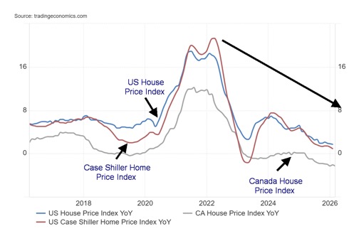
One source of savings that many have dipped into is through lines of credit on their house. While stock prices (S&P 500) have gone up 71% over the past five years, house prices have fallen, at least from their peak seen in 2022.
Yet, unlike the stock market where only 10% control upwards of 93% of all stocks, the broader public owns their home (although it is probably mortgaged). Some 65.4% own their own home. In Canada, the number is higher at 66.7%. But home prices in the U.S. have fallen steadily over the past five years, even more so in Canada. The result is, those with stocks get wealthier while those with houses get poorer.
Home Price Indices (2016–2026)
GDP advance Q1 2026 was reported as up 2.0%. The previous Q4 2025 was plus 0.5%. The market expected a gain of 2.3%. As no surprise, PCE prices were up 3.5% year over year, about as expected but above the last report of up 2.8%. Growth is up but, as we note, it appears that it is the top 20% that are helping to keep GDP growth up. The U.S. is the most unequal country in the G7 with a Gini Coefficient of 41.8% (100% is absolute inequality, 0% is total equality).
Canada is last reported at 31.5%. The highest in the world is reported to be South Africa with a Gini of 63.0%. The lowest reported is Slovakia at 23.8%, according to the World Population Review (www.worldpopulationreview.com). High Gini’s tend to be found in Latin America and Africa while low Gini’s tend to be found in Europe. High is considered to be anything over 40%.
It is interesting to note that, according to U.S. Debt Clock (https://www.usdebtclock.org/), there are today 24.2 million millionaires in the U.S., representing 7% of the population. However, there are 36.9 million living in poverty (10.8% of the population). The entry level to be in the 1% is a net wealth of $20 million or more. The average net wealth of the bottom 50% of the population is $35,372. An estimated 60%–67% of Americans live from paycheck to paycheck. The U.S. has 989 billionaires, the highest of any nation in the world. Leading the pack is Elon Musk with a net worth estimated at $839 billion.
The stock market is up challenging all-time highs. But not everyone is benefiting. And that is a problem as inequality grows.
Chart of the week
US – Buffett Indicator – 1970–2026
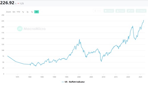
We’ve shown this chart before but it’s worth repeating. The Buffett Indicator is flashing danger. At 227 it’s in the high valuation zone. The last time it was flashing in this zone was just before the pandemic crash. The indicator was also flashing danger at the top of the dot.com bubble in 2000 and again in 2007 before the financial crisis when the U.S. housing market crashed, taking down banks and others, most notably Lehman Brothers. The indicator was high then, but this time it is at record highs.
The Buffett Indicator takes the total market capitalization to GDP ratio. What the indicator is telling us is that investors are valuing listed companies at 2.4 times their economic output.
America’s largest companies are no longer steel mills, retailers, and banks, tied mostly to domestic demand. They are global technology platforms, cloud monopolies, chip giants, software ecosystems, and intellectual-property machines earning profits across the planet. They scale faster, operate lighter, and often produce margins that old industries could only dream of. A higher Buffett Indicator today can therefore be structurally justified compared with previous decades.
Buffett has raised a mind-boggling $380 billion in cash. That represents some 38% of Berkshire Hathaway’s (BRK.A or BRK.B) market cap (estimated at $1.02 trillion).
Just because the market appears to be justifying current prices, it doesn’t mean this goes on forever. Alone, it suggests that gains from here are limited but downside risk is rising. Sell in May and go away?
Stocks
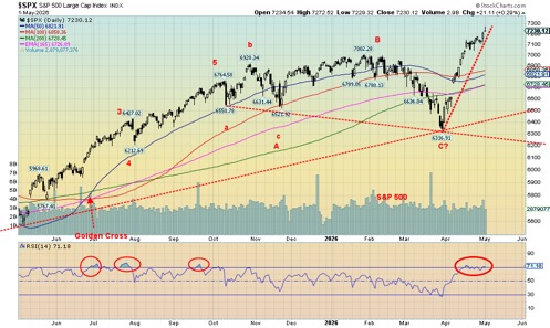
The stock market keeps on trucking. The recent run-up has been quite a run with the S&P 500 up 14.5% since that low in March. War in the Gulf? Who cares. It’s over there. AI is where it’s at. So here we go. The S&P 500 rose 0.9% this past week to new all-time highs. So did the NASDAQ, up 1.1%. But the Dow Jones Industrials (DJI)? Not so much.
The DJI gained 0.6% but remains shy of a new all-time high. So does the Dow Jones Transportations (DJT), which fell 1.4% as the US/Iran war bites with shortages of jet fuel negatively impacting the airlines and other modes of transportation.
Some of the MAG7 hit all-time highs, notably Amazon and Google. However, Meta fell almost 10% this past week and the big star Nvidia was off 4.7%. The NY FANG Index gained 0.9% but no new all-time highs. Are the DJI, DJT, and NY FANG diverging from the S&P 500 and NASDAQ? It appears that way and that usually means trouble. Even the S&P 500 Equal Weight Index diverged, failing to make all-time highs despite gaining 0.3% on the week. The S&P 400 (Mid) was flat on the week while the S&P 600 (Small) did make all-time highs, up 0.8%.
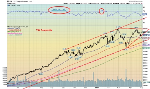
Elsewhere in the world the story wasn’t as positive. The London FTSE fell 0.1%, the EuroNext was off 0.2%, the Paris CAC 40 fell 1.4%, while the German DAX gained 0.6%. Asia fared marginally better with China’s Shanghai Index (SSEC) up 0.5%, the Tokyo Nikkei Dow (TKN) making all-time highs, gaining 0.6%, Hong Kong’s Hang Seng (HSI) falling 0.5% while India’s Nifty Fifty gained 0.4%. Not to leave Canada out, the TSX Composite was flat and the TSX Venture Exchange (CDNX) was off 1.6% as juniors continue to struggle.
The S&P 500 and even the NASDAQ left a shooting star on the charts (Japanese candlestick pattern). A shooting star occurs when the market opens, shoots higher, and then retraces back all the way to where it started. The pattern is usually considered bearish. A break of 7,100 for the S&P 500 might get the market moving to the downside.
Sell in May and go away is the long-held mantra. Since 1950, the DJI has gained an average of 7.2% in the November/April period but only 0.9% in the May/October period. The November/April period saw 58 gains against 17 losses while the May/October period saw only 46 gains vs. 29 losses. The recently completed November/April period saw the S&P 500 gain 7.5%.
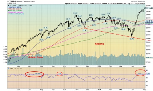
The indices are overbought (and overvalued). The RSI for both the SPX and the NASDAQ has been 70 or higher since April. Yes, overbought can hang on longer than the shorts can stay solvent. But eventually the market succumbs. As noted, the SPX may break under 7,100 but even more so under 7,000. For the NASDAQ, a break could occur under 24,000. The rise has been very steep, and it is usually not sustainable. We’ll update break points as we move lower. But the odds favour a downside break.
In Canada, the TSX saw six of the 14 sub-indices down on the week. It was predominantly Gold (TGD) -8.6%, Metals (TGM) -5.6%, and Materials (TMT) -6.8% that fell. The big gainer was Energy (TEN), which went up 6.9%.
Momentum has been weak on the current rise, yet another sign of a weakening market. Until we break, the trend is up but pursuing up here could be dicey.
Bonds
The story on the week was about the FOMC that left the Fed rate unchanged, as was widely expected. We also learned that the DOJ is dropping its investigation into Fed Chair Jerome Powell and the Fed. That should help advance Kevin Warsh as the next Fed chair, but we note that is still not finalized. Fed Chair Powell has said he will remain on the Board of Governors as he is allowed to until January 31, 2028. He says he will stay on to protect the Fed’s independence against unprecedented political and legal attacks.
As a result, with Warsh probably becoming the new Fed chair, Board Governor Stephen Marin, a Trump appointee, will stand aside as his initial term is already up. Warsh would then be taking over Marin’s spot, not Powell’s, as Powell stays on. The next Fed meeting is June 16–17. Some are already thinking Warsh’s first meeting will see a rate cut. But that is not a layup. There were four dissenters at the April 28–29 meeting, the highest since 1992. Miran dissented, favouring immediate rate cuts. Three – Hammack, Kashkari, and Logan – all wanted to cut any references to hints of a rate cut. Donald Trump could continue to be stonewalled by the Fed.
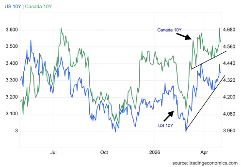
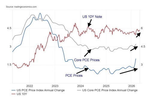
Because of the war and the rise in oil prices bond yields ticked higher this past week. The U.S. 10-year treasury note rose to 4.38% from 4.31%. In Canada the 10-year Government of Canada bond (CGB) rose to 3.53% from 3.46%. Inflation was up as measured by PCE prices. PCE prices rose y-o-y 3.5%, the highest since March 2022. The previous was 2.8%. Core PCE prices were up 3.2% vs. 3.0% in February. The 10-year yields 4.35%. The Fed’s preferred reference for inflation is PCE prices.
PCE Prices, Core PCE and U.S. 10-Year Note 2021-2026
It is interesting to note that since the start of the Iran war that jet fuel is up 60%, heating oil up 46% as is diesel fuel, gasoline up 35%, and the EU Natural Gas up 33% (to April 22, 2026, only). Other fuels and fertilizers are up accordingly as well. Shortages of jet fuel in particular are emerging negatively impacting the airlines and consumers and commercial who fly.
Gold and silver
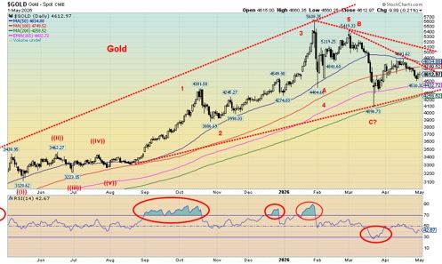
Some are claiming that gold’s safe-haven status is over. Ever since the US/Iran war broke out, gold has fallen 12.6%. Oil has jumped almost 53% while the U.S. 20-year Treasury note yield is up 43 bp to 4.38% from 3.95%. Inflation has leaped from 2.4% in February to 3.3% in March. The S&P 500 is up 5.1%. None of this is good for gold. Inflationary pressures keep many believing the Fed’s hands are tied and they won’t lower rates. That’s also not good for gold. But central banks keep buying and that could put a floor on the price. This past week, thoughts that a breakthrough between the U.S. and Iran on a peace deal helped gold prices to rebound on May 1, 2026.
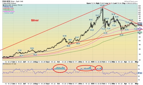
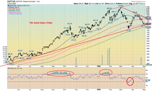
However, that didn’t help as gold ended the week down 2.0%, silver was down 0.7%, platinum fell 1.0%, palladium was up 2.1%, while copper fell 2.0%. The gold stock indices were whacked again with the Gold Bugs Index (HUI) down 7.6% and the TSX Gold Index (TGD) off 8.6%. Because silver outperformed this past week, the gold/silver ratio fell 1.3% in favour of silver.
Gold, silver, and the gold stocks continue in a corrective mode. We remain above the recent lows. So far, this has a look of a test of the lows. The RSI is neutral. Our expectation continues to be that gold will eventually break to the upside. But it has resistance to get through. First at around $4,700/$4,800 and then again at $5,000/$5,100.
Above $5,100 we should be breaking out. Above $5,250 new highs are possible. Seasonally, gold has strength from roughly June to September before a correction sets in, although the real gain may not start until July/August. Gold’s support is down to $4,300. Below $4,200 new lows become possible.
Silver is similar. A breakout occurs above $79 but we wouldn’t be looking at potential new highs until we break over $107. Silver appears to have good support down to $65. Below $62 silver is in trouble. Gold stocks, represented here by the TGD, have had a rough time. The TGD is down 25% from its all-time high, a bear market. At its recent worst, the TGD had fallen 50%. Notably, during the 2008 financial crisis, the TGD fell 61%. By the high in 2011 the TGD was up over 200% from the 2008 low. Similar observations were made for the HUI.
So, while this correction has been nasty, we’ve seen worse during a bull market. The conditions for gold remain solid and new highs will beckon once this correction is over. The only real danger is new lows; then we’d have to question the bull market. Until then, the bull remains intact, albeit currently wobbly.
Oil and gas
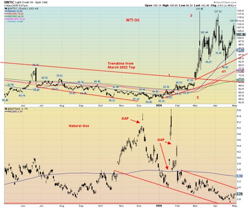
Oil prices continue to have wild swings, thanks to the ongoing whims of the president on whether the war has ended, whether Iran’s peace proposal is accepted or rejected (primarily the case), or whether the two sides are even talking (apparently not, but maybe they are). There is also the big argument over Trump’s war powers, which would normally expire after 60 days, thus requiring congressional approval to continue.
Trump declares the war was over, so any renewal of hostilities would set up another 60 days before he must go to Congress. It’s all argumentative, of course, with Trump probably getting his way. Nonetheless, the wild swings this past week were to the upside as WTI oil leaped over $8 or 8.7%. Brent crude did the same, although its biggest move came the week before, but it was still up 3.3%. Brent is just shy of new 52-week highs while WTI needs to climb a bit further.
Nonetheless, the Strait of Hormuz remains effectively closed. Iran is charging a toll to sail through while the U.S. has threatened sanctions against anyone who pays the toll. With the strait effectively closed, the clock is ticking as to when the impact on the global economy heightens. Already there is rationing, gas riots, and airlines running out of jet fuel and cancelling flights, while prices at the pump keep going up.
Notably one of the U.S.’s goals for the war against Iran was to ensure the Strait of Hormuz remains open. Additionally, the U.S. wanted to end Iran’s nuclear program and change the regime. So far, the U.S. is 0 for 3. The U.S. doubts Iran’s peace plan is acceptable, and Trump says that Iran has not paid the price.
The United Arab Emirates (UAE) announced they are leaving OPEC. The UAE had constantly complained about OPEC’s quotas. Technically, it would allow the UAE to pump more, but since most of the UAE is behind the Strait of Hormuz it won’t do a lot of good. The UAE, like Saudi Arabia, does have a pipeline elsewhere. It is the Abu Dhabi Crude Oil Pipeline (ADCOP) from the UAE to the Gulf of Oman. It carries about 1.5 million bpd, representing some 50% of the UAE’s crude oil exports. Not insignificant. Could the pipeline be vulnerable to Iranian bombs?
Natural gas (NG) prices rose in the week. NG at the Henry Hub rose 10.7% because of a smaller storage injection and reduced production, despite record LNG exports. At the EU Dutch Hub, prices were up only 1.7%, thanks to the ongoing blockade of the Strait. This could become quite critical for the EU going forward as they need NG to replenish reserves over the summer to prepare for next winter. Could the EU pivot back to Russia?
Energy stocks rose in the week with the ARCA Oil & Gas Index (XOI) up 5.0% and the TSX Energy Index up 6.9%. Both remain short of previous highs. The Gold/Oil ratio continued to fall in favour of oil, down 8.2% on the week. Some have argued that gold’s safe-haven status has ended because it now lags oil. But sharp corrections for gold in a bull market are not unusual. The 2008 financial crisis saw gold and especially silver and the gold stock indices fall sharply, exceeding the fall in the stock market, but they rebounded first and by 2011 were setting all-time highs.
Oil prices should continue to be volatile, depending on what happens in the Gulf. Regardless, even if they came to a deal tomorrow and the Strait of Hormuz reopens, so much damage has been done that it will take months, even years, to bring the Gulf back to where it was previously. As a result, oil prices would most likely remain high for a considerable time longer. As we have noted, the damage to the global economy is still unfolding and the worst is yet to come.
Markets and Trends
| % Gains (Losses) Trends | ||||||||
| Close Dec 31/25 | Close May 1/26 | Week | YTD | Daily (Short Term) | Weekly (Intermediate) | Monthly (Long Term) | ||
| S&P 500 | 6,845.50 | 7,230.12 (new highs) * | 0.9% | 5.6% | up | Up | up | |
| Dow Jones Industrials | 48,063.29 | 49,499.27 | 0.6% | 3.0% | up | up | up | |
| Dow Jones Transport | 17,357.19 | 20,598.2 | (1.4)% | 18.7% | up | up | up | |
| NASDAQ | 23,241.99 | 25,114.44 (new highs) * | 1.1% | 8.1% | up | up | up | |
| S&P/TSX Composite | 31,712.76 | 33,891.18 | flat | 6.9% | up | up | up | |
| S&P/TSX Venture (CDNX) | 987.74 | 994.44 | (1.6)% | 0.7% | neutral | up | up | |
| S&P 600 (small) | 1,467.76 | 1,672.78 (new highs) * | 0.8% | 14.0% | up | up | up | |
| ACWX MSCI World x US | 67.18 | 73.64 | 0.5% | 9.6% | up | up | up | |
| Bitcoin | 87,576.98 | 78,314.65 | 1.0% | (10.6)% | up | down | neutral | |
| Gold Mining Stock Indices | ||||||||
| Gold Bugs Index (HUI) | 701.49 | 741.09 | (7.6)% | 5.7% | down | up (weak) | up | |
| TSX Gold Index (TGD) | 817.76 | 839.24 | (8.6)% | 2.6% | down | up (weak) | up | |
| Bonds% | ||||||||
| U.S. 10-Year Treasury Bond yield | 4.17% | 4.38% | 1.6% | 5.0% | ||||
| 3.3Cdn. 10-Year Bond CGB yield | 3.44% | 3.53% | 2.0% | 2.6% | ||||
| Recession Watch Spreads | ||||||||
| U.S. 2-year 10-year Treasury spread | 0.69% | 0.49% | (5.6)% | (29.0)% | ||||
| Cdn 2-year 10-year CGB spread | 0.85% | 0.59% | (7.8)% | (30.6)% | ||||
| Currencies | ||||||||
| US$ Index | 98.26 | 98.20 | (0.3)% | (0.1)% | down | neutral | down | |
| Canadian $ | 72.87 | 73.59 | 0.6% | 1.0% | up | up | neutral | |
| Euro | 117.48 | 117.21 | flat | (0.2)% | up | up | up | |
| Swiss Franc | 126.21 | 127.93 | 0.4% | 1.4% | up | up | up | |
| British Pound | 134.78 | 135.75 | 0.3% | 0.7% | up | up | up | |
| Japanese Yen | 63.83 | 63.67 | 1.5% | (0.3)% | up | down | down | |
| Precious Metals | ||||||||
| Gold | 4,311.97 | 4,612.97 | (2.0)% | 7.0% | down | up | up | |
| Silver | 71.16 | 75.34 | (0.7)% | 5.9% | down (weak) | up | up | |
| Platinum | 124.81 | 1,999.70 | (1.0)% | (2.3)% | neutral | neutral | up | |
| Base Metals | ||||||||
| Palladium | 1,619.50 | 1,537.50 | 2.1% | (5.1)% | neutral | neutral | up | |
| Copper | 5.64 | 5.91 | (2.0)% | 4.8% | up | up | up | |
| Energy | ||||||||
| WTI Oil | 57.44 | 102.63 | 8.7% | 78.7% | up | up | up | |
| Nat Gas | 3.71 | 2.79 | 10.7% | (24.8)% | down (weak) | down | down (weak) | |
__
(Featured image by Jakub Zerdzicki via Unsplash)
DISCLAIMER: This article was written by a third party contributor and does not reflect the opinion of Born2Invest, its management, staff or its associates. Please review our disclaimer for more information.
This article may include forward-looking statements. These forward-looking statements generally are identified by the words “believe,” “project,” “estimate,” “become,” “plan,” “will,” and similar expressions, including with regards to potential earnings in the Empire Flippers affiliate program. These forward-looking statements involve known and unknown risks as well as uncertainties, including those discussed in the following cautionary statements and elsewhere in this article and on this site. Although the Company may believe that its expectations are based on reasonable assumptions, the actual results that the Company may achieve may differ materially from any forward-looking statements, which reflect the opinions of the management of the Company only as of the date hereof. Additionally, please make sure to read these important disclosures.
David Chapman is not a registered advisory service and is not an exempt market dealer (EMD) nor a licensed financial advisor. He does not and cannot give individualised market advice. David Chapman has worked in the financial industry for over 40 years including large financial corporations, banks, and investment dealers. The information in this newsletter is intended only for informational and educational purposes. It should not be construed as an offer, a solicitation of an offer or sale of any security. Every effort is made to provide accurate and complete information.
However, we cannot guarantee that there will be no errors. We make no claims, promises or guarantees about the accuracy, completeness, or adequacy of the contents of this commentary and expressly disclaim liability for errors and omissions in the contents of this commentary. David Chapman will always use his best efforts to ensure the accuracy and timeliness of all information. The reader assumes all risk when trading in securities and David Chapman advises consulting a licensed professional financial advisor or portfolio manager such as Enriched Investing Incorporated before proceeding with any trade or idea presented in this newsletter.
David Chapman may own shares in companies mentioned in this newsletter. Before making an investment, prospective investors should review each security’s offering documents which summarize the objectives, fees, expenses and associated risks. Although Artificial Intelligence (AI) may be deployed from time to time, AI output is monitored and adjusted, if necessary, for accuracy. David Chapman shares his ideas and opinions for informational and educational purposes only and expects the reader to perform due diligence before considering a position in any security. That includes consulting with your own licensed professional financial advisor such as Enriched Investing Incorporated. Performance is not guaranteed, values change frequently, and past performance may not be repeated.


Virginia Cannabis Market Could Reshape Regional Competition
Virginia’s planned recreational cannabis market could reshape the Washington region’s economic landscape. With nine million residents, it may draw consumers...


Bitcoin’s Price Drops as Investors Turn to Layer 2 Solutions
Bitcoin fell toward $63,000 after leveraged liquidations erased recent gains, while geopolitical tensions between the US and Iran pressured risk...


Emily.AI: Personalized Oxygen Therapy Earns Global AI Recognition
Emily.AI, Quirónsalud’s explainable AI medical device, became a global finalist at the AI for Good Summit 2026 after competing with...


Advanced Blockchain Under Pressure Amid Crypto Market Shifts
The crypto market shows diverging trends: Advanced Blockchain faces heavy pressure despite restructuring, weak finances, and ongoing transformation, though analysts...


Cannabis Regulation in Germany and Switzerland Shows Early Benefits of Legalization Models
Germany and Switzerland’s cannabis reforms suggest regulated access can reduce criminalization without increasing consumption. Germany saw fewer cannabis-related prosecutions, while...
 |
|
 |  |
 |
|
-

 Crowdfunding1 week ago
East Crema Coffee Launches €3.5M Crowdfunding Campaign
-

 Cannabis2 weeks ago
Tilray Acquires HelloMD to Expand Medical Cannabis Digital Platform
-

 Africa3 days ago
Morocco Cuts Card Fees to Spur Digital Payments, but Uncertainty Remains
-

 Markets1 week ago
Rice Prices Rise as Supply Outlook Tightens and Demand Stays Mixed