Business
Finally: The Dow Jones Made Two New All-Time Highs This Week
The Dow Jones hadn’t made a new all-time high since last February, as many of the major stock indexes I follow, have made multiple new all-time highs since mid-April, all the while the Dow Jones refused too. That changed this week, as the Dow Jones closed at new all-time highs on Thursday, and Friday.
As I’ve said before, when an index closes in scoring position, Red Box below / above the BEV -5% line, pending new all-time highs should be assumed. This week for the Dow Jones, that has proven to be correct once again. Now 55,000 on the Dow Jones is in view.
Below is a chart of the Dow Jones, plotted with its 52Wk High & 52Wk Low lines. Within the red box below, is the same data seen above, but in dollars, from when the Dow Jones entered scoring position in November 2023, to this week’s close. Take a moment to study what is inside these two Red Boxes, above and below, to see why the Bear’s Eye View works so well.
The difference between these two charts is; with the Bear’s Eye View (BEV) above, price data is converted into a range of only 100 possible percentage points;
• 0.0% = New All-Time High, aka BEV Zero,
• -100% = Total Wipeout in Valuation.
With the Dow Jones below, plotted in the dollars it is published in, along with its 52Wk High & Low Lines, the Dow Jones is seen rising to new all-time highs in dollar terms. Look at what it is doing with its 52Wk High Line; it continues pushing it up, until it enters a correction. When the Dow Jones, or any index is actively pushing up on its 52Wk Line, it is in scoring position in a BEV chart.
This week on Thursday and Friday’s close; the Dow Jones is once again pushing its 52Wk High Line higher. Let’s see if it can push it up to something above 55,000 before it corrects once again. Of course, should the Dow Jones begin pushing down on its 52Wk Low Line in the chart above, that would be a problem for the bulls now running wild and free on Wall Street.


The Dow Jones hadn’t made a new all-time high since last February, as many of the major stock indexes I follow, have made multiple new all-time highs since mid-April, all the while the Dow Jones refused too. That changed this week, as the Dow Jones closed at new all-time highs on Thursday, and Friday.
As I’ve said before, when an index closes in scoring position, Red Box below / above the BEV -5% line, pending new all-time highs should be assumed. This week for the Dow Jones, that has proven to be correct once again. Now 55,000 on the Dow Jones is in view.
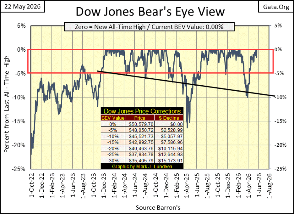
Below is a chart of the Dow Jones, plotted with its 52Wk High & 52Wk Low lines. Within the red box below, is the same data seen above, but in dollars, from when the Dow Jones entered scoring position in November 2023, to this week’s close. Take a moment to study what is inside these two Red Boxes, above and below, to see why the Bear’s Eye View works so well.
The difference between these two charts is; with the Bear’s Eye View (BEV) above, price data is converted into a range of only 100 possible percentage points;
• 0.0% = New All-Time High, aka BEV Zero,
• -100% = Total Wipeout in Valuation.
With the Dow Jones below, plotted in the dollars it is published in, along with its 52Wk High & Low Lines, the Dow Jones is seen rising to new all-time highs in dollar terms. Look at what it is doing with its 52Wk High Line; it continues pushing it up, until it enters a correction. When the Dow Jones, or any index is actively pushing up on its 52Wk Line, it is in scoring position in a BEV chart.
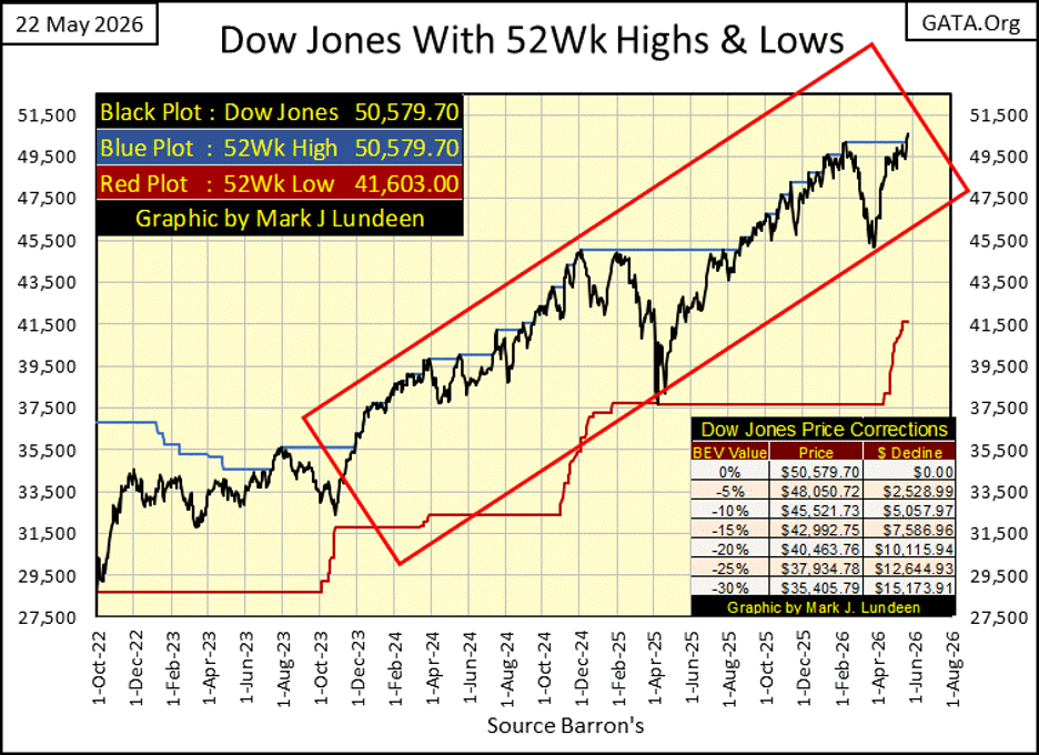
This week on Thursday and Friday’s close; the Dow Jones is once again pushing its 52Wk High Line higher. Let’s see if it can push it up to something above 55,000 before it corrects once again. Of course, should the Dow Jones begin pushing down on its 52Wk Low Line in the chart above, that would be a problem for the bulls now running wild and free on Wall Street.
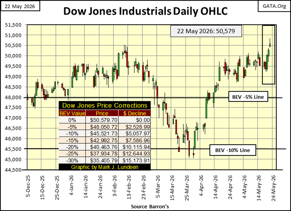
Next is my chart plots the Dow Jones in daily bars. Since February, for three months, the 50K line provided stiff resistance for the Dow Jones. But that was then, and this is now. And now the Dow Jones is rising, leaving its 50K line in the market’s rearview mirror.
How high can the Dow Jones rise before it sees its next line of resistance, and what would that line of resistance be? Those are darn fine questions. Questions I don’t have a clue what their answers would be. I’m just a market enthusiast. I bet on the ponies now and then. But with this advance now into its 44th year, an advance that began with the Dow Jones closing below 700 in August 1982, and now closing above 50,000 in May 2026, following the broad stock market is only a spectator sport for me. Still, I do enjoy the show.
Below in my table for the major market indexes I follow. This week, the Dow Jones made not one, but two new all-time highs, on Thursday and Friday. Other than the Russell Value Index, nothing else did this entire week. So – we next look to see how many of these indexes closed in scoring position this week, within 5% of their last new all-time highs; thirteen of them. This advance appears to be intact, and hopefully we’ll see numerous new all-time highs in the weeks to come.
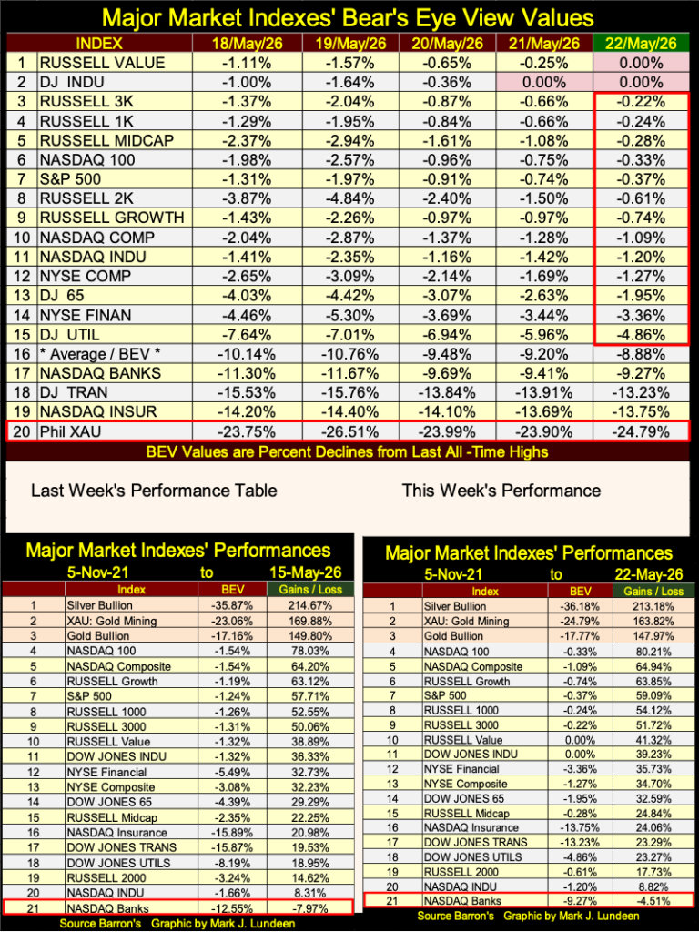
Precious metal assets remain in the top three spots in the performance table above, but their corrections from their last all-time highs continue. I remain confident before this summer is over, we’ll see their BEVs in scoring position, and then on to BEV Zeros (0.00% = new all-time high) once again.
CNBC.Com published this article on Wednesday. Nothing special about it except, they mentioned the yield on the 30yr T-bond, something “market experts” rarely do these days.
Long ago, when speaking about yields in the T-bond market, “market experts” always mentioned the yield on the “long T-bond,” as before the 1970s, there were no 30yr T-bonds issued by the US Treasury. Way back then, the 20yr T-bond was as long as Uncle Same cared to go. It wasn’t until sometime during the Carter Administration in the 1970s, the Treasury began issuing 30yr T-bonds.
The Clinton misadministration, as I recall, pulled the 30yr T-bond sometime in the late 1990s. A few years later, the Bush junior’s administration reissued it in the 2000s, and ever since, the Treasury has issued a new 30yr T-bond every August, November, February, and May. In fact, a new 30yr T-bond was issued this week.
https://www.cnbc.com/2026/05/19/stock-market-today-live-updates.html
Why should anyone care about this market trivia? Maybe they shouldn’t. I just find it interesting, it was when Alan Greenspan was FOMC Idiot Primate (1987 to 2006) that the financial world began their current fixation on the yield of the 10yr T-bond, when addressing the long-end of the yield curve.
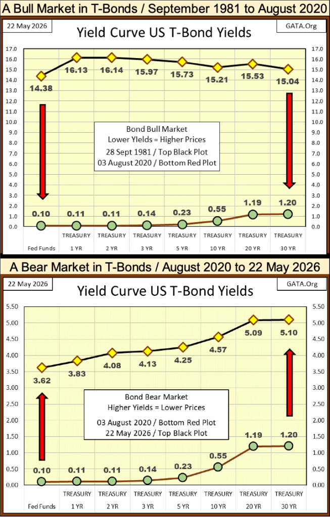
As I’m not a “market expert,” I don’t know why “market experts” for decades have prefer to focus on the yield for a 10yr bond, when data for a 20yr, or even a 30yr bond is available. But not me, because if I have the data, I like to use it, as seen below, where I’ve plotted the 1981 to 2020 bull market, and the 2020 to 2026 bear market in T-bonds.
At the September 1981 bottom, of the 1957 to 1981 bond-bear market, yields for T-bond were all deep into double digits, as seen in the yield curves below. For two weeks in September 1981, the yield for the 30yr T-bond increased to something over 15%. In 1981, it was possible to lock in a for thirty-years a 15% annual return in the T-bond market, and almost no one wanted too! That is what the bottom of a bear market looks like; lots of compelling bargains available, that only a few care to buy.
September 1981 was the bottom of a multi-decade long, bear market in debt. In the years that followed, T-bond yields continued sliding down, until they hit bottom in August 2020. And what a bottom T-bond yields saw six years ago! Someone had to go out twenty-years in the T-bond market, to get an annual rate of return of something over 1%. But that is what a top in a bull market looks like; assets being traded at prices (and bond yields) buyers would soon regret.
Below is the 30yr T-Bond issued in February 2020. Since its current yield bottomed in August 2020 at 1.19%, it has lost 53% of the valuation it traded at six years ago, when its current yield broke above 5% in 2026. Looking at this chart, and the charts above, it seems to me T-bond yields are destined to increase to higher levels, sending bond prices down further. No guarantees on that. But that is what it looks like to me.
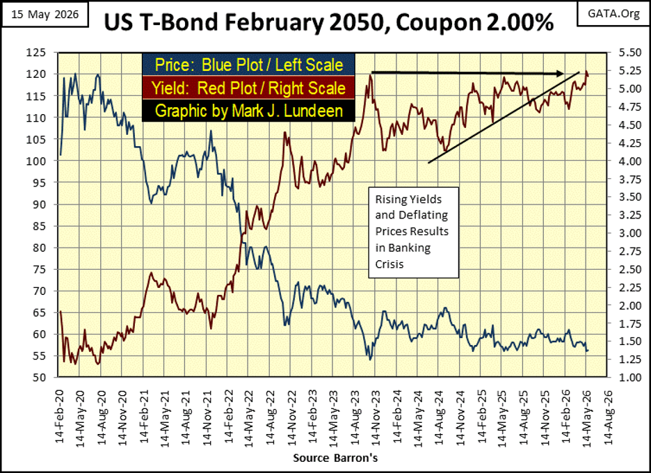
If August 2020 was the top of a multi-decade long bull market, it is also the starting point for what I believe will be another multi-decade long bear market in debt, as seen in the charts above.
In the past six years, T-bond yields are up significantly. There are good reasons to believe they will continue rising in the years to follow. A big reason this must be true was seen this week, the US National Debt increased to something over 39 trillion dollars, with no signs of it slowing down. Consumer and corporate debt levels continue to rise, corrupting balance sheets everywhere.
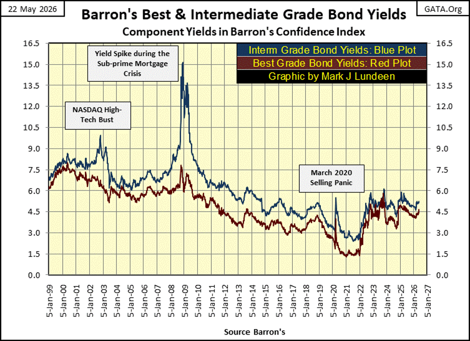
Corporate bonds also entered a bear market in 2022, as seen below. These things take time, and so far, no one seems to have noticed, or cared about this developing bear market in the bond markets. And why should they, as bond yields have “stabilized” in the past few years.
However, one day, when rising bond yields cross above an unknown threshold, the bear market in debt that began in 2020, will be on everyone’s mind, as valuations in the stock market and in real estate evaporate. But when? I don’t know when, just that someday they will.
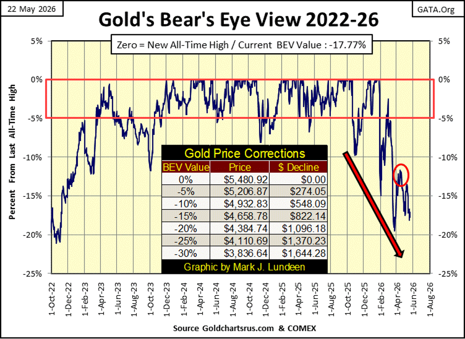
All the above points to one thing; the wisdom of owning some gold and silver bullion, assets with zero counter-party risk. Here is gold’s BEV chart below.
This week, like last week, gold went the wrong way; down, threatening to take out its lows of March 26th, a BEV of -19.54%. If it does, and it looks like it will, there is nothing I can do about it. Obviously, the bears want to drag gold, silver and the XAU down farther than I would have them go. But all market corrections have bottoms, this current decline in all things precious won’t be any different.
My advice is to keep an iron hand on the tiller in this storm, and some day you’ll be glad you did.
Below is silver’s BEV chart. Keep in mind; silver’s BEV values prior to October 2025 in this chart, are based on silver’s last all-time high of January 1980. Silver didn’t see a new all-time high for over forty-five years!
Silver’s BEV closed the week at -36.18%. It could be better. But what’s worse is how silver got down to these deep BEV levels. From a BEV Zero (new all-time high) on January 28th, silver was driven down to its BEV -40% line on February 5th, in only six trading days.
How does something like that happen? And where are the government regulators at the CFTC when you need them to investigate the weird stuff happening in the silver market?

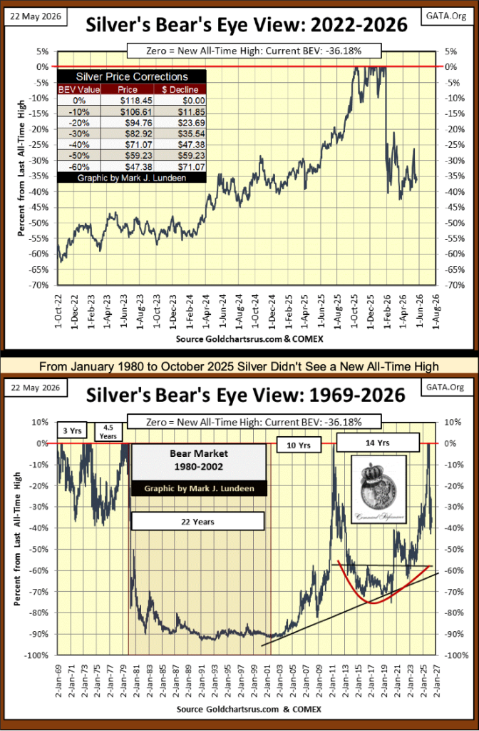
Silver’s long-term BEV chart above is amazing. Not a new all-time high for silver from January 1980, to October 2025, forty-five years. It came close in April 2011, but failed.
Nothing else priced in dollars, not a can of beans at the grocery store, or anything else went for 60%, 70%, and 80% below a price last seen in January 1980 – for decades! And now, even with silver at this week’s close 36% below its last all-time high, after the forty-five-year bear market seen in silver’s long-term BEV chart above, it is finally breaking out to new all-time highs that will astound the financial markets.
But when? I don’t know! But should silver begin seeing new all-time highs before this October, I wouldn’t be surprised.
On gold’s side of the step sum table below, declining days continue to dominate the market. That is how it has been since March 16th, so I have to wonder how much longer can down days continue dominating the gold market? Maybe for another few weeks, but we are approaching another period of time when advancing days, and positive 15-counts will once again dominate the gold market. Let’s see what that does to the price of gold.
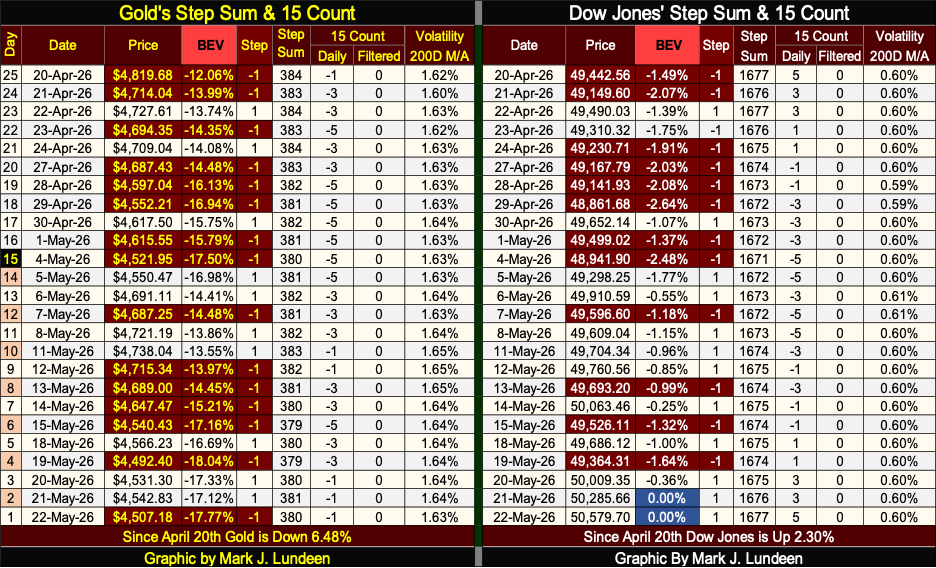
For the Dow Jones on its side of the step sum table above, since May 5th, advancing days have dominated the market, and finally this week, we see two Blue BEV Zeros on Thursday and Friday. The Dow Jones daily volatility’s 200D M/A remains at 0.60%, very low daily volatility, as is typical of all stock market advances since February 1885, when the Dow Jones was first published.
Dow Jones 55,000 before 2027? Don’t think that is impossible. Even so, I still don’t like this market. I still prefer my investment funds in gold and silver bullion, as well as their miners.
The Three Gorge Dam is making news again

This video doesn’t look very good. Should that dam go, it will be a catastrophe for China.
I’m not a civil-engineer. There are many factors to be understood before any dam’s construction be even considered, factors I’m totally unaware of. But there is reason to believe the problem with the Three Gorges Dam isn’t its size.
The Grand Coulee Dam in Washington State is comparable to the Three Gorge Dam, and has been in operation since March 1941. With never a word on cracks forming in its concrete, or photos of it displaying deformation in its construction, after eighty-five years of generating electricity.
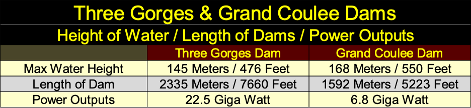
The real problem with the Three Gorges Dam, is it was constructed by the Chinese Communist Party. It was built for political reasons, for the party’s prestige, as well as for any economic benefits its construction would offer China.
Unfortunately, the concrete poured for it was deficient of the required cement. Its steel rebar was made from compromised steel. Now it’s falling apart only twenty years after it was completed, because much of the money intended for its construction, was diverted into the pockets of high-party officials.
The same is true for just about everything made in China;
• its housing units are crumbling after only a few years,
• its newest nuclear submarine recently sank while moored next to its pier,
• its ballistic missiles were filled with water instead of fuel.
• etc. etc. etc.
How do things like these happen? Corruption at the highest levels of government.
The CCP wants to invade Taiwan with a huge amphibious operation, across the 100-mile wide (160 KM) Taiwan Straits, an amphibious invasion on a scale not seen since the WWII. They can try.
__
(Featured image by Jakub Zerdzicki via Unsplash)
DISCLAIMER: This article was written by a third party contributor and does not reflect the opinion of Born2Invest, its management, staff or its associates. Please review our disclaimer for more information.
This article may include forward-looking statements. These forward-looking statements generally are identified by the words “believe,” “project,” “estimate,” “become,” “plan,” “will,” and similar expressions, including with regards to potential earnings in the Empire Flippers affiliate program. These forward-looking statements involve known and unknown risks as well as uncertainties, including those discussed in the following cautionary statements and elsewhere in this article and on this site. Although the Company may believe that its expectations are based on reasonable assumptions, the actual results that the Company may achieve may differ materially from any forward-looking statements, which reflect the opinions of the management of the Company only as of the date hereof. Additionally, please make sure to read these important disclosures.












Namibia Cannabis Activists Seek Political Path After Legal Setbacks
Ganja Users of Namibia is shifting its cannabis reform campaign from legal challenges to politics by proposing the Ganja Users...


XRP at a Turning Point Amid Price Pressure, Regulation, and Institutional Growth
XRP faces a critical period as price pressure, regulatory uncertainty, and institutional expansion shape its outlook. Analysts debate ambitious targets...


Biodiversity Becomes a Key Driver of Value and Resilience in Real Estate
Biodiversity is becoming central to the real estate sector, driven by regulations like the Biodiversity Net Gain and the demand...


Market Faces Potential Shift as Secular Bull Ages and Gold, Oil Gain Attention
Markets alternate long secular bulls and bears; 1982–2000 bull then 2000–2009 bear. Current bull is 17 years old, raising concerns...


Rising Bond Yields Signal Potential Trouble Beneath a Calm Stock Market
This week’s market was calm, but underlying conditions may be weakening. The Dow Jones has stalled without new highs, while...
 |
|
 |  |
 |
|
-

 Biotech2 weeks ago
Emily.AI: Personalized Oxygen Therapy Earns Global AI Recognition
-
 Business7 days ago
The $40 Trillion Trap: Disinflation Is Not Deliverance
-

 Cannabis2 weeks ago
Germany Tightens Cannabis Reimbursement Rules: Approved Medicines Must Come First
-

 Africa4 days ago
Bank of Africa Launches BOA MDM Network to Boost Diaspora Investment in Morocco