Markets
Dow Jones Pauses Near Record Highs as Precious Metals Lead
The Dow Jones reached a record high before pausing, staying near peak levels as the bull market remains intact. Analysts expect further gains unless volatility returns with major selloffs. Most indexes remain close to highs, while precious metals continue outperforming despite large declines from previous peaks, highlighting unusual market strength and investor demand.


The Dow Jones this week made a new all-time high on Monday, but remained in scoring position for the rest of the week, within 1.40% of Monday’s BEV Zero. There are those who wished it made a few more BEV Zeros in its BEV chart below. But not every week in a historic bull market advance, is as exciting as others.
This advance has more to go before it exhausts itself, and we’ll know when it has given us its all – when we once again see daily volatility rise, with the arrival of Dow Jones Days of Extreme Market Volatility, or Dow Jones 2% days.
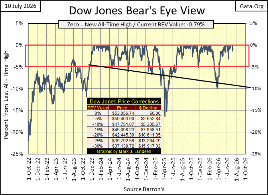
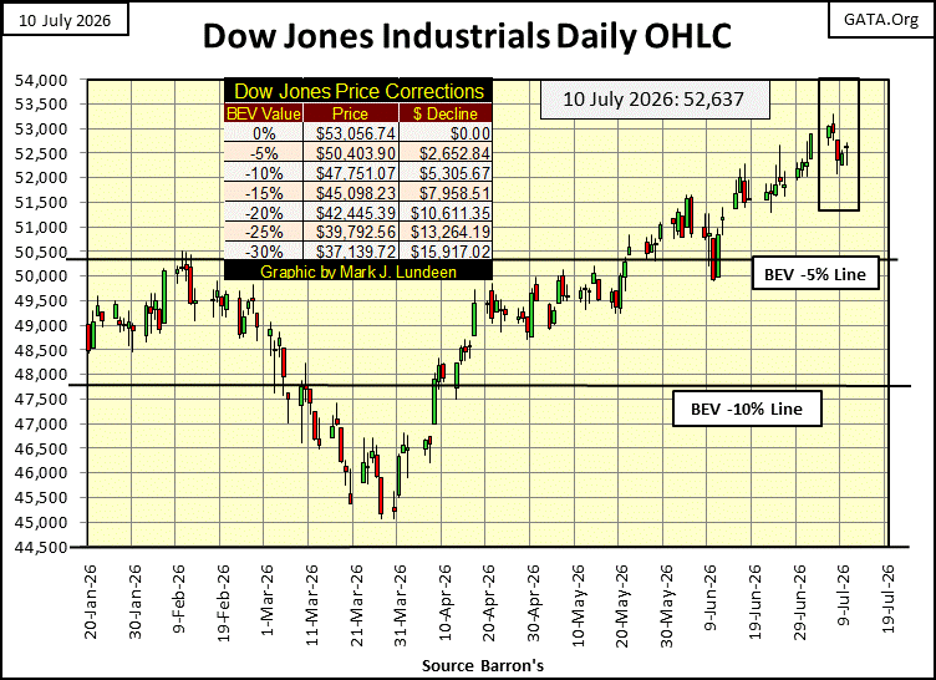
The chart below plotting the Dow Jones in daily bars displays what happened this week better, than the BEV chart above. The Dow Jones took a pause in the advance. How long could this pause continue? That we already had a 10% market correction in the Dow Jones last March / April, suggests it won’t last for long.
Looking at the Bear’s Eye View values to the major market indexes I follow below, suggests this market advance has more to go. New all-time highs (BEV Zeros) peaked at five on Monday, with Wednesday to Friday becoming a new all-time high free zone. Look at all of the BEV values in scoring position at the close of this week, inside of the red rectangle, within 5% of their last all-time highs. It won’t take much for these indexes to once again break into market history.
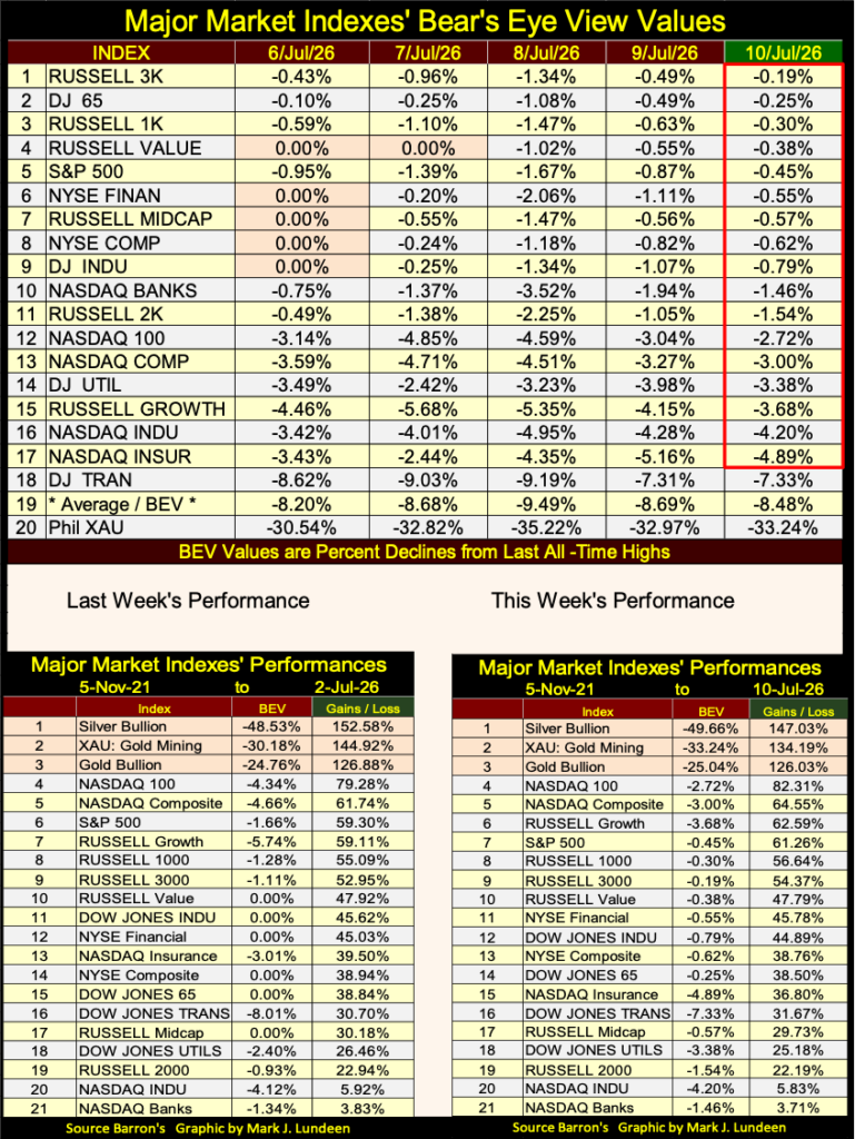
For a long time, precious metal assets have resided in the top three spots in the performance tables above. What is remarkable about that, is seen when looking at their BEV values, compared to the other indexes in the table. Silver bullion is #1. Silver bullion’s BEV value is also -49.66%, indicating silver has lost half of its last all-time high’s valuation, since last January. Yet silver is #1 in the performance table above? Yes, it is. The same thing goes for the XAU, and gold bullion.
What is going on here?
Let’s take the XAU for our example below. From January 2025, to January 2026, the XAU advanced by 222%, in only twelve months. This is historic. I can’t think of another established industry group, one that has traded in the markets for many decades, that has advanced from 140.09, to 451.13 twelve months later.
The XAU has been digesting that advance since last January, closing the week with a BEV of -33.24%. But its advance of the previous year is so huge, even after losing 1/3 of its gains from the year before, it’s still far ahead of all of the major market indexes I follow, in the performance table above.
Looking at the XAU in dollars below, for decades these gold and silver mining companies did little for their owners. At the bottom of the 2011 to 2016 bear market (January 2016), it was trading for half of what it did on its opening day of trading in 1983. What the XAU has done since its lows of January 2016, is seen in the chart below. And it’s remarkable.
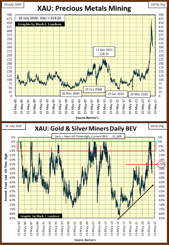
Looking at the XAU in BEV format above, the bottom of the 2011 to 2016 bear market, was the lowest point for the XAU since 1983, where the XAU was down by 83% from its April 2011’s all-time high. After a bear-market low like that, only the true believers, or lunatics would find such an investment attractive.
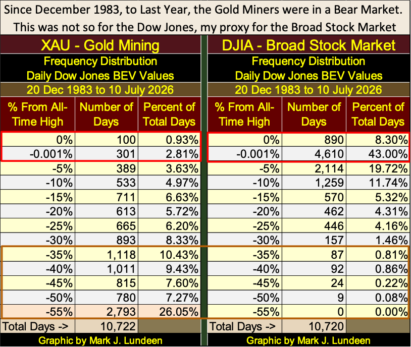
To point out the differences between the XAU, and the Dow Jones (my proxy for the broad stock market), I constructed the two BEV Frequency Tables below, to better illustrate how the XAU has done compared to the Dow Jones since December 1983, when the XAU first began trading.
In these tables, inside their red rectangles, the 0% and the -0.001% rows count the days these indexes have advanced in a bull market;
• 0% = new all-time highs,
• -0.001% = daily closings in scoring position.
Since December 1983, to this day, the XAU has seen only 100 new daily all-time highs. The Dow Jones has seen 890 daily new all-time highs. As for closings in scoring position, the XAU has seen only 301 daily closes in scoring position, while the Dow Jones has seen 4,610.
However, the rows deeper in the table reveal how poorly the XAU has done, compared to the Dow Jones these past forty-three years. The XAU has seen 2,793 daily closing, 55%, and more, below their last all-time highs. To see a similar performance in the Dow Jones, one would have to go back to the depressing 1930s.
But those were the bad old days. We have reason to believe the future will be better for the gold and silver miners. It’s the Dow Jones that I have reason to be worried for in the years to come
Let’s take a look at a fifty-six-year comparison of the performance of the Dow Jones (Blue Plot) to one ounce of gold (Red Plot), below. Hard to believe it, but since January 1970, gold has far outperformed the Dow Jones, even after it began correcting last January. Since January 1970, gold has advanced by a factor of 116.49, while the Dow Jones’ has increase by a factor of only 62.80.
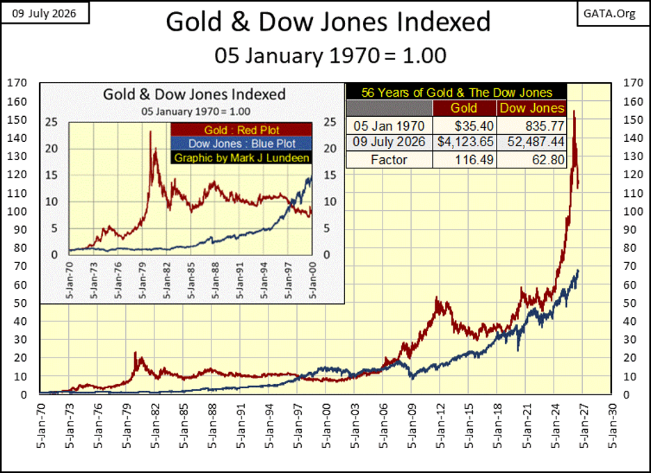
To be fair to the Dow Jones, 1970 was during a period where it failed to advance above 1,000, and remain above 1,000, from 1966 to 1982. But then gold endured a massive, 70% bear market decline from 1980, to 2001. So, since 1970, both Dow Jones and gold have seen good times, and bad. After all the years of good times and bad, now in July 2026, gold has outperformed the Dow Jones by a wide measure, and I anticipate these trends seen above, will continue for a long time to come.
It’s important to note; gold is currently in a correction, down 24.76% from its last all-time high, while the Dow Jones is currently generating new all-time highs. With my way of looking at the market, that makes gold cheap, and the stock market expensive. This chart will look very different when gold resumes its bull market, and the Dow Jones enters a bear market, which one day it must.
Next is a chart of the ratio of the two plots above, a ratio of the Dow Jones to gold. When this ratio is declining, gold is outperforming the Dow Jones, my proxy for the broad stock market. When the ratio is rising, the Dow Jones is outperforming gold.
From 1970 to 1980 (#2 in the chart), gold outperformed the Dow Jones. For these ten years, gold was in a massive bull market, while the stock market did little for investors.
From January 1980 (#2) to the 2000 top of the NASDAQ High-Tech bubble (#3), the Dow Jones outperformed gold by a large measure. Gold was to begin a new bull market in February 2001, as the stock market was already a year in a bear market. The bear market in stocks ended in October 2002. Still, the ratio trended downward, as gold continued outperforming the stock market until August 2011 (#4).
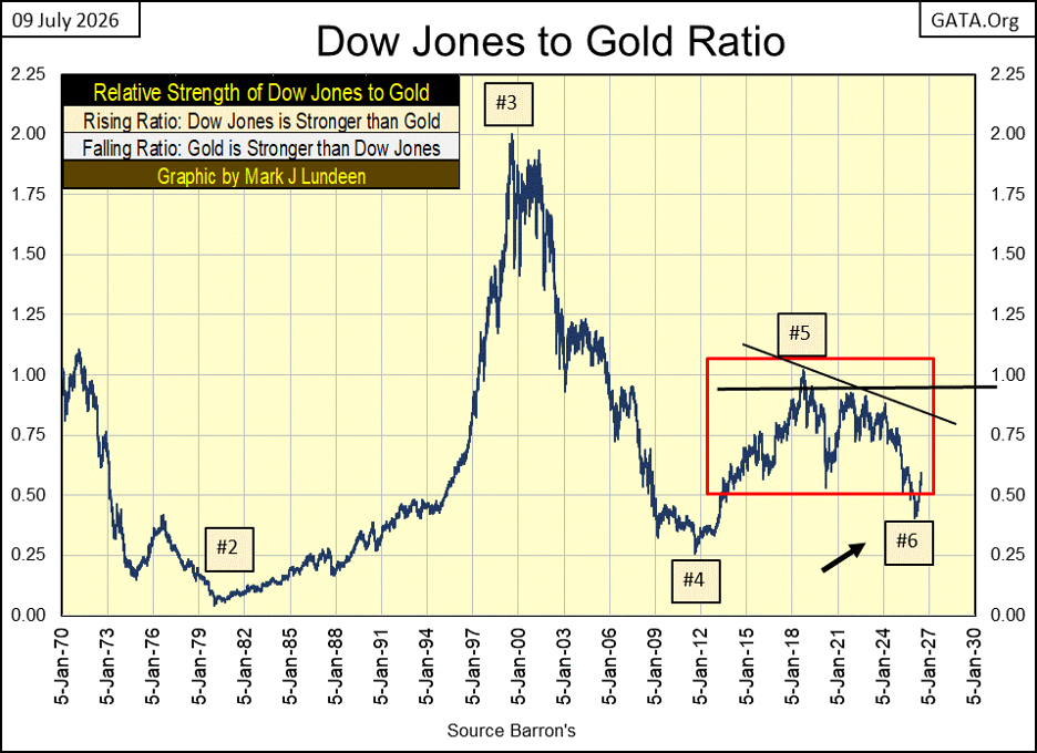
From #4 to December 2015, gold endured a 45% bear market decline, while the Dow Jones advanced. So, the ratio increased from 0.25 to 0.75, at the December 2015 bottom of the gold bear market. The ratio continued rising in favor of the Dow Jones, until October 2018 (#5).
Since October 2018 (#5) to gold’s January 2026 last all-time high (#6), the action of this ratio is very different from what it was before October 2018. I placed a red box around it to note the ratio is no longer rising, or declining as a long-term market trend, but is oscillating in a range as the Dow Jones, and gold, struggles to become the dominant market trend.
Gold broke out of the box at #6, last January. It has returned to the box only because of its current correction. I suspect gold will once again break out of the box for good, when it resumes its bull market trend, and the Dow Jones enters a bear market sometime in the future. As I see it; the chart above is long-term bullish for gold, and bearish for the stock market.
Let’s take a long-term look at the price of silver below. In January 1969, silver was trading for $1.85 an ounce. Eleven years later in January 1980, it * ALMOST * broke above $50 an ounce. But that didn’t happen – twice, in 1980 and again in 2011. For decades, silver was capped at under $50 an ounce.
This ceiling, this immovable object of silver at $50 an ounce, was finally defeated by the unstoppable force of rising silver prices last October 10th, when silver finally closed at $50.10. What happened following October 10th is seen below. In the next three months, silver spiked to $118.
Any market move that exceeds gains of 100% in only three months, as silver did last year, is going to be corrected. So far, silver has seen a reduction of 50% from its highs of last January. How much farther in terms of time and dollars can this correction in silver go on for?
Time wise, I’m not certain of. Hopefully in the next few months, or better yet in the weeks or days to come, silver will resume its advance. What is very interesting in the chart below, is how an old ceiling, such as $50 silver from January 1980 to October 2025, can become an important price floor.
I noted last week, how silver went from its last all-time high on January 28th, ($118), to $70.63, a reduction in the price of silver of over 40%, in only six trading days at the COMEX.
That was five months ago. What have the silver bears done since then? On June 24th, silver saw its low of this move, closing at $57.40, only $13.23 below where it was five months earlier, last February. That is getting silver close to closing below $50, as seen in the chart below.
But after * FIVE MONTHS *, silver isn’t there yet! Try as they might, since February, the silver bears have failed to push the price of silver down into its old trading range, of something below $50 an ounce. That seems an important fact to keep in mind.
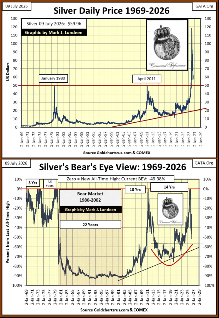
Above is silver plotted in the Bear’s Eye View (BEV) Format, which converts a price series into a range of percentages, spanning from 0% to -100%;
• new all-time highs = 0.0%,
• all other daily closes not at a new all-time high = a negative percentage claw-back from its last all-time high, with a BEV of -100%, a total wipeout in valuation.
Above, the 1980 to 2002 bear market in silver, saw a 90% market decline in the price of silver, that dragged on for a full decade, from 1991 to 2002.
For silver, since 1980, that was the worst of it. Silver’s next bear market, from April 2011 to January 2016, saw only a 70% market decline. Note; the January 2016 bear market low in the price of silver * DIDN’T DRAG ON FOR OVER A DECADE. *
And now, our current bear market in silver, the third since January 1980, has fallen below its BEV -50% line, five months after its last all-time high. Look at the 2011 to 2016 bear market; it took almost two years before silver broke below its BEV -50% line. That in our current market decline in silver, where silver has broken below its BEV -50% line in only six months, suggest this market decline will prove to be much shorter, and hopefully not as deep as the previous bear-market declines.
But that is me just thinking after looking at the chart above. What actually happens will take time to see. I’m optimistic silver, gold and the XAU will soon resume their bull-market advances.
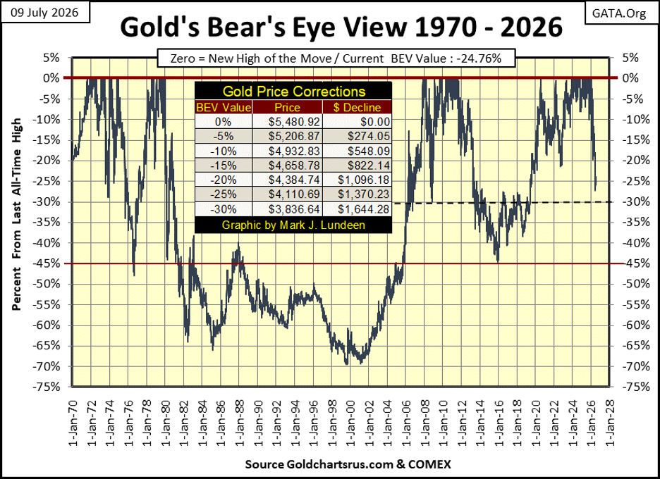
Next is a long-term BEV chart for gold, where we can compare past bull-market corrections in the price of gold, to our current correction. So far, our correction in the price of gold has yet to break below its BEV -30% line. In gold’s 1970 to 1980 bull market, gold saw several corrections. Two broke below its BEV -25% line, the other its BEV -45% line, prior to gold seeing its last all-time high of the advance in January 1980.
The point being, seeing gold now 25% below its last all-time high of last January, is no reason to be concerned the advance has stalled, or has been terminated.
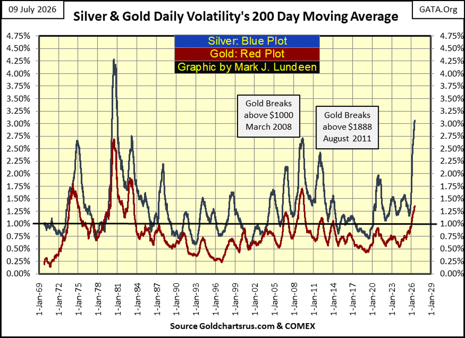
Next is gold and silver’s daily volatility’s 200D M/A. Volatility for the old monetary metals has increased dramatically in 2026. Increases in daily volatility for the Dow Jones is * ALWAYS * bearish. But not so for gold and silver. The best way of thinking of increases in volatility for gold and silver, is thinking increases in volatility is the market’s way of highlighting something is happening, something that could be bullish, or bearish.
So far, the volatility spikes below in daily volatility have happened, following gold and silver’s last all-time high of last January. Gold has corrected by 25%, and silver by 50%. So, these volatility spikes have been a reaction to a bearish market trend. Look at silver’s spike, it’s at levels not seen since 1980 / 81. But unlike 1980 / 81, I doubt silver is about to enter a two decade long, 90% bear market.
This is how things go early in a bull-market advance; when things get scary, people sell, when they should have held on to their positions. I’m holding on, and I expect seeing the gold and silver markets turn to the upside, in the not to distance future.
Here is a wild chart for silver; its annual totals of days of extreme market volatility, or silver’s 5% days. Not since 1980, has silver seen so many days of extreme volatility, and it is only July! Something BIG is happening in the silver market, and I doubt it will prove to be a repeat of the 1980 to 2002 bear market!
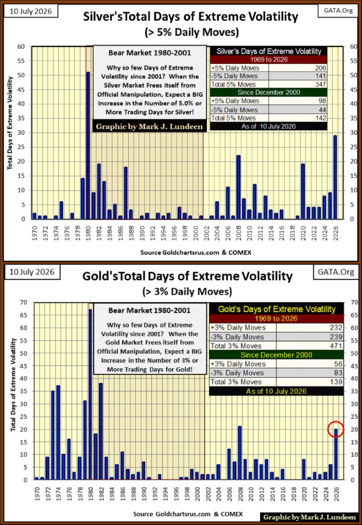
Above is the chart for gold’s days of extreme market volatility, or gold’s 3% days, annual totals since 1970. So far in 2026, gold has seen twenty, 3% days, and that is a lot. 2008 saw twenty-one 3% days, but neither 2008 or 2026 can compare to the volatility gold saw from 1970 to 1982.
So Mark, are you sure this increase in daily volatility for gold and silver will ultimately prove to be bullish? Good question, but I have another; what drives the dollar price of anything trading in the market? The answer to that question is; dollars.
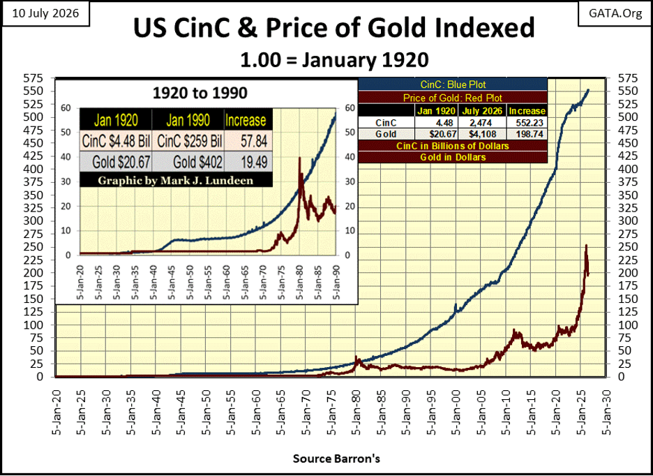
Before 1913, the dollar was defined in terms of gold, but that is no longer so. Today, the dollar has no legal definition, so dollars can be lots of things. Dollars as seen below (next chart, far below), or Currency in Circulation (CinC), are paper dollars circulating in the global economy. Banks take these paper dollars when deposited in a savings account, and leverage them via credit creation, where one dollar of CinC, deposited in a bank, is lent out to ten, or more individuals as credit.
That isn’t totally true, as the idiots at the FOMC can “inject liquidity” into the banking system, independent of CinC (dollars, not paper, but from computer keystrokes). These digital dollars, exactly like dollars of CinC, can be leveraged via credit creation, to many multiples of whatever “liquidity” the idiots had “injected” into the banking system.
So, when someone purchases something with a credit card, or buys a new car with a loan from a bank (a check from a bank), that is credit being created by a bank. Note; with a credit card, a bank loan for a new car, or at the closing of a real estate transaction, no paper money (CinC) is used in these transactions. In fact, is it was demanded that these transactions were to use CinC (paper money), not credit dollars, the entire inflationary bubble now supporting current market valuations, would implode in a single day.
Today, most economic transactions are credit transaction. Whether one is shopping for groceries, or buying a new car, they are made possible by dollars created by the banking system.
The system seems to work well, so what is the problem? The problem is; using credit is only possible if debt is also taken on by someone, or something. The Mogambo Guru (aka Richard Daughty), explains the situation below, as no text book on economics ever will.

Ultimately, credit is a burden that must be carried by someone, with monthly payments to the banking system that created these dollars of credit, at nominal cost to them. It’s actually a scandal.
These dollars of credit, created by banks, used for purchasing everything offered in the economy, don’t disappear after the purchase is completed. Like CinC, they also circulate in the banking system, flowing into areas of the economy far from where they were first used to buy clothing or a new fishing boat. Areas of the economy like, the bond and stock markets.
So, Elon Musk is now a trillionaire. Had the banking system not inflated the supply of dollars of credit circulating in the economy, to now grotesque levels, that could not have happened.
Historically, the problem with dollars of credit is, they have a bad habit of evaporating back into the nothing from where they came from. Look at the Roaring 1920s, Wall Street and the public had a party, made possible by credit creation. Then came the 1930s, where Mr Bear busted every credit bubble he could get his claws on, and he got his claws on every one of them.
During a deflationary market collapse, dollars of credit supporting the vast fortunes of billionaires, can, and will evaporate into nothing. Possibly to an extent where many of today’s billionaires, are converted into tomorrow’s paupers. Former rich people who can no longer service the outstanding balance on their credit cards.
But gold and silver bullion have no counter-party risks, aka credit risk. That makes them very desirable in times of financial crisis. In the not to distance future, demand for gold will result in the indexed price of gold seen below, to rise up to, and possibly exceed the plot of CinC. It happened once before, in 1979, during a bull market in gold and silver. Don’t think it can’t happen again.
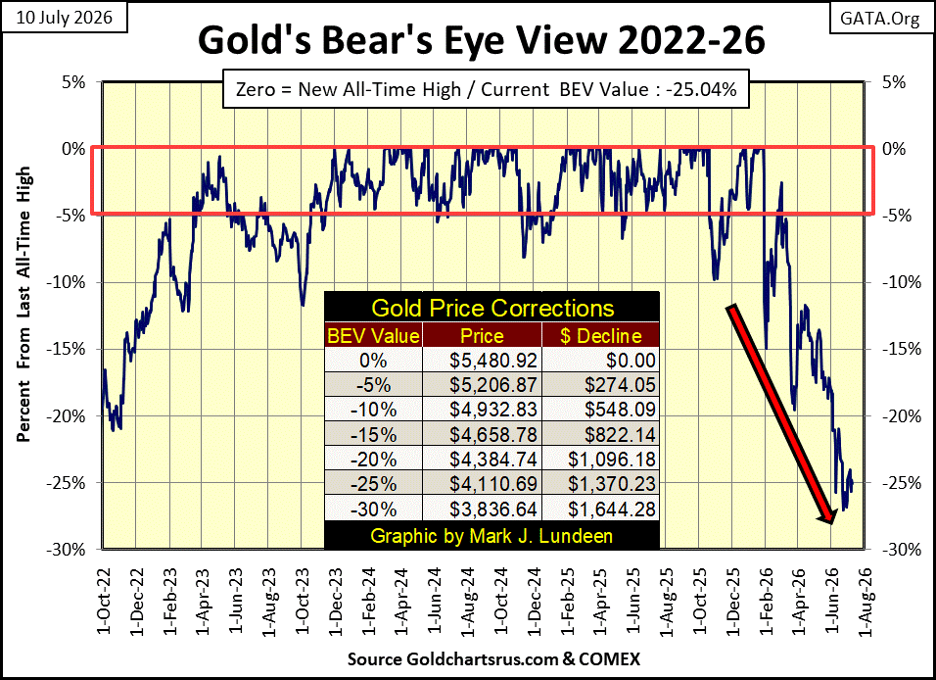
Looking at gold’s BEV chart below, not much has changed since last week. The trend for gold remains down. But so far, gold has refused to close below its BEV -30% line. As gold closed the week with a BEV of -25.04%, half way between its BEV -20% & -30% lines.
Let’s see which BEV line gold next breaks above, or below. If it breaks below its BEV -30% line ($3836), this correction must still have some unfinished business to accomplish. But should gold next break above its BEV -20% line ($4384), that would be a very positive development in the gold market.
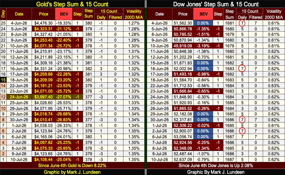
In gold’s step sum table below, its 15-count closed the week with a -3. So, declining days still dominate the gold market. It has been like that since mid-March. That is a long time for a market to be dominated by down days. Well one of these days, advancing days will once again dominate the gold market. We’ll see what happens then.
I highlighted June 24th, as that is gold’s low of the current correction. Let’s hope it holds! Gold’s daily volatility’s 200D M/A was at 1.27% on June 4th. It closed this week at 1.35%. That’s a big jump for a 200D M/A. I hope it jumps higher when advancing days once again dominate the gold market.
I’m telling you; stock market valuations are being supported by wave, after wave of credit dollars flowing into Wall Street. The bulls being bulls, just don’t care, and won’t until this bubble goes bust.
But there isn’t a cloud in the sky. So, who am I to rain on this parade on Wall Street? Instead, let’s look at all the pretty blue BEV Zeros on the Dow Jones side of the table, and the fact that the Dow Jones closed this week only 0.79% from making a new all-time high. What is the Dow Jones daily volatility’s 200D M/A doing? It’s been less than 0.80% for the last three years! What can go wrong with that?
__
(Featured image by Robb Miller via Unsplash)
DISCLAIMER: This article was written by a third party contributor and does not reflect the opinion of Born2Invest, its management, staff or its associates. Please review our disclaimer for more information.
This article may include forward-looking statements. These forward-looking statements generally are identified by the words “believe,” “project,” “estimate,” “become,” “plan,” “will,” and similar expressions, including with regards to potential earnings in the Empire Flippers affiliate program. These forward-looking statements involve known and unknown risks as well as uncertainties, including those discussed in the following cautionary statements and elsewhere in this article and on this site. Although the Company may believe that its expectations are based on reasonable assumptions, the actual results that the Company may achieve may differ materially from any forward-looking statements, which reflect the opinions of the management of the Company only as of the date hereof. Additionally, please make sure to read these important disclosures.















Withings Achieves Profitability in 2025 with 90% Growth Since 2018
Withings reached full-year profitability in 2025, growing revenue about 90% since 2018, driven by CE MDR-certified medical devices generating 66%...


Dow Jones Pauses Near Record Highs as Precious Metals Lead
The Dow Jones reached a record high before pausing, staying near peak levels as the bull market remains intact. Analysts...


Jobs Cooling Fast as a Cautious Fed Leaves Markets Without a Safety Net
June’s weak jobs report signals a cooling labor market, with low hiring, falling participation, and significant job losses. Growth is...


Quiet Markets Await a Catalyst as Jobs and Oil Support Sentiment
Markets remained calm as US-Iran tensions fluctuated between conflict and negotiations, keeping oil volatile but supported. CES Energy Solutions benefited...


Bank of Africa Launches SME Pact to Boost Business Growth
Bank of Africa launched the “SME Pact, BOA & Maroc PME” to support Moroccan MSMEs through financing, advisory services, partnerships,...
 |
|
 |  |
 |
|
-

 Biotech2 weeks ago
Eli Lilly Hits $1 Trillion Valuation Amid Strong Bullish Momentum
-

 Crowdfunding4 days ago
East Crema Coffee Launches €3.5M Crowdfunding Campaign
-

 Cannabis1 week ago
Tilray Acquires HelloMD to Expand Medical Cannabis Digital Platform
-

 Markets6 days ago
Rice Prices Rise as Supply Outlook Tightens and Demand Stays Mixed